Exterior colors for small house
Exterior Colors For Small Houses? (Explained & Solved!)
Choosing an exterior color for your home comes down to taste, style, and preference.
Many homeowners prefer to choose their favorite color – within reason. You don’t see many houses that are hot pink, but they do exist.
But what are classic colors for smaller houses?
When Painting Your Small Home a Certain Color, Consider This:
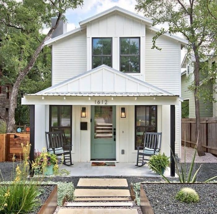
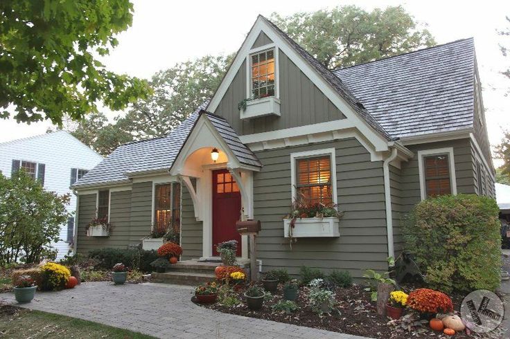
Lighter, neutral, and earthy tones are the best color for a smaller home. Brighter colors like off-white, light yellow, or grey are perfect for making your house look bigger than it is. Light blue and cream colors give small homes a cottage or beach look.
Table of Contents
What Are the Most Used Colors for Smaller Houses?
The most used colors for small homes are more likely going to be bright and light.
Here is a list of the most-used colors in a smaller home exterior:
- Grey
- Light Yellow
- Sage or Hazel Green
- Off-White
- Light Blue
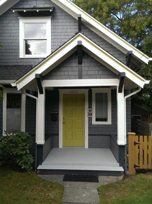
- Barn Red
There are also popular tiny homes and small home exteriors that use real wood with black trim or real stone to give it that small, cottage, Hobbit-home vibe.
If you like it to feel more farmhouse-looking, you might paint it white with red trim.
Either way, most exteriors are light, neutral, and earthy-looking.
How Do I Pick Exterior House Colors?
Picking an exterior house color comes down to your style and taste!
If you love beach or cottage style tiny houses, you might want light blue or off-white to give it that summer vibe. Ranch styles are more yellow and cream.
If you like something a little darker, you would go with a darker blue, an earthy green, or even a barn red.
Or, if you are feeling adventurous and fun, you might choose a bright, light yellow or light sage green!
Either way, choosing a color is more about happy you will be when you come home to it every day and less about marketability.
Although, if you are planning to sell that house again in the future, try not to paint it bright pink.
What Exterior Colors make a Small House Look Bigger?
Brighter colors make a house look bigger and more inviting.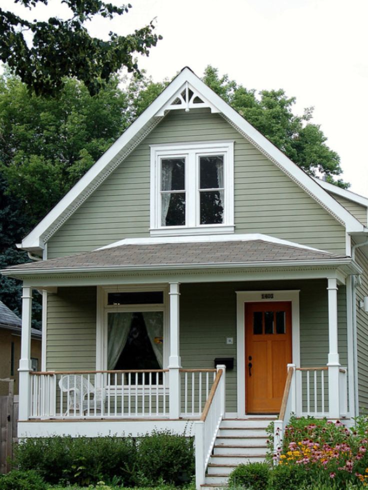
A lighter color, such as off-white, cream, or light blue or green, will make your house seem less compressed and more open and airy.
If you painted a small house a deep, dark blue, it would feel tighter, smaller, and more cramped.
Furthermore, interior paint jobs should be bright and sunny. It is proven that darker paint jobs inside can make homeowners feel more sad, angry, or confined.
If you’re not sure about this, consider looking at two small houses side-by-side: a deep blue and the other a bright cream or off-white.
Even a light grey is better for making your small house seem so much bigger!
How Many Colors Should a House Exterior Have?
A house exterior should not have more than three colors.
This would include the color of the walls, the shutters (if you have any) and trim, and finally the front door.
Many homeowners love to have neutral homes with light-colored shutters and trim but with a bright, statement-making front door.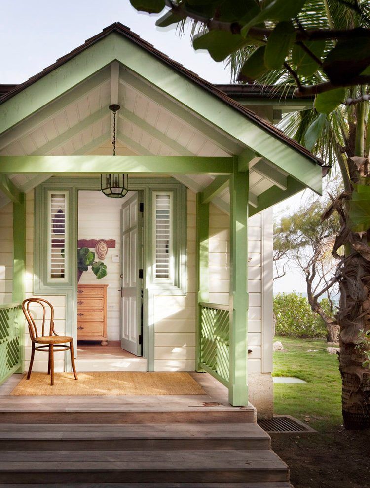 Sometimes they will go as far as four colors, but that is usually two different shades of the same color in the trim or walls.
For example, your house could have white walls with grey trim or shutters, and a big red door.
Or your house could have light blue walls, dark blue shutters, and a bright white door.
Whatever you decide, try not to go over three exterior colors for your house, and make sure they match!
Exterior Color Combination Ideas for Small Houses:
On the road trips home to see my family, I always pass by this light purple house with black shutters and a bright, neon green door.
It is the oddest-looking home and has been there for about three years now. I assume it either can’t sell, or it makes the owners very happy.
However, I wouldn’t recommend it for your own home.
If you are looking for good color combinations for your small home, consider these:
- Off-white walls, light grey trim/shutters, red door.
- Light blue walls, dark blue trim/shutters, white door.
- Light green walls, cream, and dark green trim/shutters, brown door.
- Light yellow walls, cream, and white trim/shutters, blue door.
These are only four of the many, many combinations out there that can make your house into a home.
Consider looking online at small house exteriors and get some ideas for yourself!
How Does the Choice of Color Affect a House?
The choice of color can really affect how the house is perceived.
Like we mentioned before, the color of your house can make it look bigger or smaller, open and airy or cramped and confined. It can also make it feel “warmer” or “cooler.”
In the same vein as that neon-green door and purple house that I pass on road trips, people in your neighborhood will remember your house specifically if you give it a bright and crazy color scheme.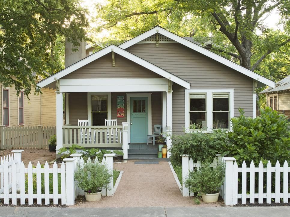
Or you can blend into the crowd with a basic, neutral tone.
While you don’t have to take any of this into account when choosing a color palette (after all, this is your house, do what you like with it), some homeowners want to feng-shui their home to match their style and tastes.
So, if you like basic white colonials, light blue beach houses, or bright yellow farmhouses, that’s entirely up to you.
Should Exterior Colors be Lighter or Darker?
Exterior colors are better when they are lighter – if it is painted.
If you have a home made of natural stone and wood, a darker trim looks great!
However, if you have painted wood or siding, consider going with a lighter, more earthy, and neutral tone. This is a great choice that will make your house look fresh and new, with bright, happy colors that light up your yard and street.
Once the exterior is painted lighter, you can add darker or more earthy trim colors to it, such as dark greens, blues, or even browns and reds.
If you painted it a dark color, that’s also fine, but you will have a home that is more imposing and may look smaller or more cramped because of it.
However, there are some dark colors, such as blue and barn red, that work well with smaller homes and make them seem warmer.
Most of all, choose the color that you like best! You are, after all, the person who will be living there.
Why not enjoy it?
What Color Houses Sell Best?
Houses with versatile colors or ones that aren’t too bold and garish are your best bet when selling your home.
If you have ever seen houses that were painted purple or bright green, perhaps even pink, then you might have assumed that those are too hard to sell.
Not without a fresh coat of paint, that is.
Some of the more marketable colors are:
- Off-White
- Wheat (Cream Color)
- Grey (& Other Shades of Grey)
- Blue (Light & Dark)
These are the classic colors that most houses are painted to keep them marketable.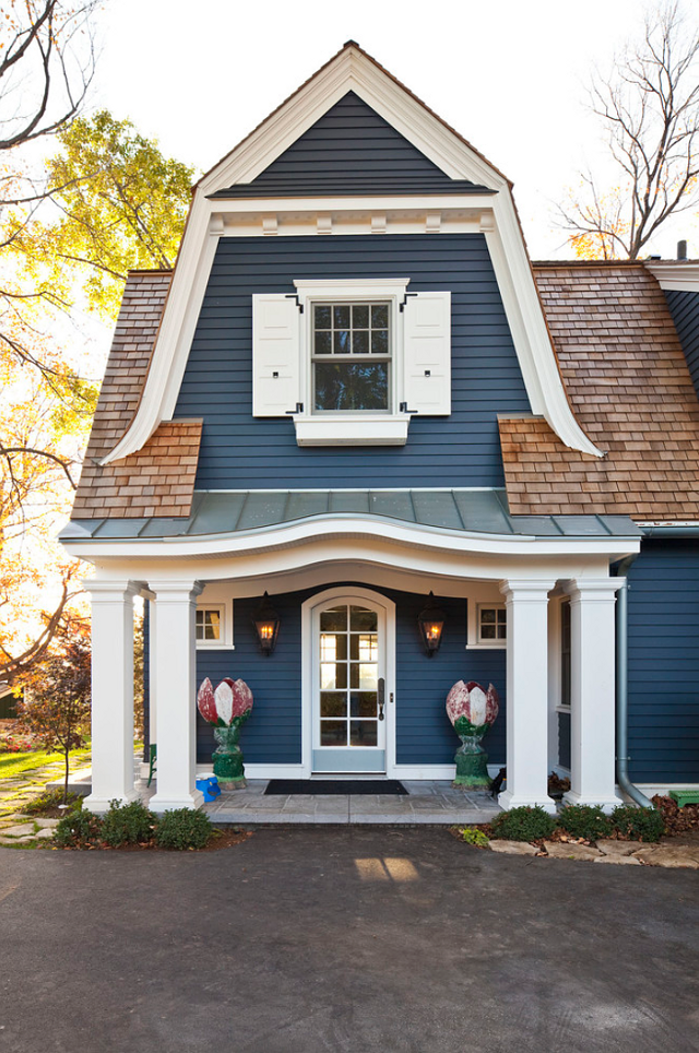
Creams, greys, blues, and off-whites are great because you can pair trim colors with them, such as blue shutters or a big red door.
If you had a very bright or primary-colored exterior paint job on your house, it might be a lot harder to sell.
If, however, you like bright colors, consider these colors instead:
- Yellow (Sunny or Light Yellow)
- Green (Light or Sage Green)
- Red (Barn or Deep Red)
Primary colors are way too bold and often will make your house stand out too much. Neutral, earthy tones are much easier to sell because they go with everything.
Neutral tones are easy on the eyes and don’t attract a lot of attention, and they are pleasing to look at, too.
Should the Outside Colors Match the Inside of the House?
The outside of your house is simply to make a statement to everyone passing by.
It can be neutral and plain or eye-catching and bright, but your inside doesn’t have to match.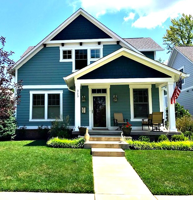
Instead, many homeowners will do one of two things:
- Choose an overall theme both inside and out (cottage, ranch, modern, colonial, etc.).
- Have an outside that doesn’t match the inside at all.
There is no “should.” Your house is your own!
Enjoy it, and make it look however you want, you’re the one who has to live there.
However, if you are in the market for selling your house, you might want to rethink having a bold inside, especially if your outside is painted a plain, off-white colonial style.
If your inside has hot pink walls and leopard print furniture, then you might need to redecorate before the realtors come knocking.
References:
12 Exterior Paint Colors to Help Sell Your House
What Color Should You Paint a Small House Exterior?
The Best Colors to Use in Small Homes
Was this article helpful?
Great!
Click to share.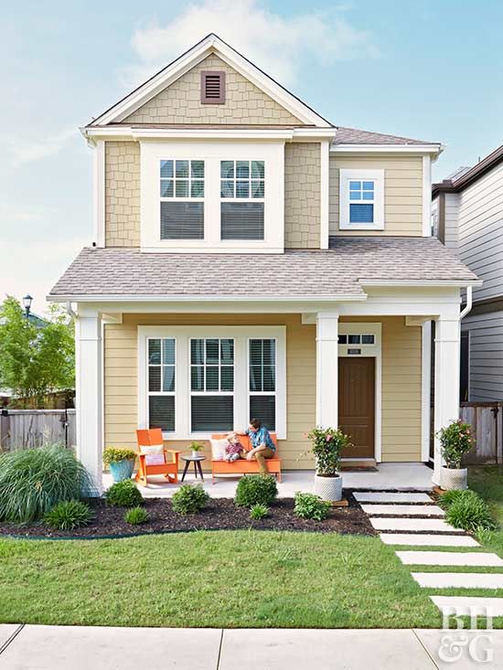 ..
..
Did you find wrong information or was something missing?
We would love to hear your thoughts! (PS: We read ALL feedback)
Name (not required)
Email (not required)
Message
Exterior Paint Combinations for Small Houses | Home Guides
By Kristine Tucker Updated August 26, 2019
The right combination of paint color for the exterior of your house takes on added importance when your house is small. The goal is to make your house appear as expansive as possible while focusing on appealing architectural features to make your house stand out. Most exterior color schemes on small homes have two main colors -- one for the bulk of the house and the other for the trim and special features.
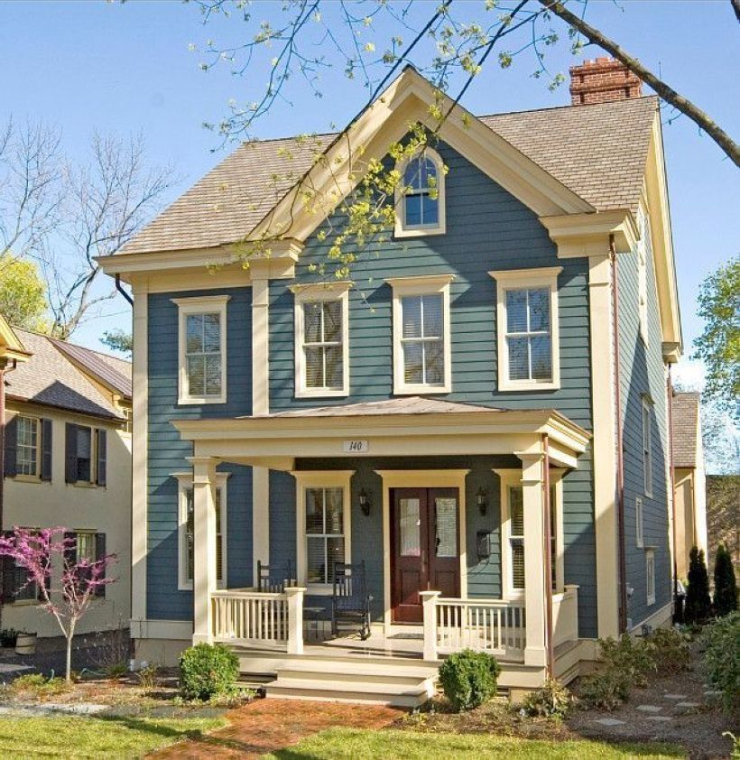
Blue and White
Blue and white work magic for a small house because blue grounds the home, making it look more substantial.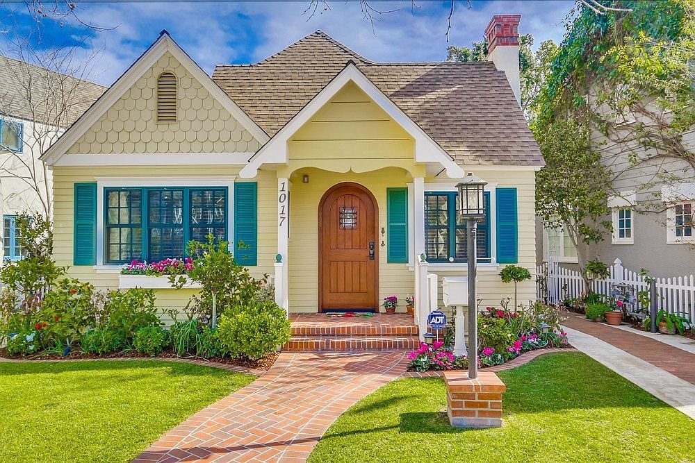 White trim brightens the entire house and makes the blue look crisp and finely detailed. Midnight blue and navy blue are too dark for most small homes, and pastel blue looks faded, dull and outdated. Opt for medium shades of blue, such as blue-gray, cornflower blue, ocean blue or sky blue. Stark white paint works best for the trim, edging, arches and any additional architectural features. Paint your gutters and downspouts blue, so they blend with the house and don't stand out.
Black and White
Black and white is a familiar color combination because white expands a house, making it appear larger than it really is. Paint the entire house white and use black paint for the trim and shutters. Black fades quickly when exposed to sunlight, so opt for a high-performance paint that has ultraviolet protection. Black trim is especially appealing on a white house when the roof is also black, charcoal gray or light gray. If black is too dark for you, opt for a dark or medium shade of gray for the trim.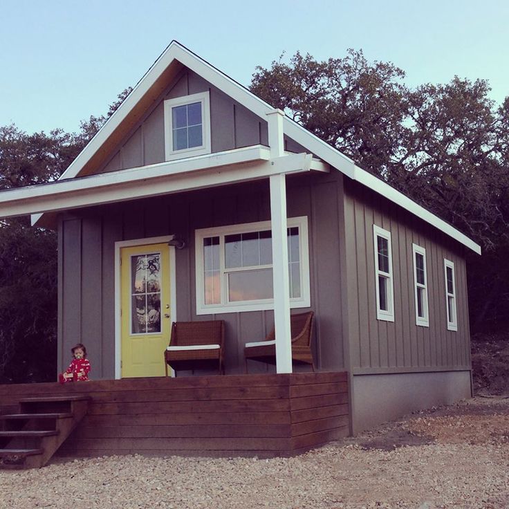 To avoid unwanted shadows and help your paint effectively reflect natural light, paint your window sashes and porch ceilings white. You can always add colorful flowers, vivid landscape, a brightly painted front door or a zesty "welcome" mat to spruce up the black-and-white combo with color.
Brown and Tan
Brown and tan team up for a warm and welcoming color combination that is subtle and won't easily go out of style. Choose a light, medium or neutral tan shade for the bulk of the house. These hues aren't dark enough to shrink the appearance of a house, so they work well on small houses. Then, select a shade two or three shades darker on the same color swatch for the trim and architectural features. Choosing colors from the same swatch ensures that the colors blend harmoniously. You might choose a brown or taupe accent color for the trim that also matches one of the flecks of color in your roof.
Sage Green and White
If you prefer darker exterior house colors, opt for sage green. Its warm undertones and muted hue work well on a small house, especially if you use white, off-white or beige to highlight your trim and architectural accents. Sage green blends nicely with outdoor surroundings, such as trees, bushes and vines, so it makes a small house look like a continuous, fluid extension of the outdoors. You might install a wooden front door to maintain your nature-inspired color theme.
References
- Sherwin-Williams: Color Tips -- Choosing Exterior Paint Colors
- HGTV: 67 Inviting Home Exterior Color Palettes
Writer Bio
As curriculum developer and educator, Kristine Tucker has enjoyed the plethora of English assignments she's read (and graded!) over the years. Her experiences as vice-president of an energy consulting firm have given her the opportunity to explore business writing and HR. Tucker has a BA and holds Ohio teaching credentials.
The color of the facade of the house - which is better to choose? 100 photos of new designs
When designing a façade, take into account factors such as climatic and weather conditions, nearby buildings, and landscape.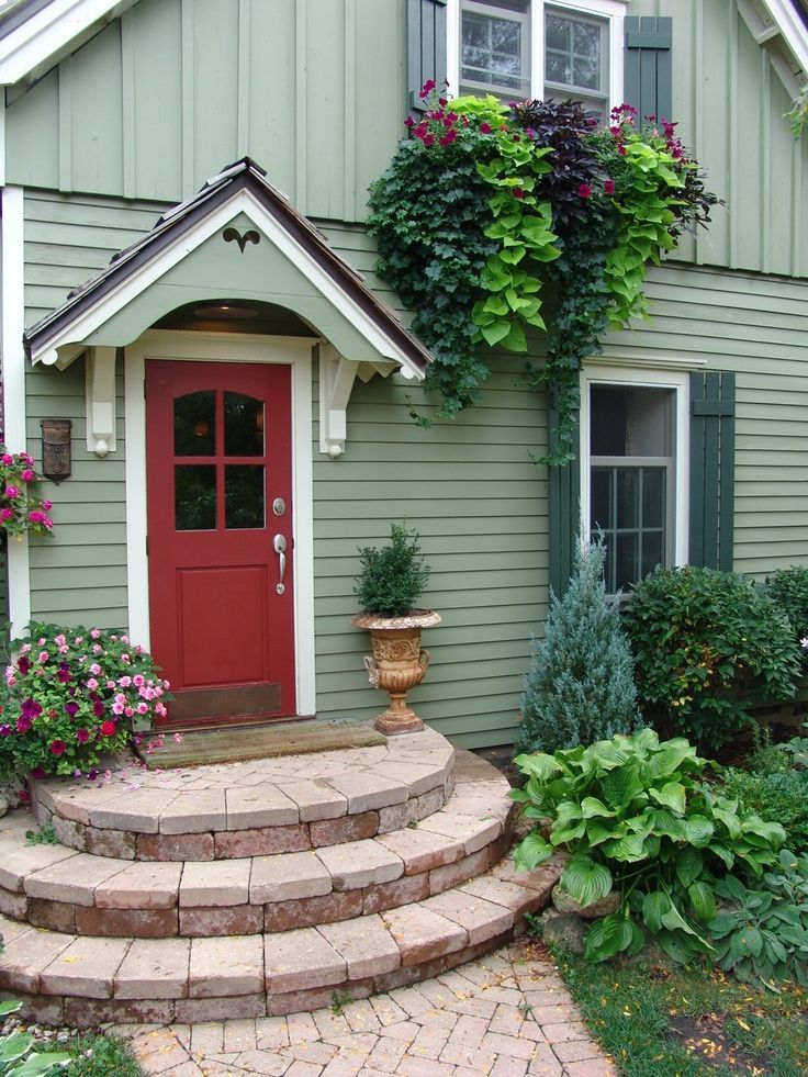 Harmoniously combining colors, you can create beautiful architectural ensembles. Photos of examples of a beautiful facade with successful color combinations clearly demonstrate this.
The texture and properties of cladding materials sometimes suggest the color solution itself. Wood and stone have their own unique natural tones, which significantly affect the whole look of the house.
Brief content of the article:
Facade decoration
The texture of natural material in the cladding and lighting affect the perception of color in different ways. Structural elements must be in harmony with each other, creating a single ensemble. Stone and wood can be successfully combined with glass, mosaic or metal. The combinations of shades of the roof, facade and plinth are carefully thought out to create a holistic image of the building.
Plastered walls are usually finished with weather and temperature resistant paint. Black steel paint is suitable for painting metal surfaces.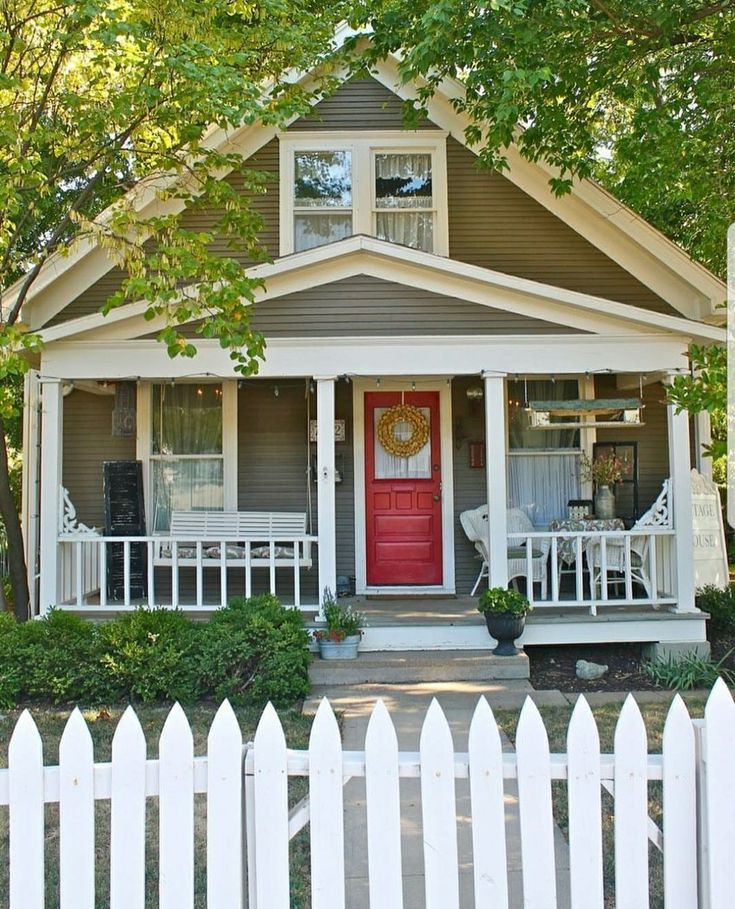 Metal alloys are coated with vinyl chloride or varnish.
Features of choosing a color
A competent specialist will help you decide which color is best for decorating the facade. For selection, you can use special programs online. In any case, adopt the basic rules that will help you avoid common mistakes.
It is always best to go for lighter colors. Too bright, saturated and dark are more difficult to harmoniously include in the space, besides, they quickly tire the eye.
Shades of the same range are well combined with each other: brown with beige, blue with light blue, etc. White is versatile and goes with any color.
Try to use colors that are close to natural - this will provide you with the best combination of facade color with nature and adjacent buildings. Competent coloring will help to emphasize the advantages of the finish and slightly smooth out the flaws.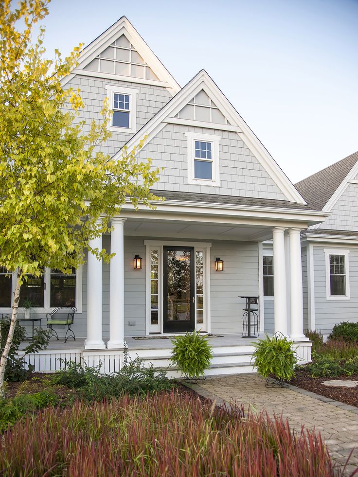
When choosing a bright color, keep in mind that it will visually increase the size and highlight the house against the surrounding background. Most often, warm yellow, brown, red are used to paint the walls.
Be careful with dark tones and use them in limited quantities. Shades of green are quite popular, which look very organic in the bosom of nature and are perfect for suburban buildings.
A trendy modern trend is the use of terracotta. You can choose both bright and more calm, muted shades that set you up for rest and relax. You can find the right solution by using the color charts for the façade.
A common variant is brown-red tones, ranging from copper to chocolate. It is optimal to use them in the decoration of buildings with a simple architecture.
Choose paint according to the weather and climate. Paint of organic origin tends to quickly fade from sunlight, and dark colors will increase the heating of the facade, which will lead to its accelerated destruction.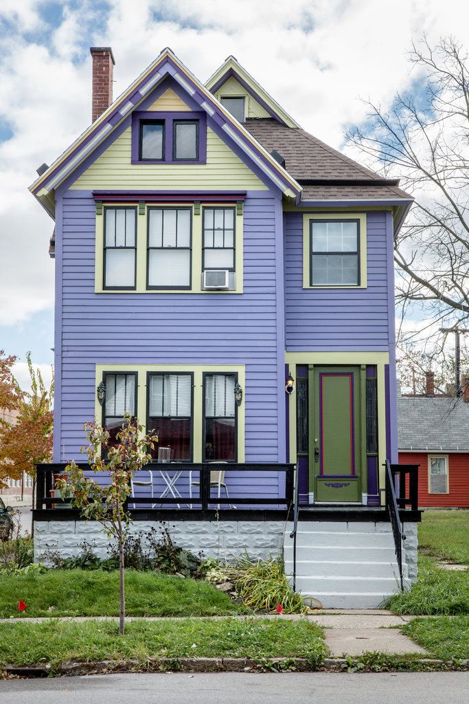
Combination with adjacent objects
Coloring should be done, focusing not only on your taste preferences, but also taking into account the color scheme of buildings and structures nearby.
If the building is located in a historic area, the color scheme must be respected, characteristic of the area. Traditionally, for houses located outside the city, the most acceptable solution would be the use of soft pastel shades.
If the house is surrounded by greenery, bushes and trees, it is best to use very light shades for painting. A building standing in an open area can be enlivened with bright colors.
The south side of the house requires the use of muted colors - intense sunlight will make the facade lighter and brighter. Think about how the house will look at different times of the year - against the backdrop of white snow or bright green spaces.
With the help of coloring, you can focus on what you want to emphasize and make some imperfections invisible.
Nuances of choosing a shade
Color creates a mood, affects the psycho-emotional state. It is better that professionals who will take into account all the nuances are engaged in its selection. However, you can easily understand how to choose the color of the facade yourself if you have at least a little experience in this.
The general rules are as follows
- the choice of shade is significantly influenced by the style in which the building is made - from classic to modern solutions;
- well-chosen tones will emphasize the features of the style and beauty of the building, and unsuccessful tones level the features of architecture;
- for a building in a classic style, beige, white, milky shades are suitable;
- dark tones have the ability to attract the sun's rays and heat, so they are best used for buildings located in cold climates;
- consider in advance the fact that bright colors fade faster in the sun;
- to highlight small elements, use light colors;
- rich and dark colors are best used if the building has a simple shape;
- dark tones emphasize the shape of the object, light tones increase its volume.

Multicolour facade
Several shades can be used for decoration at once, provided that they are correctly combined. This option will draw attention to the building, and living in it can become more comfortable psychologically. If your project involves a combination of several tones, you need to take into account the nuances that will facilitate this choice.
With bright colors it is convenient to create an accent by painting windows and doors with them. Use the help of special architectural programs - this will save you a lot of time.
Evaluate the overall style of the building to select the best combination. Facade and roof can be made in the same color. In modern projects, interesting contrasts are allowed for these parts of the building. Looks great, for example, a combination of black and yellow.
Wooden houses are best painted with glossy paints. But if the building is located in a sunny area, give preference to matte paint.
Monochrome facade
This option is considered classic, it is suitable for conservatives who adhere to the traditional style of home decoration. If you are inclined to such a decision, it is worth considering some points that affect the correct choice of the main tone.
Natural colors are suitable for wooden houses, buildings in the style of "Russian hut". It can be all kinds of shades of brown, pastel colors. The castle-style house looks very nice in gray.
Consider the combination with the landscape and nearby buildings - it must be harmonious. As the main one, it is better to choose the dominant gamut in the environment.
In addition, it should be in harmony with green spaces and various small buildings on your site.
When designing the facade, it is worth remembering that this part of the house is the visiting card of its owners. She will eloquently tell about the lifestyle that is familiar to them, will make the first serious impression on any guest.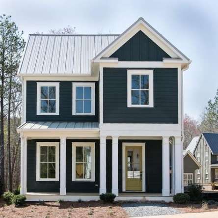 Therefore, the issue of its design must be taken very responsibly.
The selection of color combinations must be careful and thoughtful, and the quality of the paint used must be of the highest quality. Only this approach guarantees you an excellent result, and the house will become your pride.
Photo front color
Post published: 03.12
Join the discussion:
detector
selection and combination of colors, red, green, brown
Content:
- Types of facades and finishes
- Front color harmony and features
- Combination of colors of the facade of the building with surrounding objects
Facade cladding is made with a variety of materials that give it a natural and natural color.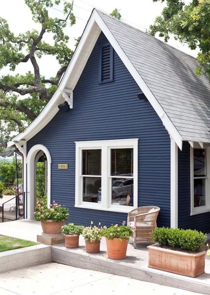 Brick, stone, wood, painted plaster, clinker, majolica - all materials or their combinations change and decorate the appearance of the building.
To choose the color of the facade, you need to take into account a number of parameters: climate, geographic location, technical characteristics, building functions, its dimensions, facing materials, structural elements.
A harmonious combination of shades contributes to the creation of architectural ensembles at the level of works of art.
Types of facades and finishes
The surface texture and the type of lighting have a great influence on the perception of color. Remarkable effects can be achieved by combining natural building and cladding materials.
Stone, concrete, wood are perfectly combined with mosaics, glass, asbestos cement, ceramics, metal.
Sometimes artificial materials are used for decoration, but this is not the best choice, because the walls of houses must be strong and reliable, because this is not furniture, where chipboard facades are often used.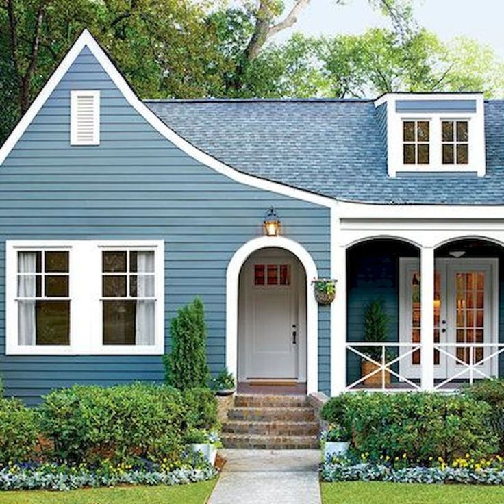
Shades of structural elements should be combined with each other and decorate the facade. Usually, color combinations of the basement, roof and facade are selected so that they harmoniously decorate the house.
For plastered walls, paints are used that are resistant to temperature changes and other weather conditions.
For metal elements, steel or black paint is more often used, and facade elements made of metal alloys are varnished, vinyl chloride or anodized.
To select colors, you can use special programs or invite a specialist.
Rules for choosing colors and combinations of colors
When choosing the color of the facade, you need to remember simple rules:
- light tones are more preferable than bright and saturated ones;
- are in good harmony with each other shades derived from the same color;
- the classic look of the object can be obtained using natural paints;
- A well-chosen palette will give the object individuality and originality.
The combination of colors should highlight the strengths and hide the flaws.
Walls are painted in warm shades: brown, yellow, red. A rare combination of white and gray. Dark facade colors should be used in small quantities so as not to create an impression of bad taste.
The house should be beautiful, neat, and bright colors make the building stand out from the space, visually increase the size. The white facade is well combined with other shades.
The green hue goes well with nature and is often used to decorate the facades of cottages and mansions outside the city. In modern architecture, purple and black shades can be used.
Terracotta is a modern and fashionable color that contains the whole range of autumn colors: carrot, brick, orange. They induce relaxation and tranquility. Terracotta decoration can consist of both rich tones and more muted ones.
Facades are also decorated in brown-red tones.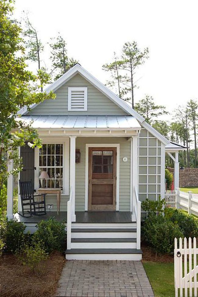 The brown façade comes in a variety of hues, from copper to chocolate, and is often used to finish objects that do not have complex architecture.
Façade color harmony and characteristics
How to choose a color to make an object look more impressive and attract attention - this issue is solved by both professionals and ordinary people building their own private house.
Color has a different effect on the human psyche, and for the color scheme it is important to select shades that have a beneficial effect on the body. For some people, these are shades of red and brick, and for others, beige and green.
Scales
There are several types of color scales: achromatic, contrasting, monochromatic, disharmonious, nuanced. Gamma selection is not an easy process, and it is better if it is carried out by specialists.
Select it according to the style of the building: classic, modern or rustic.
It is better to use a small number of shades: one main and 2 or 3 additional ones.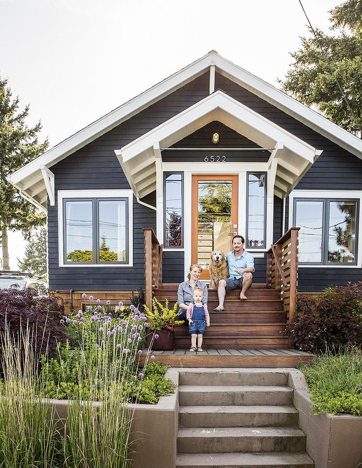 Painting a house in one color is not a very good solution, because it will look monotonous and uninteresting.
Primary colors are blue, red and yellow, while green, violet and orange are secondary colors.
Architectural features of the object dictate decisions in the choice of color palette, because poorly matched colors can cross out the style and sophistication of the building.
White and milky shades are often used in classical architecture, because they visually increase the size.
Important color characteristics:
- fastness;
- shape dependency;
- visual properties;
- degree of heat absorption.
Dark shades attract light and are used for buildings in the Nordic countries. Bright colors fade in the sun, and it is better to take this factor into account in advance.
Saturated colors are used in the absence of small elements and simple forms of the building, while intricate structures look good in light colors.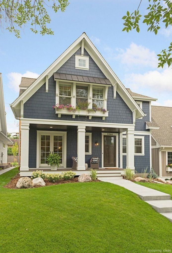
Light colors visually increase the volume of the building, dark colors emphasize the shape and reduce the emphasis on the object, bright colors make the house stand out from the surrounding space.
Important parameters for choosing a color scheme
The choice of color for the facade is carried out taking into account the following parameters:
- object assignment;
- architecture of neighboring buildings;
- climatic conditions;
- features of psychological perception;
- cultural traditions;
- modern fashion.
Shade selection should be carried out taking into account the architecture of the object: the laconic and simple silhouette of the building is emphasized by light tones, and complex architecture - by bright colors.
You also need to take into account the texture and dimensions of the elements. A smooth texture increases brightness, while a rough texture softens colors.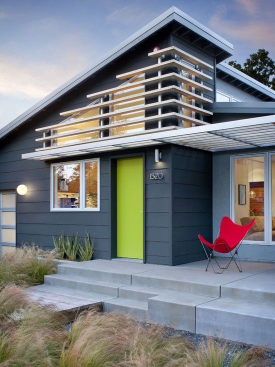 The selection of colors involves the selection of all elements: doors, plinth, facade, roof, windows.
Rules to be observed when selecting colors:
- base is painted in dark shades;
- the roof is usually lighter than the plinth;
- walls have an intermediate shade between the plinth and the roof.
Regardless of the choice of colors, the combination must be harmonious and consistent with the architecture of the object. You can choose the colors of the facades of houses by looking at the photo (see link). This is a great opportunity to choose the right option.
Combination of the colors of the facade of the building with the surrounding objects
You need to paint the house not only according to your taste, but also take into account the general surrounding color scheme of those objects that are nearby.
In a historic site, the color combinations that are typical for the building area should be followed.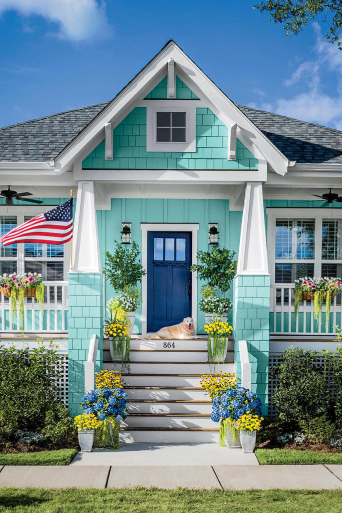 For a country house, a good solution would be to use pastel colors. If the house is surrounded by a garden and trees, then it is decorated with light colors.
If the building is located in an ordinary residential area or in an open area, then it can be highlighted with bright colors.
Facades should also be painted taking into account climatic conditions, because paints of organic origin (red, green, purple, yellow) quickly fade under the influence of ultraviolet rays, and too dark ones contribute to the heating of the facade and its destruction.
For the south side of the façade, paint tones should be more muted, because they look lighter in bright light. It is necessary to take into account how the building will look in winter or summer: the white house will not stand out against the background of snow and will completely merge with the surroundings, and the green house will not look like summer.