Wooden furniture colours
11 Terrific Paint Color Matches for Wood Details
What paint colors work best with stained wood trim? I generally select neutral colors when I am painting a room with natural wood details, whether cabinets or stain-grade trim. Greens, grays, whites and beiges are no-brainers. Warmer colors, like orange, brown, rust and red, work too, but the deeper tones of these colors work best. Here are 11 great spaces that I think got the choice of paint colors right.
Related: 10 Tried-and-True Paint Colors for Walls With White Trim
Jamesthomas Interiors
Creamy white works with honey- and amber-toned trim; this is Benjamin Moore’s Sweet Spring 1500. I like creamy whites in an eggshell or pearl finish for just a little bit of sheen. Save a flat finish for ceilings; a little bit of sheen will make cleaning minor scuffs on walls easier.
GoodHome Painting Co.
White is an obvious choice with wood trim. Stay away from bright white and look for something with milky undertones. Here is Farrow & Ball’s Slipper Satin 2004.
Lowe's Home Improvement
My favorite neutral with wood trim is green. The olive-toned greens are the best. Greens work with red, brown and blonde woods. I love this shade by Valspar, Grandma’s Linen 6001-1C.
Hendel Homes
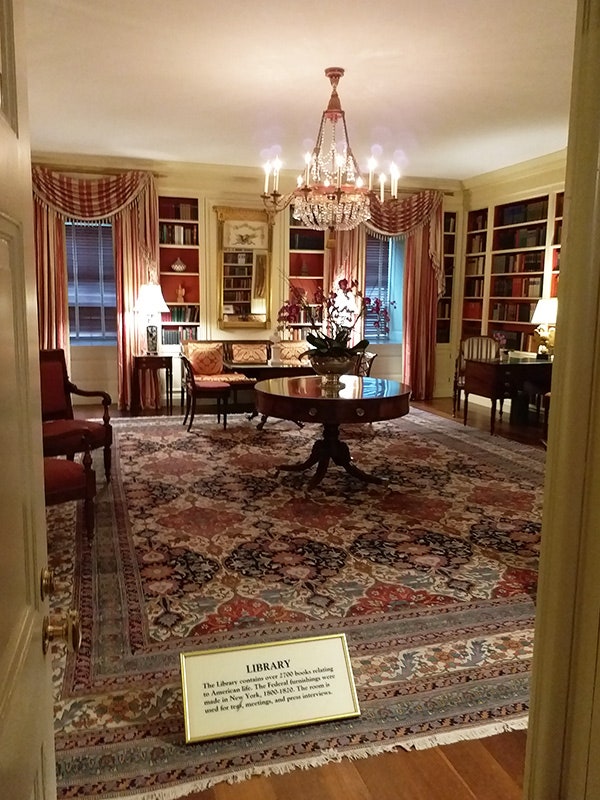
Beige, tan and ivory work great with light and dark shades of wood. Here is Mesa Verde Tan AC-33 by Benjamin Moore. Notice the wood floors are a contrasting color to the trim. The contrast is nice with the trim, while the darker colors are highlighted again in the rug.
TruexCullins Architecture + Interior Design
Cream is also a beautiful choice, but be careful not to confuse cream with yellow. Yellow is not a good choice for wood trim, in my opinion. If you have amber-toned wood trim, like Douglas fir or pine, try Gentle Cream OC-96 by Benjamin Moore or Glow W-B-310 by Behr.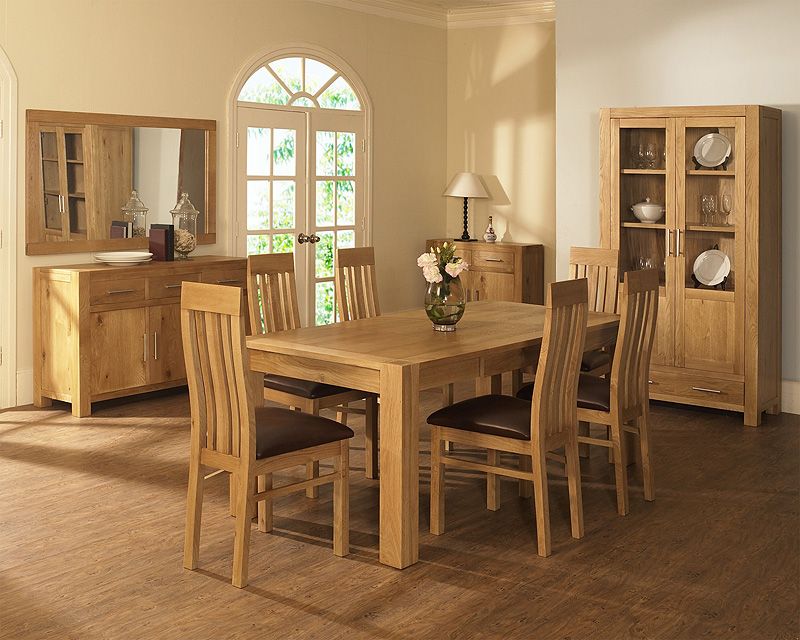
Knickerbocker Group
Gray is a winner with soft, blonde or weathered wood tones. Here the cabinets under the stairs and tread color are Bedford Gray by Martha Stewart Living, a perfect choice with the weathered wood ceiling.
Charmean Neithart Interiors
“Greige” is a great neutral with wood trim. The trick is the right shade. Go toward a warmer greige if you have red-toned trim or cabinets, like cherry or mahogany. This one is Benjamin Moore’s Pismo Dunes AC-32.
Anna Lisa Avelar Interior Design
Light blue with subtle gray undertones works great with a medium-toned walnut. Here Sherwin-Williams' North Star SW6246 blends beautifully with the wood beams and white trim.
Katerina Tana Design
Turquoise and aqua shades can work too. This great shade of aqua, Blue Ground 210, by Farrow & Ball, evokes spring and looks great with the amber-toned ceiling.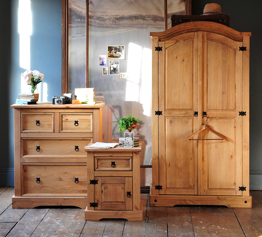
Lowe's Home Improvement
Gray and brown can work with black trim or cabinets. Make sure the shade you select provides contrast. Here Valspar’s Artichoke 6003-2A, a smokey charcoal, contrasts black accents.
Find a design pro professional
Bella Villa Design Studio
Sponsored
Badplanung | Küchenplanung | Renovierungen - Prompt und günstig
Best Places to Use Popular Wood Colors
When it comes to choosing wood furniture for your home, there are multiple colors from which to choose, but what are the most popular wood furniture tones, and how do you implement them so that they complement your décor? When choosing wood furniture, most home owners don’t realize how many options are out there until they’re searching online, which then turns the search into an overwhelming task. While there are lots of variations when it comes to color tones in wood, there are five main colors that not only look natural, but also provide the perfect foundation for a variety of design styles and color schemes.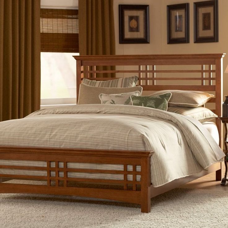
If you’re looking for a straightforward guide on how to choose the best wood furniture color for your décor, you’ve come to right place! Below you’ll find the five most common wood furniture colors, and which ones are best suited for your home’s specific design style.
Classic Walnut
When it comes to deciding on wood colors for furniture, the most timeless color is Classic Walnut. With its rich, medium-brown tones, it goes with just about any color scheme, and can seamlessly cross over from a traditional to contemporary design style (and vice versa). This color has a broad appeal mostly because of its earthy nature, as it looks like a color you would find in a beautiful wooded area, regardless of whether it’s actually natural or comes from a wood stain.
While Classic Walnut can be implemented into almost any color scheme, it works best when designing an earth tone room, as it provides the perfect canvas for cerulean blue, sage green, taupe, tan, and even pops of bold, lava red (yes, that’s an earth tone color too)!
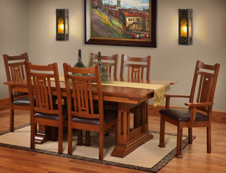
Dark Mahogany
While younger home owners tend to desire a modern vibe to their home’s décor, an older generation of home owners are usually partial to a more opulent, classical design style.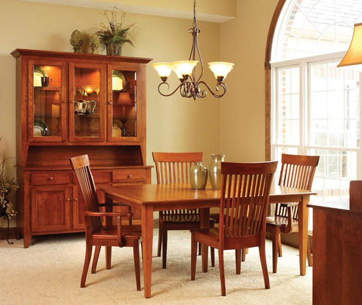 Whether you’re 32 or 62, a traditional type of décor can work well in a newer home just as well as an older one, and Dark Mahogany can help bring that old-world style to life. Dark mahogany has beautiful red and burgundy undertones that peak through medium to dark brown hues, and pairs perfectly with rich, ‘old world’ colors, such as gold, burgundy, teal, and emerald green.
Many vintage dining sets and bedroom sets are a traditional Dark Mahogany, which also helps to solidify a vintage vibe. Adding gold picture frames, burgundy candles, and various rich shades of green décor items will further enhance the warmth and depth of the Dark Mahogany wood.
Natural Maple
While most traditionalists prefer the aforementioned darker brown hues, lighter colors of wood furniture are what’s most appealing to those who prefer a more modern vibe and brighter décor colors. If you’re looking to create a clean, bright look to a living area or bedroom, Natural Maple is the way to go. It’s a light beige mixed with tan and subtle golden undertones, and still provides a natural look while supporting a contemporary design style.
Natural Maple pairs perfectly with light, airy colors, such as white, turquoise, tan, and even pops of yellow to provide a crisp, clean, spa-inspired ambiance. This type of color scheme is perfect for a bedroom, baby nursery, and even a sunroom, as it instantly creates a comforting, sunshiny glow.
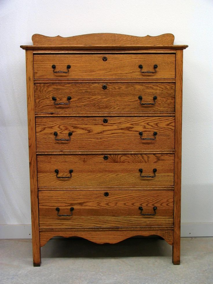
Golden Oak
If you’re looking for something in between very light Natural Maple and Dark Mahogany, Golden Oak is another option that’s equally as versatile as Classic Walnut. It can easily be implemented in both modern and traditional design styles, and supports a wide range of earth tone colors. It works well with bright ocean blues, sea foam green, white, and silver, but also strikes a nice contrast against black, brown, and dark gray.
The buttery yellow tones, which are reminiscent of golden sand dunes, create a warmth that provides the perfect foundation for other ocean-inspired colors.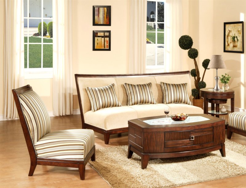 This color combination is ideal for creating a guest bedroom or reading area, as it makes guests feel relaxed and right at home.
Cherry Oak
If you’re drawn to rich colors for wooden furniture, but want more obvious color mixed in with traditional brown hues, Cherry Oak is an ideal choice. Cherry Oak is a nice medium brown with vibrant, cherry red undertones, which can bring warmth and vibrancy to a very bland, neutral space. This foyer space doesn’t have much color, and the Cherry Oak foyer table provides a beautiful, bold contrast to the grey, cream, and tan tile. This table is a statement piece all on its own with the bold wood color, and really livens up the space!
Finding the right wood color for your furniture doesn’t have to be stressful, and can be done quickly and easily once you establish your room’s color scheme, and follow this simple guide. What’s your favorite combination? Share your thoughts in the comments below!
Popular Articles
-
Thinking about selling your home? Did you buy a property and it isn’t in the condition you expected it to be? There are many plans and designs that you need to draw up before you decide to remodel any kind of property.
 All the other projects that are detailed on this site will give you an idea of the size and costs your budget will need to be able to handle.
 -
Why replace your microwave when you can always repair the one you have lying around in your kitchen or kitchenette? When the microwave first came to be, the homeowners of yesteryear found it such a convenient appliance that it became one of the many major appliances that we use today.
-
The average cost to remodel a bathroom is $5,000, however, bathroom renovation costs can range from $328 to $12,900. Here at House Tipster, we like to inform you of how much an average bathroom remodel can cost.
 Learn all about the refurbishment of your bathroom and the costs of a project of thise size with our bathroom remodel cost guide.
 -
Childhood memories mostly consist of all the times you’d gleefully play with carefree living. You’d bike around the block as your parents watched you and your neighborhood friends play with each other. They’d sit on their seats from a close distance on their porch to make sure that you were safe.
Was this article helpful?
Yes
No
How has it helped you?
This article helped me immensely
I'm now more informed one this subject
I would like to contact House Tipster team
Please select a Answer.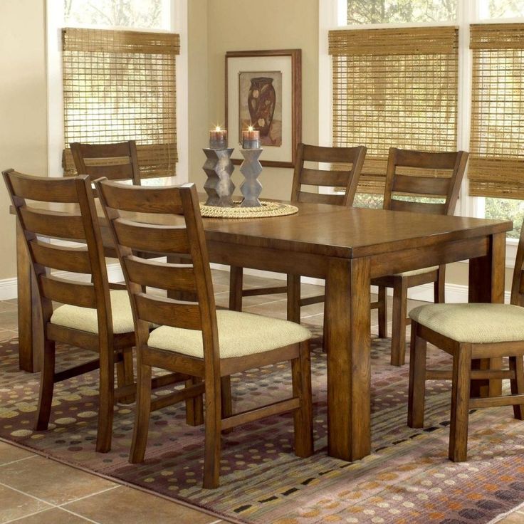
Next
What can we do to improve?
This article was not accurate at all
This article was not accurate at all
I would like to contact House Tipster team
Please select a Answer.
Next
What color furniture is - photos and names of furniture colors
Contents:
2. Furniture dark colors
- Wood effect dark colors
- Dark fabric look
- Dark colors plain
Light furniture colors
Light wood effect
| birch | Birch Mainau | Beech Artisan mother-of-pearl | Sand Artisan Beech | Beech Bavaria | Natural Country Beech |
| White Halifax Oak | Sand Gladstone Oak | Light Sonoma Oak | Maple | Natural Mandal Maple | Sugar Champagne Maple |
| Natural Pacific Walnut | Fir Bramberg | White Aland Pine | Aland polar pine | Cascina Pine | White Loft Pine |
| Cream Loft Pine | Light Riverside Cherry | Cherry Verona | Ash Navarra | Milk Oak | Sonoma Oak |
| Light oak | Wenge gray | Wenge light | Light Shimo Ash | Light Sicily Ash |
Light fabric colors
| White-grey fabric | Linen beige | Silk gray | Light skin | Light beige fabric |
Light colors plain
| Alabaster | White | Beige | Beige sand | Blue | Cream |
| Lime | Flamingo pink | Gray cashmere | Light gray | Vanilla |
Furniture dark colors
Wood effect dark colors
| Truffle Artisan Beech | Davos Oak Truffle Mainau | Natural Halifax Oak | Gray Beige Gladstone Oak | Alder | Tobacco Aida Walnut |
| Whitened Carini Walnut | Tobacco Pacific Walnut | Black Havanna Pine | Pasadena Pine | Wenge | Wenge Bamenda |
| Wenge Louisiana | Wenge Mali | Wenge Vintage | Cherry | Cherry Locarno | Dark Riverside Cherry |
| Dark Sonoma Oak | Shimo Ash | Dark Sicily Ash | Alder | Mountain alder | Toronto Maple |
Dark fabric look
| Anthracite linen | Gray fabric | Taupe fabric | Light brown fabric | Dark gray fabric |
Dark solid colors
| Black | Graphite Black | Cubanite | Lava Gray | Stone gray | Pearl Gray |
| Dusty gray |
1 rating
what are and how to choose
Finding the perfect furniture color is no easy task.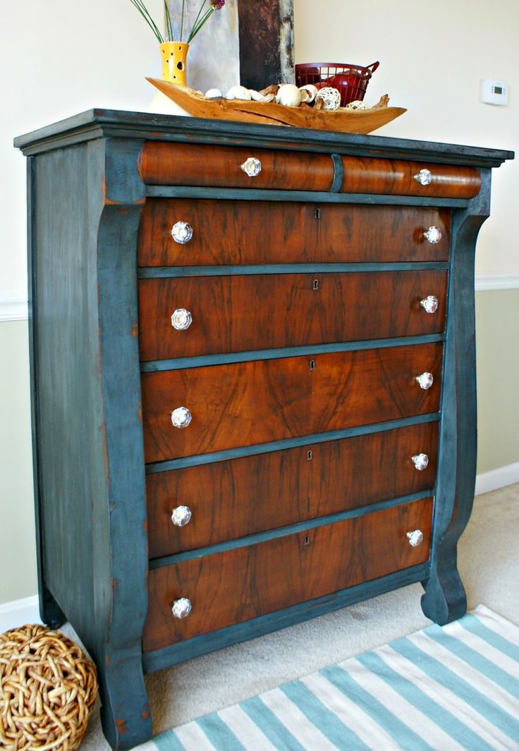 With the existing variety of shades, it will take more than one day to study the palette alone. We learned from designers how not to make a mistake with the choice and stay in trend
Photo: Shutterstock
The color of furniture is largely determined by its material: wood or its imitation, various textiles, plastic or recycled materials marked "eco", etc. For some materials, the set of colors is limited (for example, for natural solid wood), others open up room for experimentation. We figure out together with experts what to look for when choosing the color of furniture and what is in trend in 2022.
- Furniture colors
- Trends 2022
- How to choose
- Combinations: examples with photo
- Errors when selecting
Experts in this material:
- Alla Zorina , designer of the Tvoi Dom hypermarket chain;
- Ksenia Izmailova , architect, designer, author of the Prosto Remont blog;
- Olesya Khudyakova, designer, founder of Khudyakova Design architectural studio.
www.adv.rbc.ru
What are the colors of furniture
MDF and chipboard facades offer almost limitless palettes and all kinds of imitations, including wood effect (Photo: Rumman Amin/Unsplash)
Colors for cabinet furniture are largely determined by the texture of the wood. Beech, wenge, walnut and oak are all names for colors and wood from which interior items are made. At the same time, MDF and laminated chipboard facades offer almost limitless palettes and all kinds of imitations, including wood grain. The basis of such catalogs, as a rule, consists of several basic colors, and further diversity is provided by shades. Only the walnut has at least three basic ones: golden, Milanese and Italian.
According to Alla Zorina, designer of the Tvoi Dom hypermarket chain, different shades of wenge, milk oak, beech and winter pine are popular this year for wooden furniture.
Wenge
Wenge - dark saturated color with a deep brown tint, sometimes almost black (Photo: Pixabay)
Wenge is a dark saturated color with a deep brown tint, sometimes almost black. It owes its name to an exotic tree from Africa. Natural wenge furniture is expensive and rare, but its imitation is considered one of the most popular colors for furniture. Wenge looks good on the facades of cabinets, kitchen sets or bedrooms.
Beech
Beech is a warm cream color with muted amber to light white hues (Photo: Wikimedia Commons)
Beech is a warm creamy color with shades ranging from muted amber to light white. Due to the uniform texture and unobtrusive pattern, furniture made of beech (or its imitation) easily becomes a background or dominant on a contrasting background. White and bleached beech are two color options that are as close to white as possible; smoky beech is a darker shade compared to all others, it fades into brown.
Oak
There are several shades of oak: red, which varies from light brown to pinkish red, and bleached (Photo: Wikimedia Commons)
There are several varieties: red, which varies in color from light brown to pinkish red, and bleached. The darkest option is bog oak, which is characterized by an almost black or light charcoal tone. A common characteristic feature of oak is a pronounced pattern. Milk oak is also a popular shade, it can play with pearl and pink tones.
Walnut
Walnut is a warm earthy color that can bring coziness to any interior (Photo: PPD by Pixnio)
Walnut is a warm, earthy color that can bring coziness to any interior.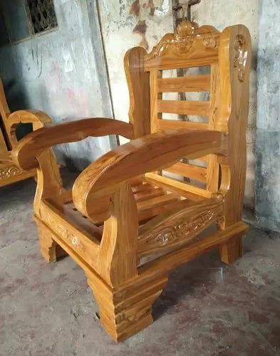 Its hues range from light to dark brown, sometimes with yellowish and golden streaks. Variations of this color (Milanese, Spanish or Black American) have rich tones that make them easy to pair with almost any color scheme.
Pine
Pine is a light warm color, usually with a creamy white hue that can vary somewhat (Photo: Wikimedia Commons)
Pine is a light warm color, usually with creamy white variations. Such furniture goes well with interior items, with different wall colors, patterns and other decor details. Winter pine is popular - a pronounced white color with smoky veins.
The range of upholstered furniture is almost limitless, especially considering all kinds of patterns, embroideries and patterns on textiles. In its simplest form, the colors of sofas and armchairs can be divided into plain and patterned. The first ones are easier to choose, but printed furniture can become a real highlight of the room.
Popular furniture colors of 2022
At the psychosomatic level for a person, terracotta and brown options are “cave” and calmness, and interiors where a person does not receive any irritation are in trend (Photo: Huseyn Kamaladdin/Pexels)
The era of terracotta with all its possible shades is coming in interior and furniture design, says designer Olesya Khudyakova. Some previously popular design solutions, such as white minimalism, are fading into the background, and in the most general form, interior trends look like this: ash and birch (Photo: Tiana Borcherding/Unsplash)
Terracotta and its various variations, from brown to chocolate, capture interiors, and furniture is no exception in this regard. This year, if you wish, you can safely change bright white sofas and wardrobes for warmer ones - caramel, beige or dark brown.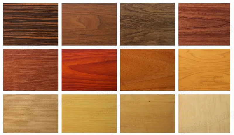
Olesya Khudyakova, designer, creator of architectural studio Khudyakova Design:
— All acidic and bright colors leave our houses, but the texture remains diverse. Today, these are pleasant and understandable materials - linen, wood, wool, rattan and wicker furniture. For upholstered furniture upholstered in matting or nubuck, shades from milky to rich brown are suitable. The tree looks good in natural, natural colors: beech, maple, cedar or olive root.
Colors inspired by nature
You can look not only at shades of beige or gray, but also more juicy ones, such as jungle green (Photo: Designecologist/Pexels)
Using earthy, dirty and dusty tones is another way to enhance the aesthetics and uplift the mood of an interior space, says Ksenia Izmailova, architect, designer, blogger Prosto Remont. Earth tones create a calming atmosphere and can work very well on their own without the addition of other bright colors. In this case, you can look not only at shades of beige or gray, but also more juicy ones, such as jungle green, the expert advises.
Eco Palette
The philosophy of sustainable consumption and environmental friendliness is already a way of life for many. When choosing furniture, items of eco-friendly colors with a hint of a craft package become popular, says Ksenia Izmailova. It is not difficult to imagine such a palette of things created from recycled materials.
How to combine colors in the interior: 5 tips, ideas, photos
How to choose furniture by color
Often the color of the interior precedes the furniture, and in this case, when the main background is already set, they follow the path of contrast or similar shades (Photo: Sophia Baboolal/Unsplash)
When it comes to choosing the color of furniture, there are a few things to consider beforehand.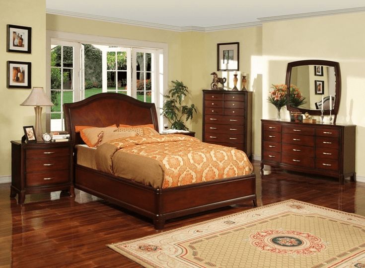
Interior color and style
Interior color design often precedes furniture selection. In the case when the main background is already set, they usually follow the path of either contrast or similar shades. For example, if the walls are bright and active, then you can choose furniture in dark colors, and vice versa. At the same time, nothing prevents the use of bright colors for both walls and furniture. The main thing is not to overdo it.
“In a classic style, you should pay attention to maple and ash, in Provence - to birch or walnut. A bright interior can be diluted with furniture with natural shades, such as birch,” advises designer Alla Zakharova.
Purpose of the room
When choosing furniture for the bedroom, calm and light colors of sets are more often considered (Photo: M&W Studios/Pexels)
When choosing furniture for a bedroom, calm and light colors of sets are more often considered. Children's rooms, on the contrary, can be more colorful and varied. The living room requires a very delicate balance - as this is where people spend most of their time.
Alla Zorina, designer of the Tvoi Dom hypermarket chain :
— Oak and alder are well suited for small spaces. Their shades are warm and fit well into the spaces of small-sized studio apartments, where objects do not look bulky. Foyers, large living rooms and dining rooms are more often equipped in walnut, wenge, mahogany or ebony colors.
How to replace the sofa in the living room: 6 unusual ideas
Lighting
Furniture can look different in store lighting, in a catalog and at home. In order not to get into trouble, it is better to study a specific color in advance by taking a small sample of fabric or furniture material. At home, it can be moved to different areas, necessarily changing the angle of illumination - so it will become clear whether such furniture suits you or not.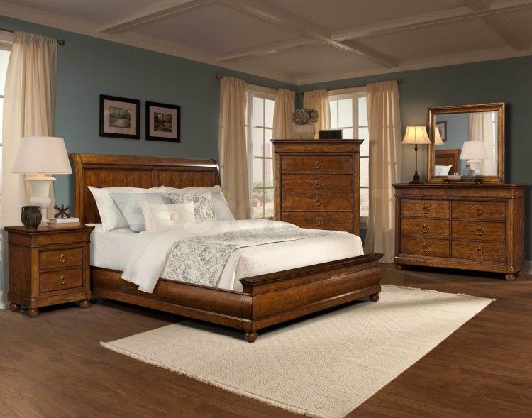
Easy to clean
Furniture needs to be cleaned and washed at some point, and the color you choose will determine whether the task is easy or difficult. Obviously, a white sofa will require more intensive stain cleaning than a dark one. But literally every mote is visible on dark wooden furniture, says designer Alla Zorina. According to her advice, from the point of view of practicality, it is better to choose light shades: ash, milk oak and beech.
Cleaning the apartment: how to clean the dirtiest places
Combination of colors of furniture, wallpaper and walls
Each house has its own unique style, in many ways it is determined by the color of the furniture (Photo: Spacejoy/Unsplash)
Every home has its own unique style, and the color of the furniture defines it in many ways. Here are some ideas and tips from the designer on how to successfully fit furniture of different colors into the interior.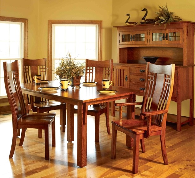
Ksenia Izmailova , architect, designer, author of the Prosto Remont blog:
— More and more designers are making built-in furniture and cabinets to match the walls. To do this, create a box of a neutral color, which can be white, gray or as much as possible "none". Someone more daring, on the contrary, makes it bright, but it still serves as a backdrop for accent elements, in particular the rest of the furniture. This is how a bright and unusual interior is obtained, in which the sofa ceases to be just a sofa, but turns into a piece of decor.
Built-in furniture becomes part of the decoration, and the design starts with a color neutral box. Individuality appears after filling (Photo: Ivanov Anton, project by Ksenia Izmailova and Olga Bedina)
Fit everything: how to save space with built-in furniture
Colors can be selected from manufacturers that produce matching furniture, or taken from universal palettes (Photo: Ivanov Anton, project by Ksenia Izmailova and Olga Bedina)
The interior in the above illustration uses quite saturated colors, it does not look like a clown for all its brightness, says Ksenia Izmailova.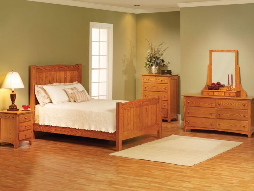 The fact is that the neutral color of the floor and walls is chosen. Bright spots are the sofa and the rack, for which not flashy shades are chosen, but deep, dusty ones. The color of the rack, although bright, is quite versatile.
A clear trend in kitchen sets is complete sterility. Bright colors are chosen less and less and more and more mask functional areas. (Photo: Ivanov Anton, project by Ksenia Izmailova and Olga Bedina)
The volumes of the room with the help of furniture and its colors are arranged in such a way that it is not immediately clear where the set is, and where is part of the wall decoration. Of course, you can see the built-in refrigerator, oven, but the end of the kitchen is already turning from furniture into decoration, notes Ksenia Izmailova. The upper part is not cabinets, but ventilation and a ceiling hood built into a box, which also turned into a finishing element. It is important that the color of the floor and walls is neutral, the designer emphasizes.
An easy way to make bright furniture look good is to take a ready-made print, for example in wallpaper or in tiles (Photo: Ivanov Anton, project by Ksenia Izmailova and Olga Bedina)
You can dilute a completely neutral interior with an accent - add bright, even kitsch, chairs or a table, advises Ksenia Izmailova. In this case, a neutral background does not have to be only gray or white. Oak or black is also fairly neutral.
Mistakes when choosing the color of furniture
To avoid disappointment after buying furniture, you should remember a number of nuances and try to avoid the following mistakes:
- do not match white to white, for example, white appliances to white furniture. As the designers warn, it is almost impossible to find a snow-white oven, hob or refrigerator - they will all be of a different shade, go cold or warm.