Symmetrical room design
Symmetry in interior design – and how to harness it for small spaces
(Image credit: De Rosee SA)
Symmetry creates balance and a feeling of calm when used in interior design – and while it is wonderfully elegant in large rooms, it can also create a feeling of enhanced space in smaller rooms, and those that are very busy, such as kitchens, too.
The best way to use symmetry in a room is by having an architectural feature as a starting or center point, whether a fire surround, a pair of identical windows or even a kitchen island. However, you can create symmetry in a non-symmetrical space with pattern or pictures on walls, with an area rug or simply a headboard in a bedroom.
Get symmetry right and you can create harmony in every room in your house – and make small spaces feel bigger and tidier.
See: Interior design tips – decorating secrets for the world's top experts
1.
(Image credit: Maureen Stevens)
Maureen Stevens is an interior designer and stylist based in Austin. We asked her to share her tips for using symmetry in a hallway.
‘Consoles and foyer tables are the best furniture to create symmetry with for most people, symmetry is what makes a space beautiful – to designers, all we need is balance, things don't have to be matchy-matchy. In this vignette (above), a bold wallpaper called for the other items to be in perfect symmetry – the table lamps & X-benches.’
2. Use architectural elements as a center point
(Image credit: Yellow London)
Symmetry is a technique used by interior designers to create a space that looks incredibly tidy and smart – and therefore calming and relaxing. Using architectural elements such as windows is a good place to start.
Liv Wallers from British design studio, Yellow London shares her advice below:
‘Symmetry provides balance within a room and it often starts from the focal point, whether that be a fireplace in the sitting room or the headboard in a bedroom. It brings a sense of comfort and rhythm to a space which is an integral part of our design approach. It can be used right down to the smaller details of the room, cushions on the sofa to lamps on a dresser.’
If you don't have an architectural element, you can use another visual anchor as your center point, whether that's a headboard or a patterned rug.
See: Living room ideas – clever ways to decorate living spaces
3. Make a kitchen island the focus for symmetry
(Image credit: Ledbury Studio)
‘We definitely like symmetry in our design work and feature it quite a bit. Symmetry creates a sense of balance and order and is calming to the mind. You see lots of examples of symmetry in nature and it is an important principle generally in design,’ says Sophie Burke from Sophie Burke Design .
Kitchen can lend themselves to symmetry as you generally work around the key elements like the sink, range or cooker hood. Islands can also provide a starting point if you place them in line with units. Shelving is also used to great effect and don’t forget finishing touches like pendants - they really can inject colour and form into a scheme especially if they are placed symmetrically.
See: Kitchen island ideas – guaranteed to make a statement
4. Bright symmetry to bedrooms
(Image credit: Future/Alecia Neo)
On the whole, when we think of symmetry we tend to think that it’s all about contemporary interiors, whereas in fact, the principles of course work in a traditional setting too.
In a bedroom, you can match up bedside tables and lamps either side of a decorative headboard, then use cushions to fill the spaces. Similarly, a child's room or guest room can be given a smart room with matching beds and bedlinen.
See: Bedroom ideas – designs and inspiration for beautiful bedrooms
(Image credit: Future)
5.
 Give bathroom a boutique hotel look with symmetry
(Image credit: Kate Watson Smyth)
‘They say two basins in the secret to a happy marriage and it's certainly one less argument to have in the morning. We had these basins installed first and then, when we inevitably realised we didn't have enough storage, we bought some reclaimed school worktops and had this unit constructed around the basins, existing tiles and mirror.
'We used offcuts from the wood to create mirror frames and make the whole thing look like an aged dresser. They also say that symmetry is pleasing to the eye and therefore calming and that's got to be a good thing in a bathroom where you start and end the day,’ explains Kate Watson-Smyth, Founder of Design Storey .
His and hers basins make for bathroom symmetry at its best, as everything can match up – even towels and toiletries. As Kate says, it helps to balance the whole space too as well as been able to keep things neat and tidy.
Below, Kit Kemp's bathroom design achieves symmetry through light fittings, tiling and wallpaper, all lined up beneath a central window.
See: Bathroom ideas – stylish decor ideas for all bathrooms
(Image credit: CP Hart/Kit Kemp)
Sophie has been an interior stylist and journalist for over 20 years and has worked for many of the main interior magazines during that time, both in-house and as a freelancer. On the side, as well as being the News Editor for indie magazine, 91, she trained to be a florist in 2019 and launched The Prettiest Posy where she curates beautiful flowers for modern weddings and events. For H&G, she writes features about interior design – and is known for having an eye for a beautiful room.
21 Beautiful Symmetrical Living Rooms
Wikipedia says that symmetry in everyday language refers to a sense of harmonious and beautiful proportion and balance.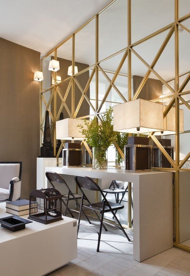 In mathematics, “symmetry” has a more precise definition, that an object is invariant to a transformation, such as reflection but including other transforms too. Although these two meanings of “symmetry” can sometimes be told apart, they are related, so they are here discussed together.
If you see the pictures in this list, I am sure you’d love some, and maybe question the others – but then again, I’m sure all the pictures in this list is likeable and pretty interesting. The thing about symmetry is that it is a safe in terms of decoration and there are times that it does not work, so making them look good and work well, you have to be careful in using the right ingredients.
1. Best Road
Studio | Sarah Willmer, Architect
Streamlining this space can mean shorter cleaning times and a more relaxed atmosphere. More flat surfaces mean more clutter is bound to accumulate there. A little empty space can be refreshing.
2. California Transitional Living Space
Ann Lowengart Interiors
A fun, fresh, and inviting transitional space with blue and green accents and lots of natural light – designed for a family in mind yet perfect for entertaining.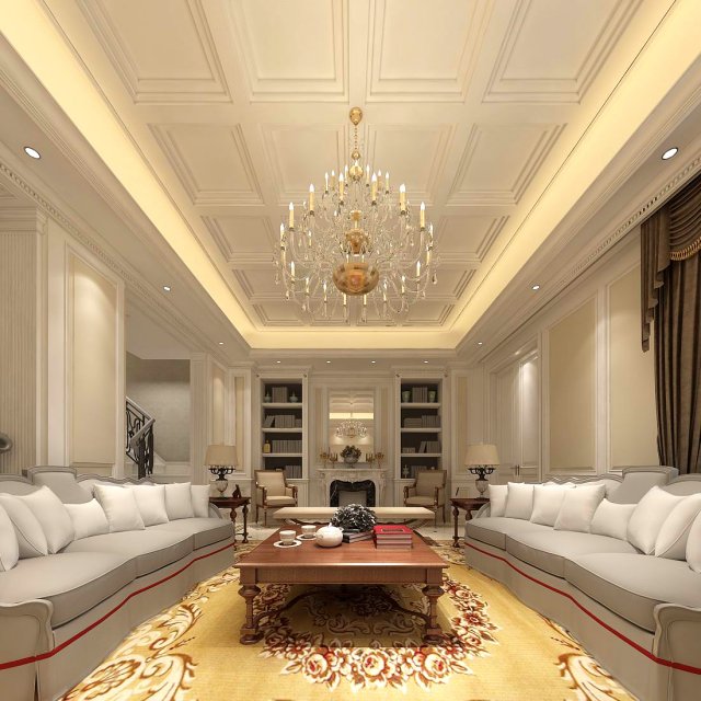
3. Casa Blanca
Jamie Herzlinger Interiors
This is the other side of that fabulous Living room! The fireplace is done in Thassos which is pure white granite that I edge detailed in black granite giving it more of Hollywood Regency flair! The two Berger chairs are upholstered in black patent leather and the fireplace screen is a custom design.
4. Contemporary in Deephaven
Space Crafting
The staircase looks really interesting in this picture. It looks very modern but it reminds me of grand staircases from Disney shows.
5. Contemporary Living Room
Elad Gonen
This room is all about symmetry, black and white, and natural light. Note how the light reflects off the dark lacquer furniture.
6. Scotland Contemporary Living Room
Malcolm Duffin Design
Patterned wallpaper is paired with furniture in strong colors, but the symmetrical arrangement and balanced feel enable these bold elements to sit together harmoniously.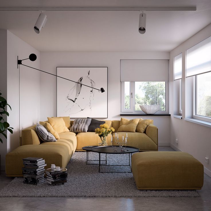
7. Custom Homes
Robert Lucke Homes
The style of furniture and arrangement of this living room is pretty simple but truly stunning.
8. Dallas Art Home
Platinum Series Homes
This is the first room that I picked when choosing living rooms for this list – awesome identical cabinets and the fireplace is superb!
9. United States Living Room
Elad Gonen
As in the previous photo, the sofas, as well as every other furnishing in this room, accentuate the bilateral symmetry. The reflection of the photo frames in the mirror even gives the impression of a central vanishing point, akin to Renaissance perspective.
10. Los Angeles Contemporary Living Room
Charles Neal Interiors
I love how this living room is arranged, truth be told, not all spaces with symmetry works – but this one sure does!
11. Lovell Living Room
Union Studio
This living room is really pretty – the loft-feeling makes it homey. Look at the color scheme of this space – just stunning!
12. Minneapolis Contemporary Living Room
Digiacomo | Homes and Renovations, Inc.
This room is tailored and transitional yet welcoming. It’s just the spot for nestling in with shows led by stylish businesswomen like Olivia Pope. I’d get my Scandal on in here, with a hunk of Vermont cheddar sharp.
13. Modern Spanish West Hollywood Home
See Construction
In a living room, consider placing two chaises so they face one another. You can lie down to read a magazine when you’re alone, but still feel comfortable inviting company to sit down because the back provides the traditional support of a sofa.
14. New York Seaside
Anthony Baratta, LLC
Palm Beachers are never afraid of going over the top. Here, opulent window treatments and molding mix with casual, boldly upholstered woven furniture.
15. Oakbridge Homes – Melford House
Ann Maurice, House Doctor
Contemporary show home living room.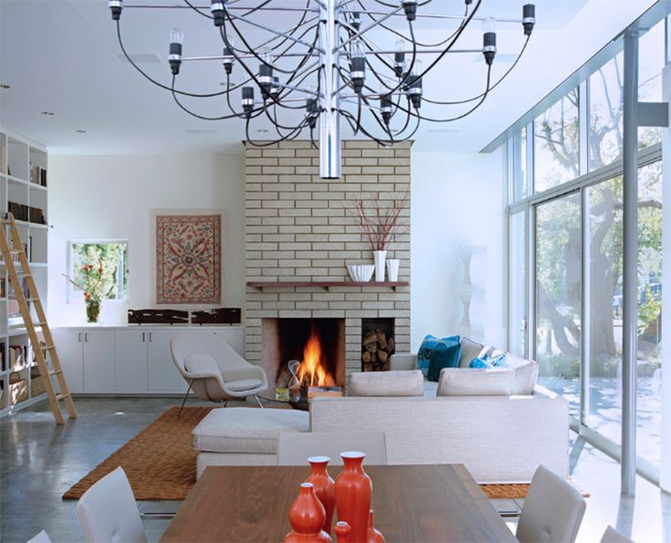 Frosted window panels allowing light into and from hallway.
16. Ottawa Living Room Symmetry
Wow Great Place | Design | Decorating
Here is one sample of a living room that may be simple but can actually work for anyone especially for small living room spaces.
17. Papermill Estate East Cobb
Kristin Drohan Collection
I like the green touches here and there – in this living room. The couches looks comfortable too.
18. Pearl
Josh Wynne Construction
The Pearl is a Contemporary styled Florida Tropical home. The Pearl was designed and built by Josh Wynne Construction. The design was a reflection of the unusually shaped lot which is quite pie shaped.
19. Penthouse Trafalgar One
Honky
I love the simplicity of the room design – so minimal and classy.
20. Private Residence
Luxe Design Inc.
It is a symmetrical balanced room because both sides of the room are the same and equal.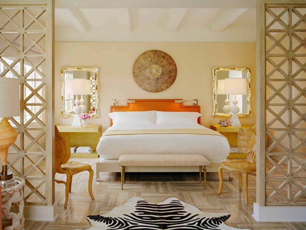 It mood is sophisticated and elegant.
21. San Francisco Living Room
Viscusi Elson Interior Design
Teal & grey in lounge. Industrial lighting fixtures. What more can you ask for?
I hope that you like this list because it was not only interesting in terms of designs and concepts and at the same time rather compelling. As a designer myself, I like using symmetry from time to time and this living room spaces really work and looks good. You can use this kind of layout in whatever type of living room! More on Home Design Lover!
Symmetry and asymmetry in the interior
The main thing is balance
Balance is important for any sphere of our existence. Balance is harmony and comfort. Balanced elements are perceived as natural and correct. Therefore, balance is one of the basic principles of art, including the art of design. Creating an interior, you need to strive for balance. However, balance does not require full compliance and mirroring.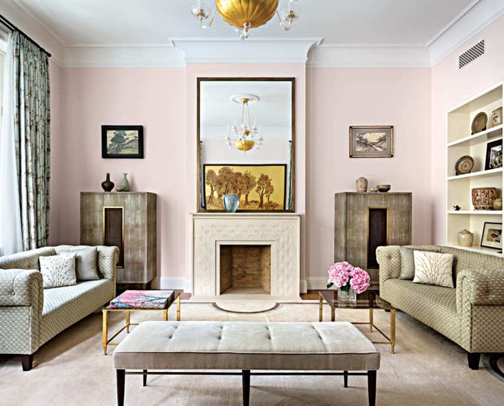 The main thing is balance, that is, a more or less equal ratio between the parts of the whole. nine0003
It is necessary to visually divide the interior into two parts and balance them with each other. Furniture, colors, textures, decor take part in creating a balance. For example, if heavy furniture is installed on one side of the room, and light and transparent on the other, an imbalance may occur. To balance the parts, the wall near light furniture can be highlighted with a “heavy” color or a “powerful” texture. It will be an asymmetrical balance. Yes, there is balance in asymmetry too.
Thus, the balance in the interior is both symmetrical and asymmetrical . Let's consider them in more detail.
Symmetry in the interior
Symmetry in the interior is achieved by the actual repetition of the elements on both sides of the axis. To create a symmetrical balance, you need to determine the center point exactly in the middle of one of the walls or in the center of the room.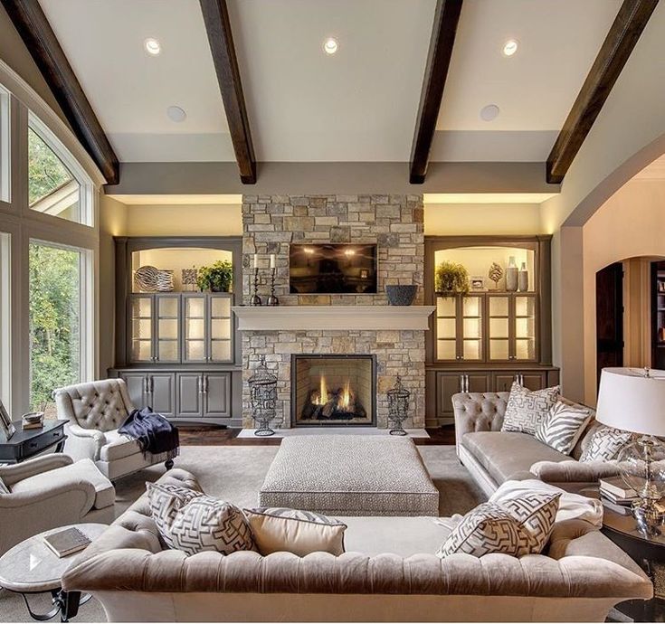 This point will be composition center . The imaginary line going from the compositional center to the point exactly opposite is the axis, on both sides of which the elements "mirror" each other. nine0003
What can be a composition center? In the living room, this is usually a fireplace or TV wall. A little less often - a showcase, a large picture, two armchairs with a table or a sofa. In the bedroom, the center is the bed. In the lobby - for example, the console. In the kitchen - a stove with a hood, a dining table or an island. In any room, the center can be a window, a niche or a ledge.
Symmetry in the interior is created with the help of paired armchairs, mini-sofas, showcases, cabinets, cabinets, table lamps and other floor lamps , you can use color and finish - for example, repeat the same accent fragments on both opposite walls parallel to the central axis.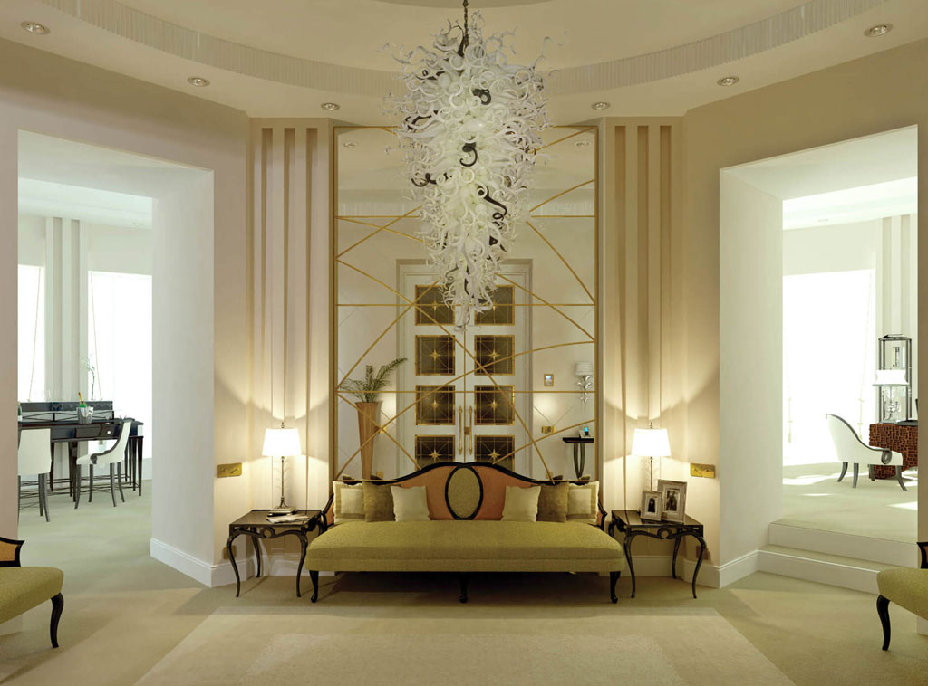 Single objects, such as a sofa or a dining table, can stand on an axis so that it divides them in half. nine0003
Symmetrical interior construction is also called formal . This is a classic solution, ideal for conservative styles. In a symmetrically balanced room, there is a sense of stability, order, calmness and security. Symmetrical interiors in spirit for those people who are prone to perfectionism and conservatism.
There are some drawbacks to symmetry in the interior. This plan is often not suitable for small spaces. The fact is that the symmetrical arrangement of elements along the central axis is frames and “brackets” that emphasize the shape and size of the room. For example, if the room is narrow and long, a symmetrical arrangement will emphasize this feature of it, making the room look like a trailer. Asymmetry, on the contrary, eliminates frames and deprives the form of rigidity. nine0003
Tip.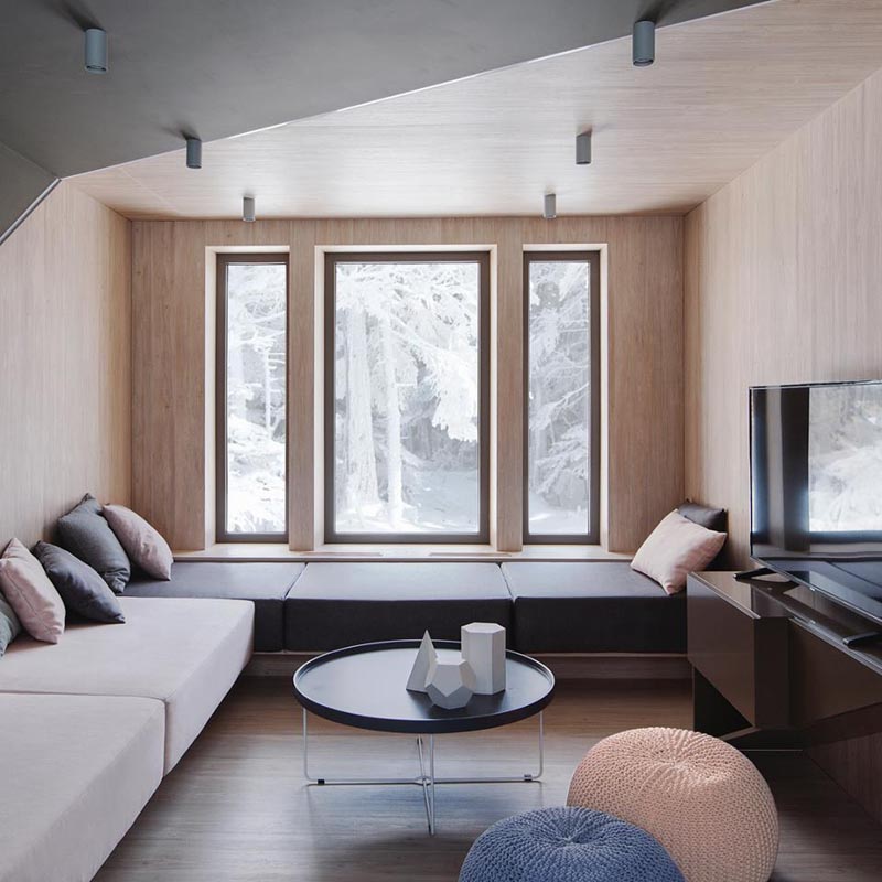 Do not strive for absolute symmetry - it is unnatural. Our faces seem symmetrical, but upon closer examination, any person has asymmetry. She makes us attractive. A mole on one side, a dimple on one of the cheeks, bangs combed to the side - all this gives the face an individuality. It is the same with the interior: creating a symmetrical balance, add a drop of inconsistency.
Asymmetry in the interior
Asymmetric balance is preferable if the shape or size of the room leaves much to be desired. Asymmetry is more suitable for modern styles. There is another plus to this layout: asymmetrical interiors are rarely boring. They are more alive and dynamic. They are called "informal" for a reason. nine0003
When creating an asymmetric interior, you can choose a compositional center that is offset from the midpoint. The principle of the golden section can be taken as a basis : you need to shift the center in a proportion of about 60% to 40%.
A complete rejection of a single compositional center is also possible, although this is not so easy.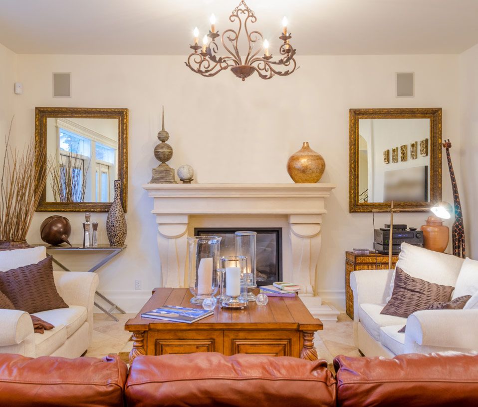
Finishing, furnishing and decoration are carried out in a balance, i.e. the principle of balance remains in force . However, the specular effect is eliminated. So, if in symmetrical interiors the same sofa or two similar chairs are placed opposite the sofa, then in asymmetric interiors everything is different: there can be one chair or a rack opposite the sofa.
Corner sofas and the diagonal arrangement of furniture work on asymmetry. For example, chairs can be placed in the corners by placing them diagonally. Likewise, a bed set at an angle will deprive the bedroom of traditional symmetry. nine0003
Different levels of objects also help to achieve the goal. Opposite each other have furniture or decor of different heights. For example, one wall has a high showcase, and exactly opposite is a low console. On one side of the sofa is a tall floor lamp, and on the other side is a low table with a small table lamp.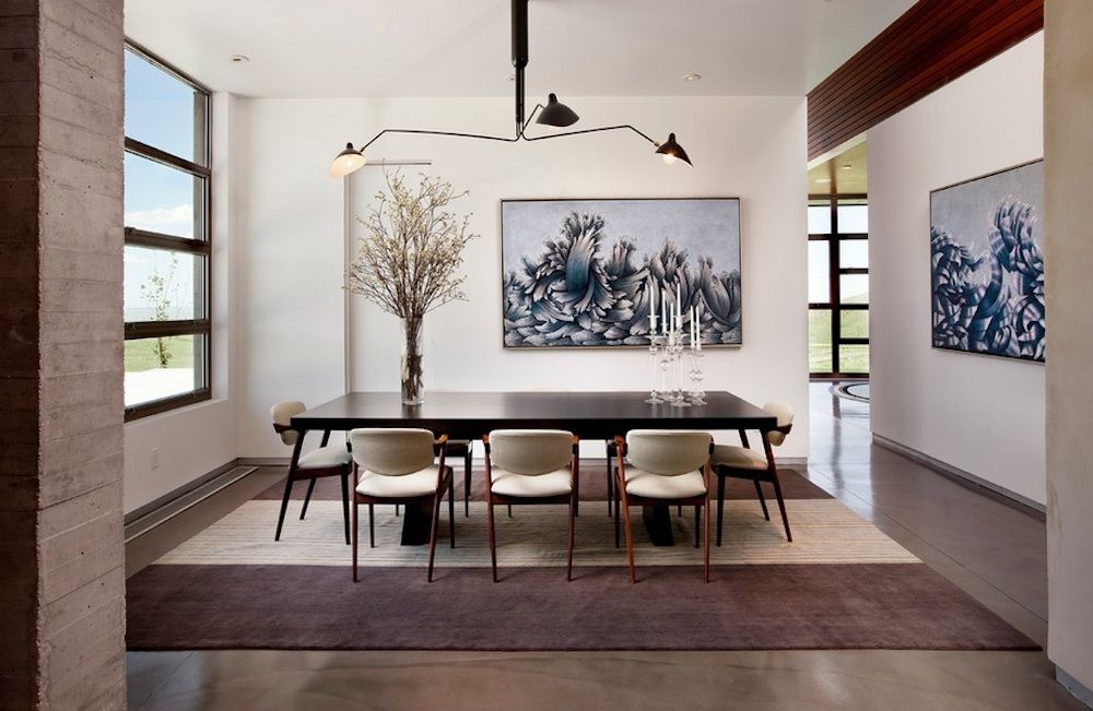 In the kitchen, to the right of the stove, there is a tall, blank pencil case, and to the left, there is a cabinet and a pair of open shelves above it.
The curtain can also be folded to one side and secured with a holder. The arrangement of wall decor can also be asymmetric: for example, on one wall there are three paintings in a row, and on the opposite wall there are three decorative plates placed in a ladder. nine0003
It is important to remember that the asymmetry must be balanced, that is, both halves of the room should be approximately the same in terms of “weight”. Visually “weigh” not only furniture, but also textures, colors, and decor.
See also:
Given: dark room. How to make it lighter?
Bathroom and toilet tile layouts
Dark floors in the house
Colorful interior: a stylish riot of colors
Bedroom layout
why symmetrical lines in design are pleasing to the eye
After seeing an interior design, most people can almost instantly determine whether it is successful or not.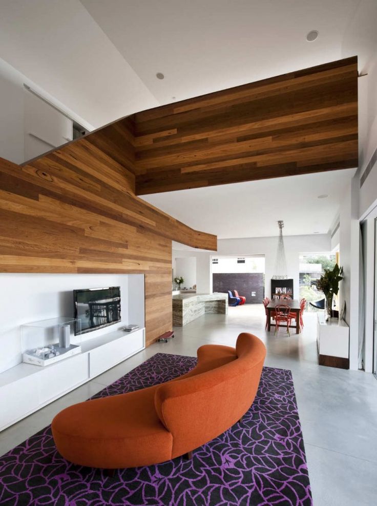 Have you thought about why this happens?
Where do we get this ability to determine the level of design, for example, in interior design of apartment , without even being a professional interior designer?
It has to do with symmetry, or, in other words, a sense of balance. Because all people, as a rule, are drawn to a balanced design and find it more aesthetically pleasing. nine0003
Perception of symmetry in interior design
If you want to know why we love symmetry and balance in interior design and beyond, then read this article. In addition, from it you also know how to bring a sense of harmony to the interior, regardless of your personal style.
It looks familiar to us
The answer is very simple: we love symmetry and balance because it is right in front of us, so to speak. When you look at your reflection in the mirror and conditionally divide your body in half along the navel line (a vertical line along), you will see how symmetrical your left and right halves are. nine0003
However, we are not the only beings who are inherently balanced and symmetrical. Scientists have found that the mirror ratio - better known as the golden ratio - 1:1.61, is constantly found in nature. Not only do some of our organs maintain these proportions, but the same thing happens, for example, with clouds, a galaxy arm, etc.
Since this type of balance is so common in our lives, it is better perceived by our brain. Symmetrical and balanced interiors are often calmer and more comfortable than asymmetrical ones. nine0003
When you are designing an interior, think carefully about your goals. If you want your home to be a kind of cozy oasis where you can take a break from the outside world, then symmetry and balance should be the main thing in the interior.
Balance fits everything
When it comes to interior design, balance doesn't have to be just a line drawn down the middle - an imaginary central axis. It might look pretty boring.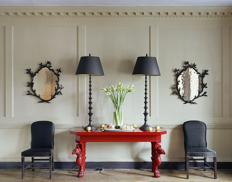 Instead, designers have found solutions to keep the symmetry and make a good and interesting interior. nine0152
Here are a few:
1. The most common solution is mirroring.
It can be vertical or horizontal. For example, two sofas separated by a coffee table, or using a horizontal rail to protect the walls from damage by chairs, which will visually divide the room into an upper and lower part.
2. Radial symmetry (radial balance)
Refers to objects rotated in the same direction around a single central point. Such a point could be, for example, a round dining table in a dining room, a spiral staircase, or, to take an example on a smaller scale, a wreath on a door. nine0003
3. Repetition
Create the illusion of movement using repeating elements in the same space. Most often it can be found in wallpaper, skirting boards and floor tiles.
4. Asymmetry
Purposefully breaking symmetry, you draw attention to a certain object.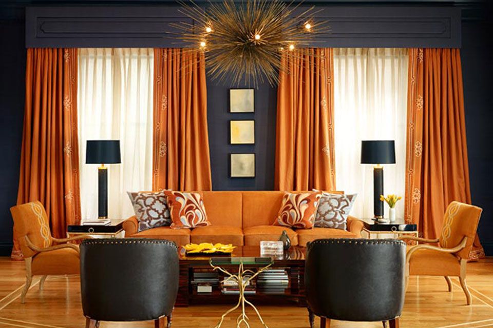 It can be furniture or a work of art.
When you need to choose a specific solution, you first need to decide on the size of the space. Radial symmetry and repetition work well for large open-plan spaces such as a large foyer or dining room, but for smaller spaces they are not well suited as repeating elements can be overpowering. In conditions of limited space, mirror symmetry (reflection) and asymmetry are the best choice, as they often have a simpler design. nine0152
Symmetry is easy to achieve
Luckily, you don't have to be a pro to achieve balance in your interior. Everyone can make it harmonious if they take into account the following three things:
1. Center point
This should be a design element that catches the eye as soon as you enter the room. It could be a fireplace, built-in storage space or some architectural details. nine0003
2. Visual weight
Although your center point should have the heaviest weight within a single space, you can balance it by placing two objects of the same visual weight on either side.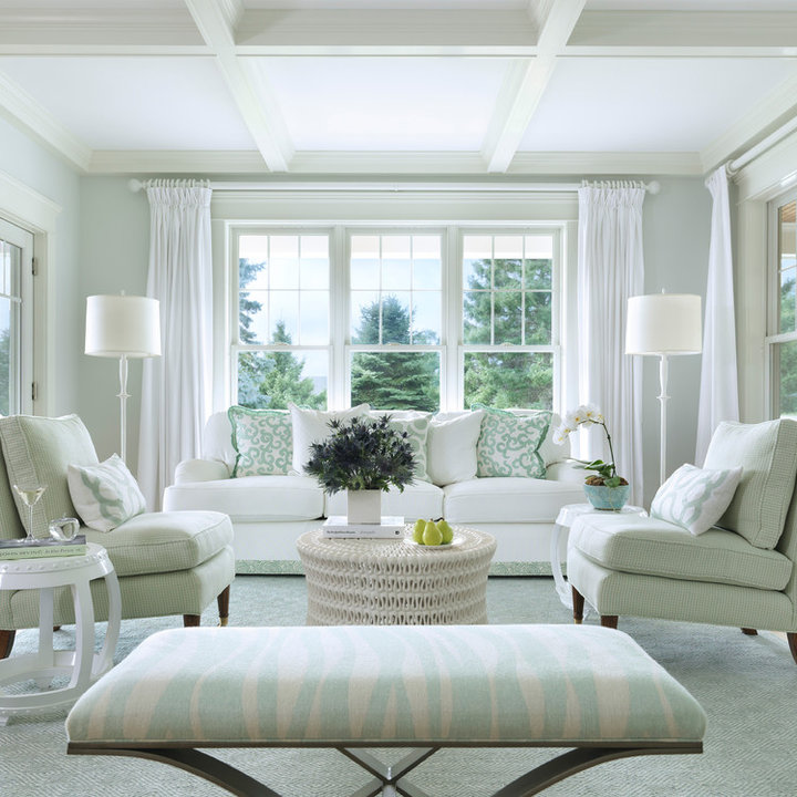 For example, a fireplace and two sofas on either side of it. Or, to balance, a dining table with a heavier visual weight with chairs on either side is lighter.
3. Scale and Proportion
Make sure design elements maintain scale and proportion among themselves and in relation to space. Proportions of 2:3, 3:5, or 5:8 work best. nine0003
When all else fails, take a step back. Literally. When you are designing, sometimes you need to abstract and try to look from the outside. If you can evaluate the design with an outsider's eye, then you can evaluate and get an idea of \u200b\u200bbalance. If it does not seem balanced and symmetrical enough to you, try to change something until you achieve a result that satisfies you as much as possible.
Symmetry works with every style
Usually, when it comes to interior design, personal sense of style is always a stumbling block. Some people love lavish and ornate interiors, while others prefer a modern aesthetic.