Visual texture in interior design
Visual Texture in Interior Design
Texture
Gallery René Dekker
Image courtesy of Page Lacquer Image courtesy of Page Lacquer Image courtesy of Page LacquerPhysical Texture
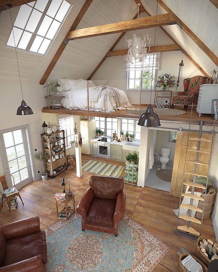
The use of texture when planning an interior design scheme is an element that is often overlooked and underused. Texture has the ability to completely add a significant dimension to any room, when carefully integrated into the design. Texure describes the surface quality of a material including the actual variations on the surface. This is generally referred to as physical texture. Examples of physical texture include, but are not limited to, wood grain, metal, leather, velvet, mohair, or grass cloth. The use of textures in a room can add a further dimension besides just the colour or look, but also how objects feel. These are differentiated from other types of texture because they have a physical quality that can either be seen or experienced by touch. When physical textures are combined with other forms to create a complimentary or even contrasting design, these are tools that a luxury interior designer can use to accentuate or even add personality to the interior.
Visual Texture
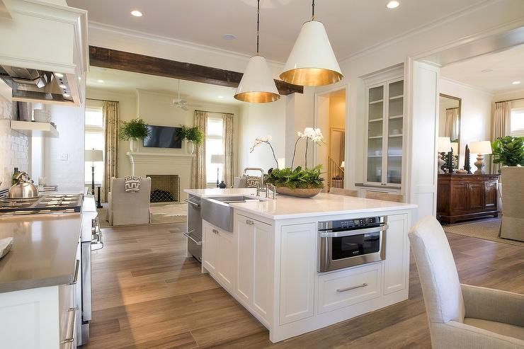
Visual Texture creates an appearance of having physical texture but does not generally have the same influence to the touch. Such examples include matt or shiny finishes or even the use of patterns. There are so many different types of exciting textures that can be used; it really takes careful consideration to achieve an inviting and luxurious interior. Consider how the use of patterns can influence the excitement of a room. No longer are the days when just adding splashes of colour to a neutral room is enough to add contrast or interest. Many companies today are providing alternative wall coverings, surfaces and textiles – the opportunities are almost limitless to creating the perfect interior design.
Light Reflection
Consider how light reflects off various surfaces.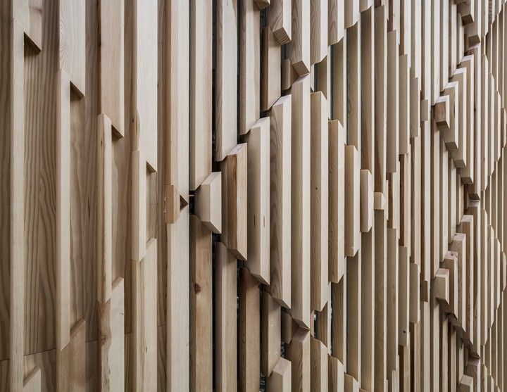 A carpet or rug is going to reflect light differently than a stone or wooden floor. Even the matt or shiny finish will have a distinctive reflection, which can suggest a different mood or ‘feel’ to the room. Combined with the use of colour, the overall atmosphere can be transformed from cool and contemporary to warm and cosy. Adding texture can be a vital tool when adding interest to a monochromatic scheme.
Visual and Tactile Experience
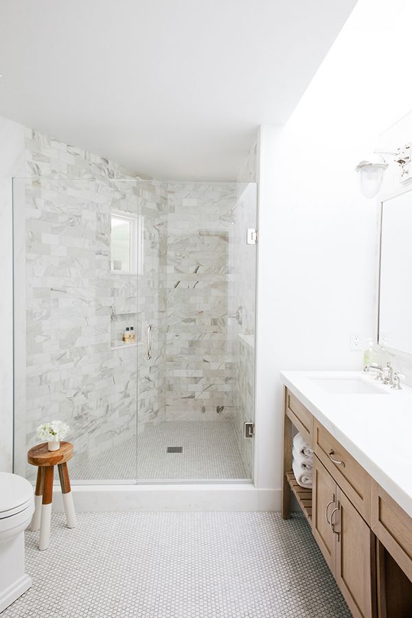
Let’s not forget the importance of the visual and tactile experience. A well-considered scheme will have elements that are discovered. Part of the intrigue of sumptuous interiors is the subtle unfolding of details. A sofa upholstered in silk or suede is going to have a very different feel to one that is upholstered in linen – both in visual experience as well as to the touch. Imagine how different a mosaic tiled bathroom would look and feel compared to one finished in a polished travertine.
Suitability and Practicality
The suitability of textures should be included in your final consideration.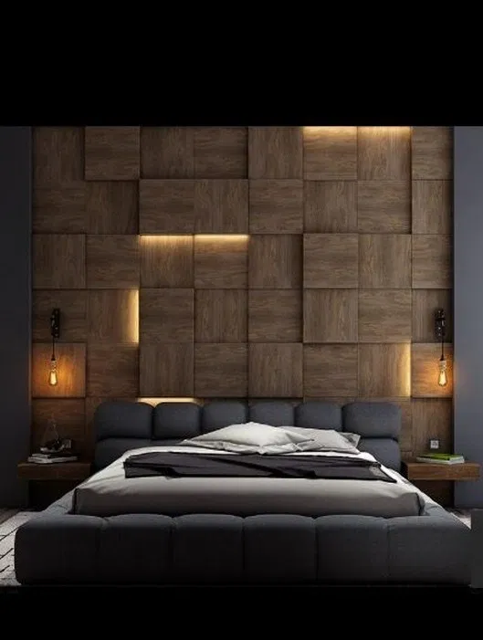 A highly polished marble floor a luxury bathroom or kitchen may look contemporary and lustrous, but is it very practical from a safety perspective? Consider, too, that while silk curtains will look luxurious and hang beautifully, they have a tendency to deteriorate quicker in very sunny rooms. In fact, they are more likely to rot if they have not been properly lined. Be sure to understand which window treatments will be best suited for your luxury interior design.
Although it may seem relatively straightforward to coordinate various textures and patterns to create a luxurious interior, the fact remains that using the services of a professional and reputable interior designer will ensure the effortless precision in achieving the desired look and feel.
Colour textureLightLight ReflectionModern TexturetexturetexturesVisual TextureYour browser doesn't support HTML 5 video objects!
Follow René Dekker Design
Interior Design by René Dekker
How To Use Texture In Interior Design | 6 Ideas
FREE ACCESSORIES DELIVERY OVER £300*
The Luxurist
A compendium for luxury living
Meet the TastemakerBehind the BrandInspirationLifestyleThe Sound of LuxDecoPodcast
INSPIRATION
Discover what texture means in interior design & how to add to your home
By Joanne Quinn, Senior Interior Designer
Texture is a buzzword in interior design. It’s an essential part of any designer’s vocabulary, because a scheme without texture is a scheme that falls seriously short of the mark.
Adding texture to a room encompasses a great deal more than a fringed edged cushion here and a rough-sawn wood texture there. It is the precise art of blending the rough with the smooth and knowing how to create visual texture—the sort that isn’t tactile at all. The answer to "what is texture" and how to apply it to your interior awaits.
What Is Texture In Interior Design?
Texture is, quite simply, an object's physical feeling or visual appearance. Everything from a nubby boucle throw to a cane screen and a suede wall to a stone backsplash count as texture in a space.
A room's overall textural feel translates in a similar way to physical and visual texture, but it also touches on how we perceive things. Lighting, for example, is neither physically or visually textured itself, but it's one of the biggest contributors of texture in the home.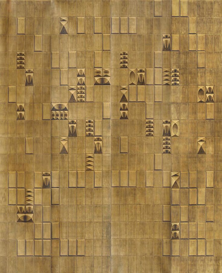 Its ambient glow can transform an entire space into one of incredible softness or, conversely, one that’s hard and harsh.
Texture is also a way to create accents. Interior designers will use texture to add what’s referred to as ‘visual weight’. In other words, how an object or section of the room is able to draw attention to itself. Contrasting textures is one way to make certain aspects stand out more than others.
Image Credit: Studio Ashby
Without an interior designer at your side, the intricacies of texture is one of those areas that is easy to overlook. In decorating your own home, you will find that texture weaves its way in quite naturally. After all, every material is a texture of some description.
These somewhat accidental textures have their positive points. Principally, these are the textures that you instinctively gravitated towards, ergo, your scheme will naturally be filled with the things you love.
That said, there should also be a level of consciousness in your textural decisions.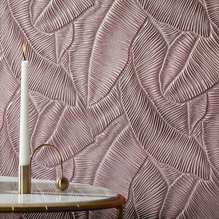 You wouldn’t throw a combination of paint colours on a wall without considering their relationship with one another and their effect on the whole room, and the same is true of texture. It needs to be thought through, repeated to create a theme and balanced with others so it doesn’t feel predictable and over-staged.
6 Ways To Add Texture To Any Room In Your Home
Mixing texture in interior design is not just a case of combining different materials and finishes. You should look to integrate different ways to add texture too. Here are six possibilities for bringing texture into your room’s design to get your creative juices flowing.
1. Layer Different Textures
Layering in interior design is key to producing a scheme that’s rich and full of depth. Try blending multiple different sources of texture so that you’re not relying on just fabric or furniture finishes.
Texture can come through in a whole host of ways, so don’t forget the impact that the following can have: matte versus glazed ornaments on a bookcase, book spines stacked on a side table aside a sculpted glass lamp base, a polished granite fireplace hearth with a tasselled rug in front of it, or even wall treatments and artwork that have the ability to make the walls feel multi-dimensional.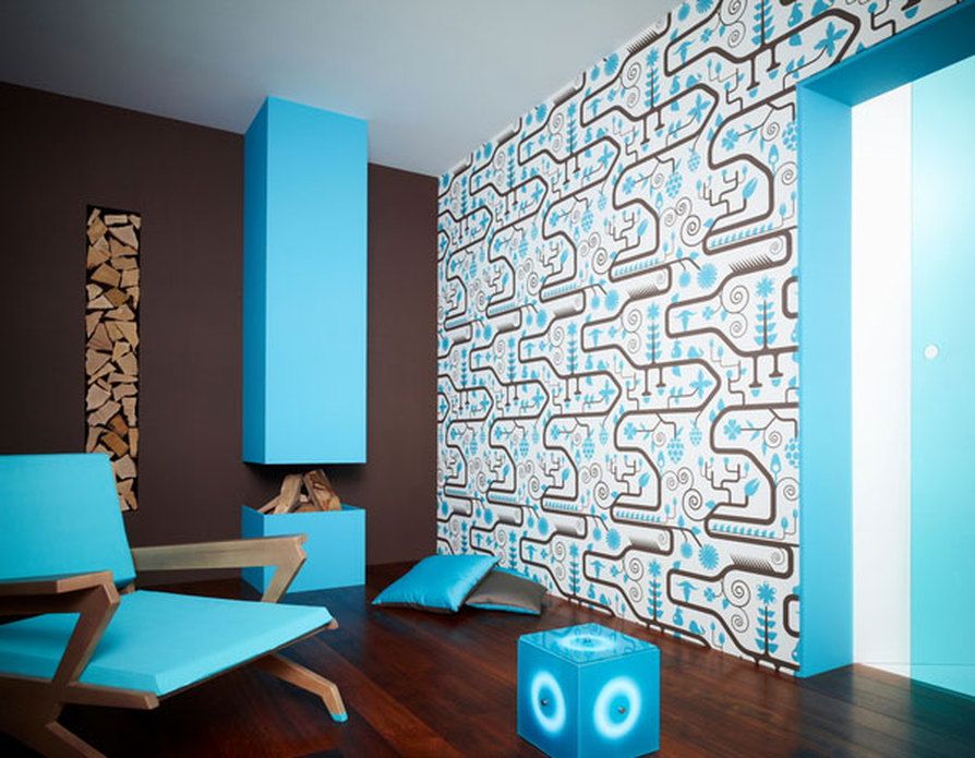
Every ounce of your room can bring spark a textural discussion, and as they form layers, the result is immersive and arresting.
Image credit: Image Credit: Interior Marketing Group
Image credit: Image Credit: Zinc Textile
2. Use Contrasting Fabrics
Interesting textures aren’t only pleasing to look at, but when you contrast them, they’re great providers of balance too.
Is your colour palette comprised of very similar shades? If so, you can interrupt the consistency by changing up the textures of any fabric in the room. Even if your decor has multiple shades, using contrasting fabrics proves that colour and pattern aren’t the only routes to achieving difference.
Remember to look beyond the obvious areas of fabric such as sofas and armchairs and to not leave curtains, blinds and lampshades out of the equation. You can also evolve these textural contrasts as the seasons change. For example, a linen sofa might go from having cotton and silk cushions in summer to velvet and faux fur in winter.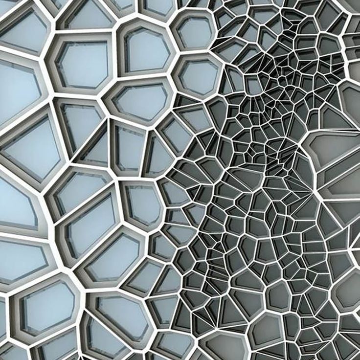
Image credit:
3. Add Textured Furniture
Furniture texture is worthy of exploring, especially as you’re most likely to come into physical contact with it. Imagine running your hand over a cool, smooth marble table, eating off a rustic oak dining table, opening the drawers of a shagreen-lined chest and kicking back in an opulent velvet sofa.
Texture doesn’t always have to be obvious. It’s these subtle differences as your eye moves around the room that are most alluring.
4. Play With Textured Home Accessories
Vases, ornaments, sculptures and mirrors are accessories ripe for playing with texture. You could purposefully create an arrangement of objets with alternating textures to really make a statement.
Careful to not add too many competing finishes into the room though or the lack of link could produce a lack of direction. The objective isn’t to fill your room with every different texture under the sun, but to welcome an assortment of characters that are sympathetic to one another and unite to inject variation and intrigue in your room.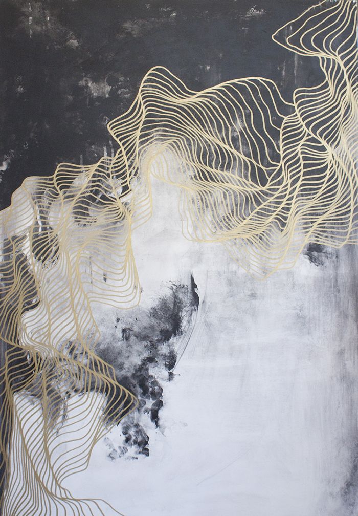
Image credit: Image Credit: LuxDeco.com
Image credit: Image Credit: Sophie Peckett Design
5. Decorate With Plants & Flowers
While you can reach out and touch plantlife, this is more of an example of visual textile.
The difference in form, petal and leaf shape, height, colour and vessel all produce a textural effect on a room’s decoration.
Try to choose plants and flowers that link to other textures in the space, such as the glossy verdant leaves of an oversized palm linking to lacquered, strong-lined furniture.
Similarly, ensure any vases match an existing texture in the room too, be it an ornament or lamp base.
6. Don’t Forget Lighting
Lighting is another feature in the room with a dual texture aspect. The look and feel of the lamp itself plays a role in providing texture.
A high-shine chrome floor lamp adds very different texture to a hammered bronze wall sconce, for example. But it is the rays of light themselves where texture takes on a more visual character.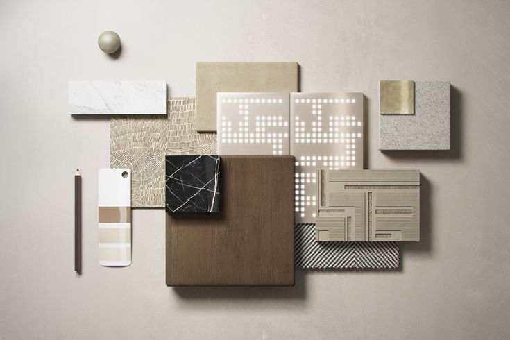
Warm white light (approximately 300 kelvins) produces a far softer, more ambient glow than cool white light (around 500 kelvins) which has a brighter, more contemporary beam that can cause a room’s atmosphere to feel harsher.
Where you position these light sources also varies the texture—an unlit corner can blossom into a beckoning reading nook with the help of lighting texture (and furniture of course).
Lighting is the most multi-layered subject of all when it comes to texture. It is a matter of mixing different styles of source, choosing the right temperature of bulb, and spreading the light sources at different levels throughout the room so you have wave upon wave of illuminated texture.
Image credit: Image Credit: Interior Marketing Group
Our Top Picks
Shop New Arrivals
Greg Natale
Astoria Throw, Navy
£264
Related Topics
FRINGINGFURNITUREHOME ACCESSORIESHOW TO LUX IT
Related articles
INSPIRATION
How To Decorate Your Home For Winter
Add warmth to your home with these winter decoration ideas
Share this article
quickly and clearly about the textures in the interior - INMYROOM
Properly selected textures can create a harmonious interior.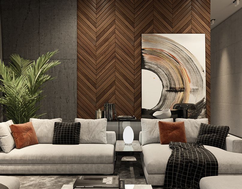 The more their combinations, the more interesting the space turns out. We have compiled a list of the most popular options for you.
Texture and texture: what's the difference?
In order not to confuse these two concepts, let's try to figure it out. T texture is a visual difference. For example, ceramic tile texture is a pattern. nine0013 Texture is determined by the type of surface: glossy or matte, wood or stone.
Design: PHD
Why is texture needed in the interior?
Texture becomes important when you use one color and its shades. It enhances, and sometimes takes on the role of color, makes the space more interesting and "alive".
Design: Studio S-Style
Basic principles for combining textures
1. Do not mix in the same interior two different materials with the same surface .
2. The main secret of combining textures - is contrast and harmony.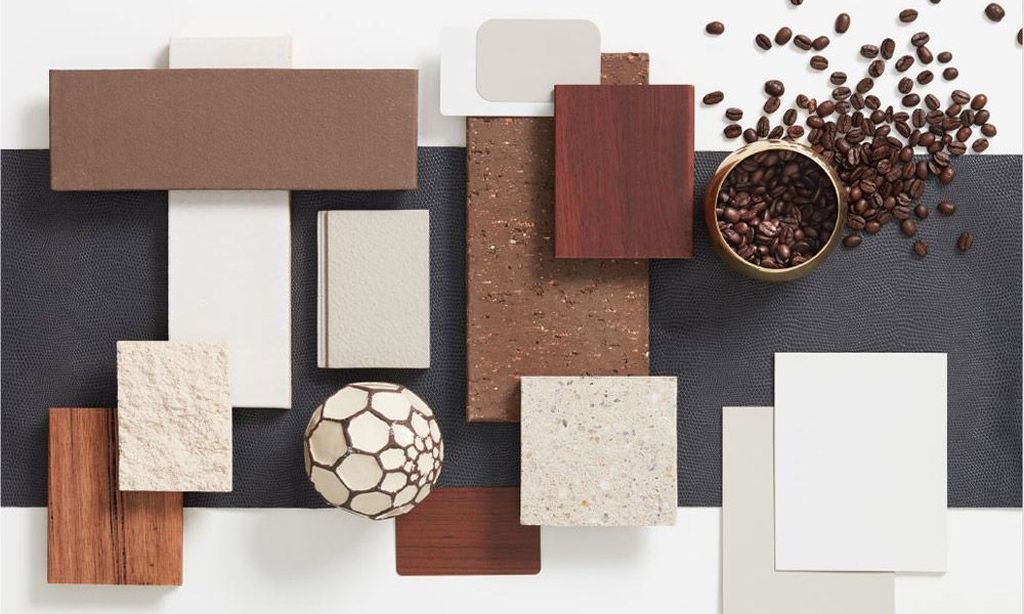 Smooth and rough, flat and voluminous, hard and soft.
3. Velvety and rough surfaces reflect light much less, therefore they are perceived more softly, seem “cozy”. Glossy evokes a feeling of solemnity and formality.
Design: Studio S-Style
How to combine different textures in the interior
Leather + wood
Leather can be soft and voluminous or look like wallpaper. The first option is suitable for classic interiors, the second - for boho-chic or art deco.
It is important that the leather "single" in the interior - do not interrupt it with other accents. Pair it with smooth wood finished in matt or glossy lacquer. And the skin looks advantageous against the background of monochromatic lacquered surfaces or glass. nine0003
Design: Space4Life
Wood + natural stone
Wood blends well with natural stone. Pay attention to the invoice: it should be different.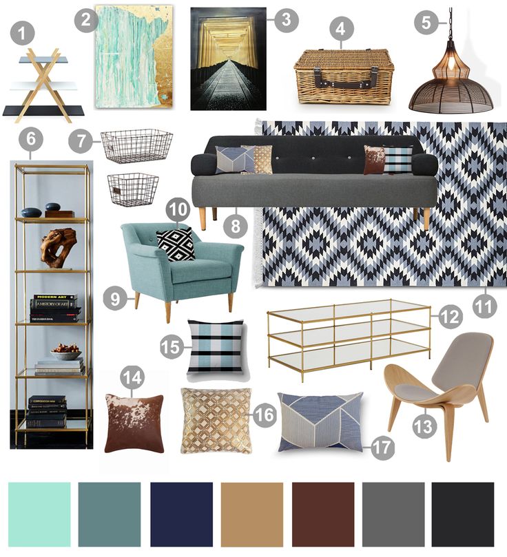 For example, if the wooden surface is smooth, then the stone should be rough and rough.
Design: Fisheye Design
INMYROOM tip: choose details - for example, sockets - - according to the texture of the interior so that they do not draw attention to themselves. nine0032 For wooden textures, the Legrand switch of the Valena Life/Allure collection under light or dark wood is suitable.
Legrand collection Valena Life/Allure
Different textures
Interiors with such different textures have many shades, even if the surfaces are painted in the same color. Therefore, choosing a plain interior, highlight the area that you decorate with relief panels.
Design: Fisheye Design
Ceramic tile or wood + live plants
The fashion trend of recent years is the combination of wooden or ceramic surfaces with living plants in the form of phytowalls. They enliven minimalist spaces and bring coziness to the interior.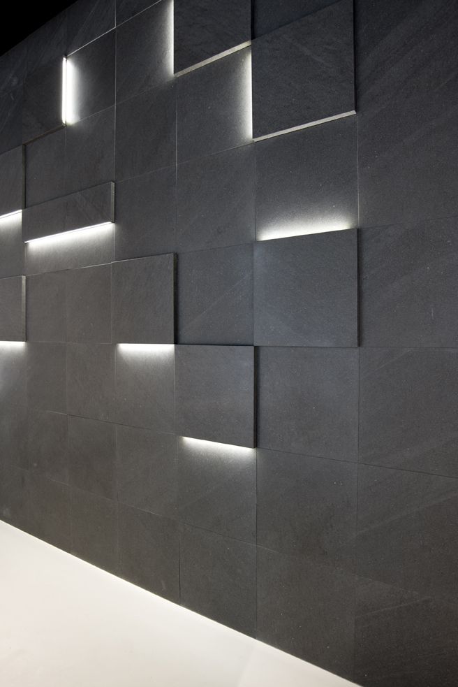
This wall can be made in any room. It is necessary to provide in advance additional lighting for plants and the withdrawal of water for the built-in irrigation system. If you like this idea but haven't thought about the technical side beforehand, use artificial moss. Outwardly, it is almost indistinguishable from natural. nine0003
Design: ToTaste Studio
Natural wood + smooth surface
To diversify the interior, add unexpected combinations: for example, combine a classic wooden surface with a modern smooth one. This technique looks great in furniture when the body is made of solid wood or veneered, and the facades are covered with glossy or matte enamel.
Design: Fisheye Design
Any surface + mirror, glass or metal
Play with contrast: wood can be diluted with mirror or glass panels, and metal inserts and moldings can be added to natural stone or ceramic cladding.
Design: ToTaste Studio
On the cover: design project by S-Style Studio.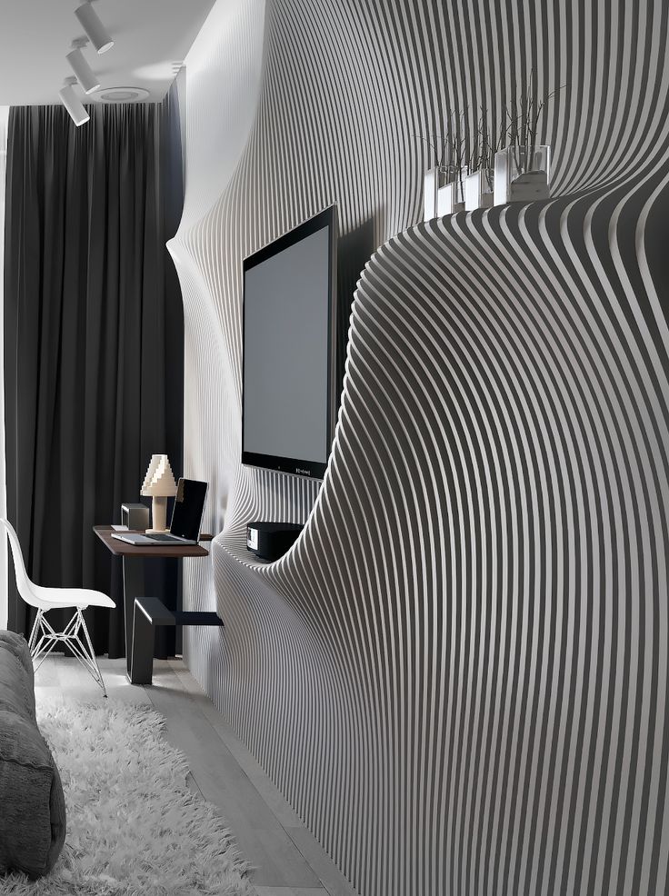
Combination of textures in the interior | Blog L.DesignStudio
08/02/2021
Interior design in the modern sense appeared in the second half of the 19th century. This is the time when not only the richest people, but also ordinary residents of cities could afford the design of their home. And even then it was obvious that color and layout are far from the only important concepts in creating a unique design composition. Texture and texture matter a lot. nine0003
Both concepts characterize the material and are closely intertwined. This causes a lot of controversy and disagreement about what texture and texture really are.
Texture vs texture: what's the difference?
Texture is a feature of the surface that helps to determine whether it belongs to a particular type of material. If we are talking about a wooden tabletop, its texture can be called roughness, the presence of a characteristic pattern on the surface, a certain color inherent in wood.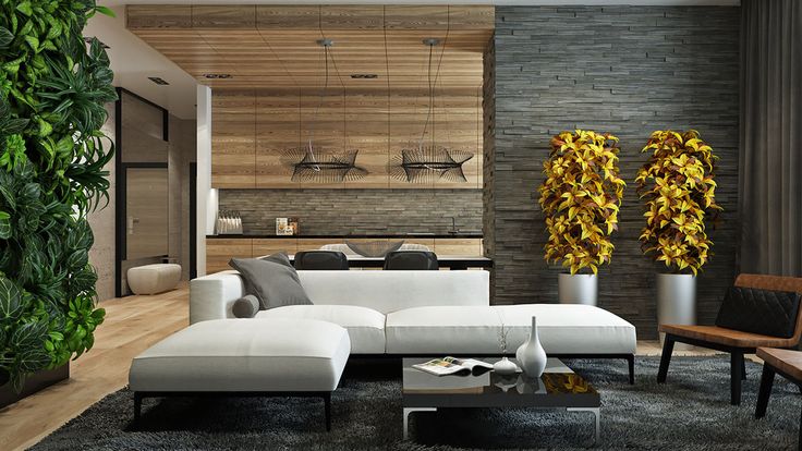 If you need to describe the texture of the fabric, the defining characteristics here will be the type of weave of the threads, their structure (thin, thick, smooth or rough, satin or matte). Texture helps you understand what kind of material is in front of you. nine0003
Texture - these are the external properties of the material, which reflect its density, finishing and processing features, surface microdistortions. This is a combination of such properties as: structure, relief and surface pattern, which do not tell us anything about whether this surface belongs to any category of materials. But they can have a significant impact on the interior.
According to the expressiveness of the surface texture, they can be:
- Textured or with a rich texture. For example, Venetian plaster or wood surface create a similar effect. nine0148
- Non-textured. A poor texture is, for example, a wall treated with ordinary plaster, resembling a sheet of white paper.
Structure and relief interact with all other external features of the interior.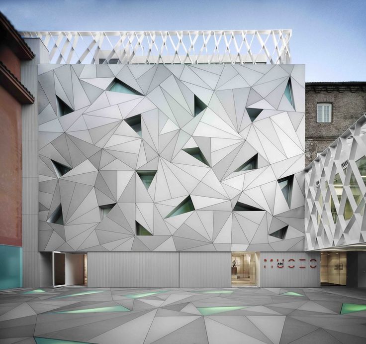 They allow you to create an interesting space from a monochrome room with accents and a pleasant impression.
Today, technology allows you to play with a variety of textures. And, given the trend towards minimalism and monochrome in the interior, understanding how to combine them correctly can be useful for anyone who wants to make their home stylish and modern. nine0003
Rules for combining textures
In any kind of activity that a person is engaged in for more or less a long time, some tricks become obvious that always “work” and vice versa, those that never work. The design was no exception, therefore, in the matter of combining textures, such techniques or rules can also be distinguished.
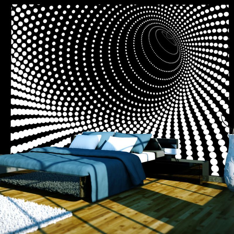
- Contrast. One of the main rules for working with textures is to create a harmonious contrast. A single relief for all surfaces in a room is almost never a good solution. A certain contrast should be present and ideally “highlight” the advantages of neighboring surfaces.
 nine0148
 - Rules of three. In coloring there are rules of three colors in the interior, one of which is the base, the second is its complement, and the third is the opposite and accent. In approximately the same way, it is better to use the visual and tactile properties of objects. There should not be too many of them, and they should be correctly combined with each other.
- Psychology of influence. If you pay attention, shiny and glossy elements are always in abundance in banquet halls and ceremonial events. They create and enhance a festive and solemn impression. Soft and velvety surfaces, on the contrary, create a feeling of comfort and self-absorption. This can and should be used to create the appropriate atmosphere in the room. nine0148
- One of two. This rule assumes that of the two objects that you plan to place side by side (on top of each other or in any other configuration), only one should be bright, embossed, defiant.

