Popular wall paint colors 2023
2023 Paint Color Trends Designers Can’t Stop Talking About
Designers are already abuzz over 2023 paint color trends. Here, 17 industry experts let us in on what’s popular, what’s working and what’s out when it comes to top interior paint colors for the year ahead.
“Greens reflect nature and there is a shade of it for everyone,” notes Chicago designer Sarah Montgomery. (Photo: Ryan McDonald)
Bringing the outdoors in.“I use different shades of green and teal in every room. It can create a pop or serves as a backdrop for other colors to stand out.”
—Sarah Montgomery, Sarah Montgomery Design | Chicago
“A cozy mauve like Benjamin Moore’s Cashmere Wrap is a perfect example of a color that can flow throughout the home,” says Hudson, New York, designer Nicole Fisher. (Photo: Helena Palazzi)
Carrying color throughout the home.“Clients are still being adventurous with color. Instead of one bold room, we’re seeing it throughout. It’s about creating beauty in every space, not just one.”
—Nicole Fisher, BNR Interiors | Hudson, New York
“Blue and greens are our go-tos right now,” says Denver-based designer Andrea Schumacher. In this office she used a navy from Benjamin Moore to add rich color. (Photo: Roger Davies)
Looking beyond gray.“We love color and always will. Gray is a trend we are definitely over. Instead, we use a lot of blues and greens.”
—Andrea Schumacher, Andrea Schumacher Interiors | Denver
Chicago designer Sarah Vaile created visual impact by pairing Benjamin Moore’s Dark Sapphire with chartreuse drapes. (Photo: Ryan McDonald)
Embracing the unexpected.“We recently paired a deep sapphire lacquer with chartreuse silk drapes. We received lot of fun, positive reactions to the unexpected color pairing.”
—Sarah Vaile, Sarah Vaile Interior Design | Chicago
“Sophisticated and refined only begin to describe this room in Sherwin Williams’ Agreeable Gray,” says Los Angeles- and Orlando-based designer John McClain. (Photo: Lauren Pressy)
“The neutral and classic combination of black, white, gray, green and brown will always provide the perfect pallet for every interior. They are rooted in nature and therefore resonate with the core of humanity.”
—John McClain, John McClain Design | Los Angeles and Orlando
Silver throw pillows and drapes set off the blue lacquer walls in this room designed by New York designer Jamie Drake.
Pairing blue with silver.“Pale and mid-blue accents paired with white and silver resonate with so many. The popularity is because it is gender neutral, crisp and like fresh air.”
—Jamie Drake, Drake/Anderson | New York City
“From the kitchen to the bathroom to the living room, the color green is a strong player,” says Los Angeles designer Martyn Lawrence Bullard, who used Benjamin Moore’s Weeping Willow in this kitchen.
Going green.
“Green in almost every shade is having the most amazing comeback. The richer shades like emerald and forest are really strong and will be here to stay for a while.”
—Martyn Lawrence Bullard, Martyn Lawrence Bullard | Los Angeles
Florida designer Sandra Asdourian set off a medium blue from Sherwin Williams with varying shades of the color and touches of white.
Turning to blue and white for the win.“Blue and white is classic but can be contemporary, traditional or coastal.”
—Sandra Asdourian, Sandra Asdourian Interiors | Naples, Florida
Designer Elisa Baran Tréan used Farrow & Ball Cabbage White (No. 269) and JH Wallpaints 103 + 114 in this recent kitchen project. (Photo: Jared Kuzia)
Mixing paint and texture.“In California, some clients are requesting whites, creams and beiges with a subtle amount of texture on the walls. This will require limewash or plaster to achieve the desired vibe. People really need a sense of calm at home, and this combination has a bright and airy, yet warm feel to it.”
—Elisa Baran Tréan, Elisa Baran, LLC | New York, New York
A Bernhardt bed is framed by molding in a matte lilac bedroom by builder Divco and designers Glenn Midnet and Morgan Bratcher. The walls are swathed in Sherwin Williams Quest Gray. (Photo: Venjhamin Reyes Photography)
Make way for purple.“Purple is a color we’ve rarely seen used in bedroom designs, but we are expecting more of. Color psychology has proven purples are romantic, peaceful and luxurious. The buzz surrounding Digital Lavender as the 2023 Color of the Year has only reassured us that purple is a definite for 2023 design.”
—Design West | Naples, Florida
Dark trim and casework in Benjamin Moore Black HV190 and ceiling coffers in Benjamin Moore White Dove pair for a statement-making dining room in this family home. (Photo: Thomas Kuoh)
Turn to timeless color combos.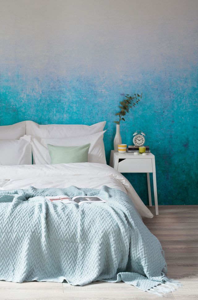
“The power of black next to white stands the test of time. Because they are both neutrals, the combination is bold and dramatic without being brash. Black can bring wow factor as a contrast window sash or passage door and can also highlight architectural detailing that would otherwise go unnoticed.”
—Emilie Munroe, Studio Munroe | San Francisco
White will never go out of style, but the key is to add pops of color for interest, advises Hillary Stamm. (Photo: Lauren Pressey)
Keep the color contrasts coming.“Clients are looking for a timeless elegance but with contrast and a touch of something that creates a special and unique look and space to call their own.”
—Hillary Stamm, HMS Interiors | Manhattan Beach, California
“While there is a time and place for quiet, neutral greige, we’re advocating for something a bit more opinionated—we look for color with a point of view,” notes Kathleen Walsh. This library in Greenwich, Connecticut features Benjamin Moore Symphony Blue. (Photo: John Bessler)
“We’ve noted that brown and blue is slowly making a comeback. The combination allows us to easily mix antique and modern; however, it’s notably different than how we used in the ‘90s. We’re going way more saturated in the blues, picking up on deep complex hues for a more luminous, dynamic color.”
—Kathleen Walsh, Kathleen Walsh Interiors | New York, New York
“While neutrals can sometimes be seen as playing it safe, venturing into bolder shades keeps a room contemporary and dramatic,” notes Leslie Murphy. This primary bedroom project features a Benjamin Moore Soot. (Photo: Lisa Hubbard)
Channel deep charcoals and browns.“Heading into 2023, we’re really into darker and dramatic shades, such as deep charcoals and browns. These tones are not only elegant and upscale when complemented with tonal furnishings and accessories, but they bring a warm and comfortable feel to the space. ”
”
—Leslie Murphy, Murphy Maude Interiors | Memphis, Tennessee
Sometimes, it all boils down to the basics, as San Francisco Noz Nozawa notes about pairing oranges and blues. This Victorian parlor features C2 Tortoise with burnishing and gold resin drip by Caroline Lizarraga. (Photo: Colin Price Photography)
Opposites attract.“Across all eras in design, I have always loved orange-red-brick tones and teal-blue tones together. From a color theory standpoint, these tones are perfect opposites on the color wheel; but I think there’s something so iconic about this pairing—from Southwestern indigenous jewelry pairing coral and turquoise stones together, to every Hot-and-Cold water faucet.”
—Noz Nozawa, Noz Design | San Francisco
Peignoir by Farrow and Ball graces the wainscoting of designer Susie Novak’d own dining room, where the muted rose is paired with gray floral wallpaper by Cole & Son. (Photo: Thomas Kuoh)
Pink is sticking around.
“Dusty pinks, salmon, and taupes. These warm neutrals, in particular, really came up in the last couple of years or so, and I think are now considered mainstays. There is something so soothing about a dusty pink that also feels special and unique.”
—Susie Novak, Susie Novak Interiors | Oakland, California
Virginia Toledo likens the timelessness of neutrals and blacks to the appeal of a pair of cream linen pants or perfect little black dress. Here, a living space project features Benjamin Moore Winter White with Benjamin Moore Decorator White. (Photo: Jacob Snavely)
Play nice with neutrals.“Neutrals became the response to living with greige for so many years. We find that these tones, paired with crisp whites and a dash of black, never go out of style.”
—Virginia Toledo, Toledo Geller | Franklin Lakes, New Jersey
DISCOVER THE POWER OF PAINT
Explore the best hues for home with tips and trends from designers across the country.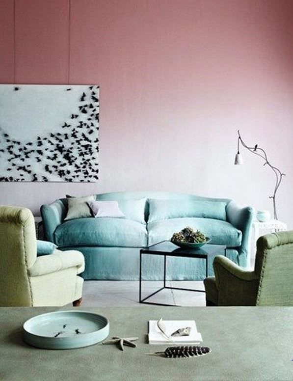 See what's hot in 2023 color trends, read up on today's top paint colors for bedrooms—plus dive into designer favorites for best blues, neutrals, greens, earth tones and more.
Next Year's Hottest Paint Color Trends, Revealed
Photo: istockphoto.com
Painting can be one of the easiest and most cost-effective ways to update the look of your space, whether it’s inside or out. But choosing a color that brings out the best in your room and is also on trend can be difficult.
Some major paint companies are out with their picks for what they anticipate will be hot colors in the year to come. Whether you’re looking to go bold or stick with colors that are a bit on the reserved side, consider one of these hot new paint hues to bring new life to your home.
Dutch BoyPhoto: trends.dutchboy.com
For its 2023 color of the year, Dutch Boy drew inspiration from home and workplace aesthetics, including feelings of safety, harmony, and comfort. Rustic Greige is the result. It’s a neutral hue that not only gives off a soothing vibe but also adds a bit of sophistication to any space. Bonus: It can be applied with just a single coat.
Rustic Greige is a neutral in the medium-toned range. Since it has a slight red undertones, it pairs appealingly with both warm and cool colors as well as wood furniture and accents, making it a great choice for any room in the home, whether it’s a bedroom or living space, home office, bathroom, or kitchen.
The hue also serves as the grounding color for the three palettes in the company’s 2023 Color Trend Forecast.
Plush: This palette offers colors that are fluid, relaxing, and restorative. These colors bring a feeling of luxury, along with spiritual and emotional well-being, to a room.
Wistful: Hues in this palette draw inspiration from nostalgia. Think spaces that are special to our lives with both soft and energizing colors.
Botanic: This palette is rooted in shades of warm florals and romantic hues that bring forth a feeling of creativity and soulfulness.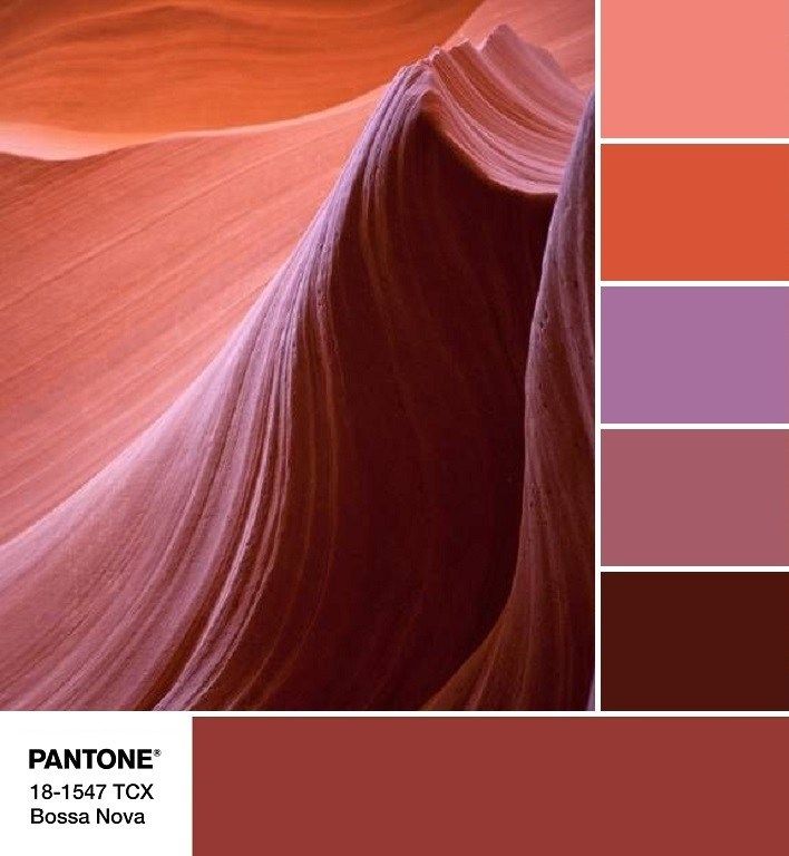
Advertisement
Get Dutch Boy Paint at Menard’s
Graham & BrownPhoto: grahambrown.com
If you’re in the mood to update with a color that’s, well, deep and moody, Alizarin should be on your radar. Graham & Brown’s 2023 Color of the Year is a refreshing auburn hue that is dark enough to be eye-catching, yet also natural and inspiring. The company notes that it’s a “creative alternative to the grey and beige shades that have grown wearisome.”
The rich red may make you think of ancient lands, but it’s perfect for adding warmth to any room in the home, whether used on walls or as an accent color.
“The rise of earthly neutrals has been growing recently,” notes Paula Taylor, head stylist at Graham & Brown. “They are warm and welcoming, providing the cosy feel we love in our homes. With energy bills getting higher, we are looking at ways we can evoke a sense of warmth in our homes, and these tones and their connection with nature create a warm, relaxed atmosphere. ”
”
Get Graham & Brown Paints at The Home Depot
BehrPhoto: Behr.com
For those who are unsure if they’re ready to jump into the world of bold hues, Blank Canvas may be more your speed. Behr’s 2023 Color of the Year is a great choice if you’d like to build upon a neutral hue with more colorful accents. Blank Canvas establishes a serene setting, yet it’s versatile and can be paired with more vibrant hues to create the perfect space to promote a feeling of relaxation and calmness.
“Blank Canvas effortlessly offers a clean and inviting blank slate that allows individuality and creativity to flow freely. This white easily harmonizes with a wide range of hues, including neutrals, earth tones, and pastels, for a charming and cozy appeal. Blank Canvas also pairs beautifully with black for a dramatic impact and with bright accents like green or cobalt blue to instantly lift your mood.”
Advertisement
Try Blank Canvas in shared spaces like the living or family room to foster a feeling of tranquility. Or use it to update the look of kitchen cupboards and pair it with bright accents, such as tile and fixtures.
Get Behr Paints at The Home Depot
GliddenPhoto: Glidden.com
When it was time to choose their 2023 color of the year, Glidden paint by PPG asked consumers what they wanted to see in a new hue. Turns out they wanted a pop of color for those with more traditional tastes.
The result is Vining Ivy, a color that is not quite blue and not quite green. This deep teal will bring a feeling of calmness to any space, and its rich undertones make it a good choice for those who want a bold color that’s also sophisticated. The best part? It’s versatile!
“Consumers are seeking to simplify in this post-Covid era, as the past 2 years have shed a new light on the importance of serenity and little moments,” said Ashley McCollum, Glidden color expert. “Vining Ivy embodies this vibe perfectly. It is energizing yet grounding, and it works in literally any space. Its versatility takes the guesswork out of design, leaving consumers with more time to indulge in the things that matter most to them.”
If you’re on the hunt for a color that’s symbolic of water, Vining Ivy (PPG1148-6) is a great option, as it combines the boldness of blue with the calming and refined characteristics of green. The color pairs well with richly colored woods as well as a range of whites. And pairing it with gold accents, such as doorknobs, light fixtures, and furniture, will bring a glamorous feeling to your space.
For those not ready to go all in, Vining Ivy can rejuvenate kitchen cabinets, make an accent wall pop, or freshen up the look of your front door.
Advertisement
“Even the most modest spaces can benefit from the teal treatment. For those short on square footage but big on style, we recommend using this rich hue as a bold contrast to a neutral palette, making a petite room feel plush,” McCollum said.
Additional 2023 color trends from Glidden include:
Foxfire Brown (PPG1069-6)
Stonehenge Greige (PPG1024-5)
Cool Clay (PPG1071-5)
Dark Granite (PPG1005-7)
Spicy Mustard (PPG1108-5)
Pine Forest (PPG1134-7)
Fossil Stone (PPG1102-2)
Lazy River (PPG1148-4)
Mostly Metal (PPG1036-7)
Get Glidden Paints at The Home Depot
Sherwin-WilliamsPhoto: sherwin-williams. com
com
If earthier and more traditional hues are your style, you’ll want to check out the Terra Collection from Sherwin-Williams, which is composed of 40 colors across four palettes.
Sherwin-Williams invites consumers to think of these earthy colors not just as a collection but as a representation of ourselves and our planet. Designers of the Terra palette chose the muted hues as a reflection of our connection to the Earth, our fondest memories, and future hopes.
“All kinds of trend topics are considered—from climate change to mental health—and emerging trend topics are then thoughtfully translated into defining colors and cohesive palettes,” the company noted in its press release.
Terra CollectionsThe 40 colors in the Terra Collection fit in one of four curated palettes: balanced Biome, passionate Lore, serene Nexus, and vibrant Origin. Within these four palettes are a variety of hues, including earthy naturals, reds and violets, and deep blues and greens—meaning there is something for every style.
The company’s pick for the 2023 color of the year comes from the Nexus palette. Redend Point is a calming blush-beige that inspires expanded horizons and eye-opening discoveries. “The color is a natural choice for those looking for a warm and joyful neutral in both interiors and exteriors,” noted Sue Wadden, director of color marketing at Sherwin-Williams.
Advertisement
Here’s a look at the four curated palettes, the types of colors in each, and how they could work in your space.
Biome: The Biome palette is a representation of our planet’s changing ecosystem that also gives a nod to its balance. For those looking to bring a feeling of peacefulness and sophistication to a room, this color palette delivers. Think taupes, foggy greens, and a deep bronze.
Lore: Colors from the Lore palette are a representation of the world. These ancient reds, powdery pastels, and jewel tones are, according to the company’s website, “present in the very air we breathe, binding us together in a community of makers that spans centuries and crosses cultures. ” For an unexpected look, try Serape, a muted orange, or Mineral Gray, which brings a warm, dramatic feeling to a room.
Nexus: The Nexus palette represents our communal well-being. These colors reflect love and kindness, quiet and healing. “Enkindle a sense of support and serenity with a potter’s palette of natural clays and sunbaked desert sands, grounding brown, and soft, soulful white.” Lei Flower, a deep coral and the brightest hue in the palette, is mixed in among Cool Beige, Malted Milk, and Chatura Gray.
Origin: The Origin palette brings a joyful energy to the Terra Collection. Those looking for vibrant colors to enliven their space will gravitate toward these hues. Check out options like gold-yellow Goldfinch and not-quite-maroon Peppery. Indigo, a darkish blue, is a dignified entry from a color family that never seems to go out of style.
Get Sherwin-Williams paints at Lowe’s
Advertisement
Fashionable colors in the interior 2023
When designing interiors, it is necessary to take into account modern fashion trends in the selection of color combinations and high-quality types of finishing materials. It should be noted that the selection of trendy shades for decorating rooms is largely conditional, but the main trends in this field of activity can still be established after analyzing various options.
Contents of the article:
Trends in 2023 in choosing colors for a fashionable interior (photo)
A general trend recognized by leading designers in defining the most preferred shades and trendy colors for 2023, which should create a calm, light, serene and natural atmosphere in the room. Modern interiors are dominated by universal tones used in various combinations.
Warm Beige
A nice neutral synthesis of beige and gray with a more cozy feel. With a competent overall solution of space, it brings a feeling of elegance, tranquility, warmth. Natural beige color makes successful combinations with chestnut, as well as with muted blue or green hues.
Dark Ginger Shade
Another soothing trendy shade of dark ginger with hints of persimmon is becoming popular. It is warm and cozy. It will allow you to bring into the atmosphere of the room not only comfort, but also a feeling of noble luxury, combined with golden, cherry accents. It goes well with mahogany color scheme.
Aquarelle Blue
A subdued azure that mimics tropical water covered with light mist, is considered the best solution for the bedroom. The mystical watercolor-blue tint can also be used in other rooms, adjacent to neutral tones. Perfectly combined with a delicate cream shade.
Refreshing green
Conservatively minded people are pleased to realize that refreshing green is still a fashionable color in the interior of 2023, which will be especially relevant in interiors with minimalist elements. It is recommended to select a dark green background for wall decoration, and use ultramarine or emerald colors for a velvety finish of upholstered furniture.
Almond Shade
Cool and delicate, multi-faceted almond is transformed by its neighboring colors. The original combination is with rich blue, deep green, graphite. The almond tone can dominate the interior or play an auxiliary role as a companion color.
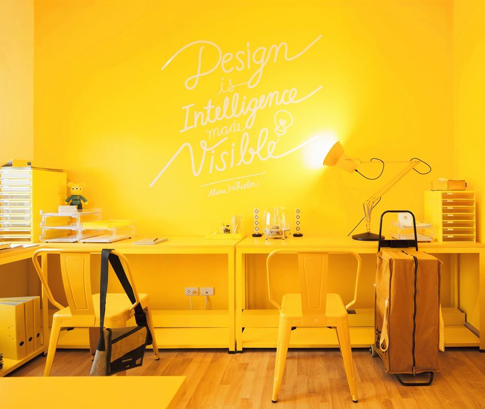
Amber
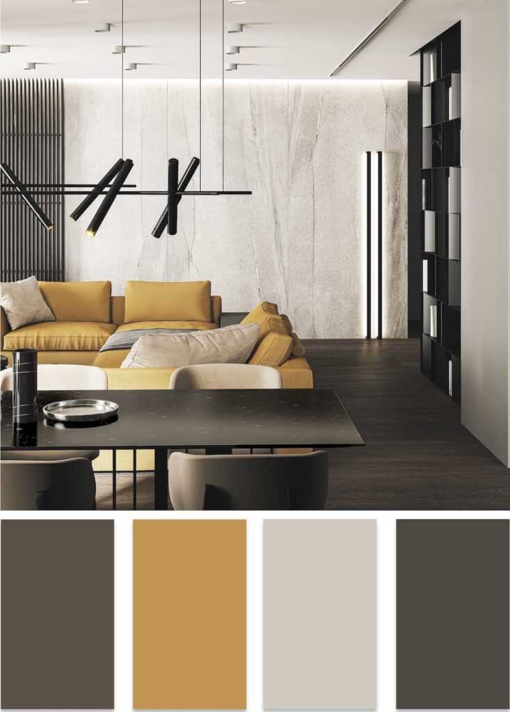
This cheerful color scheme includes yellow, red, orange notes. From the degree of their concentration, the amber radiance also changes. In any interior, the presence of such a tone, most often as an accent, provides an energetic, stimulating thought process, uplifting atmosphere. Amber is successfully combined with dark brown, beige, lilac shades.
Samba
A mature, slightly muted, very expressive cherry red color known as samba, in the 2023 season, it is on the list of leaders in interior design. This tone is appropriate in the decoration of furniture, on textile details. A refined and sensual accent gives the interior a touch of chic and sophistication. Samba is combined with a neutral background, shading it favorably.
Gold
The flashy golden decoration begins to play in full force. Designers urge not to be afraid to bring elements of luxury into your home. Even small golden elements give the room features of well-being and nobility. Chocolate, red, turquoise, orange tones are organically located in the neighborhood. A combination of gold with a velvety black color scheme is considered an aristocratic option.
The principle of selecting shades in the interior 2023
The dominant design principle is based on the following ratios:
- base tone - 60%;
- additional shade - 30%;
- accent color - 10%.
The search for color solutions is intended to solve not only the task of approaching fashion trends. It is important for each person to express their own preferences and create an atmosphere of comfort and coziness while observing the norms of aesthetics and harmony.
Modern interior often involves an organic combination of color elements typical of different styles. The subsequent operations practiced in the improvement of any premises depend on this, for example:
- Layout with installation of partitions, coordinated transfer of walls;
- Zoning of the surrounding space by different methods;
- Selection of furniture, decoration, lighting, textiles.
The variant of decorating a room in one particular style is gradually going out of fashion. Designers prefer projects with an organic combination of elements from different stylistic trends.
With proper selection of all the components of the interior, it is possible to obtain a comfortable space that reflects the personal preferences of the household, with well-thought-out functionality.
Trends in the selection of color solutions for exclusive interiors 2023
Creation of unique interiors is based on introducing aesthetics, pragmatic component, lightness and environmental safety into the space. Trendy colors in the interior of 2023 and some design tricks are becoming a reference point:
- Naturalness . The trend, which implies close proximity to nature, does not lose its leading positions. The use of natural materials (stone, wood, leather) with a warm texture and soothing tones is relevant in today's dynamic environment.
 Natural color schemes have a unique personality and always attract attention.
- Glitter . Increasingly, attention is drawn to the abundance of textures, bright colors, the organic inclusion of yellow metal parts, catchy textiles. Similar decisions will be relevant in the 2023 season. Giving preference to some theatrical aesthetics with an abundance of mirrors, textures, complex color transitions, it is important to maintain a balance, especially in small rooms.
- Dynamic . A feature of dynamic modern interiors is the urban theme, which involves the use of innovative materials, clear geometry in lines, as well as additional details with industrial style features: metal mesh on furniture facades, massive ceiling lamps. The color scheme often contains contrasting shades.
Urbanism allows you to combine different styles, organizing an unusual, but very cozy space without any special restrictions.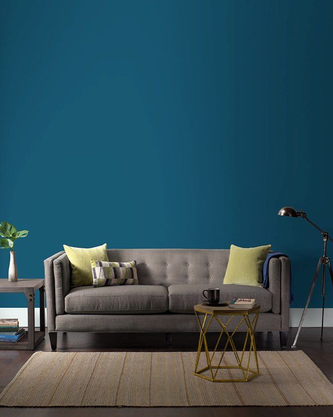 Funny posters can be placed on the walls, the cast-iron base of a static table perfectly coexists with an elegant bright armchair.
- Historical motifs . Deep saturation emerald green, sapphire, wine tones on textiles, as if descended from an old engraving, are gracefully woven into the classic decor with gilding, stucco, restrained colors on the walls, noble parquet floors.
- Ethnic sound . In the interiors of 2023, the impact of colorful ethnic motifs will increase. Values are figurines, various handmade items, including furniture, unusual eye-catching textiles. A carved chest, a bronze lamp, a floor carpet with ethnic original patterns will serve as a bright accent.
Trendy color shades 2023 in furniture
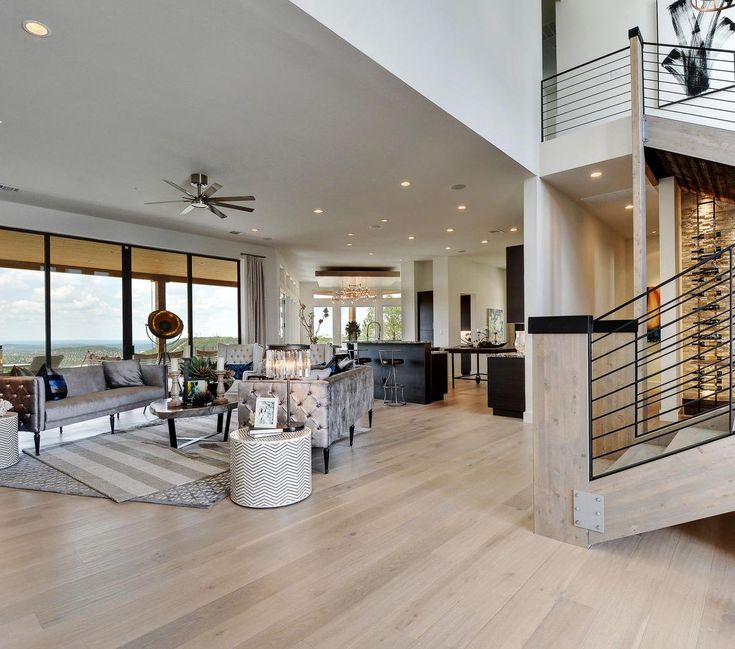
Modern living rooms acquire an atmosphere of comfort thanks to furniture made from natural materials. Elegant wicker and wooden furniture sets will be fashionable in 2023. The color scheme in the selection of furniture involves a variety of variations.
Leather in a respectable chestnut or luxurious golden hue will dominate next season not only in the role of furnishing. Increasingly, designers are using leather panels in the design of walls and floors.
Balancing elegant steel tones continue to attract the attention of designers when decorating various furniture planes. The popularity of polished nickel, darkened steel, noble silver, brass is increasing. Iron does not lose its leading position, white alloys are increasingly common. When used in the living room, elements made of bronze with a golden brown tint achieve an exquisitely luxurious atmosphere.
Along with the dominance of restrained tones on furniture surfaces, bright ornaments with certain ethnic features are also popular. Juicy yellow, crimson, blue notes bring dynamism, festivity. In such an interior it is pleasant to be after a busy day of work.
Trendy color range 2023 for a modern interior
Analyzing the emerging style and color preferences, it can be noted that the following options will be popular in 2023:
- Combination of various concentrations of graphite, light grey, white with accent splashes from the list of bright colors. This option in any situation is different win-win. The calm atmosphere set by the basic background allows you to relieve stress and relax.
- Use for interior decoration of any functional pastel palette from lightened sand color to a pronounced cream shade. For example: any shade of a universal sand color (straw, golden sand, beige khaki, etc.) easily gets along next to all, even very saturated colors. The elegant sound of the sand palette looks noble, restrained and cozy.
- Cream tone, which is preferred by people who value classics, comfort, balance, can dominate the space, but will require darker neighboring accents, such as bronze or chestnut.
- Application of refreshing tones of natural greenery. Delicate light green, mint, malachite varieties, as well as dark turquoise, olive tones remain relevant. With a clean sound, green notes in bright variations are great for accent dot display. Mint, noble pistachio, solid cane can solo in space. Light greens are suitable for people seeking renewal. Conservatives prefer a serious, balanced dark green color scheme.
- Include in the variations of the combined color scheme of the interior a calm, pure blue tint of varying degrees of saturation. When properly distributed over surfaces, cornflower blue, azure, heavenly, turquoise colors create an atmosphere of creativity, tranquility, security, relaxation, and trust in the surrounding space.
Priority directions for 2023 in interior color design
Indoor color schemes perform not only the function of designing and decorating various surfaces. With the help of the rational use of the diversity of the color palette, designers successfully solve other problems.
Zoning
A well-designed visual division of space into functional areas is one of the main trends of the 2023 season. Using a combination of well-matched shades, you can highlight a work area, a fireplace area, a relaxation area, a place for children's activities or placement of flowering plants in the room. In the kitchen, it is easy to visually separate the dining and working areas.
Different techniques are used for zoning. You can paint the surfaces of the walls by choosing different colors. An interesting effect is obtained if the floor or even the ceiling surface is decorated with materials of different tone.
Complex interior
The current trend in interior design solutions for the 2023 season is the organic integration of working and functional areas into living spaces. The interior becomes complex, which saves space and creates an orderly appearance of the room. The base background is selected from a list of neutral shades interspersed with saturated colors.
Adjusting the proportions of the room
The current trend is to use more active tones in small rooms. The postulate that only light walls can visually expand a miniature space is gradually becoming a thing of the past.
On the contrary, the analysis of modern projects allows us to conclude that a deep rich color scheme distracts attention from small dimensions. It is important not to use it in the dominant version. Usually one accent wall or a specific area is brightly decorated to emphasize its functionality.
Cooling or warming the room
Fashionable colors in the interior 2023 can not only give the space a certain impact on the psychological state of a person. With the right selection, they will warm a cold room, oriented to the north and practically not receiving the beneficial effects of sunlight.
In this situation, you will need to choose a background from an arsenal of warm colors, including a variety of shades from yellow radiance to red-violet nobility. Accordingly, it is advisable to decide on a room on the south side with a predominance of cold shades from another part of the color palette.
Summing up the above, it can be noted that in the field of interior design, the selection of color solutions is usually carried out with a focus not only on fashion trends and current trends. An important role is played by personal preferences and ideas about comfort and coziness. The priority is not just functional interiors, but soothing ones, allowing you to relieve irritation, relax and unwind.
Trendy interior colors 2022 - 2023
- The most fashionable colors in the interior 2022/2023: rich browns and earthy tones
- Color trends in interior design: fiery red
- Fashionable interiors 2022/2023: the autumn-winter season is marked by blues
- Trends in the interior of the autumn-winter 2022/2023 season: delicate pink
- Trendy colors of upholstered furniture.
 What upholstery to choose in the coming season?
 - Furniture that will conquer the interior of 2022/2023: wood colors and natural materials
- Trends in interior decoration. Colors of accessories and attributes
Trendy colors in the interior in 2022 have become more than just home decoration. They have become symbols that evoke the values that we missed during times of lockdown: stability, a sense of security, comfort and joy in life. The upcoming season, however, brings us a few surprises and a change in optical perception. Among the color favorites at the turn of 2022 and 2023 are not only calm neutrals, but also bright, energetic colors and romantic pastels. What other colors will change your interior in the near future? Check out our overview of color trends and get inspired!
Trendy interior colors 2022/2023: rich browns and earthy tones
Deep, elegant brown tones are loved this season not only by fashion designers, but also by interior decorators.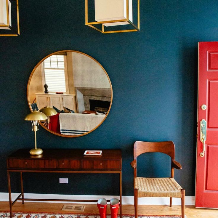 Cold muted shades, evoking associations with nature, contain peace and harmony, so desired in autumn and winter compositions. The addition of brown soothes the senses, making the interior a cozy oasis. Moreover, it is ideal for both classical and more austere arrangements, such as Japandi.
Japandi is a very cozy style, a mixture of Scandinavian and Japanese. This style is often complemented by a large number of plants. Looks very natural and natural
Japandi Style Trend 2022-2023
In addition to the chocolate brown chosen by the Pantone Institute, the list of the hottest colors 2022/2023 also includes the entire palette of earthy colors. Calm grays, olive greens, deep reds and creamy shades of coconut cream are a must-have for this year's arrangements. The colors of nature with elegant accents of gold and copper are the perfect fit for this season's boho-glam style. Such a mixture is a recipe for an elegant interior, although not devoid of naturalness and freedom.
Interior design trends: fiery red
Bright, energetic red boldly enters the interior, and not only in the form of accessories! In a noble version, it greets guests on velvet upholstery fabrics and velvet cushions, and in a bold contrasting version it looks great on the walls: as a color accent of patterned wallpaper or an intriguing paint color. Dark red in a wine shade will create an elegant and expressive composition. It will look great in a duet with pomegranate or bottle greens, creating an unusual color set.
Expressive colors such as red are the basis of a fashionable autumn-winter look. It can not be overlooked among the elements of autumn table decorations or New Year's decorations, such as candles, centerpieces or ceramic figurines.
Trendy Interiors 2022/2023: Fall/Winter season marked by blues
Inspirational Blue is the Color of the Year for 2022, chosen by AkzoNobel's Global Aesthetic Center. A bright shade of blue, reminiscent of the color of the summer sky, is a proposal that is a real surprise and an interesting alternative to dark, deep colors.
Bright blue color gives the rooms a feeling of freshness and openness, optically enlarging the space even more. For this reason, it is a great option for small apartments and interiors that require additional lighting. It will be a good choice for a small bedroom - it will work mainly as a wall color, although nothing prevents it from appearing on bed upholstery fabric and textile fittings. How to play with blue in the interior? Add subtle shades of gray and bleached wood to it, creating the perfect composition for modern Scandinavian interiors.
Fall-Winter 2022/2023 interior trends: delicate pink
Calm, harmonious arrangements are projects in which not only earthy tones, but also pastel colors reign in autumn and winter. Interior design trends 2022/2023 stand out in particular with delicate pink, a color that can be found both in combinations with basic shades of beige and creamy white, and in slightly less obvious combinations with navy blue or red.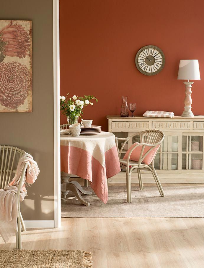
Powdery pink, although not a flashy color, can attract attention. If you want it to be a hallmark of the whole arrangement, present it in the form of elegant accessories: shimmering decorative pillows, bedspreads, fluffy rugs or romantic paintings will please you!
Trendy colors for upholstered furniture. What upholstery to choose in the coming season?
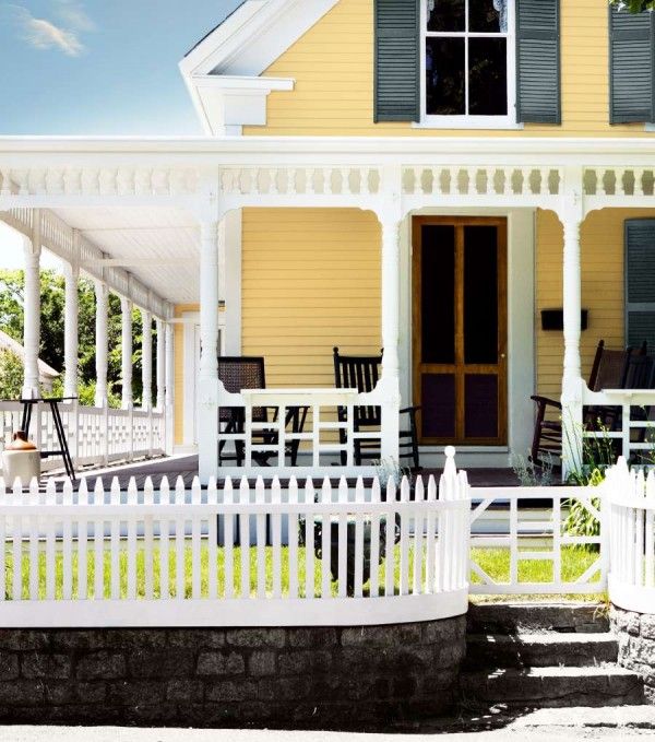
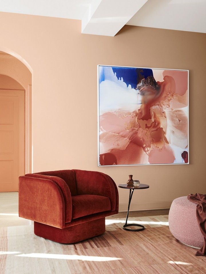
Another color trend announced for the 2022/2023 season? Vibrant shades of red and rusty orange, also known as terracotta or ochre. In addition to the brick red color, there are also muted yellows, especially mustard yellow, which are ideal for retro aesthetics. Leisure furniture in such colors will appeal not only to fans of style 90's, but also to everyone who appreciates impeccable design. Velvet upholstery on sunny sofas and couches will successfully enliven modern, classic or vintage interiors.
Terracotta bedroom interior The elegance of the furniture with soft rounded shapes and decorative stitching is flawlessly accentuated by natural colors.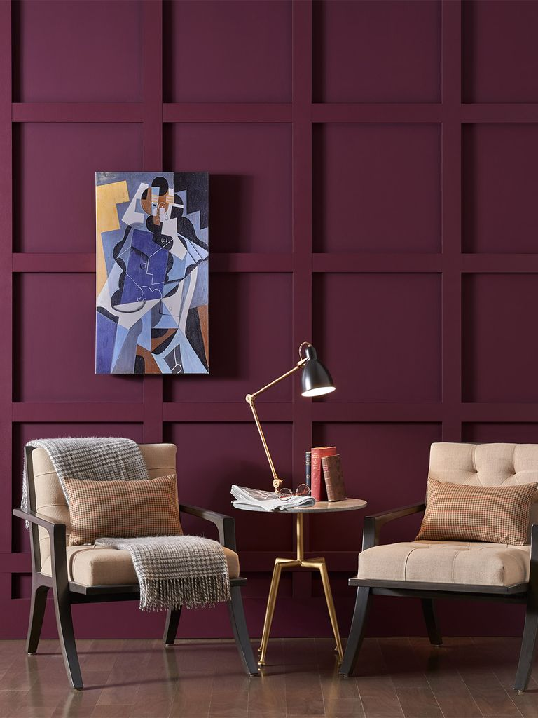 Creamy white and sandy beige shades will fit into almost any interior - they will be the perfect setting for a living room in English, Italian or glamorous styles.
Furniture that will conquer the interior 2022/2023: wood colors and natural materials
If you are looking for an idea how to furnish a living room or bedroom, choose furniture with classic silhouettes and visual lightness in the new season. Ecological design, pragmatism and subtle details are now in a price, so in the most fashionable interiors you will find openwork tables or rattan chairs, as well as massive cabinets of slender shapes covered with ecological varnish.
Wooden elements in the interiorWood remains on top in a universal form - natural, with a noticeable pattern of texture and noble coloring. The bleached shades of wood will soon be replaced by warm brown tones, thanks to which the compositions will acquire a friendly and unusually cozy character.
Interior trends. Colors for accessories and accessories
Energizing colors, described by AkzoNobel as a palette of expressive colors, are suggestions that are safest to bring into the home in the form of accessories and individual pieces of equipment.