How to display your china
Displaying china: 5 design rules to get it right
(Image credit: Future/Polly Wreford)
We've been displaying china for centuries now, but if your arrangement at home isn't look quite as cohesive as you would like it to, it might help to read our expert design advice below.
From creating shapes with groups to displaying the odd over even numbers to picking a color scheme, these interior design tips will help your china shine.
- See: How to display – show off artwork, ornaments and cherished finds
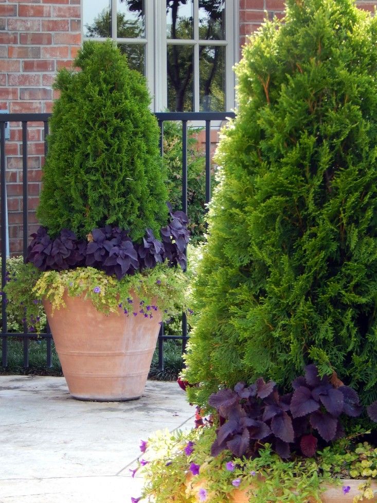
1. Display china in an odd-numbered cluster
(Image credit: Future/Polly Wreford)
We couldn’t resist featuring this picture from a recent Homes & Gardens photo shoot. These stunning vessels grouped together are a fabulous example of how to show off your pieces rather than store them away.
(Image credit: Future/Polly Wreford)
Placement is key when styling like this and odd numbers always work best. Vary the heights and note that the tallest are at the back. Let the smallest nestle between two and create a focal point with the most decorative. Shapes are important too, use a mixture of short and curvy in with the tall and narrow to create interest.
(Image credit: Future/Polly Wreford)
2. Display plates in a shape that reflects your intent
(Image credit: Adam Lippes X OKA)
If you have favorite plates, mounting them on a wall is a wonderful display idea. We asked Ana Moisin, Head Interior Designer at Oka for her advice on how to achieve a striking display.
‘China displays have been around for decades, they are so versatile and add a timeless beauty. They can just work everywhere; it doesn’t matter if your home is rustic or modern, the most important thing is to position them in a place where they can take center stage and you can really appreciate the craftsmanship – above a console, for example.
'I like to display china in a geometric pattern, and for a more contemporary angle, incorporate plain white pieces alongside intricate patterns in the wall design. ’
’
(Image credit: Future/Polly Wreford)
While the geometric, symmetrical arrangement is a wonderful approach for smarter, more formal feel – ideal in an elegant living space or kitchen – a more fluid pattern created with china, like those above and below, will suit a more informal setting, and in a space with few architectural details, it can really boost interest.
As always, picking a background color that either complements the unified color scheme of the china – or offers a pleasing contrast, as in the arrangement below – will help make the display more successful.
Note too the gaps between the plates – the arrangements remain intimate but entirely uniform in the formal arrangement at the top, and more irregular in the fluid displays.
Deluxe White Oiled Oak laminate flooring, Carpetright . For similar illustrated plates, try Rory Dobner
(Image credit: Carpet right)
3. Display tableware on open shelving in layers
(Image credit: Jody Stewart)
The rise in popularity of open shelving in kitchens means there’s a fresh new spot for the china to be displayed.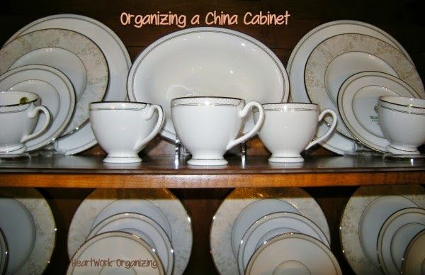 Again, there are two routes to take: formal or relaxed.
Formal arrangements of china tend to be sparer and more uniform; informal will be more cluttered, but will add a ton of character, pattern and color, especially if the china is decorative.
(Image credit: Alexander James)
We asked Kate Cartwright at Burleigh for her thoughts on the techniques for display china like this.
‘Historically, the uniformity and tradition of a starched and styled ceramics cabinet was once show-stopping but we are seeing more and more consumers embrace a more rustic, laid-back approach to displaying their plates and dishes, and indeed their homes. With interior styles often opting for a single wooden shelf on antiqued brackets, it allows your eclectically original pieces to really gleam in a stark comparison.
'When displaying earthenware, we like to think about layering and incorporating pieces in different sizes to create a more dynamic scheme, and curating designs together to show individual styles. ’
’
4. Display china in a dresser by visual weight
(Image credit: Emma Lee)
Showcasing china in a specifically-designed freestanding unit that complements your existing scheme and has plenty of storage space isn't a new idea. A traditional dresser will add character and charm to a country kitchen, while glass doors will ensure you can still see your china, but prevent it getting dusty or grimy.
In a vertical arrangement like this, it pays to keep the china in some kind of order that works visually. The best way to display? Heavier-looking, bulkier or larger items at the bottom, visually lighter, lighter colored and more delicate pieces towards the top.
(Image credit: Future / Kasia Fiszer)
(Image credit: Future / Malcolm Menzies)
5. Display china symmetrically in alcoves
(Image credit: Tom Howley)
Just as with the plates on the wall, china displayed symmetrically on shelves or in a cabinet will create a purposeful, smart look that's as much about aesthetics as it is about storage.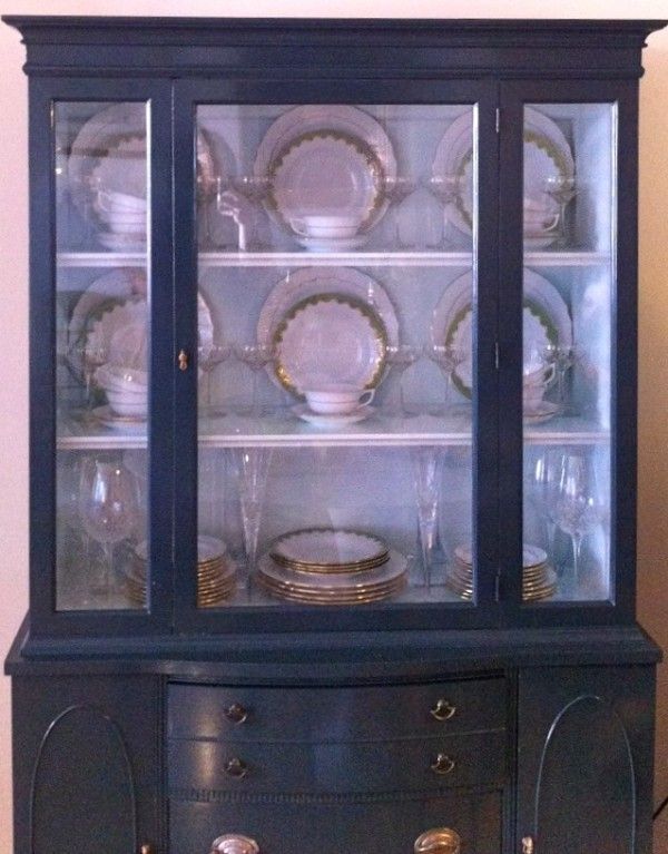
Alcoves are great for this purpose – whether as part of your home's architecture or created within a kitchen. Vicki McCarthy, Designer at Tom Howley explains:
‘Displaying your finest china in the kitchen will add instant country charm. The stacking, layering and artful positioning of your favorite patterned plates, dishes, or pots lends itself wonderfully to Shaker-style painted cabinetry.
'It makes most sense to use open shelving of glazed cabinetry as a base for displaying your china or ceramics, and another benefit of using this kind of cabinet for your china is that you can opt for closed cabinetry at the bottom, meaning the everyday ware can be stored away out of view.’
Sophie has been an interior stylist and journalist for over 20 years and has worked for many of the main interior magazines during that time, both in-house and as a freelancer. On the side, as well as being the News Editor for indie magazine, 91, she trained to be a florist in 2019 and launched The Prettiest Posy where she curates beautiful flowers for modern weddings and events.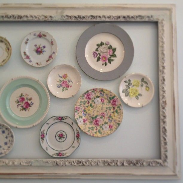 For H&G, she writes features about interior design – and is known for having an eye for a beautiful room.
20+ Creative Ideas for Displaying China
Every item on this page was curated by an ELLE Decor editor. We may earn commission on some of the items you choose to buy.
Make elegant plates and serving vessels an integral element of your decor.
By Alyssa Gautieri | Chairish
Stacy Bass
When you have beautiful formal dishware, you want to show it off. Elegant plates and serving vessels become an integral element of the decor—if styled correctly—whether hung on the wall in full view of the dining table or relegated to a china hutch in the kitchen. See how expert design professionals created beautiful spaces to display their clients' curated china and ceramics collections.
Michael J Lee Photography
1 of 24
Clean & Sophisticated
Kathy Marshall Design uses green-blue cabinetry with glass doors and brass fixtures to display white, ceramic dishware.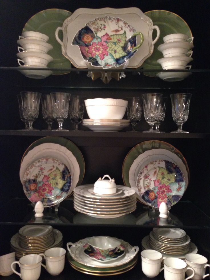
Helen Norman
2 of 24
Satisfying Symmetry
Bright, white dishes are symmetrically hung on the wall in this elegant dining room by Kathryn Ivey Interiors.
Keith Scott Morton
3 of 24
Timeless Design
There is a long history behind the use of blue and white china, and the classic color combination is often reinvented in modern-day spaces. Design by Deborah Leamann Interior Design.
Bjorn Wallander
4 of 24
Vintage Charm
Here, D'Aquino Monaco uses vintage elements—from the dining room chairs, to the porcelain collection hanging from the walls.
Eric Roth Photography
5 of 24
A Vibrant Display
Arrange dishware along a wallpapered wall as Gerald Pomeroy Interiors does in this vibrant space.
Julie Soefer
6 of 24
Antique Meets Modern
This modern dining room by Laura U boasts an antique china hutch that has been refinished with a blue stain.
Carter Berg
7 of 24
Artsy & Antique
This antique server functions as a display for colorful ceramics. Design by Liliane Hart Interiors.
David W. Gilbert
8 of 24
Classic Color
Reminiscent of an older time, this vintage space by Blythe Home is completed with a display of blue and white china.
Werner Straube
9 of 24
Bright & Bold
Displayed in bright blue cabinetry, dishware becomes the focal point of this butler's pantry by Amy Kartheiser Design.
Rett Peek
10 of 24
All About the Antiques
Antique platters and majolica are showcased above a refurbished table that was once a bench. Design by Goddard Design Group.
Max Kim-Bee
11 of 24
Decorate with Dishes
A dining hutch is more than a place to store dishware, it's often used as a central design element—like in this space by Brockschmidt & Coleman.
David Bader
12 of 24
A Pop of Color
Bright and colorful dishes shine through the glass display of this gray cabinetry. Design by Wade Weissmann Architecture.
Simon Brown
13 of 24
Stylish Shelving
Here, Beata Heuman uses a display of framed artwork and ceramic dishes to complement the kitchen's curved walls and marble backsplash.
Tim Street Porter
14 of 24
A Touch of Modern
Incorporate stainless steel cabinetry for a sleek and modern touch. Breakfast area by Tim Barber.
Neil Rashba
15 of 24
Coastal Chic
Coastal-style cabinetry displays a collection of elegant china. Design by Amanda Webster Design.
Thomas Kuoh
16 of 24
Soothing Grays
This sophisticated butler's pantry by Nest Design Company uses gray cabinetry for a collection of neutral-colored dishware.
Stacy Bass
17 of 24
Mix & Match
Here, Sarah Blank Design Studio displays a variety of dishware in a farmhouse-style kitchen.
Werner Straube
18 of 24
All White
Amy Kartheiser Design shows off white ceramics in bright, modern cabinetry.
David Livingston
19 of 24
Inspired by the Victorian Era
This baby blue dining room by Suzanne Childress Design blends modern elements with Victorian-era design.
Susan Gilmore Photography
20 of 24
Eye-Catching Cabinetry
A china cabinet creates intrigue in a space by Murphy & Co.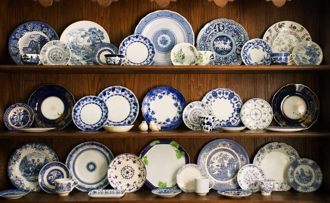 Design.
Alexander Bailhache, courtesy of Veranda Magazine
21 of 24
Along the Walls
Placed intentionally along the walls, these white dishes are various shapes and sizes. Design by Charles Spada Interiors.
Buff Strickland
22 of 24
Sophisticated Style
Although dishware is often associated with vintage or rustic spaces, Annie Downing Interiors uses a sophisticated corner hutch in this contemporary dining room.
Carter Berg
23 of 24
Simple Elegance
Functional dishware can be stylish too. Here, Liliane Hart Interiors displays everyday dishware using glass cabinet doors.
Andrew McKinney
24 of 24
An Assortment of China
Here, Tres McKinney Design uses two different cabinets for a variety of china and ceramic dishware.
23 Dining Rooms with Floral Wallpaper
Alyssa Gautieri | Chairish Alyssa Gautieri is an editor for Chairish who explores a range of interior design and architecture trends — from unique artwork and furnishings, to intriguing exteriors and outdoor living areas.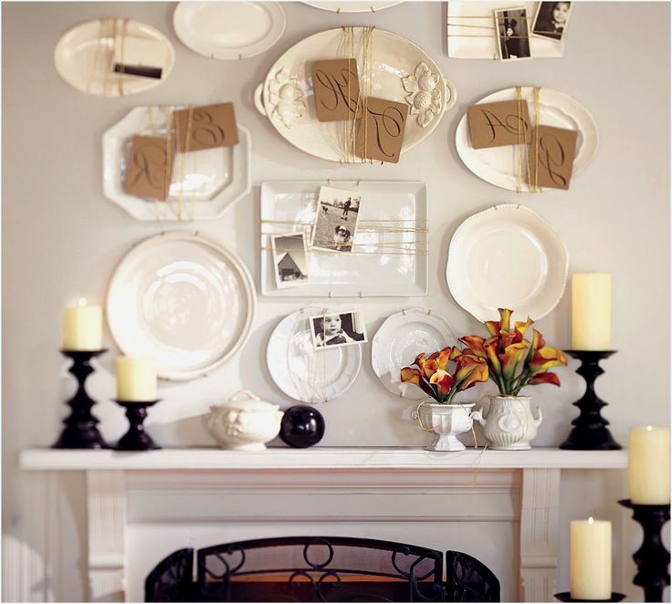
How to distinguish porcelain from a fake!
How to determine the authenticity of the material!
Porcelain is loved, appreciated and admired all over the world. Porcelain is the pinnacle of pottery. And regardless of the prevailing fashion in the world, products made from this material have been in demand for centuries. Nothing changes! Probably because the craving for beauty, to art has always been in man and is. Not in vain all over the world porcelain products like to collect: someone prefers have in your arsenal figurines or vases, someone cups, plates or gravy boats. In the antique market there is always a demand for "white gold". It is this title that porcelain has had since time immemorial. Collectors appreciate for its artistic value, history, rarity, age, preservation. Porcelain has always been considered a gem ever since it made itself known to the world. Porcelain products can be safely compared with an ornament, a rarity, its value only increases over time. Rich people love to invest their money into white gold.
Porcelain can be different: yes, there are services or individual pieces with paintings for fabulous money, so to speak, not for the pocket of people with average incomes. But everything in the world is changing and today ordinary people can also afford to buy porcelain dishes for the kitchen. In such dishes in the modern world often offer food in restaurants and cafes. Now this is the norm. White dishes without painting became available to us. In fact, for ordinary people, this is also a reliable investment, because durable and practical dishes will serve you for a very long time. Once bought and satisfied with high-quality and aesthetic dishes for a very long time. She always looks noble, stylish and beautiful. On the market, manufacturers offer a great variety porcelain utensils and one must be able to distinguish it from faience or a fake, which some unscrupulous manufacturers are trying to sell at the price of china. The main rule is to always buy well-known brand goods, and you will not run into a fake.
But, nevertheless, we offer you advice from professionals on how to like even newbies in this question according to external data can reveal whether they really hold porcelain in their hands. To do this, it is not at all necessary to understand the types of porcelain and its hallmarks. The fact, that real porcelain is not subject to time, its characteristics do not change - this is an important its value, but in another similar material, microcracks appear on the glaze over time, discoloration or chipping. Porcelain can be identified through SOUND by tapping on an object wooden stick. Real porcelain will "sing" with high notes. But different products from this material they can sing in a different way, this is permissible. Other dishes will not be able to produce such melodic sounds. So not in vain connoisseurs "white gold" call it "singing".
It must be understood that porcelain can be both thin-walled and thick.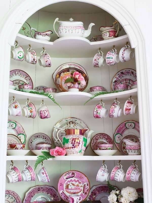 The next property of porcelain is TRANSPARENCY. To do this, you need to bring the product to a light source and look through the walls, they should shine through. This is easy and simple to do. Even the contours of the fingers can be seen through thin porcelain. COLOR is another important aspect in determining the authenticity of porcelain. Quality porcelain always has a milky white or creamy hue. Even if the product is painted, its basis will always be white, other material can have it in any color. Next Feature porcelain: he is not afraid of MECHANICAL impact. It is possible to strike on the product with a cutting sharp object and there will be no trace on porcelain. Another simple but essential sign of the authenticity of the material is it's UNGLAZED RIM on the bottom of the dish. Porcelain does not glaze it, because according to technology it goes through higher firing temperatures and if the piece were fully glazed the object would have been firmly stuck to the base in the oven.
 It would not have been destined to be taken out entirely from there. The unglazed rim of the dishes also says that porcelain DOES NOT LEAP WATER , but light, please. For this reason, your cup will never darken from tea or coffee stains. Other ceramics allow water to pass through, so they are completely covered with glaze.
hallmarks of Russian antique porcelain. Hallmarks of porcelain factories in Russia
The first hallmarks in Tsarist Russia
Types of hallmarks on porcelain of Tsarist Russia
Two hallmarks
Problems with the identification of hallmarks
Features of hallmarks of the Soviet period
First hallmarks in Imperial Russia
In Russia, the need to use hallmarks appeared as soon as the first porcelain factories were opened. Until the middle of the eighteenth century, Russia could only dream of its own porcelain production, until the incredible diligence of Dmitry Ivanovich Vinogradov at the first porcelain manufactory in the country led to the discovery of a recipe for Russian porcelain. In 1747-1749years, the first successful products appeared, which began to be branded with the letter W (the initial letter of Vinogradov's surname) and the year of manufacture of the product.
There were no standards for the first hallmarks, so they differed from each other in size, location and style of signs. Even then, the tradition of indicating the place of production and the number of the recipe for porcelain mass began to emerge.
With the transformation of the Neva Porcelain Manufactory into the Imperial Porcelain Factory, the opening of the F.Ya. Gardner and other hallmarks helped to distinguish one porcelain product from another. Moreover, enterprising people not only began to massively open their own porcelain establishments, but also actively created fakes of products from famous factories, which led to the need to create high-quality hallmarks.
The problem began to acquire a mass character not only within the country, since there was a need to distinguish Russian porcelain from foreign.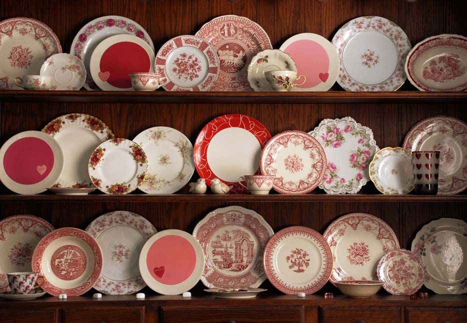 To this end, several decrees were issued at different times describing the procedure for hallmarking porcelain products. In particular, decrees issued from the middle of the 18th to the middle of the 19th century prescribed that the owner of the factory and its location should be indicated in the hallmarks. At the same time, the product must have had a Russian brand, even if another brand was supposed to be for foreign markets. Since 1857, the hallmarks had to be made with red paint.
All these requirements left a significant imprint on the hallmarks of Russian porcelain, although they were not an indisputable truth for small manufacturers. Many did not disdain to violate the established rules in every possible way, therefore, on porcelain produced in the Russian Empire, there are many hallmarks in a variety of designs.
Types of stamps on porcelain of Tsarist Russia
Application options
Traditionally in Russia, several methods of hallmarking porcelain were used. Overglaze and underglaze hallmarks were very common. The first of them were placed on top of the fired glaze, and the second - before it was applied, so they were preserved better than the first. A more reliable method of branding, which was more difficult to fake, is considered to be indentation into a mass of unbaked clay. However, the payoff for reliability with this method is reduced artistic capabilities.
Image complexity
The contents of the stamps were very diverse even at the same enterprise. In the first years of production, simple stamps in the form of one or more letters could be used, and in subsequent years they could move on to complex ornaments. For example, if the first hallmarks at the Dulevo Porcelain Factory were the abbreviations STK or ZSK, behind which the names of their owners were hidden, then later picturesque ornaments and a coat of arms were added to them, and the owner's surname began to be written in full. A similar practice existed at other Russian porcelain manufactories.
Royal symbols
The image of the Russian coat of arms was a privilege that only a few factories received. Such a right was given to those breeders whose porcelain products were especially singled out at exhibitions, noted at the Court. Producing porcelain of excellent quality, factories often received orders from the Imperial Court itself. These included the factory of the Kornilov brothers, the Gardner factory, the enterprises of Kuznetsov, Auerbach and some others. At the Kornilov factory, the Moscow coat of arms was painted with all care, using paints of different colors for one hallmark.
Most often, state paraphernalia was applied to expensive products or porcelain and earthenware that was intended for export. It was here that the coat of arms was depicted very subtly, carefully outlining every detail.
In addition to the emblem itself, the hallmarks depicted symbols of royal power. In particular, in the hallmarks of the world-famous Imperial Porcelain Factory, the crown was the most frequent element. She began to be depicted with the coming to power of Emperor Paul I and was used until the October Revolution, when, with the advent of Soviet power, all royal symbols were removed from the hallmarks. The crown was also depicted conditionally or painted with all care.
Monogramming
A frequent practice in factories was the use of a monogram. For example, at the factory of the brothers Novykh and Khrapunov-Novoy, it consisted of the initials of the owners: Ivan Novy and then Yakov Khrapunov-Novoy. For Alexei Popov, the letter “A” smoothly turned into “P”, while for Andrei Miklashevsky, “A” merged with “M”.
Hallmarks with the initials of Andrei Miklashevsky (left) and Alexei Popov (right).
At the Imperial Porcelain Factory (IFZ), monograms were the initial letter of the monarch's name and the specific number of his title. For example, for Catherine II, the Roman deuce was written inside the capital letter E. Since many tsars have been on the Russian throne during the existence of the IPM, so there were hallmarks with monograms AI, AII, AIII, HI and others according to the names of the kings.
Floral and other ornaments
The most frequent element of complex stamps, which were usually put on the highest quality products, are all kinds of floral and other ornaments. For example, from the second half of the 19th century, at the Khrapunov-Novoy plant, they began to use whole baskets of flowers with the name of the factory owner on the basket itself. At the Dulevo factory in the middle of the 19th century, a gold brand “ZSTK in Dulevo” appeared with a beautiful floral pattern. It was put only on expensive products. The hallmarks of many manufactories were framed with curls, enclosed in oval, round and other shapes.
Marks on the porcelain of the Novy brothers.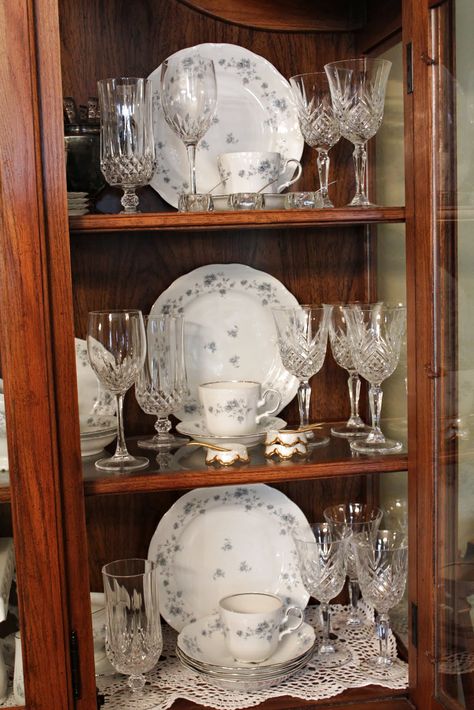
Variety of characters
The hallmarks of Russian porcelain factories amaze with the variety of symbolism. Tsarist decrees prescribed to indicate the owner and address of the factory in the hallmarks, but did not prohibit expressing one's individuality. This was reflected in the fact that enterprises used their own symbols, one way or another characterizing their activities. For example, there is a family coat of arms in the hallmarks of the Miklashevsky factory, Yusupov had his own symbol in the hallmark, among other things, stars, orders and medals can be found on Kuznetsov porcelain, Gardner depicted a rider on a horse, and after the Great October Revolution attributes of the Soviet era appeared in the hallmarks.
Stamp of the Miklashevsky factory with the family coat of arms.
Information about heirs
Since successful porcelain enterprises existed for several decades and even centuries, several owners changed during their work. If the former owner of the factory managed to achieve significant success and glorify his porcelain, the new owner tried to keep his name or used transitional hallmarks. For example, the descendants of the manufacturer Batenin used the inscription "NASL: BATEN", denoting Batenin's heirs. Kuznetsov, who bought out the dilapidated Auerbach plant, for some time used the brand “Former. Auerbach" to keep the old clientele. And Yakov Khrapunov completely decided to take a different surname after he entered into the right to own the plant of his wife Novaya.
Special notes
At many factories, special notes were made in the hallmarks, which could only be explained by the factory masters themselves. In some cases, these were designations of the addressee to whom this or that service or figurine was intended. At the IPM, for this, a “PK” mark was made, indicating that specific products were created for the court office. The Kornilovs had a mark “ON SPECIAL. ORDER". By the way, it is at the Kornilov factory that there is an inscription on porcelain about the prohibition of reproduction, which was the first attempt in Russia to protect the rights of authors to porcelain products.
If the factory experimented with porcelain mass, then they could put on the products the number of a specific recipe or make other notes related directly to the production.
On some products there are names of porcelain masters in the form of initials or full names. So, at the Yusupov factory, the signature of the master Lambert is found on porcelain. However, the talented painter of the Sevres manufactory not only contributed to the flourishing of the Yusupov factory, but also owned it for some time. On the IPM, hallmarks with the names of masters are found approximately from the middle of the 19century. The more famous the master was, the more expensive the product with his name was valued.
Signature and monogram Lambert
on Yusupov's porcelain.
Two hallmarks
On a number of porcelain works there are two hallmarks at once. There are several reasons for this phenomenon. The first is that the master simply could not make the stamp with sufficient pressure the first time. Then he put another one, trying to get into the previous one or in a new place. Since the attempt to put one brand into another did not always end with the desired result, fuzzy brands with double characters appeared. An example is Batenin's porcelain.
The second reason was that the linen (glazed porcelain without painting) was made by one factory, and the painting was completely different. So, at the factory of the Kornilov brothers, twice a year they sold low-quality porcelain, including linen. As a result, the stamp of the porcelain manufacturer and the master of painting appeared on the final products. Some factories were not engaged in the manufacture of porcelain mass, but simply purchased blanks and painted them.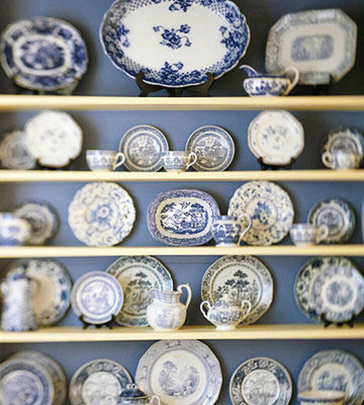 In particular, this was done in the workshop of Prince Yusupov, who purchased linen from Popov, Gardner and other large breeders.
Another reason was related to the need to move from one period to another. Most often, this referred to a change of ownership, which had already managed to make itself known in the porcelain market. In order not to lose the old customers, the new owner put a new brand next to the old one, in which his name already appeared.
There were other reasons for putting two hallmarks, for example, they were put on products intended for export.
Problems identifying marks
Until now, specialists have to make a lot of efforts to classify this or that product to a particular plant. This is due not only to the low quality of hallmarks or their absence, but also to the desire of small workshops to imitate eminent enterprises.
Small establishments often failed to achieve high quality porcelain, so that a trained eye quickly distinguished a fake.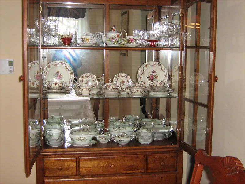 However, there were cases when fakes were obtained at the level of the original. In particular, the Safronov plant began by imitating the famous products of the Gardner factory. There is a version that it is with this imitation that the fact that in the early years of the existence of the Safronov plant they used exactly the same hallmarks in the form of a hook-shaped letter “C” was used on it, as well as at the well-known Gardner plant at that time. At the Gardner plant at one time, the letter G began to look like a "C".
Interestingly, over time, the Safronov factory gained its own fame thanks to good quality porcelain and original artistic painting. At that time, at one of the Moscow exhibitions, the products of the plant were described as those that deserve approval and praise. At the beginning of the 19th century, according to its artistic value, Safronov's porcelain was in third place after the eminent factories of Popov and Gardner.
Russian factories imitated the brands not only of their compatriots, but also of foreign manufactories. For example, at the Gardner factory in 1770–179In the early 1900s, they used the mark with the image of crossed swords, which is typical for Meissen porcelain. This symbol was used in various variations, including one in which the letter G was present.
Another problem was the peculiarities of the hallmarks themselves or their erasure over time. For example, some hallmarks on the Batenins' porcelain can be distinguished only if the light source is directed very slowly towards the product, changing the angle of inclination.
Overglaze marks were poorly preserved and were easily forged, while those pressed into the mass often depended on the quality of the stamp and the force of pressure. Moreover, many original works do not have any designations at all. This applies, for example, to the products of the Yusupov plant.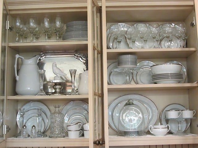 The prince created his workshop, having no commercial interest, and therefore there was no need for hallmarks. Most of Yusupov's products came to his estate or were donated by the prince to noble persons.
Features of stamps of the Soviet period
After the October Revolution in 1917, mass nationalization of porcelain enterprises began. Some of them completely ceased to exist immediately after the advent of Soviet power, others were renamed and continued their work. The first thing that changed in the hallmarks of this period was the complete disappearance of the symbols of royal power. The only reminder was a double-headed eagle without royal paraphernalia, which for some time was present in the hallmarks of the IPE. Note that the stamp with the date 1917 were installed only during the period of the Provisional Government. At this time, a small number of items with such a stigma were released, so their collection value is high.
Now the hammer and sickle have replaced the kings with their crowns and sceptres.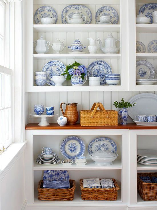 Stars, ears of wheat, the image of the globe and other elements typical of the Soviet period were used in almost every factory. And the former names of the owners have replaced numerous abbreviations and new names of enterprises. Thus, the IFZ turned first into the GFZ, and then into the LFZ. Hallmarks with the inscription LFZ are known to many, since porcelain was branded with their help for eighty years from 1925 to 2005.
The abbreviations referred not only to the new names of factories, but also to various organizations that emerged from them, or those through which porcelain was sold. This is how the inscriptions Mosoblgorspetstorg, Glavunivermag, abbreviations TD (trading house), TF (Tver porcelain), TsFFT (Centrofarforforrest) and many others appeared.
Of particular interest to collectors around the world is the so-called propaganda porcelain, which has practically no analogues. Its origin is connected with the no less interesting plan of "monumental propaganda" called for by V.I. Lenin. The meaning of this propaganda was to move as soon as possible from everything that symbolized tsarist Russia to the Russia of workers and peasants. However, in practice, propaganda porcelain turned out to be too expensive for the common man and ended up in collectors' collections. Moreover, over time, the interest of foreign collectors in it has grown so much that the price of such items has risen several times.
Agitation porcelain is characterized by a variety of appeals and slogans: "The kingdom of the workers and peasants will have no end!", "Long live Soviet power!" etc. As for the hallmarks, their main elements were the crossed hammer and sickle. There are also some inscriptions in the hallmarks, for example, “For the benefit of the starving”.
If in tsarist Russia the hallmarks of the same factory differed greatly in letter size, style of writing, drawing, and generally depended on the mood of the master, then the hallmarks of the Soviet period are characterized by the same letter size, stencilling, and sufficient clarity of images.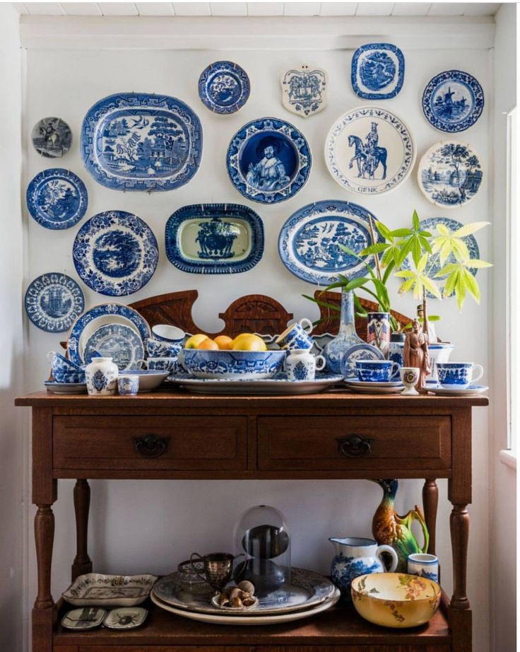 Still, the mechanization of production has left its mark on the quality of stamps.
Hallmarks of the Dulevo Porcelain Factory.
Another characteristic element for the hallmarks of Soviet porcelain is the words in Latin letters with the designation of the country: USSR or SOVIETUNION, as well as the postscript made in. In the same theme and the brand Torgsin, denoting "Trade Syndicate". Before the revolution, each plant itself came up with what the stamps for export should be. Some used inscriptions in French, others depicted arabesques and other elements for oriental clients. There was also a practice of using the inscription Made in Russia, the first use of which belongs to the factory of the Kornilov brothers.
In Soviet times, stamps often indicated the group of complexity of the drawing and the grade of the product. For example, at the LFZ, different colors were used to designate one or another variety, and the varieties themselves were designated as “1 s”, “2 s”, “3 s”.