Color schemes for the whole house
Create a Whole House Color Palette (with Real-World Examples)
There’s one mistake I see time and time again when I go into new clients’ homes: instead of using a whole house color palette, rooms are painted one by one in a variety of colors without a cohesive theme.
The master bedroom is a shade they liked in the store and the kitchen was painted the color they saw and loved in their neighbor’s house. The bathroom is the same Day-Glo yellow it was when they moved in.
The result is what I (lovingly) call a “Skittles” house…a rainbow of mismatched colors that just doesn’t lend itself to a beautiful, cohesive design.
If you’re ready to simplify your paint color palette, then you’re in the right place. In today’s post, we’re taking a deep dive into how to create a color palette for the whole house. We’ll explore what to consider when planning your palette and how to use different paint throughout your space.
We’ll even take a look at a real-life Farrow & Ball color palette used in my clients’ historic cottage, so you can see how a palette comes to life in a home.
The key is to create a plan. You can either start with a clean slate or integrate some of the existing colors as we did in this project.
Without further ado, let’s jump right in.
How to Create a Whole House Color Palette – Step By Step
Have you ever spent time in the Home Depot paint aisle agonizing over 15 paint swatches that all look pretty much the same? Then you know just how hard choosing paint colors for your home can be.
Most homeowners spend way too much time focusing on the paint itself. The real secret to choosing the right palette for your home comes down to focusing more on the space and less on the color.
A favorite quote of mine illustrates this point perfectly:
“Pick a color that looks good in the room and you will fall in love with the room instead of the color.”
Use the following tips to find the right colors for your rooms (and your whole house).
Consider your hard finishes & decor
Paint colors should always be considered in the context of your home and your room. When you pick paint colors for your whole home color palette, consider the colors that will pair best with the hard finishes in the room, such as your flooring, your furniture, and your decor.
You’re probably not going to buy a new couch to match your paint, but it’s easy enough to make sure your paint coordinates with your existing decor. Look at the colors in your accent pillows, art and other design elements to help you plan your palette.
It’s also a good idea to consider the existing paint in your home. While you may be open to painting every surface of your house, there may be existing paint colors that need to stay. Painting new trim throughout the house, for example, can cost almost the same amount as painting all of the walls, so you may need to use your existing trim color in your palette.
Photo by M. MarcenyPick a trim and ceiling white – and stick to it.
Every good color palette starts with great white paint. Start by picking a trim and ceiling color (or going with the trim color you already have) and plan to use that on all your trim, window frames, and doors throughout the house.
The cultural convention is that if you have white cabinets, they should be the same or similar to the trim and ceiling white paint color. If you want a warmer white or light greige for the cabinets, that’s ok as long as it looks visibly different from the trim. Don’t pick a cooler white than the trim and ceiling for the cabinets. It won’t look right.
If your finishes are more modern, go with a clean white like Benjamin Moore Chantilly Lace or the slightly warmer Sherwin-Williams Pure White. If your finishes are earthier (such as granite), then go with an off-white like Cloud White or White Dove by Benjamin Moore or Sherwin-Williams Alabaster.
Start with common areas
Once you’ve chosen your trim and ceiling white paint color, you can build out your whole house color palette by starting with the common areas of your home. Typically these include the living room, kitchen, and sometimes dining room.
In some homes, these areas may be completely sectioned off and could be treated as their own spaces. But in most modern homes they are open concept or open layouts and should be considered as one large space.
I love to pick a basic neutral – or a couple of coordinating neutral colors – to use in these kinds of spaces. Benjamin Moore’s Agreeable Gray is a great foundation for a whole house color palette. It works well in just about any light and pairs well with a broad range of finishes.
Other good whole-house neutral paint colors include Edgecomb Gray, Stonington Gray and Pale Oak.
Move on to secondary living spaces
Up next in our whole house color palette are the secondary living spaces – bedrooms, offices and sometimes dining rooms. These rooms can be painted with one of the neutral paint colors already selected, but they can also feature more colorful paints that coordinate with the overall palette.
In many traditional homes, the office and the dining room are near the front door. These can be great places to use an accent color that stands out from the rest of the house.
An accent paint color might be a very different shade than your whole house neutrals. This is a great opportunity to pull in the colors in your decor.
Choose colors for bedrooms
Bedrooms are a great place to play with more color in your home. I love using blues, greens and neutral paint colors with colorful undertones when choosing paint colors for bedrooms.
Nimbus Gray by Benjamin Moore, for example, is a darker gray paint color with strong blue undertones. Farrow & Ball Cromarty, on the other hand, is a muted green-gray that creates a really calming bedroom space.
Photo by M. MarcenyDepending on the room, a neutral paint with pink or purple undertones can also be beautiful. Benjamin Moore Ballet White or Portland Gray have soft pink undertones and work perfectly for a nursery or little girl’s room.
How many colors should be in a whole house color scheme?
I get this question all the time! The actual number of colors to include in a whole house color scheme can vary depending on the size of the home and your paint needs, but generally, I like to choose from 4 to 8 paint colors when building a palette.
These include:
- 1 white trim and ceiling color
- 1 foundational lighter neutral for common spaces and baths (typically white, cream, greige or beige)
- 1-2 accent colors for walls or accent rooms such as powder rooms, dining rooms or offices.
- 1-4 bedroom paint colors to show each person’s individuality. You can also use the foundation light neutral color with a headboard wall accent.
Explore A Real-Life Whole House Color Palette with Farrow & Ball Paints
Sometimes the best way to plan a color palette for your whole house is to see a real-world example to inspire you. This client’s whole home project is sure to do just that!
The setting is their beautiful historic cottage built in 1910. This home features some really unique finishes and design elements, like a wood beam ceiling, exposed brick, and even curved wall features.
This whole home color palette needed to complement these hard finishes, while also bringing together the unique space to feel like a cohesive, well-designed home. This is a warm family house meant for living and that’s exactly how it was set up.
For this home, we went with a Farrow & Ball color palette (with a couple of Sherwin-Williams and Benjamin Moore colors thrown in there too). It was this project that first got me obsessed with Farrow & Ball paints and inspired my recent series of Farrow & Ball paint color reviews.
Let’s explore this home room by room to look at how the colors come together in this beautiful whole house color palette.
Living Room and Dining Room
This historic cottage features an open-concept living and dining room with beautiful warm wood floors and a mix of neutral colors in the furniture and decor. We knew we had to choose a really beautiful, creamy white to make this space feel warm and inviting.
Photo by M. MarcenyThe trim in the house was already painted with Benjamin Moore Chantilly Lace, so we left that color throughout. This space originally had Chantilly Lace on the walls as well, but without enough natural light, it looked a bit dingy.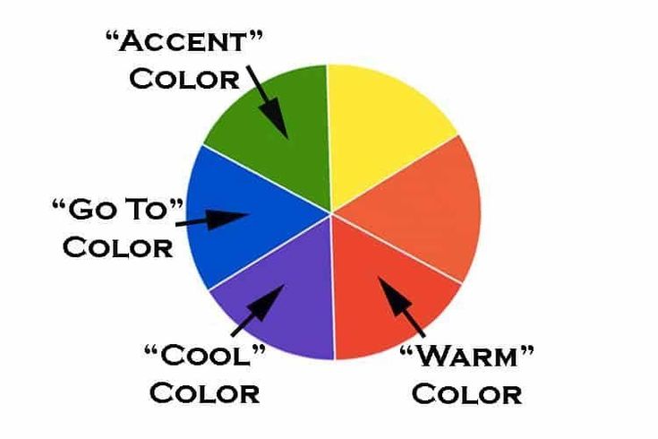 We changed the walls to Simply White by Benjamin Moore, a crisp off-white, and it really transformed this space. I don’t know how Benjamin Moore created that formula, but it just lights up a room, even if its a bit dark.
Kitchen
The kitchen paint colors of this historic cottage go against almost all of my own color rules. And yet, it totally works!
This kitchen features a unique combination of warm and cool colors and finishes.
The wood ceiling and natural light from windows and skylights bring a ton of warmth to this kitchen. The kitchen cabinets are also a warm color. They’re painted with Farrow & Ball Dimity paint, a soft, almost white color that is actually pink.
Photo by M. MarcenyThe cool blue-gray is repeated in the Carrara marble countertops, stainless steel appliances, and blue-gray flooring for a cohesive and cool pattern.
When it came to wall colors for this kitchen, I really wasn’t convinced that Farrow & Ball Setting Plaster would work. The homeowner picked this amazing combination, and she absolutely nailed it!
I would normally never paint such a warm color in a space with equally warm cabinets and such cool finishes. But Setting Plaster is truly beautiful in this space! The Dimity kitchen cabinets are really just a lighter shade of the same color, so they work really well together, and also repeat the blush theme.
We were able to mix warm and cool colors in this case because we repeated similar colors over and over again, creating layers of color that really tie the room together.
Girl’s Bedroom
We wanted this space to feel like a little girl’s room without being overtly pink. We also wanted it to coordinate well with the warm blush tones that are present throughout this whole house color palette.
Benjamin Moore Parchment was the perfect solution. This soft off-white paint has warm pink undertones that pair just as well with the existing white trim as they do with the creamy off-white of the dresser.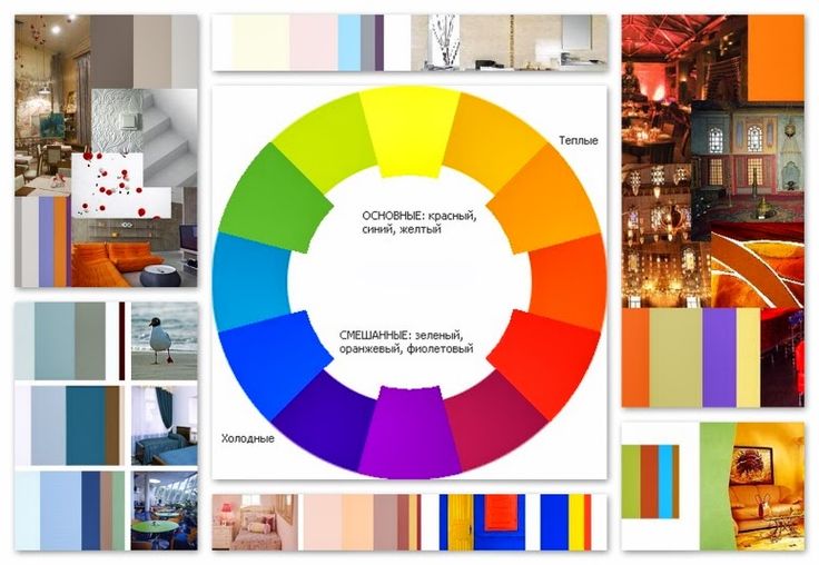
Boy’s Bedroom
For the little boy’s bedroom in this home, we wanted a paint color that would contrast with the warm pink and taupe tones in the wood ceiling, wood floors and throughout the rest of the whole house paint color palette.
Farrow & Ball’s Green-Blue paint works really well in this space. It sometimes looks blue and sometimes looks green depending on the changing light throughout the day. Its green tones add warmth to the color, helping it easily coordinate with the rest of the Farrow & Ball color schemes in this home.
Photo by M. MarcenyHall Bathroom
The other bathroom in this home is also painted a gorgeous Farrow & Ball green. Vert de Terre is a very earthy green color that adds warmth to the crisp whites and grays of this space. It acts as a beautiful connection between the Carrara marble flooring and the warm wood ceiling and helps tie together the mixed metal finishes in this unique bathroom.
I love this picture of this room because the light shining through the window really helps showcase the depth of the Vert de Terre paint. When the light shines on the wall, the color is really bright and vibrant while the shaded corners of the room show the moodiness of this paint color.
Primary Bedroom
The primary bedroom in this home is the perfect example of working with the colors you already have when building a whole house color palette. This room was already painted with Sherwin-Williams Panda White.
Photo by M. MarcenyThis color is not a favorite of mine, but we decided to leave it because it works well with the rest of the paint palette for the whole house. It looks really beautiful in this room. Panda White is a taupe color that looks almost yellow in these images thanks to light bouncing off fall trees in the yard.
Remember: it’s not about choosing your favorite paint color, but choosing the paint color that looks good in the room. In this case, Panda White works perfectly for this space and for the whole palette.
Primary Bathroom
The primary bathroom is one of my favorite spaces in this home. This space is painted with Farrow & Ball Teresa’s Green, a beautiful aqua paint color that adds a feeling of calm to the spaces it’s used in.
Teresa’s Green was the perfect color for this cottage bathroom because it is so versatile. It looks beautiful next to the natural wood beams, wood ceiling, and brick accents of this home and also pairs well with the white wainscoting and trim. This color was already in place, and it made me realize the magic and beauty of Farrow and Ball paint colors.
Photo by M. MarcenyAdditional Considerations for Whole House Color Palettes
But before you head to the store to start buying paint and planning your own whole house color palette, follow these additional tips to make sure your color scheme will truly work in your space.
Create a Pinterest mood board
This is one of my favorite quick and easy ways to check your color palette and make sure it works in your space. Create a Pinterest board with paint color swatches and pictures of your flooring, furniture, decor, and other hard finishes. Add an area rug and curtains to pull everything together.
Choose the right paint sheens
Creating the perfect whole house color palette goes beyond the actual colors – you need to choose the right sheens for each color too. Paint sheens are critical to the design of a color scheme.
Use these basic guidelines to choose the right sheen for your whole house paint colors:
- Use the shiniest sheen on your trim, doors, millwork, and cabinets. A Satin or Semi-Gloss sheen often works well here to help highlight architectural details. From a practical perspective, these elements also get the dirtiest, and shiny sheens are the easiest to clean.
- Paint walls with mid-sheen paint. If you have children or pets, an eggshell sheen is recommended for walls because it’s easier to clean.
- Paint ceilings with flat or ultra-flat paint.
 This helps hide imperfections and keep the focus on the walls and trim. Often dry-wallers take less care with the ceilings because they are hard to reach and most people don’t look at them.
And remember, sheens vary between companies and even between one company’s paint collections. What Benjamin Moore calls Eggshell, Sherwin Williams calls Satin. Benjamin Moore Regal Pearl is equal to Benjamin Moore’s Advance Satin. Choosing Farrow & Ball paint sheens can add even more confusion to the process, with finishes like Modern Emulsion and Estate Emulsion.
Read our guide to paint finishes to make sure you choose the right sheen for each space in your home.
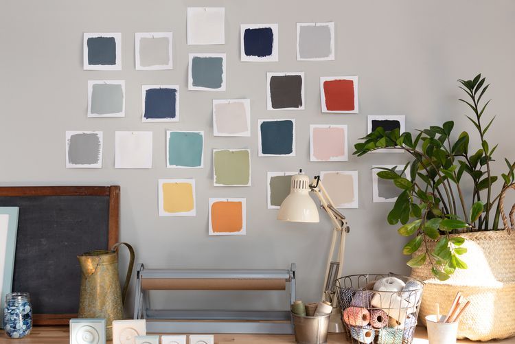
Photo by M. MarcenyTest Paint Colors in Your Home
Even the best paint colors can look all wrong once they’re actually on the wall. It’s critical to test your paint colors in the spaces you plan to use them and to do your tests in natural light.
In the old days, we had to paint samples onto large poster boards. These paint samples were messy and time-consuming, and we always had to find a way to dispose of the leftover paint.
Today there is another way! You can purchase Peel-and-Stick paint samples from companies like Samplize. Their colors are consistent, they use real paint in an eggshell sheen, and there is no mess.
Our recommendation is to stick them onto a white poster board and move them around the room at different times of the day. Compare them to your trim, carpet, and even your art. With a white background, you can see how the samples compare to the current color and the carpet.
Visit the Samplize website to get samples of a broad range of paint colors and get more whole home color palette ideas and inspiration.
Explore Our Whole House Color Palettes
Not ready to build your own whole house color palette? Leave it to the experts (that’s us)!
Work with The Color Concierge team on an Online Paint Color Consult to build your own custom whole-house palette. Or, DIY your project the right way with our upcoming Ready-Made Interior Color Palettes that can work in any home. The color palettes will drop on November 23, 2022!
We love your comments! Please note that the blog is meant as general advice, and it is not possible to give out specific answers to your paint questions. If you want more specific advice, please consider purchasing a color consultation. Thank you for your understanding.
House color schemes: creating whole house color schemes
(Image credit: Valspar)
We realize establishing whole house color schemes may sound daunting – it can be hard enough to choose a color scheme for one room alone, so picking one for a whole house does take a lot of thought, and commitment.
Why would you want a whole house color scheme? There are so many reasons – not least of which is that it's something the world's greatest interior designers routinely do to create a fabulously cohesive feel. And, once you have chosen your key shades, the color scheming will flow like a dream.
All you need to do is start with three favorite colors – and a little understanding of how shades work together. Here, we show you how.
See: The Color Wheel – H&G's complete guide on how to mix colors
1. Whole house color schemes create continuity and flow
(Image credit: Albion Nord)
One of the most important elements of a whole house color scheme is that it flows and is easy on the eye.
‘Diversity and continuity play equally important roles in a home, but it is a fine line. While it is important that each room has a personality of its own, it is also important that spaces do not jar. Unexpected arrivals can create a sense of chaos and unease,’ says Ottalie Stride, Creative Director at Albion Nord .
‘On the same tangent, room after room of the same color can also be incredibly dull. The key is to create rooms which function to serve different uses. This is a great way to develop schemes; a cinema or bar can be more playful than a kitchen or bedroom but colors can be subtly carried from one to the next so there aren’t any shocking surprises. ’
’
2. You can invert shades from room to room
(Image credit: Valspar)
‘You can enjoy the colors you love all the time by inverting your preferred shades between rooms; this will add a new dimension to your home whilst remaining in keeping with your chosen palette,’ explains Will Thompson of Valspar . ‘For example, a living room space wrapped in neutral shades can be complemented with bold, deeper tones. This can be echoed in the other rooms of the home by simply switching up the dominant color in each space to expand the scheme elsewhere.’
So a pale green shade used on the walls in a living room with blush pink accents could be inverted in a bedroom to show blush walls with green accents.
- See: Living room color schemes – the best colors for living spaces
3. Neutrals will create a calm whole house color scheme
(Image credit: Ikea)
Not a fan of color? No problem. Pull together a calming palette of three neutrals that includes greige – grey/beige. The reason we recommend three colors is that it’s easy to become overwhelmed by too many choices.
Easy on the eye and perfect if you want to lighten up a kitchen that doesn’t get a ton of natural light, these neutral shades create a classic and stylish look. If you want to add a bit of depth, go for a mid-toned grey – it’s such a versatile shade that can be pulled through into other spaces – even if only a grey sofa in the living room.
4. Whole house color schemes can be adjusted to light levels in each room
(Image credit: Little Greene)
There is a belief that you can only use complementary colors or harmonious shades together for a whole color house scheme, but as long as they work tonally, unusual color pairings will work – and, importantly can be adjusted by room to suit the natural light that space receives, and the time of day you use the room.
For example, north-facing rooms that you want to feel cozy and welcoming will do best with warm colors; south-facing rooms will take cooler colors.
What do we mean by choosing colors that match 'tonally'? Colors have an intensity – pale shades have less, and bright shades have more. Shades that match tonally have the same strength, regardless of their color (as you can see in this bathroom by Little Greene ), and in their own way, are harmonious.
5. Whole house color schemes are comforting
(Image credit: Ward & Co)
‘When an entire home is considered as "one" rather than a cluster of individual rooms, there is instantly greater fluidity between different zones,’ says Sarah Ward, Co-Founder of Ward & Co .
'When each room complements each other in this way it can be hugely comforting and naturally creates a much calmer environment to live in, particularly when space is limited.’
6. Start a whole house color scheme from your most used room
(Image credit: Kitchen)
Choose the room that you frequent the most as a starting point for your whole house color scheme. More often than not, this is the kitchen or living space.
Melissa Klink, Creative Director at Harvey Jones says, ‘The kitchen is the perfect environment for experimenting with color on both a large or small scale. Contrasting top and bottom cabinets or using color in a localized area like an island or free-standing cabinet are great ways to add a touch of personality to your whole house color scheme. Introducing tonal colors from the same spectrum is also an interesting way to bring color into the kitchen – this effect can be achieved, for example, by using different shades of the same color across the cabinetry and the island.’
7. Whole house color schemes are perfect for blending open-plan layouts
(Image credit: Sara Cosgrove/Donal Murphy)
One idea with whole house color scheming is to keep the downstairs as one color palette, then switch it up upstairs. For example, a beautiful taupe shade with accents of sky blue across the living and dining areas, then the landing and bedrooms could have sky blue as the predominant shade and taupe as the secondary color.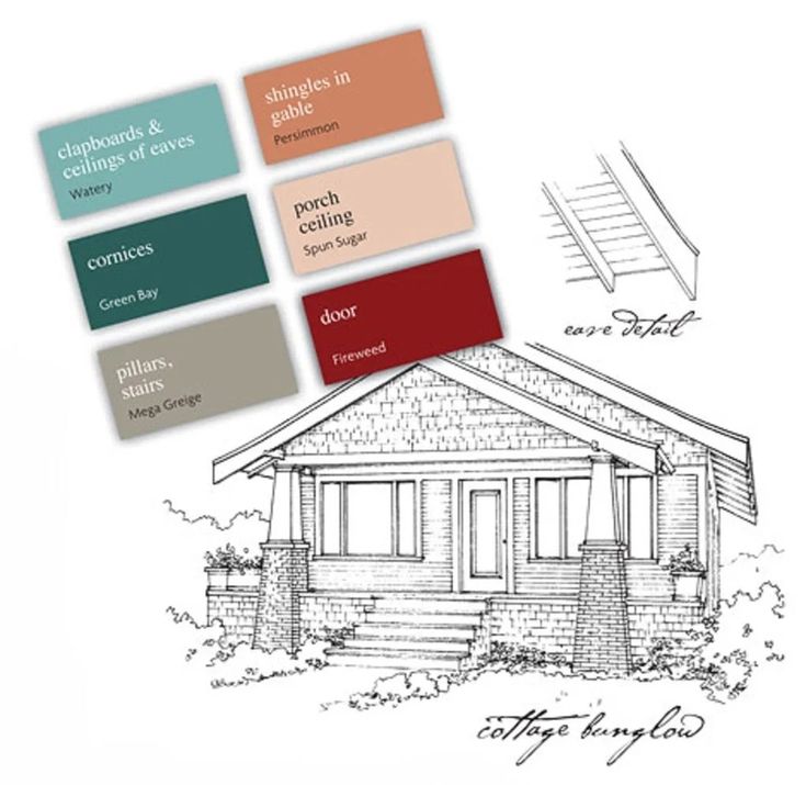
Essentially you’re swapping the accent shades. Follow the example of this space and use metallics and dark wood as the constant between the two floors too – consistency is the main element to making the whole house color scheme work.
8. A family of colors will create a coordinated scheme
(Image credit: Little Greene)
To create a truly cohesive feel, consider, use a family of colors in combination, as Ruth Mottershead, Creative Director at Little Greene explains:
‘Using shades from the same color family will work beautifully as a canvas for a coordinated palette of home furnishings whilst still adding design interest in a subtle way. A good palette to utilize is the Little Greene "Color Scales " collection.
'Our most popular colors sit within families of four graduated tones, made using the same pigments, but in different strengths. Masquerade, for example, appears alongside Masquerade Light and Masquerade Mid; these Color Scales of the earth-pink offer graduated tones.
'These groups of colors are a timeless choice if you are looking for soft, neutral tones to provide natural movement throughout the home. They are easy to use in combination on walls, ceiling and trim as well as providing a seamless color journey from room to room. In addition, the use of the related two strong colors at the bottom of the Color Scales color card allows for highlight and texture to be created without fear of discord.’
9. Whole house color schemes can be adjusted to suit the mood a room you wish to create
(Image credit: Sofa.com)
Set the tone for your whole house color scheme by painting every single wall in your favorite color. Use shots of subtle color and bolder accents elsewhere to enhance the mood and impact as you wander around.
A whole house color scheme need not be dull or boring. Here, a dramatic inky blue is a bold choice and one that you shouldn't hesitate to recreate if you dare.
10. Use whole house color schemes to integrate forgotten spaces
(Image credit: Edward Bulmer Natural Paints)
See: The 60-30-10 rule – and how to use it to balance a color palette
We often neglect the most used areas – the entryway, the hallways and landings – but this is where whole house color scheming comes to the fore. Linking spaces together is integral to this look and you can see how beautifully it works here – the hallway paint color is used in the living space and beyond, too.
Sophie has been an interior stylist and journalist for over 20 years and has worked for many of the main interior magazines during that time, both in-house and as a freelancer. On the side, as well as being the News Editor for indie magazine, 91, she trained to be a florist in 2019 and launched The Prettiest Posy where she curates beautiful flowers for modern weddings and events. For H&G, she writes features about interior design – and is known for having an eye for a beautiful room.
Color schemes in the interior: 75 photos of rooms
The color scheme of the interior is no less important detail than the choice of style and materials for decoration. Colors are able to transform the room beyond recognition, not only the harmony of decoration, but also the mood of the people in the room depends on the correct selection of the range. When selecting shades, it is necessary to take into account the purpose of the room and even the location of the windows - the amount of sunlight greatly affects the perception of tone.
Room design color scheme
Combination of white and blue in the interior
Content
- 1 Classification of colors
- 2 Possible combinations
- 3 Using shades in design
- 3.1 Red
- 3.3 Green 3.5 Aquamarine and Gologa Blue and Blue
- 3.8 Violet
- 3.9 Lilac
- 3.10 Pink
- 3.11 Black and white
- 11.1 See also
Color classification
Globally, the entire spectrum is divided into two large parts - warm and cold. nine0003
- Warm include red, orange, yellow, violet with predominant red, as well as all derivatives. Some varieties of green also belong to the summer half of the spectrum, it is easy to understand this by the presence of an admixture of yellow. In places with little natural light, choose finishes and accessories in a warm spectrum.
- All types of blue and light blue, turquoise, lilac, etc. are considered cold. At the same time, the cold group is best used in the interiors of rooms facing south. There is always a lot of light in them, and in summer cool colors can refresh the design. But for the northern premises, you do not need to select blue or light blue as a finish, especially in combination with snow-white. Such a combination will look lifeless. nine0012
It's also important to know about visual effects. Objects painted in summer colors visually appear closer in contrast to objects of a cool spectrum.
Black and white bedroom interior
Bedroom in white
See alsoDoor color in the interior: match the floor or walls?
Possible combinations
The color scheme of the interior can be chosen in contrast or vice versa, you can get by with a more calm, nuanced one. In the first case, shades that harmoniously combine, but at the same time are at opposite ends of the spectrum, predominate, for example, pink and turquoise, red and green, etc. With a nuanced combination, colors from the same group are selected, for example, several types of green. nine0003
Selected combinations can influence the perception of space. Contrasting, especially black and white, will visually make the room smaller, so they are only appropriate for large areas. In this case, there is no need to choose many colors, two or three are enough for the background. Too bright and colorful combination will quickly tire your eyesight.
Room design in light colors
See alsoJapanese style in the interior in a modern interpretation
The use of shades in design
When choosing a color scheme, it is also necessary to focus on psychology - it is known that different combinations can affect mood. What effect can different colors have?
See alsoSwedish style in the interior: 10 rules of the Swedish environment
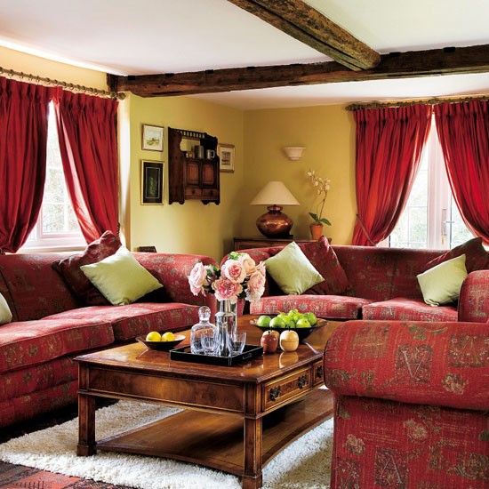
Red
The first associations that come to mind are energy, passion, aggression, strength, fire. Scarlet is very strong emotionally, in large quantities it is not appropriate. It is best used as accents - in accessories. Red is good when active pastime is meant. This is an excellent choice for the living room, but it is contraindicated in the recreation area and children's rooms. Of all the styles, scarlet is the best for the avant-garde, but even then it is hardly used as the main one. It is not recommended to combine with orange. nine0003
Bright room design
Dark colors in the interior of the living room
See alsoLoft style in the interior of a small apartment
Yellow
Associated with summer, sunny days, joy. It is most successfully combined with emerald, looks good with lilac, gray, blue, snow-white. But with scarlet or carrot, it should be used extremely carefully, such a tandem is too bright and active. Golden varieties of yellow are suitable for any style, but you should be careful when using its pure variety, the brightness will strain your eyes. In residential buildings and apartments, it is better to choose softer options - golden, ocher. nine0003
See alsoCombination of gray with other colors in the interior
Green
Symbolizes health, life, spring, nature as such. It has many varieties, each of which has its own characteristics. The most famous are salad (green with a clear admixture of yellow), emerald and aquamarine. Salad is most associated with lightness, early spring and carefree joy. This delicate shade is suitable for most styles, but in this case, too saturated varieties should be avoided. nine0003
Color solutions in the interior of the living room
Light bedroom design
See also Dark floor in interior design
Emerald
Beautiful rich tone, calm and soothing. Thanks to these properties, it is well suited for areas intended for work or leisure - home office, library, bedroom. Good for almost all styles.
See also Psychology of color in the interior
Aquamarine
It is closer to the blue spectrum, reminiscent of the sea and cool wind. Due to the obvious admixture of blue, it can cause a drowsy mood, so it must be used very carefully in an office or hall. But the bedroom is the perfect place for blue-green. nine0003
The combination of light green and purple in the interior of the kitchen
See alsoCombining blue with other colors correctly
Blue and blue
Calm palette, first of all, evoking associations with the sky and the sea. Blue-blue colors are suitable for a recreation area and a nursery. It goes well with white, amber, honey, gold, orange, emerald, gray.
See alsoDesign of a one-room apartment 30m2. Basic Principles
Brown
Is a symbol of the earth and trees, is considered neutral, combined with almost everything. Light brown and beige are great backdrops for any decor. Do not overdo it - such a base must be diluted with more saturated tones, otherwise it risks becoming monotonous, especially for beige.
Beige interior color
Bright room design
See also Advantages and disadvantages of wood surface finishes in the interior
Violet
Creates a mystical atmosphere, but is highly discouraged for apartments due to the fact that it causes depressive moods.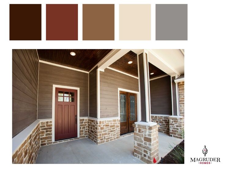 Violet must be chosen very carefully and only in small quantities.
See also Fresh interior design ideas for small apartments
Lilac
A softer version, however, and you shouldn't get carried away with it too much. Lilac is good for bedrooms, but in the hall, nursery or kitchen, it should be used with caution. nine0003
Pink
Light and delicate, but some varieties such as fuchsia can be very aggressive. Hot pink can be chosen for the living room, but pastel varieties are suitable for the recreation area and children's rooms. Combining with orange is highly discouraged, the resulting tandem is too bright and psychedelic.
Combination of white and red in the interior
Beige color in the interior of the living room
Black and white
The most versatile yet controversial duet. Both black and snow-white are combined with any shades, but are used only as additional ones. Black in the form of the main one is too gloomy and depressing, and white will turn the dwelling into a hospital ward. You can also use them at the same time, but this is a very risky step. You should follow the proportions and avoid the 50/50 ratio, it looks too sharp. nine0003
It is important to understand that associations are purely individual. The abundance of lilac drives someone into melancholy, but on the contrary, someone will like it. Choosing the color scheme of the interior, it will be correct to be based not only on the generally accepted rules of combination, but also on your own taste and perception.
Bedroom in bright colors
Dependence on cardinal direction
As already mentioned above, the choice of combinations also depends on the cardinal direction on which the windows face. The reason is the amount of natural light, in other words, insolation. This greatly affects the physical and mental state. Dark and gloomy apartments, where the sun's rays practically do not fall, cause discomfort, fatigue, drowsiness, they overlook the west and north, this must be taken into account when choosing a color scheme. nine0003
On the north side, amber, honey, red, peach, golden beige are appropriate. These colors are associated with warmth, which is so lacking especially in winter. Turquoise, mint, lilac, gray, indigo, blue and white are not the best choice, as they will visually make the interior even cooler.
The eastern rooms are always well lit, especially in the morning. Both warm and cool colors can be used in the design, but it is important to avoid pale pastel shades. Due to the fact that in the evening there is no sun on the east side, they will look faded and dirty, acquiring a grayish appearance. nine0003
Blue bedroom interior
Dark bedroom
There is always a lot of sun on the south side, even in winter. It is always warmer and hotter here, so the cold spectrum can be a real salvation. Turquoise, aquamarine, mint in different proportions can create a feeling of coolness. At the same time, if saturated colors are more appropriate in eastern apartments, then in southern apartments, on the contrary, try to choose pastel options for decoration.
For apartments with west-facing windows, warm colors are suitable. Since there is little light in the west during the day, dark colors should be avoided, as well as pink and lilac - they will appear gray and faded in the absence of sun. As a last resort, when using such a finish, take care of high-quality artificial lighting. For finishing on the west side, you need to choose colors with great care, since the slightest miscalculation can turn a beautiful design into gray and faded. nine0003
Bright room interior
Light green color in the interior of the kitchen
Recreation area
Since this space is intended for sleeping and daytime relaxation, the color scheme of the interior must be appropriate for the task. It is best to choose calm colors, both warm and cold. Too bright tones, as well as black and purple, there is no place even as accessories. Be sure to pay attention to lighting. On the north or west side, warm colors are more appropriate, while on the south side, cool. nine0003
With the help of color, you can not only correct lighting imperfections, but also slightly change the visual perception. Light combinations visually expand the room, while dark and saturated ones make it smaller. The same effect from contrasting finishes and furniture.
Light colors in the interior of the room
Kitchen furniture
First of all, it is important to understand what function, besides cooking, is assigned to this room. How often do you go into the kitchen, cook at home, invite guests? Is the kitchen combined with the hall or is it isolated? Is she big or small? The further design of the kitchen depends on the answers to these questions. nine0003
In small kitchens, it is preferable to use light combinations - vanilla, milky, beige, light gray, mint, soft pink, etc. But in large rooms, and especially studio apartments, you can use brighter and more contrasting options. If the kitchen area is combined with the living room, it can contrast with it, or be in harmony.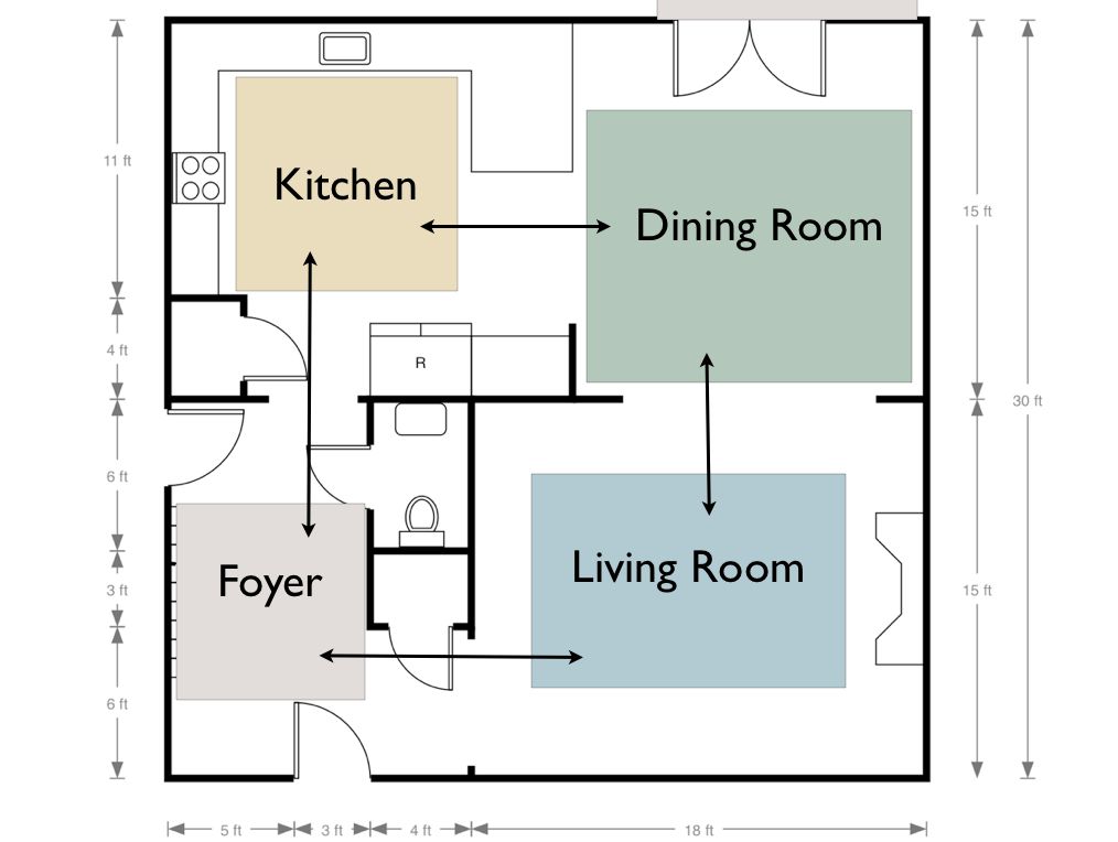 The contrast is convenient if you need to visually distinguish between the kitchen space and the living room.
Color combination in bedroom interior
nine0002 Room interior in black and whiteHall decoration
Most often this is a room where a lot of time is spent every day. Here the family gathers in the evenings, gatherings with friends and family dinners are also arranged here. For this reason, the selection of a palette should be approached with the greatest seriousness.
- In spacious rooms, you can safely embody any combination. In such a room there may be more than 3 colors, a larger number is more difficult to combine with each other. nine0012
- The use of dark colors is appropriate for hi-tech or minimalism, but in classic interiors, light colors look much more harmonious.
- If light combinations are chosen as the basis, it must be diluted with bright details to refresh the decoration. It can be furniture, such as a carrot sofa against beige walls, or accessories such as curtains, vases, photos and paintings, sofa cushions, bedspreads, etc.
Hall decoration
nine0002 The corridor is a windowless place, so the palette here is very limited. The hallway is also rarely impressive in size, so white or beige are most appropriate. If desired, you can choose azure, green or yellow, but then the electric lighting must be flawless. In cold white light, a bright palette will appear darker, while golden lamps hardly distort them.Room interior in light colors
Bedroom in bright colors
Bright purple color in the interior of the kitchen
Bathroom decoration
For the bathroom, snow-white, rich turquoise, azure and light varieties of blue in different combinations are considered traditional. The nautical theme and everything connected with water fits most organically into such decoration. However, you can choose an original solution, for example, combine red with snow-white. Such a choice will look stylish and unusual.
Video: Color solutions in the interior
50 photo examples of color schemes in the interior of the apartment:
style and character of the whole house or apartment
10/01/2019
0 Comments
The living room is the most visited place in the house or apartment. The whole family rests here in the evenings, guests and unexpected visitors are received here. Therefore, the choice of color in the interior of the living room determines the whole character of the house or apartment. An ideal living room should be functional, comfortable and harmonious at the same time, not annoying with flashy colors and not be faceless. nine0003
Factors affecting color choice
The choice of colors for the living room is influenced by many factors: the size and illumination of the room, the design style of the hall and the house as a whole, the taste preferences of the owners (and the designer), the colors, shapes and textures of the furniture.
Dimensions and shape of the living room
The dimensions and height of the common room directly affect the choice of colors for the walls, ceiling and floor. Traditional advice is appropriate here: for small rooms, you should use light colors that visually increase the volume. Black, chocolate, dark blue, purple, burgundy tones make the room visually smaller. nine0003
In compact and low living rooms, a glossy ceiling will be very appropriate - it adds height to the room.
Spacious rooms give more space to the imagination of homeowners - the choice of colors and shades for decorating the living room is much wider.
To choose the decoration of the living room, the location of the room in the house or apartment is no less important. An enclosed space with a door allows for a more creative finish. Open placement, when the hall is one with the dining room, hall, hallway, implies a common style and color scheme for all rooms. In open living rooms, it is usually not used to paint a large surface in one color, especially dark. A combination of several colors and / or textures would be more appropriate. nine0003
The monochrome solution of the walls visually enlarges the room. In current design solutions, a combination of several wall colors or textures in one room is very often used.
Lighting
The natural illumination of the room depends on which side of the world the windows of the living room face. North windows give a little light, so it is better to choose warm shades: beige, chocolate, peach, orange, coral, lemon, yellow, pink. nine0003
The southern windows give bright light, and you can choose cool colors in the room: blue, blue, gray, turquoise, white, mint. For a living room with western windows, a cold color scheme is also more suitable.
Colors are perceived differently in natural and artificial lighting.
Color specification
White is becoming more and more popular. Initially, neutral white blends well and effectively emphasizes any color accents, decor elements, furniture, textiles. White has many shades. A room in white tones will always look flooded with light, clean and gentle. Depending on partner colors, décor, textiles and lighting, a white living room can look warm or cool. But light or white furniture, white carpet, curtains will give the room a somewhat cold and distant look. nine0003
Black color looks very stylish and extravagant, but visually reduces and darkens the room. Sometimes it acts somewhat depressingly, requires bright lighting. It is better to use it for individual design elements or to highlight part of the wall, rather than paint over the entire room with black paint. The black gloss on the ceiling looks interesting - the reflection of the room adds volume to it, no matter how paradoxical it sounds. Black is combined with all colors, but it is better not to choose caramel, pink, beige, lilac, peach as partners. nine0003
Everything that has been said about black belongs to the noble shades of dark chocolate. But it is better to combine chocolate shades with white, beige, cocoa with milk, cherry. Brown colors - chocolate, cocoa with milk, light brown, coffee - require competent lighting, in the twilight all the charm of these colors is lost.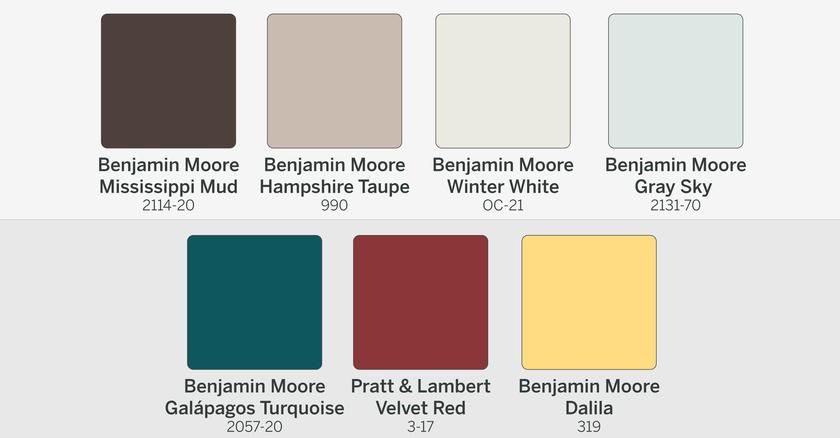
Green, pistachio and salad colors have a calming effect on the psyche and relax - there is an association with green vegetation and nature. For dark shades, it is necessary to provide bright lighting. The optimal partner for green and salad shades is yellow and lemon. Olive and marsh colors should be used with caution, preferably in partnership with white. nine0003
The warmest colors are yellow, peach, light orange. The living room in these colors seems warm, cozy and sunny. This is the best choice for a room with windows to the north. Yellow and peach do not go well with red, cherry, black furniture. Optimal partners are natural wood browns, beige, green, ivory, dark orange and terracotta.
Red color is the brightest, exciting, active. And aggressive - it is uncomfortable to live in it. It is better not to use it for the entire room, but to highlight individual sections of the wall with decor. It is better to muffle the brightness of red with a combination of gray, beige, white walls, furniture, textiles. nine0003
A more refined and muted shade of red is coral. But it is better to use it in doses. The same applies to dark orange, terracotta.
Cherry blossom has long been the color of luxury. Especially when combined with gold. It will warm the room and serve as a wonderful backdrop for light-colored furniture, curtains, carpets. It is possible to use furniture in "palace" styles - natural lacquered wood, carving, gilding, inlays. Requires bright lighting. It does not go well with black, orange furniture or high-tech items. nine0003
The same can be said about emerald and blue colors combined with gold.
But all shades of blue and blue (boring faded blue does not count) are gaining more and more popularity. The white and blue gamma simply does not go out of trend. To soften the contrast, bright accents are used: red, coral, yellow, orange. Blue and blue shades are great for high-tech style.
Increasingly, purple and lilac colors are used. That's right - combine purple walls with white or light-colored furniture, light purple textiles. Companion colors - white, beige, light coffee, gray, lilac, light purple. Looks great, but the purple space is not very suitable for families with small children. Purple living room requires bright lighting. nine0003
Another trend among modern designers is light gray. A discreet neutral color is not as cold and easily soiled as white, and at the same time it is combined with any color and favorably emphasizes all design delights, furniture, decor, textiles.
Family and living room color
In many ways, the color scheme of the living room is determined by the composition of the family and the characteristics of family pastime. For a couple without children or with teenage children, a creative design of the hall would be more appropriate: bright or dark colors, non-traditional catchy design, high-tech style, loft, etc. nine0003
For a family with young children, neutral warm tones and a small amount of aggressive colors are preferable. Children will be uncomfortable in a black or coffee room, and parents of children in an exciting red one. For a family of three generations, a calmer color scheme of the common room and a traditional design are more suitable. The main thing is that all family members do not feel discomfort and can fully relax.
Interior styles
The style of the living room determines the color. Some styles simply dictate the use of certain colors. So, hi-tech requires cold, soft shades (possible with bright accents): gray, white, blue. Loft - almost always white or brick (terracotta) walls, or a combination of both. Rustic style, eco-style require the use of wood, white and beige. Provence - muted beige, pistachio, olive shades.
For modern styles, more saturated colors are used, often only one wall is painted in a bright color. For a classic style, muted beige, salad, blue, lemon shades are used. nine0003
Any renovation starts with an idea.