1930S interior design
How the 1930s Changed Interior Design As We Know It
Skip to main content
Set designer Cedric Gibbons designed this house in 1930 for himself and Dolores del Río in Los Angeles.Photo: George Hurrell / Courtesy Bison Archives. © 2017 Marilyn F. Friedman
Architecture + Design
See firsthand the integral decade’s incredible impact on modern American interior design
By Stefanie Waldek
The 1930s in America were bookended by two of the most significant events of the 20th century: the stock market crash of 1929 and World War II. Despite these hardships, the decade was incredibly fruitful in terms of innovations across a variety of fields, from aviation to film to architecture and design—the last of which is tackled in a new book by design historian Marilyn F. Friedman. Making America Modern: Interior Design in the 1930s ($50, Bauer and Dean) examines more than 100 interiors by 50 designers, looking at the development of modern design over the decade. Even during the Great Depression, wealthy patrons à la Walter Annenberg, Abby Rockefeller Milton, and William Paley commissioned modernist design works, breaking away from the typical revivalist styles that were popular up till this point. This new American design aesthetic, which championed practicality and simplicity over ornateness, quickly permeated the industry, setting the tone for the rest of not just the decade, but the entire century. Here, we dive into the book to take a look at some of the seminal interiors of the 1930s.
This book is available for preorder on amazon.com. It will be published in April 2018.
The dining room at the New York City home of David and Abby Rockefeller Milton was designed by Donald Deskey in 1933.
Photo: Courtesy of the Cooper Hewitt, Smithsonian Design Museum. © 2017 Marilyn F. Friedman
Many interiors made their debuts at expositions, like this Gilbert Rohde–designed living room, which was on display at Design for Living at the 1933 Century of Progress Exposition in Chicago.
Photo: Courtesy Chicago History Museum. © 2017 Marilyn F. Friedman
Rudolph Schindler designed this living area for Stephanie and William Oliver in their Los Angeles home in 1933.
Photo: Axel Fog / Courtesy University of California, Santa Barbara; Architecture and Design Collection; Art, Design & Architecture Museum. © 2017 Marilyn F. Friedman
Russel Wright designed this model room at Bloomingdale’s in New York City in 1934.
Photo: Courtesy Syracuse University; Special Collections Research Center; Syracuse University Libraries. © 2017 Marilyn F. Friedman
This 1936 rendering by Kem Weber shows the living room in the Kansas City, Missouri, home of Angeline and Walter Edwin Bixby Sr.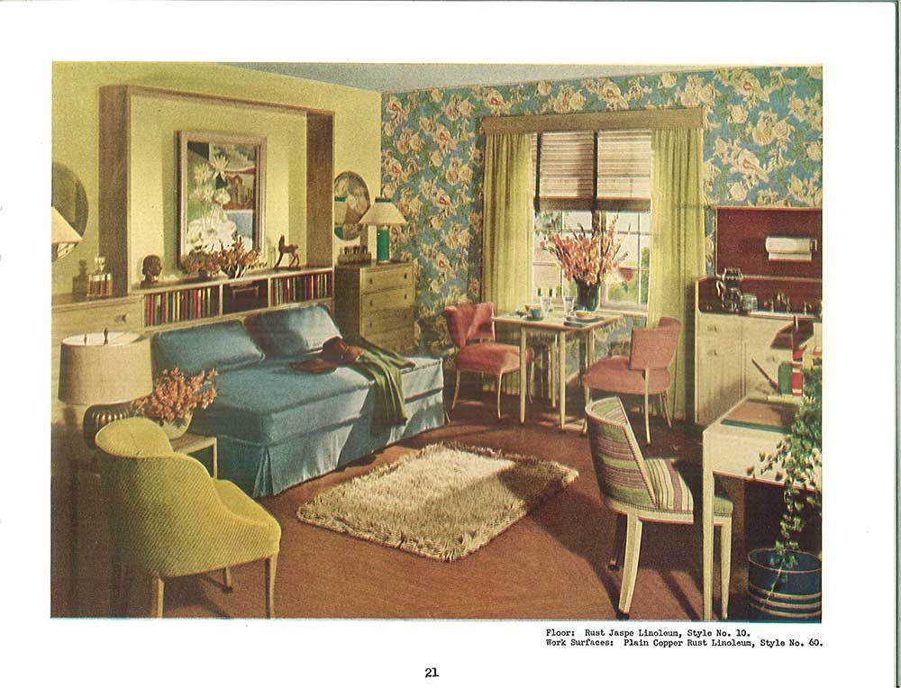
Photo: Courtesy University of California, Santa Barbara; Architecture and Design Collection; Art, Design & Architecture Museum. © 2017 Marilyn F. Friedman
In 1936 Eugene Schoen designed this living room for Gwendolyn and Morris Cafritz in their home in Washington, D.C.
Photo: Courtesy Cafritz family. © 2017 Marilyn F. Friedman
William Muschenheim designed this Parents’ Retreat, which was shown at the America at Home exhibition at the 1940 New York World’s Fair.
Photo: Richard Averill Smith. © 2017 Marilyn F. Friedman
ExploreArchitecture + design
Read MoreArchitecture + Design
Why Are We Still So Obsessed With Wood Shingles?
Explore the enduring legacy of this 17th-century cladding material and its benefits, and see how architects are using wood shingles in fresh ways
By Kyle Hoepner
45 Cool Photos of House Interiors in the 1930s ~ Vintage Everyday
For some, the 1930s were synonymous with Art Deco. Though Art Deco was a significant trend in ‘modern’ design, it was by no means the only style.
| House interiors in the 1930s |
Deco is generally applied design, very geometric, and highly stylized. Contrast that with the most prevalent style, Colonial, which was based on early American traditional details and elements.
There was a tension between the emerging Modern styles and the traditionalists. There were many articles written from the late 20s to WWII assuring home decorators that Modern really wasn’t a ‘fad."’
Though modern styles were there to stay, it took a full twenty years for them to be accepted into the mainstream.
Here below is a set of cool photos from Rikki Nyman that shows what house interiors looked like in the 1930s.
| 1930 Armstrong linoleum - English revival style |
| 1930 bathroom |
| 1930 crane bathroom |
| 1930 crane kitchen |
| 1930 fenestra casement window |
| 1930 living room |
| 1930 sun room by Armstrong |
| 1931 Armstrong sunny yellow kitchen |
| 1931 bathroom |
| 1931 kitchen |
| 1931 Sealex Veltone linoleum in the living room |
| 1933 bathroom |
| 1934 “modern girl's” bedroom |
| 1934 imperial wallpaper |
| 1934 Sealex kids' room |
| 1934 yellow kitchen by Sealex |
| 1935 Armstrong kitchen - Asian theme |
| 1935 Armstrong kitchen |
| 1935 kids' room |
| 1935 modern Armstrong kitchen |
| 1935 modern living room in neutrals |
| 1936 deco bedroom - white & purple |
| 1936 key lime living room |
| 1936 kitchen with linoleum counter |
| 1936 middle class bedroom |
| 1936 pink polka dot kitchen |
| 1936 Westinghouse kitchen |
| 1936 yellow Armstrong kitchen with geraniums |
| 1937 bathroom - Carrara structural glass |
| 1937 deco blue bedroom |
| 1937 Carrara glass bathroom - Art deco streamline |
| 1937 green & rattan family room by Sealex |
| 1937 Johns-Manville art deco bath |
| 1937 kitchen with a sink to wash the dog |
| 1937 living room |
| 1937 modern Congoleum kitchen |
| 1937 modern deco bath in red |
| 1937 modern living room |
| 1937 modern sun room |
| 1937 Sealex modern kitchen |
| 1937 Sealex red & white kitchen |
| 1938 Armstrong kitchen |
| 1938 Armstrong multipurpose room |
| 1939 kitchen by Pabco |
| 1939 mid-century modern den |
Apartment design in the spirit of the 1930s
Apartments
Living room.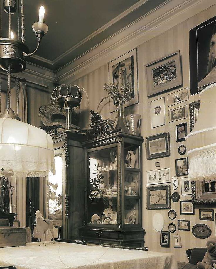 Laconic plaster molding in the spirit of the 1930s, Peterhof workshop. Chandelier, Jonathan Adler. Floor lamp, Rubn. Sofa, Ostend. Coffee table, Bonaldo. Armchairs, Dantone. Chest of drawers for equipment, Crate and Barrel. Mirrors in brass frames repeat the pattern of interior doors, made according to the sketches of architects in the Likmet workshop. Paints and textiles, Manders company.
- Photo
- Rositsa Pereslavtseva
“In a word, there was nothing to save,” architects Pavel Zheleznov and Tatyana Borisova say. “Especially since the customer’s requirement was to maximize perspective views and ensure that the interior echoes the facade of the building.”
Canteen. Table, Moooi. Armchairs, Dantone. Buffet, Crate and Barrel. Chandelier, Vibia. On the wall is a scarf "Tractor Driver" by Olga Nikich.
- Photo
- Rositsa Pereslavtseva
In search of samples of historical stucco and window designs, Tatyana and Pavel looked into neighboring entrances and miraculously survived old windows. Without setting themselves the goal of making a complete historical reconstruction, they tried to create a feeling of an interior with history.
Hall. The console is made to order in the Likmet workshop. Table lamp, Oluce. Satellite chandelier, Lamps of 50 60 70s gallery. Doors, windows and joinery, Ancon company.
- Photo
- Rositsa Pereslavtseva
“It's as if people have been living in it all this time,” Tatyana specifies. - The modular parquet was made of oak - like in old Moscow houses. Replace it with a walnut and immediately get an American accent. Notice how the color of the floor blends into the baseboard and further into the door architraves, creating a contrasting contour.”
Architects Tatyana Borisova and Pavel Zheleznov.
- Photo
- Rositsa Pereslavtseva
The customer likes the idea of creating a single space in the living space.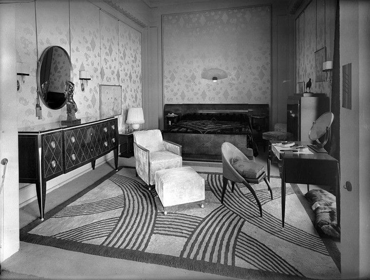 Therefore, in an apartment of 92 square meters, almost all doors are glass. Even the bedroom adjacent to the living room was no exception. Doors with deglazing and transoms to the ceiling in the spirit of the 1930s are made according to the sketches of the architects.
Kitchen Windsor, Nolte. The shelves are made to order in the Likmet workshop. Ceiling lamp Frisbi, Flos.
- Photo
- Rositsa Pereslavtseva
Especially for the bedroom, they created a panel, in the pixel art of which the silhouettes of "Skiers" from A.A. Deineki 1926 years old
The marble window sill is Vasily the cat's favorite place.
- Photo
- Rositsa Pereslavtseva
“The owner has excellent taste. Some of the items are a tribute to his love for the American classics, something is made to order, the vintage was brought from Italy.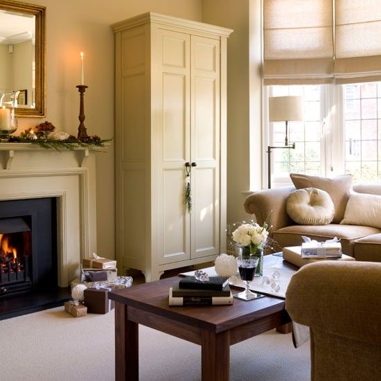 In combination with modern design objects, they create the effect of a lived-in space.
The kitchen terrace was tiled with terracotta tiles in the spirit of Italian patios. Here the owner gladly grows flowers and parsley. Parquet, Finex.
- Photo
- Rositsa Pereslavtseva
And if at the beginning of the work the customer was afraid of saturated colors, in the end he preferred the brightest of all the proposed options. The final shades for the walls were already chosen at the construction site, when everything was ready. This is a very subtle point.
Bedroom. Bed, Dantone. Chandelier, Arteriors Home. Table lamps, Rubn. The art panel was created by architects based on the painting by A.A. Deineka "Skiers" 1926. Bookshelves are hidden behind the flaps.
- Photo
- Rositsa Pereslavtseva
After all, we needed this turquoise and this particular blue — bright, but at the same time masculine and very Moscow. ”
”
Bathroom. Lamp, Rubn. Mirror and shelving made to order. Sink, Duravit. Faucet, Axor. Tiles, APE Ceramica. Stone countertop by Unizaro.
- Photos
- Rositsa Pereslavtseva
Tags
- Design of small apartments
- bright
- Moscow
- traditional
- 60-120 sqm
- archive
- blue
Chapter 5
Design and society
Established in the 1920s. The design industry has changed. High ideological demands were made on the objective environment - it had to educate a class feeling, induce action, create a feeling of joy and elation, i.e. carry out propaganda and political functions. These requirements began to be implemented on the basis of the classical heritage of order architecture and ornamentation.
In the 1930s design developed in three main directions: the design of new technology, design art and amateur technical creativity and invention.
The design of industrial products and means of transport was subject to the world laws of technological development. In the USSR
, the first all-Union standards for component parts were introduced, and the technology of stamping and volume molding was widely introduced. In addition to calculating structures for strength, engineers began to take into account aerodynamic drag. Plastics (bakelite, celluloid, plexiglass) and new decorative metal protective coatings (chromium and nickel plating) began to be used not only in aviation, automotive, electrical engineering, but also in household appliances, lamps, and furniture.
In the pre-war years, in a number of industries and design bureaus, groups were formed that successfully solved design problems to create unique samples and for mass production (Metrostroy, TsAGI, ZIS, as well as teams involved in the design of
| Chapter | 5. | Soviet | design | 1930s |
| 187 |
by the Palace of Soviets). And although most of the work was done by architects, they needed professional designers to create specific equipment, lighting fittings, and so on.
At the turning point of style
Early 1930s the construction of some buildings according to the projects of the 1920s was completed. At that time, the inertia of style formation, characteristic of functionalism and constructivism, was still preserved in design, based on playing with simple geometry, structure, contrasting ratios of colors and textures. An example of this kind is the equipment for the building of the editorial and printing plant of the Pravda newspaper, built according to the project of P.A. Votes by 1934
For editorial premises and printing house A.I. Damsky, a graduate of the metfaka of VKhUTEMAS, has developed functional lamps with a changing lampshade angle, for staircases, foyers and halls - original light sculptures made of milky glass: a ball hanging on a chain near a mirror, as well as a flower-like structure of six sheets with curved edges.
Some universal lamps, designed by Damsky in the All-Union Electrotechnical Association, were produced in mass editions. A table lamp with a stamped metal shade of complex curvature was produced almost unchanged until 1960s In each institution one could find a glass ceiling lamp "Lucetta", the shape of which consisted of two truncated cones. A more elegant version was equipped with a metal rim. In subsequent years, Damsky designed chandeliers for the metro and high-rise buildings. Works of the mid-1930s. already belonged to a different style system. Secondarily, the designer changed his style in the late 1950s, when, having abandoned the embellishments of the “Stalinist Empire” era, Russian design returned to the mainstream of the international style.
The style of the interiors and furniture of the editorial premises of the Pravda plant can be defined as "plastic constructivism" (Fig. 49). There is a hint of streamlining in the shapes of chairs, sofas, even tables and bookshelves. The chairs were designed
188 Part IV. At the origins of functionalism. Modernism and development
design...
Fig. 49 N. Borov, G. Zamsky,
V. Young. The interior design of the editor-in-chief's office for the Pravda plant. 1934
on a metal or wooden frame, the curves of which connected vertical and horizontal surfaces. The professional press rated this project positively, but the first comments about formalism and following Western models were already appearing. “In general, the project is an undoubted achievement by virtue of the very formulation of the problem of a holistic architectural and artistic design of the interior of a huge plant. At the same time, it should be noted that the project is somewhat connected with traditional modernist clichés, which unfortunately slow down the work of the brigade”1, the author of a critical article about the interiors of the plant concluded.
The publication of works close in spirit to constructivism or functional design actually ceased after 1934. Most of the same issue of the USSR Architecture magazine, which published interior designs for the Pravda plant, was occupied by neoclassical projects for the reconstruction of the Moskva River embankments, the building of the Communist university on Sparrow Hills. The article about the interior was illustrated with photographs of the 12th century palazzo. and Michelangelo's stairs in the Florentine Library. In art, a stylistic turning point has already been identified. At the First Congress of Soviet Writers on August 1934, Maxim Gorky spoke out with a presentation of the concept of socialist realism. Following literature, theatre, cinema, sculpture, painting and architecture, the interior of the Pravda plant also changed. 1934. No. 7.
P.29.
| Head | 5. | Soviet | design | 1930s |
| 189 |
zain - those of his areas that were associated with the interior, the design of books, posters and magazines, clothing and fabric. Any free surface now carried an ideological load - either in the form of an ornament of technical details, ribbons, stars, ears of corn and oak leaves, or in the form of joyful pictures of a bright life under socialism.
Sports, the Red Army, aviation, industrialization, the eradication of illiteracy and, of course, images of Lenin and Stalin were considered politically important topics in painting, sculpture and graphics, photography and cinema, textile design and porcelain painting. Artists showed a lot of ingenuity to translate the plot picture into the language of ornament. Some drawings for fabric turned into a propaganda poster, others, despite the ideological load, retained the accuracy and elegance, flatness and conventionality of images, indicating the assimilation of the experience of geometric constructive ornament in textiles 1920s There were even decisions that anticipated the ideas of op art in plot images. In the late 1930s, when ideological demands became even more stringent, it was decided to destroy the "politically harmful", "formalist" drawings and grind off the engraving on the rolls for printing the heel.
Metro
In the 1930s several large projects were developed, in which many artists, architects, decorators and designers were involved. First of all, this is the construction of the Moscow Metro, the All-Union Agricultural Exhibition, the design of the Palace of Soviets.
The Moscow metro was conceived as an exemplary transport system. Its design essence was considered in the demonstration drawings of 1931, where the connection between the metro and the city is outlined, the principle of the movement of passengers along the escalator, the location of platforms, entrances and exits are shown.
External attributes were given the same importance as directly architectural and construction works. Graphic artist L.A. Rappoport came up with a logo - the same letter M standing on two legs. Fashion designers developed several types of uniforms.0003
190 Part IV. At the origins of functionalism. Modernism and the development of design...
dy - for machinists on duty at the station, even for ice cream sellers in the subway. The stations, their decoration and construction were designed by many famous architects, among them A.N. Dushkin, I.A. Fomin, N.D. Colley, D.N. Chechulin.
The equipment of the stations included not only turnstiles or change offices, but also benches, book and flower kiosks, signs. This was done by the 12th architectural workshop of the Moscow City Council, at
|
| which interior designers also worked |
|
| workers of the Pravda plant. Kiosks and cash desks |
|
| were solved in "aerodynamic" style, |
|
| transport design specific |
|
| 1930s, rounded shapes, abundance of small |
|
| stainless steel attachments. In this style - |
|
| the leaflet read the image of the metro as technical |
|
| The ultimate system, all parts |
|
| which work like clockwork. |
|
| visual media and |
|
| communications (Fig. 50). It was necessary |
|
| not only show the scheme of the subway lines, |
| Fig. 50 | designate the places of transfers, but also choose ho- |
| Information stand | legible font, develop techno- |
| for the Moscow metro. | inscription production. |
| 1934 | Based on the design of Moscow carriages - |
|
|
Berlin metro model was taken, but instead of three doors, four were made, and the interior decoration of the seats and walls (type A car) was also changed. At 1940, artist-designer V.A. Stenberg, commissioned by the subway, designed the interior of a type G carriage.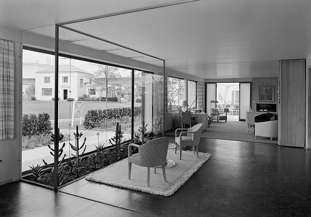 The cabin had comfortable soft leather sofas, rounded metal handrails, and hemispherical lamps. Armchairs were supposed to be placed not along the walls, but to arrange a kind of small sections, compartments, inside the car. In the future, the idea of a compartment was abandoned, but the outline of the handrails, the type of lamps, the pattern of the walls itself, the contours of doors and windows were preserved until the 1970s.
Transport design and aerodynamics
The Moscow metro influenced not only the world practice of designing underground transport, but also the character and appearance
| Chapter | 5. | Soviet | design | 1930s |
| 191 |
ground transport. A new type of Moscow trolleybus and tram was developed, and experimental buses with a "carriage" layout appeared. Based on a truck with a streamlined cab 1938, they began to produce the ZIS-16 bus.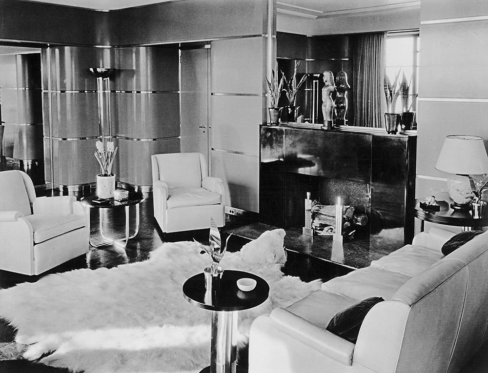 On the same basis, samples of specialized aerodynamically shaped vans for transporting products were created. Streamlining, swiftness also came to railway transport, where one or two passenger steam locomotives of the IS series with a streamlined casing and a railcar that ran between Moscow and Leningrad were built in one or two copies.
There was another trend in the design of technical products, related to decoration and symbolism. On some steam locomotives of the K-1 series of the Kolomna Plant, two sheets of iron carved in the form of a banner were attached to the sides of the boiler, and on the front part there was a gilded coat of arms of the USSR and a five-pointed star with a bas-relief of Stalin in the center. A more curious object is also known. One of the planes of the propaganda squadron "Maxim Gorky" belonged to the satirical magazine "Crocodile". According to the drawing by B.E. Efimov, engineers V. Ushakov and B. Shavrov modified the standard nose of the PS-9 aircraftTupolev’s designs, turning it into a crocodile’s head, and plates resembling a comb were reinforced on the fuselage.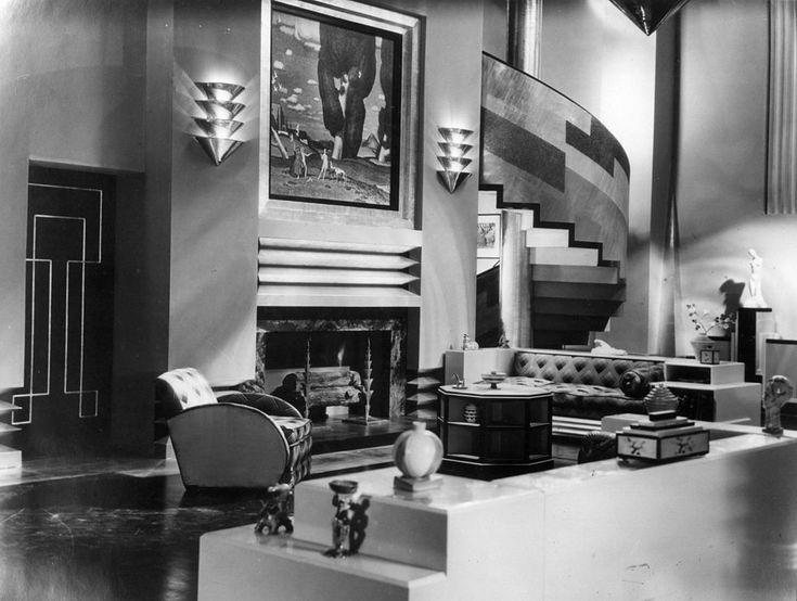
The ideological decoration of technology played a particularly important role during the festive demonstrations. The car was completely decorated with shields, turning into a platform on which objects with a symbolic content were installed (for example, a model of the globe with a clearly marked territory of the USSR, a statue of the leader), or athletes demonstrated their skills by creating complex pyramids.
Aerodynamic shapes begin to dominate experimental designs from the mid-1930s. Steam locomotives of the K-2 and B series with streamlined casings (designed by engineer D. Lvov), built in the late 1930s. in Kolomna according to the “2-3-2” scheme (two rollers in front, three large leading rollers in the center and two more rollers under the driver’s cab), seemed to be faster (and, possibly, eco-
1 -constructive approaches in transport design 1930s see: Antonov P.O. On the problem of the relationship between engineering thought and artistic image in transport design of the 1930s // Proceedings of VNIITE. Series "Technical Aesthetics". M., 1980. Issue. 23.
192 Part IV. At the origins of functionalism. Modernism and the rise of design...
nomic) than usual. There was, of course, a stylistic sense in the predilection for streamlined forms. Aviation in those years served as a symbol of progress. The swiftness and purity of the forms of aircraft tried to imitate designers who worked in various fields. Historians of technology testify that streamlining in aviation really appeared at 1933-1934 Nevertheless, several years before that, there were already experimental models of high-speed vehicles that were specially tested for environmental resistance in the TsAGI wind tunnel (for example, the balloon train engineer N. Yarmolchuk).
The appearance of aerodynamic forms was caused not only by fashion, but also by new technologies of volumetric molding, stamping, which are increasingly used in industry. From the design of frames and internal frames, designers and engineers moved on to shell structures. In the automotive industry, this is called "carrier body".
Virtually all mass-produced in the second half of the 1930s. types of cars were modifications of foreign analogues. GAZ A M-1 ("Emka") was a variant of the "Ford". Despite this, when finalizing the appearance, creating templates and stamps for surfaces of complex curvature, highly qualified engineers and artists were required (N. Borisov, A. Kirillov, I. German, V. Rostkov, D. Konanykin).
Late 1930s independent models appeared. Among them is a streamlined ZIS truck. Shortly before the beginning of the Great Patriotic War, the serial production of a small car, the KIM car (Communist Youth International), was mastered. The car designer - V. Brodsky - created a single sculptural body with recessed steps, streamlined contours. The gray color of the body and the general silhouette of the car reminded of the relationship with Ford.
The Pobeda became a symbol of post-war automotive design, a completely original and independent model, the design of which was completed in 1943. Experts believe that the artist V. Samoilov not only summed up the previous foreign and domestic development of streamlined forms, but also made an aesthetic discovery , creating a convincing teardrop-shaped silhouette of the car with wings almost completely recessed into the body. This silhouette was revived already in the 1980-1990s. in various modifications of cars with a hatchback body.
| Chapter 5. Soviet design in the 1930s. | 193 |
Unique objects: "Maxim Gorky" and OSGA-25
In 1934, newspapers published an appeal from writers to financially help build the giant propaganda aircraft "Maxim Gorky". It was proposed to transfer fees and savings to a special account.
The aircraft "Maxim Gorky" by design was a variant of the military transport aircraft ANT-20. The fuselage and wings were riveted from corrugated duralumin sheets. This technology did not allow making surfaces of complex double curvature. To increase power and increase lift, in addition to the available six engines designed by A.I. Mikoyan in the wings, two more were installed on the hull.
"Maxim Gorky" was filled with completely unique equipment, located on an area of about 100 square meters. m: an automatic telephone exchange, a portable printing house, pneumatic mail, a film projector and a folding screen measuring 4.5x6 m (when installed, it served simultaneously as a radio mast). It had its own film studio, not to mention the buffet, washbasins, showers, toilets.
Interior photographs show many of these technical details - telephones, radio, lightweight metal chairs. Even for tablecloths on the tables, graduates of the textile faculty of VKhUTEMAS came up with a special, “aviation” ornament.
The aircraft crashed during an air parade over Moscow in May 1936.
The second giant aircraft, built according to the same project, carried passengers along the Moscow-Yalta route before the start of the war.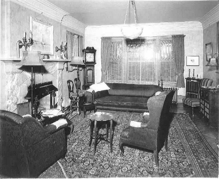
Back in the 1920s. under Avtodor, a voluntary society for promoting the development of motoring and improving roads in the RSFSR, a special design department for the construction of gliders and snowmobiles was created.
Mid-1930s under the supervision of the chief designer
V. Hartwig began designing a giant passenger glider-catamaran OSGA-25.
and VKHUTEIN graduate V. Meshcherin took part in the creation of the project. As a designer, he designed salons, armchairs, lamps, supergraphics, corporate identity elements, ticket kiosks. In the interior composition, the facings of the sections from which the ship was assembled were emphasized by vertical divisions. The armchairs were very dynamic in their appearance - the complex curve of the tubular metal frame seemed to swirl.0003
194 Part IV. At the origins of functionalism. Modernism and development
design...
Fig. 51 V. Meshcherin. Lateral view,
plan and sections of the OSGA-25 glidercatamaran.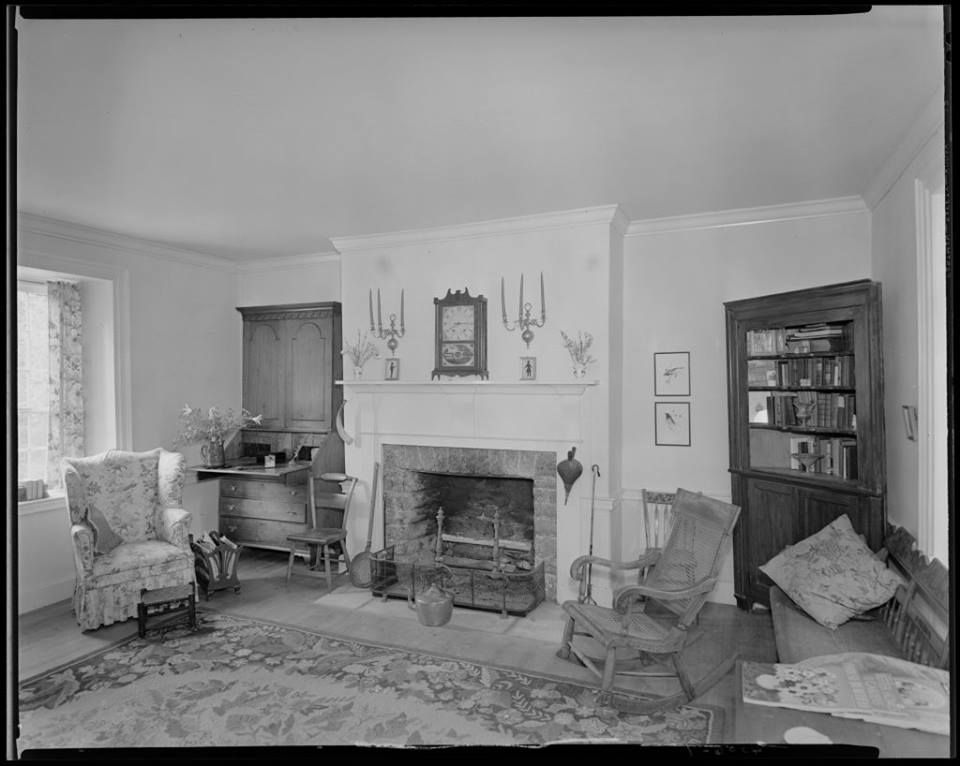 The chief designer of the vessel is V. Hartwig. 1937
rolled up and looped around the seats, creating a feeling of safety and security at the same time.
OSGA-25, despite its significant size (24 m long and 12 m wide), had a compact and solid shape. The designers managed to visually unify the complex structure of the catamaran, highlighting the observation room in the front part between the floats, where the bulk of the passengers were accommodated. Both the bridge and the floats looked like a single ensemble. The smooth parabolic line of the outlines of the upper deck began in the aft part and, as it were, covered the entire hull of the vessel (Fig. 51).
By 1938 the building was completed. The glider cruised on the Yalta-Sevastopol passenger line. It could carry up to 150 passengers at a speed of 80 km/h.
Life and urban design
In pre-war feature films, part of the action necessarily took place on the streets, mainly in summer, to show how beautiful the appearance of socialist cities is, how comfortable they are for life.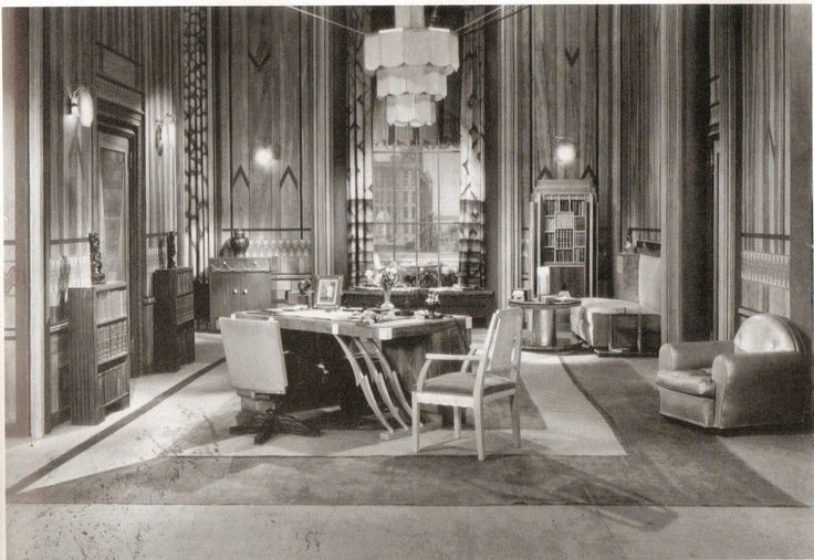 The urban environment was ideally presented as a park - with white wooden stages and pavilions in the form of classical architecture, benches and indispensable statues of girls with a paddle.
The desire of the city authorities to improve the city was realized by architects and designers in a series of projects for summer cafes with balustrades and canopies, separate exemplary projects for shopping kiosks.
5.
Soviet
design
1930s
]
95
cov. The design of summer cafes required a certain ingenuity, since the equipment had to be light, storable, and cheap.
Exhibitions of the second half of the 1930s show how designer works coexisted in an environment oversaturated with decorative and pictorial elements. First of all, we are talking about carefully prepared expositions at international exhibitions in Paris (1937) and New York (1939), for which expensive pavilions with sculptures on the roof were created - “Worker and Collective Farm Woman”, “Worker with a Star”.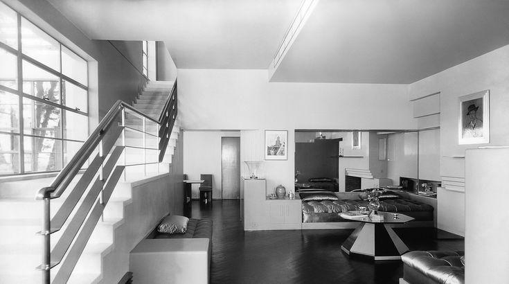 The interior decoration included all kinds of fine and applied arts: wall painting, stained-glass windows, mosaics, stucco bas-reliefs, giant photo panels, sculpture, ceramic vases, etc. Here, just like in Paris at 1925, there was a kind of unity of the exposition. However, the task was different - not so much to show a democratic functional slice of life, but to amaze the imagination with wealth and power. The inclusions of technology in these expositions were already of less importance than the façade itself. The design of the main exposition of the country, the All-Union Agricultural Exhibition, which opened in 1939 and underwent several transformations over its history, developed along the same path.
Youth fashion in the 1930s was formed under the influence of sports parades, sports and athletics and a sports complex of tests for the badge "Ready for Labor and Defense of the USSR" (TRP).
Despite the obvious achievements in the creation of unique objects, the profession of a designer in the 1930s.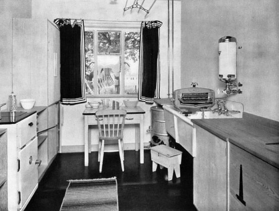 developed as if in a hidden form. The country knew the names of actors, writers, scientists, inventors, pilots, sometimes artists and architects, while designers remained in the shadows. They did not have their own professional organization like the Union of Artists, Composers or Writers. If in the 1920s there were informal associations (“The Constructivist Group”, the Left Front of Art, “October”, partly the designers collaborated with the association of architects “OSA”), whose members created original projects, developed directions for the development of design, then in the next decade the designers were dispersed and were forced to specialize for individual industries.
196 Part IV. At the origins of functionalism. Modernism and the formation of design...
Questions and tasks
1. Name the characteristic features of the style of the 1930s. in Soviet design.
2. What role did unique technical objects play in the history of Soviet design?
3. Analyze the features of the concept of urban space in the 1930s.
 Special place for


