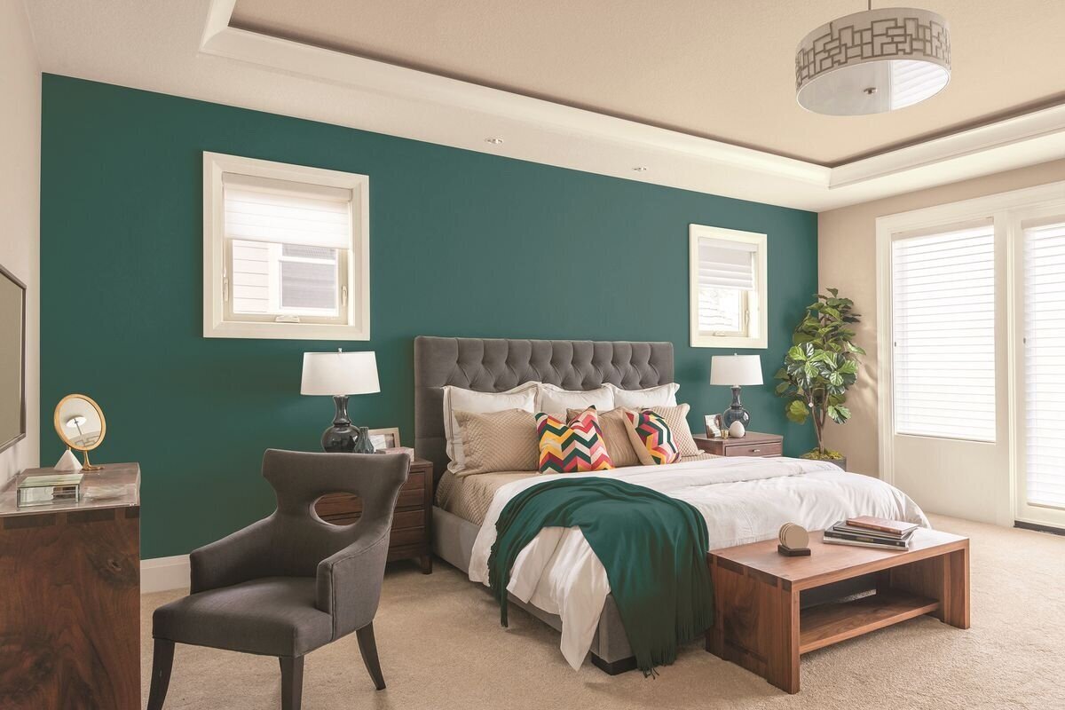
Whole house color
The Best Whole House Paint Colors (2022)
3.0K shares
Learn why choosing a whole house paint color can have a dramatic effect on the flow of your home, as well as what are the most popular whole house paint colors in 2022.
Choosing just one or two colors for your whole house can seem like a daunting decision. After all, whether you’re DIYing or hiring out, a lot of time and effort will have to be put into the task of painting.
Having gone the whole house paint color route when we moved into our current house, I’ve learned what types of colors work well with a variety of finishes, decorating styles and over all taste.
Conversely, I’ve learned from past mistakes, too. In our first house, I painted every room a different color… and it wasn’t a good look!
Setting the scene in your home with the right whole house color palette will mean that the paint color can serve as the perfect backdrop for the other elements in your home to really shine.
Before getting into the nitty gritty of selecting your perfect paint color for your home, take a minute to decide if you want to pick one color for every single space, or if your idea of a whole house paint color is one color for all the open spaces, such as kitchen, dining room and living room, and then a coordinating color palette for the bedroom, bathrooms and other spaces.
While the former is the easier route to go, the latter will still give you that same sense of flow but will add more contrast as you walk room to room.
Before Choosing a Paint Color
If you are painting your home before moving in, you may not quite yet understand how the light affects each individual room in your home. This can become a huge issue down the road if you pick the wrong color.
For instance, if you choose what you think is the perfect warm gray paint color for all the open plan spaces in your home, but only see the paint swatch first thing in the afternoon, you may be not so pleasantly surprised to see that same color looks baby blue first thing in the morning.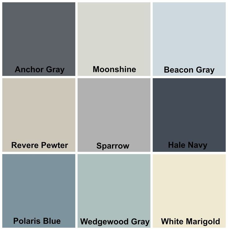
Room exposure (whether the room is north, south, east or west facing) can have a dramatic impact on bringing a paint color’s undertones to the fore.
If you can’t be in the house to see how the color changes and reacts throughout the day, it’s important to choose a paint color with as minimal undertones as possible (and that’s where I come in to help you!).
Undertones To Avoid
As a general rule, I usually recommend avoiding strong blue and yellow undertones when choosing a whole house paint color.
Blue can make spaces feel cold and drab, and while a drop of yellow can be a great way to warm up sterile whites, too much is usually not what most people want to see in their perfect paint color.
Don’t get me wrong – some of my favorite paint colors of all time have a strong blue undertone. They just aren’t colors I would rely on to work as a whole house color.
Blue undertoned paints are however perfect for bedrooms, bathrooms and any other space that’s closed behind a door – or where you know exactly how the lighting will affect the color.
Popular Colors For a Whole House
By far the safest colors to choose for a whole house are neutral paint colors or shades of white.
Both neutrals and whites come with their own set of challenges, of course. Figuring out the dominant undertone is always the main concern.
For this reason, I like to stick with warmer neutrals and warmer whites.
This way, any cool light will be offset by the warmer tones, and warmer lighting won’t completely wash out the color.
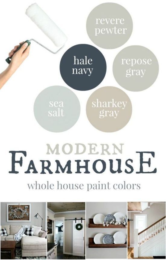
Neutral Colors That Are Great Choices
Sherwin Williams Repose GrayThis is my all-time favorite paint color because it just works everywhere! My entire main floor was originally painted Repose Gray, and I’ve since repainted and had the color lightened by 50%.
Repose Gray lightened by 50% with SW Pure White wainscoting.I am beyond obsessed with how light and bright it makes every room feel. It’s the perfect neutral backdrop with just enough warmth that no room ever feels cold.
While Repose Gray technically has a green/taupe undertone, I’ve found it to be barely visible. At full strength, you may see the green pull out of the shadows a bit, but nothing concerning at all.
Repose Gray lightened by 50%At half strength (lightened by 50%) those same undertones are what keeps just enough warmth in the color, but no longer become apparent under any lighting conditions (that I’ve at least seen!).
The great thing about Repose Gray works well with a lot of different accent colors and furniture colors. I’ve seen it with light wood and dark wood. Accent colors of beige, blue, green and white look beautiful against it.
Repose Gray lightened by 50%. This kitchen gets both east and west facing light. The photo was taken at midday with the sun overhead so that you can see the darkest shadows of the color in the top right hand corner. Island color is BM Boothbay Gray and wainscoting/trim is SW Pure White.Other shades that work well with Repose Gray: Both SW Mindful Gray, SW Chelsea Gray would both make for good contrasting colors on an accent wall next to Repose Gray.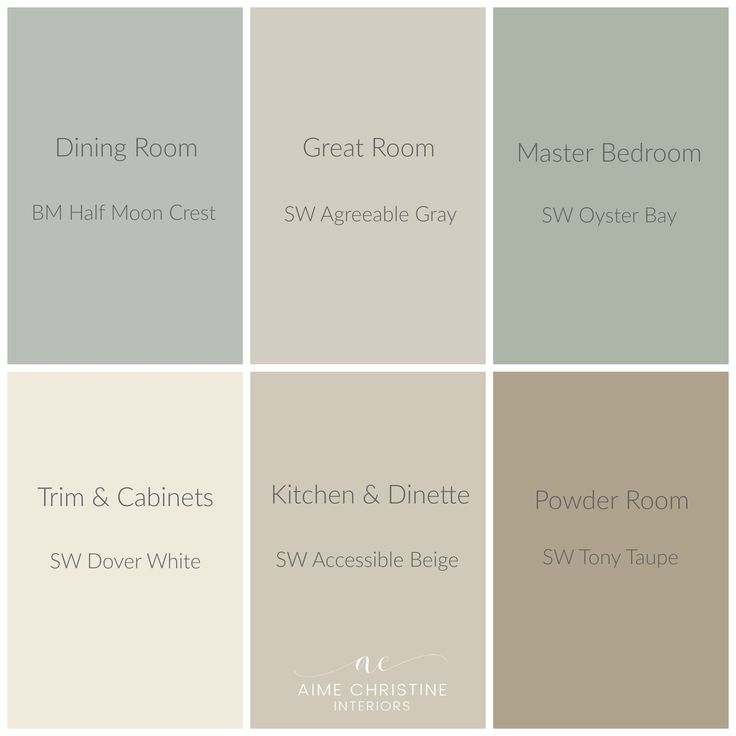
Agreeable Gray is another incredibly popular greige paint color. It’s similar in tone to Repose Gray, but significantly warmer. I like this color because it can read warmer or cooler depending on the light. Sometimes it looks more gray, other times it’s definitely a greige.
Benjamin Moore Paper WhiteSimilar in terms of depth of color to Repose Gray at half strength, Benjamin Moore’s Paper White is my go-to for east and west facing rooms, where you have warm light half the day and cooler light the other half.
Benjamin Moore Paper WhiteDespite the name, Paper White is a very light dove gray with just a hint of green that ensures it never looks cold. Paired with bright white trim, it makes for an excellent whole house color.
As close in color as it is to the lightened version of Repose Gray, I find that it maintains its light and bright color more in poorly lit rooms. If you remember back to the shadows in my kitchen (pictured above), Paper White will never look that warm or saturated.
If gray is less your style and you want a warmer neutral, Classic Gray is an excellent choice. It’s considerably warmer than the other colors mentioned above, but still has just enough gray to stop it being too warm.
BM Classic Gray dining room via Home BunchLike Agreeable Gray, Classic Gray can be a bit of a chameleon and look warmer or cooler depending on the available light. In the above picture, you can see how light and bright it is the dining with tons of natural light.
In a lower light room, there will be more saturation to the color.
I personally love this aspect of the color, since it feels like you have different shades when in fact it’s the same paint color the entire time!
Read In Depth Reviews Of These Paint Colors
White Colors That Are Great Choices
Sherwin Williams Pure WhiteSW Pure White is one of the safest white paint colors out there. It’s a lovely bright white color, with just the tiniest bit of warmth to stop it ever feeling stark.
It works just as well on walls as it does on trim and will give you the appearance of a clean white without having to worry about any funky undertones rearing their ugly heads!
Benjamin Moore Chantilly LaceThis is Benjamin Moore’s brightest white, so if you want a really bright crisp white, then Chantilly Lace is the right color for you.
BM Chantilly Lace walls, cabinets and ceiling via Home BunchThere’s no apparent undertones in this bright white, but it will take on colors from the environment surrounding it. So keep that in mind!
Benjamin Moore White DoveI absolutely adore White Dove as a whole house white. It has a lovely creamy softness to it, and works really well in north facing rooms where white paint can look dull and flat.
BM White Dove Walls and Trim with SW Tricorn Black door via @asturiaofmylifeIf you have other bright whites, White Dove will look considerably creamier next to them, but not in a yellow way, just in a really soft warm way.
Shoji White has become really popular in the past year, and for good reason. If you can’t decide between a greige or a creamier shade, then Shoji White may be perfect for you.
Shoji White bedroom via @brightsmilinglifeRead In Depth Reviews of These White Colors
What’s The Right Paint Color For Trim Work?
If you’re sticking with classic white trim, then you’ll want one shade of white for all the trim work, doors, moldings and casings in your home.
If you chose a bright white paint color for your wall (like Pure White or Chantilly Lace) you’re going to want to use that same color for the trim, but in a different sheen. Usually, we do a washable matte sheen or eggshell on walls, and then satin or semi-gloss for all the trim.
Both SW Pure White and BM Chantilly Lace are great white trim colors if you chose a greige or other neutral for your walls, too. Pure White is always a safe bet, as it has a slight warm undertone so it works well with these warmer colors
Chantilly Lace is a brighter white that really adds serious contrast.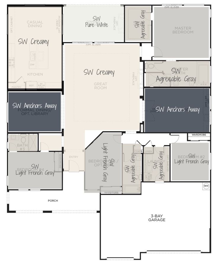 Other bright whites that are great for trim would be SW Extra White, SW High Reflective White.
If you want a creamier white for your trim then BM White Dove is a beautiful choice.
BM Simply White is also another popular choice, though it has a sneaky yellow undertone so I would only use it in a semi-gloss finish to offset that.
Simply White Trim and Walls. Notice how the walls (painted in a matte finish) are very creamy compared to the trim. Artificial light further heightens the yellow undertone.I personally would not use it as a whole-house white because it can look very yellow in certain lighting conditions, most notably artificial light.
BM Simply White Walls in semi-gloss sheenBut when it works, it really works and is a beautiful warmer white!
If you’re looking for another way to inject some personality into your home, doing contrasting trim is also another idea. Especially when paired with white walls, a warm gray trim can really elevate the look of a home.
Tip: If you're planning on tackling all the trim yourself, be sure to read my best tips for Painting Walls and Trim Like a Pro.
When To Deviate From The Whole House Color Scheme
Don’t be afraid to add an accent wall in another color, or go crazy in a powder room.
The idea of choosing one color for your whole house is to simplify the process of bringing in other colors, and to make your home feel cohesive and not at all disjointed.
As long as you have an overall cohesive color scheme, adding a pop of color will be a welcome addition and stop your home from feeling like a sea of boring neutral.
To learn more about choosing colors that will work in your home, read my posts about How To Pick The Right Colors For Your Home, How To Choose a Whole House Color Palette and 5 Reasons Why Your Color Scheme Does Not Look Cohesive.
Final Thoughts
Don’t Forget…
Don’t forget – no matter what you’ve read or photos you’ve seen online, it’s really important to sample paint colors in your home before committing!
Samplize provides real paint samples that are easy to move around your home, and cheaper than buying a gazillion paint pots! It’s the only way I buy paint samples.
Try Samplize For Yourself Here
Looking for more? Follow me on social media for lots more home decor, DIY & recipe content!
Pinterest | Instagram | Facebook |
3.0K shares
20 of the Best Paint Colors for the Whole House – Welsh Design Studio
Skip to contentLet me just start by saying that I’m a strong advocate for using different paint colors in different rooms of your home. Paint is one of the best and easiest ways to add personality to a space, and bring together the design elements in a room. However, there is always going to be a need for that perfect, neutral base color that ties together the hallways and other main areas of the house with surrounding rooms. Or, perhaps you’ve got a rental property, and just want to paint every room in the house a neutral shade that will work with any style and appeal to tenants. So, what are the best paint colors for the whole house? I’ve complied a list of 20 go-to, neutral shades that designers swear by, and should be at the top of your list of colors to try for your house color palette.
White walls are making a comeback in a big way right now, and are very much on-trend this year. Pair soft white walls with contrasting black windows/doors, and lots of natural wood for a stunning and stylish room design. You’ll see several of my favorite whites for the whole-house listed here, but check out my post on the best white paint colors for interiors for more great options.
1. Benjamin Moore Swiss Coffee (OC-45)
Swiss Coffee is a true classic that has been a designer favorite for years. It is a beautiful, warm, creamy hue that is versatile, tranquil, and works great with earthy colors. Order a peel-and-stick sample sheet of BM Swiss Coffee HERE
Image Source: Studio McGee
2. Benjamin Moore Chantilly Lace (OC-65)
Chantilly Lace is a crisp, pure white with subtle cool undertones. If you want to create a bright white space, this is a great paint to try. Also works well for trim and ceilings. Order your sample of Chantilly Lace HERE.
3. Sherwin Williams Alabaster (SW 7008)
Alabaster was Sherwin-Williams’ 2016 Color of the Year, and there’s no doubt it has become a favorite white for designers. My girl Joanna Gaines used this color to paint the main areas of her own house, and it is one of her go-to whites for walls and shiplap. Alabaster is a warm white and brings a serene softness to any room. Want to learn more about Alabaster…check out this post. Order a sample of SW Alabaster HERE.
Image Source: Addison’s Wonderland
4. Benjamin Moore Paper White (OC-55)
Paper White is a very pale gray that can actually look white in certain light. If you’re looking for a very pale gray, this is a great paint choice to lighten and brighten your space. Paper White leans toward the cool side, but has a nice softness to it. I love it paired with bright white trim, and it also tends to work well with Carrara marble in bathrooms and kitchens. Order a sample of BM Paper White HERE.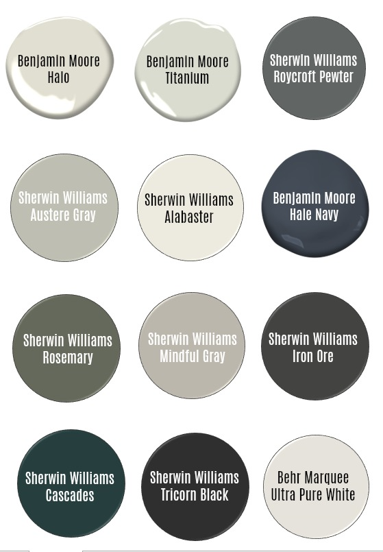
Greige is just a blend of gray and beige. It can be the best of both worlds, appealing to those that like the look of gray, but aren’t sure about moving away from the more traditional feeling of beige. Greiges make a great whole-house paint color choice because they tend to go with everything and appeal to everyone! Here are some beautiful greiges for your home.
5. Benjamin Moore Revere Pewter (HC-172)
Probably the most beloved greige paint color out there, it’s no wonder designers love Revere Pewter. It has just the right mix of gray and beige to satisfy almost everyone, and it works with pretty much every style. This is a fantastic choice for open floor plans, and is a paint color I recommend often to my clients for the whole-house and/or main living areas. In well-lit spaces, Revere Pewter will give you the gray appearance you are looking for, but warm up nicely in the evenings to create a cozy feeling. Order a peel-and-stick sample sheet of BM Revere Pewter HERE
6.
 Sherwin Williams Colonnade Gray (SW 7641)
Colonnade Gray is another favorite, and happens to be the whole-house paint color we chose for our Colorado home. It is sometimes referred to as the Sherwin Williams version of Benjamin Moore’s Revere Pewter, and it’s true that they are very close in depth, warmth, and tone. So close, in fact, you could consider them twins. However, some report that Colonnade Gray is just a touch more neutral, in that it won’t take on any of the taupe or green undertones that are sometimes seen with Revere Pewter. Regardless, Colonnade Gray is another fantastic medium greige that works beautifully in all different lighting conditions, and with any design style. Order a peel-and-stick sample sheet of SW Colonnade Gray HERE
Design by Welsh Design Studio
7. Benjamin Moore Balboa Mist (OC-27)
Balboa Mist is a beautiful light greige with a faint, hardly-noticeable purple undertone, and is one of Benjamin Moore’s most popular neutral colors. Its soft, elegant undertone gives it a chameleon quality, such that the color changes slightly during the day, and in different types of lighting. The overall color is a light, neutral gray, with a relaxing, warm vibe. Due to its tendency to shift, this is one color that should be thoroughly tested on your wall in different lighting conditions before committing. Order a peel-and-stick sample sheet of BM Balboa Mist HERE
- I can help you choose the best paint colors for one room, or choose a color scheme for the entire house!
- See your room virtually painted a new color, and feel confident in your color choices!
- Finally convince your significant other to paint the kitchen cabinets!
- Perfect for online clients!
LEARN MORE
8. Sherwin Williams Agreeable Gray (SW 7029)
Agreeable Gray is one color that everyone seems to agree is a perfectly balanced greige paint. Not too dark or too light, it’s a great choice for every room in the house. Unlike some other greige paints, Agreeable Gray has no detectable taupe or purple undertones. It has become a favorite in the interior design world, and is one that designers everywhere wholeheartedly recommend. You can read more about Agreeable Gray in my post here. Order a peel-and-stick sample sheet of SW Agreeable Gray HERE
9. Benjamin Moore Edgecomb Gray (HC-173)
Edgecomb Gray is a lovely, soft greige that leans a little more to the beige side than others in this category. This color will appear light gray in rooms with good natural light, but appear more like a creamy beige in warm lighting. It has an understated, classic, and reserved nature, which is why it pairs so well with a wide range of natural materials like wood, stone, and granite. Order a peel-and-stick sample sheet of BM Edgecomb Gray HERE
Image Source: Young House Love
Over the last decade, gray overtook beige to became the most popular wall color for every room in the house. Grays are very flexible, offering a fantastic neutral backdrop for a wide range of design styles. For a whole-house color, I recommend going with a warm or neutral light-medium gray, and I’ve rounded up some great options for you.
10. Benjamin Moore Classic Gray (OC-23)
A minimal, barely-there gray that almost reads white. This is a great choice if you just want to add the slightest contrast against white trim, but want your overall look to be very light and bright. Classic Gray is a great option for dark spaces that don’t get a lot of natural light. and it has a slight warmth to it, which might not appeal to someone looking for a darker, true gray. Order a peel-and-stick sample sheet of BM Classic Gray HERE
11. SW Repose Gray (SW 7015)
Repose Gray is an excellent light-medium gray paint, that is not too dark or heavy, and is often described as the “perfect gray color.” It looks fantastic against pure white trim, and is a great whole-house choice for those of you who are looking for something that looks like a true gray. Order a peel-and-stick sample sheet of SW Repose Gray HERE
Image Source: The Creativity Exchange
12. Benjamin Moore Silver Chain (BM 1472)
Possibly one of the truest grays out there, Silver Chain has no apparent purple or blue/green undertones. While all grays have slight undertones, this is one that stays gray on the walls in almost any lighting. Its medium value (lightness versus darkness) creates a beautiful contrast against white trim or cabinetry, and its neutral nature lets it work with any design style. Order a peel-and-stick sample sheet of BM Silver Chain HERE
13. Benjamin Moore Stonington Gray (HC-170)
Ask any designer, and it’s likely they know all about Stonington Gray. Part of Benjamin Moore’s historic color collection, Stonington Gray is a timeless color that works in both traditional and more contemporary homes. This light gray has a slight blue undertone, which means that it can read a tad blue in some light, but it isn’t a cold gray. Works great with cool tones often seen in marble, Order a peel-and-stick sample sheet of BM Stonington Gray HERE
Image Source: Adam Beasley
14. Benjamin Moore Gray Owl (OC-52)
Gray Owl is always on my list of gray paints to recommend to clients, and it’s a color you’ll find over and over again in photos of designer rooms. Gray Owl is considered to be a true gray, but it has subtle blue/green undertones. Because of this, it can look VERY different from one room to another, so it’s important to test this one out in a variety of lighting conditions. Order a peel-and-stick sample sheet of BM Gray Owl HERE
Image Source: Kylie M Interiors
15. Benjamin Moore Moonshine (OC-56)
Moonshine has quickly become a Benjamin Moore bestseller. It is a pale gray with green undertones, and looks beautiful when paired with soft blues and greens, so it’s often used in bedrooms. However, Moonshine’s etherial nature and ability to add subtle color without competing for your attention makes it a great choice for the entire house. Order a peel-and-stick sample sheet of BM Moonshine HERE
Even though gray has become today’s neutral color of choice, beige will always remain a timeless classic. Its ability to work in a variety of rooms, and warm up a space, makes it a perfect choice for a whole-house neutral.
16. Sherwin Williams Kilim Beige (SW 6106)
Back when beige ruled the world, Kilim Beige was king. Kilim Beige is a very warm, comfortable beige that has been a top seller for Sherwin Williams for many years. If you love beige, and want the feel of a cozy space, this is a great choice for you! It looks fantastic with rich wood tones, soft blue/greens, and natural stone. Order a peel-and-stick sample sheet of SW Kilim Beige HERE
Image Source: Terracotta Design Build
17. Benjamin Moore Manchester Tan (HC-81)
Manchester Tan is a light, sandy beige that is neutral enough to work well throughout the house. It’s a favorite amongst designers due to its flexible, casual nature and ability to play well with others. With just a touch of gray in it, it pairs very well with other grays in the home, like stainless steel and stone, and it looks beautiful with a wide variety of wood tones. Order a peel-and-stick sample sheet of BM Manchester Tan HERE
18. Sherwin Williams Accessible Beige (SW 7036)
A whole-house color should be versatile, which describes Accessible Beige to a tee. At the top of the list for Pottery Barn neutrals, Accessible Beige provides a great backdrop as a balanced, warm neutral color. Beige, yes, but with enough gray to keep it subtle and flexible for any room in the house. Accessible Beige is gorgeous in spaces with lots of natural light, and provides a warm elegance in the evenings. A great choice for modernizing your home, without entering into the greige/gray realm. Order a peel-and-stick sample sheet of SW Accessible Beige HERE
Image Source: Mary Cook Associates
19. Benjamin Moore Shaker Beige (HC-45)
One of the top selling colors of all time for Benjamin Moore, and part of their Historical Collection, this inviting paint color is a true classic. Shaker Beige is a warm, medium-value, sandy beige, that is expertly balanced, and works in a variety of rooms. Shaker Beige contrasts beautifully against white trim, while pairing perfectly with Fall colors and rich wood tones. Order a peel-and-stick sample sheet of BM Shaker Beige HERE
20. Sherwin Williams Canvas Tan (SW 7531)
Soft and fresh, Canvas Tan is perhaps the most neutral of all the beiges on this list. It reads pure tan, without any obvious undertones, and is light enough to brighten up a dark space. If you’re looking for a classic, light tan for the main areas of your home, this is a great place to start. Order a peel-and-stick sample sheet of SW Canvas Tan HERE
Image Source: John Cannon Homes
So there you have it! These are the 20 best-of-the-best paint colors for the whole house; the tried and true designer favorites that should be at the top of your list of samples to try. Time to head out to the paint store, grab your samples, and start painting!
Speaking of sampling (which is an absolute must when choosing paint colors), you’ve got to check out Samplize. They offer convenient, affordable peel-and-stick paint samples that are much easier to use than traditional methods. Here are just a few reasons why I always recommend Samplize to my clients…
- Samples arrive quickly (1-3 business days, depending on location)
- They’re more affordable than buying the samples paint/rollers/foam boards that are needing for traditional paint sampling
- You can move them around the room, and test them in a variety of lighting conditions
BONUS CONTENT
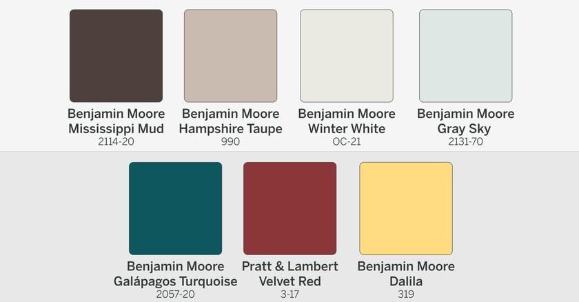
After publishing, I saw some comments about wanting a whole-house paint with more color. While neutral colors tend to work best for whole-house paints, due to their ability to work with any style and appeal to large populations, there are other colors options out there worth considering.
Blue is a relaxing, serene color, that is often used in bedrooms. But, it can work beautifully as a whole-house color, as well. The key is to keep it light and airy. Here are some of the best blue shades to use in the main areas of your home.
21. Farrow & Ball Borrowed Light (No. 235)
This is a gorgeous, subtle blue that is a designer favorite. Borrowed Light has just enough saturation to read blue, without overwhelming the space. This is a great option for many different styles! Order a peel-and-stick sample sheet of F&B Borrowed Light HERE
Image Source: Palette Paint
22. Benjamin Moore Quiet Moments (BM 1563)
Quiet Moments is a soft gray with a hint of blue-green. One of Benjamin Moore’s top sellers! Order a peel-and-stick sample sheet of BM Quiet Moments HERE
Image Source: Benjamin Moore
ABOUT MELISSA
Hey there! I'm an interior designer and DIY enthusiast with a passion for sharing what I've learned and helping others create a home they love! Read More -->
SEARCH
Search for:
FREE Masterclass: Mistakes to Avoid When Choosing Paint Colors
FREE! – Learn the 7 Secrets of Successful Home Decorating
FREE DIY Project Planner
Struggling with finding paint colors? Check out my eBook!
RECENT POSTS
- Paint Colors for 2023 – Trends & Predictions
- Top 10 Holiday Decorating Tips & Ideas
- 3 Easy Interior Design Hacks to Elevate Your Home
- Small Bathroom Storage Ideas To Save Your Sanity!
- Be Your Own Designer: The Interior Design Process for Homeowners
ARCHIVES
ARCHIVES Select Month December 2022 (1) November 2022 (3) October 2022 (1) September 2022 (2) August 2022 (3) July 2022 (1) June 2022 (2) April 2022 (1) March 2022 (1) February 2022 (1) January 2022 (2) December 2021 (1) November 2021 (2) October 2021 (5) September 2021 (5) August 2021 (1) June 2021 (1) May 2021 (1) March 2021 (1) February 2021 (1) January 2021 (4) December 2020 (1) November 2020 (2) October 2020 (1) September 2020 (1) August 2020 (2) July 2020 (1) May 2020 (4) April 2020 (6) March 2020 (3) February 2020 (2) January 2020 (4) December 2019 (3) October 2019 (5) September 2019 (3) August 2019 (4) July 2019 (3) June 2019 (1) May 2019 (6) April 2019 (2) October 2018 (4) September 2018 (2) May 2018 (3) April 2018 (1) March 2018 (3) February 2018 (1) January 2018 (1) December 2017 (3) October 2017 (2) September 2017 (3) August 2017 (9) July 2017 (9) June 2017 (10) May 2017 (7) April 2017 (3) February 2017 (2) January 2017 (4) December 2016 (1) November 2016 (2) October 2016 (5) September 2016 (5) August 2016 (1) March 2016 (1) June 2015 (2) May 2015 (1) April 2015 (3) March 2015 (4) February 2015 (1) January 2015 (5) December 2014 (1) November 2014 (1) October 2014 (3) September 2014 (3) August 2014 (2) July 2014 (3) June 2014 (4) May 2014 (6) April 2014 (9) March 2014 (3) January 2014 (1) November 2013 (2) Page load link Go to TopThe color of a warm home
Every day a modern person sees colors bright and subdued, warm and cold, dark and light. It is the color that evokes different feelings and associations in people. The use of colors in the interior can not only enlarge or reduce the room, make it visually warmer or cooler, but also create some pleasant associations and interesting color patterns. The most popular interior colors used for home decoration are warm, natural colors, various shades of brown, beige, terracotta. nine0003
So, brown is one of the most “serious” colors, strongly associated with protection, safety, and family. The basis of these associations is tree trunks, which for a long time provided shelter and shelter for primitive people. Brown is also the color of sweet tooth, coffee and chocolate lovers. Pleasant associations associated with eating brown shades appear in the head literally by themselves. To the mentioned coffee and chocolate, hints of cocoa, burnt sugar, warm pie with a crispy crust and even baked meat are added. And along with these associations, the corresponding aromas seem to appear in the air, which, by the way, can be created with the help of fragrant candles, sachets and simply by preparing something tasty.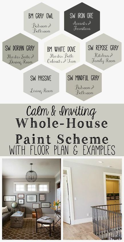 nine0003
Furniture, made in various shades of brown, has long been a permanent hit and continues to be popular due to such color characteristics as warmth, comfort, depth and the "non-staining" that Russians love.
A whitened variation of brown - beige - another hit in the interior. This is a lighter, but no less cozy and tasty shade. Furniture of this color will probably be more branded compared to brown, but visually it will seem lighter and more elegant. nine0003
There is another shade of brown - terracotta. The color of fired clay, tiled roofs, reddish brown. This color is perhaps less popular than beige and brown, but its brightness evokes thoughts about the sun, summer, southern countries and creates an appropriate psychological mood. What is it for? The interior, made using terracotta shades, will add sun even to the darkest room.
Pure warm colors are rarely used. The fact is that they are able to invigorate and saturate with energy. Perhaps this is why a person, on an intuitive level, adds these shades to his life in a dosed and cautious manner.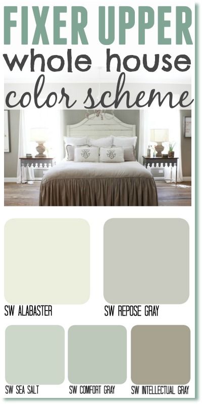 For example, red is associated with danger, making it an excellent eye-catcher. Red accessories are often used in the interior to soften cold shades and accentuate pure white. nine0003
Yellow and orange are the colors of the sun and light. These colors invigorate, give positive emotions and even stimulate appetite. However, yellow or orange walls can provoke overexcitation, it’s simply impossible to relax in such a bright house, which is why yellow and orange are most often used as accent spots in calmer interior colors.
It should be noted that it is easiest to combine warm shades with cold ones. For example, in a brown-beige interior, make accents with blue-green colors, and include bright spots of yellow, red and orange in a monochrome (black and white) or gray interior. nine0003
Tekstil Plus Company Offers a wide range of upholstery fabrics and artificial leathers in various shades of warm colors. Creating coziness and warmth in the house with our materials is easy and simple, just choose what you like.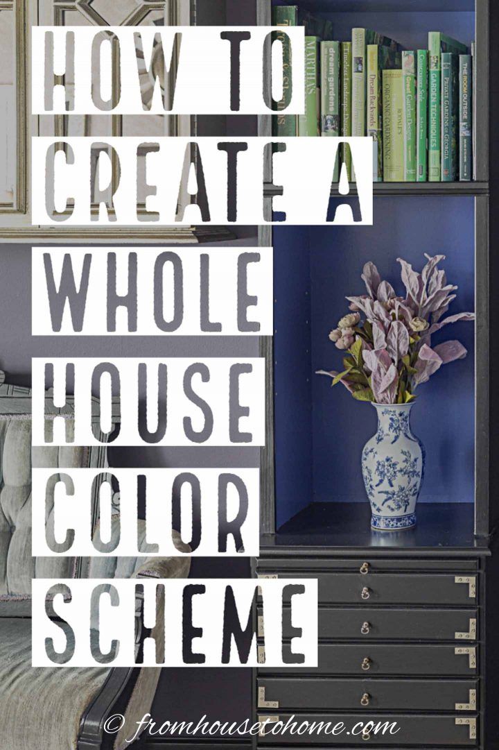
TOP 11 modern style home interior ideas that are cheap +Video
TOP 11 modern style home interior color ideas. If you crave novelty, we advise you to start with changes in the apartment. The best option would be painting wooden furniture, frames, doors and walls and similar surfaces. By applying simple shades (colors), you can emphasize the advantages of a particular subject. nine0003
In order to decide on the choice of color, we have compiled a TOP of eleven colors for you, all these colors are paid attention to fashion trends. At the moment, ultraviolet is considered the main color of the year, but pearl shades and good old metallic are in the top.
Content:
- 1 Color Lavender
- 2 Color Niagar
- 3 Mint and turquoise
- 4 Outlass Drozda
- 5 raspberry color
- 6 tint cream
- 7 Green (rich) color
- 8 Coal-black color
- 9 White color
- 10 pink-pink color
- 11 A midjesty-blue color
Lavender color
is a more emotional and sensual color.
If you want to create a so-called trendy interior, then this color is made just for you. Also, this shade goes very well with golden brown and white.
Niagara
Calm shade. Mainly applied in the children's room and also in the bedroom. It is combined with blue, silver, white and dark blue.
Mint & Turquoise
Light shade, clean and airy. Able to relieve fatigue and cheer up.
If you paint a children's room in this shade with the addition of, for example, the same yellow, orange or light green color, then the room will become very bright and comfortable for the child.
Both turquoise and mint go well with white. But together they are able to create a somewhat cold combination. nine0003
Thrush Egg Shade
Natural and natural shade. For giving this color is the most suitable.
Veranda or porch can be repainted. When combined with coral, beige, carrot and pale brown, this color is the most beautiful.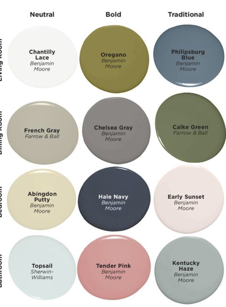
Raspberry
Very intense and bright on its own. Able to create the so-called festive atmosphere and energize. It goes well with blue, green, pink, beige. nine0003
There is also an explosive combination, this is raspberry with bright blue.
However, there is a special ratio of this combination, namely sixty percent crimson, thirty percent bright blue and ten percent other.
Cream shade
Cream color is the most pleasing to the eye. With the presence of this shade, a light atmosphere is observed, a small room becomes larger and warmer. When combined with yellowish, gray and chocolate, the creamy shade becomes even more pleasant. This is the most successful color for changing the interior of the house in a modern style. nine0003
Green (intense)
Green is also called the intense or natural color of nature. From this shade breathes peace. It can also affect the human psyche. When combined with white shades, it looks very impressive.
The best ratio of green and white is 50/50. There is also an option to combine green with red-brown - such a design move will soften the contrast. You can also combine green with a pink tint, this combination is currently in trend. nine0003
Jet Black
Considered the most mysterious shade. With careful and competent application in the interior of the house, he is able to create real miracles. Your home will be, oddly enough, very comfortable in this color. When combined with gold objects and woods, black is able to emphasize the beauty of the room and the whole house as a whole.
When combined with gray-beige flowers, you will find peace. Together, these shades are able to build a protective barrier with comfort inside.