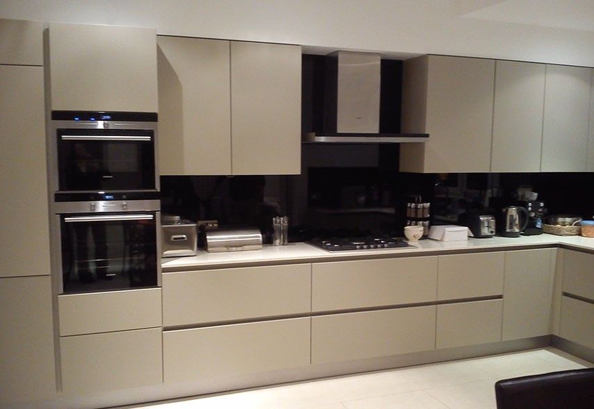
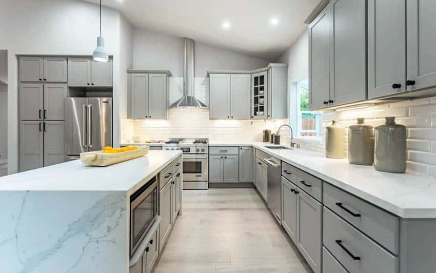
What colour goes with cream kitchen units
10 designs in this classic neutral |
(Image credit: British Standard)
Cream kitchen ideas are always warm and inviting, whether they're classic Shaker-style rooms or super-modern, streamlined spaces. The ultimate neutral, it's just as timeless as white or gray, but sunnier and more welcoming for larger or light-starved kitchens that will feel less like home in cooler tones.
There is a whole range of creams to choose from – from elegant, just-off-whites, such as ivory, chalk and alabaster, to gray-creams, such as taupe and stone, and more earthy shades, like linen.
Cream kitchens look fabulous with other colors, too – pale blue to navy, blush pinks, deep greens, grey, white and even black.
For anyone who has dismissed cream as a top option for their list of kitchen ideas, let us change your mind.
Cream kitchen ideas
Cream kitchens are incredibly easy to introduce accent colors and tones to. For contemporary spaces, warm metallics, such as gold and brass, look wonderful.
More traditional rooms will benefit from the textures that wood will introduce. And, of course, you can match cream to other kitchen color ideas for a two-tone kitchen design, too.
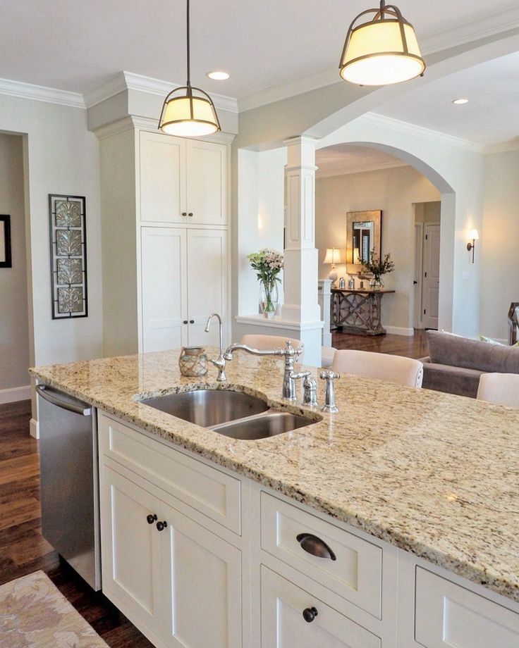
1. Combining cream with white creates a layered feel
(Image credit: Little Greene)
The beauty of a cream kitchen is that it works with pretty much all colors – the sign of a great neutral. If you love white kitchen ideas but feel they will be too stark in your kitchen then consider teaming white with cream, which will create a subtly layered look.
To create contrast, you can opt for a deeper cream – more of a taupe or stone, like in this kitchen by Little Greene . That way, the white will stand out and create a fresh feel while the cream warms the space. Wooden elements look great with this combination. Choose a dark tone for a kitchen that has plenty of natural light; otherwise, a mid-toned wood is the best option.
2. Patterns work well with neutrals
(Image credit: Carpetright)
Using a neutral like cream opens up the opportunity to use color and pattern, because it’s so versatile. We love the idea of installing decorative flooring – it creates a focal point and adds an exciting element to the space.
David Snazel, hard flooring buyer at Carpetright , explains: ‘When looking to update your scheme, bold kitchen flooring ideas can add a little "wow". If the room is on the smaller side, lighter floors will help open a space and create the perfect base to build upon with trending accessories.’
3. Matching walls to cabinetry creates a spacious feel
(Image credit: Neptune)
For an all encompassing look that is spacious and airy, choose your favorite cream shade and use it everywhere – on the cabinetry and walls, like in this kitchen by Neptune .
Using the same cream on the ceiling will create a really warm-looking space, too. However, you will want to have some kind of contrast for the flooring and countertops so that the cream has something to shine against.
Here, the wood's natural textures and colors in the rustic gray kitchen flooring introduce a characterful feel and tie in nicely with the wooden window frame and soft gray backsplash. Pale blue chairs tone down the cream to create a pale, but interesting, finish.
4. Cream kitchen cabinetry suits a traditional look
(Image credit: British Standard)
Painted kitchens tend to suit traditional-style homes, but how do you choose the right shade of cream for your room? It really depends on the effect you want to create – warm, welcoming and relaxed or cool, elegant and restrained – and the amount and quality of natural daylight the room receives.
Light-starved kitchens, and those that you want to feel warm need creams with a hint of yellow or pink in them; sunny spaces or ones you would like to feel more pared back will work with creams that tend towards gray hues, so consider light when deciding how to paint your kitchen cabinets.
5. Warm metallics are the perfect accent for cream
(Image credit: Cullifords)
For more contemporary cream kitchen ideas that you want to give a glam appeal, try using surfaces like Gerald Culliford’s SapienStone ceramic. It’s shown here on the countertops and cabinet fronts, teamed with internal brass edging.
This cream kitchen scheme would work well in a small kitchen design, as the clean lines and sleek edges create a spacious and seamless feel.
6. Teaming cream with navy creates real impact
(Image credit: Farrow & Ball)
When natural light is low in a kitchen, a barely-there white-cream like Farrow & Ball’s Lime White will brighten it without making it feel too stark. Named after the chalky pigments used in original distempers, it’s one of their traditional neutrals and has a small amount of green pigment.
The result is a subtle yet understated feel, that gently brightens without being too intense. Plus, it looks wonderful matched with deep navy blue kitchen accents – pick out just one element of your scheme in this color, whether a range, fire surround or kitchen island, and the effect will be beautiful.
7. Contrasting wall colors add depth and interest
(Image credit: Martin Moore)
‘The key with a cream kitchen is to pair cream painted kitchen cabinets with contrasting walls and textural elements, like dark wood countertops and flooring. This will give the design an edge and create appealing visual interest,’ explains Tom Howley, design director at Tom Howley .
‘Use lighting to your advantage and choose a combination of colors that look fresh in the day but warm and inviting at night. The shadows created by your lighting choices creates an extra element of texture which can transform the space. Even during daylight, your choice of pendant lighting will add to the overall feel of the room.’
8. Combine cream with black for a contemporary kitchen
(Image credit: Future/Jonathan Gooch)
We often think of black and white kitchens working better in a contemporary space, but actually cream and black can be a touch softer, as London based interior designer Louise Bradley explains:
‘It doesn't have to be difficult to create a modern feel in a cream kitchen. Start with choosing a tone variation that's slightly muted and away from the yellow and cyan undertones. A light colored veneer will also create a contemporary feel.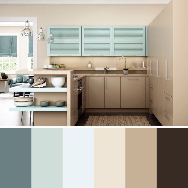
'Combine this with a clean architectural design, a light or dark stone worktop and a less traditional handle detail. Adding glass and metal elements to your kitchen will further enhance the contemporary feel of the space.’
9. Cream kitchen cabinetry is the perfect match for low ceilings
(Image credit: Neptune)
We don’t all love light and bright – some of us adore a cosy feel that can be achieved with beautiful dark parquet flooring and warmer cream kitchen cabinet colors. This charming Shaker style kitchen by Neptune shows you how to combat that age-old issue of low ceilings, too.
The ivory units lighten the space and add warmth, which is helped by the white countertops. Recessed ceiling lights teamed with global task lights will create an ambience when the sun goes down. Stainless steel appliances coupled with chrome drawer knobs add a modern touch.
10. Cream looks fabulous matched with deep green
(Image credit: The Expert / Jean Stoffer Design)
If you want to create a light and dark contrast then consider teaming cream with deep green kitchen ideas – it’s a classic combination that won't date any time soon.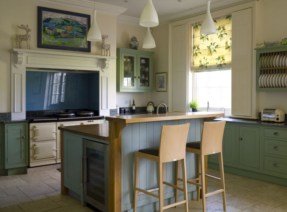
Helen Parker, creative director at deVOL , explains why cream is such a hit for kitchens:
‘Limited color palettes make styling a room easier. You can be much more selective, not necessarily keeping to that same color but being a little more restrained with your choices. A rich, muted color on the walls and cupboards with flashes of crystal and copper is enough to create drama.
'Similarly, in a light colored kitchen, the constraints of using only natural earthy colors help to instantly create a soft and mellow feel.’
What colors go best with a cream kitchen?
Natural colors go best in most cream kitchen ideas. At the most neutral end of the spectrum, that includes white, gray, browns and blacks – and you can include everything from marble to wood to slate within that color spectrum.
For bolder colors, sticking to shades inspired by nature is the best option – that's earthy terracottas, deep greens, dark blues and even blush pink. We would avoid anything too glaring – think: orange – and primary colors like red kitchen accents, which just don't complement cream's soft tones.
Are cream kitchen cabinets in style?
Cream kitchen cabinets are definitely in style – in fact, this color is a timeless shade that will never date, whether your kitchen is contemporary or traditional.
If you're wondering how to make a small kitchen look bigger, cream is a smart color choice. Unlike white, it will feel more welcoming and home buyers love cream kitchens, too, which is always a bonus.
Sophie has been an interior stylist and journalist for over 20 years and has worked for many of the main interior magazines during that time, both in-house and as a freelancer. On the side, as well as being the News Editor for indie magazine, 91, she trained to be a florist in 2019 and launched The Prettiest Posy where she curates beautiful flowers for modern weddings and events. For H&G, she writes features about interior design – and is known for having an eye for a beautiful room.
Cream kitchen ideas in timeless shades from hessian white to ecru
Looking for cream kitchen ideas? For many years now all shades of cream and magnolia have been shunned for brilliant white and hues of grey. But for 2021 the tide has turned, and those creamy neutrals have been brought up to date with a new, sophisticated colour palette, offering a wider choice of soft neutrals.
Cream kitchens are the ideal choice for those looking for a safe neutral shade, but a colour warmer than white and not as outspoken as grey.
This steadfast neutral colour lends itself to a number of kitchen ideas and decorating styles, from rustic to contemporary. Harvey Jones kitchen designer Leisha Norman tells Ideal Home, ‘Cream is a versatile shade that looks beautiful in both traditional and contemporary settings. It is light enough to make the room feel more spacious, yet it’s not as stark as white can be.’
As a new kitchen is a huge investment, it's no surprise that so many of us opt for kitchen colour schemes that will stand the test of time. Cream kitchens are one of the most popular styles, with colours such as ivory, off-white and buttermilk proving popular choices.
You might choose an ultra-modern glossy cream kitchen that combines streamlined cabinetry with the latest appliances, or perhaps use painted cream cupboards to transform a cottage kitchen that has low ceilings.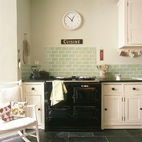 However you use this versatile shade, here are our cream kitchen ideas to inspire your design.
Cream kitchen ideas
1. Make cream feel contemporary
(Image credit: Future PLC/Colin Poole)
Cream doesn't have to say 'country-style', it can be highly effective as the backdrop in a more contemporary setting. In a modern home, choose a cream kitchen to create a bright and summery feel. Combine cream units with black metro tiled walls and practical kitchen worktop ideas, such as granite, for a busy family kitchen.
Choose statement glass pendant lights to add a living room vibe to the space – a design feature which is very on-trend for 2021. Add contemporary wireframe barstools to amplify the modern style credentials.
2. Give neutrals a new lease of life
(Image credit: Polly Eltes/Future PLC)
If you prefer your kitchens pale but find that white kitchens are too clinical, opt for a palette of off-whites and buffs - imagine shades of vintage paper. Cream cabinetry feels fresh and modern teamed with white fittings and chalk-white walls. Matching stone worktops and floors help to keep the look cohesive. A warming cream AGA adds a classic country finish.
3. Go for splashes of on-trend grey
(Image credit: Mark Bolton/Future PLC)
Warm cream cabinetry is an ideal backdrop for sophisticated grey kitchen ideas such as worktops, lights and accessories. Choose a shade of grey with warm undertones to help retain the warm qualities of cream, avoiding blue-toned greys. Finish the look by painting the walls with a putty colour, to meet the two tones of cream and grey halfway.
4. Factor in freestanding furniture for flexibility
(Image credit: Future PLC/Simon Bevan)
Why not opt for freestanding furniture instead of fitted kitchen units? Choose pieces such as a painted cream sideboard for storage, a dresser where you can display your favourite china and glassware, and a large farmhouse table surrounded by spindle chairs for family meals.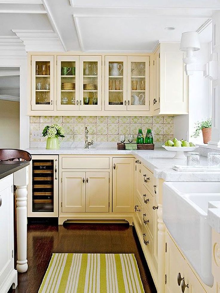
If you're looking for shabby chic decorating ideas, fit shelves instead of wall cupboards to store items such as Kilner jars, cookware and serving dishes. Touches of copper, pink and stone bring this country kitchen scheme to life.
5. Play it safe with an off-white scheme
(Image credit: Future PLC/Jamie Mason)
If you want to create the perfect family kitchen, be inspired by this modern kitchen idea. This open-plan design has ample worktop space for food preparation, a stainless-steel range cooker and chic white metro tiles. Built in an extension, the cream units curve round to form a breakfast bar for a casual eating space, with stylish pale blue pendant lights above.
6. Create a café-style kitchen
(Image credit: Future PLC/Dominic Blackmore)
For a café-style kitchen combine cream walls and cabinetry with an area decorated with blackboard paint and you'll never forget anything on your shopping list ever again! Keep the look light and cheerful with cream painted base units and a practical wooden worktop.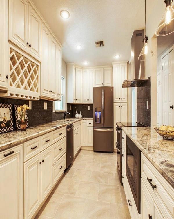
Continue the warm wood tones with dining furniture, then add black and copper accessories as a finishing touch.
7. Create a classic scheme you'll love for years to come
(Image credit: Future PLC/Brent Darby)
A cream painted kitchen is the perfect choice for a cottage with low ceilings, as it makes the space feel light and open. Create this look with Shaker-style base cabinets, cream wall tiles and pale flagstone flooring. If you have space, an Aga will suit a cream country kitchen perfectly.
As an alternative to wall cupboards, install a kitchen island in the centre of the room to provide plenty of storage.
8. Invigorate with strong blue accents
(Image credit: Future PLC/David Parmiter)
If you're looking for ways to add colour to an all white kitchen or you want to inject some personality into your cream space, use one strong accent colour. In the case of this neutral kitchen scheme, cream walls play the perfect backdrop to display midnight blue storage and shelving. For extra effect the main kitchen island is also blue.
The delicious shade of mushroom on the tiles adds a subtle layer on from the cream, to create a harmonious palette of neutrals to compliment the punchier blue accents.
9. Create focus with a feature wall
(Image credit: Future PLC/Colin Poole)
Like with all good neutral schemes, a hit of strong accent colour can go a long way to uplift the spirit of the room. If red kitchens are too strong, this shade paired with cream is a trusted colour combination, especially in a country-style kitchen like the one shown above.
In this compact U-shaped kitchen idea, one striking red wall helps to add a focal point of interest within the cream colour scheme. The painted wall anchors the red accent colours dotted around the kitchen, from the appliances to textiles it all flows seamlessly.
10. Offset cream with dark flooring
(Image credit: Future PLC/Douglas Gibb)
Maintain an all-cream colour scheme with the cabinetry and walls and instead use the floor to add a statement shade. A dark tiled floor helps to add depth to the room, ideal for small kitchens because it highlights the amount of floor space, which when the rest of the room is bright and airy, it can give a greater perspective.
Natural wooden worktops help to break up the look further, without drawing the eye away from the two contrasting tones of cream and black.
11. Team with green to create a country classic
(Image credit: Future PLC/Colin Poole)
12. Compliment with cream in a country kitchen
(Image credit: Future PLC/David Still)
In a farmhouse choose a kitchen design that complements the original features in your home. In this country kitchen, cream cabinetry and pale stone flooring blend seamlessly with the vaulted ceiling and exposed wood beams.
The island unit has been painted in coordinating stone and accents of colour with fuchsia pendant lamps, glassware and pretty artwork.
13. Keep it classy and sophisticated
(Image credit: Future PLC/Polly Eltes)
In this beautiful kitchen, a cream palette keeps the look fresh, while the dresser and vintage wooden table create a charming country feel. A combination of antiques, vintage accessories and salvaged pieces give this kitchen a sense of grandeur.
Does grey go with a cream kitchen?
We can hear the whole nation asking, because grey is a firm favourite for the modern home. All will be pleased to hear the answer is yes, the key is keeping the tones similar in warmth. Grey and cream can offer an ideal soothing colour combination to create a strong neutral base, avoiding the starkness of brilliant white. Thanks to the undertones in both colours, they work together in unison to add warmth and depth.
What colours go with a cream kitchen?
Thanks to the warmth of cream it works best with colours on the warmer scale of the spectrum, such as red. The colour combination of red and cream is a particularly popular painted kitchen idea in a country kitchen, which teams well with natural woods and stone worktops and flooring.
While warm colours are the most welcome, green and blue can work just as well despite being colder in tone.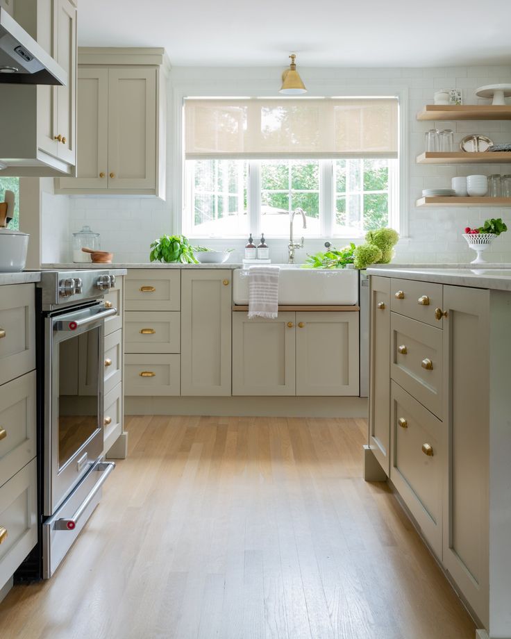 It's about choosing the right depth of colour, which can compliment the cream. For instance sage green has an earthy quality that helps to bring warmth.
‘As cream is a soft, neutral shade, it works really well with a multitude of colours’ explains Leisha Norman, kitchen designer at Harvey Jones.
‘Consider having your cabinets or walls in a different tone – perhaps a deeper blue-grey or a forest green – as this will add more of an edge to the final space. Another good idea is to add some interest with standalone pieces, such as an old AGA in a black shiny finish.’
colors in the kitchen interior in the photo. Color combinations for a kitchen set
The table of color combinations in the interior of the kitchen will definitely come in handy at the renovation stage, because the main secret of a beautiful and up-to-date design of this room is the right range. It is able to smooth out any imperfections such as a small footage or an unsuccessful layout. And vice versa - colors that do not match with each other or unpleasant dull shades will make even the largest and most modern kitchen boring and old-fashioned.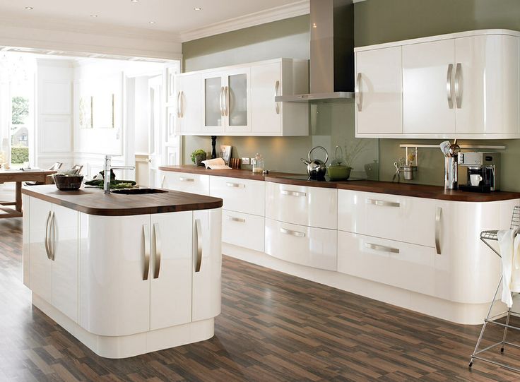 In this article, we will talk about color combinations in the interior of the kitchen and give good examples along with photos so that you can easily plan the perfect renovation. nine0003
Basic rules of color
Before you start choosing color combinations in a kitchen interior, you need to have at least a basic understanding of color and design in general. Here are a few "golden" rules:
- It is best to use no more than 3 solid colors or 4-5 shades to decorate the room, otherwise the design will turn out to be overly colorful and overloaded. Use a proportion of 60/30/10 - give 60% of the gamma to a neutral base color, 30% to an additional one, and let bright accents take no more than 10%. If you allocate too much space for catchy shades, they will quickly begin to cause discomfort. nine0014
- Proper stretching of tones helps to give the room depth and airiness. To achieve this, distribute the saturation of the tone from the bottom up - let the floor be the darkest spot in the room, and the ceiling the lightest.
- Use decor and textiles for accents - they are easy to replace and thereby refresh the look of the kitchen without resorting to repairs.
- Kitchen set and furniture look beautiful when they are made in different colors and create contrast. nine0014
- You can tone down any tone with a matte finish.
- If the kitchen windows face north and there is little light in it, then compensate for this with warm shades. And vice versa - cold tones will look good in a sunny kitchen.
- When choosing a combination of colors in the interior of the kitchen, be guided by the overall design of the apartment. For example, delicate pastel colors dominate in Provence, dark inserts and cold tones look beautiful in the Scandinavian style, and a calm and restrained range is appropriate in the classics. nine0014
For the best understanding of how to combine colors in the interior of the kitchen, be guided by the color wheel.
Color wheel
Itten's circle of 12 colors is a universal lifesaver for all designers. The most eye-catching color combinations:
- Complementary combination , also called contrast, are two colors located opposite each other. This is a very active combination: so that the colors do not “argue” with each other, you should not take them in the same proportions - it is better to use one for the background, the other for the accent. nine0014
- Contrasting triad . It uses one color from the circle and two others, which are located on both sides of the contrasting shade. A softer and more commonly used variant of the regular contrast.
- Classic triad - 3 equally spaced colors on a circle. Looks good in proportions of 60:30:10.
- Analog triad - 3 colors side by side. Soft and versatile combination. nine0063
- Any shades of blue and cyan.
- Black.
- Red.
- Warm yellow + terracotta.
- Cold yellow + lilac.
- Gray + turquoise.
- Natural shades of brown.
- All pastel shades look great against gray - mint, lavender, pale blue, etc.
- Very beautiful combination of gray and pink.
- Turquoise.
- Yellow + purple.
- Violet.
- cream and dark brown;
- white and orange;
- red and white/black;
- steel gray and blue;
- green and walnut;
- black and purple;
- mint and light beige.
Please note that only pure, bright colors are represented in the circle, and it is better to avoid their abundance in the interior. Therefore, decide on an attractive scheme for yourself and use more interesting shades of the selected colors. For example, not bright yellow and purple, but cream and lavender. Here are examples of successful colors in the interior of the kitchen in the photo.
Successful color combinations in the interior of the kitchen
As much as you would like to take your favorite color as the basis of the color scheme and add it everywhere, it is better not to do this. For a harmonious design that will not get bored in a few months, it is worth choosing the most neutral tones as a base, such as white (it looks especially good in the interior of small kitchens, helping to visually enlarge them), gray or a light shade of beige. And already to them you can safely add any other shades. The most successful color combinations in the interior of the kitchen, see the table:
| Base | Additional colors and accents |
| White . | nine0083 |
| Gray . Different shades of gray can suit different designs, for example, cool gray will look good in Scandinavian style, and warmer shades with a pink bias in Provence. nine0003 | |
| Beige . You can use any shades - from close to yellow for a more positive and bright interior to a calm, peach for a classic design. | The most beautiful combinations of beige in the interior of the kitchen are with other warm natural colors, such as caramel, sand, mustard, terracotta. Use cool shades of blue or purple as an accent. |
 It is recommended to choose not a boil-white color for finishing, but its derivatives - milky, ivory, white with a slight sheen in blue, and so on. They look more interesting and give the room a designer look.
  nine0003
Kitchen set color combinations in the kitchen interior
We have already mentioned above that when designing a kitchen, you need to use a maximum of 4-5 different shades. When choosing a headset, there should be no more than two. Another important rule is that the colors of the headset directly depend on the finish. If you have chosen bright finishing materials, then the furniture should be more restrained shades. And vice versa, with a neutral finish, you can afford a set of rich colors. Beautiful combinations for kitchen furniture:
In our online store you can buy a wide variety of decor for the kitchen - from textiles and dishes to unusual wall clocks and figurines that will fit into almost any design. All products shown in the catalog are available from stock and will be shipped the next day after ordering. After the purchase, you will receive bonus points that you can spend on your next order.
Go to the section WARE
The combination of colors in the interior of the kitchen
When looking to renovate a kitchen or buy new kitchen furniture, everyone faces the challenge of decorating the kitchen and choosing colors for such an important room in our home.
Based on the designers' recommendations, we have compiled the basic rules for combining colors in the interior of the kitchen. When deciding on the choice of color for decorating the interior of the kitchen, you should remember two main points Therefore, for a small kitchen, it is desirable to use pastel colors in combination with bright accents. Too spacious kitchen can be made more comfortable if you combine bright colors and low-key dark color in its interior, and make the kitchen set two-tone. nine0003
2. The interior of the kitchen can be made multi-color or one-color. In a multi-color kitchen, one color should be dominant.
Single color (monochrome kitchen)
If you are going to design a kitchen set in a single color, you must not only choose one color for the set itself, but use its shades in interior design.
The basis of a quality kitchen design lies in the maximum harmony of furniture and decor with wall, floor and ceiling finishes. It is very important that the components of the interior fit each other both in terms of stylistic orientation and color scheme. nine0003
Every person associates the kitchen in the house with the comfort and warmth of the hearth. This effect can be achieved only if the right combination of colors in the interior of the kitchen.
Designer's advice on choosing a color palette and its intensity:
* The kitchen can be decorated in several colors. However, you should not use more than three shades, as in this case the main idea of \u200b\u200bthe design of the room will be lost. nine0003
* If the color of the walls and the color of the kitchen set are the same, then the shade of the furniture should be darker, at least one or two positions.
* In most cases, it is not recommended to make the floor and ceiling in the same color and texture. This will lead to an imbalance in the volume of the room.
* The countertop and backsplash (wall panel) should preferably be designed in colors that are opposite to the kitchen set and other furniture. The game of contrasts helps to place the right accents.
* If the furniture in the kitchen is light unsaturated colors, then the walls, curtains, upholstery for chairs or sofas, tablecloths must take the lead in using brighter and more catchy colors. Otherwise, the kitchen will be boring and uninteresting. nine0003
* If the walls are painted in bright, eye-catching colors, then the kitchen set should be made in soothing colors that do not attract the eye. And vice versa. The defiant color of the kitchen set does not allow making walls that are active in color.
Color rules:
White - goes with everything, best with blue, red and black
Beige - goes well with blue, brown and white
Gray is a boring color that is nevertheless basic. Pairs well with dark pink, red, purple, hot blue
Pink - this color goes well with brown, white, olive, gray, turquoise
Red - perfect with yellow, white, green, blue, gray and black
brown - with bright blue, cream, pink, green, beige
orange - with blue, blue, purple, violet
Yellow - with blue, purple, light blue, grey, black
Green - goes with golden brown, yellow, black, light beige white, yellow
blue to lilac, green, yellow, orange, red
Black is a versatile elegant color. Looks good with all colors. Best combined with orange, pink, green, white, red and yellow. nine0086
At first glance, choosing the perfect color scheme for your kitchen seems like a difficult and impossible task. Indeed, you need to spend a lot of time to achieve the desired result. However, by applying the above rules in practice, you will see that the game was worth the candle.
A popular color option for the kitchen is a combination of the base color and its shades with white.
Basic rules for choosing wall colors for the kitchen * A large pattern on the walls visually reduces the size of the room. * A small pattern, on the other hand, makes the room seem larger than it really is. * Geometric patterns on the walls of the kitchen in the form of intersecting stripes, like the ornament on Scottish kilts, create the illusion of a continuous space.
 * Vertical pattern "raises" the ceilings, visually "increasing" the height of the room. * Horizontal pattern and horizontal stripes on the walls "expand" the kitchen while reducing its height. nine0348 * Diagonal lines on the wallpaper add dynamism to the kitchen, creating the illusion of movement.
 Today, designers are actively using an interesting option - the use of silver instead of white. While white is the traditional choice in a monochromatic interior, the use of silver is in line with the latest trends in interior design. Designers love metallic for its neutrality and the ability to combine this color with many others. Gray color is perfect for the kitchen in view of its practicality and non-staining. nine0003
So that a plain kitchen does not turn out boring, designers recommend following certain rules:
* choose at least three additional shades in the interior, one of which must be dominant.
* use different shades of the base color to divide the kitchen into functional areas. This technique, among other things, allows you to correct the shortcomings of the layout. nine0003
* use different textures of materials - one color looks different on materials of different textures. Contrasting accents. Even one object that contrasts with the main color of the kitchen will make a monochromatic interior more “alive”. For this, the already mentioned black color, and any bright shades, are suitable. The main thing is not to oversaturate the interior of the kitchen with separate bright details. nine0003
Another option for using colors is two base colors and complementary shades of transition from one color to another.
Contrasting color combinations in the interior of the kitchen
When using contrasting color combinations in the interior of the kitchen, you must be extremely careful.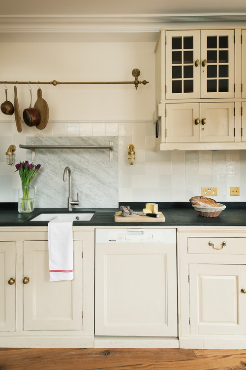 For in this case, you risk making the kitchen too aggressive or tastelessly decorated. nine0003
The combination of opposite colors in the spectrum, where only one of the selected colors is the main one, looks good in the interior.
Contrasting kitchen looks stylish and trendy.
When designing a contrasting interior, furniture should be the starting point.
Furniture should be darker than the walls and lighter than the floor.
The most popular color combinations for a contrasting kitchen interior: 9*8 red and gray white * beige and dark brown * green and black * lilac and warm green In addition, a combination of any bright color with white or black is considered a contrast. nine00499034 5 Conclusion Whatever design option you choose, whatever combination of colors in the interior of the kitchen you choose, follow the basic rules: * White or black color can be combined without risk with almost any other color.