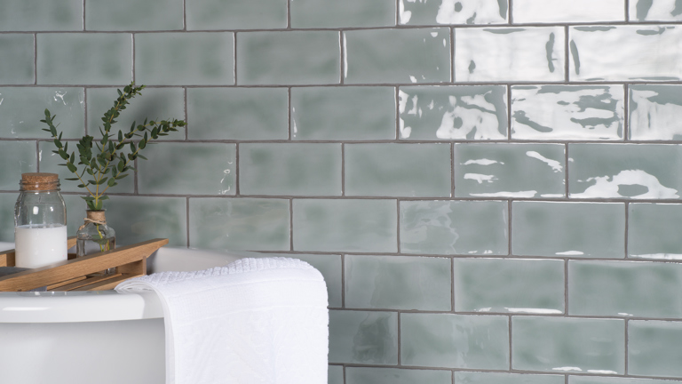
Stiffkey blue bedroom
Three beautiful palettes for Stiffkey Blue
Picking a Paint Colour?
Choose the right paint colour
the first time Let me show you how in just 5 easy steps!
BONUS: The Top 15 Shades of Gray by Benjamin Moore
We value your privacy. We will never share or sell your information.
Three Beautiful Palettes for Stiffkey Blue
My most recent colour review was for Stiffkey Blue by Farrow & Ball. Today I have pulled together three gorgeous Stiffkey Blue colour palette designs to inspire you with some ideas on how to use this gorgeous rich blue to put together a complete look for your home.
In this video, I demonstrate how to use the colours from my Stiffkey Blue Perfect Colour Palette as inspiration for creating beautiful interior design palettes with fabrics, wallpaper, hardwood, countertops and more, for your home.
All the colours I use are included in my Stiffkey Blue palette. I have come up with three exquisite combinations for you, but there are many more ways that you could mix and match to create a design palette that is perfect for your home.
Stiffkey Blue is just one of the colours in my Farrow & Ball Classic Collection which showcases 10 popular Farrow & Ball paints. Just think of the inspiration waiting to be tapped.
Stiffkey Blue Colour Palette Designs
1st Fabulous Colour Combination
Talk about a fabulous paint palette! This combination of colours with the featured Stiffkey Blue by Farrow & Ball would make for quite a dramatic look. Bold, and beautiful.
These three colour tones look stunning together, a real rich, luxe feel.
You can easily use the colour combinations I put together in my Perfect Colour Palette digital downloads to find inspiration for fabrics and other home décor finishes.
Am I suggesting you need to use all three of these paint colours in one space? Not necessarily. The idea is to use them to guide and inspire you for pulling together an entire interior design palette.
Here are two lovely fabrics that tie into our colour combination wonderfully. The one on the left is from JF Fabrics – pattern Parlor – and would look so great as drapery.
The second fabric on the right is also a JF Fabric, pattern code AW-ZINIO, from the Ashley Wilde designs collection. It has a beautiful purple tone and a lovely greeny-yellow that is very similar to the Churlish Green. An accent pillow in this fabric would look so great on a dark gray sofa or chair.
If we bring the colour combination into a kitchen design for the same home, I found a Cambria counter called Newport that would tie in nicely and keep the flow going from the living room. You aren’t limited to using the fabrics only in the living room, but you could incorporate them into your kitchen space as well on a bench seat or a window valence.
To top off the look I found this striking pull from Richelieu that looks amazing with the colours and materials in this palette. Imagine kitchen cabinetry painted in Stiffkey Blue with these pulls…absolutely gorgeous!
Make sure to watch the video to see a few more elements I selected for this palette, including a white picket tile that I used in my own bathroom remodel.
2nd Palette, Upping the Elegance
The second palette has slightly more muted tones and I found a fabric I adored that looks striking against this combination.
This paisley fabric is called Turnout and is part of the Color Concepts Coral Sky Collection from JF Fabrics. Are the two purples an exact match? No. And they don’t have to be, yet they complement each other beautifully.
The second fabric shown would look fantastic on a couple of occasional chairs.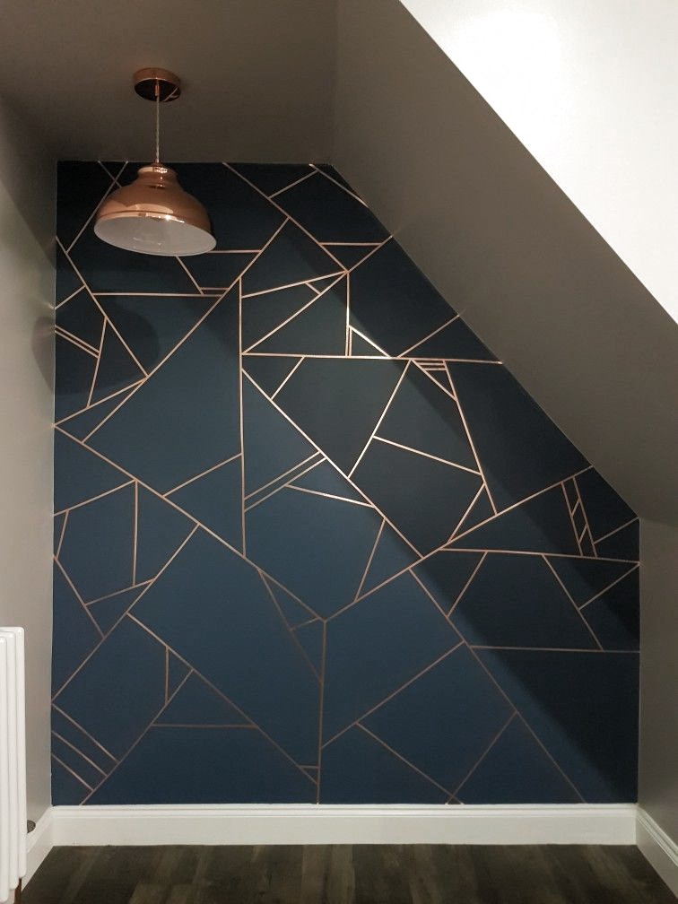 The Cambria quartz shown above in the bottom right corner is Bellingham. Notice how it picks up a couple of colours from our palette, which would allow you to repeat the colours as you move through to the kitchen.
Your home should always flow from room to room. It should be obvious that your design choices are purposeful. To do this successfully, repeat the same tones into other areas of your home.
Fresh with Blues and Greens for the 3rd Colour Combination
For the final Stiffkey Blue colour palette design, I went with slightly fresher shades of blue and green.
It is such a great feeling when that perfect fabric jumps right out at you. That’s how I found the jumping-off fabric for this 3rd colour combination. Seriously, it looks like it was made with these colours in mind. Jackpot!!!
This JF patterned fabric is called Leaflet and it’s from the Morning Glory Inside Out collection.
I worked off this one fabric to build my palette and when I was done I had fabrics that could potentially be used for pillows, drapery, and furniture.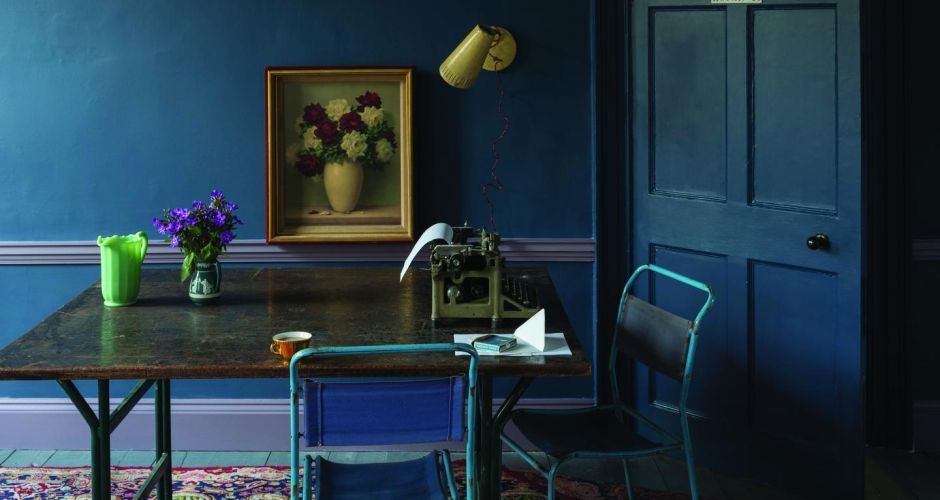 They all tied in so well and were all inspired by my Stiffkey Blue Perfect Colour Palette.
Not only did I find amazing fabrics to colour match with my palette, but I came across a fabulous grasscloth wallpaper that you see in the video.
Grasscloth wallpaper 52063, upper leftAs an example, a main floor powder room could be papered in this paper which would flow nicely from the front room where two occasional chairs might be covered in one of the coordinated fabrics. Cohesiveness throughout the living space demonstrates that all your design choices have been deliberate.
Putting together palettes combining colour, textures, patterns and materials was made easier using the colour combinations from my Perfect Colour Palette.
If you get stuck on how to come up with a colour palette for your own projects, learn more about my carefully curated paint palettes and how they can help. Their purpose is to make it less daunting to choose paint colours for your home.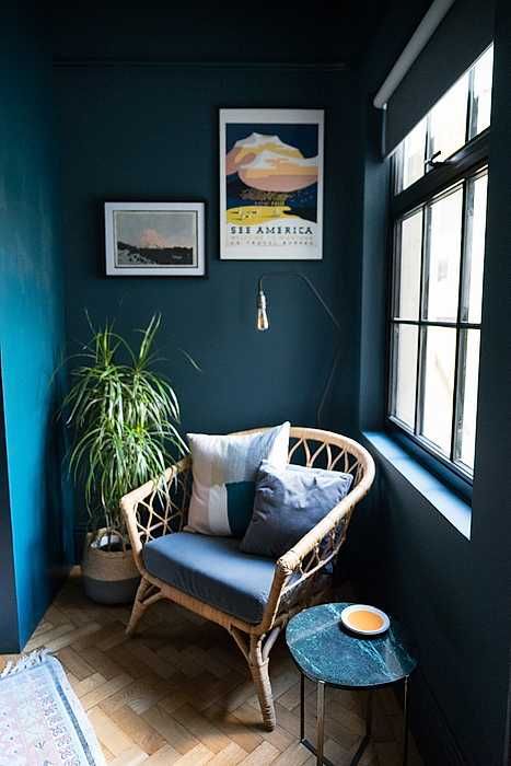
Which palette was your favourite? Comment below to share your thoughts on which one you found resonates the most with your interior design style.
Get Inspired – Perfect for Pinning!
Convenience At Your Fingertips
My Perfect Colour Palette library now has 40 paint colours to select from. Click here to see them all.
Remember, it only takes one mistake to take your home decorating project from divine to disaster. Don’t let the paint be what stresses you out!
Farrow & Ball Stiffkey Blue Colour Review by Claire Jefford
Picking a Paint Colour?
Choose the right paint colour
the first time Let me show you how in just 5 easy steps!
BONUS: The Top 15 Shades of Gray by Benjamin Moore
We value your privacy. We will never share or sell your information.
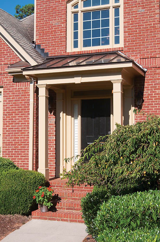
Stiffkey Blue No.281
A rich blue, Farrow & Ball’s Stiffkey Blue can be used in traditional spaces or to give a more dramatic look to a contemporary design.
If you’re new here, welcome! Below you will see what I cover in every colour review post.
In this colour review video, I share:
- The undertone of my featured colour
- Colour comparisons in order to easily see the different colour tones
- Best white paint colours for the trim and ceilings
- Beautiful colour combinations to inspire you for your decorating project
If you prefer to have all these palettes conveniently to hand, plus see all 10 colour combinations to use with Stiffkey Blue, I’ve got that ready for you here in my Perfect Colour Palette.
Stiffkey Blue Colour Review Video
Undertone: Inky Navy
This rich depth of this ‘inky navy’ may appear more or less blue, depending on the lighting and what other decorative elements you pair with it in your interior decorating project.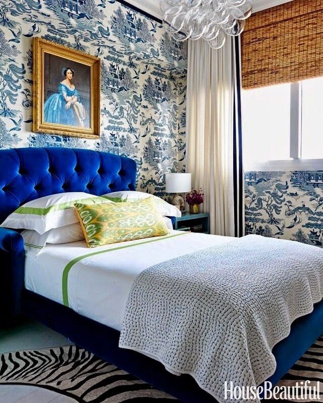
As you can see below when we look at comparisons to other paint colours, that fact becomes more eye-opening.
Colour Comparisons
Hague Blue No.30 & Pitch Blue No.220
It’s only when we compare colours that we can truly understand the tones and whether they lean more one way or another on the colour spectrum.
When I do Colour Consultations in a client’s home, I am always comparing colours so they too can easily see the differences.
When I hold my large paint boards up to decorative elements such as fabrics, wallpaper or subway tile and then swap out one board with another board, it becomes much more evident as to which colour will work best.
Best Whites To Pair With Stiffkey Blue
All White No.2005
James White No.2010
Wevet No.273
I can assure you that the best colour for your project already exists, you just need to know the 5 Steps on how to choose the right paint colour the first time.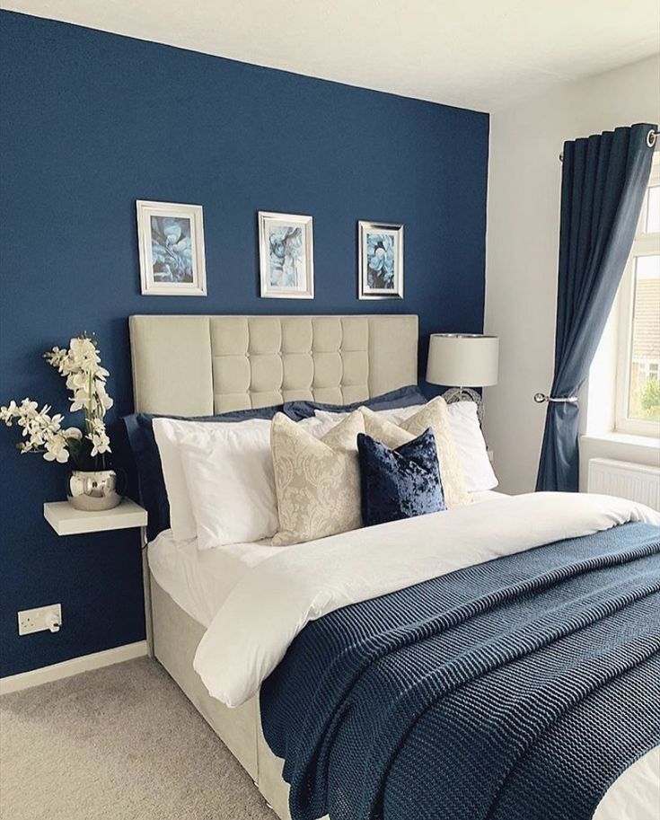
Fabulous Colour Combinations
Stiffkey Blue with Churlish Green, De Nimes & Skylight
Churlish Green No.251 – MY FAVOURITE OF ALL THESE PAIRINGS!
De Nimes No.299
Skylight No.205
Where would you use this striking paint tone? I would love to use Stiffkey Blue by Farrow and Ball for kitchen or bathroom cabinetry and to create a dramatic mood in a dining room.
Convenience At Your Fingertips
All of the colour combinations shown above plus more options for you to choose from are included in my Perfect Colour Palette for Stiffkey Blue.
My Perfect Colour Palette library holds over 50 palettes to select from! Click here to see all of them.
Classic Paint Collection
If you want more Farrow & Ball, check out my Classic Collection here.
Note: All colours shown are by Farrow & Ball
My Newest Collection: Sherwin Williams Neutrals
Remember, it only takes one mistake to take your home decorating project from divine to disaster.
Don’t let the paint be what stresses you out!
For Easy Pinning
60+ photos in the interior, modern design ideas
Features of the blue color in the interior
Actual this season, blue is truly loved by many designers around the world. What are its distinguishing features?
- The range of shades is very wide: from cold aquamarine to warm lavender. Everyone can find the right one for themselves.
- Universal blue will suit any room: the main thing is to correctly balance it with other colors.
- Light blue does not tire, gives a feeling of infinity of space, soothes and pacifies. Deep blue adds mystery, mystery, comfort to the interior.
- From the point of view of Feng Shui, the color of water and sky represents purity, stability and tranquility.
Shades of blue
Shades of blue have a wide palette, which means that the interior can be either dark, which will add respectability and mystery to the atmosphere, or light, airy and refreshing.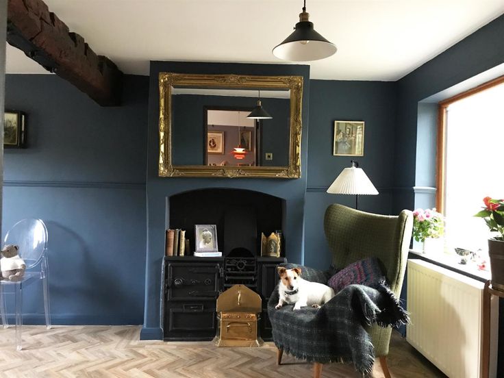
Pictured is a rich dark blue Art Deco interior with pearl and gold accents.
Festive cornflower blue with a slight hint of purple is perfect for a child's room - for both boys and girls. In addition, bright blue goes well with natural motifs: house plants and wooden furniture. A bedroom in warm blue tones will be appreciated by creative people. If a workplace is equipped in the room, the atmosphere will enliven thinking and fill it with energy, and at night, with the lights off, it will set you up for sleep.
The photo shows a nursery with a cornflower blue wall that sets the mood for the whole room.
Turquoise color will refresh the bedroom, while delicate aquamarine will fill the room with light and coolness.
Color combinations
The blue color, in harmony with various shades, gives amazing effects in its variety. Combining it with white, it is easy to achieve airiness and spaciousness in an environment. The blue-gray combination, on the contrary, dims the light, sets it in a more serious way. A bedroom with brown decor makes a strict and solid impression.
The photo shows a blue and white interior, the airiness of which is maintained by mirrors around the perimeter of the wall.
Combining blue shades with gold, it is easy to get a magnificent bedroom with a refined and rich interior. A beige or cream room with a sky-colored finish will create a calm, sophisticated atmosphere, while a contrasting yellow and blue room, on the contrary, will give a charge of vivacity.
The photo shows a bedroom in aquamarine shades, in perfect harmony with golden elements.
One of the most win-win combinations is the blue-blue palette. Close shades successfully complement each other and do not cause dissonance.
The photo shows a blue accent wall, which is successfully set off by darker accessories: curtains, pillows, a bedspread and a chest.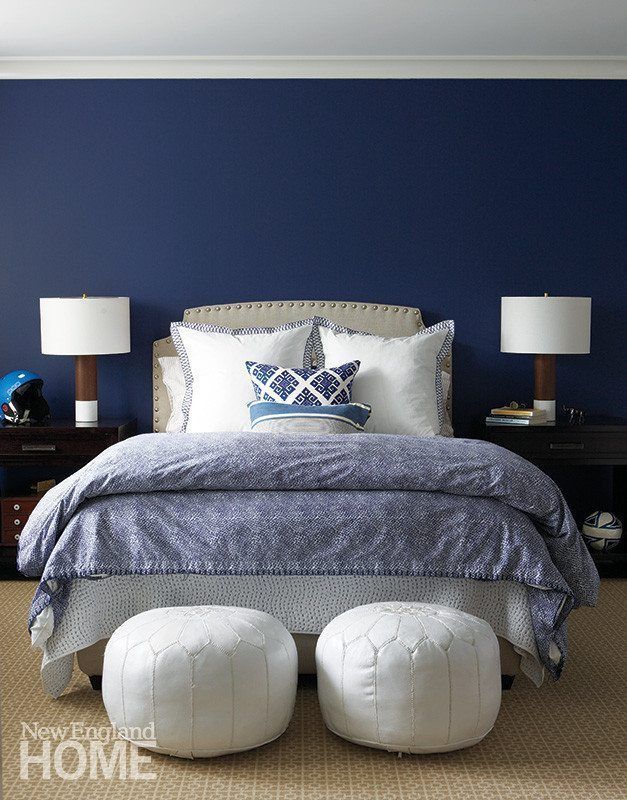
Finishes
The standard use of blue in interiors is wall decoration. This color makes spacious rooms more comfortable. In a small bedroom, a dark accent wall adds depth, expanding or narrowing the room - it all depends on the area of \u200b\u200bapplication. Wallpaper, paint, decorative plaster or wood panels are used for decoration.
Pictured is a bedroom with a lavender accent wall.
Blue color on the floor and ceiling is guaranteed to make the room bright and distinctive. It can unite the walls and ceiling or set off the top of the bedroom. An irregularly shaped room that is only partially painted looks especially impressive: for example, an attic with a sloping roof.
Pictured is a cornflower blue ceiling with wooden slats that follows the headboard wall.
As for the flooring, the most popular flooring for a colored bedroom is dark wood laminate or parquet, which adds solidity and solidity to the atmosphere.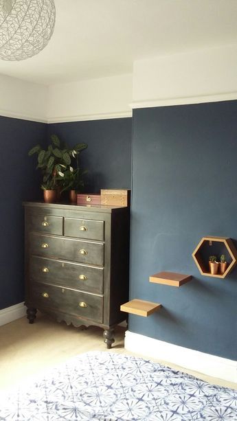 The blue floor is less common, as it looks very eccentric. To create it, carpet is usually used.
Selection of furniture and textiles
In modern interiors, the arrangement of white furniture on a blue background, which not only looks stylish, but also lightens the atmosphere, is a winning one. A bedroom with a brown set creates the effect of a cozy and lived-in room. Often these three shades are successfully combined in a marine style.
An excellent solution would be to use blue furniture on an identical background: a cabinet painted in the same color as the walls gives an interesting effect, as if dissolving into the surroundings. Contrasting furniture gives the opposite result: for example, a red and blue combination of an armchair or decor against a cornflower blue wall.
The photo shows a spacious bedroom in a marine style with blue and transparent furniture.
The purpose of textiles in the blue bedroom is to dilute the base and give the interior coziness and texture.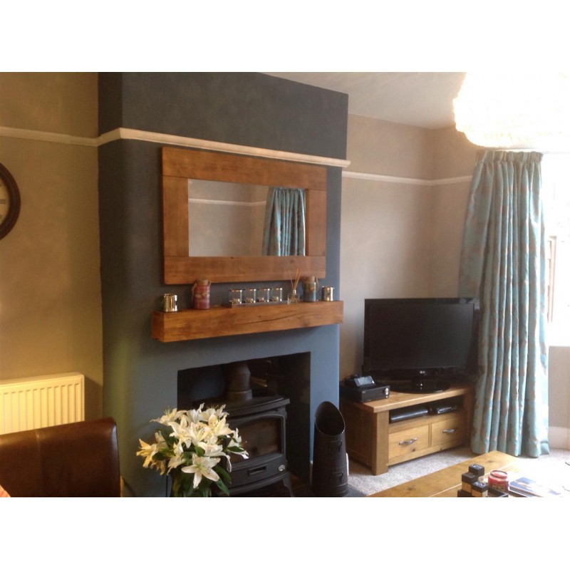 A good solution would be to decorate windows with tulle, light curtains or blinds. If blue is an accent in the bedroom, pillows and curtains of the same color will come in handy here. Covers with a geometric pattern look great, as well as colored elements: yellow or orange sofa upholstery, dusty pink or silver pillows.
In the photo, the head of the bed is combined with pillows and a bedspread, and the blue carpet seems to reflect the ceiling of the same color.
Emerald, mustard or orange elements look great in combination with blue furnishings.
Pictured is a bright aqua chest of drawers and a door painted in ultramarine.
Examples of lighting and decor
When choosing a shade of blue for the bedroom, it is worth considering that in natural light the room will look different than in artificial light. Cold tones are best diluted with warm light by installing a chandelier or wall lamps with incandescent lamps.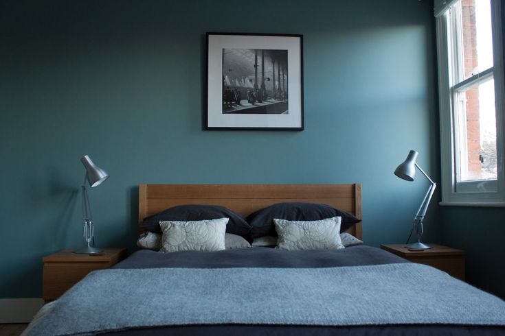
Pictured is a classic blue room lit by a warm glow.
In a modern style, spotlights in a stretch ceiling will be appropriate, and in grandiose baroque - crystal chandeliers and sconces with floor lamps. Dark rooms decorated with garlands or stylized as a starry sky look picturesque and romantic.
Pictured is an artsy baroque bedroom in lavender hues.
Design Ideas
Let's take a look at some more interesting ideas that can be implemented using azure shades.
Pictured is a nautical-themed teen bedroom with wide blue and white stripes on the walls.
To make the rest room expressive, you can decorate the headboard with watercolors, floral prints, photo wallpapers or frescoes, and also paint only half of the wall in blue: the bottom or the top.
The photo shows an unusual room with artistic painting, the palette of which echoes the carpet on the floor.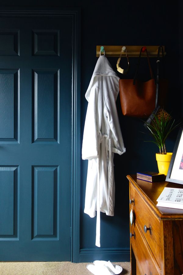
Interior styles
An elegant neoclassical interior is a balance of expensive aesthetic accessories and textured finishes. The blue color in such a bedroom should not be intrusive: wallpaper with patterns, colored textiles and furniture are used for this.
In a laconic Scandinavian interior, indigo is most often seen - and only on an accent wall. It goes well with white furnishings and wooden elements.
Blue is not characteristic of the loft direction, but a stunning combination of rich cornflower blue details and orange bricks make the atmosphere of a rough industrial style bright and memorable.
The photo shows a neoclassical bedroom with aquamarine wallpaper with silver ornaments.
Summer Mediterranean style bedroom is a combination of wood, all kinds of patterns and shades of the seascape. The walls, finished with blue plaster, become the basis for recreating the holiday mood.
Hi-tech sleeping room is the exact opposite of the previous approach. High-tech appliances, metal elements and glass help to support this direction, and the blue tint is achieved due to the abundance of built-in lighting.
In a minimalist style, dark colors are rarely used, so the bedroom in muted blue tones looks unusual, but does not lose its conciseness. The palette here is monotonous, but this does not make the monochrome room any less attractive.
Photo gallery
Blue color can be associated with a gloomy atmosphere, so melancholy people are advised to avoid dark interiors. Everyone else can safely experiment with azure, indigo and aquamarine shades, filling your home with beauty, color and air.
Blue bedroom (100+ photos) - real interiors, a selection of design ideas
Blue bedroom is an ideal choice for those who love the atmosphere of freshness, lightness. This color symbolizes space, silence. It provides for many shades and harmonizes with different ones. The variety of possibilities for implementing a recreation room in this color allows you to develop interesting projects.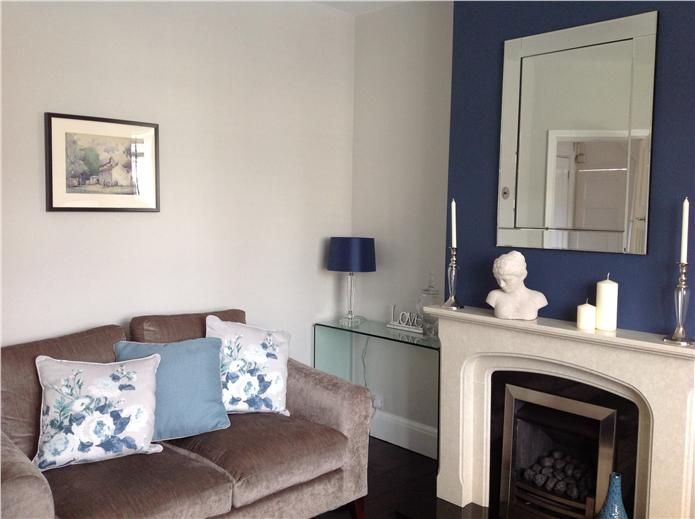 The light spectrum will help visually enlarge the room. Whereas dark shades will make the interior more strict, narrow the space. In this article we will consider all the nuances of decorating a bedroom in blue.
Blue color in the interior of the bedroom is quite a profitable solution. This room is adapted for relaxation, so it should have a peaceful, calm atmosphere.
The right color spectrum helps to achieve this. It should not contain a large number of bright colors.
Benefits of blue bedroom design:
- inspiring, calm environment;
- ensuring good sleep;
- versatility;
- visual expansion of space;
- combination with many tones.
The disadvantage in some situations is that this color belongs to cold tones. Therefore, a room with the wrong design can become gloomy.
[VIDEO] Designer's approach to blue in the interior
How to choose the right shade
Design in various spectra from dark to light overflows allows you to make the room airy, create a light, delicate atmosphere, and also make the interior more massive, gothic . Your favorite shade can be an excellent accent in the decoration of the room.
Blue tones are perfectly combined with green, lime, pink, lilac spectrum.
Sea green and white can also be a great addition to the main shade of the interior design.
Bedroom in blue tones can be made in different styles: provence, modern, modern, classic, hi-tech, loft.
Blue
The design of the bedroom in sky and blue-gray tones is considered a classic. Such shades are suitable for spacious and small bedrooms. They make the room brighter, expand the space.
complementary colors available in white, grey, violet, pearl, blue and bright shades.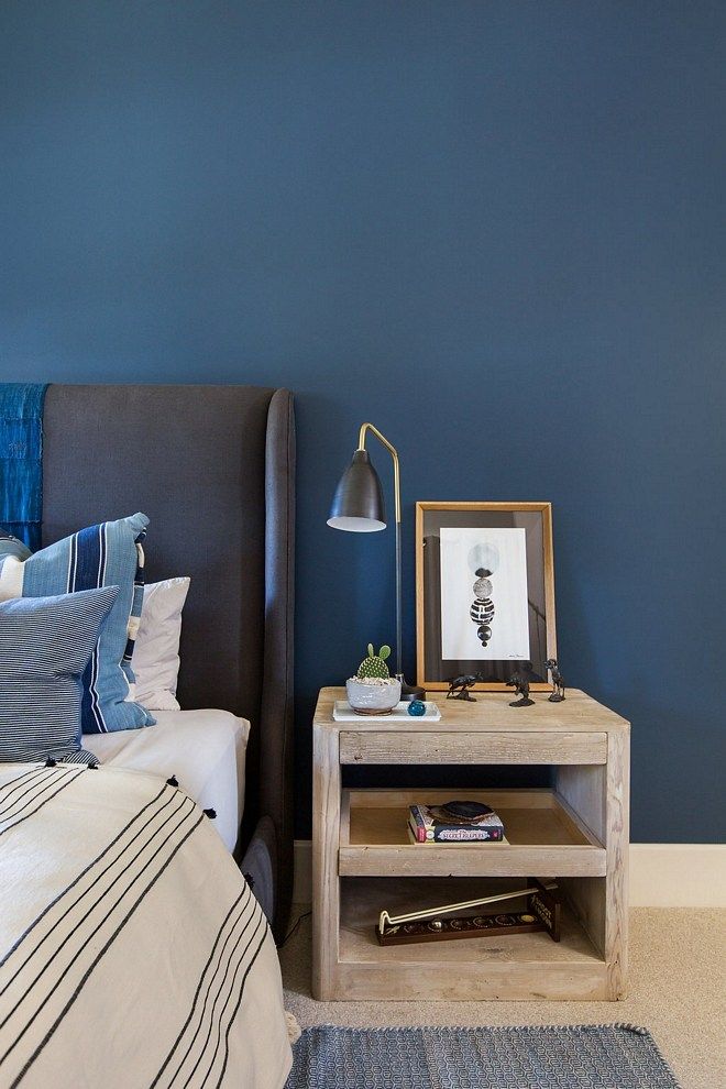 Lightweight decor, unobtrusive elements will look more beneficial.
Expert opinion
Irina Klimova
I am 29 years old. I am an interior designer. I love my job and have been doing it for over 8 years. About 100 projects have been implemented. I provide professional advice.
It is preferable to use refined, graceful outlines in the arrangement of walls, ceilings, and furniture structures. It is better to abandon massive interior items. The bedroom in blue provides harmony, lightness and neutrality in design.
Leaves, flowers, feathers, geometry and other accents can be decorative motifs.
If you have chosen a bright blue color, then it is better to combine it with another more calm shade.
Blue
The classic tone looks great in well-lit rooms where light colors would appear washed out. It perfectly emphasizes the geometry, lines.
Many designers recommend combining dark blue with warm undertones. So you can achieve a cozy interior. But it looks no less advantageous with neutral tones - white, blue.
Blue wallpaper for the bedroom is usually used in the arrangement, while the ceiling and floor are decorated with contrasting or neutral shades.
Often you can see the wall treatment in the form of color panels - the area at the head of the bed is painted in a rich shade. The near walls are made in a calm design.
Indigo
The color is deep, extremely rich and vibrant. It is ideal for decorating a bedroom in a modern style.
This way you can decorate the walls, ceiling, create additional decorative accessories - lampshades on floor lamps, furniture upholstery, etc. The shade is used as a modular accent, as well as a full-fledged coloring, pasting space.
Indigo tone is used to create a bright element in rooms with small dimensions. Large rooms allow you to create various interior projects with this shade. It is in harmony with light gray-blue tones, white, green, peach, beige. Excellent indigo combined with purple, lilac.
Turquoise
The shade is considered universal, as it is suitable for decorating any style in the interior, relevant for an adult and children's room. It is combined with classic white, pink, beige, brown, green, dark blue and many other colors.
Combination with different tones allows you to make the room bright, unusual, but also discreet. Most often, the design in turquoise tint is complemented by stylish accents - a blue vase, fuchsia decorative pillows.
Aquamarine
The color combines iridescent blues and greens. So in different lighting it will appear bluish, in another it will become greenish.
Aquamarine shade looks great as a base color for decorative elements - curtains, furniture upholstery, pillows, lampshades, floor lamps and more. Such an element brings an original, stylish accent to the arrangement of the room.
Since the shade is darker, it is better suited for larger rooms.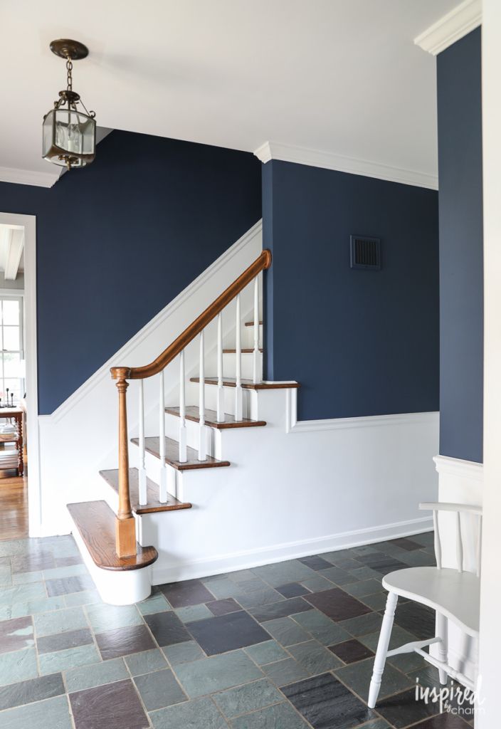 But it can be combined with light colors - powdery, peach, blue, light pink, pearl.
Choosing a style for a blue bedroom
Blue in the bedroom is a versatile solution that allows you to realize various interior ideas. It is optimal, suitable for organizing design in different stylistic types.
The design will look great in the restrained and romantic style of Provence, as well as country. This design is filled with comfort, warmth, simplicity.
Combined with the classic white color, blue wallpaper in the bedroom will create notes of Scandinavian or Mediterranean style. Such a color spectrum will emphasize sophistication, increase space, create an atmosphere of lightness, and be associated with the sea.
Decorative accessories - shells, printed vases, paintings, panels will help create an unsurpassed decor.
The bedroom interior in blue tones is often used in the loft style.
This is a rather complex type of decoration, but it is perfectly emphasized by a cold, neutral tone. In this case, you need to use a blurry shade. Mixing of colors is often created, forming a panel of peculiar blots of paint.
In combination with decorative bricks and wood, such elements perfectly emphasize the stylistic features of the loft.
Blue wallpaper in the bedroom is relevant for classics, as well as high-tech and many other types of design. The tone has proven itself to be in demand and fashionable.
The right choice of shades and accessories will help create a unique design of the rest room. The diversity of the range and versatility allows you to adapt the range to different styles of interior decor.
Proper lighting and decoration of the blue bedroom
Designing a competent lighting scheme for a room is a complex and responsible process. Depending on the dimensions of the room, the optimal volume of lighting devices is selected, the scheme of their placement to create uniform lighting.
The following types can be distinguished:
- Basic lighting.
 The main light, a chandelier must be present even in a bright room. It should not be too bright, as additional lamps provide the required level. It is better to choose diffused light , which provides direction to the ceiling or walls. Dense shades also allow you to create soft, unobtrusive lighting. The location of the main lamp is preferably in the middle of the room. For small spaces it is better to use flat chandeliers.
 - Bedside light. Necessary for reading, working with a laptop. It is realized through sconces, floor lamps. Paired lamps are purchased for a wide bed. Lighting should be bright enough, but at the same time directional, not diffused. The lamp should be placed about 60 cm above the bed. The sconce, as a rule, is located at a height of about 2 meters from the floor. Lamps on brackets that can be moved would be an excellent option.
- Mirror lighting. Accessory is an important attribute in the room. Perfectly serves the sconces placed on both sides, as well as the backlight built into the product.

- Decorative light. It is used for decoration, as well as a functional muffled source. An excellent option would be point ceiling lamps. They can be turned on separately from the main lamp, creating the most calm light.
Optional lighting fixtures for cabinet, workstation. An important requirement is the containment of the overall design style of chandeliers and lamps.
The variety of modern lighting fixtures allows you to choose the actual product for the style of the room design. To make the room more comfortable and original, you can make your own lampshades for floor lamps.
Blue wallpaper in the interior of the bedroom can be the main accent, as well as a neutral element.
It is important to consider the shades of the arrangement when choosing decorative elements. Lamps, curtains are not only a functional item, but also an important attribute that emphasizes the design. Therefore, the development of accessories must be taken as responsibly as possible.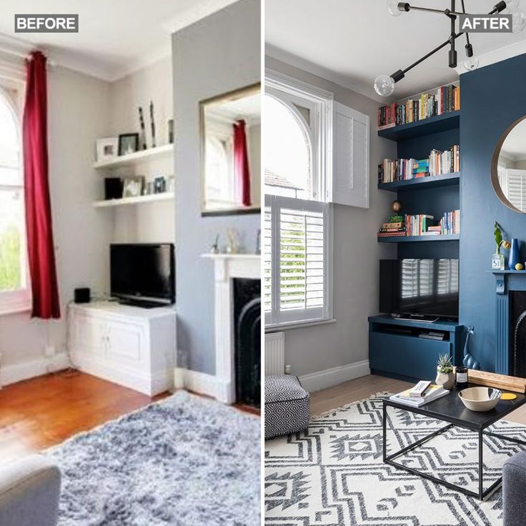
Blue curtains in the bedroom can be hung in the presence of light shades of the walls. They will create contrast, focus on the element, emphasize the decor.
Draperies can be made from heavy fabrics, as well as light, weightless ones. Textiles are selected in accordance with the style of interior design. Combined curtains will look most advantageous.
Decorative elements are:
- photo wallpapers;
- paintings, panels;
- books;
- vases;
- pillows, bedspreads, blankets, tablecloths;
- curtains, blinds;
- stylized plant pots and more.
There are many options for decorating a room with small or large pieces, but it's important not to overdo it.
Elements should be selected based on the style of decoration. For example, the marine style includes stripes, anchors, waves, accessories in the form of ships and steering wheels.
Loft is a more serious, minimalist type of design.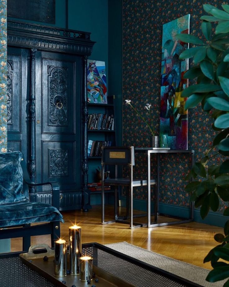 Geometric shapes, bricks, wooden lamps, massive shelves are welcome here.
Provence includes floral attributes, patterns, frills.
Hi-tech also implies geometry, the presence of glass, metal accessories in an elegant and sophisticated style.
The combination of blue with other colors in the interior of the bedroom
The combination of shades in the interior is of great importance. By choosing the right spectrum, you can create an optimal atmosphere in which it will be comfortable to be, it is pleasant to fall asleep. It is important to understand the palette and determine which colors can emphasize the style of the room.
Among the recommendations for creating interior decoration, we can note the use of two basic shades. They may be similar or contrasting. A few more tones can act as additional colors.
Gray-blue bedroom
Gray is quite similar in color to shades of blue. It is combined with blue, dark blue, aquamarine, turquoise and other tones.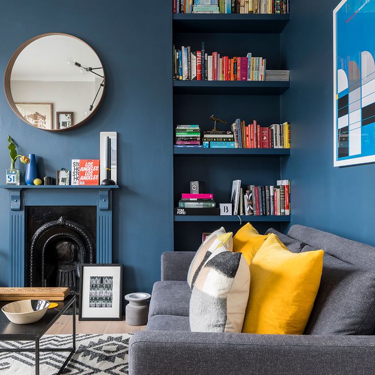
Light gray walls with blue furniture look amazing. It can be noted asymmetrically located curtains of blue tone on the curtains, decor with a gradient is possible.
For textile accessories, it is better to give preference to light colors. It can be light, translucent gray curtains with overflows, as well as blue shades. The gray-blue design is accentuated by silver elements.
This type of design is universal. It is suitable for small and large rooms in classic and modern interiors.
Glass and metal products can be used as accessories.
Bedroom in blue-beige
When it comes to combining similar shades, beige acts as the main tone, and dark complements, creates accents. Beige wallpaper and ceiling will help create a light design, while blue elements will bring charm and style.
The combination of blue-beige shades will create a gentle, light design. Such a room will not seem cold, gloomy. This is a universal range, relevant for rooms of different sizes.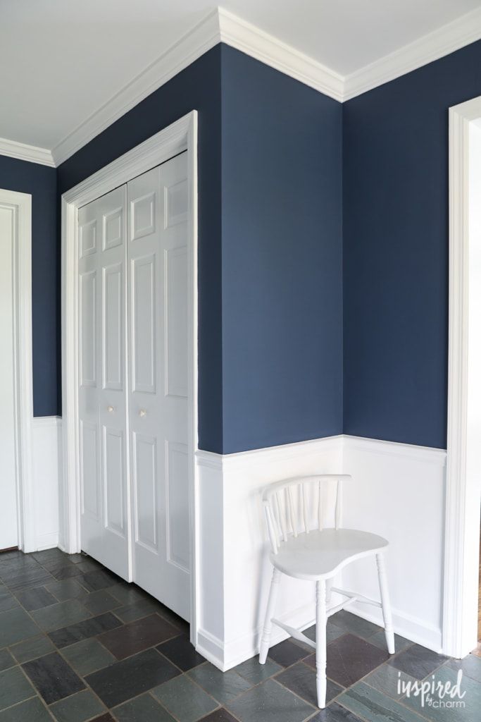
The blue curtains in the interior of the bedroom perfectly emphasize the elegance and sophistication of the design. With beige furniture, light walls, the decoration will look unobtrusive, cozy. This type is more suitable for the classic style of decorating the room.
Golden blue bedroom
Gold looks best with dark tones, but the shade will look no less elegant with light shades. This design is relevant for well-lit rooms, since in most cases the combination is carried out with a dark blue color.
Decorated with golden elements, the wallpaper emphasizes the bohemian, rich, sophisticated, royal style of interior decoration. In such shades, you can make the ceiling.
Golden curtains and curtains with elements of gold in the blue bedroom will create a warm atmosphere. Such an interior is optimal for both dark and light rooms.
Bedroom in blue and white
The combination of blue and white creates a fresh design. By itself, the white shade is an excellent reflector of light, so it can perfectly level the gloom of a dark blue tone.
A more common design is the presence of light furniture and colored wall decor.
For additional decoration to the combination of blue and white bedroom, you can add gray and silver, pearl tones used to decorate the ceiling or furniture elements.
Blue bedroom with white furniture is universally suitable for large and not too large rooms. This solution is a classic of aesthetic interior design. The room will look solemn, stylish. This range is also suitable for modern design.
Blue-brown bedroom
Blue-brown room design becomes more melancholic combination. This combination provides a certain charm.
This combination is associated with natural motifs, since blue itself is a reflection of the color of the sky, water, and brown - trees, earth.
Harmony of tones allows you to make the atmosphere in the room more balanced, calm and peaceful.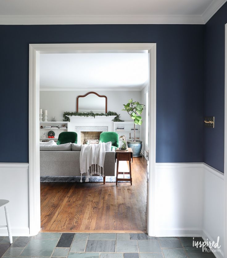 The room in blue-brown shades will be as cozy and warm as possible. Tandem is used in various tint combinations. But if the room is dark, it is better to prefer light colors.
Blue bedroom
The arrangement of the room in the blue-blue spectrum is considered harmonious, neutral. This design is relevant for dark and light rooms. Often in the organization of interior decoration, a sky-blue tone is used, but a bright shade is also used in combination with muted overflows.
Monochrome design will not cause contrast, therefore it is optimal for a bedroom. It is also suitable for those who do not want to use white because of its impracticality.
Curtains and curtains in blue are of great importance. In the blue bedroom, they will create an airy, light atmosphere, fill the atmosphere with freshness and light.
For this design, curtains should be of soothing tones. The accessory will not tire your eyesight.
Red and blue bedroom
People who prefer unusual contrasts in the interior will be delighted with the red and blue combination of room decor. With a bright design, it is better to choose more neutral tones to dilute the interior design.
White, celestial are suitable as additional shades. They will dilute the brightness, make the decor more concise.
It is better to define the primary and secondary tones. So the walls with blue wallpaper perfectly complement the red curtains and lampshades to match them.
Blue bedroom design - photo gallery
Blue bedroom design creates a peaceful environment that is perfect for the room. Psychologists and designers recommend this color as the main shade for arranging a sleeping room.
It has a positive effect on the psyche, does not strain the eyes, and promotes normal falling asleep. Ample possibilities of combining shades allow you to implement various projects for the design of room decoration.
Here are photos of bedroom interiors in blue tones that can inspire your own renovation ideas.
Briefly about the main things
- Blue color is conducive to relaxation, serenity and tranquility.