Red grey kitchen ideas
Best Red and Grey Kitchen Ideas for 2020
Love grey but need a dose of excitement? You can still have your grey kitchen but turn up the heat with bold splashes of red. The contrast works both ways – the grey will help cool down the red to a comfortable, liveable everyday palette.
Red brings in a fun factor, a high energy vibe. There’s probably no other color that can look as striking, no matter what shade of red you add. Think fire engine red for retro accents, a cherry tomato red in a farmhouse kitchen, or a dark moody red in a sophisticated space.
White is a common combination color with red, and so is black. But why not try something different by adding grey instead? A pale grey does the same job as a white, without as much of a glaring contrast with the red. And a dark somber grey can tone down the red and help make the space look sleek and chic.
Don’t forget to use your walls and flooring to your advantage in such a high contrast space. The right hardware and appliances can make all the difference between a kitschy kitchen and a luxe loft.
1. Red Done Right
Votes: 5
Source
Hot reds and cool greys tempered with loads of white makes a classy kitchen that’s definitely not boring. If you can picture the room after removing the reds, you’ll notice that the space would indeed look nondescript. It’s the red that brings in the movement and excitement.
2. Classic Redefined
Votes: 5
Source
This gorgeous gray kitchen sparkles with all the different shades of grey on display. Between the pale gray cabinets and deep grey walls and gray veined marble countertops, it’s a visual feast, even without the reds. But bring in the red and it becomes a whole another space altogether – exciting, attention grabbing, and yet remaining classy.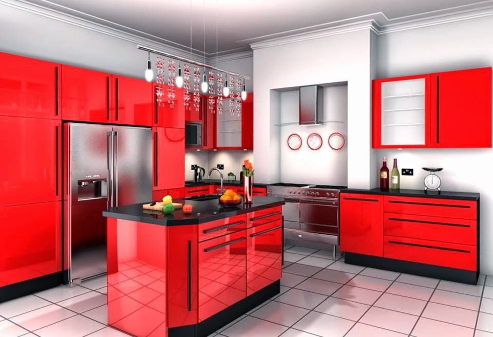
3. Accent on the Grey
Votes: 5
Source
A kitchen that doesn’t scream red even though its walls and cabinets are red is because it’s wine red. The almost-white pale gray contrasts well with the wine cabinets, while the coal colored grey acts as the perfect accent on the oven hood.
4. A Fiesty Red
Votes: 5
Source
The eye-catching dragon print fabric on this banquette could stop traffic if there was traffic. And yet, the fun and cheerful print doesn’t seem too rowdy in here, thanks to the gorgeous grey cabinets and sleek hardware and light fixtures.
5. Fun and Functional
Votes: 5
Source
This bright orangey red will put a smile on anyone’s face at the end of a long day.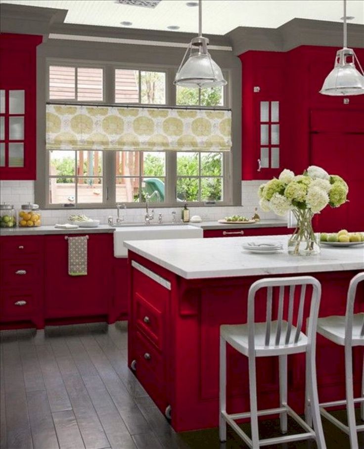 However, it doesn’t stop there – for a small space, it’s hard working, practical and functional. The dove gray walls offer a calming contrast to the glossy red cabinets.
6. Cranberry Country
Votes: 5
Source
This is an all-red kitchen, with the cabinets and the shelves and the island all painted a dark cranberry color, while the grey is the accent color, in the stone walls and weathered beams. It works because it’s a large space, paired with bold rustic elements.
Want to be added to this list? Click here to bring up our submission form. We will be in touch shortly with feedback.
51 Inspirational Red Kitchens With Tips & Accessories To Help You Design Yours
Like Architecture & Interior Design? Follow Us...
- Follow
Intense and not to everyone’s taste, red kitchens can be controversial. With that said, we’re here to prove the awesome power of the bold red kitchen aesthetic – I mean, if the colour is a favourite of Superman’s then its a favourite of ours too. Red can be your kitchen’s superpower by blasting away boundaries and adding fire to the mundane with a shade that’s not for the faint of heart. We’ve included some tips and tricks with these 51 inspirational red kitchen designs to help you design your very own super space, as well as a sophisticated collection of muted red kitchens for those who want the heat but not the blaze.
- 1 |
- Visualizer: Angelina Gladkova
- 2 |
- Visualizer: Palina Karniyenka
 This design utilises green kitchen bar stools and an indoor plant to exaggerate the eye catching pop of green established by the island.
- 3 |
- Visualizer: xo_ wasim
- 4 |
- Visualizer: Orb
- 5 |
- Designer: Lauri Brothers
- 6 |
- Designer: Austin Maynard Architects
 The bright red kitchen volumes gain command of their allocated space even beside the unique distraction.
- 7 |
- Designer: Gleba+Störmer
- 8 |
- Designer: Gon Architects
- 9 |
- Designer: Colombo and Serboli Architecture
- 10 |
- Via: Hus & Hem
- 11 |
- Visualizer: 3D Quart Studio
- 12 |
- Designer: Christopher Strom Architects
- 13 |
- Designer: Zero Energy Design
- 14 |
- Photographer: Adriano Pecchio
- 15 |
- Photographer: Michael Garland
 A splash of living greenery softly subdues the eruption of burning colour.
- 16 |
- Designer: CstudioArchitetti
- 17 |
- Photographer: Adam Butler
- 18 |
- Visualizer: RIP3D
- 19 |
- Visualizer: Natalia Pogorielova
- 20 |
- Visualizer: Kate Khotsim
- 21 |
- Visualizer: Buro White
- 22 |
- Designer: HE.D group
- Visualizer: HE.D group
- 23 |
- Visualizer: Rina Lovko
- 24 |
- Designer: Dries Otten
 An arched backsplash tops off the arty kitchen concept.
- 25 |
- Via: The Guardian
- 26 |
- Designer: Sophie Nguyen
- 27 |
- Visualizer: Yaroslav Priadka
- 28 |
- Designer: Carole Hunter
- 29 |
- Designer: Ande Bunbury Architects
- 30 |
- Designer: taomi design
- 31 |
- Visualizer: Lev Production & Alexandr Radionov
- 32 |
- Source: HEXIA Real Estate Toulouse and Bagnères de Luchon
- 33 |
- Designer: D&J Kitchens and Baths
- 34 |
- Source: Ikea
- 35 |
- Visualizer: Anna Marinenko
- 36 |
- Visualizer: Alina Novytska & Lada Kamyshanska
- 37 |
- 38 |
- Visualizer: K Band
- 39 |
- Designer: Dyna Contracting
- 40 |
- Source: Popstahl
- 41 |
- Visualizer: Alfgram Koie
- 42 |
- Visualizer: Mikhail Lenko
- 43 |
- Designer: All Arts Design
- 44 |
- Designer: Rare Office
- 45 |
- Visualizer: Julia Bielova
- 46 |
- Visualizer: Ricardo Tohme
- 47 |
- Designer: PAINTIT
- Photographer: Shurpenkov Andriy
- 48 |
- Source: Pedini
- 49 |
- Source: GeD CUCINE
- 50 |
- Designer: RULES architekti
- 51 |
- Source: Oppein
- 52 |
 Red measuring spoon set 8. Red kitchen stools 9. Anti-fatigues kitchen standing mat
 Recommended Reading:
51 Red Living Rooms
51 Red Bedrooms
51 Red Bathrooms
Did you like this article?
Share it on any of the following social media channels below to give us your vote. Your feedback helps us improve.
Make your dream home a reality
Learn how
X
interior design ideas, kitchen renovation
Red is always bold and extravagant. Bright and juicy shades invigorate and stimulate appetite. And the thoughtful design of the red kitchen will become a real embodiment of the hearth. You will want to return to such a kitchen again and again, gather for a family dinner and invite guests. Saturated red color warms with one of its existence. Its variations never go out of style, from delicate pale to deep burgundy and burgundy.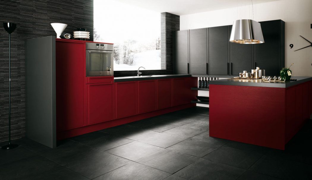 But in order to achieve harmony in such an interior, you need to carefully consider it.
Interior styles
The red color is not as unambiguous as it might seem at first glance. This is by no means aggression, because red is the color of love, passion, celebration and good mood. This is one of the strongest natural shades. It can be inscribed in different styles.
Modern style red kitchen
Modern style is strict straight lines, metal, glass, bright plastic, clear geometry and space thought out to the millimeter. This kitchen is a real work area. The task of the red color is to bring a little color and warmth to healthy pragmatism. Moreover, red goes well with black, white and hi-tech chrome elements. Especially its rich shades: scarlet, raspberry, dark cherry.
Loft style red kitchen
Loft is a 50s bohemian American style that was especially popular in New York. Now it is back in fashion, combining practicality, functionality and simplicity.
Loft is always creativity and slight negligence. The style was actively developing at a time when offices, warehouses and factory premises were converted for life. These are raw walls, rough furniture, open communications and a well-planned layout. Any nondescript kitchen can be turned into a beautiful loft. The ideal backdrop for this style is a rough, raw brick wall.
Pop Art Red Kitchen
Pop culture is an endless source of inspiration. Its elements are used everywhere: in accessories, clothes, decor and interior. Red color and this style are made for each other. It uses simple materials, a lot of plastic and metal, contrasting color accents. You can complement the design with retro posters designed in red tones.
Oriental Red Kitchen
Oriental style and red color seem to be made for each other. In the interior of such a kitchen, you can use any shades and their combinations. And here these are not accents, but quite a basic functional color. Red is used in Chinese, Moroccan and Arabic styles. It is combined with expensive wood, other dark and rich shades, gold.
The most discreet is the Arabic style with its neutral background. Moroccan - heavy, like oriental spices. Deep carmine shades are combined in it with the color of turmeric, dark blue, purple, emerald. The Chinese style is always a clear zoning, screens and partitions, bright and contrasting color combinations, and painting.
Victorian Red Kitchen
Of the classic luxurious styles, Victorian is the most fertile ground for red. It is usually used in living rooms, bedrooms and offices, but you can also experiment with the kitchen. The main thing is that the room is spacious enough. And it is desirable that the whole apartment was designed in the same spirit.
Victorian style is luxurious burgundy velvet and deep dark shades. Eclecticism prevails here. Classic, gothic, rococo and light Indian, as well as Chinese notes are found in one room.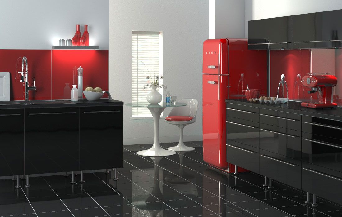
Finishes and materials
The choice of red finishing materials is unlimited. This is one of the primary colors that is in almost any line and not in one copy.
When it comes to combinations, in addition to classic and natural shades, red can be safely combined with other bright colors. With green - for modern eco-interiors. Such a duet looks fresh and invigorating. Blue color will help to cool the temperature, while yellow or orange will make the room even warmer and brighter. This is good for cold apartments and kitchens that lack light.
Floor
Red tile or laminate is suitable for the kitchen floor. These materials are well washed, unpretentious, not afraid of moisture and dirt. You can also use modern linoleums. They are cheap and easy to replace. But classic red carpets are best avoided.
Walls
Red color - very active. Too much of it can be tiring and annoying. Therefore, with the finishing of large surfaces you need to be very careful.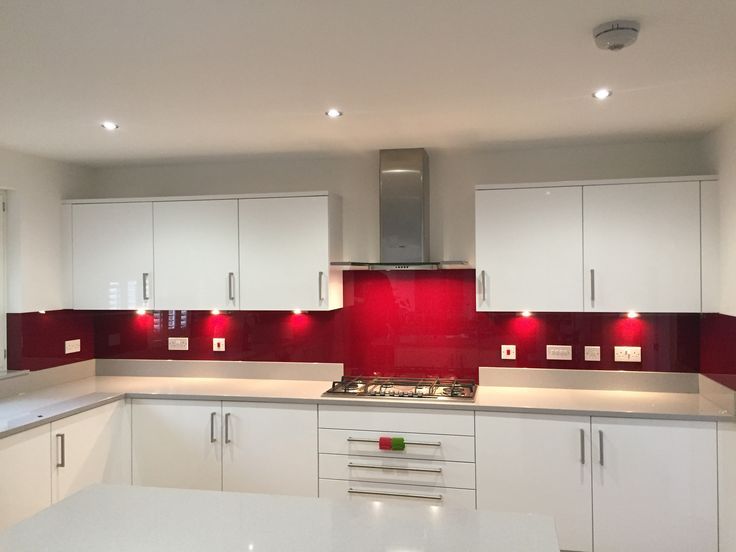 This is especially true for walls. One or more bright accents are enough.
A handy option is a red apron over the work area. It can be laid out with tiles or glass, plain canvas or in the form of a mosaic. Wallpaper for it is better to take light, soft, to create a comfortable contrast. If you need a muted natural red, you should pay attention to natural stone and brick.
Ceiling
The ceiling is rarely painted red. But if such a desire has arisen, a glossy stretch fabric looks best. It is only important to choose the right shade in order to visually maintain the height of the room. But lamps are well mounted in stretch ceilings.
Kitchen furniture
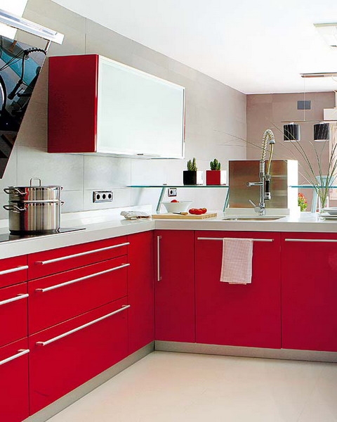
Red glossy panels look stylish in modern kitchen sets. Especially - on a white or black background, with metal elements. Deeper and muted tones are ideally combined with wood.
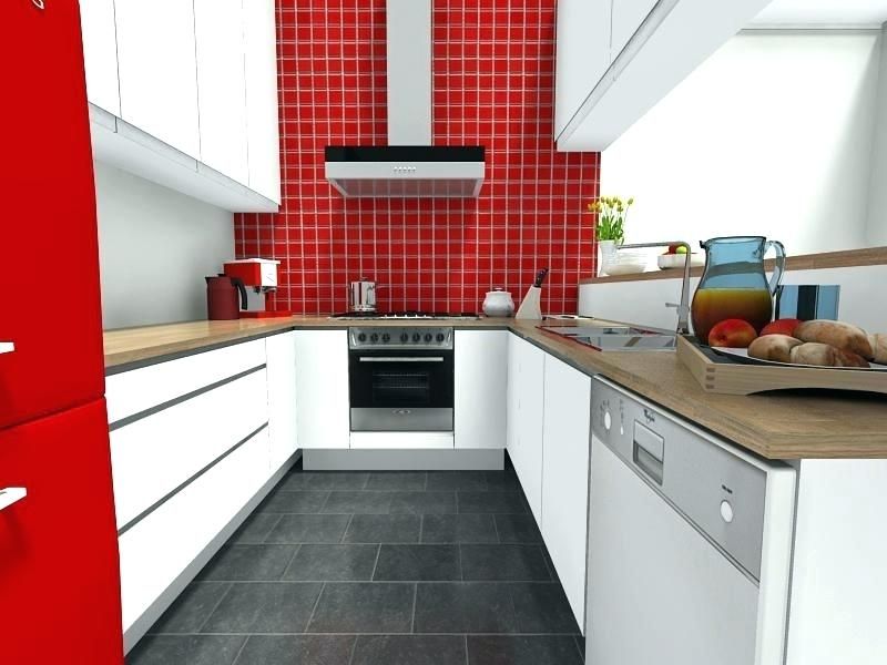
An interesting and extravagant option is a red refrigerator. It may well become the central accent of the kitchen, especially in the style of pop art. It can be decorated with bright stickers or unusual magnets.
If the kitchen is small, then the abundance of red will narrow it even more. In this case, you can limit yourself to a bright dining group with a colored table top or chair backs. But it is better to avoid completely monophonic furniture, it looks more cumbersome.
Decor and lighting
The most noticeable decorative element in the kitchen is the curtains. But it is better not to take deaf dense bright curtains. They are heavy and difficult to care for. Tulle, polka dots, stripes or plaid are great choices. And you can supplement them with smaller textiles: towels, rags, tablecloths, pillows on chairs.
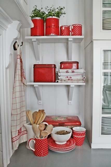
In red, you can also choose functional accessories: jars, coasters, dishes, flowerpots. They look stylish on a neutral background.
Red solid lighting is not the most convenient option for a kitchen where functionality is important. Here you need to constantly cut and cook, and most importantly - to see what you are doing and not get tired.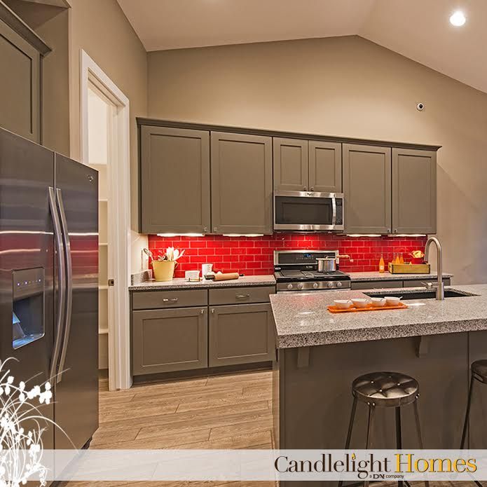 But individual decorative lamps can interestingly complement the interior.
Red kitchen design - photo
And to find fresh, bright and bold ideas for your taste, we offer you a selection of the best photos of kitchen interior design in red tones. Happy viewing and inspiration!
Video: Red kitchen - Interior Design
100+ real photo examples and design tips
A beautiful and cozy kitchen is the pride of every housewife who spends a lot of time there. Therefore, it is important that the interior of this room is not only stylish and beautiful, but also replenishes the supply of vivacity and energy. Red kitchen design is a tricky but interesting solution that does a great job if you only know how to properly use its shades in interior design.
Table of Contents
General Tips for Decorating a Red Kitchen
For some reason, many people do not dare to use red when decorating the kitchen, they prefer calmer and softer ones: brownish, beige or snow-white. And in vain: the reddish tones in the interior look original, unusual and even festive.
They create a warm atmosphere in the room, improve mood and invigorate.
But keep in mind that they are not suitable for everyone and that the red color in the interior has its drawbacks:
- Red shades in the kitchen should be used sparingly or completely abandoned if there are hypertensive or hyperactive children in the family.
- This design is not suitable for introverts and people who prefer a quiet, calm environment. In the red kitchen, they will be uncomfortable and want to leave as soon as possible.
- The red color strongly excites the psyche, it does not give the opportunity to relax and relieve stress.
- The red color scheme of the interior of the kitchen is considered unsuitable for people doing hard work.
- Dark shades, such as cherry, are not suitable for decorating small kitchens, as they visually "hide" the space and make the room less bright.
And yet, red kitchens have more pluses than minuses:
- They attract attention and make memorable even the simplest design of the room.
- Red increases blood pressure and is therefore excellent for hypotensive patients.
- This color improves brain activity and encourages a person to be active.
- Shades of red give confidence.
- Reddish tones go well with many other colors.
- Red brings a touch of luxury to the room: after all, in the old days it was considered the color of the aristocracy and ruling houses.
- Allows you to create interiors in a wide variety of styles: from Romanesque to hi-tech and loft.
To make a red kitchen look interesting and attractive, it is necessary to carefully consider its design down to the smallest detail.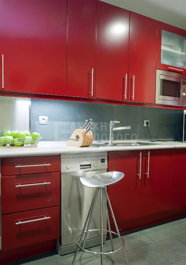
IMPORTANT! It is not recommended to make monochrome interiors, as in large quantities this color increases aggression, causes a feeling of anxiety and discomfort.
It should be used locally, for example, by making furniture facades or ceilings, or walls, or floors red. But only individually, and not all at once.
If we are talking about a small kitchen, then red should be used as patterns of one of the shades of the mosaic or multi-colored tiles.
Choosing a red set
In a red kitchen set, red should be combined with other shades. A combination of different materials will look advantageous. For example, plastic or wood with glass inserts.
Often, red sets are made in modern or minimalist style. Their bright, saturated color goes well with the laconic forms and the absence of excessive decor or flashy fittings.
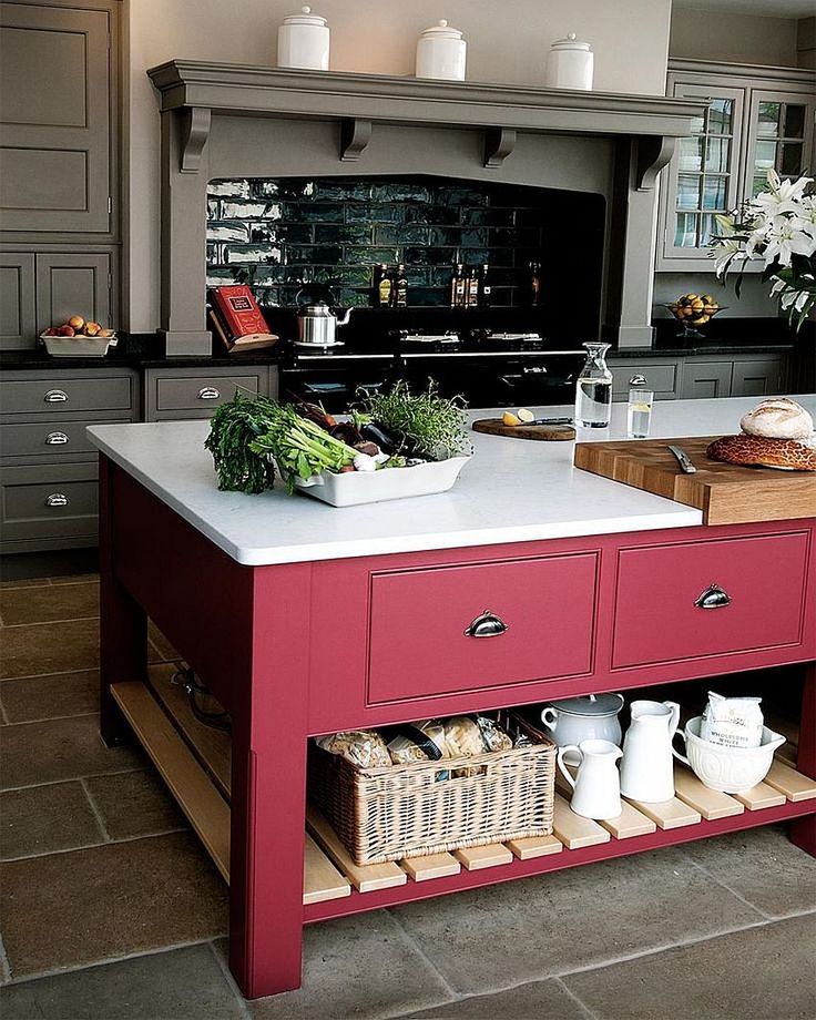
Spectral red is used infrequently, shades such as terracotta, cherry, coral or wine are more popular.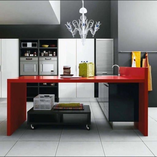
Wooden furniture in muted reddish tones, suitable for country style. They will also be good when decorating an interior in a classic style, but they will need to be combined with softer and calmer shades, such as white, ecru, beige, brown.
IMPORTANT! Red kitchen set can be either matte, suitable for classic trends, or glossy, which fits perfectly even in ultra-modern styles.
Choosing curtains for a red kitchen
To avoid quick fading of textile shades, give preference to curtains made of high-quality dense natural fabrics in light colors. If the kitchen is located on the shady side, then it is better to use translucent thin fabrics of a reddish gamut.
Drapes in rich dark shades make the room heavier and visually make it gloomy.
It is not necessary to use one-color curtains: patterned curtains often look more original and effective.
IMPORTANT! If the walls in the kitchen are covered with wallpaper with a large, rich pattern, choose plain curtains in neutral tones that match the main color scheme.
For country-style kitchens, curtains in a medium-sized white and red check or vertical stripes will be a good solution, which will give the interior a touch of rusticity. In a classic interior, red curtains with golden patterns in Roman or Empire style will look good.
Choosing wallpapers
The abundance of red and other bright colors has a negative effect on the psyche. When choosing wallpaper for a red kitchen, it is better to give preference to neutral tones, such as light gray, white, ecru, beige. Light coffee wallpaper or shades of natural wood are also suitable.
In large kitchens, you can make an accent wall and highlight it with wallpaper in a contrasting color.
IMPORTANT! A good solution would be photo wallpapers that can be placed in the dining area or in the living room combined with the kitchen.
If the kitchen set is light, the walls are decorated in red tones like this:
- One-color accent wall on the main patterned background.
 On it you can place hinged open shelves, photos or paintings in frames.
 - Patterned wallpaper, the pattern on which repeats the tone of the headset.
- Large patterned wallpaper with the same design as the apron.
Wallpaper and furniture must be designed in the same style. It will look bad as a carved antique set against the background of modern wallpaper with a bright abstract pattern, as well as modern or high-tech furniture, if placed in a kitchen decorated with “baroque” wallpaper with monograms.
Regardless of their design, wallpaper in the kitchen must be waterproof, easy to clean, not fade in the sun and tolerate high temperatures well. You should not save on their purchase, as cheap wallpapers turn out to be fragile and soon begin to move away from the walls or swell with bubbles.
Buy wallpaper for the kitchen only from trusted manufacturers, and not from those that are easier to find or cheaper to buy. Such dubious savings often cause new repairs to be carried out much faster than desired.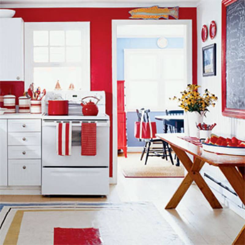
Choosing an apron
A kitchen apron protects walls from water drops, grease and vapors, and only then performs a decorative function. It should be not only beautiful, but also durable, heat and moisture resistant. It is important that water, drops of grease or other contaminants are easily removed from the kitchen apron. That is why it is better to give preference to materials with smooth, rather than embossed textures.
Kitchen apron can be decorated in red tones. The ideal material for it will be ceramic tiles or mosaics. These wall coverings are beautiful and durable, they will delight hosts and their guests with their almost new look for many years and decades.
Such an apron can be made in the same shades with the set or be a contrasting color scheme.
You can also choose a kitchen splashback made of safety glass. It can be transparent or decorated with photo printing, special interior stickers or hand-painted.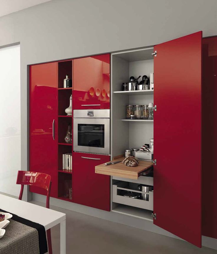
The most successful way to fit into kitchen interiors is glass aprons depicting fruits, flowers or abstract patterns, as well as a forest, mountain landscape or city panorama.
If you don't like a kitchen backsplash in red, then make it black, white, beige, grayish, silver or light brown.
IMPORTANT! From materials other than ceramic tiles and mosaics, for such an apron, you can choose natural or artificial stone, metal or brick.
Photo gallery
Red and black kitchen
The combination of these colors is considered classic, but red and black kitchen interiors are not always successful. An excess of black elements will make the room dark and gloomy. If red prevails, then the kitchen will look too bright and defiant.
The hardest part of designing is getting the right balance between black and red. But if you managed to do this, then the room literally changes: it becomes more interesting and more attractive.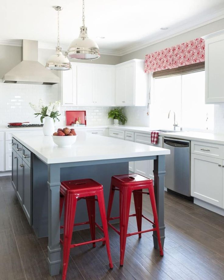
Most often, these designs are dominated by a black bottom and a red top. But if you have a desire to experiment with this bold and beautiful combination, then try placing the headset sections and drawers in a checkerboard or random order.
This design solution will allow you to avoid monotony in the kitchen and make its interior more dynamic and original.
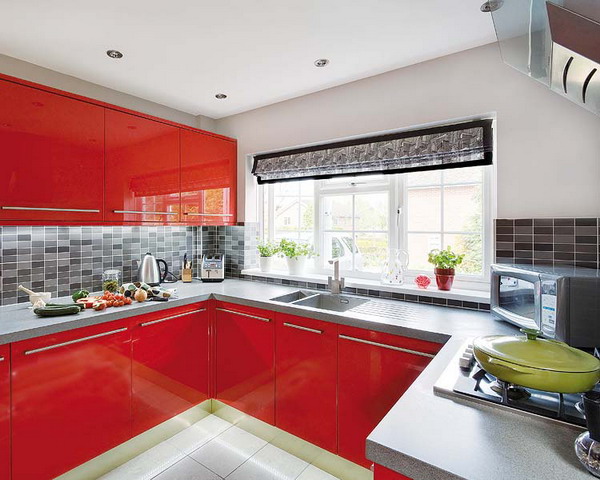
Red and white kitchen
The combination of red furniture and white walls results in a harmonious and bright interior design that visually enlarges the ceiling. In this case, the use of bright spectral shades is also considered acceptable.
IMPORTANT! If the walls are made red, it is better to give preference to muted tones, such as cherry or wine.
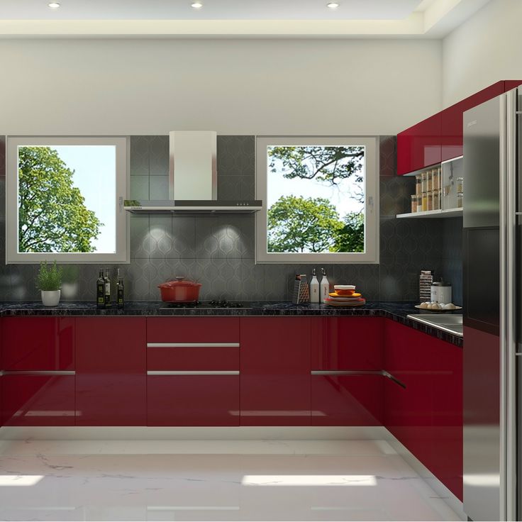
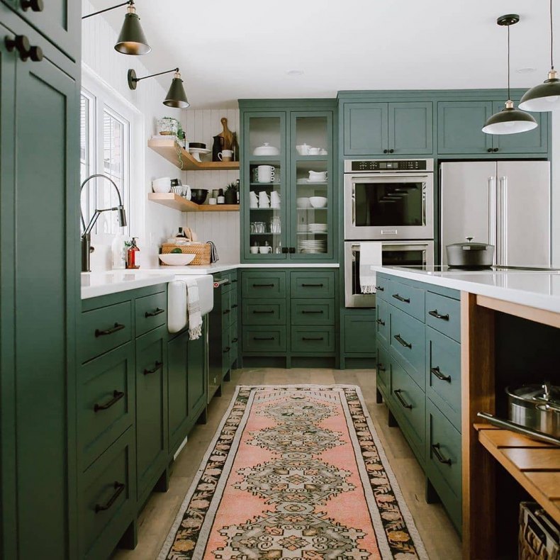
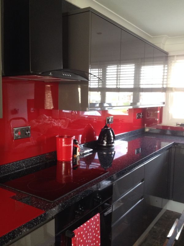
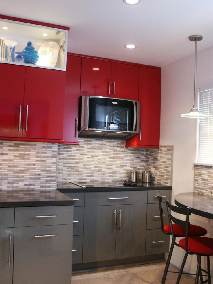
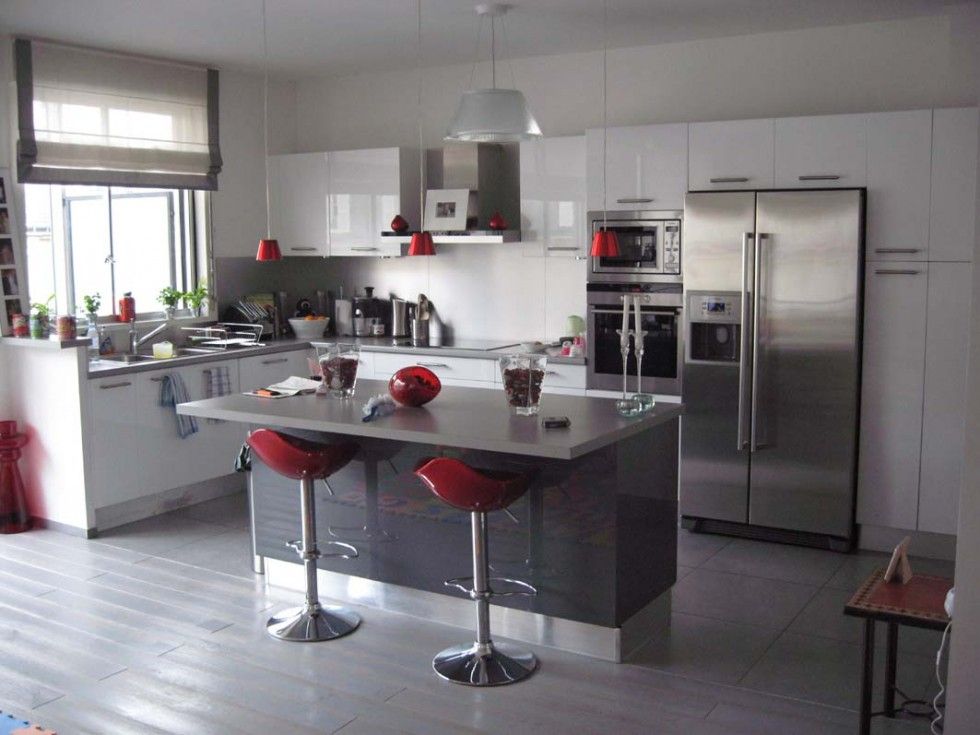
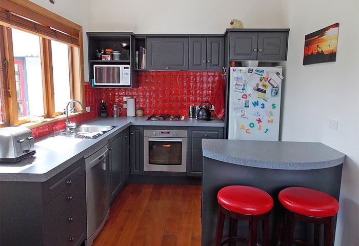
Red-grey kitchen
For red-gray interiors, it is preferable to use cool gray-violet and bright reddish-orange tones. To smooth out too sharp a contrast, they can be supplemented with brownish or beige shades with a cold undertone.
A combination of these shades with steel elements will also look good, especially if the room is decorated in a modern style.
Black and white red kitchen
With this combination, the tonal and color contrast of red and black is somewhat smoothed out and the interior looks harmonious and original. Experienced designers recommend positioning these colors as follows:
- The bottom set is black or black with small inserts of red elements.
- The top of the furniture is red.
- Apron and wallpaper - white, with a small discreet pattern.
IMPORTANT! This color scheme fits perfectly with modern styles, but it also looks good in a classic version.
Red-beige kitchen
Red-beige interior looks stylish and elegant. It does not form too sharp contrasts, like a combination of red with black or white, but it creates an atmosphere of comfort, home warmth and family coziness in the kitchen.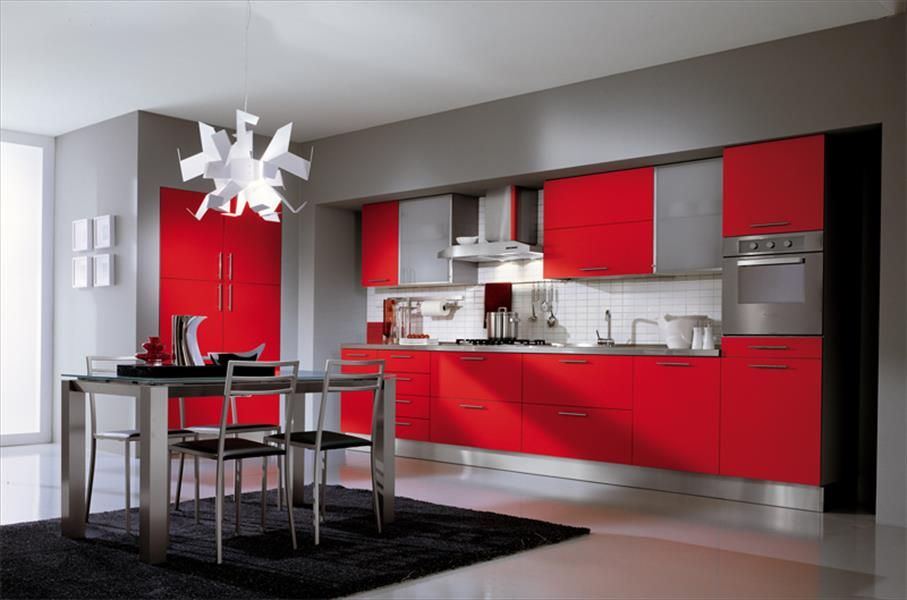
In such a kitchen, natural wood furniture or parquet would be appropriate. It is also important to consider that beige is best combined with bright and warm reddish-orange tones.
Red and green kitchen
The combination of red and green in the interior of the kitchen makes it original and at the same time brings it closer to nature. But it must be remembered that not all tones of red and greenish are successfully combined with each other.
IMPORTANT! The best solution would be a combination of only warm or extremely cold shades.
For example red-orange with lime or chilly raspberry red with emerald.
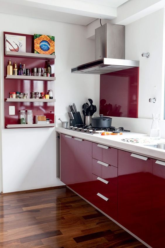
Dark kitchen red or burgundy
Dark reddish tones look noble and elegant. They fit well with most styles. Colors such as wine or burgundy do not irritate the psyche of people and do not tire the eyes.
Burgundy and dark red shades look good in classic interiors, such as Empire or Victorian.
But at the same time, you need to remember that these tones visually reduce the room and are not suitable for small kitchens.
Yellow-red kitchen
Such a room seems filled with warmth and comfort. But to make it less "hot", it is recommended to alternate red and yellow design elements with more neutral colors. For this, white, black, grayish, brown and beige or milky shades are suitable.
It is important to note that this color solution is better suited for rooms facing the shadow side.
IMPORTANT! If in winter you want to “let in” as much light and heat as possible into the room, then in summer it will not be very comfortable to be in a red-yellow kitchen due to the increased warmth of these colors.
Also note that you will need to choose the primary and secondary shades: in equal proportions, red and yellow will "interrupt" each other with brightness and saturation, such an interior will look inharmonious and even flashy.