Picking bathroom colors
How to Choose Bathroom Paint Colors
The paint colors that you choose for the walls of your home have a lot of power to affect your mood and the overall feel of your space. This is especially true in the bathroom, where choosing the right colors can make the difference between it being just another room and it being a Zen-like oasis. So how do you pick the right bathroom paint colors? There are some tricks for that.
Whether you’re doing a complete bathroom remodel or just looking to freshen up the space, here’s what you need to know to choose the best bathroom paint colors—plus some of the most popular choices for getting those spa-worthy vibes.
Choosing Bathroom Paint ColorsThere are a number of considerations that you have to keep in mind any time you pick out paint colors for your home. Painting is a time-consuming task, and if you’re paying someone to do it for you, it’s a costly one too (anywhere from $200 to $6,000, according to HomeAdvisor). It’s important then to pick out the right color on the first go, instead of realizing after the whole room is done that you should have gone in another direction.
When it comes to your bathroom paint colors, keep these following factors in mind to ensure you make the right choice:
Lighting. The same color can look very different in natural light versus artificial light, so your choice of color for your bathroom walls will vary depending on if you have a window or not. In either case, be sure to bring a paint swatch home before committing to a particular shade and to hold it up to the wall to see how it’ll look in your specific space.
Flooring. Since you’re probably not going to want to swap out your floors just to match your walls, you need to work from the opposite angle and choose a wall color that complements your existing flooring. If you have a neutral tile in a color like white or gray this shouldn’t be too difficult to do, but if you’re working with a non-traditional floor color your options will be more limited.
Overall color scheme. In addition to your flooring, there are a few other features in bathrooms that are difficult to switch out or change—including your vanity and your cabinets (though in the latter case, if it’s just your cabinets that look off with your choice of color, you can consider painting those too to a more flattering shade). Keep your overall color scheme in mind as you browse bathroom paint colors, and be careful not to inadvertently clash with the other major focal points of the room.
Room size. Size matters when choosing bathroom paint colors, and a bright or bold shade might look great in a powder room but garish in a master. Likewise, a bathroom that seems a little too roomy can become more cozy by painting the ceiling a darker shade than the walls. In either case, factoring in room size will help you make paint decisions that don’t just address how you want the room to look but how you want it to feel.
Popular Bathroom Paint ColorsIf you get overwhelmed looking at a wall of swatches, we don’t blame you.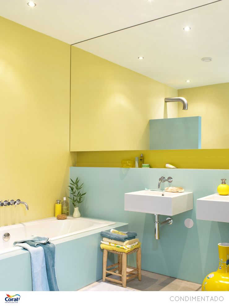 Here are some of the most popular bathroom paint colors to help you narrow down your search.
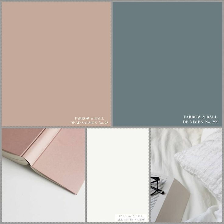
- Warm Gray
Warm gray is pretty much always guaranteed to be a win. This perfect neutral can elevate and modernize any space, and as a bonus, it matches with most other colors so it’s easy to pair with your bathroom’s existing features.
Our fave: Behr Toasty Gray N320-2
- Greige
Another winner on the gray scale is greige, which pairs well with both light and dark flooring and brings in a touch of cream for a warmer, cozier space.
Our fave: Benjamin Moore Pale Oak OC-20
- Sage
This blue-green-gray hybrid is a good way to introduce color to your space. If you’re scared of overdoing it, pick a lighter shade of this farmhouse-y hue for a pretty, muted take on the trend.
Our fave: Valspar Sparkling Sage 5005-3B
- Navy
Dark bathroom paint colors can definitely work, but with some caveats.
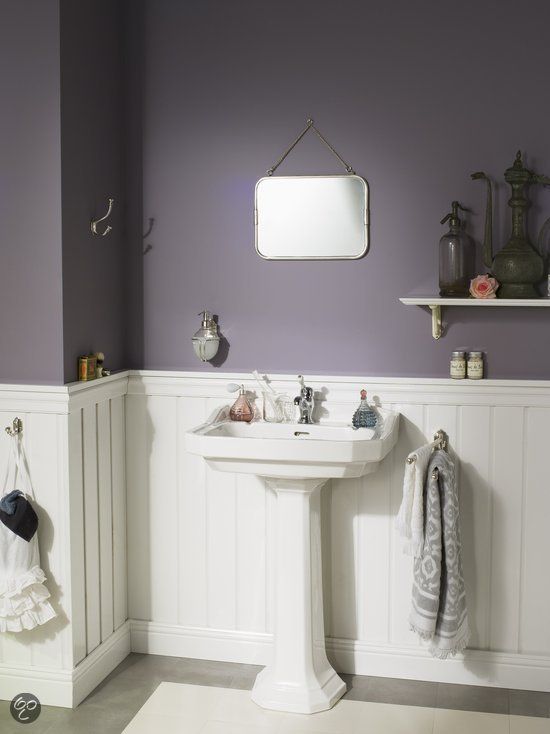 A deep shade like navy works best in bathrooms with natural light and white accents, but can seem overbearing in bathrooms that are inherently dark. If you’ve got the light though, go for it—and while you’re at it, swap in some brass cabinet pulls to dramatically change the entire room’s aesthetic.
Our fave: Sherwin Williams Naval SW 6244
- Blush
Pink isn’t just for kids. This classic color offers instant coziness, and is equal part graceful and bold. Pair with black and white accents for a look that’s totally up-to-date without seeming over the top.
Our fave: Magnolia Ella Rose
- Powder Blue
You can’t talk bathroom paint colors without mentioning powder blue. While this shade has been a popular pick for decades, you can easily take it into the 2020s by choosing a hue with a little bit of gray to mellow it out.
Our fave: Farrow & Ball Borrowed Light No.
 235
235 - White
It’s hard to go wrong with white paint. Opt for a bright hue to counteract the darkening effects of artificial light, and bring in some texture with wood or brass accent for a truly timeless look. Just be sure to keep the wall and/or ceiling trim the same color so it doesn’t look like you tried to match your whites and missed the mark.
Our fave: Portola Paints & Glazes White Cliffs
Choosing bathroom paint colors is all about finding colors that speak serenity to you. Think of what you’re trying to achieve with your space—such as relaxation and tranquility—and seek out the colors that make you feel that way. From there, it’s just a matter of ensuring that the other features in your bathroom complement your shade of choice.
For more help with your project, check out our interior painting tips and tricks, plus our best advice for how to paint a room quickly.
Bathroom Color Do's and Don'ts That You Should Remember
Bathroom Color Do’s and Don’ts That You Should Remember
You can simply give your bathroom a new look with just a gallon or two of paint and a few days.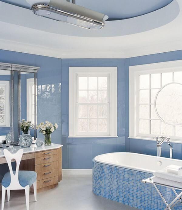 In fact, selecting a color scheme is the most challenging element of the bathroom remodel. There’s no exact science to picking the right bathroom color, and with so many options, it can be difficult to make a selection.
To assist you, we’ve compiled the greatest bathroom color do’s and don’ts, including how to choose tones for your ceiling or tile and where to utilize them. These suggestions can help you choose the ideal bathroom colors for a space you’ll love. The best part is that you can use these rules whether you want to create a spa-like master bath or a statement powder room.
Follow the Color Wheel
Look to the color wheel for guidance if you’re having trouble deciding which colors work together. Color theory ideas can guide you toward shades that complement one another.
Purple and yellow, for example, balance each other on the color wheel since they are opposite each other. On the other hand, green and blue merge well because they’re near each other and are equivalent.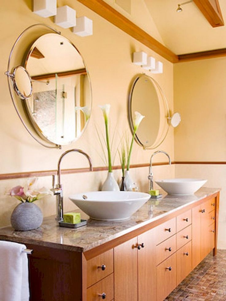 When in doubt, consult the color wheel for quick and simple answers to your bathroom color dilemmas.
Always Pick Three Colors
When designing a bathroom color scheme, keep the rule of three in mind: Choose a neutral, rich color, and accent color. Consider proportion and use a 70/20/10 distribution to achieve success. Use the lightest color for approximately 70% of the room’s decor, the next lightest color for 20%, and the boldest shade for 10%.
Remember, you can blend neutrals in a variety of ways. For example, you can achieve a clean, traditional aesthetic with a white, cocoa brown, and light green palette. Following the right color scheme will give you a top bathroom update and make it look as good as new.
Especially when you use those same neutrals with green, the result is lively and uplifting. With this brilliant guideline in place, your bathroom paint colors will appear to have been re-done by a professional.
Mix Two Neutrals
Photo by R ARCHITECTURE on Unsplash
A predominantly neutral bathroom color design helps to create a calm and relaxing ambiance. Again, proportional rules apply: Concentrate on a 70/30 color distribution when employing two bathroom colors.
Gray and white, for example, create a peaceful color combination that is subtle but not dull. Incorporate patterned components, such as herringbone tiling on the floor or veined marble on worktops or wainscoting, to appeal visually.
Go Organic
Colors influenced by nature, such as seafoam green and robin’s-egg blue, usually work well together and contribute to a bathroom’s organic feel. These colors also assist to soften the hard edges and geometric designs that are common in restrooms.
For a fresh, clean aesthetic, choose hues inspired by nature in your bathroom wall colors or vanity top.
Draw Inspiration From Your Home Interior
To help you choose a color palette for your bathroom, find inspiration from your home interior. Choose a color that you like in your living room and make it the dominating color in your bathroom.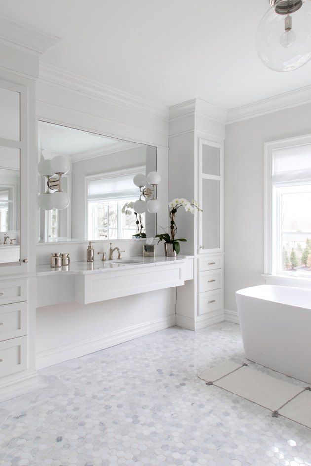 The seamless flow of color will enhance the overall look of your home, even though the rooms will retain their individual identities.
Don’t Use The Same Color More Than Thrice
Another rule of three can assist you in successfully executing your bathroom color plan. Use a color not more than three times in a room once you’ve decided on it. This can be in the form of towels, sink-side decorations, or a feature of bathroom furniture.
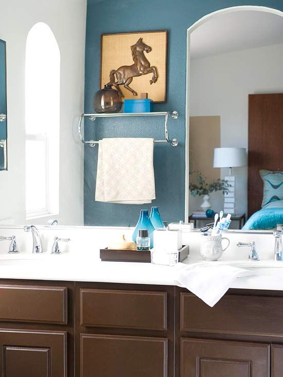
The vanity, sconces, and wallpaper in this bathroom, for example, are all crimson. Each color in the bathroom is evenly distributed, making it appear deliberate and not out of place.
Don’t Be Afraid of Dark Colors
Photo by R ARCHITECTURE on Unsplash
In small bathroom remodels, many individuals prefer lighter and brighter colors over dark, deep tones. Dark colors like charcoal or cocoa, on the other hand, can provide a striking contrast in powder rooms, especially when paired with white trim and bathroom fixtures.
People are afraid to put dark colors in tiny spaces. But with a dose of another tint, such as bright green, the overall impact is interactive and contemporary at the same time.
However, they do not make the rooms appear smaller; rather, they darken them. To make the area feel less cavelike, use mercury glass and mirrored lamps.
Don’t Overlook Bright Tones
Choose a collection of bright, vibrant tones for a bathroom color plan that is more lively than soothing. Orange and blue, for example, are a complementing and energizing color combination. Use plenty of white in the trim, sink, tub, or another key element in the room to bring some serenity to this energetic color scheme. Add a splash of color with low-cost accents like linens that you can replace.
A healthy amount of tension is beneficial. In your color schemes, you want to surprise people. If you don’t have an eye for it, look for a cloth or piece of art with an interesting color combination and use it as a guide.
Don’t Forget To Include Some Selections
Photo by Watermark Designs on Unsplash
If your color scheme includes more vibrant hues (apple green or hot pink), go for it, but keep one neutral as a balance and foundation. Think of paint as a complementary background rather than something that knocks you down as soon as you walk into a room.
You can use a creamy light brown or pristine white, for example, as a balanced wall color or bathroom tile hue. Vanity hardware or patterned wallpaper with black accents creates punctuation to divide the boldness.
Choosing a hue will feel less intimidating if you consider these bathroom color do’s and don’ts. Furthermore, you can pick as many colors as you want, with no restrictions. Then reduce your choices down to two or three. Examine them in various types of bathroom lighting and at various times of the day.
Finally, after you’re confident that you’ve picked the perfect bathroom color, go for it. It’s only paint after all.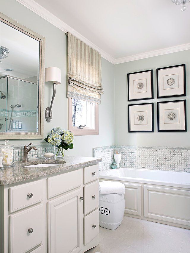 You may easily modify it if you are dissatisfied with it.
Color combinations in the interior of the bathroom
In interior design, even if you have the opportunity to embody your own fantasies and creativity, you can remain not entirely satisfied with the result. This often happens if the color palette is not well thought out, and staying in a particular room begins to affect a person in a way that he would not like. The bathroom is a place where we draw energy every morning, relax in the evenings, and therefore it should be as comfortable as possible. Let's take a closer look at how to choose color combinations for the bathroom interior! nine0005
Rules for choosing shades in the interior
The choice of color solutions is influenced not only by individual taste preferences, but also by a number of other factors. In particular, you need to consider how space is perceived visually.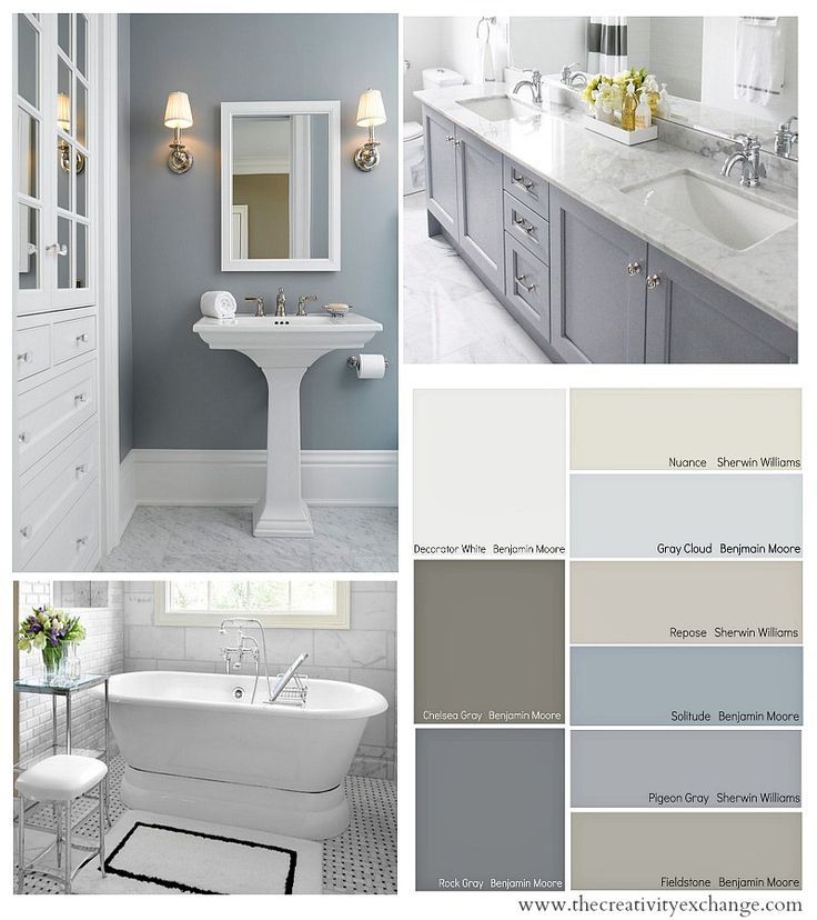 It's no secret that light colors visually enlarge the room, and dark ones reduce it.
It is also necessary to remember about the psychological perception of colors. In addition, when choosing shades, you should focus on the stylistic direction. The concept of any style implies certain patterns in the selection of colors. You can identify general recommendations for the design of the bathroom. nine0005
Try not to use more than three different colors or more than five shades of the same color. In the opposite situation, the interior will not be harmonious. Most often, they get by with only two tones, which are often either contrasting or adjacent. In any case, one color should emphasize the value of the other. For those who prefer the design in a single color, the best solution would be to use three shades that allow you to highlight all the details of the bathroom.
Consider the size of the bathroom when determining the acceptable brightness level. Keep in mind that in most typical apartments, the use of light shades that expand the space is relevant.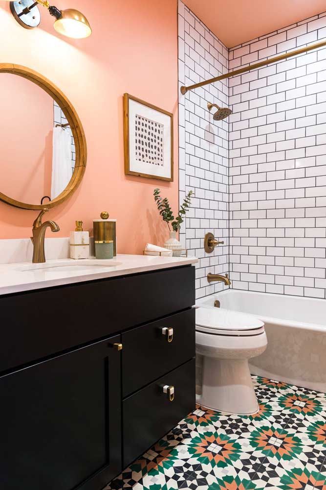 This is due to the small area of the bathrooms. Remember that bright colors will help to cheer up and cheer you up, and a calm palette will contribute to a relaxed atmosphere. nine0005
Psychological perception
Experienced designers know how important it is to choose the right color scheme for the bathroom in order to make it visually larger and highlight the accents in the room. To create a comfortable interior, it is necessary to take into account certain features.
Light colors will not only make the room look bigger, but will also look calmer, help your eye to relax and get in the mood for rest. Pastel colors will be the best background that will allow decorative elements to look more advantageous. nine0005
Dark colors have a different effect, as if "stealing" the light, and therefore they make the room more cramped. However, this allows you to make the atmosphere cozy and, in a way, intimate. Remember that the darker the tone that is used in the decoration of the walls and floor, the larger the bathroom area should be.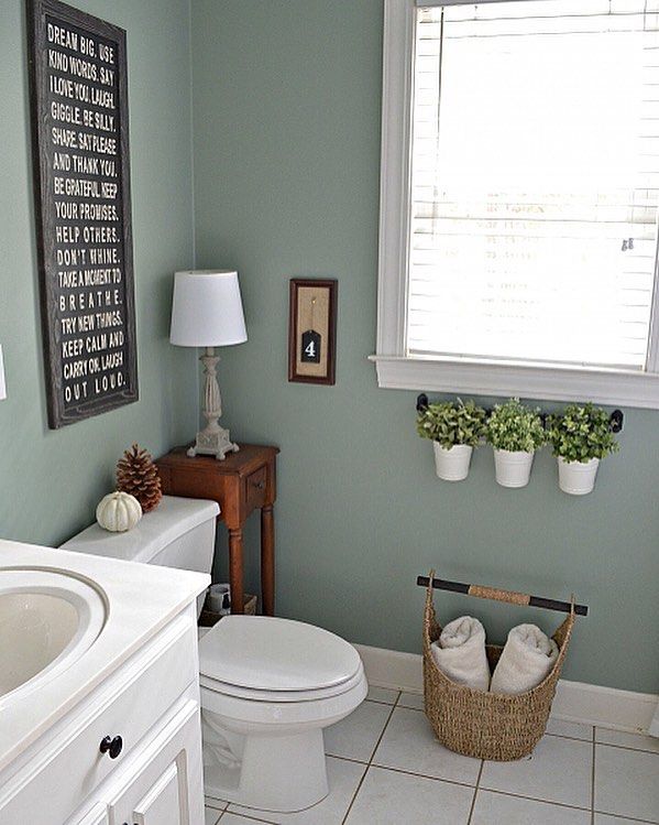 In addition, you need to think about installing intense lighting.
Color wheel
When choosing combinations of colors and shades, you can keep in mind one secret that is often used by many designers. In the design of any room, you can use the color wheel rule, which is associated with four simple formulas:
- The two most compatible shades can be located opposite each other (for example, it can be a combination of orange and blue).
- Contrasting triad formula. Choose one main color, to which you want to add two shades opposite to the main tone. For example, light green and bright yellow are additionally selected to the main purple.
- A classic solution in three colors. You can choose colors that will be located at the same distance. For example, yellow along with red and blue. nine0005
- Analog triad formula. Pick up any three tones that will be nearby. It can be yellow with a hint of green, pure yellow and yellow-orange.
Color combinations
Here are some options for popular colors for the bathroom.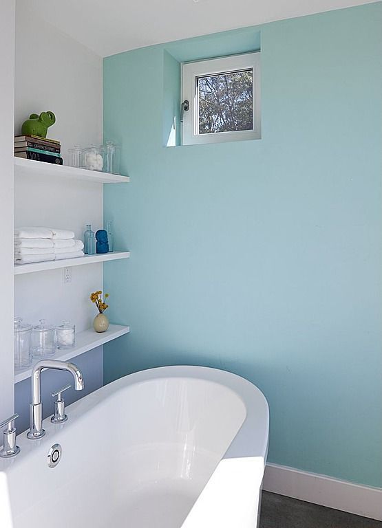 Remember that before you make a choice in favor of one of them, you need to determine how this or that palette matches the style of the room.
White bathroom
The only color that is considered universal is white. It gives the interior sophistication and simplicity, and is also combined with any other colors. The white bathroom looks spacious and bright, which is important for small apartments. In addition, it is a wonderful backdrop for various decorative elements. If you are afraid of the association of a room with a sterile doctor's office, use any other shades except snow-white. nine0005
Bathroom in warm colors
Warm tones are great for designing small bathrooms as well as rooms with free space. In the first case, you can expand the area visually and make the bathroom more lit. The second option allows using warm shades to create a pleasant and cozy atmosphere in a large room.
Often there are stylish bathrooms in beige and cream, pink and scarlet, sand and coffee tones. Gold and brown colors will also look good. nine0005
Remember that light shades help maintain cleanliness and hide various stains that even the most careful owners cannot avoid. If you wish, you can combine tones and play with colors, combining dark and light shades.
Cool bathroom
This is a common bathroom design. You can often find blue and blue bathrooms, as well as cold shades of gray. These colors are sometimes combined with white, which gives the room freshness. In this situation, use light shades whenever possible, because dark gray and blue can cause discomfort. However, if you take, for example, the light tones of blue, they will be associated with clean water and perceived as fresh. nine0005
Green looks natural and natural. Although cool tones of green can be used in the interior, they will promote relaxation, and in combination with red or orange, they will refresh and elevate mood.
Cool shades can be diluted with colorful accents and bright accessories, various decorative details. So the bathroom will look warmer and more comfortable.
Contrasting bathroom
One of the most requested color combinations is black with white. At first glance, it seems that it is impossible to make a cozy room using two completely opposite colors. But it is the high contrast of black and white that gives a delightful effect and helps to create a stylish interior. However, it is important to use them wisely. nine0005
If white prevails over black, then this also contributes to the visual increase of the room. Accordingly, if you prefer black, and white fades into the background, then the bathroom will visually look smaller.
The combination of white and black is stylish and creates a strict yet intimate atmosphere. This is the best option for those who want, above all, to express their own individuality. From the point of view of psychologists, white means elegance and purity, while black means anxiety and emptiness, so be careful when choosing finishes and plumbing.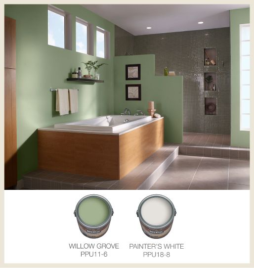 It is important not only not to make the space sterile, but also to avoid an oppressive atmosphere. nine0005
The combination of colors in the interior of the bathroom - photo
When analyzing suitable combinations in bathroom interiors, experimentation cannot be dispensed with. In practical application, different color solutions differ from the results of computer rendering. In order to find out how combinations of different textures and shades look in reality, you need to look at photographs taken in real conditions. We have selected for you a large number of different bathroom design options, among which you can choose the best color scheme! nine0005
Color palette for bathrooms and toilets. How to choose a color? Projects.
When choosing a color for a bathroom, the same principles apply as when choosing a palette for other rooms.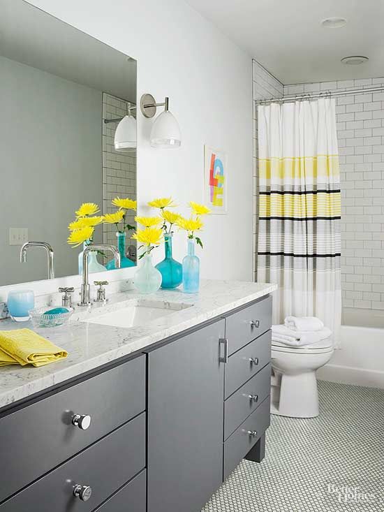 Consider personal preferences and make adjustments for the size of the room and the overall color scheme of the apartment or house.
When developing an individual project, the designer will proceed from your wishes, correctly select additional shades and place accents. nine0005
All photos: interiorcom studio projects. Copying without the permission of the studio management and indication of the source will be considered a copyright infringement. You can see the projects in full in the section: Portfolio.
Basic rules for color matching
Most apartments, even from modern developers, cannot boast of very spacious rooms of various shapes, high ceilings and windows in the bathrooms. Most often it is an ordinary deaf rectangle with modest dimensions. In this case, you should be careful trying on bold interiors from glossy magazines. nine0005
Bold interiors in everyday realities can be called solutions with very bright saturated colors - black, red, burgundy, purple, fuchsia. Of course, you can find a compromise when the accent color scheme will look good in a small bathroom, but it is much more difficult to do this, and the risk of making a mistake and getting a different result at the end increases significantly. Especially if you do repairs yourself, without consulting a specialist.
Calm and traditional combinations will become more acceptable - light, white, pastel, beige, blue-blue. White interiors look great with rich and bright colors.
The main task of the designer is to find a balance by adding interesting color notes or fashionable dark tones, but not overloading the interior.
Possibilities of the color palette
With the help of color, you can correct the features of the room - minimize or almost completely hide imperfections, emphasizing the advantages. This is achieved not only by the choice of color, but by an integrated approach - the right color scheme, auxiliary shades, accents, furniture and layout. nine0005
Bright and dark colors require space. Intense reds and deep blacks will make a small bathroom even smaller, and a dark ceiling will sink even lower. Even with well-chosen lighting and various scenarios, the bathroom will be dark and uncomfortable. But the same colors and combinations will play in a completely different way if there is a larger footage, or, for example, a window and natural light.
Light colors, on the contrary, can visually expand the space, make the ceiling higher, and make the walls part a little. If you fill the interior with bevelled mirrors, use diagonal tiling, replace ordinary furniture and plumbing with “floating” installations, and even highlight them with LED strip, then even a small bath will seem more spacious and comfortable. nine0005
Natural accents
Any color can be used in decoration, if it is prepared and presented correctly. For example, black or gray graphite will look completely different if you introduce it into the interior as a natural texture. Marble or porcelain stoneware large-format panels in combination with decorative LED lighting fit perfectly into the ideology of the bathroom. You can also use dark plumbing instead of classic white.
An interesting and fresh solution for the bathroom is wood finish. In this case, both real panels and tiles that completely imitate the color and texture of natural material can be used. Bright accent tones can be introduced as decor. Several items or textile elements will color the interior, fill it with mood and character.
In addition to imitation of natural materials, you can complement the interior with stabilized, artificial and live plants. A phytowall or vertical gardening with moss will look very organic. nine0005
Lighting
When thinking about the color scheme, be sure to work out different lighting scenarios. Using the same lamp, but with lamps of different color temperatures, you will get different bathrooms. Modern LEDs can work both in cold and white scales, and in warm lamp ranges.