Kitchen new trends
Kitchen trends 2023: 50 brand new looks and innovations
(Image credit: Sheraton Interiors / Caz Myers Design / Aker Interiors)
When it comes to the best kitchen trends 2023, it can be a minefield of ideas and designs. We talked to the trend experts to find out which kitchen trends will be big in 2023.
With cool new kitchen brands popping up and lots of innovative design ideas and clever twists on old appliance designs on display in kitchen showrooms across the country, there are plenty of on-trend looks and state-of-the-art appliances to pick from.
Below, we look at the biggest trends and new kitchen ideas and pictures of kitchens to inspire your next kitchen remodel.
1. Welcome with a sociable kitchen
(Image credit: Sheraton Interiors)
Activate the ergonomic benefits of curves to get the party flowing. ‘A rounded island comes into its own when entertaining, especially in open-plan kitchens with multiple entrance/exit points, making it easier for guests to socialize and encouraging smooth transition between spaces,’ says Shehryar Khan, director, Sheraton Interior s. ‘A curved island can also include a more expansive seating area, allowing guests to comfortably eat and socialize around the kitchen island.’
2. Make your kitchen a multiuse space
(Image credit: Caz Myers Design)
‘When seeking to create a family-friendly hub, it’s great to incorporate a bespoke desk and study area. A quiet but connected space for homework or for everyday home admin,’ says Caz Myers, director of Caz Myers Design . ‘Ensure the desk area ties in seamlessly with the kitchen design by using elements of the same finishes but with a defining twist – here the timber is dominant, for example.’
3. Add smart partitions
(Image credit: Muchmore Design)
Don’t be afraid to disrupt sightlines in a modern kitchen – not every chef enjoys an audience. Opting for an open partition, like this mid-century-inspired installation by Muchmore Design , is a smart move. ‘Designed to work as a beautiful display as well as a functional room divider, it effectively bridges the feeling of coziness and openness within the contemporary open-plan living space,’ explains founder and creative director, Linsey Skepper.
4. Create unusual shapes for shelving
(Image credit: Aker Interiors)
The kitchen should be a fun, interesting, and wonderful space. Gabrielle Akers of Aker Interiors created original kitchen shelving for this loft dating from 1925. ‘I set out to create something different and unexpected to soften the raw, industrial architecture,’ she says. ‘Introducing curves was paramount to bringing warmth and moments of surprise to the otherwise angular space.'
5. Take a quieter approach to interiors
(Image credit: Adrien Dirand / Joseph Dirand Architecture)
With busy lives, homeowners are now more aware of their decorating choices and are aiming to find a balance between streamlined minimalism and luxury for their kitchens, which is why we will be seeing minimalist kitchen ideas soaring in popularity in 2023.
Internationally admired for his minimalist designs and monochromatic aesthetic, architect Joseph Dirand has created this elegant black and white kitchen featuring monolithic slabs of Breccia Viola marble. Fingi pendants in patinated bronze by Eric Schmitt introduce a softer line, as do Platner Collection chairs from Knoll.
6. Embrace a wood resurgence
(Image credit: Mike Fetherston / Darren Chung)
Wood kitchen cabinets are a popular choice for those that love a timeless or classic look, so it comes as no surprise that we will be seeing more and more homeowners look for walnut and oak cabinet kitchen ideas in the near future.
‘The inspiration for this island was a 1960s slatted screen, owned by the client,’ explains Mike Fetherston, design director, Hetherington Newman . It was handmade using stained strips of walnut and topped with Calacatta Rosato marble.
7. Think about display possibilities
(Image credit: Polly Wreford )
No space for a dresser? Glazed wall cabinets are just as beautiful and the display possibilities just as strong, albeit on a smaller scale. Steer clear of a fitted-kitchen feel by opting for a standalone unit that’s more focal point than functional storage – perfect for walls without windows.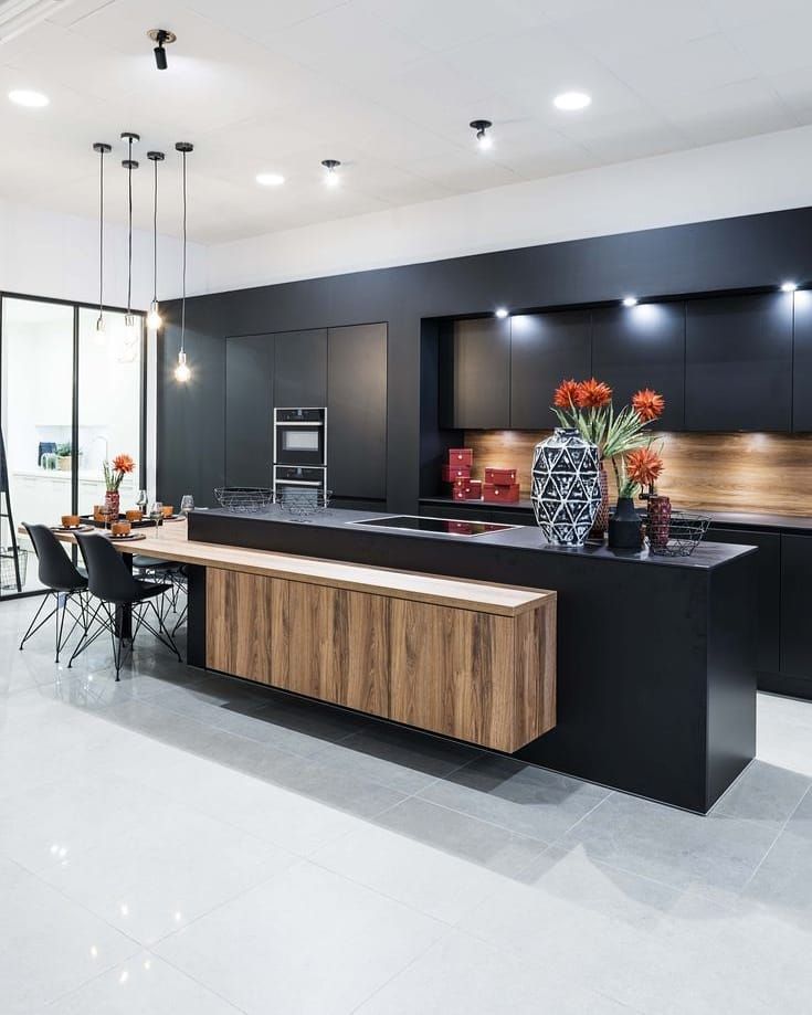 Fill with colorful kitchen ideas, with crockery and artisanal packaging as the mood takes.
8. Invest in a shapely backsplash
(Image credit: Cullifords / Sean Fennessey)
Why end a kitchen backsplash in a straight, horizontal line when curvaceous silhouettes can prove far more enticing? Here, Australia-based designer Tamsin Johnson cut swooping curves into marble, merging backsplash and cooker hood with striking sinuousness. Also explore tiled backsplash in fish scales and hexagons for simple shape-shifting surfaces.
9. Step up
Project by Adam Knibb Architects & The Myers Touch
(Image credit: Paul Craig)
Now there’s one more reason to celebrate high ceilings – the library ladder is coming into its own. Seen in all the loftiest kitchens, statement ladders are being embraced in all their vertical glory. ‘A permanent ladder is about so much more than accessible high-level kitchen storage,’ says designer Keith Myers, founder of The Myers Touch . ‘A beautiful ladder provides an interesting, eye-catching feature, while the metal rail introduces a punchy design detail.’
10. Go for pattern play
Image credit: Martin Moore
(Image credit: Martin Moore)
Traditional kitchens are making a play on directional pattern. Focus on areas such as cupboard interiors and backsplashes, advises Richard Moore of Martin Moore . ‘Used in this way, pattern makes a statement without overwhelming the space or detracting from the timelessness of the cabinetry,’ he says.
11. Decorate with color of the season
(Image credit: Cullifords)
Carrara has competition – the latest natural stones are all about green, the undisputed kitchen color hero for 2023.
‘There’s a definite trend towards more impactful surface choices and we’re seeing demand soar for nature-inspired shades,’ reports Oliver Webb, director of stone specialist Cullifords.
‘From Indian marbles to Brazilian granites and even onyx, there’s a huge array of exotic green stones to be explored.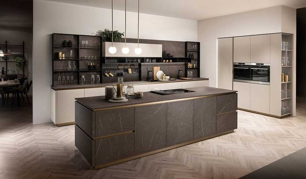 ’ The incredible bottle green, khaki and fresh lime tones seen here are courtesy of Cullifords.
12. Bring flooring up-to-date
(Image credit: Gyorgy Korossy)
Those seeking an alternative to herringbone or chevron kitchen flooring should check out mansion weave. Originating in 17th-century French mansions, this pattern is being revived for a new audience. While the latest incarnation shares the same polygons and trapezoids as the original, chunkier plank formats and pale timbers bring it up to date.
13. Introduce mirrored elements
(Image credit: David Mitchell)
An established backsplash favorite, antiqued mirrored glass is making a move onto kitchen cabinet ideas. In this home in Manhattan, David Howell, founder of DHD Architecture and Interior Design , used handblown silvered glass on the wall cabinets to bring the cityscape inside.
‘The room was set up to focus on the Manhattan views and the mirrored cabinetry was used to create an extended vista,’ he explains. Choosing mirrored glass over transparent also has fringe benefits in the form of concealment – there’s no need to keep contents neat and tidy!
(Image credit: Jack Trench)
When it comes to bar stools, bespoke maker Jack Trench points to a trend for more intimate perching in the kitchen.
‘This may be a single or two-stool perching point, or simply a more economically sized breakfast bar,’ says director, Jack Trench . ‘The trend stems from those with kitchen-diners, who are realising they don’t always need extensive breakfast bars in addition to a table. However, they do still want seating within the hub of the kitchen. This is where the kitchen perch comes into its own; informal seating for a quick coffee or checking emails.’
15. Create a lovely look with antique wood
(Image credit: K&H Design)
As part of the trend toward less ‘kitchen-y’ cooking spaces, classical wood kitchen ideas are making a move into the kitchen. ‘Traditional timbers are being embraced in new and unexpected ways,’ says Katie Glaister of K&H Design .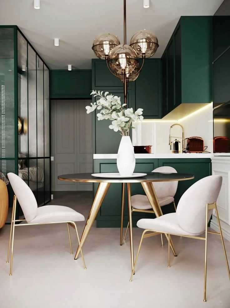
‘For example, framing a beautifully book-matched kitchen island in burr walnut with aged brass accents recreates the look of an antique bureau but, elevated on legs, it feels less cumbersome and more modern.’
16. Go for glazed tiles
(Image credit: Chris Edwards / Natalia Miyar)
A tiled kitchen backsplash is nothing new, but there will be a shift away from matt finishes and towards gloss. A glazed tile is not just easy to clean – it will also reflect the light around the room, with effective results regardless of the color.
Interior designer Natalia Miyar has these richly hued green kitchen tiles handmade in Florence. 'Paired with the rustic wood and marble work surfaces, they create a really beautiful contrast with the earthy colors, as well as adding different layers of texture to the space,' she explains. You don't need to use a saturated shade to enjoy the full impact.
For a more muted look, choose glazed white tiles, which will certainly make the most of the natural light.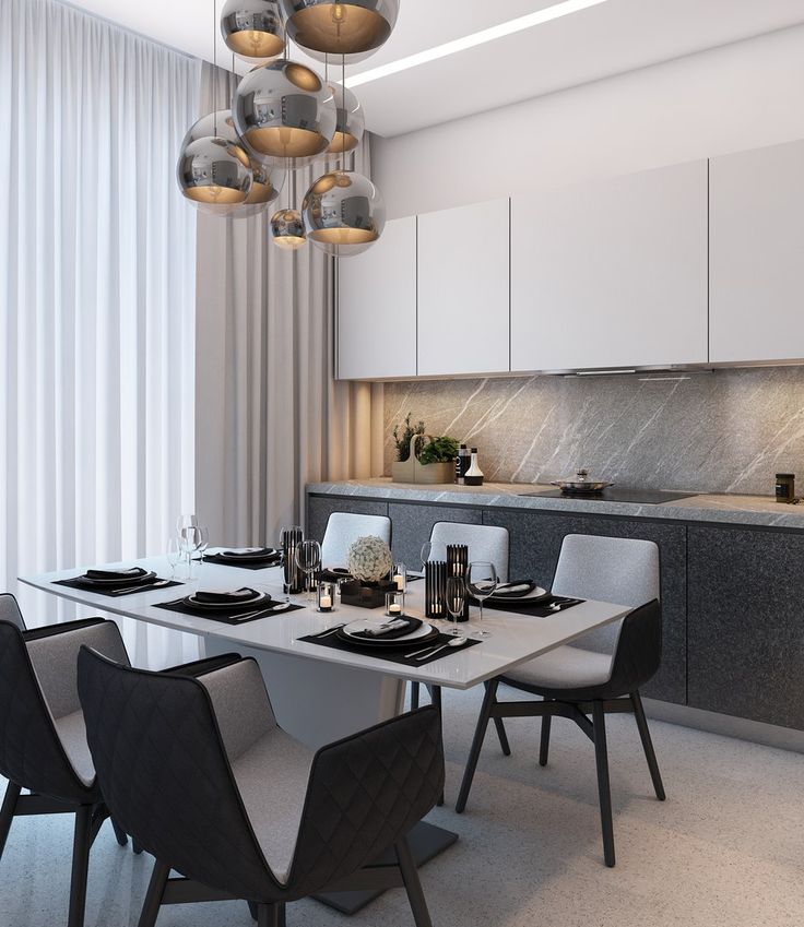 Zelliges will also remain a popular choice. Handcrafted in Morocco, these distinctive glazed clay tiles, with their irregular surface and varying tones, bring texture and artisan character to a scheme.
17. Mix vintage with antiques
(Image credit: Simon Brown)
Future kitchen trends are about dispelling any notions of a show home, and introducing some antique or vintage furniture into a kitchen has the immediate effect of creating a warm, lived-in home environment. Farmhouse kitchen furniture in the form of a scrubbed kitchen table or dresser is the obvious choice for a traditional look. Timeless, built to last and often inexpensive to find at vintage fairs, antique pieces will introduce character to a new space.
This design by Ben Pentreath was a 21st-century take on a Welsh farmhouse kitchen. Simple joinery, including a large larder cupboard and open shelves, combines with a butler's sink, Delft tiles, period-style lighting and antique furniture to create a timeless feel, perfectly in keeping with the house's architectural style.
18. Break up your space with partitions
(Image credit: Alexander James)
After years of breaking down walls to create large open-plan rooms, over recent times we've come to appreciate the benefits of being able to close the door and escape the soundtrack of the entire house. A glazed partition can split spaces without compromising on light or the feeling of togetherness. It also has the advantage of helping to contain smells in the kitchen area.
In his own home, Thomas Cox, co-founder of Ham Interiors , replaced the wall between the kitchen and sitting room with a reclaimed Georgian shop front. 'We like to use glazed partitions as they define area and create the illusion of space without having to be fully open plan,' he explains. 'If the existing kitchen layout won't allow for a fully glazed wall then a smaller glazed panel can enhance a space; it offers architectural interest and is also useful in providing a backdrop for a piece of furniture.'
(Image credit: Lucy Call)
While they are generally considered something of a necessary evil in the UK, the American approach to extractor hoods has long been more celebratory, with custom-made designs in unusual finishes making strong and defining statements in kitchens across the land. This kitchen trend looks set to take off in a big way, too, especially in eye-catching metal surfaces.
'Aesthetically, adding a striking extractor canopy to a kitchen scheme is a chance to interrupt with shape and sculpture all the angular lines of cabinets and panels,' says Bruce Hodgson of Somerset-based Artichoke Ltd . 'This etched zinc extractor canopy is made using specialist crafts and traditional materials, throwing a spotlight on our handmade values as well as a nod to the past.
20. Focus on layered lighting
(Image credit: Eric Piasecki)
Lighting in a kitchen is always a challenge to get right but the art of layering will be key to designing kitchens successfully going forward. The reality is you only need a certain amount of task lighting in specific preparation areas, too many downlighters and the kitchen ceiling ends up looking rather like a landing strip.
New York-based Steven Gambrel Inc. is known for its sophisticated interiors. Having originally trained as an architect, he's a master at considering how kitchen lighting, kitchen layout, and functionality create a sense of place in a room. In this family kitchen for a recently built beach house in East Hampton, Long Island, he's made a feature of the lighting, introducing two sets of bold pendants. In a large, open-plan kitchen space, choosing two such different designs adds character but also helps define the distinctive areas within the room.
(Image credit: Matthew Williams)
With so much going on in kitchens, the risk of a visual overload is always high. Those searching for a more restrained look will need to focus on colors, which should be kept simple, and thinking about leaving wall space bare.
In this design for a house in Hudson, New York, by General Assembly, a single shelf has been used in place of wall-hung kitchen cabinets resulting in a relaxed and unfussy look. 'We grouped a full-height pantry with the fridge to give us the possibility of removing upper storage,' explains Colin Stief. 'The shelf is used in the place of cupboards to give the concrete backsplash a place to end and a visual break to the monochromatic scheme. ' As always, when working with open kitchen storage, a curated display is essential. Some designers choose to use a single open shelf for artwork rather than kitchenalia to elevate the room.
22. Evoke nature with natural elements
(Image credit: Victoria Pearson)
The use of natural materials has increased considerably during the pandemic and will strengthen in appeal as marble, granite and unpainted wood kitchen cabinets become a firm fixture. Not only do they have a rich aesthetic quality, but they are increasingly being recognized for their health benefits (reducing the amount of chemically treated items in the home).
With this beautiful design, Californian decorator Ohara Davies-Geatano of ODG Interiors demonstrates how the materials add warmth and depth to a kitchen. 'The cabinetry is cerused oak, which is incredibly durable and provides wonderful texture,' she says. 'I love how the timber highlights the depth of the limestone backsplash. The basket-style pendants introduce another layer – their scale gives great balance to the overall design. As the materiality of the space is so tonal, the addition of the floating wood shelves enabled moments of curation.'
23. Keep storage concealed
(Image credit: Future)
Small space living gives way to even more kitchen innovation, like the small kitchen above. This chic open-plan space conceals the cooking area with chameleon-like skill, allowing the focus to be on entertaining.
Maximize the feeling of spaciousness by uniting cooking, dining and relaxing into one glorious, light-filled room. Here an uninviting and small kitchen was demolished in favour of a big living room with the kitchen tucked discreetly at one end.
The layout is flexible so it transitions from a kitchen to a dining room to a living area in an effortless way. The cooking space is as invisible as possible, with door panels looking like decorative wall finishings.
All doors are hidden, with fingerprint sensors that allow them to open and close in a smooth a manner.
24.
 Introduce mesh details
(Image credit: Davonport)
Bespoke kitchen specialist Davonport has added a burnished wire mesh cupboard door to its design portfolio. Teamed with diamond-cut brass handles, the look makes for a sophisticated twist on industrial style.
25. Use materials in surprising ways
(Image credit: Quirky Interiors)
Theres something free-ing about having a kitchen that doesn't feel 'off the shelf'. Even if some elements like cabinetry and appliances need to be standardized, think about adding character with practical elements sourced elsewhere.
This sink area features a rustic shelf to display pottery and a narrow geometric backsplash made of brass sits behind, creating an unusual vignette and wall decor for the kitchen.
26. Be brave with color contrasts
(Image credit: DeVOL)
Picking two shades on opposite sides of the color wheel, like pink and green, will achieve bold contrasts. Here the Classic English kitchen by deVOL is painted in a Farrow & Ball green and a custom pink.
(Image credit: Future)
Bright white kitchens contrast with rich timbers and soft curves to lend a modern mid-century flair to modern kitchens.
Dark walnut cabinetry works to keep the look simple with smart bespoke detailing. Tall white cabinets and light marble backsplashes and countertops draw the eye up creating an illusion of space, keeping the look fresh and of the moment.
28. Embrace the sink skirt revival
(Image credit: Beata Heuman)
Once considered outdated and frumpy, the sink skirt is back in fashion creating opportunity for texture and pattern, softening kitchen schemes and adding a touch of nostalgia.
The idea is based around replacing the base cabinet doors underneath the sink with pleated curtains, often suspended on a decorative rod. Here is an opportunity for an element that can be updated often – on trend gingham, tactile untreated linen or pale pink stripes amongst bold colors like Beata Heuman .
29. Marvel at marble
(Image credit: Blakes London)
It’s the time of strongly veined marble, the busier the better for unmissable luxury and next-level style. If there’s one thing that’s storming the style charts and shaking up interiors, it’s the return of marble.
As an architect Natalia Miyar has a great passion for materiality and uses the finest, high quality materials in her design schemes. She says ‘heavily veined marble is making a significant comeback in the design world and has become synonymous with high-end luxury.’ A popular choice for kitchens and bathrooms, it is also highly sustainable; its durability, classic attributes and ability to withstand passing trends makes it a good investment and good choice for kitchen flooring.
Marbles with naturally strong veining add statement value and create a textural contract between other polished surfaces, metals and woods. Within a kitchen, Natalia uses marble to create an eye-catching sink or a kitchen island.
30. Wow with wood finishes
(Image credit: Caesarstone)
Out of fashion for a while, wood is now enjoying a bit of a revival. These kitchen cabinets use subtle-grained ash, paler than oak or walnut, to pick out the warm tones in manmade stone.
31. Dramatize with black
(Image credit: Neptune)
Black kitchen ideas are having something of a moment. Often overlooked as purely an 'accent' color, black walls, cabinetry and work surfaces are having something of a moment. Black becomes liveable, luxe and inviting, with textured woods adding rustic, homely charm.
32. Curate with color
(Image credit: Martin Moore)
Throw the rulebook out of the window in favor of unexpected paint-color pairings. Kitchens are rife with color opportunities, from appliances and flooring, to window treatments, kitchen tile ideas and cabinets.
Start by deciding how much of a permanent commitment you are willing to make. One of easiest and least expensive options is to change your kitchen styling or paint a wall because either can be easily updated should you tire of it. Choosing color is such a personal experience. In fact, no one knows for sure whether we all even see the myriad shades in the same way.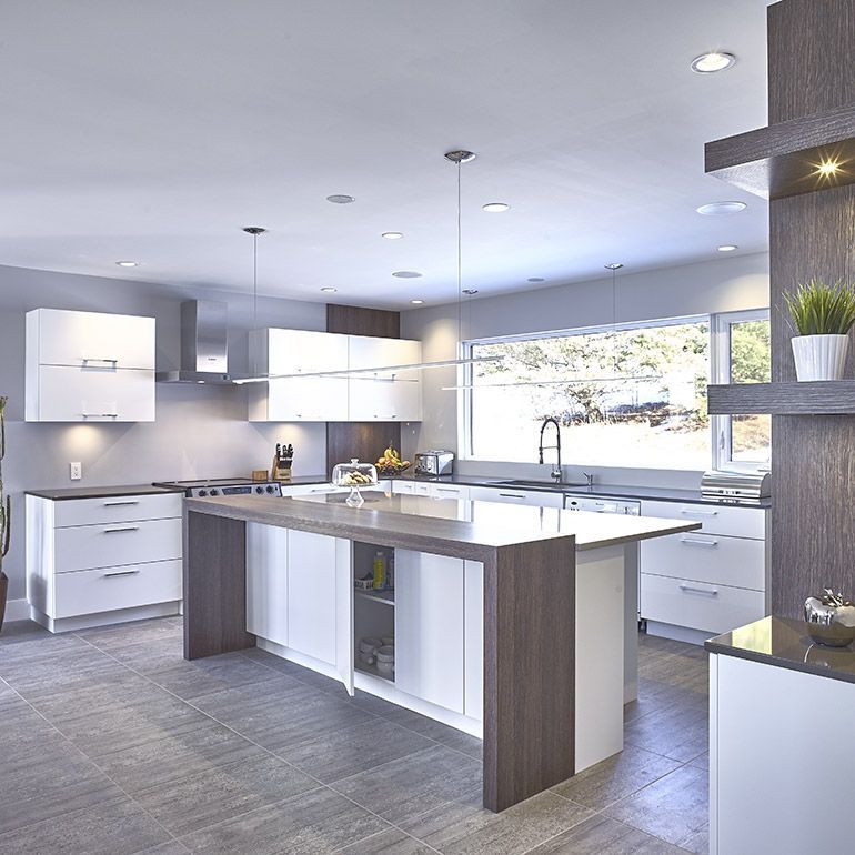
Mark Wilkinson, founder of Mark Wilkinson Furniture, believes that the colors we choose automatically are naturally influenced by current fashions. 'The color in a kitchen – be it on walls or fittings – should last for at least five years, minimum, so try to look beyond immediate trends and choose a kitchen color scheme that will keep you feeling good long term,' he advises.
(Image credit: Original BTC)
Far from the drama of what you would expect from 'statement' lighting, the latest collection of pendants from Original BTC are quietly show-stopping. The Drop series follows the journey of a droplet of water through the air and this bone china light captures the moment when it flattens as it hits the ground.
Designed 20 years ago, it was initially pulled from the range because it proved too technically challenging to make. But, thanks to new developments, it has finally made a long-awaited appearance.
34. Double up with your islands
(Image credit: Kitchen Architecture)
With the move towards larger kitchens, in open plan spaces, the kitchen island has become an essential kitchen feature. New double kitchen island ideas, such as opting for a pair of island units, has become the last work in luxury - an expansive addition for when space is no object.
(Image credit: Future PLC and David Lovatti)
The latest modern designs are all about multi-tasking, free-flowing designs with a paired-back look. Technological advances in push-open and close doors mean that it has become possible to dispense with handles in both wall and base cabinets.
If you prefer not to have push-open cupboards, then recessed handles provide the same sleek look and can be lined with contrasting colors and materials to add interest.
'Handleless kitchen cabinets are one of the biggest trends for 2023 for a more pared-back, streamlined look. It’s all about simplicity and a focus on cabinetry details,' explains Busola Evans, Kitchen and Bathroom Supplement Editor.
36. Create a space for a pantry
(Image credit: Harvey Jones)
Pantry cupboards have been kitchen staples for centuries. In the last few years, pantry ideas such as pantry cupboards have established themselves as one of the must-have items in modern homes.
'Having a pantry makes perfect sense. All the food goods are in one place and not scattered around in numerous wall cupboards, meaning people can be more organized when doing their food shopping.
'The other great advantage of a larder and its storage capacity is that a kitchen no longer needs to be full of wall cupboards. It frees up entire walls to either be left free or have an attractive piece of artwork in the kitchen which in turn helps it feel less like a kitchen and instead more of a relaxed environment, perfect for open plan living areas,' says Leisha Norman, Designer, Harvey Jones.
37. Make room for two
(Image credit: LochAnna Kitchens)
'The trend for clever storage continues to be a key design choice due to the practicality it offers,' says Paul Jenkinson, founder and managing director of British kitchen brand LochAnna Kitchens . 'From bi-fold dressers to tower and corner larders, storage can be both a design and practical trend.
'Storage is and will continue to be, a big part of the kitchen space. For those with smaller kitchens, the need for clever kitchen storage ideas in this space is crucial in terms of efficiently utilizing the room you have.
'In bigger, minimalist kitchens, clever storage allows for clutter to be easily tidied away. Many homeowners are adding more storage solutions into their kitchens as a way of storing their office supplies as they adapt to working from home indefinitely.'
38. Choose a dark wood
(Image credit: Charles Yorke)
We have recently seen a rise in walnut cabinetry. It’s rich, dark color, fine grain and natural warmth are prized by makers for its feeling of instant luxury.
39. Shine with gold
(Image credit: Grohe)
Now that faucets are available in a wide choice of colors and finishes, sinks are following too, and shouldn't drive up the average cost of a new kitchen too much. Aesthetics have made an impact in wet areas just as they have in furniture and appliance design, with color, shape, size and material heavily influenced by the overall look of the room.
'Sinks have moved up on the scale of importance in kitchen design,' says Joan Fraser, product development and training manager for Smeg. 'Models are introduced to meet customers’ demands for a sink which, in addition to being purely functional, also makes a definitive style statement.'
40. Enhance a kitchen with metallic features
(Image credit: Ledbury Studio)
A by-product of metallics in the kitchen comes the demand for well-executed quality materials that don’t just look good, but have integrity, too. 'That’s why I decided against metallic finishes sprayed onto wood, in favor of real metals that I could work with sensitively to bring out their natural beauty’, says Charlie Smallbone.
The founder of iconic brand Smallbone of Devizes and Ledbury Studio, Charlie has been pushing the boundaries of kitchen design for over 40 years.
41. Go for a fully curated design
(Image credit: British Standard)
As pride in interior styling takes center stage, we have witnessed an increase in sales of glazed cupboards and opening shelving, following a growing demand for kitchens designed for a ‘curated’ look.
Thoughtfully designed, these visual spaces are carefully styled with artworks, decorative ceramics, cookery books and other curiosities, to achieve an instant lived in look – adding personality and resulting in a space that feels homely.
'In an age of uncertainty and with busy digital lives, people are increasingly nostalgic for a space to slow down and surround themselves with the comfort and security of tactile items and personal treasures. We are moving away from hiding everything away in cupboards, instead drawing inspiration from displays of china and silverware in glazed cabinets and on shelving, racks and dressers of grand houses – the end result sitting between the maximalist and minimalist styles,' says Merlin Wright, Design Director at British Standard and Plain English .
42. Put appliances in drawers
(Image credit: Fisher & Paykel)
This isn't so much a new innovation – Fisher & Paykel introduced its first DishDrawer™ 20 years ago. However, as we become more interested in the ergonomics of our kitchens – and more of us suffer back problems – these innovative appliances will become more popular.
Fisher & Paykel’s DishDrawer™ and CoolDrawer™ provide an array of functions that make life easier. When placed at bench height, the need to bend down is significantly reduced and there is no longer a need for you to get on your knees to fill the salt, rinse aid or detergent – it is as easy to open as a normal drawer.
43. Embrace the trend for 'broken-plan' living
(Image credit: British Standard)
Set to define the next decade, zoning will replace open-plan when planning a kitchen in 2022 and beyond. The new phenomenon is being referred to as ‘broken-plan’. Retaining the spacious feel of an open plan design, the trend employs the use of screens, freestanding furniture, cabinetry and house plants to create distinct zones and nest-like nooks intended for cooking, relaxing and entertaining.
44. Make space for a mudroom
(Image credit: British Standard)
Ancillary spaces – we mean functional but thoughtfully considered utility, pantry, larder and mudrooms – provide the perfect space in which to house everyday essentials away from the main kitchen. Ancillary spaces and larder cupboards have become the ultimate status symbol and are fast becoming number one on kitchen wish lists.
‘Having a utility room has become a status symbol. Coupled with the current trend for neat and tidy spaces and zealous cleaning, it provides a much-needed dedicated housekeeping area,’ says Design Director at British Standard and Plain English, Merlin Wright.
45. Paint your kitchen
(Image credit: Future / Richard Gadsby)
The year 2022 saw the revival of hand-painted kitchens – and this kitchen trend continues into 2022. 'They wear well, age even better and continue to be repairable in ways that a factory-applied laminate cannot match,' says Ledbury Studio founder, Charlie Smallbone. 'From this point of view, hand painting is also more ecologically sound.'
One of the most appealing and varied finishes for kitchen cabinetry, paint lends itself to both the classic looks of the traditional kitchen and to crisply modern linear designs.
The advantage is in its almost limitless choice of colors, allowing you free rein to express yourself, whether your home is period or contemporary, country or urban. And you can always re-paint if you want a change or update in the future.
46. Add intrigue to the ceiling
(Image credit: The Shaker Workshop/Maple Photo)
Our feature on Instagram kitchen trends looked into what was trending on social media for kitchens. Unsurprisingly, kitchen islands came out tops, but the next searched term was 'pendant lights'.
More than just a practical addition, kitchen pendant lighting is a decorative feature over worktop spaces, too.
'Lighting is key to any kitchen design scheme,' comments Sarah Davies of Floella Interiors. 'My advice would be: be open to exploring different pendant kitchen lighting. For example, grouping multiple pendants to add drama to the kitchen.'
47. Decorate with retro fittings
(Image credit: Colin Poole)
Design styles from the past will be making a comeback – but with a new, contemporary spin. Inspired by the painted kitchen of thirty years ago, Ledbury Studio are reinterpreting paint finishes and wood tints to sit beautifully alongside more modern kitchen designs.
48. Mix materials for instant interest
(Image credit: Ledbury Studio)
Contrast is king when it comes to mixing materials; the trick is to make sure that every material used encourages the others to really sing.
Brass and steel married with marble and dark timbers prove a winning formula in this luxurious and vibrant family kitchen by Ledbury Studio .
'Use a fusion of tactile materials to achieve a confident blending of styles,' advises architect Natalia Miyar. 'Marble, wood and metallics complement each other well with different shades of wood and metal often bringing warmth and contrast to a cold marble surface.
'Using contrasting materials for different worktops within a kitchen naturally creates different zones within a room, not only making a space more practical but aesthetically creates a visually pleasing and harmonious space to live in.'
49. Layer tones and texture in white kitchens
(Image credit: Classic English Kitchen by deVOL)
There are many good reasons why white kitchens are so enduringly popular: white is calm, neat, minimal and light-enhancing – all must-have qualities in a space that's increasingly busy (and sometimes somewhat chaotic).
White is also so easy to change up: 'white cabinets are great for giving you that fresh clean minimal look but are also a great backdrop for layering up color and texture,' says Sarah Davies of Floella Interiors.
And, of course, white kitchens are the most likely to please potential buyers, should you decide it's time to move on.
50. Make a feature of bare walls
(Image credit: Future)
Over 122,000 of us have tagged our floating shelves on Instagram – at our last count. Not only are they practical, but they are the perfect spot to show off your most attractive kitchen accessories, making your kitchen feel more like a living space than a cooking space.
Arabella is a freelance journalist writing for national newspapers, magazines and websites including Homes & Gardens, Country Life, The Telegraph and The Times. For many years she has specialized in writing about property and interiors, but she began her career in the early 2000s working on the newly launched Country Life website, covering anything from competitions to find the nation’s prettiest vicarage to the plight of rural post offices.
the best ways to use oak cabinetry |
(Image credit: Future)
Oak cabinet kitchen ideas are nothing new – they have been a popular choice for years because of their timeless appeal, not to mention the fact oak is a durable material that gets better with age.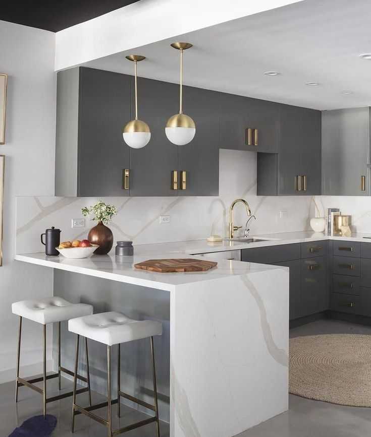 But if you think that oak cabinet kitchen ideas will feel too traditional in a contemporary home, think again.
In recent years, there have been a number of new and interesting techniques which have reinvigorated the material, and made this old staple a modern favorite. If oak cabinet kitchen ideas are high on your list, here are the key ways to put a fresh spin on the look.
Oak cabinet kitchen ideas – 10 modern ways to style a wood kitchen
Finding the right oak cabinet kitchen ideas is pivotal to creating a space that you will love for years to come.
Whether you prefer a classic look with lots of detailing or something more modern, such as flat-fronted doors, these oak cabinet kitchen ideas will provide you with the inspiration you need to create a scheme that fits your home's period, your decorating style and the room's proportions.
If you're looking for more kitchen ideas, these kitchen cabinet ideas will provide inspiration for open-plan, galley, U-shaped and L-shaped kitchens.
1. Choose a serene scheme
(Image credit: Banda)
Pale and interesting best describes this dreamy scheme in west London by Banda. ‘We have positioned this wood kitchen cabinet idea on the south-facing side of the apartment so it is filled with natural light,’ says founder Edo Mapelli Mozzi.
‘It has a calming uplifting feel and overlooks the garden square through the generously proportioned early-Victorian windows. The long central island mirrors the length of the room in a linear style. We worked with Obumex to create minimalist bespoke cabinets in a light brushed-oak wood and incorporated a Calacatta Dior marble kitchen countertop.’
2. Explore the beauty of bespoke
(Image credit: Eggersmann Design)
A combination of textured timber and striking metal details forms this original look. ‘Hand-applied concrete along with vintage oak and rolled-steel surfaces create a tactile space with an elegant industrial presence,’ says Gary Singer of Eggersmann Design .
3. Go for a dark and moody color scheme
(Image credit: Chamber Kitchens )
This Chamber Kitchens design features dark kitchen cabinets with handleless rough-sawn oak doors, antiqued Indian Black granite countertops and a Lazenby polished concrete floor, which combine to create a sophisticated scheme.
‘The restrained palette ensures that the Cherner chairs, Ochre light and artefacts from southeast Asia are not lost in what is a fairly large space,’ says Matthew Higgs, designer at Chamber Furniture . ‘The clients (one an architect) were enthusiastic about design, materials and the process – it was a nice collaboration to be part of.'
4. Create decorative interest
(Image credit: Ledbury Studio)
Detail is at the heart of this sensational kitchen by Ledbury Studio . ‘Handmade from English and European Oak with patinated zinc highlights, it blends a strong contemporary feel with traditional craftsmanship,’ says founder Charlie Smallbone.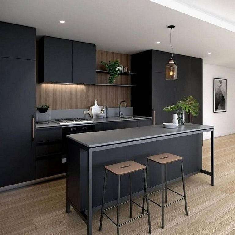 ‘Highlights include the exquisite design of the tall cupboards.’
5. Give it a modern farmhouse twist
(Image credit: Tim Williams )
This highly layered kitchen was created by US-based designer Studio Jake Arnold . ‘We wanted to preserve the charm of this Los Angeles home, and this kitchen emits an amazing combination of old world and modern elements,’ says Jake. ‘The tones of the wood cabinetry and the skinny floorboards are the perfect contrast to the exposed beams, while the ogee edge of the stone countertop adds fine detail.'
6. Mix different styles of oak and timber
(Image credit: Base Interior)
‘If you want to introduce two or more species of timber in the same room, it’s wise to ensure there’s enough contrast between each one. You can just see the media wall shelving, in a much darker stained oak, reflected in the kitchen backsplash here,’ explains Deborah Bass, director, Base Interior .
The hexagonal flooring is cut from natural marble in similar tones to both timbers, helping to unite the two. ‘Whatever timbers you use in the kitchen, the key to avoiding a heavy ‘wall’ of wood is to balance out the other finishes in the room – such as pale painted walls, simple handles, antique mirror or metal backsplashes.’
7. Evoke a textural look
(Image credit: Studio Jake Arnold)
Jake Arnold’s integration of contemporary Californian style and traditional British design has produced a wood kitchen that delights with its sense of comfort and luxury.
Timelessness was key when it came to the kitchen, too. ‘We wanted to create a well-appointed space that functioned as a central hub for the home, so we developed a rich warm wood tone for the oak cabinetry, coupled with hand-painted cabinets, antique bronze hardware and a classic La Cornue range,' says interior designer Jake Arnold. 'It was important to combine high impact with minimal materiality. Lastly we chose an ogee edge for the stone to enhance the natural veining of the marble.’
When it comes to choose kitchen cabinet colors for a farmhouse kitchen, it is best to stick to muted tones. 'The paint shade on the oak cabinetry – dead salmon by Farrow & Ball – brings about the warm and timeless feel that we love to create in our homes.'
8. Invest in simple oak cabinetry
(Image credit: CRL Quartz.)
The beautifully integrated oak cabinet kitchen idea is the highlight of this chic well-crafted white kitchen, bringing character to the open-plan kitchen space. ‘The industrial look is key here,’ says Simon Boocock, managing director of CRL Quartz . ‘The Ceralsio Slate Grey ceramic surface, with its textured finish, is hardwearing and easy to care for.'
9. Embrace an industrial approach
(Image credit: Caesarstone)
Considering the kitchen color options for your modern kitchen? Whether you’re remodelling your room or refreshing it, oak cabinets are a fabulous choice, with the potential to create both a look you love plus give your room a durable finish.
The charm of this oak cabinet kitchen idea comes through the reinterpretation of industrial style, with pale, textured surfaces in Caesarstone’s quartz Cloudburst Concrete. ‘We wanted to soften the rawness associated with this trend,’ says Mor Krisher, chief designer.'
10. Take inspiration from nature
(Image credit: Magnet)
Inspired by the beauty of Scandinavian woods, the new Nordic Nature range by Magnet has oak-effect doors in smooth, fluted and glass-fronted designs. ‘Incorporating forms inspired by nature improves our physical and mental wellbeing,’ says Herman Persson, group design director.
Are oak kitchens outdated?
Oak kitchens are enduringly stylish, and designs using sustainably produced or reclaimed woods are more popular than ever. What has changed is the design of oak kitchen cabinetry: fluting, unusual, textured finishes and inlay are at the forefront of kitchen trends right now.
How do you complement oak cabinets?
Oak cabinet ideas can be complemented in many ways, and will suit open-plan kitchens, galley kitchen, U-shaped kitchens and L-shaped kitchens.
If you want to give an existing oak kitchen cabinet an update, then do consider the best painted kitchen cabinet ideas first. Painting existing cabinets is a great way of changing the aesthetic of a kitchen without the upheaval of a full room refit – plus it will take less time, skip the disruption of renovation, and save money.
Kitchen lighting ideas are another brilliant way to add interest and illumination to your oak cabinet kitchen ideas. Apart from its key function, lighting can have a transformative effect on your kitchen cabinet ideas from making them look brighter to highlighting key details and creating a specific ambience.
Jennifer is the Digital Editor at Homes & Gardens. Having worked in the interiors industry for a number of years, spanning many publications, she now hones her digital prowess on the 'best interiors website' in the world. Multi-skilled, Jennifer has worked in PR and marketing, and the occasional dabble in the social media, commercial and e-commerce space. Over the years, she has written about every area of the home, from compiling design houses from some of the best interior designers in the world to sourcing celebrity homes, reviewing appliances and even the odd news story or two.
fashion ideas and trends, 50 photos
Choosing a kitchen that matches the latest fashion trends is easy. In 2022, the trend is simplicity and practicality. Screaming colors and pretentiousness were replaced in designer tops by a strict style and muted shades of furniture. As decor, eco-friendly accents and geometric patterns have come into fashion. With a variety of trendy styles, colors and materials, you can choose from a wide range of stylish and trendy kitchens to match the latest trends. nine0003
Fashion styles
At the peak of trends in 2022, styles that combine external simplicity and ergonomics: practical modern, strict neoclassical, discreet Scandinavian. Graceful simplicity, straight lines and pastel colors are back in fashion. It is not difficult to choose a comfortable and stylish kitchen in such a variety at the same time.
Contemporary
Modern style kitchen - a combination of laconic design and practicality of use.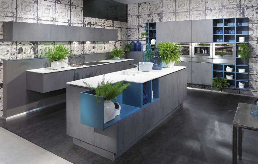 In large areas, the addition of a bar counter or an island becomes a fashionable solution, which can become both a dining area and a work surface with additional storage space. A separate level of chic will be the transfer of a sink or hob to the island and the installation of a hinged hood above it. This decision makes this part of the kitchen the logical center of the room and is considered one of the trends of 2022, although it may not be implemented in every home. nine0003
The area of the window sill in modern-style kitchens can be used both for placing accents and decor items, and for expanding the working area. The storage systems in these headsets are made as intuitive and modern as possible to access and use every centimeter of space.
Scandinavian
Scandinavian style is one of the trends of 2022. A light, unobtrusive color scheme with predominant white, complemented by wooden elements, and accents of dirty, muted tones. One of the features of the Scandinavian style is the seeming slight negligence, “imperfection”. In the interior of the kitchen, this is very practical, because even a small mess created during cooking does not stand out from the interior. nine0003
The geometric pattern that can be traced throughout the interior is also a feature of the Scandinavian style. A repeating element can move from a kitchen set to a table, chairs or other pieces of furniture, and can be played up in decor. The Scandinavian style is based on simplicity and does not involve expensive decorations, while remaining concise and elegant at the same time.
Minimalist
The severity of the lines in the absence of unnecessary details is also in fashion in 2022. The task of minimalism is to create comfort in use with a minimum of elements in the design. Straight facades without relief, often devoid of handles, and the maximum amount of free space by saving space on the decor. nine0003
One of the important features of the layout of a fashionable minimalist kitchen is the right lighting, which visually expands the space even more. The installation of separate lighting fixtures for different areas of the kitchen is welcome, making work easier. As accents in a minimalist design, you can use an apron or one of the walls painted in a color that differs from the general range. Often darker built-in furniture is used to create contrast.
Neoclassic
The combination of classic design with modern details and bright elements makes the kitchen look fresh and stylish. Supporting the 2022 fashion for practicality, neoclassical combines straight facades and characteristic relief of the classical style with modern and functional solutions: thoughtful storage systems, high-tech appliances.
Neoclassicism in 2022 is characterized by a single color scheme without bright knock-out details, materials that imitate natural, high-quality lighting that fills the space with a feeling of lightness and airiness. Accents of novelty in neoclassicism are usually functional: glass hobs, modern chrome faucets, appliances. nine0003
Trend colors
In 2022, muted colors have become the main trend in the design of the kitchen. Bright catchy shades went out of fashion, giving way to pastel colors in the interior. Designer trends are headed by gray, white, beige kitchens with light unobtrusive accents.
Gray
Shades of gray are one of the most popular options for stylish kitchen design in 2022. They go well with almost any of the trendy styles: restrained minimalism, strict neoclassicism, and functional modern style look noble in gray tones. A light gray kitchen feels comfortable to most people, regardless of taste, and the color itself pairs well with just about any trendy hue this year. Darker gray options give the kitchen an atmosphere of austerity and solidity, but are more suitable for spacious rooms. nine0003
Beige
One of the trendy kitchen colors in 2022 is neutral beige, fading into gray. It is easily combined with pastel shades of other colors, making the kitchen lighter and lighter. Since beige goes well with any style except hi-tech, its use will be justified in any trendy kitchen in 2022.
The advantage of a beige kitchen is the comfortable and cozy atmosphere created by this color. In combination with diffused light, such a room evokes a feeling of peace and is well suited not only for cooking, but also for pleasant family gatherings at dinner. nine0003
Woody
Another trend this year is woody colors and wood imitation in kitchen furniture. Such elements are especially relevant for Scandinavian-style kitchens, where they are considered a standard addition to the interior. No less stylish details of the wood-colored facade look in strict minimalism, including as dominant colors.
Wood and its imitation in the interior of the kitchen supports the long-standing trend for natural materials and motifs in the manufacture of furniture. Therefore, adding such a countertop or part of the facade will not be superfluous when designing a fashionable modern kitchen. Eco-friendly decor, such as live plants, will help to beat it even more. nine0003
White and black
Black and white facades are a timeless solution. Such furniture looks spectacular in any interior and in any style, from minimalism to modern. By changing the ratios of these two colors, you can get completely different cuisines. With an increase in the number of white elements, the room becomes more spacious and light, and with an increase in the dark part of the facade, it becomes more strict and solid. Even a combination of white and black in equal proportions allows you to develop an original kitchen, including creating the desired space zoning. nine0003
Pastels
The choice of kitchen colors in 2022 is not limited to gray and beige: fashionable furniture may well turn green, blue or pink. It is only important to choose muted pastel shades of these colors - they are at the peak of modern trends. Such furniture goes well with light walls, without overloading the space and visually leaving the kitchen spacious.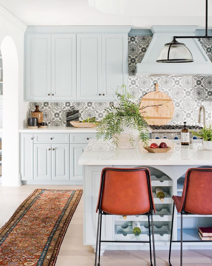
Headsets in pastel colors look good under both natural and artificial lighting. Well emphasizes their appearance diffused white light and additional LED lighting of individual areas. nine0003
Materials and textures
The choice of kitchen materials in 2022 is practically unlimited. Matte facade surfaces will look more preferable in a fashionable interior, so acrylic temporarily fades into the background. When choosing a material for a neoclassical kitchen, you will also have to abandon MDF, pasted over with plastic, in favor of other embossed ones characteristic of the neoclassical style. Among the trendy textures for facades in 2022, there are imitations of wood with straight fibers, both in natural colors and painted in non-standard shades. nine0003
When choosing a fashionable apron in 2022, you should pay attention to plain tiles without patterns. This kitchen detail can either emphasize the overall color scheme or become a bright contrasting accent that sets off the overall style. In addition, a stylish addition to countertops made of artificial and natural stone will be an apron made of the same material, which harmoniously complements the overall design and gives the kitchen an expensive, solid appearance. The uniformity of the backsplash and countertop is one of the trends that are gaining popularity in 2022. nine0003
Decor and details
As a decor, transparent glass inserts illuminated from the inside will be a stylish solution. Large stained-glass surfaces can become a bright accent. Also in the trends of 2022 are matte gold fittings, which can be replaced with standard chrome to give the kitchen a special style.
As additional accents, you can use live indoor plants that will look appropriate in both modern or Scandinavian, and neoclassical styles. Chlorophytum will look interesting in modern interiors. In addition to a stylish appearance that complements the interior, the plant is distinguished by its unpretentiousness and the ability to purify the air, which is useful in a room with a gas stove. A bright accent can be a decorative pepper, especially during the fruiting period, or sansevieria, which fit perfectly into the Scandinavian style. nine0003
When choosing a lighting option for the kitchen, it is worth considering that the trend in 2022 is its dispersal. The lonely central chandelier is a thing of the past, and additional spotlights, LED lighting for individual surfaces, decorative and functional lighting in storage areas have come into fashion. At the same time, it is very important that the central lighting is slightly diffused, but at the same time sufficient. Otherwise, in the evening, the kitchen will look dull and uncomfortable. The appearance of lighting fixtures is chosen depending on the overall style of the kitchen. Among the popular options are bar lamps and strict geometric shapes. nine0003
When choosing curtains, you should give preference to monochrome options that are close in color to the overall composition. For minimalistic designs, roll-on or roman pastel shades are suitable.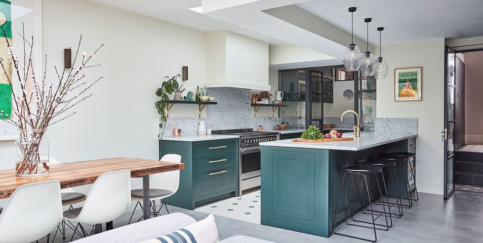 It is better to refuse heavy dark canvases, with the exception of large rooms with bright artificial lighting.
In 2022, calm interiors with strict lines and low-key muted colors have gained popularity among designers. The trends include modern and Scandinavian styles, complemented by natural and artificial wood. It can be quite difficult to develop an actual design of kitchen furniture, taking into account the peculiarities of manufacturing, materials and fittings, so it is better to seek advice from professionals. Experts will help not only to choose fashionable solutions, but also help with their implementation in practice. nine0003
Kitchen design 2023: 85 photos of fashionable interiors, trends
Trends change every year, but it is unlikely that it will be possible to repair and update the interior just as often. In this article, we have collected the brightest trends that will set the tone for kitchen interiors for more than one season. You will also find a selection of styles that will not lose their relevance in the coming years.
Kitchen Design Trends 2023
Top Trends
— Single space
— Comfort colors
— Rounded silhouettes
— Compact cooking zone
— Two colors or textures
— Natural decor
— Without dining table
Trendy styles
— Minimalism
— Ecostyle
— Neoclassic
Listed the brightest trends in the video
1. Single space
Design: Natalia Vasilyeva
You won’t surprise anyone with a combined kitchen-living room - a fashion trend has long passed into the category of classics. The concept of a single space within which you can cook, communicate with family or friends, work and relax is firmly established both in the minds of people and in the layouts of new apartments. More and more euro-twos and euro-threes are appearing - this is housing designed according to European canons, where the bedrooms are made small and isolated, and up to 50% of the area is allocated for a spacious kitchen-living room, where all life is in full swing. nine0003
What is important to consider when designing such a space?
- The main idea is in unity. Do not pile up walls and partitions, do not block the light, do not split the room into small cramped areas. This is especially important for small apartments, where you need to create the illusion of a spacious room.
- The main problem of such a neighborhood is that the sounds and smells from the cooking area will also hover in the living room. The problem is solved by a powerful hood and good ventilation. If you cook a lot, and you need to create privacy in the hall, you can use light partitions, preferably transparent or at least letting in light. The best options are glass screens, mobile screens and rack structures. nine0111
- The cooking area is most often made discreet, shifting the focus of attention to the living room with a sofa group. To do this, you will need laconic facades, hidden storage systems (including household appliances) and a neutral palette that will almost merge with the finish.

- The standard way to zone the cooking area and the living part of the room is the dining group, located between them and forming a smooth transition. It can be a full-fledged dining table or a bar counter, depending on the lifestyle of the owners. nine0009
Another long-term trend that is unlikely to lose popularity in the near future.
Yulia Pisareva's studio social networks
But if in the last few years neutral natural tones, especially white and gray, have been an obvious trend, now the direction is changing a bit. There are two categories of cozy, eye-friendly and brain-friendly color schemes for the kitchen.
Warm base
First of all, these are all kinds of beige variations: from a light shade of sand dunes or delicate creamy to a denser wheaten. As well as any other "edible" tones:
- Honey.
- Dairy.
- Biscuit.
- Champagne.
- Cappuccino.
- Creme brulee.

- Vanilla.
- Milk chocolate, etc.
The most popular choice is a combo of beige and light gray, which can be further diluted with a warm white base or, conversely, accents. It turns out an airy and light design with a nod to the Scandinavian style. nine0003
No need to limit yourself to basic shades, the cooking area and the dining group can be enlivened with rich shades, also seen in nature. Choose not acidic, but soothing deep tones. Then even on a large area (for example, if it is a set or a whole wall), they will look harmonious and not annoying.
Feel free to add to the palette:
- Blue and cyan. Any variations will do: shades of the cold waters of the Atlantic Ocean, thunderclouds, indigo, the sky on a sunny day, cornflower blue. nine0111
- Orange and yellow. Do not be afraid of the shades of the soil: terracotta, ocher, clay, brick, the color of the southern scorched earth will make the interior more comfortable. Sunny yellow or a shade of melted butter will cope with the same task.
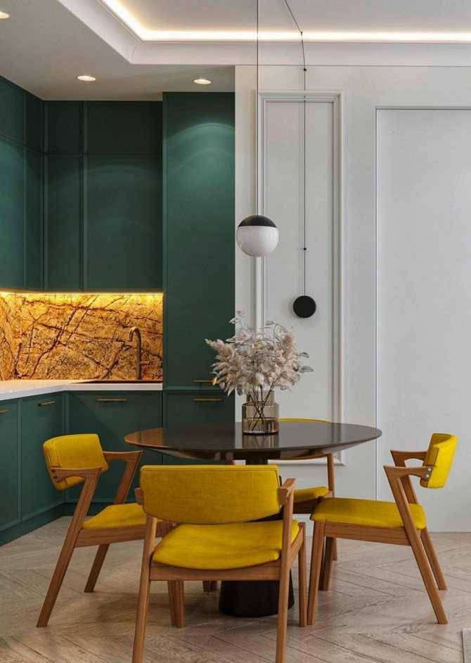
- Red. Choose deep wine, pomegranate and berry shades.
- Green. For facades, a sage color with a gray fade (for a lighter color scheme) or a deep and warm tone of olive oil (for a darker one) is suitable. They can also be used as accents. nine0003
Social networks of designer Leyla Kamalova
But if in the living room or bedroom it is clear how to implement it - curved sofas, shell chairs, round carpets, upholstered headboards - then in the cooking area we are used to seeing designs with right angles. But now, projects are beginning to actively use sets with radiused facades, rounded islands, curved lines in decorative elements, and arched shapes. And finally, there is an easy way to soften the interior - put a round or oval table in the dining area. nine0003 nine
photoSocial networks of the designer Lesia Pechenkina
VstudiIg.
 ru
ru Social networks of the designer Leila Kamalova
Social networks of designer Svetlana Khabeeva
Socialists of the designer Svetlana Khabeeva
Social networks Olga Pushkareva 9,0002 STOTS designer Leila Kamalova Kamalova Kamalova Kamalova Kamalova Kamalovoye Lyu Kamalova Camalo0002 Social networks of designer Leyla Kamalova
4. Compact cooking zone
The lifestyle of a modern urban dweller, especially in megacities, is changing.
Social networks of designer Ekaterina Rasulova
Many processes are optimized, thus freeing up time for a career, self-development and communication with loved ones, including cooking. Someone uses the delivery of ready-made food, someone prefers to eat out. But the fact remains: on average, people cook less, and someone even makes only light breakfasts at home. nine0003
The design of the kitchen in the apartment is also adapted to these changing needs. Massive structures occupying two walls completely are being replaced by compact corner or linear systems with two-burner stoves, hidden storage and a small work surface.
eight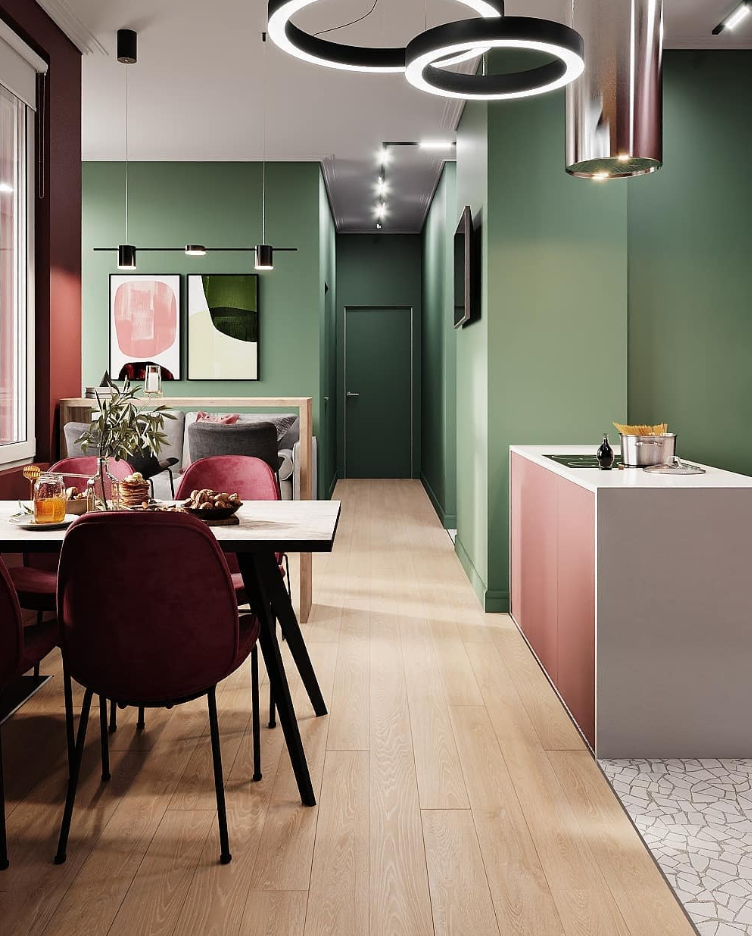
photoSocial networks of designer Veronika Marchenko
Social networks of designer Ksenia Erlakova
Social networks of BODES
Social networks Holll
Social networks of the Rerooms
Social networks of designer Yevgenia Kostenko
ART Studio MIR
Social Settings of Yekaterina Two -Sulfur 5000 9000 9000 9000 9000 9000 9000 9000 9000 9000 . They are increasingly seen in the photo of kitchens in an apartment or a private house.
Holl Studio Social Media
Colors can be divided vertically or horizontally, clearly 50 by 50 or by the principle of color blocking: one tone is basic, the second is accent. The classic version is a darker color at the bottom of the furniture, a lighter one at the top, but no one forbids breaking these canons. For example, two different functional areas can be divided by color: a cooking area with an apron, a sink, a stove, a countertop, and a structure with storage and built-in appliances.
 nine0003 6
photoSocial networks of designer Svetlana Kapustina
Social networks of the studio Holl
Cubiq studio
Issots of designer Ekaterina Koddintseva
Social networks of the ONE Line Design
Elena Lebedeva
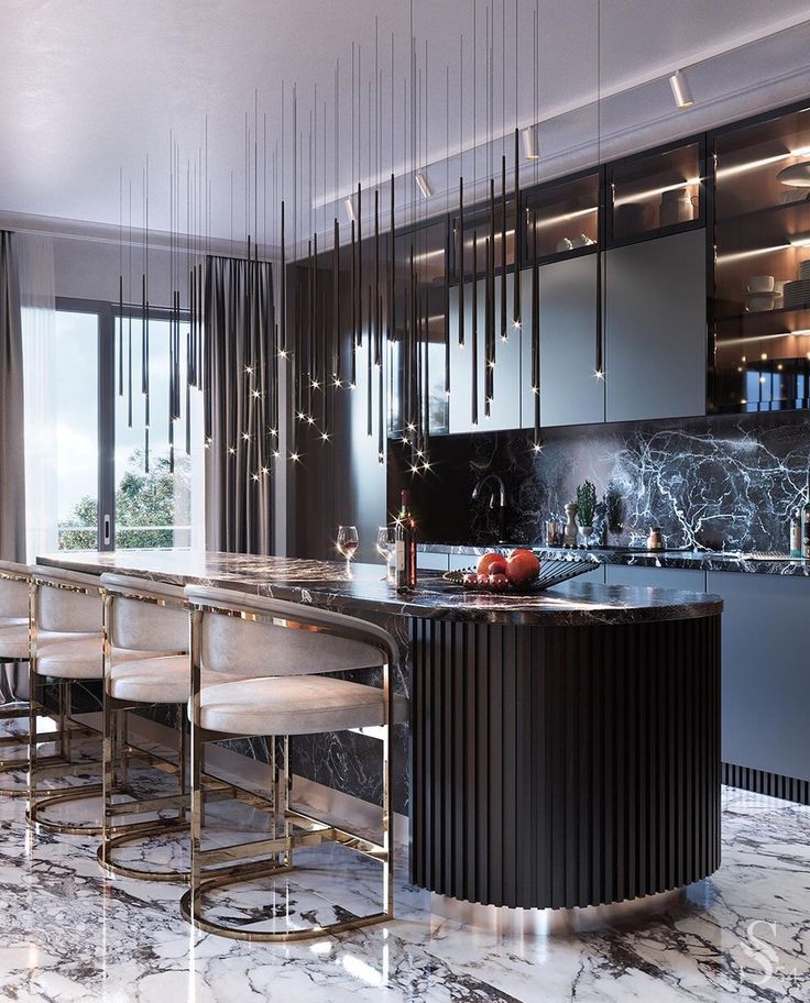
Prets. , marble and metal, MDF and glass. For kitchen design in a modern style, a combination of smooth matte facades with a pronounced wood texture works great. The palette can be anything, but the gray-beige or taupe combo is considered a classic. nine0003
Unsplash
Social networks of Bodes studio
Social networks of designer Evgeniya Kostenko
Social networks of designer Dmitry Kurilov
Social networks of studio Osome
2023.
Social networks of the company "Invest repair and property management"
It will perfectly complement the general trend towards environmental friendliness and closeness to nature, as well as unobtrusively add coziness and originality even to such strict and “cold” styles as minimalism or hi-tech.
 nine0003
 Suitable for decorating dining and work areas:
- Ceramics, in particular handmade crockery.
- Clay vases or figurines.
- Fresh flowers, dried flowers, herbs.
- Beautifully designed mini-garden (for example, herbs in identical planters).
- Fruit dishes.
- Wooden boards and other accessories for cooking.
- Lamps with straw shade.
photoDesign: Fedor Krylov
Social networks of the Yudin & novikov
Social networks of designer Alexei Ivanov
Design: MDN Studio
Social networks of designer Natalya Palino
Social Setter Squire
Social Settings of the Pechenkina
Socials property management"
Social networks of the company "Invest repair and property management"
7. No dining table
Today, homeowners are increasingly moving away from the traditional dining table.
 And it doesn't matter if it's in a tiny studio or a spacious apartment.
 Design: Denis and Anton Yurov. Photo: Evgeny Gnesin
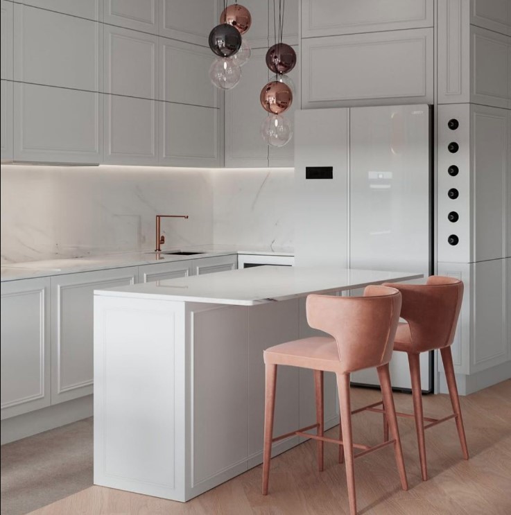
The trend will obviously gain momentum - just like the rejection of capacious full-fledged headsets. This is due to the modern rhythm of life: we increasingly have lunch, dinner and even breakfast outside the home, so for many, the kitchen in the apartment ceases to be the main room. Enough of a small corner for a coffee break or a quick snack. And if one person or a couple without children lives in the apartment, then a wide island or bar counter is enough to replace a full-fledged dining table. nine0003
Of course, this solution is not suitable for everyone: for example, it will be uncomfortable for older people to sit even on the softest bar stools. But otherwise, the trend is quite bright, and it will obviously only strengthen its position, especially in the face of rising real estate prices and, accordingly, the growing popularity of small-sized housing.
7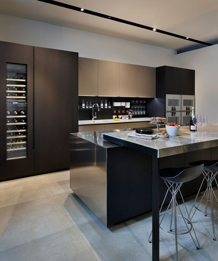
photoDesign: Svetlana Kapustina. Photo: Nick Rudenko. Style: Kira Prokhorova
Design: Anna Dobrokovskaya. Photo: Anton Likhtarovich
Design District social networks
Design: Ekaterina Durava. Photo: Evgeny Gnesin
Social networks of designer Ekaterina Rasulova
Social networks of Design District studio
Design: Denis and Anton Yurovs. Photo: Evgeny Gnesin
Despite new trends appearing in the design of the kitchen, the design of this room will remain unchanged for at least several years. Here are some styles that will definitely not lose their relevance in the near future. nine0003
Minimalism
Ard Design social networks
Minimalism can hardly be called a trend - it's a whole philosophy of life without rigid design canons. The direction develops, changes and integrates into everyday life, going beyond the interior.

To keep the kitchen interior design in this style relevant, follow the following rules.
- Use warm, diluted shades to add warmth to the room and make up for the minimal amount of decor. nine0111
- Little does not mean boring. Minimalistic interiors work due to the verified forms, color depth and combination of textures. It is the textures that need to be given special attention. Combine cold and warm textures, glossy and matte surfaces. Rough concrete or stone looks great with warm wood and cozy kitchen textiles. To enliven the interior, you can add 1-2 fresh flowers in minimalist flower pots, as well as make an accent apron: lay out unusual tiles or continue the tabletop material. nine0111
- Design follows function, not the other way around. All furniture and appliances should be multi-tasking and arranged according to the principles of ergonomics.
photoSigma Pro Social Media
Artpartner Architects Social Media
Holl Social Media
Studio57 Social Media
Bodes Studio Social Media
Social networks of Artpartners Architects studio
Social networks of Ard Design studio
Eco
People will continue to strive for nature, including within the interior of their apartment.

Social media blogger love_my_home_pl
Ecostyle will not leave the list of popular trends for a long time, but, like minimalism, it has already become more of a concept than a set of stylistic markers.
The key idea of ecodesign is the naturalness of all materials. In the top there is a tree or its eco-friendly analogues, which can be supplemented with artificial or natural stone, marble texture, precious metals. There should be a lot of light in the room, the decor should be only natural. Clay and ceramic dishes, textiles made from natural fabrics, accessories made of wood, stone, bamboo and other plant materials. Visually, eco-style can be close to Scandinavian interiors, minimalism or boho, depending on personal tastes and the overall style of the apartment. nine0003
Design: Irina Baldanova. Photo: Evgeny Gnesin. Style: Irina Bebeshina
In such spaces there is no "naphthalene" heaviness, bulky structures and too dense, sometimes "stuffy" colors.
Learn more
