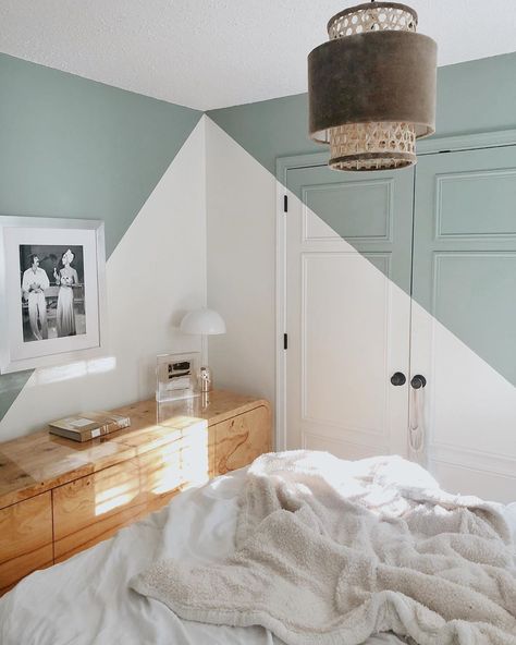
Interior design diagonal lines
ELEMENTS OF DESIGN PART 1: LINE
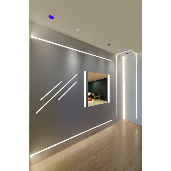
The application of line in this office designed by One Plus Partnership has a lot of impact. Lines are applied diagonally and vertically to create a very dynamic interior.
After many years in the business our Interior Designers have completed an array of successful commercial projects here in Kelowna and across Canada. These engaging spaces did not happen by chance. Design has a technical aspect to it referred to as the elements and principals of design, and when combined successfully, evoke emotion from our interactions with the interior environment. In commercial settings, these emotions assist to reinforce your brand and corporate message.
So, what are the elements and principals of design? We’ll explain it all in this blog series, so check back often. This week we’re talking about line – horizontal, vertical, curving, diagonal; each has an impact on how you perceive space. Lines can also be combined to create shapes and planes, or form – but that’s for another post. Structural elements, applied finishes, even lighting can all be applied to create strong lines within a space.
Dan Brunn Architecture was successful in accentuating length with the horizontal wall slats and rectangular floor tile in this showroom design for Ceasarstone.
Horizontal Line
Lines applied horizontally often evoke feelings of stability, grounding, emphasis and direction. So, although horizontal lines tend create length and lower the ceiling of a space they can also be applied to direct the viewer to a particular focal point.
The gold panels applied vertically and upwards onto the ceiling create a strong line that really adds to the feeling of height in Le Theatre Saint-Nazaire designed by K-architectures.
Vertical Line
Vertical lines are often associated with strength (think pillar of strength), stability, balance, and elevation. It has been hypothesized that viewing vertical lines is unnatural compared to viewing horizontal lines.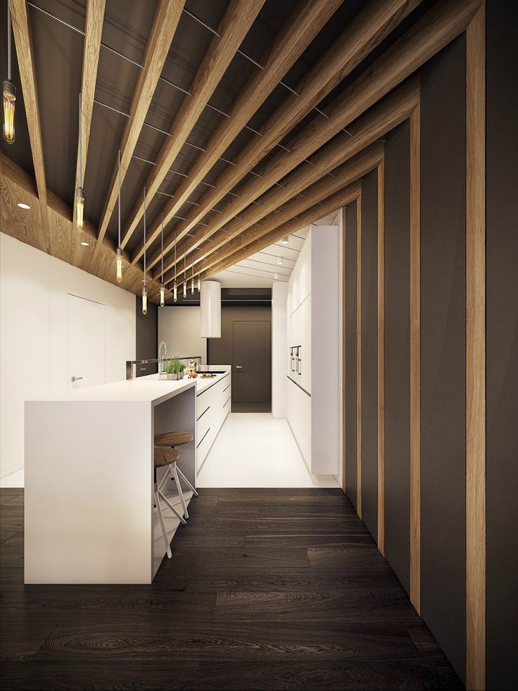 Additionally, vertical lines extend away from our visual plane. For these reasons, the length of a line applied vertically is often extended lending to the feeling of height in a space.
If the goal was to create a dynamic and fun space, Dialogue 38 hit the nail on the head with this design for Guu Izakaya.
Diagonal Line
Diagonal lines typically connote a sense of dynamic movement, transformation, and freedom. Diagonal lines can really bring life to a space, direct the eye upwards or downwards, and add volume to a space, making it feel larger than it is. That being said if applied incorrectly, diagonal lines can conjure a sense of confusion and imbalance.
This undulating seating element designed by Cappellini really creates a playful environment in this interior space.
Curved Line
Curving lines whether freeform, arcing, circular, or elliptical often feel natural, organic, playful, and soothing. If you are looking to make a space flow curving lines are a great way to do it. They are also very voluminous taking up space within an interior.
By applying lines in a way that relates to your brand message, you can create a space that appeals to your customers and highlights the product you sell.
» Do you need help with your commercial Interior Design project? Contact Hatch Interior Design located in Kelowna, British Columbia – Sustainable Interior Design Solutions for the Modern Workplace.
Using line in interior design – what it is and how to use it
When you purchase through links on our site, we may earn an affiliate commission. Here’s how it works.
(Image credit: Future / Jake Curtis)
'Line' is one of the informal rules that interior designers will often follow when creating a room that's well-balanced, proportioned – and visually pleasing.
See: Interior design tips – decorating secrets for the world's top experts
The different types of lines – vertical lines that extend up and down; horizontal lines that extend side to side; and dynamic lines (diagonal, curved or zigzag) can all help to unify as well as contrast, guiding the eye around the room and ensuring it's interesting as well as functional.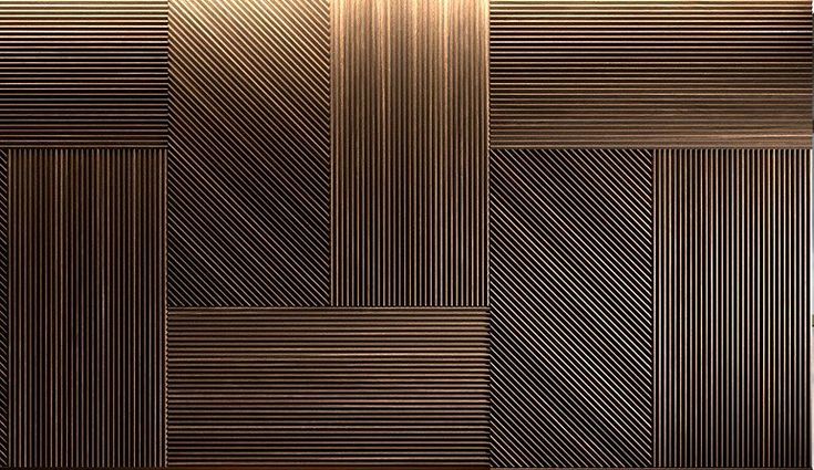
Barrie Cutchie, Design Director at BC Designs , says: 'Lines are part of the concept of form within interior design and are critical to the success of a design scheme. There is an argument that lines are at the heart of form and are characterized as either horizontal, vertical, diagonal and curved lines which all help to define shape and volume.
'As well as this, they are hugely important when it comes to texture – think the defined lines of fluted glass – or apparent texture such as marble where it appears to have texture and doesn’t.'
'Linear elements in interior design draw the eye, and can be used to manipulate the way we interpret a space,' says Tiffany Leigh, of Tiffany Leigh Design .
Furniture can be used to create horizontal lines, like tables and countertops, and give a space a sense of anchored stability. Vertical lines can help a room feel taller, and panelling, cladding and shiplap can all be used to enhance height.
Tiffany says: 'Want to make a space feel taller or emphasize a high ceiling? Use vertical lines to draw the eye up! Vertical tongue and groove panelling is one of our favorite linear elements to add to a space, drawing the eye up while adding architectural interest and texture to a space. '
'
(Image credit: Tiffany Leigh Design)
Dynamic lines are often used to engage the eye and stimulate the senses, so are particularly good in accent pieces, like chevron on a rug or lampshade, or a parquet floor or tiled feature wall.
Dynamic lines should generally be kept to a minimum and not overpower vertical and horizontal lines, although this a guide only.
Discover some top tips how to use line in each room below.
1. Use line to form zones in the kitchen
(Image credit: British Standard by Plain English)
'When used carefully, lines help balance a kitchen, playing with the proportion of a space and helping to create zones,' says Adrian Bergman, Senior Designer at British Standard by Plain English .
'We often use a tide line paint effect, a painting technique that's now synonymous with British Standard, whereby the color of the cabinets extends above the worktop to eye level, creating one continuous line around the room.
'This technique works particularly well in rooms with high ceilings, as it lowers the focus and grounds the joinery, with the added benefit of adding color and personality to a space. The tide line can be tonal or contrasting colors, both create a very graphic quality adding real interest to the room.’
In the image below from Original BTC , lines are cleverly used to create zones; the slimline, short tongue and groove above the worktop adds a pop of color as well as a coziness that defines the work space. The vertical cladding lines are then widened and lengthened to create height.
Panelling on the cabinets helps to define the storage area, while fluted glass on the island does the same job but injects a different aesthetic as a contrast.
(Image credit: Original BTC)
See: Kitchen ideas – decor and decorating ideas for all kitchens
Lines can also be used to add texture to a kitchen, through pattern on tiled splashbacks or fluting on cabinetry or glass, for example.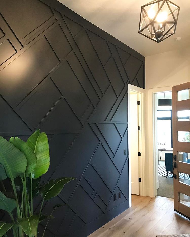
(Image credit: VEVES interior design)
2. Create a spa-style bathroom with lines
(Image credit: BC Designs)
There has been a shift towards using dynamic lines to create a bathroom sanctuary, says Barrie Cutchie, explaining: 'Lines run throughout furniture, architectural elements and accessories that you choose, and we’ve seen a huge evolution in bathroom design from simple horizontal and vertical lines to lots of curves, which helps to soften a look; creating a much more relaxing environment – think spa-like bathroom trends.'
However, vertical and horizontal lines still have their place, and can be used to make a space feel cozier or larger. The curve of the freestanding bath above softens the vertical lines in the wall cladding, too.
Barrie says: 'You can also use lines to make a space feel bigger or small. An example is the use of tiles. If you have a long or narrow space, running tile lengthwise can make it feel bigger because the lines diminish into perspective.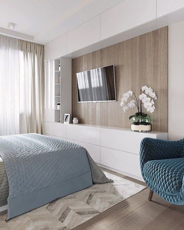 If you place the tiles running side to side, the room will look shorter but feel wider.'
As is the same in any room, lines can also be harnessed to inject texture into a bathroom, from fluted lights, cabinets and vanity units, to rustic wooden wall cladding.
(Image credit: Ham Interiors)
See: Bathroom ideas – stylish decor ideas for all bathrooms
The beautiful wood cladding in the bathroom below, belonging to Bee Osborn, of Osborn Interiors , shows how the ceiling cladding gives the room length and, as there's already height but not much width, horizontal wall cladding makes it feel bigger, as well as adding warmth with the grainy texture.
Tiffany Leigh says: 'The direction we run hardwood in a room is carefully planned when thinking about line and what it will do to a space. Running hardwood parallel to long walls makes a space feel longer but narrower, perpendicular means wider but shorter.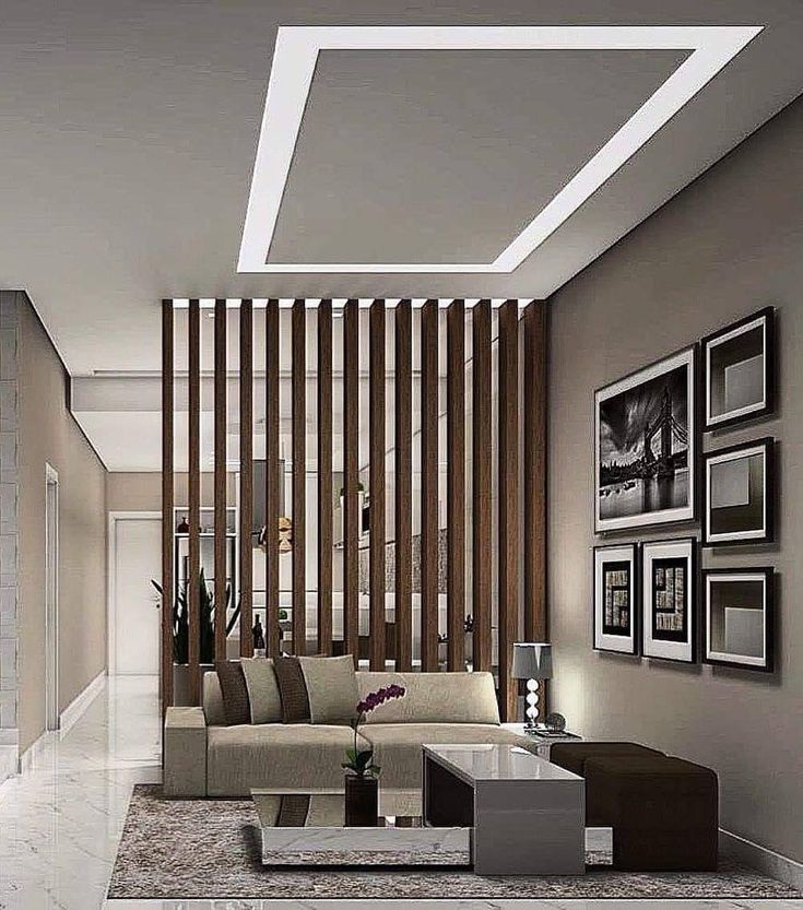 '
'
(Image credit: BC Designs/Bee Osborn)
Tiffany also has a little line design style trick for the bathroom. She reveals: 'Want to make a space feel more intimate? Designers actually use a trick called 'breaking the line' to do this, where you break up a long, solid countertop with a hand towel draped over the end.'
(Image credit: Tiffany Leigh Design)
3. Add color to the bedroom with painted lines
(Image credit: Neptune)
Annie Sloan explains that using paint to create lines in the bedroom can help to make a space feel larger, while also adding color and atmosphere.
She explains: 'The fundamental principles of using stripes to make a space look larger are simple: vertical stripes of any width will make walls appear taller, narrower stripes especially can give a high-ceilinged feel to a space. Horizontal stripes make the walls and the room appear wider. Especially at one or two third intervals up a wall, they create the feeling of a larger space whilst also being directional, and, crucially, easier to paint than vertical lines!'
Annie adds: 'It’s a great way to incorporate more color into your home when you can’t decide on a wall color or if you’d like to experiment with a statement shade without committing to a whole wall of color.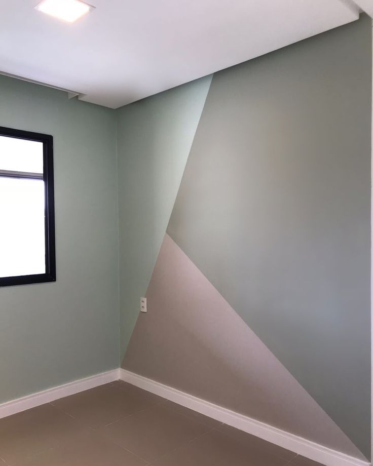 Using contrasting colors will make a grand statement; use the brighter color at the top third of the wall to draw the eye upwards and create the illusion of height as well as width! Use tonal colors for a more subtle, contemporary nod to the trend.'
Painted panelling is also a stylish way to use line to create a timeless and elevated feel in the bedroom.
See: Bedroom ideas – designs and inspiration for beautiful bedrooms
(Image credit: Neptune)
The bedroom above by Neptune perfectly shows how using different lines can guide your eye around the room; the rug stripes run parallel with the wooden flooring, leading the eye to the back of the room, where vertical panelling draws the eye upwards to appreciate the artwork. The dynamic lines in the curves of the headboard add extra interest for a varied and visually pleasing aesthetic.
4. Makes accent pieces pop with dynamic lines in the living room
(Image credit: Damian Russell)
Dynamic lines, including curves, zigzags and chevrons, are a clever and easy way to bring a living room to life.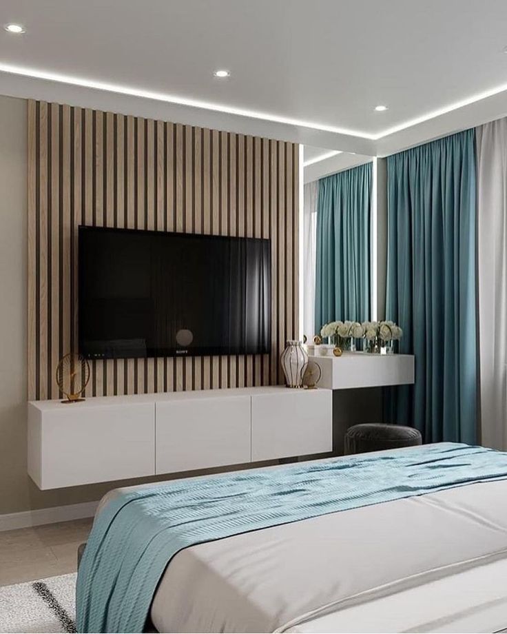 A curved sofa is always a timeless and elegant choice and, in the image above, the round table, glass-blown lamp, half-circle rug and cheeky vase all soften the vertical lines of the full-height curtains and wall panelling for a vibrant room.
(Image credit: Future / Jake Curtis)
5. Adopt a mix of lines to add verve to a dining room
(Image credit: Ligne Roset)
The above design by Ligne Roset offers an excellent example of how to mix vertical, horizontal and dynamic lines to give character to a dining room. The lines in the rug add depth, color and dynamism to the room, while the round table softens the statement. A fluted cabinet on the back wall also adds texture to the space.
Ruth Doherty is an experienced digital writer and editor specializing in interiors, travel and lifestyle. With 20 years of writing for national sites under her belt, she’s worked for the likes of Livingetc.com, Standard, Ideal Home, Stylist and Marie Claire as well as Homes & Gardens.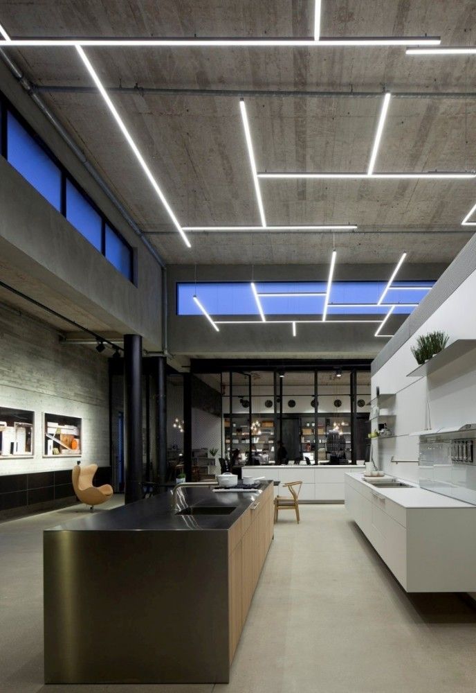
Fifth design principle. Lines.
Author admin Read 3 min. Posted by
Designers often use lines to create a certain atmosphere or change the overall perception of an interior. Read what types of lines exist and how to correctly use them in the interior.
When working on interior design, pay attention to the direction of the lines that will prevail in it. After all, lines greatly affect our sense of space.
In the interior, the lines are set by architectural elements, the arrangement of lamps, patterns on wallpaper and carpets, the geometry of furniture and shelves. They will help you in solving various problems.
• Lines affect the emotional state. Horizontal and flowing lines soothe, vertical - inspire, diagonal - excite. Thanks to this, you can create the mood you need in the interior.
• They guide the movement of the eye and help to navigate in space.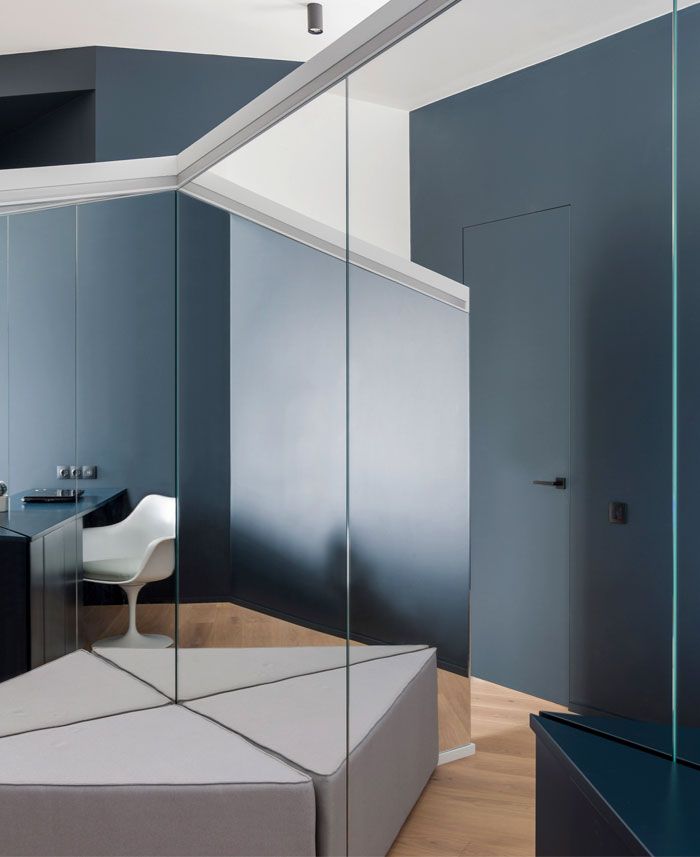 Therefore, they are used to emphasize the main elements, or vice versa - to hide the insignificant ones.
• Lines change visual perception. With their help, you can visually expand or reduce the room, disguise irregular shapes.
Next, we will look at the different types of lines, their effect on the psyche and examples of use in interiors.
Contents
- Horizontal lines in the design
- Vertical lines in the design
- Diagonal lines in the design
- Curved lines
Convey a sense of stability. They soothe with their balanced monotony, but also set a slight dynamics for the interior. Visually, horizontal lines "push" the walls, so the room seems wider. But at the same time, the ceiling will appear lower. Therefore, if you already have low ceilings, it is better to abandon the horizontal rails.
The use of horizontal lines is one way to emphasize the compositional center. For example, long open shelves on the sides of the fireplace will draw attention to it, guiding the movement of your gaze.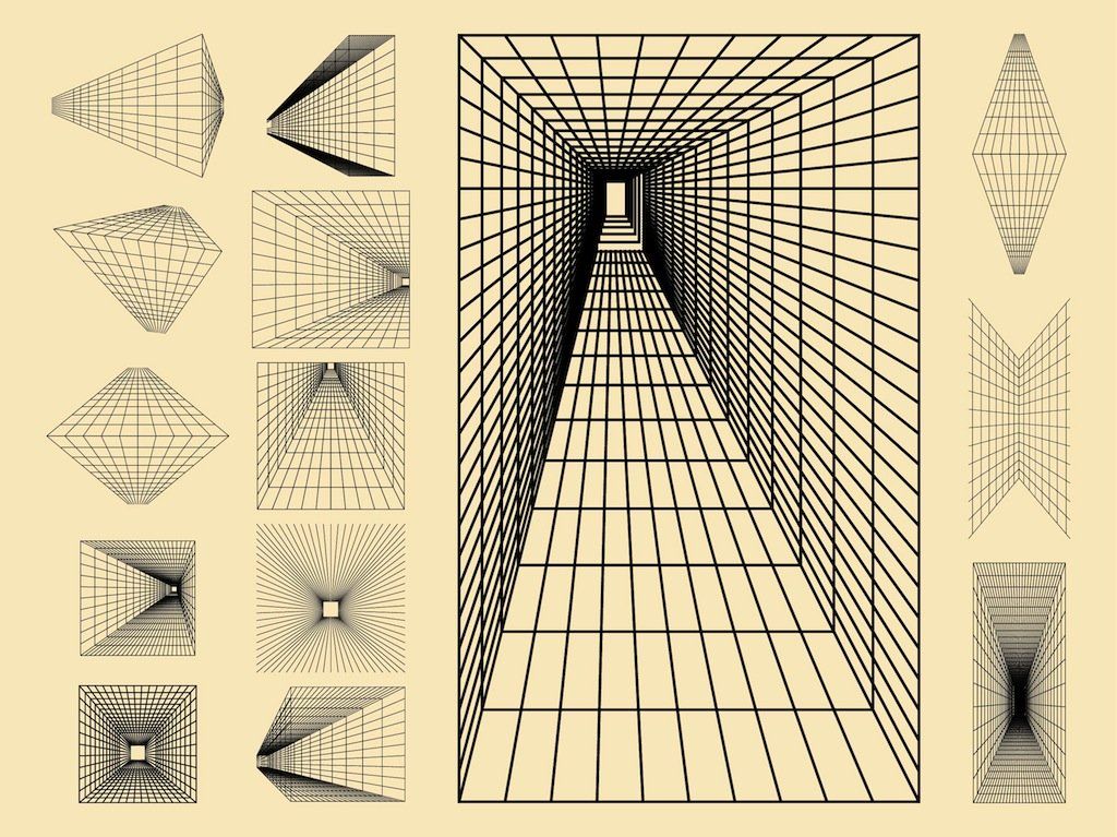
Horizontal lines dominate modern interiors. They are accentuated by low long sofas, continuous rows of cabinets and open shelves.
Cause an emotional lift and balance the internal state, associating with the power of the columns.
Vertical lines visually “raise” the ceilings, it is beneficial to use them in small rooms.
Columns are the most obvious example of using verticals in an interior. Also, verticality can be emphasized with the help of narrow long cabinets, ceiling-to-floor draperies laid with clear folds, wallpaper with a striped pattern, and in other ways.
Vertical lines can also highlight the main element of the interior. For example, vertical panels above the bed will emphasize its importance and enhance the emotionality of the interior as a whole.
They excite, set the pace, lift the mood. They can revive even the most boring interior. But use them sparingly in rooms intended for recreation or work. It will be difficult for you to relax or concentrate in a room dominated by diagonal lines.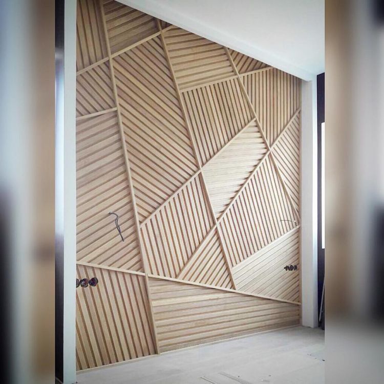
Visually, diagonals expand the space. They can be used in the bathroom to visually enlarge this room and make it more expressive.
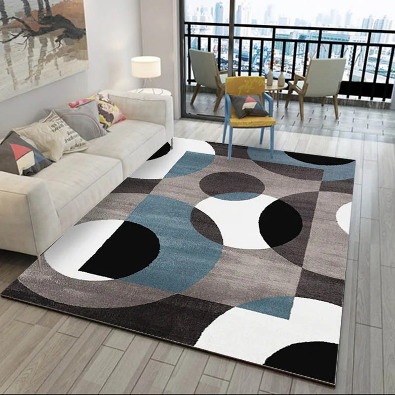
Diagonals may be present in carpet design, tile arrangement, upholstery ornamentation or wall painting.
Pacify, lead to inner harmony. Subconsciously, they evoke associations with natural motifs: the flowing smoothness of rivers, the softness of green hills. With their help, you can create a very poetic interior that will promote relaxation.
If you decide to use this type of line, consider softening the angles that dominate traditional apartment layouts. Smooth lines can be present in the pattern of suspended ceilings, furniture bends, plastic lamps and shelves, various ornaments on carpets and walls.
It is not necessary to use only one type of line. You can combine horizontal and vertical lines to design the space to your liking. Or locally add diagonals to highlight some part of the interior. Or soften the rigid geometry of the furniture with a smooth bend of the ceiling cornice.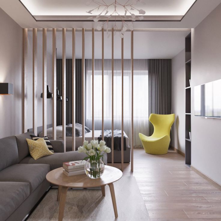
There's a lot of room for creativity here, so make the most of it!
Interior stripes: horizontal or vertical stripes in interior design
We also got a strip a long time ago. But only now it was called “motley” and it turned out due to the fact that it was often difficult for peasants to find the same fabric, so clothes were sewn from strips of different patches. Colors were chosen so that it looked harmonious and beautiful. They were mainly red, blue, white, purple and gold shades.
But in medieval Europe, the attitude towards this pattern was somewhat different: jesters, executioners, servants, convicts and other outcasts had to wear it. In order not to be confused with decent citizens. This was the case until the Renaissance. Then the strip was finally appreciated. Since then, it has remained one of the most popular patterns. But let's look at some examples.
Horizontal or vertical
Vertical lines can visually lift the ceiling and make the space appear taller.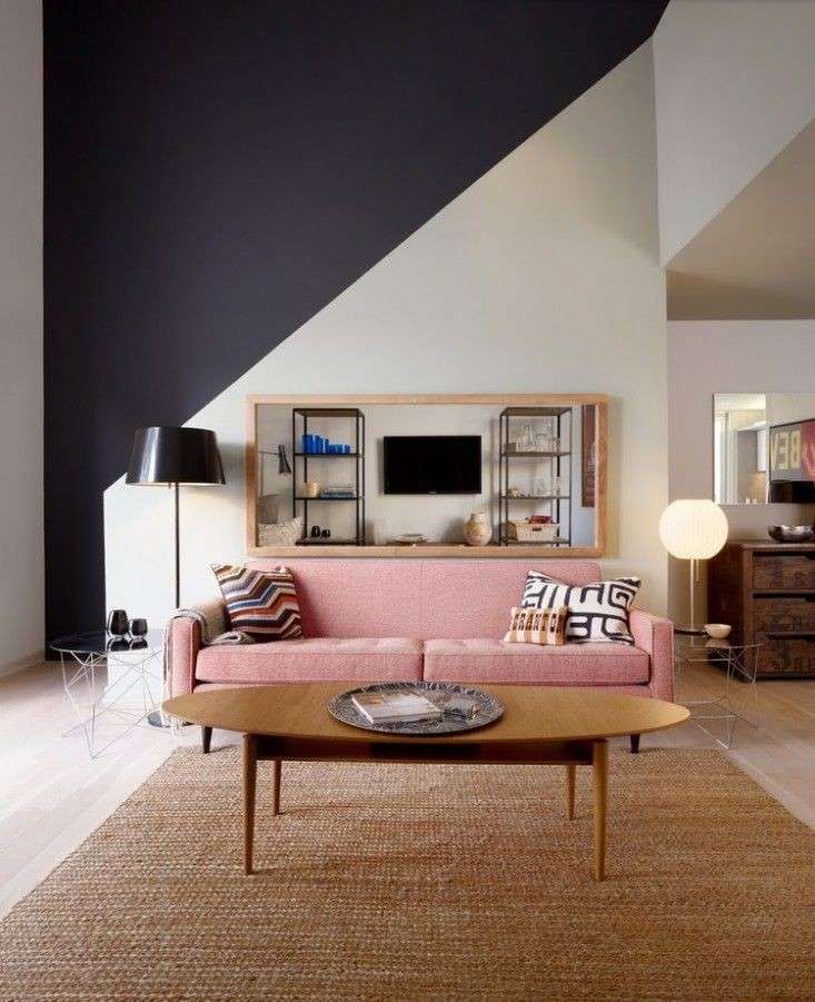
And the horizontal ones are wider. True, the ceiling will seem a little lower. Therefore, you need to choose a strip taking into account the characteristics of the room. If the ceilings are low, vertical lines are ideal.
Diagonal also visually enlarges the space. At the same time, unlike horizontal lines, it does not “lower” ceilings. You can “stripe” the entire wall or just make a few bright lines. The interior will become brighter and more expressive.
Small or wide
Wide stripes make the space more intimate. At the same time, they set the tone for the interior and build the space. And the thin ones will merge into a pattern, creating an excellent background for bright decor items.
Colored or plain
Plain stripes bring clarity, geometricity and balance to the interior. While bright, multi-colored stripes, on the contrary, make it more vibrant, playful and add a little chaos.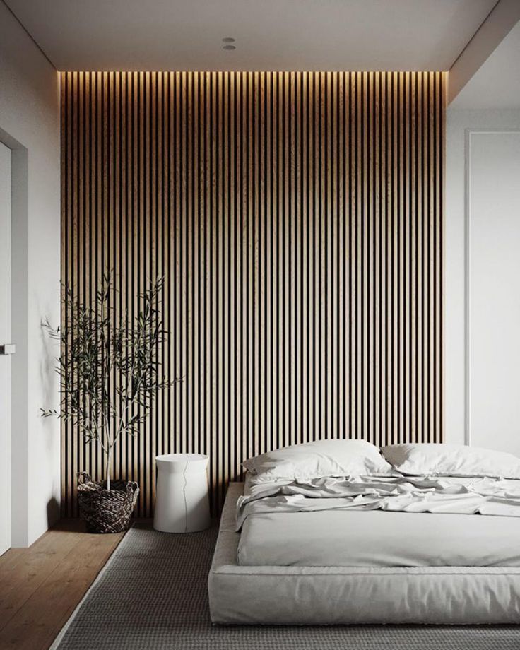 What do you like more?
“Striped objects are also good because they can perfectly exist in solitude. They do not have to be supported by stripes in other corners. And the strip does not have to be straight! The skin of a zebra is also striped” Maria Solovieva-Sosnovik, studio Bureau17-117. Interior designer, decorator, journalist, member of the Association of Interior Decorators
Same or different
Stripes of different widths will add rhythm and dynamics to the pattern. Combinations of thick and thin lines can be a very simple alternation of two or three types of stripes or a complex pattern. Decor elements with such a pattern can be an interesting accent in the interior.
Whatever the stripes, they go well with each other and with any other prints. In one interior, you can safely use lines of different thicknesses, colors and rhythms. It will still be stylish and beautiful.
The stripe is a truly unique ornament with a rich and interesting history.