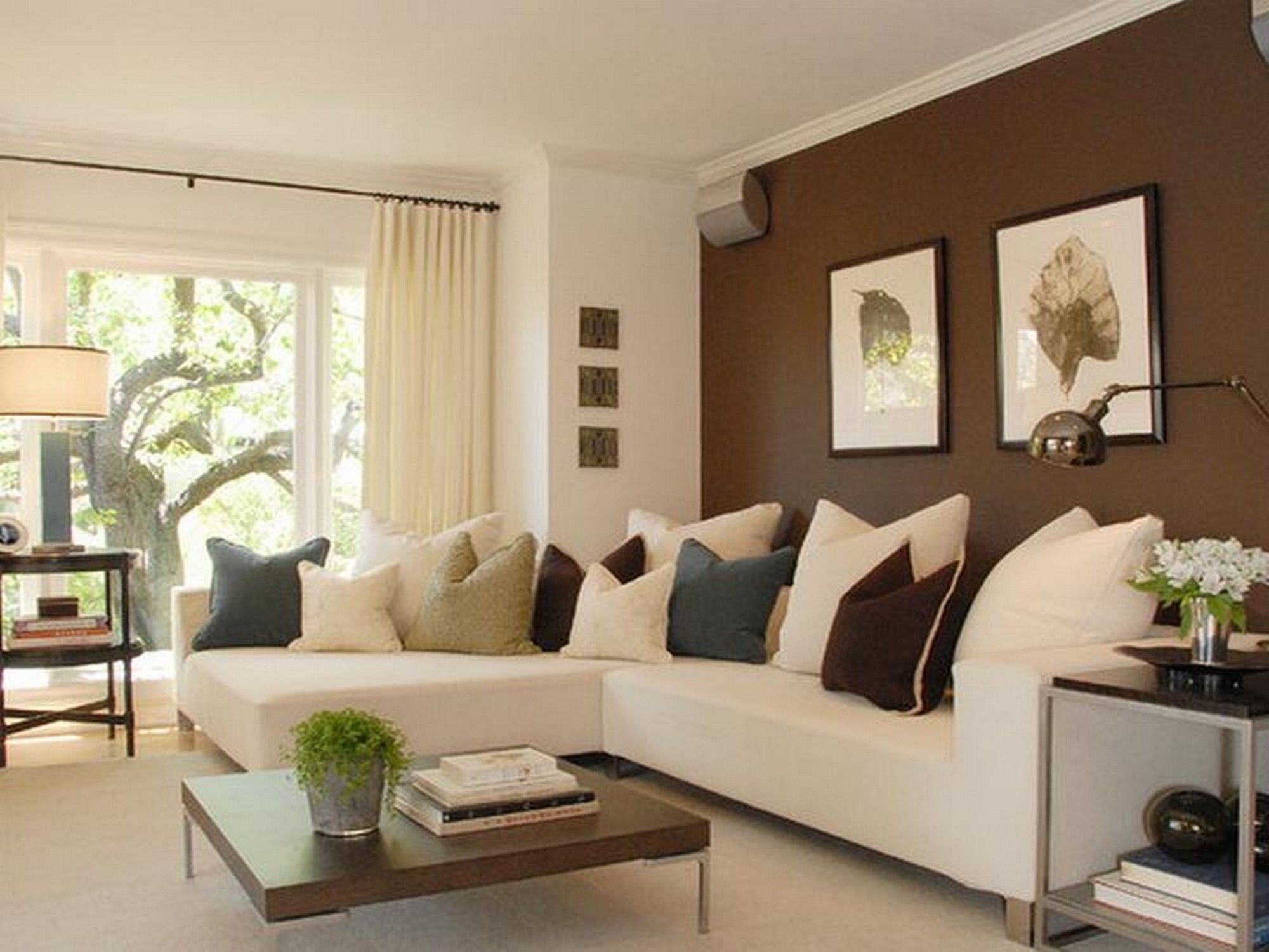
Indoor home paint colors
10 Best Interior Paint Colors 2023
by Andre Kazimierski | Jan 16, 2023
Finding the best interior paint colors for your house is hard. As a homeowner, you’re faced with an endless array of colors, shades, and sheens. To complicate things further, you’ll need to coordinate paint colors between rooms and surfaces.
That’s why our color experts created this top 10 favorite interior paint colors to make it easy for you.
Regardless if you’re sprucing up your bedroom walls or painting the whole house, here are the top 10 most popular interior paint colors for any room.
Best Paint Color Criteria
First and foremost, our goal is to save you time and money with this list. You shouldn’t spend all weekend ordering test patch swatches and driving to paint stores.
To simplify the process, the paint colors listed are fairly neutral, easy to match, and can be used in most rooms. Remember, every home is different and the amount of light in a room affects how colors look.
With this list of the best paint colors for your home, we’ll make the process as simple as possible. Let’s start with a shade that climbed from number ten to the top spot in a year’s time.
-
Origami White By Sherwin Williams
Sherwin Williams’ Origami White (SW 7636) is a balanced, modern wall color and our top pick for interior paint color this year. Certainly, it’s white with a slight tan undertone that can be a neutral backdrop for most rooms in your house.
But what we love most is Origami White’s versatility.
Indeed, the color has enough depth to work for large rooms with lots of sunlight while still being bright enough to open up smaller spaces. Not to mention, it finishes velvety smooth and seems to adapt well to both warm and cool lighting conditions.
All in all, Origami White’s unique warm hue is why many interior decor experts swear by it as the perfect neutral paint color. Underrated no more, this color exemplifies the fresh and inviting theme of the trendiest interior paint colors of the year.
-
Behr Blank Canvas (DC-003)
Blank Canvas (DC-003) is a warm white neutral that has earned its distinction as Behr’s 2023 color of the year. Not only is it an inviting light neutral paint color, it perfectly encompasses a fresh new start. Certainly something we can all use after the past few years of uncertainty.
Moreover, Behr’s Blank Canvas has an earthy tinge of brown which characterizes it as an off-white color. At the same time, it’s light enough of a white to contrast other neutrals. This makes it a great color for kitchen cabinets as well.
Indeed, this is the perfect interior paint color for entryways, hallways, and mudrooms in addition to most any room in your home.
No question, the latest color trends do away with cold white tones like Delicate White by PPG. Instead, we are seeing warmer neutrals like Blank Canvas and Origami White taking over this year.
Finally, it’s easy to coordinate and with an LRV of 84, it has just enough depth to contrast white trim and ceilings.
-
Benjamin Moore Classic Gray
Benjamin Moore Classic Gray (BM 1548) is a natural light warm gray color that registers as a sophisticated off-white on the walls of most rooms. A top paint color among designers, this can be used to paint the whole house, bedroom, living room, or kitchen.
Not to mention, you can use this color instead of white in a darker room. Lastly, this top gray shade works in both south-facing and north-facing rooms.
Thinking about painting your main rooms? Find out which shades our experts picked in the best 9 living room paint colors this year.
-
Pure White Sherwin-Williams
Pure White (SW 7005) by Sherwin Williams is a versatile off-white paint color that is often used in the kitchen, bedroom, or living room. Likewise, it has a soft, warmer taupe tone that doesn’t feel terribly creamy and pairs well with gray color palettes.
Flexibility is key with this popular modern neutral interior color as it can be used on walls, cabinets, trim, or ceilings.
Narrowing down paint colors in a bedroom can be tough. With thousands of colors to choose from, where do you start? A good place to begin would be this list of popular bedroom wall hues curated by our expert design team.
-
Repose Gray Sherwin-Williams
This warm neutral paint color looks gray without feeling too cold. It’s a great color for walls in living rooms, foyers, dining rooms, kitchens, and bedrooms. Repose Gray (SW 7015) has slight taupe or green undertones and pairs well with white trim colors like Extra White (SW 7006).
The combination of gray and beige blends perfectly, allowing this color to go with most existing home paint color palettes.
Stumped on which primers to use? Learn all you’ll need to know about priming in our homeowner primer paint guide so you are better equipped to tackle your next project.
-
Sea Salt By Sherwin Williams
Sherwin-Williams Sea Salt (SW 6204) is a popular coastal “neutral” interior paint color that is a mix of gray and green. Used often in bathrooms, dining rooms, kitchens, and mudrooms, this is a relaxing cooler-leaning color with slight blue undertones.
This color has been described as “chameleon-like” in that it looks different in a variety of rooms/lighting. It also happens to be one of the most researched painting colors in the US with nearly 50,000 online searches per month.
Inspired by the painted powder room above? Find out which interior shades made our 10 best bathroom paint colors list this year!
-
Benjamin Moore Chantilly Lace
One of Benjamin Moore’s truest whites, Chantilly Lace (OC-65) is a crisp, clean interior color with slightly gray undertones used on trim, cabinets, and walls. In most rooms and lighting, it reads like a warm white and can be used on ceilings as well.
Now as one of the whitest whites, it may take a third or fourth coat when painting over most wall colors. Therefore, it’s no surprise that this popular shade has the same wall coverage issues as Sherwin’s Highly Reflective White and Behr’s Ultra Pure White. Nonetheless, it acts as a great contrasting trim color to other popular Benjamin Moore wall colors, Revere Pewter and Gray Owl.
-
Behr Swiss Coffee
Swiss Coffee 12 by Behr is another warm white that has a neutral base that may appear more creamy, yellow depending on room lighting or time of day. In any case, it’s Behr’s most popular interior paint shades, and test swatches can be found in most Home Depot stores.
Behr’s Swiss Coffee has a bit of a beige undertone and is a popular neutral hue for bedrooms, living rooms, basements, and family rooms.
-
Farrow and Ball Hague Blue
Hague Blue (No. 30) by Farrow Ball is a deep, darker blue-green that is a popular choice as an accent color or whole room color. Similar to SW Sea Salt, the color changes slightly in different interior lighting situations. It’s a rich and luxurious paint color that works well in a home office, dining room, or as a contrasting kitchen island cabinet color.
This popular Farrow & Ball color pairs beautifully with white trim or bright furniture pieces as a moody backdrop. It also works well with brass fixtures or a white tile bathroom as a classic shade of blue.
-
Gray Owl By Benjamin-Moore
One of the best-selling paints for Benjamin Moore in recent years, Gray Owl (2137-60) is a highly versatile warm-ish gray paint color. While blue, colder undertones may come out in certain lights, it’s still a very popular living room or kitchen paint color.
It can also be used in hallways and contrasts well with crisp white trim and flat white ceilings as a wall color. Certainly, it reflects light well in a room. On the other hand, it won’t make a small room look bigger like some of the white colors above.
How much will your next painting project cost? Check out our interior painter pricing guide to learn all you’ll need to know when budgeting for your next paint job.
Interior Paint Colors By Brand
Oftentimes, you’ll be considering paint colors from specific brands as a homeowner.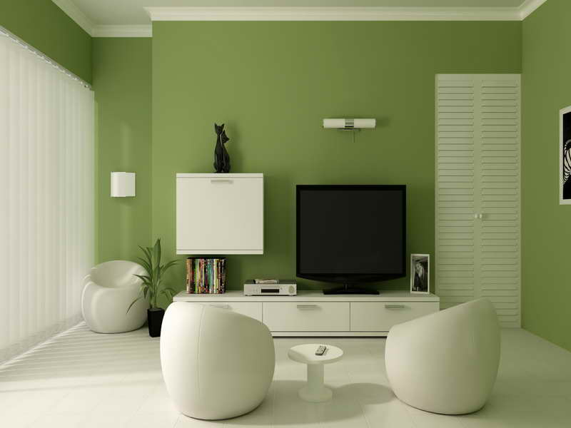
In this case, your paint crew may have a preferred painting brand or a specific paint store may be located nearby. The most frequented stores include colors from specific paint brands. These include Sherwin Williams, Benjamin Moore, Home Depot, or Lowes stores.
To make things easy, we’re going to highlight our best picks for interior paint colors from brands carried by each store.
Best Interior Color At Sherwin Williams
The top-selling paint color by Sherwin Williams is Agreeable Gray (SW 7029). This popular pick from Sherwin is a softer warm gray paint color that coordinates with most other paint colors.
The color is a balanced softer shade that goes with any home style. It’s often used as a wall color in living rooms, hallways, or staircases. This greige tone is best used on walls. Similarly, it pairs well with a variety of shades including white trim, greens, blues, teals, and virtually any contrasting warm paint color.
Did you know that Sherwin also carries some of our favorite exterior paint products? If you are painting exterior stucco or wood siding, their SuperPaint and Duration lines are solid picks.
Top Benjamin Moore Paint Color
We mentioned Chantilly Lace earlier but another top Benjamin Moore paint color is White Dove (OC-17). This is a classic style short shade of white that has a hint of warmth to it.
White Dove is a neutral favorite for homeowners and contractors, often used on interior trim, moldings, baseboards, and doors.
Home Depot’s Best Painting Color
Home Depot carries a few different paint color brands including Behr, PPG, and Glidden. We recommend Behr in particular for budget DIY painting projects like painting a small bedroom. Please note, paint offerings from big box stores are cheaper but the paint is “entry-level” when it comes to quality. Specifically, the coverage and finish of the paint will leave a lot to be desired.
The best interior paint color at home Depot is Behr White 52. It’s a cooler-toned white color that has enough of a tint to be categorized as an “off-white”. Likewise, this is most apparent when you pair it as a wall color with trim painted in a true or base white.
For exteriors, you can check our new trending house paint color list which includes Behr’s popular Polar Bear 75.
Lowes Interior Paint Colors
Lowes, as a whole, is a slightly nicer version of Home Depot but that comes with slightly higher prices and a limited selection. Nonetheless, Lowes carries known interior paint brands like Valspar and HGTV Home by Sherwin.
If you are confused about the difference between paint found at a Sherwin Williams paint store and the HGTV brand carried by Lowes, we are too. Likewise, it may worth a future blog post.
For now, we will highlight one nice aspect of this confusing corporate partnership. Most if not all Sherwin Williams paint color swatches can be picked up at Lowes. If you live closer to a Lowes versus a Sherwin Store like me, this is super useful.
As a general rule of thumb, you can always ask any paint store to mix colors for you from other brands. They all share the color mix codes with one another.
Thinking about updating your kitchen this season? Discover what it really costs to paint kitchen cabinets this year.
Valspar Paint Colors
A few recommended favorite paint colors from Valspar are as follows. Gilded Linen is a great warmer neutral, Summer Gray is a cooler off-white, and Oyster Pearl is another popular choice. We also like Granite Dust for kitchen cabinets or island accent pairings. Not to mention, Blissful Blue by Valspar is a homey bedroom color that contrasts well with white trim.
Are you looking to learn about the cost to paint a room in Chicago? Check out Improovy’s latest article about room painting costs in Chicago, Illinois.
Interior Painting Color FAQs
Which neutral wall color is most popular in 2023?
The most popular neutral interior paint color of 2023 is Origami White by Sherwin-Williams. This popular neutral wall color is beloved by interior designers for any room in your house.
What's the best interior paint brand for 2023?
The best interior paint brand in 2023 remains Benjamin Moore. A majority of professional painters agree that Regal Select by Benjamin Moore is the best quality interior paint you can buy.
 Sherwin Williams is the second-best interior paint brand in 2023. For interior paint products, Cashmere and SuperPaint are rated number two and three respectively.
What is Sherwin-Williams HGTV Home Color of the Year 2022?
The HGTV Home By Sherwin-Williams 2022 color of the year is Aleutian (HGSW3355). Sherwin Williams Aleutian is a dusty blue paint color with enough gray undertones to act as a fantastic neutral backdrop for any interior wall. If you like blue but don't want vibrant aqua or dark navy room, this trending shade is for you. Please note, HGTV Home by Sherwin Williams is a specific paint line made for Lowes Stores. This brand differs from Sherwin Williams' flagship storefront paint. Sherwin-Williams 2022 paint color of the year for it's storefronts is Evergreen Fog SW 9130.
What are the latest interior paint color trends?
The latest paint colors trends for interiors are warmer shades of neutral white, greige, and inviting, fresh tones.
 Behr's Canvas White and Origami White by Sherwin Williams are two of the most trendworth neutrals this year.
20 Best Paint Colors - Interior Designers' Favorite Wall Paint Colors
Ryan GarvinIf you're unable to pull off a major home renovation in the near future, giving your space an entirely new look with a fresh coat of paint is the next best thing. But finding the right shade is far from easy. Minimalists might want nothing more than a room full of neutrals, like white, beige or gray, and those who aren't afraid to take a design risk might fall for bold hues — think teal, purple or even doses of green. Wherever your design sensibilities lie, you can find the right paint color for you.
Consider this roundup of gorgeous interior paint colors as inspiration. These designer-approved picks are brilliant for just about any room. All you have to do is grab your paintbrush!
Advertisement - Continue Reading Below
1
Green Smoke, Farrow & Ball
Sarah Winchester"I love this deep rich green color in powder rooms (I used it in my own!) and on millwork," says interior designer Erin Gates. "We've been using it a lot lately in libraries and dens. It has a nice amount of gray in it, which makes it subdued yet dramatic."
SHOP NOW
2
Forged Steel, Sherwin-Williams
Life CreatedSherwin-Williams' Forged Steel is a go-to choice for Lauren Lerner of Living with Lolo. "I love that this color changes depending on the lighting and nearby hues," she says. "It is a warm gray with some brown tones and a great neutral to be used as a dramatic backdrop."
SHOP NOW
Advertisement - Continue Reading Below
3
Classic Gray, Benjamin Moore
Photo: Meghan Beierle-O’Brien; Stylist: Char Hatch LangosWhen it comes to gray paint colors, Benjamin Moore's Classic Gray is the top pick for Kitchen Design Group's Caren Rideau. “It brings soft warmth to a room and does not distract from artwork or any bright colors in furniture. It is a nice backdrop in a room."
SHOP NOW
4
Century Darjeeling, Benjamin Moore
Mike Van TassellDark hues can make a big impact, and this project from interior designer Gail Davis is proof. "I had the opportunity to use this expressive color in a guest bedroom for a private residence in Princeton, New Jersey. This color did not disappoint, being the perfect backdrop for the headboard and artwork. It takes your breath away."
SHOP NOW
Advertisement - Continue Reading Below
5
Dimpse, Farrow & Ball
Melinda Kelson O'Connor DesignGray paint colors, like Farrow & Ball's Dimpse, are beyond versatile, according to architect and designer Mindy O'Connor. "Dimpse is a cool pale gray that works as a terrific neutral in lieu of white in modern space. It is a perfect backdrop for kitchen cabinetry or against other natural wood and stone elements without overwhelming the design. While setting a more cool tone, it is not stark."
SHOP NOW
6
Gray, Benjamin Moore
Brianne Bishop Design"We love using a deep, moody color to give depth to a space and this color achieves that with the perfect balance of warm and cool," says Brianne Bishop.
SHOP NOW
Advertisement - Continue Reading Below
7
Snowbound, Sherwin-Williams
Travis Richardson"When it comes to white paint, we like to use the same shades throughout for the walls, trim, cabinets and ceilings," says House of Jade Interiors' Kirsten Krason, noting that Sherwin-Williams' Snowbound is the perfect hue.
SHOP NOW
8
Chantilly Lace, Benjamin Moore
Donna DotanDesigner Ariel Okin likes this cool, crisp white from Benjamin Moore. "It automatically opens up a room and makes it feel airy and clean," she says. "We also love pairing it as a trim color with Simply White by Benjamin Moore on the walls for a nice warm-cool contrast."
SHOP NOW
Advertisement - Continue Reading Below
9
Aegean Teal, Benjamin Moore
Ryan GarvinTeal is a no-fail choice for a bedroom, library, office or even cabinetry, according to designer and HGTV star Breegan Jane.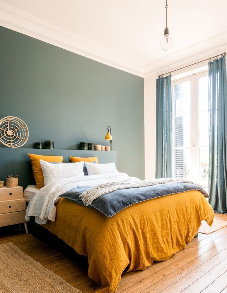 Her favorite? Benjamin Moore's Aegean Teal. "Teal is reminiscent of the shimmering waters of Ibiza on a warm, sunny day," says Jane. "It's synonymous with serenity, and who couldn’t use a little more of that?"
SHOP NOW
10
Cavernous, Dunn Edwards
Amy BartlamLook no further than Dunn-Edwards' Cavernous if you have an affinity for dark paint colors. "The contrast is amazing with a crisp white, but also has this ability that allows it to pair perfectly with the warmer neutrals that we are using more and more of these days as well," says Los Angeles-based interior designer Kate Lester.
SHOP NOW
Advertisement - Continue Reading Below
11
Palladian Blue, Benjamin Moore
Benjamin Moore"My go-to paint colors are classic and easy to live with," says interior designer Lauri Ward. "This blue-gray-green shade can be used in almost any room. It's an especially good choice for cooling a very sunny room, or creating a tranquil bedroom. "
"
SHOP NOW
12
Garden Stone, Clark+Kensington
Ace Hardware"I try to stay away from colors with heavy blue undertones, and I direct my clients toward warm grays that will stand the test of time," say Ace design expert Katie Reynolds. "This shade is a favorite."
SHOP NOW
Advertisement - Continue Reading Below
13
Compatible Cream, Sherwin Williams
Courtesy of Ace Hardware"When I need a yellow that isn't too sunny, I choose this one," says Jill Hosking-Cartland of Hosking Interiors. "This creamy shade is warm, inviting and very flexible when it comes to coordinating with colors with adjoining rooms."
SHOP NOW
14
Intense White, Benjamin Moore
Benjamin Moore"Don't be fooled by its name — this color gives off a grayish tone." says Irene Lovett, founder of designstiles. "It's an ideal backdrop for those who aren't brave enough to go with a bold color, but still wish for a subtle contrast with white trim. I love pairing this modern hue with transitional furnishings for a more contemporary mix."
SHOP NOW
Advertisement - Continue Reading Below
15
Salmon Peach, Benjamin Moore
Jonny ValiantYou can't go wrong with pairings found in nature (hello peonies!). Amanda Lindroth choose this blush-like hue to contrast with the pops of green. "The palette is based on the apple painting, which I inherited from my mother," the designer told House Beautiful.
SHOP NOW
16
Revere Pewter, Benjamin Moore
Benjamin Moore"This is my go-to color when working with an open floor plan," says Abbe Fenimore, founder/principal designer at Studio Ten 25. "A fail-safe neutral, it works with all styles, from traditional to modern, and both warm and cool color palettes. It's a great alternative to white, as it adds enough color to a room without overwhelming. "
"
SHOP NOW
Advertisement - Continue Reading Below
17
Decorator's White, Benjamin Moore
Courtesy of Brittany Zachos"This shade has the most brilliant pure white undertones," says Brittany Zachos of Zachos Design Group. "It's perfect for bright ceilings, trim and even bathrooms when you want a crisp, clean feel."
SHOP NOW
18
Wool Skein, Sherwin Williams
Courtesy of Arianne Bellizaire"If you're looking for a great neutral that will play with the other colors you want to bring into your space, try this one," says interior designer Arianne Bellizaire. "I love this color because it won't turn 'pink' on you."
SHOP NOW
Advertisement - Continue Reading Below
19
Manchester Tan, Benjamin Moore
Benjamin Moore"This shade is my go-to warm neutral," says Elissa Morgante, co-principal of Morgante-Wilson Architects. "What I love about Manchester Tan is that it changes with the light. It goes from a rich warm hue to light and fresh depending on the source of the light in the room."
SHOP NOW
20
Lavender Mist, Benjamin Moore
Beatriz da Costa"People underestimate the power of lavender," Mary McGee told House Beautiful. Pale orchid livens up this entryway's walls while keeping rooms light and airy.
SHOP NOW
How to choose an interior color? - World of Colors
The choice of color plays an important role in the design of the room. The color of the walls determines the mood of the rooms. Whether your room turns out to be cozy or not, whether its tone is uncomfortably cold or cozy warm, sketchy or disturbing, largely depends on the shade of interior paint chosen.
The human eye does not perceive color without light. The color effect is influenced by the brightness, the color of the lighting, and indeed the presence of daylight or artificial lighting. Direct rays of bright sunlight highlight warm colors better, diffused gloomy lighting emphasizes cold ones. Therefore for a sunny room, cool blue is more suitable than for a room overlooking the shady side - it will be made attractive by yellow-orange tones.
Each color has its opposite. For example: red - excites, green - soothes, blue - cold, orange - warm, yellow - cheerful, purple - full of dignity. Contrasting colors harmoniously balance each other if the effect of the active color (red, yellow) is muted by reducing its quantity or intensity. With the help of contrasts, you can emphasize or subtract various objects.
In addition to the pure contrast of colors, we also have at our disposal such contrasts as light-dark, cold-warm, as well as the contrast of quality (glossy-matt) and quantity (small-large color carriers) as design tools. In addition, several colors can be combined into a harmonious whole.
Colors and their properties
The essence of flowers. Objects have the property of absorbing, reflecting or transmitting light rays. In order for the human eye to see color, light rays must reflect off an object. For example, if an object reflects only green rays, absorbing all other rays of the spectrum, we see this object as green. If this object is placed in a light in which there are no green rays, it will appear black to us. An object that transmits all light rays appears transparent. The degree and nature of the reflection and absorption of light, as well as the transparency of objects are different and depend on their physical and chemical properties. Thus reds, oranges, yellows, greens, blues, violets and purples in all shades are called chromatic colors, black and white and all grays are called achromatic.
The basic, natural series of colors makes up the spectrum, in which the colors are arranged in a strict order; red, orange, yellow, green, blue, indigo and violet. Of these, yellow, blue and red are called primary colors
When primary colors are mixed, secondary colors are obtained. Red + yellow = orange, yellow + blue = green, blue + red = purple. Further mixing of colors gives different tones. For example, red + green = reddish brown; yellow + purple = yellowish brown; blue + orange = bluish brown. Repeated mixing of colors always results in brown tones. Brown is not chromatic, but is neutral, like black, white and gray. All colors obtained by mixing primary colors are called mixed colors.
Mental properties of colors . When decorating walls in living and working premises, it is necessary to take into account the mental properties of colors. It is known that in a bright room, painted in joyful colors, it is good to live and work, as these colors cause an optimistic mood, increase working capacity, cheerfulness and similar feelings. A room painted in dark, gloomy colors can make you feel unwell, and it is more difficult to work in this room. If you need help getting ready to paint your walls, read our article on choosing a finishing tool, as well as a resource on how to choose the right type of paint.
Warm and cool colors . Red and yellow, as well as colors close to them (orange, reddish-orange, etc.) are called warm. The colors on the right side of the spectrum: blue, bluish-green, bluish-violet) are called cold.
Receding and protruding colors. Warm color tones give the impression that the painted surface is closer than it actually is. Most of all, the surface is yellow and somewhat less - orange. Therefore, warm colors seem to reduce the room. Cool colors give the appearance of removing the surface. The blue color has the greatest removing property.
Heavy and light colors. Dark colors appear heavier. To achieve visual balance, the plinth of the building is painted darker than the walls, and the floor is darker than the ceiling . But this is not the rule. Currently, heavy and light colors are used in the design of premises, based mainly on their mutual harmony and the purpose of the room to be finished. Of the chromatic colors, light yellow, light green are light, and dark red, dark brown, dark green are heavy. The severity or lightness of a color also depends on the paint material: oil paint seems heavier than water paint of the same color, a surface with a rough texture is heavier than a smooth one.
How to use the properties of colors: influencing emotions
Experts have noticed that green tones contribute to the expansion of the bronchi, increased heart rate, increase mental performance, red tones stimulate the secretion of the glands of the digestive tract, restore physical performance and at the same time have an exciting effect on some people, and soft shades of brown and blue have a rest. An excitable person should not live in a room with red walls, and a melancholy person should not live in a room with purple hues.
Color is the ratio of all colors included in the color composition. It is determined by the dominant colors of similar shades.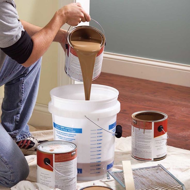 So, if the interior is dominated by gray-blue tones, then if it contains minor elements of yellow, brown and white, it is perceived in a gray-blue color.
A natural combination of colors that contribute to their high artistic expressiveness is color harmony. There are two types of harmony - nuanced and contrasting. Nuance harmony is characterized by the absence of strong color contrasts in their lightness and saturation, although there is some contrast. The state of rest is achieved by balancing the color surfaces. This means that large surfaces (walls, ceilings, bedspreads, curtains have discreet neutral light colors, while smaller ones (some woven products, ceramics, art glass) are bright. Nuanced harmony is typical for bedrooms and children's rooms, offices, rooms for the elderly age.
Contrasting harmony , which is characterized by a juxtaposition of bright cold and warm colors, can be used in the common rooms of 2-5-room apartments and manor houses.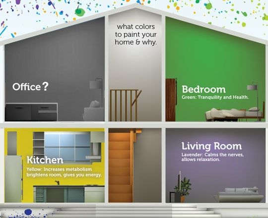 A difficult but extremely interesting task is to harmonize the color elements of the dwelling (walls, ceilings, floors, decorative fabrics, furniture, etc.) to create an artistically integral ensemble. It must be borne in mind that contrasting harmony quickly tires and worsens the mental state of a person. Therefore, bright chromatic colors should be balanced, muffled by achromatic (gray, black, white). Drapery, bright red armchairs require a calm, balanced background, which is created by light gray walls, a gray fleecy carpet, a light gray or golden curtain. Certain colors and their combinations can cause joy, sadness, anxiety and melancholy in a person. The combination of several colors in one composition evokes more complex feelings.
Red color creates high spirits, but at the same time it is restless: it irritates, quickly tires the nervous system, and reduces the ability to work. Under its influence, blood pressure rises, the rhythm of breathing accelerates.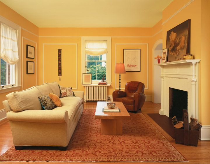 Therefore, it is not recommended for residential areas.
Orange color is energetic, promotes good mood, creates a festive atmosphere. But you need to be careful with this color: for walls, choose complex or pastel shades of orange, combine it with calmer colors so as not to visually overload the design.
Yellow color is clear, fresh, stimulates vision and nervous system.
Green — the color of leaves and grass — sets you in a calm mood, inclines you to rest. Under its influence, blood pressure decreases, hearing susceptibility increases. Green is the most favorable color for a person.
Blue color with all its shades creates an impression of spaciousness, depth and coolness. It calms the nervous system, increases working capacity, more than green, helps to reduce muscle tone and blood pressure. This color is especially favorable for people with increased nervous excitability.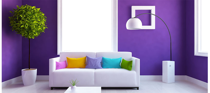
Violet color sets the mood for melancholy and meditation, promotes the development of sensitivity. However, it has been established that it does not so much calm as relax the psyche and therefore quickly tire a person.
When choosing a paint color for kitchens, bathrooms or dry areas, remember one simple rule: the richer the shade, the smaller the surface of the coating should be. This is how the principle of using accent walls in design works: three walls are painted in light colors and one in a rich tone. 9Inmyroom paint often becomes a real torture. Who knew that the store would offer you dozens of shades of beige and gray, hundreds of shades of red or blue, that white is not just white, and can be in a hundred different versions.
Paint will always look different on the palette in the store than it does on the walls at home. Of course, you can always recolor and find “your” shade, but all this is exhausting and annoying.![]() Designer Inna Usubyan told InMyRoom about her principles for choosing colors so that in the new year you will have one less problem.
Designer Inna Usubyan told InMyRoom about her principles for choosing colors so that in the new year you will have one less problem.
Inna Usubyan - interior designer and professional decorator, head of the Decolabs studio. She graduated from the prestigious school "Details" and courses at the British Higher School of Design. For many years he has been creating unique decor items, often decorating interiors with his watercolors and photographs.
Step #1: Set the Mood
The first step in choosing a color is to determine the atmosphere you want to create in your home. Some people want a bright and cheerful orange summer, others like neutral beige shades, and still others want coolness and gray. Analyze which side of the world the windows face and decide: do you want to make this room bright and bright or quiet, cozy and with subdued light.
Step 2: Choose the Main Color
So you've decided what mood you want to create in your home, now think about what color represents this atmosphere for you and is it suitable for this room? For rooms oriented to the south, choose cool shades, and then in the summer this room will be very comfortable.
Neutral colors like beige, white or gray are a great backdrop for almost any interior. For example, if the windows of the children's room face north and there is not much daylight, you should not paint the walls in chocolate color: even if you add a lot of light details to the interior, this will not save the child from darkness and the feeling that the walls are "pressing". But if you organize an office with an English-style interior in this room, then the color scheme can be quite saturated.
Step #3: One Hundred Shades of White
Of course, not everything is so simple, and there are a huge number of varieties of red, blue or green flowers. Therefore, in the next step, decide on the shade of the selected color. Do you like green? Then decide how it will be - mint, light green, emerald, olive or something else.
Have you decided to make a modern interior and paint everything white? Great! Just keep in mind that there are also a huge number of shades of white: architectural white, cream, magnolia, snowy, almond, antique and many other beautiful and tasty names.
Shades of each color can be divided into warm and cold, and this, in turn, will greatly influence the mood that you want to create in the room. In any salon you will always find a palette in which there will be colors with all sorts of shades - gray with beige, green and purple, blue with green, red with blue or yellow ...
Do you want a neutral color, but do not want a cold sensation? Take, for example, gray with a warm undertone (gray with beige). Try to find examples of interiors with this color.
Step 4: Paint
Never paint the whole room in the chosen color at once. Even if you are sure that you have found the most beautiful shade and you are madly in love with it, this does not mean that it will remain the same flawless on the walls of your bedroom.
The fact is that you chose the paint based on a small piece of the palette in one light, and the whole room with a different light, painted with the same paint, will look completely different.
Buy samples (200g jars) of several shades of paint you like and use it on sheets of primed drywall that are at least 50 x 50 cm. Label each sheet with the name of the paint.
Step #5: Checking the Shade
Now you can test how this paint will look on different walls of the room at different times of the day. Each color sample should be held against the wall opposite the window, to the side of the window and to the wall with the window, look at the paint samples in the morning, afternoon and evening, and you will see how the color changes.
When making your choice, also take into account the ability of paint to change space. If you like the color blue, for example, then for a small bathroom where there is no natural light, a very light shade of blue is more suitable, otherwise the entire space of the bathroom will shrink and the walls will put pressure on you.
Tips for InMyRoom readers
- When choosing a color for a child's room, always invite the children to participate.
 It is they who then live in this room, and it is important that they like not only the chosen color, but also the right shade.
 - If you want to make combined colors in one room by painting part of the walls in one color and part in another, then keep in mind that the richer the shade, the less it should be in the interior. Therefore, you can, for example, paint 3 walls in a light and light tone, and let the fourth wall be with an accent rich color.
- Remember that the color of the walls is only the background and base for the rest of the interior. Think in advance what all the other details will be: furniture, carpet, curtains. It will be even better if you choose all the furniture in advance, and you will buy wall paint already taking into account all the colors in the room.
- Two interesting and useful programs that you can download from the iTunes Store can help you. The Home Decorator app will help you avoid mistakes when choosing a color for a room. You can do this by taking a photo of a real room, and then simply trying on different colors to it.