House color patterns
House Color Schemes - 15 Paint Colors for Your House
Find the Perfect Pairing for Exterior Paint Colors
1/17
Selecting a single color for your home's exterior can be difficult enough, but trying to find two or more hues that work well together in a whole house color scheme makes the decision even more challenging. Whether your aim is to highlight architectural details or simply to find a complementary shade for shutters and trim, the choice is an important one.
"Color can make a big impact on the look of a house," confirms architect Jim Rill, principal of Rill Architects, in Bethesda, Maryland. For inspiration, consider your home's style and scale as well as architectural styles typical of your neighborhood and region. "The best exterior colors are contextual to their environment," Rill observes. Here, 15 color scheme combinations that hit the mark.
istockphoto.com
1. Two-Tone Olive
2/17
Deep natural colors that recede into the landscape are typical of Craftsman-style houses. For this renovation, Rill Architects chose a duo of Benjamin Moore olive greens: Gloucester Sage (HC-100) and Dakota Woods Green (2139-20). A yellow-orange stain on the front door adds a lighthearted dash of color. "Front doors should always have character and draw subtle attention to themselves," Jim Rill points out.
Related: Welcome Home: 11 Fresh Ways to Spruce Up Your Front Door
rillarchitects.com
2. Straw and Sage
3/17
"A balanced look always provides plenty of curb appeal," says interior designer Kerrie Kelly, principal of Kerrie Kelly Design Lab, in Sacramento, California. "Starting with a neutral shade in straw yellow sets a welcoming palette, while accents in sage green give a lively look to traditional architecture. This combination is an approachable classic year-round."
Related: 9 Ways to Crank Up Curb Appeal with Nothing But Paint
kerriekelly.com
Advertisement
3.
 Putty and Gray
 4/17
Older neighborhood dwellings guided the color choice for this Midwest home. "We chose a soft neutral for the body of the house that would allow it to stand out and yet still complement the other homes around it," reports Kristen Schammel, interior designer for Highmark Builders, in Burnsville, Minnesota. "This exterior is simple, traditional, and admired!"
Related: 7 No-Fail Exterior Paint Colors
highmark-builders.com
4. Red and Black
5/17
"Red is a classic color," says interior designer Cindy McClure, owner of Grossmueller's Design Consultants, in Washington, D.C. "I love using it on smaller homes because they handle the color so well. Black accents like the front door and shutters look great when set off by white trim."
Related: Before and After: DIY Facelifts for 8 Home Exteriors
grossmuellers.com
5. Gray and Blue
6/17
"Gray is a great neutral that can match just about any style of home and is a beautiful complement to brick," says Jackie Jordan, director of color marketing for Sherwin-Williams.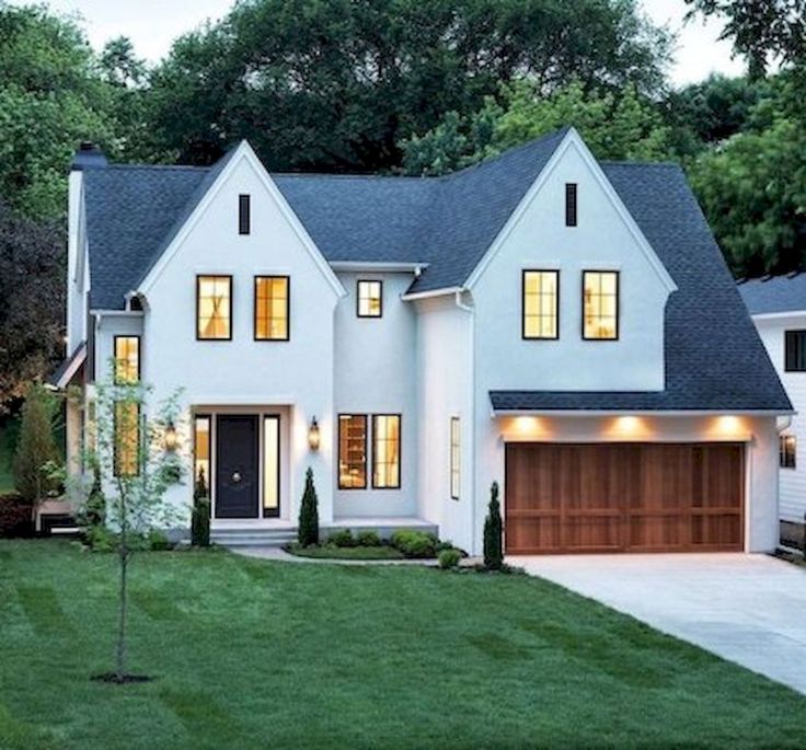 "The slightly more saturated shutters and door provide a sophisticated accent and bring in the tones of sky and sea." Seen here are Sherwin-Williams's Comfort Gray (SW 6205) and Rain (SW 6219).
Related: The Most Popular Paint Colors in America
sherwin-williams.com
Advertisement
6. Green, Cream, and Burgundy
7/17
"The combination of green, cream, and burgundy is a favorite for Victorian-style homes," reports Erika Woelfel, director of color marketing for Behr Paints. "The bold color scheme gives this home a dramatic yet warm appearance." The trio of Behr colors used here are Ivy Wreath (QE-46), Terra Sol (QE-20), and Country Lane Red (QE-07).
Related: 18 Victorian Homes We Love
behr.com
7. Charcoal and Lime
8/17
A wonderful way to make a bold color statement on modern houses—even the smallest ones—is to start with a strong neutral and add a bright pop of color on the front door.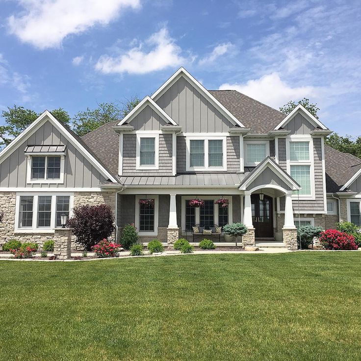 This home, designed by Ana Williamson Architect, in Menlo Park, California, combines two Benjamin Moore hues: Gunmetal (1602) for the siding and Tequila Lime (2028-30) on the door.
Related: 9 Bold Rooms That Will Make You Rethink Black Paint
awarchitect.com
8. Greige and Teal
9/17
You can still achieve a modern look without using shocking hues if those colors just aren’t for you. Here, greige—that’s gray and beige—with a teal door and natural wood and stone accents puts a modern spin on the traditional neighborhood home. This combination still looks warm and welcoming without feeling dated.
Related: America’s 50 Favorite Streets
Zillow Digs home in Edmonds, WA
Advertisement
9. Blue, Red, and Tan
10/17
Blue is a popular exterior color for homes in waterside settings like this one. Adding red and tan to highlight trim and architectural features was a eye-catching choice by designers at New Urban Home Builders, in Grand Rapids, Michigan. The trio of hues also gives the lakefront compound a Scandinavian feel.
Related: 11 Paint Colors Designers Pick for Their Own Homes
ashleyavila.com
10. Black and White
11/17
Black and white never goes out of style. Whether you have an old home or a new build, this classic combo looks fresh forever—plus it really pops against a green lawn.
Related: The Most Popular House Styles in America Right Now
Zillow Digs home in Laguna Beach, CA
11. Black and Taupe
12/17
A twist on the traditional black and white color scheme. If crisp white and classic black looks classy, swapping in taupe warms up the look and brings a touch of warmth and coziness to your home exterior.
Related: 12 Outdoor Upgrades That Make Your Home More Valuable
Zillow Digs home in Rancho Santa Fe, CA
Advertisement
12.
 Yellow and Blue
 13/17
Some might think that a double dose of primary colors is too bold for a house, but when executed with finesse, it’s a real charmer. Here, aqua blue and mellow yellow keeps play off each other for a quaint effect.
Related: 9 Paint Color Rules Worth Breaking
Zillow Digs home in Coronado, CA
13. Brown and Sand
14/17
Nearby houses inspired the color scheme of this charming home. "The sandy color on top resembles the muted tones common on neighboring houses," says architect David Neiman, of Neiman Taber Architects, in Seattle, Washington. "The brown is a darker complement that provides a strong visual base. Red window frames add an extra punch of color."
Related: 19 Rooms That Prove Beige Isn’t Boring
neimantaber.com
14. Turquoise and White
15/17
Turquoise is a fun choice for those who live in warmer climates; it evokes sunny skies and the sea.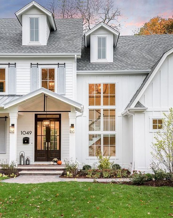 If you’re nervous that it’s too bold of a color for your neighborhood, cool it down with white accents. When used in combination, the palette is bright and cheerful.
Related: 15 Tiny Beach Bungalows for Your Next Vacation
Triton Builders; Uneek Images
Advertisement
15. Taupe, Red, and White
16/17
Honor the history of your home with a simple palette. The white columns maintain the old house charm, but the soft taupe and red give it a 21st century twist.
Related: 13 Homes from the Original Colonies that Still Stand Today
istockphoto.com
A Perfect Match
17/17
There's a color combo perfectly suited for every kind of design preference and home style.
bobvila.com
Don't Miss!
If you have the money to hire a handyman for every household woe, go ahead. But if you want to hang on to your cash and exercise some self-sufficiency, check out these clever products that solve a million and one little problems around the house.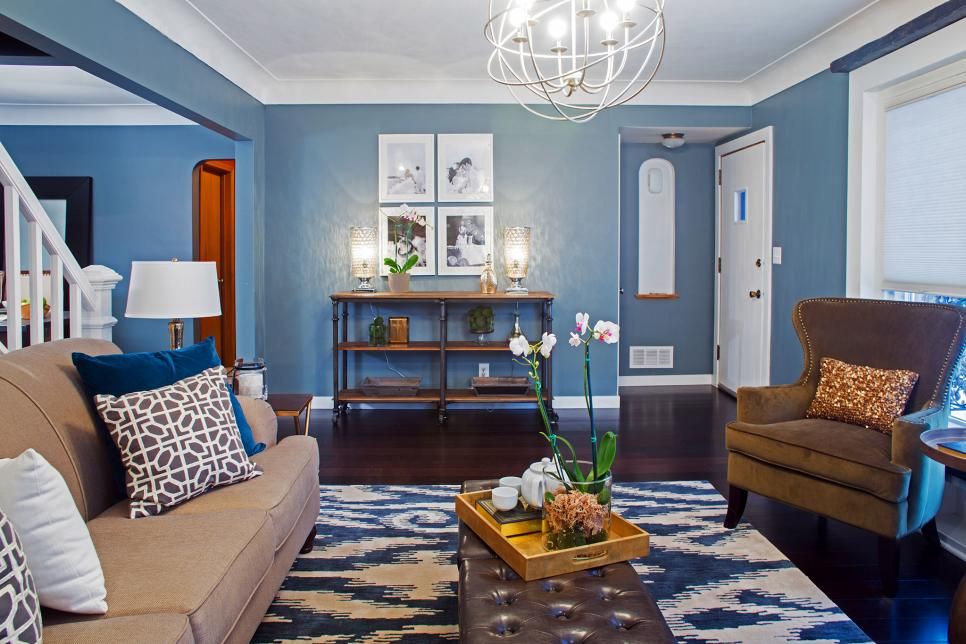 Go now!
20 Best Home Color Palettes | House Color Schemes
Reaching out for a tub of ice-cream or binge-watching your favourite drama series are some ways of lifting our spirits. But do you know, color is not just a visual language understood by all but also a powerful tool that can completely transform your experience and strongly influence our mood? While not many of us think much about the colors of our rooms, furniture or walls, it does affect us every day in terms of influencing our moods and thoughts. Therefore, it’s important to choose colors wisely when it comes to your personal sanctuary space called home.
Color is not just a visual language understood by all but also a powerful tool that can completely transform your experience and strongly influence your mood. While most of us don’t usually think about the colors of our rooms, furniture, or walls, it affects us every day to influence our moods and thoughts. Therefore, choosing colors wisely and creating on-point color schemes for your personal sanctuary space called home is essential.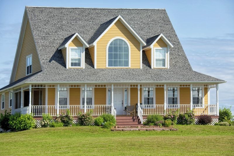
Ensuring that you have a suitable color scheme will help link one room to the other seamlessly. Color can transform an ordinary plain room into an attractive, striking space. Finding the right color is a serious and personal matter as well. Colors can hide the imperfections present in the house and change the atmosphere altogether.
Sprucing up your space with paint color becomes easy if you have the right color palette. A color palette uses specific color schemes in various areas in the interior of your home. Creating a color scheme for your house’s interior will help you decorate your home much quicker than ever because it narrows down the previously vast number of choices you had.
In this article, we will be sharing 20 color palettes of various tones. Hopefully, this can help you decide your sanctuary space’s overall colors and vibes and create your dream home. But before getting into that, let's get to know some basics about colors that will help you choose the palette or create your palette.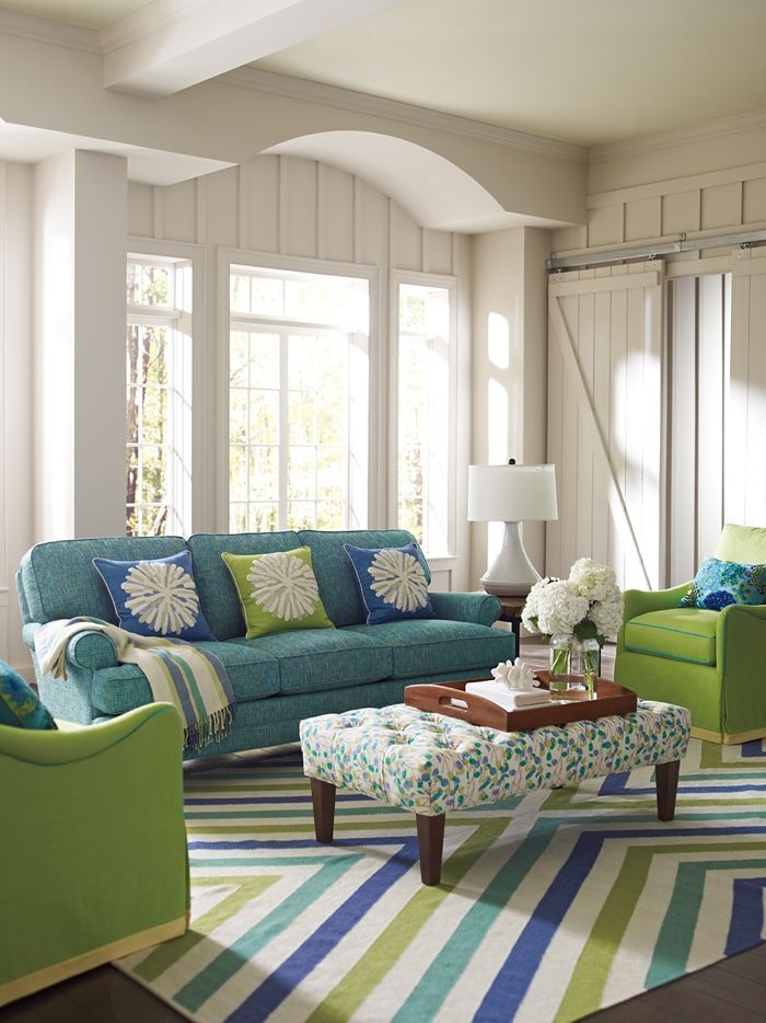
The Basics About Home Color Palette
Color can be of two types based on tones: warm and cool.
What are warm and cool colors?
Cool colors bring a relaxed, calm, and peaceful atmosphere and include blue, purple, and green. Warm colors can evoke warm feelings in people and can give an instant energy surge or rush of adrenaline. Yellow, red, and orange are warm colors. Not just a color, you have to pick an exact shade to convey what you want. For example, light colors are more pleasing to the eye compared to darker colors and they also make the rooms feel brighter and larger. On the other hand, darker colors give off a more sophisticated vibe hence making space feels more intimate. Use paint colour to your advantage and don’t just blindly follow the trends. Go with a paint colour that will reveal your choices and personality. Lastly, use colors that work together and create a pleasing combination.
It is without a doubt that many decisions have to be made with regards to buying and refurbishing the house that you and your significant other are looking forward to stay in.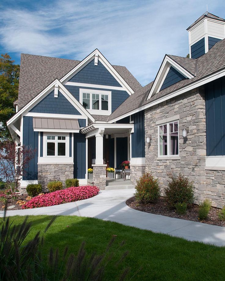 Thus, a rule of thumb for choosing colors in your home would be to keep in mind that light colors are more pleasing to the eye compared to darker colors and it also make the rooms feel brighter and larger. On the other hand, darker colors give off a more sophisticated vibe hence making the room feels more intimate.
We have put together a series of 20 color palettes that are of a variety of tones and hopefully this can help you in deciding the overall colors and vibes for your sanctuary space.
Home Color Palettes
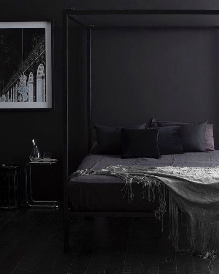
#1 – The Midnight BlueThis color palette is a luxurious and bold home palette with blue and gray colors. All the pieces utilize some shades of blue for more depth. Try this at a place where there is a lot of natural light. Starting from the walls to the sofa, blue is added along with complementary colors that are used in a subtle manner that adds some light. If you want something sophisticated, this modern blue color palette might just be the perfect house color palette for you.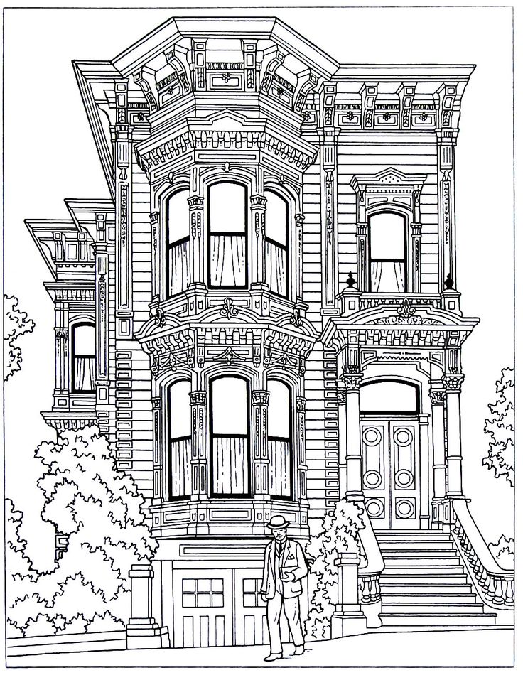 Moreover, the color scheme can be used anywhere from the kitchen to the living room because it can work well in any part of the house. Color palettes like this are versatile and can be tweaked a bit according to your personality to create a mix of comfort and style.
A minimalistic yet fashionable look in this beautiful red, white, and grey combination. The red color scheme represents an energetic environment. Red and white work almost in every form of architecture and can be used in bedrooms and bathrooms also. The white ceiling, the walls, and the sheets in white are perfectly combined with bright red throw pillows and lamp top with beautiful wall art.
The art which has red and grey combines well with the grey wooden floor. In color palettes where there is white the inclusion of the strong red color makes it effective and not so boring. The strong color here is the red one which can be found in Sherwin Williams and Benjamin Moore’s colors and can be used as a whole home color palette. We can find inspiration in this for the master bedroom as it has all the right colors and create our own version of this beauty.
Who would’ve thought a monochromatic purple color scheme can work so well. Shades of lilac and lavender can be really soothing. Color palettes like this bring magic because lilac is a paint color that works wonderfully with simple decor and neat lines. The lilac color matches the soft violet and gives a visual balance. This tone can be used in your living room, kids’ room, or nursery.
Evoking elegance in this dual-toned home color palette that has white in the cushions and also the side table. The rug is also very well color-coordinated with the whole space and this makes it an unexpected yet the right color scheme. Not to miss, the golden lamp at the side table which also golden adds a regal touch to the palette. This type of paint colour can be found in Benjamin Moore and Sherwin Williams range also.
#4 – Christian GreyThe design elements and color palette here make one of the best interior color schemes.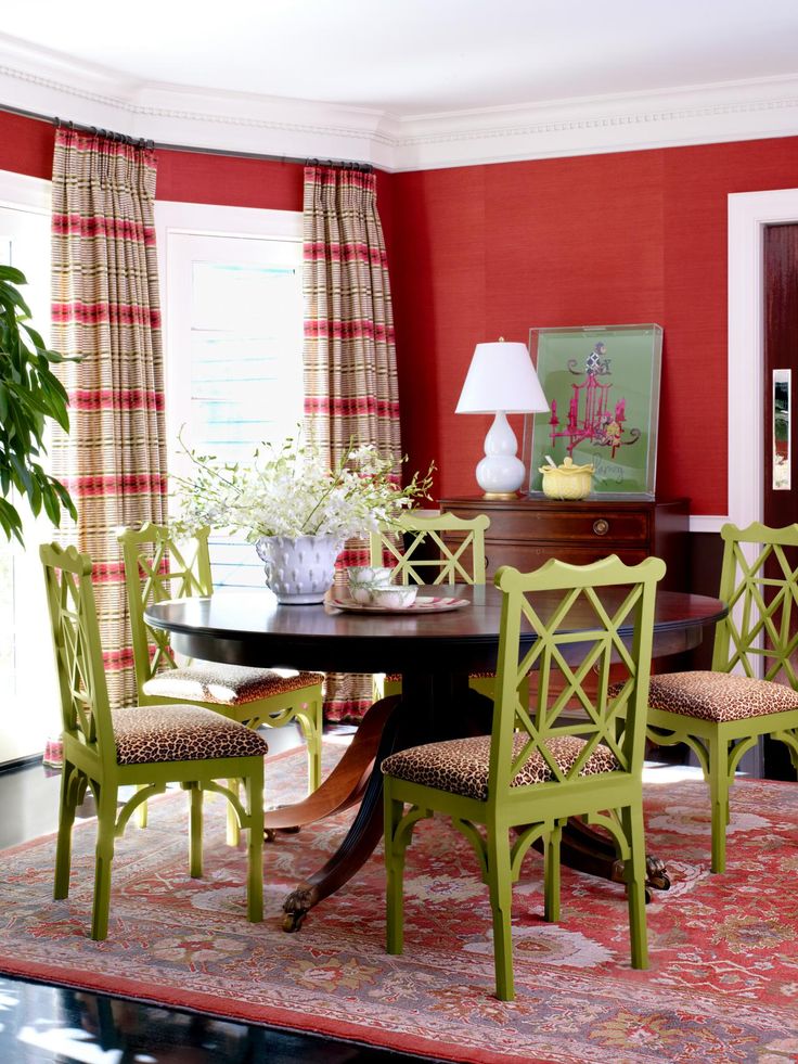 Charcoal and slate grey give the kitchen a cozy vibe while the pops of brass color used in the tap and chimney give it an unexpected color scheme. The white pendant lights with warm brass accents match perfectly with the other elements in the room and up the ante. The grey cabinets welcome a thoroughly modern vibe and the countertops add to it. The grey units feel heavenly with the addition of brass and make it look glamourous too.
This is an age-old color palette combination that reminds us of greek architecture or traditional Chinese pottery. Giving a very fresh look with the usage of this home color palette in the living room, this can also be used in other places of the house. The blue and gainsboro colors give the idea of the ultimate serene and cozy space. By using patterns in the rug the whole look of the room is elevated. The versatility of the classic color palette allows infusing new elements so that you get to create different styles and spaces.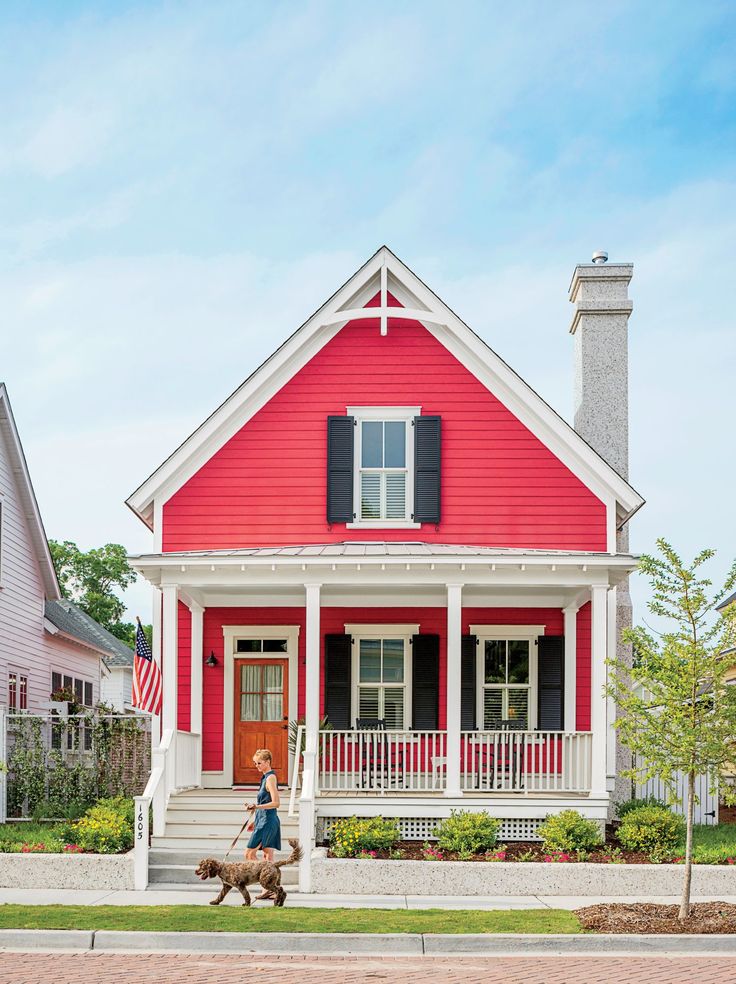 You can also add hints of Peru color just like in this color palette, to add some warmth. The floor, vase, and couch all have a mix-up of colors which add to the vibrancy of the home.
When you look at this living room, it gives an artistic feel and is contemporary. The geometric rug softens the aesthetic of the room. The unique table and pendant light fixture work very well and make the place relaxing. The room’s visual appeal is enhanced because of the wonderful wall hangings in the same color palette.
The black background in the wall hanging also has khaki’s contrast colors, which adds a pop. Even the cushions on the couch make for a snug place. Though white is used as the main hue in the color palette for this room the addition of black, grey, and khaki colors make the room stand out. To create a graceful and elegant color palette like this, you can use the paint color, Pale oak from Benjamin Moore.
#7 – Aquamarine by the bayThe blue and gray combination works perfectly for this sea-facing room. Without taking away the white the room replaces some part of it with grey. This gives greater decorating freedom when used with blue color. This type of color palettes uses a light paint colour along with contrast colours that are not too bright. The serene blue colour blends very well with the light gray colored sofa and the white ceiling and pillar. White dove shade from Benjamin Moore can be used as the main color here,but to overcome the simply white color palette a shade or two of blue will enhance the look. The floor and throw pillows are also kept light in color to attract more light in this beautiful coastal home. Create your own beachside home, keeping this in mind.
It is a pre-conceived notion that Earthy tones make the room look dull. But,that’s not true at all. This home color palette has brown, grey, and green that look comfortable and inviting. The grey walls give the space an airy feel. The addition of a green wall in color palettes like this helps to pull the whole look together added with the hale navy color chair. The pendant brown light complements the brown couch while the plant perfectly strands in harmony with the other elements. The painting on the gray wall in brown paint adds texture to the wall and matches with the light and couch too.
Varying shades of green always seem to work with brown and grey and serve as the perfect colors when thinking of a rustic and warm whole house color palette. By bringing some nature into the decor, it looks homely and really peaceful and is a nice complementary color scheme. Use a light grey paint colour for the walls and some dark green on the adjacent wall to complete the look.
#9 – Aurelia PinkThese color in the home color palette is a combination of cool and warm shades. This is one of the color palettes that looks really chic, with the plain white paint colour on the wall. The living room looks very gentle and warm and the colors make it look cozy. The ottoman in blush pink adds a nice refreshing detail to the room. The white paint color on the wall beautifully pairs with the wall hangings in brown color. Each painting is organized in a way to create a beautiful pattern. The color combinations are like a match made in heaven that makes the room look bright, spacious and also adds an element of calm. Using perfect colors in color schemes can change the look of the whole house, and this color palette is great to be used in the rooms of your kids or the living space.
This is not one of the commonly used interior color schemes. Seems very vibrant and contemporary with the fusion of paint colors in the wall. The tan shade and the Light steel blue color scheme make for a great transition effect. Pink and blue is a timeless combination and we know how perfectly they work, but here the two lighter shades of blue and pink are used which are cool tones.
The rug also has similar colors like the space and blends in well giving it a type of pattern. The cushions in hale navy and light green are a wonderful addition to the pink couch and complement it nicely. Use a paint colour like light steel blue and tan from the above colour palette for your family room and make it a happy place. You can even use it as a whole home color palette.
White and black is always in vogue. Many of us think that only a colorful room has the power to attract eyes, but let us tell you even white and black paint colors can create a wonderful whole house color palette. This cool white shade is the main paint color in the room and is used in a thoughtful way. While it is always easy to go from minimal to overwhelming in a white and black color palette this complementary color scheme is a great idea for the family room.
The space has beautiful white details like the dining table, the pendant lights, the center table, and the TV unit. You can choose this beautiful white color from Sherwin Williams paint colors or Benjamin Moore paint colors. Though these two colors might be on opposite sides of the color wheel they are a timeless combination. The wooden build on the top gives a nice finishing touch to this space.
Unlike the previous color palette which had a sharply contrasting black and white color inspiration, this one blends beautifully with other colors. the primary colors here are grey, white, beige, and some soft pastels. The color inspiration behind this space is definitely the homes in Scandinavia, where lighting, light-colored flooring, and neutral colors along with fresh botanicals are the main elements. The painting on the white wall adds some personality to the design. The wooden floor is done in a dark khaki color that works pretty well for the room.
Color palettes like this need some pastels to add an amount of pop to the basic white theme. Fresh plants are a must in the Scandinavian style. The olive color chair and the plants are used for adding some accent. The window which has a very light fabric invites as much light as possible to keep the space illuminated. The gray couch and the cushions add subtle color and texture to the home.
A Brown color palette feels earthy and rustic. The color scheme used in this room features a lot of browns in the walls, flooring, and to some extent the furniture too. But, this is beautifully balanced by the addition of yellow, white, and a little blue. Yellow is a bold color that brings the pop of color in this monochromatic color scheme. The patterned rug defines the space in the room with a closely matching color scheme that is soothing to the eye. Adding a white bed adds accent color and helps keep the space bright. The cool and warm tones are playfully mixed to create a color scheme that is luxurious and also homely.
#14 – Cornflower TaleThis blue room is sure going to relieve you of your Monday blues! If you are thinking of decorating your living room with different shades of blue then feel free to use this blue color palette for the purpose. the blue paint colour on the wall is not the same color as the rug but both the colors work well together to bring a cohesive effect. The couch, cushions, and table are not in blue but brown which adds warmth. The introduction of brown colors to the place breaks up the binary of blue and white giving it a natural feel. The artistic elements on the window and the wall make the home decor more refined. The wall clock breaks up space and adds elegance and sophistication. The white trim on top of the window gives polish to space. The decorating choices and the color choices make this place contemporary and comfortable.
This house color palette along with the interior design uses recent color trends. Turquoise is one of the favorite colors among designers as it is very flexible and can be combined with almost every paint color on the color wheel. This is a very playful color that can be used in a soft, rich, or bold way too. The use of white and dark khaki brings all of it together in a seamless manner throughout the space. It blends the colors to create a coastal look inspired by the sea. The accent wall uses warm colors with some white that brightens the place. The furniture in white forms a geometric pattern that adds lines to space and makes for great home decor.
Pretty and peaceful in pink, this house color palette uses complementary colors like gray with pink for some pastel colour inspiration. This is a whole house color palette and can be used in any room and any type of house. The color palette gives an airy and refreshing atmosphere. The flowers and the cycle make the color scheme feminine and simple. The incorporation of the grey couch with matching throw pillows allows the pink color to shine in this otherwise monochromatic color scheme. The wooden table works perfectly with the muted grey shade creating a welcoming and comfortable feel. The right paint color can be Benjamin Moore’s edgecomb gray that can be used to create a space like this. mixing grey and pink in this color palette with some wooden elements creates a neutral and chic space.
The South American country Peru inspires a lot of interior design when people create their homes. this uses natural materials and bright colors and patterns. You can find inspiration from some Peruvian homes and they mostly use whites in combination with the earthy color palette. There is a lot happening in this design, from using art and architecture to decorating the space with all beautiful things this is a perfect luxury home. This sophisticated interior design mixes up glass, wood, textiles, and metals for a dynamic and inviting look. The wooden ceiling and the floor both use the real pattern and the light walls have large open windows covered in glass to allow the light to come in. The white area rug on the floor balances that on the floor. The place has so many elements but they are not cluttered and chaotic instead work together beautifully. This space includes a color palette of brown and white as the main colors and also some orange that works as a color pop and makes it look trendy. White and natural light is no doubt the primary source of light but the circular hanging lights from the ceiling give a nice contemporary touch. The couch is in a lighter shade of brown and the throw pillows also use those colors as the base. The geometric print sofa on the other end adds a fun element with some earth-tone cushions.
Brown and grey look much nicer when paired with white, isn’t it? A lovely living cum dining space, this place has a strong visual appeal. this place offers an array of furniture and all of them are in contrast to each other and make the perfect color palette. The throw pillows are not too bright neither too dull but hold the look together. the cabinets in the dining room, are wooden and classic. The black pendant lights overhead on the kitchen counter add some drama to the simple dining room. A wooden brown table bifurcates the space and makes it look large too. Complementary colors like white and black make it easy to place other colors in the space. The dark brown side table and the dining table all are artistically woven together. The large white windows allow light to pass easily and make it airy and spacious too. The white color lights present near each other contrast beautifully with the brown color palette.
A very urbane and chic space that uses timeless white with brown to draw attention. This space feels well illuminated and brings the best of both worlds together. The swimming pool outside seamlessly transitions into space and makes it more connected. The chairs have a pattern with alternate white and brown which complements the color palette too. Inclusion of flowers, white chairs, and a glass table anchor the place harmoniously. This is a really fancy yet minimal space with stunning lights too that up the zen vibes. The color palette is light and thus does not shift focus away from the furniture.
#20 – Classic ScandivanianMinimalist, practical and chic is what comes to our mind when we look at this place.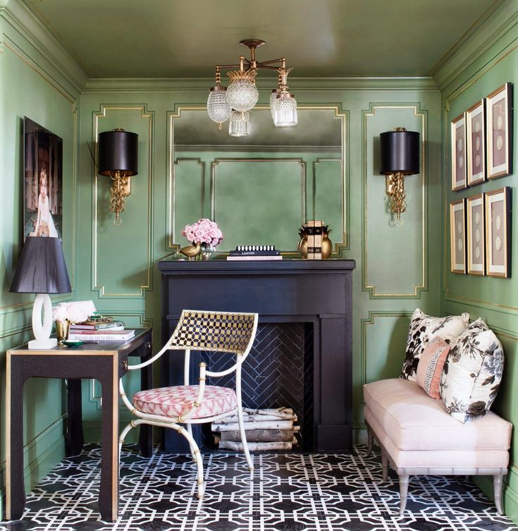 Taking inspiration from Scandinavia, this space mostly uses white paint color on the walls that make it open and inviting. It features light nuances and earthy tones. Using grey as the main color in the color palette makes it a welcoming and cozy space. The wooden tables and the accent wall are probably the only things in the room. This is true about Scandinavian design where a minimalist approach is taken still things seem to be bare or empty. The throw blanket and cushions complement the grey-colored couch and add some contrast. The area rug in an almost geometric pattern is in sync with the other elements. The very careful inclusion of a painting on the wall behind adds a blush of color. Open windows and earthy curtains let air and light enter and make it look easy and relaxing.
FAQs on Home Color Palettes
How do I choose a color palette for my house?
The first thing before selecting your home color palette first to all figure out what will suit your personality or use your favorite color. Start off by working from a color wheel and what color scheme you want. It can be monochromatic, analogous, contrast, or complementary. The next step will be to create a color palette and you can begin with finding contrast colors for the whole home color palette. If you wish for something subtle go for neutrals, when using bold colors make sure they are having clean lines while decorating it. test out your colors with swatches and sketch them out, you can also paint a little on your walls to see if it’s working or not. Check the colors in different lighting environments to get an idea of how it will look. Look for different hues of the color you have selected both light and dark. Check out the paint samples when you go to the store and bring them home if possible and see how it looks. Remember to not rush into anything and listen to your instincts.
How do you make a color palette for a room?
Making a color palette for a room is almost similar to selecting a color palette for the house except here you only have to consider decorating a single room instead of a whole house. It is very necessary to remember that it is your house and so you have the freedom to use any color any want, it should just suit your personality. if it is your bedroom choose colors that are restful and inspiring, if it is your hall or living area choose colors that are welcoming. For the bathroom make it clean and refreshing. The kitchen can be classic, modern, sophisticated, or anything you want. In this way, you can refer to the color wheel and make color schemes suiting the personality.
What is the best paint color for a house?
What will be the best paint color for the whole house is subjective and varies from person to person. Paint colors can be used to convey your personality. Therefore,it all depends from person to person but we can share some trendy colors of the year that you can choose from for the whole house color palette. If you want to create a color palette you can use these colors for the paint, if it is your first house be a little extra careful. The colors can be warm whites and off-white, gray, revere pewter, black, sage, grey-green, deep blue, light blue, pastel pinks, terracotta, mint green, butter yellow, beige, and burgundy. So,go ahead and create a color palette and select the best paint color for the house.
What paint colors go well together?
To know what colors go well together, we can suggest you refer to this article where we have combined a list of 20 different color palettes for home which also gives an idea of which colors work well together. Upon knowing the famous Sherwin Williams paint colors selecting your colors can be easy. To help you with that, below we have a list of top Sherwin Williams paint colors.
What are the best Sherwin Williams paint colors?
- Iron ore
- Tricorn black
- Alabaster
- Sea salt
- Naval
- Repose gray
- Revere pewter
- Accessible beige
- Extra white
- Pure white
What are some Interesting facts about the home color palette?
The Sherwin Williams color of the year 2021 is Urbane Bronze, which is a warm and relaxing neutral with some sophistication.
The Benjamin Moore Color of the year 2021 is Aegean teal, which is balanced and really soothing to the eyes.
So, what are your thoughts on the Home color palettes we have curated for you? If they have inspired you in some way then go ahead and start planning your next experience of decorating your house. Good luck!
7 best ornaments in the interior
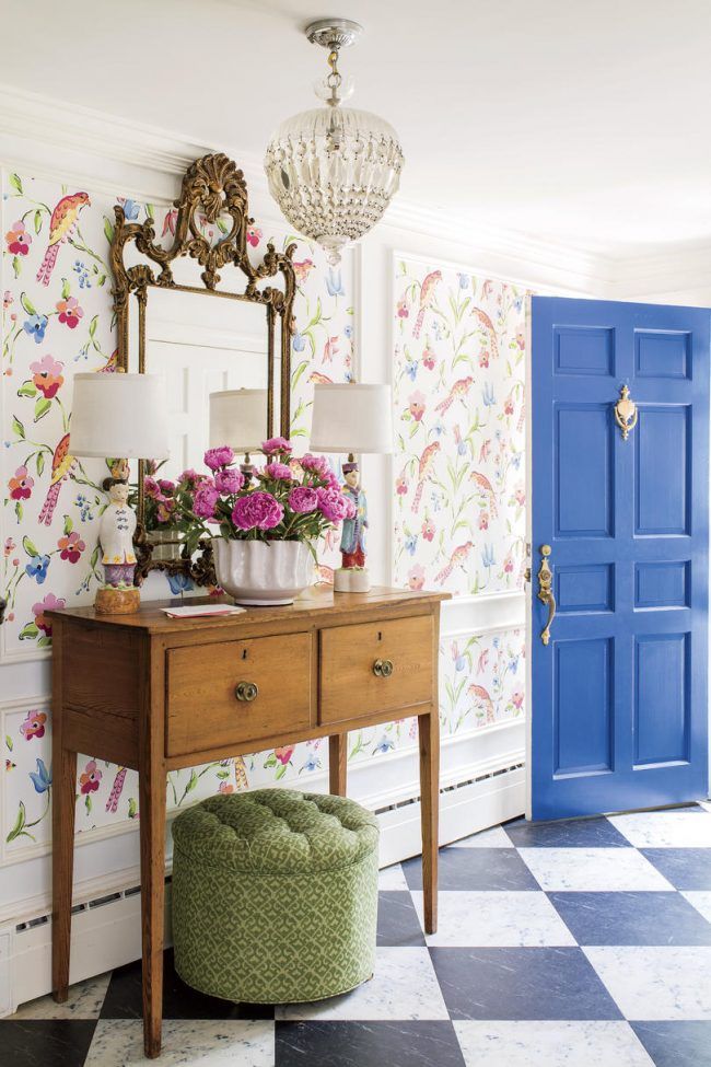
Ornaments and patterns can transform the interior of an apartment, add individuality and dynamics to it. Even the most monochrome and monochromatic interiors can sparkle in a new way when using non-standard ornaments. Mossebo designers have selected seven basic ornaments that make the interiors unique and atmospheric.
Perhaps there is no country that could not boast of its national ornament. Initially, the patterns were of a mystical nature, they were amulets or a sign of belonging to a certain estate, clan or caste. In the modern world, patterns have lost their identifying character, but still they are able to give rise to many associations and an ethnic atmosphere in the interior.
How to combine ornaments in the interior
Boho, kitsch, African and Mediterranean styles often involve a combination of many ornaments in the interior. However, if you don’t know the key rules for combining ornaments, you can mess up the interior, create excessive ripples. After all, a large number of drawings loads the eye. That is why it is worth combining ornaments in rooms with a neutral solid background. Do not try to place more than four ornaments in one room, you risk overloading the interior.
Color accents of ornaments should be selected based on the prevailing color of the interior. Patterns should be in harmony with the main color.
The more neutral the background of the room, for example, white, the more bright colors in the ornaments you can afford.
The easiest way to apply a harmonious combination of patterns in decorative cushions for furniture.
It is good to combine large patterns with small ornaments in one color scheme.
It is wiser to choose different ornaments in the same style. For example, honeycombs and scales can coexist in Art Deco styles, and ikat pairs well with zigzags in ethnic-inspired interiors.
Ikat is perhaps the most diverse and unique ornament. It can be created from diamonds, circles, flowers, or be completely abstract. This pattern originates from oriental embroidery techniques and African methods of dyeing fabrics. That is why today, most often, it is found in textiles. In European interiors, these southern ethnic patterns began to be actively encountered during the colonial era. It was the French who brought these fabrics from Morocco and began to introduce them into fashion in the middle of the 19th century.
This ornament in the interior can give an exotic character. Textiles, curtains, decorative pillows or furniture upholstery with such patterns are style-forming in boho, Mexican, Moroccan, Mediterranean and, of course, African styles. With small decorative inclusions of muted tones, ikat complements styles such as loft and modern style.
As an addition, decorative textiles with ikat ornament will fit into the kitsch interior style. In combination with other bright interior elements, it is able to create a crazy and expressive atmosphere of a postmodernist art workshop.
Ikat is often found on dishes, tablecloths or even wallpaper. The main rule for using such an ornament is not to overdo it, it is able to create a feeling of ripples, to annoy a little. To avoid this effect, designers advise using ikat in small patches or using muted adjacent tones.
Scandinavian pattern
Another pattern that originates from the national color is Scandinavian. Each of us has seen knitted sweaters with deer, flowers, snowflakes or birds embroidered in a graphic naive image. Such northern patterns are close to the peoples of Sweden, Norway, Finland and many residents of the northern part of Russia. Most often, to create such ornaments, a white or black background is used and no more than four basic colors for applying the pattern (red, blue, green, yellow). Initially, Scandinavian patterns had a folklore character of folk art, served as amulets against evil spirits and had many interpretations, however, now they are used everywhere.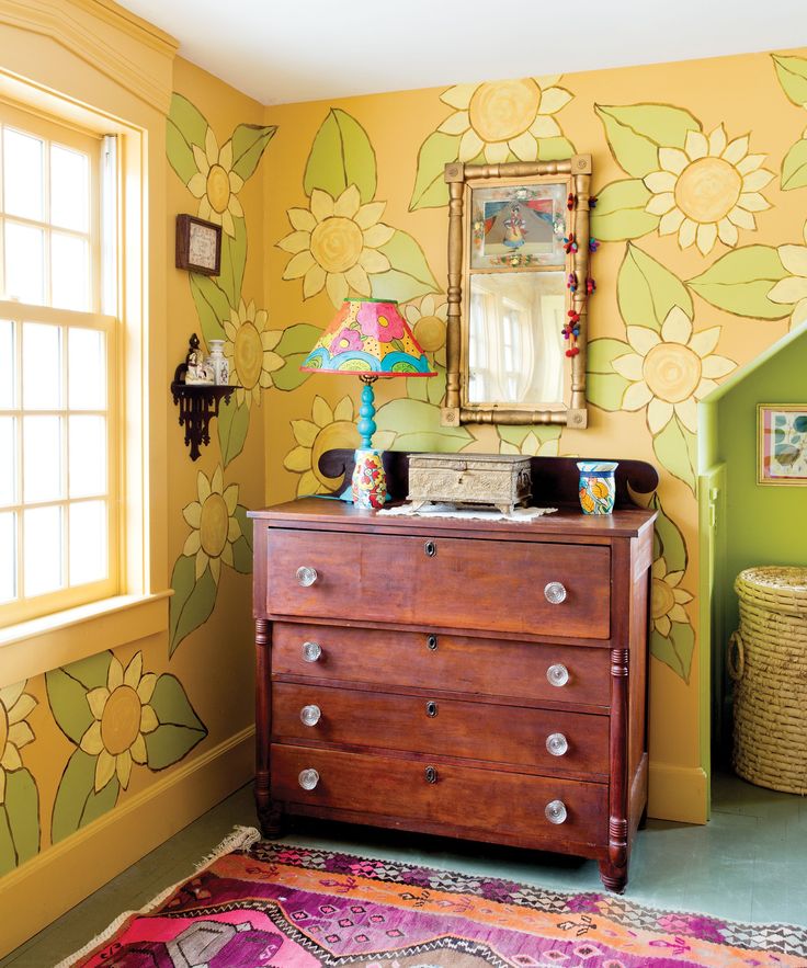
In the interior, Scandinavian ornaments are found in textiles, as a print or embroidery on decorative pillows and rugs. The white base background also allows you to apply patterns in ceramic tiles. In terms of atmosphere, Scandinavian motifs are able to create the warmth and comfort of a northern home. The pattern is unobtrusive, simple colors and shapes, limited in use. It is actively used in eco, bio, rustic and, of course, Scandinavian interior styles. It is this pattern that is the most New Year's and is used everywhere as a Christmas decor, regardless of the style of the interior.
Damascus
Damascus is one of the most exquisite ornaments in the interior. From ancient times to this day, Damascus has been a luxury item and is used in such interior styles as classic and neoclassical, baroque and neo-baroque, rococo and Stalinist Empire. As a decorative element, it can be found in boho and kitsch interiors.
Damascus is a symmetrical vegetal pattern that repeats harmoniously. Basically, only two colors are used - the background and the drawing itself. The pattern is often found in golden color. The different structure of the floral ornament indicates its cultural epoch and origin. Damascus takes its origin from heraldry; ornaments similar to the coat of arms adorned the walls of rich houses and ladies' dresses. To this day, damask is most often found in wallpaper and curtain prints.
Designers point out that this pattern is somewhat intrusive and advise not to use it on the entire surface of the walls, but to decorate only one wall or niches. Thus, damascus will be used as a stylistic focal point.
Argyle
Men's diamond-patterned sweaters flooded stores in 2008-2010. This type of pattern is called argyle - a two or three-color geometric pattern of rhombuses of adjacent shades. Years later, the argyle penetrated the interior fashion, becoming one of the recognizable ornaments. When creating a pattern, the background and colors that shade it are used. Another distinctive feature of this ornament is the cross dotted lines over the rhombus.
As you might guess, this ornament originates from Scotland and has family ties with the classic Scottish check. Initially, the ornament was characteristic of the Campbell clan, which is located in the West of Scotland. In the twentieth century, the argyle migrated to the United States and became a hallmark of golfers' clothing.
A sharp geometric pattern creates an illusion of three-dimensionality and multi-layeredness, constant movement. That is why argyle is able to visually expand the boundaries of space. But designers advise to treat it with caution, apply it only on one wall or on pieces of furniture and decor, and carefully combine it with the main background of the interior. Argyle perfectly complements the English-style apartments and colorfully decorates children's rooms. The main thing is not to use an overabundance of the pattern and observe color harmony.
Honeycombs
Another repeating polyhedron in the interior is honeycombs. This ornament entered the fashion peak last year and was often seen in the Scandinavian style and in lofts. Honeycombs were used not only as an ornament on textiles, but also as tiles or even as a form of mirrors and hanging shelves. The form of honeycombs first entered the interior fashion in the Art Nouveau era at the end of the 19th century. Architects looking for inspiration in natural motifs tried to achieve regular geometric shapes. Found the harmony of urban geometry and nature - a hexagonal pattern, or, more simply, a honeycomb. The ornament began to be widely used in Art Nouveau, Art Deco, Neo-Baroque and Scandinavian styles. It is customary to select a pattern of hexagons in two colors and simplify as much as possible.
Even at the junction of natural pattern and simple geometry, the scale ornament is born. Many circles float on each other, creating a semblance of fish scales. Like the hexagonal pattern, scales began to be actively used in Art Deco interiors and gained particular popularity in the 1920s and 1930s in Europe and the USA. Now such an ornament is used in retro styles as a print. Particularly popular in modern interiors are wall tiles in the area of the bathroom and kitchen backsplash.
Zigzag
The simplest, but perhaps the most “immortal” ornament in the interior is the zigzag. Parallel broken lines can create an optical illusion and visually expand the space. Such an ornament in a two-color design looks the best in the interior, but there are also multi-color "Christmas trees". That is why one of the main parquet board patterns is a zigzag, especially in Art Deco or Stalinist Empire styles.
The zigzag pattern is often found in textiles, porcelain, ceramics and upholstery. Most often, monochrome zigzag is used in retro styles, pop art and as a decorative design for Scandinavian-style apartments.
Due to the special dynamics, the zigzag is actively used in children's interiors. Of course, such an ornament can ruffle in case of redundancy or the use of too small a pattern. Interior designers are trying to apply a large pattern that looks calmer.
The combination of colors in the interior: 5 tips, ideas, photos
Large-scale renovation or a small "pumping" of the interior - in both cases it is important to choose the right colors that will please the eye and blend harmoniously with each other. How to do it, we figure it out together with an expert
Photo: piqsels
Interior colors directly affect our mood, behavior and well-being. Busting with red can lead to discomfort, green tones are calming, and pink or white harmonize the mood. Blue color has a positive effect on health, orange can add courage, enthusiasm and stimulate appetite [1].
Colors set the atmosphere in a room and help express the owner's personality. So choosing a palette of wallpapers, furniture, textiles for a room or the whole house is quite a responsible task.
How to combine colors and shades so that after the repair you don’t want to redo everything, and the range of colors brings pleasure - we tell in our article.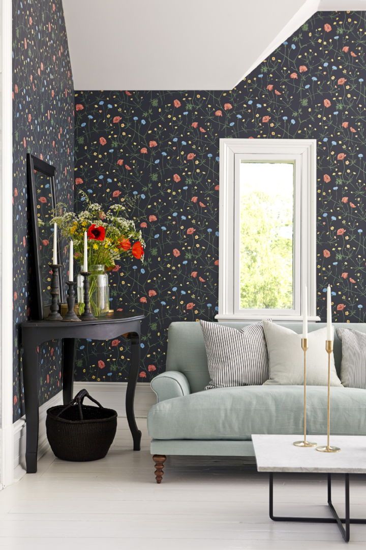
www.adv.rbc.ru
- Fundamentals
- Trendy colors
The expert in this article:
Elena Mizotina, founder and head of the Gm-interior studio
The combination of colors in the interior: principles
There are some useful principles and tips that will help you choose the right color combinations so that the interior looks harmonious.
Color wheel
The color wheel is a special visual scheme that helps to determine the correct combination of colors with each other. Most models consist of 12 colors. There are more detailed options - from 24 or more shades.
Photo: Unsplash
Colors are divided into three main types:
- Primary: red, blue and yellow. These colors cannot be obtained by mixing others.
- Secondaries: orange, purple and green.
 Obtained by mixing primary colors.
 - Tertiary: Six shades made by mixing primary and secondary colors.
There are several ways to use the color wheel. First of all, you need to choose one main color, which will become the base for the interior palette. It is complemented by two or three other colors.
If you don't want contrasts, it's better to choose three colors in a row on the palette. For bolder color schemes, complementary combinations are suitable: colors located on a circle opposite each other. The third color is easiest to choose according to the principle of a contrasting triad - two complementary colors plus a third, located next to one of them. Usually, calmer colors are made basic, and the brightest is used to decorate details and place accents.
Elena Mizotina, designer, founder and head of the Gm-interior studio:
— The color wheel is a kind of cheat sheet with basic color schemes, with its help it is very convenient to select harmonious combinations of shades.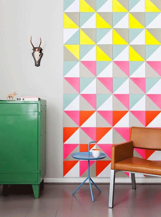 It implies the presence of the original, base color, and you need to start from it. And then you can choose colors that blend well, or look for bold, contrasting triads.
The color wheel makes it possible to create unmistakable combinations. For example, if we take a light tone as a basis and want to achieve contrast, we select dark shades using the color wheel. The right color combination is an important aspect of any interior.
Color temperature
Colors are divided into warm and cool colors. Reds, yellows, oranges, beiges, or creams are warm. Blues, greens and grays are cold. Hues are grouped by temperature on the color wheel. When cold and warm colors are mixed, hybrids are formed - such, for example, is purple.
Warm bright colors stimulate emotions and are considered to be best used in common areas such as living room, dining room, kitchen. Cool, on the contrary, soothe. The blue side of the spectrum, along with browns, grays and cool whites, creates a sense of tranquility and helps focus, and is perfect for an office, nursery or bathroom. Also, cool colors contribute to a restful sleep, so they are recommended to choose for the bedroom.
Photo: Unsplash
When choosing a color temperature for a room, consider the size of the room. Using an intense warm color in a small space runs the risk of making it look smaller. And an excess of cold shades in a spacious room can make it too strict and neutral, “soulless”.
The 60/30/10 Rule
This is a classic decor rule that helps create a color palette for a space. It indicates the ratio of the three main colors that were chosen for the interior. It is necessary that the dominant shade prevails in 60% of the room - it is logical to choose it for the color of the walls. The secondary color should occupy approximately 30% of the space - textiles, paintings, shelves, part of the furniture. The remaining 10% is a color accent, which is expressed in accessories, small details.
Black and white
Choosing white as the basis of the interior, you can fall into the trap: without color accents, the room will look cold and soulless.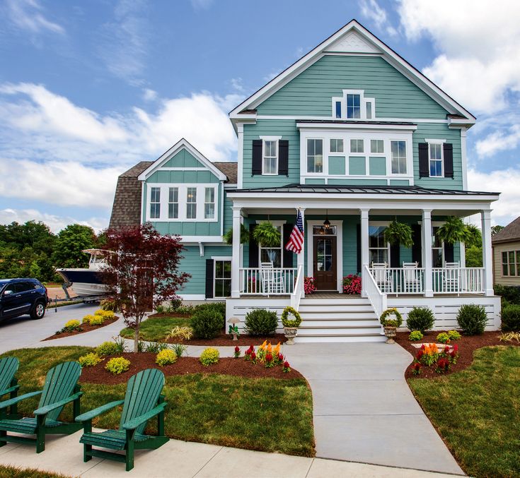
Photo: Pexels
It is also important to remember about weather conditions: in countries where there is little sun and much of the year is cold, white walls can look uncomfortable. Therefore, “warm” support is needed in accessories, textiles, and furniture.
Whiter than white: how to create an interior in the style of total white
Too much black can make a space gloomy and austere - it is important that it is not overloaded with dark accents.
Black and white interiors are more common in public areas - offices, hotels, restaurants. You can also choose it for your home, but in this case, a variety of shapes and textures is important so that the interior does not look boring.
50 shades of black: how to create a total black interior
Neutral colors
Afraid of making a mistake with the color, many choose a neutral solution - beige and its shades. But it is this color that requires a thoughtful and careful attitude: without proper accents and interesting combinations, a room in beige tones risks looking boring and faceless.
Photo: Piqsels
The advantage of beige shades is that they are very flexible, they are easy to combine with other brighter ones. Pairing options range from warm red-brown and milk chocolate to cooler dark grays and stone tones, light beige and white. Neutral colors rarely evoke emotion on their own, but they provide a sophisticated and elegant backdrop for a more intense main color.
Elena Mizotina, designer:
- Choose the base color you like. You can choose white, beige, gray, but remember how many shades each of them has. In order for the interior to play, all its components are important - from the color of furniture to textiles, from interior pillows to the dimensions of the room, and so on.
If you like strong colors, you can make one accent wall in the room. If you want variety, but lack courage, accents can be made using textiles, paintings, accessories, various textures.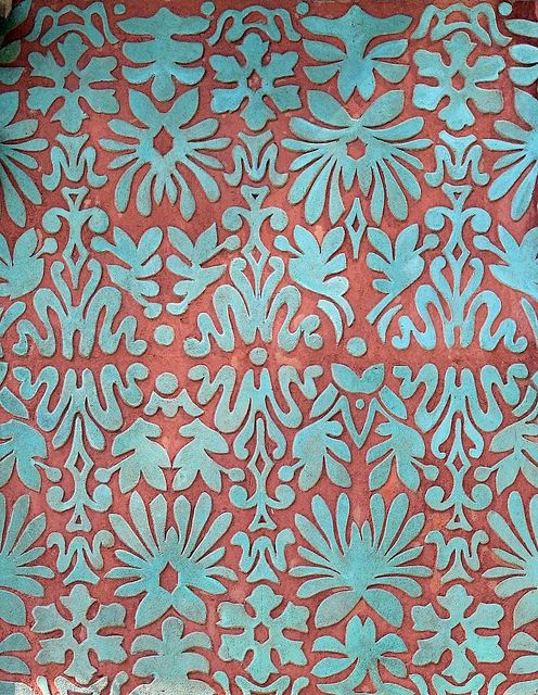
When you are bored in a monochrome interior, but don't want contrasts, you can use different shades of the same color, adhering to the 60/30/10 principle.
Trendy colors of 2021
All shades of green
This year, most of the trend-setting companies are betting on muted palettes and pastels. Also in the spotlight are warm brown, bright and juicy blue-blue, red-pink shades. A wide range of green shades is especially good: herbal, emerald green, bottle green and even bright lime.
Green is popular in interiors today. Thanks to the variety of shades, everyone will find something to their taste in the green palette. Also in favor of green is its ability to “chameleon” freely fit into various color schemes and decorative styles, always refreshing them. Specific combinations of shades of green depend on the nature of the interior and personal preferences.
Photo: Unsplash
Natural forest colors will look good surrounded by cream, yellow-orange, brown shades. Emerald is best used for accents in the room, and olive is appropriate in any interior.
Red-pink shades
Sophisticated red-pink shades look trendy in the interior, if you choose the right textures and combinations for them. The style in which the interior is decided is also important. Terracotta is appropriate in loft-style interiors, brick is more suitable for southern, oriental motifs. Both of these colors go well with milky, beige, cream. If you want contrasting solutions, you can choose blue, green colors.
Burgundy will perfectly emphasize a classic interior, while pure red color is suitable for bright, contrasting details. It is also important to pay attention to the lighting in the room: in natural and electric light, the color looks different. You can combine burgundy and red with natural shades of wood, with blue and brown.
Photo: Unsplash
Shades of pink provide a varied palette, from bright fuchsia to pastel peach. They are easy to fit into any interior, they look good with different colors and provide ample opportunities for creativity. Pale pink is good as a neutral background and harmonizes perfectly with rich colors. Bright fuchsia looks unusual and bold in combination with green, orange, blue. But if you want calm options, you can balance the pink interior with woody shades, gray, beige.
Coral: how to use the Pantone color of the year in the interior of apartments
Shades of blue and blue
Shades of blue and blue are still in fashion. They can ennoble and refresh any interior. Deep dramatic blue can be used in small spaces: the boundaries will visually dissolve and the room will look intimate and cozy.
Photo: Unsplash
Soft blue has a calming effect and adapts well to different combinations, tasks and formats. When used with white, it creates the atmosphere of a seascape, and as a single color block, it can add air to a space. It is also easy to combine with other pastel shades: pale lemon and soft pink. For a more modern interior, combinations with rust and terracotta are suitable.
Blue of Blue: Interiors in Pantone Color 2020
Pantone Colors 2021
Gray is a versatile neutral. It goes with most shades and can work as a blank canvas for any interior fantasy. Pale and medium grays can balance out the brightest tones of orange and dark yellow.
Gray softens yellow, resulting in a relaxing and pleasant decor that does not look boring. Combined with bright yellow hues, gray can create a feeling of vivacity and stimulate the workflow.
The combination is perfect for when you need a warm, modern contrast. But if you want a softer effect, you can choose natural tones of pebbles and stone, which are in harmony with the natural shades of sand, chalk, as well as materials such as linen and light wood. This creates an atmosphere of calm and comfort.