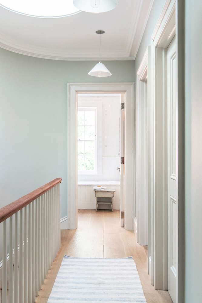
Hallway paint colour schemes
Hallway colour schemes – 26 ways to make a grand entrance
With hallway colour schemes, you generally have two options. You can a) embrace the lack of natural light and go dark and moody, or b) employ paler, more reflective tones to brighten things up. We’d err on the side of moody as it can make the rooms leading on from the hall feel more spacious, but the choice is all yours...
The ideal hallway invites you to take off your shoes, hang up your coat, and exhale in the comfort of being home. And colour plays a huge role in creating the right space for you. Do you want muted, soothing shades to welcome you in after your long commute, or would you prefer it to feel more energetic with statement colours and pattern? Would you like it to be warm and cocooning or crisp and clean?
Hallway colour schemes to inspire
Be inspired by our pick of the best hallway ideas when it comes to colour schemes. And once you’ve decided on the kind of first impression you want to create with your hallway colour ideas, there are some practical steps you can take so you’re not touching up chipped paint a year down the line.
‘Hallways are by their nature intensely high traffic areas and so a durable washable matt paint is always a smart choice,’ says interior designer Shanade McAllister-Fisher . ‘Dulux easy-care is perfect for neutral colours but I would tend to choose Farrow & Ball estate emulsion or Little Greene Intelligent matt emulsion when using colour as they offer a richer depth of colour.'
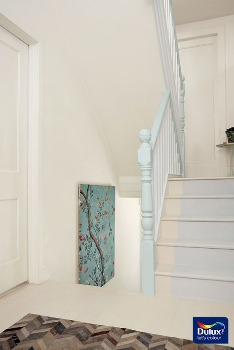
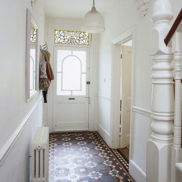
1. Combine monochrome patterns with sky blue
(Image credit: Future PLC / Dan Duchars)
Find a black and white patterned wallpaper you love and use that as the envelope of your hallway, adding colour and texture with storage baskets and a slim side table. This modern floral pattern reminds us a little of Moroccan tiles and would work as a lovely backdrop for splashes of bright blues, pinks, oranges and greens in a 70s boho scheme. The uplifting sky blue of the front door here demonstrates this beautifully, elevating the space and giving it plenty of character.
2. Wipe the slate clean with all white everything
(Image credit: Future PLC / Richard Powers)
Keep things simple with some timeless white hallway ideas. Give all walls and woodwork a fresh lick of the best white paint for a look that's clean, modern and bright. You could also use a matt finish halfway up the wall and a gloss finish on the top to create an interesting textural contrast, all while sticking with basic white. As this room shows, white doesn't have to be boring and makes this downstairs loo look intriguing.
3. Hone in on deep blues
(Image credit: Future PLC / Dominic Blackmore)
Choose a fresh teal or a perennially popular navy for your walls and floors, and then layer on accessories in similar tones. Install shoe storage onto the wall painted in dark blue and add a handy shelf on top for displaying decor. Incorporate planters, a rug, a wall mirror and vases in keeping with the blue theme to create a cohesive look that hangs together. Accent colours of yellow or orange will inject energy into the space and break things up.
4. Embrace bursts of fiery red
(Image credit: Annie Sloan)
Make a statement with a daring hallway colour idea, like this rich red hallway with red and white checkerboard floors.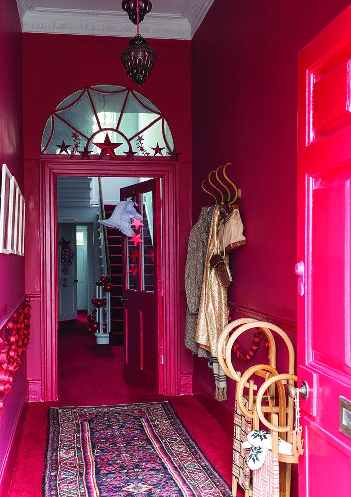 ‘This year people are making bolder colour choices in their homes, and you cannot get any bolder than bright, hot, dramatic red,’ says Annie Sloan .
‘Use this statement shade in hallways and landings – short bursts of fiery reds work fabulously here and you’ll certainly intrigue the postman with your bold colour choice. Contrast red with mellow and luxurious chocolate browns.’
5. Envelope the space with colour drenching
(Image credit: Future PLC)
Put the white paint away and go for one wrap-around colour for woodwork, walls and even the ceiling. This will draw attention away from the edges and make the space feel larger.
‘Colour drenching, especially when using darker brave colours, works best in small spaces like hallway or corridor,’ says Justyna Korczynska, senior designer at Crown . ‘By enveloping a small space in a colour, the focus shifts from noticing the size of that space to just appreciation of the shades that surround us.’
6.
 Indulge with opulent tones
(Image credit: CTD Tiles)
To create a luxurious feel in your hallway, Amanda Telford from CTD Tiles recommends going for opulent dark tones from ceiling to floor. ‘Incorporate moodier colours through materials such as paint, wallpaper and tiles. ‘To add intrigue, choose tiles with a touch of pattern,’ Amanda suggests.
7. Take it upstairs with patterned wallpaper
(Image credit: Future PLC / Georgia Burns)
If you generally prefer neutrals but want to add some interest, why not make a feature of the wall that leads upstairs? The staircase is a transitional space; it's not somewhere we tend to sit in for hours as we do in the living room. So you can afford to be more playful and daring with your hallway colour ideas without worrying that you'll go off it. Blue wallpaper with a white palm-leafed print here really brightens up an otherwise neutral scheme.
8. Reflect on metallic designs with hints of gold
(Image credit: I Love Wallpaper)
If you’re going down the brighten-it-up route, why not try a wallpaper that has some hints of metallic in it? ‘Consider a lighter paint or wallpaper, such as I Love Wallpaper’s Venice Industrial Metallic wallpaper ,’ says Chelsea Clark. ‘This will illuminate and create a feeling of space.' Hallway mirror ideas will also prevent a space from feeling cramped.
'If you want to incorporate a pattern, avoid small print repeats as these can further shrink the space,' adds Chelsea. 'Opt for a pattern that brings warmth, personality and light to ensure a welcoming entrance.’
9. Choose green to soothe the soul
(Image credit: Valspar Paint)
Paint halfway up your walls in pale, minty green, taking it over the skirting boards and doorframes to create contrast. This calming green and white hallway colour scheme is really stylish and considered, blurring the boundary between your indoor and outdoor space. Thanks to its associations with nature, green is always a safe bet if you want to create a space that feels safe and soothing.
10. Be bold with colour combinations
(Image credit: Future PLC/ Georgia Burns)
To make that 'wow' first impression the key is to be brave with colour combinations and even pattern. As this stunning hallway proves, an accent pop of sunshine yellow looks striking when paired with black.
To keep the look focused try using the accent colours purely on woodwork within the hallway, keeping the main mains in a neutral shade.
A patterned floor works well for combining a paint colour scheme, plus a patterned hallway flooring idea is ideal as it shows up less dirt than a block colour solution.
11. Take an accent colour to waist height
(Image credit: Future PLC/ Douglas Gibb)
An ideal way to use colour in a hallway, especially good as a small hallway idea, is to use a heavier accent colour on the lower portion of the wall leaving the top in a bright white. Balancing the use of colours helps to prevent the space from feeling overwhelmed by the stronger of the two colours.
Painting along the hallway but only to waist level frames the space, breaking up a solid corridor of wall. By doing so you're creating a Trompe-l'œil effect that can give a different perspective, making the space feel bigger and the ceilings higher.
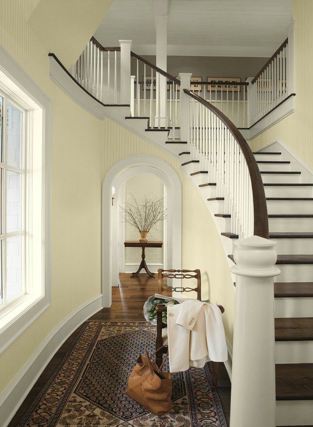
12. Showcase the stairs
(Image credit: Claire Lloyd Davies/Style at Home)
An imaginative staircase idea can do wonders to transform a hallway in an instant. Liven up a white hallway with the addition of an accent colour painted on the stairs.
Less is so much more with this modern approach to a hallway colour scheme. Go for any colour you love, painting it on staircase risers and drawing attention to them with brilliant white treads and backdrop.
13. Pick out the woodwork in contrasting colours
(Image credit: Dulux)
There are those that say never paint the original woodwork on a stairway but we say when it looks this good, why not?
Picking out the woodwork on a staircase in a bold contrast colour is a great way to modernise your hallway scheme. In this stylish hallway a black wood stain makes the banisters and spindles stand out for all the right reasons.
Going one step further, the design team at Dulux have introduced softer accent colours on the stairs, which works beautifully in the space.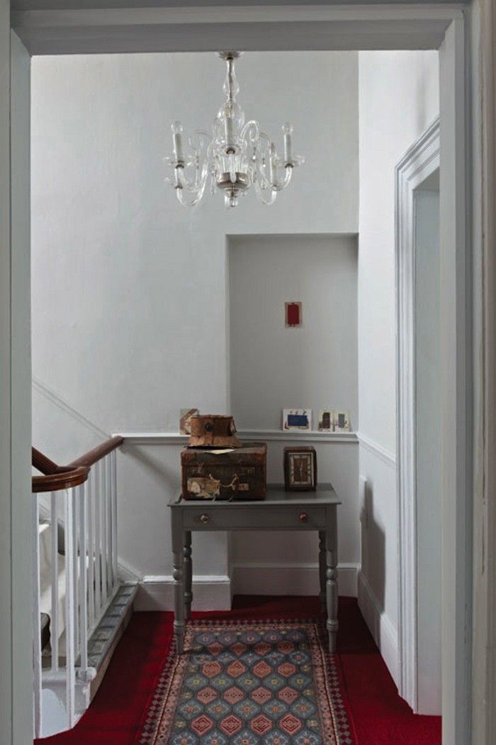
14. Mix and match complementary colours
(Image credit: Dominic Blackmore)
Use your hallway as a place to experiment with complimentary colours. This colourful hallway scheme has boldly mixed coral pink with a teal blue – opposite colours on the colour wheel – and it works so well.
The pink tone of the paper is matched with a runner to add an element of coordination, allowing the blue painted sideboard to really stand out. Proving how well opposites attract, as far as colour is concerned.
15. Create a refreshing blue entrance
(Image credit: Dulux)
Traditionally homes have small and narrow hallways, often lacking space and light. So select a shade such as Dulux's White Mist to open it up. With a clean slate to work with, you’re then free to add a unique flourish, which is where painting the ceiling, the door, its surrounds and a stripe down one wall comes in.
Dulux's soft blue Mineral Mist keeps things fresh and conjures up a subtle coastal theme in the process. Both of these shades are taken from Dulux's Easycare Washable & Tough range. This paint is more likely to withstand scuffs and marks, which in a high-traffic area like a hallway, is a huge advantage.
16. Welcome ambience with moody tones
(Image credit: Dominic Blackmore)
Brooding dark walls are becoming more and more popular in the modern home. It's often a misconception that dark can make a room feel smaller, which can be the case. But more often than not it creates a sense of space by almost pushing the walls out.
It also depends on the light. If your hallway has a great source of natural light it can totally take a dark wall colour.
To prevent the dark walls feeling too overwhelming pair with white painted woodwork, bleached wood furniture and light accessories such as this simple hallway lighting idea.
17. Opt for on-trend shades of calming grey
(Image credit: Future PLC/ Tim Young)
A calming, soft grey shade will offer a timeless look. Create a restful feel with dove grey hallway ideas by using two shades on the wall for contrast. Helen Ashmore, Head of Design at Laura Ashley agrees that dove grey is a perfect choice for a hallway. 'This neutral shade features an underlying hint of red, that will add some warmth to your colour scheme.
'Break up your hallway by creating an architectural feature such as a drop picture rail or a mid-dado rail so you can add depth of colour with a stronger shade. To create tonal variation within the scheme, add a lighter more subtle tone on the main part of the wall.'
Lighten the look with white or cream furniture and glass accessories. It’s incredibly versatile, too. Look for shades that have subtle hints of blue or pink, and dress them using luxe metallics or natural textures.
18. Make an impact with purple
(Image credit: Future PLC/ Mark Scott)
Create a comforting, cosy vibe with beautiful rich tones, such as the berry colour on this panelled wall. This look is super snug and wintery, with a draft-excluding curtain that will keep your home wonderfully warm. But the blue and white leaf-print curtain makes it more than suitable for the sunniest of seasons, too.
19. Introduce fun and friendly accents
(Image credit: Dominic Blackmore)
Create a hallway that can change with you, using a versatile mix of colour, pattern and hard-working furniture that’s easy to live with, and reflects your personality.
This vibrant look uses a clever hallway shoe storage idea and is all about mixing up colour. Use fabrics featuring multicoloured prints as a starting point and you’ll have more flexibility when you want to update the accent tones in the future.
If you want to up the glamour, add more jewel tones, such as turquoise blue, hot fuchsia pink and deep emerald green, to your palette for a more luxurious feel.
20. Decorate with duck egg blue
(Image credit: Future PLC/ David Brittain)
This new modern rustic style takes elements of traditional country looks, but gives them a smarter edge that suits any home. Think chic without the shabby! Swap the floral-patterned wallpapers of classic country style for crisp, painted walls and matching woodwork for a simple streamlined backdrop.
Duck egg is a great colour choice for a feature wall. Perfect for clutter-lovers, duck egg's calming effect will offset busyness if you like to have a lot of stuff on show.
21. Choose sun-bleached simplicity
(Image credit: Future PLC/ David Brittain)
Bring the beach home by mixing weathered coastal colours, unfussy reclaimed-wood furniture and characterful seaside motifs for a look that will relax you as soon as you walk through the front door. Lighten the look by mixing in painted furniture in a classic country style. Avoid bold blues in favour of soft stone, sand, pebble-grey and shell pink.
22. Hang captivating artwork
(Image credit: Future PLC/ Tim Young)
Choose a large-scale artwork and hang it in your hallway for an easy way to add character to your hallway colour scheme.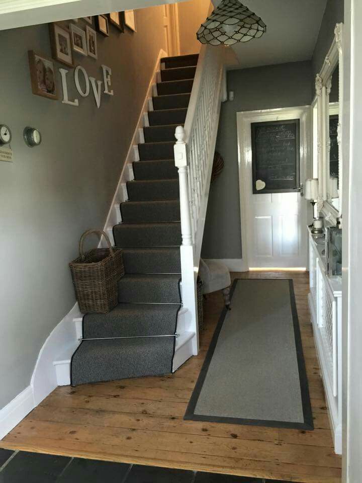 Pick something you love, as you will inevitably see it a lot while moving throughout your home.
Black and white designs are good choices, but you could also go for something super colourful if you prefer a lively look. Consider your wall paint and how it will best show off your picture – the brilliant white walls here look fantastic, and really show off the blue details.
23. Welcome hints of natural green
(Image credit: Future PLC/ Dominic Blackmore)
Get back to nature with beautiful botanical shades and motifs in your hallway. Even a soft hint of green on the walls adds impact when looking to create a serene and welcoming space.
If you have period features, put them centre stage with pared-back hallway colour schemes. Or you could use a different paint colour to highlight features such as dado-height panelling or skirting boards.
Try using a richly patterned hallway wallpaper idea or paint in recesses, nooks, just above the dado rail or even on stair risers. Add an assortment of green furniture artworks and accessories to enhance the accent colour.
24. Live au naturel
(Image credit: Future PLC/ Polly Eltes)
Let nature take centre stage, the way it definitely does in this hallway, which is packed with natural elements, from the colour palette to the natural materials in the wooden floor and stone wall.
The large window is a big bonus for nature lovers, too, offering views far beyond the confines of the hallway and letting the light flood in. We love the sea-life-inspired artwork, too.
25. Uplift with daffodil yellow
(Image credit: Future PLC/ David Brittain)
Let the sunshine in with corn-field yellows and rustic woods – all inspired by nature’s best. Light up a gloomy under stairs space with a butter-yellow wall covering featuring super-sized foliage – the perfect spot for a clever hallway storage idea like the one shown above.
26. Introduce colour through accessories
(Image credit: Future PLC/ Georgia Burns)
This hallway was the first opportunity for this home owner to take in her chosen jungle theme. She took inspiration from natural textures and raw materials and slowly but surely, this neutral colour split wall became a stylish gallery wall full of memories and treasures.
Do you feel inspired by these hallway colour schemes? Happy decorating!
What colour is best to paint a hallway?
'Whether you’re looking to emphasise just one feature of your hallway or wanting to transform the entire space, choosing a lighter palette is a great option as it often creates the illusion of natural light in dark and cavernous areas,' advises Charlotte Radford, Senior Product Manager at Valspar .
Charlotte says a dark hallway isn't always a bad feature, and that dark navy blue can create a calming space for greeting guests. 'Painting with a mid-sheen will also create a light-enhancing effect in your hallway, as these finishes will naturally reflect any light present in the space,' she adds. 'It’s important to remember, however, that these more reflective sheens can accentuate any blemishes on your walls, so make sure you are working on perfectly smooth surfaces. '
'
What colours brighten a hallway?
Chelsea Clark from I Love Wallpaper comments that many households opt for a neutral colour palette as this ensures often dark and narrow spaces feel light and airy. ‘For those wanting to add a little personality, injecting light and mid-tone shades of pink, blue, yellow and green will instantly add an uplifting and mood-boosting feel to any space,’ she says.
Should hallways be lighter or darker?
‘I love a dark hallway,’ comments interior designer Shanade. ‘Many don’t have windows or natural light so why not embrace this and create drama with shades of rich deep colours?
Designers Share the 15 Best Hallway Colors
Tom Ferguson
Just a guess, but the word you'd use to describe your hallway probably isn't one of these: striking, dramatic, gorgeous, warm, intimate, exciting. But it could be! It's all about knowing what hallway color you should choose as your backdrop. Keep reading to get inspired by fifteen beautifully decorated hallways along with designer tips and paint color suggestions to transform all your transitional spaces.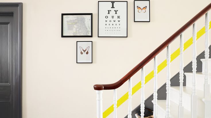
Farrow & Ball
1 of 15
Brown
"I always think it's a mistake to try to make an interior room look brighter with white," says interior designer Tom Stringer. "I'd rather make it dark and interesting." His go-to dark color is Benjamin Moore's Van Buren Brown HC-70, which resembles semisweet chocolate chips. "It doesn't feel dark to me, just intimate and enveloping," he says.
Shop a similar shade below:
BUY NOW Farrow & Ball Tanner's Brown, $110
Anson Smart
2 of 15
Baby Blue
Designer Darren Henault has a probing question for the world: "Why do people treat hallways as a lonely, pathetic passageway?" His cure is adding seating, "even if nobody's actually going to sit." This makes it feel comfortable and inviting. In this space designed by Arent & Pyke, the soft blue accent color softens everything up while the striped barrel chair brings in a modern touch.
Shop a similar shade below:
BUY NOW PPG Zero Blue Ice Age Paint, $19
Farrow & Ball
3 of 15
Bright Yellow
"Usually, hallways don't get much sun, so I like yellow—a color that emanates warmth and light," shares designed Marshall Watson.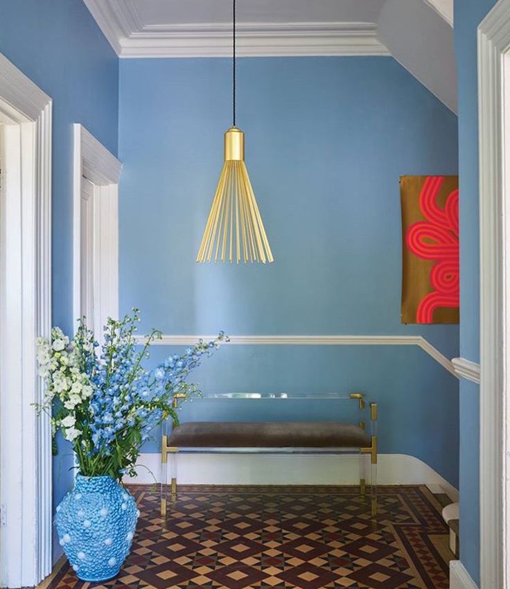 "It won't take on that gray pallor that white and beige or tan can acquire when there's no window around," He explains. Then consider hanging a series of black and white photographs, as repetition works well in a corridor, he suggests.
Shop a similar shade below:
BUY NOW Farrow & Ball Babouche 223, $110
Tom Ferguson
4 of 15
Black Blue
"I like black in a small hallway. Clients think you're crazy at first, but it's very romantic," Elizabeth Brauer tells us. "Do sconces or a chandelier on dimmers, because you don't want bright light flooding the walls." In this hallway designed by Arent & Pyke, the deep shade of navy still has a lively spirit to it.
Shop a similar shade below:
BUY NOW Farrow & Ball Black Blue 95, $110
STEPHEN KENT JOHNSON
5 of 15
Brown Gray
Kim Alexandruik's motto is to "go for impact. " She encourages you to consider the hallway a playing field for bold accents, like unusual seating and colorful artwork that may be harder to integrate into other rooms. Her color of choice is a "putty-colored gray, with a hint of pink and lavender. Not too light, so it doesn't go vapid," says Aleandruik. Use this hallway designed by Mally Skok as inspiration.
Shop a similar shade below:
BUY NOW Farrow & Ball Elephant's Breath 229, $110
Jonny Valiant
6 of 15
High-Gloss Green
"To reduce that long tunnel effect, you have to dematerialize the walls," says designed Maureen Footer. She suggests lacquering them to reflect light and get that shimmery glow. These high-gloss green walls in a hallway designed by Christina Murphy are such a fun surprise.
Shop a similar shade below:
BUY NOW Behr High-Gloss Sparking Apple, $33
Anson Smart
7 of 15
Beige
"A hallway should be the reverse of what's happening around it," says designer Birch Coffey. In this home designed by Arent & Pyke, the front door is painted a lively orangey-red color, so the entry hall softens things up with a muted pewter. Coffey likes Benjamin Moore's Revere Pewter HC-172. "This seagull gray doesn't scream for attention, yet it has presence. Light, yet deep enough to look sharp with a contrasting trim," says the designer.
Shop a similar shade below:
BUY NOW Farrow & Ball Wevet, $110
Francesco Lagnese
8 of 15
Hot Pink
Intense, eye-catching, and adventurous, we're loving the neon pink walls in this townhouse designed by Jonathan Berger. Use it in a foyer for a warm, welcoming, impossible-to-forget entrance, or to embolden a lackluster hallway.
Shop a similar shade below:
BUY NOW Benjamin Moore Peony, $43
Felix Forest
9 of 15
Light Gray
"Remember those boutique hotels with hallways so dark they made you feel like a mole? I think the drama should come from your art, and the paint should be fresh and light," says designed Betsy Brown.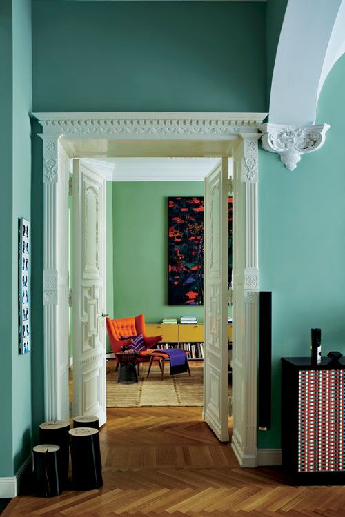 A nice in between neutral is a gorgeous backdrop for sculptural mirrors and unique lighting, as seen in this hallway by Arent & Pyke.
Shop a similar shade below:
BUY NOW Benjamin Moore Classic Gray 0C-23, $43
Blush Pink
10 of 15
Blush Pink
A light, delicate pink that provides just a touch of oomph looks surprisingly good when paired with more modern, streamlined, geometric pieces. It also works brilliantly in playful, eccentric spaces, like this one designed by 2LG Studio. The pink color makes it feel open and bright while the elaborate, saturated blue runner grounds it.
Shop a similar shade below:
BUY NOW Farrow & Ball Middleton Pink, $110
Matthew Williams
11 of 15
Deep Aqua
"Hallways without windows can and should be mysterious," asserts Susan Zises Green. She recommends trying a a deep blue with a lot of green that's wet and languid, like this glossy transitional space designed by Studio DB. Green also suggests carrying it up the ceiling to make it feel like a cocoon.
Shop a similar shade below:
BUY NOW Benjamin Moore Naples Blue 2057-30, $43
Sara Tramp
12 of 15
All White
Sometimes white really is the best option. "I like to use white in a space that has no natural light," shares Lisa Jackson. Her favorite is Farrow & Ball's All White 2005 because "it's not too blue, not too pink, not too yellow." She also says "there should always be a focal point at the end of a hall—a console table, a fabulous chair..." In this one designed by Jess Bunge of Emily Henderson Design, our attention is drawn to the minimalist mirror.
Shop a similar shade below:
BUY NOW Farrow & Ball All White, $110
Tom Ferguson
13 of 15
Dark Gray
People are often afraid of dark colors. But it's just paint, bottom line. Try it. You'll like it," Sue Burgess reminds us. Her favorite dark paint color is Benjamin Moore's Taupe 2110-10, which is a rich chocolate-y brown. You could also opt for a moody gray hue like this one used by Arent & Pyke. It's sullen and serious yet exciting and fresh. Plus, it pairs beautifully with a ton of color schemes.
Shop a similar shade below:
BUY NOW Farrow & Ball Manor House Gray, $110
Dustin Askland
14 of 15
Mint Green
You can embrace color without going too over-the-top, as proven by this cheerful little hallway designed by Elizabeth Architecture and Design. Pale mint green is a lovely option to give a narrow passageway some fresh energy.
Shop a similar shade below:
BUY NOW Behr Light Mint Paint, $32
Hecker Guthrie
15 of 15
Cream
"There's just something about white that feels very pure and fresh and doesn't compete with the rooms off the hallway," Alex Papachristidis tells us. The designer usually opts for Benjamin Moore Cloud White 967, using different finishes for the wall and trims to create subtle contrast. The soft white in this hallway designed by Hecker Guthrie allows us to focus on the striking blue carpet in the room ahead.
Shop a similar shade below:
BUY NOW Behr Vermont Cream Paint, $35
20 Designer-Approved Concrete Floor Ideas
11 styles, the right choice of shade, combination in the interior and painting options
The hallway is the room that is the hallmark of the whole house. Therefore, its design should be considered in the most careful way. In this article I will talk about the color scheme of the hallway. I will tell readers about what color scheme is suitable for a given room, how to correctly combine the color of the walls with furniture and design, and I will give practical advice on what to consider when choosing a color.
What to consider when choosing the color of the hallway walls
The hallway has the most traffic. Therefore, the walls there get dirty the most.
Choosing the shade of the walls in the corridor, first of all, select washable finishes. It can be both paint and washable wallpaper. When putting on shoes, or dressing, we hold on to the walls with our hands, leaving dirty shoes and wet clothes there.
There is also high humidity in the hallway: wet clothes, shoes, umbrellas, open doors to the bathroom.
Whatever color you prefer, either paint or wallpaper should be moisture resistant and preferably with an anti-fungal coating. nine0003
When choosing the color of the walls of the corridor, follow the tips and recommendations:
- If you like light white, due to the greater contamination of the walls in this room, it is better to give preference not to a snow-white tone, but to ivory, beige, etc.
- The choice of color depends entirely on the height, dimensions of the room, as well as on the lighting of and the number of fixtures.
 If the hallway is poorly lit, give preference to light colors. If there is enough natural light, then you can paint the walls in darker colors. Walls two or more tones lighter than furniture will visually enlarge the corridor. nine0018
 - Do not combine more than three tones in one room . Whatever colors of walls, furniture, interior items you choose, the color scheme should vary within no more than three shades.
Popular styles and their inherent tones
The choice of color for the hallway depends on the style of the interior:
- Modern , or classicism is in perfect harmony with natural light shades. Different options for white: noble ivory, beige, light brown colors will come in handy in this style direction. nine0018
- Baroque goes well with rich pink shades, White and gold will also be appropriate.
- Rococo is in harmony with browns and pastels.
 Golden elements will also create a successful tandem with the main color scheme in this style.
 - Fashion style Empire style does not tolerate halftones. The color scheme should be bright, most often these are all shades of green, turquoise, light blue and blue.
- Idea minimalist calls for grays and creams, black is fine too.
- Pop Art forces the use of an exceptionally juicy, fresh and rich palette. Sunny colors will do.
- Hi-tech prefers metallics. The style is in perfect harmony with all shades of gray. A combination of contrasts is appropriate in this style: black and white.
Combination and color options
If you want to make your hallway fresh and juicy, use a lemon or blue palette, burgundy or green shades. A sunny range of yellow and orange is also suitable for these purposes. There will never be a dull moment in such a beautiful room.
Those who prefer the classics should pay attention to terracotta tones, light brown colors. This option of painting the walls gives them sophistication and nobility, moreover, this color scheme is not easily soiled.
Smoky, ash and silver tones are the most versatile and can be successfully combined with bright colors. nine0003
Experienced designers recommend using a color scheme for the walls that is slightly lighter than the shade of the furniture. Too dark tones, it is recommended to dilute with light tones.
Walls with vertical lines in any color scheme will visually elevate the ceiling, and a horizontal pattern on the walls will help to expand the hallway. Horizontal stripes will make the ceiling visually lower and the room itself wider.
Walls with vertical lines on any color scheme will visually raise the ceiling An entrance hall in light colors is a classic of the genre in an apartment.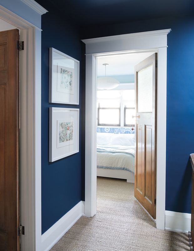 But the combination of dark colors is a new fashion trend. But dark colors tend to narrow the space. A hallway in dark colors will look somewhat smaller. But on the other hand, dark shades are fraught with a certain mystery and power. nine0003
A dark color scheme is appropriate to use in a spacious hallway with large windows. A successful tandem is a combination of black and purple. Such a room will look elegant, with a touch of mystery.
trendy corridor shades, blue or lilac
Hallway. This space plays an important role. Already at the entrance to it, one can feel the harmony, the mood reigning in the house. Here we meet dear guests, friends who have dropped in for a cup of tea. I want to create the perfect interior here. To do this, you need to choose the right color.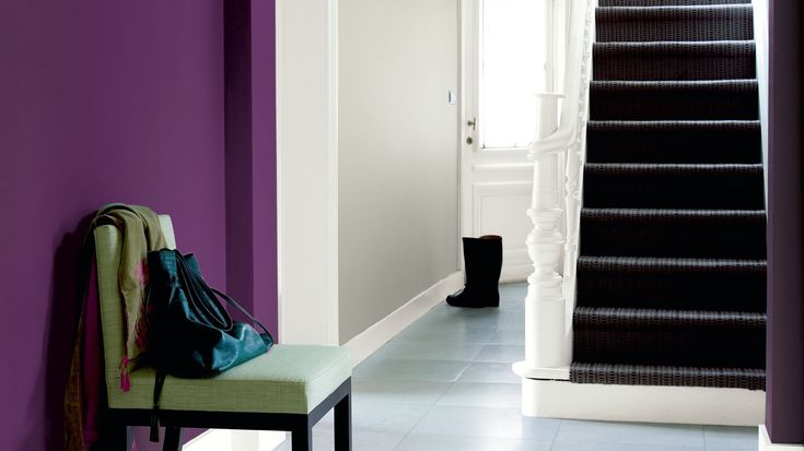 nine0003
Since entrance halls are often small in size and at the same time they form the first impression of the home, one should approach the issue of their design carefully.
What colors to paint the walls of the hallway (selection of photos)
Contents
- What colors to paint the walls of the hallway (selection of photos)
- Color scheme depending on the style of the interior
- Why the corridor should be beautiful corridor
- Fashionable design solutions in 2019 (photo selection)
- VIDEO: Modern hallway design trends.
- 50 stylish wall designs in the hallway:
When choosing colors for the corridor, consider all the nuances, especially the corridor footage and its layout. Not everyone can boast of a large room. Most often, the hallway is either too small or very long and limited in width. If you like dark shades, especially brown, then visually the width will decrease even more. nine0003
Cold colors are best suited for a small corridor: white, pale chestnut, azure, ivory, silver, haze, light brown, grayish.
When deciding on a color, take into account the area and configuration of the room.
The most acceptable design is light brown and gray. Their highlight is neutrality. What it is: a shadow falls on a milky one - a grayish one is formed, and gray in combination with yellow gives a light brown. nine0003
Colors depending on the interior style
Classic style. Many people follow this direction. It is not difficult to create it - paint or wallpaper is used to decorate the walls. This style is characterized by a wide range of colors, a combination of large elements, images, ornaments, and uniformity. In some cases, it is more expedient to decorate the hallway with panels - this is one of the most commonly used finishing options today.
Choosing the shade of the walls in the corridor, first of all, select washable finishes. nine0003
This style is characterized by the following combination: grayish with light brown, sandy with milky, dark with red, chestnut with red, light purple with light brown, milky with azure.
With a small footage, it is more correct to choose one of the above tones, and it is better to refrain from designing 3D, large drawings. If you live in a private house, the color should be soft, calm, otherwise it will seem that the walls are crushing. No one likes this feeling. nine0003
Whatever color you prefer, either paint or wallpaper must be moisture resistant and preferably with an anti-fungal coating.
For decoration, use wallpaper of higher quality than paper. These include non-woven, glass, vinyl, but they also cost a little more than usual.
Walls in a small hallway are best decorated in light and warm colors, they will significantly expand the space.
Modern style. Haven’t decided yet which tone to choose, but want to design it in accordance with fashion trends, the following materials and coatings will do. nine0003
- Natural and artificial stone of remarkable, colorful colors (intense gray, purple, dark, burgundy, chestnut).
- Red brick with visible seams.
Brick. With it, you can decorate all the walls in the hallway or apply only partial decoration and create a rather unusual design in the hallway.
- Pistachio, dark, azure, bluish, scarlet, red, greenish colors are used. If the hallway is spacious, you can combine colors with soft, neutral tones. Interior and decorative paints are suitable for any style. nine0018
- You can apply subtle, soft shades individually. Of these, light brown, milky, light yellow are often used.
A dimly lit hallway should be decorated in bright colors.
Additional information. If your main goal is to visually expand the room, then paint or decorate the side walls with the lightest colors or finishing materials. Refrain from large elements, massive pieces of furniture, large niches - this will visually significantly reduce the hallway. nine0003
Retro style. The use of stone is an acceptable option. It is permissible to use stones of various sizes here.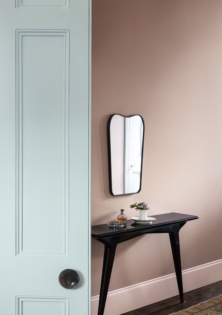 The main requirement is that objects have relief outlines, be bulky, with rigid contours. This will allow the wall covering to look natural, realistic, as in the old days.
Whatever colors of walls, furniture, interior items you choose, the color scheme should vary within no more than three shades.
A distinctive feature of this direction is the use of natural decoration and established colors. The most suitable colors: light brown, milky cream, chestnut, sandy. Contrast and brightness are not allowed. nine0003
As for materials, use wallpaper, paint, as well as stones that imitate unevenness, attrition. The same result will give decorative plaster. Although it is expensive, it is used sparingly.
Embossed surface with various patterns, perfect for decorating any style.
Scandinavian style. This direction is characterized by an abundance of light. It is worth using neutral, soft, cool colors, bright colors are unacceptable. The selected shade is recommended to be diluted. nine0003
Stylistic design allows not only to create a fashionable interior, but also to reflect taste preferences.
Don't focus on just pale grey, light brown. Sandy, light yellow, azure, golden shades are ideal. With a small area, this is the best option that deserves attention.
Hi-tech. This style is no less popular in our time. Its key areas include the presence of elements of niches and metal decoration in the hallway. nine0003
Uncomplicated and simple types of functional finishes emphasize the fundamental features of this trend.
Dark tones are characteristic of the style: dark, greenish, dark azure, silver, etc. The use of stones, wallpapering, coloring are not excluded.
Country style. A few words about colors. The most suitable.
- Dark brown matte colors, textures with imitation of streaks - the most acceptable option.
- Light brown and snow white tones. nine0018
- Light yellowish and white rough flats.
- Recommended color and texture combination.
- The background is better neutral, with the addition of colorful elements - this is necessary.
The room is expanded due to mirrors, arches, large passages.
Each style is unique and interesting in its own way. Thanks to its features, it helps to create a unique interior.
Note. If you cannot decide on your own, contact the experts. They will help not only to choose the style, but also hide all the shortcomings of the room, create the perfect interior. nine0003
Why a corridor needs to be beautiful
This room needs to be beautifully decorated just as much as other rooms. This is like a “visiting card” of the house, so the design should be approached thoroughly.
Backgrounds and patterns should not be too contrasting in hallways with large wall areas.
In addition, the corridor requires a lot of space for outerwear, shoes and other accessories. But all this should be combined with decor. There is a large area for him - this is a wall.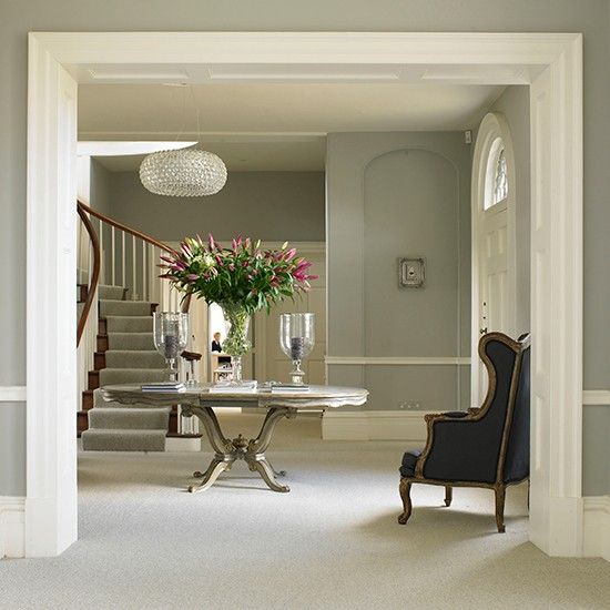 By designing this surface, where there are no clothes, you can radically change the atmosphere here. nine0003
To transform the area at the front door, consider these points.
- Compact - here the dimensions are smaller than in other rooms. In this regard, it is worthwhile to correctly approach the placement of the necessary items, create a design that visually expands this area.
- Thoughtfulness. After returning home from work, I want to plunge into comfort. Therefore, the design of the corridor should evoke only positive emotions, and the furniture should be cozy and multifunctional. Consider choosing a place for outerwear, shoes, mirrors to be comfortable. nine0018
- Quality. Choose high-quality materials, they will last a long time, and low-grade ones are unreliable, they will soon need to be replaced. Pay attention to the moisture resistance of the material, ease of cleaning.
- Beauty. Every room in the house should correspond to this word. If you yourself want to make repairs in the corridor, work hard on the interior so that it matches the style of the entire apartment.
Make the floor darker than the walls and the ceiling lighter than the floor. In this way, the proportions of the room are visually preserved and the space is not hidden. nine0003
What color is better for the corridor
Starting the repair, I want to carry out all the finishing work in a quality manner, to choose the best design. But sometimes there are difficulties with the choice of colors. The best option would be the shade that will be combined with the home environment, interior and color of other rooms.
White. Many are sure that this color is not suitable for the hallway, that it is not entirely practical. Stylists are convinced that entering the white corridor improves the mood, and this is a strong argument in favor of white. In addition, the room visually increases. Of course, everyone finds their own advantages and disadvantages in milky color. But if you really wanted to decorate the interior in this way, you should not give up your desires.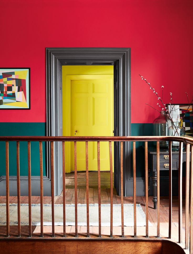 nine0003
This wall design is an excellent option for small or narrow spaces.
Light green. Green and its shades are gaining more and more popularity. When choosing a shade of green, the design you have conceived is also important. The corridor is small, light colors are ideal: light green, mint, grayish green. Appropriate finishing materials and decorative elements should be used.
Light green wall decoration is very trendy, trendy and modern. With its help, you can bring incredible freshness to the interior. nine0003
Please note! This color is basic, and what tone is better to choose, be guided by the footage and shape of the corridor, the type of lighting.
The brightest colors of green can also be used for a large corridor. But you need to be careful, as its overabundance can cause an aggressive attitude. More saturated green shades are also suitable - darkish green, yellow-green, especially with high ceilings and original layout.
The surface of the wall, highlighted with an unusual texture, bright color or pattern, is a special interior technique that guarantees an excellent result. nine0003
Inserts will give a peculiar effect. It is more correct to perform colorful inserts on a neutral background. This kind of contrast will make the room larger or visually make a large corridor smaller.
Light. The shade of coffee with milk is preferred by most as the most practical. Light brown decor and furnishings are perfect for different styles. Perfectly combines with dark chestnut, cream, light green.
A well-placed mirror, by adding perspective, will give the room spatial depth and spaciousness. nine0003
Let's designate some pluses of a light shade.
- Decorating in these colors, including floors and ceilings, requires fewer lighting fixtures.
- Light color perfectly hides irregularities and masks flaws in planning.
- Perfectly combines with all colors, which greatly facilitates the work of stylists.
- With this design, any decor element looks very impressive.
- Light design has a beneficial effect on the nervous system, the house becomes cozy and comfortable.
 nine0018
A good alternative to white is ivory. The shade is rich, combined with many colors and looks presentable.
Among the shortcomings, one can single out the short service life of such a coating and the likelihood of staining the walls with outerwear or shoes. But now produced moisture and wear-resistant materials will help to easily cope with this problem.
Grey. This color has many shades, it is considered an excellent additional background for colorful elements used in the interior. Painting the walls in the corridor in gray will help to make the atmosphere in the room peaceful and also unusual. nine0003
It is recommended to give preference to light shades of gray, which will make the room airy, fresh and spacious.
Unlike light, this color is much more practical, it has several shades: asphalt, metal, pearl. They have a positive effect on a person, soothe, relieve stress. But if there is an overabundance of dark gray in the corridor, it causes melancholy and despondency. Decorative plaster will add variety to such an interior, with its help you can recreate a different texture. nine0003
Lilac. This color, like others, is distinguished by a variety of palettes. Lavender belongs to the cool shades, it is best used in rooms facing the sunny side.
A lighter lavender color can be used in rooms with north facing windows.
Delicate lilac tone is ideal for minimalist and classic styles. And in any other style, it looks very impressive.
Some argue that for large rooms where we are constantly, this color is not suitable and it is better to use it in small rooms. One can argue about this. If residents really like this shade, they feel comfortable in such a room, it is quite advisable to use it for decoration. But everything needs moderation. nine0003
Dark. A corridor in a dark design looks intimidating, especially with the wrong lighting. In a narrow room, it is better not to use dark tones. Neither thoughtful design nor proper lighting will help with this.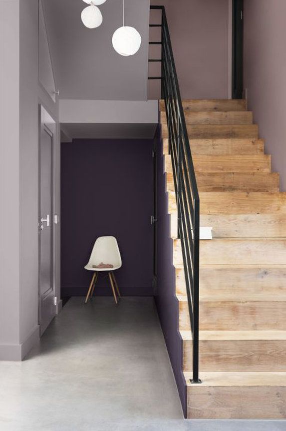 A small corridor can be decorated with a dark-colored rug and a small picture; for furniture, choose a wenge tone - it is amber chestnut or dark chestnut with black veins.
Dark walls will be the main accent and will look very elegant, chic and original. nine0003
To visually enlarge a dark corridor, it is better not to install interior doors, but to limit yourself to arches. Use a mirror for this. It is better to choose a wall-mounted and wide, built-in will not give such an effect. Suitable shades for the frame are silver or gold. The edges need LED lighting.
Bulky furniture is not suitable for a dark hallway - it makes it heavier. Shelves and hangers should be open, bedside tables are better low. Items choose polished, glossy or mirror. Install multi-level lighting: a chandelier, a sconce, along the edges of the ceiling - a diode contour tape. nine0003
Beige. "Business card" - this is also called the corridor, because by its appearance an opinion about the owners is formed. Therefore, they try to create a beautiful interior here. But this is complicated by the constant movement in the room, by the fact that its area is small, there is no natural lighting.
Painting the walls in gray or beige shifts the focus from form to content – a small entrance hall in neutral tones will seem a bit bigger than it really is.
Beige color is best suited for decoration, it will visually enlarge it, add light. Perfectly combined with all colors. Here you can easily pick up furniture, decor. Beige shades will give the interior coziness, harmony. nine0003
Fashionable design solutions in 2019 (selection of photos)
Consider the fashion trends in the design of the hallway for this year:
- It is important to plan the arrangement of furniture when creating the interior of the hallway. Since there are few free walls left, decoration plays a secondary role.
- Repair is difficult for a large number of items. Be sensible by opting for minimalism.
- Use up to three colors for decoration: wood effect, white, gray or dark. Everything in the hallway has its own colors, for example, a wood-like floor, a snow-white ceiling, a dark rug. These colors are present in almost every interior. If you bring bright colors, it will look pretentious and ridiculous. nine0018
- Fashionable entryway with built-in furniture and hidden LED lighting.
If the entrance hall is conceived in a neutral color and without bright accents, then you can choose combinations of colors close in palette.
When designing a small corridor, accuracy and functionality should be a priority. Make the background in neutral colors, and from finishing materials we advise you to focus on decorative plaster. It is reliable, stains are not noticeable on it, it is easy to clean. Optionally, you can choose wallpaper for painting or paint. If you have a spacious entrance hall or are planning a redevelopment, then the design will be completely different.