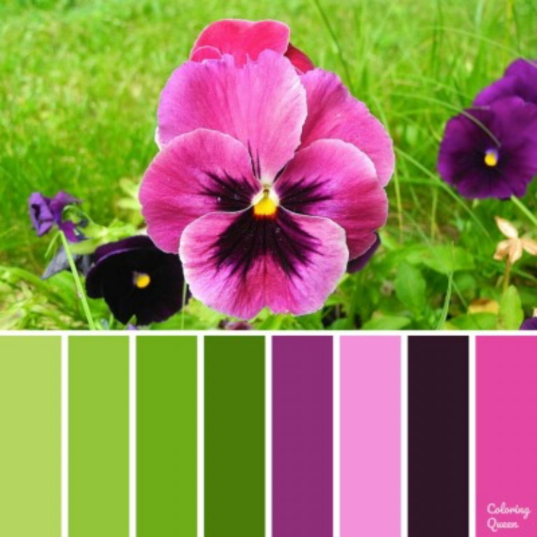
Colour schemes for gardens
Garden color schemes: how to use color in the garden
(Image credit: Leigh clapp)
Choosing garden color schemes is one of the key considerations when looking at garden design.
You can change the mood of your garden, or areas of your yard, through the use of color. This can range from a calming effect created by a harmonious selection of soft shades, such as muted greys, purples and blues, to vibrant and energetic spaces filled with rich reds, bright oranges and punchy lime greens.
A thoughtful use of color in the garden, together with form and texture, will form the basis of your garden ideas.
Whether you prefer strong garden color schemes, or more peaceful yet impactful white garden ideas, there are myriad options to choose from and different ways to combine color in the garden
(Image credit: Dan Pearson Studio / Huw Morgan)
Seeing garden color schemes as part of an overall composition that includes texture and shape within your flower bed ideas is key. It’s important to understand how and where to use different colors in the garden design to achieve the best effects.
'When grouping plants, create a pinboard and Pinterest page of things that you like, to put a mood board together. If you look at blues, for instnce, you will see there is a range of different blues that slip into blue-green, and at the other end into blue-purple. Once you start to get all your palettes together, you can play with how things are combined,' advises award-winning landscape designer Dan Pearson OBE, who is renowned for his painterly planting style.
Also take into account the way light moves around in the garden, and the play of sunlight and shadow as these influence how we see color at different times of the day.
‘Color and light are key elements in the garden,' says garden designer Charlotte Rowe . 'Color gets refracted and changes throughout the day with the play of light on surfaces, which can really affect how color and light behaves in landscapes. ’
’
Choose garden color schemes to create a mood
(Image credit: Dan Pearson Studio / Huw Morgan)
Color has a huge impact on mood and ambience, so choose your garden color scheme carefully.
'Color is a way of changing the mood in different areas of the garden. I would use whites for something that feels calming, including plants such as cow parsley and clean whites, or those with hints of cream or yellow, rather than whites with pink in them. This keeps the mood uncomplicated for a restful zone,' explains Dan Pearson,
Choosing colors to create different moods can add to a sensory garden experience.
'All the colors have different applications. Blue, for instance, makes you feel calm and is best in shadow where the color is more interesting – it becomes quite fugitive in bright lights. Whereas reds are used for providing energy. I use them in a place that is not too far away from where you might be looking as they can be distracting. If I want to catch attention, I’ll use a small amount of reds further away, but only in small amounts,' adds Dan.
When it comes to choosing garden color schemes, garden designers tend to limit the color palette to green plus two other colors. Whether you are choosing summer bulbs or late summer flowers, there are many options.
‘A riot of color is great if you really know what you’re doing but it’s safer to restrict the color range,’ says Charlotte Rowe. ‘Limit the use of color in backyard landscaping, too. We never use the color green for trellis and fences as it fights against the natural color of the plants.’
Instead, choose neutral colors and local materials wherever possible, such as brick and flint. The exception is very dark grey for walls, fences and trellis, as it helps boundaries recede, makes the space look larger and is brilliant for off-setting plants.
Start with green when choosing color in the garden
(Image credit: Future)
Don’t underestimate the use of the color green in the garden.
'Green is often overlooked and a much-underestimated color in the garden; however, it is, of course, the most important of all.![]() It underpins most things in landscape settings, and you can play with its various tones to create a beautiful space,' says Dan Pearson.
It underpins most things in landscape settings, and you can play with its various tones to create a beautiful space,' says Dan Pearson.
‘It creates calm and connects us to nature,’ adds garden designer Michelle Brandon , who specializes in therapeutic gardens. ‘The garden doesn’t have to be all-singing, all-dancing color. We have enough stimulus in our lives to contend with as it is.’ Green is an important element to include if you're looking into how to design a restorative garden.
There is a tremendous range of green when it comes to garden color schemes, from dark holly greens through brown greens, copper coloured foliage to the lime greens. 'Holly has the darkness that works alongside purple, which can make somewhere feel quite sophisticated, whereas if you’re looking to create a vibrant garden zone, bright lime greens, such as euphorbias, will add a sense of energy,' explains Dan Pearson.
'I will often create garden spaces that are 90 per cent green. It is like a palette cleanser. You go into it, and it instantly makes you feel calm. You can gather your thoughts and it’s not confronting you in the same way that more obvious colors do,' Dan adds.
Evergreen shrubs and evergreen climbers can soften boundaries, 'as well as provide you with a lovely darkness that contrasts with other colors,' he says.
However, Dan cautions to 'think about the degree of variety in the greens in terms of seasonality. I do use evergreens, but I would rely on 60 to 70 percent being deciduous because you are building seasonal change. The evergreen provides you with the foundation; the deciduous greens provide you with that flux,'
Choose garden color schemes to zone areas
(Image credit: Alamy)
Using specific color ranges and styles of planting in different parts of the garden helps to reinforce the character of each area, resulting in a much more varied experience. But other things need to be decided first.
‘When I plan a garden color scheme, decisions on hues and detailed planting usually come last once the overall structure has been decided,’ says landscape architect Pip Morrison. ‘It’s definitely a case of last but not least though as it’s probably color, whether full-on or restrained, that has the most immediate impact.’
Pip suggests thinking of adjectives to describe the feel you want in your garden. These defining words help to form a unifying thread throughout the design, including in those later stages of planning the detailed planting when it’s all too easy to fall back on favourite plants and colors.
'If you’re zoning a garden in terms of color, you need to go all out and be quite strict. It makes the garden into something that becomes an event. If you start diluting it too quickly with other things, it then becomes something that is less of an experience,' says Dan Pearson.
Plan garden color schemes for borders
(Image credit: Clive Nicholls/Alistair W Baldwin Garden Design)
A stylish effect in a garden color scheme can be achieved through the use of restraint and repetition – and this is where knowing how to plan a flower bed is key to this, as is a knowledge of the color wheel (more on this below), which can lend a pleasing unity to the planting.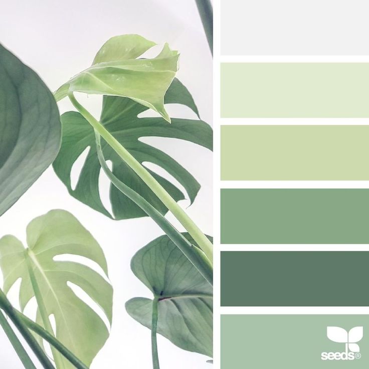
‘We love creating harmony through simplicity and rhythm in our planting,’ says designer Alistair W Baldwin . 'Repetition of color is a useful device to unify the garden and pull together a theme. The most simple and effective way to do this is by choosing one or two dominant colors. The trick to add that special wow is to plant colors in big loose blocks. It can be tempting to cram in more but try to keep things simple with a more subdued approach if you want to create a relaxing space. The fewer the colors, the more stylish the result.'
This south-facing border above uses a limited palette featuring the roses ‘Princess Anne’ (bottom left), ‘Young Lycidas’ (middle left) and ‘Harlow Carr’ (center) combined with perennials including Salvia ‘Amethyst’, Echinops ‘Veitch’s Blue’, Eryngium x tripartitum and Penstemon ‘Blackbird’.
Color changes through the garden
(Image credit: Dan Pearson Studio / Huw Morgan)
'In my garden, I have "color fields". It’s all one scheme, but as you move with the garden, you move into different areas where the color changes,' explains Dan Pearson .
'The center of the garden, which is the first that you enter when you come from the house, has the strongest colors; about 20 percent reds and 80 percent greens – it is pretty lively.
'I then replace the reds further into the garden with oranges, which allow me to leave the reds behind. Then the garden picks up through the oranges to dark reds, burgundies and browns. These allow me to move into purple and blue, which always have white in them to stop them from feeling heavy. You then have the softer, less demanding colors at the end of the garden and that includes smoky pinks.
'Your eye can travel through that because it's not demanding. Your eye wouldn’t be able to travel through that if it had the bright greens and reds at the end of the garden. You can stretch a yard by playing with a color like that,' he explains.
Make garden color schemes work for a contemporary look
(Image credit: Patricia Fox/Aralia Garden Design)
A garden color scheme in a modern setting can be anything you want it to be: have fun, break the rules and add some personality to your garden.
‘One of the things I love about using color in contemporary gardens is that there are no rules,’ says Patricia Fox of Aralia Garden Design . ‘There’s a real sense of freedom, which can lead to a truly innovative garden space.’
Simplicity is everything. Go minimal and choose just one flower or color as a highlighting touch, such as these bold orange flowers above which also complement the rusted look of Corten steel, pulling together the hard landscaping to create cohesive tropical garden ideas.
This courtyard features bold splashes of orange crocosmia against an evergreen backdrop of buxus and taxus hedging, with a theatrical green canopy of Dicksonian tree ferns overhead. A neutral hardscape of Corten steel arches, oak, reclaimed brick, sawn sandstone and cream canopies complements the look.
(Image credit: Jane Brockbank)
What colors go well together in a garden?
To work out which colors go well together in a garden, first decide on the mood you want to create for your garden color scheme.
‘Do you want it to be vibrant and energizing using bright and contrasting colors, or would you prefer a relaxing feel with a pastel-based color palette?’ says Sue Townsend .
Create a mood board of plants suited to your soil in the colors you like and note when they’re in flower. This allows you to see the effect of each of the plants next to each other before you take the plunge. Consider the color of the foliage of perennials, grasses or shrubs that add color to accentuate the plants beside them.
‘Drama can be ramped up in a garden when you put plants together that have close color associations,’ says designer Jane Brockbank . ‘Thinking more in terms of “pools” of warm or cool colors, put hot pinks/reds/magentas together or combine a palette of lilacs/blues/deep purples. There’s no such thing as clashing in my book!’
'Colors are often interesting when juxtaposed with the shade opposite on the color wheel. Orange, for instance, sits opposite purple, or bright magenta pink. You can get a wonderful burst of energy. To play with color and provide energy is a really interesting way of animating a garden,' says Dan Pearson.
(Image credit: Sue Townsend)
How do I plan a color scheme for my garden?
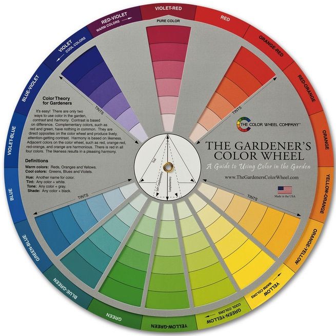
The color wheel provides a technical reference for organizing a garden color scheme, enabling us to make selections and contrasts so our color choices sing.
'Central to the color wheel are the bold and bright primaries red, yellow and blue,' says color expert Andrew Wilson FSGD and design consultant to McWilliam Studio and Director of London College of Garden Design.
'The use of these colors together in a planting scheme would prove lively but the real fun starts as we move away from primaries to mixing colors together. Our first stop is the secondaries or complementary colors opposite the primaries in the wheel. The use of red with green would be a good example as the combination makes the red more intense and the green brighter. The next group of colors are the tertiaries, which lie between the secondaries, for example warming up in the red spectrum.'
We often make predictable choices related to our preferences. If you want to be a little more experimental, start by placing a triangle on the color wheel so that each point sits on a color. 'First do the primaries, then move the triangle as if it were a dial – the points will sit on colors that will work together through contrast. These are color triads,' says Andrew Wilson. 'For the tetrads, place a square or a rectangle over the color wheel in the same way. The four corners will pick up colors that work together. Again, the square can be moved to change the color combinations.'
The properties of color are also important. Red is also known as an advancing color, noticeable and bold, suggestive of heat and energy in colors it permeates such as orange and magenta. Blue is a receding, cooler color creating depth and space in blues, blue-violet and blue-greens. Yellows are sunny and cheerful. Most are warm and pair well with reds and oranges. Greenish-yellows are cooler and suit more delicate combinations. Greens suggest calmness and freshness.
(Image credit: Jane Brockbank)
What colors look good with plants?
The colors that look good with plants – on house exteriors, paintwork, garden fence ideas and walls – really depend on the effect you want to create.
The most subtle way to choose colors that look good with plants is to rely on natural, local materials to show off your blooms, from natural stone to untreated timber. This will also help in creating a sustainable garden.
If you want to create drama, creating a backdrop that complements your planting will show it off to great effect. For example, cottage garden ideas can look beautiful against house colors that are sympathetic to the planting – think pastel blue, pink or yellow, for example.
Generally, greens aren't favored as a backdrop for planting, because they can look unnatural against the green of your foliage; however, harsher colors, such as grey, blue and even black can show off planting to great effect.
(Image credit: Andrew Wilson and Gavin McWilliam)
Can a garden be too colorful?
A garden can be too colorful if it contains too many contrasting colors. 'In terms of grouping or layering colors, it’s important that you have a degree of contrast, but not so much that it becomes distracting or confusing,' explains Dan Pearson.
Likewise, do not combine colors that might alter the mood of that area of the backyard. 'If you were making a blue garden, I wouldn’t allow it to contrast too readily with something like yellow because it would drain its energy and stop it from feeling tranquil. It’s a color that is influenced by light and the other colors that surround it. It’s a fragile color in a way,' he adds.
'It is often better to use pinpricks of color rather than big splashes.'
Lifestyle journalist Sarah Wilson has been writing about gardens since 2015. She's written for Gardeningetc.com, Livingetc, Homes & Gardens, Easy Gardens and Modern Gardens magazines. Her first job on glossy magazines was at Elle, during which time a visit to the legendary La Colombe d'Or in St-Paul-de-Vence led to an interest in all things gardening. Later as lifestyle editor at Country Homes & Interiors magazine the real pull was the run of captivating country gardens that were featured.
Simple Secrets for Creating Garden Color Schemes
32539 shares
Many beginner gardeners don’t think much about garden color schemes other than they want a lot of color — the more the better. Choosing too many colors for your garden can result in a wild mess that you likely won’t be happy with.
Luckily, working with garden color schemes is not as intimidating as you think. When you plan your home decor, you rely on color to tie your room together. When you get dressed in the morning, you pick your clothing based on color schemes.
Why do we treat our gardens so differently… combining colors together that we’d never put in our homes or on our bodies?
When deciding on a color scheme for your garden, take cues from your clothes and your home décor.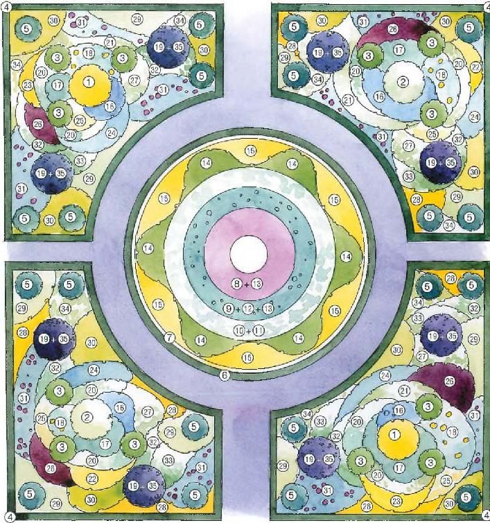 What colors do you like to wear or use when decorating? These are the colors that you’re drawn to and will give you a sense of what you may like in your garden, too!
Before we get “into the weeds,” I want to give you some quick wins if you’ve never even considered using a color scheme in your garden. It’s easy for me to say “choose a color scheme and stick with it.” But… I know it can be overwhelming to choose colors if you are a beginner gardener. So, here are some of my tips for selecting a garden color scheme:
- Decide on the energy of your garden: Depending on the color “temperature” the colors in your garden can evoke different energy. So, it’s important to first decide what type of feeling you want to convey with your garden.
- Do you want a garden that’s relaxing and calm? For peaceful gardens, you want to keep the color temperature cool and the contrast to a minimum. I’d recommend blue, purple, blue green and as a bonus… white!
- Do you want a garden that’s vibrant and energizing? For exciting gardens, keep the color temperature warm and amp up the contrast.
 I’d recommend red, orange and yellow and yellow-green.
- Choose ONE color at first: To get started, all you need to do is choose one single color — that’s it! Pick your favorite color and this will be the beginning of your color scheme! Keep it simple.
- Research native plants in this color: Next you’ll want to find some plants that have the color you’re focusing on. The garden planning worksheets in my Printable Garden Planner Kit are great for getting these ideas down onto paper.
- Choose a design style for your garden: Are you looking for a cottage, traditional or a modern garden style? Decide on the style that you’ll use to give you a better idea of how to arrange your plantings.
- Hone your garden over time: Once you get the base color, style and feeling in place, you can begin to incorporate more plant combinations, colors and focal points into your garden beds. Take it one step at a time!
Planning your color palette before you start choosing plants will save you a lot of headaches – and money buying the wrong plants. Think about your garden in terms of color schemes and plant combinations rather than quantity of colors. This is pretty easy to do once you learn a little bit about color theory and settle yourself into your chosen color scheme. This is done using the color wheel.
Understanding the Color WheelQuick Tip: If you are interested in learning more about creating a 4-season garden, check out my post about Landscape Layering.
Before your eyes roll back in your head or you click away from this page… try to bear with me. The color wheel is not that intimidating, I promise!
There are 12 colors on the basic color wheel and these are divided into 3 primary colors, 3 secondary colors and 6 tertiary, or intermediate, colors.
The three primary colors are red, blue and yellow. Each and every OTHER color on the color wheel is created from mixing these colors together. This means that if you had only red, blue and yellow tubes of paint, you would be able to mix those colors together to make the other 9 colors. In fact, combining the 3 primary colors in addition to black and white (as tints) is how every other color in the world is created!
Secondary ColorsMixing two of the three primary colors together in 50/50 combinations creates the three secondary colors of the color wheel:
- Red + Blue = Purple
- Red + Yellow = Orange
- Blue + Yellow = Green
Furthermore, a 50/50 combination of a primary color with its neighboring secondary color will create tertiary colors (also called intermediate). These make up the final 6 colors we’ll be talking about:
- Red + Orange = Vermillion (Red-Orange)
- Red + Purple = Magenta (Red-Purple)
- Blue + Purple = Violet (Blue-Purple)
- Blue + Green = Teal (Blue-Green)
- Yellow + Orange = Amber (Yellow-Orange)
- Yellow + Green = Chartreuse (Yellow-Green)
What Blooms with What?
Never know what to plant together? Find out with this FREE Plant Pairing Guide and become a pro at combining plants for the best garden design possible!
First Name
Email Address
We use this field to detect spam bots. If you fill this in, you will be marked as a spammer.
With just a little bit of knowledge of how the color wheel works, you can use it to create amazing garden color schemes. Let me show you how!
Garden color schemes and how to use themIf you’re following along, you’ve already chosen the “main” color for your garden color scheme. Using what you know about the color wheel, you can start to hone that single color into a beautiful palette. There’s no rush here! Starting with just one single color is totally ok at first.
Using the color wheel, you are able to create all different kinds of garden color schemes that will evoke different types of moods. The three types of color schemes I’m going to cover are:
- Analogous: three colors next to each other on the color wheel
- Complementary: two colors opposite each other on the color wheel
- Complex: a set of analogous colors plus the complimentary color opposite them on the color wheel.
 Basically, combine the two together 🙂
Analogous color schemes use colors that are right next to each other on the color wheel in groups of 3’s. Because there isn’t too much contrast between the three colors, they sort of just “blend” together in a really harmonious way. It’s very pleasing to the eye (and easy to do)!
Analogous (Blue, Violet and Purple) Asters – Image CreditThe photo above is a great example of an analogous color scheme.
If you use violet as your primary garden color, add to it various shades of purple flowers and blue flowers. When you combine purples and blues in the garden, you get a harmonious, analogous color scheme that works every time.
Complementary Color SchemesOn the color wheel, each primary color will be directly across from a secondary color. These “opposites” are called complementary colors. The way my high school art teacher explained this to me is that complementary colors, when placed right next to each other, make each color appear its most vibrant and bright. Complementary colors are great for adding a “pop” to your garden. Here are some examples of vibrant, exciting complimentary garden color schemes:
Yellow + Purple
Complimentary (Yellow and Purple) garden color scheme Image CreditA complimentary color scheme of purple and yellow is a very easy combination to try in the garden. There are so many plant choices in this range. And, these opposite colors really pop against each other.
Try the yellow ‘Moonshine’ yarrow (zones 3-9) combined with catmint (zones 3-9) and ‘Blue Queen’ salvia (zones 5-9).
Orange + Blue
Complimentary (Blue and Orange) garden color scheme with tulips and forget-me-nots.Combining blue and orange in the garden is a vibrant and unique complimentary color scheme that will take people’s breath away. Although it’s more difficult to find true blue flowers to contrast with orange, the results are well-worth the effort for this stand out display.
Create this blue-orange complimentary color scheme at home by combining the beautiful ‘Orange Emperor’ tulip (zones 3-8) with blue forgot-me-nots (zones 5-9) for a high impact combination.
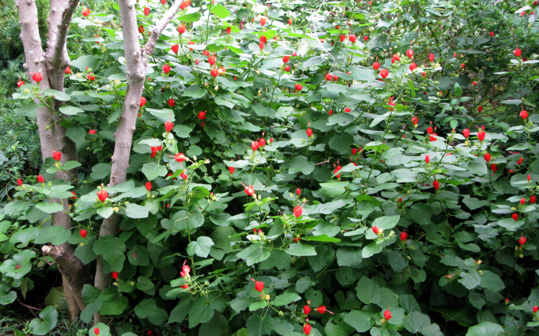
Red + Green
Complimentary (Red and Green) garden color scheme – Image CreditSince foliage is green, a red-green complimentary color scheme is one of the easiest to pull off. A lush mix of green leafed plants is the perfect backdrop to set red blooming plants on fire. Red will always look its most intense grown against it’s opposite: green.
Try it at home by combining ‘Tiny Tim’ euphorbia (zones 6-8) and ‘Red Emperor’ or ‘Madame Lefeber’ tulips (zones 3-8). You can also swap the tulips for some beautiful red roses.
Quick Tip: If you’re enjoying these color combinations, check out my post about how to combine plants in your garden.
What Blooms with What?
Never know what to plant together? Find out with this FREE Plant Pairing Guide and become a pro at combining plants for the best garden design possible!
First Name
Email Address
We use this field to detect spam bots. If you fill this in, you will be marked as a spammer.
Complex garden color schemes are the most, well, complex of the schemes. Basically, we’re combining the first two garden color schemes together! Yay, more color! This color scheme lets you use a wider range of colors without creating chaos.
Despite being complex, this is the most popular of the garden color schemes! It literally is the difference between professionally designed gardens and ones that look amateurish. If you can edit down your wild and crazy color scheme to a complex color scheme, you will notice such a huge change in the harmony of your landscape. It’s the “little” tweak that makes all the difference!
A complex complimentary color scheme consists of 3 colors next to each other on the color wheel (analogous) contrasted with the color opposite them (compliment). This amazing color scheme combines the harmony of similar colors with the pop and excitement of their complete opposite. For example, combine blue, violet & purple with their complimentary color: amber.
Ready for my favorite complex color scheme?
Blue + Violet + Purple + Amber
Complex (Blue, Violet, Purple and Amber) Garden Color Scheme – Image CreditWhat a stunning combination this makes. Keep most of your plantings in the blue and purple color range. For a fiery pop of interest, add in the amber (yellow-orange) here and there!
To try this one at home, combine ‘Holland Sensation’ Allium (Zones 4-8), ‘Bowles’ Mauve’ Erysimum Wallflower (Zones 6-9) and Campanula Bellflower (Zones 5-8).
Using white in the garden
You may have noticed that white isn’t on the color wheel. So, you’re probably wondering how white plays into these color scheme concepts. You can use white to highlight focal points at the end of a path, too. I’ve seen a lot of really beautiful gardens that just use white blooms and that’s it. Using *just* white and no color is a very popular practice in “traditional” style gardens.
White is actually the absence of color, which means that you can use it with almost any color scheme. What makes white so diverse is that it brings out the true hue of any color that you pair it with. So, if you place a white flower next to green and it takes on a greenish tinge. The same thing happens with yellow, pink or blue. On it’s own, white would be be placed in the “cool” color temperature category. But, if it’s paired with a warmer color, it can take on the warmer tones, too.
Wrapping upThis article really covered a lot about garden color schemes and color theory. Using the color wheel you can see how primary, secondary and tertiary colors relate to one another.
Choosing a garden color scheme means using these colors in a controlled way in your landscape. You can plan a complementary, analogous or complex color scheme depending on the feelings you want to evoke in your garden.
If you’re having trouble deciding which colors to use, look to your wardrobe for cues. Choose a single color to base your garden design from.
Then, choose the feeling of your garden (peaceful vs. energetic) and decide on a style like cottage, traditional or modern. Over time you can build on your garden color scheme, but in the beginning keeping it simple is the best option.
Now that you have color theory and some garden color scheme examples, you should be well on your way to choosing a great color scheme for your own landscape.
To learn more about landscape gardening, you may like my post about Landscape Layering, the Garden Planting Pyramid or How to get started landscaping your yard.
Comment below and let me know what colors are in your garden. Did you follow color theory to decide on your garden color schemes or do you just go with your gut?
More Gardening Posts
- 13 Pro Tips for a Low Maintenance Landscape (+Mistakes to Avoid)
Whether you’re trying to transition your garden into less work, or you’re starting from scratch and you want to start off on the right foot, these tips for a low maintenance garden will help you do just that.

- 5 Tips for Drawing a Killer Garden Plan, Even if You’re Not a Designer
These 5 steps will take you through the process of drawing a simple garden plan for your home landscape. Learn my simple process for drawing your own garden plan that’s uniquely you.
- This Blocking Method Will Have You Drawing Pro Garden Plans in No Time
If you’re struggling to arrange plants, try the blocking method. This is a way to draw your garden plans using a series of shapes and repeating patterns. It’s really fun, too!
What Blooms with What?
Never know what to plant together? Find out with this FREE Plant Pairing Guide and become a pro at combining plants for the best garden design possible!
First Name
Email Address
We use this field to detect spam bots. If you fill this in, you will be marked as a spammer.
Powered by ConvertKit32539 shares
Perfect colors for your garden
Color is one of the main tools of landscape design. The color palette helps to emphasize the advantages and hide the imperfections of the site, and also sets the tone for the overall mood of the garden. Creating a luxurious flower garden is much easier than it seems at first glance.
Obviously, the main task of a flower garden is to please its owner. However, at the same time, one must not forget about some other nuances, for example, the requirements of plants for agricultural technology, the orientation of the garden to the cardinal points, insolation of the site and the timing of flowering crops. In order to unravel all the secrets of landscape design, you will need more than one year, but you can start working on creating a bright dream garden right now, including with the help of our life hacks. nine0003
"Illuminate" the shadow area
If you are faced with the task of arranging a flower garden that is in the shade for most of the day, be sure to plant plants with pale pink, pale blue, lavender, light yellow or white flowers (astilba, Siberian iris, kupena, begonia, tiarka, etc. ).
).
An excellent solution is to use ornamental crops with light foliage that will contrast with the dark green of the background. Note that shrubs and herbaceous perennials with dark purple, green-blue, and dark green foliage in a shady corner of the garden will quickly get lost and begin to create unnecessary darkening. nine0003
If you really want to plant some dark plants, be sure to surround them with light elements, such as decorative mulch or low annuals with light flowers.
Avoid too colorful compositions
Too many colors on one spot will not allow you to create a complete composition, because. there will be nothing to catch the eye. To make the overall picture look solid, try not to use more than three or four shades of a different spectrum. Otherwise, instead of a flower garden organically integrated into the landscape, you risk getting a color spot that cuts your eyes. Start with simple two- or three-color solutions so that your garden doesn't look too gaudy and gaudy. nine0023
Use color wheel
The color wheel is a schematic representation of all colors in the visible spectrum. It is she who helps artists and designers to select the optimal color solutions. If you want to arrange a spectacular flower garden on your site, be sure to check out the basic color combination options on the color wheel. Conventionally, they can be divided into three large groups:
Harmonious - colors are neighbors on the color wheel. Their combination helps to visually expand the space. nine0003
Contrasting are color combinations that are on opposite sides of the circle. Such flower beds look impressive and extravagant.
Monochrome flower beds are compositions that use different shades of the same color. When arranging a single-color flower bed, it should be remembered that the main role in such flower beds is not played by color, but by shape and texture.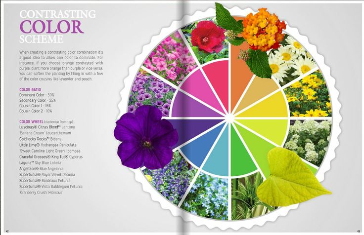
If you have a question about any combination, be sure to check the color wheel! nine0003
Repeat accent spots
Just because you love a certain bright color, but you know that its abundance will look out of place, this does not mean that you have to give it up. Try to develop a color scheme where your "favorite" would be duplicated. By creating bright accents on different plans of the composition, you will combine it with one color, make it more harmonious and complete.
Build color tiers
nine0003
The combination of plants of different heights looks very impressive, because this is how the plant communities that have developed in natural conditions are located. If you want to add depth to your garden, try layering not only by the height of the plants, but also by their color. By planting decorative crops of different heights, you can set the "relief" of the composition. If you make these tiers also different in color, then the picture will become more convex.
Choose your color for every season
If you are not too fond of monotony or you are faced with the task of arranging several small flower beds at once, which would not intersect with each other, try to recreate one or more "seasonal" flower beds. For example, on the "spring" plant plants with flowers of delicate shades (pink, blue, lavender, etc.). On the "summer" place varieties with flowers of saturated colors. In the "autumn" flower bed, plant plants with yellow and orange buds. nine0003
Do not use bright colors in a small garden
Blood reds, sunny yellows, oranges and purples are instantly eye-catching. However, at the same time, saturated colors tend to visually reduce the space, so for arranging small areas it would be better to opt for softer pastel shades.
Plants with soft pink, lavender or peach flowers look great in shady and secluded corners of the garden. They make the space look bigger and wider. nine0003
Look for color combinations in nature
If you think about it, then the most successful color combinations are suggested by nature itself.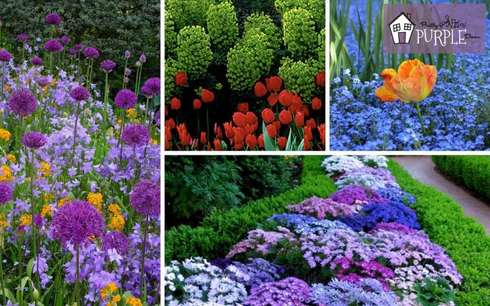 For example, a spectacular combination of yellow and purple can be seen in many plants, such as pansies, crocuses, irises. Daisies and daffodils show us the winning combination of white and yellow. Combinations of yellow and orange or red look very organic in marigolds, gazanias, nasturtiums.
The following color combinations look very stylish: yellow and blue, yellow and purple, pale yellow or lemon yellow and lavender, red and yellow, green and white, orange and purple, blue and pink.
Use the space outside the site
When choosing colors for their garden, many gardeners forget about the background. At the same time, it is important to pay attention not only to the fences and buildings that are located on your site. Be sure to take into account the color scheme of territories that are outside the zone of your "jurisdiction". A collective farm field, a neighbor's garage or a birch growing near a fire pond - all this should be taken into account when designing your own site. nine0003
If you want your garden to turn into a flower garden from the cover, be sure to take into account the agrotechnical features of crops and think over color schemes.
Garden color solutions
Category: Landscape design
Garden color solutions
The role of color in landscape design is no less important than in home interior decor. When color is out of place, visual disharmony and chaos ensue. The right use of color can enhance and bring life to even the simplest design. nine0003
To effectively manage color in landscape design, some basic knowledge of color theory is needed. There is a difference between primary, secondary and tertiary colors. Also available in neutral colors.
Primary colors include red, blue and yellow. Secondary - green, purple, lilac and orange. In third place are mixtures of primary and secondary tones. Neutral colors include white, all shades of gray and silver. It must be taken into account that black in landscape design is not a color. It is the absence of color. nine0003
Harmonious combination of colors occurs when they are used properly. To achieve this, you need to study combinations and work with those tones that get along well with each other.
Choose colors that reflect the purpose of the landscape design. For example, if a recreation area is created, it is necessary that green prevail with an admixture of purple or pink flowers. If the goal is to design the active zone, it is better to use red, yellow and orange. For variety and depth, you can mix neutral tones - white or gray with primary or secondary colors, and use tertiary colors to connect between them. nine0003
Garden plants must be chosen carefully. Seasonal colors need to be taken into account - the timing of the flowering of some plants and the way others change their foliage color depending on the season.
If your garden is not very large, it makes sense to be careful about warm colors in landscape design. Too bright colors produce a shocking effect. And cold tones will give the feeling that your garden is larger than it really is.
In order for the garden to please its owner with many colors in the spring season, it is best to plant plants that are actively blooming at this time of the year. You need to worry about this in advance, for example, the previous autumn. Bulbous plants are well suited for this - daffodils, tulips and hyacinths. There are many such plants, but these flowers are the most colorful. You can achieve a stunning visual effect if you plant several bulbs of the same plant together. With their help, designers create interesting ornaments. nine0003
Daffodils come in many colors, but mostly they grow yellow. But you can choose any shade of yellow - from bright saturated to cream.
Tulips are also distinguished by a variety of colors, more than daffodils. You can choose shades of pink, purple, white and yellow. These are the most common colors. The buds themselves are very large and very small, like wild flowers.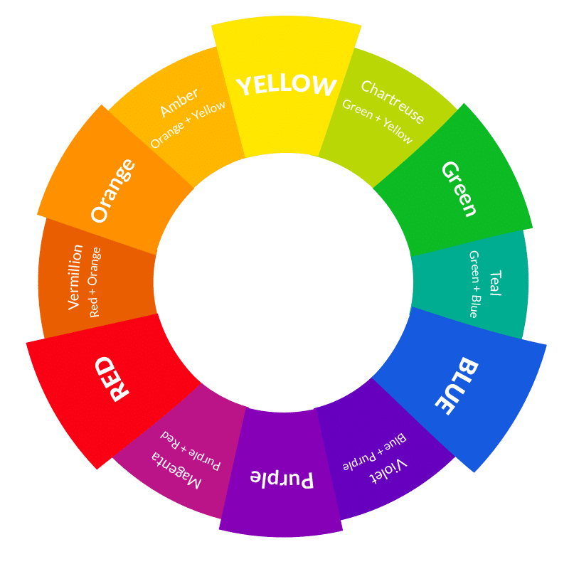
Bush hyacinth has very small white or purple flowers. They are best planted in groups to decorate a flower bed or lawn. They look great against the background of greenery. Common hyacinths are larger and their color range is very wide. nine0003
Trees that bloom in early spring really enliven the design of the garden at this time, when the eye is tired of black and white winter colors. Cherry trees, dogwood, magnolia are very suitable for these purposes. Some varieties are hardier than others, so choose trees that will do well in your climate.
There are flowering shrubs that add color to landscaping in late spring. Lilac, viburnum and rhododendron are the best choice. These shrubs provide a wide field of activity for the color scheme of the garden, because they represent the entire required palette. Japanese andromeda and mountain laurel are also lovely plants with rich colors. It is better to plant trees that have light flowers. Spring design should be airy. nine0003
When it comes to autumn colours, the opposite is true.