Color matching for rooms
Color combinations for rooms: how to pick color pairings
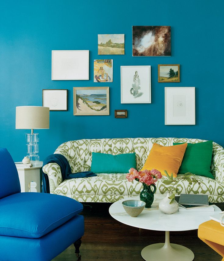
(Image credit: Kit Kemp/Firmdale Hotels)
Getting complementary color combinations spot on isn’t always simple. Here, design experts tell us their favorite no-fail, classic and brave color pairings, plus trends for the year ahead.
Now no longer a place just to relax and unwind, paint ideas for every room need to adapt to become multitasking spaces in the ‘new normal’, incorporating areas where we can work, rest and play.
As a result, our decor needs to reflect this new flexibility, while also embracing a look that we won’t tire of too quickly.
Color combinations for rooms
We’ve asked a panel of industry experts for their views on what color combinations work well together for them – using a color wheel will help you get it right.
1. Green and blue
(Image credit: Tricia Guild )
Looking to combine green room ideas with blue room ideas? Why not use them as a color combination?
‘People feel nervous about teaming blue and green, but I believe it’s a quintessential pairing,' says Tricia Guild OBE, founder and creative director, Designers Guild .
'Just imagine the landscape – the endless blue optimism of a sky against a green and pleasant land. It’s a classic combination that evokes familiarity and comfort. Make it more dynamic by using glamorous fabrics, such as our Varanasi printed silk taffeta.’
2. Neutrals and bolds
(Image credit: Sanderson/ One Sixty collection )
Neutral room ideas can be maximalist, too. But where to start?
‘Pick one color as a foundation – from a favorite artwork, image or piece of clothing – to form the thread that runs through the space. Build your palette around this with complementary or tonal shades,' says Charlotte Archer, head of brand, Sanderson .
'My number one rule is: decorate for yourself, not others – choose tones that you love and you won’t go wrong.’
3. Orange and green
(Image credit: Kit Kemp/Firmdale Hotels)
Orange is a color that many of us shy away from – but Kit Kemp shows how it can work, beautifully.
‘In this suite at the Crosby Street Hotel, against the orange fabric-covered walls, I used my Friendly Folk design in Melon Orange for the curtains and cushions and in Basil Green on the chairs,' says Kit Kemp, founder, Firmdale Hotels .
'Combined with Lewis & Wood’s tribal in Limpopo on the sofas this playful reverse color combination adds freshness to the warm room. A solid orange trim on the curtains and cushions helps to frame the fabric and create a sense of harmony.’
4. Brown and white
(Image credit: Future/Paul Massey)
The words 'brown living room ideas' don't necessarily conjure up an appealing image – but they can be incredibly welcoming and quite beautiful.
‘The color pairing I keep returning to is multiple shades of brown and white. It is very important to use layers of the same combination to create contrast, depth and the feel of a well lived-in space,' says Paolo Moschino, co-owner, Nicholas Haslam .
'I admire the American designer Bill Blass and his brown and white apartment in New York has been my number one inspiration for many years.’
5. Yellow and green
(Image credit: Farrow & Ball)
Some design experts are urging us to be bold with colors in the year ahead.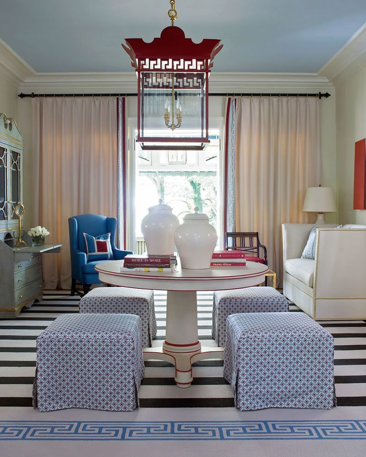
‘As we move into thinking about pairing colors into and beyond 2022, I feel we might look beyond the nostalgic tones of the past year and be attracted to colors that are full of excitement, but somehow familiar,' says Joa Studholme, color curator, Farrow & Ball .
'I am keen to use more homely, uncomplicated colors that are full of memories. The combination of India Yellow with Green Smoke epitomises the feeling of optimism so crucial to our homes next year.’
6. Navy and earthy accents
(Image credit: Mikel Welch )
Want a dramatic room scheme that feels elegant, too?
‘When picking the perfect paint color, I’m typically on board for moody hues of navy, grey or noir. I love the warm, cozy vibes that darker tones lend to a space. Next, I layer in natural earthy accents such as terracotta, stone, putty and grey-beige,' says Mikel Welch, owner Mikel Welch design agency.
'Don’t be afraid to walk over to the dark side… just don’t forget your complementary earthy tones. ’
’
7. Earthy naturals
(Image credit: Elicyon/Patrick Williamson)
‘Scale really drives how diverse you can be with color pairings: larger homes can take a looser palette; in smaller homes, it’s best to keep the colors more concise – find three colors that harmonize and use them as a common thread for continuity,' says Charu Gandhi, founder and director, Elicyon .
'I enjoy using ivory, egg-yolk yellows and hints of navy, mixed with copper and metal accents. Old rose pink, nude and orangey tones is also a nice palette – the combination of dull shades creates a calm but sumptuous aesthetic. We are also using pastel lilac with thistle green and soft amber, which gives a pleasing visual sense.’
8. Blue and red
(Image credit: GP & J Baker)
If it's a timeless appeal you are looking for, return to red and blue.
'A classic yet enduring color combination that I love is denim blue paired with aged antique red colors. These colors combine to create rooms that appear effortless and stylish, offering comfort and embracing the trend for relaxed living,' says Ann Grafton, creative director, GP & J Baker .
'Our latest collection Portobello combines these classic colors in a curated edit of several, simple Indienne-inspired block prints and softly colored embroideries to create fabrics that are perfectly suited to interiors that are layered and reflect the spirit of timelessness.'
9. Green and pink
Styling: Claudia Bryant
(Image credit: Polly Wreford / Claudia Bryant)
Want to impart a summery impression, year round?
‘Green and pink always feel like such a joyful combination to me, reminiscent of the abundance of florals and botanicals in nature as spring turns to summer. I like to keep it feeling fresh and clean with a good dose of white in the mix,’ says Emma Thomas, Homes & Gardens’ interiors editor.
10. Pastels and strong colors
Geraldine Tan's living room
(Image credit: Geraldine Tan )
Creating a surprise with pastels and deeper shades can work brilliantly if done right.
'I firmly believe that any color pairing can work, it is all a matter of introducing an element of separation,' says Dr Geraldine Tan, creator interiors blog Little Big Bell and one of the founding contributors to Instagram’s @design account.
'So what might traditionally be a color clash – really light pastel hues in accessories against a super dark wall color, for example – can work if separated by neutral tones. This, to me, is very important when you decorate with color, and creates a more restful space.'
What two colors go well together for a room?
There is an endless variety of color combinations that go well together, but at the moment, natural shades matched together are very on trend.
‘The colors of nature, such as earthy beige and warm clay and all shades of green have been a firm favourite for the last seasons,’ says Judy Smith, Crown Color Consultant.
‘Over the past few months, nature has become even more important. The outdoors has been an escape, somewhere to go to recharge our batteries or even just take a break from everything. We now want to channel that feeling in our home too, with warm, cozy shades inspired by the natural world.’
Joa Studholme, Color Curator at Farrow & Ball approves.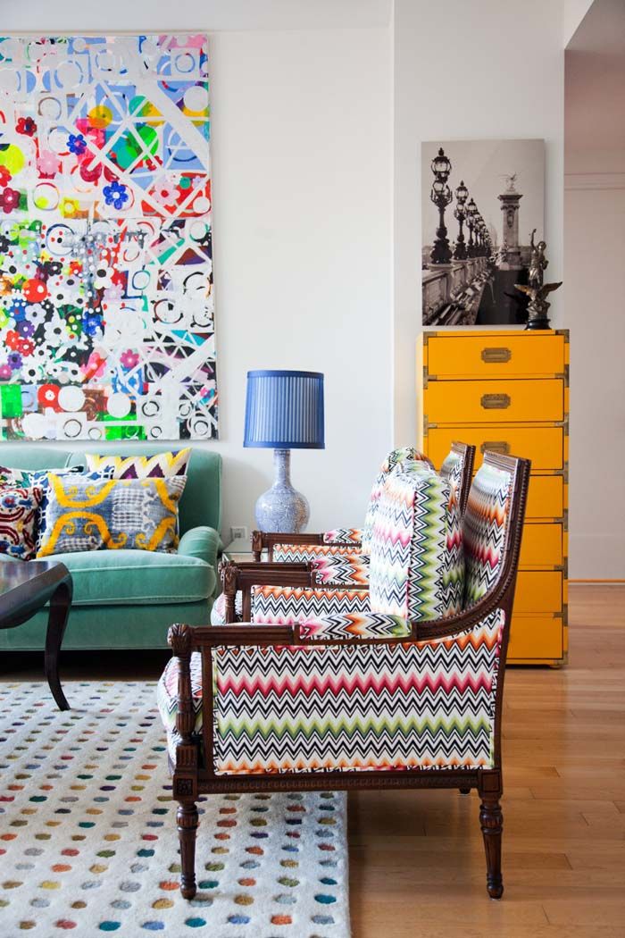 ‘Uncomplicated shades of blue feel familiar, like memories from our childhood, so they have a soothing effect in the home despite their cooler undertones.’
Lucy Searle has written about interiors, property and gardens since 1990, working her way around the interiors departments of women's magazines before switching to interiors-only titles in the mid-nineties. She was Associate Editor on Ideal Home, and Launch Editor of 4Homes magazine, before moving into digital in 2007, launching Channel 4's flagship website, Channel4.com/4homes. In 2018, Lucy took on the role of Global Editor in Chief for Realhomes.com, taking the site from a small magazine add-on to a global success. She was asked to repeat that success at Homes & Gardens, where she has also taken on the editorship of the magazine.
30+ Best New Color Combinations
Read McKendree
1 of 35
Blue + Brown
Chocolate brown and blue is always a win, but this foyer designed by Elizabeth Roberts is making it look even better than usual.
Tria Giovan
2 of 35
Marigold + Cream
White and yellow can be almost too cheerful—this cream and marigold combination is softer and a little more mellow as a result, though it still boasts that signature energy you'd expect from a yellow backdrop.
Roland Bello
3 of 35
Lime Green + Dark Blue
Dark blue wallpaper, black lacquer moldings, and a moody buffet bring depth and texture to the Miles Redd-designed room while the white marble table and lime green upholstered dining chairs ensure levity.
Nicole Franzen
4 of 35
Peach + Cream + Chrome
This eclectic contemporary living room is understated and visually soothing, but if you take a closer look, there are plenty of bold style statements. Part of this is thanks to the neutral yet unique color scheme.
George Ross
5 of 35
Ruby + Ink
Birgette Pearce designed a hidden pantry to keep stored items discrete behind inky sliding doors with textured glass—but once open, the pocket doors reveal a bright red surprise.
Stephen Kent Johnson
6 of 35
Turquoise + White + Warm Wood
A custom turquoise velvet banquette in this contemporary California dining nook designed by Studio Shamshiri is just the right dose color.
Mali Azima
7 of 35
Melanie Turner makes a strong case for monochromatic decorating with this soothing green sitting room. The brass accents, burled wood table, and brown marble fireplace facade spice things up.
Ngoc Minh Ngo
8 of 35
Amethyst + Scarlet
The velvet-covered banquette serves as plush seating at the dining table, draped in purple burlap from Elegant Fabrics. Designer David Kaihoi's three-year-old daughter sits in the red Tripp Trapp high chair by Stokke in the New York City apartment.
Shade Degges
9 of 35
Bubblegum Pink + Greige
Designed by Jae Joo, this timeless living room is both peaceful and inspiring, perfect for unwinding, socializing, studying, or more. Bubblegum pink arm chairs with a wood frame are a breath of fresh air and the greige walls add more intrigue and sophistication than a simple bright white color would.
Thomas Loof
10 of 35
Yellow + Turquoise
The tight prints and splashes of red help marry the playful yellow and turquoise lacquer paints in this wide-open landing that Kati Curtis transformed into a jewel box of a reading nook.
Jonny Valiant
11 of 35
Green Tea + Dusty Brown
To bring a feeling of nature into a New York living room, designer Fawn Galli used a custom minty green: "I don't think a color should be too saturated or strong on a wall." Pal + Smith chairs upholstered in Safari by Manuel Canovas, a Paley sofa from Profiles, a Fiona Curran Palette carpet for the Rug Company, and a painting by Anne Siems give the room "a sense of storybook fantasy."
Heidi Caillier Design
12 of 35
Army Green + Burnt Orange
Army green and burnt orange are great for anyone who is typically color averse but wants to experiment a bit with less neutral tones.
William Abranowicz
13 of 35
Tangerine + Dark Stone
If you have a little alcove on your porch or a built-in cabana on a pool deck, make it cozy and outdoor-friendly with the right mix of materials. John Houshman added cushions and a rug to soften things up.
Noe DeWitt
14 of 35
Sage + Aqua + Rattan
A super warm, almost golden material like rattan will balance out a cooler sage and aqua color combination. It's perfect for a tropical location—or anywhere you want to channel a vacation vibe. Add some brass for good measure, as Pheobe Howard did here.
AMY NEUNSINGER
15 of 35
Big Apple Red + Dusty Blue
A different shade of red and an extra dose of gold give the above color combination a different spin that we love equally as much. Some warmer neutrals and a contrasting statement bolster pillow upholstered in dusty blue balance it all out.
Kendall McCaugherty
16 of 35
Peach + Black + Pink
Black and cream calm pieces down the various shades of pink in this great room designed by Bruce Fox. The lighting casts a golden glow over the whole room.
Paul Raeside
17 of 35
Gray-Blue + Black
Give yourself something inspiring to look up at when you're getting ready to dream during a nap or while you ponder your reading material. to look at Artist Rajiv Surendra embellished the black chalkboard paint walls and ceiling in this Montreal writing room to mimic elaborate moldings. It feels fresh and modern, but also classic.
Roland Bello
18 of 35
Raspberry + Sky Blue
A classic wall mural gets a burst of contemporary energy with deep pink lampshades and a pinstriped sofa in this sitting room corner designed by Miles Redd.
Emily Minton Redfield
19 of 35
Cherry + Brass
Cherry red walls with a high-gloss finish and brass accents bring maximum luxury to this tea room designed by Marie Flanigan for House Beautiful's Whole Home in Denver. It's perfect for a much-needed quiet moment for one.
Karyn Millet
20 of 35
Orange Cream + Deep Teal
Designer Celerie Kemble let her daughter pick the color scheme for this room in their Manhattan apartment. The orange cream walls paired with the deep teal carpeting and accents breeds a lively atmosphere.
Werner Straube
21 of 35
Sapphire + Mustard
The color-drenched "flex room" in a Michigan house designed by Corey Damen Jenkins is a fun place for kids to do homework or for the grown-ups to have after-dinner drinks. The lacquered walls are actually a Philip Jeffries wallcovering.
Reid Rolls
22 of 35
Aqua + Raspberry
Nick Olsen used look-at-me shades of pink and blue to cover every inch of a girl's bedroom—check out the Christopher Farr Cloth wallpaper on the ceiling!
David A. Land
23 of 35
Tangerine + Olive
Olive-painted trim on walls papered in a bright orange pattern? It doesn't sound like it should work, but this dining room—designed by Chenault James for House Beautiful's Whole Home in Nashville—is proof that it definitely does.
TRIA GIOVAN
24 of 35
Pistachio + Periwinkle
This sweet concoction of a living room, designed by Amanda Lindroth, provides irrefutable proof that opposites attract. She had the Quadrille fabric on the sofas printed in a custom color combination to tie the two hues together,
Jane Beiles
25 of 35
Royal Blue + Orchid
“Nothing matches, but it all works together,” says designer Charlotte Barnes of the bright blue kitchen in a family's South Carolina vacation house. Her go-to shade? Farrow & Ball's Hague Blue.
Thomas Loof
26 of 35
Blush + Mahogany
Matthew Carter used pale pink walls—painted in Benjamin Moore’s Precocious—as a backdrop for antique wood furniture in a Bahamas vacation home.
David A. Land
27 of 35
Iris + Crimson
Feeling bold? With its purple ceiling (Delicate Petal by Pratt & Lambert) and red walls (Red Statement, also Pratt & Lambert), the living room of Katie Brown's Connecticut house is a showstopper.
CHRISTOPHER DELANEY
28 of 35
Fuchsia + Robin's Egg Blue
Kristen McCory used a few coats of saturated pink paint—inspired by her client's grandmother's lipstick—to turn a hand-me-down secretary into a showstopping focal point for an upstairs hallway clad in pale blue wallpaper.
Douglas Friedman
29 of 35
Yellow + White
The vibrant yellow-and-white Clarence House wallpaper in this breakfast nook designed by Krista Ewart ensures a bright start to the day. "The yellow is so fresh and sunny, and the room goes a little retro with the white Chinese Chippendale chairs and the black painted floor," she says.
Luke White
30 of 35
Teal + Brick
“Saturated colors balance the strength of the architecture,” says Janie Molster of this 1700s Virginia study where red curtains hang from walls in Benjamin Moore's Mill Spring Blue.
The combination of colors in the interior - how to combine colors, examples from the photo
The walls are the background that sets the atmosphere of the house, so the choice of color is a responsible matter. Repainting / regluing is a rather laborious and not very pleasant process. Therefore, many fears and doubts are born. What if the interior is too dark/cold/bright/sterile?
As a result, most people settle for the most "safe" and proven option. Most often it is “beige” (What? Warm color, goes with everything). How to stop being afraid of color and how to make a beautiful interior in your favorite colors? What are the rules for color combinations? Let's figure it out. Color will help us.
A bit of theory
The color wheel model, designed by the Swiss artist Johannes Itten, will be an excellent cheat sheet in the selection of a harmonious color solution. The Itten circle consists of 12 parts. This is a table of three primary colors (red, yellow, blue), three additional (composite) colors, which are formed by mixing the primary (green, purple, orange) and six tertiary colors, which are formed by combining the primary with additional ones. All colors can be divided into cold and warm.
Neutral colors (black, white, gray, ivory, brown, beige) are included in a separate category. They go well with other colors from the circle, as well as with each other. Use them as a background for other colors (for example, you can make walls in neutral shades, but bring color into the interior with furniture, textiles or bright posters) or add accessories in neutral tones to “dilute” the main color a little.
How does it work?
It's very simple. There are only six canonical schemes (selections) of color combinations in the interior. Let's look at them with examples.
1. Analog triad
This is the simplest and "safest" option. 3 consecutive colors are taken from the palette. Use shades of these colors in interior design and you are guaranteed a calm, beautiful interior.
2. Complimentary combination
Complementary colors are colors that are at diametrically opposite ends of the circle. One of the colors will be the main, contrasting color, you can emphasize the details of the interior. If you are afraid that it will be too bright, dilute the room with neutral colors to a level that is comfortable for you personally.
3. Contrasting triad
It looks like a complementary combination, only two neighboring sectors are added to one of the colors. Decorate the apartment in these colors, and leave the contrast for small interesting details. Or, on the contrary, make one color the main one, and use the other two, closer ones, for accents.
4. Classical triad
This is a more complicated version. A combination of three colors equidistant on a circle. Here, one color is usually taken as the basis. The other two are used for accents. If you are afraid that it will come out too colorful, dilute it with neutral colors “to taste”.
5. Rectangular/square pattern
Use two pairs of contrasting colors. It is important not to overdo it, otherwise the interior may turn out to be colorful. It would be more correct to choose one main color and three additional ones.
The square scheme is a variation of the rectangular scheme, but the colors used in it are located in a circle at an equal distance from each other.
This scheme is not for everyone. Interiors with a large number of colors are bright, interesting, but eventually tiring. This approach is a good way to design oriental or boho style interiors.
Could it be easier?
Possible. If combinations from the circle are still intimidating, the easiest and safest option is to choose one color and combine it with neutral companions.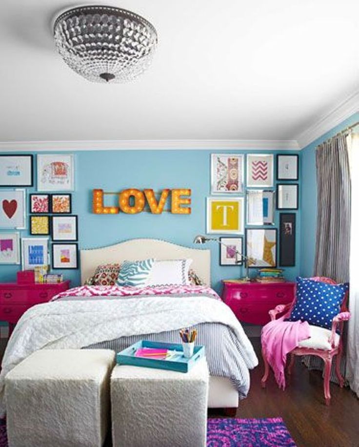 It will turn out simple, stylish, minimalistic and modern.
Dark-light
We finally decided on the colors. But how to choose the right tone? Dark? Light coloured? And how to combine them? Shade compatibility depends on the task.
You can, for example, take selected colors of very light tones. The interior will be light and delicate. This is a great solution for children's design.
And you can use the most saturated colors. This will make the room bright, atmospheric, inspiring and energizing, so this option is not very suitable for the bedroom. There it is better to use more calm tones.
And you can take one or more soft shades and one - saturated. Colors "work" together, complementing and emphasizing each other. Against the background of delicate pastel colors, a bright color will sound in a completely new way. Try it!
Color combination in the kitchen
Warm colors are best for the kitchen. For example, orange, yellow and red - they improve mood and improve appetite. They can be used as an accent on one of the walls, an apron, and also on appliances, furniture and accessories. Neutral white, beige, gray and black work well as companions for such bright, cheerful shades.
If the kitchen windows face south, it is better to refuse too warm tones, as they increase the feeling of heat and stuffiness. Pay attention to the no less winning combination of brown and green. It creates a cozy atmosphere and makes us a little closer to nature.
The combination of colors in the bedroom
The color scheme of the bedroom should help you relax and sleep sweetly after a hard day. Pastel colors are the best. Pay attention to such colors as milky, gray, sand, chocolate, gold, delicate lilac, blue, pink and turquoise, which can be harmoniously combined with each other.
Bathroom color combination
The bathroom is where we start and end our day.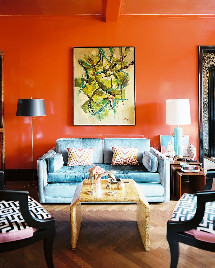 Here it is important to find a balance and choose a color scheme that will invigorate and delight in the morning, and relax and soothe in the evening. The most popular solutions are: white with blue or blue, white with beige and gray, white with chocolate. But it is better to avoid green - in the bathroom it will be associated with mold and dampness.
As a rule, the footage of the bathroom is not large, so you should give up the abundance of too dark or bright colors that visually reduce the space. Instead, there are light and muted shades with a couple of catchy accents.
There are millions of successful combinations for a cozy and beautiful home. Bright, juicy, tender, airy, inspiring, bewitching. Do not be afraid! Experiment! Even if suddenly the chosen color on the walls does not turn out to be ideal, this can be fixed. Choose accessories in the right color or “dilute” with large accents of neutral tones. Use the tips in this article and surround yourself with your favorite color. It's better than "beige", right?
color tips
Contents
- Suitable colors for different rooms
- Wall color and interior style
- How to choose the color of wallpaper
- Decorating a child's room
- Wall color combinations
- Color combinations and their effects on humans (2109)
- Color scheme for different rooms (41 photos)
In the design of the room, an important issue is how to choose colors in the interior so that all norms are observed. In many ways, the situation in the room depends on the color scheme, in particular, psychological health. It is especially important to choose the right shade for the children's room, where the baby spends a lot of time.
The living room and bedroom also require a special color scheme to make the residents of the house and guests feel comfortable and cozy. Therefore, it is important to correctly combine colors and choose the main range for decorating walls, textiles and furniture.
Suitable colors for different rooms
How to choose the right colors in the interior is the most important issue in the design of a living space. After all, the house is a haven where you want to take a break from the bustle and work, so you need to choose colors for the rooms so that they relax, radiating homeliness and comfort. The right tone is the key to comfort and coziness in any room:
- Most often, blue or its color scheme is used in the decoration of the walls of the living room. It relaxes the psyche and is combined with almost any additional color and at the same time looks harmonious. Blue colors and all cold shades are suitable for a children's room.
- In the room where the recreation area is planned, green is used, as well as its cold shades. This is the best option for the children's room, and for the bedroom, and for the living room. Nature is associated with this color, namely forest, grass, flowers.
 The chosen wall design option does not provide for a combination with bright hot colors, but harmonizes remarkably with pastel-colored furniture.
- Yellow background is also suitable for decorating any room in a residential building. It goes well with white and brown, does not require enhancement due to bright or non-standard furniture. It is not recommended to use acidic shades of yellow - they can spoil the overall picture of the interior.
- Red is a rather risky solution for the interior - it is often chosen by active people, but in this case there is no way to relax or rest in the room. Often this solution is used when decorating a bedroom, but on condition that the room is bright and spacious. It is not recommended to use red in the children's room - it can be found in the design of individual elements. The living room is also not an option.
- White is a standard space design solution.
 Can be combined with any palettes. Makes the room visually more spacious and cleaner. Relaxes and soothes, becoming a real find for people who lead a too active lifestyle. The color of the walls made in this range is suitable for the living room and bedroom, the nursery should be brighter and more colorful.
Sometimes other design solutions are used, but it is important not to overdo it with palette variation. Too bright interior still requires a more relaxed palette for decoration.
In the video: design rules - color in the interior
Wall color and interior style
Naturally, each interior style has its own range of design, since the entire interior should perfectly combine all the decor elements and their palettes. In a room, regardless of its main function, the style of the interior is first determined:
- Classic style implies the use of white as the base color, which is combined with any other pastel tone.
 The walls are richly decorated with stucco, usually golden or bronze. This textured finish makes the interior elegant and original.
- Loft style is considered a modern design, so it uses a mostly natural palette that is close to brown, beige and yellow, as this style uses a lot of wood, plastic and glass. The color of the walls is white or beige.
- Hi-tech is a high-tech design that uses metallic and matte shades. Popular for decoration are: gray, metallic, white, black. Bright accents are furniture in red, blue, green colors.
- Styles futurism and minimalism are similar in color solutions. The main feature is the furniture of the correct geometric shape in white. The walls should be beige with bright accents in the form of a picture or a column.
These are the most common interior designs that are used to decorate the living room and bedroom. Calm color schemes are diluted with bright interior details that can be selected in accordance with the design.
How to choose wallpaper color
An equally important question is how to choose wallpaper color? Any design involves the presence of a wall covering such as wallpaper, and choosing them is not always easy, especially when it comes to their color scheme. First of all, the color of the walls depends on the texture. If this is a relief wallpaper, then two or three colors are mainly combined. The classic style combines a white base and a golden convex pattern. Smooth wallpaper is preferable to choose plain.
You can use wallpaper with a small print in a contrasting shade. For example, blue wallpaper with green small dotted patches.
In more modern design styles, wallpaper is rarely used, except in the bedroom and then only partially. With the help of decorative material, zoning of a place to sleep is usually performed. And this part should contrast brightly with the rest of the color scheme, so the wallpaper can be dark saturated tones, for example, burgundy.
For a children's room, wallpaper is the best option, because thanks to the texture of this material, the child will feel comfortable and cozy in his room. Since the nursery usually has a lot of bright toys and decorative elements, the wallpaper should be plain and preferably cold tones. Green or blue preferred.
When choosing wallpaper, the main thing is a contrasting combination with other interior items. It is worth considering not only the furniture palette, but also textural decorative elements.
Children's room decoration
The color of the walls in the children's room is of particular importance in the development and well-being of the child, so it is important to know which color is ideal here. It has already been mentioned above that the walls can be finished with wallpaper. An alternative solution for wall decoration is painting them, you can also over the wallpaper. For a baby, it is preferable to choose pastel or cold colors.
For decorating a boy's nursery, it is better to choose blue, blue, purple and all their variations. Green would be ideal. The color of the walls should in no case be aggressive.
Children's room for a girl is decorated in a similar color palette, but pink, yellow and, of course, light green are still preferred. Sometimes green wall decoration is used, as it is considered almost universal for decorating the walls of a children's room.
If wallpaper is used, it can combine several tones to form a colorful palette. In the rooms for kids, wallpapers are usually decorated with images of fairy-tale or cartoon characters. The texture used for children's wallpapers is soft and environmentally friendly. The color for the children's room in the wallpaper should be chosen calm and plain, as they serve as a background.
Furniture should stand out qualitatively against the dull background of the walls. White and green, beige and blue, orange and red are ideally combined in children's furniture. In addition, it must be necessarily soft and comfortable for the baby. The same applies to textile interior design in terms of color scheme.
Wall color combination
The combination of different tones and shades is used in bedrooms and living rooms, thus performing partial zoning. So, the recreation area should be done in soothing pastel colors. If a working area is provided in the living room or bedroom, that is, an office, then colors similar to wood predominate here: brown, beige, gray, metallic.
Walls in the reading area should be painted yellow or green. Such color schemes contribute to active brain activity and relaxation at the same time. Provence-style furniture with soft covers in a small flower is ideal. At the same time, the color of the room will not bother with its monotony.