Color in decorating
7 Must-Know Rules for Decorating With Color
Color can have a profound impact on mood and emotion—it's a powerful transformative design tool. Some believe fiery tones evoke rage and passion, blue can calm you down after a stressful day, and green encourages rest and relaxation. Prominent Australian interior designer and stylist Shannon Fricke believes "every aspect of interior decorating requires a thorough understanding of color," and the only way to become a deft hand is to practice.
But what about the color-averse, like me? Decorating with color can be really intimidating when your default is neutrals or pastels at best. Well, don't stress, Fricke's no-fuss approach will guide you toward the hues that not only suit your home but your personality and lifestyle too. Push aside your doubts or fears and be open to exploring the beauty that color can bring to your space.
But before you pick up that paintbrush, it's time to improve your color knowledge with Fricke's expert tips.
Color can be intimidating, especially if it’s your first time decorating. If you want to experiment but aren't sure where to start, Fricke recommends choosing a small space in the house rather than the main living areas, such as a home office or guest room. This will give you a chance to test new colorways or wallpaper patterns without making a major commitment. Be sure to map out a plan before you start, though. “Like everything with decorating, it’s important to have an overall concept for your home before you begin coloring one particular room,” she says.
Louise Liljencrantz It’s well known that white is a go-to hue to create the illusion of space, but which shade is best? Not all whites are created equal, according to Fricke. “Keep your whites crisp, a gray or blue undertone helps, and steer clear of yellow whites, as these will warm and close in a space,” she says. “Always stick to the lighter end of the spectrum when creating the illusion of space in a room. Keep the color pure, not muted or dirty.”
While some colors naturally work well together, others can clash terribly. So how do you know which ones to incorporate in your space? Shannon encourages getting to know the color wheel when pairing colors. “As a rule, pair complementary colors together (those that sit opposite each other on the color wheel),” she notes. “This approach creates a vibrant, sometimes feisty interior. Alternatively, choose colors on either side of your main color and work within tones of that color. For example, blue and green or orange and yellow always work well together. This approach creates a serene, calming interior.”
Louise Liljencrantz Color isn’t one-size-fits-all. What works for one person won’t work for another, so Fricke says it’s important you develop a relationship with color and understand that each shade has an underlying personality. "Red, for example, is jumpy, full of adrenaline, the life of the party, while blue is serene and calm," she says.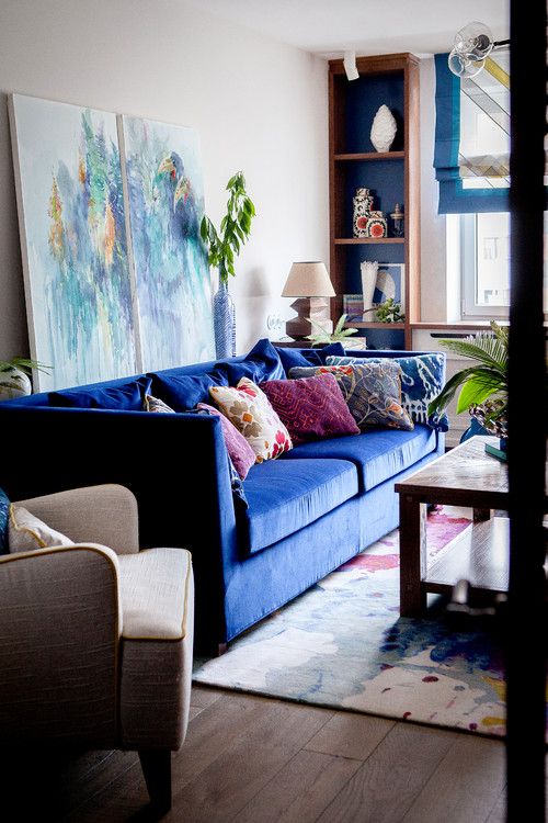 "Once you begin to mix colors, then the party really starts. A cobalt blue will take on the attributes of red and blue—serene and feisty at the same time. So be sure to get to know color in this way first."
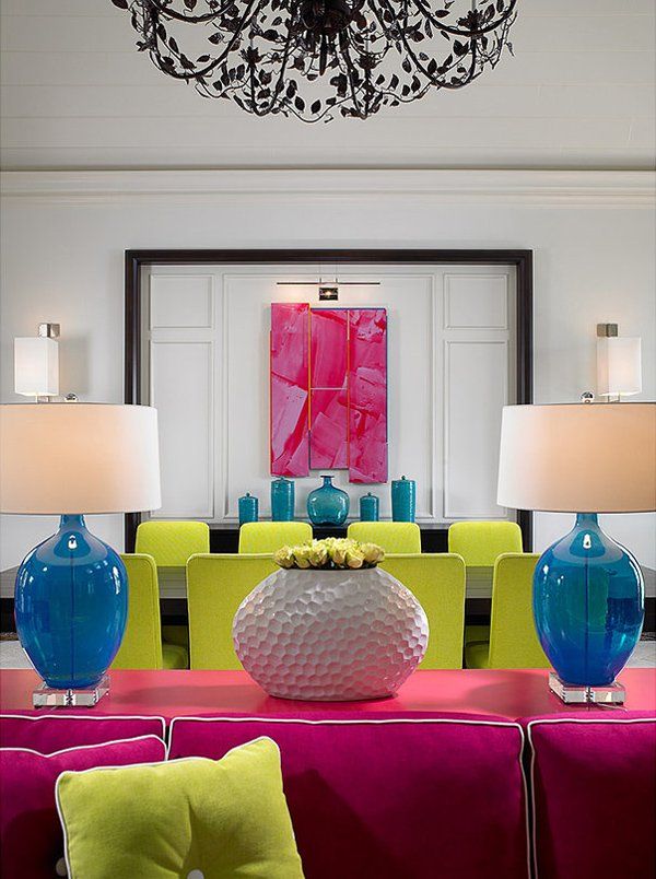
If you really want to push your personal color boundaries, Fricke says the bathroom is the place to do it. “I’ve seen color used to great effect in en suite bathrooms,” she says, “particularly through the use of pattern and wallpaper.” But before you start painting the glue and plastering your favorite wallcovering, there are a few things you should know about placement. “Above the railing is always best, and away from wet areas as your wallpaper won’t survive,” said Shannon. “Below the railing should be one solid color and preferably tiled. If you’d prefer to stick to tiles in the bathroom, then experiment with bold color throughout—or on one wall (behind the vanity is best) if you’d prefer to take things slowly. ”
”
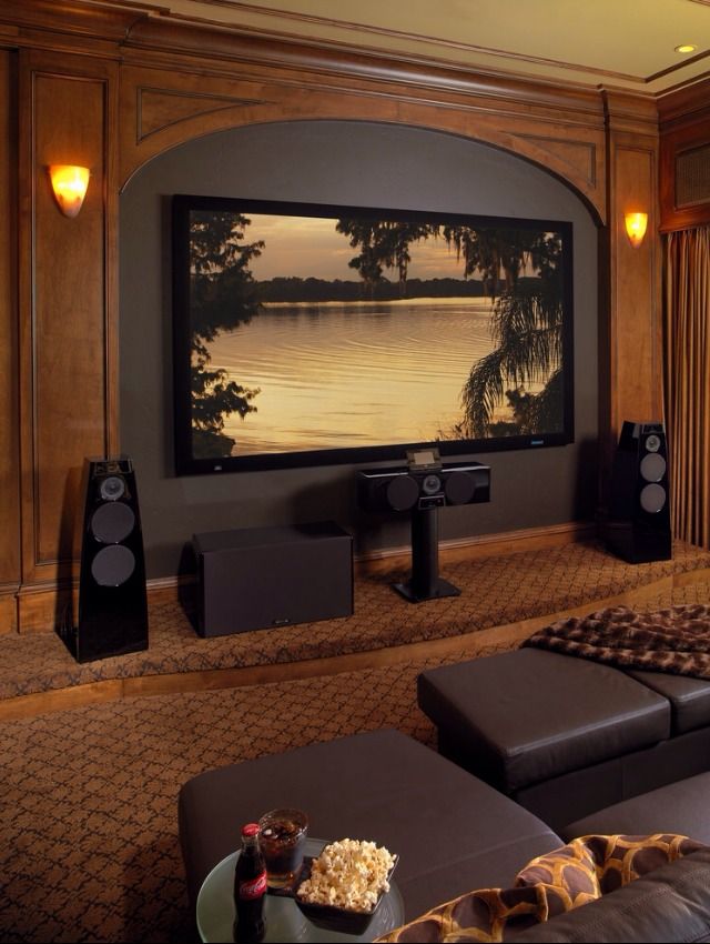
Dark interiors have become incredibly popular in recent years, but there’s a big difference between saving them on Pinterest and actually translating the look into your home. Fricke recommends dark colors in a large space that is difficult to anchor. “The darkness of your color choice, let’s say charcoal, works well to cocoon the space, making you feel more supported in the space,” she says. “Another approach is to use a dark color in a teeny-weeny space, going with the space rather than fighting it. This creates a kind of boudoir effect, and it’s seriously cozy, especially if it’s a bedroom.”
Alyssa RosenheckIt can be tricky keeping your interior fresh over the years—here’s what to do if your décor is dated—so how can you use color to ensure it stays modern? First, Shannon asks you to take time to consider the size of a space and how much natural light it receives. Then make a note of the era: What are the architectural features? Does your color complement the era? Is the environment of your space urban or country?
“Your color palette needs to extend from the exterior to the interior, creating a sense of harmony from the front to the back of the room,” she says. “If you consider all of these elements, then color won’t date.” But if you’re into experimentation and love throwing out the rule book, then Shannon has some sage advice: “Choose color for one wall or one space, and apply it in a way that is easily changed—like through paint!”
20 Beautiful Interior Color Schemes Designers Have on Repeat
a masterclass in decorating with color |
(Image credit: Paint & Paper Library / Gunter & Co. / Jonathan Bond)
As anyone who has been through the process of searching for room color ideas will attest, choosing the right color for a room can be a minefield with endless choices and subtle nuances to understand and overcome.
'Choosing color is one of the hardest parts of decorating because we only actually know the true color of something because it’s sitting next to another color,' says Rachel Chudley, an interior designer renowned for her use of strong color.
Here, designers, decorators, and experts reveal how to approach choosing room color ideas and decorating with color with confidence, from using the color wheel to create strong color combinations to using accent shades and neutrals.
Room color ideas – and how to decorate with color
When looking for room color ideas – or even just decorating with color in the most subtle of ways, start by embracing color theory.
1. Embrace color theory
Color blocking is a great way to create unusual or even tonal combinations
(Image credit: Farrow & Ball)
Color theory, which touches on color psychology, can be a complicated subject but there are a few basic principles to help steer you in the right direction. Below, Patrick O’Donnell, brand ambassador for Farrow & Ball , explains.
'Red is linked with passion, energy, and action. The color is also associated with increasing our metabolism, hence its popularity for dining room color ideas but at the darker end, especially a reddish-brown shade, it can look elegant, dramatic and warm for a bedroom. For further inspiration, see our guide on what colors make a bedroom feel warmer?
'Blue has many emotional attributes: at the paler end, tranquillity and calm, to intelligence at the darker end.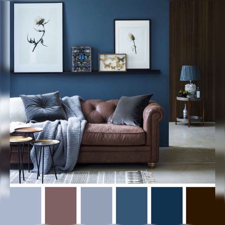 It is often considered a restful and sympathetic color, so a paler blue is ideal for a bedroom, but I’d err towards darker blue shades for the home office, living room or for kitchen color ideas.
'Yellow (orange shares similar characteristics) is the color of energy, happiness, and optimism and therefore a brilliant choice for either a kitchen or a home office but try and avoid in a bedroom as this primarily is a space for rest.
'Green is a joy to use: the primary color of nature and the outdoors. It is the perfect color family to deliver calm and serenity and therefore has the flexibility to be applied in every room throughout the home if you're looking at decorating with green, but is especially great for bedrooms and for living room color ideas. It symbolizes renewal and growth.
'White represents purity, innocence, and new beginnings, as well as cleanliness and clarity. It can be used everywhere in the home but is very successful in the bathroom and any room where you want to create order and with little distraction.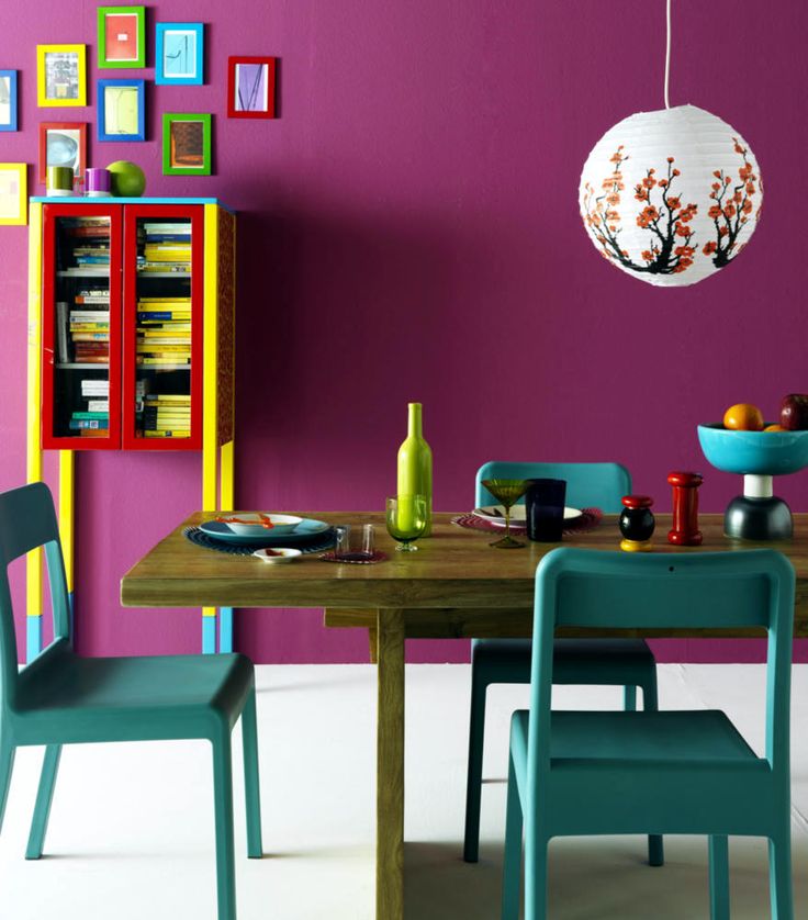 It is also an ideal foil for a well-curated room of art and furniture.'
2. Factor in daylight
For shades are flattering to live among and set off good furniture, go for colors with a bit of dirt in them, as demonstrated in the Oxfordshire drawing room of Emma Burns, director of Sibyl Colefax & John Fowler
(Image credit: Sibyl Colefax & John Fowler)
Another key factor is light, and the best way to address this is by considering the aspect of the room. 'As a general rule, to lighten up a north-facing room, avoid anything with a green or gray base – or don’t fight it and paint it dark which creates a cozy and cocooning feel,' says Patrick.
Meanwhile, using soft, pale tones is a great way to maximize the feeling of light and space in a south-facing room. Light in west-facing spaces is cooler in the morning and brighter in the afternoon so warm tones will work well while light blues and greens can have a calming effect on east-facing rooms.
'The trap that people fall into is that they consider dark rooms to be wrong, and just paint it bright white. I really like to lean into the darkness and explore the depths of color,' says interior designer Rachel Chudley . 'Go for a very deep, dark color but mix it up in a very high gloss paint, and this will reflect the light around the room. Then you get the depth you’re leaning into but also this amazing light which can glow like a jewel, especially in candlelight.'
3. Include contrasting colors to create impact
You can’t go wrong with decorating using glorious jewel colors, says Lulu Lytle co-founder of Soane
(Image credit: Soane)
Interior designers also talk about another element which needs to come into play when introducing colorful room ideas: contrast. As a result, don’t be tempted to lean on analogous colors – those that sit side-by-side on the color wheel – the result will be broadly harmonious but might lack in vitality.
Equally, a scheme based on complementary colors will result in maximum contrast but will need to be softened by neutrals. 'Don’t forget you can introduce techniques such as color blocking to create unusual or tonal combinations,' adds Patrick.
'Clashing colors can really make my heart sing,' says Rachel Chudley. 'For a project I'm currently working on, we’ve been mixing up deep purple, almost blacks, with very bright apple red – an almost "fruits of the forest" combination.
'Getting the color right in a room is an amazing balance, because it’s those last minute touches which can really set things off. What I like to do is just when everything’s looking really harmonious and perfect is to throw in a little rogue element of chaos, like adding a little yellow silk blind in space with no other yellow. If it’s too perfect, a space can feel claustrophobic in its designed-ness, so having a couple of rogue elements like that spices things up, and also helps a house feel like a home.'
4. Base room color ideas around what you can't change
Use color to balance the weight of elements in a room. Here walls in London Brown by Edward Bulmer Natural Paint are offset by the pink upholstery
(Image credit: Edward Bulmer)
Another way to take the first step is to begin with what is already decided or what you can’t change, recommends interior designer and natural paint specialist Edward Bulmer .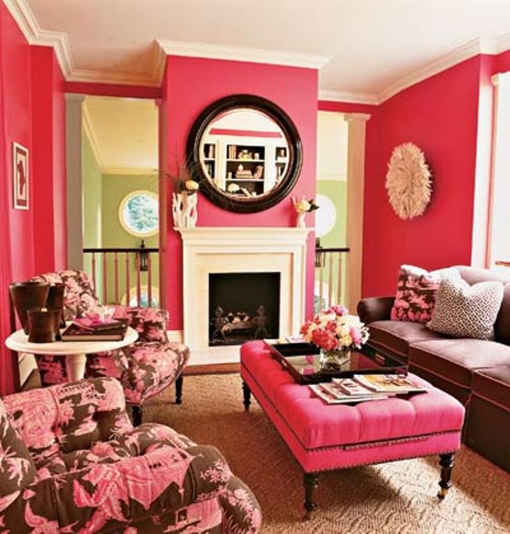
'It might be a wood floor or an old fireplace, for example. Then base your tonal choices on the color of these elements – effectively, warm or cool. If you get the tonality right first, you will then have a wide variety of colors that will work and so choice comes down to personal preference or other elements of your scheme – like fabrics.'
5. Consider the color's weight
Blue and green are the fundamental colors of nature and work beautifully together, contrary to the old saying, believes Lulu Lytle, co-founder of Soane. Shown is their Persian Flower fabric in Lapiz and Coral wallpaper in Green
(Image credit: Soane)
'A further consideration that can help is the weight of the color,' continues Edward Bulmer. 'One can get a sense of the weight of elements in the room visually and it helps to try and balance them, for instance an old oak dresser will look better with a mid, rather than a light, tone.'
'For classic and timeless decorating, it's the rather muddy colors that I'm particularly drawn to – those that John Fowler had made up by Christopher Wall of the National Trust, the archive which was eventually given to Tom Helme of Farrow & Ball. They are, in essence, colors with a lot of dirt in them which results in warm, sympathetic and flattering shades for people to live in and furniture to sit against,' says Emma Burns director, Sibyl Colefax & John Fowler .
‘I’ve always adored blues and greens, the fundamental colors of nature,' says Lulu Lytle of Soane . 'Contrary to the old saying, I think they work together beautifully and often combine them. As a child I was exposed to lots of pattern – all our bedrooms were wallpapered – and color. My mother, who once remarked, “raspberry’s just a neutral”, used many deep pinks around the home and clearly left an impression, since they feature strongly in the Soane fabric and wallpaper collections. Later travels to Egypt introduced me to a favorite combination of pale blue and buff and glorious jewel colors.'
6. Decorate with strong colors
Another way to go bold with color is to paint woodwork and decorate with bright accessories, says decorator and designer Bridie Hall
(Image credit: Pentreath & Hall)
Paint ideas are the perfect way to transform a space quickly and easily, adding personality and character to create an inspired interior, says Ruth Mottershead, creative director of Little Greene . 'Bold, vivid hues and lively tones work well in rooms that are made for entertaining, or see a lot of activity, such as kitchens and living rooms. A pop of bright, rich contrasting color is a great way to add impact and an element of surprise to an otherwise muted scheme. Alternatively, bold colors are also a great option for spaces with a lot of natural light and can be used in much bigger proportions without being "too much”.'
7. Try color drenching for impact
Color drenching – painting the walls and woodwork in the same tone – is a fun way to embrace a bold approach, says Ruth Mottershead of Little Greene
(Image credit: Little Greene)
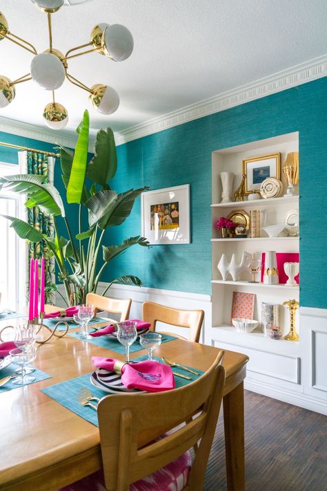
For a strong approach, embrace the color drenching trend. This sees mid-strength tones, in just one or two very closely related colors, used to create enveloping cohesive interiors that allow color to be a focal point. It’s an approach used by interior designer Sarah Brown for the kitchen in her Chiswick home.
'All the walls and woodwork are in the same color with contrasting notes.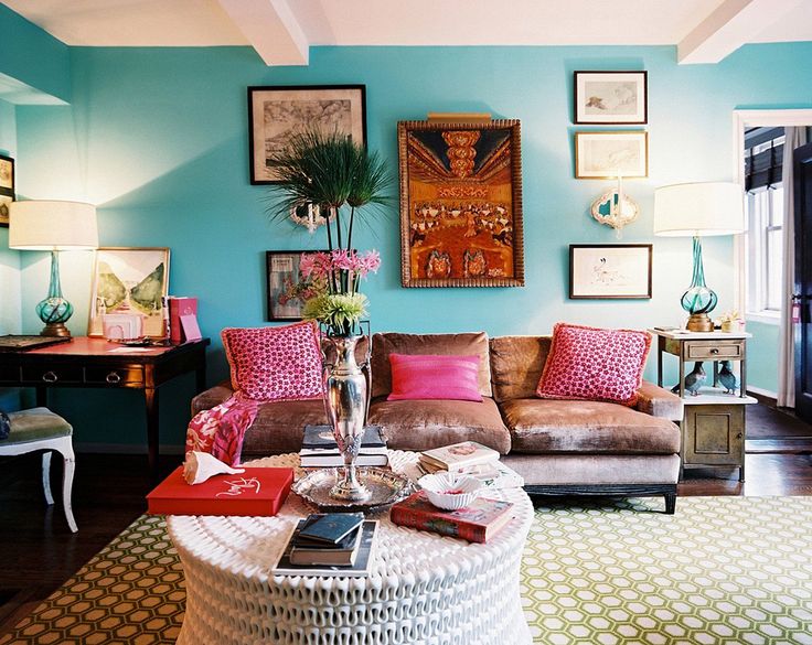 It’s a way of straddling the design gap between town and country, traditional and contemporary,' explains Sarah.
The beauty of color drenching is that it can be applied to such a variety of different spaces. It can’t make a small room larger, warns Ruth but it can embrace the size of the space and create something that lifts the mood and feels really engaging, inviting and contemporary.
8. Create surprise with color in the kitchen
Walls in turquoise are paired with crisp white cabinetry in this kitchen scheme by Vanrenan GW designs
(Image credit: Vanrenan GW Designs)
Kitchen color ideas are a relatively new concept. Historically, says Edward Bulmer, the considerations taken into account were that the materials used were fire-proof, serviceable, sturdy and washable.
But as more and more begin to embrace bolder tones, the best bet for those who want to follow suit is to consider light and volume of the space, says Louisa Greville Williams of Vanrenan GW Designs .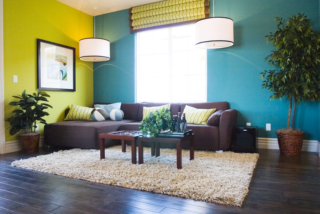 'If the kitchen is a very large space, we might use a patterned wallpaper and then contrast, rather than match, with a paint color. We think kitchens should be just as decorative as the rest of the house, even though it has a utilitarian use, especially as we all live in our kitchens more than ever so we should enjoy them.'
9. Use bold hues in bedrooms
Don’t be afraid to go bold in a bedroom – in this scheme by Albion Nord crisp white sheets balance the strong orange walls in Sang de Boeuf by Edward Bulmer Natural Paint
(Image credit: Patrick Williamson for Albion Nord)
Bedroom color ideas can be bold too, adds Camilla Clarke, creative director of Albion Nord . 'It’s easy to shy away from bold bedroom color ideas but it works wonderfully when paired with fresh white sheets and the creamy tones of a headboard and cushions,' she recommends.
Bear in mind, you don’t need to go bold with the walls – you can focus instead on big color pops instead. 'I live with a lot of boldly-painted woodwork and objects – all strong in color and finish which have a lot to say when they’re put together,' says Bridie Hall, interior designer and co-founder of Pentreath & Hall .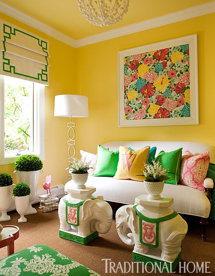
'My trick is to sink it all into a neutral environment; all of my walls are painted white. Those blank spaces create a negative where the eyes can take a breather and are just as important as the positive impactful burst of color and form.'
10. Limit your room color ideas
Here, Sarah Peake of Studio Peake demonstrates how to pick out anchor colours and add in additional pops while always maintaining a sense of restraint
(Image credit: Alexander James for Studio Peake)
Sarah Peake, founder of Studio Peake , says she likes to pick out one or two colors that anchor the room and then mix in other, complementary, colors, with the main anchor tones being the common threads that run through the scheme. You can also use pattern to ensure that even a very bold color scheme is dispersed throughout the space in a more subtle, harmonious way; for example, a plain wallpaper or paint on the walls offset by patterned cushions and soft furnishings that quietly pick up that tone. It is also important to limit the overall number of different colors you use, otherwise the space may feel unstructured and overwhelming.
11. Add color with art
Sophie Ashby of Studio Ashby uses art as a jumping off point for room color ideas
(Image credit: Studio Ashby/Philip Durrant)
Colorful art is another way to go bold. A favorite painting can be a good inspiration and art is always the starting point for any scheme by Sophie Ashby of Studio Ashby who is known for her dynamic designs that feature colors inspired by her South African roots.
'Ideally, we would work from a client’s own collection. From that, we can then begin to build a color palette and design references,' says Sophie. 'In a new build, I like to go with all-white walls and curtains and put color into the middle of the room with art and textiles. While in a period house, I might go for a strong color on the wall picked out by a white ceiling and skirtings.'
12. Work with unusual color pairings
When decorating with unusual color pairings, remember to balance the scheme with a natural element such as the stone floor here which juxtaposes the bold colours, recommends textile designer Eva Sonaike who created this bathroom design for CP Hart
(Image credit: Anna Stathaki/CP Hart/Eva Soniacke)
Decorators and designers will often say they don’t follow rules when it comes to decorating but something that is helpful to bear in mind is that colors never need to match, color combinations for rooms just need to work together.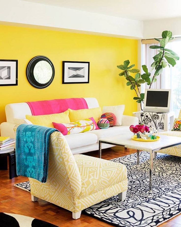
'I love unusual color pairings,' says the textile designer Eva Sonaike who specializes in luxury African interiors, and recently showed off her bathroom color ideas with a collaboration with CP Hart (above). 'My favorite combination at the moment is green and purple,' she adds. 'If in doubt, always look at nature and, in particular, plants and flowers.'
Throwing something unexpected into an interior helps it to look considered and confident, adds Nicole Salvesen, co-founder of Salvesen Graham . 'Choose colors that come from the same tonal family or have the same depth of color, even if they are different ends of the spectrum, this will help them work together. Also choose bolder colors such as rich greens and yellows and raspberry reds as they can be easier to work with, rather than paler candy colors that can sometimes come across as insipid if they aren’t quite right.'
13. Use room color ideas to alter the mood of the space
At the hotel Les Deux Gares in Paris, decorator Luke Edward Hall chose strong olive and orange with accents of pale violet and mustard – the result is unexpected but balanced
(Image credit: Benoit Linero for Luke Edward Hall/Hotel Deux Gares)
Using a more unusual color pairing in a room will alter the atmosphere in the space, explains interior decorator Nicola Harding, founder of Nicola Harding & Co .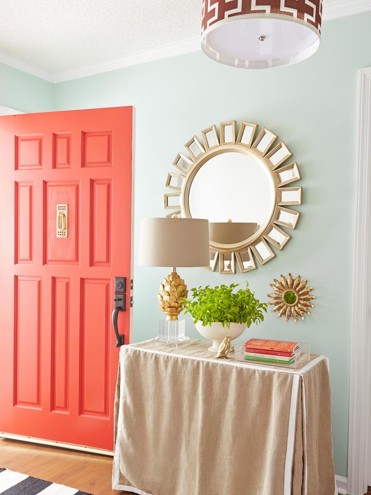 “The greater the degree of contrast there is, the more drama there is the room and when there is less contrast, the space is calmer.'
As a general rule of thumb, you want to include high contrast when you want a dynamic, high energy feeling but this should be done in a space that you don’t spend loads of time in such as holiday homes, cloakrooms, and rooms at home that aren’t in frequent use. 'That of course includes kids’ bedrooms which are naturally more energetic anyway as they are filled with their toys, books and artworks,' says Nicola.
Interior designer Luke Edward Hall took a similar approach when decorating the Parisian hotel Les Deux Gares – conjuring bedrooms of olive green walls with violet woodwork and orange curtains. 'I wanted to challenge the idea that guests always want to stay in bland boxes,' he explains. 'However, I don't believe in throwing a rainbow of colours at a room: there needs to be balance.' For bedrooms, consider some of the most relaxing colors to create a soothing sanctuary.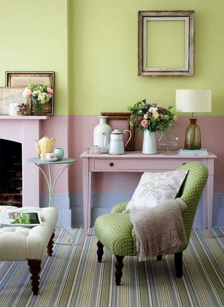
14. Pair strong and muted colors
Be sure to add a bright hue when introducing an off-tone color, says Nicole Salvesen – above all avoid insipid colors. Here, Salvesen Graham’s cane side table in raspberry red strikes the right cheery note against more modest green and pink
(Image credit: Astrid Templer for Salvesen Graham)
To achieve that balance, it’s helpful to bear in mind that one color can also be stronger than the other, adds Nicola. 'This should be used in the same way that you might use a stronger condiment with a meal, like mustard for instance. A fun color combo is soft pink with a mustard yellow. The mustard yellow would be like the mustard on your plate – therefore one color can be more intense as your accent whilst the other is more muted in tone.'
15. Choose room color ideas by instinct
One color – or pattern – can always be stronger than another when putting together unusual tones. In this bedroom, Nicola Harding chose a dynamic headboard as the protagonist, supported by various shades of nude, pale blue and red
(Image credit: Nicola Harding)
For those who feel a headache brewing when it comes to choosing the right color combinations, take a step back and follow your instinct.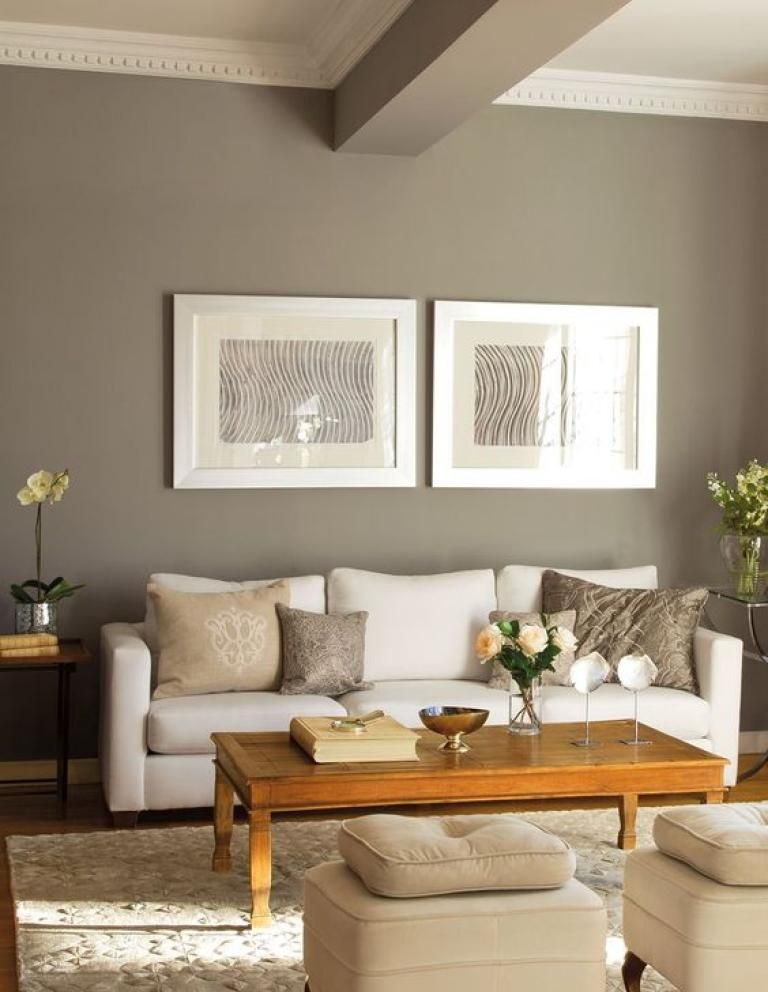 ‘Whenever I choose colors I try not to overthink it,’ says the American designer and decorator Sheila Bridges who is known for a joyful use of color in her projects. 'Intuitively I want simple colors that feel relaxing and soothing – particularly during this very complicated and stressful time. Paint color can be transformative but also forgiving. My feeling (and advice) about wall color has always been the same: if it doesn’t feel right just repaint. It’s one of the most inexpensive yet dramatic ways to change the interior of your home.'
The architrave in Suzy Hoodless’s home was painted yellow to create a division between the two rooms but also for some sunshine in the space and to lift the room, she says
(Image credit: Paul Massey for Suzy Hoodless)
'The addition of accent colors is a quick and easy way to transform a space, define an area, or highlight architectural elements,’ believes Ruth Mottershead of Little Greene. ‘If you’re lucky enough to have wonderful architectural details such as archways, mouldings or picture rails in your home, paint is the perfect way to highlight them to create a design detail.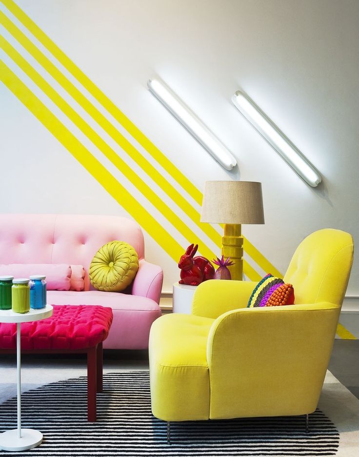 A simple pop of contrasting color on a door or skirting is a great way to add impact and an element of surprise to an otherwise muted scheme.’
This is what decorator Suzy Hoodless decided to do in her own sitting room where she painted the architrave between the library and sitting room in a near neon yellow to create definition between the two spaces. 'Colors don't have to be bright–they can be muted too but a powerful shock of a bold or unexpected hue instantly saves a space from being too polite,' says Suzy. 'I particularly like to paint woodwork in an unexpected color, together with quieter tones and lively patterns on cushions or upholstery, it results in things that perhaps shouldn't really go together but somehow they do.'
17. Pick a white with a matching undertone
Pink is a favourite accent color of Natalia Miyar who recommends selecting a white with an undertone in the same shade for a seamless look
(Image credit: Natalia Miyar)
Another decorator trick when you are using a color accent in a white scheme is to bring these together by selecting a white with an undertone in the same shade, recommends the architect and designer Natalia Miyar of Natalia Miyar Atelier .
'There are many different shades of white: my personal favorites are warm white with pink or yellow undertones used with accent colors in the same tones such as burnt orange, red or pink.'
Don’t forget, she adds, 'you can be quite creative, don’t limit yourself to cushions, you can introduce your accent color on any surface including lamp bases, art, furniture and objects.'
18. Break up bold room colors with neutrals
(Image credit: Jonathan Bond for Katharine Paravacini )
When using strong colors in a room, you can create a balance with the accent colors you use, recommends Katharine Paravacini , founder of her own design studio. Bold walls can be complemented by accessories in punchy colors such as reds and yellows and then broken up with areas of neutral such as a carpet. 'We like adding pattern into bold schemes to add interest and depth, too,' says Katharine.
19. Introduce color in unexpected places
Bring an accent color into a bathroom by painting the vanity or architectural detail in a contrasting colour, recommends American decorator Cortney Bishop
(Image credit: Cortney Bishop)
Don't be afraid to bring in an accent color to unexpected places, says interior decorator Cortney Bishop . 'Consider applying a lively hue to a bathroom vanity or painting your interior doors or trim with a contrasting color that makes your walls stand out even more. The transition and break in color will be more welcoming than you might think when transitioning between rooms.'
20. Use antique rugs as a starting point for a color scheme
For Henriette von Stockhausen of VSP Interiors, the balance of color and pattern is the most important thing – too much of one leads the eye astray rather than letting it all sit together, as demonstrated in this master bedroom
(Image credit: Paul Massey for VSP)
You can introduce room color ideas by mixing patterns and prints in interior design – especially when decorating with rugs as a starting point. 'I often start from antique carpets and pick up the colors I would like to introduce more dominantly,' says Henriette von Stockhausen, creative director of interior design studio VSP Interiors . 'I’m not one for using too many colors or patterns in my designs so I choose carefully: if I use a pattern on the walls through wallpaper, I tend to choose a plain-ish curtain fabric and bring a pop of color with trimming and fringes. It all has to feel like a natural progression – not too designed or forced – and more like an interior that has evolved over time and through collected pieces. Also, antique fabrics colors are more faded and sit softer within and next to each other.'
21. Combine room color ideas in pattern ratios
The team at Turner Pocock like to start with patterns with at least three colors in them which will then form the basis of the decorating scheme
(Image credit: Alexander James for Turner Pocock)
Pattern plays a leading role in schemes designed by Turner Pocock . 'Our starting point is always a pattern with at least three colors in it,' explain co-founders Bunny Turner and Emma Pocock. 'It can be a floral, geometric, ikat or stripe and it can come from something as small as a cushion or a large-scale fabric for a sofa, but it will form the basis of our decorating scheme.
'We like to layer different patterns, big and small, in a room so that it creates enough interest without the eye settling on one thing for too long,' continues Bunny. 'It’s important to always work with different scales of pattern – like a large floral with a smaller geometric – as it allows each one to stand out. Working with two different patterns in the same scale means neither will be strong enough for one to bounce off the other.'
As mentioned before, the scale and orientation of the room will mean some are better suited to more dramatic patterns. 'Rooms with plenty of natural light can lend themselves to large-scale pattern and strong colors,' says designer and decorator Sarah Fortescue .
22. Let wallpaper or fabric inspire a room color
Demonstrating how to pick out a color from a pattern and take it to the woodwork or walls, this fabric is called Espalier by Neisha Crosland with Schumacher
(Image credit: Neisha Crosland)
One approach to introduce color confidently to a room – be it a bedroom or sitting room – is to choose a small secondary color detail in a patterned fabric design and use this as the inspiration for solid fields of complementary paint color, recommends Genevieve Bennett, head of design at Liberty Fabrics . 'It helps provide a perfect canvas for the fabrics which is both surprising and liveable and allows you to introduce bold rich colors to a scheme.'
Textile and wallpaper designer Neisha Crosland says another way to sew a room together is to pick out the strongest (or the darkest) color from the wallpaper pattern and use on the woodwork in a room. 'That could be on the doors, cornicing, window frames, wardrobes or radiators – it’s a clever decorating tip that I like to use,' she says.
23. Choose a hero highlight color
Choose a hero design in your color palette and then layer it with other designs in a mix of scales, recommends designer and decorator Birdie Fortescue
(Image credit: Birdie Fortescue)
Again, a vital consideration is about balance – perhaps particularly in a bedroom environment where the aim is to create somewhere restful. To do this, says designer and decorator Birdie Fortescue , be sure to have a single highlight color – or a hero design if it’s a pattern – and layer it with others in smaller scale or quieter styles to ensure there is focus on the highlight tones. 'Florals and geometrics, combined with the correct balance of scale and color, work together to great effect. I’m particularly fond of a trellis design. It is so versatile; a classic motif like this helps to anchor a scheme.'
24. Be inspired by the 'new neutrals'
The team at Elicyon kept the palette for this home office space in London neutral which gives the space a light and bright fresh vibrancy, but used a subtle yet rich textured wallpaper, which gives the room some depth and interesting detail
(Image credit: Elicyon Photograph Patrick Williamson)
While some decorators instinctively lean towards pale yellows, and others where green meets gray, many agree that new neutrals are largely inspired by colors emanating from the natural world, which help us to feel grounded in our homes. 'They also comprise ivory base notes and a scattering of additional tones including rust, pink, beige, mustard and burnt orange,' says Charu Gandhi, founder and director of Elicyon .
'Not to be confused with cold and bland palettes, new neutrals are warm by nature,' she adds. 'Typically matte in finish, they have the ability to flex, and so it’s possible for them to suit any home, be it traditional or contemporary – in fact, their elasticity is the reason we’re calling them "new".'
For a warmer, cozier aesthetic, consider a red-based neutral such as Wimborne White or Dimity by Farrow & Ball, recommends Louise Wicksteed, design director at Sims Hilditch .
25. Steer clear of white with neutral schemes
Here a favorite dirty pink adds a bolt of color in an otherwise neutral kitchen scheme by Gunter & Co
(Image credit: Mary Wadsworth for Gunter & Co)
Even when working with neutrals, color choices need to be site specific, adds interior decorator Rachel Chudley. 'We think that pale biscuits or very light pinks are ideal for south-facing rooms which have plenty of light – not only do they filter the light beautifully, but they also add to a feeling of calm and relaxation, perfect for a bedroom environment.
'When working with neutrals, my only rule is to steer clear of white walls,' continues Rachel. 'They work well in galleries for the very reason that they create a blank canvas which is perfect for focussing on one piece of art, uninterrupted by anything. However, in a living space, you need a touch of color to add a bit more depth and reflect the light around the room.'
Irene Gunter, founder of Gunter & Co, agrees: 'I often find, especially with a neutral background, that adding in pops of color can add so much personality of your own to a space by choosing colors you love and tying those in with the cardinal directions of each room to make sure they complement the natural light (or lack thereof) in each room.'
26. Use a natural palette to allow accessories to shine
Jamie Waterworth Thurstan favors neutral backgrounds so that tactile surfaces and striking furniture can then stand out, as demonstrated here in the dining room of a house in Holland Park, west London
(Image credit: Simon Brown)
Subtle nuances of color are why James Thurstan Waterworth, founder of Thurstan , favours neutral colors in his schemes because they create a soft springboard from which antiques, art and other embellishments are able to sing. 'You can then build out from here with tactile surfaces, patterned textiles, eclectic furnishings and more modern flourishes to create layers of interest, whilst still allowing all the individual elements of the interior to breathe. I gravitate toward natural palettes, and materials too, as for me they bring a certain timelessness and longevity to design.'
27. Examine room color pigments
Subtle background colors allow other elements in the room –such as artworks – to stand out says Tom Cox of HÁM interiors
(Image credit: Alexander James/HAM Interiors)
When it comes to selecting more neutral paint shades, it’s important to get the mineral balance right, believes Tom Cox, co-founder of HÁM interiors . 'We like to look at the pigment and depth of color in a paint, too often a shade will have too much gray or brown as undertones which can then be challenging when adding the layers of furniture and finishing touches.
'We try to make the backdrop subtle so furniture and carpets sit harmoniously, we also like to paint the ceiling, walls and skirting in the same hue, it stops awkward visual breaks and enhances architectural details in an understated way.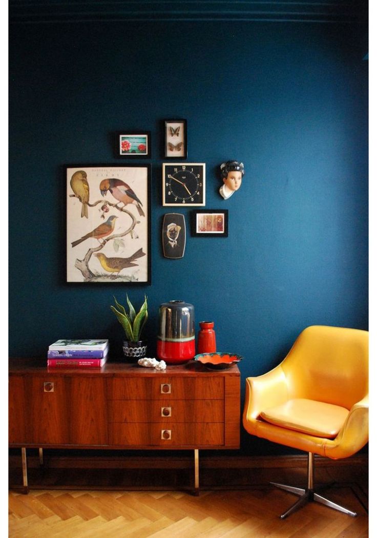 '
'
28. Add vibrancy with orange
(Image credit: Paint & Paper Library )
Give your interior an update that is filled with joy and optimism with vibrant orange. Choose a paint color that is rich in earthy pigments as they give an exceptional depth of color and life to any scheme.
‘Orange is the perfect color for an open-plan kitchen, providing a dramatic yet familiar backdrop to a hive of activity, says Andy Greenall, creative director, Paint & Paper Library . 'Rather than opt for the habitual white on kitchen cabinets, consider a warm pink hue such as Robens Honour, which will provide a playful touch when paired with orange.’
29. Use a color that takes on different attitudes
Beresford Red, Sibyl Colefax & John Fowler for Fenwick & Tilbrook
(Image credit: Sibyl Colefax & John Fowler)
Look no further than a rich rusty red for an enticing and enveloping hue. Like orange, red is a brilliant room color idea for small rooms and snug rooms. Deep earthy red tones are also great for hard-working spaces like pantries and breakfast bar areas.
‘Whether covered with prints and paintings or left unadorned, this deep Indian red makes a beautiful background for living rooms or hallways,' says Emma Burns, managing director, Sibyl Colefax & John Fowler. 'Chalky off-white woodwork accentuates the depth of the tone and keeps it fresh while painting moldings in the same color can disguise any awkward elements.’
30. Take a dark turn
(Image credit: Kalina Krawczyk)
Deep chocolate brown – this confident hue looks delicious as an all-over room color idea yet it's equally perfect for pairing with brights and pastels.
‘We created Jam (on the wall) because of the glorious alchemy of turning fruit into conserves,' says Cassandra Ellis, founder, Atelier Ellis. 'The colors come alive and offer a delicious, dark alternative to black or dark grey walls. Using red ochre, violet and green make a beautifully changeable color that, while dark, is rich and enveloping. ’
’
31. Curate a jewel-box room
(Image credit: Billal Taright)
Deep purple with all its dark, dramatic, and nuanced glory is guaranteed to bring both opulence and intimacy to rooms, especially those with little natural light.
‘Decorating with deep purple is about selecting the right tone,' says Joa Studholme, color curator, Farrow & Ball. 'Purples with an underlying red create a warm, intimate space, while blue-based ones are more dramatic. Purple works best in small spaces deprived of light, so is ideal for creating jewel-box rooms.’
In this guest bedroom designed by Rachel Chudley, the vivid purple chosen for the walls helps to pull together the strong patterns and tones of the red-striped wallpaper and vintage bedspread.
32. Go for a background blue
Joinery in Inchyra Blue, Farrow & Ball. Armchair in Kimono, Lewis & Wood; panel in Rooksmoor velvet, Mulberry
(Image credit: Jonathan Bond)
Mid-toned blues – ranging from the heritage Air Force blue to softer French blues, these classic colors have become the shades of choice for elegant interiors and exteriors.
‘Historically, people have often been afraid to design with blue,' says Lucy Marsh, founder, Lucy Marsh Interiors. 'Too cold, too bold. But, with experience, I’ve found success if the right tones are applied to specific situations. This is a versatile timeless color, as a classic wool check or a toile; a contemporary bold paint; or it can be eclectic when coupled with bright colors and strong geometric design.’
If not looking for total color saturation, think about painting a wall of joinery in this mid-tone blue hue and use it as a focal point to show off art and objets.
What color makes a room feel bigger?
Light-reflecting colors tend to make a room feel bigger – though that needn't mean white. Pale pastels will make rooms that receive lots of warm daylight feel larger, while cozy neutrals, such as cream, will make cooler rooms feel bigger, but welcoming, too. You can decorate rooms in darker colors and yet still make them feel bigger – the trick is to keep floors and ceilings in pale shades, and to ensure windows aren't cluttered by drapes.
Which color to use for north-facing rooms?
North-facing rooms tend to feel cool and are generally much darker than south-, east- or west-facing rooms, which will get some sunlight throughout the day. Using any color – from yellow to blue – with a warm undertone will make the space feel warmer. If you want to make a north-facing room feel brighter, it's important to choose a light color; however, if you are happy to embrace 'cozy', you can choose dark colors – just ensure they have warm tones so that the room doesn't feel cold and unwelcoming.
Arabella is a freelance journalist writing for national newspapers, magazines and websites including Homes & Gardens, Country Life, The Telegraph and The Times. For many years she has specialized in writing about property and interiors, but she began her career in the early 2000s working on the newly launched Country Life website, covering anything from competitions to find the nation’s prettiest vicarage to the plight of rural post offices.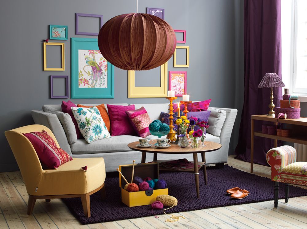
The meaning of color in interior decoration
Home / Design / The meaning of color in the interior
Category: Design | Comments: Comments are disabled for this article
When developing a project for the interior decoration of a cottage, designers pay great attention to the selection of color schemes, this makes it possible to achieve an attractive interior. nine0003
Meaning of color
In design, color solutions occupy a leading place among other aesthetic components. Scientists, having studied the perception of different colors by a person, have long divided them into cold and warm.
Warm colors in the interior
Warm colors, these include red, orange, yellow, are considered activity colors that excite the nervous system, help to increase efficiency. However, in the future, warm colors depress the human central nervous system and activity declines sharply. nine0003
Cold colors of the interior
The colors of the cold part of the spectrum - blue-green, green, blue, blue, are considered passive, that is, they have a calming effect on the central nervous system.
According to scientists, the green color and all its shades have a particularly beneficial effect on the nervous system. In a room painted with this color, efficiency is maintained for a long time and it is believed that green is good for perception where activity is associated with the need for mental stress. nine0003
What colors to choose for the interior
The most comfortable colors for perception are considered optimal , located in the mid-wave region of the spectrum. These include mixed yellow-greens, green-blues, blue-blues, and soft pastels.
Color sets the mood of the house, and, therefore, the mood of the owners. With a skillful approach to the use of colors in the interior, you can change the visual perception of the room and generally remake it beyond recognition. For example, it is known that non-contrasting cold colors visually increase the volume of the room, while warm colors, on the contrary, cause a feeling of space reduction. nine0003
The use of colors in interior design
When designing cottages, firms engage decorators to develop color schemes. When working with flowers, you should be careful, because using color incorrectly can negate all the work of creating an interior. To understand colors and how they affect human perception, one must know their distribution and the results of mixing with each other.
When working on an interior, it should be taken into account that the proportion in which colors are used is considered more important than combination. The predominance of blue in combination with green causes a positive attitude, stimulates the desire for success in life. The combination of red and green colors encourages the desire to win and overcome difficulties, yellow and green - causes a desire for recognition. Purple with green is a restless combination, and if black is added to green, a feeling of resentment and anger may develop, and an emotional decline will occur. nine0003
If there are several rooms in the house, each of them should be decorated in its own color palette.
Design articles:
- Design and construction of a cottage price per m2
- Architectural project of the house
- Structural project of the house
- Construction of houses in the suburbs
photos, popular colors, tips on choosing colors
A living room is a place where you can not only spend your free time and have fun, but also meet guests. It is not surprising that the design of this room requires special attention. nine0003
What is the first thing that catches the eye when a person enters the living room? Of course, this is the color of the walls and furniture. The selection of the color palette used in the arrangement of the room is a top priority.
At the same time, the color scheme of the walls of the living room, along with the selection of furniture, are a key factor in the formation of an individual design. Then a natural question arises: how to choose the color in the living room?
Design: Zhenya Zhdanova, DivaDecor.ru
Basic rules for color combinations in the interior
When choosing a particular color for decorating a room, one should proceed not only from one's personal preferences, but also from the existing color combination rules. An incorrect combination of even two tones will cause dissonance in the interior and psychological discomfort.
What should be the correct combination of colors in the interior?
-
Using a gamut of shades within a single color. For example, if you combine light yellow, yellow and dark yellow. In this case, the palette should be diluted with a neutral companion, which will help create a smooth transition from one tone to another.
 It is gray, white, beige. nine0003
 -
Shades that harmonize with each other. There are universal tones - white, black, gray, beige, which are combined with any others. They can be taken as a basis, diluted with contrasts.
-
Contrasting interior color combination. To understand which of them are well combined, you should use the color wheel - this is a palette of color combinations in the interior. For example, yellow and purple, orange and blue, green and red harmonize with each other. But they should not be used in equal proportions, there should be more of some shade. nine0003
-
Use of adjacent tones (analogue triad). On the color wheel, it is green with blue and blue, orange with red and purple.
In addition, you should follow the recommendations regarding interior color design:
-
Do not use more than three or four shades. Choose the main one, the rest will be his companions. The combination of colors in the interior is considered correct if the proportion is observed: 75% - the main tone, 25% - companions, 5% - bright color accents.
 nine0003
 -
Neutral shades should be used for the background.
-
A monochrome interior can seem boring. To revive it, it is worth adding bright decor and elements with different textures.
Psychology, meaning and perception of color
Choosing a harmonious combination of colors in the interior, you can remember Luscher's psychological test. It helps to determine what state a person is in based on the choice of palette. The test does not highlight gray, beige, white or black - they are neutral. But it distinguishes four main shades: red, yellow, green and blue. nine0003
They can be interpreted as follows:
-
Yellow is a symbol of joy, happiness, manifestation of new opportunities, self-development. An interesting combination of colors in the interior (photo below): muted yellow, gray and greenery of living plants.
-
Red symbolizes self-respect, confidence, power. Many people cannot get along with this color, considering it aggressive.
 But you can always add muted shades of red to the design of the room, for example, terracotta, dusty pink. nine0003
 -
Blue - Luscher self-limitation. From the side of interaction on the psyche, one can say about blue as calming, pacifying, capable of giving a good sleep.
-
Green - trust, optimism, self-confidence. This color in the interior gives peace, relaxation, and reduces fatigue.
Classic color combinations
Some interior color combinations have become classic:
-
Black and white. A combination of two universal shades suitable for any style and room.
-
Gray and blue. This combination of colors in the interior gives peace and tranquility. A sophisticated, stylish combination suitable for bedroom, study, library.
-
Beige (brown) with pink. Symbiosis of simplicity and classics. The shade of a dusty rose is especially relevant today.
-
Yellow - ivory.
 A bright combination, suitable for rooms that need additional lighting. Shades bring a touch of joy, freshness, purity.
 -
Red and gold. Bright hues may look too pompous, but muted ones help to create an elegant, expensive interior.
Warm and cold colors in the interior
The combination of colors in the interior of cold and warm colors requires following some rules:
-
Harmony is achieved by choosing the dominant scale - warm or cold, to which accents of the opposite are added.
-
Application of the principle of balancing one tone at the expense of another. So, the result of this principle was a combination of turquoise and beige.
-
The use of mutual reinforcement, when the shades make each other deeper, nobler (for example, emerald and marsala).
-
Uses a muted, desaturated effect. An example of such a technique is a neutral main background with accent bright colors.
 nine0003
By combining a warm palette with a cold one, you can adjust the space. It is known that warm tones visually reduce the space, and cold tones make it deeper, wider.
The use of a gradient in the interior
Gradient (ombre) is a complex technique of combining shades from lighter to darkest. It is used when painting surfaces, combining wallpapers, selecting accessories. When decorating walls with a gradient, they make a transition from bottom to top from dark to light, thereby visually increasing the height of the ceiling. nine0003
When creating a gradient, it is important to find the right combination of colors in the interior. Then the ombre technique will make the room stylish, and not just colorful. When combining, you can use the color wheel. The most commonly used gradient is blue and gray.
The technique of painting walls with a gradient is often difficult for the layman, so you can simplify your task by using ready-made textiles or ombre-colored decor (curtains, rugs, carpets, photos, floor lamps). Curtains with a gradient look especially advantageous against the background of neutral, plain walls. Small ombre carpets give the effect of volume. nine0003
Tables of harmonious color combinations in the interior
When creating a fashionable image of your home, it can be difficult to figure out which colors are best to choose. Therefore, there are ways to simplify this choice. They were created by experts. In addition to the color wheel, they include a tabular form for selecting shades.
To choose the right combination of colors in the interior, the table offers ready-made options. It remains to choose the main shade, then see which complementary companions are suitable. In tables built on this principle, several tones (five or six) are presented. The first of them is the main one, the next two are complementary to it, and the fourth and subsequent ones are contrasting. With the help of such a palette, you can choose all the necessary shades for decorating a room. nine0003
Other tables may work differently. For example, by choosing a shade you like, you can see the degree of its compatibility with another. If it is low, you should look for other options. More opportunities are provided by tables that present a shade and a number of tones combined with it: a similar range, similar shades of other colors, or in contrast.
Popular colors for living room walls
Living room colors can be varied. The entire palette of existing shades is divided into warm and cold tones, which should not be mixed with each other. What colors can be taken as a basis in any living room? nine0003
White
An undoubted favorite of the classic style, versatile and perfect for creating a cozy room. Light colors create the effect of expanded space, visually increasing the volume of the living room. White color is easily combined with any other shade, black and white is especially welcome - a classic that will never go out of style.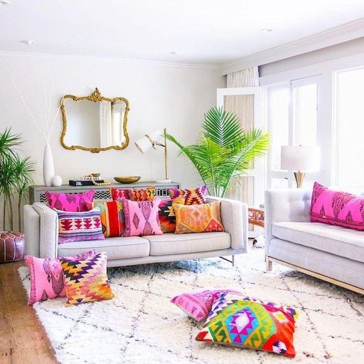
Recommendations from Nadezhda Kuzina
The only rule of a "white" living room is to use bright and contrasting elements, because an exclusively white interior will create an impression of incompleteness. Among such elements may be furniture, paintings or patterns on the walls, curtains. nine0003
In general, the white shade of the walls can be compared to a canvas: further drawing will depend on your imagination.
Beige
Another win-win option that is very difficult to spoil the design of the living room. This color scheme makes the room bright and spacious, does not tire, combines well with other shades.
Beige-coloured walls go well with natural wood furniture. This approach to the design of the room will not leave your guests indifferent. nine0003
Design: Svetlana Startseva
Brown
There are a huge number of shades of brown, and all of them will add practicality and richness to your living room.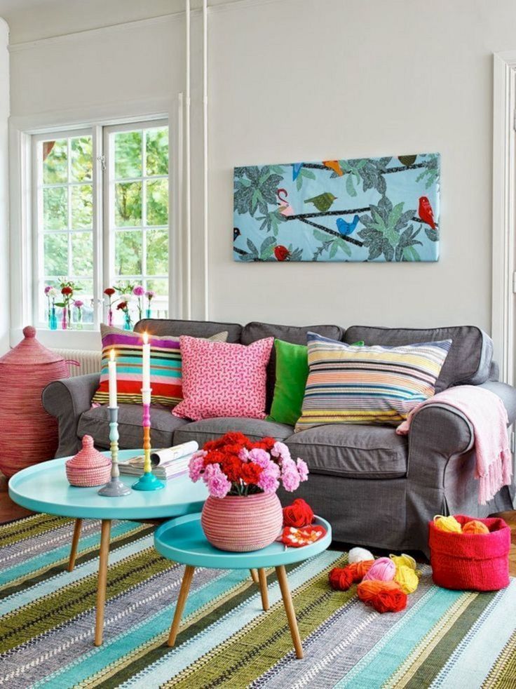 Brown walls are suitable for those rooms that are well lit.
Just don't overdo it with brown, because too much brown will make the living room look smaller. And one more tip: first paint the walls brown, and then pick up furniture and other sets of a different shade so that the elements of the room do not merge with each other. nine0003
Gray
Another versatile option for decorating the living room walls. Against a gray background, any bright paraphernalia looks good, be it a headset or paintings. A good option would be to dilute the monotonous gray shade with patterns or stripes.
Design: Yana Molodykh
Green
Among the many shades of green, there are both bright and dark options for decorating a living room. The presence of green color will give the room a sense of calm, which is so lacking after a hard day's work. nine0003
Green colors look original and attractive, but matching them with other design elements will not be so easy.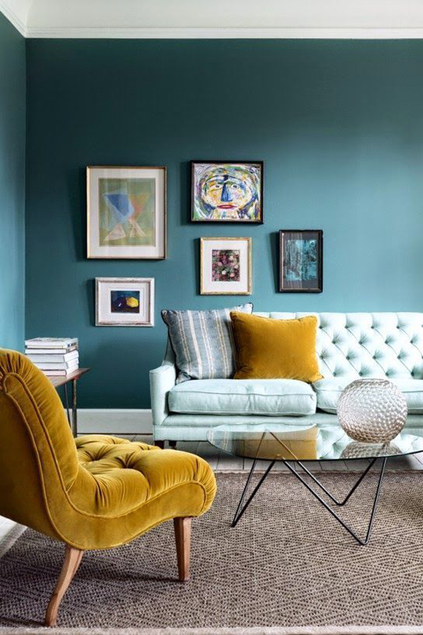 Shades of green may not be combined with all furniture or floor options, which makes it somewhat difficult to design a living room.
At the same time, a competent combination of all factors makes a room in green tones cozy, beautiful and mysterious. Natural colors are always pleasing to the human eye, which your guests will definitely appreciate.
Design: Stepan Bugaev
Yellow
A truly vibrant color scheme for the living room. The use of yellow shades will be a saving solution for rooms with insufficient natural light.
Bright yellow must be diluted with other, calmer tones (white, gray, beige). A successful combination will make the living room so cheerful and cheerful that you won’t want to leave it.
Design: Irina Sobylenskaya
Blue and light blue
Blue and light blue are suitable for small rooms. These shades are well combined with white, gray, yellow, lilac, brown. Do you want to make your living room a place of peace and tranquility? Then blue tones will be a good solution when choosing a color scheme.
When using blue or light blue, it is important to know the measure and be able to combine with the material of the headset and other elements of the living room. With a successful selection, the room will look elegant and unusual. nine0003
Design: Nikolay Nikitin
Red
The use of red color with proper design leads to good results. An excess of this shade gives the room excessive saturation and contrast, which greatly hurts the eyes, and guests can plunge into a slight shock.
Would you like to use shades of red? Dilute them with furniture and white curtains. This will reduce the “danger” of red in the room and save the eye from overstrain.
Orange
This is where you can talk about the character of a person if he uses orange to decorate the living room. Walls painted in this color will obviously speak of the positive mood of the owner and give the guests a charge of good mood.
Too much orange is the same mistake as in the case of red.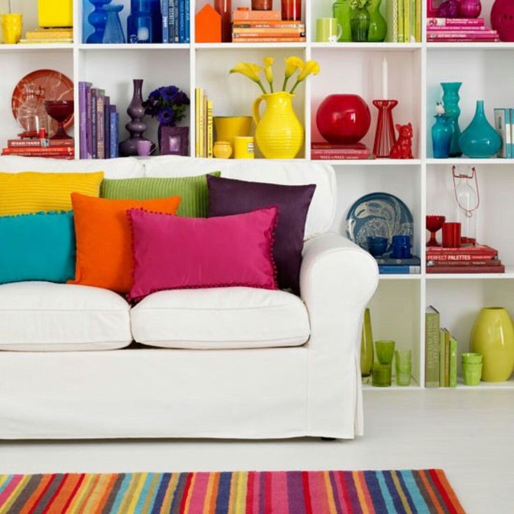 Because orange color is very popular with designers, they advise to dilute it with white, gray, beige or black.
Purple and lilac
Purple is a symbol of wealth. The decision to paint the walls of the living room in such shades speaks of the owner's creative and extraordinary thinking. Rich style and unusual design - that's what you can get when choosing lilac and purple colors for decorating the living room.
Black
Here we can talk again about the classic combination "white + black", the choice of which will bring almost 100% effect on you and your guests. However, the use of black for wall decoration is a rather controversial point, although acceptable in the modern world of design. nine0003
It is believed that black shades can bring sadness and melancholy to those who are in the room. However, now there are many projects where black tones fit perfectly into the overall picture of the living room.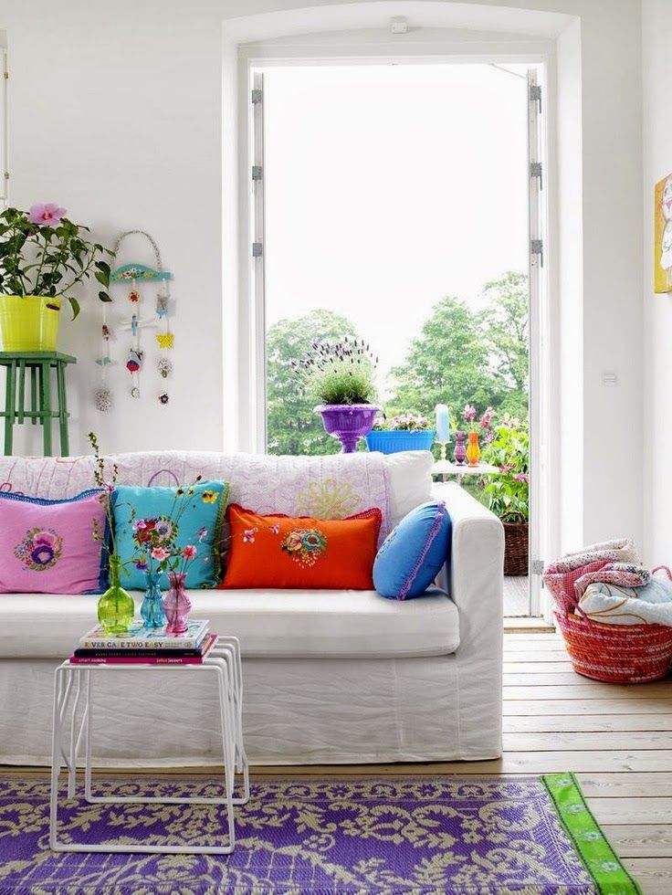 The main feature is the use of additional matte, metallic and chrome shades of the color palette in the room set.
Design: Kameleono studio, Pavel Lichik and Anastasia Ivanova
Living room zoning with color
Zoning will be an excellent addition to the overall design of the living room. In particular, the room should have its own seating area, where guests can sit on the sofa and spend their free time having pleasant conversations. How can space be divided? nine0003
- An excellent solution would be to paint one of the walls in a bright and saturated color. This contrast is especially visible in the room, the main shades of which will be beige, gray, white and other light colors. The brightness of the object will visually divide the room into several zones;
- If you have a dark room in which the walls and other attributes are designed in brown, dark green, blue shades, you can highlight the place for leisure by installing floor lamps, lamps and lamps;
- If you dilute plainly painted walls with a few paintings or photographs, you will also be able to highlight a corner in the living room.
Choosing the color of the living room according to the cardinal direction
As the wind rose is taken into account when building a city, one should not forget about the direction in which the living room windows face. The choice of the color of the walls and its maximum manifestation may depend on this.
- If the windows are facing north, it is a great option to use warm and bright colors when decorating the room. Here you can use red, yellow, orange, green, etc.; nine0062
- In cases where the windows are open towards the South, the situation is opposite. Cold and calm shades like blue, purple, beige organically fit in here;
- Are the windows facing East? This means that the room will be well lit. The use of neutral, soft colors will be the perfect solution for such a living room. Among these shades, white, gray, beige, lilac can be distinguished;
- Windows facing West. Everything here is just the opposite: The lack of light should be compensated for with bright and saturated colors like red, yellow and orange.
Learn more