12 colors wheel
|
Explanations > Perception > Visual Perception > Twelve Color Wheel The 12-color wheel | Primary Hues | Secondary Hues | Tertiary Hues | The RYB wheel | So what?
Colors can be described in several ways, such as with the classic 'spectrum'. They can also be arranged in a circle (this was first noticed by Isaac Newton). The arrangement can be very helpful when choosing colors for a color scheme. The 12 color wheelThe 12-color wheel is a common structuring of hues that is based in paint and light and is hence popular with artists as well as photographers. The hues can be arranged in a circle, which is convenient for combinations as described below. The names for hues can vary (as indicated below).
Note that there are a number of other schemes of 12 hues that,
although similar are different in various ways. Warm and coolA line can be drawn across the wheel roughly separating those hues which can be considered warmer from those which are cooler. Warmer hues are more dominant as they stand out more, while cool hues tend to recede and be noticed less. Warm is associated with daylight, action, emotion, while cool is associated more with night, calm, reason. In graphic design, this difference can be used for example in separating headlines from sub-text.
Lightness
Lightness of a color is the perceived brightness. Hence, we see yellow as
brighter than blue, even though they are both fully saturated. These can be
measured and hence sequenced in terms of lightness.
Primary huesThe primary hues are Red, Green and Blue (RGB). Secondary huesThe secondary hues are Cyan (or Aqua), Magenta (or Fuscia) and Yellow (together known as CMY or, with black, CMYK). They are 'opposites' of RGB and can be created with lights by shining the adjacent primary colors together (hence red light and green light make yellow light). Secondary hues are sometimes called 'printer's colors' as they are used in printer pigment inks and are combined to create all other colors on printers. They are hence referred to as 'subtractive' hues. Printers also use black (K, to differentiate from Blue) as it is very difficult to mix CMY to get a pure black. Tertiary huesTertiary hues make up the remaining colors in the wheel, with Orange,
Chartreuse Green (or just Chartreuse or Yellow Green), Spring Green (or Blue Green), Azure (or Blue Violet), Violet, and Rose (or Red Violet). It is possible to extend the number of hues around the wheel ad infinitum by combining adjacent hues, thereby doubling the total number on each pass through this process. Red, Yellow and Blue Wheel (RYB)Artists use subtractive primary hues of Red, Yellow and Blue. A similar 12-color wheel can be constructed using these, as below. Note how this is subtly similar and different to the additive RGB wheel above, though with an expanded Red-Yellow section (and correspondingly reduced Green-Blue section). The secondary hues of Orange, Green and Purple are of course probably quite familiar to most people who grew up using physical paints. Note that the wheel starts and ends with the same hue (typically, red is used
for end-stops when shown as a linear spectrum). This is different to the
Newtonian, frequency-based, optical spectrum that starts with red and ends with
indigo (as seen in a rainbow). Use this wheel to help select colors. Remember that you can use desaturated versions of any hue and any combination of hues in between. See alsoThe Meaning of Colors, Color Schemes, Lightness, Luminosity, Luminance and Other Tonal Descriptors, Colorfulness, Saturation, Chrominance and Other Ways of Understanding Color
|
 This is useful when you want colors to stand out, especially if they may be rendered in grayscale. With
constant saturation and lightness, converted to grayscale, luminance is:
This is useful when you want colors to stand out, especially if they may be rendered in grayscale. With
constant saturation and lightness, converted to grayscale, luminance is: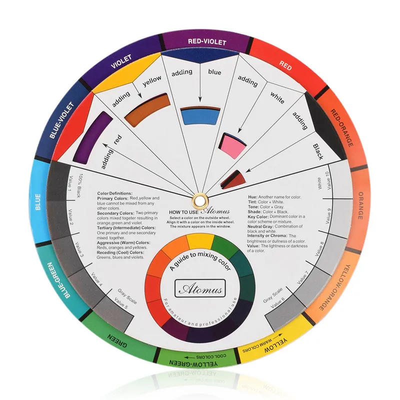 They are sometimes called the
'electronic colors' as they are used to display hues in electronic devices where
RGB dot clusters are used to create all other colors. They are hence referred to
as 'additive' hues.
They are sometimes called the
'electronic colors' as they are used to display hues in electronic devices where
RGB dot clusters are used to create all other colors. They are hence referred to
as 'additive' hues. They are made by mixing adjacent primary and secondary colors.
Color Basics | Usability.gov
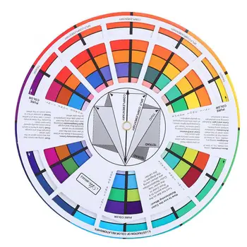
A color wheel is an illustrative model of color hues around a circle. It shows the relationships between the primary, secondary, and intermediate/ tertiary colors and helps demonstrate color temperature. Digital teams communicate exact colors through the use of hex codes.
Understanding the Color Wheel
Many color wheels are shown using 12 colors. Using this color wheel as an example, it can be read as follows:
- Three Primary Colors (Ps): Red, Yellow, Blue
- Three Secondary Colors (S’): Orange, Green, Violet
- Six Tertiary Colors (Ts): Red-Orange, Yellow-Orange, Yellow-Green, Blue-Green, Blue-Violet, Red-Violet, which are formed by mixing a primary with a secondary
It’s important to note that some people add more intermediates, for 24 total named colors, and some color wheels show interior points and circles, which represent color mixtures.
Color Temperature
The colors on the red side of the wheel are warm; the green side of the wheel has the cooler colors. These color temperature designations are absolute. More subtle color temperature relationships are relative, meaning that each color on the warm side of the wheel can be known as cool, and colors on the cools side of the wheel can be known as warm depending on the relationship to their neighboring color. Colors from the same hue, for instance red, can also be warmer or cooler than one another.
Color temperatures affect us both psychologically and perceptually by helping us determine how objects appear positioned.
| Warm Colors | Cool Colors |
|---|---|
|
|
|

Neutrals
Neutral colors include black, white, gray, tans, and browns. They’re commonly combined with brighter accent colors but they can also be used on their own in designs. The meanings and impressions of neutral colors depend more so upon the colors around them.
Color Models: CMYK vs. RGB
There are two models for colors. They have different purposes and different attributes. They are as follows:
- CMYK Color Models: Stands for cyan, magenta, and yellow. It applies to painting and printing. The CMYK model is a subtractive model, meaning that colors are created through absorbing wavelengths of visible light.
 The wavelengths of light that don’t get absorbed are reflected, and that reflected light ends up being the color we see.
 - RGB Color Models: RGB stands for red, green, and blue. It applies to computers, televisions, and electronics. The RGB model is an additive model, meaning that colors are created through light waves that are added together in particular combinations in order to produce colors.
Hex Codes
To name colors in web design, teams use hexademal code. All hexadermal codes:
- Start with a hash mark (#)
- Consist of three pairs of characters sequenced together (totaling of six characters), with each pair controlling one of the primary additive colors (red, green, blue)
- Those six characters following the hash mark consist of ten numerals (0-9) and/ or six letters (a-f)
It is easy to identify patterns in the hex codes some colors; see SmashingMagazine’s great chart at the right for this. Some things to know include:
- 00 is a lack of primary
- ff is the primary at full strength
To find additive colors, start with black and change each pair to ff:
- #000000 is black (no primaries)
- #ff0000 is the brightest red
- #00ff00 is the brightest green
- #0000ff is the brightest blue
To find subtractive colors, start with white and change each pair to 00:
- #ffffff is white (all primaries
- #00ffff is the brightest cyan
- #ff00ff is the brightest magenta
- #ffff00 is the brightest yellow
It is also possible to abbreviate some hex numbers.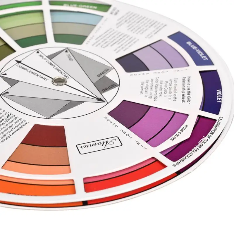 For instances #fae expands to #ffaaee and #09b expands to #0099bb.
Additional Resources
- Color Meaning
- Color Pallets
- Color Theory for Designers, Part 1: The Meaning of Color
- The Code Side of Color
- Color Theory 101: Deconstructing 7 Famous Brands' Color Palettes
- Color
- Color Meanings
- Color Wheel Pro: Color Meaning
Color Wheel and Color Scheme Selection
Introduction
When choosing a color scheme for your home, it can be difficult to match colors..jpg) It is rather difficult to imagine how the colors will be combined, and how they will look “live” in combination. Help in the selection of colors, the so-called color wheel, which will be discussed in this article.
It is rather difficult to imagine how the colors will be combined, and how they will look “live” in combination. Help in the selection of colors, the so-called color wheel, which will be discussed in this article.
Before we return to the world of color, let's talk about the color wheel and its history.
Basic color wheels
Sir Isaac Newton was the first to discover that white included the entire spectrum of colors. This was the creation of the first color wheel in the world. From this experiment, the study of color components and their effect on humans began and continues to this day.
Newton's first color wheel includes 12 colors of the spectrum. They are divided into 3 categories:
Primary colors : red, yellow and blue;
secondary colors : orange (orange), green and violet;
Secondary colors are colors obtained by mixing the primary colors of the spectrum.
Tertiary colors . Tertiary colors include primary and secondary colors.
e.g.
- red-orange,
- yellow-orange,
- yellow-green,
- red-violet,
- blue-green,
- blue-violet.
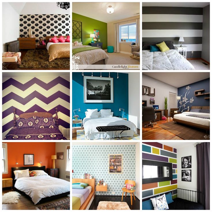
What are color schemes? The color scheme is the most successful combination of colors for interior design and decoration.
Monochromatic colors
If one color of different shades (tones) is used in the decoration of the room, then such a color scheme is called monochromatic.
Analogous colors
A color scheme that uses adjacent colors on the color wheel. The color palette can include from 2 to 6 adjacent colors.
Complementary colors
Complementary or high contrast colors are opposite each other on the color wheel.
Additional mixed (split) colors are isolated separately. These are contrasting color schemes.
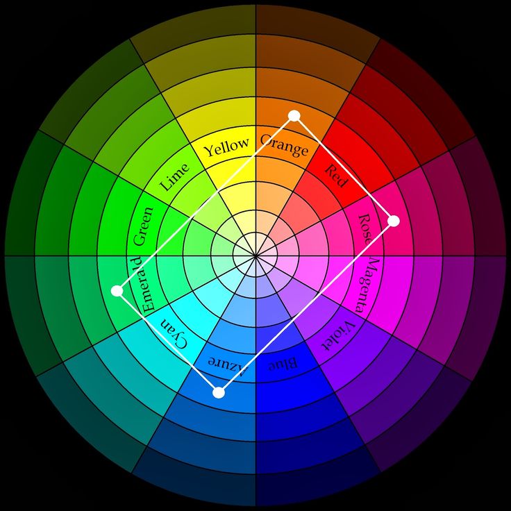
Triad color scheme
Triad is a color scheme with three colors.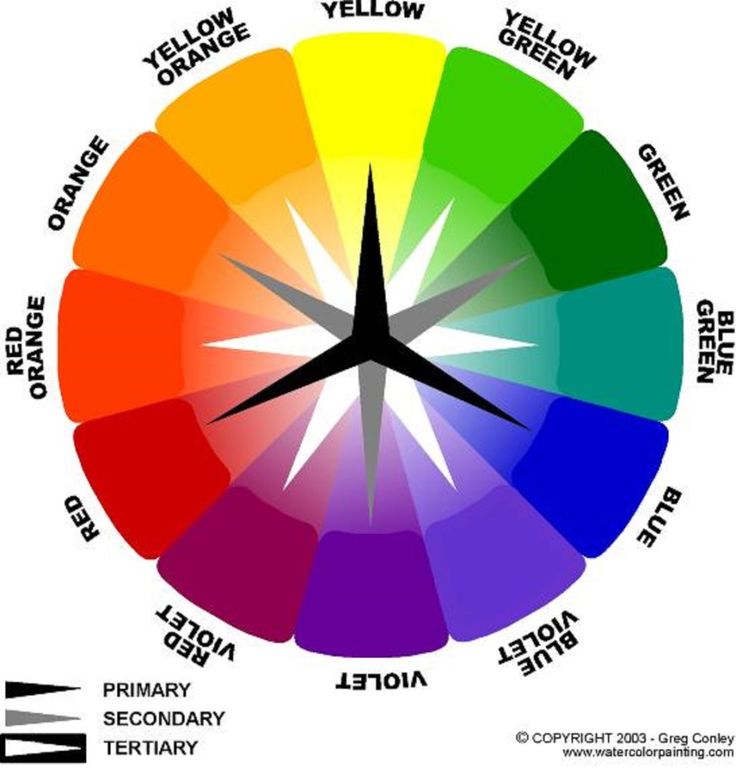 It is the most balanced for interior design. Triads are colors that form an equilateral triangle on the color wheel.
Square and rectangle color scheme
Square and rectangle color schemes stand out separately. In these schemes, one color is bright, and three colors are complementary, faded, highlighting the main bright color.
Color response
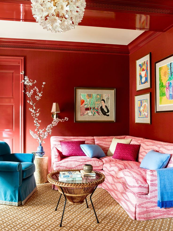
All colors can be associated with natural phenomena. Fire, sky, water, earth evoke certain associations and are directly related to the colors of the palette.
Cool colors
Cool colors such as blue, green cause a feeling of coolness, calm the body and mind. These colors and their shades should be used in rooms to calm and relax.
Warm colors
Warm colors such as orange, yellow, red for energy, cheerfulness and activity. They need to be used in rooms where vigorous activity is planned: a kitchen, a children's playroom.
Color wheel of emotions
Everyone knows that colors have a psychological effect on people and individual color selection is important. Therefore, in addition to the color wheel in the selection of color schemes, there is a color wheel of emotions. The wheel of emotions was developed by psychology professor Robert Plutchik. But the photo of the wheel shows what emotions various colors and their shades evoke.
Total
The color wheel is a handy tool for choosing color combinations in the interior and decoration of rooms in the house. They are easy to use and give good results.
Useful services in color matching
http://paletton.com/
Other articles in the section: Color in the interior and Psychology of color
- Yellow color in the interior
- Purple color in the interior
- Preparing the ceiling for plastering
- Pink color in the interior
- Blue color in the interior of the house: the influence of blue on a person
- Brown color in the interior of the house
- Individual color selection for interior design
Color and performance. The meaning of color in the interior of the house. DIY color matching
Discover the color wheel or chromatic wheel
La color wheel is also better known as color wheel. This is an image of the primary colors and their mixtures in the form of a wheel. Of course, you have already seen this type of wheel more than once, but this is a topic that originated many centuries ago and can now be presented in different ways.
In the color wheel we see primary colors and their compounds, with opposites that each primary color has. With the help of this color wheel, you can learn to combine those tones that are more aesthetically suitable for each other, thanks to the combinations created. So we can use it in many different ways in decoration and even in fashion.
Index
- 1 Color wheel
- 2 How to combine colors
- 2.
 1 Monochrome colors
 - 2.2 Similar colors
- 2.3 Additional colors
- 2.4 Triad colors
- 2.
- 3 Using color circle
Circle
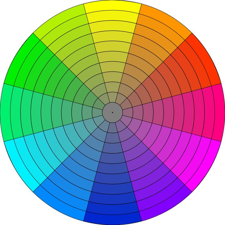
This color circle is an orderly representation of primary colors and their derivatives . It is circled and easy to understand and use. The first colored circles presented by artists date back to the 6th century. Since then, different types of wheels have been created, represented by 12, 24 or 24 colors, stepped or graduated, so that we can see the evolution of tones in different tones with mixtures of the main ones.
To easily see this color wheel, we must follow the natural pattern. There are three main colors: red, green and blue. . From their composition, connecting the two of them, another tone arises, opposite to the main tone not used to create the mix. That is, red has cyan as its opposite, green has purple as its opposite, and blue has yellow as its opposite.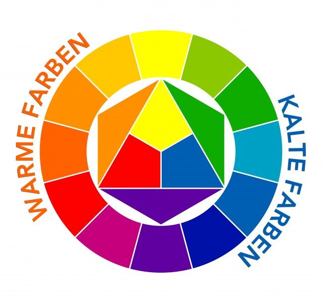
Color wheel does not show black and white , since white is the sum of all colors and black is their absence. These are the so-called neutral tones that go with everything. They are as well as gray, which is the sum of the two. Whites would be the opposite of blacks.
From the color wheel you can't get all of the existing ones as there is also mixed with white, black and grayscale . This is the only way to achieve, for example, pastel colors and many nuances in tones coming from the color wheel.
How to match colors
If you are one of those who don't know match colors well When dressing, decorating or doing work, you can use this wheel to have a clear idea of colors that coexist in harmony or create contrasts that are colorful and pleasing to our mind.
Monochrome
They use the same base color as but with different nuances. A single color is used with shades of white or black, thereby achieving its shades. The difference that exists, for example, between bright red and garnet.
Similar colors
Son similar colors in the color wheel . If we trace the same line in a circle, the color next to it will be the same color. In this way, we get similar but changing tones that blend harmoniously and simply with the same color saturation.
Complementary colors
There are opposite colors in the color wheel. That is, the one on the other side of the wheel. Opposites blend beautifully, creating the best contrasts when decorating. To use them in text, they should be avoided as they are cancelled. Red and green, for example, are opposites and can be perfect for embellishment or embellishment, but they can be reversed in texts.
Process colors
There are three colors that select creating the same distance between them . We choose, for example, red, blue and yellow. You can create great contrasts of the three colors.
Use of the color wheel
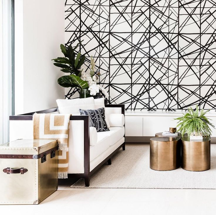
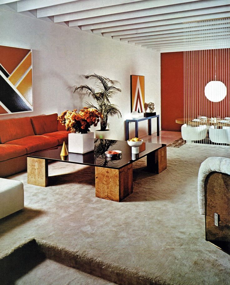
This color wheel and its simple combinations based on this type of mix will help to match the style and tones to any room. We generally recommend using basic or neutral tones such as white, black or gray as the base of any decor. These colors allow you to add any others and make them stand out.
With the help of the color wheel, we can easily choose combinations and stick to these tones in order to create spaces that are harmonious or have interesting contrasts . In any case, when decorating, it is recommended not to go beyond the three colors that should be the main ones. One tone, which is the main character, and two others, minor ones, are added with small touches. With a color wheel, your choice can be much easier. In this way, we will have a clear idea of the tones from which to choose, and we will not make mistakes when buying accessories, textiles or furniture, or even wall paint.