What is the best color for an office
Best Colors for Home Offices
With so many people working remotely or on hybrid schedules, the home office has become an important room in the house. Work areas have been thoughtfully carved out of living rooms, kitchen nooks, attics, basements, spare rooms, closets and even garages. Regardless of size or location, a considerable amount of time is spent in this room each day. Productivity is the #1 consideration for a successful workspace and color plays a role in achieving that.
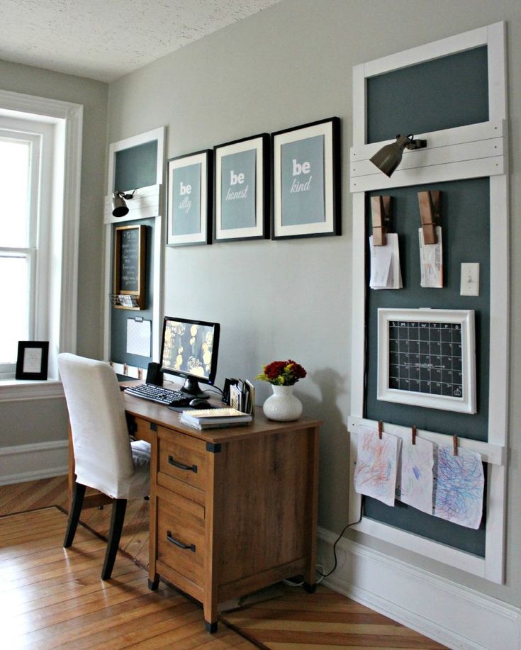
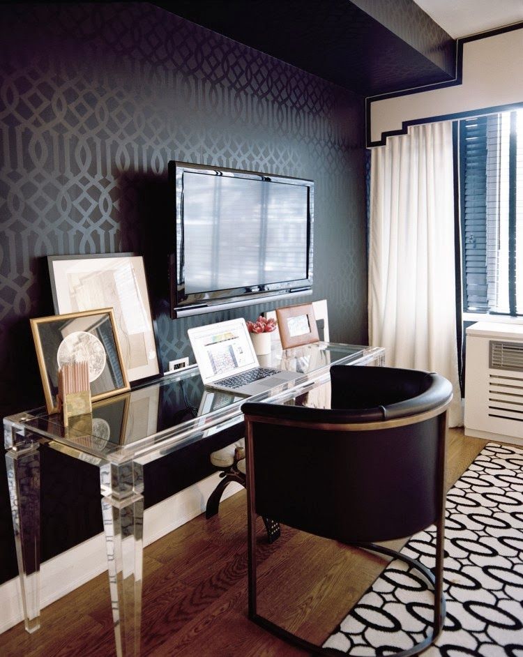
Wall-Fast as the Wind PPU26-17When choosing color for your home office, consider the types of activities that take place there. How does the room need to feel for you to do your best work? Do you need to sit quietly and focus, or will you take calls and join video conferences? Will you need to move around the room or have tables available to spread out projects. Is this your private workplace, or do you share the area with other family members?
Proper lighting is a must: natural light from a window helps keep energy levels at their peak. Task lighting can also keep eyes from becoming fatigued if they focus on small details for a long time. Color also looks better in well-lit rooms!
Let’s take a look at how color can impact your working style:
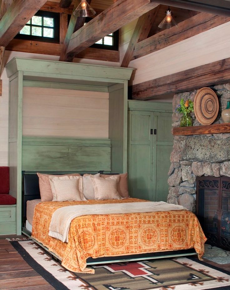
White is a great color for small spaces to help areas feel larger and more open.
wall- Nano White HDC-MD-06Gray is a color that feels balanced, does not distract and easily coordinates with other office furniture or colorful accessories.
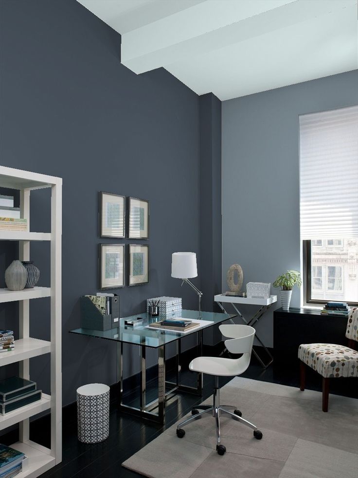
wall: Platinum PPU26-11walls- Meteor Shower N450-3, trim & door-Polar Bear 75walls & trim-Silver Bullet N520-2
When the need to focus is essential, neutrals create a non-distracting background. Try using warm shades of brown, taupe or sand keep walls from feeling ho-hum dreary.
wall & trim-Light Truffle PPU5-06ABlue is a tranquil color. Lighter blues have positive associations for clear thinking.
walls – Light Drizzle N480-1 trim-Polar Bear 75Darker Blues are known for creating an atmosphere of stability.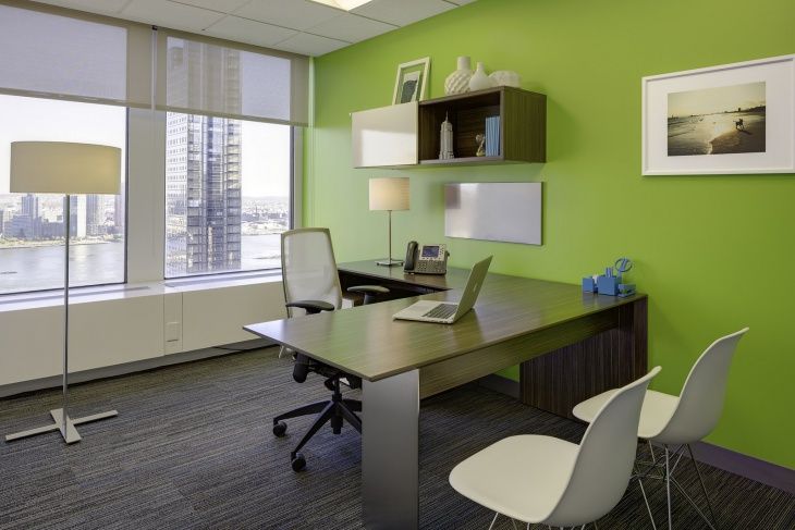
Aqua and turquoise offices have a peaceful balance of blue and green and are easy to live with and helps with focus.
wall – Beach Foam S450-1back wall & trim- Vibrant White BWC-12, accent wall- Thai Teal M460-6Natural and calming green are great for people working long hours and does not fatigue the eyes.
wall & trim- Back to Nature S340-4 door-Graphic Charcoal N500-6Dark Greens create boldness and balance in where concentration and focus is needed.
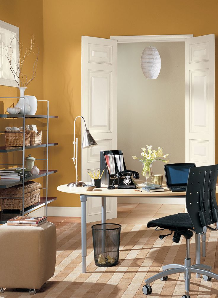
wall- Royal Orchard PPU11-01 fireplace & trim: Smoky White BWC-13 door-Barnwood Gray PPU24-07Yellow is associated with optimism and helps stimulate creativity. This is a great color for designers to have in their space.
walls & trim- Painters White PPU18-08, geometric design-Charismatic PPU6-14Terra cotta tones provide a sense a warmth to all white space and can suit a variety of home office styles.
walls: Smoky White BWC-13 trim: Polar Bear 75 desk: Canyon Dusk S210-4For a room that feels less serious, pink is a color that adds an element of charm and playfulness in an office.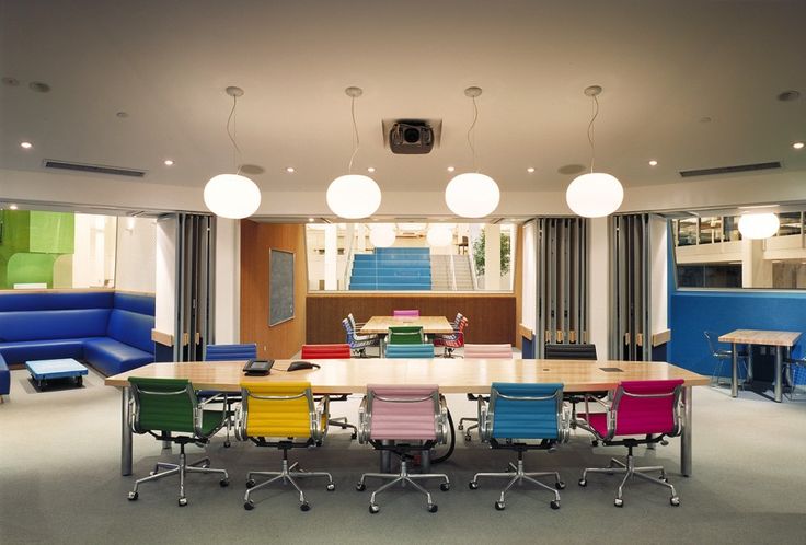
Red is a high energy color – great for rooms where there are lots of conversations or activities taking place.
walls-Red Pepper PPU2-02 trim-Polar Bear 75When projects call for out-of-the-box thinking, purple is known to stimulate creativity making it terrific for studios or craft areas.
walls- Standing Ovation N570-2 accent- Elephant Skin PPU18-16Lastly, your home office can be professional, but still feel personal. Show off family photos, favorite pieces of art, book collections and make sure your favorite coffee cup is always nearby!
Colorfully yours,
Erika
25 Best Office Paint Colors
1
Pale Oak by Benjamin Moore
1
Pale Oak by Benjamin Moore
Now 71% Off
Shop at Benjamin Moore
“A pale green, like Benjamin Moore’s Pale Oak, is easy on the eyes and helps keep stress levels down. An office can often be a place that is tense, so counteracting that with a restful tone can be just what you need. ” —Marika Meyer of Meyer Interiors
2
Hague Blue by Farrow & Ball
2
Hague Blue by Farrow & Ball
Now 72% Off
Shop at Farrow & Ball
“We love a dark, bold color for an office wall, trim, and ceilings. Using a deeper tone helps distinguish the room the minute you step foot inside and close the door behind you. It feels cozy.” —Julie Massucco Kleiner of Massucco Warner
3
Lichen by Farrow & Ball
3
Lichen by Farrow & Ball
Shop at Farrow & Ball
“I once read that olive green is the traditional color of peace. I can’t think of a place more in need of peace than a coworking space designed for a family with teenagers!” —Marika Meyer
Advertisement - Continue Reading Below
4
Dead Salmon by Farrow & Ball
4
Dead Salmon by Farrow & Ball
Shop at Farrow & Ball
“This is one of my favorite colors of all time, and not just because of its fantastic name.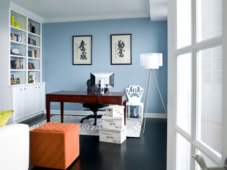 It’s a great choice for an office due to its mellowing effect. It’s not too pink but also not too fleshy and looks great with aged wood and modern materials.” —Bella Zakarian Mancini of Bella Mancini Design
5
Hale Navy by Benjamin Moore
5
Hale Navy by Benjamin Moore
Shop at Benjamin Moore
“Blue is always a go-to color, but it really sets the tone in the office. On the one hand, blue is thought of as a calming, peaceful color, and darker shades are also associated with intelligence and strength. If you want an office that inspires deep thoughts and concentration, Hale Navy by Benjamin Moore is a great choice.” —Marika Meyer
6
Nickel by Benjamin Moore
6
Nickel by Benjamin Moore
Shop at Benjamin Moore
“Nickel by Benjamin Moore is a light gray with blue hues that’s perfect for a home-office space. The lightness of the color produces a calming and peaceful aesthetic. The blue hues stimulate the mind, increase productivity, and help you stay focused! Who doesn’t like to be calm and focused when it comes to work?” —Nina Magon of Contour Interior Design
Advertisement - Continue Reading Below
7
West Coast by Benjamin Moore
7
West Coast by Benjamin Moore
Shop at Benjamin Moore
“I love this shade—it’s warm and clean at the same time.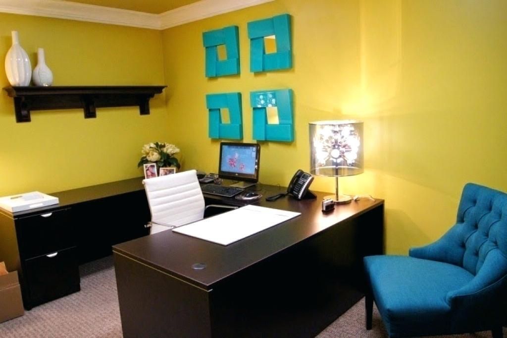 Blue is the easiest color to live and work with, and along with the reflective quality of a glossy finish, it helps bring the outdoors inside.” —Caroline Rafferty of Caroline Rafferty Interiors
8
Studio Green 93 by Farrow & Ball
“This deep, dark green, in either a matte or satin finish, will bring a dramatic mood to any home office. It is a true Renaissance color! The rich, saturated pigments respond extremely well to all types of light and remarkably emerge much greener than on the color card. Since green is the color of growth, life, and renewal, an office clad in this hue will promote calmness, harmony, a strong sense of balance, reassurance, safety, and productivity.” —Keita Turner of Keita Turner Design
Buy Now
9
Pointing by Farrow & Ball
“We used Pointing by Farrow & Ball in our own office. It is one of my favorite off-whites and acts like a fabulous Instagram filter.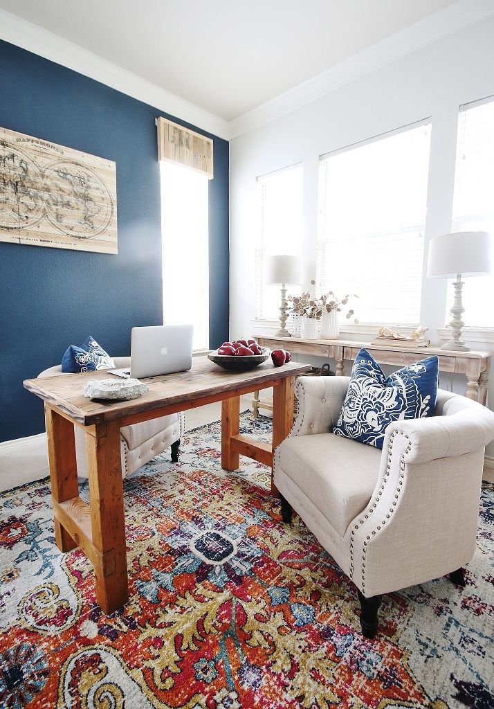 It gives your room that perfect warm glow that you only get with natural sunlight.” —Alyssa Kapito of Alyssa Kapito Interiors
Buy Now
Farrow & BallAdvertisement - Continue Reading Below
10
St. John Blue by Benjamin Moore
“The color is deep but not too overwhelming, as we needed a great base to work from in a creative office! One might think that too much color in an office space would be distracting, but it’s actually more inspiring and motivating, while the deep blue of this hue is simultaneously relaxing and tranquil.” —Kati Curtis of Kati Curtis Design
Buy Now
11
Gentleman’s Gray by Benjamin Moore
“I love using dark and moody colors in separate home office spaces, especially behind French or glass doors. Benjamin Moore’s Gentleman’s Gray is a watery blue-black, and when the light hits it, you see lots of teal.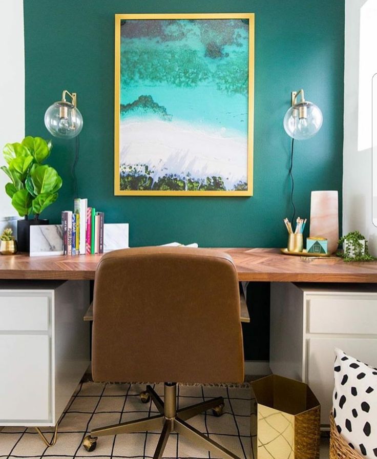 It looks especially good in a room with ample natural light. Colors you can’t quite put your finger on keep you thinking, which is perfect for a work space!” —Claire Staszak of Centered by Design
Buy Now
benjaminmoore.com12
Simply White by Benjamin Moore
“As a creative, I prefer a crisp and clean palette for my office spaces. Benjamin Moore’s Simply White is my favorite in this instance. It’s bright, serene, and fresh without feeling too stark, which I love. Not only does a bright white space allow you to begin each day with a clean slate and a clear mind, but it also affords you the ability to switch out little details as your taste (or the seasons) shift, providing a brand-new space with little effort each and every time.” —Jacquelyn Clark of Lark & Linen
Buy Now
Advertisement - Continue Reading Below
13
RAL 8022 from RAL Color Chart
“This dark, bold color in the Eurolux matte finish makes a powerful statement. Its sepia tones are eye-catching while at the same time understated, creating the perfect corporate aesthetic.” —Patrick Planeta of Planeta Design Group
Buy Now
Katja Cho14
Charmed Violet by Benjamin Moore
“The color you choose will affect your mood and influence how you feel. Choose colors that make you happy and keep you motivated. Charmed Violet will change your vibe in your bedroom or office in a positive and confident way!” —Moll Anderson
Buy Now
Katja Cho15
Blue Note by Benjamin Moore
“This deep, rich color instantly brings some moody vibes into any home office. The saturated color is one of my favorites when you want to bring some drama into that drab home office of yours.” —Emily Henderson
Buy Now
Advertisement - Continue Reading Below
16
Classic Gray by Benjamin Moore
“Office life can sometimes be drab and lackluster. Add a fresh coat of light gray to keep the office light and bright, and invigorate your team with an accent wall in a bright color.” —Taniya Nayak
Buy Now
Katja Cho17
Full Moon by Benjamin Moore
“I love Benjamin Moore’s Full Moon for an office. It’s a calming white, but still fresh and bright enough to keep you from falling asleep on the job! It also creates a nice, clean backdrop for bookcase accessorizing.” —Christine Markatos Lowe
Buy Now
Katja Cho18
Blue Echo by Benjamin Moore
“I believe life should be lived in color, and your work space is no exception. This rich blue has subtle tones of gray and works for every square inch of the room when you vary the sheen—walls, trim, bookcases, you name it. It provides a pleasant environment to inspire creative minds!” —Meredith Ellis
Buy Now
Advertisement - Continue Reading Below
19
Shaded White by Farrow & Ball
“It has that washed-out café au lait color that I love.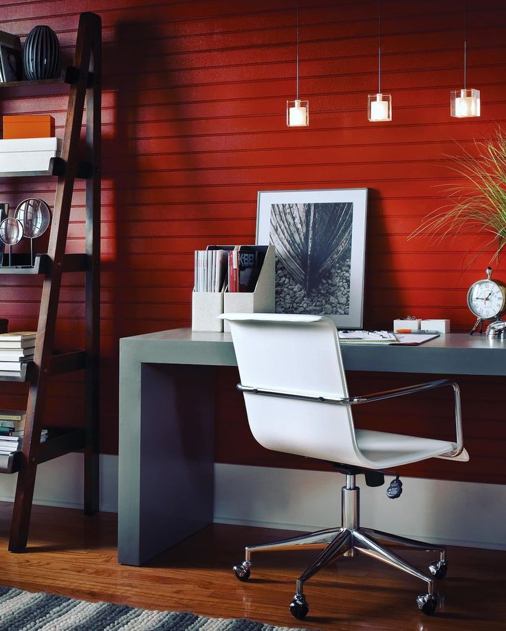 Shaded White is very saturated, so if you like a stronger color, I would go for it! This color creates the perfect backdrop for decorating. It can go either masculine or feminine, which is a nice trick for an office. I’ve paired this wall color with black accents, a black desk, and some black and tan upholstery to create a super graphic, masculine space. I’ve also used the same color and mixed it with lots of pretty reds and blues to create a more feminine space. It’s a neutral, but a neutral with personality!” —Eric Hughes
Buy Now
Katja Cho20
Oval Room Blue by Farrow & Ball
“There’s typically an overabundance of wood in most home offices, so I prefer to stay away from neutrals and choose a complementary color. This soft blue-green hue offsets the warmth in most woods and creates a sense of calm in an area where you need it most. It looks especially beautiful on built-in cabinetry and crown moldings for an unexpected twist!” —Donna Mondi
Buy Now
21
Shoreline by Benjamin Moore
“I love to use Shoreline by Benjamin Moore in a home office. It’s a beautiful gray that feels light, crisp, and peaceful — doesn’t that sound like the best place to work?” —Kimille Taylor
Buy Now
Advertisement - Continue Reading Below
22
Silver Mist by Benjamin Moore
“I love blue-grays in office spaces because they give off a very tailored and clean backdrop to the space. White is always a go-to, but I also love to play with different tones of gray. One of my favorite selections is Silver Mist by Benjamin Moore. Different shades of gray in an office can create a rich, neutral ombré effect in a stark corporate environment that needs a boost.” —Elisa Shankle
Buy Now
Katja Cho23
Stiffkey Blue by Farrow & Ball
“I am currently obsessed with Farrow & Ball’s Stiffkey Blue. I love using this rich deep-blue color in a gloss finish for cabinetry in a home office or even on a front door.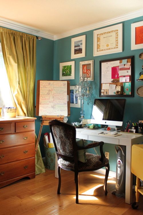 Mixing it with copper and other metallic finishes makes everything feel very elegant. It also looks great on walls in general or simply on an accent wall to create a dramatic space with a more contemporary twist. It’s a dreamy shade that complements many other colors, yet it is warm and soft.” —Birgit Klein of Birgit Klein Interiors
Buy Now
24
Strong White by Farrow & Ball
“For an office paint color, I would suggest Farrow & Ball’s Strong White. It is versatile and easy to use in a lot of different types of spaces. For an office, you want that fresh, clean, and inspiring feeling. This white will give you that beautiful and airy vibe.” —Lauren Soloff
Buy Now
Katja ChoAdvertisement - Continue Reading Below
25
Super White by Benjamin Moore
“My favorite paint color for an office is Benjamin Moore’s Super White. The color feels really clean and bright, which helps invigorate you and get you ready to work!” —Melanie Burstin
Buy Now
what colors in the interior increase efficiency?
Office color: what colors in the interior increase efficiency?Rent of offices and conference rooms
Tyumen, st. Permyakova, 1
+7 (3452) 566-366Working hours: 08:00 - 17:00
Call me back
April 18, 2017
Share:
Comfortable furniture, an eco-friendly computer and thoughtful lighting are not enough to create a comfortable working environment. One of the most important visual informants and stimuli is color. The color scheme plays a huge role in shaping the well-being and mood of a person. That's why it's so important to choose the right color for the office we're in all day long.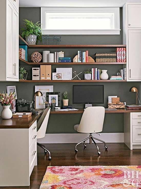 This color should not be too bright to distract from work, but also not too calm to let us fall asleep.
An office is a place where people work. This means that the main task of the color scheme of the interior of your office is to help create a working environment. Stimulate activity, reduce fatigue, increase mindfulness and concentration, reduce nervous tension. We have prepared some interesting and useful information, and we hope you find it useful.
Five main rules when choosing an office color:
- The right color of the walls in the office not only sets the employees in a working mood, but also attracts new customers and partners. Psychologists are convinced that color is able, on a subconscious level, to "force" a partner to sign a contract on the terms that you offer.
- Three golden principles for choosing colors for painting/decorating walls: area, number of windows, amount of light.
- The color of the walls should: match the overall interior, not contradict the wishes of management or employees, not contrast with furniture, take into account the peculiarities of the impact on psychological health.
- Bright colors excite the nervous system too much and interfere with concentration, while variegation can cause headaches.
- Cold shades contribute to concentration, and the whole color palette of green has a positive effect on vision.
Below are some specific recommendations for using a particular color in your office interiors.
Gray and other neutral colors
The tradition of painting offices in neutral colors was born by itself. Gray, white, beige - a considerable number of cabinets around the world are painted in these calm colors. Gray suits are also prescribed by a mass of strict office dress codes. And now, attention! Gray color demotivates, makes employees passive. And beige and white make employees, and especially employees, feel sad and depressed. As for male employees, orange and purple, which are far from neutral, also have a similar effect on them.
Yellow
Here the opinions of scientists are divided.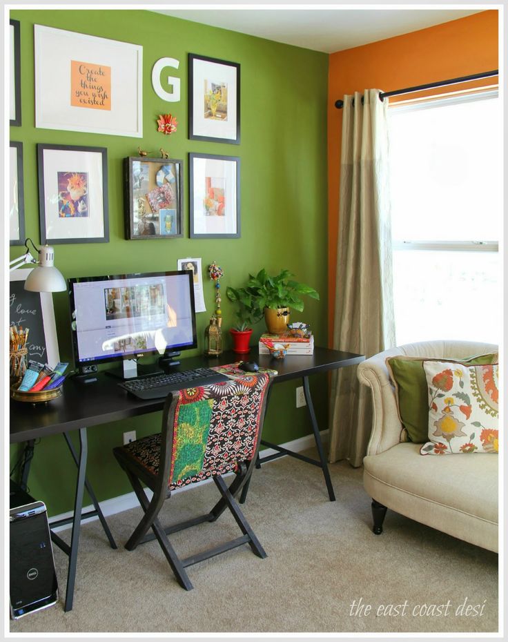 Some say yellow is great. Everyone will look at him, enjoy life and be creative. Others argue that it cannot be worse, your eyes will get tired of yellow even before you start work, and it will be impossible to concentrate at all. Scientists can argue further, but it seems to us that everything is quite obvious: if you plan to be creative and give birth to new ideas - paint the walls yellow, if you are going to focus and concentrate - choose a different color!
Green
A green-painted office is the dream of every workaholic. This color does not tire the eyes, and, in fact, it does not tire you either. But it calms and helps to focus. Also very good for reading. So if you have to sit for a long time checking documents written in small print, green will help you control yourself, not be annoyed by monotonous work and not lose concentration.
Blue
In the ranking of the most successful colors for the office, blue confidently shares the first place with green. It helps not to lose concentration and, like green, does not tire. For anyone who has to work with numbers or small details, this is what you need. The main thing is not to confuse it with blue and gray.
Brown
Oddly enough, brown did not fall into the "dull" group along with its companion, gray. On the contrary, scientists believe that this color can create a feeling of safety and security. So if you sell, for example, insurance, or the services of a security company, then brown will help convince customers that everything will be fine with you.
Red
Red can also help creatives. It enhances emotionality and expressiveness, almost like yellow promotes creative activity, and in general invigorates. The latter, by the way, can also help those whose work is associated with physical labor. True, along with cheerfulness, red increases aggressiveness, so it is better not to paint the negotiation room in this color. And also know - if you decide to paint it in red open space (open space) - everyone will always eat something in it, because red stimulates the appetite. With red, everything is too ambiguous to paint the entire office. But we still recommend using it in the interior.
We will separately touch on the most favorable color solutions for open space offices.
"Spread" the walls and visually enlarge the space in a densely populated and noisy due to conversations and buzzing of the open space technique will help light cold tones - pearl, water-green. And the colors of the "quiet" range will help to change the perception of noise - unsaturated cold ones: light blue, gray-blue. A calm range of pastel colors will reduce fatigue from crowds.
So, when choosing an office color, you should not be guided only by personal tastes and preferences. Color is a complex and multifaceted factor. Color in the office can solve many problems, but when used ill-conceived, on the contrary, it can create them. Ergonomic knowledge will help you choose the right color so that a good mood does not leave you, work is successful, and relationships in the team are harmonious.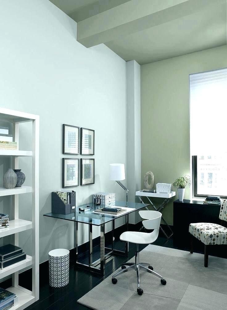
Let us remind you that when renting offices in the Nobel and Nobel Park business centers in Tyumen, we are ready to offer not only painting the walls in any of your chosen colors, but also help in developing a design project for your office. Ask any questions about renting to the managers of our company by phone +7 (3452) 566-366 or fill out the form below and we will contact you.
Your name
Your phone number is
Get a discount"Take the test and choose your office"You can get a bonus and a discount
How to choose the color of the walls in the office, so as not to turn employees into "boiled flies"?
Contents:
- Why dimming is important
- Which colors increase efficiency and which decrease it?
- Color or style? How to choose a design option by tone?
- How to quickly set up employees for work?
Working in a dark, gray room with poor lighting and boring design is very difficult.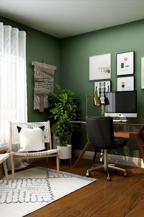 Psychologists have proven that the color of the walls in the office directly affects the mood and productivity of employees. There are shades that cause a desire to work, and there are shades that “kill” all the undertakings and aspirations of specialists. That is why it is important to choose the right wallpaper or paint to create a unique and productive atmosphere in the room.
Principles for choosing the color of the walls in the office
The effect of color on a person's mood is successfully used not only by designers of offices and apartments, but also by marketers who want to draw attention to a product, product or service. It has been proven that the human brain is already used to responding with certain reactions to different colors. For example, bright blue has nothing to do with food. And pure black evokes thoughts of sorrow and sadness.
How to choose the best wall color for your office? It is worth relying on a number of principles that are regularly used by designers of offices and public spaces:
- Assess the direct impact of color on a person's health and mood.
 The tone of the walls can be attuning to work or irritate the eyes of employees. In the second case, the efficiency will decrease, and colleagues will begin to go on sick leave more often.
 - Consider office size. Dark colors visually reduce the space. Light colors make it wider and lighter. In spacious options, matte tones look good, which smooth out the breadth and volume. But for modest cabinets, glossy surfaces that reflect light are well suited.
- Comply with lighting regulations. This is important for the health and productivity of employees. The amount of light directly affects the eyes. When it is low, the eye muscles are constantly tense, which causes headaches and weakness. The standards are spelled out in special documentation, which describes the general indicators and the illumination of each workplace.
- Evaluate overall style. Often corporate identity shows employees how important their work is. Among the general recommendations, designers advise loft or modern styles, where there are few small details that distract attention “for nothing”.
- Observe design rules. It is recommended to use only two main colors for the design of work areas. When applying three tones, their distribution should be as follows: 60% for the main color, 30% for the secondary and only 10% for the third shade.
- Follow color selection rules to increase, not decrease, performance.
To choose the optimal color for the walls in the office, you need to take into account all the recommendations. Choose the main tone both according to the design rules and the influence of shades on the health and mood of employees.
Which colors increase efficiency and which decrease it?
It is important not only to understand what color it is desirable to paint the walls in the office, but also to take into account the saturation of the tone. For example, "nuclear" blue can only be included as a design element, but definitely not as a primary color. But blue, sky blue or pale blue are perfect as a base to which you need to add a little "warmth".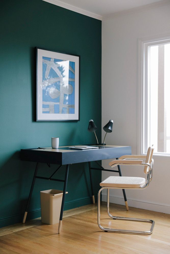
All colors have advantages and disadvantages. They are taken into account in psychology and in design.
Shade blue
Takes a leading position in the design of work areas. It is he who activates those parts of the brain that are responsible for the assimilation of new information and the establishment of working contacts. Often it is used to decorate schools, public buildings and even hospitals.
Blue
A bright and deep shade suitable only for decoration of individual details. If blue is used as the main color, the performance of employees will drop sharply.
An interesting fact. One large company in Moscow decided to choose blue as the main color for their corporate identity. Several departments were "repainted" in this color. And in just a month, productivity fell 3 times. Only after the change of tone did everything fall into place.
Green or grass shade
The color is perfect for break rooms. In this case, you do not need to choose bright colors.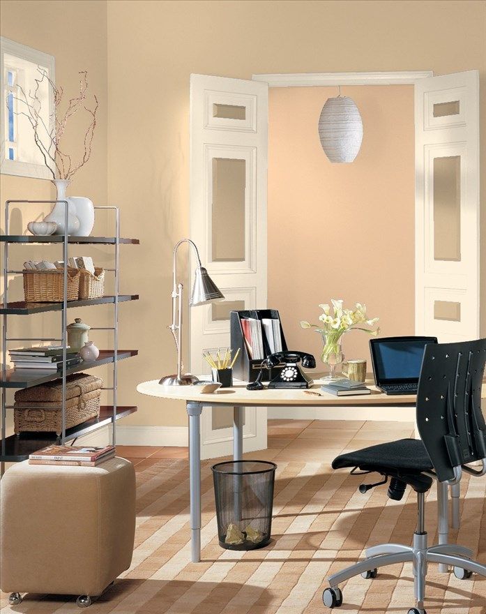 It is better to take classic or pale green. It is he who calms the central nervous system and helps to relax. Often, wallpapers of the same tone are placed on the walls of children's rooms.
Office red
A unique color that simultaneously boosts productivity through the release of adrenaline and reduces the speed of work, as it is associated with a red prohibition signal. It is impossible to decorate work areas only with this shade. But for focusing attention and combining with other tones, it is perfect.
Quite often the red rooms are meeting rooms designed for brainstorming. It is with this color that the wall is distinguished, on which the deadline for tasks is indicated or the best employees are congratulated.
Pink shade
Refers to warm tones, but not recommended for office spaces. Psychologists conducted an experiment and painted the floor in one of the offices of the office building in pink. As a result, employees became suspicious, wary, and even irritated.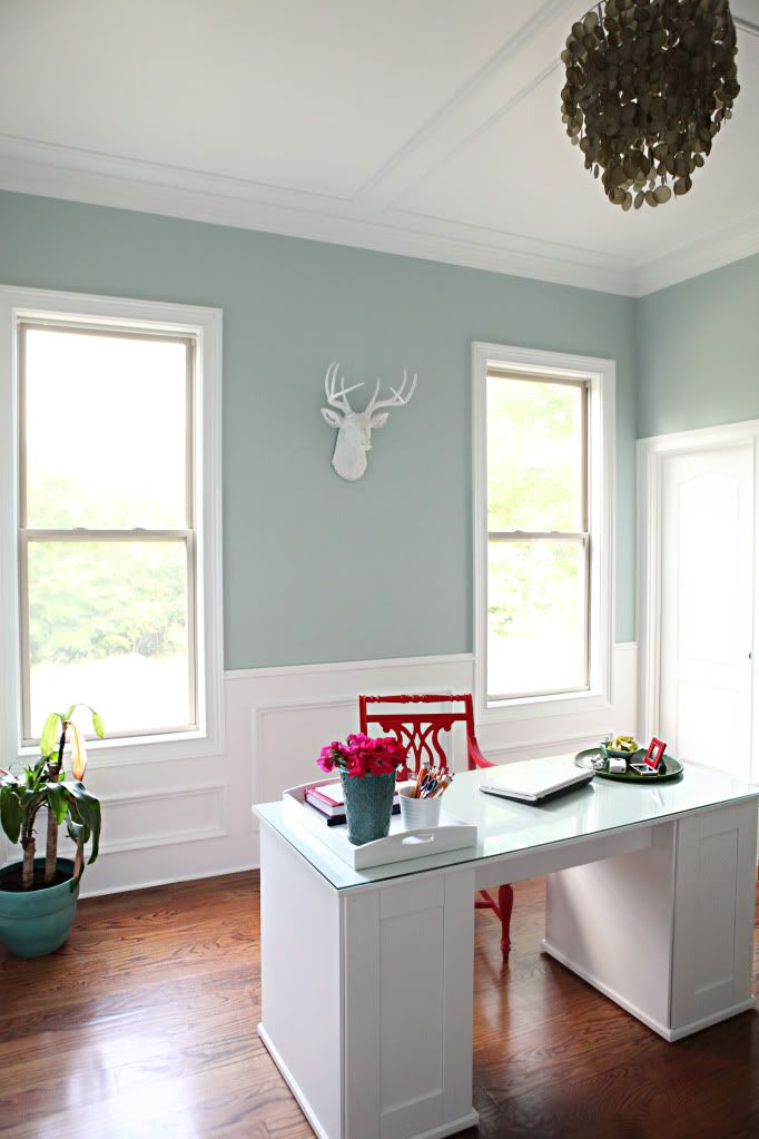
Brown and Beige
Next in popularity and utility to blue. Brown tones give self-confidence. Remove anxiety and fear, increase self-confidence. Beige shades are considered neutral. They make the room more spacious and warmer.
White and black
Such colors in their pure form cannot be used to decorate premises, not only for work, but also for living. Psychologists have proven that if the walls are painted only in white, gray or black, a person subconsciously wants to escape from this atmosphere of cold and silence.
Violet
Definitely a positive option for office walls, especially if it's not too bright. Violet improves the functioning of the heart and lungs. It increases self-confidence, stamina and even concentration.
Only purple is not recommended for office decoration. If there is too much color, it begins to cause a feeling of fatigue and oppression.
It is precisely because of these color features that designers do not use only one paint for decorating office and public buildings.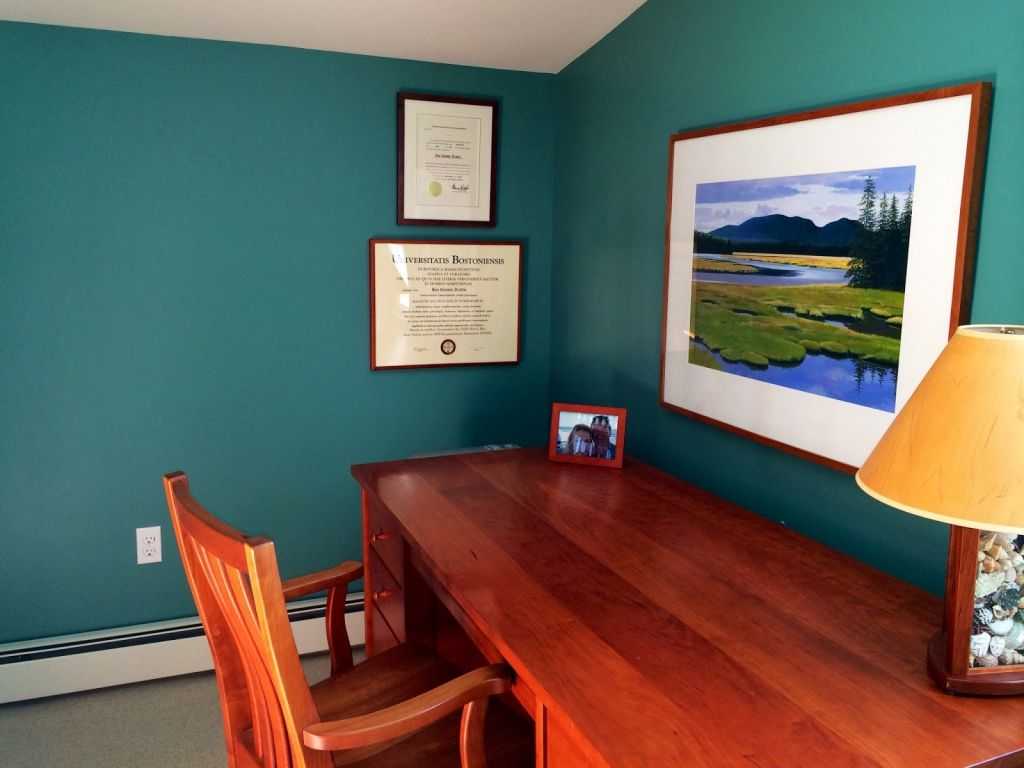 To get the perfect office or create a suitable work area, experts first choose the style of decoration, and only then take care of the color scheme.
Color or style? How to choose a design option by tone?
Designers do not just choose a certain style for office decoration. The decision relies not only on beauty, but also on knowledge of the features of the color palette. More precisely, its impact on the performance and productivity of employees.
Among the most popular styles are loft, classic and modern (modern). Each of them deserves special attention.
Features of the color palette of the loft style in the office
The popularity of the style began in the 40s of the XX century in the industrial areas of New York. In Russia, the loft came into fashion much later. But now they decorate almost any office space.
Offices decorated in a loft style are characterized by a minimal number of partitions. Large rooms are filled with light. High ceilings and panoramic windows emphasize the beauty of the interior.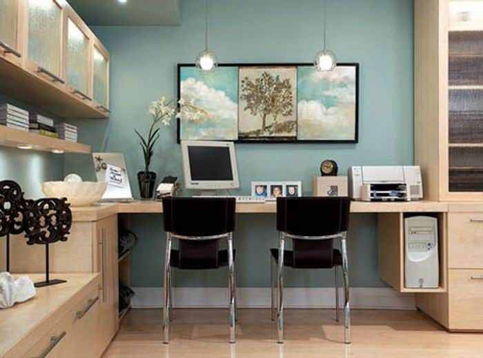
The colors of the loft are characterized by a combination of white, red and black. The main details are done in bright colors. Walls - pastel or brick tone. The combination of details literally set you up for a flight of fancy and creative work.
Contemporary spaces
Modernity, minimalism, light and spaciousness - all this characterizes a new fashion trend in office design - modern style. The layout of such premises is dominated by open space, that is, 75% of the space remains free (empty).
The flexibility of the working areas is also an important feature of the modern style. Mobile glass partitions, furniture on wheels and other details emphasize the practicality and mobility of offices.
Among the color schemes, there is a combination of contrasting shades: black and white, deep blue and pale blue, bright purple “spots” and snow-white walls.
Timeless classic
The most luxurious offices and executive offices are decorated in the classic style.![]() Natural finishing materials are perfectly combined with liquid wallpaper in light, warm colors.
Natural finishing materials are perfectly combined with liquid wallpaper in light, warm colors.
Executive offices in a classic style combine rigor and respectability. The walls are painted in white or beige tones. Massive furniture in the color of natural wood. A small number of cabinets are complemented by modern household appliances.
Such an atmosphere encourages productive managerial decisions and encourages the conclusion of major contracts and deals.
How to quickly set up employees for work?
Is it hard to figure out all the variety of colors and styles on your own? Contact the professionals. Designers take into account a number of criteria when choosing colors and interior style:
- Company's field of activity. If this is a creative center for creating ads or videos, then the design must have bright yellow, red or purple “spots”. It is believed that such accents can awaken imagination and activate a creative vein.
- Presence of corporate identity.