What colors to paint kitchen cabinets
7 Best Kitchen Cabinets Paint Colors for a Happier Kitchen
Kitchen
Expert Interview
Interior Design
Tips & Techniques
Alyssa Longobucco
updated Sep 7, 2022
“If you hate it, you can always repaint.” That’s what people say about painting and it’s true. But if you’re painting your kitchen cabinets, that’s a lot of work. What if you go through all those steps to paint your cabinets and you end up really disliking the color? What if you wished you had picked a more white white than a cream white?
Save yourself the trouble and read this story before you even pick up a paint brush. We asked seven interior designers to share their favorite kitchen cabinet paint colors. And these aren’t just any kitchen cabinet paint colors, either — these are the colors that will really shine, hold up well over time, and add a bit of happiness to the kitchen.
1. White and dark gray
“It’s important to keep in mind how much natural light your space gets before deciding on paint colors. White and a rich, dark gray are my favorite colors to use in a kitchen. We recently used Benjamin Moore Decorator’s White on upper cabinets and Farrow & Ball’s Down Pipe on lower cabinets in a kitchen project and it turned out so well. The dark gray really grounded the design, and the satin brass hardware that we used really popped against it, while white on the upper cabinets and walls kept the space feeling light and bright. For both, we used a matte finish that was still wipeable for a more modern take. Both of these shades also work well with stainless steel appliances and Carrara marble.” — Elizabeth Lawson, Elizabeth Lawson Design
2. Crisp white
“Benjamin Moore’s Chantilly Lace is a nice clean, crisp white that works really well in any kitchen. It allows other design elements to stand out as a focal point, such as the blue stove in the above kitchen, or a warm wood island. We’ve used it in many homes and it always ends up looking great. ” — Renee DiSanto, Park and Oak
3. Understated gray
“When it comes to kitchens, I never tire of bright, white spaces. It’s a classic look that stands the test of time and allows your furniture (and food!) to be the hero of the room. That being said, I love adding a subtle contrast to strong white walls with Farrow and Ball’s Cornforth White in their Estate Eggshell finish for the cabinetry. It’s a wispy shade that reads like a cloud-gray and adds the perfect amount of depth to a space.” — Crystal Palecek, Crystal Palecek Interiors
4. Vibrant blue
“If we are going for a bit of a bold contrast, we tend to gravitate towards darker blues. In the kitchen above, Benjamin Moore’s Hale Navy gives the space a lot of depth and warmth. The blue is timeless, but makes a statement, which is one of our favorite design combos!” — Megan Papworth, E. Interiors
5. White and dark gray
“To add a splash of sophistication to bright white kitchens (my favorites are Farrow and Ball’s All White and Benjamin Moore Decorators White — both are bright and welcoming), I like to add a dark gray, like Benjamin Moore Gray to the cabinets. It’s the perfect combination. These colors go with all finishes (stainless steel, brass, bronze, black, etc.) and complement both a natural stone (such as marble) and a quartz counter.” — Claire Zinnecker, Claire Zinnecker Design
6. A slightly off-white white
“We love using Benjamin Moore’s White Heron for kitchens. It’s a beautiful, bright white without any weird undertones. The color feels light and airy — we love the way it works with Carrara and Calcatta marbles, as well as colored countertops and tiles, because it’s such a neutral and versatile hue. On cabinets and trim, we usually use a satin finish unless we want a higher gloss or a hand-painted look — then we switch to semi-gloss. ” — Amy Storm, DesignStorms Interior Designs
7. Greige
“Generally when a paint color goes wrong, it’s because the wrong undertone was selected. Gray isn’t just gray — there are blue-grays, green-grays, purple-grays, etc. Balboa Mist by Benjamin Moore is the perfect greige (a mix of beige and grey). Often times, we are dealing with existing tile that has a lot of gold and I’ve found that Balboa Mist can really help tone it down for a more cool, neutral affect. It’s literally the perfect shade to complement so many things.” — Leyla Bowden Jaworski, Design Shop Interiors
Have you painted your kitchen cabinets recently? What color did you use? Or maybe you’re currently eyeing something specific? Tell us in the comments!
The Best Kitchen Cabinet Paint Colors, According to 18 Designers
AD It Yourself
Plus, how to paint with them
By Sarah Lyon
Choosing kitchen cabinet paint colors that will make your cupboards pop may seem like an impossible task when there are so many brands and shades to choose from. But whether your inclination is to go for a classic white or think outside the box a bit with a moody hue, there are plenty of designer-approved options that you should feel confident about choosing. Below, 18 designers weigh in on the kitchen cabinet paint colors that they find to be ultra-dreamy and perfect for your DIY painting job.
A kitchen by Amhad Freeman showcases wall cabinets in Sherwin-Williams’ Crushed Ice.
Photo: Nick McGinn
Sherwin-Williams Crushed Ice (SW 7647)
“This is the most absolute perfect color of light gray, and it’s as close to white as possible. I request that the cabinets be primed with standard white primer, as it will provide a clean and clear backdrop for the truest color. Always use semigloss paint, and have the cabinets hand-painted for the best look. This way, if the paint chips or gets scratched, they can be touched up much easier!”—Amhad Freeman
Farrow & Ball Pointing (No. 2003)
“It’s the perfect shade of creamy white and looks great with anything from veiny Paonazzo marble to Belgian Bluestone countertops. A little tip: I always recommend a hand-painted finish. I really adore seeing the faintest hint of paintbrush lines; I think this adds so much character.”—Alyssa Kapito
Behr Ultra Dark Cobalt Blue Extra Durable Semi-Gloss Enamel Interior Paint & Primer (PPU15-3)
“My favorite kitchen cabinet paint color is deep cobalt blue. While this color is striking, it also represents peace and serenity—perfect for one of the most-used places in your home. To achieve the desired look, you need three coats.”—Dominique Fluker
Benjamin Moore Kendall Charcoal (HC-166)
“This is a saturated warm gray that works well in kitchens and bathrooms.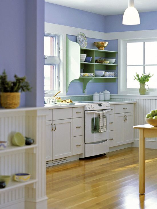 For cabinet durability, oil-based paint is the best. We have the cabinets sanded thoroughly, then use an oil-based primer. I prefer to have existing cabinets sprayed for a clean look, but they can be hand-brushed as well. If a client is sensitive to smell, I recommend using Benjamin Moore’s Stix primer followed by their waster-based Advance paint line.”—Laura Casey
Sherwin-Williams Caviar (SW 6990)
“Choosing a black with depth can be a bit challenging, but we’re leaning into Caviar as the perfect black for kitchen cabinets. To keep the cabinets from getting too flat and cold, we suggest utilizing festive hardware in brass finishes to warm them up a bit.”—Eneia White
Benjamin Moore Balboa Mist (OC-27)
“It’s one of those paint shades that looks beautiful in almost any setting. It breathes an air of sophistication and visual appeal to any space. I recommend two coats of paint paired with one coat of primer for optimal results.”—Nishi Donovan
Sherwin-Williams Salty Dog (SW 9177) and Sherwin-Williams Dark Night (SW 6237)
“These impactful blues allow for a lovely contrast when paired with lighter natural or quartz countertops. We recommend using a tinted primer close to your color to cut down on the number of coats needed—at least 50 percent of the full color should be in the primer. Don’t shy away from a fun and dramatic color!”—Laura Umansky
Farrow & Ball Skimming Stone (No. 241) and Farrow & Ball Strong White (No. 2001)
“Off colors that straddle the line between gray and beige are particularly stunning and can work well with both dark and light countertops. They have just enough pigment, so if your countertops are marble, the cabinet paint intentionally doesn’t match (versus a white, which has to be perfect). Like all paint jobs, be sure to test in different lights, such as early morning and dusk.”—Anne Mueller
Benjamin Moore Simply White (OC-117)
“We love a creamy white kitchen cabinet and often use this—it looks great with many different quartz and marble countertops and is clean, simple, and not too bright. From our experience, kitchen cabinets require a primer and a minimum of two coats of paint. We strongly recommend letting your paint cure for a minimum of 48 hours; we like to wait three days before adding hardware and all your favorite items back.”—Liz Goldberg
Sherwin-Williams’ Black Magic stars in this kitchen by Arianne Bellizaire.
Photo: Jessie Preza
Most Popular
Sherwin-Williams Black Magic (SW 6991)
“For any darker color, you will likely need more coats to fully cover the cabinets. I almost always recommend choosing a semigloss finish on cabinets because it is a lower maintenance option than the flatter finishes. If covering an existing color, I would highly recommend a primer to neutralize the base and then allow the new color to present without the bleed-through from the previous color.”—Arianne Bellizaire
Sherwin-Williams Agreeable Gray (SW 7029)
“This is a very light, warm gray that works well with all types of neutrals—whether they’re cooler or warmer—and contrasts beautifully with darks. When painting with this shade, one coat should probably do it if you are going from a pure white, but for existing dark cabinets, I recommend at least two or even three coats to fully cover. For a more dramatic, elegant look, I recommend a semigloss or even high-gloss finish. For a more casual look, go for a flat enamel sheen.”—Amy Youngblood
Benjamin Moore Soft Sand (2106-60)
“It’s all about blush right now. A lot of clients who are getting sick of going white with their cabinets have been trending toward a soft, pale pink. When this color is done in a high-gloss mirror-like finish, it comes across as very chic yet romantic. My pick would be Benjamin Moore’s Soft Sand (2106-60) tinted in the Fine Paints of Europe’s Hollandlac Brilliant 98 enamel. You will need someone with experience in using those types of finishes; it would need to be sanded down and sprayed on and can take up to 5 to 10 layers to get the right sheen. The multilayer process ensures that there is not a bump to be felt when you brush your fingers across the final product.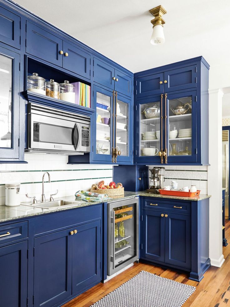 ”—Blanche Garcia
In a kitchen by Beth Diana Smith, the back of the peninsula is painted in Sherwin-Williams’ Caviar.
Photo: Mike Van Tassell
Sherwin-Williams Origami White (SW 7636)
Most Popular
“You’ll see me use this color any and everywhere. With its warm gray undertone, it will never feel stark or cold. And using this warmer white with brass hardware gives a very sophisticated kitchen vibe that can be made playful or modern.”—Beth Diana Smith
Farrow & Ball Studio Green (No. 93)
“I like that this is almost a soft black with a hint of green. To prep your millwork or paint over previously painted cabinets, start by using a wood knot and resin blocking primer. I usually do three to four coats of this before putting on the primer. Farrow & Ball recommends different primers based on the shade you pick. For example, we did one coat of Interior Wood and a primer undercoat for dark tones. We used the Estate Eggshell finish for our topcoat, because I prefer a low-shine finish on my cabinets, as it hides any imperfections that you may see otherwise. Finally, we did two coats with an air sprayer, with four hours of drying time between.”—Pallavi Kale
Sherwin-Williams Privilege Green (SW 6193)
“Green is gaining popularity, with nearly all the paint companies selecting a version of green as their current color of the year. I have found that the key is proper prep work. If the cabinets are not prepped properly, the paint finish looks amateurish. So whether it’s a DIY project or you hire a painter, be sure that time will be put into sanding and smoothing the cabinets before painting.”— Pamela O’Brien
Farrow & Ball Lime White (No. 1)
“This is a really rich taupe-y off-white that is completely classic but very warm and interesting. I like to do this shade in either Modern Eggshell or Full Gloss depending on the look we are trying to achieve. Full Gloss works better in a space that’s a little more polished, and Modern Eggshell is perfect when we're trying to achieve a more rustic look. I always suggest using the Farrow & Ball primer under the paint, as even the most beautiful cabinet color in the world still won’t look good if it’s scuffed and chipped.”—Emma Beryl
Christina Kim Interior Design conceived this kitchen with North End Builders. The cabinets are painted in Benjamin Moore’s Classic Gray.
Photo: Raquel Langworthy Photography
Benjamin Moore Classic Gray (OC-23)
“This is actually a white paint with a tiny drop of warm gray. It’s a great look for an elevated white kitchen. First things first: We always wash the cabinets with a degreaser. Then they get sanded before getting one coat of an oil-based primer. We let that dry for a day or two and try not to rush it. Then we cover the cabinets in two coats of Benjamin Moore Advance in the Satin finish and lightly sand between coats. I’m always amazed when even older cabinets turn out so fresh and great-looking!”—Christina Kim
Sherwin-Williams Repose Gray (SW 7015)
“This is my go-to neutral kitchen cabinet color. It’s the perfect shade of greige—not too gray or too beige—and brings that earthy, organic vibe I love to see in kitchens. Choosing a high-quality paint is crucial. Kitchen cabinets are not the place to skimp on quality. Finish is also extremely important; be sure to select a durable finish that’s easy to wipe. Leave the eggshell and matte paints for your walls: Choose a more durable finish that won’t hold on to all your sticky fingerprints.”—McCall Dulkys
ExploreAD It YourselfDIYkitchen
Read MoreHow to choose the right color for the walls in the kitchen
In case of insufficient light and especially the lack of sunlight, choose warm, calm shades for the walls - yellow, orange, light brown and beige.
If a lot of sunlight enters the room, it is better not to paint the walls in saturated colors, as they will become even brighter when illuminated and may change color.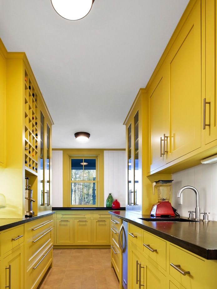
Green color is popular now. It is believed that the green color has a good effect on digestion. For the kitchen, it is advisable to choose pistachio or soft salad shades. nine0007
Also popular pastel colors, yellow gloss, red copper. The universal color is white, it can be used in any style, from classic to modern.
Consider the color and design of the kitchen furniture.
For example, white kitchen furniture goes well with red, green, burgundy, peach, yellow, blue walls.
Classic brown furniture looks good against peach, beige or white walls. nine0007
Furniture is one of the most significant elements of the interior, so you often have to choose the shade of the walls just for it, and not for other interior details. If the furniture needs to stand out, then regardless of its color, the walls should not be bright and do not contain catchy ornaments.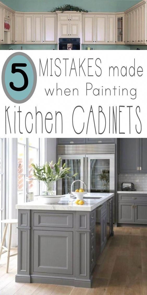 The more unusual and original the furniture looks, the more restrained the walls should be - calm shades, without flashy patterns.
If your kitchen set has a very light and calm shade, and the kitchen is large enough, you can choose a brighter and more saturated color for the walls. nine0007
Solid color furniture needs to contrast with the walls - walls can be bright, patterned and large decorative elements.
If pieces of furniture should not attract attention (furniture is old, in poor condition or simply ugly), then emphasis should be placed on juicy and expressive walls - catchy patterns and shades that delight the eye.
If the room is small and the number is furniture is also not enough, then you can paint the walls in calm, restrained colors, and decorate one side with a bright large picture.
In general, it is recommended to stick to the colors closest in tone. Soft, warm colors of the walls look equally harmonious with both light-colored furniture and darker tones.
Look at the design of furniture . If it is chosen in a romantic and rustic style, then it is better to leave the walls light - pale green, beige tones, with bright contrasting stripes of brick shades. nine0007
For an interior in a classic style, more solid and juicy shades are suitable - cold pink, strictly blue, beige.
For modern style furniture with its metallic sheen and subdued brightness, it is better to choose a solid, conservative and calm wall finish.
There are several "forbidden" colors for kitchen walls: is black and all dark shades of brown. They oppress and make the room cramped, evoke associations with dirt. * To understand how comfortable you will live with the chosen wall color, hang sheets of white paper, old wallpaper or cardboard on the walls. Apply paint spots on them and leave for a few days, during which, looking at these colors, you can understand which color suits you best. nine0007
Popular articles:
What color to choose for the kitchen
beautiful and cozy.
1) Canary Yellow
Place a bowl full of juicy, ripe lemons on the table and see how your kitchen transforms! It will immediately be filled with warm light, it will become bright and hospitable. This is what your kitchen will look like if the cabinets radiate this color and energy! Yellow cabinets will bring that light and warmth to even the darkest and smallest spaces. nine0098 Yellow has a beneficial effect on the nervous system, promotes the emergence of new ideas, gives a charge of vivacity and joy!
2) Scandinavian Grey. 4) Blue Black Combination of dark blue, almost black base cabinets with a marble top that has elements of sophistication in gray and white. This color is perfect for larger kitchens that require stylish design elements. 5) Cedar Green This color is reminiscent of grassy fields and will give your kitchen a fresh and open look. It is the color of life, harmony and balance. Such pastel green will decorate your kitchen, you will feel calm and comfortable in it. ) A shade of sky blue gives the kitchen freshness and coolness, fill it with air and transparent light. If your kitchen is on the sunny side, this color option is perfect for you. nine0007 Golden handles and lights make for a dream space for hosting upscale cocktail parties. Pair your turquoise cabinets with intricate wall paneling for a vibrant vibe that will grab everyone's attention when they spend time in your kitchen.
Gray cabinets on gray walls and a white backsplash make the room interesting and original, but do not overload the interior. With the right presentation, such interiors look expensive and luxurious. nine0007
Choose a deep, intense, somewhat reminiscent of burgundy, red.
For brave and determined people who enjoy life and enjoy it!
This color will give your kitchen warmth, vitality and joyful emotions. And your guests and relatives will eat with a double appetite. nine0007
Wealth and discreet luxury dominate this magnificent interior!
 The combination with natural wood creates a beautiful interior for your kitchen.
Such a kitchen is timeless, as is white. It is always relevant both by itself and in various combinations and shades. This is a clean, fresh environment, which is pleasant to stay in for a long time. nine0007
The color of the sea wave, bringing good luck, relaxing and restoring energy, will have a beneficial effect in the interior of the kitchen.