Trending interior colors
Color trends for 2023 – from high gloss ceilings and bold red hues to warm earthy tones and cocooning neutrals |
When you purchase through links on our site, we may earn an affiliate commission. Here’s how it works.
(Image credit: Mylands)
For 2023 it's all about colors that make you feel good. Forget being on-trend really, the trend is to just go with what you love, create rooms filled with colors that reflect your personal style, and give you an uplift every time you enter them. Experiment with shades too, after all it's just paint, it's the easiest low-commitment update you can make to a home so don't hold back from trying something you've wanted to see in situ for years. 2023 is the time to do it.
'There is something inherently human in the colors that we are attracted to now,' says Joa Studholme, Farrow & Ball’s color curator. 'Décor is moving forward while drawing inspiration from the modest character of the world of folk and craft, using five significant shades that extol the virtues of a simple life and can be used in any combination and in any room. '
'They are an eclectic mix of the pure and the humble that evokes the warmth and harmony of a more innocent age while celebrating life today. Function goes hand in hand with ornament, using colors and finishes in unusual ways to celebrate the principles of utility, kindness, and honesty.'
And there's also a feeling that we aren't playing it as safe anymore. You'll see that grey and cream and white aren't as apparent as they once were, instead, there are more energetic shades like pinks and yellows and even red has recently made a renaissance in the world of interior design trends.
The biggest color trends for 2023
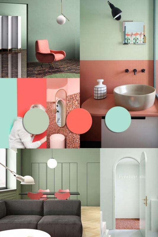
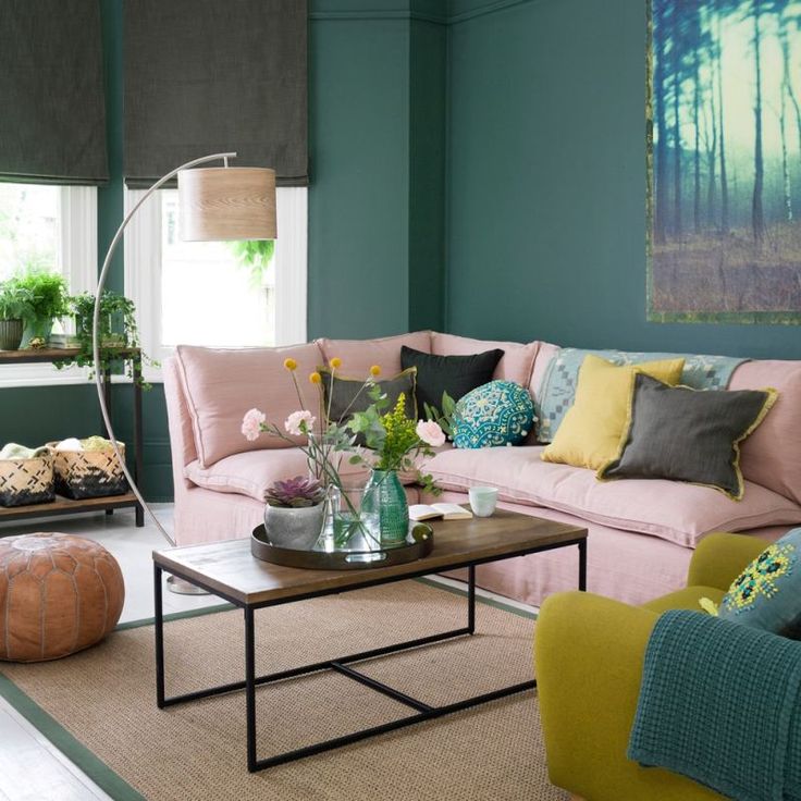
1. Jade
(Image credit: Bert and May)
Touches of this jewel tone are popping up in interiors across the world. Pale blues and greens inspired by the natural color of the gem itself are increasingly popular and can be applied to both tranquil and striking aesthetics depending on how it is used.
“Jade works well as the lead color in a modern bedroom or bathroom,” comments Ruth Webber, the Creative Director at Bert & May . “It has an air of coastal chic and pairs well with neutrals and terracotta for an understated scheme.”
2. Honeyed Yellows
(Image credit: Bert and May)
“We have noticed a growing popularity for muted, pastel colors,” states Clara Ewart, interior designer, and Head of Design at Kitesgrove. “Soft pastels are versatile and easy to incorporate in a myriad of schemes. Earthy yellow and orange tones are not only easy to style but feel incredibly current.”
Injecting small pops of the color initially can help build confidence before adding it to the wall. In modern bathrooms and kitchens, matching tonal shades on the tiles and walls brings cohesion to the space.
3. Lavender
(Image credit: Mylands)
Our love for purple is back again, with Mylands claiming that searches for lilac is up by 33% on its website, not to mention WGSN’s prediction of Digital Lavender being the colorr of the year for 2023.
Seen across fashion and interiors, shades of purple have previously been associated with wealth and royalty and, while many might associate it with a traditional interior scheme, designers are incorporating it into fresh, contemporary aesthetics bringing a new dynamic to the color.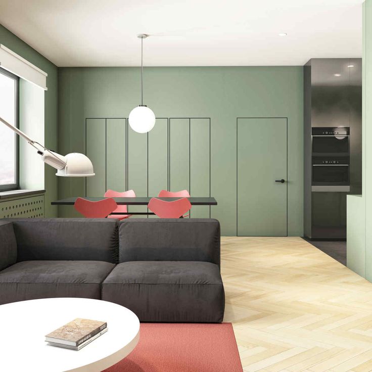
4. Fuchsia pink
(Image credit: Mylands)
Some are calling it ‘Barbiecore’, but hot pinks have been working their way back into homes for a while, with our love for maximalist interiors increasing and social media instilling confidence into homeowners to experiment more with their colour choices. “This shade makes a strong statement when used as the main colour in a room,” states Mylands’ CEO, Dominic Mylands.
“If you aren’t sure about using it on the walls, try it on smaller areas such as woodwork, kitchen cabinetry or even a front door to introduce characterful colour without dominating the space.”
When applying to woodwork, a gloss paint finish can add extra drama to the overall effect.
5. Green and Orange combined
(Image credit: Colors of Arley)
Green has been a firm favorite in the home for several years, however, there are certain shades which are increasing in popularity such as pine, pistachio, and all the colors that go with sage greens. While green works well on its own, pairing it with orange is bringing interior schemes to life and adding a playfully retro feel to the space.
As seen in this image, with fabrics by Colors of Arley , this color combination injects energy and brings fun, happiness and vitality to the home. “Don’t forget to refer to the 60-30-10 rule when you’re decorating to ensure you achieve balance,” advises Louisa Tratalos, the founder of Colors of Arley. “For example, opt for 60% of the room in green, 30% in your chosen orange and 10% in an accent, such as a soft cream to allow the main colors to do the talking.”
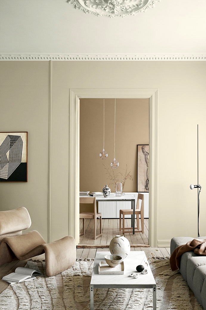
6. Warm Beige
(Image credit: Lick x Soho Home)
Our love for neutrals has returned, especially in bedroom trends, as it helps create a restful ambiance and a sanctuary to escape in. Warm and earthy creams work well paired with soft terracotta or deep red tones, adding depth to the room.
Beige 02 by Lick x Soho Home is a great colour for this trend and has a rustic, yet refined, aesthetic. Remember, with neutral schemes, layers of texture bring tactility and interest to create a distinguished feel within the space.
7. Dark Chocolate Brown
(Image credit: Edward Bulmer)
Yes, brown is back. And it’s looking better than ever! With brown often perceived as drab or boring, designers and stylists are helping us to view the color in a new light. Bringing an earthy, yet sophisticated, tone to any interior, brown living rooms are full of drama.
“Being polychromatic, brown goes with everything but in deeper hues it is particularly good at flattering beautiful, well-drawn patterns. I would even suggest that more people will find how useful brown is as a wall paint in support of clever colours in the artworks and furnishings,” says Edward Bulmer when discussing the brands own color, London Brown . “It puts everything else in a good light. It is strong and warm but somehow respectful to other colors regardless of weight or shade. I love its sophistication and I feel it might just be time for deep browns to enjoy a well-deserved resurgence!”
8.
 Deep Red
(Image credit: Graphenstone)
Deep, earthy reds are having a revival thanks to the intensity of hues from paint experts such as Graphenstone . A brand new color for the brand, the Carnelian shade by Graphenstone has an opulence which elevates any interior and works exceptionally well with period features and detailing.
Paired here with two different colors: Old Lilac for a soothing and comforting atmosphere or Cerulean Blue for a bolder, vivid, and striking statement. When combined with complementing colours, reds such as this work well in a variety of spaces and rooms.
9. Paprika
(Image credit: Paint and Paper Library)
The terracotta trend morphs into paprika, and we are glad it’s here to stay. This year, think of vibrant versions of the color to really make your home stand out.
Blending different shades of paprika together creates a beautifully tonal look and, when set against neutral fabrics and linens, it comes together in a cohesive, sophisticated aesthetic.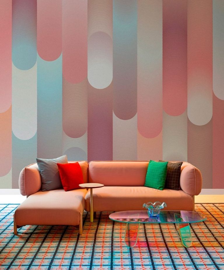 Caravan 453 by Paint & Paper Library is a gorgeous option for this style and brings the room to life.
10. Sunlit Yellows with Black Accents
(Image credit: Little Greene)
With yellows firmly on trend for 2023, pairing brighter tones of the color with black accents in a monochromatic style is a great way to embrace the look.
Colors such as yellow are helping to bring joy and happiness into the heart of the home. Matt black fixtures, fittings and furniture allows the color to pop, as shown here with Giallo 337 by Little Greene .
11. Warm summery tones
(Image credit: Annie Sloan)
There has been a rise in uplifting shades this year (unsurprisingly). Yellows, tangerines, pale purples and baby pinks, which once may have sounded a bit saccharine are all seeping into interiors in a very sophisticated, grown-up way. In their more muted forms there are in fact surprisingly liveable shades even when used on four walls.
'There are several colors that stand out to me, when I think of upcoming trends for 2022, and these include pinks, oranges, lavenders, purples, and greens.' says designer and master of color Yinka Ilori . 'Many of us have struggled to experience a proper summer, or to go on holiday this year, so people are tending to opt for richer tones that inject positivity and warmth into their homes - bringing that summer feeling inside. As an artist, I’ve always loved color and I’m glad to see how people are using it more and more to enrich their home environments.'
12. Rich blues
(Image credit: Soho Management London Ltd)
Blue comes into color trends every year, just taking a slightly different form. It's such a grounding, a familiar color that there's so surprise we are drawn to it year after year, and this year it's deep blues that are looking to be the most on-trend. And it's about really embracing the darker shades, not just bringing it into a neutral space with furniture, or a feature wall but going all over with an inky shade to create a dramatic and cocooning room.
'The boldness and warmth found in blue will continue to be prominent in our homes. Darker colors form a much better background for paintings and artworks than white, which art galleries and museums have discovered.' says Martin Waller, Founder of Andrew Martin . 'Having painted a room blue, it may take time to accustom yourself to the look. You're likely to be horrified. People find it difficult to cope with change. Leave it for a week and your feelings will alter. I suspect you won't hate it and if you do, repainting isn't that difficult. If you are still hesitant, start your transformation in a cloakroom or small bedroom, since richer colors work well in such spaces, despite the accepted wisdom that white paint makes a room seem larger.'
13. Deep jewel shades
(Image credit: Little Greene)
Dark and stormy is still up there when it comes to color trends. This time used
on staircases, feature windows or woodwork to bring elegant definition to a space.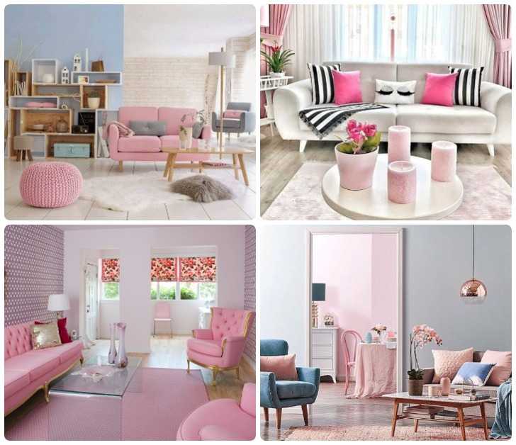 A deep plum or black with a red undertone makes for a warmer and more striking alternative to the popular deep charcoal greys and blue-blacks. It adds warmth to cooler palettes, and pairs beautifully with pink and nude tones.
14. Baby pinks paired with teal greens
Kitchen by deVOL
(Image credit: deVOL)
The unusual color pairing that is hot pink and forest green is unmissable seen everywhere right now across walls, homeware and even daringly kitchens like this viral kitchen combination. Green and pink are complementary colors as they sit opposite each other on the traditional color wheel and enhance each other and are far less contrasting than green and red.
Find more colors that go with pink in our expert color pairing guide.
15. Neutral stone hues
(Image credit: Future/ Jake Curtis / Alyce Taylor)
'The neutral trend continues subtly away from cold greys and traditional creams, towards warmer neutral stone tones. This trend is all about creating warm cocooning spaces that feel intimate, inviting and familiar with consumers embracing warmer, more natural colors.' explains Ruth Mottershead, Creative Director at Little Greene.
'Earthy, stonier tones alongside soft welcoming greens are becoming increasingly popular, providing a restful alternative to cooler choices. These gentle neutrals can be used in all areas of the home adding warmth as well as a sophisticated, complementary canvas for fabrics, wallcoverings, and furnishings from all genres.'
16. Bold hued furniture
(Image credit: Future / Damien Russel)
If bright colors spark joy for you - but going bold on the walls feels too much - choose strong colors on furniture pieces instead. This is a really easy way to create impact without color overpowering the space.
A color that we love right now, and is back a sure comeback this year, is a primary red. It's bright but the clean notes in the red makes it feel vintage and therefore timeless amongst modern interiors.
17. Pistachio
(SPRIG I 701, SPRIG III 703, SPRIG IV 704, SPRIG V 705 by Paint and Paper Library)
(Image credit: Paint and Paper Library)
This soft, pastel green hue is the shade thats everybody’s going nuts for! With our love for green in the home continuing, thanks to its warmth and earthy ambience, homeowners and designers are opting for lighter and more subtle shades as an alternative to neutral and off-white colors.
Pairing different greens together in one space, as shown here by Paint and Paper Library with the darker Sprig hues, is a great way to embrace the color with the tones complementing each other in a cohesive manner. Go green, go pistachio green.
Design Writer, presenter, panel host, consultant and journalist Roddy Clarke is a regular in the pages of Livingetc. He also writes frequently for FT Weekend and Forbes. Based in London, and with a breadth of skills and hands on industry experience, Roddy now offers an exclusive interior styling and design service.
Paint trends 2022: the 15 best colors you need for your home
(Image credit: Future)
The best paint trends are one of the hottest topics in interior design at the moment. Bold, brave and beautiful room color schemes are redefining the way we see color, but where to start when it comes to choosing the best paint for your space?
When it comes to refreshing our homes with color, it takes careful consideration and expertise to choose a paint palette that is timeless and enduring. Applying a new lick of paint to your walls is an excellent way to give your interiors a fresh-faced makeover. But which color sample pots should you be buying, and what are the biggest paint trends for 2022?
The top paint trends 2022
We've teamed up with a host of color experts to bring you the most exciting paint trends in the year ahead. Brushes at the ready...
1. Create calm with blue
(Image credit: Church & Rose)
Fresh and inviting, blue is certainly worthy of its place in the spotlight. There are endless shades of blue room ideas for all your color trend and room color needs. Many blues have their own beneficial qualities but there's nothing quite like sky blue – a mood-lifting hue that is ideal for quiet spaces, reading rooms and even outdoor spaces.
'We love this color for being neither loud nor cold – it adds an instant freshness to outdoor spaces.' says Ruth Mottershead, creative director, Little Greene .
2. Beautify with soft lilac
(Image credit: Benjamin Moore)
Lilac, especially at the lighter end of the scale, can be used as a softer, more romantic version of grey so if you want a look that feels clean and unfussy but with a little character, this is your ‘go to’ shade when thinking about room color schemes.
'Lilac is a calming, comforting color, it makes you want to relax and stay in an interior longer.' says Saffron Hare, creative director, James Hare . It is a hue that encourages quiet moments of contemplation.
3. Decorate with a barely-there beige-grey
(Image credit: Base Interior | Christopher Horwood)
It's fair to say that we've been championing colorful interior schemes and bold decorating ideas for some time, but a neutral whole-house color scheme can enable beautiful architecture and decorative furniture to make a true style statement within your home.
When it's comes home ideas and planning your scheme, it's often best to consider the overall color palette of a room early on, this will assist with defining the other aspects within the space as the project moves forward. For example, a neutral shade, like this beige-grey, may need to be paired with other materials to truly sing: timber, leather and marble work particularly well.
4. Warm up with earthy pinks
(Image credit: Georgie Wykeham Designs)
Earthy pinks – these natural hues, somewhere between red, pink and brown, conjure up warmth in any room and are reminiscent of late summer evening sunsets.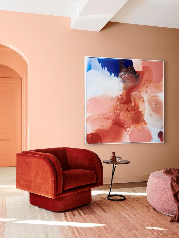
‘Rhubarb is my go-to color; added to a neutral scheme, it creates warmth, depth and a touch of the unexpected,' says Georgie Wykeham, founder, Georgie Wykeham Designs . 'Used on its own, it is a very easy color to live with and yet it also works beautifully with blues, greens, pinks and reds.’
5. Make a room feel grounded
(Image credit: Laura Stephens Interior Design)
While this rich caramel hue definitely belongs to the neutral color family, we think it packs a strong punch that blends well with natural materials, as well as patterned fabrics, to create a calm and relaxing space.
‘This sandy shade has such depth to it,' says Laura Stephens, founder, Laura Stephens Interior Design . 'It makes a room feel warm so is good for north-facing rooms and those that don’t get a lot of natural light. It works really well with both crisp whites and also colors closer in tone, such as burgundy and olive green. It also makes stronger colors like a royal blue pop against it. It’s so versatile.’
6. Inspire with orange paint trends
(Image credit: Davide Lovatti)
Vibrant and inviting, deep orange packs a pinch and is full of optimism and hope.
‘For me, the home should be filled with bright color trends and bold patterns as they add personality to a space,' says ’ Emma Deterding, founder, Kelling Designs. 'Orange shades are a great choice – they bring an uplifting feel during the day and can help create a cozy, relaxed atmosphere in the evening, showing how versatile this color is in different light.'
An orange entrance hall is a wonderful way to welcome people to a home. Here, the interior of the client’s antique Chinese lacquered cabinet inspired the glossy walls of this apartment. A strong sense of orange was carried throughout the scheme.
7. Warm up with mid-brown taupe
(Image credit: Edward Bulmer Paint / Paul Whitbread)
Reminiscent of velvety cocoa, this mid-brown taupe is a striking color for any room. Depending on the furniture and accent color ideas introduced alongside, it has the flexibility to range from looking neat and tailored to soft and welcoming. Insiders reveal how to use it to best effect.
‘Timeless neutrals lend themselves to historic properties, creating warm backgrounds for original features,' says Louise Wicksteed, design director, Sims Hilditch. 'When opting for a neutral shade on the walls and ceiling, be playful with your soft furnishings and consider threading splashes of color and pattern through the fabric used for your scatter cushions.’
8. Escape with an ocean-inspired palette
(Image credit: Designers Guild)
Instantly energizing, an ocean hue offers a mental escape route from busy schedules and looming deadlines. It’s versatile, too: turn up the intensity with a gloss finish or subdue it in a flat matt.
‘Reminiscent of endless tropical skies and oceans, this color is full of vitality even on a grey day,' says Tricia Guild, founder and creative director, Designers Guild.
'Some consider blue room ideas to be cold (and it can be sometimes) but this powerful, punchy shade is anything but; rather it is enlivening in its strength. Use it with a white for crisp simplicity, make it dramatic with darker hues or take it to the Caribbean with pastel tones. It responds beautifully to sunlit rooms but looks equally stunning with low lighting and candlelight.’
9. Energize with yellow paint trends
(Image credit: Paint & Paper Library)
An earthy tobacco shade, this golden hue creates rooms that are rich, warm and inviting throughout the year – and it also allows artwork to pop out from the walls.
'Yellow is a color that evokes happiness and provides a sense of positivity,' says Andy Greenall, head of design, Paint & Paper Library. 'It is perfect for areas of the home where there is much activity and socializing, such as the kitchen and dining room, where it adds energy and vitality.'
It’s easier to incorporate this color into a scheme if you’re slightly put off by bright yellow paint in your home – and is particularly effective in darker, moodier spaces as it creates a feeling of warmth.
10. Ground your space with an earthy brown
(Image credit: Francesca’s Paint)
Considered a dark neutral, earthy brown living room ideas are grounding but also has an elegance that is truly sophisticated. Versatile, it can be striking on its own or allow other hues to stand proud.
‘Don’t be scared to use dark colors in a small, gloomy room,' says Natalie Forbes and Louisa Rix, co-founders, Forbes Rix Design. 'It’s never going to look light, so choose a rich color and the effect can be truly transformative.’
Mike Fisher, creative director and founder, Studio Indigo agrees: ‘We believe north-facing rooms should be painted a dark or strong color, like brown, to make it more cocooning and those on the south side in lighter colors. The thinking is where you have darkness you should bring color, warmth and joy.’ .
11. Decorate with an easy to live with grey
(Image credit: Andrew Steel)
A grey that straddles the boundaries between blue, green and grey can be many things: front and centre or a background to show off art and objects.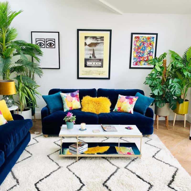 Easy to live with, it looks beautiful in west- or south-facing rooms while being suitably moody in spaces with less light.
‘I love using this sort of color on walls as it allows paintings and portraits to really sing out,' says Anna Haines, founder, Anna Haines Design. 'It feels both calming and quiet and also works as the ideal backdrop for a range of rich textiles, decorative antique rugs and furniture.’
12. Exude confidence with color
(Image credit: Little Greene)
Mood-lifting and warm, yellow room ideas bring energy, confidence and optimism to a space. It can be used anywhere in the home but is particularly effective in busy spaces, such as hallways and kitchens, or north-facing rooms that lack light.
‘The kitchen, often seen as the heart of the home, is the perfect space to use bolder colors, such as Little Greene’s Giallo, reminiscent of golden sun, which will bring joy and create an energetic scheme,' says Ruth Mottershead, creative director, Little Greene.
'You can use this to highlight architectural details or pair it with soft greens and whites, such as the new shades Garden and Silent White, both by Little Greene, in the rest of the space, for a more elegant and pared-back scheme.’
13. Be inspired by the natural world
(Image credit: Neptune)
Green room ideas, inspired by the natural world, olive is restful with a touch of heritage. Strong yet soothing, it brings an enveloping feel but can also sit quietly and allow bold furniture to shine.
‘This is a wonderful color that works well all through the year and is ideal if you are trying to bring an element of nature or a heritage feel into a more contemporary city home,' says Emma Sims-Hilditch, founder and creative director, Sims Hilditch. 'It’s a restful and calming shade which not only works well on cabinetry but also looks great on walls.’
What's more, green is generally considered the best color for a bedroom by paint experts for a calming, sleepy scheme.
14. Be drawn to the quite sophistication of pink
(Image credit: Dulux)
Pink room ideas the new decorating neutral – it has a natural ability to deliver warmth and interest without overwhelming a space. But choosing the right shade can be a thorny task when you’re faced with everything from soft rose pinks to peachy tones. The key is to pick a serene hue. Enter Potters Pink from Heritage by Dulux, a soft, clay-like shade that brings sophistication to a living space but is subtle enough for a calming bedroom. It complements most colors, but olive greens, rich browns and deep burgundy will truly make it sing.
15. Encourage creativity with purple
(Image credit: Pantone)
Purple room ideas are having something of a moment. Pantone, the global color authority for the design community, has announced a new blue shade, PANTONE 17-3938 Very Peri, a dynamic periwinkle blue hue with a vivifying violet red undertone as the Pantone Color of the Year selection for 2022.
Blending the faithfulness and constancy of blue with the energy and excitement of red, this happiest and warmest of all the blue hues introduces an empowering mix of newness.
'As we move into a world of unprecedented change, the selection of Very Peri brings a novel perspective and vision of the trusted and beloved blue color family,' says Leatrice Eiseman, Executive Director, Pantone Color Institute.
'Encompassing the qualities of the blues, yet at the same time possessing a violet-red undertone, Very Peri displays a spritely, joyous attitude and dynamic presence that encourages courageous creativity and imaginative expression.'
What colors will trend in 2022?
The colors that will trend in 2022 are noted to create calm and serenity – or evoke creativity and optimism. Pantone, the global color authority for the design community, has announced that purple and blue paint will play a huge role in our decorating choices. But while this vivid color is set to be pivotal, we also noticed many paint companies opting for more subdued neutral color palettes.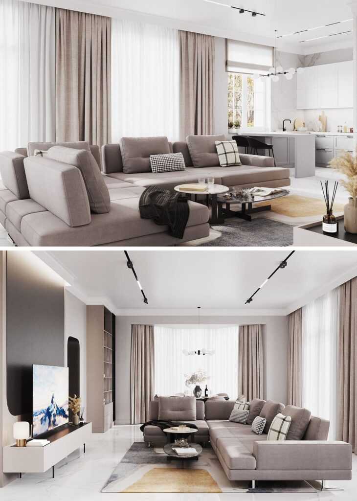 Think taupes, beige and soft pinks.
Jennifer is the Digital Editor at Homes & Gardens. Having worked in the interiors industry for a number of years, spanning many publications, she now hones her digital prowess on the 'best interiors website' in the world. Multi-skilled, Jennifer has worked in PR and marketing, and the occasional dabble in the social media, commercial and e-commerce space. Over the years, she has written about every area of the home, from compiling design houses from some of the best interior designers in the world to sourcing celebrity homes, reviewing appliances and even the odd news story or two.
Trendy colors in the interior - 2021: color trends - Cozy wall
Muted and bright tones, pastel shades and an open cheerful palette. What colors in the trend in the interior will be relevant in 2021? We offer ideas from trendsetters in the design world.
Yellow and gray
Yellow (Illuminating) and light gray (Ultimate Gray) were assigned the main roles by experts from the Pantone Institute. According to experts, the brightness and cheerfulness of the first is in perfect harmony with the strength, energy, stability and strength of the second. Together, they help build self-confidence and increase hope for the best. nine0003
This combination, experts believe, makes it easy to create a harmonious design. For example, photo wallpapers or paintings on canvas in yellow tones look good against the background of gray walls. The winning solution is the image of one large object. You can support the color scheme with the help of yellow textiles.
Pantone 2021 experts recommend complementing the color of the year in the interior with shades of graphite, silver, steel, mustard, sand, fawn. So the palette will be richer. nine0003
Dusty turquoise
The manufacturer of paints from the USA, Benjamin Moore, suggests paying attention to cold shades. First of all, on the Aegean turquoise (Aegean Teal) - soft, as if dusted.
It can be used both as a base color and to create accents.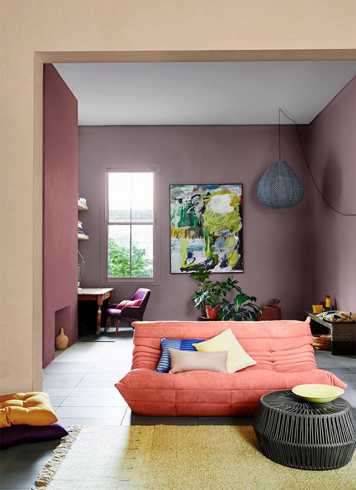 Suitable for any room: living room, bedroom, bathroom, nursery, kitchen.
Bold earth
English Dulux focuses on a natural shade called "brave earth" ( Brave ground) - earthy beige or gray-beige. The company's experts believe that it allows you to achieve balance and balance in the interior. nine0003
They offer color trends 2021 in the interior based on this warm natural shade - beige, sand, brown.
Let's name a few design ideas from Dulux.
- Monochrome palette in beige tones. Suitable for both classic and modern design, in harmony with natural materials (stone, yellowish metal, wood).
- Brave Ground as a backdrop for shades of red and pink. nine0028
- Combination of "daring earth" with other natural tones: sand, brown, burgundy, and elegant textures of marble, copper and velvet.
- The fourth option is Brave Ground with tones of earth, water and greenery: blue, green, brown. Plus wicker furniture, ceramics, wood and living plants.
 This idea is also supported by Farrow & Ball.
Delicate pastel and bright rustic
Norwegian designers Jotun Lady proposed four palettes at once, uniting them under the heading “Rediscover”, which means “to open yourself again”. The combination includes warm rustic tones (golden pink, bright orange, etc.), soft natural shades, delicate pastels, light blues. nine0003
Urbane Bronze
Urbane Bronze, an earthy gray with woody and metallic undertones, was chosen by an American paint manufacturer as its favorite. This color, according to the company's experts, helps to create a sense of protected space. It is proposed to complement it with light tones of leather, metal, wood, natural stone.
Deep red-pink, warm brown
Farrow&Ball also offers to add rich tones to the environment. Luxurious Preference Red №297, which combines red and pink, is relevant in the bedroom and living room.
The company is also betting on warm brown - Broccoli Brown No.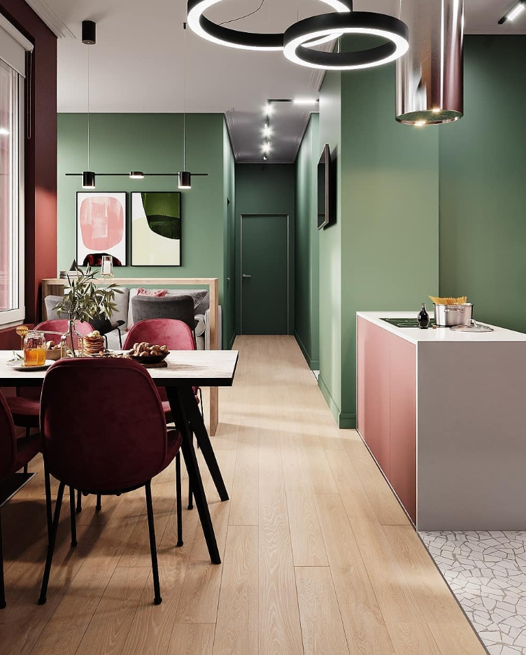 108 and Callagan No. 214.
21 shades
Canadian Behr decided to go beyond and build the interior using twenty-one shades. To make it easier, I suggested six schemes for zones in the room:
- serenity - green, blue, sky blue, grassy, beige as a base; nine0028
- serenity - light pastel;
- silence - brown, dark green, deep blue in combination with wood, stone, velvet and leather, for spacious rooms;
- optimism - purple, bright orange, coral to create high spirits;
- casual - beige shades of almond, mocha, twilight in the canyon;
- on the facade, the company's experts recommend focusing on windows, doors, decorative details, choosing bright colors. nine0028
Stylish decor in trendy colors
To use the color trends in the interior of 2021, it is not at all necessary to start a large-scale renovation. You can bring current trends in a simpler and more economical way. For example, decorate the wall with a modular picture or photo wallpaper.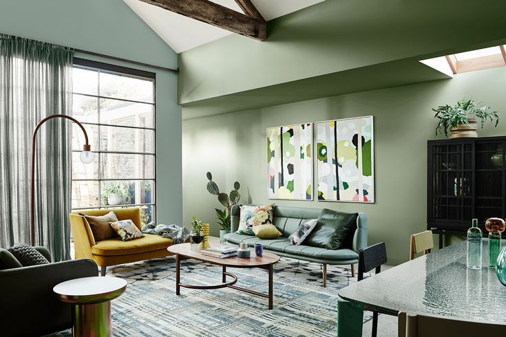
If the walls, floor and furniture in the room are made in beige tones, a picture of trees, antique clockwork in warm colors will do. And one of the gray-beige walls can be pasted over with photo wallpapers with bright pink or red flowers, birds and other objects. nine0003
You can choose the appropriate option in the catalog of the online store "Cozy wall".
Printed on canvas or interlining using latex technology, such wall decor items look very impressive and retain the original freshness of shades for a long time.
Orders are processed within one business day. Finished products are delivered to any region of Russia.
Pastel mountains
3D tree with round leaves
Chicago in the tones of the Sepia
Peace of Pion
Double Yellow Line on Black and White Street
Ascetic Architecture
Flamingos at the Oil
burgundy orchids on the black background of
Portrait of the gypsy
BIRUZ ORO in the mountains
BIRA BIRA balls in a modernist interior
Lemon and its slice
Recommended reading
Texture, greenery and graphics. Top Wall Design Trends 2020-2021
Fashionable colors in the interior 2023
When designing interiors, modern fashion trends should be taken into account in the selection of color combinations and high-quality types of finishing materials. It should be noted that the selection of trendy shades for decorating rooms is largely conditional, but the main trends in this field of activity can still be established after analyzing various options.
Contents of the article:
Trends in 2023 in choosing colors for a fashionable interior (photo)
A general trend recognized by leading designers in identifying the most preferred shades and trendy colors for 2023, which should create a calm, light, serene and natural atmosphere in the room. Modern interiors are dominated by universal tones used in various combinations.
Warm Beige
This is a successful neutral synthesis of beige and gray with a more cozy sound. With a competent overall solution of space, it brings a feeling of elegance, tranquility, warmth. Natural beige color makes successful combinations with chestnut, as well as with muted blue or green hues. nine0003
Dark Ginger Shade
Another soothing trendy shade of dark ginger with a hint of persimmon is becoming popular. It is warm and cozy. It will allow you to bring into the atmosphere of the room not only comfort, but also a feeling of noble luxury, combined with golden, cherry accents. It goes well with mahogany color scheme.
Aquarelle Blue
A subdued azure that mimics tropical water covered with light mist, is considered the best solution for the bedroom. The mystical watercolor-blue tint can also be used in other rooms, adjacent to neutral tones. Perfectly combined with a delicate cream shade. nine0003
Refreshing green
Conservative-minded people are pleased to realize that refreshing green color is still a fashionable color in the interior of 2023, which will be especially relevant in interiors with minimalist elements. It is recommended to select a dark green background for wall decoration, and use ultramarine or emerald colors for a velvety finish of upholstered furniture.
Almond Shade
Cool and delicate, the multi-faceted almond is transformed by its neighboring colors. The original combination is with rich blue, deep green, graphite. The almond tone can dominate the interior or play an auxiliary role as a companion color. nine0003
Amber
This cheerful color scheme includes yellow, red, orange notes. From the degree of their concentration, the amber radiance also changes. In any interior, the presence of such a tone, most often as an accent, provides an energetic, stimulating thought process, uplifting atmosphere. Amber is successfully combined with dark brown, beige, lilac shades.
Samba
A mature, slightly muted, very expressive cherry red color known as samba, in the 2023 season, it is on the list of leaders in interior design.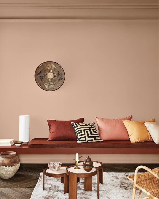 This tone is appropriate in the decoration of furniture, on textile details. A refined and sensual accent gives the interior a touch of chic and sophistication. Samba is combined with a neutral background, shading it favorably. nine0003
Gold
The flashy golden decoration begins to play in full force. Designers urge not to be afraid to bring elements of luxury into your home. Even small golden elements give the room features of well-being and nobility. Chocolate, red, turquoise, orange tones are organically located in the neighborhood. A combination of gold with a velvety black color scheme is considered an aristocratic option.
The principle of selecting shades in the interior 2023
The dominant design principle is based on the following ratios:
- base tone - 60%;
- additional shade - 30%;
- accent color - 10%.
The search for color solutions is intended to solve not only the task of approaching fashion trends. It is important for each person to express their own preferences and create an atmosphere of comfort and coziness while observing the norms of aesthetics and harmony.
Modern interior often involves an organic combination of color elements typical of different styles. The subsequent operations practiced in the improvement of any premises depend on this, for example:
- Layout with installation of partitions, coordinated transfer of walls;
- Zoning of the surrounding space by different methods;
- Selection of furniture, decoration, lighting, textiles.
Gradually, the option of decorating a room in one particular style is going out of fashion. Designers prefer projects with an organic combination of elements from different stylistic trends.
With proper selection of all the components of the interior, it is possible to obtain a comfortable space that reflects the personal preferences of the household, with well-thought-out functionality. nine0003
Trends in the selection of color solutions for exclusive interiors 2023
Creation of unique interiors is based on introducing aesthetics, pragmatic component, lightness and environmental safety into the space. Trendy colors in the interior of 2023 and some design tricks are becoming a reference point:
- Natural . The trend, which implies close proximity to nature, does not lose its leading positions. The use of natural materials (stone, wood, leather) with a warm texture and soothing tones is relevant in today's dynamic environment. Natural color schemes have a unique personality and always attract attention. nine0028
- Glitter . Increasingly, attention is drawn to the abundance of textures, bright colors, the organic inclusion of yellow metal parts, catchy textiles. Similar decisions will be relevant in the 2023 season. Giving preference to some theatrical aesthetics with an abundance of mirrors, textures, complex color transitions, it is important to maintain a balance, especially in small rooms.
- Dynamic . A feature of dynamic modern interiors is the urban theme, which involves the use of innovative materials, clear geometry in lines, as well as additional details with industrial style features: metal mesh on furniture facades, massive ceiling lamps. The color scheme often contains contrasting shades. nine0028
Urbanism allows you to combine different styles, organizing an unusual, but very cozy space without any special restrictions. Funny posters can be placed on the walls, the cast-iron base of a static table perfectly coexists with an elegant bright armchair.
- Historical motifs . Deep saturation emerald green, sapphire, wine tones on textiles, as if descended from an old engraving, are gracefully woven into the classic decor with gilding, stucco, restrained colors on the walls, noble parquet floors. nine0028
- Ethnic sound .
 In the interiors of 2023, the impact of colorful ethnic motifs will increase. Values are figurines, various handmade items, including furniture, unusual eye-catching textiles. A carved chest, a bronze lamp, a floor carpet with ethnic original patterns will serve as a bright accent.
Trendy color shades 2023 in furniture
Modern living rooms acquire an atmosphere of comfort thanks to furniture made from natural materials. Elegant wicker and wooden furniture sets will be fashionable in 2023. The color scheme in the selection of furniture involves a variety of variations. nine0003
Leather in a respectable chestnut or luxurious golden hue will dominate next season not only in the role of furnishing. Increasingly, designers are using leather panels in the design of walls and floors.
Balancing elegant steel tones continue to attract the attention of designers when decorating various furniture planes. The popularity of polished nickel, darkened steel, noble silver, brass is increasing. Iron does not lose its leading position, white alloys are increasingly common. When used in the living room, elements made of bronze with a golden brown tint achieve an exquisitely luxurious atmosphere. nine0080
Along with the dominance of restrained tones on furniture surfaces, bright ornaments with certain ethnic features are popular. Juicy yellow, crimson, blue notes bring dynamism, festivity. In such an interior it is pleasant to be after a busy day of work.
Trendy color range 2023 for a modern interior
Analyzing the emerging style and color preferences, it can be noted that the following options will be popular in 2023:
- Combination of various concentrations of graphite, light gray, white with accent splashes from the list of bright colors. This option in any situation is different win-win. The calm atmosphere set by the basic background allows you to relieve stress and relax.
- Use for interior decoration of any functional pastel palette from lightened sand color to a pronounced cream shade.
 For example: any shade of a universal sand color (straw, golden sand, beige khaki, etc.) easily gets along next to all, even very saturated colors. The elegant sound of the sand palette looks noble, restrained and cozy. nine0028
 - Cream tone, which is preferred by people who value classics, comfort, balance, can dominate the space, but will require darker neighboring accents, such as bronze or chestnut.
- Application of refreshing tones of natural greenery. Delicate light green, mint, malachite varieties, as well as dark turquoise, olive tones remain relevant. With a clean sound, green notes in bright variations are great for accent dot display. Mint, noble pistachio, solid cane can solo in space. Light greens are suitable for people seeking renewal. Conservatives prefer a serious, balanced dark green color scheme. nine0028
- Include in the variations of the combined color scheme of the interior a calm pure blue tint of varying degrees of saturation. When properly distributed over surfaces, cornflower blue, azure, heavenly, turquoise colors create an atmosphere of creativity, tranquility, security, relaxation, and trust in the surrounding space.
Priority areas for 2023 in interior color design
Indoor color schemes perform not only the function of designing and decorating various surfaces. With the help of the rational use of the diversity of the color palette, designers successfully solve other problems. nine0003
Zoning
A well-designed visual division of space into functional areas is one of the main trends of the 2023 season. Using a combination of well-matched shades, you can highlight a work area, a fireplace area, a relaxation area, a place for children's activities or placement of flowering plants in the room. In the kitchen, it is easy to visually separate the dining and working areas.
Different techniques are used for zoning. You can paint the surfaces of the walls by choosing different colors. An interesting effect is obtained if the floor or even the ceiling surface is decorated with materials of different tone. nine0003
Complex interior
The current trend in interior design solutions for the 2023 season is the organic integration of working and functional areas into living spaces.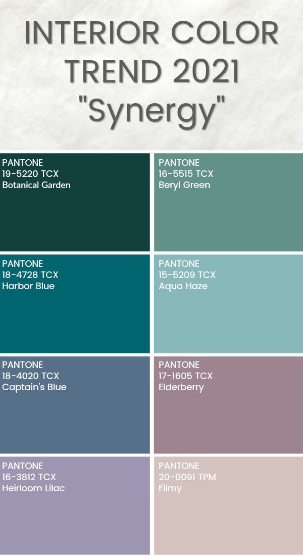 The interior becomes complex, which saves space and creates an orderly appearance of the room. The base background is selected from a list of neutral shades interspersed with saturated colors.
Adjusting the proportions of the room
The current trend is to use more active tones in small rooms. The postulate that only light walls can visually expand a miniature space is gradually becoming a thing of the past. nine0003
On the contrary, the analysis of modern projects allows us to conclude that a deep rich color scheme distracts attention from small dimensions. It is important not to use it in the dominant version. Usually one accent wall or a specific area is brightly decorated to emphasize its functionality.
Cooling or warming the room
Fashionable colors in the interior 2023 can not only give the space a certain impact on the psychological state of a person. With the right selection, they will warm a cold room, oriented to the north and practically not receiving the beneficial effects of sunlight.