Top design ideas
8 of the best design ideas in the world (and 4 of the worst)
The best design ideas often go unnoticed by most people. That perhaps shouldn't be surprising. Unlike art, which aims to grab attention and provoke, great design primarily serves a function and solves problems, although it ideally does so in a way that also looks very attractive.
By definition then, if it's done well, it's likely that many people will never notice the best design ideas unless they're looking for them. To quote God in Futurama: "If you do things right, people won't know you've done anything at all." In this article, we pay tribute to the conceptual design thinking and outstanding execution behind eight of the best designs in different niches, from graphic design to digital design, interior design and product design.
We think these examples all deserve recognition as truly game-changing designs that can serve as lessons in how to do design right. Just to emphasise how great these design ideas are, we've also included a few examples of how NOT to do the same thing for contrast. For more on great design, see our article on design thinking.
The London Tube Map was originally created by Harry Beck, a London Underground electrical draughtsman, in 1931. His revolutionary idea was to abandon geographical accuracy in favour of geometric simplicity.
Inspired by the electrical circuit diagrams that Beck drew during his day job, his map represented London's complex, sprawling underground transport network as a simple system of coloured, criss-crossing lines. His employers initially rejected his approach as too radical, but a test run was hugely popular with the public, so they quickly changed their minds. The map has been updated periodically since, as more lines and stations have been added, the basic design remains intact a testament to the fact that the best design ideas can have a very long lifespan.
The downside, of course, is that the map makes it more difficult for visitors to judge how far places are from each other. Transport for London has consequently had to post signs at key stations, advising tourists that it may be quicker to walk between them. However, overall, that proved to be a sacrifice worth making. The design has become the gold standard around the world for clarity and usefulness. (Though it doesn't mean people haven't created concept tube map redesigns over the years.)
From New York to Shanghai, subway maps have followed this basic template of colour-coded circles and lines, and it’s even been used for other purposes, visualising everything from US National Parks to the solar system . The wider lesson here for designers is clear: making something simpler is usually the path to making it better... even if that might mean sacrificing some accuracy along the way.
Worst idea: Lots of other transit maps
The County Transit Bus Map for Josephine, Oregon (Image credit: Josephine County Online)If you’re a lifelong Londoner, you probably take the Tube Map for granted, but the great design behind it becomes apparent if you compare it with the maps of some other transport systems.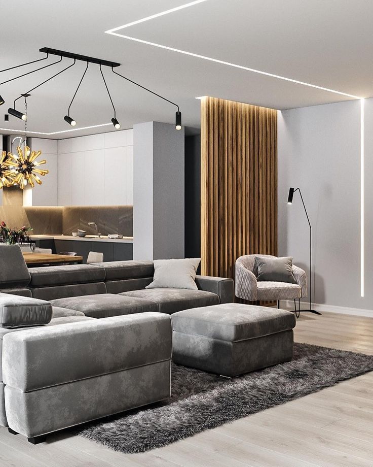 Examples like the one above, from Transit Map Hall of Shame show just how hard it is to present a complex network in a way that's comfortable for the user to read.
These days, geolocation technologies allow anyone with a mobile device to identify their exact location. But annoyingly, sharing that location with others is not that easy. Yes, you could give someone a complex, 18-digit long series of coordinates and in theory, they could find you, or you could use Share My Location on your phone.
But if you're one of the millions in the developing world without a proper street address, good luck trying that with your local pizza delivery firm, or your neighbourhood mail carrier. Enter What3Words , a more user-friendly geocoding system that divides the entire world into three-metre squares segments, and identifies each using just three words (random example: 'belly rises indeed').
Yes, it might sound very weird, but it's both easy to remember and easy to convey to others.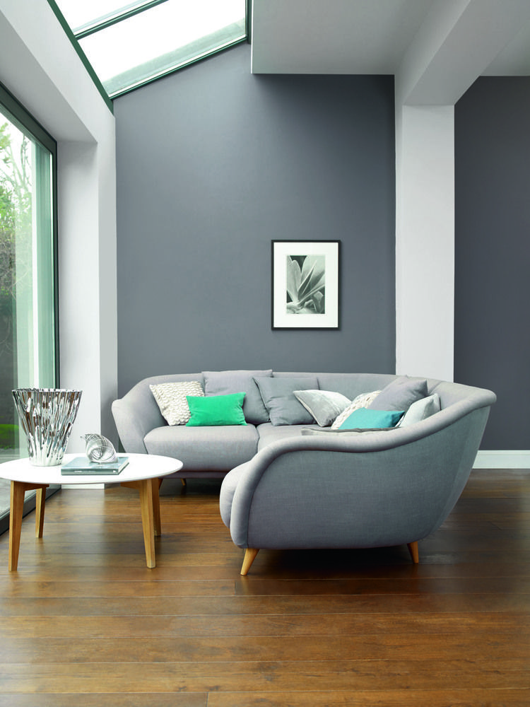 Plus if an error is made, it’s immediately apparent: a misheard word will almost certainly point to a place in another country, alerting both parties to instantly realise a mistake's been made.
It’s already been adopted as an address standard by the postal serves of Nigeria, Kiribati, Mongolia, Sint-Maarten, Côte d’Ivoire, Djibouti, Tonga, and Solomon Islands. "In Mongolia you can get a pizza, you can get a taxi, you can open a bank account, all with a three-word address,” CMO Giles Rhys Jones told our sister site Tech Radar .
Travel companies have also been keen to use the system, and it’s also been included as a standard feature in the navigation system of Mercedes-Benz cars. In the UK, What3Words has been used by the emergency services and has been instrumental in police rescues. As with many game-changing designs, the secret to What3Words lies in its simplicity.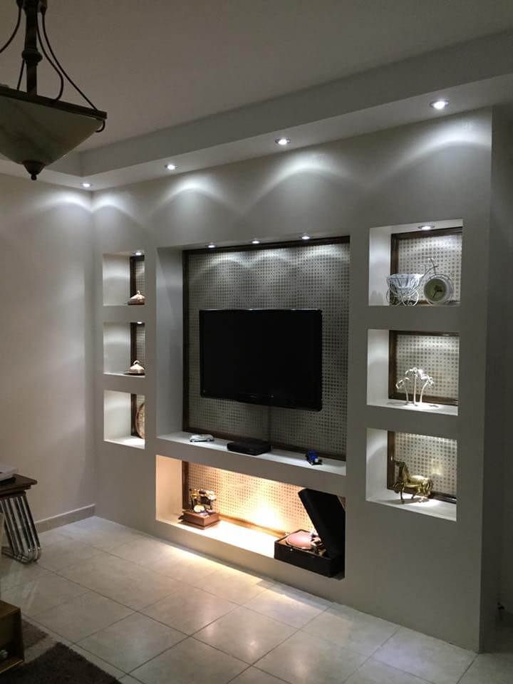
Most of us know by now how important it is to use sunscreen to protect our skin, but we're often unsure about how much of which factor to use, and when. The Australian sunscreen maker Blue Lizard pioneered a simple but very effective solution: bottles that change colour in UV light.
Its 30+ Baby Sunscreen , for example, turns from blue to bright pink, which is particularly useful on cloudy days when you may not have realised you needed protection. It’s vaguely reminiscent of Dulux’s Magic Paint , which goes on pink and dries white, helping you notice if you’ve missed any spots. Both are great examples of how thoughtful design can make life easier – an excellent principle to apply to any design work, whether you're crafting an app interface or laying out a brochure.
Worst idea: Misleading and oversized packaging
you_know_what_those_are_that_i_ordered from r/EgregiousPackaging
For the worst packaging design, just look at any of the thousands of items that come with packaging that's several times larger than the product, often in an intentional attempt to trick customers into thinking they're getting more than what they really are.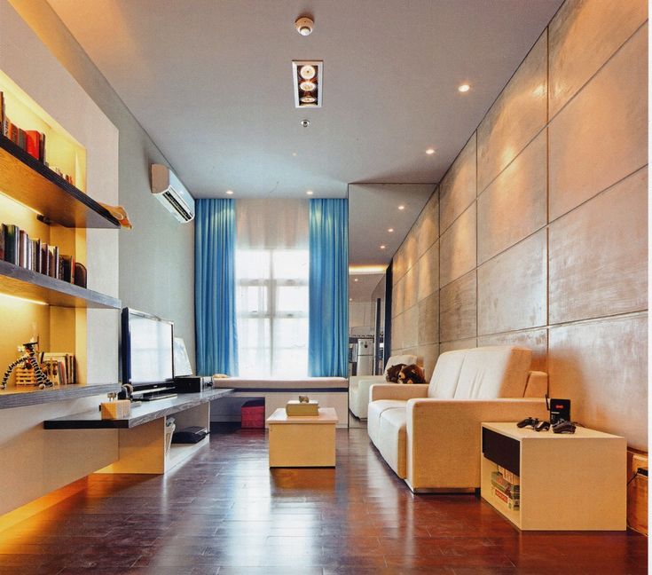
From false bottoms to plastic or card filler, there are tons of examples of egregious packing being used to fool us. In some cases, even products that are intended to be "green" come with far more packaging than seems necessary. In general, a careless use of plastic, for example in individually plastic-wrapped screws and even ear buds, can leave customers irate while showing a huge lack of environmental awareness.
When words fail you, a picture dictionary is a great backup (Image credit: Michael O'Mara Books)When you’re stuck in a country where you can’t speak your language, and no one speaks yours, Google Translate can be a lifesaver. But when your phone is out of battery, or there’s no available internet, then you might need to fall back on more traditional, printed means.
However, if you’re travelling around a lot of different countries, or a country where multiple languages are spoken, then you don’t want to be lugging around a ton of phrasebooks. A more elegant solution can be a picture dictionary like the Tourist Picture Dictionary .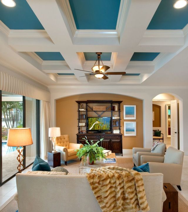 Need to find a toilet? Point to the picture of a toilet. It's as simple as that!
So it is quite a niche product, but it’s a great fallback for when all other attempts at communication break down. And it's another example of a great design idea that’s extremely simple.
A font set that makes letters more distinct from each other has been a winner for dyslexic people (Image credit: Dyslexie )When it comes to choosing a font, readability is always an issue. But what if the reader is dyslexic? To answer this question, Christian Boer as developed a special typeface, Dyslexie , to overcome some of the problems that people with dyslexia, including himself, can have when reading. His aim was to develop the kind of typeface that he wished existed when he was a child.
The design sets out to make it easier to distinguish different letters from each other. For example, the openings of letters are enlarged to make them look less alike and easier to recognise by their shape.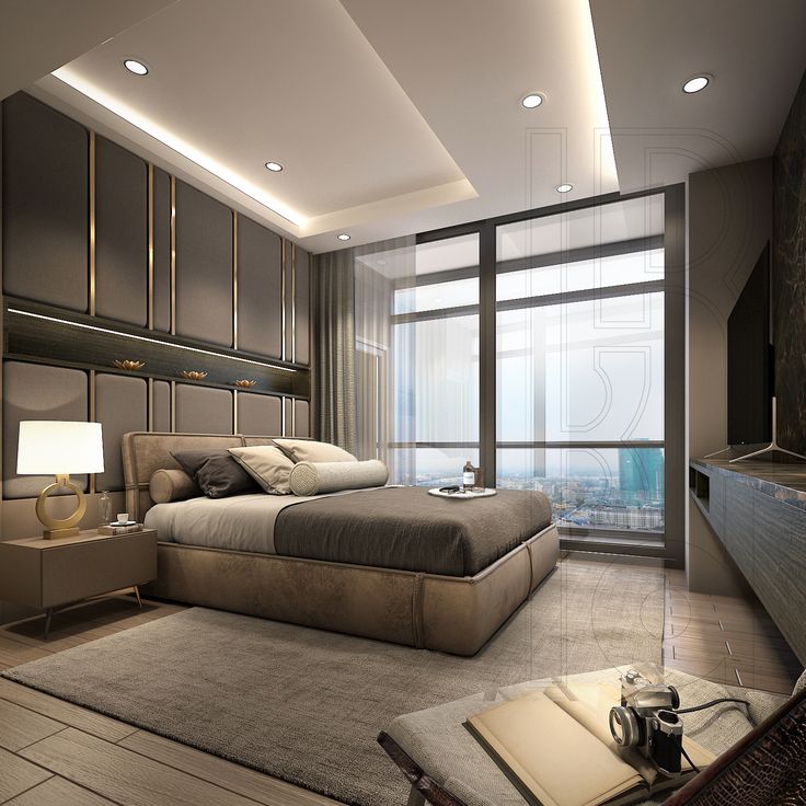 Punctuation marks and capital letters are bold, emphasising the breaks, endings and beginnings of phrases, and the distance between individual letters and words is enlarged, which makes reading more comfortable and avoids the 'crowding effect'.
The font has been downloaded more than 300,000 times, and the lesson is clear. If good design is about solving a problem, then the best person to solve it is often someone who's affected on a personal level. If that's you, then great! If not, it's worth getting in touch with the relevant people and doing some serious research before you start designing.
- Best free fonts for designers
Worst idea: Ink-saving font
Ecofont Vera Sans aimed to save ink, but other regular fonts use less (Image credit: Ecofont)Dyslexie isn't the only font design that aimed to change the world. Several fonts have aimed to save printer ink. That in itself is a fantastic idea, but this is where we see that execution is key. A study by the University of Wisconsin, looked at Ecofont, a system that adds holes to existing font families in order to reduce ink use, and found that some Ecofont fonts, such as Ecofont Vera Sans, actually used more ink than regular fonts, such as Century Gothic.
If you live in Japan, it may perplex you to know that in other countries, bathrooms separate their toilet and sink. A standard toilet model in Japan incorporates both into a very elegant and efficient system. The toilet basically has an in-built sink (note that you don't wash your hands in the toilet, but rather above it). As a result, the water for washing your hands is recycled for flushing.
This design originally came about in the 1950s as a space saver because apartments in Japan tend to be on the smaller side. But with the rising importance of environmental issues, it's gained more interest as a water saver. The device doesn’t only offer an important way to conserve water, it also gives us a wider lesson in not taking everyday designs for granted. If we continually ask, 'Could this be put together differently?', who knows what game-changing ideas we could come up with.
And the worst interior design idea? Just pick from any of the travesties in our roundup of the worst interior design fails, but how about this door for starters?
step_out_of_a_bathtub_down_a_flight_of_stairs from r/dangerousdesignThe cat's eye lights your way by reflecting back from your own headlamps (Image credit: Eliot2000)
Here’s another brilliant design that some take for granted, but which is unknown in many countries.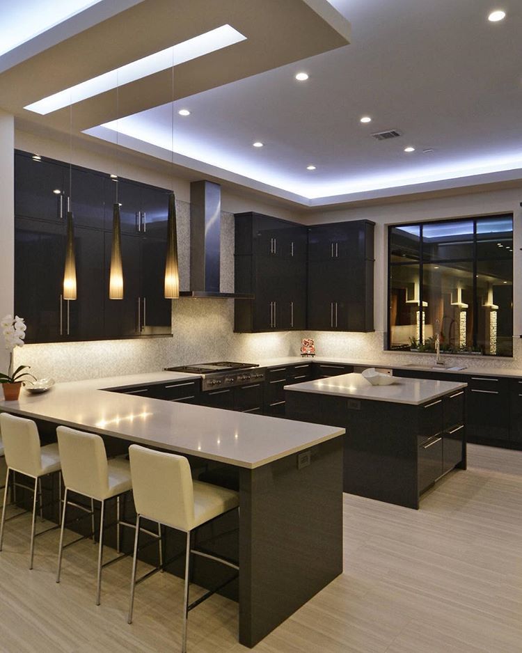 The cat’s eye is a type of road marker that uses a retroreflector to illuminate night-time journeys using your own headlights. It has a flexible rubber dome, which can withstand the passage of traffic if driven across. It’s also self-cleaning, thanks to a build in rainwater reservoir; resistant to snow ploughs; and proves particularly useful in fog.
The original design was the work of Percy Shaw of Halifax, England in the 1930s. His inspiration came from the tramlines that reflected his headlights, helping him to see at night. One night, the tramlines were shrouded in heavy fog and he was left blindsided... until suddenly he saw light reflecting from the eyes of a cat.
While there are many reasons that Britain has one of the best road safety records in the world, this clever design, which is used on the majority of roads in the country, has certainly made a big contribution. Its success offers an important lesson to designers everywhere. If you find something useful by accident (in this case, shiny tramlines and wandering felines), why not design something that does the same thing but on purpose?
Navigating airports can be a challenge for kids, but this product makes it fun (Image credit: Trunki )Product design student Rob Law was 21 when he came up with the idea for taking a suitcase and turning it into a ride-on vehicle for kids. And anyone who’s had to put up with an overtired and cranky child in a long-haul airport will appreciate what a fantastic idea this was.
Putting it into production was a long slog and Law was turned down by both luggage companies (who said they weren’t interested in toys) and toy companies (who said they weren’t interested in luggage). He also failed to get investment on the BBC’s Dragon’s Den, the equivalent to Shark Tank in the US. He finally got funding from The Prince’s Trust Enterprise Fund and launched the Trunki in May 2006. Within 10 years he'd sold over three million suitcases in over 100 countries, and won over 100 design awards.
There are two lessons here. Firstly, a good idea is not always enough; you often need bucketloads of patience and perseverance to convince people of your vision. Secondly, new product designs don’t have to involve radical new materials, processes or technologies. Sometimes just combining two things that already exist can be the game-changer everyone is looking for.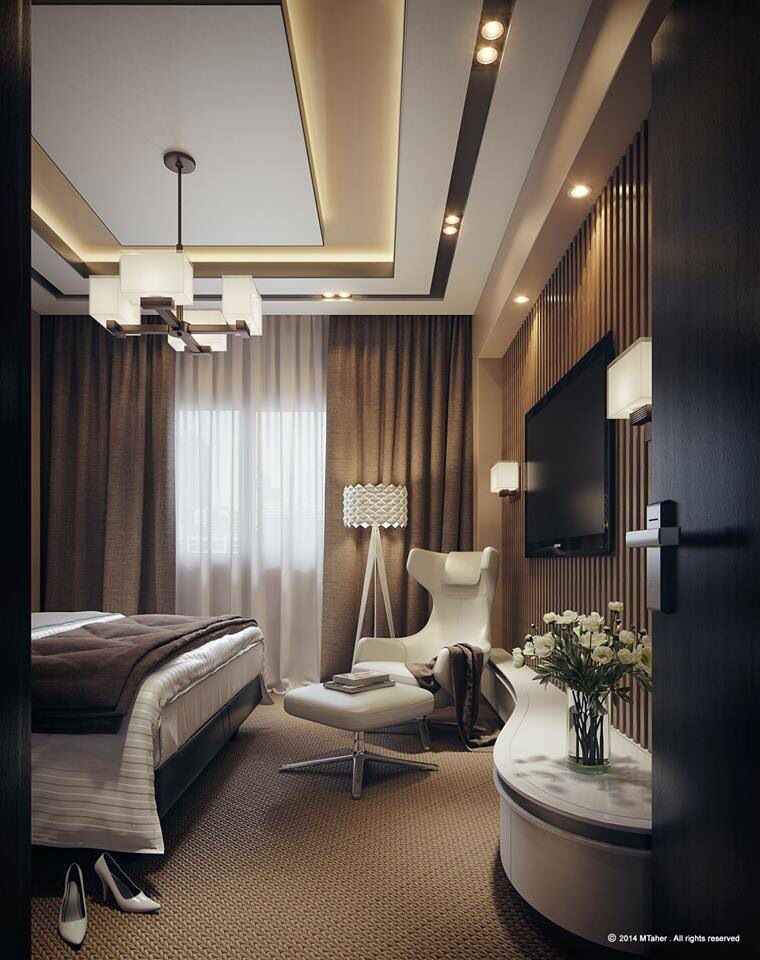
Worst idea: 3D TVs
Worst idea: Designing TVs that could show 3D movies turned out to be an expensive waste of time (Image credit: Sky)Of course, it's important to remember that simply bringing two popular things together doesn't necessarily add up to a good idea. Sometimes it can lead to a truly terrible one. Remember when tech companies tried to capitalise on the popularity of 3D movies such as Avatar and spent millions developing 3D TVs.
While people were happy to wear clunky 3D glasses in a darkened cinema, far fewer were keen on doing so in their more sociable living rooms, where the smaller size of the screen also made the 3D effect far less awe-inspiring. Just a few years later, nobody was manufacturing 3D sets, and broadcasters like Sky had closed their 3D channels. It seemed that in the rush to design a revolutionary new product, everyone forgot to ask if people actually wanted it (See, Amazon's smart clock for another example).
Read more:
- 3 times brands tried to be woke and failed
- 10 innovations that changed the world of CG
- How to create work that could change the world
Thank you for reading 5 articles this month* Join now for unlimited access
Enjoy your first month for just £1 / $1 / €1
Already have an account ? Sign in here
*Read 5 free articles per month without a subscription
Join now for unlimited access
Try first month for just £1 / $1 / €1
Already have an account ? Sign in here
Sign up below to get the latest from Creative Bloq, plus exclusive special offers, direct to your inbox!
Contact me with news and offers from other Future brandsReceive email from us on behalf of our trusted partners or sponsorsTom May is an award-winning journalist and editor specialising in design, photography and technology. Author of the Amazon #1 bestseller Great TED Talks: Creativity , published by Pavilion Books, Tom was previously editor of Professional Photography magazine, associate editor at Creative Bloq, and deputy editor at net magazine. Today, he is a regular contributor to Creative Bloq and its sister sites Digital Camera World, T3.com and Tech Radar. He also writes for Creative Boom and works on content marketing projects.
Top 10 product design ideas and inspiration
Explore
Design
Discover Pinterest’s 10 best ideas and inspiration for Product Design. Get inspired and try out new things.
0:53
Saved from shapr3d.com
3D modeling a bathroom tap
Great product design means more than a pretty object. Just as Shapr3D is more than some CAD software, especially since the Visualization feature is live. Using the app, you can get from concept to manufacture-grade 3D models ready for client preview, just like in the case of this bathroom tap.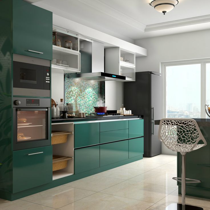 Download Shapr3D, available on iPadOS, macOS, and Windows.
Graphic Design Lessons
Graphic Design Tutorials
Graphic Design Posters
Sketch Design
3d Design
Design Case
Design Model
Architecture Drawing Art
Architecture Design
Nezar Alshomrani saved to Art
Saved from designspiration.net
packaging, package, package design, products, and packaging design image inspiration on Designspiration
Saved by Bruna Schuch (@istopor). Discover more of the best packaging, package, package design, products, and packaging design inspiration on Designspiration
Honey Packaging
Cool Packaging
Bottle Packaging
Brand Packaging
Packaging Design
Product Packaging
Brilliant Packaging
Innovative Packaging
Chocolate Packaging
Erika Carlock saved to get graphic
Saved from dribbble.com
Køhaku – Product Page
Køhaku – Product Page designed by Tran Mau Tri Tam ✪ for UI8. Connect with them on Dribbble; the global community for designers and creative professionals.
Unique Website Design
Website Design Layout
Web Layout
Layout Design
Web Ui Design
Page Design
Minimal Web Design
Creative Web Design
Mise En Page Web
Zekui LiZ
Zekui Li saved to UI/UX
Saved from branchbasics.com
NonToxic Cleaning Starter Kit
Replace all of your toxic cleaning supplies with our most popular kit! #greencleaning #nontoxic #safe #saferproduct #branchbasics #natural #ecofriendly #green #earthfriendly #greenliving #plantpower #hypoallergenic #humansafe
Nontoxic Cleaning
Toxic Cleaning Products
Cleaning Supplies
Start Cleaning
Green Cleaning
Human Safe
Branch Basics
Fragrance Free Products
Pure Products
Branch Basics saved to BRANCH BASICS
Saved from journal-du-design.fr
Nebl, magnifique collection de jardinières par Studio Rem pour Gejst - Journal du Design
En allemand, Nebel tiré du latin Nebula signifie brouillard, une masse opaque de particules, généralement composée d'eau, suspendue dans les airs,
Design Transparent
Design Maker
Terraria
Vase
Design Milk
Frosted Glass
Houseplants
Minimalist Design
Diy Organization
Maud Leblanc saved to Beau . ... etc !
Saved from yankodesign.com
15 Amazing Bicycles For The Future of Seoul - Yanko Design
Seoul is one city that is conscious of the fact that we need to ride more bicycles and loosen up the traffic congestion. To advocate their intent Seoul Design F
Velo Design
Bicycle Design
Folding Bicycle
Bicycle Bike
Cool Bicycles
Cool Bikes
Pimp Your Bike
Velo Cargo
Electric Tricycle
Vladimír Vanický saved to skládačky
Saved from leibal.com
Leibal — Ikawa
Ikawa is a minimalist coffee roaster designed by London-based designers Andrew Stordy and Rombout Frieling.
Coffee Roasters
Coffee Brewing
Home Gadgets
Kitchen Gadgets
Camping Gadgets
Tech Gadgets
Kitchen Tools
Design Package
Minibar
Caresse Javier saved to Products
Saved from dribbble.com
Adidas EQT GPR Product Page
Adidas EQT GPR Product Page designed by Rob Robertson. Connect with them on Dribbble; the global community for designers and creative professionals.
Web Design Trends
Design Web
Web Design Tutorial
Web Design Mobile
Web Design Quotes
Minimal Web Design
Design Logo
Website Design Layout
Web Design Company
fulcrum saved to Design
Saved from design-milk.com
Presenting the 2020 Winners of the A’ Design Awards & Competition - Design Milk
Presenting the 2020 Winners of the A’ Design Awards & Competition - Design Milk
Modern Lighting Design
Lighting Concepts
Modern Lamp
Cool Lighting
Modern Design
Industrial Design Sketch
Industrial Product Design
Architectural Presentation
Architectural Models
Buffalo Huang saved to 03_DETAIL & CMF
Saved from thedieline.com
Pack of the Month: Aja Marie Johnson Builds A Bolder Brew
Designer Aja Marie Johnson brews up some bold typography for Better Coffee Co.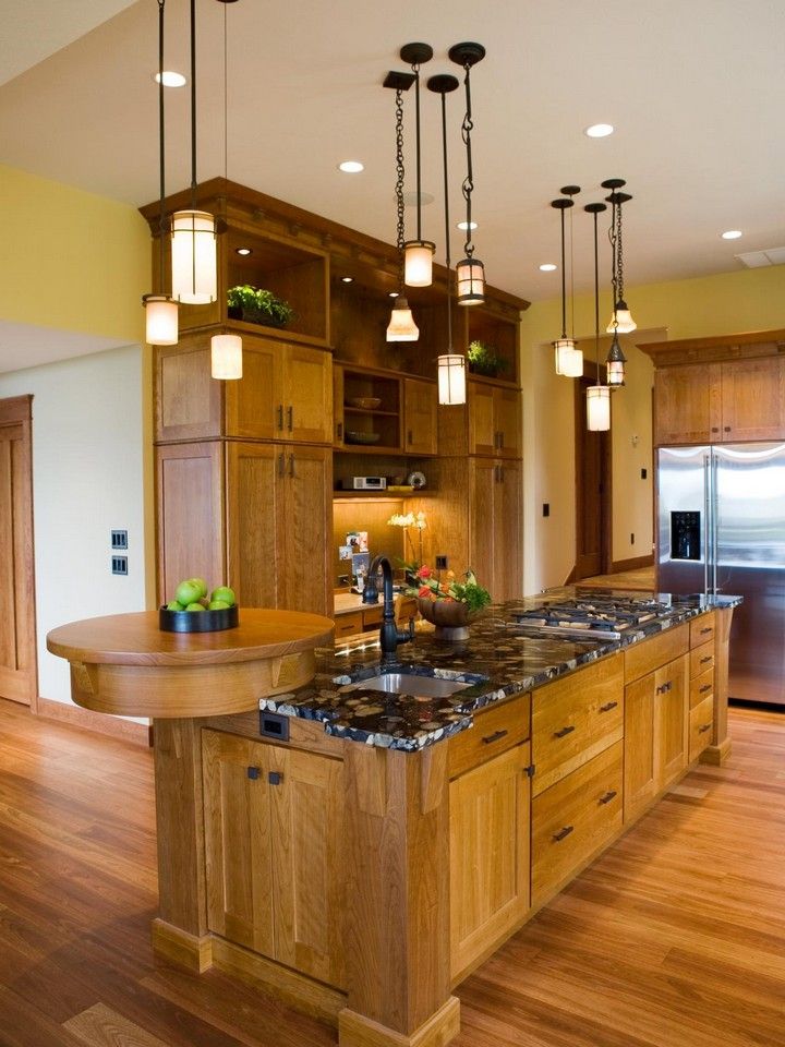
Graphic Design Branding
Graphic Design Posters
Identity Design
Graphic Design Inspiration
Graphic Design Trends
Logo Design Inspiration
Cool Packaging
Food Packaging Design
Brand Packaging
Wicked Sushi saved to Food Packaging
More related to Product Design
Calendar Design
Music Album Design
Music Album Cover
Printable Calendar
Design Process
Trending searches for Product Design
2023 Mood Board
Clothing Design Sketches
2023 Interior Design Trends
3d Printing
Brand Color Palette
Vending Machine
Texture Inspiration
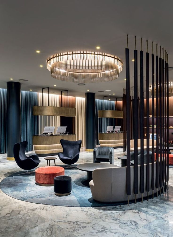
Design ideas - interior design, renovation ideas | design ideas photo
TATLIN apartments
num.21
View of master bedroom from hallway
A fresh design idea: a large, narrow hallway in modern style with white walls, medium-toned parquet floors and brown floors - great interior photo
Kaluzhskaya Residential Complex
4 ROOMS
Original Design Example: Medium-Size Modern Kitchen
Sponsored
Bochum
Von der Idee bis hin zur Fertigstellung
ONE!CONTACT-Planungsbüro GmbHAverage rating: 5 out of 5 stars 16 reviews
NRW | Ihre neuen Lebensräume aus unserer Hand!
The Philosophy of Concrete
IRINA LIMONOVA "LIMSTYLE" design studio
Inspiration for home comfort: a parallel, bright medium-sized modern style kitchen-living room with flat fronts, beige fronts, wooden worktops, black splashback, appliances under the furniture front, peninsula, beige floor and beige worktop
Moscow, House on Izumrudnaya.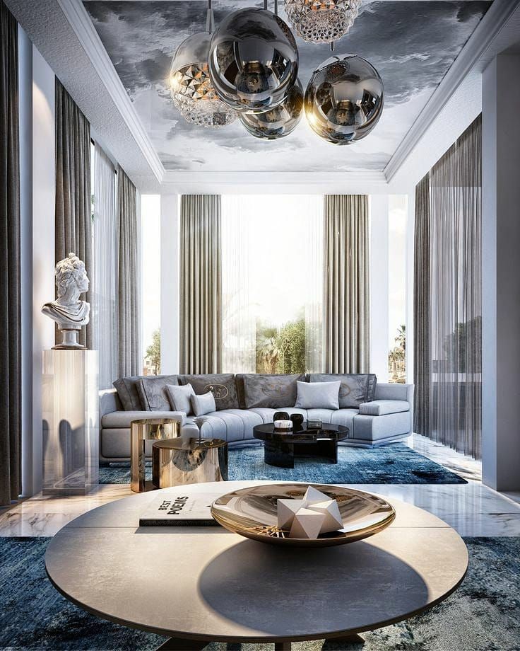
SunWaveStudio
Design idea for a mid-sized contemporary straight kitchen with dining table, sink sink, flat cabinets, medium wood cabinets, blue splashback, fitted appliances, gray floors and black worktops without island
B cloud
Margarita Merezhnyuk
Design idea: a parallel, light kitchen-living room in a modern style with an inset sink, flat fronts, white fronts, a beige splashback, white appliances, an island, white floors and a white worktop
Sponsored
Mülheim an der Ruhr
Siepmann-Holzbau GmbHAverage rating: 4.8 out of 5 stars 5 reviews
Bauunternehmen | Düsseldorf
Apartment on the Petrograd side
Nice Design
Development of an interior solution for an apartment in St. Petersburg, on Barmaleeva street!
Stylish design: modern style kitchen - the latest trend
Mont Blanc
ReDi
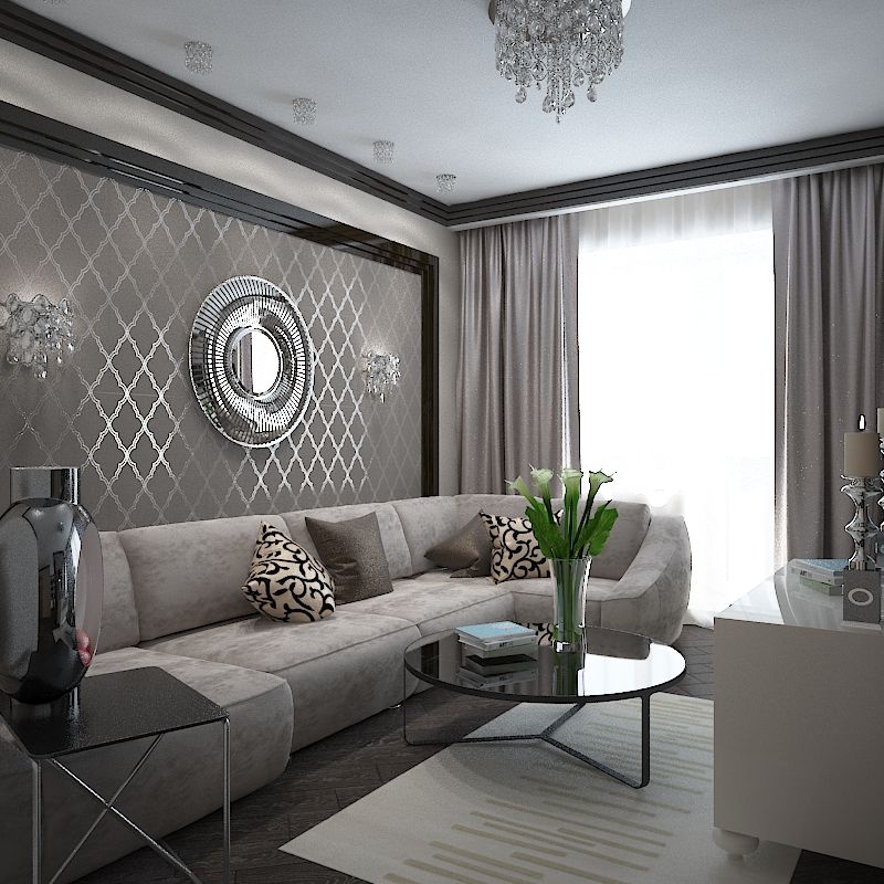
Pictured: a neoclassical (modern classic) living room with gray walls, medium-tone parquet floors and brown floors with
Stalin on Krasnaya Presnya
Elena Sidorina
Stylish Design: Canteen in the Scandinavian style with gray walls, a light parquet floor and gray sex - the last trend
Apartment in Moscow, 100 m² 9000 for home comfort: neutral medium-sized modern-style children's room with a bed, gray walls, medium-tone parquet floors and beige floors for two children
If your family consists of several people, it is important to consider the interests of everyone. It is quite possible that for one of the family members, when designing the interior of a living room in an apartment, they will have to give space for working at a computer, doing creative work, even sports. All these points must be planned at the stage of designing the premises.
Determine the center of the living room
Living room design is inseparable from a competent layout. After looking at examples of photos of the living room in the apartment, you can see various space planning options. Of course, the choice depends on your preferences, as well as on the size and functionality of the room.
Place sofas and armchairs around the perimeter of the room in no case is worth it. Firstly, this is the last century, and the modern design of the living room categorically does not accept such a layout. In addition, you will clutter up the space with only recreational items, leaving no free space for other functional areas.
The best option for the interior of the living room is to highlight the central group, around which the rest of the furniture will be grouped. As a rule, a recreation area with a TV and a sofa is chosen as the center of the composition.
A fireplace can also be a central element, next to which chairs, rocking chairs or even luxurious skins for relaxation will comfortably fit.
Standard set of furniture for designing a living room in an apartment:
- sofa;
- several chairs;
- coffee or coffee table;
- shelving for decorative items and/or books.
If the room is large, or it will have to take on a diverse functional load, naturally you should not limit yourself to this. The living room may well have a desktop for a computer, chests of drawers and cabinets, a bar counter.
In order not to clutter up a cramped room too much, give preference to the transformer models that are popular today. Such furniture is very functional and allows you to perfectly save scarce space.
Choice of colors
If your living room is on the sunny side, then you are practically unlimited in the choice of colors for its decoration and furnishing. The contrasting interior design of the living room will look very interesting. For example, walls and floors can be decorated in cold colors, while furniture, in contrast, in warm colors.
Many modern interior styles welcome the design of the living room in a clean slate apartment. This technique involves decorating the walls and ceiling with plain white plaster or paint. And furniture and decor elements can be selected in a variety of colors: bright or rich dark - to create a spectacular and stylish interior, delicate and pastel - for a light, cozy and elegant design.
For north-facing living rooms with little to no daylight, choose warm-coloured finishes. Such an interior design of the living room compensates for the lack of sun, makes the room cozy and conducive to relaxation no matter what.
And, of course, if the room is a bit dark, you should take care of good artificial lighting. Well-placed spotlights are best suited to illuminate every corner of your living room.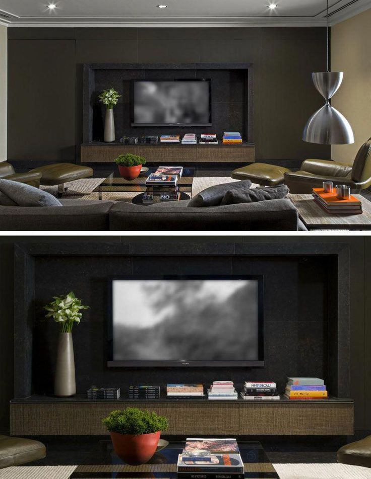
Of course, the choice of colors for decorating a room should also depend on what visual and emotional effect you want to achieve.
If the living room is intended for stormy parties and active pastime, then it makes sense to decorate it in bright, saturated colors.
If the owners want to indulge in a calm and relaxing holiday, then the interior of the living room should be to match. In this case, you should give preference to soft light tones or, conversely, deep and calm, but in no case flashy.
Finishing materials
The choice of finishing materials should largely depend on the style in which you would like to maintain the design of the living room in the apartment. So, paper wallpapers with romantic flowers are definitely not suitable for laconic hi-tech or minimalism. And Provence or country-style interiors will not be combined with bright carpets with psychedelic prints and ultra-modern wall coverings with fur or leather texture.
In addition, the shape and size of the room is of great importance. Properly selected finishes will perfectly smooth out the flaws of the room and focus on its merits. While a thoughtlessly chosen design can spoil even a spacious and bright room.
Walls
The classic rule is that for small rooms it is better to choose light shades. It always works flawlessly. However, if this solution seems too boring for you, you can try all sorts of interesting wall designs. Spectacular examples of wall design in the living room, photos of which are presented in our article, will help you navigate and choose the most attractive options for yourself.
For example, even smooth, light-colored walls can be made a spectacular interior detail by adding bright or simply contrasting color accents to them. See such unusual living room interior ideas in the photo below.
All kinds of plasterboard niches look very stylish. They not only diversify the interior, but also become its very functional detail. After all, they can accommodate both decorative elements and items needed in the household. And if such a niche is beautifully illuminated from the inside, this will create an interesting effect of depth.
The traditional option for decorating the living room walls is wallpaper. Fortunately, today there is a great variety of them: both classic paper, and modern non-woven, and washable, and glass, and even innovative liquid wallpaper. If you are a lover of change, then you can pay attention to the wallpaper for painting. With such a finish, you can easily change the look of the room, at least several times a year. However, please note that, as a rule, such wallpapers are designed for a limited number of repaints.
Smoothly plastered or painted walls look great in modern interiors. At the same time, if you are a fan of the original design, you can pick up plaster with all sorts of beautiful and unusual textures. With its help, you can add a twist to your design and create a truly beautiful living room interior.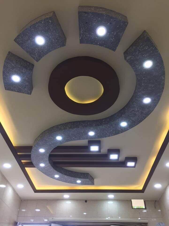
One of the fashion trends in modern design is the combination of materials. It is very important to use combinations of several finishes in one room: different types and shades of plaster, paint plus wallpaper, or even a combination of two types of wallpaper with different patterns and textures. See examples of such a living room design in the photo below.
Using this technique, you will not only be able to make your interior bright, stylish and original, but will also successfully cope with the zoning of the room. As you know, for proper zoning, it is not enough to collect several diverse groups of furniture in one room. So that all this does not look like a "hodgepodge", it is necessary to highlight each of the functional areas with its own design elements. And here, the design of wall sections in different colors and even different textures is the best fit.
Ceiling
When choosing the design of the ceiling in the living room, first of all, start from the size of the room.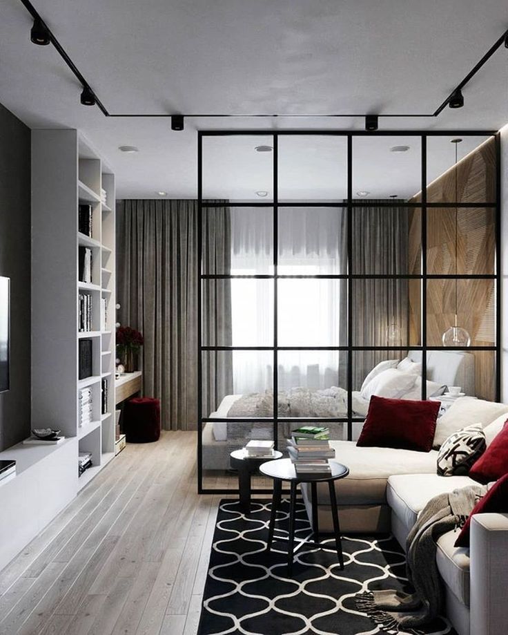 No matter how much you like spectacular multi-tiered structures, in a small room, packed full of necessary furniture, they will look simply ridiculous. In no case do not overload the design of the room.
If the room is small, then the best option is a simple ceiling in light colors with built-in ceiling lights. A good design move would be a small cornice around the perimeter, it will add a sense of depth.
Another interesting solution for visually increasing the space is the so-called "floating" suspended ceilings. This is a two-tier structure with a small height difference and built-in lights mounted inside the "upper" tier in such a way that they themselves are not visible. This technique creates soft diffused light and an interesting depth effect. As a result, the room seems visually higher and more spacious.
However, remember that the design tricks you have listed are inappropriate for small rooms with high ceilings. If in such a room you try to “distance” the ceiling even more due to visual techniques, then you will feel in it like at the bottom of a bottomless well.
In narrow rooms with high ceilings, it makes sense, on the contrary, to reduce the height - through visual means or with the help of suspended structures. Then the living room will immediately seem more comfortable and suitable for a comfortable stay.
If you are lucky and your living room is spacious and has high enough ceilings, then feel free to experiment with their design.
Here, multi-level suspended structures, both laconic and intricate forms, stucco, columns, scallops, and complex lighting systems can be used.
The main thing is not to overdo it and stick to the intended design of the room. If the room is decorated in a ceremonial classical style, in the spirit of Baroque or Empire, then without a doubt, both bas-reliefs and columns will be appropriate. But for more concise modern styles, you should choose a simpler and more rigorous ceiling design.
If your living room will have several functional areas, then the zoning can be "supported" with an appropriately designed ceiling.
For example, a central seating area with a sofa group and a TV set can be highlighted with a second tier of false ceiling. Depending on the general style of the room, both strict rectangular shapes and soft rounded lines may be appropriate.
The ceiling does not have to be white. Delicate, warm pastel shades will look perfect in almost any room.
Fans of more extravagant options can experiment with bright shades. It is not necessary to decorate the entire ceiling in saturated colors. However, if you highlight only part of it or one of the tiers with a spectacular shade, you will get a chic look.
As far as materials are concerned, it is best to avoid whitewashing and painting. After all, this will take a long time and carefully level the surface. An excellent modern solution is plasterboard suspended ceilings or stylish stretch models. They are quick to install, provide perfectly flat surfaces, and in addition, allow you to create a wide variety of design options.
Lighting
Just a few years ago, when choosing lighting, the issue was always decided in favor of a large ceiling chandelier. Of course, today there are many lovers of such lighting fixtures, including those decorated with numerous "crystal" pendants. However, you should not get hung up on this option, because modern manufacturers offer many interesting, stylish and comfortable options.
If you - due to adherence to traditions or in order to create a certain style of interior - have opted for a massive chandelier, you do not need to limit yourself to this. In any living room, additional sources of lighting will be appropriate: wall sconces, floor lamps and portable standing lamps.
Additional light sources perform several functions at once:
- They allow you to well illuminate all corners of the room without leaving any terra incognita areas in it, where it is dark in the evening, even if you gouge out your eye.
- Create separate lighting and comfort in each functional area.
 Thanks to a well-placed floor lamp or sconce, one of the family members with all the conveniences can read or work at a computer in the corner of the hall, while others have a “movie show” or an evening rest in the twilight on the sofa.
 - Can create decorative lighting in a niche, near art objects, etc.
- They are additional decorative elements.
If you are a supporter of laconic design, then recessed ceiling lights are the best fit. They also allow you to create separate lighting in different functional areas of the living room. And besides, with their help you can always adjust the brightness and level of illumination of the room. And with all this, they remain almost invisible, do not overload the design and fit almost all interior styles.
It's safe to say that recessed ceiling lights are the best choice for a small room with low ceilings. But, at the same time, they will also be appropriate in a spacious hall.
Style Selection
Choose a style based on the tastes of the whole family. Look at photo examples of living room designs in a magazine, on the Internet, explore the various styles that are in abundance today.
Of course, the dimensions of the room must also be taken into account. In a small room in Khrushchev, a lush baroque or any other “palace” interior will look out of place. For small living rooms, it is best to choose a laconic design in the Scandinavian style, elegant classics or strict hi-tech or minimalism. Country and Provence are perfect, as these styles suggest comfort and emphatically home furnishings.
If your living room is large, then there is room to roam. In principle, a spacious room can be decorated in almost any style that you and your family like.
When choosing the style of the living room, be sure to take into account the features of the interior of the other rooms. Maintain style and harmony.
Classic
The classic style of the interior involves the use of the most natural materials. The whole environment should breathe quality and good taste.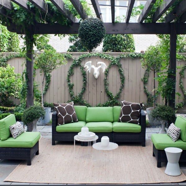 As part of this style, traditional furniture made of solid wood or at least high-quality MDF will be appropriate.
Classic interior colors are soft, calm, usually light. But in principle, within the framework of this style, almost any shades (except bright and flashy) will be appropriate if they are correctly beaten.
Elegant wallpaper, paintings, vases, traditional chandeliers, beautiful curtains - all this will be an excellent frame for an interior in a classic style.
Despite certain design rules, there are different directions for decorating a living room in the spirit of the classics. Within the framework of the classical style, several variations can exist at once:
- refined and rich "palace", in which discreet gilding and more elaborate forms will be appropriate;
- solid and reliable English style, suggesting solid furniture of simple shapes and unpretentious decor;
- neoclassical, meaning lighter and simpler forms, expensive elegance without ostentatious luxury.
Minimalism and high-tech
High-tech and constructivism can also be combined under this general direction. All these styles imply laconic finishes, emphatically simple and modern furniture models, built-in lighting, and an abundance of technology.
Minimalism is characterized by soft colors, calm combinations, stylish and simple shapes.
For hi-tech, for all their similarities, saturated tones, metallic luster and a lot of glass are more characteristic. High-tech furniture or decor can have very unusual, but at the same time laconic and streamlined shapes.
Minimalist interior of the living room is best suited for young and energetic people who keep up with the times, who do not attach much importance to luxurious surroundings, preferring simplicity and elegance of lines.
However, do not think that the interior in the style of hi-tech or minimalism is something from the category of "cheap and cheerful". Such a design may well turn out to be much more expensive than some magnificent Empire style.
Country and Provence
These styles are perfect for lovers of home comfort, antiquity and rustic simplicity. If you want to enjoy peace as much as possible, relax and forget about the bustle of the city, then these are excellent options for the living room.
At the same time, country is deliberately rough, emphatically rural, with simple, almost unfinished furniture and themed textiles. It is characterized by natural, natural shades: soft light and dark green tones, the whole range of brown, light yellow, ocher. Of the prints, a large cage, as well as various variations of floral patterns, will be especially harmonious.
The Provence style, as it should be for a true Frenchman, is more refined, distinguished by a special chic and charm. It is characterized by lighter shades of furniture and finishes: white, cream, pale blue, turquoise, beige. Decor and textiles can be very flirtatious: with ruffles, scallops, flounces, etc.
Today, these design trends are very popular not only in the design of country cottages, but also in the decoration of city apartments. Therefore, in stores you can easily find furniture, decor and finishing materials that perfectly match these styles.
Scandinavian
This style is incredibly popular right now. The secret of its success is in the harmonious combination of minimalism, comfort and homeliness. It involves a simple and concise finish, convenient and comfortable furniture of simple shapes, stylish, but at the same time soft and not defiant decor.
The Scandinavian style is characterized by calm shades: white, beige, light gray, gray-green, pale blue, dark blue. Often in the colors of such an interior there is a certain marine theme.
Living room interior in Scandinavian style is the perfect balance of functionality, convenience, modernity and home comfort. Stylish and modern upholstered furniture for the living room is perfect here, a photo of which you can see below.
Choosing furniture
Before you start choosing furniture for your living room, carefully consider which functional areas will be allocated in the room. Beautiful furniture for the living room, the photo of which can be seen below, is not all. It is important to correctly arrange it so that all the inhabitants and guests of the apartment feel cozy and comfortable.
If it is intended exclusively for families, then a comfortable sofa, armchairs, a TV stand and a couple of shelving will be enough. If space allows, you can add a coffee table, as well as small cabinets where you can place various decor items.
If you often arrange parties, like to receive and treat guests, then you will need a bar counter. It looks stylish, modern, spectacular, can serve as a place to store all kinds of items and will allow you to organize the serving of drinks and treats for guests in a very small area. In addition, the bar counter can be an excellent dividing element if you need to zone the living room.
Choose the dimensions of the sofa and the number of chairs depending on the number of family members and the possible number of guests.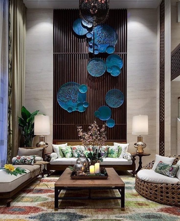 It makes no sense to choose an airfield sofa and three armchairs if you live alone and rarely receive guests. In this case, it is worth limiting yourself to more compact options and leaving more free space in the room - to create a feeling of spaciousness or to accommodate other functional elements.
If you expect your guests to occasionally stay overnight, then the choice of sofa should be approached especially carefully. Choose folding models, on which, if necessary, you can fully sleep. If there can be several overnight guests, then it makes sense to consider options for transforming chairs that can fold out and turn into a bed.
Modern design solutions, as a rule, do not involve the placement of solid cabinets in the hall. It is assumed that this tradition should remain in the Soviet past. However, if you don't have a walk-in closet and don't have enough space to place storage items in other rooms, no one can force you to give up a spacious closet in the living room.
In a classic interior, it can even be a solid wall. However, if you prefer more modern design trends, then it is better to pay attention to stylish wardrobes. For a small room, models with mirrored doors are perfect, they allow you to visually expand the space, and will not weigh down the interior as much as their counterparts with solid doors.
A small room should not be cluttered with a large number of pieces of furniture. Such an "abundant" environment will overwhelm, distract, and simply interfere with free movement around the room. If you don’t have a lot of things, then you definitely shouldn’t put a massive closet in the living room, limit yourself to a light and elegant rack. If you want to create a truly light and stylish design, pay special attention to the modern style living room furniture, the photo of which can be seen below.
If you do not plan to receive guests often, it makes no sense to purchase a grand dining table in the hall. In order to drink coffee or have a snack in front of the TV, an elegant coffee table will be quite enough.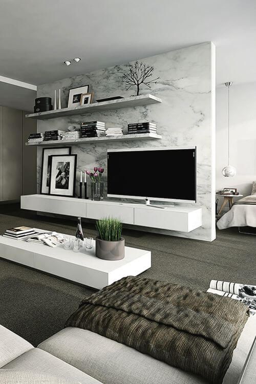 To save space, you can choose a functional transforming table, which will serve as both a stand and a storage for books and magazines, and, if necessary, can be expanded into a fairly full-fledged springboard for home meals.
Fireplace in the living room interior
If you want your living room to breathe genuine comfort and hospitality, consider purchasing a fireplace. Naturally, it is almost impossible to establish a real hearth in a city apartment. But today there are a lot of magnificent imitations on sale that will emphasize the elegance of the interior, create an atmosphere of comfort in the room and even be able to heat it.
An electric fireplace is perfect for an apartment. Do not think that this is a more beautiful analogue of the heater. In fact, modern manufacturers produce incredibly realistic models that amazingly imitate real flames. There are even models with sound and aroma accompaniment. That is, in front of you there will be not only the illusion of an open fire, but also real crackles, as well as the smells of burning logs.