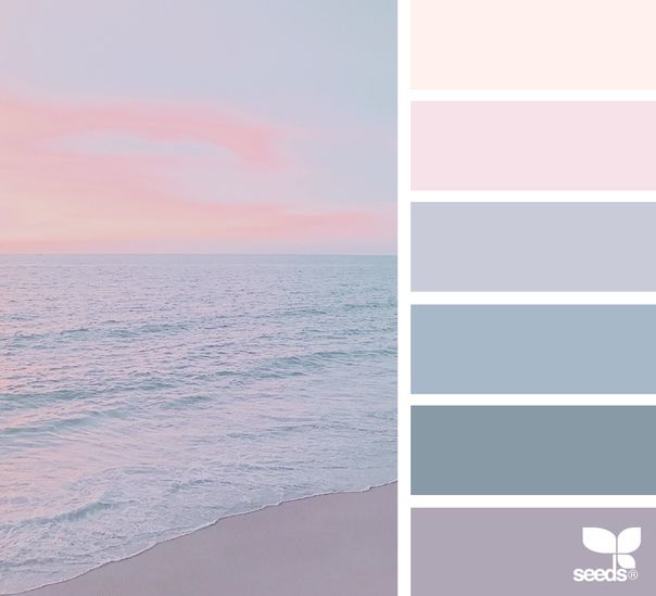
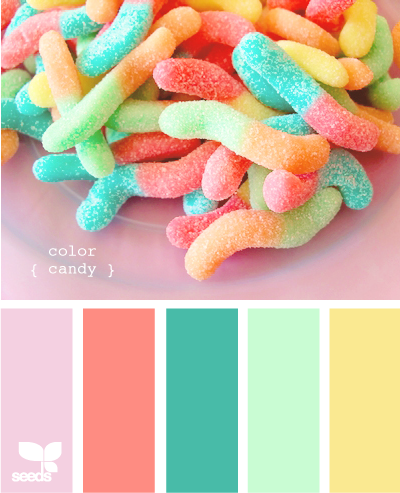
Sleepy color palette
The 5 Best Colors To Promote Better Sleep
Color is a very powerful tool the hospitality industry can use to add emphasis, change perceptions and provide calm, peaceful environments that allow guests to relax in comfort. But one thing any guest will appreciate is having a truly welcoming, relaxing room. Making sure that your guests are getting the tasteful, stylish decor they want and all the rest they need is imperative in order to offer them a great customer experience.
No matter what colors you intend to use in the public areas of your hotel, it’s important that you pay special attention to the color palette for your guestrooms. For this, let’s take a look at how you can apply five no-fail colors to form beautiful spaces and promote better sleep.
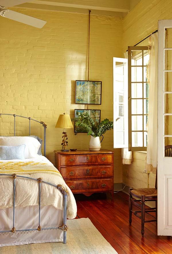
- Muted blue – Reminding us of water and sky, blue is perceived as an important constant in our daily lives. Typically linked to calm, soothing, serene feelings, a room painted in a muted shade of blue can help us relax and fall asleep more quickly.
Different studies have also shown that those who sleep in blue rooms wake up feeling happy, positive and energetic. Also, little details like including muted blues across your hotel’s color palette can keep your guests in a good mood all day long. If you think blue doesn’t fit your guestrooms too well, you may consider using it as an accent color on a white, butter yellow or light grey “backdrop.”
- Earth tones – Tranquil, soft and comforting, earth tones deliver some excellent color options for creating a chic, relaxing mood in your guestrooms. A soft tone of beige, a medium taupe or a sweet shade of caramel can make a guestroom transition beautifully into a relaxing, restful, spa-like retreat as the day goes by. Using an earth tone is a wonderful idea not only to promote relaxation and better sleep but also to create refined, cohesive and delightful interiors.
- Light green – Green is another good color for creating a nice balance and giving your guestrooms a better sleep makeover.
 A cool, pale shade of green can lower blood pressure and heart rate, ensuring a proper night’s sleep. Just like blue, green also makes people feel upbeat and positive when they wake up. If you want to spice up a boring green color palette, the best advice our commercial painting contractors can offer is to leave strong shades like fire-engine red, bright orange or electric blue out of your rooms. These colors can create anxiety and restless sleep. For a vivid yet well-balanced color palette, it’s best to choose complementary colors with a soothing vibe.
 - Pale yellow or orange – Doing a great job at stimulating communication and creativity, warm colors are more suited for social areas. But pale shades of yellow and orange have also been found to provide a comfortable, warm and reassuring atmosphere. Encouraging relaxation, a cozy, inviting atmosphere can make people nod off easier and usually contributes to better sleep.
- Light grey – Grey is one of the most intriguing colors you can use to decorate your guestrooms.
 Depending on its undertone, grey can be a cold or a warm color, and can be successfully combined with almost any other hue to breathe life into any modern or classic room setting. Since the color palette in a guestroom should be geared toward creating a comfortable, intimate setting, opting for a light shade of grey with a warm undertone is the recipe for room design success.
The science of color might be helpful when choosing a color palette for better sleep. However, it’s not an exact science. For this reason, we would like to suggest that you go for a paint color that perfectly fits the overall decor. If your rooms look better dressed up in a light shade of olive, then olive is likely a much better choice than muted blue.
Painting companies aren’t all the same; knowing this can make a huge difference for your hotel. Committed to the local community, Performance Painting Contractors is more than just a typical painting company; it’s a responsible and dependable partner you can count on for a full range of high-quality commercial painting services.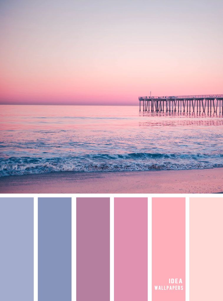 With offices located in Jacksonville and Tampa, FL, our color consultants and commercial painters are ready to take on any interior or exterior painting project. If you’d like to learn more about how to use color to enhance the curb appeal of your hotel or if you have any questions about our painting services, please feel free to contact us today!
Best Bedroom Colors for Sleep
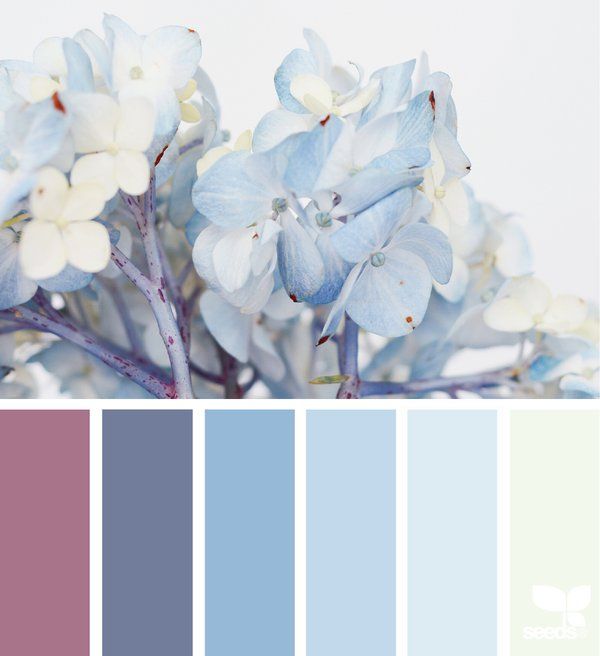
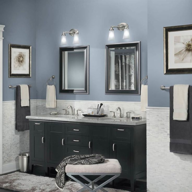
Blue
The color blue has many positive associations, including clear skies or clean, clear water. According to color psychology, soft blues can help calm the mind, while more intense blues can inspire reflection and clear thoughts.
A study of university residence hall room colors found that blue was the most preferred room color. The students in the study reported that blue best encouraged studying. Additionally, the students highly associated the color blue with a calm mood.
In a study of physical and emotional experiences in colored rooms, researchers found that a blue room was less likely to put the brain in an excited state compared with a red room. Other research found that a blue study environment induced feelings of calmness and relaxation, which are important for sleep.
The color blue can be incorporated into your bedroom in a number of ways. You might paint your walls blue or choose a blue accent wall. You can also choose blue bedding, furniture, rugs, or art to create an environment that soothes you. As blue comes in many different shades, it is a good color for layering across decorative pillows, throw rugs, or other accessories.
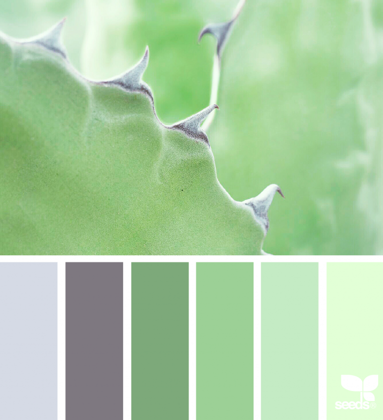
Green
Like blue, green is another cool, calming color. Green can make a space feel peaceful, given that this color is associated with grass, trees, and other plants found in nature. These peaceful associations can help you de-stress and relax into a night of restful sleep.
In the previously mentioned study on university housing, green was the second most preferred room color. However, certain shades of green may be more desirable for sleep than others. For example, yellow-greens may be less desirable because of negative associations with rotten food.
Soft shades such as mint green or sage might be calming colors for a bedroom. You can also incorporate green in other ways, such as hanging green art on walls or green curtains over your window. You can also bring green plants into your room. Indoor plants can both purify the air and reduce stress levels.
White
White is a neutral shade that inspires happiness and relaxation. Studies in the U.S. have found that the color white is strongly associated with positive emotions and images, such as fluffy clouds. In office spaces, white has been reported as one of the least distracting wall colors. Incorporating white in your sleep space can minimize distraction and help you relax before falling asleep.
White is a common ceiling color. A white ceiling can make the room feel more spacious. In the study of university rooms, students vastly preferred a white ceiling to a colored ceiling. Having lighter-colored walls in addition to a white ceiling may further increase the sense of spaciousness.
Apart from the walls, another way to incorporate white into your bedroom is to pair it with an accent color. For example, you might choose a blue or green color for one wall, and paint the remaining walls white or shades of off-white. That way you can have a pop of color without it overwhelming the room and being a distraction when you fall asleep.
Beige
Beige is another neutral color that allows for calm and balance in a room. Like white, beige is a popular color for workplace walls because it is seen as less distracting than brighter colors. Painting your bedroom walls beige walls can create a distraction-free space, making it easier for you to fall asleep.
Because of its lightness, beige balances well with other colors, even if they are more vivid hues. Beige works well as both a neutral wall color and an accent color. You can easily incorporate beige into your room decor, bedding, and wall art.
Pink
Like white, pink is a bright color commonly associated with positivity.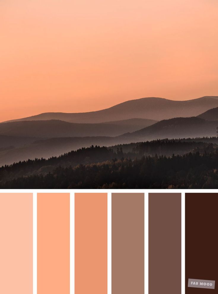 However, the research on the exact effects of pink walls on the brain has differed over the past several decades. This may be partially due to some cultures associating pink with femininity.
In the late 1970s, pink walls in prisons were thought to reduce aggression in inmates. More recently, lighter pink walls in prison settings were demonstrated to reduce aggression and lower blood pressure. However, further studies have failed to reach the same conclusion and more high-quality academic research is needed.
Some shades of pink may be better suited for a bedroom than others. The latest prison experiment used a soft pink, as some people find a hot pink too vivid and distracting. If you want a more vivid pink in your sleeping space, consider only having one accent wall in the color or incorporating it into your bedding and wall decor.
Best Bedroom Colors for Children
Preferences and responses to color shift through infancy, childhood, and adulthood. Although infants match adults in their preference for blue hues over green-yellow hues, infants seem to be more interested in saturated colors than less vivid colors.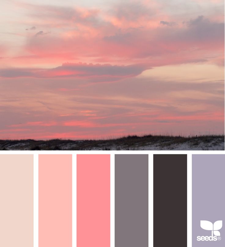 Individual responses to color may be further shaped throughout childhood with exposure to loved or hated objects in specific colors.
Research shows that children also display positive responses to bright colors such as red, yellow, pink, green, blue, or purple over dark colors like gray, black, and brown. While adults also appreciate standalone bright colors, they tend to prefer lighter colors for wall color. By contrast, warmer or brighter colors may help a bedroom space feel inviting and comfortable for children.
- Orange: Orange is typically disliked by American adults, perhaps due to its harshness and negative associations with traffic signs. However, the color orange is also associated with joy and happiness. As dark orange is not very popular, a medium or light orange hue may be most appropriate for a child’s bedroom.
- Yellow: Children associate the color yellow with happiness, and yellow has been found to reduce anxiety for children attending a dentist appointment.
 Light yellows may bring warmth into a child’s bedroom without being too distracting or overwhelming.
 - Pink: Pink is a popular bedroom color choice for children because it evokes positive emotions. Some children may find the color calming.There may also be gender preferences for the color pink, due to the fact that parents often choose pink for a girl’s room and blue for a boy’s room.
- Brown: Children who are sensitive to overstimulation may prefer a bedroom with more brown, which can be perceived as calming. Light brown and beige can also be paired with brighter colors to create balance.
- Green: One study found that children in a hospital setting preferred their bedroom to be blue or green. The color green is associated with quietness and many adults find it comforting. Painting a child’s bedroom walls green can make the environment calm and suitable for comfortable sleep.
Worst Bedroom Colors for Children
Both adults and children tend to associate dark colors with negative emotions. If these feelings lead to stress, anxiety, or restlessness before bedtime, children may struggle to fall asleep or have disturbed sleep.
- Red: Research shows that red is a stimulating color for adults, leading to the possibility this is true for children as well. Research has shown children associate the color red with negativity. This association may affect their mindset before bedtime and make falling asleep a challenge.
- Yellow: Although yellow has many positive associations, some children may find bright yellows to be overwhelming or distracting, which can make it more difficult to fall asleep.
- Gray: Children tend to have negative associations with dark colors, including gray. If gray evokes negative emotions for your child, they may have trouble relaxing at bedtime.
What Color Light Helps You Sleep?
Light is known to impact sleep quality. For bedroom lighting, experts recommend low color temperature lights in warm hues such as red, orange, and yellow. This is the opposite of the cool greens and blues recommended for wall hues.
Exposure to white and blue light, or high color temperature light, is the strongest visual cue for suppressing the release of melatonin, the sleep hormone. Bright light exposure before bedtime has been shown to suppress melatonin production in the body, particularly in children.
In a study comparing different light temperature environments, children were significantly less sleepy in the room with bluer lighting. By contrast, some studies have shown that lighting with a color temperature similar to candlelight is less likely to suppress melatonin. As a result, using this type of lighting in the bedroom can improve your quality of sleep.
One small study compared how well adults slept in environments with different color illumination. Participants fell asleep much faster in their preferred color illumination than in any other space, possibly because they found it more relaxing.
How Does Blue Light Affect Sleep?
Blue light is an important part of regulating the body’s circadian rhythm, a primary contributor to the sleep-wake cycle. With exposure to blue light during the day, the sleep hormone melatonin is suppressed. This means that exposure to blue light helps keep people alert and able to complete daily tasks.
While blue is a highly recommended bedroom wall color because it invokes calm and relaxation, exposure to blue light in the evening can negatively impact sleep. Blue light is emitted from electronic devices such as TVs, computers, and cell phones. Research shows that using these devices right before bedtime delays sleep onset. Excess exposure to blue light at night can also increase sleepiness the next morning because it disrupts the circadian rhythm.
Worst Bedroom Colors
Colors with negative associations or stimulating physical effects are typically not recommended for primary bedroom colors. Having excessive amounts of these colors in your bedroom can make winding down at the end of the day more difficult and delay or disrupt your sleep.
Red
Red is often associated with aggression and danger. Researchers theorize that because the human eye has the most trouble adjusting to see the red wavelength, people may perceive red objects to be closer than they are. The color also comes with a number of negative associations like blood, which might make a red-colored sleeping environment less than comfortable.
Physiologically, red is thought to be a stimulating color. One study found that people in a red room experienced more brain waves associated with an alert, awake state. Other studies have found that the color red increases heart rate and blood pressure. One study found that seeing the color red increased the physical force participants used on a task when compared to blue and gray. Red may even trigger a fight-or-flight response. Such arousal can be overstimulating or anxiety-provoking and make it difficult for you to fall asleep.
When designing your bedroom, consider limiting the use of red to a few items at most. You can also consider using a less saturated shade of red so the color is not as harsh. Pink, which is related to red, may offer warmth without the negative associations and arousing physiological response.
Purple
Although purple is a shorter wavelength color like green and blue, it is perceived as more distracting. Some believe that a purple room can lead to more nightmares.
According to a Travelodge study of 2,000 British sleepers, people who sleep in purple rooms get an average of fewer than six hours of sleep each night, the lowest amount reported of any color in that study.
Instead of using purple in your room decor, consider the closely related color violet, which does not have the strong red undertones of purple. In the study of university housing, violet was the third-ranked choice for room color after blue and green. The same study found that violet was considered calmer than red, yellow, and orange.
Dark Brown
Because it is a dark color, brown tends to be associated with negative emotions. The color may also be disliked because it is associated with unpleasant images.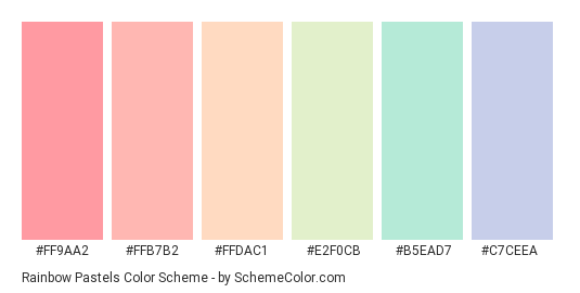 A brown bedroom may be perceived as cold. In the Travelodge study, people with brown bedrooms only got an average of six hours and five minutes of sleep each night.
To avoid unpleasantness linked to dark brown, limit the color to room furniture, baseboards, and trim. Rather than painting your walls dark brown, consider using beige. The color beige can offer more warmth and light in a room.
Black and Gray
Even though an ideal sleep environment is dark, too much black or gray color in your bedroom may negatively impact your sleep. Black is often linked to coldness and negative emotions. Gray, the color of cloudy and stormy days, may be seen as suppressive and was the least favorite color used to paint a students’ union complex in one study. Because of these negative associations, black and gray bedrooms may make it difficult to relax and fall asleep or sleep peacefully.
For those who want to incorporate black and gray into the bedroom, there are a number of ways to do so without overwhelming the space. Both black and gray can be used as an accent color in the furniture, woodwork, or molding in the bedroom.
If you want to paint your walls gray, consider lighter shades of gray for a better sense of spaciousness. When paired with a cool color such as blue or green, light gray may feel more relaxing. You might also choose a gray paint with blue, green, or violet undertones. These undertones may make the room feel less dreary than a dark gray or black color palette. As for black, it may be best to stick with smaller objects such as picture frames.
Tips for Choosing the Best Color for Your Bedroom
- Try a matte paint finish: A flat or matte paint finish absorbs light. In contrast, a wall with a glossy finish tends to reflect light, which can be distracting as you try to fall asleep.
- Think about the lighting: Before settling on a color, see how it is affected by the lighting in your room. Test the color in your bedroom’s natural lighting, artificial lighting, and in the darkness level you keep the room at when you sleep.
 You might also consider having a brighter overhead light for daytime and a warmer-hued bedside lamp for the evening.
 - Consider your preferences: If you find a certain color calming and relaxing, even if it is not a commonly relaxing hue, it may be the right choice for your walls.
Additional Tips to Optimize Your Bedroom for Sleep
- Bedding: The combination of wall color, lighting, and bedding color can change the appearance of your room. For example, if your walls are dark, using lighter-colored bedding may make your bedroom feel brighter and larger.
- Furniture: Aim for furniture that makes your sleep space functional and stress-free. Clutter can reduce feelings of well-being and negatively impact sleep, so consider underbed storage or baskets to reduce the number of items on your floor.
- Rugs: Floor rugs in the bedroom can reduce noise if a sleep partner or pet gets up during the night. Rugs also provide an additional opportunity to add color to your bedroom.
- Curtains: To fall asleep more easily and not wake too early, it is important to eliminate excess light. Heavy, dark curtains can block out street lights or an early sunrise.
Resources for Bedroom Environment and Sleep
- How to Design Your Bedroom for a Better Night’s Sleep: The layout of your bedroom can impact your sleep. Forbes breaks down which layouts are most popular among people who get restful sleep.
- How to Light a Modern Bedroom: The right lighting for your bedroom depends on a number of factors. This blog post from YLighting covers everything from functional lighting placement to bulb color.
- Picking the Best Bedroom Rug: Rugs can enhance your bedroom and reduce noise. This blog offers recommendations for choosing a rug that meets your needs based on sizing, texture, and design.
- How to Choose the Best Curtains for Your Bedroom: Bedroom curtains do more than just blocking out light. Strategies for choosing curtain height, fabric, and hardware are all explained on the Martha Stewart blog.
- Bedroom Discussions: Houzz.com connects people who are interested in renovating their homes. The Bedroom Discussions forums offer a place to post questions and access design advice from other members.
References
+33 Sources
- Accessed on February 18, 2022. https://medlineplus.gov/healthysleep.html
- Accessed on February 18, 2022. https://pubmed.ncbi.nlm.nih.gov/20421475/
- Accessed on February 18, 2022. https://pubmed.ncbi.nlm.nih.gov/21667759/
- Accessed on February 18, 2022. https://journals.sagepub.com/doi/10.1177/2158244014525423
- Accessed on February 18, 2022. https://pubmed.ncbi.nlm.nih.gov/30210407/
- Accessed on February 18, 2022. https://onlinelibrary.wiley.com/doi/10.1002/col.20476
- Accessed on February 18, 2022. https://onlinelibrary.wiley.com/doi/abs/10.1002/col.21949
- Accessed on February 18, 2022. https://pubmed.ncbi.nlm.nih.gov/30387059/
- Accessed on February 18, 2022. https://pubmed.
 ncbi.nlm.nih.gov/25987304/
 - Accessed on February 18, 2022. https://pubmed.ncbi.nlm.nih.gov/20401809/
- Accessed on February 18, 2022. https://www.colormotion.ch/download/cool-down-pink/Veroeffentlichung-AIC.pdf
- Accessed on February 18, 2022. https://www.ojp.gov/ncjrs/virtual-library/abstracts/tranquilizing-effect-color-reduces-aggressive-behavior-and
- Accessed on February 18, 2022. https://psycnet.apa.org/record/2015-17739-005
- Accessed on February 18, 2022. https://pubmed.ncbi.nlm.nih.gov/30911475/
- Accessed on February 18, 2022. https://pubmed.ncbi.nlm.nih.gov/21500913/
- Accessed on February 18, 2022. https://www.travelodge.co.uk/press-centre/press-releases/SECRET-GOOD-NIGHT%E2%80%99S-SLUMBER-SLEEP-BLUE-BEDROOM
- Accessed on February 18, 2022. https://pubmed.ncbi.nlm.nih.gov/24594683/
- Accessed on February 18, 2022. https://pubmed.ncbi.nlm.nih.gov/31848908/
- Accessed on February 18, 2022. https://pubmed.ncbi.nlm.nih.
 gov/27630948/
 - Accessed on February 18, 2022. https://pubmed.ncbi.nlm.nih.gov/23616112/
- Accessed on February 18, 2022. https://onlinelibrary.wiley.com/doi/full/10.1002/col.22171
- Accessed on February 18, 2022. https://pubmed.ncbi.nlm.nih.gov/28702059/
- Accessed on February 18, 2022. https://pubmed.ncbi.nlm.nih.gov/30536193/
- Accessed on February 18, 2022. https://pubmed.ncbi.nlm.nih.gov/28066297/
- Accessed on February 18, 2022. https://pubmed.ncbi.nlm.nih.gov/24089179/
- Accessed on February 18, 2022. https://pubmed.ncbi.nlm.nih.gov/24262394/
- Accessed on February 18, 2022. https://pubmed.ncbi.nlm.nih.gov/30556352/
- Accessed on February 18, 2022. https://pubmed.ncbi.nlm.nih.gov/31101840/
- Accessed on February 18, 2022. https://pubmed.ncbi.nlm.nih.gov/29065627/
- Accessed on February 18, 2022. https://www.nigms.nih.gov/education/fact-sheets/Pages/circadian-rhythms.aspx
- Accessed on February 18, 2022. https://pubmed.
 ncbi.nlm.nih.gov/31433569/
 - Accessed on February 18, 2022. https://www.sciencedirect.com/science/article/abs/pii/S0272494416300159
- Accessed on February 18, 2022. https://pubmed.ncbi.nlm.nih.gov/26751571/
Film fiction. "Gogol. The Beginning" - Sherlock Holmes in Sleepy Hollow (16+) > Rubric in Samara
"But what's weirder, what's more incomprehensible of all, is how authors can take stories like this, I confess, it's completely incomprehensible, that's for sure ... no, no, I don’t understand at all” (Nikolai Vasilyevich Gogol, The Nose, 1832-1833). The most mystical Russian prose writer would probably have repeated these words from his story “The Nose” if he had watched the adventure detective Egor Baranov “Gogol. Start". And Nikolai Vasilievich would hardly recognize himself in the actor Alexander Petrov, who played the writer in our answer to Berton's Sleepy Hollow. But then - Nikolai Vasilyevich, and then - we, ordinary viewers, so we'll talk objectively.
So, a couple of years ago, the producers of the TV-3 channel and Alexander Tsekalo's company Sreda came up with the idea to create a mini-series based on the works of Nikolai Gogol. Moreover, to combine all the stories written in the collections “Evenings on a Farm near Dikanka” and “Mirgorod” into a single plot, and make Gogol himself the main character. In 2016, the creative team enthusiastically started filming in the Pskov region and St. Petersburg, where the scenery for the village of Dikanka was created.
According to the plot, Cossacks, witches, mermaids, drowned women and other inhabitants of Dikanka meet face to face with their creator, Nikolai Gogol. According to the legend of the film's authors, he works as a young clerk from St. Petersburg, who suffers from mysterious seizures and can communicate with characters from the other world. Together with his boss, a brilliant metropolitan investigator Yakov Guro, the aspiring writer comes to the Poltava region to investigate the mysterious murders of girls.
The idea of the TV-3 producers is to break the 8-episode series into 4 films and show them in turn in the cinema, well, and then launch the series on the first mystical one. This cunning move was adopted by Russian filmmakers a long time ago (Dark World, Admiral, etc.). And since “Gogol. Beginning "includes only the first two series, then the viewer is faced with certain problems. After watching, there are a lot of questions, the answers to which we will receive only in 2018. In fairness, it can be noted that questions remain even after viewing some full-length films that leave groundwork for sequels. So let's take a look at what we have now.
As you must have already understood from the title of the review, the creators of Gogol. The Beginning” not only drew inspiration from foreign paintings, but also did not hesitate to quote them. What we have. Investigator Yakov Guro, played by Oleg Menshikov, is an eccentric detective who is not afraid to take on the most difficult cases. And you don't even need to draw parallels with Guy Ritchie's Sherlock Holmes, because in some episodes with the participation of Guro, almost the same melody is played as in Sherlock. On the other hand, Menshikov plays Guro the way he played Erast Fandorin in The State Counsellor, which gives the character our own flavor. Gogol, performed by Alexander Petrov, is almost the same Ichabod Crane, who was played by Johnny Depp in the film Sleepy Hollow. This is a sickly-looking young man who suffers from neurosis and uses unusual methods to investigate the devilry going on in the village of Dikanka. The resemblance to Tim Burton's Sleepy Hollow doesn't end there. Judge for yourself.
In The Hollow, a constable arrives in the village to investigate the case of a mystical headless horseman who has been actively reducing the local population. In our version, the clerk comes to the village of Dikanka to investigate the case of a mystical horseman (but with a head!), Which actively reduced the local population, however, was limited only to young girls.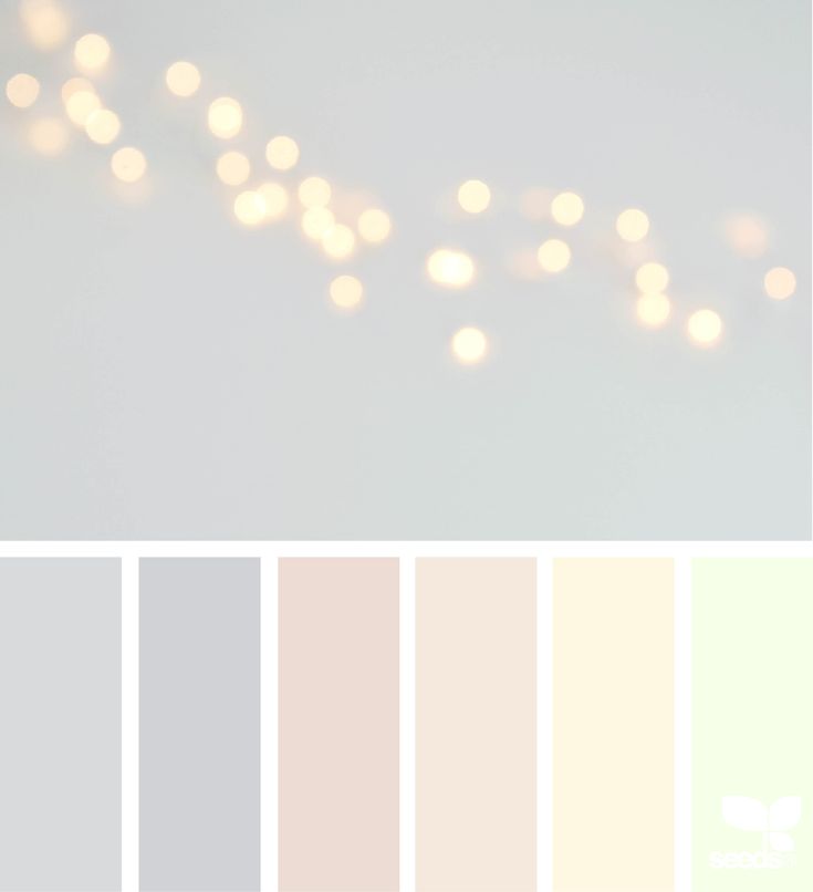 The color scheme of the film is also reminiscent of Burton's creation. There are many borrowings in the film, and not only from Sherlock or Sleepy Hollow. Remember the moment from The Lord of the Rings when the hobbits were hiding behind a log, over which a hooded Nazgûl rider loomed? Then get ready for deja vu when you see almost the same scene in Gogol.
But there is a big difference between bad copying of other people's ideas and competent borrowing. I believe that the creators of Gogol. The Beginning" tried to make their picture look high quality. Therefore, while watching, I only smiled, recognizing the images and scenes from the above-mentioned paintings. To the credit of the creators of the picture, they managed to combine foreign developments with our color. The atmosphere of Gogol's works is present in the film. Largely due to good acting, including secondary characters, and the wonderful scenery of Dikanka.
The film's disadvantages are the special effects, which sometimes look very cheap. The serial basis of the film is affected. In addition, as I noted above, the film offers us a whole cocktail of various storylines that still leave many questions - Gogol's mysterious ability to travel through the world of spirits and his demonic origin, the motives of the antagonists, the health problems of the hero's beloved and the plans of her villainous appearance. husband, etc. In addition, the film is divided into two chapters, each of which is, in fact, a separate series. Yes, the general storyline runs through both chapters, but there are separate micro-plots that are characteristic of the series. Therefore, "Gogol. The Beginning is difficult to perceive as an independent full-length film.
Not without kinks. The authors of the picture, imitating their Western colleagues, for some reason tried to copy the pathos and some tricks that look appropriate in a major blockbuster, but funny in Gogol. For example, they try to convince the viewer of the death of some hero, which only a child can believe in, and then give out a “powerful” twist about his resurrection, accompanied by pathos music, with a camera zooming in. At such moments, it became somehow awkward.
Summing up the interim results, it can be noted that so far the project looks interesting. The film is head and shoulders above the dreadful 2014 film Viy, where Gogol's legacy was treated quite blasphemously. "Gogol. Beginning looks pretty good. Despite the general absurdity of what is happening, it is clear that the authors are trying to recreate the book atmosphere. On trifles, one could find fault with many things, for example, with the miller's daughter with the appearance of a silicone supermodel, but I don’t want to do this. But to look at what will happen next, there is a desire, and this is already commendable.
Enjoy watching!
Other cinemas:
“Kingsman: Golden Ring” - step in the “rear door” (18+)
“It comes at night” - the director deceived all (18+)
“ Killer's Bodyguard" — melodrama wrapped in action comedy (18+)
COSTUMES AGAIN: LIGHT AND DARK IN T.
 BURTON'S FILM "SLEEPY HOLLOW"
 Among other cinematographic works by T. Burton "Sleepy 9"0005
Hollow” holds a special place. With all the recognizability of the director's handwriting, this
film is distinguished by an extraordinary atmosphere that reigns in the frame. The picture turned out
gentle, impressionistic.
The work of the American Impressionist D. Wistler
FARS from the film
Initially, the picture was conceived as black-and-white. The director in his interviews said that the source of inspiration for the film adaptation of this short story by Irving was an old Italian black-and-white horror film "The Mask of Satan" (1960 d) directed by Mario Bava.
Frames from the films “Satan Mask”
and “Sleepy Hollow”
and indeed, the parallels are obvious, and pavilion forest, false prospect, respectively, respectively, respectively, respectively, respectively, respectively, respectively, respectively, respectively, respectively, respectively, respectively lots of smoke to soften the background.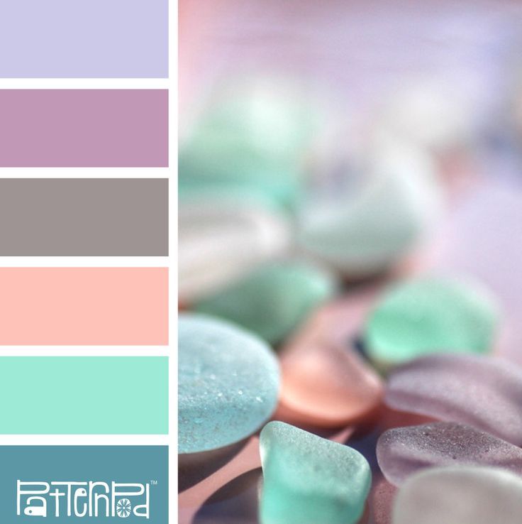 But the film turned out to be more beautiful and lyrical.
The action of the picture takes place in 1799 in the small American town of Sleepy Hollow, inhabited by Dutch settlers
How about without a windmill, since we are talking about the Dutch? Painting by a Dutch painter, frame from a film,
director's drawing.
His tranquility is disturbed by a chain of mysterious, cruel
murders. "Sleepy Hollow sleeps and has nightmares," was how production designer Rick
Rick Heinrichs explained his
vision for the project. The black color present in the film, of course,
adds to the anxiety. The forest, with its trees resembling skeletons, with rotten
autumn leaves, as if talking about the frailty of our lives, makes us nervous.
The range of the film is very beautiful: ash, dusty brown with occasional splashes
burgundy and gold.
T. Burton said in one of his interviews: “Location, mood, feeling – all this is very important in this film. It's just another character in the play."
The task of the costume designer, faithful to Colin Atwood, was to fit the costumes into this background as organically as possible, without destroying the fragility and watercolor ghostliness. She drew inspiration from the paintings of famous painters of that time.
Painting by J.O. Fragonard's The Swing, still from the film
Nicolas Lancret's painting The Bird Cage, still from the film
Therefore, there are no open or contrasting colors in this film. The only sharp color in the suits is black. It balances other dark details in the frame - trees, buildings, gives visual aggressiveness to some characters.
All the fabrics she purchases for her suits have undergone mandatory film testing.
The costumes themselves are quite laconic in line, but are made from fabrics of various complex textures. For example, the costume of the protagonist Ichabod Crane is not made of black, as it might seem, but of cloth of a deaf blue-green hue.
And velvet and satin vests were also made for him. Since they were immediately filmed on a special film that absorbs chiaroscuro and makes the suit of dark fabric a flat black blot, the artist had to sew a thin satin edging around the edge of the suit. It reflected light and added relief. By the way, such a dull dark color emphasized the whiteness of the face, which was necessary according to the concept of the film.
In the photo: male ensemble, circa 1790, METROPOLITAN Museum and D. Depp's costume from the film Sleepy Hollow. This version of the men's suit was called "abi", it was a transitional form from the justocor to the tailcoat. There is no elaborate embroidery, plentiful lace. The style is understated and elegant.
The people of Sleepy Hollow have good old-fashioned clothes. They demonstrate their wealth and position in society with the help of rich trimmings and lace, as was customary at that time.
In her interviews, K. Astwood did not hide the fact that she did not pursue the goal of creating historically correct costumes. “This is not a history lesson,” she said. The format of the film - a gothic fairy tale - was conducive to bold, interesting experiments. "More fantasy - less historical truth" - that was Colin's motto.
This stepmother's dress looks really unusual for that era, but it makes it clear to us what kind of woman is in front of us. “A costume is an opportunity to establish the character of a character before he opens his mouth,” Colin Atwood likes to say.
The black color, quenching the energetic yellow on the Stepmother's satin dress, subconsciously arouses anxiety in us and points to the secretive nature of the character. The combination of colors - yellow and black - is not accidental. This is one of the favorite color combinations in Dutch painting of the 17th century.
Painting by Vermeer "Music Lesson".
Of course, K.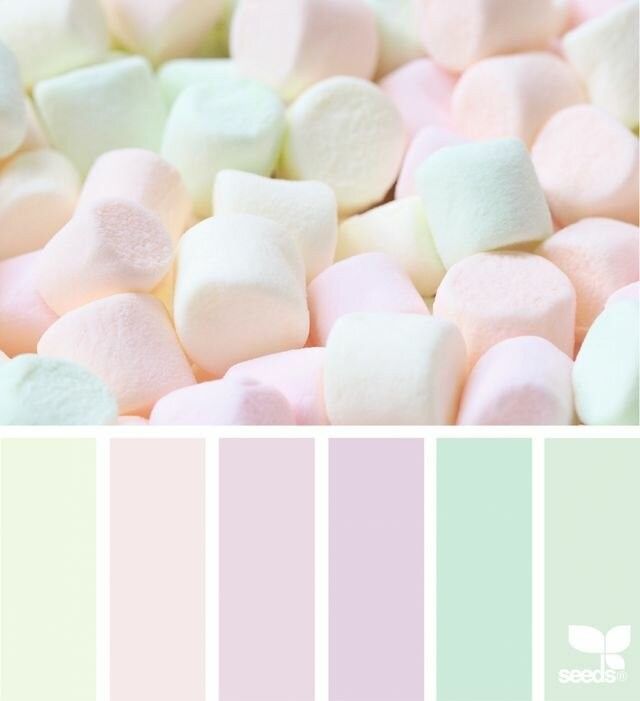 Atwood chose a warmer shade of yellow and complicated the decor, but the essence remained clear, we are talking about the Dutch roots of the Stepmother.
The bouncy swirl of this dress's ornament will tangle into a black cobweb in her final costume.
As if this décor is alive, it exists outside of the dresses, weaving and unweaving like the hair of the Gorgon Medusa.
For many years the stepmother wove this net, into which she lured half the city.
Again, one cannot fail to notice the similarity of the black and white dress with the outfit of Sidonia von Bork from the famous painting.
"Sidonia von Bork" painting by Edward Burne-Jones, the famous Pre-Raphaelite and still from the film.
Sidonia von Bork was not a contemporary of the artist, but lived in the distant 1548-1620. The plot for the picture was the book of the German writer of the first half of the 19th century. Wilhelm Meinhold "Sidonia von Bork. Monastery Witch. She was very popular among the Pre-Raphaelites. The book told about a cruel sorceress who took revenge on men using her charms. As a result, for these "arts" she was burned at the stake. The artist depicted Sidonia plotting a new crime. Her gaze is full of cold hatred, and her face and figure express unbending determination.
Also, the final white dress with black cobwebs is almost a mirror image of the outfit of the White Witch, her sister, whom she killed.
White Witch dress and drawing - T. Burton's concept of a witch.
After all, even in childhood they dressed in almost identical dresses.
The outfit in which she deals with her sister is also interesting.
First, it has aggressive black trim details.
Secondly, artistically there are some borrowings from Lucas Cranach, whose work was inspired by the director of photography Emmanuel Lubezki. This connection of times is not accidental. Evil has no time frame and, mind you, Judith and Stepmother have one “hobby”.
Thirdly, the costume designer wanted this dress to look like the bark of a tree overgrown with moss, because the Stepmother once lived in the forest for a long time and feels one with it.
With the help of her sorcery charms, the Stepmother perfectly manipulates the Headless Horseman. The poor fellow, in search of his lost, literally, head cuts off the heads of the inhabitants of the town right and left. It's funny that his costume almost repeats the costume of Yavuto from the movie "Mask of Satan", so beloved by the director.
Stills from the film "Sleepy Hollow" and the film "Mask of Satan" 1960.
Both here and there the costume consists of a raincoat, a tunic, trousers, a belt with a wide buckle. Moreover, on Yavuto's tunic we see an embroidered silver dragon. Here is what Wikipedia writes about the symbolism of the Dragon: “The dragon symbolizes immortality, which can be obtained by invading the body of a monster (both from the outside and from the inside, for example, by being swallowed by a dragon). The battle with the dragon is an initiatory mystery with the symbolism of temporary death and rebirth. It's all about our heroes.
Colin Atwood made a more stylish version and we already see her heraldic double-headed dragon. In his right paw he holds an orb - a symbol of royal power.
A tunic and a fragment of an embroidery of the Headless Horseman costume and a fragment of the Yavuto costume. By the way, in the Russian translation of this film, the dragon on Yavuto's tunic is called a silver griffin, which is not true. Griffins are half lions, half eagles, and the photo clearly shows that this is a dragon.
The very gamma of the costume - black-red-gray tells us about blood, death, ashes from fires, the brilliance of swords and chain mail.
At the time when our heroes see him, many years have passed since he died and lay in the grave. Therefore, his outfit was rotten and dilapidated in places (as, by the way, with Yavuto).
And again I compare the Headless Horseman and Yavuto, crawling out of the grave in the mask of Satan.
"A ray of light in the dark realm" in this film is, of course, Katrina (!) Van Tassel.
Outwardly incredibly fragile, delicate, almost transparent, she reminds me of portraits of the Renaissance with her eyebrowlessness and long reddish curls.
Drawing by Leonardo da Vinci
The range of her costumes is correspondingly romantic - pastel. The outfits are devoid of flashy, bright finishes.
Her wardrobe has some fashion details, after all, she is the daughter of one of the richest people in the town.
For example, here we see pierrot jackets.
A characteristic detail of this jacket is the beautiful line of the bodice, very popular in the 18th century.
Katrina's peach dress and the original dress from the Kyoto Costume Museum.
The basis of the silhouette of this dress is a rigid corset
And small figs. Sometimes they wore a quilted skirt under the dress, it helped keep the shape and warmed the hostess in cold weather.
In this scene we see Katrina in a redingote with a polonaise skirt draped in the fashion of those years.
These polonaise dresses came into fashion in the 1770s. Their feature is a tight-fitting bodice and a pleated skirt at the back.
Authentic 1776 dresses from the Metropolitan Museum of Art (NY)
Although the picture below is not a jacket, but a pierrot jacket, the lines on Katrina's jacket are clearly inspired by this suit from the Metropolitan Museum. Jacket. Picture from a fashion magazine and portrait of Lady Worsley by J. Reynolds (1776) Mostly, it was an outfit for riding and hunting. Katrina's dressing gown is a delicate gray color that seems to dissolve into the scenery surrounding her, making the girl almost transparent. Same color as Katrina's raincoat. Thanks to the shimmering texture of silk velvet, it creates the effect of something unearthly, unreal. Red juicy embroidered roses on the hood look like drops of blood, preparing us in advance for the bleeding tree scene. This is one of Colleen's favorite tricks, remember the embroidery on the hem of Alice's dress. The cloak falls from Katrina's shoulders in beautiful folds, reminiscent of the veils of Gothic Madonnas. After all, Sleepy Hollow is a gothic fairy tale! The final black-and-white dress stands out from all her gentle pastel row. It is also a polonaise style, but the change in the gamma of the dress to a sharper stripe, I think, indicates a change in the girl's life, in connection with her move to New York. There will no longer be a sleepy existence, as in her hometown, there will be a vibrant life, full of sharp turns, as, indeed, among the inhabitants of all megacities.