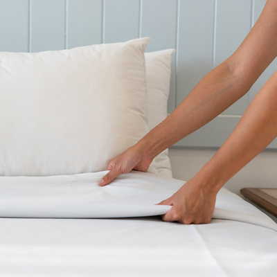
Modern house paint color
10 Modern Exterior House Colors for 2022
There are clear trends when it comes to modern exterior house colors, but modern color schemes are not necessarily one-size-fits-all. Depending on your design style, you might lean toward a sleek aesthetic or something more striking and bold. Furthermore, small details, like the color of the front door or trim, make all the difference with modern homes. Whatever your tastes might be, we have tons of color ideas below to inspire you.
We stay up-to-date on the latest trends so you don’t have to. Our team can help you transform your exterior and make your home stand out. We focus on understanding our clients’ design goals to recommend intentional, impactful updates. Learn more about our virtual design services.
Color palette trends for modern homes
Modern homes encompass a variety of design styles and color preferences. Specifically, modern exterior house colors tend to follow a minimalist, neutral approach. We frequently use monochromatic color schemes and those that combine contrasting dark and light shades. Daring aesthetics that make use of bold, saturated shades of charcoal and black are on-trend, but white exteriors with darker accents cultivate a fresh, timeless appearance. Plus, another trend we can’t get enough of is incorporating a bold pop of color for the front door on a modern home. If you’re searching for the perfect color for your modern exterior, read on for some of our favorites.
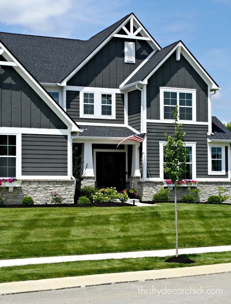
#1 // Sherwin Williams’ Caviar
Despite its LRV of 3, Sherwin Williams’ Caviar is a black paint color with dimension. Caviar has deep brown undertones that give it a warmer feel. The earthy tone of this color pairs well with natural elements. In the rendering above, our designers combined Caviar siding with wooden accents, bringing in a rustic feel. Because of its quiet complexity, Caviar is one of our favorite modern exterior house colors and is on our list of the best Sherwin Williams exterior paint colors for 2022.
#2 // James Hardie’s Night Gray
Are you looking for modern exterior house colors that will add drama and depth to your home’s aesthetic? Look no further than James Hardie’s Night Gray.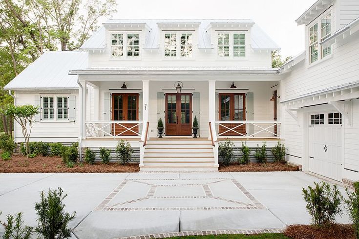 This sophisticated hue looks incredible with the light gray stone in the rendering above. As you can see, combining light and dark shades is a great way to bring dimension to a modern exterior. New to James Hardie? They offer a variety of siding options with different textures and tons of great color choices.
#3 // Sherwin Williams’ Black Fox
Another dark shade we recommend for modern homes is Sherwin Williams’ Black Fox. Modern designs make use of clean lines and incorporate geometric elements. Using dark colors for an exterior accentuates this sharpness. If you want to go with an almost-black shade that isn’t too stark, Black Fox should be on your radar. This brown-meets-black shade pairs perfectly with wood and copper accents, which our designers often include on modern designs.
#4 // Benjamin Moore’s Sussex Green
Looking for neutral modern exterior house colors that don’t live in the gray, black, or white realm? Benjamin Moore’s Sussex Green is a warm, deep green that pairs perfectly with natural accents like wood and stone.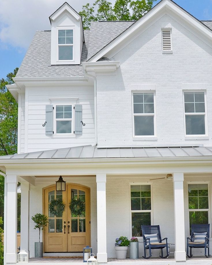 In the rendering above, the color is amplified by the landscaping and subtle wooden additions. This shade is so appealing that we included it in our list of the best Benjamin Moore exterior paint colors for 2022.
#5 // Benjamin Moore’s Black Beauty
We can’t talk about modern exterior house colors without including an example that uses a black-and-white color scheme. We love Benjamin Moore’s Black Beauty so much that we named it our top exterior house color for 2022. On the home above, our designers used Black Beauty for the brick, columns, trim, and other accents. Additionally, the siding is painted with Sherwin Williams’ Alabaster, one of our favorite warm white paint colors. For mid-century modern homes like this one, the classic color palette is elevated by the pop of color (Benjamin Moore’s Galapagos Turquoise) on the front door.
#6 // James Hardie’s Iron Gray
Coming in at sixth on our list, James Hardie’s Iron Gray is a bold, elegant shade that works great for modern exterior house colors. Our designers used Benjamin Moore’s Black on the trim above, creating a daring aesthetic. The wood and stone accents give the exterior a layered look, enhancing the depth of the design.
#7 // Sherwin Williams’ Olympic Range
Sherwin Williams’ Olympic Range is a beautiful deep forest green shade that looks incredible on modern exteriors. In the rendering above, our designers used Olympic Range on the siding to highlight the home’s sharp edges and unique structure. This home makes a statement.
#8 // Benjamin Moore’s Deep River
Next on our list of the best modern exterior house colors is Benjamin Moore’s Deep River. This saturated dark gray features blue undertones. It also has a warmth to it. Deep River pairs nicely with the walkway pavers and wooden accents on the home design above. We also love it alongside the unexpected burst of Benjamin Moore’s Wasabi on the front door.
We always recommend sampling and testing paint colors before committing.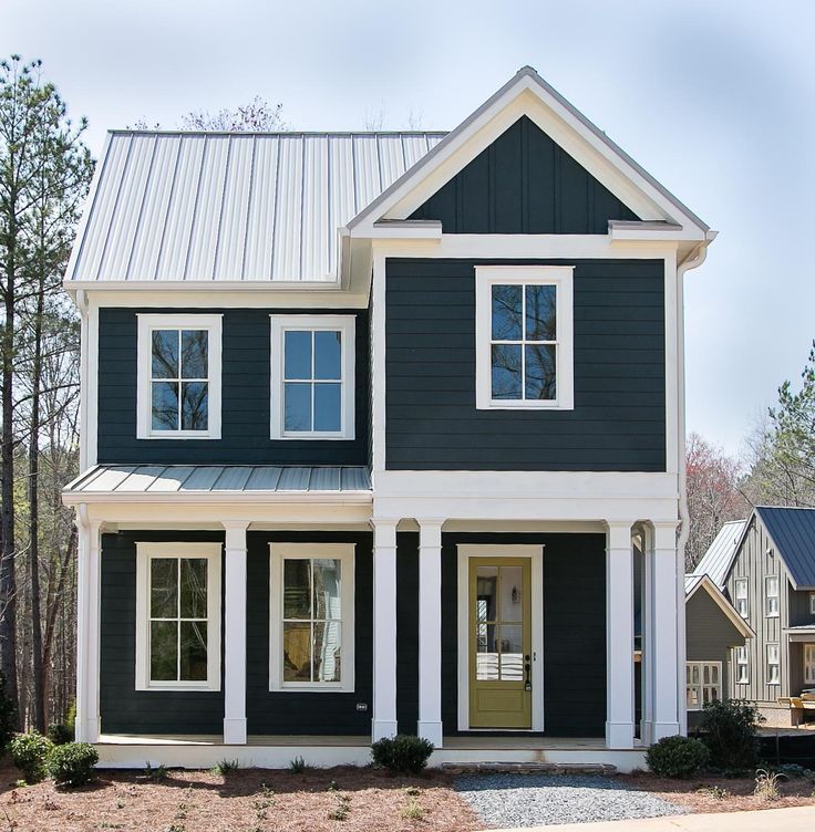 Factors such as natural lighting, undertones, and your property’s fixed elements will have a significant impact on how a color will appear on your exterior. Our friends at Samplize offer extra-large 9 x 14.75 inch peel-and-stick paint samples of the colors we love for exteriors. Order your ‘Real Paint, No Mess’ samples from Samplize here.
#9 // Sherwin Williams’ Anonymous
Neutrals are on-trend modern exterior house colors. And Sherwin Williams’ Anonymous is quickly becoming one of our favorite complex neutral shades. This mid-to-dark tone creates a sophisticated appearance on the home above. The Galapagos Turquoise front door draws the eye to the entry, and the black accents showcase the home’s sharp lines.
#10 // Sherwin Williams’ Alabaster
White is timeless, classic, and works for any style of home. This is why we included Sherwin Williams’ Alabaster in this list of modern exterior house colors. It has a sleek, refreshing appearance, especially when combined with black accents. Alabaster’s warmth creates a smooth canvas for the home above, allowing the accents to stand out and elevating the curb appeal in turn.
Wrapping up our favorite modern exterior house colors for 2022
At brick&batten, our designers often work on modern home upgrades for our clients. This work almost always includes recommendations for updating exterior paint colors. And we consider every detail — from accent and trim colors to landscaping suggestions and light fixtures. Our designers will harness the right modern design elements to take your curb appeal to the next level.
Ready to transform your exterior design goals into a reality? Not sure where to start? Tell us your vision and design style, and we can help you achieve the look you’re after. Get started today!
19 Popular Exterior House Colors for Fall 2023
Revive your house with one of these popular home exterior paint choices.
1 / 19
Artazum/Shutterstock
Blue-Gray
Blues and grays have been a popular exterior paint color for the last decade.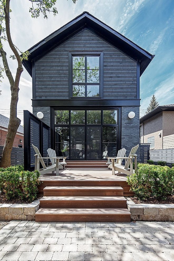 Now designers are combining the two for blue-gray tones that result in a welcoming color choice for home exteriors. The hue is a great complement to stonework and wood trim.
2 / 19
almanino/Shutterstock
An Unexpected Pairing
An emerging trend is to paint a home in two hues that normally wouldn’t be found in the same exterior color scheme. For example, try a gray paint on the siding with turquoise accents or a warm green with shutters in a cooler green hue.
3 / 19
Pawel Kazmierczak/Shutterstock
Pick Primary Exterior Home Colors
Mix and match reds, blues and yellows for your home’s exterior colors. Try a sunny yellow with a deep blue.
4 / 19
ppa/Shutterstock
Wood for Warmth
Warm up nearly any home’s exterior color with wood, which works extremely well when paired with a medium to dark color.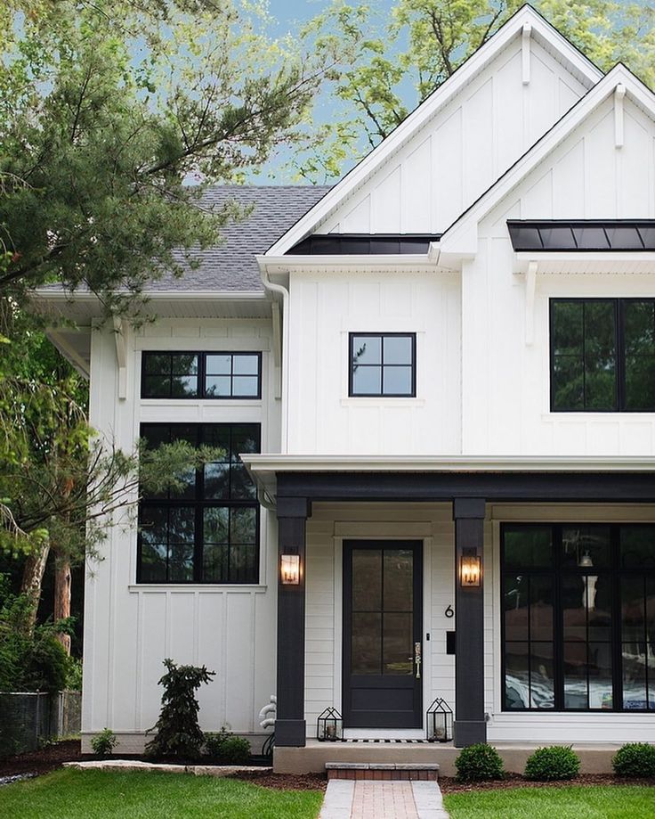 And try wood shake siding, wood shutters or a wood garage door.
5 / 19
Claud B./Shutterstock
Updated Yellow
Prepare your home for an exterior color update. Bright yellow is out, but deeper mustard yellows are trending. And mustard tones go well with both browns and whites as accent exterior home colors. So try Classic Gold (PPU6-17) from Behr.
6 / 19
Krista Abel/Shutterstock
Try Stain
Instead of using a bold exterior color on your home’s all-over exterior. And try outdoor stain, which works well on a variety of home styles. Then use a bold pop of color on your home’s front door.
7 / 19
Konstantin L/Shutterstock
Rich Greens
Greens, particularly sage and olive exterior color hues, work well with Craftsman-style homes. And while the color is rich, greens allow a home’s design to shine. So try Renwick Olive (SW 2815) from Sherwin-Williams.
8 / 19
Robert Crum/Shutterstock
Classic White
White as an exterior color never goes out of style. And the classic look can be updated with a bold front door and colorful landscaping.
9 / 19
Susan Law Cain/Shutterstock
Ocean Blues and Greens
Ocean blues, greens and aquas are a welcome update to the pale blues of yesterday. Prepare your home’s exterior for painting and try pairing a seaside aqua hue with ivory for refreshing look.
10 / 19
kataleewan intarachote/Shutterstock
Peaches and Cream
It’s not quite pink, not quite orange. Trending peach and apricot evoke a warm feel and work well in nearly every part of the country. And pair peach with black and white for a classic look, or try greens for an unexpected twist.
11 / 19
Artazum/Shutterstock
Black
With the explosion of minimalist modern styles, layers of black are trending as a striking home exterior color. Blacks pair well with brick and wood and will work with both primary exterior home colors and grays for accents.
12 / 19
Lindasj22/Shutterstock
Updated Neutrals
Classic exterior home colors such as tan and beige are getting an upgrade. And whether your home is a traditional Victorian, Colonial or a Craftsman bungalow, gray-beige or a warm tan will look nice. Try as Colonial Revival Stone (SW 2827) from Sherwin-Williams. And it pairs well with classic white and black, along with a door painted in a deep burgundy or a classic wood stain.
13 / 19
Artazum/Shutterstock
Warm and Cool Tints
Light and easy warm greens, yellows and blues can make your home appear larger.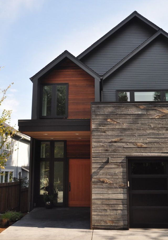 Using the warmer tints of color themes with a simple white trim visually brings the home closer to the curb to make your home stand out in your neighborhood. Once you’ve selected a basic color, it’s easy to create many different and warmer versions within the same family. All you need to do is combine that color with a neutral in order to make it warmer or cooler, lighter or darker. This is known as tint and shade. Tint is lightening a color by adding white. Shade is darkening a color by adding black. Check out this resource on how to choose paint colors.
14 / 19
Artazum/Shutterstock
Monochromatic
Monochromatic colors on the wheel are one basic color (hue), but have different values — lightness (tints) or darkness (shades). A dramatic and bold way to use the monochromatic paint trend is to paint your home all black. While contrasting trim and siding colors is typical, choosing monochromatic — especially black or gray with a darker or glossier black for the trim — really enhances the architectural and structural features of the home.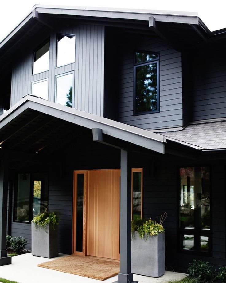 Be careful when choosing your exterior paint colors in the store because they may appear lighter on the home exterior than on the paint chip in the store because of the natural lighting.
Plus: Exterior Painting Tips and Tricks
15 / 19
romakoma/Shutterstock
Bold Color
Trim draws attention to your home’s architectural details. Dramatic exterior trim paint is one way to feature your home’s beautiful windows or doors. Try dark red trim, dark blue or black trim, or other bold trim colors for a classy exterior statement.
16 / 19
Rafal Olechowski/Shutterstock
Roof Color
The roof can be up to 40% of your home’s exterior. If you have to replace your roof, take the opportunity to consider your color choices. Bring home samples and see how they look with your other exterior colors.
17 / 19
via Valspar
Tech-Inspired Colors
Senior Color Designer, Sue Kim of Valspar, believes 2019 will be all about high-intensity shades that mimic artificial light.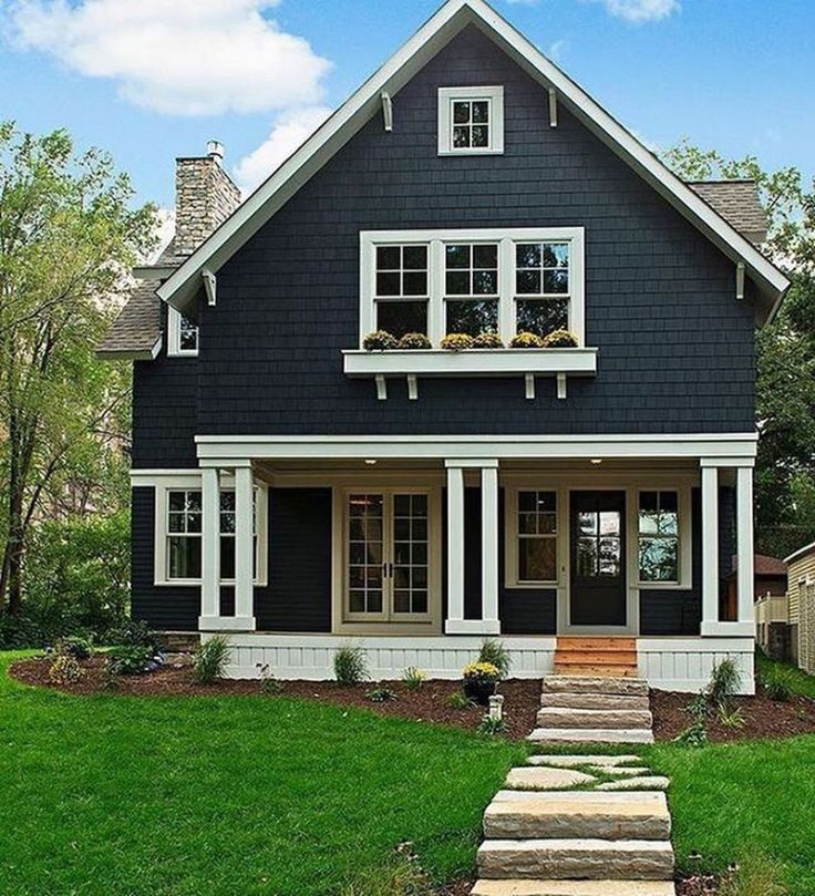 “Smart technology in the home is driving the color experience differently,” Kim said. Twilight Mist from Valspar is a blue-lilac hue that pairs well with ultra white.
18 / 19
BondRocketImages/Shutterstock
Citrus
Bold and unexpected, citrus colors will be popular in 2019. Whether lime green or citrus orange, add something unexpected to your home’s decor this year. Citrus make a statement and are especially effective on an exterior door. “If you’re looking to make a change, look at the shades of colors that your neighbors have selected and avoid making the same choice,” said Bruce Schmidt, chief brand officer of CertaPro Painters.
These tips will help you paint a door perfectly.
19 / 19
karamysh/Shutterstock
Sky Blue
Sky blue is a bit of a classic but it’s seeing a resurgence as an alternative to the darker earth tones that people like.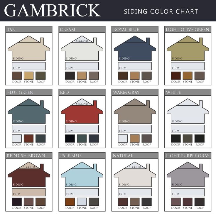 Sky blue naturally pairs well with white trim, gutters and gray shingles. Plus the gray stonework like with this house, looks great, too!
Originally Published: July 14, 2021
12 trendiest house exterior colors - Pantone | Articles
Bagretsova Irina Aleksandrovna
content manager, photographer
Everyone dreams of a place where they would like to return every time after a long working day. For many people, the symbol of the family nest is their home on earth.
For a house in which people will live, it is necessary to choose natural materials, including wood. In order for a tree to serve on the street for a long time, it must be protected - covered with a material that is resistant to atmospheric changes. At the same time, I want to observe the aesthetic side - so that the house looks complete and interesting.
What color to paint the facade so that it causes delight and slight envy among the neighbor, while harmonizing with the environment, and the owner likes it? Let's figure it out.
What will you learn in the article?
- Before choosing a color, you need to consider 3 important factors
- Victorian Colors
- Colors of "Constructivism"
- Chalet style colors
- Things to Consider Before Deciding on a House Color
- How to combine shades
- correctly Wood facade painting systems
Before choosing a color, it is necessary to take into account 3 important factors
- the location of the site and the architectural style of the house;
- roof color and style;
- whether you want to see the tree structure, or prefer to hide it.
Based on these factors and your taste, you need to choose a color for your facade. At the link you will find many different shades on the tree, and below we will analyze the main colors that are often ordered from us.
Photo 1. The Pantone Institute chose the colors for this year - 12 colors
To understand which colors will be most relevant in the next decade - and our paint schemes last up to 15 years on facades, we turned to the universally recognized world authority in the field of color.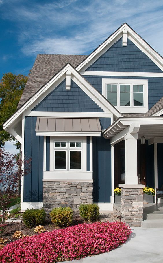
Last December, the Pantone Institute chose the colors for this year - 12 colors and their shades, showing the mood of this year - reliability, sustainability, hope, originality and brightness of the user.
Classic Blue has been chosen as the color of the year for 2020 - a bright, deep and calming color.
Photo 2. Classic Blue - classic blue. The glazing composition on the facade in combination with white trim looks incredibly beautiful! The house turned out to be a sight to behold!
Photo 3. Painting the house in trendy shade "Classic Blue"
Photo 4. Painting the house with hydro oil in 2 layers
The whole palette of fashionable colors can be safely diluted with the usual light, or vice versa, dark color - to give integrity to the image and highlight some elements of the house, such as architraves, corners and terraces. Of course, it is not necessary to use only these colors in the decoration of the house, you can use slightly brighter, or more pastel shades of each color - at the peak of popularity, the combination of orange Flame Orange - "Fire Orange" and delicate Tanager Turquoise - "Turquoise Tanager". A combination of neutral shades will always be relevant - white, gray, navy blue, and beige. It all depends on your taste and style of the house.
Photo 5. Color "Flame Orange" ("Fiery orange") on the facade
Photo 6. Very beautiful and popular color "Flame Orange"
Photo 7. This color on the facade looks natural and expensive
Victorian Colors
Almost all the colors presented by Pantone are suitable for the Victorian style - this style is associated with pastels, coupled with bright, deep colors. The style, which originated in the 19th century - the century of Queen Victoria, indulges in a variety of finishes, carved balusters and railings, as well as obligatory veranda terraces near the entrance.
Photo 8. The house itself and painting are made in the Victorian style
Photo 9. Bright facade in combination with architraves in pastel colors
Photo 10. Victorian house
Colors of "Constructivism"
For cold Constructivism, warmer options for painting wood are suitable - a mixture of Cinnamon sticks and Saffron, or cold options - Classic blue, the so-called color of the Navy jacket - Navy blaser, which, with an advantageous contrast of textures of wood and concrete in pearl gray, or ash gray create a design of conciseness and spaciousness. This design suits those people who keep up with the times and adore simplicity in details.
Photo 11. The combination of concrete and wood - a modern and stylish solution
Photo 12. Colors of "Constructivism"
Chalet style colors
The Chalet style is characterized by warmer, chocolate shades of decoration. The main thing in this style is the naturalness of the materials. Raw stones in the foundation masonry, real wood with knots and their fine structure. Warm, sometimes orange, notes in wood coloring create the atmosphere of a cozy winter evening by the fireplace with a mug of hot chocolate in hand.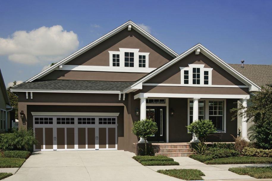 Of course, you can design your home the way you want it to be! Therefore, for your home, you can use the colors that you most like.
Photo 13. House and painting in the style of "Chalet"
Photo 14. Warm, chocolate shades in the design of the facade
Things to Consider Before Deciding on a House Color
In order to determine the color of the house decoration most accurately, it is necessary to take into account not only the architecture, but also the surrounding landscape and the color of the roof.
So that the house does not turn out to be too colorful, it is not recommended to use more than three colors in the decoration of the house. The colors that contrast with each other look most brightly - red and green, blue and orange. If the colors are close to each other on the color wheel, the result will be neutral. White, cream and milk colors are suitable for almost any color, so they can be used as a base or as a secondary color.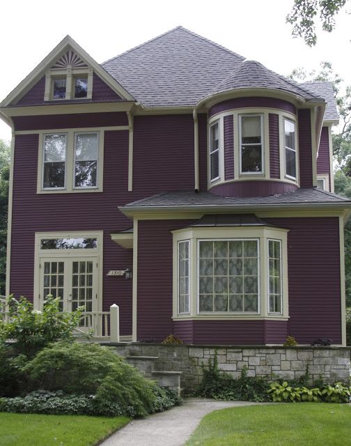 As for the third color, it can be both on the facade itself, creating a holistic look of the house, and “background” - the color of the landscape in which this house is located.
Photo 15. A harmonious combination of three colors on the example of a country house
Photo 16. Beautiful combination of colors on the combined facade
It is also necessary to take into account the location of your home - more natural colors and natural materials look good in the mountains, bright, saturated shades near the sea, light shades of the structure under the scorching sun.
Of course, in order for your house to arouse the admiration and envy of your neighbors, you need to harmoniously choose colors, although sometimes you can play around with color options. Below we want to give examples of how you can diversify your facade, using this year's fashionable palette.
Photo 17. Very unusual design of the house, with a perfectly matched color scheme
Photo 18.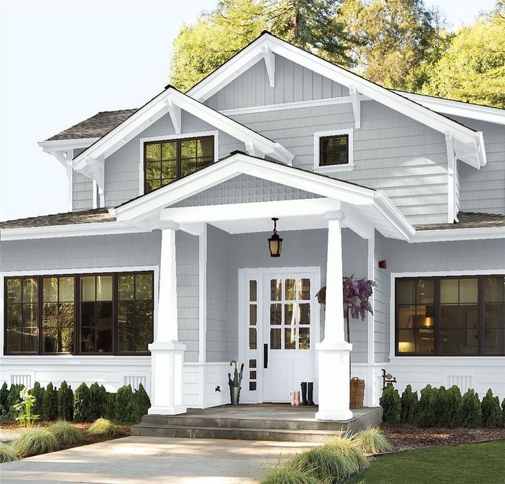 White color always looks advantageous, perfectly complements and decorates any facade
How to correctly combine shades
In order to make your home unusual, it is enough to take a simple color as a basis, for example, Faded Denim - "Faded Denim", Mosaik blue - "Mosaic Blue", and only paint the front door in a bright color - Flame Scarlet "Scarlet Flame" , Orange Peel "Orange Peel". Thus, you will give individuality and brightness to your home.
Do you want your home to look presentable and unusual? Choose chocolate or cinnamon colors. Beautiful overflows and shades of chocolate will not leave indifferent any person, whether he is a designer or an inexperienced layman. And by diluting dark chocolate with a light, delicate shade of Sunlight - "Sunshine" you will achieve the feeling of a warm, cozy home in the Alpine mountains.
Photo 19. Planken painted in chocolate color
Photo 20.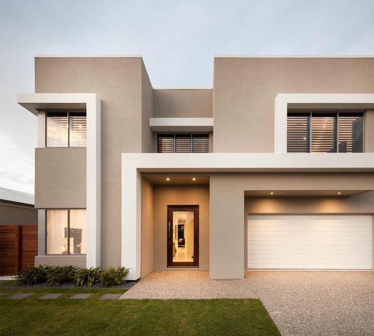 Planken painted in noble chocolate color
Do you live near the sea? Embrace bright, sunny colors - such Pantone attributed the color "Biscay Green" - "Biscay Green". In this color, your house will seem light, weightless, like a sunny breeze on a bright, midday day of a cloudless summer. And if you add to this color also Orange Peel - "Orange Peel", or Saffron - "Saffron" - you will get a bright combination that pleases the eye and makes you enjoy life!
Warm and cozy is also the combination of colors Saffron - "Saffron" and Cinnamon Stick - "Cinnamon Stick". This option will always be a win-win, bright enough to show its cheerfulness, and at the same time, the combination of these colors is the closest to natural wood.
Photo 21. Bright and saturated color for the facade - "Orange Peel"
Photo 22. Color "Orange Peel" on the facade
Perhaps you want something more extravagant - then turn your attention to shades of red - perhaps closer to wine color.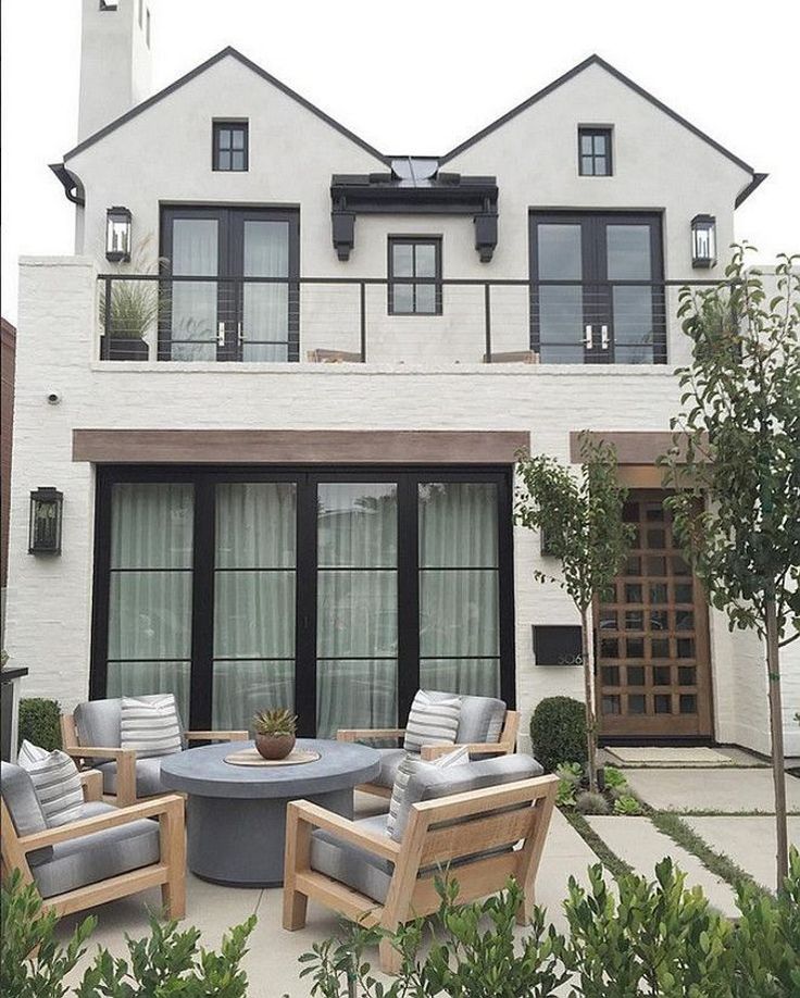 Thanks to the chosen color, you can achieve a contrasting wow effect, because the red color will look amazing among the abundant greenery of your site. Or, you can give your façade the look of a noble mahogany finish.
Photo 23. Painting the house in wine color
Photo 24. The red color looks amazing among the abundant greenery on site
Photo 25. On this site we painted three whole facades - the house itself, the sauna and the garage
Do you want more brightness and extravagance? Perhaps only one bright accent is not your option? The Pantone collection presents an unusual, but too attractive color in its shade - Grape Compote - “grape compote”. The house will look very bright, maybe even a little crazy - in the style of the films "Charlie and the Chocolate Factory", but what's the difference if you like it, and the neighbor fainted with envy?
Photo 26. Grape Compote
Specialists of the Pantone Institute pleased us with a beautiful green color - it combined both herbal and emerald shades. Chive is an unobtrusive color for your facade, if you want to fit your house into the surrounding green landscape. Just imagine how beautiful such a facade will look among autumn trees!
There are a great many color schemes, the main thing is to decide on the architecture, the surrounding landscape and be guided only by your wishes.
One of the recommendations is to choose the color and style of home decoration in such a way that it is combined with interior decoration as well - so you will not have the feeling that from the Chalet style in the exterior you find yourself in the interior of a fairy tale about Willy Wonka.
Having decided on the color, it remains to decide on a painting system that suits the style.
Wood facade painting systems
Our company provides several options for painting wood for the exterior - this is a premium lacquer scheme, the service life of which without repainting is up to 8 years, and an oil painting system, if you want more naturalness (service life up to 15 years), and a covering painting scheme ( service life up to 15 years), giving the opportunity to see your home in bright, summer colors.
You can read more about painting systems in the relevant articles, find out all the advantages and choose the one that matches the style of home decoration you have chosen.
If suddenly you have any problems with the selection of a painting scheme, our specialists will always be happy to help you, answer all your questions about the merits and advantages of a particular painting system.
See how we can
September 25, 2019 1504
Painting the house with oil, but not simple, but such that repairs will not be required for another 15 years
280 m 2 620 000
27 days DNP Pine Coast
September 25, 2019 1266
How we painted the log house with white oil, beautifully highlighted the ends and made insulation using the “warm seam” technology
420 m 2 630 000
43 days DNP Pine Coast
July 09, 2019 1452
Fighting cracks in the log, sealing the joints and painting the log house with oil
170 m 2 379 300
23 days d.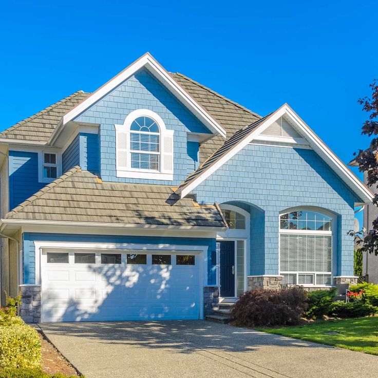 Nikulino
Next
View other works
What color to paint the house: choosing the right shade
Before the summer season, it's time to update the facade of a country house. We suggest what color to paint the house outside and show photos of beautiful examples. The choice is influenced by practical and aesthetic factors.
What color to choose for exterior decoration:
Things to consider
- Features of the site and house
- Roof
- Lining material
Color options
Paint types
Let's talk about aesthetics first. The rules come down to the covering ability of the material and its durability. Dark colors have less consumption, which reduces the cost of work. In addition, they attract heat, so they are best used in cloudy, cold areas.
If it is important that the wall fade more slowly, choose a light color. On the surface painted with it, dust is less noticeable, it will retain saturation longer.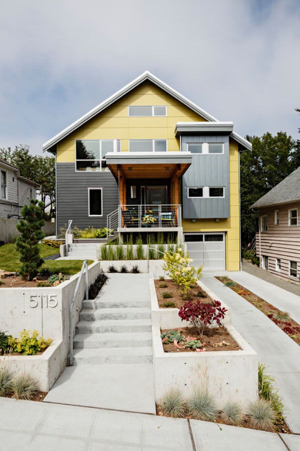 Red and all its shades fade the fastest. The maximum brightness period is 5-7 years. Next, let's talk about successful combinations for different areas.
Pexels
At the first stage, you can use various online services to select a palette. Download special applications or look for sites. You can use official Pantone services. It is also important to take into account several factors, which we will now discuss.
Site location
- In the southern regions, black tone and a dark palette are usually not used. In the north, in the mountains, brown, gray, bright walls look good. Proximity to the sea is played with pink, blue, turquoise, beige shades.
- Village and country houses provide more room for creativity. Cottages located within the city are usually painted in something neutral to match neighboring buildings.
- A building of a simple form without elegant details adorns a bright facade.
 It will help divert attention from construction flaws.
 - On the contrary, if the building has bas-reliefs or other decorative details, a neutral background would be appropriate.
- The building must stand out on your lot. The green cladding is lost against the background of tall shrubs and trees.
- Interior. Some styles (for example, Victorian, classic, hi-tech, modern) are logical to apply on the outside in order to maintain a coherent picture.
- It happens that in the design of rooms there is no certain style, but there is panoramic glazing. In this case, you can also build on the internal design of walls and floors.
- Sauna, outbuildings, gates and everything on the site plays a role in the choice of paint. The task is to create a single project.
Pexels
Instagram @yourmortgagechampion
Instagram @heygents
Roof color
Usually this part of the house is different from the facade. It is desirable that they are combined with each other.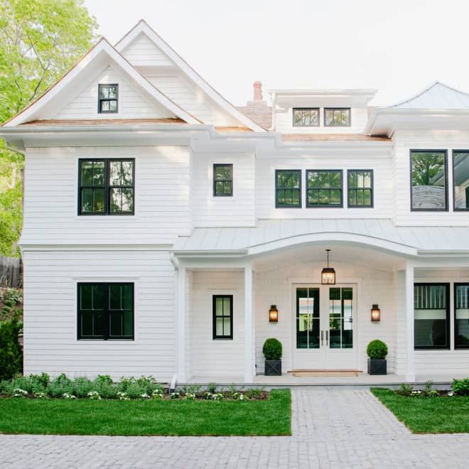 For example, what color to paint the house if the roof is brown? In this case, it is recommended to use white, beige, shades of brown, blue. Gray tiles or slate can be combined with orange, blue, darker gray, burgundy, white, green, blue walls. Red roof - with gray, brown, black, yellow. Black - with light colors.
There is one more rule: the brighter the building, the less visible the roof should be. And vice versa.
Instagram @diamondvogelpaint
Instagram @urbancottageliving
Instagram @the_hen_homestead
Instagram @queenslander_living
Other elements of the building are sometimes distinguished from the general background. For example, platbands, drainpipes, cornices, doors. Another option is to combine several variations of the same color. In this case, use the combination rule: a dark plinth, a slightly lighter roof, and a medium-density paint for the walls.
Instagram @ strongshieldsiding
Instagram @ black
Facade material
Private wooden cottages and dachas are usually covered with antiseptic translucent or top coats.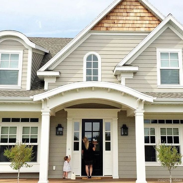 The former retain the pattern of timber or logs, the latter only its relief. If the facade is made of stone, brick or unpainted wood, you need to select decorative elements, a roof, a pediment.
To find a harmonious combination, look for it in the texture of these materials. Inclusions in stone or knots in wood are the best source of inspiration in this case. Brick is beautifully combined with brown, white, red, green and their derivative shades.
Pexels
Instagram @ wpieknymwnetrzu
These are general points to consider when choosing an outdoor design. After you find your color, paint a large sheet of paper or drywall with it and attach it to the building. Step back a long distance and evaluate how this option looks. Even better is to do it directly on the wall, as the paint manifests itself differently on different surfaces. During the day, you will be able to understand how the building will look with different lighting.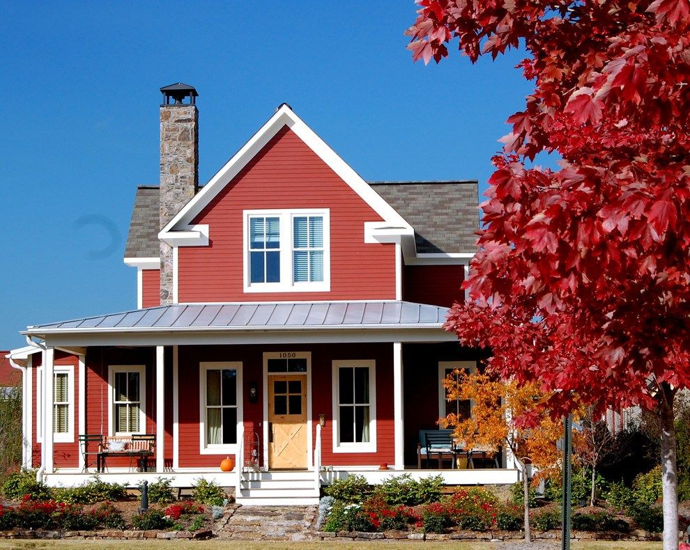
We list the most popular finishes.
Brown
A classic country house finish. Associated with warmth, comfort, closeness to nature.
Instagram @ cottage_a_day
Instagram @ cottage_a_day
White
White, like yellow, is perceived as elegant, joyful. In addition, it harmonizes perfectly with greenery. Deciduous trees next to such a structure look openwork, and for bright plants this is one of the best backgrounds. True, in winter it will merge with snow. Therefore, it is better to combine it with black, brown, red, blue, pink, blue. All of the above applies to beige facades.
Instagram @ cottage_a_day
Instagram @ cottage_a_day
Gray
A discreet palette might seem boring, but it's not. Together with snow-white or brown accents, it creates a cozy, elegant picture. This painting option is very practical - dust and dirt are the least noticeable on the surface. If you are thinking about what color to paint the outside of a wooden house, and you don’t like the option with a transparent stain, pay attention to the gray scale.
Instagram @ cottage_a_day
Instagram @ cottage_a_day
Green
Use it only if there are few trees nearby. Suitable for both cottages and cottages in the city. It is both bright and calm color.
Instagram @ cottage_a_day
Instagram @ cottage_a_day
A light gray-green hue that is trending this year. It is neutral, but at the same time unbeatable. It is combined with dark blue, gray, red-orange, coffee, swamp green, white. In each of the combinations, sage will look different.
Instagram @ cottage_a_day
Instagram @ cottage_a_day
Yellow
Bright canary or pale yellow are associated with freshness, sun, warmth. Paint a house with it and even in the off-season the site will not be gloomy. Against such a background, white platbands and a brown roof look good.
Pexels
Pexels
Red
A deep ruby red that is not often used in home decoration and is completely in vain. This color emphasizes the beauty of landscape design on the site, stands out from other buildings, looks great in any season. The only downside is that it burns out fairly quickly. Combines beautifully with wood.
Instagram @ cottage_a_day
Instagram @ cottage_a_day
Check out our selection of beautiful exterior painting examples.
photo
Pexels
Instagram @newlifeluxury
Instagram @cottage_a_day
Invoice
Also on sale there are textured compositions resembling decorative plaster. They include fine granulate, which makes the wall grainy. This mixture is suitable for cases where you need to hide the defects of the cladding. It is applied in a thick layer and therefore careful leveling of the surface is not required.
Instagram @kvezal_decor
Instagram @kvezal_decor
According to the method of action
Frame and other wooden structures are often coated with transparent and tinted antiseptics, alkyd, oil or acrylic paints. The latter are preferred for a number of reasons.
- They are easier to work with.