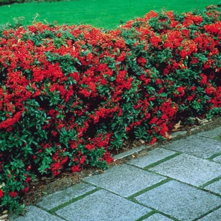
Living room color trends
2022 Living Room Paint Color Trends
Here's how to choose a timeless hue for a space that does it all.
Choosing the perfect paint color for your living room means selecting a shade that's adaptable and timeless but also shows off your style and personality. "Often a hub of the home, living rooms tend to connect multiple rooms," says Arianna Cesa, associate manager of color marketing and development at Benjamin Moore. "Choosing a versatile color is always a great option, because it gives you more flexibility in selecting the colors for the adjoining rooms." This practical approach is also trending—neutrals will dominate in this heart-of-the-home space come 2022, note our experts. Ahead, how to play with these calm, grounding tones in your living room next year.
living room of kristen blazek family home
Credit: Courtesy of @virtuallyherestudios
Trend towards warm neutrals.
Neutral white, ivory, and beige are classic living room tones that connect seamlessly with more dramatic shades in adjoining spaces, allow for effortless furniture changes, and show off your favorite fabrics and textures, whether you're using the room for cocktails before dinner or a semester of hybrid learning. "Living rooms are now the centers of our homes: Over the past two years, they've acted as offices, classrooms, craft rooms, and family gathering spaces," says Sue Wadden, director of color marketing at Sherwin-Williams. "People have always been drawn to neutrals—they are, almost by definition, timeless. Warm whites and beiges create a neutral backdrop, while still feeling cozy."
She recommends Sherwin-Williams' Accessible Beige and Shoji White, two "warm neutrals" that contrast with the last decade's obsession with cool grays and whites. "While those colors had their place in Scandinavian minimalism and other prevailing design movements, they came to be seen as cold and severe. The warm neutrals of today are much softer and forgiving, allowing people to add personal touches in other ways," says Wadden. "These warm neutrals point to our desire to create an inviting space that works for every aspect of our lives. Family photos, your favorite throw blanket, travel souvenirs, plants, what have you—all have a place in the room, and these colors help bring them together. "
"
neutral-colored living and dining room with greenery
Credit: Photo by Sean Litchfield courtesy of Becky Shea Design
Try gray with a soothing twist.
Cesa often connects with homeowners looking for rich color that doesn't overwhelm their space. "Gray, neutral, and white paint colors will always be integral parts of color palettes, but we are seeing a desire for individuality and escapism through our design choices in our home," she says. "Colors that have a touch of gray or neutral to them, or neutrals and grays that have a stronger undertone of a color like blue or green, create the perfect balance to cater to those needs without feeling overwhelming." Her favorites: The brand's Morning Dew, "a cool, soothing gray with the softest touch of green," and High Park, which "leans more green, but has a gray undertone that calms it," she says. "These colors are a great introduction to bringing more expressive or bolder hues into your home without being too overwhelming. " Both shades play well with the rest of your room, too: Cesa likes Morning Dew accented by white, blue, and green fabrics and art alongside warm wood and gold accessories, and High Park with "woven textiles, dark wood flooring, creamy ceramics, and lots of leafy floral accents," she says. "These are great transitional colors as you begin to experiment with finding your personal style with more creative and expressive design choices."
These Are the Living Room Color Trends You'll Be Seeing Everywhere in 2022
Chances are, your living room is one of the most frequented spots in your home—and with good reason. It's a spot where you can entertain friends and family, or just kick back and watch TV on your day off. Naturally, the color palette you choose for this space is crucial, as you want to make sure it's something that's relaxing and inviting, but not lacking in eye-catching design. As we approach 2022, it's time to get a head start on 2022 living room color trends, so House Beautiful spoke to nine designers to get the low down. The good news? Their answers run the gamut—touching on everything from subdued pops of color to various shades of white—meaning there's certainly timeless-yet-of-the-moment inspiration for homes of every style.
1
Olive Green
Patrick Williamson
Cecilia Halling, Creative Director at Elicyon, says colors like honeycomb, lilac, zesty curry lime, olive-yellow, dark navy, cherry and maple will be in vogue in the new year. As part of a recent project for a client, Halling incorporated an acid yellow high gloss lacquer, which she describes as "leap[ing] from the interior of the bespoke dining room drinks bar whenever the doors are opened. It’s the most exciting of surprises." If you need more proof that greens of every hue are on the rise, look no further than the 2022 Colors of the Year from Behr, Benjamin Moore, Sherwin Williams, and PPG.
2
Purple Hues
FLOR
"A key color trend to note is the rise of lilac in our living spaces," says designer Katherine Cohen. "As a gentle, welcoming hue, lilac will be a trending color over the next year in interiors. For playful yet creative spaces, lilac adds bright energy to any space." Just look at this cool hangout with a lilac rug from Flor.
3
Shades of White
Justin Chung
....but don't let that focus on purple convince you the most popular neutral is "over." Architect and designer Amanda Gunawan of OWIU Studio finds that neutral colors will take over living rooms in 2022, like Sherwin-Williams' White Flour and Benjamin Moore's Swiss Coffee—at least in certain multifunctional rooms. "With so many people working from home, many former single-use living rooms have been transformed into part-time or transitional work spaces during the day; therefore, I suspect that living room colors will continue to veer neutral, as they create a sense of light and clarity while encouraging functionality," explains Gunawan. "Many of us are still spending more time at home, and our spaces should create a sense of calm."
4
Earthy Tones
Contura
"With an ever-important focus on relaxation and wellness, for 2022, we’re forecasting interior color trends that both combine and reinforce our connection to nature and instill a sense of cozy comfort in the home," says Catharina Björkman, Scandi lifestyle expert at Contura. "Think earthy tones like hazy greens, soft and timeless blues, soothing sandy greys, and warming muted blush hues. These nature-centric tones give a calming, serene feel to a space," she adds.
5
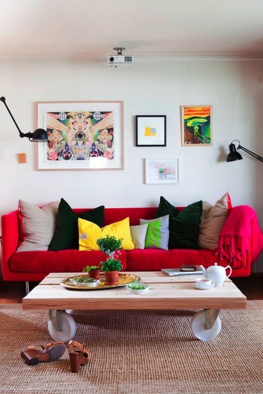
Crimson Red
Pieter EstersohnGetty Images
Speaking of nature-centric, a "rich and earthy crimson shade is absolutely gorgeous and will bring a touch of maturity and glamour to any room," declares James Waylett of Jacobs & Dalton. "This unique shade perfectly ties in with the whole color palette and will be the staple shade to carry through into the autumn months. We think this indulgent shade would be perfect for master bedrooms or to create an accent wall in a home study or living space."
6
Soft Neutrals
James Balston
Anna Saroukhanova of the British Institute of Interior Designers predicts that "light and calming tones, greens and blues will bring calmness and comfort to the living rooms, with a pop of fun, bold and colorful accents introduced via accessories." She adds that you can incorporate this color scheme through "lighting objects, textured and patterned scattered cushions, or indeed other light furniture items such as stools or coffee tables."
7
Unique Shades of Green and Yellow
Graphenstone
"Subdued greens and mustard toned yellows are an unexpected but endearing combination," advises Betsy Smith of Graphenstone.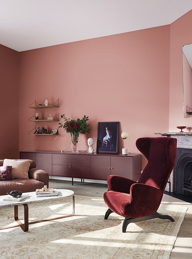 To incorporate this trend in your own living room, Smith suggests "layering with off whites textures, such as boucle and white oiled timbers" which will "create an understated and timeless elegance."
8
Subdued Pops of Color
Jojo Bradley
Interior designer Jojo Bradley believes that, because of the pandemic, "our homes, which have been our sanctuaries, will be turned into calming and inspiring places." She cites neutral pops of color, including subdued shades of yellow, red, and blue as the colors to look out for next year, as these will "add simple, effective splashes to warm our homes."
9
Animal Prints and Patterns
Tony Mitchell
Julie Clifford of Alexander James Interior Design knows that "animal prints aren’t exactly anything new, but this trend is timeless and ever-evolving, look for cool twist on the classics. " One such example is a zebra print, which the designer finds to be the "leading animal print in the market."
Mary Elizabeth Andriotis Associate Editor Mary Elizabeth Andriotis is House Beautiful's Associate Editor, where she covers historic homes, entertainment, culture, and design.
Trends 2022: trendy colors for the kitchen-living room
Trends Decor
Marazzi ceramic tiles on the wall, www.marazzigroup.com In the foreground Le Creuset cast iron pan, www.designboom.ru
Le Creuset ceramic teapot, cups and cast iron pans in pastel pink shades go well with mint shelves, www.designboom.ru
According to research, most consumers prefer white kitchens. They can be understood, a monochrome interior is a practical and generally win-win solution. Experts advise: if you don’t know what color to choose a kitchen, take a white one, you won’t go wrong. But what to do if the sterile interior began to become boring? A sure way to cheer up and improve the moral climate in the house - color accents , and it's much easier than you think. Introducing trendy colors and techniques to give your kitchen a modern and welcoming feel.
Pastel colors have topped the list of trends for several seasons in a row and are not going to give up their positions. We are only happy about this: the palette of candy shades and fruit ice cream will perfectly fit into the interior of the kitchen-living room. At the peak of popularity are complex red-pink and berry tones, as well as various shades of green from coniferous to mint. These cheerful natural colors are good both individually and in combination with each other.
Owners of black, gray and other monochrome interiors can also use the "candy" palette, because these colors are truly universal.
Fronts and shelves in berry sorbet
An easy way to transform a monochrome kitchen is to highlight individual sections with color. In addition, a two-tone kitchen is one of the most fashionable design solutions. You can create solid color combinations in the Color Blocking style by partially replacing or painting white fronts and shelves. Highlight better individual units such as a kitchen island, row of cabinets or open shelving.
Marshmallow tiles and mosaics
Pastel shades green and pink are perfect for color blocking in the interior. For finishing residential premises, we recommend choosing tiles with a matte velvety surface, as a glossy sheen often gives the room a cold and not cozy look.
Appliances mint color
In an open-plan interior, even seemingly minor details matter. For example, a microwave oven is always in sight, which means it has no right to spoil the interior, and with the right approach, it can even emphasize its advantages. Design models with color facades will support the creative mood of the owners and help create a stylish space with a modern character.
Bright table linen
Tablecloths, napkins, kitchen towels, curtains and seat cushions sweet, "candy" flowers - an easy and quick way to colorize gray everyday life.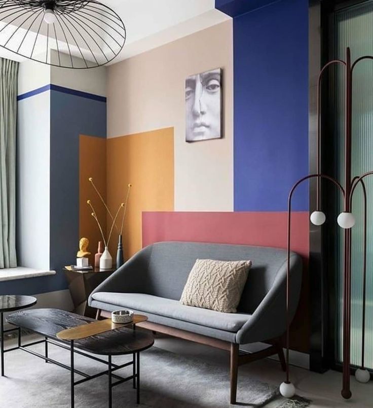 We consider linen textiles to be the best choice for the kitchen, they are not only beautiful and environmentally friendly, but also the most practical. Unlike other fabrics, linen can “age beautifully” - over time, linen only gets better, and subsequent washing only enhances its softness and texture.
Colored linen napkins, @linen_lace_russia
Green linen tablecloth and napkin, @linen_lace_russia
1 of 4
Tablecloth "Morning", "Family values"
Ask for price
Advertising. www.lamoda.ru
2 of 4
Tablecloth, DeNastia
Ask for price
Advertising. www.lamoda.ru
3 of 4
Cotton tablecloth Scandinavian touch, Tkano
Ask for price
Advertising. OOO "Yandex"
4 of 4
Runner Prairie, Tkano
Ask for price
Advertising. www.lamoda.ru
Pastel color palette
Light pastel palette visually expands the space , making it airy, so these colors are especially welcome in small spaces. Thanks to the general “milky” undertone, pastel colors blend well with each other. And yet, if you are not a professional, it is better to limit yourself to a combination of two, maximum three shades in one room. Otherwise, there is a risk of getting a lurid result.
Cookware and accessories in delicate colors
Cast iron and ceramic cookware in vintage style pastel shades is a stylish and desirable element in any kitchen. It does not absorb odors, is easy to clean, cooks food quickly and evenly, while maintaining the benefits of the products.
Le Creuset ceramic tableware in candy and lollipop colours, www.designboom.ru
1 of 3
Saucepan Ceraflame 2 l.
Get the price
The saucepan is made of high-quality heat-resistant ceramics and covered with smooth enamel, resistant to cracks and scratches
Advertisement. www.lamoda.ru
2 of 3
Saucepan and lid, Elan Gallery, 3 l
Ask for price
Advertising. www.lamoda.ru
3 of 3
Cast iron enameled cauldron, Le Creuset
Ask for price
Advertising. OOO "Yandex"
Designer waste containers
Yes, you heard right. Even such a utilitarian thing as a garbage bin can hopelessly spoil the look of the room, and maybe even decorate it, if you take its choice responsibly.
The waste bin collection features pastel shades of pink and green. Brabantia, www.brabantia.com
1 of 5
Waste container Woodrow, Umbra
Ask for price
Advertising. www.lamoda.ru
2 of 5
Colored wastebaskets
Ask for price
Advertising. https://aliexpress.ru
3 of 5
Bin
Ask for price
Advertising. OOO "Yandex"
4 of 5
Tabletop waste container
Ask for price
Advertising. Yandex LLC
5 out of 5
Separate waste bin Split, Joseph Joseph
Ask for price
Advertising. www.lamoda.ru
Miroshnik Larisa
Tags
- Kitchen
- pink
- green
Trendy colors 2022 and how to apply them in the interior
The palette plays a key role in the interior: the overall atmosphere in the house and the psycho-emotional state of the residents depend on it. If you are planning a renovation this year, then in search of inspiration, we suggest studying the latest trends - you will definitely find something interesting in them.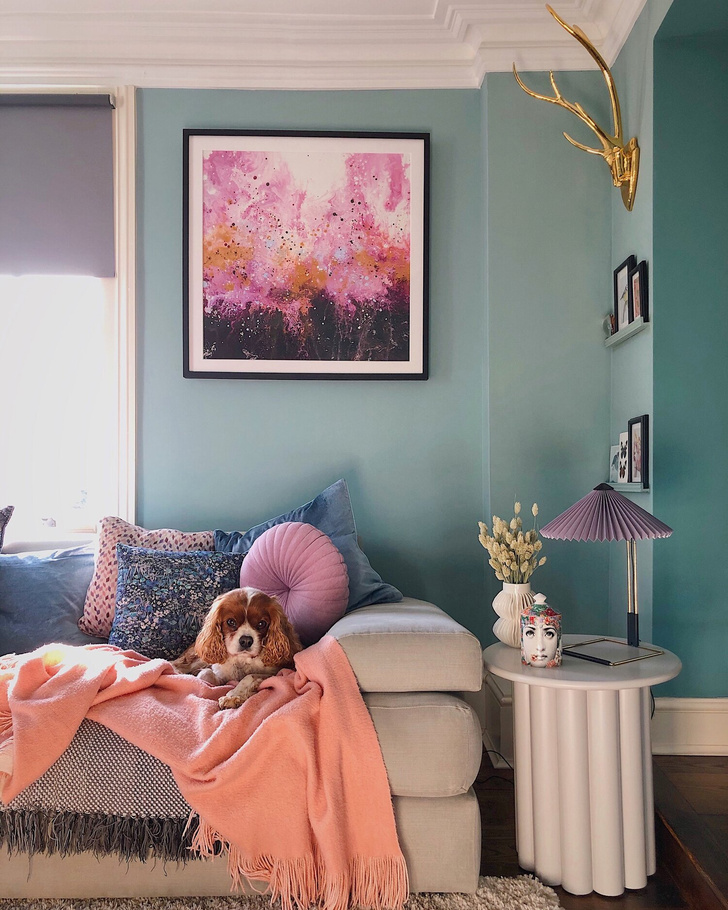 Pantone's Color of the Year 2022, neutrals and deep natural tones - in this article we have collected the most trendy shades that will suit different styles, decorate your home and inspire unusual design ideas.
Trend colors 2022
Neutrals
— Creamy
— Olive
— Angelic white
— Greige
Bright
- Periwinkle
— Malachite
— Deep blue
— Sunny yellow
The trend for a calm natural palette, on which the eye “rests”, was fixed several years ago and is unlikely to lose its relevance in the near future. The house should be a cozy and safe fortress, where it is easy to relax and recuperate after a stressful day. This year, pay attention to light and warm colors that are associated with nature or delicious food.
Creamy
Social networks of Rindes studio
Cream Butter Cream - A light beige shade with yellowish undertones, perfect for decorating rooms with north-facing windows or just where there is not enough sun. This is the most fashionable color for walls in the interior in 2022 - on matte surfaces it will give a pleasant enveloping effect and a feeling of the presence of sunlight in the room even on a cloudy day. In addition to finishing, cream is suitable for upholstery of upholstered furniture and textiles - coupled with tactilely pleasant fabrics, you will get an even more comfortable and at the same time elegant atmosphere.
What to combine with
Since creamy beige has a pronounced warm undertone, combine it with any colors that match it in color temperature. You can use neutrals (like light gray or pure white), but don't go into obvious coldness - such a contrast will look unnatural and break the harmony of the palette.
Best partners for this shade:
- Light and chocolate brown (especially on wood texture).
- Light or neutral grey.
- White and black.
- Ocher, terracotta, diluted yellow.
- Pastel blue.
a photo
Social networks of Rindes studio
Social networks of designer Evgenia Matveenko
Design: Nadezhda Trebukhina and Anna Dvurechenskaya. Photo: Natalia Khairullina
Social networks of the Rindes studio
Social networks of the designer Evgenia Matveenko
Social networks of the Rindes studio
Olive
If you like green, take a closer look at the olive among dozens of its variations. This warm noble tone will fit into a variety of styles and add comfort to the atmosphere.
Shubochkini Architects social networks
By itself, olive also varies: from deep green to almost yellow, like butter. It is associated with stability and at the same time optimism, freshness, novelty. For a neutral interior, choose lighter and more diluted tones. Olive green can be walls, a kitchen set, accent furniture (for example, a sofa in the living room or a closet in the hallway), decor. Best suited for eco-style, contemporary, boho, neoclassical.
What to combine with
The color of olives feels good surrounded by a variety of colors:
- Grey, white, black.
- Beige and brown.
- Pastel pink and crimson.
- Orange and brick red.
- Muted blue.
Social networks of Rindes studio
Social networks of designer Alexey Volkov
Social networks of Rindes studio
Social networks of Rindes studio
Shubochkini Architects Social Media
Angelic White
This is a soft and warm version of white with yellowish beige undertones.
Social networks of designer Evgenia Matveenko
It will be especially relevant for small apartments with a small number of windows, as it visually expands the space and fills the room with light. It can be taken as the basis of a palette in any style: from classic to scandi and minimalism. So that the interior does not look too “sterile”, it is better to dilute it with more saturated colors.
What to combine with
Like other achromats, white is perfectly combined with any shades.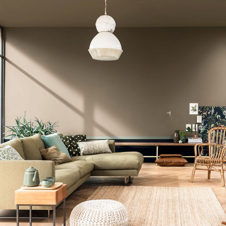 But just as in the case of cream, it is important to select partners according to temperature. Matches:
- Gray, beige, coffee brown as part of the base palette.
- Pastel colors - pink, peach, yellow, blue, pistachio, lavender.
- Intense colors for vibrant accents - wine red, deep blue, emerald green, terracotta, coral, mango.
a photo
Social networks of Westwing
Studios of the Rindes
Studio Studio ST Design
Social networks of designer Yevgenia Matveenko
Blogger Social Weigher HEY
Evgenia Matvezhey
CENT suitable for the role of the base. This combination even has a special name - grage.
Design: Julia Veselova. Photo: Mikhail Chekalov
Visually, this variant of gray resembles a bird's wing - it turns out a soft, natural and at the same time a deep shade that will create a chamber and cozy atmosphere in the room. Suitable for neutral finishes that will emphasize brighter or textured interior elements without interrupting them or drawing attention to themselves.
What to pair with
Grey-beige can be combined with anything:
- White and black.
- Other gray variations.
- Blue and blue.
- Yellow, orange, red.
- Brown - from light coffee to mahogany.
- Olive, grassy, pistachio, bottled.
a photo
Social networks of designer Alexey Volkov
Alvhem social networks
Design: Julia Veselova. Photo: Mikhail Chekalov
Social networks of Enjoy Home studio
Social networks of N.ice Design studio
Social networks of designer Alexey Volkov
Design: Julia Veselova. Photo: Mikhail Chekalov
Where to look for announcements of materials and fresh interior ideas? Subscribe to our channels! We publish beautiful selections, videos and reviews:
https://zen.yandex.ru/ivd.ru
https://t.me/ivd_ru
https://vk.com/ivd_ru
If you prefer rich and active colors, bright colors in the interior are also in trend in 2022.
Periwinkle
Project ON Design Lab
Speaking of what color is in fashion now, in 2022 it will certainly be Veri Peri (otherwise it is called periwinkle). A rather rich and deep shade of purple appeared quite recently - it was created at the Pantone Institute and immediately proclaimed the color of the year. You can use it in different ways: from decor to finishing materials. But since this tone is complex, and violet in the interior is, in principle, treated with caution, it is better to start with local solutions: for example, lay a set of bed linen in the bedroom or paint part of the wall in periwinkle - the color block is now just in trend.
What to combine with
The best companions for Veri Peri:
- Any achromat, especially if purple is the only accent in an achromatic interior with light walls and dark floors.
- Sand, cream, brown.
- Sophisticated shades of red, dark or powdery pink.
- Blue, aquamarine, dark green.
ON Design Lab project
Social media blogger Roseberry Home
Project by Igor and Galina Berezkin
Social networks of the artist Marta Schmielek
ON Design Lab project
Malachite is a trendy color in the interior-2022 take a closer look at the natural colors of precious stones.
Social networks of designer Alexey Volkov
Unlike olive or herbal, malachite has a blue undertone. This is a cool version of green that looks luxurious and elegant, visually making any interior more expensive. It feels good on any pronounced textures: stone imitation, leather, velvety fabric, embossed wallpaper, decorative panels, etc. Most often it is used locally: for furniture, textiles or decor. If you love a bright finish, for example, choose malachite for one accent wall.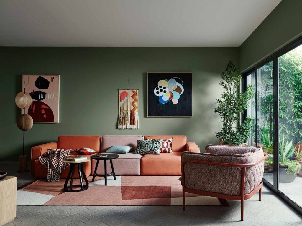
What to combine with
Choose other colors, taking into account the color temperature of this variation of green. Will fit:
- Almost all shades of blue and cyan.
- Violet.
- Black, dark brown.
- White and light grey.
Social networks of Rindes studio
Social networks of designer Alexey Volkov
Social networks of Stellar Studio
Social networks of ST Design studio
Social networks of designer Alexey Volkov
Deep Blue
Although blue is often viewed with disdain (believed to be depressing and blues in large quantities), it is one of the hottest colors in 2022.
Social networks of designer Evgenia Matveenko
Choose deep natural tones: ocean waters, stormy seas, clear skies or pre-storm clouds. The best option is to use blue as an accent: for example, in decor or textiles. You can use this color in decoration, but it is better to do it locally so that the room does not have an oppressive and gloomy atmosphere.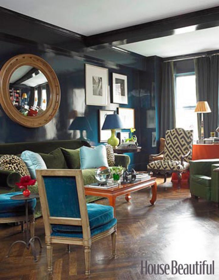 Be sure to dilute it with lighter and more refreshing tones that will add air to the interior and balance the dense blue tone.
What to combine with
The most successful combinations will be prompted by nature itself. Assembling the palette, focus on natural landscapes. So, blue will organically complement:
- White and gray in any variations.
- Sand, straw and other natural shades of beige.
- Light and dark brown (deep dark shades with a purple tint look especially good).
- Terracotta, brick, yellow.
- Violet and muted pink.
a photo
Design: Alesya Kotova. Photo: Evgeny Gnesin. Style: Anastasia Vlasova
Stellar Studio social networks
Enjoy Home studio social networks
Designer Alexei Volkov social networks
Enjoy Home studio social networks
ST Design social networks
Design: Natalia Balashova.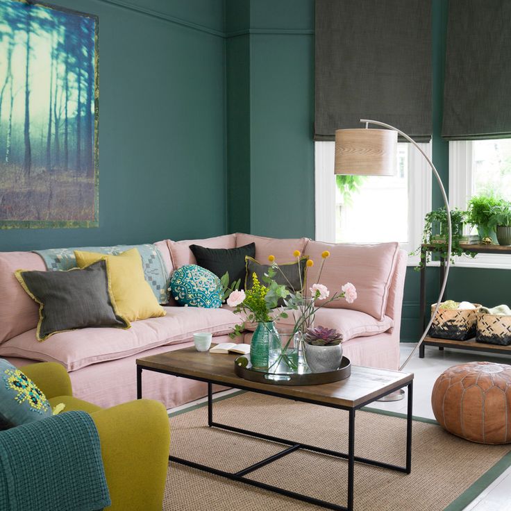 Photo: Olga Shangina
Social networks of designer Evgenia Matveenko
Social networks of designer Evgenia Matveenko
Sunny yellow
The easiest way to cheer yourself up and bring bright colors into your home is to add a rich yellow tint to the interior.
Social networks of blogger Roseberry Home
At its peak this year, the natural warm version, reminiscent of warming sunlight, is something that is now especially lacking. Such yellow is suitable for any room, whether it is a small kitchen, a nursery or a bathroom. You can use it as you like: in decoration, for furniture or decor. If you want to make yellow walls, you should first check the color on the paints so that it looks in life the way you intended.
What to pair with
Good partners:
- Gray in all variations.
- All pastel colors.
- White and black.
- Beige and brown.
- Bright blue and blue.
Learn more