Ideas for narrow hallways
10 essential design rules for making a long space seem wider |
If you have ever had to look for narrow hallway ideas, then you’ll be more than aware of the tricky task of making it a long hallway look wider than it actually is, while desperately searching for interior designer tricks to make your entryway appear warm and welcoming.
You’ve probably spent hours trying out different hallway ideas, rearranging furniture, choosing paint colors and deliberating on rug styles in a frenzied attempt to make your small hallway look more spacious, light and airy.
Do not panic – with some clever tricks of the trade, there are in fact multiple small hallway ideas that wall help turn that awkward hall layout into something stylish and sophisticated, so don’t give up just yet.
Narrow hallway ideas
Give your narrow hallway a much-need update with our curated selection of interior design-approved layouts, hallway paint ideas, lighting inspiration and more.
1.
(Image credit: Paul Raeside / Future)
Hallway storage ideas and furniture can be a cumbersome business, especially in a narrow room, so it pays to invest in the best possible solutions.
One great way to make the most of a smaller hallway is by using multi-functional furniture, like a bench that can be used as a storage unit, console tables with drawers and folding chairs that can be tucked away when you don’t need them.
Another important pointer is to place large pieces of furniture against walls so the open space in the middle is not broken up. Scale the furniture to fit the size of the room and don’t block walking pathways.
2. Light up a small space
(Image credit: Davide Lovatti / Future)
Light will help to brighten up a narrow hallway instantly, so first and foremost allow any natural light to stream indoors by taking down heavy, dark window treatments.
If natural light is non-existent in your corridor, instead look to hallway lighting ideas and have an electrician install statement chandeliers, wall sconces and table lamps for a dose of illumination.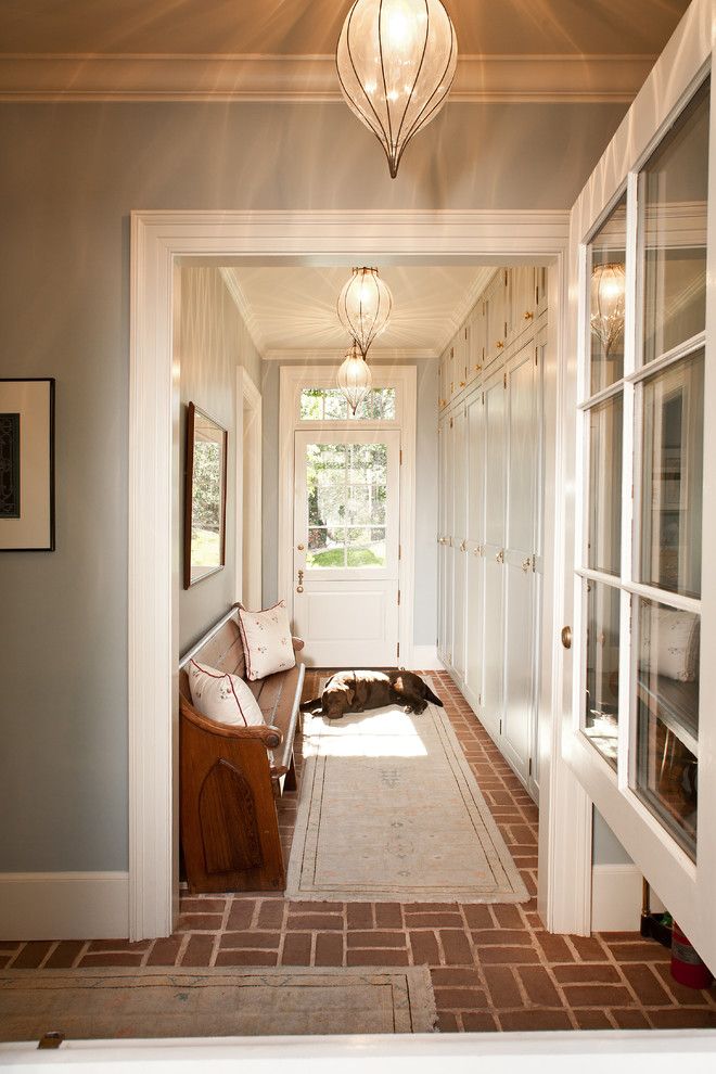
Dark corners can make a hall appear small and cramped, so position a floor or table lamp in a bare corner to visually expand the area, while recessed ceiling lights can illuminate an entire room without eating into the space.
3. Stick to a monochromatic color palette
(Image credit: Davide Lovatti / Future)
Striking, cool and confident, gray and white is always a winning combination when it comes to narrow hallway ideas. Create a perfect balance of the two neutrals, by using equal amounts of each. It will give a bright and fresh look for day, together with a dramatic and tailored look for night.
Introduce pattern and character with gallery wall ideas, such as these sophisticated framed photographs, and keep the rest of your furniture and accessories plain and understated for a contemporary aesthetic.
4. Hang up a mirror in a small entrance
(Image credit: Mark Bolton / Future)
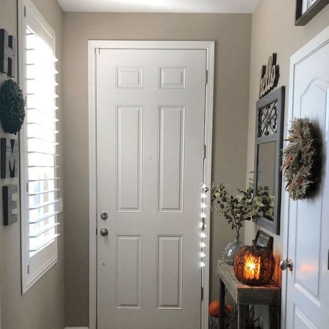
Not surprisingly, mirrors can make a hall or foyer appear more spacious.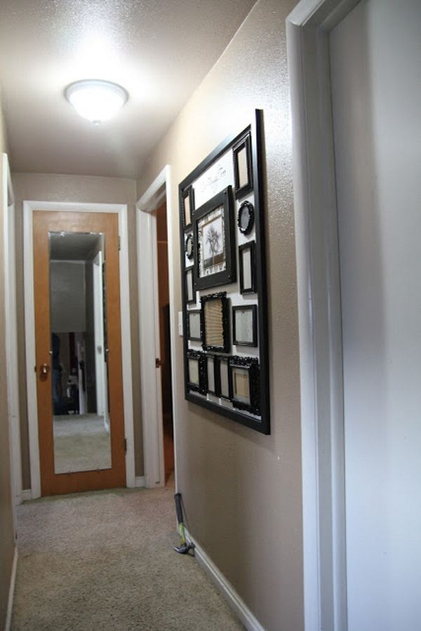 Hang a large mirror on a wall opposite a window or very near one to reflect the outdoors, broadening the feel of your room.
Mirrors reflect both natural and artificial light to make a room brighter during the day – and at night they bounce light deep into the room, making it appear larger.
5. Use paint to visually enlarge a narrow hallway
(Image credit: Future)
You can visually widen a long, narrow room by painting a wall at the end a darker color than the other opposite and adjacent walls. The gradation of shade and color of paint on opposing walls can either lengthen distance by using a lighter shade, or shorten a distance with a darker shade.
Light colors such as creamy white or light gray help to brighten a room, making it appear larger and wider. Plus, you can also paint horizontal stripes on a wall to make a room feel wider, or vertical stripes to make the space feel taller.
6. Play to proportions in a long hallway
(Image credit: Paul Raeside / Future)
Long hallways rarely feel homely, but there are tricks you can use to zone the space to make it feel far cozier.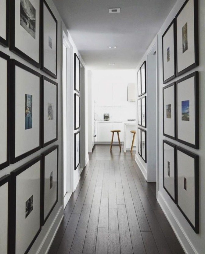
A rug can visually draw together the furniture in a space, giving a room focus and adding comfort. While a focal point that contrasts with the rest of the scheme can be visually interesting, disguising the awkward layout – something like a statement piece of art, console or striking pendant.
7. Display oversized wall art
(Image credit: Polly Eltes / Future)
Wall decor ideas that feature too many pictures and other wall hangings tend to make a room feel closed in, so simply hang one large piece of artwork on your wall to make the room feel wider.
Avoid hanging art too high on the longer wall as it will just highlight the imbalance in the proportions. Instead, choose art that can sit wide but low over the console for example, to bring the eye level down and help make the room seem wider.
8. Use paint to create a focal point
(Image credit: Davide Lovatti / Future)
When decorating a small hallway, create a focal point with hallway paint – one area that will draw the eye, so there’s less emphasis on the room’s narrow layout.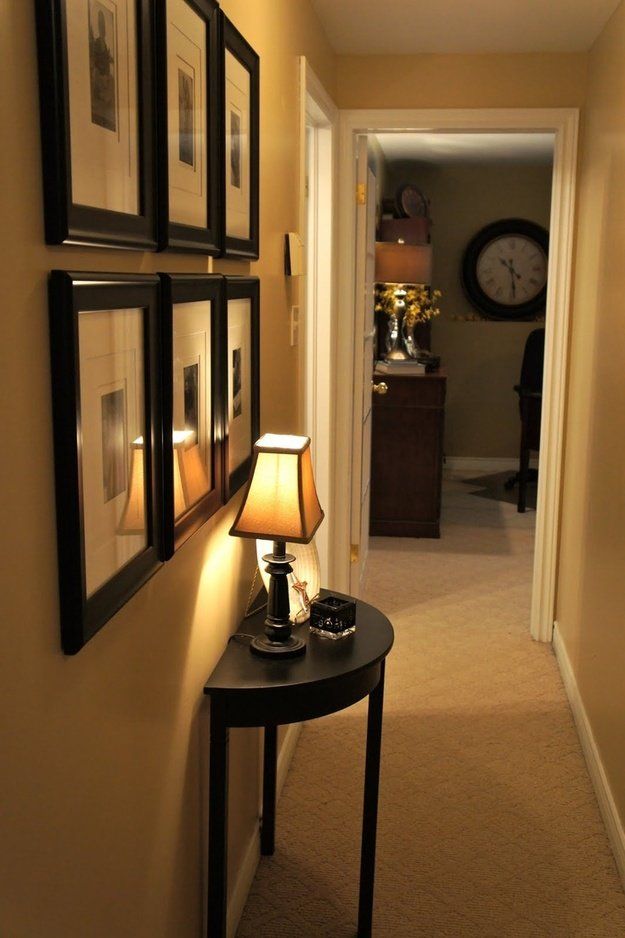
As long as your ceiling is painted in a paler color than your walls, no matter what the color, your ceilings will feel higher, helping a narrow room feel more spacious
9. Pay attention to scale
(Image credit: Paul Raeside / Future)
Select furniture pieces that are in proportion to the size of your entrance. Oversized consoles, chairs and entry table decor ideas can make a small hallway feel narrow, while furniture that is the same color as your walls tends to blend into the wall, making it look wider.
Another clever trick is to arrange your furniture at an angle to create a sense of depth to the room – otherwise if you place all furniture against the walls you might end up with a 'bowling alley' look.
10. Keep a narrow space free from clutter
(Image credit: Davide Lovatti / Future)
If there’s one thing that’s going to create the illusion of more space in a narrow hallway, it’s decluttering. Make sure you keep your room organized by removing unnecessary items, and your space will instantly feel bigger – and more welcoming.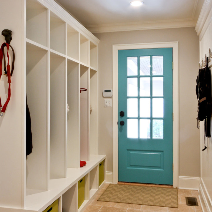
Try and keep the floor as clear as possible, too, as it’s one of the easiest ways to maintain a sense of spaciousness. Remove any oversized rugs and plants, and factor in hallway shoe storage to ensure footwear doesn't accumulate.
How do you decorate a narrow hallway?
When decorating a narrow hallway, often a less-is-more approach pays dividends, so do start by highlighting the strengths of this small space.
Many narrow hallways are lacking in light. Try to turn yours into something more than a transitional space – significant changes such as replacing a solid wall with striking Crittall windows will allow light to be borrowed from adjoining rooms, while updating a front door with larger glass panels will illuminate the area.
Additional tweaks such as a well-planned lighting scheme can be just as impactful. Choose a layered approach, adding subtle dimmable recessed lights and pendants combined with the subtle glow of table lamps.
Narrow hallway ideas – 19 ways to improve a tight space
Narrow hallway ideas can go a long way in making a restrictive entryway feel more open and airy.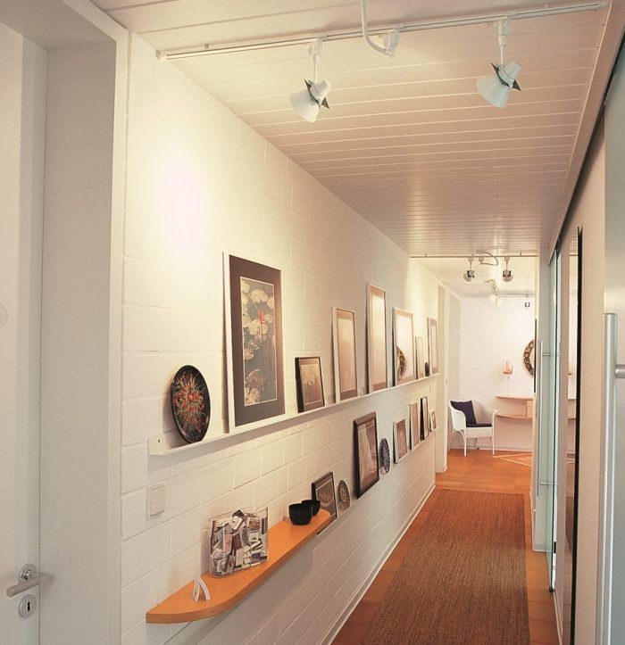 Whether you live in a Victorian property blessed with a dark, skinny hall or a flat that has a less-than-generous hallway, a few practical design tips and tricks will open things up in a way you didn't think possible.
From ceiling lights to flooring, paint to wallpaper, a few new hallway ideas will distract from the dimensions of your space and make your narrow entrance feel brand new.
Narrow hallway ideas to open up small entryways
Amy Wilson, interior designer from 247 Curtains and Interior Design Masters on BBC One says, 'When working with a more narrow space, it may be tempting to steer away from larger items. However, one of my favourite tips for giving the illusion of a larger hallway is to add in an oversized light.
'Not only will this help create a feel of grandeur but also makes the space feel larger as opposed to making the room feel restricted by opting for smaller accessories.' The designer also says simply switching up the paint can help make your hallway appear larger. Her top tip is to paint halfway up the walls, either to the dado or to create the illusion of there being one. 'This popular painting style helps to draw your eye lengthways, taking you down into the rest of the house,' she says.
1. Choose a Scandi-chic aesthetic
(Image credit: Future PLC / Joanna Henderson)
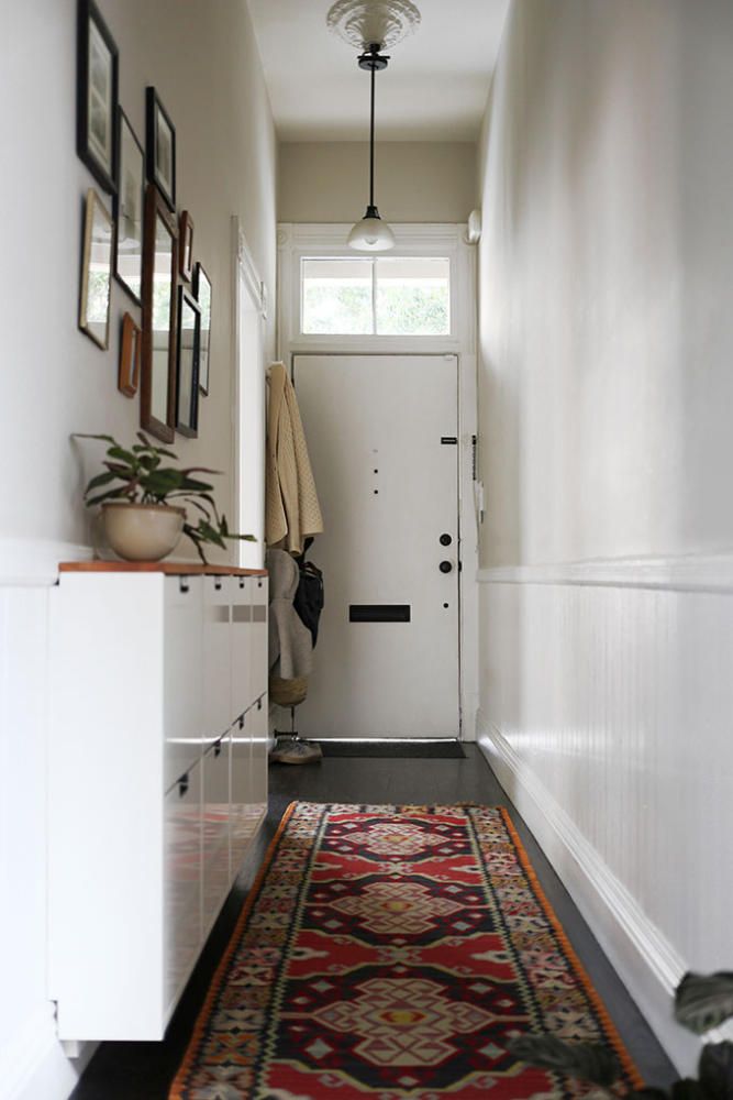
Opt for crisp white on walls, woodwork and doors for the 'envelope' of your hallway, and then layer in in natural materials to create a minimalist and Scandi-inspired scheme. Taking inspiration from Nordic interiors will help to create a calming entryway even if space is tight, while warm wood tones, a woven jute rug and dried flowers will bring texture and cosy vibes.
You can keep things pared-back while still displaying a selection of your favourite vases and prints on ledges or on top of slimline hallway shoe storage ideas. A concealed shoe rack like this one is perfect – space-saving but provides practical storage so your hall isn't littered with trainers, boots and school shoes.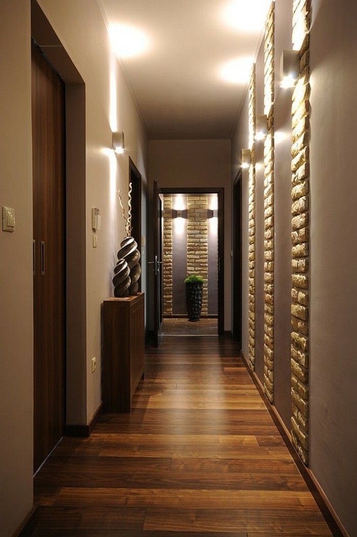
2. Distract with patterned wallpaper
(Image credit: Future PLC)
Create a great first impression with a show-stopping wallpaper that's so striking that the width of the hallway becomes irrelevant. Patterned hallway wallpaper ideas are great for creating a sense of depth, visually enlarging the space. Keep the lower part of the walls in a clean white shade of paint and then take a bold wallpaper all the way up the stairs for a small hallway idea that packs a punch.
3. Bring personality with a gallery wall
(Image credit: Future PLC)
There's simply no better place for family photos than the hallway – it's good for feng shui and instantly makes the space feel more personal and homely. Hang framed pictures all the way along the walls to keep the eye-line focused up, visually drawing the floor away from the ceiling. Elevate the ceiling height through clever tricks like this and you'll make a narrow hallway look wider.
Use this gallery wall idea along the full length of the narrow corridor space to help to elongate the wall and invite guests to have a nosey.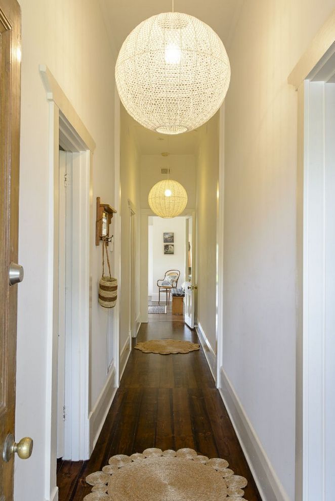 Make the artwork of choice treasured family photos to make the space feel welcoming and cosy, rather than restrictive and soulless.
4. Keep things organised with hooks and catchalls
(Image credit: Future PLC / Simon Whitmore)
When it comes to narrow hallway ideas, the more you can use your walls the better, as it'll keep your floor space free and prevent the feeling of walking in through the door and tripping over clutter. Wall storage organisers, like the HULTARP rails and hooks from IKEA with little baskets and buckets, will give you lots of places to put keys, travel cards, post and other bits and bobs.
'Storage that is chic but also space-saving will help you utilise the space in your hall without getting in the way,' agrees Simon from A Place For Everything.
5. Use a blackboard
(Image credit: Future PLC / Joanna Henderson)
If you're a Virgo who loves a list, why not dedicate a space in your narrow hallway to reminders and to-do lists? Keep your hallway light and bright and hang a blackboard above a white console table to keep everything together. Here, a retro telephone adds character and the plants bring natural shape and texture.
6. Add a bench with built-in storage
(Image credit: Future PLC / Dominic Blackmore)
If tying your laces leaves you inordinately flustered when rushing out the door (just us?) consider adding a bench so you can take a seat and do it in a more orderly fashion. Incorporate plenty of built-in storage to house shoes, tote bags, and dog leads and keep everything ship-shape.
7. Hang a mirror to open up the space
(Image credit: Future PLC / Robert Sanderson)
Hanging a generous mirror in a hall is a smart aesthetic solution to make more of a narrow hallway space. A mirror works by reflecting light, which opens up the space. It also fakes a sense of depth by extending the wall because it mirrors the view.
There is a range of hall mirror ideas to choose from depending on your hallway size and decor. But it's always a very handy addition in any hallway space, so you can carry out a last-minute appearance check before you dash out the door!
‘If your front door has a glass panel, position a mirror so that it can capture the natural light and reflect this into the hallway,' comments Peter Legg, Lead Designer at där lighting .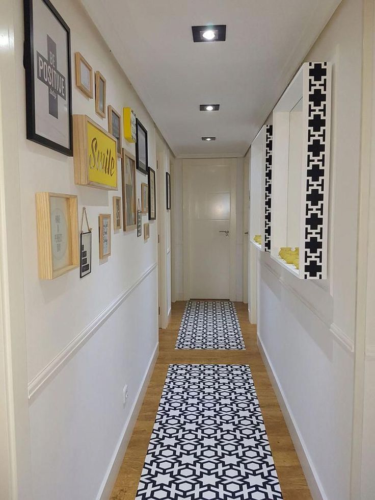 'If you don’t have a natural light source, try a mirror with a lit frame to create an inviting aesthetic.’
8. Elevate the ceiling height with clever painting
(Image credit: Future PLC/Rachael Smith)
Try a clever paint trick to make your narrow hallway colour scheme feel more characterful. Choose a colour you love and paint along the length of the hallway but only to your waist level.
The theory behind painting to waist height in a narrow hallway space is to break up a solid corridor of wall, creating a Trompe-l'œil style optical illusion of interest that can give a different perspective. This smart use of colour frames the space, giving it extra depth and interest.
9. Keep clutter at bay
(Image credit: IKEA)
'Two-in-one furniture, like the a bench with shoe storage really comes in handy when you want to optimise a small hallway,' suggests Clotilde Passalacqua, Interior Design Manager at IKEA UK and Ireland.
'Whilst wall-mounted hooks will help you take advantage of the full height of your ceiling.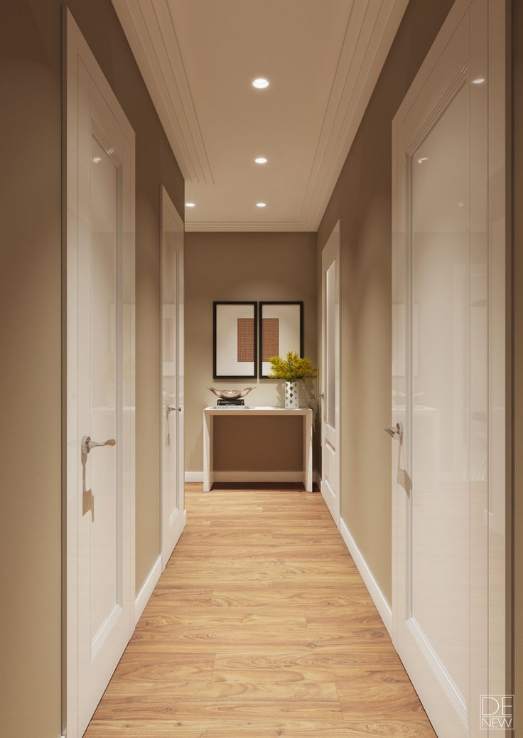 The PINNIG rack (above) with hooks means you can easily make good use of awkward spaces, like the wall surface over your radiator. And a bonus is that your wet clothes dry faster!'
Buy now: Pinnig Coat Rack, £75, IKEA
10. Let the sunshine in
(Image credit: Future PLC/ Lizzie Orme)
Maximise the natural light that can come through windows and your front door, and add a mirror, too. Keep things light and bright by painting a narrow hallway in an all-white colour palette to offer a blank canvas.
Choose the best white paint to suit the light quality. Is it south-facing and bathed in warm natural light or north-facing and cold? The right undertones of white will enhance the warmth, in turn making the space feel brighter and airy.
11. Adopt an immersive colour scheme
(Image credit: Farrow & Ball)
If you're not looking to decorate with white, the best way to overcome a problem narrow hallway is to make it feel like part of a wider layout.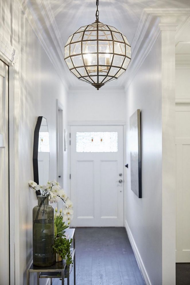
Incorporate the colour scheme from an adjoining downstairs room that leads off the hallway to create a continuity to the flow – in essence preventing the narrow hall from feeling small in comparison to the linking spaces.
A dark wall colour is a great way to create a cocooning ambient feel for a welcoming entranceway.
12. Add a decorative rug to dress the floor
(Image credit: IKEA)
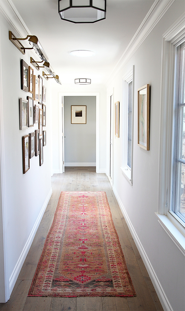
Don't feel like the decor has to be limited just because the space is. A long thin runner can actually help to make the space feel better dressed, making a hallway feel more considered.
This alternative hallway flooring idea helps to make the narrow corridor-like space feel more generous, because you're highlighting the space rather than glazing over it.
A decorative runner or rug helps to lift the decor and give the space more of a homely vibe, essential for a welcoming entrance to any home.
13. Go for large patterned flooring
(Image credit: Future PLC/Colin Poole)
Whether you're using tiles, peel and stick tiles or paint, try a supersized checkerboard pattern on your flooring for a classic yet contemporary look. Larger squares, as pictured above, will work much better in a narrow space than lots of tiny squares that are likely to feel too busy. A diamond pattern generally emphasises the width of a space.
14. Stack vertical storage
(Image credit: Future PLC/ Lizzie Orme)
The key to successful hallway storage ideas is to capitalise on vertical wall space. If you really want to maximise your hallway, a tailor-made unit with built-in shelves and drawers will fill the available space intelligently and look great too.
Like this slim but multifunctional storage unit that scales the wall from floor to ceiling, to ensure the storage doesn't impact on valuable floorspace. Having such plentiful storage also in turn helps to open up a narrow hallway space, alleviating the area from being overrun with shoes strewn on the floor and stray bits and bobs left with nowhere to go.
15. Illuminate a central point of focus
(Image credit: IKEA)
If you have a long narrow hallway, use clever hallway lighting ideas well to elongate the space.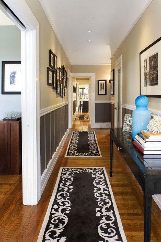 Centrally placed overhead lights, such as these pendant lights used by IKEA, will cast pools of light one after the other to naturally invite guests into the rest of the home.
Poor hallway lighting is one of the common hallway decorating mistakes to avoid, so make sure all bulbs are working and light it fully with overhead lights and perhaps a table lamp on a timer to welcome you home. A central strip of light helps to create a central focus of illumination that highlights and celebrates the narrow space, rather than making it feel limited.
16. Hide an unattractive radiator
(Image credit: Future PLC/ Lizzie Orme)
Don't let an unsightly radiator becomes the main focus of a small narrow hallway. An elegant radiator cover hides a multitude of sins and helps to add a polished finish to a space that could easily be overlooked in the style stakes. Plus it provides a handy shelf ledge to keep keys and display photos and flowers – adding a more homely touch to the decor.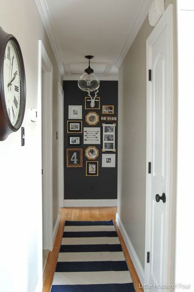
17. Aim high for shelving
(Image credit: Future PLC/ Lizzie Orme)
Placing floating shelves and wall-mounted storage units high will naturally free up the space below, to make it feel more open. A high shelf rack is a useful spot for coats and scarves and ensures precious floor space is kept clear.
'Wall or overhead storage solutions – whether that’s floating bookshelves or wall mounted coat racks – will help make your space go further,' agrees Simon.
18. Welcome a slim console table
(Image credit: Future PLC/Jo Henderson)
Console tables are a great place to allow family belongings to accumulate, with drawers to hide away all those delivery menus and loose change.
Opt for a slim design, especially in narrow, corridor-style spaces to preserve a sense of openness. Wicker baskets placed at the side or underneath are a useful place for hiding away other knick-knacks.
19. Make storage multipurpose
(Image credit: A Place For Everything)
Adding a mirror and handy storage at the same time is a win-win, as shown in this white hallway.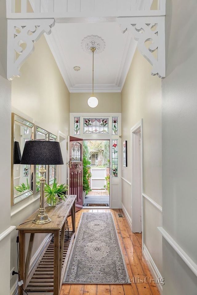 'Multifunctional storage is also a clever way to store items without sacrificing the decor of the room,' says Simon Glanville, managing director of A Place for Everything.
'A mirror can add a lovely touch to a narrow hallway and can double up as a box for shoes or bags.
Buy now: Hallway Storage Mirror, £85, A Place For Everything
How do you get the most out of a narrow hallway?
A slim hallway has more potential than you might think, and you can totally make it into one of you favourite parts of your home. Just because you can't fit furniture into a narrow hallway doesn't mean it has to lack display surfaces, as Ideal Home Style Editor Nicky Phillips points out. 'Using picture ledges means you can create a gallery of prints and photos but you can also add small vases, candle sticks or trinkets along its length.
'Cup hooks can be added on the underside for hanging keys, dog leads and even scarfs. If you have enough room for narrow furniture, try wall-hung shoe cabinets to keep storage super shallow and again use the surfaces for a small lamp and pretty accessories to add character and charm,' Nicky suggests.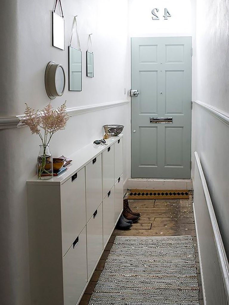 Making the most of a narrow hallway means balancing the practical with the pretty details.
How can I improve my narrow hallway?
The easiest way to improve a narrow hallway is to clear the clutter – remove surplus shoes, coats and outerwear that can comfortably live elsewhere. Look for savvy storage solutions that are slimline to avoid taking up valuable spaces. Also look for multipurpose storage solutions that work harder to make the space more practical.
'We all live busy lives, so adding clever storage to your hallway makes it easier for everyone to make that stress-free dash out of the house,' says Clotilde Passalacqua, Interior Design Manager at IKEA UK and Ireland. 'As well as creating an inviting entrance to come home to'.
'Wide striped wallpaper in a neutral colour makes the space seem larger,' comments Joanna Wood . 'A statement lamp or piece of eye-catching art will also draw attention away from the size of the space and you can maximise 'the beyond' either with a colour or a strong pattern.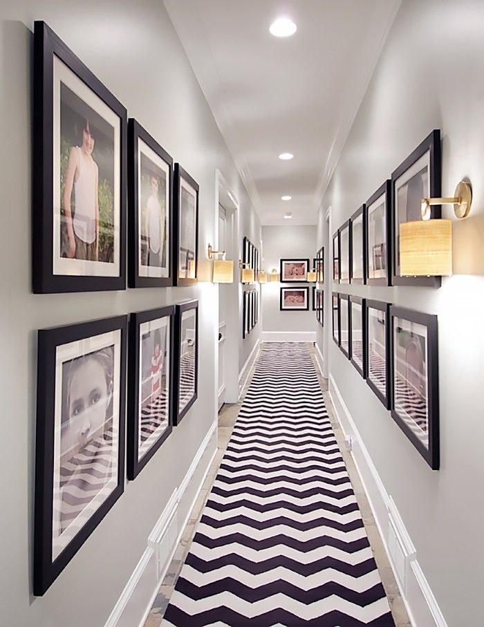 '
'
What colour should I paint my narrow hallway?
A failsafe colour to paint a narrow hallway will always be white. This light neutral creates a sense of space by bouncing light around the small space. Lighter wall colours reflect more light, a great quality when in small or light-deprived spaces such as hallways.
Interior designer Caroline Cobbald agrees that choosing light paint colours for the walls will usually be your best bet in a narrow hallway. 'Don't pick out the woodwork – ceiling, skirting, doors, architraves for example,' she says. By painting doorframes, doors and skirting boards the same colour, you'll prevent the space from looking busy and cramped.
Having said that if the space already feels small and enclosed it can sometimes benefit from a dark colour. On all walls and woodwork bold colour cocoons the space – leaning into the fact it's small and cosy. A brooding dark charcoal grey hallway or even navy can actually be very sophisticated and create a stylish entrance.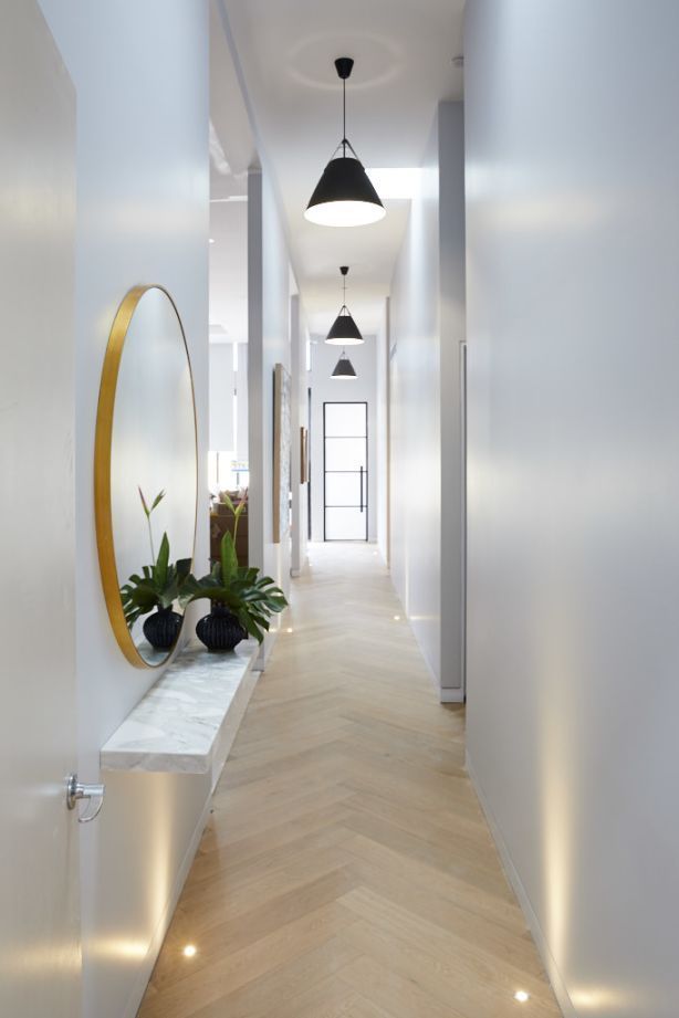 The key to decorating with dark colours is to be sure everything matches. Ensure storage units are in the same colour palette to prevent them leaping out and jarring – overwhelming the limited space.
Design of a narrow hallway in an apartment: 110 photos in the interior
It's great when guests enter a spacious hall right from the doorstep. But this pleasure is not for typical apartments. In Khrushchev, Brezhnevka, and even some new buildings, the entrance area is often a small cramped pencil case. How to arrange a harmonious design of a narrow hallway in an apartment, we will tell in this article.
All about designing a long hallway
Main problems
Design tips
— Light palette
- Box effect
— Minimalism
— Gloss and mirrors
— High openings
- Multiple zones
— Furniture by size
— Proper lighting
Project examples
— Laconic classic
— In gray tones
— Blue walls and stucco
Instagram @byswetka_home
- There are no windows in the hallway of the apartment, which means that the small room also becomes very dark.
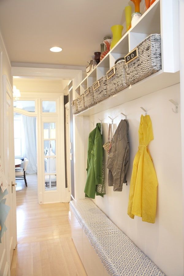 Hence the first task: to provide enough light in the entrance area. This is important, because here residents and guests change clothes, look at themselves in the mirror, fix their makeup.
 - On several squares, you need to somehow place the necessary minimum: a storage system, a mirror, a place where you can take off and put on shoes, a hanger.
- The small width of the entrance area limits the possibilities of planning: a capacious closet will not fit, there will be nowhere for a chest of drawers to open, there may not even be enough space for a shelving unit. Refusing furniture is not an option at all - you need to look for compact alternatives.
- In the end, a long tunnel just looks unaesthetic. I would like each zone in the apartment to look beautiful and harmonious, so you need to adjust the proportions of the long corridor, at least visually.
The design of a small narrow hallway in an apartment (photo below) should solve all these issues.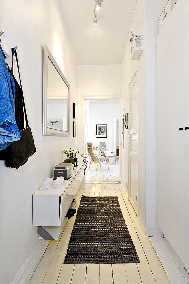
photo
Instagram @arhint.ru
Instagram @in_myhome.vn
Instagram @bychkovi_design_interior
Instagram @irooms.design0071
This is the easiest way to visually expand the space, add air to it.
Instagram @dotspoints
Since the entrance area gets dirty quickly, don't make it crystal white. Choose non-staining shades: cream, beige, sand, gray. It is also not necessary to use only light colors. Place accents with individual objects or paint one wall in a darker color - you get an interesting contrast, and the interior will become more voluminous.
By the way, use color play to visually change the proportions of the narrow hall. For example, paint smaller walls with light paint, and long ones with dark paint. This technique is based on the basic properties of colors: everything light seems larger than it is; everything dark is less.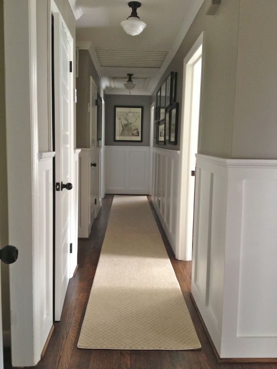
photo
Instagram @liza_sargaeva
Instagram @liza_sargaeva
Instagram @liza_sargaeva
Instagram @bychkovi_design_interior
Instagram @rerooms_design
Instagram @yugatov_design
Instagram @my47home
Instagram @olegkurgaev_design
Instagram @olegkurgaev_design
Instagram @andesign.studio
Instagram @domik_kissner
Instagram @domik_kissner
Instagram @domik_kissner
Instagram @dotspoints
Instagram @omniastudio
Box effect
If you want something more dramatic, you can go the other way.
Instagram @arhint.ru
For example, do not try to change the proportions or hide the real volumes of the room, but simply divert attention from them.
This design hack is suitable for apartments where there is a living room with large windows at the end of the hall.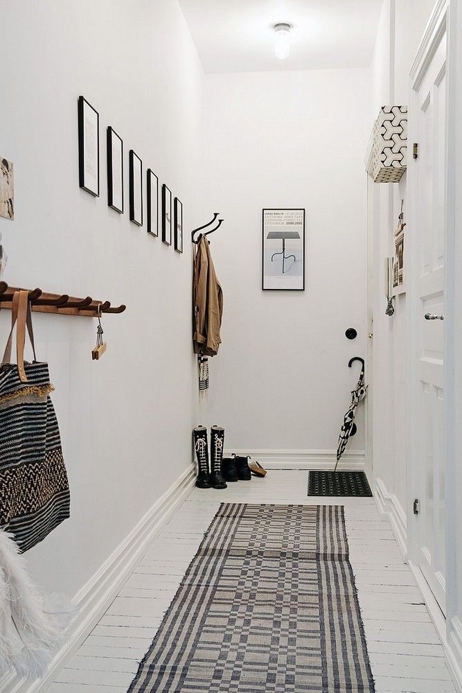 The essence of the reception is simple: the entrance area is decorated in dark colors without bright accents, and a person at the entrance sees natural light at the end of the corridor and instinctively moves there. Well, if the living room is not separated by a door at all, or the canvas will be with glass inserts.
Instagram @rerooms_design
The main thing is not to overload a small room and not clutter up an already narrow passage. To do this:
- Use furniture that is simple in form and only the most necessary.
- Limit yourself to 2-3 decorative elements. The smaller they are, the better.
- Choose clean finishes without large, contrasting prints.
It's okay if at the planning stage the entrance area seems empty - in real life, the entrance hall will be filled with clothes, shoes, umbrellas, etc.
12photo
Instagram @anna_zueva_design
Instagram @arhint.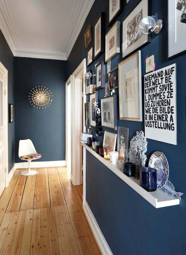 ru
ru
Instagram @omniastudio
Instagram @anna_zueva_design
Instagram @olegkurgaev_design
Instagram @olegkurgaev_design
Instagram @olegkurgaev_design
Instagram @olegkurgaev_design
Instagram @rerooms_design
Instagram @olegkurgaev_design
Instagram @600sqftandababy
Instagram @demina_ksenia
Gloss and mirrors
In addition to light colors, glossy and mirror surfaces visually increase the area.
Instagram @atmosphera_interiors
Use them in the entrance area, but do not overdo it: if the floor, the ceiling, and the cabinet body shimmer, and all this is reflected in each other, the interior will look clumsy, and the colors will glare.
Striking a balance: let the glossy floor set off the matte plaster on the walls, or vice versa. There can be several mirrors (for example, full-length and on a wardrobe), but they should not be strictly opposite each other, otherwise the labyrinth effect will not be the most pleasant. If there is not enough light in the hallway, install a mirror at the end - this way it will reflect part of the living room with a window.
photo
Instagram @rerooms_design
Instagram @poltavskaya_dizayn
Instagram @irooms.design
Instagram @irooms.design
Instagram @atmosphera_interiors
Instagram @atmosphera_interiors
Instagram @rerooms_design
Instagram @rerooms_design
Instagram @arhint.ru
Instagram @omniastudio
Instagram @buro9
Instagram @designer_vera_ganeeva
Instagram @designer_vera_ganeeva
Instagram @olina_kvartira
Instagram @katindsgn
Instagram @katindsgn
Tall openings
Narrow spaces seem disproportionate when unequal aspect ratio and wrong scale catch the eye.
Instagram @olegkurgaev_design
This is easy to correct with the help of high doors - openings to the ceiling are just in trend now.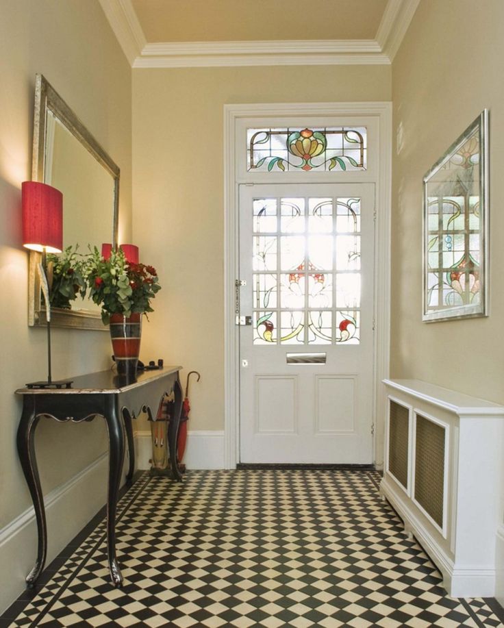 You can add scale to them by decorating the wall around with moldings to match the finish - they will duplicate the contours of the opening, the canvas will seem larger than it is.
In order not to crush the space, take note of another trend of recent years - concealed doors, which are painted in the color of the finish. It is not necessary to completely mask them - let the borders be visible, but unobtrusively.
7photo
Instagram @koresckova_bella
Instagram @olegkurgaev_design
Instagram @irooms.design
Instagram @irooms.design
Instagram @olegkurgaev_design
Instagram @olegkurgaev_design
Instagram @olegkurgaev_design
Zoning
If the entrance group is not quite tiny, zone it like any other rectangular room.
Instagram @olegkurgaev_design
This is not only functional in terms of layout, but also helps the eye to find focus points and move between them, rather than wandering along the long monotonous surface of the walls.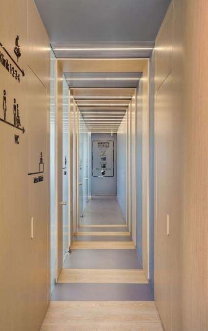
With the help of different finishes, several colors, lighting and furniture, you can generally create the feeling that we are not in front of one elongated space, but several separate ones - just without doors.
7photo
Instagram @enjoy_home
Instagram @rerooms_design
Instagram @olegkurgaev_design
Instagram @rasulova.design
Instagram @mayav.interiors
Instagram @designcorner.spb
Instagram @designcorner.spb
Furniture by size
For small, elongated rooms, you will have to look for non-standard options.
Instagram @on_plane_design
Or make furniture to order - it will be more expensive, but often there are simply no other options. For example, if you need to design a narrow hallway with a wardrobe, the standard model will most likely not fit in depth.
A good option for limited footage - built-in systems from floor to ceiling.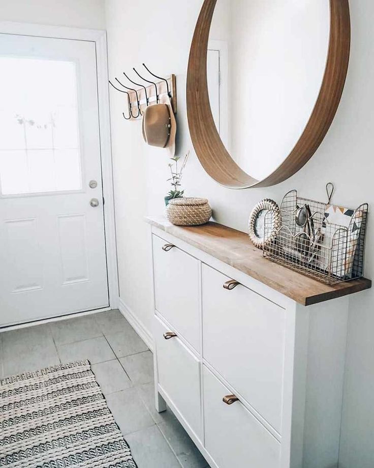 They compensate for the small depth of the cabinets and use the entire area of the walls. Most often, vertical surfaces are empty or hung with paintings, although they can be used much more rationally.
photo
Instagram @ointerior_design
Instagram @titova_design
Instagram @poltavskaya_dizayn
Instagram @rerooms_design
Instagram @olegkurgaev_design
Instagram @juliarodionova.design
Instagram @on_plane_design
Instagram @arhint.ru
Instagram @lavandainterior
Instagram @lavandainterior
Instagram @dariadesign. studio
Proper lighting
In a long hallway, it is important to provide several light sources so that there are no dark corners and sad shadows.
Instagram @bychkovi_design_interior
Use:
- Several lampshades equally spaced.
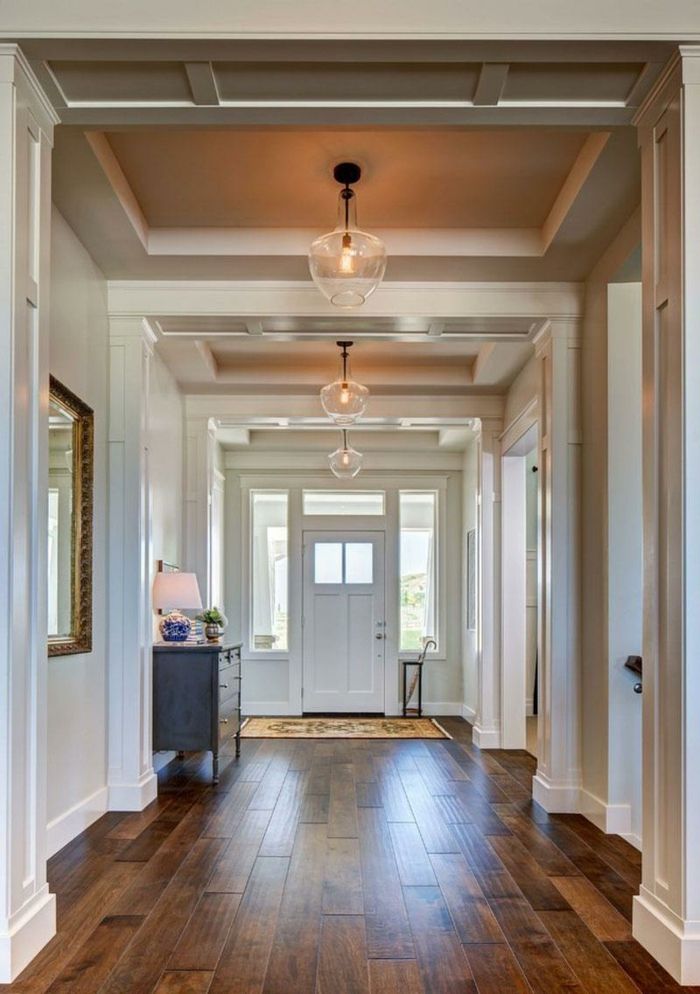 They can be exactly the same or from the same collection to maintain visual unity.
 - Track lights along the entire length of the hall.
- Hidden lighting, which is mounted in a false ceiling, will visually raise it.
- Several local sources. Light up a mirror, paintings or shelves in a niche.
Minimalism and classic
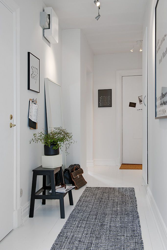
This project is an example of how nothing superfluous can be in design, and this is the best. The long elongated entrance hall is made in a light classical style, but at the same time it is not overloaded with decor and bulky architectural elements. Due to the light palette, the space seems airy and spacious, and a large floor-to-ceiling built-in wardrobe along the entire wall does not press.
On the sides of the entrance door, the designers placed a large full-length mirror, a bench with a drawer and a light hanging console. As a result, there was enough storage space in the entrance area, and the passage does not seem like a gloomy tunnel thanks to light walls and good lighting.
Instagram @irooms.design
Instagram @irooms.design
Instagram @irooms.design
Instagram @irooms.design
Gray
such a case. If the footage is too small, it is better to move the main storage system to another room: bedroom, dressing room, living room. But the hallway cannot be left completely without furniture.
For example, here the designers left one wall empty, hanging only pictures, and along the second they placed compact systems: a coat rack in two rows, a bench with a place to store shoes, and a shallow console.
Instagram @design.trikota
Instagram @design.trikota
Instagram @design.trikota
Blue walls and moldings
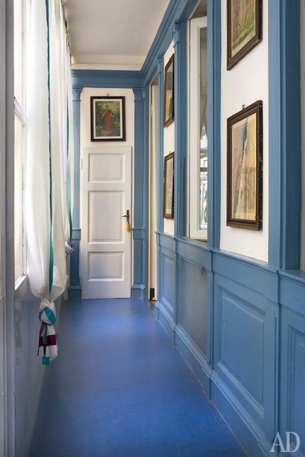
The combination of blue and white gives a stunning effect in any room: it refreshes, fills the space with air, makes it brighter . You don’t even notice the proportions of the hall - first the carpet of tiles on the floor draws attention to yourself, then a large accent chandelier and, finally, a large mirror in a curly frame.
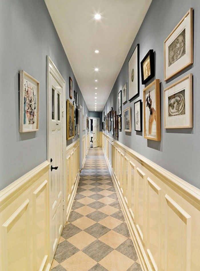
All decor is located on one side, and a spacious wardrobe is built into the other. It is painted in the same tone as the walls, thanks to which it completely disguises itself as them.
The less space in the hallway, the more rational should be the design approach
Contents
- 1 Where to start?
- 2 The choice of finishing materials
- 3 What shades to choose
- 4 Properly arrange the furniture
- 5 The design of a narrow long hallway: expanding the space »
- 9Narrow hallway interior style: 3 ideas, design features
- 10 Conclusion
- 11 Video on how to plan a narrow hallway
- 12 Photo: narrow hallway interiors
- 12.1 See also
- correct zoning - it is carried out with the help of furniture, different colors of walls, ceiling heights;
- finish - not too bulky materials are preferred;
- shape correction - the use of light, color techniques, mirrors;
- furnishing - the presence of only the most necessary;
- interior style - it should match the rest of the rooms, without "littering" the cramped room.
- parquet board;
- natural stone;
- laminate;
- dense linoleum;
- ceramic tiles;
- short pile carpet.
- various colors;
- thick washable wallpaper or paintable;
- PVC panels;
- decorative plasters;
- artificial stone.
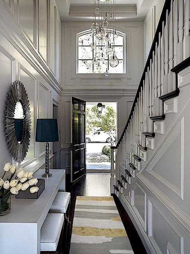
- pearl with coffee;
- sand with terracotta;
- sky blue with white;
- violet with pink;
- ocher with beige;
- apricot with eggplant;
- red-orange with grey-yellow;
- khaki with olive;
- golden green with brown;
- lime with turquoise;
- creamy with dark saffron.
- wardrobe - a narrow wardrobe or corner wardrobe is preferred;
- hanger - needed when it is decided to place the cabinet in another place;
- shoe rack - a vertical shelf for everyday shoes;
- corner or straight sofa - the most compact is selected;
- chest of drawers - for storing all sorts of little things, if they cannot be folded into a closet;
- shelves - several corner or one under the mirror;
- dressing table - if there is a need for it, if there is free space.
- several light sources should be used - the main overhead lighting, lamps near the door itself and above the mirror, LED cabinet lighting;
- if only long walls are illuminated, a narrow hallway will become wider;
- , if necessary, make the ceiling higher, it is illuminated along the contour and by two or three ceiling chandeliers located at the same distance from each other;
- LED floor perimeter lighting will also make the room a little wider;
- the mirror is illuminated brightly, for the convenience of combing, applying makeup, it reflects the incoming light, doubling its amount.
- contrasting photo wallpaper on one of the walls;
- two or three plants in flowerpots on the shelves;
- colorful carpet or several bright rugs in separate areas;
- colored organizers on the walls;
- framed paintings or color photographs;
- cushions on a compact sofa or pouffes.
- lighting - in order to avoid injuries, it is made bright, including local;
- the style of the ladder must match the overall design of the room;
- glass steps are acceptable for high-tech and industrial interiors, but the strength of the materials is of paramount importance here;
- railings framing the stairs are made as safe as possible - they should not slip, have roughness;
- LED lighting is recommended for decorating every step.
- Modern built-in wardrobe with lots of shelves, hooks, hangers, full length mirror, long narrow daybed.
 The floor in the entrance area is covered with laminate, the vestibule part is covered with carpet in a contrasting color. Stretch ceiling, pastel colors.
 Elegance and functionality are the main features of modern style
- Loft - white brick walls, light wood floor, stylized false beams on the ceiling, shiny lamps on long cords. The cabinet is necessarily wooden, artificially aged, but narrow. Several pouffes for sitting, one or two mirrors.
It is in the loft that a bicycle, skateboard and other attributes of an active lifestyle will organically fit in
- Minimalism - a smooth plain ceiling, decorated with foam tiles without a pattern, the walls are light, there is a laminate on the floor, a little darker than the walls. Near the entrance is a simple hanger, above it is a wide shelf with storage boxes in contrasting colors. A little further - a sofa covered with eco-leather, a large mirror without a frame.
Just a shoe rack and hanger - enough to get as close to minimalist style as possible
Where to start?
The design of an overly narrow hallway, a narrow corridor in an apartment or a country house begins with a project. Any room has several zones - it is not difficult to organize them in an oblong-shaped corridor.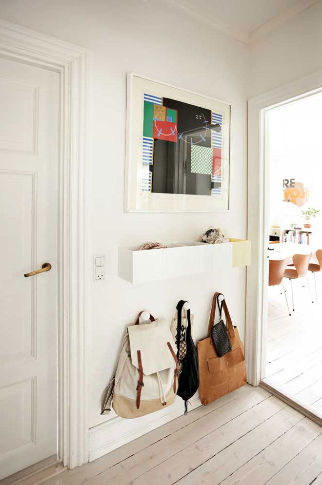 It is important to maintain maximum functionality without cluttering up the space.
First of all, you need to think about how you can adjust the space itself
When developing a design project, some principles should be considered:
Before starting the repair, decide on the arrangement of all necessary items
There are two main zones in the hallway: entrance and vestibule. They stylize the space as a “study”, “courtyard in France”, “winter garden”, “alley of fairy tales”, etc. Increased attention is paid to doors - if they are located on both sides of the corridor, they should not open towards each other, but in different sides.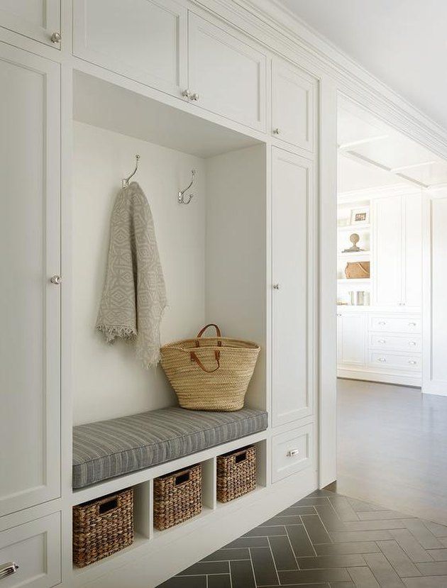 If possible, they are made sliding or completely removed, replacing them with arches - this is how an open, combined space is formed.
Two rugs of different sizes - the easiest way to zone the hallway
See alsoFeatures of Scandinavian style hallway design
The decoration of the corridor is selected depending on the style of the interior, the planned budget, and the personal preferences of the owners. Suitable for both classic and modern.
Ceramic tiles - the most durable floor covering
The floor covering is chosen to be wear-resistant, moisture-resistant, because there is a lot of walking in the hallway, preferably easy to clean. Most commonly used:
Walls are also made washable, especially if children live in the apartment, pets that need to be walked. Applicable:
For walls, choose easy-to-clean wallpaper or moisture-resistant paint
The ceiling is made stretch, suspended, it can sometimes be multi-level, covered with decorative plaster, decorated with expanded polystyrene tiles, decorated with foam stucco molding or painted with water-based paint.
All doors must be made in the same style, from the same materials. When buying them, the thickness of the walls is taken into account - the door frame should not stick out much. Skirting boards are usually matched to the tone of the doors, less often to match the color of the floor.
Advice: if the ceiling is low, you should avoid a large number of tiers, stucco elements. With a hall width of a meter and a half, voluminous details such as wooden panels, textured stone are completely unacceptable.
Glossy ceiling will appear taller than
See alsoWhere to start the transformation and decor of the hallway
With the help of color it is easy to visually change the shape and size of the space. The smaller the room being decorated, the lighter, warmer colors are used for it. They are used no more than three, and the main one accounts for up to 65% of the space being designed, the auxiliary one - up to 30%, the rest - bright accents.
White walls, black accents and natural wood are a great choice for a small hallway
The most suitable combinations for a narrow hallway:
Harmonious combination of white, light gray and brown
Tip. The floor is darker than the walls, the ceiling - this is how the balance of the design is created, stable support for the legs and furniture.
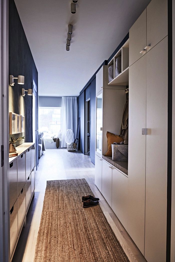
Skillful use of black in the interior of a narrow hallway
0003
Properly arrange furniture
When the hallway is very cramped, there are not many pieces of furniture here:
From the above items of furniture, choose two or three at the same time. Sometimes, instead of a sofa, they put a pair of ottomans, complementing them with an umbrella stand.
If the hallway is very small, you can do with a hanging cabinet and simple hooks
Open shoe cabinet can be used as a bench
A built-in bench is a great solution to avoid cluttering up a narrow hallway with extra furniture
The narrower the corridor, the more narrow furniture is required for it.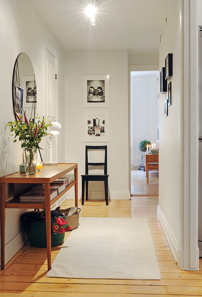 Objects should be preferred, no more than 40-55 cm deep. The furniture is placed in one row along a long wall, it is advisable not to allow a large number of protruding corners, catching on which it is easy to get injured.
When choosing furniture, try to stick to neutral colors
A compromise option - a hallway to order. In this case, the owner of the apartment himself chooses the style of furniture, the filling of the closet, the shape, the number of shelves, the configuration of the couch, etc.
See also Small hallway design problems: how to solve?
Design of a narrow long hallway: expanding the space
With the right finishing of a narrow hallway, it is possible to visually expand it. If laminate, floorboard, tiles are laid across or diagonally, and not along, the room will appear wider. The same effect will be obtained if the baseboard matches the color of the floor covering. Light walls will also visually "remove" the boundaries of space, it is preferable to use different finishes for different areas - a combination of two types of wallpaper of similar colors, but with a pattern of different sizes. A large 3D sticker is placed on one of the long walls, in the form of a realistic open window with a beautiful view behind it.
Laying a floorboard across a narrow corridor will visually expand the space
Mirrors are a reliable assistant in expanding the space, filling it with light. With their help, the room of a narrow corridor visually expands. The mirror covers almost half of the long wall, decorates the cabinet doors, which can be completely mirrored. A partially or completely mirrored ceiling is also acceptable, especially if it is not too high. If sunlight falls on the mirror surfaces from the doorways of other rooms, the narrow hallway will become bright and spacious. The mirror, which completely occupies the entire narrow wall, makes the front one even longer.
Mirror tiles on the wall will make the corridor more spacious
Lighting a long, narrow corridor can also change the shape of the front:
Make sure that there is no lack of lighting in the hallway
See alsoCorridor and hallway design, finishing features
All attention to details
Bright accents are irreplaceable in any interior. They will be:
Even in a small hallway, a couple of bright accents are quite appropriate
Too bright contrasts do not need a lot - they visually "break" the overall picture, the hallway will not look whole. It is desirable that all the details are in harmony with each other, making up a single ensemble - similar floral motifs on the carpet and sofa upholstery, geometric patterns on the mirror frame and flower pots, cross-stitch on pillows and wall panels.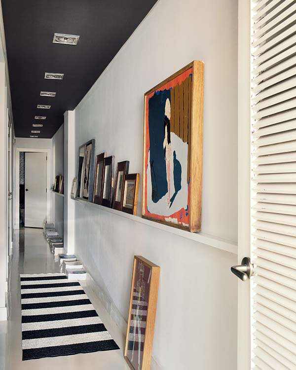
Tip. Illumination of each significant element of the decor will make the interior unique.
See alsoDesign of a hallway in a private or rural house
If there is a staircase to the second floor, it is made as compact and narrow as possible. Stairs here are acceptable mid-flight, spiral, straight. The nuances of a narrow hallway with stairs:
Wooden wardrobe matches the dark stair railing
Advice: safety issues are of paramount importance here, especially if the house is occupied by elderly people, small children, persons with disabilities of the musculoskeletal system.
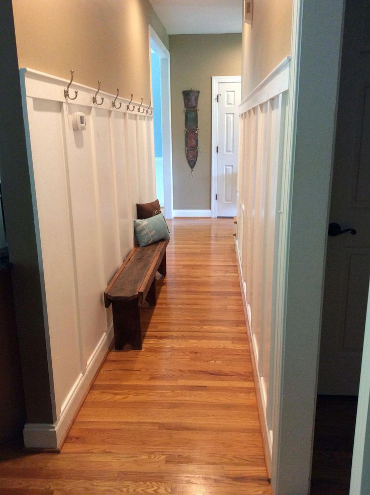
Small entrance hall with Scandinavian style stairs
See alsoDetails of the hallway design with mirrors
In such apartments, the entrance hall is not only narrow, but also most often of an “uncomfortable” shape - a corner one. An L-shaped corridor is usually decorated with corner furniture - a wardrobe, a small sofa, shelves. Wallpapers are selected suitable for the overall interior design - vinyl, bamboo, metallized, "liquid". The narrow hallway here will become even more elongated. Do not litter it with voluminous decorative elements.
In a small hallway a mirror can be placed on the front door
The interior of the entrance hall of a complex configuration, made in the classic style
See alsoDifficulties, features and design rules of the hallway with stairs
Narrow hallway interior style: 3 ideas, design features
Today's most popular styles:
Corridor - a place where those who enter the house take off their outer clothing, shoes, put various other items on the shelf, evaluate their appearance in the mirror.