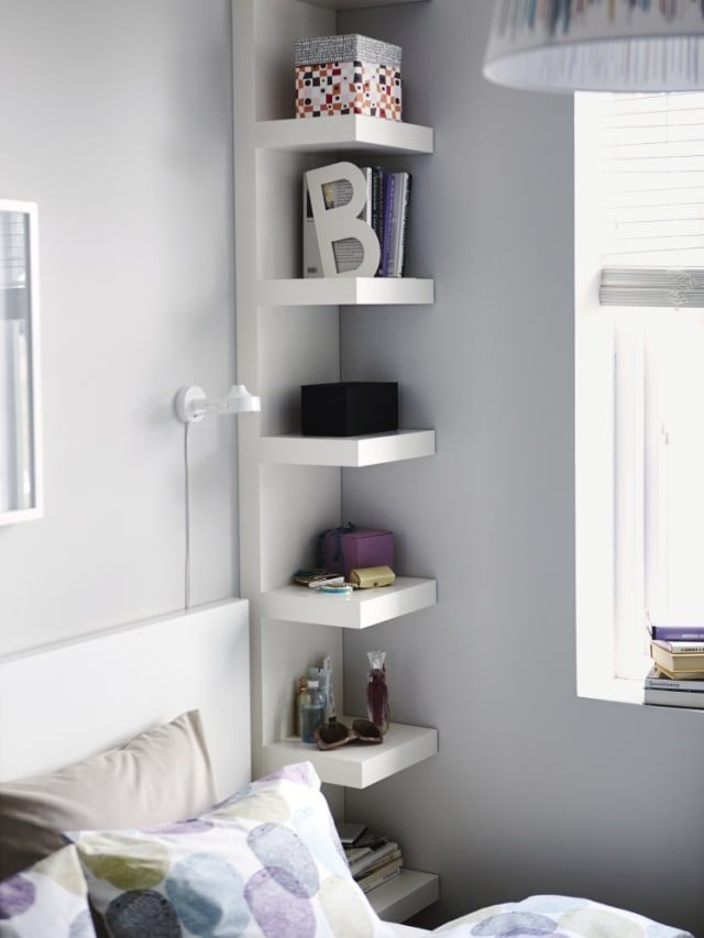
How to pick a color for your living room
How to Choose Paint Colors: 12 Pro-Tips and 5 Mistakes to Avoid
So you’ve renovated your house like a skilled surgeon, fixing structural flaws and preserving each room’s distinct architectural character. But something’s still missing. More than likely, that something is color—the renovator’s secret weapon.
Did you know that crown molding can visually raise the ceiling or lower it, depending on how it contrasts with the walls? Or that deft use of color can turn one room into a lively gathering place and another into a relaxing space for curling up with a book?
In today’s open-plan homes, where kitchens, living rooms, and dining rooms are often one large space, color is used to help define interiors and create focal points in relatively featureless rooms. The trick, of course, is figuring out how to pick paint colors to use and where to put them.
How To Choose Interior Paint Colors1. Create a Color Scheme That Matches Your Home’s FurnitureIn a world where thousands of colors can be yours for just $25 a gallon, it pays to consider the advice of architectural color consultant Bonnie Krims.
“Always remember that while there are thousands of paint chips at the store, there are only seven colors in the paint spectrum,” says Krims, referring to red, orange, yellow, green, blue, indigo, and violet (what Color Theory 101 students are often taught to remember by the mnemonic device, “Roy G. Biv”). “I always suggest eliminating a couple even before you go to the paint store.”
Here’s her sure-fire 4 step method for creating a color scheme:
Pro2Pro Tip: If you find yourself paralyzed at the paint store, unable to choose your color sample cards, Krims offers this tip: Look at the darkest color at the bottom of the strip. “If you can live with the one at the bottom, you know you’ll like the middle and top, but if you choose by looking at the top, lightest colors, all the cards in that category start to look the same.”
- Start by selecting three colors from an existing object in your home. “Take a pillow from the family-room sofa, your favorite tie or scarf, or a painting—anything that conveys comfort or has an emotional connection for you—and take that object to the paint store,” says Krims.
 “Find three sample strips with those colors, and you instantly have 15 to 18 colors you can use, since each sample strip typically contains six paint colors.”
 - The next step is to choose one of the three paint colors as your wall color and to save the other two to be used around the room in fabric or furnishings.
- To choose the colors for adjacent rooms, take the same original three color sample strips and select another color.
- Finally, choose a fourth color that can be used as an accent: “Splash a little of that color into every room of the house—by way of a pillow or plate or artwork. It makes a connection between the spaces,” Krims says.
Once you have your colors in hand, consider the finish you’ll be using. Though today’s flat paints have increased stain resistance, conventional wisdom has long held that a satin (also called eggshell) finish is best for walls because it is scrubbable and doesn’t draw attention to imperfections. Semi-gloss and high-gloss finishes, it was thought, were best left to the trim, where they could accent the curves of a molding profile or the panels of a door.
Today, however, finishes are also being used to create visual effects on the entire wall. Paint one wall in a flat or satin finish and the adjacent wall in a semi-gloss, both in the same color, and “when the light hits the walls, it creates a corduroy or velvet effect,” says Doty Horn. Similarly, you can paint the walls flat and the ceiling semi-gloss to achieve a matte and sheen contrast. (The ceiling will feel higher the more light-reflective it is.) Keep in mind that the higher the gloss, the more sheen and the more attention you draw to the surface. Used strategically, color and gloss together can emphasize your interior’s best assets.
3. Match The Color To The Feeling You Want In The Room Colors evoke an emotional response. In general, cool colors (blues, greens, and clean whites) are perceived as restful and soothing while warm colors (like red, orange, and yellow) create a sense of drama and energy.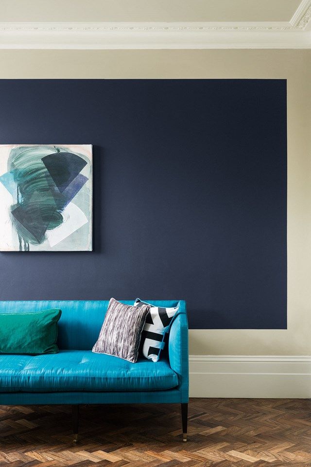 Cool colors are calming in private rooms—like the ice-blue that covers the walls in this bath; warm colors are a good way to enliven social spaces.Photo by Patrick Barta/Cornerhouse Stock Photo
 The psychology of color is a minor obsession among paint professionals. Many say you should choose a color based at least in part on how a room is used and the mood you want to establish.
Maxwell Gillingham-Ryan, co-founder and editor of the blog apartmenttherapy.com suggests, painting social rooms (dining rooms, kitchens, family and living areas) warm colors like daffodil-yellow, coral, or cranberry, and give private rooms (home offices, powder rooms, bedrooms) cooler hues like sage-green, violet, or sky-blue.
Keep in mind, when it comes to emotional effect, of course, one person’s welcome-home orange will be another person’s signal to scram.
Debbie Zimmer, for one, declares that “red will increase your appetite—and your blood pressure; blues and greens are naturelike and calming; purple is loved by children but not necessarily by adults; yellow is inviting; and orange can be welcoming but also a little irritating, depending on the tint, tone, or shade. ”
”
Research done by Behr indicates that yellow can stimulate the brain, so it might be worth considering for rooms where homework is done; but avoid yellow in bedrooms, where the goal is generally to chill out. Instead, explore these calming colors in the bedroom to help you sleep better.
4. Know Your WhitesWhites come in a staggering variety. Pure, “clean” whites are formulated without tinted undertones. These are favored by designers looking to showcase artwork or furnishings and are often used on ceilings to create a neutral field overhead.
Most other whites are either warm—with yellow, rust, pink, or brownish undertones—or cool, with green, blue, or gray undertones. Behr’s Mary Rice says: “Use warmer whites in rooms without a lot of natural light, or to make larger spaces seem cozier.”
Cool whites, by contrast, can help open up a space. Test several at once to see which one works best with the other colors at play in the room.
How To Use Interior Paint Colors5. Create Flow in Open Plan Spaces Using the same gray in the open-plan adjoining living room unifies the two spaces. The simplicity of archways with no casework pulls in the view of the next room rather than framing it.Photo by Karin Melvin
 Continuity is important on the ground floor, but color can help “zone” a big open space, separating the dining area from the TV room, for instance. There’s no need to stick to a single color or even a single color palette that is either all warm (reds, oranges, yellows) or all cool (blues, greens, bright whites).
However, “by using muted, dustier values, there’s a better chance the colors you choose will flow into one another,” says Tami Ridgeway, a color stylist for Valspar. She recommends leaning toward colors softened by a bit of gray; these are often found in historical palettes. Bright colors can be injected in small doses as accents—in furnishings, floor coverings, even flowers.
6. Make Small Spaces Feel Bigger or Cozier What Colors Make A Room Look Bigger?
Generally, crisp whites can make a space feel bigger and more open, while warm colors create a sense of intimacy. At the most rudimentary level, large rooms generally can handle more color than small rooms. “Lighter hues can open up a small space, while darker colors give the perception that the surfaces are closer than they are,” says Debbie Zimmer.
What Colors Make A Room Cozier?Of course, some small spaces don’t need to feel big: If you’re aiming to create a welcoming or cozy atmosphere in a foyer, study, or library, for example, hunter green or rust may serve you better than pale peach or celery.
7. Using Color ArchitecturallyReddish browns provide a visual connection from the dining room to the front door (Sherman-Williams 2801 Rookwood Dark Red) through a series of cased and uncased openings, which allow a glimpse of the entry’s sunny walls. Photo by Karin Melvin
 One of the most effective ways to use color to transform a room is to play up its architectural features. Molding, mantels, built-in bookcases, arched doorways, wainscot, windows, and doors all offer an opportunity to add another layer of interest to colored walls.
Painting Molding and DoorwaysFor subtle emphasis, Sheri Thompson, director of color marketing and design for Sherwin-Williams, suggests painting molding or doorways just one step lighter or darker than the primary wall. “It’s a subtle shift in color but it really brings your eye to the detail,” she says.
Painting a metallic glaze right on top of an existing painted element, like a ceiling medallion, is another way to draw attention. “A copper or bronze finish is very translucent and it gives a nice shimmer that enhances the architectural feature,” says Thompson.
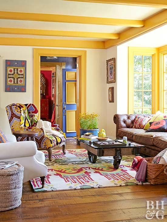
One way to give adjoining rooms in ground-floor living areas a harmonious look is to paint them in colors with the same undertones, like the yellow-based red, khaki, and pumpkin used here.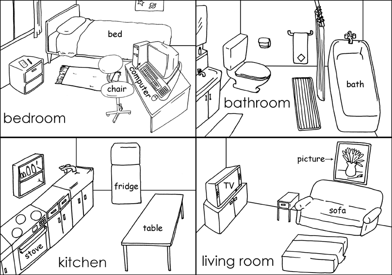 Keeping trim color consistent from room to room helps avoid any jarring transitions. Private areas that typically remain closed off from view—home offices, bedrooms, and powder rooms, for example—don’t need to tie in as closely with their neighboring spaces.Photo by Patrick Barta/Cornerhouse Stock Photo
 Where Do You Switch Color When Moving From Door to Casing?
It’s not an open-and-shut case, but the rule of thumb goes something like this: Paint the face of the door the color of the trim in the room it faces when shut, and the edges of the door the same color as the trim in the room it swings into.
If you’re using different trim colors in adjoining rooms, they need to work well together. “Doors tend to stay open, so you’ll have the trim color from an adjoining room in any given space on a regular basis,” observes painter Susan English. So, let’s say you have a barn-red door opening into a room with pale yellow walls. “This can be an effective accent color in the space where it doesn’t ‘belong’—if it’s carefully considered. ”
”
Keeping trim color consistent in adjoining rooms that have open entryways generally offers a sense of cohesiveness, providing an unbroken line that is pleasing to the eye. In an open plan, consider painting all the trim white, even where wall colors vary.
8. Exploring Using Two Different Colors in The Same RoomFor a bolder approach, try using two different colors in the same room. For example, paint a built-in bookcase or niche a shade of green in a room with blue walls, which will highlight the items on the bookcase or inside the recessed area. Of course, architectural elements can also provide continuity throughout a house if they are painted the same color in every room. Starting in the Federal period and continuing today, white and off-white have been the traditional choice for molding, windows, and doors.
9. Create Contrast in Rooms with WainscotingA room containing wainscot provides a good opportunity for a contrast between light and dark.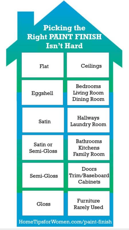 A dark wainscot below a bright wall will draw attention to the upper walls, while a bright white wainscot next to a colored wall will focus the eye on the wainscot. You can also use paint to create the effect of wainscot where it doesn’t exist by covering the bottom third of the wall in one color and the upper walls in another; then place a piece of flat molding along the intersection and paint it the color of the lower wall to reinforce the wainscot look.
Where rooms are relatively featureless, painting an “accent wall” in a vivid hue where the others are white or neutral can add a dramatic, contemporary edge. Or, as Ken Charbonneau, a New York color marketing consultant, suggests, paint the primary walls a soft color such as beige or celadon green and the accent wall three shades darker. “The accent wall still gives the room some punch, but it’s not as dramatic.”
11. Explore Bolder Options with Multiple ColorsIf drama is your goal, you might rethink the entire notion of painting a wall from corner to corner, says Doty Horn, director of color and design for Benjamin Moore, and you’ll create an architectural emphasis where one doesn’t exist. Moving around the room in a clockwise direction, try painting a third of one wall and two thirds of the adjacent wall, wrapping the corner in color. Then paint the last one eighth of the second wall and three quarters of its adjacent wall, covering that corner.
Another bold play: Take a big wall and, working in from both corners, paint it almost to the center, leaving an 18- to 20-inch vertical line of white space, and hang artwork down the center.
12. Treat Your Ceiling Like a Fifth WallPainting walls in complementary colors, like the deep red and gray-green at left, and furnishing with neutral hues of similar intensity creates a harmonious look. Red walls make this large dining room more intimate, while highlighting the white wainscoting and trim. Red overhead also lowers the ceiling visually, making the space feel cozier and more convivial—a plus in a room designed for conversation.Photo by Susan SeubertTo give low ceilings the illusion of height, paint them white and any crown molding the same color as the wall; this will keep from interrupting your gaze upward.
Though sticking to “ceiling white” generally makes a space feel airy, a similar effect can be achieved by painting the ceiling a lighter shade of the wall color. Just take the paint sample card that has your wall color as the middle choice, then go one or two choices lighter for the ceiling color. The result will be a room that appears larger, because the contrast between wall color and ceiling color has been softened. In a small room, such as a bathroom, the ceiling can even be painted the same color as the walls to make it look bigger.
Of course, sometimes lowering the ceiling visually creates a welcome feeling of enclosure. In his own 19th-century brownstone, Ken Charbonneau painted the dining room ceiling Pompeiian Red. “People love to ask if the red paint doesn’t bring the ceiling down too much. But you’re sitting the whole time you’re in a dining room, and you want to create a warm, cozy, intimate feeling, so why not?” Of course, his ceilings are 11 feet high. In a house that has ceilings just 8 or 9 feet high, painting a bedroom ceiling a pale robin’s egg blue, for instance, would be a way to create a similar, soothing effect.
Just keep in mind something Kathleen Jewell, a color consultant in Orange Park Acres, California, has learned: “Warm shades lose their yellow tones on a surface where no sun ever falls, turning bluer and grayer,” aka dingy.
5 Paint Color Selection Mistakes To Avoid1. Being Afraid To Explore Interior Paint Color Options“The world is divided into two groups—the color courageous and the color cowardly,” says New York color marketing consultant Ken Charbonneau. “People who live in colorful interiors have gotten over the fear of making a mistake.” The best way to get over that fear is to always start with a color you love—from a rug, a painting, a fabric. Then test it on the wall. If it’s too strong, consider asking your paint store to formulate it at “half-strength” to lighten it or to tone it down by adding more gray.
2. Putting Too Much Paint On The WallsBe aware of the intensity of the colors in a room. “If you have an Oriental rug with five or six strong colors, don’t paint the walls in equally strong hues. Let the rug be the focal point and the walls a lighter color,” says Sherwin-Williams’s Sheri Thompson.
If you think your room is boring, look at it in terms of the 60-30-10 rule that designers employ.
What is the 60 30 10 decorating rule?Sixty percent of the color in a space generally comes from the walls; 30 percent from upholstery, floor covering, or window treatments; and 10 percent from accent pieces, accessories, and artwork. Translation: Liven up those white walls.
4. Rushing The Paint Selection Process The paint chip strip is only a guide. To really see how a color will look on your walls, paint a large piece of foam-core board with it, then move it around the room for a few days. Different lighting will affect how it looks over the course of the day. While yellow looks cheerful in this sun-filled space, a similar warm color used in a room that gets no natural light can quickly start to look dingy.Photo by Alan Shortall/Cornerhouse Stock Photo
 The best way to find a color you can live with is to paint a 4-by-4-foot swatch on the wall and live with it for at least 24 to 48 hours so you can see it in action.
The size of the room, the amount of natural or artificial light, and competing elements—ranging from flooring to furnishings—can all affect the way a particular color is perceived.
“Taking the extra time to do the swatch test is worth it to find a color you’ll love living with for years,” says Benjamin Moore’s Doty Horn.
A number of paint companies sell small jars of paint for sampling: Use one to paint a big piece of foam-core board with your top choice. Place it in various spots around the room, and see how it reflects the upholstery and responds to the quality and amount of light in the room over the course of a few days.
When changing the color of a wall, primer (white or tinted) is vital to getting the actual color you picked out. Michael Baillie, paint sales associate at The Home Depot, says, “Priming ensures there will be no interference from the previous wall color.”
The interior of the living room’s uncased square arch is wrapped with the entry’s warm yellow, leading the eye from the front door through the house.Photo by Karin MelvinTips for Choosing Interior Paint Colors
By
Diana Hathaway Timmons
Diana Hathaway Timmons
Diana Hathaway Timmons has over 10 years as a color and interior design consultant. She writes about ideas and tips for beautifying your space and incorporating decor trends into your home. She wrote the book "How to Sell Your Home Without Losing Your Zen" and has been featured in the "Huffington Post," "Better Homes & Gardens," and additional publications.
Learn more about The Spruce's Editorial Process
Updated on 04/20/22
Fact checked by
Emily Estep
Fact checked by Emily Estep
Emily Estep is a plant biologist and fact-checker focused on environmental sciences. She received a Bachelor of Arts in Journalism and a Master of Science in Plant Biology from Ohio University. Emily has been a proofreader and editor at a variety of online media outlets over the past decade.
Learn more about The Spruce's Editorial Process
The Spruce / Jesi Lee
The easiest way to choose the best interior paint colors is to start with the colors you love. When you start with the colors you love, you are not bound by traditional color schemes for a particular decorating style. With your favorite color as your base color, you can use it to create a color scheme around it. Your favorite colors can be the perfect inspiration for your new color palette for the whole home.
Here's how to find out what your favorite color means and how you can decorate with it.
Find Paint Color Inspiration
Magazines and catalogs have always been the staple of decorating inspiration. You have access to thousands of pages of inspiration on the internet. Retailer sites can be inspiring with their room vignettes, and paint brands can also show you ways to use color in your home. Social media sites such as Pinterest and Instagram offer color inspiration that is refreshed in real-time. Pinterest is great for creating inspiration boards for your favorite ideas, so you can keep all your ideas in one spot.
The Spruce / Jesi Lee
Use Color Theory to Create a Color Scheme
You don't have to study color theory to get great ideas from a little color wheel. These inexpensive color tools can generate color scheme ideas quickly. With a turn of the wheel, you can see how colors might relate to each other and learn the basics of color theory. While you probably won't be painting your home in the exact colors you see on the wheel, you can choose shades of those colors at your favorite paint store.
It's easy to use a color wheel to create a color scheme once you learn a few easy concepts.
The Spruce / Jesi Lee
Get Creative With Neutral Paint Colors
Just because you choose neutral paint colors doesn't mean they have to be laid-back. You can rev up your neutral color palette by being creative with how the colors are used. A striped wall in neutral colors adds tons of style but still keeps the room looking relaxed. Neutral wall color with a pastel ceiling is a sneaky way to add color without losing the soothing vibe of the space.
Patti McConville / Getty ImagesPull Your Paint Color From a Print
One of the easiest ways to choose interior paint colors is to start with a print fabric. Throw pillows, bedding, and even table linens can provide you with paint color ideas. If you're creating an accent wall, look to the boldest colors in the print.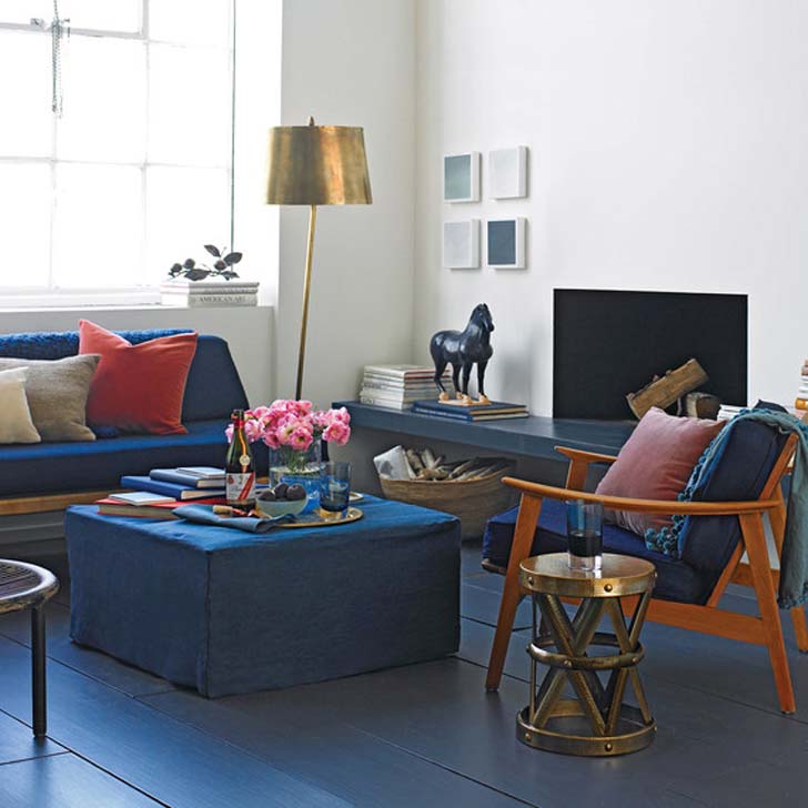 If you would like to choose a paint color that is more subtle or for a larger space, look at the color in the small details of your print fabric. Take a fabric swatch to the paint store, so you can choose paint strips to view at home.
The Spruce / Jesi Lee
Look Outside for Ideas
Bringing the outside in is a popular inspiration for color schemes. Whether you choose foliage green or the laid-back blues of the beach, exterior-inspired color schemes are meant to be restful and relaxing. Be sure to sample your favorite paint colors at all times of the day and night and with the window treatments closed and open to get the most realistic view of your possible choices.
If you're going to use your landscape as inspiration, observe some dos and don'ts of decorating with green.
Zia Soleil / Iconica / Getty ImagesFind Your Paint Color in Artwork
An interior designer's secret is choosing colors from artwork in your home. Most artists are masters of color and light, creating their color schemes for their pieces. You can benefit from their insight by choosing colors from a favorite piece of art. You can also choose complementary colors from the same work of art to create a color scheme.
Look to Historical Color Inspiration
Just because you love Craftsman color schemes doesn't mean you have to decorate in a Craftsman style. Historical paint colors are offered by many of the paint industry leaders. Use these collections as inspiration and tailor them to your decorating style.
Benjamin Moore's Damask Yellow is a rich and warm wall color that would work well in a variety of decorating styles, including Craftsman and mid-century modern.
Benjamin Moore
Try a Lighter or Darker Shade
Sometimes all you need is a little adjustment to find the right interior paint color. Before you abandon your paint color choice too quickly, consider a lighter or darker shade of the same color. Many paint colors appear on a paint strip in gradual shades, but you can also ask your paint store to customize it by percentages of light or dark shades.
This wall features Sherwin-Williams Muddled Basil.
Sherwin-Williams
How to Use Undertones to Find Your Perfect Paint Colors
You can be unpleasantly surprised by the undertones when choosing interior paint colors. Simply explained, undertones are the colors lurking beneath your favorite paint color. A simple beige may not be all that simple if it has a strong green undertone. The only way to accurately read how an undertone will appear in your home is to sample the color. Undertones from other surfaces in your room can also change the way your paint appears due to reflection, so sampling is essential.
Make sure you know how undertones work and why it matters when you're choosing interior paint colors.
Wayfair
Do Your Homework Before Shopping
Choosing the right interior paint color starts at home. Before you head to the paint store to gather paper samples, gather inspiration from catalogs, magazines, and fabric swatches. This will keep you from grabbing too many paint color options on your first trip to the store. The hardest part of choosing a paint color, at first, is having too many options.
Once you narrow down your paint color choices, return to the store for paint color samples to try at home. This step is crucial to finding the perfect color.
Stockernumber2 / Getty ImagesSample Your Paint Colors Before Committing
This is a simple rule that should never be ignored. Always sample any paint color you're considering. When you are committing gallons of paint and hours to your project, you have to get the color right the first time. You don't want to skip this step. If you look at the back of the paint store, there are stacks of cans of returned paint from people that did not take the time to sample first. Don't be one of them. Make sure to calculate exactly how much paint you'll need, as well, so that you minimize waste.
Remember, sampling paint colors is the most important step in finding the right colors for your home.
The Spruce / Jesi Lee
How to Flow Color Throughout Your Home
If you're decorating a small home, flowing paint color throughout the rooms can give the illusion of a larger space. Flowing paint color through your home can also create a relaxing vibe. The most stunning way to use flowing color is to choose a neutral paint color that will be your signature hue for your home. Each room can have its accent colors, or you can use the same accent colors in different amounts in each room. Keep flooring similar from room to room, and consider molding to tie everything together.
Astronaut Images / Getty ImagesUse a Color Consultant
If you would like a new color scheme and aren't sure which interior paint colors to choose, a color consultant can point you in the right direction. A color consultant can provide you with paint color ideas to sample or even a custom-designed color palette for your home.
Before you meet with your color consultant, gather ideas and inspiration to share with them so that they can see what you have in mind. Ask if your consultant can visit at a particular time so that he or she can see the challenges that the natural lighting poses for your space. Don't be surprised if your color consultant suggests changes to your lighting to correct color problems in the room.
Paint Color Apps Can Make Choosing Paint Color Easier
Choosing a paint color can be easier with the use of a phone or tablet app. Paint color apps have been evolving and improving since they were first released, so you might want to check them out again if you've tried one in the past and it didn't work for you.
The most popular paint color apps give you the ability to match a color you see anywhere, as long as the phone or tablet camera can read it. Though it may not be an exact match, these apps can suggest similar colors. The best apps can also offer color palettes created around your color and ways to share your palettes with friends on social media. Look for extra tools like paint buying tips and basic DIY videos
Sherwin-WilliamsStill not sure which color to choose? Take our short personality quiz and learn which color palette is right for you!
Wall color in the living room - how to choose, 100 photo-ideas of living room interior
The living room is rightfully considered the center of the apartment and the house, since it is in it that relatives and friends gather for rest and relaxation after a working day.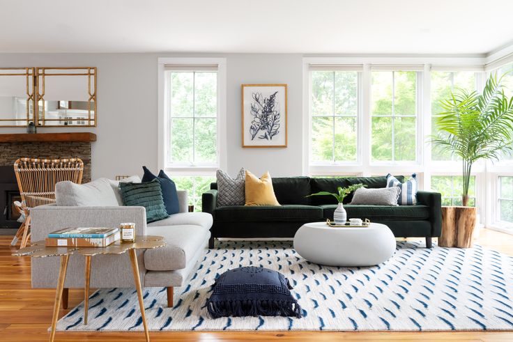 For a good mood, relieving nervous tension and a complete distraction from everyday life, the color of the walls in the living room is selected taking into account a number of rules used by professional designers around the world.
Selections
The right color scheme allows you to visually make the room bigger and more spacious, fill it with light, support the overall concept and even eliminate some of the room’s shortcomings.
Color selection criteria
- Lighting features. Dim lighting can be corrected by using bright, light palettes that evenly distribute light and remove dark corners. If natural light enters the room in sufficient quantity or even in excess, preference should be given to cool, calm tones.
- Design and personal preference. First of all, the color of the living room should please its owners. In addition, if a certain style concept has already been chosen in the design project, it must be adhered to.
- Functionality requirements.
 The color of the finish can often act as a tool for zoning space instead of massive partitions or furniture groups.
 - Living room area. A spacious room opens up more opportunities for the implementation of bright ideas. Here you can create a contrasting finish, or use smooth transitions. Small living rooms require the use of light colors and neat accents that will be in harmony with other interior details.
Not all walls have to be painted the same tone, but there must be a balance in everything. The floor and ceiling finishes are pre-thought out so that all surfaces blend well with each other.
Influence on the choice of cardinal directions
Any palette can manifest itself differently depending on the degree of natural light. This factor depends not only on the size of the window openings and their openness, but on the side of the world from which the room is located.
- South. Often, sunlight is not only enough, but also in excess.
 In order to reduce the “temperature”, it is recommended to use moderately cool shades (white, blue, turquoise, gray).
 - West. During the daytime peaks, the room can be too hot and light, so there should be cool shades, such as mint (closer to blue), deep blue, gray, brown.
- East. It is recommended to give preference to pink, brown tones, which will favorably beat the sunrise and compensate for its lack in the afternoon.
- North. Due to the coldness and short duration of the sundial, you need to choose warm, soft shades (beige, coffee, green, yellow). They will not only add light to the room, but also visually fill it with the sun.
Before choosing the color of the walls for the living room, you need to consider the location and intensity of the lighting fixtures. If they are located around the entire perimeter of the room (in the form of LEDs or built-in lamps), the tint palette can be changed depending on the desired effect.
Feng Shui in the colors of the living room
The use of Eastern teachings in the selection of interior colors allows you to determine the direction of vibration and energy, which will positively affect the mental and physical health of a person. The doctrine is based on the main elements: Wood, Fire, Metal, Water and Earth. At the same time, the finish should lie on smooth, even walls so that nothing interferes with the movement of positive energy.
Feng Shui color characteristics
- White. Symbolizes the ideal, purity, light. For comfort and warmth, use in combination with another palette. A great solution is to add yellow tones.
- Red. The color of passion, activity, movement. It stimulates the appetite, but can sometimes cause bouts of aggression. In combination with gold, it attracts good luck. Red doesn't go well with black. The palette is not recommended for people with diseases of the nervous system.
- Orange. Combines the positive energy of yellow tones and the power of red. Disposes to a pleasant conversation in the guest room, attracts well-being and kindness.
- Gold. Denotes respect, honor, status. Previously, only rulers could use this color in the interior.
 The golden palette has a positive effect, attracts monetary energy.
- Black. In fact, it is not considered a mourning, but a magical color according to Chinese teachings. But, many still equate it with a negative, so the use of black is best minimized or used for accents.
- Blue. The main association is water. The palette has a calming effect, restores harmony, relaxes and is suitable for meditation. Blue stimulates spiritual energy, intuition.
- Green. The color of calmness, peace, nature. It stimulates wealth and well-being, means life, growth, harmony with others. Pairs well with yellow and gold to create an energy of success.
- Yellow. Symbolizes positive energy, success, happiness. It attracts warmth and makes the living room cozy, causes an optimistic mood, attracts good luck.
- Violet. It has mystical, magical properties. Suitable for creative people, symbolizes material well-being.
When choosing not one, but several wall colors in the interior of the living room, it is important that they indicate one direction to enhance energy. You should be guided not only by the above characteristics, but also by your own preferences in order to create a cozy interior.
Optimal solutions
Gray background
A modern, popular palette that is suitable for both classic and loft styles, minimalism, modern. For greater effect, it is complemented by geometric textures. Due to the variety of shades, it is suitable for rooms of different sizes.
Yellow range
When choosing, you should pay attention only to pastel and calm, and not bright and flashy shades, which will negatively affect the rest and cause nervous tension. Sunny, warm yellow is associated with summer, comfort. In spacious rooms it can be used for all walls, in small living rooms - for interesting accents in decor, photos, etc.
Browns
Mainly used for classical solutions. For accents, more saturated and deep shades are chosen, for the background - coffee, chocolate, etc.
Olive shade
Well suited for Provence, Scandinavian style, country. A soft, natural, pastel shade of green is suitable for rooms of different sizes and locations. The noble tone gives coziness and comfort, goes well with other soft tones.
Light orange
Associated with rich summer colors. It is used for various interior solutions, it will become a highlight of mixed style in classic and modern. Pairs well with turquoise and grey. Favorably looks in dark living rooms, the windows of which face the north side. It also compensates for the lack of lighting.
Shades of beige
A popular, versatile, practical color that can be used to decorate any living room. The room will turn out warm, harmonious. Bright, rich colors, imitation of brickwork, textured plaster are used for decor.
Shades of turquoise
The turquoise palette will give a feeling of freshness, freedom, spaciousness. Shades are presented as rich and deep, as well as pastel, fresh. It goes well with different color options, while not overloading the interior. Makes a cold palette softer and more appropriate. More suitable for spacious rooms, plays well in accents.
Natural shades of green
A natural, comfortable palette that symbolizes life. Various shades are used in the interior of the living room. Often gamma is used for zoning space. It goes well with shades of gold, brown, floral prints.
White background
Strict and restrained, but at the same time, a neutral color that can be used as a base for any style. Its tint palette is wide and varied, and textured application will open up new facets of white. The palette visually expands the room, fills it with light and warmth, eliminates dark corners.
Characteristic stylistic palettes
- Contemporary. The modern style allows for more vibrant colors such as blue, teal, emerald, lilac, etc. A combination of several contrasting scales in one room is characteristic.
- Scandinavian. The style is characterized by the use of beige, gray and white tones, as well as shades of blue.
 The color should be harmonious, maintain spaciousness.
 - Classic solutions. These areas are characterized by muted, calm ranges of brown, green, blue. The interior uses only one shade, wallpaper with a pattern is used for accents.
- Loft. A modern solution for decorating a living room. Mostly cold, calm tones are used for the interior. Gray and white goes well with brick. For such an "industrial" idea, you can use black.
- Country. A rustic theme is impossible without natural shades, such as brown, green, pale yellow, blue, peach, olive, etc.
- Provence. The base is pastel colors such as olive, beige, lavender, etc. It has a natural, restrained palette.
The palette of each style may vary depending on the functional purpose of the color, the area of \u200b\u200bthe room, and personal preferences. If, according to the design project, the implementation of non-standard tones is appropriate, there are no restrictions on bringing such an idea to life.
Color combinations
- Contrast. This combination of colors is used to implement modern interiors. You can choose the most unexpected scales, if you place them correctly in the room. Use cases - accent wall, geometric patterns, stained glass or panel effect, etc.
- Neutral combination. It opens up ample opportunities for the implementation of original ideas. Delicate shades are suitable for classics, for modern solutions - colder palettes.
- Monochrome. The use of one color scheme allows not only to visually preserve the area, but also to expand it. There are many combinations, since each color can have dozens of shades. Without overloading the interior, you can zone the space.
- Two colors. The use of two different colors is acceptable for spacious rooms, but other solutions can be considered if both shades are light. It is important that the selected colors are from one half of the spectrum. The transition is smooth, the gradient method is popular.

The use of several combinations is possible only if the living room area is 25 square meters or more. Then one of the zones can be decorated for relaxation in soothing colors, the other can be finished for receiving guests, etc.
Color choice for a small living room
To decorate a small living room, light, soothing colors are used that will be in harmony with other elements of the interior. It is better to refuse patterns and prints, because because of them the room may seem smaller in size. For bright accents, decor items and furniture are used.
To visually enlarge the room, you need to think over a lighting scheme that will emphasize the color of the walls favorably, as well as hang mirrors. If you use wallpaper or decorative plaster, they should be discreet, monochrome, without unnecessary details that could adversely affect the visualization of the space. An interesting solution could be to paint the accent wall in a different shade, if you choose the right color.
What color to choose for the living room: design tips - Roomble.com
Design and Decor
2021-09-08T09:40:00+00:00 2021-09-08T10:11:00+00:00 What color to choose for the living room: design tips 2021-09-08T09:40:00+00:00 How to make a living room cozy with the right color? What is combined with this or that shade? How does lighting affect mood? We will find out all the details and choose the very living room in which it will be comfortable and joyful to be What color to choose for the living room: design tips
How to make a living room cozy with the right color? What is combined with this or that shade? How does lighting affect mood? We will find out all the details and choose the very living room in which it will be comfortable and joyful to be
The living room is the main room in the house.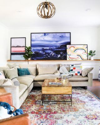 The color scheme in which you decorate this room can ruin your life, or it can guarantee a good mood and a desire to return home with pleasure, receive guests and proudly show them the fruits of your decorating labors.
But first you need to understand what shade you prefer to make in your living room. Moreover, it is far from always the main one - this is the color of which there is a lot. Even a bright accent, skillfully placed against a calm background, can dominate. And in the ability to find this balance, your own good taste - and you should have it if you regularly read our articles - and design advice will help you find this balance.
Let's start with shades of white, of which there are a huge variety. Combining them in one interior, you can create a bright and airy room, while the living room will not look boring and monotonous. A lot of light, small bright accents emphasize the freshness and tenderness of the atmosphere. However, such a room can both cool you on a hot summer day and warm you on a winter evening - it all depends on accessories, lighting, a combination of primary and secondary tones. White is an excellent "partner" for almost any other color, which in this case should not be much.
Living room in green perfectly relaxes and soothes after a hard day. If you choose darker shades of green, take care of good lighting. There is not enough natural light - make additional artificial lighting scenarios. The gloominess of a swamp shade is not the most cheerful decor option.
In a green living room, wooden objects, copper lamps, yellow curtains will be appropriate. All at once or separately - choose together with the designer.
Inga Azhgirey, designer:
- To begin with, I would recommend paying attention to the illumination of the room (the sun is in the morning or evening here, or maybe it illuminates the room all day), also note which side of the world it faces. In a sunnier room, you can choose cooler shades.
If we are talking about a living room, it is also important to understand whether this is a living room for a large family or for 1-2 people. If there is more often a large family in it, then I personally always see the living room as lighter, honey, greenish (complex, but soft colors). This background is good for family photos, paintings, etc. In my memories, it will be a warm, cozy living room, conducive to relaxation, reading after work, and cozy communication.
If the living room is designed for 1-2 people, then I would prefer more saturated, dynamic colors. Some accent bright wall is possible.
facebook.com/inga.azhgirei
A yellow living room always looks warm and sunny. This is a great choice for a room with little natural light. And if your living room is flooded with sun for most of the day, it will only emphasize the richness of the golden hues.
No need to overload the yellow living room with bright accessories. It is better to prefer light, beige or ivory furniture, light brown and greenish touches and details.
You have to be very careful with red. The desire to be original can turn a room into an aggressively bright space, where it will be uncomfortable for you and your guests.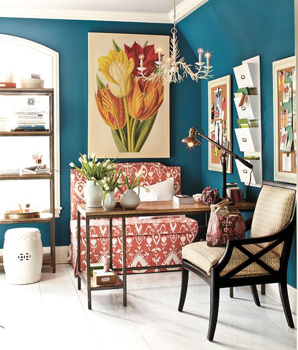 However, the guests will praise and leave, and you still have to live in all this.
Red, of course, warms, but even for large rooms it is acceptable within reasonable limits. It is better to “damp out” its activity with white or light gray shades of carpet, furniture, decor items, curtains.
It is believed that melancholics or large originals choose the blue color as the decoration of the living room. Meanwhile, the blue range is very popular among designers this year. Most often, the decor uses a white and blue combination with red and black accents, which help to avoid excessive contrast and lifeless coldness. Yellow and orange accessories and parts are also acceptable.
Asya Bondareva, designer:
— There can be absolutely any color for the living room, I prefer to start from the chosen concept, it is it that gives a reasonable approach to choosing a color scheme. If, for example, our concept sounds like “the positive of the 60s”, then the color scheme is immediately born: blue, yellow, orange, turquoise, a lot of white, glossy.
bondarevadesign.ru
Purple in the interior is a sign of a creative person. This is undeniable. But keep in mind that the purple color balances between a warm red spectrum and a cold blue. In many ways, balance can be maintained thanks to the right lighting, both natural and additional artificial. Amateurish experiments with purple can spoil a great idea, so be sure to ask the designer for advice.
Shades of white, beige, grey, coffee and indigo are violet's friends. But in any friendship, a measure is good.
Black living room is not always gloomy, but always very stylish, extravagant, intelligent. Of course, it is not easy to decide on such an environment and design. But rest in such a room will allow the owner to relax, immerse himself in thoughts, distract from the brightness of the outside world. The combination of black and white is an eternal classic, it is always modern.
Chrome-plated fittings, silver accessories and glossy or matt surfaces create a harmonious stylistic composition. A couple of bright accessories will give a noticeable liveliness to such an interior, which will not interfere with you in case of an attack of melancholy.
Inga Azhgirey, designer:
— It is necessary to determine the cardinal directions in the room, with the main and additional, artificial lighting. The whole family gathers in the living room, friends come here. It is important that everyone feels comfortable here. Let the choice of color for the living room become a common family decision.
We need to consider whether we want to highlight some wall with color or make the color of the wall a background for paintings, family archives, and so on. It is also good to focus on the amount of time when the sun looks into the living room, the morning is mainly hours, daytime or evening. In the "southern" room, cooler shades are appropriate, in the "northern" - warmer. However, if in the "southern" room the sunlight in the window covers a tree or a house opposite, warm shades will be preferred.
facebook.com/inga.azhgirei
Chocolate shades just scream - give us light! Lots of light! In a room with poor lighting, shades of cocoa, chocolate, coffee with milk will lose their tenderness and charm - dusk is contraindicated for them. But the possibilities for combining with other colors are almost endless. But gold looks especially luxurious against the background of brown. Good gray, beige, white, pastel green.
Brown shades bring noble notes, give peace and relaxation. A family evening in such a living room is very close, believe me! But you need to choose this color scheme very carefully - too dark brown can greatly "reduce" the space.
Inga Azhgirey, designer:
— I think that the color and its saturation in the living room, as in other rooms, also depends on the composition of the family. For a large family, for “warm” communication, calm, clear, soft tones are good. Then the room in your feelings will be cozy, "home". And this does not interfere with the accent decor.
When choosing colors “on a fan”, you need to understand that when transferred even to panels with samples, the colors will no longer be the same as on the “fan” - they can be warmer, colder, pinker, and so on. Therefore, I recommend choosing initially more “complex” and “closed” colors for coloring. They, of course, also have the potential to look darker. In a room, I always paint on both the light and shadow walls, and in the niche - this allows you to immediately see the behavior of the color in different parts of the room. And also I look at the color in the morning and in the evening.
facebook.com/inga.azhgirei
Coral is a color beyond time and season. He is so beautiful that they want to admire endlessly. Framing windows with coral curtains seems to enhance the brightness of sunlight and expand the boundaries of the room. Armchairs with coral upholstery are regally good! Pillows covered with textiles in this color decorate the interior of the living room with bright spots.
The combination of coral with brown and coffee shades looks perfect. A little greenery does not hurt - in general, it turns out very harmonious and cozy.
And finally - simply unrealistically beautiful interiors! This is the famous tiffany color, which not everyone dares to use because of its saturation and exactingness to pastel "partners". If you figured out that a tiffany color living room is exactly what you want, think about how the rest of your house or apartment will look like. Pastel colors are preferred in all other rooms.
But before you make a decision, ask yourself: what do you want from the new interior? How many people and how often will gather in your living room? How will it look at different times of the day or in different seasons? And in general, what do you want to find a highlight that will make your living room stylish, cozy and unique?
Asya Bondareva, designer:
— Talking about the choice of color in an abstract way, without tying it to any future interior story, is dangerous - then you can slide into uncertainty in the choice and into disagreements, because there is no starting point for fantasy.