How to design interiors
How to Decorate Your Home - Real Estate Guides
By Tim McKeough
Header photography by Yasu + Junko; styled by Elizabeth Press
Moving into a new home can be one of life’s great joys, but it can also be a time of uncertainty, especially when it comes to decorating. How do you make your space look its best while reflecting your personal sense of style? Do it well and you’ll end up with a comfortable, happy home. Do it poorly and you’ll end up with a hodge-podge of furniture, fabrics and paint colors that never congeal into a pleasing whole. With a little planning, and by following the same steps used by professional interior designers, you’ll have a much greater chance of success.
Interior Decoration: Laying the Groundwork
To reach the finish line, you first have to know where you’re going.
Don't Start in the Furniture Store
Many have heard the advice to avoid grocery shopping when you’re hungry, because it leads to poor choices. The same holds true for furniture stores – don’t go shopping in a panic, just because you have an empty home. Yes, you need a sofa. But if you pick the pink-striped sectional just because you like it in the store, without taking measurements or thinking about the rest of the room, you’re stuck with it. The rest of the room will have to be built around that sofa, and if it’s too large for the space it will look forever awkward.
Start in the room you’re looking to furnish, armed with a measuring tape and a notepad.
Know Your Measurements
Matching the scale of furniture to the scale of a room is critical. A deep sectional sofa can easily overpower a small room and svelte chairs can get lost in a wide-open loft. Before you start designing, measure the length and width of each room you intend to decorate, along with the ceiling height and elements that could get in the way – stairs, columns, radiators and other obstructions. It’s also a good idea to measure window openings, along with the wall space below, above and to the sides of each one, to get ready for window coverings.
“The first mistake most people make is that they buy things that are the wrong size – sofas that don't fit in the room, sofas that don't fit through doorways, tables that are too small, desks that are too big, nightstands that hang into the doorway,” said David Kleinberg, founder of the New York interior design firm David Kleinberg Design Associates. Carefully measuring your space can help avoid such problems.
Create a Floorplan
Once you have the measurements of your room, it’s time to put them to use with a floor plan that gives you a bird’s eye view of the entire home. “Every job should start with a floor plan,” said Alexa Hampton, the president of Mark Hampton, the New York interior design firm founded by her father. “You need to know the space.”
One option is to draw a floor plan the old-fashioned way, with paper, a pencil and a ruler. However, most professional designers use drafting software like AutoCAD. In between those two extremes are apps that aim to make it easy for homeowners to create simple floor plans (some even automate measurements with your smartphone’s camera, but double-check those numbers), including Magicplan, Floor Plan Creator and RoomScan Pro.
Once you have the outline of the space, start experimenting with the placement of furniture, making sure that the footprint of each piece is scaled to match the size of the drawing.
Decide How You Want to Live
This is the tricky part, and there are no right or wrong answers. Rooms can be traditional or modern, formal or relaxed, and visually warm or cool. “To the best of your ability, you have to try to discern how you would like to live in a given space,” said Ms. Hampton. “What will you be doing? How many people live there? Are there children? What are your ambitions for how you would like to live?”
The decoration of a home for someone who regularly hosts large dinner parties, for instance, should be different from a home for someone who eats out at restaurants every night. The person who plans to host lavish fundraisers should have a different living room than the person who dreams only of crashing in front of the TV.
Copy the Pros
Look in design books and magazines, as well as at online resources like Houzz, Pinterest and Instagram to sharpen your personal style. “Figure out the style that you respond to most,” said Brad Ford, an interior designer in New York City, and develop a dossier of favorite images.
Once you have images you like, study the details, advised Mr. Kleinberg. “See where pattern is used versus where solids are used, and where color can be used successfully or not,” he said. It will also help inform everything from the type of furniture you might like to a potential strategy for window coverings.
Tape It Out
To take ideas on a floor plan one step farther, use painter’s tape in the real space to outline where furniture will be placed on floors and against walls.
“We use blue tape on the floor to box out different elements,” said Anne Maxwell Foster, an owner of the New York interior design firm Tilton Fenwick. “Where will the rug be? Does it need to be cut? How far is the coffee table coming out? Even though we have everything down to a sixteenth of an inch on a furniture plan, there's something helpful about visualizing it in the space, and being able to walk around.”
Develop a Budget
There’s no getting around the math: If you splurge on an unexpectedly expensive chair, you’ll have less money available for the rest of the home. “You want to make sure you're being strategic about how you spend your money,” said Mr. Ford. “A budget gives you a roadmap for how to divide the costs of things between rooms.” You can still make an exception if you find a one-of-a-kind dining table, he noted, but in order to pay for it you have be thoughtful about where else you can cut back.
Plan the Phases
Finishing drywall, refinishing hardwood floors and painting ceilings is all messy work. If at all possible, it’s better to have this type of work completed before moving any furniture or accessories into the space.
If it can’t be avoided, seal large furniture under plastic drop cloths and accessories in boxes with tape to protect them.
Read More About Planning Your Decor
Entryway Ideas
The foyer or entrance hall creates the first impression, so make it count.
Make a Statement
Don’t hold back. “That room is the power moment when somebody walks into your home,” said Suysel dePedro Cunningham, an owner of the interior design firm Tilton Fenwick. “It can say so much about your personality and design taste.”
For that reason, a wall finish that might seem like too much for a living room or bedroom may be ideal in a foyer. “It’s a place where you can do a bold color, a lacquer or a wallpaper for a ‘Wow’ moment that you might be scared of in a large living room,” she said.
An added benefit? Statement-making wall coverings and finishes tend to be expensive, but because foyers are usually small, these products can often be installed without breaking the bank.
Design to Your Routine
With a few key furniture pieces and accessories, you can make your daily arrival and departure sequence a breeze. “Typically, it's not a huge space, so you're working with a limited number of pieces,” said Mr. Ford. If you’re the kind of person who likes to drop everything when you walk in the door, “a console with drawers is great, because it’s a nice place to hide your keys and mail,” Mr. Ford said. Or, in the absence of drawers, a bowl, tray or other sculptural container can serve as a catchall to help keep things organized.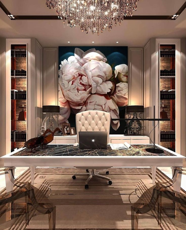
A bench or a stool or two that slide under the console can provide a place to sit while lacing up shoes while taking up minimal floor space.
Another helpful element is a wall-mounted mirror, said Mr. Ford. “It gives you one last chance to check yourself before you walk out the door.”
Plan for the Weather
As the first space people enter when coming from outside, the foyer has to deal with a lot – ice, snow, rainwater, mud and whatever else Mother Nature decides to deliver. To avoid having these things creep into the rest of the home, you need to deal with them at the front door.
The effort begins even before you cross the threshold. “I like to have a mat outside the door, so people can wipe off their feet before even stepping inside,” said Mr. Ford.
Inside, you can follow up with an indoor-outdoor rug. An umbrella stand not only keeps umbrellas handy, but also prevents wet ones from draining on the floor. Storage bins or baskets, which can be stowed under a console (if the space isn’t taken by stools), can contain soggy hats and mitts. If your foyer doesn’t have a closet, buy coat hooks or a rack. These are all functional pieces that can serve double-duty as decorative elements as well.
Dining and Living Room Decor Ideas
The main living areas, whether they are separate rooms or combined in an open-concept space, set the stage for life with family and friends.
Create the Palette
You can see colors, patterns and metal finishes online, but digital images are mere approximations of what the real things look like. Wherever possible, order color chips, fabric swatches and material samples to be sure finished products will meet your expectations. “You can order samples from most vendors, and it’s always best,” said Mr. Kleinberg. “Some colors blend together,” when viewed on a screen, he added, and it can be difficult to differentiate cool and warm tones.
Don’t just look at the samples in isolation. Pin them to a board or put them in a tray to see how well they work together. “All greens play nicely together,” said Mr. Kleinberg. “All blues fight.” Putting samples side by side is the way to see if different colors and patterns will live in harmony or tension.
Ms. Hampton sometimes goes one step farther. “When we’re working on a fabric scheme, we’ll put the fabric on the copier, reduce it, cut it into the right shape for the floor plan and paste it down,” she said, “so we can see how the various fabrics spread through the room.”
Treat the Walls
Paint colors are notorious for appearing different hues in different light conditions (and seeming to change between the paint store to home). This effect is only amplified once you slather it on four walls. For that reason, it’s never a good idea to commit to a paint color when you first see the chip in a store. Look at the largest chip you can get in the room you plan to paint, at a minimum.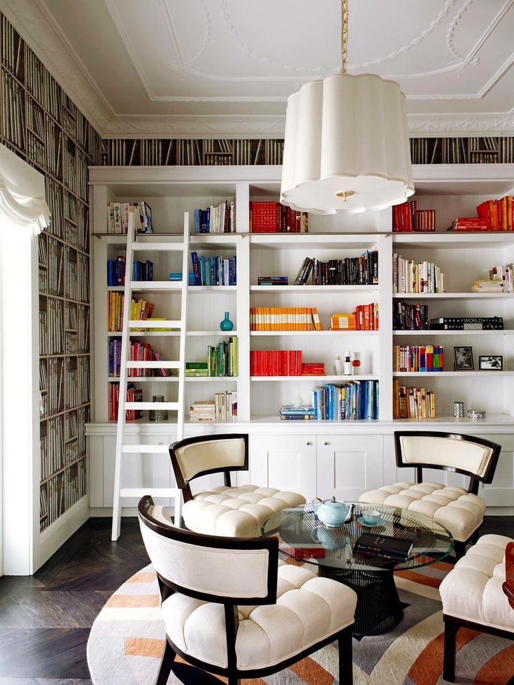 Better yet, paint large sample patches on walls or on boards that can be moved around and view them at different times of day.
Note: As long as you test the color before painting the entire room, there’s no reason to be scared of bold, saturated colors.
Once you have a color selected, choose the sheen. Matte or flat paints offer a pleasant gauzy appearance that also hides wall imperfections, but can be difficult to maintain, clean and touch up. “I tend not to do matte walls, in general,” said Ms. Hampton, who prefers paint with an eggshell or satin finish that is just slightly glossier and easier to scrub.
Baseboards, moldings, doors and other trim can be painted the same color as the room to make them visually recede, or a contrasting color — usually an off-white in a room with colored walls — to make them more of a feature. Trim can also be painted with a different sheen than the walls. A semi-gloss sheen will bring more attention to moldings while adding durability.
You should also decide how you want to treat the ceiling. You can paint it white for a crisp feel, or the same color as the walls for a cocooning feel. It’s safe to use a matte or flat sheen because the ceiling is rarely touched by dirty fingers or smudge-creating objects. If the surface is perfectly smooth, it can also be painted with a glossy finish as a design feature that reflects light down into the living space. (If your ceilings aren’t smooth, don’t do it — the glossy sheen will only highlight imperfections.)
For something unexpected, consider looking beyond paint. Manufacturers offer a multitude of alternatives, including patterned wallpaper, grass cloth, upholstery fabrics, wood paneling and even stone and brick veneer.
Choose the Furniture
Working from your floor plan and inspiration images, choose the specific pieces of furniture — the sofas, chairs and tables — that will make the space livable. Depending on the desired vibe, you can go in wildly different directions.
For a traditional room, focusing on a symmetrical layout often helps — for instance, installing a sofa and coffee table centered on a fireplace, with matching armchairs on either side. “A very symmetrical space can be beautiful and formal,” said Ms. Hampton. On the other hand, “if you choose a sectional sofa, it’s probably going to be a less formal space,” she said, with an asymmetrical layout.
Seat height is also important. Sofas and lounge chairs in the same room should have seats that are at similar heights to avoid some people sitting much higher than others. In general, lower seats offer a casual, laidback feel, and higher seats come off as more formal.
Whether the space is casual or formal, there is a rule of thumb to keep in mind: The number of dining chairs should roughly match the number of spaces for lounging. “That’s an old truth my father shared with me,” said Ms. Hampton. “If you’re planning to have 12 people at a dining room table, you should have 12 seats in the living room,” for entertaining before and after the meal.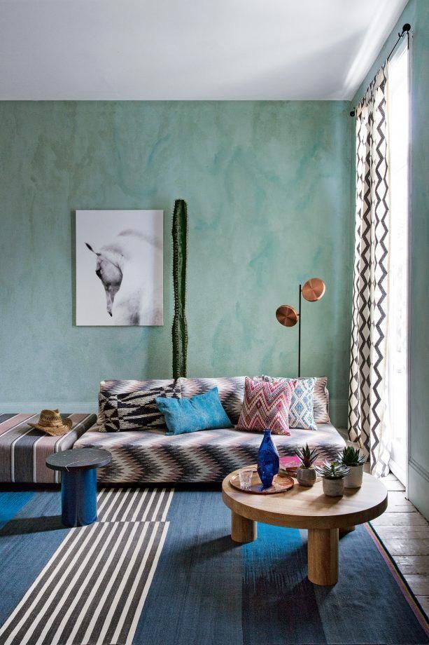
How Things Flow
No living room sofa or chair should be an island of its own. When people sit down, they almost always need a place to put a drink or book, as well as light to read by. Place a coffee table or end table within easy reach of each seat, along with a table or floor lamp.
No one wants to stub a toe on a chair leg, so you’ll also want to ensure there are clear walking paths through the living room, and that no furniture blocks part of a doorway or makes it necessary to squeeze by.
Will your living room have a TV? If so, plan for a wall mount or a media unit to hold it, as well as a path for cables that won’t be unsightly.
Do you plan to host buffet-style dinners? If so, a credenza or sideboard near the dining table will allow you to serve in one space rather than having guests traipse through the kitchen.
Add Rugs
A living room with hardwood floors but no rug looks naked. For visual and literal comfort, add a rug.
There are three common strategies for doing so:
- A room-filling rug.
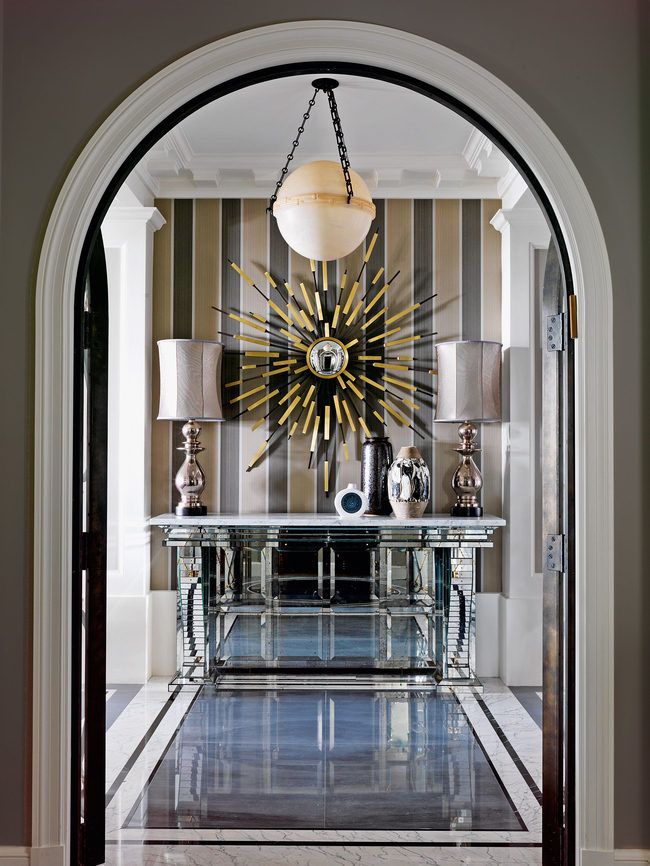 Install a rug that covers almost the entire floor of the room, leaving a border or just a foot or two at the edges. This usually works best in smaller rooms.
 - Seating area rugs. Break a larger room down into multiple seating areas by using rugs to visually hold each group of furniture together. Or, in an open-concept space, use a rug to hold the living area together, while allowing the dining area to sit directly on the wood floor.
- Layered rugs. Pile smaller rugs on top of a larger one to create extra visual interest while reinforcing the layout of the room.
Be generous when selecting sizes. A small rug under the coffee table that doesn’t reach the legs of sofas and chairs will look like a raft lost at sea. The rug should extend about halfway, or fully, under the furniture at its edges.
Finish With Art and Accessories
The last step to finishing any room is to add art and accessories, but there is no one-size-fits-all approach.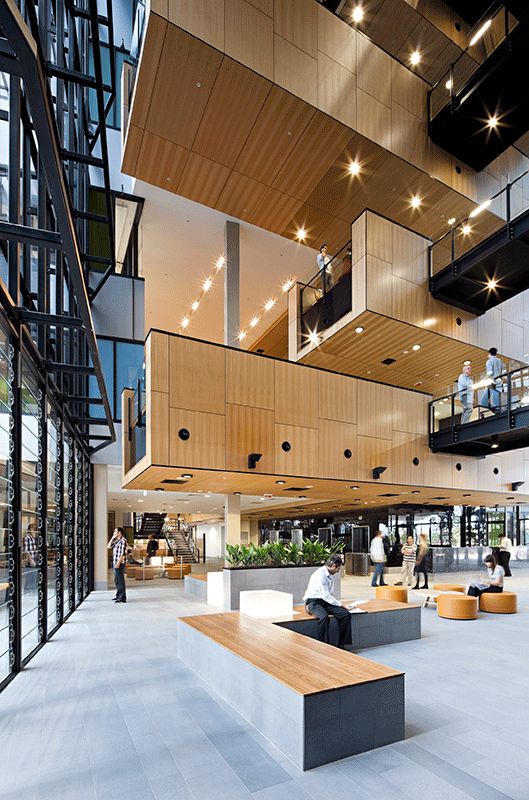 In a minimalist space, it might be just a few objects; in a maximalist space, it could involve displaying entire collections and layers of objets d’art.
Go back to your original inspirational images and study the way those rooms are accessorized. Do they mix candles, boxes, bowls and books together, or is there just one vase on a table? Is there a single artwork above the sofa, or a freeform gallery wall?
Be sure to consider your functional needs. A tray on an ottoman can contain remote controls. Throw pillows provide extra back support for deep sofas and chairs. A magazine rack can keep reading materials out of the way. Attractive baskets are ideal for tidying up children’s toys in a hurry.
Bedroom Decor Ideas
Designed correctly, a bedroom can serve as your nightly sanctuary.
Plan the Furniture
It’s called a bedroom for a reason: the bed is the key piece of furniture. As such, it should be given pride of place in the room, most likely with the headboard positioned against one wall and paths for walking on both sides.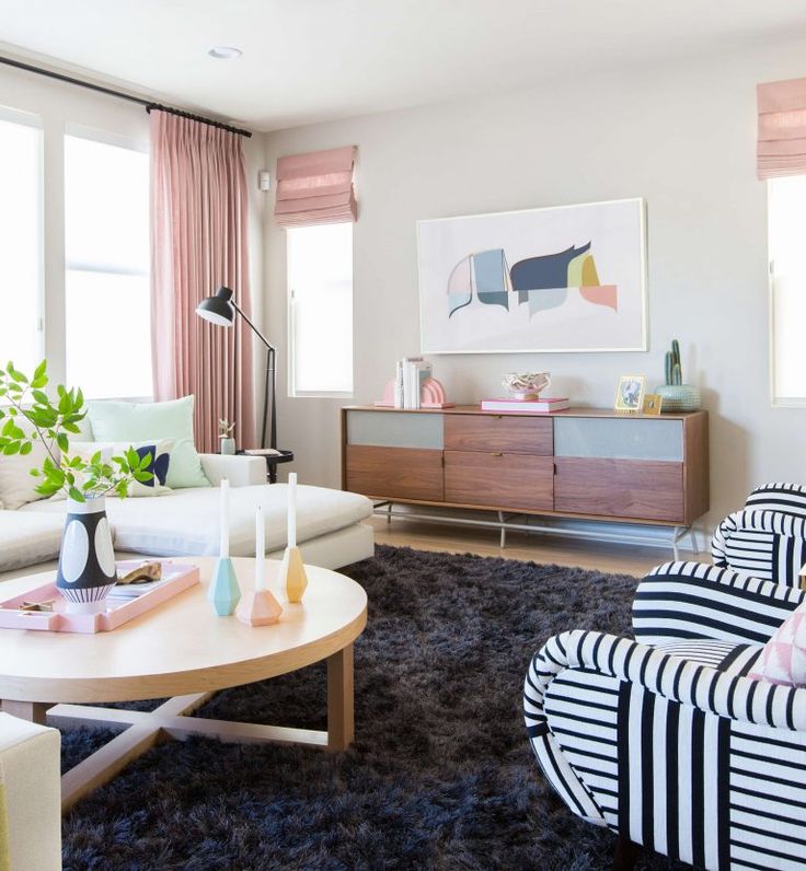
“Don’t shove a bed in the corner,” if at all possible, said Nick Olsen, a New York City interior designer. “They’re impossible to make, and uncomfortable for two people to use.”
One exception: children’s bunk beds. Because they already have safety rails that usually only allow access from one side, there’s no reason not to have one in a corner.
If there’s space, install nightstands on both sides of an adult bed for convenience. They could be simple small tabletops, tables with a single drawer for storing essentials, or something larger. “Consider whether you need extra storage space,” said Mr. Olsen. “You can use two dressers for nightstands,” to provide space for folded clothing.
Do you like to watch TV in bed? If so, you’ll want a dresser, cabinet or console table near the foot of the bed that can hold the TV while providing additional storage (unless you plan to mount it on the wall or spring for a motorized stand).
Many designers also like to put a single chair in the corner of a bedroom, not only as a place to rest but also as a landing pad for tossed clothing and personal accessories when you’re in a hurry.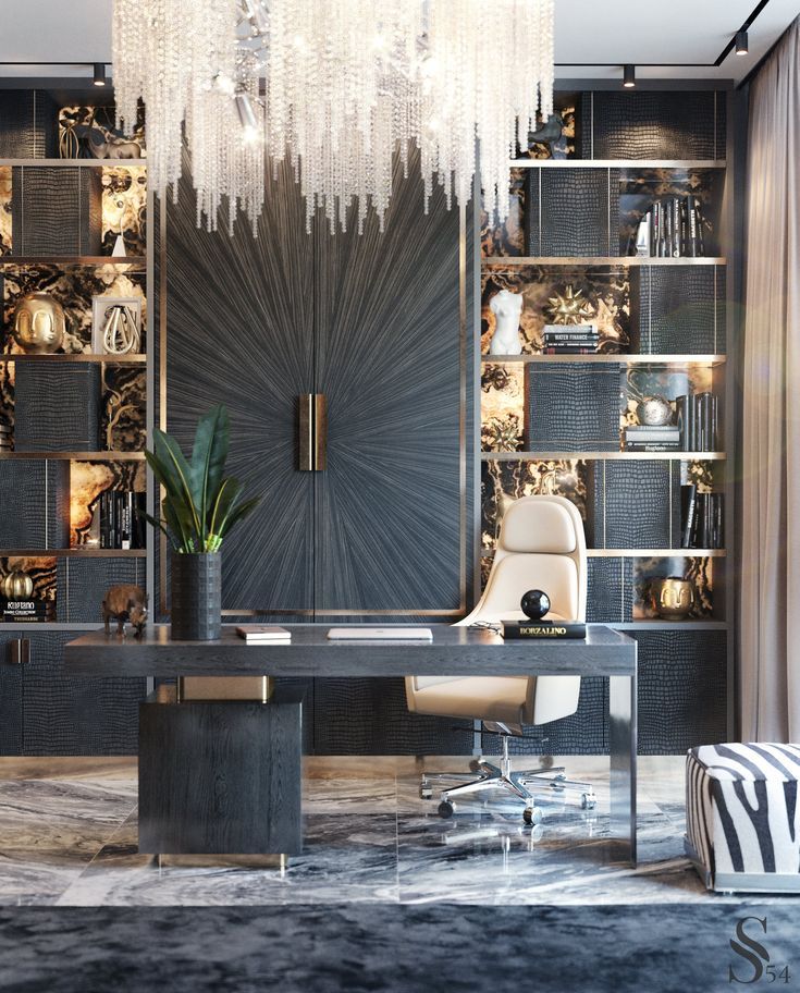
Make It Soft
Because the goal is to create a space that feels calm and inviting, a bedroom is probably not the place to use bold colors or graphic wallpaper. “I would avoid anything that feels aggressive,” Mr. Olsen said. “Even though I like bold colors in my decorating, I like paler tones in the bedrooms: gentle blues, greens and yellows.”
Some designers even upholster bedrooms walls for a literal soft touch.
Underfoot, Mr. Olsen advocates adding some kind of textile to warm up cold, hard floors – either wall-to-wall carpeting, a large rug that extends underneath the bed or smaller rugs on either side of the bed, and perhaps at the foot of the bed.
Make the Bed
There are many different ways to make a bed, and the subject of whether or not you should use a top sheet has been the subject of fierce debate in recent years. Much comes down to personal preference and whether you desire a bedroom that feels casual or formal.
It’s possible to make a bed with nothing more than a fitted sheet over the mattress, a nice duvet and a couple of pillows. But for something a little more formal, you need more layers.
Mr. Olsen has a very specific way of making a bed, which he says was passed down to him from the designer Miles Redd, who learned it from the doyenne of decorating, Bunny Williams. “I do a fitted sheet, a top sheet, and some kind of blanket, which varies in weight based on the season – a cotton blanket for summer or a wool blanket for winter,” said Mr. Olsen. “Then, four standard-sized pillows, usually down, which I stack. Then a decorative pillow stacked against the standard ones. Then, I do a down duvet with a cover folded at the foot of the bed.”
Mr. Olsen recommended keeping the sheets simple – perhaps hotel-style white linens with a subtle embroidery detail at the edge – and bringing in color and pattern with the top two pillow shams and decorative pillow.
Wirecutter productThe Best Sheets
L.L.Bean 280-Thread-Count Pima Cotton Percale Sheet Set
If you like a cool, crisp feel to your sheets, these are comfortable, very breathable, and reasonably priced.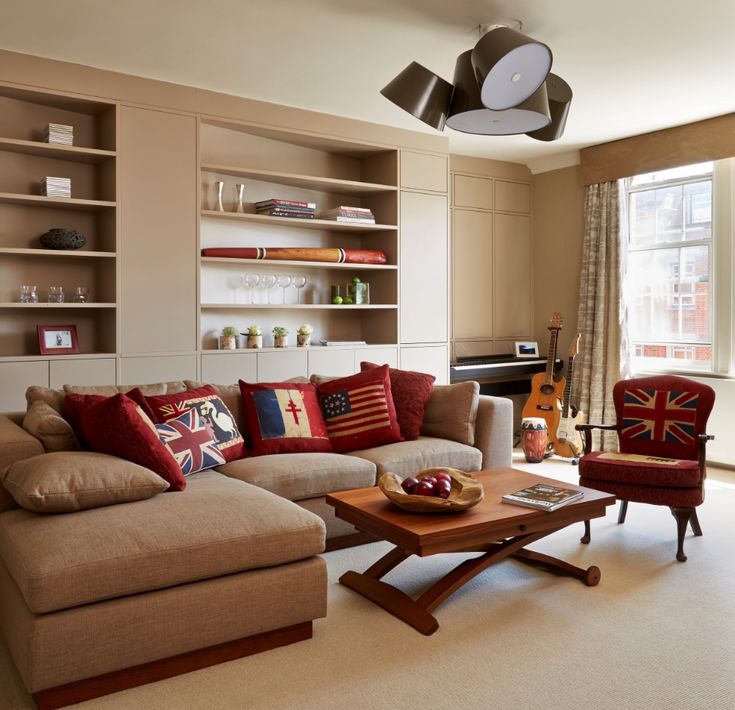
More Wirecutter sheet picksRight Arrow IconRight Arrow Icon
Wirecutter productThe Best Bed Pillows
Xtreme Comforts Shredded Memory Foam Pillow
Moldable and adjustable, with excellent support for back-, side-, and some stomach-sleepers, this is also one of the most affordable pillows we tested.
More Wirecutter pillow picksRight Arrow IconRight Arrow Icon
Wirecutter productThe Best Comforter
L.L.Bean Baffle-Box Stitch Down Comforter, Warm
Sleeping under this comforter was a delight: It felt lofty and warm, but breathable and includes L.L.Bean’s excellent satisfaction guarantee.
More Wirecutter comforter picksRight Arrow IconRight Arrow Icon
Control the Light
The ability to control light – both natural and artificial – is important.
If you’re sensitive to sunlight when sleeping, you want to have the ability to eliminate it completely. The best way to do so is with a blackout roller shade or a Roman shade with a blackout lining.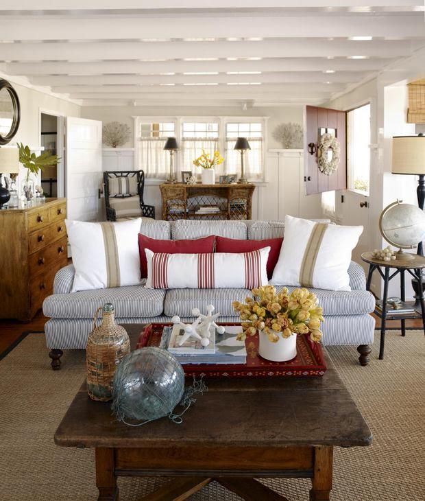 However, sunlight will still usually leak into the room at the edges of the shade. To block it, add curtains with a blackout lining.
At night, it’s helpful to have layers of lighting. An overhead light allows you to illuminate the whole room quickly, but may not do much to set the right mood.
A pair of lamps on bedside tables usually offers a more appealing glow. Many designers use table lamps as well as wall-mounted lamps, either hardwired or plugged into an outlet, on either side of the bed. The table lamps provide an ambient glow, and the wall-mounted lamps provide directional light for reading. “It’s nice to have both, but they shouldn’t compete for attention,” said Mr. Ford. “You want a super simple table lamp and a really decorative sconce, or vice versa.”
In terms of control, “Every light should be on a dimmer,” said Mr. Olsen – good advice for every room of the home.
Kitchens and Bathrooms
Customizing these spaces can add personality without requiring a gut renovation.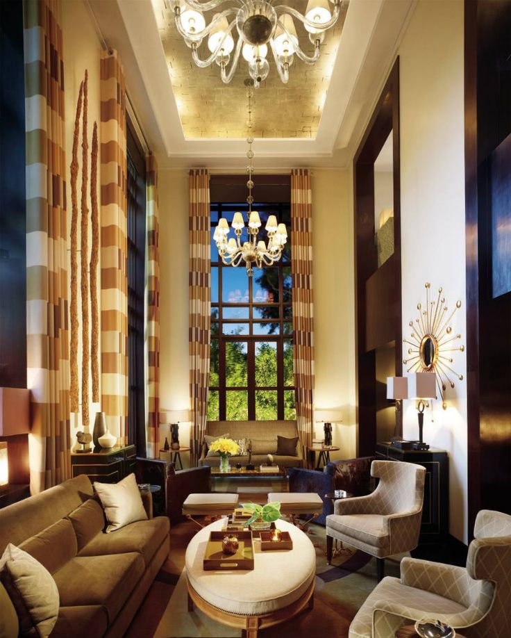
Evaluate Cabinets and Counters
Changing kitchen counters is no small undertaking, but switching from an inexpensive material, like laminate, to a luxurious one, like marble, granite or quartzite, can significantly change the overall appearance of a kitchen or bathroom.
The kitchen backsplash is another area ripe with opportunity. Even if you leave the existing counters in place, you can add or replace an existing backsplash using a favorite tile made from ceramic, glass, metal or cement.
If kitchen cabinets and the bathroom vanity cabinet are simple and in good shape, it’s often possible to paint them a new color for a different look. If the cabinet doors have a design that looks dated, you can sometimes keep the existing cabinets carcasses, and replace the doors only.
In the case of a cheap bathroom vanity, it’s often economical to replace the whole thing. Many companies offer prefabricated vanities, complete with matching tops and sinks.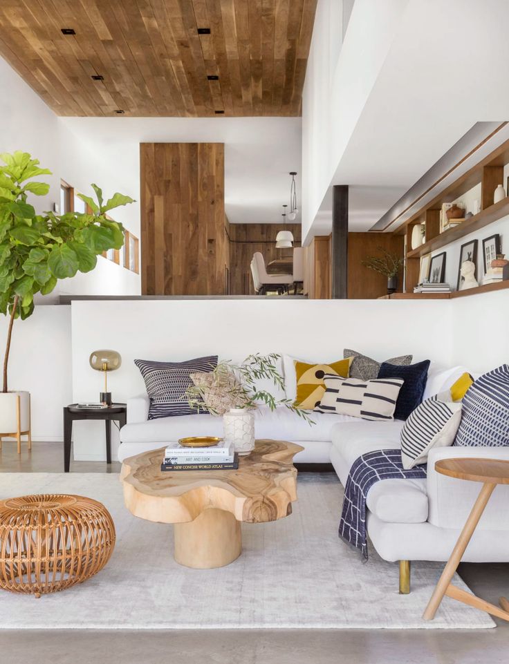
Focus on Things You Touch
Simply replacing cabinet pulls with new hardware can significantly change the look of a kitchen or bathroom. The kitchen and bathroom faucets are also no place to skimp – you touch them every day, so choose models that not only look good, but also have handles that feel reassuring when you turn them, and heads that offer the functionality you desire.
In a bathroom, this line of thinking extends to accessories as well – quality towel bars, robe hooks and toilet roll holders can all give the room an upgraded appearance at minimal cost.
Refresh With Textiles
There’s no point in having nice towel bars if they’re holding frayed or mismatched towels. Recycle your old ones and buy new towels and washcloths in a single solid color (you deserve it). For a decorative accent, add patterned hand towels.
If there’s a mildewed shower curtain around the tub, replace it with one made from a pleasing material like linen, or a glass panel.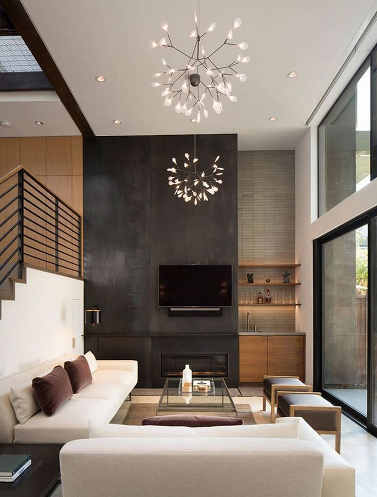
If the bathroom or kitchen floor leaves something to be desired, but you don’t want to go to the trouble or expense of tearing it out, you can cover it with a large woven vinyl rug or mat from a company like Chilewich or Bolon.
Wirecutter productThe Best Bath Towel
Frontgate Resort Cotton Bath Towel
This is the softest towel we tested—it feels like a plush towel from a luxury hotel and comes in a wider variety of sumptuous colors than any other we found.
More Wirecutter towel picksRight Arrow IconRight Arrow Icon
Don't Forget the Powder Room
Because it’s so small and used infrequently, a powder room is the perfect place to let your inner decorator run wild with bold colors and wall coverings.
“If you entertain, it’s so much fun to make it an unexpected, cool element,” that will surprise guests, said Mr. Olsen, who has designed powder rooms with wild wallpaper and mirrored wall panels.
That sentiment was echoed by Ms.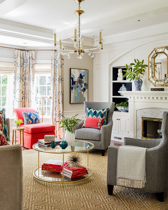 Maxwell Foster: “Find a wall treatment you love, and just go for it.”
Finally, remember that decorating should be fun. By starting out with a plan, and following the same steps used by the pros, you’ll make the experience significantly less stressful that going at it in a haphazard fashion. And, hopefully, you’ll end up with the ultimate prize: the home of your dreams.
Decorating 101 - Interior Design Basics
If you weren't born with the ability to imagine a room complete with furniture placement, wall hangings, and rug and accent choices, it is something you can develop and hone over time. Learn the basics of home decorating, including design principles, decorating styles, and answers to decorating challenges.
Interior Design Compared With Interior Decorating
Interior design and interior decorating are often mistaken for the same thing, but the terms are not completely interchangeable. Interior design is a profession that requires specific schooling and formal training, including space planning, furniture design, and architecture. An interior decorator does not have that formal training and focuses on the aesthetics and the surface appearance of a space. Who you would hire depends on whether you have any structural work or space planning to be done or you need someone to plan the decor only.
10 Must-Have Apps for Serious Interior Design
Elements of Decor
Your first step should be to select a style for your home interior. This will promote the design principle of unity and harmony, thinking of the entire home with a unifying theme. It can be as simple as choosing shabby chic instead of formal or traditional instead of contemporary. From there, you can refine it to a more specific style, such as French country, Tuscan, or modern Victorian.
Balance is another principle—distributing the visual weight in a room. You can do it symmetrically, as is common in traditional interiors, or with asymmetrical balance as seen in casual interiors.
Within each room there should be a focal point.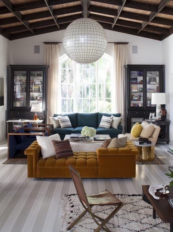 In a living room, it could be the fireplace or a piece of art. It sets itself apart by scale, color, or texture.
Contrast and variety add visual interest to a room. Keep rhythm in mind with repeating elements of the same color, texture, or pattern, and a progression of sizes or colors.
FollowTheFlow / Getty ImagesColor
Choosing a color palette is an essential part of interior design. While you could have a different style and color scheme in each room, often you will want to tie the whole dwelling together. Consider the right colors for a small room as well as colors and patterns for a large room.
The Spruce / Michelle BeckerPatterns
Mixing patterns in home decor is one of the more advanced parts of interior design. Patterns do not have to match, but they need to complement and coordinate with each other. This is done by considering color, size, and scale.
KatarzynaBialasiewicz / Getty ImagesTips to Get Started With Your Decor
A major pitfall that traps untrained decorators is editing. A good interior decorator can scan a room and understand what items work in a room and when something is too much, tasteful, or requires embellishment. A few tips in this area can make or break your room's design choices.
One room element that can usually use an editorial eye is how pillows are placed. Pillows can be a nice accent adding to the room's color story, or in some cases, even create a focal point for the room. However, some people have a tendency to overdo it with pillows. Avoid overloading a sofa to the point that a guest has to move all the pillows just to sit down.
Choices of artwork can be important for a room, but equally consider how you display it. A rule of thumb is to set wall hangings at eye-level. Similarly, the height you set the chandelier matters. A common mistake people make is hanging a chandelier too high or close to the ceiling. Drop it low enough that it brings light into the room and is noticed. If you hang it above a table, make sure that when you sit up from the table, your or any taller guests cannot knock into it.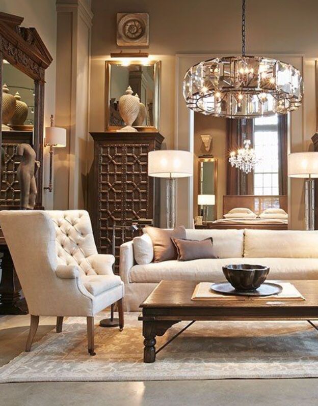
Furnishings are a big investment and account for a large part of the budget of room decor. If you are on a tight budget, there are some items you should splurge on. The two most important pieces of furniture—likely the items that will get the most use—are your sofa and bed. Spend more on those pieces. Save on area rugs, accent tables, and wall art. A mixture of high-ticket items with less expensive options is a trick of the trade that makes the room still feel stylish without breaking the bank.
How to design the interior design of the room: ideas, finishes, materials, photo
Content:
- Materials for finishing Classic style of the bedroom
- Modern -style 9000 9000 Bedding in the eastern style Bedroom in historical style0005
- classic;
- modern;
- minimalism;
- Asian - Japanese, Chinese, Indian, Boho;
- historical - Empire, Baroque, Victorian, Rococo;
- romantic rustic - provence, country;
It is better for owners of small one-room apartments to decorate their housing in a single style (especially if it is a studio) - this is a great way to create a harmonious space around, visually expand the boundaries of the apartment and bring the ideas of an actual modern interior to life.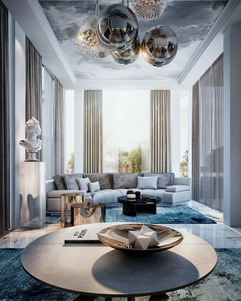 However, the owners of spacious apartments have their own indisputable advantage - the ability to embody all their design ideas in each individual room. A special interior design in each room is undoubtedly very interesting for creative natures.
Finishing materials
Special apartment interior design
Building materials, especially finishing materials, literally create the basis for the perception of a house. For example, metal or metal-like finishes will make the room strict and solid, bare brickwork will create a feeling of medieval antiquity, wooden beams are the hallmark of a romantic country style. If the room is finished for a romantic person, soft surfaces should prevail in it.
Original decoration of the apartment with quality materials
Very often in modern apartments with good audibility, the renovation project involves the use of soundproofing materials. Usually, multilayer noise absorbers are taken, in which the sound is lost passing through several layers - material - air - material. The texture of finishing materials also contributes to noise absorption.
Tip! If you want a light and airy atmosphere in the room, you need to use more glass surfaces, which noticeably lighten the interior. Wood has the same property. Wood makes a room lively, cozy and safer, because it is an environmentally friendly product that breathes and has its own natural fragrance.
It can be concluded that with the help of building materials it is possible to create a separate atmosphere for each room. To express your self, you can use a certain style of room interior design, and, as you know, there are a lot of them. What are the most common styles in interiors can be listed:
When different styles are combined in one interior, this direction is called kitsch or eclecticism.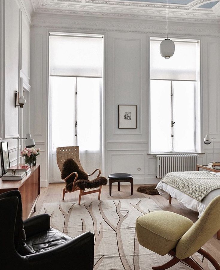
Classic bedroom style
Classic bedroom interior design style
Classic interiors always look noble, combining functionality and beauty. As a rule, classic interiors look better in spacious rooms with high ceilings. This style is characterized by the presence of decor, wall paintings, natural finishing materials. Wallpaper is usually selected with patterns or monograms.
Classic design of a room in an apartment
Part of the bedroom is usually occupied by a spacious wooden bed with a wooden headboard on curly different legs. The classic style cannot be called concise. It is characterized by the presence of numerous and large furniture: bedside tables, wardrobe, chest of drawers. Usually this style is chosen by the generation over 45, which is already more conservative due to age.
The modern furniture industry and a variety of decor elements make it possible to solve the problem when you really want a classic interior, but the room has a small area. In this case, you can pick up the same set of furniture, only in reduced sizes. On sale you can find solid furniture in a classic style from precious woods of different sizes. Clay stucco can be replaced with lighter and smaller polyurethane, multi-layer massive curtains can also be ordered in a more concise version.
Bedroom in Art Nouveau style
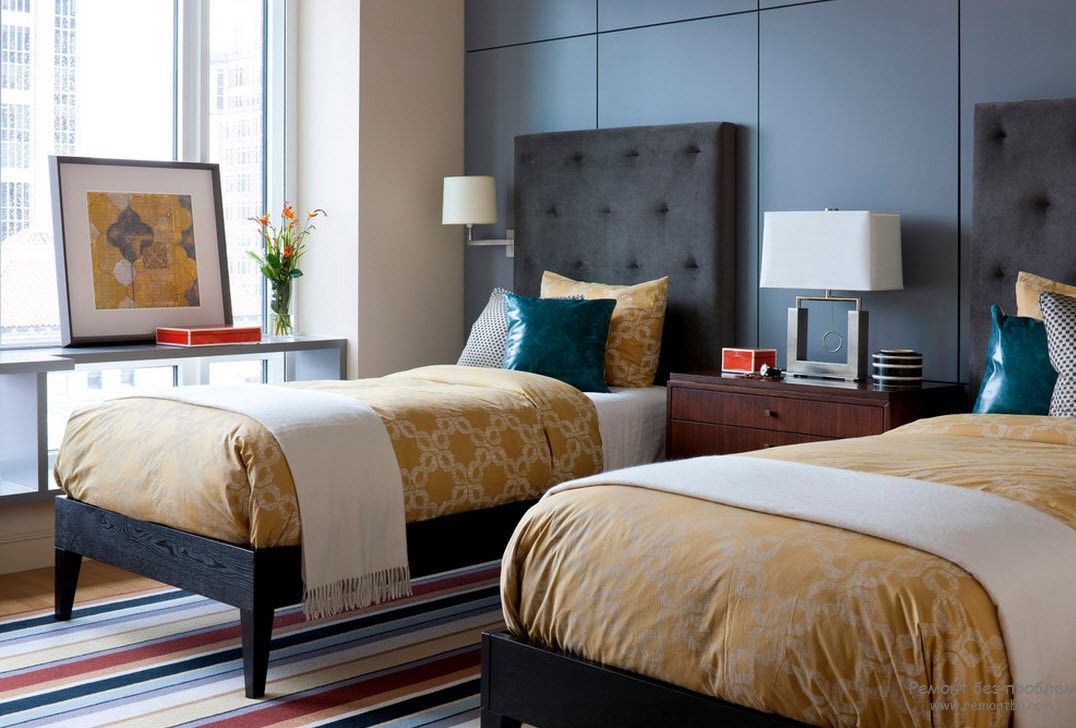
Modern interior design of a bedroom
Fashionable design of a room in an apartment in a modern Art Nouveau style is geometric laconic forms, minimalistic decor, a combination of natural and synthetic materials. The modern bedroom is distinguished by original and spectacular external characteristics and practical functionality. Embodiing this style in the interior, you need to be able to combine an atmosphere of comfort with fresh design ideas.
Special bedroom interior design in Art Nouveau style
This style is not particularly difficult to implement. Its main advantages are that you can take color combinations and any finishing materials. In Art Nouveau, you can combine traditional interior elements incompatible with other styles with modern ones and use the latest technological advances.
However, in order to achieve a feeling of home comfort, you will have to spend time choosing comfortable furniture. Fireplaces, soft carpets, textiles on the bed, elegant curtains contribute to providing comfort. This style will be comfortable for people of any age, because it allows you to create an interior based on your own desires.
Oriental style bedroom
Oriental style bedroom interior design
Oriental style is not as simple as it seems. The concept of the East includes many completely different countries with different cultures and national characteristics. These are China, India, Morocco, Japan and many, many others. Therefore, you first need to decide which country you want to display in your interior.
What can be considered common elements of oriental style: contrasts of pastel and bright colors, mostly natural finishing materials. Each country has its own characteristic differences in the interior of the bedroom. For example, a wide canopy bed is India, and a low bed or even a mattress on a low podium is Japan. For the Moroccan style, the usual interior elements are a low sofa with many decorative silk pillows, carved chests with carvings and ornaments, a busabak wardrobe with many small drawers.
Oriental design of the bedroom in the apartment
Oriental-style bedroom is decorated with many accessories and decorative elements: fans, painted ceramic vases or plates, bonsai, paintings, etc. Large pillows can be used both for a decorative function and for arranging seats on the floor . You can bring an oriental touch to the interior with the help of Japanese screens with traditional painting or images of hieroglyphs.
Of course, you need to maintain the style of one direction. For example, in a restrainedly laconic bedroom with Japanese furniture, luxurious oriental textiles made of silk, velvet, organza, brocade and moire will look ridiculous.
Historical style bedroom
Historic bedroom interior design style
Historic styles include Victorian, Empire, Baroque, Rococo. Such styles will look advantageous only in spacious rooms with high ceilings. Usually they are implemented in living rooms. The main accents of the interior here will be massive large furniture with carved legs, a large chandelier, draped curtains, ceiling decor, etc. This is an atmosphere of luxury and wealth.
Special interior design in historical style
Natural expensive materials are used to create the interiors - precious wood, gilding, earthen decor (no polyurethane). Expensive paintings, candles in candlesticks, mirrors in massive frames, lambrequins, figurines, long pile carpets, floor flowerpots are used as decor. Textiles are usually used with ornaments or floristry. A fireplace with a mantel filled with elegant knick-knacks will look good.
Rustic romance - Provence and Country
Bedroom interior design in Provence style
Many people think that Provence and Country are one style under different names. In fact, they differ from each other. Country is the English style of a provincial rural dwelling. Provence originated in France and, accordingly, carries the flavor of its country. There is a fine line between styles, dictated by the climatic differences between the two countries.
Country is usually a warmer style, embodied in warm colors. There is no white color in Country. And Provence is characterized by colder colors - because it is already hot here and coolness is often required for relaxation. Hence the color palette and the abundance of white in the interior.
Country style in the interior of the room
Country style is masonry, wooden ceiling beams, paper wallpaper with vertical stripes or small flowers, an abundance of simple textiles, from cheerful curtains to homely patchwork rugs.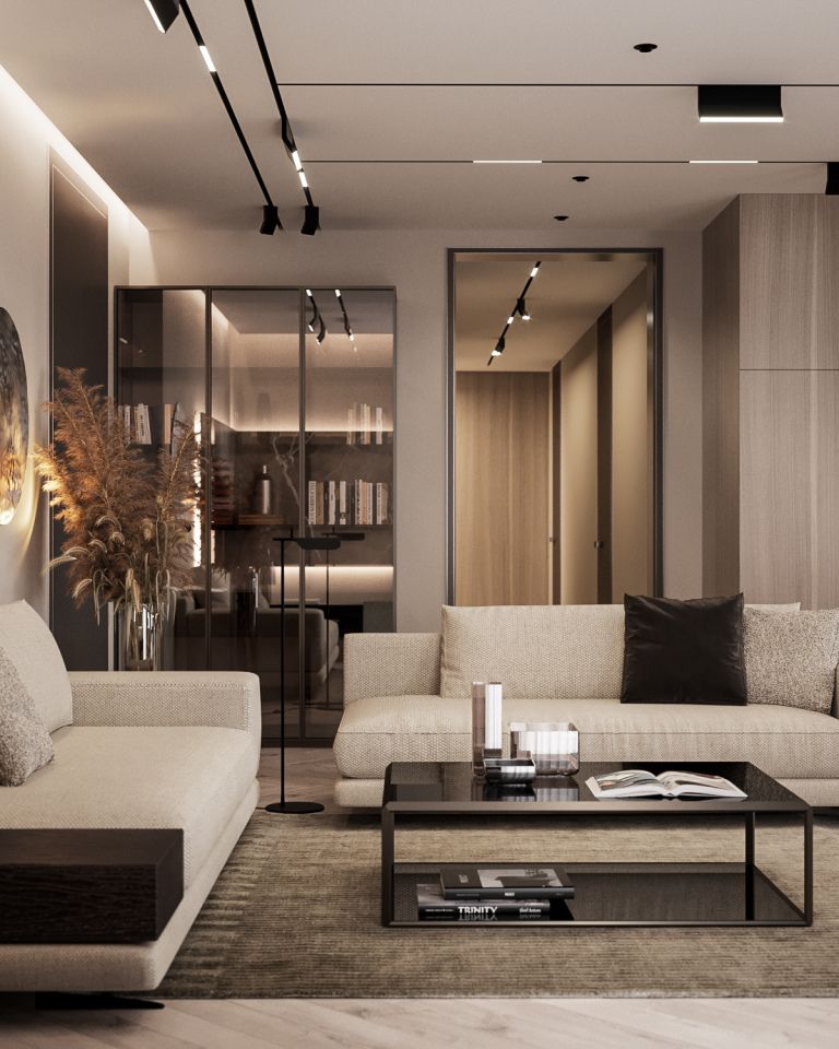 Country traditions are an abundance of unpainted wood in the interior: rough furniture, wood paneling, plank floors.
The design of Provence is brickwork, stone or tiled floors, textured plaster, beautiful mosaic surfaces, an abundance of forging and textiles, and wooden beams under the ceiling. The wood used is painted (usually white), often artificially aged.
All styles of room interior design are interesting in their own way and have their own aura. In each style, you can express yourself - that is, bring into it some kind of individual zest, character.
Like this article? Share the link:
How to design an interior in which it is easy to relax and rejuvenate: learned from designers
Is a comfortable sofa enough to be in the resource? We asked the pros about the main ways to design a relaxing and resourceful interior.
Publication date: 17. 12.2021
Material prepared: Olga Songe
A disorganized and contentious home cannot be relaxing. We learned from designers how to create a harmonious and peaceful atmosphere in the interior in simple ways.
Maria Filshtinskaya: “In the space for relaxation, I always recommend using natural fabrics and giving up bright colors”
“In our projects, we pay special attention to places to relax with a book, a magazine and have a pleasant tea party. We equip these comfort zones with special attention to the individual preferences of the customer.
In a relaxing space, I always recommend using natural fabrics and avoiding bright colors. It is important to provide for the possibility of different lighting scenarios and the access of daylight - this creates an enveloping and relaxing atmosphere. We make sure to use dimmers to control the intensity of the light.
A person can endlessly look at fire and water. These images are easy to imitate in the interior. For example, a fireplace in an apartment with the ability to light candles in it immediately sets the tone for the room as a central place for peace of mind and recuperation. Fountains or aquariums will help you relax and plunge into the world of your thoughts and become interesting accents. A pleasant smell in the house and a comfortable temperature will make your stay in it as sincere as possible.”
Elena and Dmitry Korshunov: “The main criterion for relaxing a person in a room is light”
“During our many years of experience in interiors, we have learned that the main criterion for relaxing a person is light. The main thing is that it should be as warm as possible: no higher than 2700 K. Bright and cold light of 4000 K, on the contrary, enhances attention and weakens creative thinking. It’s not for nothing that in recording studios or the theater the light is warm and soft.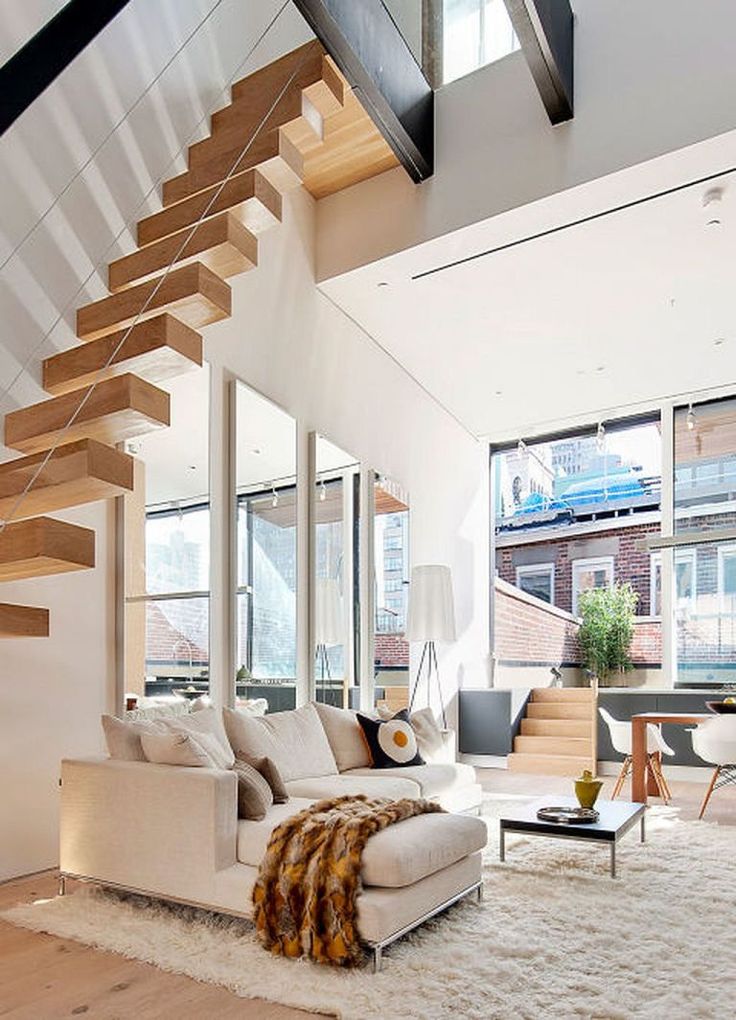
We would suggest laying decorative light sources - behind the eaves, underfloor - in all rooms. You can also provide space for candlesticks or table lamps. A great solution is to use dimmer switches: they will allow you to adjust the main light and make it dim.
Authors of the project: Elena and Dmitry Korshunov, design studio Korshunov Architects.
Marina Poklontseva: “You need to define an associative array that makes you feel calm and relaxed”
“All our customers perceive their home as a home and a very cozy space for living, so it is important for a designer to create an atmosphere of relaxation when working on an interior, especially in areas dedicated to relaxation, such as the bedroom and bathroom.
The most pronounced tricks can be seen in spas and hotels. Relaxing music plays in the recreation area, the lighting is subdued, aromatic candles are burning, and you can often see wallpapers depicting sandy shores and the emerald color of the sea on the walls.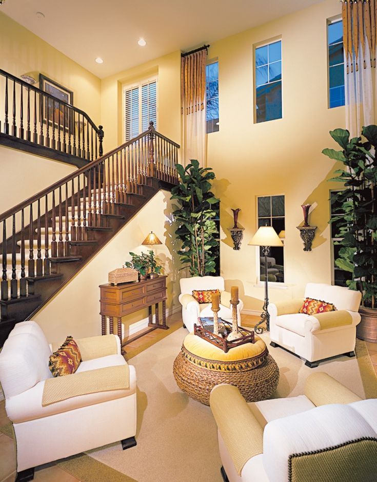 Such an atmosphere can affect all our senses, help to relax and dream about relaxing on a golden beach.
Copying the same techniques in the interior of the house, in my opinion, is not entirely reasonable, because sometimes we need to create an atmosphere for fruitful work or study. To keep the balance, I propose to allocate zones for relaxation. And the bedroom space will be the most suitable for relaxation. You need to determine the associative array that makes you feel calm and relaxed. It can be a certain color, most often blue, as it is associated with the sea and a feeling of coolness, but it can also be wallpaper - with mountain landscapes or a flowering garden. And if the garden cannot be placed on the walls, you can add a floral carpet to the interior or transfer flowers to curtains, pillows, lampshades, chests of drawers - in a word, to everything that the designer’s imagination is enough for. The main thing is that one glance of customers at such items evokes pleasant associations. It is very convenient to use various aromas for rooms.
Fragment of the interior. Project author: Marina Poklontseva.
Another room that should be designed to promote relaxation is the bathroom. In my projects, I suggest customers to use modern shower systems with chromotherapy, there are options with built-in aroma systems.
You can place built-in speakers and play relaxing melodies during water activities with the sounds of the forest, rain or birdsong. Many companies have developed a whole line of interior lights specifically for bathrooms with a high degree of moisture protection. Using these fixtures, you can create beautiful and unusual lighting scenarios, which also helps to create a relaxing atmosphere in the bathroom.”
Hasmik Kalantaryan: “Stake on natural shades, combinations of related colors: they create the effect of calmness, stability”
“Stress is a sign of modern life, and it has become especially relevant over the past year. Therefore, our houses and apartments should be for us an oasis of peace and tranquility, so that we, well rested, with a calm mind, again and again repulsed external stressors.
In my opinion, the first step in creating a relaxing interior, and indeed any interior, is its organization. That is, well-organized storage spaces so that each thing has its own place.
The second point is the ergonomics of the interior, so that all movements around the room and any actions do not cause inconvenience and worries.
The third point, of course, is color and light. Bet on natural shades, combinations of related colors: they create the effect of calm, stability. And when planning lighting, you need to come up with several scenarios: bright main, muted evening, accent, dimmable.
Last but not least, smell, touch, sound: all these elements can also contribute to calmness and are just as important as visual design. Homes should smell nice (I always use eco-friendly materials), sounds should be soft, not harsh (soundproofing and sound absorption contribute to this), and textiles should deliver a pleasant tactile sensation.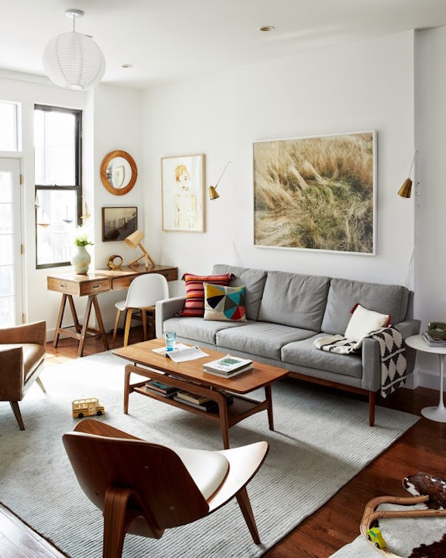 The photo shows a bedroom in which my client is very comfortable and serene.”
Project author: Hasmik Kalantaryan. Style: Ekaterina Naumova. Photo: Olga Shangina.
Svetlana Startseva: “Good sound insulation will protect you from the noise of your neighbors”
“The life of a modern person is filled with millions of different things to do during the day, and home is the place where you want to relax and unwind. To create such an atmosphere, you need to take into account a number of points: convenience of life, colors, materials and lighting.
Be sure to consider the technical fullness of your home so that everything works for you: a stove with a timer, a washer-dryer, a dishwasher, a robot vacuum cleaner - the minimum set that will allow you to reduce time for household chores and make more time for yourself and relaxation.
As for the color scheme, I would recommend using soft, muted shades. They can be either light or dark.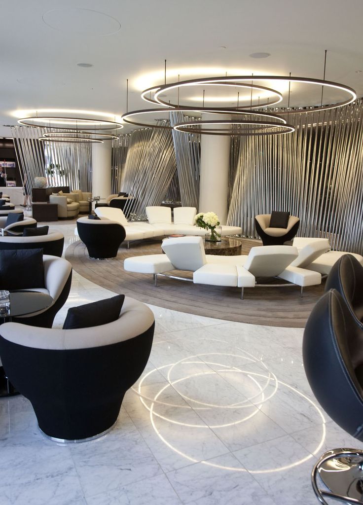 But it is important that there are few of them in one space, they are in the same scale and echo each other. The halftone interior is the most enveloping and relaxing.
Do not forget about the tactile sensations of the interior. Natural materials: wood, linen, cotton, wool, velor or velvet, marble can bring that very piece of nature into your home.
Sounds are also worth mentioning: good soundproofing will protect you from the noise of your neighbors, properly installed and selected windows will hide from city noise, and having a comfortable sound system and enough speakers can create a relaxing atmosphere even in the bathroom.”
Fragment of the interior. Project author: Svetlana Startseva.
Advertising on SALON.ru
You may like these articles:
Milan style: elegant novelties Glass Design
The new collection of bathroom furniture is dedicated to the most stylish city in the world.


