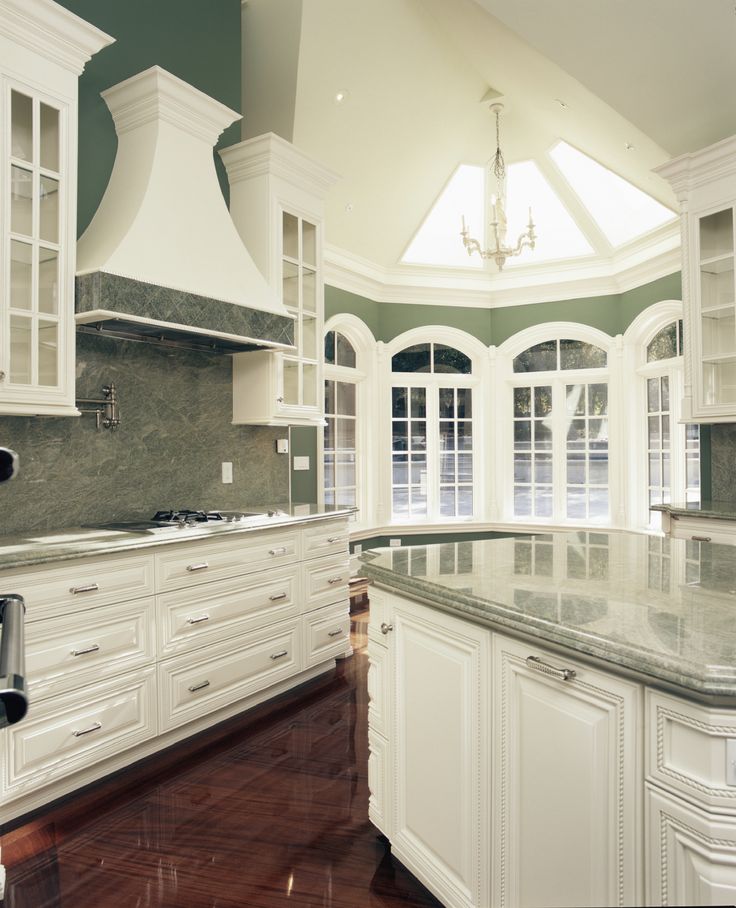
Green and white kitchens
10 refreshing color schemes |
(Image credit: Damian Russell / Future)
A green and white kitchen is energising, light and airy. It takes all the benefits of both green and white shades and puts them together in one fabulous color combination.
The beauty of these two shades in one space is that they work in both modern and traditional kitchen ideas, all you need to do is watch the tones that you choose so they suit the light you have coming in.
Green and white kitchen ideas
From sage green and brilliant white to apple green and off-white, there’s a combination for everyone whether your home is modern or classic. Use them to inspire your new green kitchen ideas or white kitchen scheme.
1. Go for a fun yet timeless scheme
(Image credit: Mendelson Group)
Gideon Mendelson, Founder of interior design studio Mendelson Group that’s based in New York, believes that great design can relieve stress, inspire conversation and help clients create memories. And he certainly has with this striking kitchen. We asked him his thoughts on using the green and white color scheme:
‘I think a range of greens can work in a kitchen and tend to look for greens that have a connection to the outdoors. So I might use anything from a happy spring-y green or a dark moody green. Here, this candy-apple green kitchen is a fun but timeless color, and it has just enough acidity in it that gives it some real punch and personality. All the greens in this kitchen were custom colors.
The counters are natural marble, which I always defer to if the client is up for the maintenance, and the floors are wood – we thought the warm wood was needed to break up and balance all of the white in the kitchen.’
And let’s just admire that ceiling for a minute or two – we thought it was wallpaper, but no, it’s handpainted.
2. One shade of green not enough? Choose two
(Image credit: Paint & Paper Library)
Loving the idea of a green and white kitchen color scheme – but want more than one green? The beauty of using white with a color is that you can be flexible with your other color choices.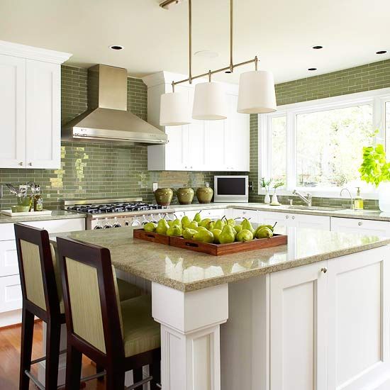
Here, a more teal shade called Deep Water Green by Paint & Paper Library is used on the cabinets and their warming Salvia above the shelf. They work together because they are of a similar tone, neither shade is brighter than the other. The white in the middle section splits them up nicely as does the wood countertop.
3. Utilise a variety of greens
(Image credit: Paint & Paper Library)
For three shades of green you need to be a little cleverer with what you pick because balance is key. For starters we have the deep green of Paint & Paper Library’s Stable Green on the cabinetry which really grounds the scheme. Then on the right the beautiful pale tone of Willow V.
The green and white kitchen is completed by the Lighthouse Palm wallpaper in Chelsea Green, a more vibrant shade that perfectly sits in the middle tonally of all three shades and the crisp white countertop and ceiling creates a visual break.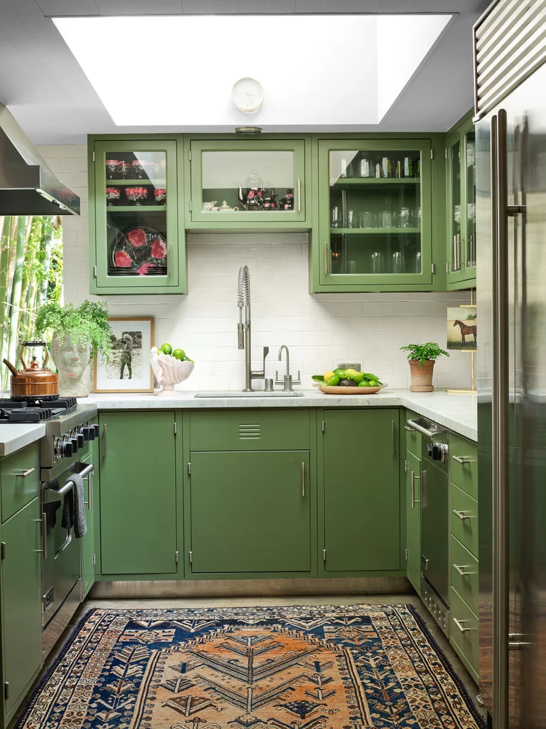 Dark toned wood looks great with this combination of greens and a pop of black will work too.
4. Match green and white to perfection
(Image credit: Farrow & Ball )
‘Green and white in combination feel incredibly timeless and can be tweaked to create both modern and traditional feeling spaces,’ says Charlotte Cosby, Head of Creative at Farrow & Ball.
For a contemporary scheme, inject brighter greens on the woodwork such as Arsenic and a clean white like Wevet on the walls, or opt for our Calke Green teamed with All White for a crisp contemporary look.’
When you have an all-white kitchen island that’s very prominent in your kitchen and you want to use white elsewhere the key is to match the paint as best you can. You don’t want to choose a creamy white as it will look off against the white island. Get as many paint chips and samples as you can to help you pick the right shade.
5. Play with the color ratios
(Image credit: Tom Howley )
We tend to only allow white on woodwork like coving, skirtings and window frames, but when it comes to a green and white kitchen scheme you can mix up the ratios - there are no rules to say you must only have green painted cabinetry. We asked Tom Howley, Creative Director at Tom Howley Kitchens for his advice on using a white to enhance green:
‘White is a classical kitchen choice that works well on its own but can prove even better when used in a two-tone scheme. Bright white is a great choice for creating crisp contrasts that will freshen and lift earthy greens. If you’re considering bright white on cabinetry, you should use warmer shades of whites and creams on the walls and floors to ensure the kitchen doesn’t feel too clinical and sparse.’
6. Add personality with a wallpaper
(Image credit: Little Greene)
If your kitchen struggles with natural light but you still yearn after a green and white scheme then it’s completely fine to opt for more white than green, this stunning Little Greene kitchen is a great example of this – and how to use wallpaper successfully in a kitchen.
The green is only on one wall and it’s their bold and bright Sage & Onions , it’s strong enough to make a statement in its own right and works well in small doses. You can carry the green through into the rest of the scheme with foraged stems, herbs and accessories – color doesn’t need to always come from paint or wallpaper.
7. Go dark and off-white in a traditional kitchen
(Image credit: Farrow & Ball)
Fresh white and bright green might not be your thing, or suit the era of your home. Darker tones work well in period properties, they’re more authentic and often tie in better with the natural elements that are existing like beautiful old terracotta tiles and a vaulted ceiling.
Charlotte Cosby, Head of Creative at Farrow & Ball explains: ‘For a more traditional look, opt for warmer whites like Pointing for the walls and a more earthy green such as Card Room Green , for the units – a scheme that also works well in reverse.’
8. Bring nature in with a verdant green – and pure brilliant white
(Image credit: Annie Sloan )
‘Bright colors in the kitchen wake you up in the morning and send you into the world energised and positive.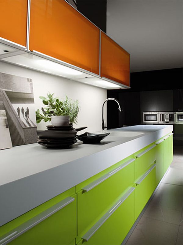 Try pairing white walls with bright green cupboards to maximise the vibrancy and juiciness of the green,’ advises Annie Sloan, Color and Paint Expert.
‘Greens are a broad spectrum, so try to look at the tone and character of the green you’re using and ascertain whether it’s more blue-green or more yellow-green when choosing colors to pair it with. Experiment in your kitchen. As with food, so with paint. I’ve got grassy, fresh Antibes Green on my cupboards and sideboards, with lots and lots of greenery and foliage for texture. It's so fresh and compliments my cooking style – organic ingredients in a back to nature environment.’
9. Contrast dark with light in a large kitchen
(Image credit: VSP Interiors)
Naturally, green comes in an array of shades which means you can go for a deep dark shade too. A space full of natural light can easily cope with that level of depth colorwise and if it has a low ceiling white of course will help combat that perfectly.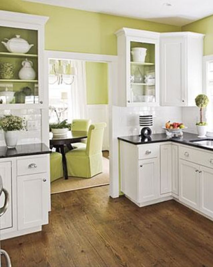
Henriette von Stockhausen, Co-Founder of VSP Interiors explains how she chose the green and white kitchen scheme shown here:
‘I used Studio Green from Farrow & Ball with the white because it has incredible depth and changes at different times of the day. It works as a fantastic backdrop to art, almost like white gallery walls. Everything looks good on it and really stands out. And, furthermore, if you're lucky enough to have doors opening to your garden, it relates brilliantly with the outdoors, blurring the lines between interior and exterior.’
10. If your kitchen has a low ceiling, keep the green on the units and white on the walls
(Image credit: The Main Company)
Keeping the green reserved for the units only will keep the eye always on the lower third of your kitchen. This is ideal when your ceiling is low, then, paint the rest of the walls and ceiling white to add brightness. A darker green like an emerald or forest green will ground the space over a pale brighter shade.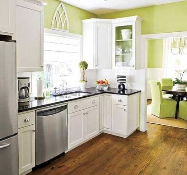
A beautiful mid-toned wooden floor will add character and warm up the overall visual feel whilst acting as a ‘middle’ element between the green and white.
What shades of white go best with green?
This depends on how intense you want your green and white kitchen to feel. For a fresh bright look then a pure brilliant white will lift any shade of green that you choose. A country cottage kitchen with original features would suit a more muted white for example, one that still bounces the light around but isn’t super bright and a deep green would work really well with a softer white.
Why is green and white such a good combination to choose?
‘As a colour combination, green and white work really well in a kitchen, giving a fresh, clean feel. White is the perfect choice for dressers, cupboards, worktops or flooring and will create a classic stylish look that is guaranteed never to date,’ explains Adam Brown, Director of Painted Furniture Company .
‘Green can then be added with soft furnishing and accessories to give a natural look and is a great way to bring the feeling of outdoors inside. Try natural shades such as Olive and Sage or go bolder with a Moss green if your kitchen has plenty of natural light.’
Sophie has been an interior stylist and journalist for over 20 years and has worked for many of the main interior magazines during that time, both in-house and as a freelancer. On the side, as well as being the News Editor for indie magazine, 91, she trained to be a florist in 2019 and launched The Prettiest Posy where she curates beautiful flowers for modern weddings and events. For H&G, she writes features about interior design – and is known for having an eye for a beautiful room.
House & Home - Bored Of White Kitchens? Discover The Cabinet Color We Love!
Decorating & Design
September 14, 2022
A refreshing change from white, green cabinets have been popping up in kitchens around the world. For those who don’t want to go too bold but still crave color in the kitchen, green is a surprisingly livable hue — whether it’s a soft sage, deep olive or somewhere in between.
Scroll down for 25+ kitchens that have us green with envy — and get inspired to see how designers have mastered this fresh look.
In this Victoria, B.C. kitchen, the emerald green cabinetry drives home a heritage feel. Farmhouse-style beadboard-paneled cabinets bring depth and texture, as well as vintage character.
Photographer: Mary McNeill-Knowles
Source: House & Home Kitchens & Baths 2022
Designer: Christi Rivard and Jessica Allerton
Several shades of dark green were considered and, ultimately, Cushing Green by Benjamin Moore was the winner.
Photographer: Mary McNeill-Knowles
Source: House & Home Kitchens & Baths 2022
Designer: Christi Rivard and Jessica Allerton
In this Eastern Townships home, a grassy green kitchen — in Farrow & Ball’s Bancha — is like a breath of fresh, spring air.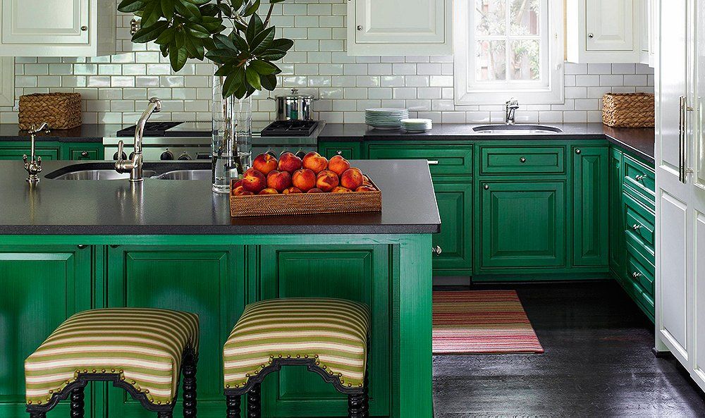 “I like solid wood, colorful kitchens in the country,” says designer Luke Havekes. “A fun shade gives wow factor, and it’s very easy to repaint if you get bored.”
Photographer: Maxime Desbiens
Source: House & Home July/August 2022
Designer: Luke Havekes
In model Suki Waterhouse’s fabulous Notting Hill kitchen by deVOL, glamorous Arabescato marble accents the deep emerald cabinets. The sumptuous dark green sets off a traditional bridge faucet with aged brass taps and hardware.
Source: Courtesy deVOL
White ceiling and trim and a fluted apron sink are crisp counterpoints.
Source: Courtesy deVOL
Brass rails, brackets and a rustic linen roman shade drive home the traditional beauty of this kitchen.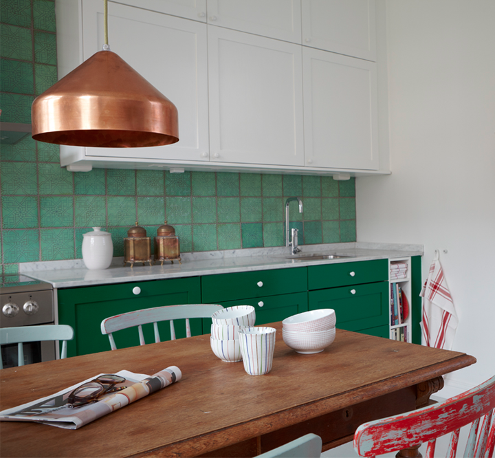
Source: Courtesy deVOL
The outdoors inspired the palette in this new build cottage on Lake Huron. “The lichen and mossy green hues in the kitchen are from the path in the woods, and the robust orange of the tile is taken from pine tree needles,” says designer Lucy Penfield.
Photographer: Spacecrafting
Source: House & Home July/August 2022
Designer: Lucy Interior Design; Architecture: Sala Architects
The juicy chartreuse cabinet color is a good foil for natural materials like warm wood and granite counters.
Photographer: Spacecrafting
Source: House & Home July/August 2022
Designer: Lucy Interior Design; Architecture: Sala Architects
Designer Emily Wunder was tasked with delivering her clients a non-white kitchen with a historical feel and garden views for this Stratford, Ontario home. Farrow & Ball’s Green Smoke is a timeless shade that embodies the colors in the garden. “It also reflects the home’s heritage and adds character,” says Emily.
Photographer: Valerie Wilcox
Source: House & Home January/February 2022
Designer: Emily Wunder
The result is an elegant monochromatic space punctuated with bold color, pattern and hits of brass. Having already had a white kitchen in her previous home, my client was excited to use color,” according to Emily Wunder.
Photographer: Valerie Wilcox
Source: House & Home January/February 2022
Designer: Emily Wunder
This smoky hunter green (deVOL’s Bakehouse Green) elevates this London kitchen. The oak counter adds some lightness to balance the rich cabinetry.
Source: deVOL Kitchens
This traditional shade complements the classic brass fixtures and marble sink to create a heritage vibe.
Source: deVOL Kitchens
Benjamin Moore’s Bonsai (CC-666) on the cabinetry and coffered ceiling gives this kitchen a rich, historical look. “It’s a modern version of avocado,” says Nova Scotia-based designer Jonathan Legate.
Photographer: Janet Kimber
Source: House & Home May 2021
Designer: Jonathan Legate
The stone is shot through with green, which ties in beautifully with the cabinets. A Wolf induction range framed by windows and painterly quartzite stone is a dramatic focal point. Hard-wearing Avocado quartzite stone on the counter, backsplash and vent hood is as artful as it is practical.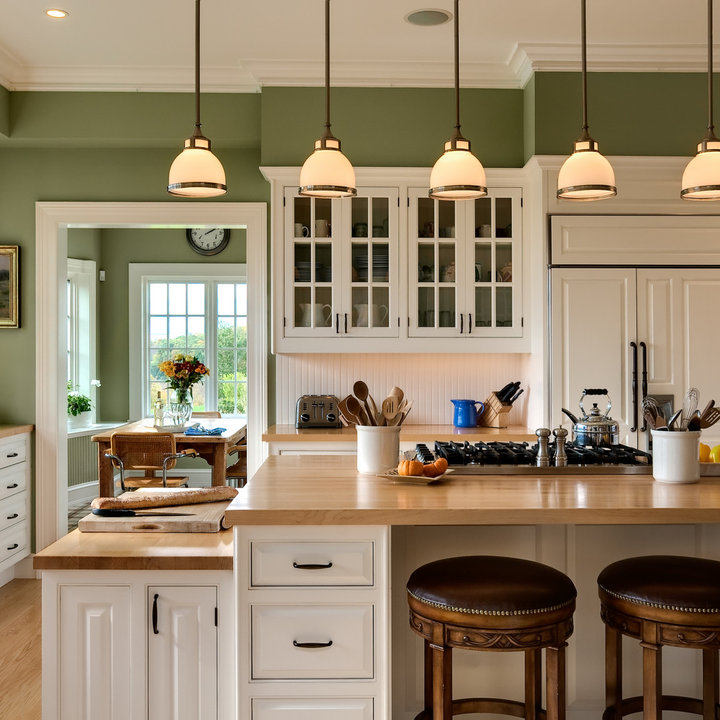
Photographer: Janet Kimber
Source: House & Home May 2021
Designer: Jonathan Legate
Using green on trim blurs the barrier between inside and out, melding into the trees and lawn. Measuring nine feet long by eight feet wide, the island features a sink area with stone counters on one side and a table-like, walnut-topped section on the other. The homeowners “wanted a huge island so the kids would have space to do homework, crafts and baking,” says Jonathan. “It’s very welcoming.”
Photographer: Janet Kimber
Source: House & Home May 2021
Designer: Jonathan Legate
A walk out to the garden makes this dark-green kitchen into a breezy, indoor-outdoor space.
Source: deVOL Kitchens
Designer: Chris Graves, Clarence & Graves
The deep forest green of this English kitchen is accented by minty green doors.
Source: deVOL Kitchens
Designer: Chris Graves, Clarence & Graves
This sweet shade of sage is a huge trend right now. It looks great when paired with rustic accents, like a vintage lantern pendant, and a white brick-veneer wall treatment.
Photographer: Patrick Biller
Source: House & Home March 2021
Designer: Tommy Smythe, Trish Johnston & Brian McCourt
For a classic color that will stand the test of time, try Farrow & Ball’s Green Smoke (47), and pair it with a creamy neutral on the walls.
Photographer: Janet Kimber
Source: House & Home March 2014
Designer: Colin Blanchard & Kenneth McRobbie, 31 Westgate
Designer Francesca Albertazzi makes a case for green cabinets in her renovated childhood home. The custom cool-toned hue punches up the understated backsplash and unconventional runner made out of carpet tiles.
Photographer: Janis Nicolay
Source: House & Home June 2019
Designer: Francesca Albertazzi, Rudy Winston Design
“This kitchen is truly a bespoke experience and uniquely tailored,” says designer Jack Creasy of Bloomsbury Fine Cabinetry. “I love the dramatic presence of the Lacanche range in that off-black color; it’s also soothing against the green.”
Photographer: Angus Fergusson
Source: House & Home March 2020
Designer: Jack Creasy, Bloomsbury Fine Cabinetry
Readers raved about this particular shade of deep emerald green. Contrasted by a marble counter and even red and white tableware amps up the richness of this kitchen.
Photographer: Angus Fergusson
Source: House & Home March 2020
Designer: Jack Creasy, Bloomsbury Fine Cabinetry
Brass pulls come alive when contrasted by the green of custom drawers.
Photographer: Angus Fergusson
Source: House & Home March 2020
Designer: Jack Creasy, Bloomsbury Fine Cabinetry
A Winnipeg bungalow gets a healthy dose of retro flair with olive paint, a rail-and-hook system and a handy pot filler.
Photographer: Ariana Derksen, Ariana Tennyson Photography
Source: House & Home December 2020
Designer: Jaclyn Peters Design
“The house is filled with different woods and black, gray and white so, in the kitchen, we wanted something colorful, rich and slightly traditional,” says homeowner Kendra Patton of the green cabinets.
Photographer: Janis Nicolay
Source: House & Home May 2020
Designer: Peter Atkinson
Even though this is a pantry, it serves as inspiration for the kitchen, thanks to emerald green paint and starburst tile floors.
Photographer: Kim Jeffery
Source: House & Home May 2019
Designer: Cameron MacNeil
Hunter green cabinets, soft white marble and copper pots give this kitchen its quintessential English charm. An accordion sconce provides task lighting and an unusual focal point.
Source: Plain English
Designer: Plain English
This kitchen by design firm Plain English is minimal yet memorable, thanks to sculptural lighting and an unconventional color scheme.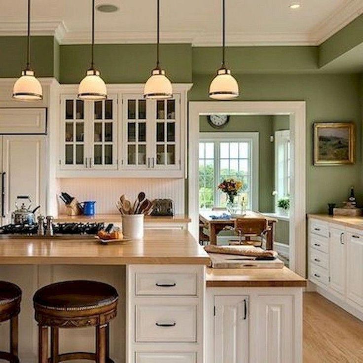
Source: Plain English
Designer: Plain English
TV exec Alix Jaffe’s California kitchen boasts schoolhouse lanterns, green cabinets and a zinc-topped island. The bold tile backsplash picks up on the tones of the kitchen cabinets and counters nicely.
Photographer: Stacey Brandford
Source: House & Home October 2014
Designer: Jackie Terrell; Architecture, Harrison Design
A wash of natural light keeps the green cabinets and zinc counters in this airy kitchen from feeling too dark.
Photographer: Stacey Brandford
Source: House & Home October 2014
Designer: Jackie Terrell; Architecture, Harrison Design
Expanses of white-gray marble on the countertops and walls of this kitchen help to lighten the island’s dark stone and kitchen cabinet’s moody green hue.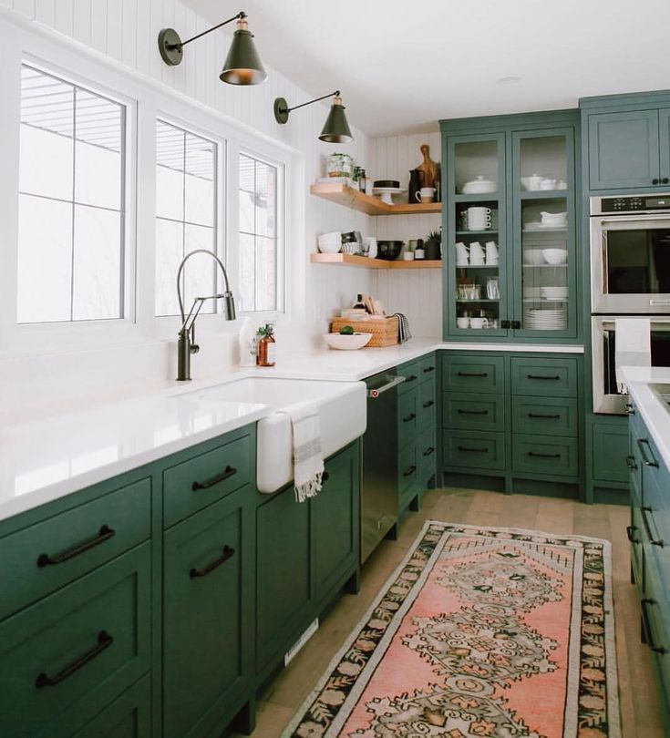
Source: Plain English
Designer: Plain English
A showstopping bronze backsplash bounces light around this minimalist, hardware-free kitchen designed by Norfolk, England, design firm Naked Kitchens.
Source: Naked Kitchens
Designer: Naked Kitchens
Former H&H art director Mandy Milks was ahead of the trend back in 2013 when she chose a dark olive color for her kitchen cabinets. The Shaker-style doors add an appropriate sense of history to the space.
Photographer: Michael Graydon
Source: House & Home Kitchens & Baths 2013
Designer: Mandy Milks
U.K. design firm deVOL Kitchens describes the daring cabinet color used in their Peckham Rye Kitchen as a cross between emerald and racing green.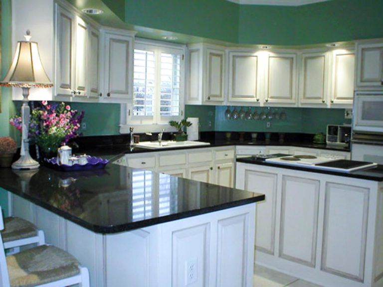 The dramatic color choice creates an atmospheric space with bags of character.
Source: deVOL Kitchens
Designer: deVOL Kitchens
This Shaker-style kitchen in the center of London, England, is also by deVOL Kitchens. Honed white marble helps to offset the moody green cabinet color perfectly.
Source: deVOL Kitchens
Designer: deVOL Kitchens
Up Next
Ask A Designer: Gillian Atkins’ Best Tips For Updating A Stair Rail
Advertisement
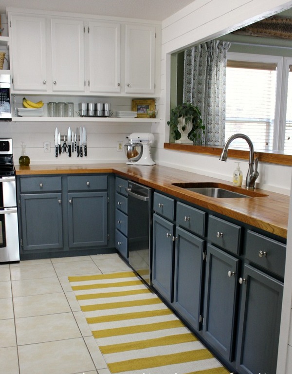
White and green kitchen (90 photos) - interior design, ideas for renovation and decoration
The kitchen is one of the most important rooms where we all spend a lot of time preparing delicious meals, meeting friends or simply eating with family.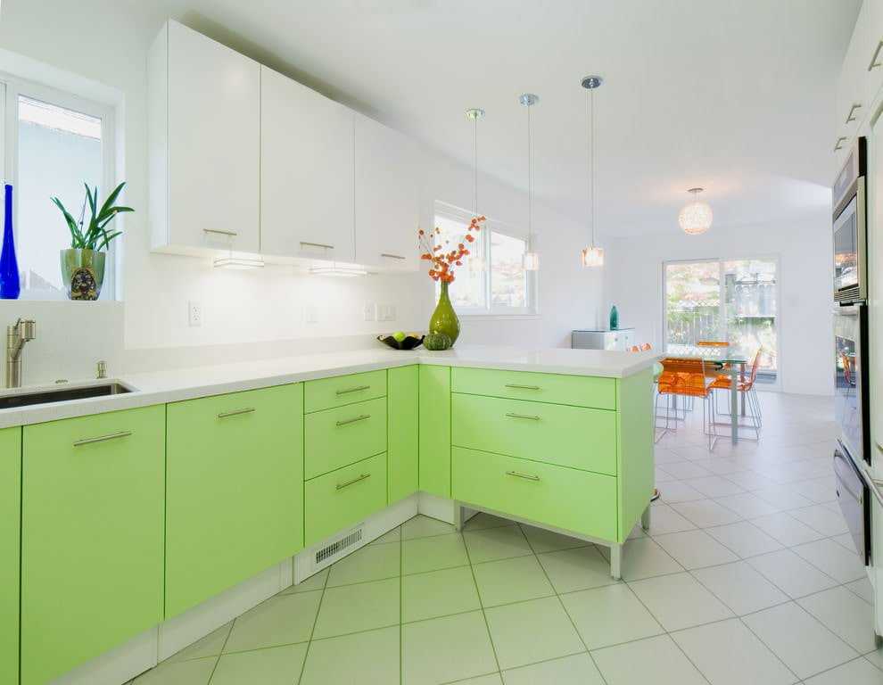 In any case, every person wants to see the kitchen as a cozy and comfortable room. Often, a city dweller living in a noisy city with numerous high-rise buildings, colorful shop windows and other “charms” of civilization most of all wants to get closer to nature, to bring a small piece of it into his home. It is not difficult to fulfill this desire - just add green colors. In our article, we will consider how the interior of the kitchen can be transformed if we take the white-green palette as the basis for its design.
Features of color combination
White and green shades make an excellent union in the interior. Each of them has an extensive range of shades, which makes it possible to apply such a coloristic design in different styles and choose the best combination depending on the size of the room. There are about 100 tones of green alone! White, in turn, can safely boast of its milky, pearly, mother-of-pearl shades, ivory, light sand, etc.
Green is the color of nature, so a person always feels comfortable in his surroundings.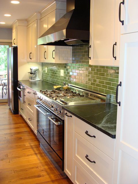 It is pleasing to the eyes, has a positive effect on the mental state, calms and promotes a good appetite. However, the use of saturated shades in large quantities can overload the space, and here white tonality comes to the rescue, capable of diluting any bright colors, bringing freshness and lightness into the atmosphere. Together, this combination has the following advantages:
- The ability to create a unique comfortable interior for any mood: to add coziness, you can combine pistachio with light milky, and white and lime tones will help make the interior more dynamic, invigorating;
- The snow-white palette contributes to the visual expansion of the space, while green shades are refreshing and add positive;
- A well-chosen white and green palette looks stylish and ultra-modern, "fitting" into large and small spaces.
When choosing this combination for your kitchen, pay attention to which side of the world the windows face - this determines the level of natural light in the room. If the room faces north, you should choose warmer shades and include more white tones in the design, which will perfectly reflect the light. And, conversely, in a south-facing kitchen, cool colors will look better, which will not allow excess lighting. This nuance can be corrected with the help of curtains or blinds.
The green palette can be present as a finishing material, furniture or individual accents that dilute the boring snow-white environment. In the latter case, it is introduced in the form of textiles, lighting fixtures, decorative flowerpots.
Combination with other colors
No matter how amazing the union of two palettes is, additional companions will not interfere with it. It is important to choose the right accompanying tones, which should not be many - just one or two colors that can diversify and decorate the interior. If white is combined with any rainbow paint, then green is more finicky, since it is quite colorful in itself.
White-green with brown
Brown is the closest in spirit to green, representing the natural palette. This is a classic combination that can fill the atmosphere with peace and warmth of the hearth. Color can be present in furniture elements and finishing materials, for example, imitating a wooden board or a brick wall. Often, a little cozy light beige tones are added to this combination.
White-green with orange
The orange palette looks pretty bold and self-contained on its own, so if you want to include it in a green and white interior, it's better to have it as an accent detail rather than a close-up. Here you should follow the rule: the more green, the less orange and vice versa. In a ratio of 50x50, such colors will oversaturate the interior too much, and even impeccable whiteness will not be able to help. In general, the combination can significantly cheer up, cheer up and improve appetite.
White-green with gray
Gray is quite a popular color in modern interior design. In alliance with snow-white lightness and greenish coolness, it will look respectable and unobtrusive.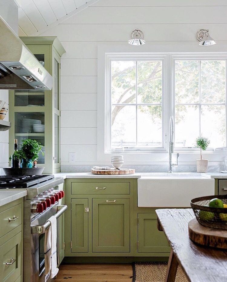 Metallic, present in the form of kitchen appliances, countertops or cabinet fronts, creates a special stylish environment. For wall decoration, lighter ash tones are preferred, which “do not interrupt” the freshness of green colors.
White-green with pink
At first glance, the combination of pink and green seems absurd, but it's worth looking at the photo to understand how much beauty and grace this union has. In this case, it is better to choose warm green tones, such as olive, pistachio, which will warm the coolness of pink. Naturally, such a combination is unthinkable without a white palette, otherwise the room will lose lightness and light.
White-green with black
The black range is associated with luxury and elegance, but its large presence in the interior of the kitchen can cause depression over time. The green and white palette, on the contrary, has a certain frivolity, so mixing these three colors together can quite balance the situation.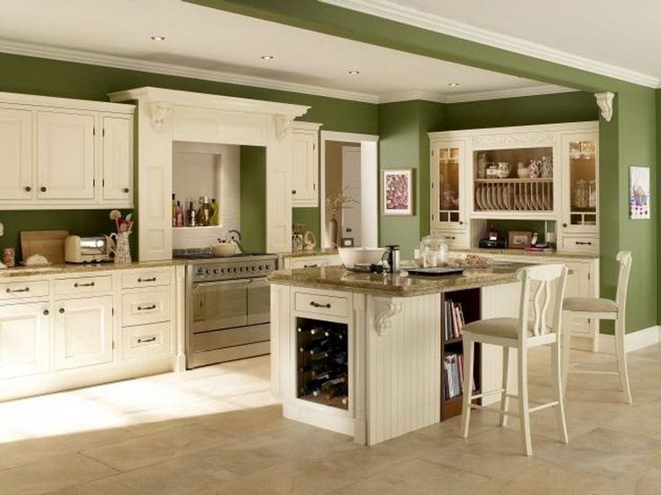 Often, designers introduce a gray palette into the lower tier of the headset, and decorate the upper one in lighter colors. This technique helps to visually expand the space.
Finishes and materials for the kitchen
Materials for lining a white-green kitchen should be chosen taking into account the characteristics of the room: they must be moisture resistant, easy to clean, and withstand temperature changes.
Floor
Tile, moisture-resistant laminate, linoleum or self-leveling floor are perfect for the kitchen. In large rooms, these materials are often combined, for example, tiles are laid on the territory of the working area, and the area with the dining table is decorated with warmer materials, while zoning is carried out. The color of the coating can be chosen at your discretion - the green-white palette goes well with different colors, as well as wood and stone textures. If you lay ceramic tiles diagonally, you can visually expand the area of \u200b\u200bthe kitchen.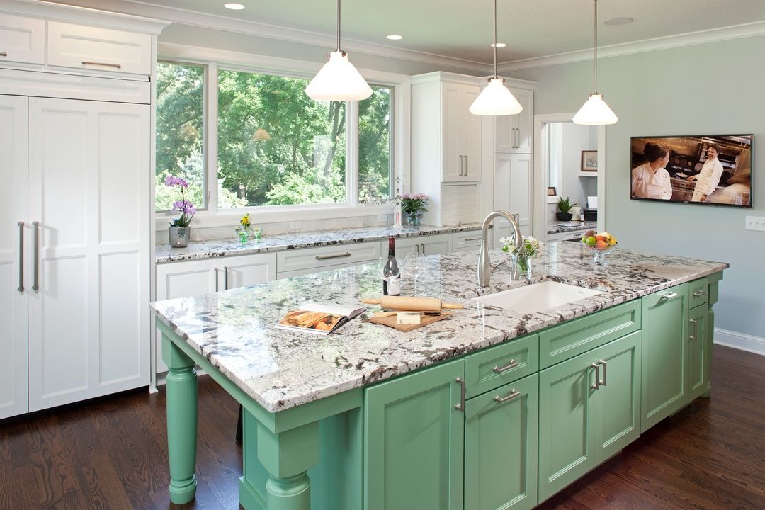
Walls
Good materials for wall decoration in the kitchen will be: tiles (including mosaics), washable wallpaper, painting, PVC panels, decorative plaster, artificial stone. Wallpaper is most often glued away from the work area - closer to the dining table. The variety of their drawings allows you to adjust the geometry of the kitchen room - to expand and raise the walls due to vertical, horizontal lines, to give depth to the room by decorating one of the walls with plain dark wallpaper. If you chose canvases with patterns, it is better that they be small, as large ones visually narrow the space.
Particular attention should be paid to the design of the apron - here it is worth choosing more durable materials. The apron often acts as a kitchen decor, so its arrangement requires originality. Patchwork patchwork tiles, mosaics, and finishes imitating brickwork look amazingly beautiful.
When choosing finishing materials for the walls, it is necessary to determine exactly the color scheme, which should be combined with the kitchen set in the future. A white set will suit the green color of the walls and vice versa. If it is planned to install two-color furniture, for example, with lower green tiers and upper white ones, the main background of the finish is selected from a milky, light green, gray, beige palette. Colors and materials can be safely combined, creating accent zones using various materials, patterned coatings, photo wallpapers.
Ceiling
The ceiling surface can be painted with a water-based or acrylic composition, decorated with a stretch fabric. Plasterboard constructions are now popular, which allow you to create multi-level ceilings, hide unsightly communications, and highlight certain zones. For small kitchens, it is advisable not to get carried away with multi-stage structures that will “steal” the height - it is better to use stretch glossy canvases. The color palette can be monophonic or combined, depending on the size of the room.
Kitchen furniture
When choosing a set for a white-green kitchen, you need to pay special attention to its facades - busting with green can create an unpleasant, depressing atmosphere.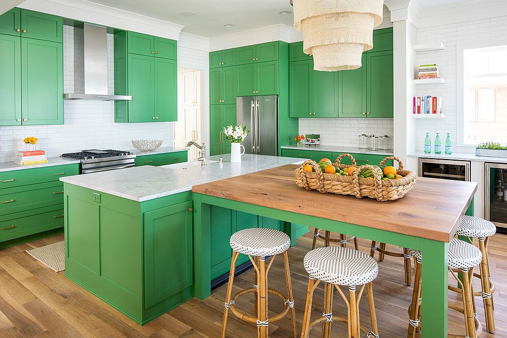
An excellent classic option is white furniture that looks harmonious in any interior. For walls in this case, you can choose painting or wallpaper in warm pistachio shades.
Set with green fronts will require light-colored finishes, mostly without patterns. As small accents, you can use a black palette in the form of countertops, appliances.
The most pleasing to the eye is considered to be such a way of distributing color as horizontal division. In this version, the snow-white upper tier will be perfectly combined with the lower green facades of any shades. In addition to aesthetic appeal, this design contributes to the visual expansion of space. To make a harmonious transition from the lower tier to the upper one, you can make the countertop and work area in a brighter, patterned tone.
Fans of non-standard solutions will surely like the combination where white and green facades seem to be “mixed” with each other. Most often, such furniture is made to order and it is important not to overdo it with the arrangement of palettes so that the set does not create chaos in the kitchen.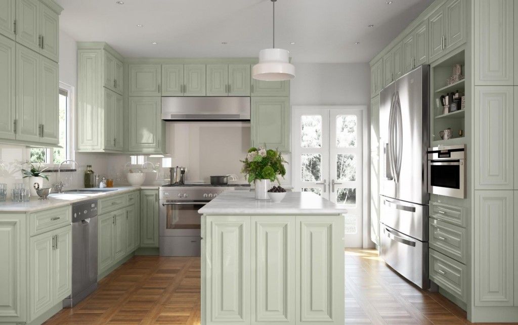
Interior styles
If you want to design a kitchen space in a certain style, you need to pay special attention to the choice of finishing materials, facades of the set and decor. Each direction has its own individual features, for example:
Classic white and green kitchen
A classic kitchen can always be recognized by its elegant furnishings, luxurious chandeliers and curtains, regular geometric proportions, decorative carvings and gilding. Only respectable wooden furniture with matte facades is welcomed here, which can be both white and green, with a predominance of calm emerald, jade, pistachio tones.
Minimalist white and green kitchen
Minimalist kitchen is an example of rationalism and practicality. There is nothing superfluous here - all interior items are exclusively functional. For minimalism, the predominance of white, gray and beige tones is preferable, so green colors often play the role of accents, although the possibility of decorating the glossy facades of the headset in grass color is not excluded.
Provence white and green kitchen
The style is characterized by lightness, rustic simplicity, bordering on the sophistication of French sophistication. Calm calming tones, massive wooden furniture, elegant textiles and, of course, light finishes are acceptable here. The walls are painted or plastered, dressed in a white, milky, cream palette, they use wallpaper or tiles with a small print. The set should look like it has been “living” in the kitchen for a long time, so it has slightly faded tones of the facades with signs of “aging”.
Green and white eco kitchen
The green and white palette fits perfectly into this direction, where natural tones come to the fore. Here you can also find wooden, stone textures in decoration and furniture. More green colors can be introduced with the help of live and artificial plants, photo wallpapers with floral images, textiles.
White and green kitchen design - photo
Next, we invite our reader to visit the gallery, which presents the best photos of the interior design of the white-green kitchen.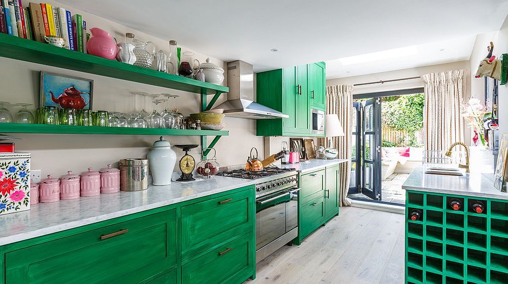 Happy viewing!
60+ photo examples, rules for combining white and green
Shades of green are the most common in nature. They are pleasing to the eye, have a positive effect on the mental state of a person, relaxing, calming, adding positive and inspiration. That is why it is so popular in interior design, especially in kitchens, where natural natural colors are relevant, stimulating life.
But the use of saturated shades of green requires dilution with other colors. Whiteness is most harmoniously combined with any shade of green.
The white-green spectrum adds charm and elegance to the space. It is very important to choose the perfect combination of shades and their combination.
Contents
Advantages of white and green tones in the kitchen
Kitchen decoration in white and green will be preferred by lovers of natural materials and colors in the interior.
The combination of white and green has a number of advantages:
- The variety of green shades allows you to create unique combinations for different moods, for example, pistachio adds comfort, emerald adds luxury, lime shades add style;
- White visually enlarges the room, while green brings a touch of freshness;
- The combination fits perfectly into large spaces where any, even dark greens can be used, and into small Khrushchev kitchens decorated in light green shades;
- White-green tones in the morning have an invigorating effect, in the evening they help relieve tension and relax;
- The combination has a beneficial effect on the human nervous system, improves immunity;
- Proper use of the combination of white and green looks aesthetically pleasing and ultra-modern.
When using white-green light colors in the kitchen, it should be borne in mind that the surfaces will quickly get dirty, so they must be made of well-washable materials.
Another nuance is the ability of white to perfectly reflect light, which can lead to an excess of light in the kitchen. This situation is easily regulated by the use of thick curtains or blinds.
When choosing a green shade for a white kitchen, you should pay attention to the location of the room. If the windows face north, it is advisable to use warm shades.
For the south side, it is recommended to look at the shades of the dark green spectrum.
Rules for combining white and green tones
Green, despite its lightness and softness, does not like excesses.
Designing a kitchen requires proper prioritization. A room overloaded with the chosen color scheme can turn even the most attractive shade into an aggressive one that will put pressure on the eyes and act depressingly.
The popular combination of white and green will not give a chance to make a mistake even for a beginner in design. Whiteness is associated with purity and perfection, which is relevant when used in the kitchen, where sterility is not only a guarantee of comfort, but also safe food for family members.
On a white background, any green looks organic and spectacular, evokes feelings of peace, tranquility and stability.
The main rule in this combination is that the richer the base tone, the more white is used.
The combination of white and green in the kitchen is almost limitless.
White kitchen with green wallpaper
Green wallpaper will add cheerfulness, festive mood and summer notes to a snow-white kitchen.
A harmonious mix of white and green will make the room look more spacious.
The more white in furniture and decor, the brighter the shade of green should be on the wallpaper.
You can complete the interior with blue, pink and yellow details. White tone will soften other colors, and the kitchen will look noble and elegant.
White kitchen with green backsplash
This combination is a bright mix of fashion trends and classic elegance.
Green ceramic tiles look aesthetically pleasing against the background of snow-white furniture facades.
Skinali with all shades of green is an excellent alternative to ceramics.
The bright inclusion of rich colors will dilute the monochrome interior and make it play with beautiful highlights.
Freshness of a white kitchen will be added by floral photo printing on a glass backsplash depicting green grass, juicy apples or tender daisies.
White kitchen with green worktop
The light color of the kitchen lightens the room and visually enlarges it, but the monochrome looks unattractive. An original accent for white facades can be a work surface made of dark shades of green. On such a countertop, stains and knife marks will be less noticeable.
Due to the variety of materials, the green surface can be diluted with various textures: gradient, stains, marble chips. The play of contrasts in the combination of snow white and dark green makes the room look stylish.
White kitchen and green curtains
Well-chosen curtains for the window can perfectly emphasize the style and effectively transform the interior of the kitchen.
Green curtains for a white kitchen do not have to be chosen in a single color.
Curtains made of natural materials can have different patterns, the main thing is that they blend harmoniously into the overall design.
The tone of the curtains is matched to the color of the walls, but you should not look for the exact shade. Curtains or blinds in combinations of green with yellow, white and beige will look advantageous in a white kitchen.
White kitchen top and green bottom
The horizontal division into a light top and a green bottom kitchen is one of the best combinations.
White color favorably sets off any shades of the main color scheme, the saturation of which is easily matched to the mood.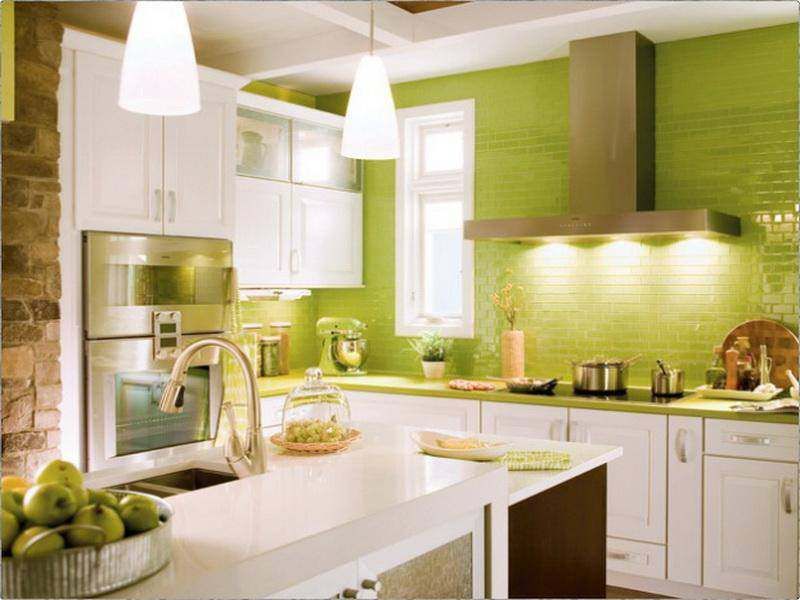
The kitchen will look non-standard and presentable due to the selection of an interesting design of the working area apron.
An original transition from a green bottom to a snow-white top can be a photo print with an image of fruit or grass.
The design of the wall with imitation brickwork painted in shades of green also looks peculiar.
The division into white bottom and green top can be accentuated with a dark top.
White and green kitchen accent colors
Some shades of green without bright inclusions can seem dull and depressing, such as swamp and olive. The white-green combination allows you to use different shades in the accent elements of the interior.
However, you should not use more than three shades in the interior, so that the situation does not become too colorful and annoying.
Red and yellow
A white and green kitchen can be diluted with yellow and red blotches in the form of a picture or photo on an apron, repeating in the pattern of walls or curtains.
These colors can be used for photo frames or decorative panels. Red color will add nobility, yellow - positive and warmth. However, these shades should be used carefully, a large amount of yellow can become too intrusive.
Black
The duo of white top and green bottom of the kitchen is perfect for black shades.
If household appliances have black facades, then dark furniture fittings and black and white mosaics for the backsplash can be an interesting solution.
Accent black and green touches will make the interior more expressive, solid and respectable, but this combination should be used in limited quantities so as not to make the room too gloomy.
Gray
Gray is one of the most discreet colors in the palette and sets off bright green details well. The steel color of the built-in and small household appliances will be in harmony with the chrome-plated fittings of the white-green headset, the legs of the chairs and the gray table top.
Style directions for white and green kitchen
White and green shade in the kitchen is widely used in all styles. Only the color palette changes. Juicy bright colors are used for modern interiors, delicate pastel colors are used for classic ones.
Classic kitchen
In addition to the soft tones of white and green, rich dark shades are used in the classics.
Deep and noble tones of malachite, emerald and jade are associated with precious stones and give the interior a luxurious and expensive look.
The interior of a light green space is perfectly complemented by shades of wood and chocolate.
The rigor and accuracy of the classic design is given by cool shades of green: gray-olive, marsh, moss.
Hi-tech and minimalism
A glossy white-green range with trendy shades of lime, emerald green, lemon green or lettuce emphasizes the modernity and practicality of a techno or minimalist kitchen. Bright juicy gamma is perfectly neutralized by white color and gray tones of details.
Household appliances with black facades fit well into green sets. Such a palette allows you to realize the dynamism of space and a cheerful mood.
Shades are not recommended for decorating the entire room, they will look most successful and extraordinary as furniture facades and accents.
Country and Provence
Rustic styles most often use a muted range of pastel shades, the combination of white and green is especially beautiful.
Pistachio, olive, mint and herbaceous colors are good colors for a traditional kitchen. These shades do not have intrusive notes, so they allow you to organize a cozy home space.
The use of several shades allows you to make the space more lively and cheerful. Openwork curtains and napkins are used to decorate the interior.
Mediterranean
The Mediterranean style uses a light finish on all surfaces in the room.