Farrow and ball skimming stone images
Farrow and Ball Skimming Stone
Often, when choosing a colour scheme for our homes, it’s the stronger accent colours that we obsess over. Selecting the perfect wall colour usually involves many tester pots and trials before we are happy. Yet, given the number of beautiful bold shades available, we often forget to consider the more subtle neutral shades.
These shades can be instrumental in achieving a well-balanced space that works well together and makes the best use of both natural and artificial light. Choosing white or magnolia may be a well-trodden choice. However, better is out there. Skimming Stone is one such colour. Its subtle warmth can bring life to spaces while complimenting well with the greys, browns and beiges of both modern and traditional interior design.
In these examples, Skimming Stone’s abilities are shown in rooms with different objectives. Versatility is one of Skimming Stone’s strongest suits!
Farrow and Ball Skimming Stone Living Room
Image via: Centered by Design
Straight lines and squares keep regiment in this space, but not at the cost of individuality or style. Brought together so well by the Farrow and Ball Skimming Stone walls, used like this, Skimming Stone shows how it has the ability to reflect in different tones. Using lighting carefully like this can bring a stronger feeling of 3-dimensional space.
This can be extremely useful in maximising visual space in smaller areas of your home. Darker furniture can sometimes be off-putting in its stark contrast in concentrated spaces. However, here your eyes find the purple flower so easily and naturally. This is helped by Skimming Stone’s subtle grey tone and timeless ability to take our eyes gently through a room.
Take inspiration from this decor and utilise small flashes of colour to draw your eye towards a focal point and enable Farrow and Ball’s Skimming Stone to ease your eye’s progress from there.
A Timeless Living Room Design
Image via Instagram: @beesforeverhome
Creating spaces that invite us and make us want to stay while keeping a modern feel can be challenging, this space shows the best of a subtle designer’s skills.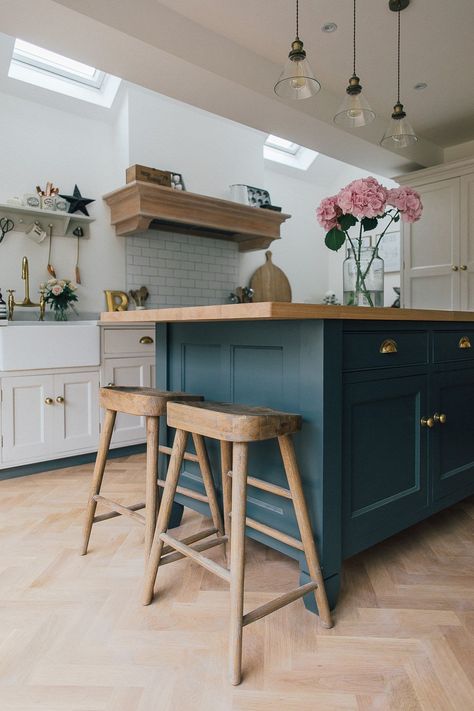
This well-defined space is kept inviting but defined and separate in style. A large rug calms the floors warmth and the white ceiling and carpentry help give strength to the space. This ensures that the natural light is used to the greatest effect as far into the room as possible.
Simple cushions with colours taken from the colour palette of the room give accent and continuation to the space. When leaving the room to the hallway, the theme continues, but darker accents and the warmer floor revealed, remind you of your destination. Use Farrow and Ball Skimming Stone in this way to ensure the best use of natural light throughout larger spaces.
A Simple Neutral Interior Painted in Skimming Stone
Image via instagram @reynoldsresidence
The warmth of Farrow and Ball’s Skimming Stone is working seamlessly here to bring life to the space without taking away the underlying calm of the space. A perfect calming bedroom colour, this is a wonderful colour for children’s bedrooms and adults’ bedrooms alike.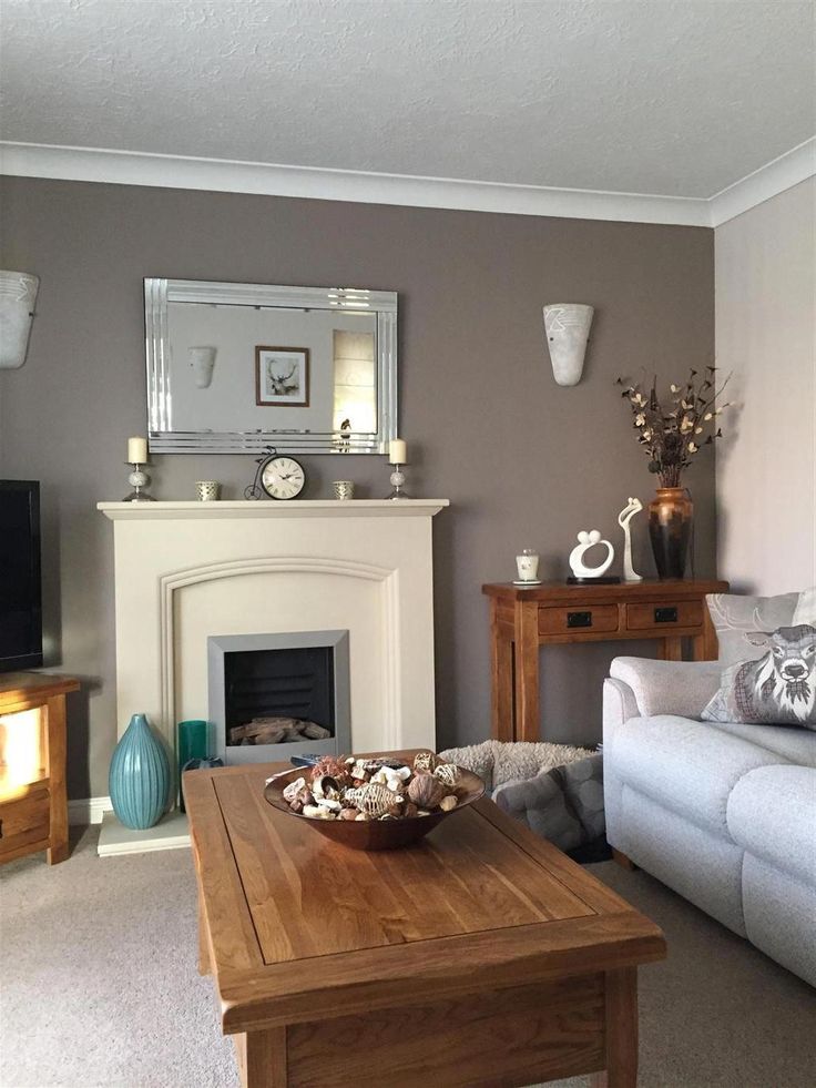
Natural fabrics and furniture upholstery work so well with Skimming Stone. Lighter shades are used here, and as you can see, they work well with the natural warmth of the wood. Try including natural fabrics in a variety of textures to bring depth and personality to a neutral space painted in Farrow and Ball Skimming Stone.
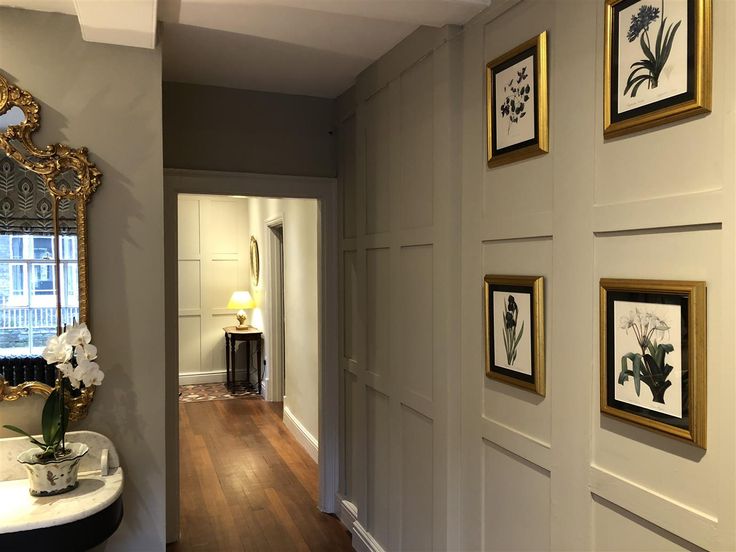
The designer has dedicated a wall to display framed artwork in this image. By choosing Skimming Stone nothing is left to chance when they are viewed. Skimming Stone is the perfect background for artwork, especially when it is itself subtle and refined.
Farrow and Ball Skimming Stone Dining Room
Image via Edition Noire
A crisp modern feel is achieved in this space, whilst still allowing it to feel warm and inviting. This is much down to the careful use of beige as an intermediary between the light and fresh Skimming Stone walls and the darker accent colours of the furniture, carpentry and picture frames.
This is ideal colour palette for shared spaces within your home. Using light and colour in this way is also perfect for a home office space or other dual-purpose areas of your home. Farrow and Ball Skimming Stone can give the subtle warmth needed to keep the room comfy as well as functional. This is important because we tend to spend long hours at work. The small details can make a big difference to how a space feels once you have been working in it for a few hours.
A Relaxing Living Room Painted in Farrow and Ball’s Skimming Stone
Image via Pinterest
Here Farrow and Ball’s Skimming Stone is showing its ability to work well with brown tones to create a soft visual contrast. Using browns like this helps give definition to a space without harsh colours. Keeping lines soft helps ensure the space is inviting and somewhere you would choose to unwind. A few sumptuous cushions and a snuggly blanket almost draw you in with the promise of tranquil comfort.
Try blending different finishes and textures with Skimming Stone. The contrast between reflective finishes like the glossed white woodwork and matt walls is perfect. Where you have larger wall areas but wish for contrast in the finish, take a tip from this design and use white decorative plates to give your eye a subtle reflection from another perspective.
As you can see through these images, Skimming Stone has so much to give as a background colour with the ability to draw the different elements of a room together and yet remain complementary to them all.
Farrow and Ball Skimming Stone FAQs
Here are some of the most common questions people are asking about Skimming Stone by Farrow and Ball.
Is Farrow and Ball Skimming Stone Grey or Beige?
Skimming Stone is a warm light grey colour from Farrow and Balls Contemporary Neutrals range. It is a colour with just the right amount of warmth to form the foundation of your colour scheme.
What Colours Go Best With Skimming Stone?
Skimming Stone is a versatile colour which can background and enhance many colour schemes.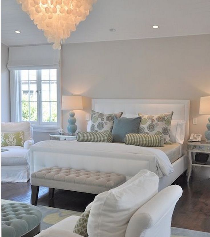 It compliments colour schemes well and really shows its ability to create calming spaces when used with grey tones. It also can be used to great effect in rooms where purples, like Farrow and Balls Pelt, are featured. Skimming Stone contrasts the deep purple with its subtle warmth.
Which White Goes With Skimming Stone?
Choosing the right white is important to get the best from Skimming Stone. A grey-based white like Farrow and Balls Strong White pairs well with Skimming Stone giving a contemporary feel to traditional decor. For a subtly warmer effect pair with All White which is a straight white with no additional tints.
Does Skimming Stone Go With Grey?
Skimming Stone compliments grey colours creating visually calming spaces that still have a strong identity. One of the best grey colours to pair with Skimming Stone is Dove Tale. Darker greys and blacks will work very well too. Try Railings or Pitch Black on your woodwork and trim for maximum contrast.
FARROW AND BALL PAINT SAMPLES
If you want to try before you buy, you can buy Farrow and Ball paint samples in small test pots. Each test pot is £4.95, and contains 0.1l which will cover about 1.4m2, which will give you a good idea of how the colour will look on your walls.
Pro Tip: Test your paint on each wall of your room, so you can see how it looks at different angles and in different amounts of light.
WHERE CAN I BUY FARROW AND BALL COLOUR CHARTS?
Farrow and Ball is one of the best paint brands in the UK, so you should be able to find them in most reputable DIY stores. It’s easier to order online though!
You can get a Farrow and Ball colour chart here, it’s completely free!
And here’s a link to Farrow and Ball’s book: Decorating With Colour.
If you’re ready to buy, head over to Farrow and Ball to order online. You can get everything you need here, including a free colour card and tester pots
If you’re just getting started in Interior Design, or looking for more inspiration, check out my article on the best interior design books for beginners for more inspiration!
Skimming Stone Farrow and Ball
It’s never as easy as you think to find the paint shade you have in your mind’s eye is it? I recently decided to give my house a paint refresh. I wanted to find a warm, neutral grey that would contrast nicely with white. Far too many tester pots later, my walls were blotchy and I was more confused if anything.
Discover Skimming Stone Farrow and Ball paint – the perfect pale milky grey with warm stone undertones.
It’s so true that you can find the exact colour you’re looking for when you look at in one corner of your home and then, when you try it in another corner, where the light is different, you often find yourself looking at a totally different shade.
Skimming Stone is a milky grey off-white neutral with warm stone undertones
Having driven myself slightly demented with tester blotches in all the different light conditions, I finally narrowed everything down and arrived at a decision. The element to make it onto my new soft, natural palette is Skimming Stone Farrow and Ball paint. It has a milky quality that I love. I have low ceilings and small windows in my old Hampshire cottage and all of the cooler greys felt too dark and gloomy. Because of its warm stone, almost pinky undertones, Skimming Stone feels so much more cheerful, whilst still definitely sitting comfortably among the greys. The other reason Skimming Stone will work so well in my cottage is that I have both grey slate floors and old dark brown wooden floorboards. Skimming Stone works beautifully with both, providing a colour bridge between the warm brown and cool grey.
I’ve put together a moodboard of how I’m seeing my new colour scheme coming together. I’m loving the idea of bringing in textural linens and ceramics as well as soft pink terracotta and fresh whites. It’s such an uplifting yet still very understated colour scheme don’t you think?
Skimming Stone Farrow and Ball moodboard
Featured in my moodboard: Plant pots from The Future Kept; textural linens from Peony & Sage; farm flowers from The Real Flower Company; Linen apron from Swedish House at Home; Teapot from Pottery West.
Buy Farrow and Ball paint online
Skimming Stone Farrow and Ball paint
BUY SKIMMING STONE PAINT NOW
Elephant’s Breath Farrow and Ball paint
BUY ELEPHANT’S BREATH PAINT NOW
Strong White Farrow and Ball paint
BUY STRONG WHITE PAINT NOW
Skimming Stone Farrow and Ball paint
Skimming Stone goes well with…
Elephant’s Breath (a mid grey with a hint of magenta created by John Fowler, the notable English interior designer) and Strong White (a cool white with light grey undertones).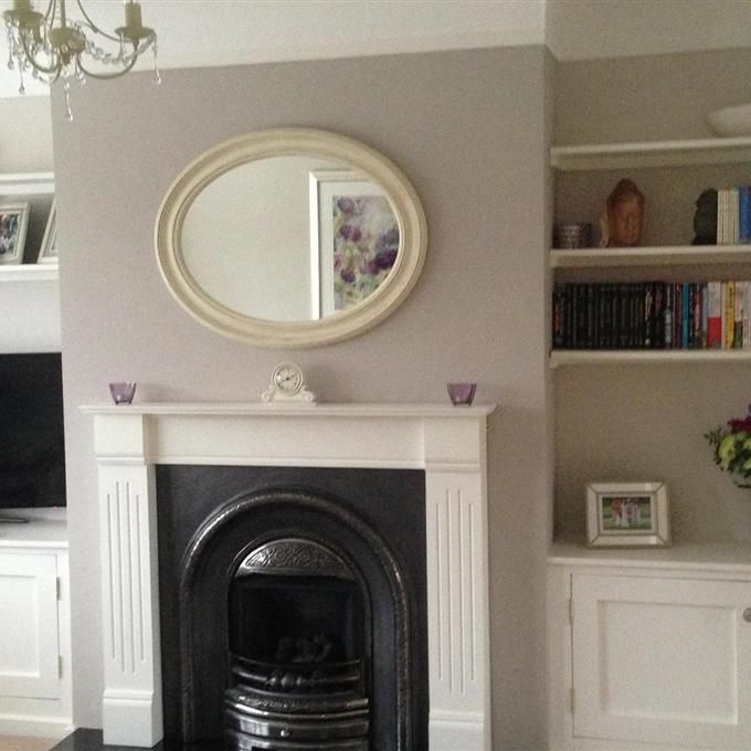 I’ve added both shades to my moodboard and really like how they work on there…
Other blog posts you might enjoy if you’re into creative home decoration:
How to decorate with Pantone Colour of the Year 2019 ‘Living Coral’
The perfect antidote to the ubiquitous grey shades we’ve surrounded ourselves with in recent years, Living Coral is a sunshiney, happy colour and I’ve shared some creative ways to bring it into your home, including paint mixing with Annie Sloan, Wallpaper ideas and beautiful accessories.
Love Modern Rustic interiors
I love relaxed, simply beautiful modern rustic interiors and I’ve shared some inspiring ideas and tips for getting the look in your own home.
How to decorate with green paint colours
How to decorate with green paint colours Discover the new Green paint colours by Little Greene in collaboration with the National Trust and also some beautiful olive green paints by Annie Sloan
INFORMATION
This article contains affiliate links, which means we may earn a small commission if a reader clicks through and makes a purchase. All our blog posts are independent and in no way influenced by any advertiser or commercial initiative. By clicking on an affiliate link, you accept that third-party cookies will be set.
Are you a maker or creative course provider? Like to list with us and benefit from joining our supportive community? We’d love to hear from you. Check out the packages we offer on our Join Us page and either click the apply now button on that page or email us on [email protected] I’d love to hear from you!
DESIGNERS' FAVORITE COLORS OF KITCHEN PAINTS
Years ago, most kitchens were dark and full of fall tones like red, gold and even orange. More recently, these bolder hues have given way to all-white kitchens. Why? Homeowners build and renovate kitchens to be open to the rest of the plan rather than segmented.
Kitchens have been made virtually invisible to blend in with the rest of the house. It really affects the paint you're going to choose - the color should flow smoothly, says Sarah Fishburne, trends and design director at The Home Depot. Previously, when [the kitchen] was segmented, it was possible to paint the kitchen one color and the dining room another.
Lighter colors also help to expand the space. A general rule of thumb is to keep the color light and neutral: think white, blue, or even pale yellow. “These colors will make the room look bigger, fill the space with light, and keep the kitchen clean and tidy,” says Abra Landau, local design expert at the company. Fashionable Furniture. Don't forget that your kitchen is not only a room for entertainment, but also a workplace that you want to keep as tidy as possible.
But of course, completely white does not mean dull or even monochromatic. While the walls are more subdued, homeowners are having fun experimenting with the color of cabinets, doors, trim, and even the ceiling. According to Fishburne, consumers perceive colors differently and are not afraid of it. It has become more individualized and intense than ever before.
However, paint colors are not constant and it is not easy to find the right shade. That's why we asked professionals to help us navigate through thousands of shades to find the best kitchen paint colors. The hues are mostly soft and light - grey, blue, white and taupe - but there are a few wildcards for those who want to push the envelope.
Save Pin It View More Images
(Image credit: Farrow & Ball)
Farrow & Ball Shaded White is a favorite neutral color for kitchens. It can be combined with almost any color on the cabinets and still be clean and light. - Marika Meyer, designer
Save Pin it View more images(Image credit: Benjamin Moore)
Light blue with a little bit of turquoise, like Benjamin Moore A breath of fresh air can open up a tiny kitchen. The color of the watery sky looks amazing with white or light maple cabinets.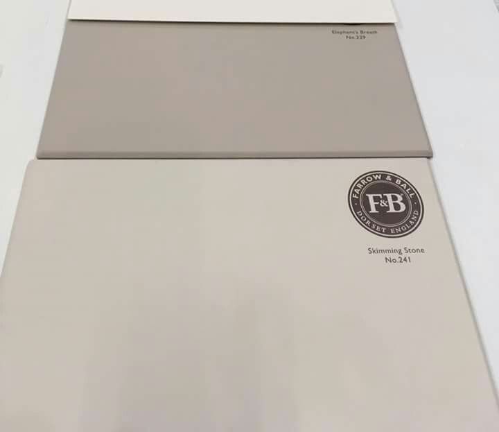 - Lesley Saul, designer
(Image credit: Farrow & Ball)
One of our favorite colors in the kitchen is Farrow and Ball Light. Depending on the direction of the light, this bluish-gray color can be neither too light nor too dark. This is the perfect backdrop for a light or dark countertop or furniture. - Terry Fiori, designer
Save Pin it View more images(Image credit: Benjamin Moore)
what is 10-10
The kitchen is the place where you need to feel relaxed yet energetic enough to cook and maybe have fun while doing it. Greens, especially spring greens with heavy yellow hues like Benjamin Moore's Sounds of Nature and Shimmering Lime are great examples that evoke both rejuvenation and transformation. Color can be used on cabinets, walls, and ceilings to help define small urban spaces, while vibrant accents of color can be naturally conveyed through plants and herb gardens, kitchen utensils, and utensils. - Lori Weitzner, designer and author An ode to color
(Image credit: Benjamin Moore)
This is an ethereal gray that gives just a hint of color. Nimbus creates a calm and cozy backdrop for your kitchen when applied to walls and is incredibly versatile. It changes during the day depending on the lighting. Therefore, it will complement any decor style. If you're feeling bold, pair it with a navy blue or charcoal gray body - Hale Navy and Chelsea Gray are great - and brass trim. - Jacqueline K. Franklin, designer and Thumbtack pro
.12 / 12Save Pin It View more images of
(Image credit: Farrow & Ball)
Soft and subtle with a slight warm tone. Skylight is one of those colors that is perfect for painting walls or even ceilings. - Bradley Odom, founder of Dixon Rye
Save Pin It View more images of(Image credit: Benjamin Moore)
This is a well balanced white that won't warp too warm or cold for all lighting styles.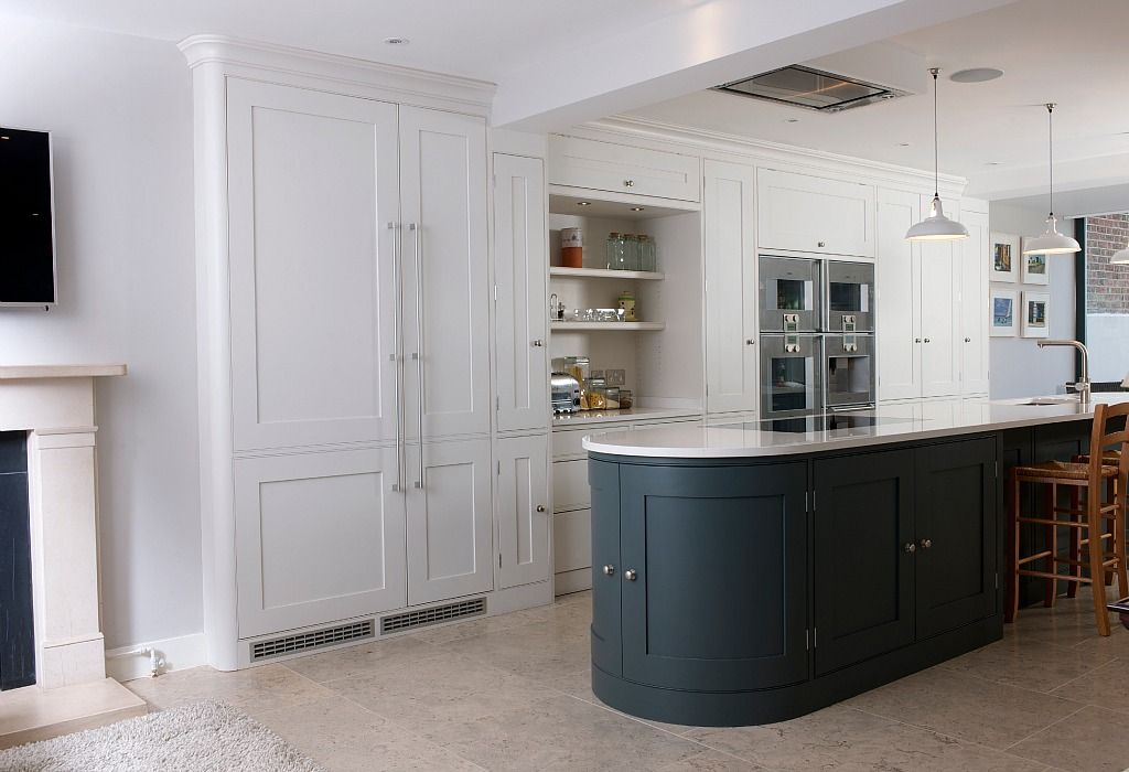 Pairs beautifully with White Dove (reduced by up to 50 percent) for cabinets. Making these subtle distinctions will help differentiate the elements while still leaving your space with the perfect tone-on-tone aesthetic. Of course, tone on tone is not for everyone, but choosing White Dove Any color of cabinets will suit your walls and will be a wonderful contrasting background. Some fun body colors that won't wash out on a white background are Benjamin Moore Hale Navy or Benjamin Moore Hunter Green. - Tracey Lynn, designer
(Image credit: Home Depot)
If you want to push the envelope, try a black wall with a white kitchen. Dark saturated colors will really accentuate furniture, windows and trim. It turns out a beautiful clean canvas. - Sarah Fishburne, The Home Depot Head of Trend & Design
Save Pin It View more images of(Image credit: Farrow & Ball)
My latest favorite kitchen color is Farrow & Ball’s.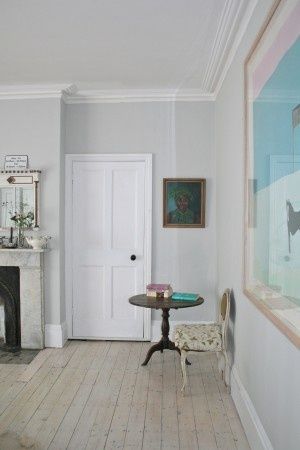 Inchyra Blue is sexy and cozy, embodying the warmth of the hearth and hospitality. It looks great with brass hardware and brings some color to a modern kitchen. I have noticed that it also calms people down. - Mally Jump, designer
Bridget Earley
Author
From Pregnancy to Farrowing: The Importance of the Transition - Articles
Home
Read this article in: NutritionWe are concerned about the changes in the transition from pregnancy to lactation, however, in practice, such changes usually occur quickly.
12 July 2021
0
4
Sow fertility rates have been increasing over the past ten years, by about one piglet every three years. In addition, sows become leaner, fat stores are less. Piglets are born less developed (low birth weight) and we know that the lipid content is less than 2% (Seerley, 1974).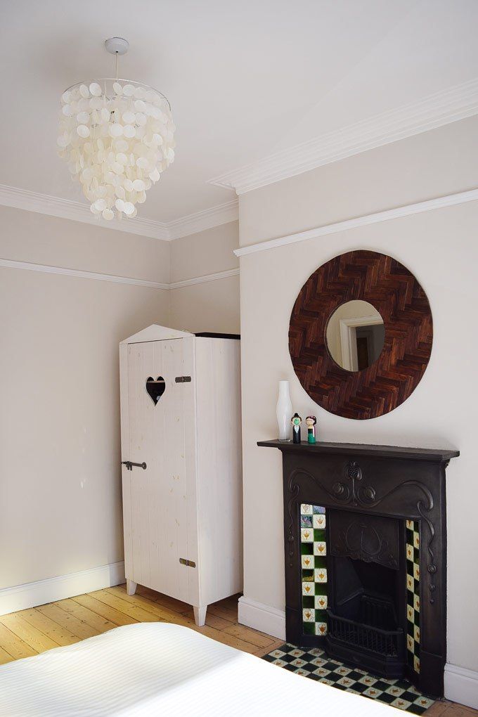 In addition, the difference between large and small piglets is increasing. Piglets' energy at birth is estimated at an average of 400 kJ/kg, while energy requirements in the first 24 hours of life average 900-950 kJ/kg (Spilsbury, 2007).
In order to exploit the high potential of sows, it is necessary, among other things, to make significant improvements to the feeding program.
Changes in feeding during the transition from gestation to lactation.
Not so many years ago we had one type of food for gilts, breeding sows, lactating sows and boars, however today we have a wide range of foods designed for each production phase according to the possibilities/availability at each production stage: for growing gilts, for the first and last month of gestation, the same feed for the entire gestation period, for gestating gilts, feed for sows a few days before farrowing, for lactating sows, for lactating gilts, supplements for lactating sows and for boars.
We are concerned about the changes during the transition from pregnancy to lactation, however, in practice, such changes usually occur overnight.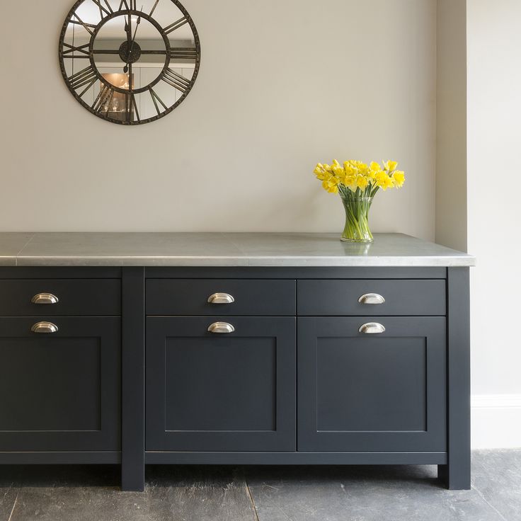 And here a lot of doubts arise, and we will try to talk about a few of them:
- How long is the gestation period at the moment? 116, 115, 114 days?
- What is the difference in duration of gestation between gilts and multiple sows?
- How many days before the expected farrowing date do we move sows to the farrowing house?
- What kind of feed should be given a few days before farrowing?
- When is the best time to switch from a gestating sow diet to a lactating sow diet?
- How much feed and nutrients should a sow eat a few days before farrowing?
- How much feed should be given on farrowing day?
- How should the amount of feed for lactating sows be increased from farrowing day to maximum intake?
- How to adapt the amount of feed per day to the existing feeding system?
- Is it recommended to use a certain feed before and after farrowing? What are its characteristics, when can it be used and in what quantity?
- What do we call the period that includes the last days of pregnancy and the first days of lactation, and how long does it last?
In this series of articles, we will look at the last question, ie. transition period (PT), which we will define as 10 days before farrowing and the first 10 days of lactation, when sows experience significant physiological and metabolic changes (Theil, PK, 2020). This may seem like a short period, but it is very important for the productivity of today's multiparous sows and is roughly comparable in duration to a lactation period of 3-4 weeks. This period especially affects the last phase of fetal development, the growth of the mammary glands and the production of both colostrum and milk, as well as the feeding behavior of the sow during lactation and the deterioration of her physical condition, which will affect her future fertility. This transitional period is attracting increased attention in the US and Canada.
Litter of 16 piglets from a multiple sow
Transition diet goals
Recent research focuses on the use of a diet that:
- Helps with farrowing, reduces the need for assistance with farrowing
- Supports performance
- Increases the survival rate of piglets
Research into the role of nutrients in this phase is not new; back at the beginning of 19In the 1980s, Dr. Jim Pettigrew collected papers on differences in the amount of fat consumed during this period and the survival rate of piglets. Recent studies have been conducted in several areas, including:
- High fiber dietary intake and its effect on shortening farrowing time (Feyera, 2017).
- Effect of hemicellulose on faeces (Ramaekers, 2013).
- Feeding multiple times before farrowing reduces stillborn piglets and increases survival rates (Miller, 2020 - Gourley, 2020).
- High doses of phytates shorten farrowing time (Batson, 2018).
- High doses of zinc sulfate improve piglet survival (Holen, 2020).
More transition studies are needed to prove these optimistic results, this will also help us minimize metabolic disturbance during lactation with subsequent benefits.
- Colostrum and milk optimization
- Avoidance of excessive loss of body weight, thickness of back fat and/or loin
- Weaning the most piglets with the best vitality
- Weaning of high weight piglets
- Nursing mortality reduction
- Reduce sow mortality
- Reduction of metabolic disorders before and after farrowing
- Reducing the period between weaning and insemination
- Improved fertility and subsequent farrowing
The lactation phase is only 20% of the reproductive period (30 days out of 150) when we expect a sow to eat 30% of her annual feed intake, which is about 5% of the total cost of a full cycle feed from an economic point of view.