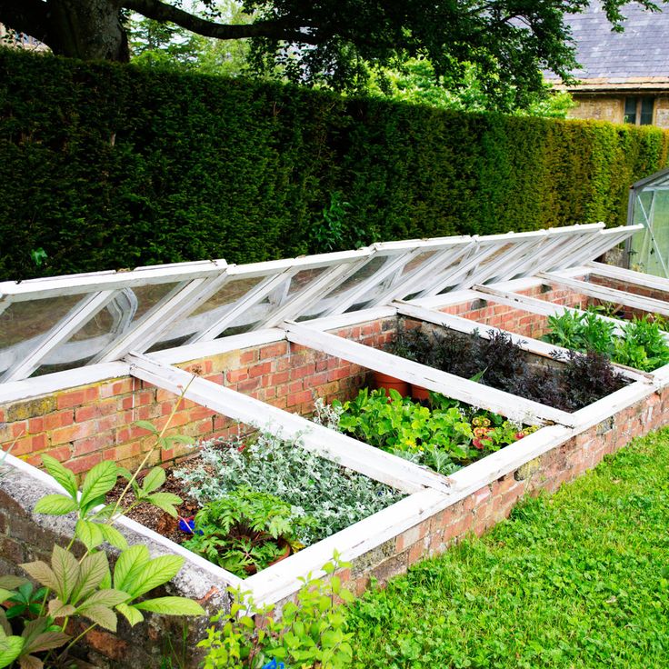
Farrow and ball mizzle kitchen
The Best Paint Color for Kitchen Cabinets
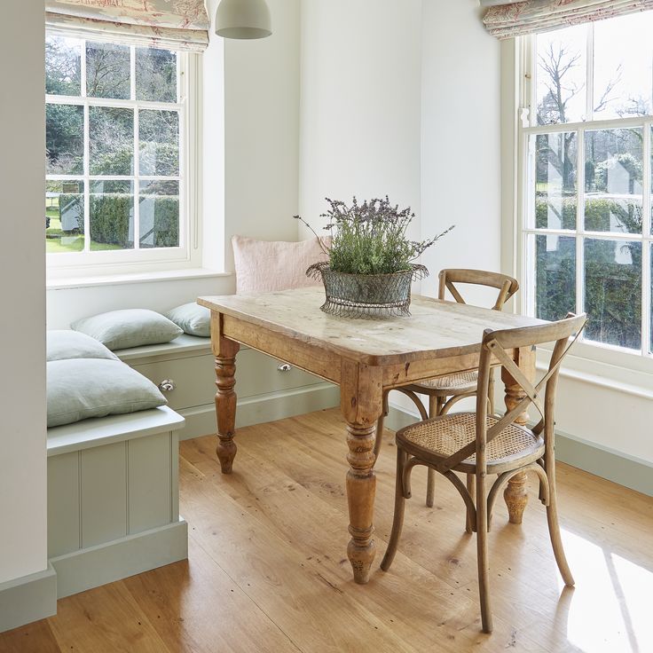
Is……..Mizzle, by Farrow & Ball. I’ve designed a lot of kitchens over the years, so when it came time to renovate my own I had a very clear idea of what I wanted. Everyone who comes into my house comments on the kitchen cabinets and how much they love them.
As much as I love a beautiful, all-white kitchen, my goal for this one was to find a cabinet color that had more life to it than white, but that didn’t stand out as a real “color” and still read as a neutral. My last house had “Green Blue” cabinets, also by Farrow & Ball, and I LOVED them, but that was a smaller kitchen in charming little beach cottage, and I was ready for a change to something more subtle and sophisticated. A great many photos that I pulled for general kitchen inspiration had gray cabinets, but going with a true gray in this particular house felt like it would be too drab for us. I needed to find a warm, light gray and I knew that Farrow & Ball was the place to start.
The great thing about all F&B colors is that they have more richness and depth to them than most other paints I’ve used. This color I used, Mizzle, seems to be constantly changing with the light, and looks different to different people, and different to me at various times of the day. I also love that even though it appears to be a mix of what are typically “cool” colors, i.e. gray, green and blue, it still has a really warm look overall. I had been hoping to find something that felt warm without going too beige, and this is it for me. It looks beautiful paired with so many different things: plain white, Carrara marble, Calacatta marble, stainless steel, and many other paint colors and accessories, both neutrals and colors. In my kitchen I used it with Carrara marble tiled backsplash (in 2×8″ running bond pattern), Carrara marble on the perimeter counters, and walnut butcher block on the island.
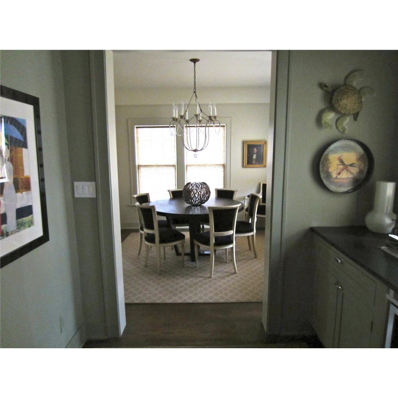
On my computer monitor, the close-up photo above of the desk area is more accurate than the photo below taken from the dining room, where it appears just slightly more green than it does in person.
It’s worth nothing that this company sells paint that is more expensive than some other popular brands. I think the price is well worth it in the grand scheme of the cost of a kitchen renovation. As ALWAYS with selecting paint for interior design projects, I suggest buying a small sample pot and putting it on a large sample board to move around and see if you love it in your own space and light before you commit to it. My personal feeling is that Mizzle looks much more green on the Farrow & Ball website than it does in my house in Palos Verdes. If it looks too green for you the great news is that there are so many pretty colors in this similar range from Farrow & Ball, and they make it so easy to order their colour cards and little sample pots!
NEED DESIGN HELP? I HAVE A NEW WEBSITE TO TEACH PEOPLE HOW TO DO INTERIOR DESIGN FOR THEIR OWN HOMES! Visit PLAN + ELEVATE to watch video tutorials, download exclusive resources and tools, and sign up for a personal interior design video consultation where you can get specific questions answered about your own rooms.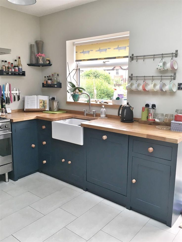
I’m available for hourly interior design consultations or art consultations in person in the South Bay of Los Angeles: Palos Verdes, Redondo Beach, Hermosa Beach, or Manhattan Beach.
Let’s keep in touch!
- Follow me on Instagram
- Follow me on Facebook
- Follow me on Pinterest
- Follow me on YouTube
- Visit my blog menu to see more posts
- Sign up for my newsletter
And share this post by clicking the icons below. Good luck with your design projects!
Anna
Farrow & Ball Paint - Mizzle No. 266
Skip to Main ContentPlease enable JavaScript in your browser for better use of the website!
Description
Shipping Policy
Refund Policy
A soft grey green
This modest grey green is named after West Country evening skies when there is a mix of both mist and drizzle.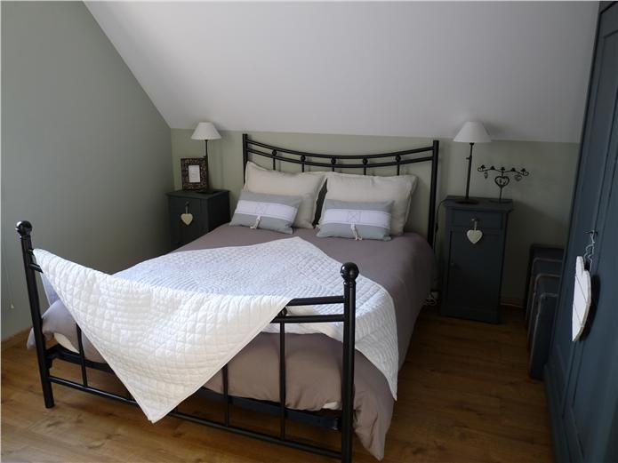 The addition of green pigment diminishes any cool blue tones, creating a lighter shade of Pigeon and Blue Gray. Rooms feel soft and contented when painted in this rather indeterminate colour.
Recommended Primer & Undercoat: Mid Tones
Complementary white: Wimborne White
Finish Finder
| Finishes | Use | Tin Size Availability | Approx. Coverage - Sq. Ft |
| Estate Emulsion | Signature chalky, very matte finish, especially suited to interior walls and ceilings. 2% Sheen | 100 ml 1 Gallon | 9 Sq. Ft. 570 Sq. Ft. |
| Estate Eggshell | Signature, very durable satin finish, especially suited to interior wood, metal, and kitchen cabinets. 20% Sheen | 750 ml 1 Gallon | 95 Sq. Ft. 480 Sq. Ft. |
| Modern Emulsion | Washable, mold and mildew resistant matte finish, especially suited to bathroom, kitchen and busy areas. 7% Sheen | 1 Gallon | 480 Sq.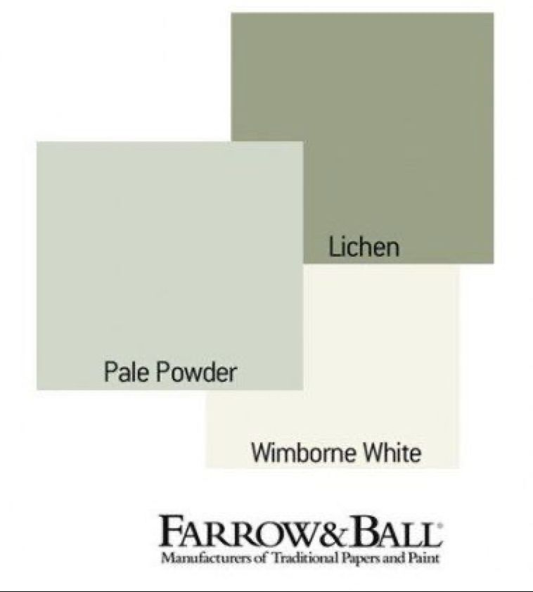 Ft. Ft. |
| Modern Eggshell | Extremely durable mid sheen finish, especially suited to staircases, floors, kitchen cabinets and interior metal 40% Sheen | 750 ml 1 Gallon | 95 Sq. Ft. 480 Sq. Ft. |
| Full Gloss | Most durable high gloss finish, especially suited to interior and exterior wood and metal. 95% Sheen | 750 ml 1 Gallon | 95 Sq. Ft. 480 Sq. Ft. |
| Exterior Masonry | Very durable, very matte, high-performance finish , especially suited to exterior masonry and exposed interior stone or brickwork. 2% Sheen | 1 Gallon | 325 Sq. Ft. |
| Exterior Eggshell | Very durable satin finish, especially suited to exterior wood and metal. 20% Sheen | 750 ml 1 Gallon | 105 Sq. Ft. 529 Sq. Ft. |
| Dead Flat | Exceptionally matte, elegant finish for interior walls, ceilings, wood and metal. 2% Sheen | 750 ml 1 Gallon | 95 Sq. Ft. 480 Sq. Ft. |
Coverage is dependent on thickness of application and surface type. Figures are based on one coat although at least 2 coats are recommended. The finishes are available in all colours except for Exterior Masonry.
Discover deeper, richer colours with Farrow & Ball Paint in an eco-friendly water base, plus high-performance finishes to transform your home inside and out.
Farrow & Ball paints their born and bred in Dorset, England, their home since 1946. Founders John Farrow and Richard Ball were passionate about creating richly pigmented paint to original formulations using age-old methods, and it’s a passion that is matched by their craftsmen today.
Their distinctive palette of eco-friendly paints is renowned for its depth and complexity. Brimming with only the finest ingredients and rich pigments, Farrow & Ball Paint responds extraordinarily to all types of light to bring your walls to life. This unique look transforms modern and traditional homes, large and small, inside and out, across the world.
Each colour tells a story, whether it’s inspired by the beauty of nature, their Dorset home, historic houses or notable people and places. Discover hushed tones such as Elephant’s Breath, hues as deep as Hague Blue and the exact shade of our Borrowed Light.
Kathie Jordan Design
Shipping for orders are shipped through either Canada Post or one of the major Couriers in Canada. Parcels are insured against loss or physical damage from outside forces - except for Paint that has been frozen and becomes unusable. You will receive an email with the tracking number for your package. Delivery time can range depending on the volume of deliveries, time of year, and delivery dates are not guaranteed.
On occasion, anomalies occur in the shipping software and rates quoted may differ from the actual shipping rate.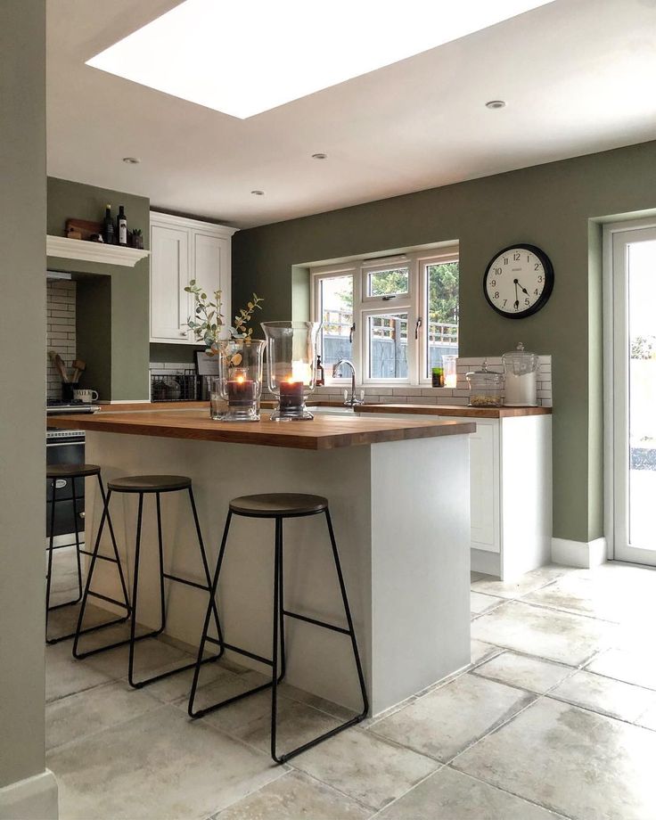 Kathie Jordan Design reserves the right to choose a carrier that has similar delivery standards and times due to discrepancies in the shipping rate. Kathie Jordan Design will always strive to get your order to you in the most efficient and cost effective manner.
If you receive a package that has been damaged physically beyond use of the product, you will need to take pictures of the packaging, and the damaged products. The more the better. Email these photos to us at [email protected] and we will start a claim.
If and when the claim has been resolved, we will ship you the replacement items.
In the winter in Canada, temperatures drop below 0ºC.
- Paint is considered a perishable item and can not be insured against freezing.
- We are not able to replace paint that does not revive after it has frozen.
- These shipments are done at the customer's own risk.
- However, with Annie Sloan's Chalk Paint and Fusion Mineral Paint they can freeze and thaw up to 3 times and still be ok.
- If your paint is frozen, let it thaw on its own at room temperature.
In order to preserve the integrity of our paint products, once these products leave our store, we cannot offer exchanges or refunds on any paint, paint mediums, or paint accessories.
If your order is damaged in shipping to you, please notify us immediately and send pictures of the outside and inside of the package and the products as the shipped orders are insured. We will ship you the products to replace the damaged items once the claim is resolved with the shipper.
In the winter in Canada, temperatures drop below 0ºC.
- Paint is considered a perishable item and can not be insured against freezing.
- We are not able to replace paint that does not revive after it has frozen.
- These shipments are done at the customer's own risk.
- However, with Annie Sloan's Chalk Paint and Fusion Mineral Paint they can freeze and thaw up to 3 times and still be ok.
- If your paint is frozen, let it thaw on its own at room temperature.
For all products, Return Shipping costs are the responsibility of the Customer. A 10% restocking fee will also apply to the order when returned in original condition which will be deducted from your refund.
If your order qualified for free shipping and the total of the products you are returning bring the total of the same order below $195 (before tax), then we will deduct the Shipping rate from the refund.
Workshop fees are also non-refundable. We can arrange to re-schedule when you can attend a future workshop.
DESIGNERS' FAVORITE COLORS OF KITCHEN PAINTS
Years ago, most kitchens were dark and full of fall tones like red, gold and even orange. More recently, these bolder hues have given way to all-white kitchens. Why? Homeowners build and renovate kitchens to be open to the rest of the plan rather than segmented.
Kitchens have been made virtually invisible to blend in with the rest of the house. It really affects the paint you're going to choose - the color should flow smoothly, says Sarah Fishburne, trends and design director at The Home Depot. Previously, when [the kitchen] was segmented, it was possible to paint the kitchen one color and the dining room another. nine0003
Lighter colors also help to expand the space. A general rule of thumb is to keep the color light and neutral: think white, blue, or even pale yellow. “These colors will make the room look bigger, fill the space with light, and keep the kitchen clean and tidy,” says Abra Landau, local design expert at the company. Fashionable Furniture. Don't forget that your kitchen is not only a room for entertainment, but also a workplace that you want to keep as tidy as possible. nine0003
But of course, completely white does not mean dull or even monochromatic.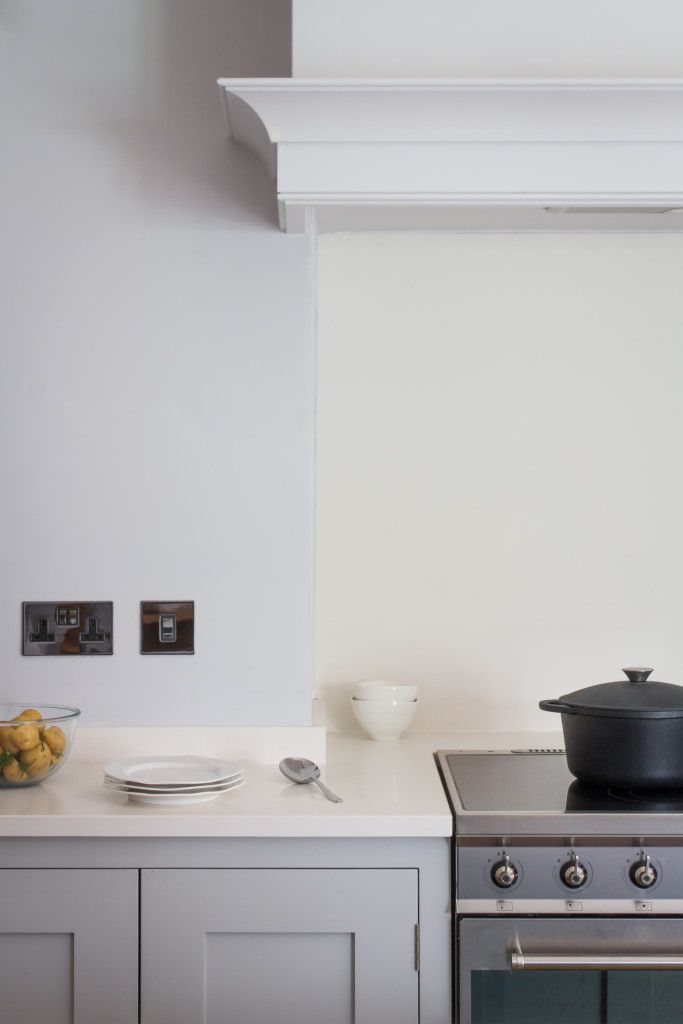 While the walls are more subdued, homeowners are having fun experimenting with the color of cabinets, doors, trim, and even the ceiling. According to Fishburne, consumers perceive colors differently and are not afraid of it. It has become more individualized and intense than ever before.
However, paint colors are not constant and it is not easy to find the right shade. That's why we asked professionals to help us navigate through thousands of shades to find the best kitchen paint colors. The hues are mostly soft and light - grey, blue, white and taupe - but there are a few wildcards for those who want to push the envelope. nine0003
Save Pin It View More Images
(Image credit: Farrow & Ball)
Farrow & Ball Shaded White is a favorite neutral color for kitchens. It can be combined with almost any color on the cabinets and still be clean and light. - Marika Meyer, designer
Save Pin it View more images(Image credit: Benjamin Moore)
Light blue with a little bit of turquoise, like Benjamin Moore A breath of fresh air can open up a tiny kitchen.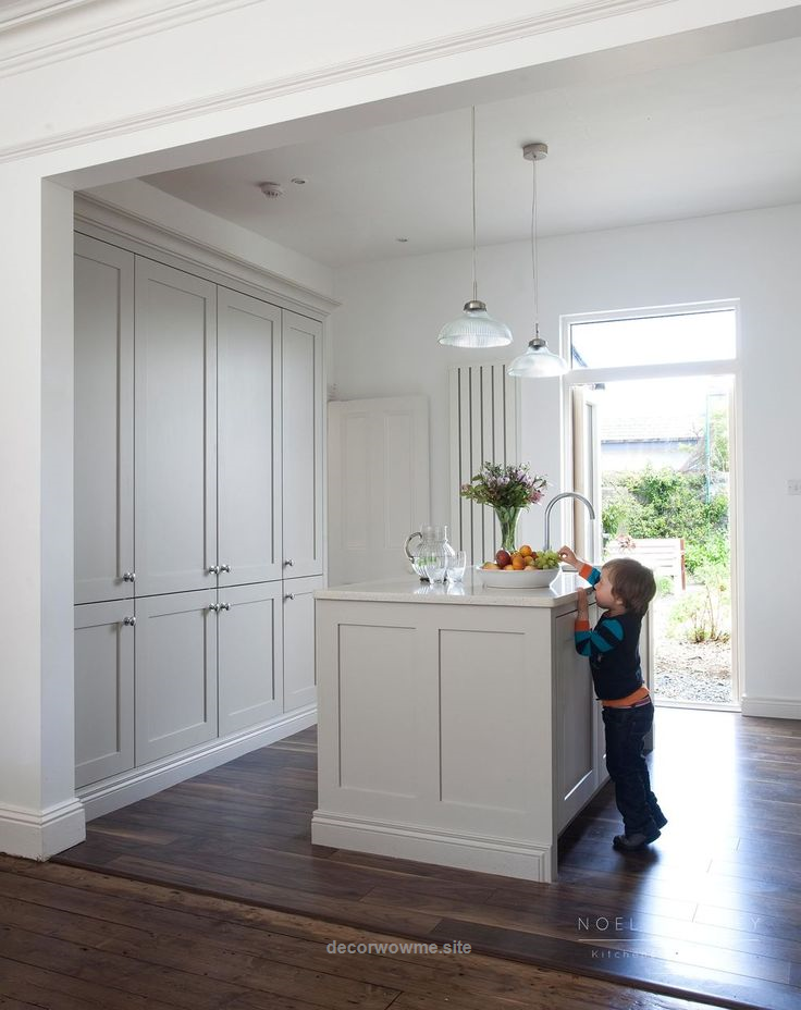 The color of the watery sky looks amazing with white or light maple cabinets. - nine0021 Lesley Saul, designer
(Image credit: Farrow & Ball)
One of our favorite colors in the kitchen is Farrow and Ball Light. Depending on the direction of the light, this bluish-gray color can be neither too light nor too dark. This is the perfect backdrop for a light or dark countertop or furniture. - Terry Fiori, designer
Save Pin it View more images(Image credit: Benjamin Moore)
what is 10-10
The kitchen is the place where you need to feel relaxed yet energetic enough to cook and maybe have fun while doing it. Greens, especially spring greens with heavy yellow hues like Benjamin Moore's Sounds of Nature and Shimmering Lime are great examples that evoke both rejuvenation and transformation. Color can be used on cabinets, walls, and ceilings to help define small urban spaces, while vibrant accents of color can be naturally conveyed through plants and herb gardens, kitchen utensils, and utensils. - nine0021 Lori Weitzner, designer and author An ode to color
(Image credit: Benjamin Moore)
This is an ethereal gray that gives just a hint of color. Nimbus creates a calm and cozy backdrop for your kitchen when applied to walls and is incredibly versatile. It changes during the day depending on the lighting. Therefore, it will complement any decor style. If you're feeling bold, pair it with a navy blue or charcoal gray body - Hale Navy and Chelsea Gray are great - and brass trim. - nine0021 Jacqueline K. Franklin, designer and Thumbtack pro
.12 / 12Save Pin It View more images of
(Image credit: Farrow & Ball)
Soft and subtle with a slight warm tone. Skylight is one of those colors that is perfect for painting walls or even ceilings. - Bradley Odom, founder of Dixon Rye
Save Pin It View more images of(Image credit: Benjamin Moore)
This is a well balanced white that won't warp too warm or cold for all lighting styles. Pairs beautifully with White Dove (reduced by up to 50 percent) for cabinets. Making these subtle distinctions will help differentiate the elements while still leaving your space with the perfect tone-on-tone aesthetic. Of course, tone on tone is not for everyone, but choosing White Dove Any color of cabinets will suit your walls and will be a wonderful contrasting background. Some fun body colors that won't wash out on a white background are Benjamin Moore Hale Navy or Benjamin Moore Hunter Green. - nine0021 Tracey Lynn, designer
(Image credit: Home Depot)
If you want to push the envelope, try a black wall with a white kitchen. Dark saturated colors will really accentuate furniture, windows and trim. It turns out a beautiful clean canvas. - Sarah Fishburne, The Home Depot Head of Trend & Design
Save Pin It View more images of(Image credit: Farrow & Ball)
My latest favorite kitchen color is Farrow & Ball’s.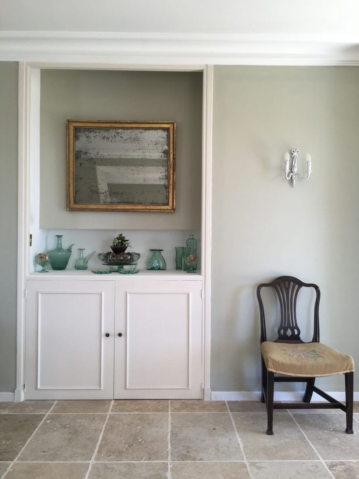 Inchyra Blue is sexy and cozy, embodying the warmth of the hearth and hospitality. It looks great with brass hardware and brings some color to a modern kitchen. I have noticed that it also calms people down. - Mally Jump, designer
Bridget Earley
Author
From Pregnancy to Farrowing: The Importance of the Transition - Articles
Home
Read this article in: NutritionWe are concerned about the changes in the transition from pregnancy to lactation, however, in practice, such changes usually occur quickly.
12 July 2021
0
4
Sow fertility rates have been increasing over the past ten years, by about one piglet every three years. In addition, sows become leaner, fat stores are less. Piglets are born less developed (low birth weight) and we know that the lipid content is less than 2% (Seerley, 1974).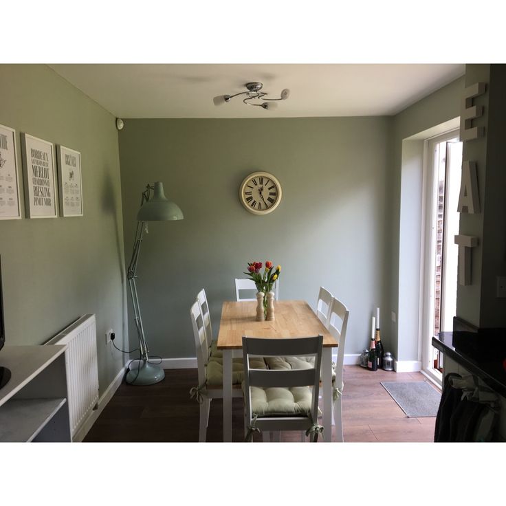 In addition, the difference between large and small piglets is increasing. Piglets' energy at birth is estimated at an average of 400 kJ/kg, while energy requirements in the first 24 hours of life average 900-950 kJ/kg (Spilsbury, 2007).
In order to exploit the high potential of sows, it is necessary, among other things, to make significant improvements to the feeding program.
Changes in feeding during the transition from gestation to lactation. nine0101
Not so many years ago we had one type of food for gilts, breeding sows, lactating sows and boars, however today we have a wide range of foods designed for each production phase according to the possibilities/availability at each production stage: for growing gilts, for the first and last month of gestation, the same feed for the entire gestation period, for gestating gilts, feed for sows a few days before farrowing, for lactating sows, for lactating gilts, supplements for lactating sows and for boars. nine0003
We are concerned about the changes during the transition from pregnancy to lactation, however, in practice, such changes usually occur overnight. And here a lot of doubts arise, and we will try to talk about a few of them:
- How long is the gestation period at the moment? 116, 115, 114 days?
- What is the difference in duration of gestation between gilts and multiple sows?
- How many days before the expected farrowing date do we move sows to the farrowing house? nine0108
- What kind of feed should be given a few days before farrowing?
- When is the best time to switch from a gestating sow diet to a lactating sow diet?
- How much feed and nutrients should a sow eat a few days before farrowing?
- How much feed should be given on farrowing day?
- How should the amount of feed for lactating sows be increased from farrowing day to maximum intake? nine0108
- How to adapt the amount of feed per day to the existing feeding system?
- Is it recommended to use a certain feed before and after farrowing? What are its characteristics, when can it be used and in what quantity?
- What do we call the period that includes the last days of pregnancy and the first days of lactation, and how long does it last?
In this series of articles, we will look at the last question, ie.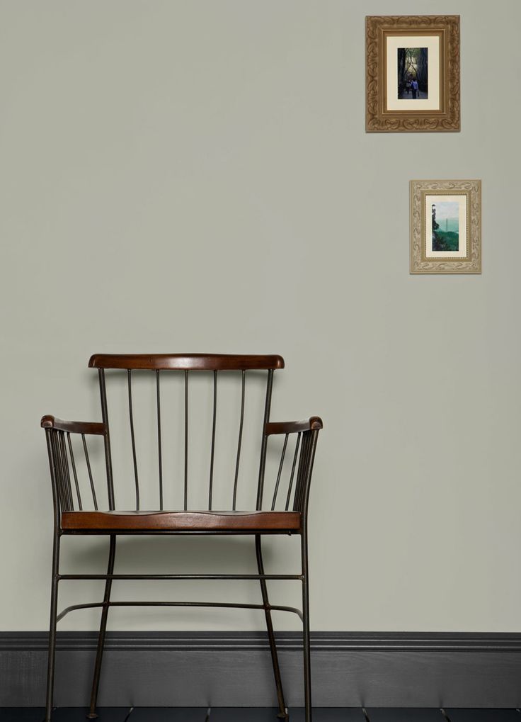 transition period (PT), which we will define as 10 days before farrowing and the first 10 days of lactation, when sows experience significant physiological and metabolic changes (Theil, PK, 2020). This may seem like a short period, but it is very important for the productivity of today's multiparous sows and is roughly comparable in duration to a lactation period of 3-4 weeks. This period especially affects the last phase of fetal development, the growth of the mammary glands and the production of both colostrum and milk, as well as the feeding behavior of the sow during lactation and the deterioration of her physical condition, which will affect her future fertility. This transitional period is attracting increased attention in the US and Canada. nine0003
Litter of 16 piglets from a multiple sow
Transition diet goals
Recent research focuses on the use of a diet that:
- Helps with farrowing, reduces the need for assistance with farrowing
- Supports performance
- Increases the survival rate of piglets
Research into the role of nutrients in this phase is not new; back at the beginning of 19In the 1980s, Dr.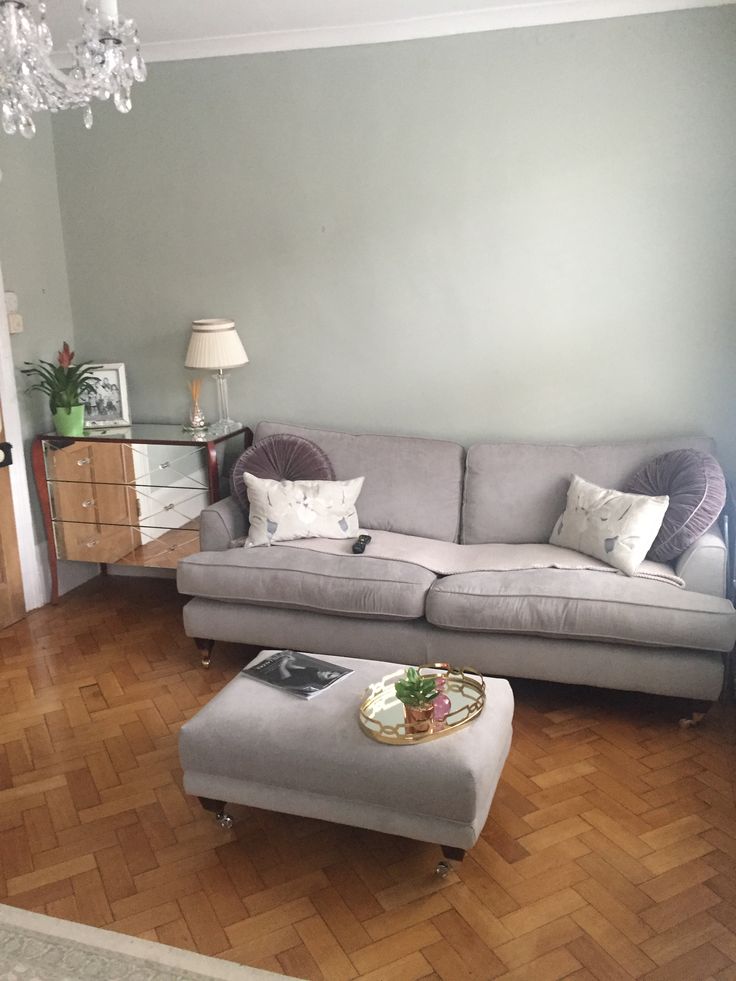 Jim Pettigrew collected papers on differences in the amount of fat consumed during this period and the survival rate of piglets. Recent studies have been conducted in several areas, including:
- High fiber dietary intake and its effect on shortening farrowing time (Feyera, 2017).
- Effect of hemicellulose on faeces (Ramaekers, 2013).
- Feeding multiple times before farrowing reduces stillborn piglets and increases survival rates (Miller, 2020 - Gourley, 2020). nine0108
- High doses of phytates shorten farrowing time (Batson, 2018).
- High doses of zinc sulfate improve piglet survival (Holen, 2020).
More transition studies are needed to prove these optimistic results, this will also help us minimize metabolic disturbance during lactation with subsequent benefits.
- Colostrum and milk optimization nine0107 Avoidance of excessive loss of body weight, thickness of back fat and/or loin
- Weaning the most piglets with the best vitality
- Weaning of high weight piglets
- Nursing mortality reduction
- Reduce sow mortality
- Reduction of metabolic disorders before and after farrowing
- Reducing the period between weaning and insemination
- Improved fertility and subsequent farrowing
The lactation phase is only 20% of the reproductive period (30 days out of 150) when we expect a sow to eat 30% of her annual feed intake, which is about 5% of the total cost of a full cycle feed from an economic point of view.