Ensuite design ideas
17 clever ideas for an ensuite bathroom |
(Image credit: Paul Massey)
We've found 17 stunning ensuite ideas for a stylish and practical ensuite bathroom. From clever partition wall ideas to divide the ensuite from the master bedroom – including sliding pocket doors, barn doors, modern Crittall doors and even just partition screens – to luxe details like lighting, tiles and brassware, these ensuite bathrooms all inspire in their own way.
There are ensuite ideas for small bathrooms too. Wood panelling can add texture to a small space, making it feel extra cosy. You could forego walls and instead zone the two areas by changing up the floor height – creating a step down (or step up) to a luxe bathing space. Or switch up the flooring itself – for example from wood or carpeting in the sleeping area to tiles around the bath or shower.
To remove the boundary between the bedroom and bathroom completely, why not move the bath to the bedroom instead? When done right, it can create a boutique hotel vibe.
Whatever your style, and whatever the size of your ensuite, you're bound to find an ensuite bathroom idea here for you.
1. Divide with sliding barn doors
Divide your ensuite bathroom from the bedroom with sliding barn doors for a country-inspired look.
(Image credit: Paul Massey)
2. Divide the bathroom area with flooring and curtains
The below ensuite bathroom features two different types of flooring, separated by a lip to signify the change in wet area from dry area.
Get the look: The walls are not actually concrete but a painted plaster effect. The bath is a vintage find, which has been repainted. The pink curtains are from Lovely Home Idea.
(Image credit: Future)
3. Install a bath in the bedroom for a boutique hotel look
A bathtub in a bedroom creates a luxe, hotel-inspired vibe. The freestanding bath below is framed by elegant panelling, with an en-suite shower room tucked beyond the new stud wall.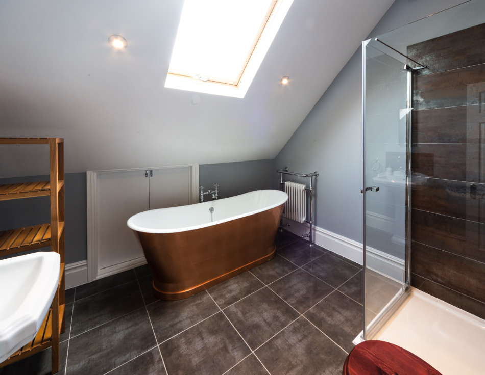 The soft pink colourway is a good counterbalance to the simple, functional aspects of the room.
Get the look: The Tamar bath in polished finish, Drummonds. Taps, Catchpole & Rye. Curtains in Silk Wool Pink Champagne, Fox Linton. Quilt, designed by Emma.
(Image credit: Davide Lovatti)
4. Choose space-saving pocket doors for small rooms
A small space between the master bedroom and ensuite bathroom below has been cleverly utilised as a dressing room . Two sets of sliding pocket doors separate the different spaces in a tidy way, without having doors swinging open and encroaching into this compact area.
(Image credit: Future)
5. Install Crittall-style doors for a modern look
Separate your ensuite bathroom from your master bedroom via Crittall doors – you'll want to move the loo to a separate powder room / cloakroom for privacy.
Get the look Porcelanosa sells similar marble tiles. Aston Matthews sells wall-mounted brass towel rails.
(Image credit: Paul Raeside)
6. Add texture to small spaces with woodwork
Tongue and groove panelling in the ensuite bathroom below lend a rust, country look. A modern bath and modern bathroom fittings keep it fresh.
Get the look: Bathroom design by Amos & Amos. Panelling in Blue Gray, Farrow & Ball. Bath, Duravit. Tap, The Watermark Collection
(Image credit: James Merrell)
The serene grey bathroom scheme below features modern wall panelling, recessed nook storage and a roll top bath. Aside from giving the space texture, the panelling also helps to create a rustic, country-inspired look.
(Image credit: James Merrell)
7. Install a partition screen
Install a dividing partition wall to separate a bath or loo from your sleeping zone, like the designers achieved in this modern house in Mexico .
This way the bathroom is still connected to the bedroom area, but there's an element of privacy too.
(Image credit: Casa Etérea)
The dividing brick partition wall below creates a cool and convenient separation between the bedroom and walk-in shower.
(Image credit: James Merrell)
Similarly, the ensuite bathroom below is segregated from the bedroom by a partition wall.
(Image credit: Sean Litchfield)
8. Consider double doors that reveal a surprise feature
Double doors reveal an unexpectedly glamorous bathroom, with a feature wall of shimmery gold tiles. The metallic tiles really make this ensuite bathroom pop.
Get the look: This is the Barcelona Bath from vandabaths.com, price from £3,675 inc vat.
(Image credit: Sanctuary Camelback Mountain Resort and Tessuto Interiors)
9. Introduce floor pattern
Floor pattern works in small bathrooms too, as the below ensuite demonstrates.
The geometric floor tiles, freestanding tub and brass details keep this bathroom firmly on trend.
(Image credit: Anna Stathaki)
10. Zone the different spaces
This stunning ensuite bathroom is connected to the master bedroom via a wide and open doorway, making the luxe bathing space feel part of the master suite.
(Image credit: Matthew Williams)
11. Brave a bold colour scheme
For a grown-up, chic and sultry look, dive in with a dark shade.
The ceiling and vanity below were painted the same bold blue as the bath, creating a cohesive look. The steel-framed shower enclosure acts as a contrast to the more traditional panelling and vanity. Wall-mounted taps, a wall-mounted towel shelf and a clear, acrylic side table all help to make this bathroom feel spacious.
Get the look: Floor tiles, Fired Earth. Bath, Aston Matthews. Towel rack, Soho Home.
(Image credit: Photography / James Merrell)
Who said bathroom lighting had to be boring? In this day and age there are numerous cool brands popping up, offering bathroom lighting that makes an impact.
(Image credit: uniquehomestays.com)
Or for a simple refresh, update your bathroom wall lights with some colourful new lampshades.
Get the look: Lampshades from Rosi de Ruig, wall lights from Tinsmith, mirror from Pottery Barn. Taps by Crosswater.
(Image credit: Interior Design by Studio Peake.)
13. Get a brassware update
Un-lacquered brass by Studio Ore adds warmth, modernity and glamour to this serene bathroom space. We love that striking modern pendant too.
Get the look: Un-lacquered brass by Studio Ore. Bathtub by Victoria & Albert. Floor tiles by Emery et Cie.
(Image credit: Photography / White Arrow)
14. Dive in with all-out opulence
It's easier to go OTT in a room you don't spend huge amounts of time in, as it'll be a pleasant surprise each time you see it rather than overkill. Here this flamboyant floral bathroom wallpaper has been teamed with richly veined marble and brass detailing to dramatic effect.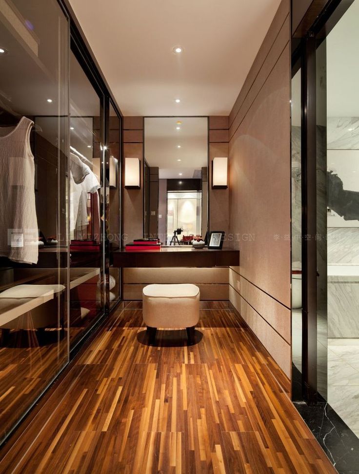
(Image credit: Matthew Williams)
15. Add an eye-catching mirror
The gorgeous bathroom mirror makes a great wake up call in this beautiful marble ensuite bathroom.
(Image credit: Anna Stathaki)
16. Opt for a floating vanity for a contemporary look
The deep drawers in this wall-hung vanity unit provide ample room for towels and toiletries, while its 'floating' style frees up floor space.
(Image credit: Anna Stathaki)
17. Heritage details
In a small space it makes sense to keep materials to a minimum, so the bath panel blends with the grey timber flooring. Heritage details such as the towel rail, mirror and wall lights add character to this loft ensuite bathroom.
Get the look: Find similar baths and basins at V+A Baths.
(Image credit: Future)
Lotte is the Digital Editor for Livingetc, and has been with the website since its launch. She has a background in online journalism and writing for SEO, with previous editor roles at Good Living, Good Housekeeping, Country & Townhouse, and BBC Good Food among others, as well as her own successful interiors blog. When she's not busy writing or tracking analytics, she's doing up houses, two of which have features in interior design magazines. She's just finished doing up her house in Wimbledon, and is eyeing up Bath for her next project.
Stylish decor and design ideas for ensuites of all sizes |
Homes & Gardens is supported by its audience. When you purchase through links on our site, we may earn an affiliate commission. Here’s why you can trust us.
Photography/Suzanna Scott
(Image credit: Geremia Designs)
Ensuite ideas come pretty high on a must-have list, when it comes to home luxuries. So much so, that once you've had one, the prospect of moving elsewhere without a similar space just isn't worth thinking about.
These bathroom ideas for ensuites help create a sanctuary in your home where you can steal a few calm, precious moments away to yourself.
With an ensuite bathroom, used by adults only, you can afford to be more adventurous with the decor.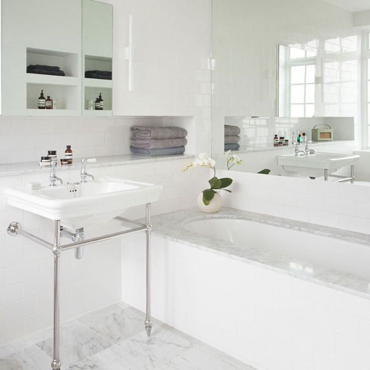 As well as being more relaxed about the robustness of surfaces, you can splash out on the fixtures and fittings to help create the dream bathroom you've always wanted.
From embracing that tile you love, to testing out paint colors deemed too bold elsewhere, it's the room where you can have a little fun. And if it doesn't work out, it's worth remembering that with small bathroom ideas , any decorating fails will be easier to remedy.
So whether you have a clear idea of what you want for your ensuite space, have notions for something a little bit different, or are starting your bathroom project completely from scratch, we've gathered some gorgeous ensuite ideas to help you create your dream master bathroom.
Ensuite ideas
1. Inject the feeling of space with reflective surfaces
Photography/Paul Craig and Megan Taylor
(Image credit: CP Hart)
There are lots of clever, space-boosting design tricks that work wonders on an ensuite and make a small bathroom look bigger .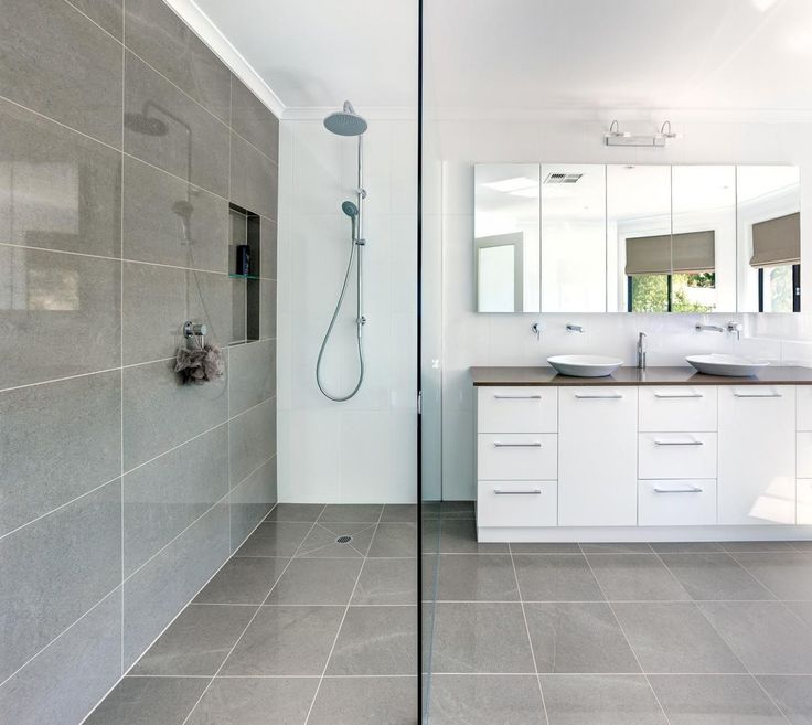
Decorating with mirrors is top of the list. ‘Mirrors are essential for bouncing natural light around the room, instantly brightening and uplifting,’ enthuses Yousef Mansuri, Head of Design at C.P. Hart .
‘Be brave and experiment with shapes and sizes. Oversized mirrors help to make a room look much bigger, while an interesting frame design can add important detail to plain décor.’
Practical features to look out for include integrated demister pads and bathroom lighting ideas for the mirror. ‘It is always practical to put an illuminated mirror on a separate circuit to the other lights in your ensuite to give the option of ambient lighting when required, usually at night,’ adds Yousef.
2. Step into the light
Photography/Chris Snook
(Image credit: BC Designs)
Stepping out of a dark, cozy bedroom into a light-filled ensuite is an uplifting way to start any day.
In this modern design by Scenesmith , dead space between the bedroom and ensuite was fitted with bespoke wardrobes in rich ebony oak veneer. The luxurious walk-through dressing space ends in sliding pocket doors that can be left open to allow borrowed light from the ensuite into the North-facing bedroom.
‘The dark finish of the cabinetry contrasts and exaggerates the delight of the bright, sun-lit ensuite beyond,’ explains Scenesmith’s director Sophie Smith.
3. Raise the floor
Photography/Alexander James
(Image credit: VSP Interiors)
If you’re lucky enough to have a view worth seeing from your ensuite, make sure the bath is perfectly pitched to enjoy it.
‘The view from this new ensuite is stunning, so we built a raised platform to make the most of the vistas across the gardens, while at the same time making it much easier to install the new waste pipes,’ recalls interior designer Henriette Von Stockhausen .
Here, Henriette has opted for a clever small bathroom flooring idea by choosing reclaimed wood - crucial for adding warmth in the high-ceiling space.
‘The most important thing for me in any bathroom is to make it feel like a room, so I love to add art, rugs and curtains, just as you would anywhere else in the house,’ adds Henriette.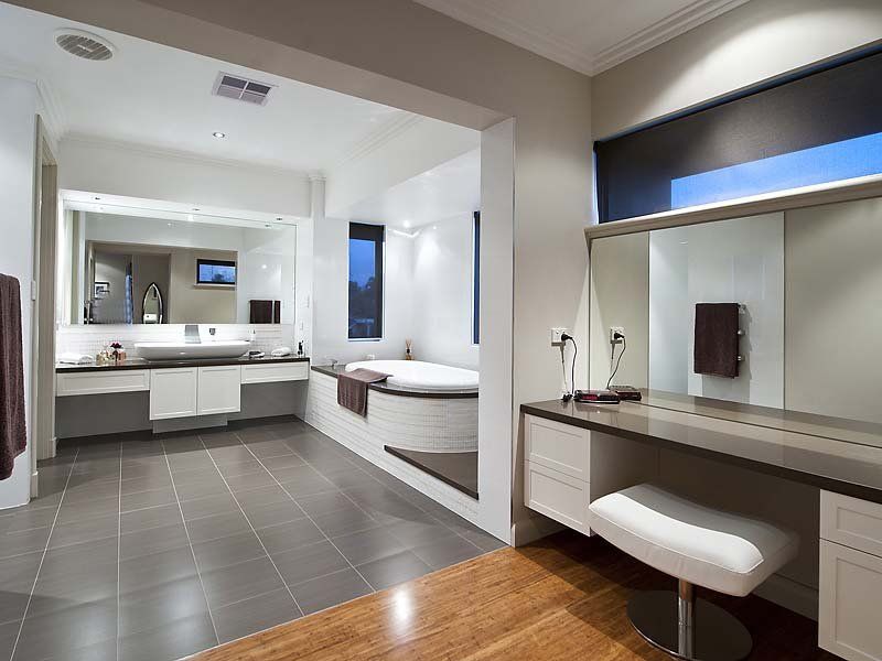
4. Add pattern and color using wallpaper
Photography/Mike Garlick
(Image credit: Penny Morrison)
Taking design cues from the living room to soften the hard lines and cold surfaces usually found in ensuites is a growing trend. Think flowing curtains, vintage furniture and pretty patterns.
Thanks to modern ventilation systems, and a bit of common sense, you can even incorporate wallpaper in your ensuite.
‘Wallpaper works really well in ensuites, injecting maximum pattern and color in a small area,’ says interior designer Penny Morrison .
Penny recommends using small bathroom tile ideas for splashbacks or upstands behind the bathtub and basin to protect wallpaper from direct splashes: 'A large sheet of glass sealed over the wallpaper is one of my favourite solutions, as it allows you to enjoy more pattern.’
5. Create a smooth flow from room-to-room
(Image credit: Benjamin Moore)
When searching for ensuite ideas to help you decorate, try to create a sense of flow from your bedroom into the bathroom with a complementary scheme.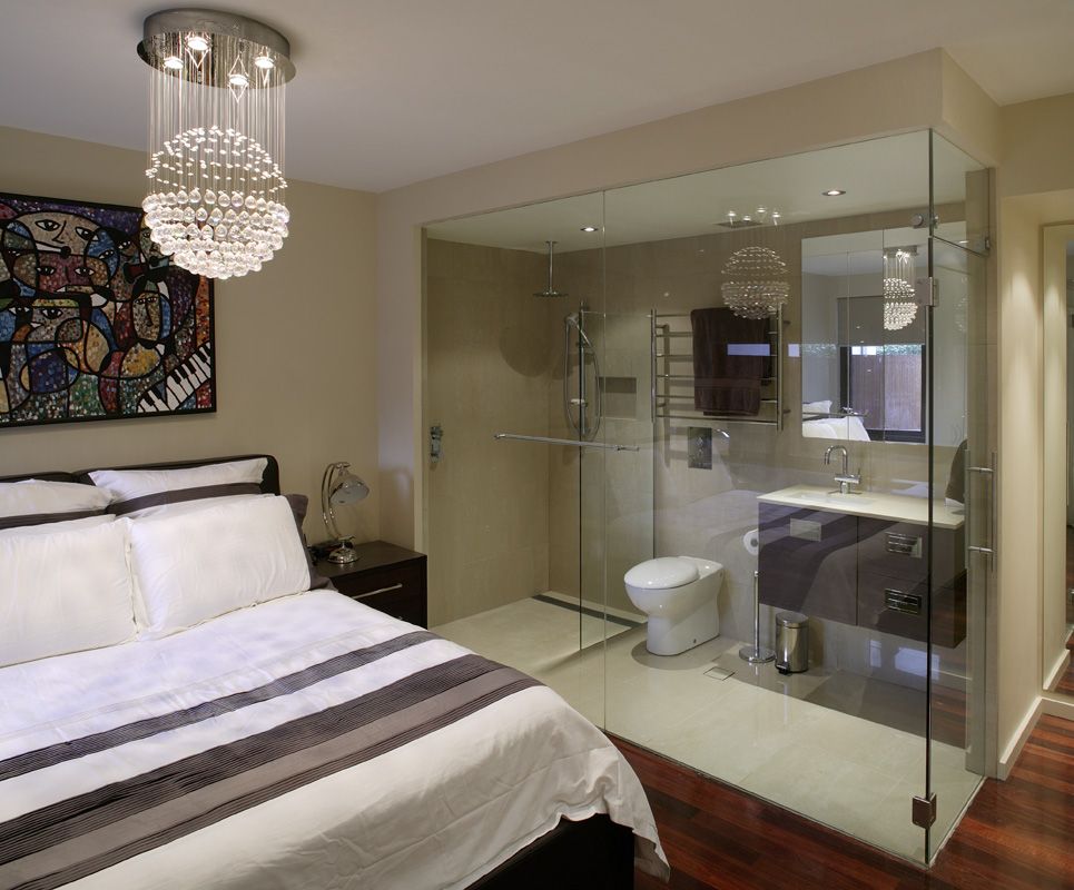 ‘This does not necessarily mean being too matchy. However, picking out key colors works particularly well,’ advises, Helen Shaw, UK director, Benjamin Moore .
‘Your ensuite should feel personal and have the same haven feeling as your bedroom. Soothing pastel shades or off-whites help to ensure the room feels relaxing while also maintaining a feeling of spaciousness due to the lightness of the colors.’
Why not take things one step further and create the ultimate bedroom-bathroom feel with master bedroom ideas with bath.
6. Let there be light
Photography/Anson Smart
(Image credit: Decus Interiors)
Nothing beats natural daylight for waking you up in the morning. Combine with one of these walk-in shower ideas and you’ll be ready to tackle whatever the day brings.
If a regular window is out, consider a roof window or sky light directly above the shower area, pitching the ceiling up into the loft space if necessary. Invest in self-cleaning glass and triple glazing to keep your ensuite cosy and quiet.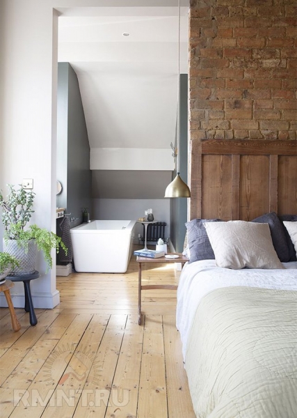
7. Use curved fixtures and fittings to make the most of the space
Photography/Mary Wadsworth
(Image credit: Gunter and Co)
If you want to include a bathtub in your ensuite, curves are the secret to comfortable access.
In this master bathroom , Gunter & Co were tasked with finding space for a generous shower and double-ended bathtub, without making the room feel cramped. ‘There is nothing spa-like about a tub that’s wedged in,’ says interior designer Irene Gunter.
‘We designed a curved vanity and had a shower enclosure curved to match, which gave us the extra inches we needed around the tub.’ Bespoke curved glass is expensive but quadrant enclosures, which are curved at one end, are readily available.
8. Reconfigure the boundaries between your bedroom and bathroom
(Image credit: Kitchen Architecture)
When reconfiguring your sleeping quarters to include an ensuite, don’t assume the bedroom should be allocated the biggest space. Since your eyes are mostly closed when in bed, why not go big in the bathroom?
Kitchen Architecture shows us how it’s done with this decadent ensuite and dressing room idea , which means the bedroom can afford to be smaller.
Featuring floor-to-ceiling built-in wardrobes amid sleek designer bathroom fittings by Agape, the luxury of spaciousness is achieved without compromising on clothes storage.
9. Maintain your privacy
Photography/Adam Carter
(Image credit: Ripples)
The dream scenario in any ensuite layout is to position the toilet on the same wall as the entrance, so on view from the bedroom.
Sadly, the soil pipe position on an external wall often overrules. Here, bathroom company Ripples commissioned a bespoke iron modesty panel, which has become the highlight of this traditional ensuite.
Other options include hiding the toilet behind a shower enclosure or dwarf wall. ‘Frosted, fluted or tinted shower glass is a really nice, unintrusive way of creating privacy in the shower,’ adds Jo Sangster, senior designer, Ripples.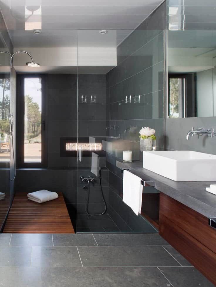
10. Add a powder room area to your ensuite
Photography/Suzanna Scott
(Image credit: Geremia Designs)
If your ensuite bathroom is blessed with an abundance of natural light it could be the perfect spot for a dressing table. East-facing bathrooms are particularly suitable for applying make-up as the light is soft and flattering.
In this Californian ensuite, Geremia Design included a generous dressing table in the same grey-stained oak veneer as the basin unit opposite. ‘The natural light is perfect for reflecting accurate skin tones in the mirror and the view is nice too. It’s a pleasant place to sit,’ says principle designer Lauren Geremia.
A space-saving small bathroom storage idea is to consider combining the two by tucking a stool under one end of a wide basin/vanity unit.
11. Spread out with a double washbasin
(Image credit: Future/Davide Lovatti)
Traditionally known as his and hers washbasins, yet now more correctly named a double basin, oversized bathroom vanity ideas with sinks offer oodles more space if you share both bedroom and bathroom with a partner.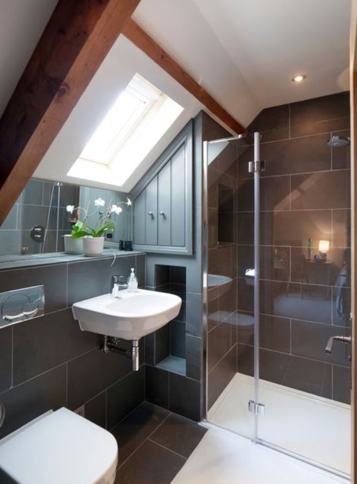
You can choose separate twin washbasins with matching dual mirrors, or opt for a lengthy trough-style sink and a single landscaped mirror, or a combination of both.
Either way, it's definitely worth it if you have the space, not just because of the harmony and symmetry that it adds to an ensuite, but because it also gives you room to stretch out.
12. Create a hidden entrance
(Image credit: Future/Jonathan Gooch)
Installing a new ensuite, as well as fitted storage? Why not design your walk in closet around the door to your bathroom by giving it a concealed entrance?
Placing the entrance to your ensuite behind a matching closet door will streamline your bedroom space further, while creating a hidden sanctuary for you to completely relax in.
13. Don't hold back with luxe fixtures
(Image credit: Future/Paul Raeside)
Save the practical design choices for the family bathroom. Your ensuite is where you want to splash out on your decor, from marble tiles and sleek flooring to that gorgeous brass bathtub you've always wanted.
Also, as is the case with many ensuites, you don't necessarily have to shut the room off from your bedroom, either. The benefits of leaving the space open, much like an open plan living space, include more light in both rooms, as well as the obvious visual space gain.
While you don't necessarily need to have each space decorated in a matching style, you should aim to choose certain pieces of furniture or decor colors that will link the two spaces together.
14. Make the most of the space with a wet room
(Image credit: Future/Davide Lovatti)
If space is an issue, consider making your ensuite a wet room. Smart wet room ideas allow you to remove any barriers or screens leaving the space more open, both physically and visually.
'You can create a true wet room by not having a shower screen at all,' says Michael Marcer of Ripples, 'especially if you have underfloor heating to dry the room quickly. But we usually put in a small screen to prevent the rest of the bathroom getting wet.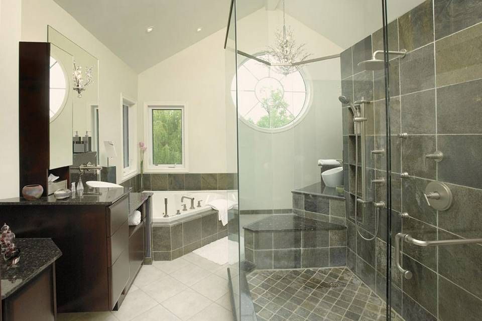 '
'
15. Stick to soothing textures and shades
(Image credit: Future/Polly Eltes)
If your personal taste is more farmhouse than futuristic, then allow your ensuite to be the place where you can execute this look to the max.
Decorate the space in soft, soothing shades and splash out on the ultimate bathroom indulgence. A claw-footed tub will help you to achieve a super relaxed scheme.
What typically makes up an ensuite bathroom?
If you're wondering what typically makes up an ensuite bathroom, you've come to the right place.
You can have an ensuite toilet, but the bare minimum required for an ensuite to earn bathroom status is a WC, basin and shower.
A compact ensuite bathroom that utilises space saving fittings is possible within just 13 square feet but aim for at least 17 square feet if possible. An ensuite with a bath should be around 5 x 6.5 feet for comfort.
The amount of space you afford should reflect anticipated use.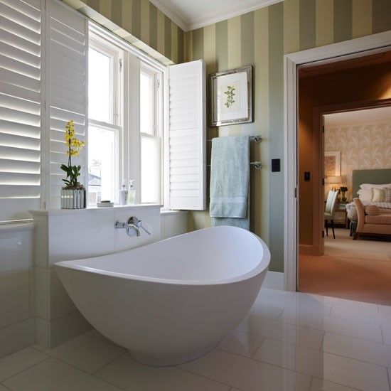 For example, an ensuite for occasional guests can afford to be much smaller than one for a master bedroom that is typically used daily by two people.
How do I get more light into an ensuite?
There are a number of ways to get more light into an ensuite.
Since windowless bedrooms are undesirable, ensuite bathrooms created in space stolen from bedrooms are often windowless.
Installing a new window doesn’t usually require planning permissions. The window should be similar in design and construction to those in the rest of the house, and windows on upper-floor side elevations should feature obscure glazing.
Other options include widening the doorway between bedroom and ensuite to share light from the bedroom. Internal windows play a similar role and can be installed above head height to protect privacy.
Skylights and rooflights are also great for bringing in daylight without worrying about being overlooked by neighbors. Suitability will depend on the type of roof above your ensuite, and budget constraints.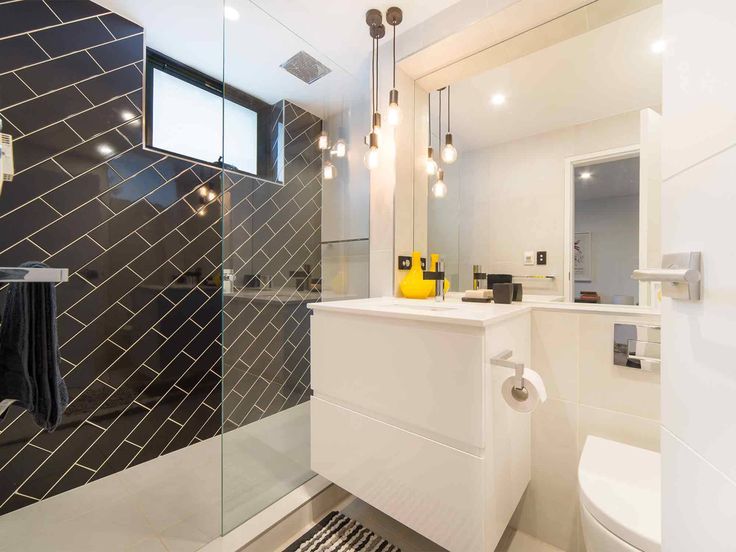 A sun tunnel is less disruptive and emits a soft defused light.
How do you decorate and arrange a small ensuite?
So you've got your layout sorted, but how do you decorate and arrange a small ensuite?
There are no hard or fast rules, but it helps to start by establishing if you’re looking for the calm, clean lines of minimalist fittings or the more decorative but cosier vibe of traditional/vintage design.
If natural light is lacking, seek out light-reflecting materials like glossy tiles and of course mirrors. An ensuite can also prove the perfect place to experiment with luxurious materials, such as designer mosaics, as the smaller surface area won’t blow your budget.
The quickest way to make an ensuite feel cramped is to overcrowd it with fittings. Allow at least 28 inches (70cm) in front of the toilet and wash basin and 32-40 inches (80-100cm) in front of the bathtub and shower.
Linda graduated from university with a First in Journalism, Film and Broadcasting. Her career began on a trade title for the kitchen and bathroom industry, and she has worked for Homes & Gardens, and sister-brands Livingetc, Country Homes & Interiors and Ideal Home, since 2006, covering interiors topics, though kitchens and bathrooms are her specialism.
Rublevo
Anna Pominova
Stylish design: medium-sized bathroom in modern style with flat cabinets, white cabinets, alcove shower, red tiles, white tiles, porcelain tiles, porcelain stoneware flooring, shower cabin, solid washbasin, multicolored floor, swing door shower, white countertop, single vanity and hanging vanity - latest trend
Sponsored
Meerbusch
Apartments in Ulyanovsk
PlatFORM Design Studio
A fresh design idea: modern style master bathroom with green facades, freestanding bathtub, white tiles, pink walls, countertop sink, white floor, white worktop, double vanity sink, floor cabinet and tiered ceiling - great interior photo
Sponsored
Hecker Architekten
Ihr Ansprechpartner für Komplettsanierungen & Neubau | Dusseldorf
Duplex apartment
Salakhova Dina
Stylish design: neoclassical (modern classic) bathroom with flat facades, brown facades, beige tiles, gray walls, sink sink, beige floor, white countertop, cabinet for two sinks and built-in curbstone - the latest trend
Project "Home History"
ELENA BODROVA | ELENA BODROVA
Small combined bathroom in monochrome shades.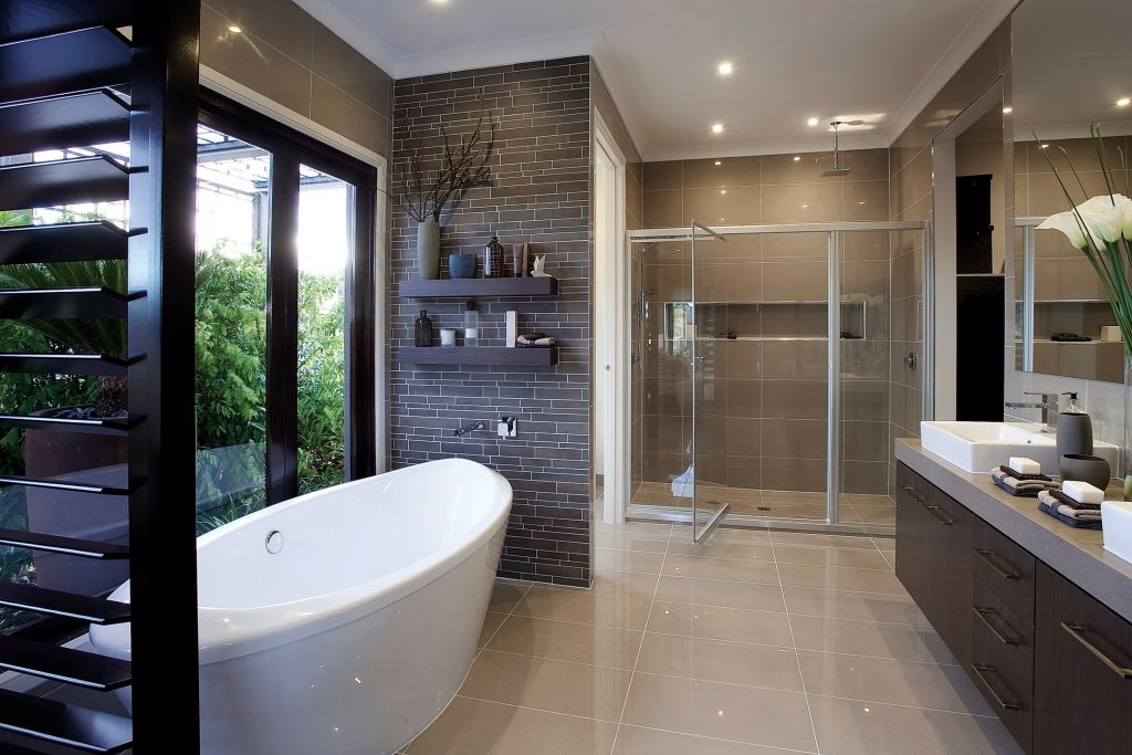
Inspiration for home comfort: small neoclassical (modern classic) bathroom with glass fronts, gray fronts, corner shower, white tiles, ceramic tile, ceramic floor, walk-in shower, gray floor, sliding door shower and console sink
Molodyozhny Residential Complex
Violetta // Studio FIXROOM
Molodyozhny Residential Complex project is located on the Neva River in St. Petersburg. The project is made in a modern style. In the implementation of the project, popular materials were used - 3D panels, laminate, stretch ceilings, cashless doors. The project was carried out for a family with two children. Wishes were to use a lot of light and warm colors. And the living room should become the center of the apartment and a place for family evenings.
APARTMENT IN SAINT PETERSBURG 150 sq.m.
Kutepova Marina
Bathroom.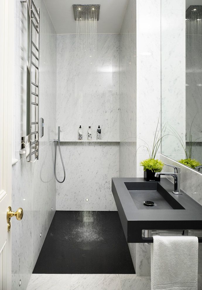 Marbled porcelain tile, Flaviker PI.SA Supreme Golden Calacatta Lux collection; sink with stone top, Antonio Lupi; faucets, Zucchetti; mirrors and hanging cases, Mr. doors; toilet, TOTO; lamps, TSENTRSVET.
Sponsored
Düsseldorf
raumkontor InnenarchitekturAverage rating: 5 out of 5 stars 5 reviews
Schönheit des Einfachen
Hometown Vorontsovsky Park0003
Anna Zhemereva / ORT-interiors
Stylish design: medium-sized bathroom in modern style with flat cabinets, medium-tone wood cabinets, gray tiles, shower cabin, monolithic washbasin, vanity unit and wall-mounted vanity cabinet - the latest trend
All shades of blue
Elena Efimovov Design Studio
Photo: neoclassical (modern classic) master bathroom with overhanging paneled fronts, white fronts, alcove bathtub, shower over bathtub, countertop sink, white countertop, cabinet for one sink and floor cabinet
9 Modern Bathroom Design Ideas in 2022 and 109 photos
I have prepared 9 design rules - follow them and you are guaranteed a beautiful and modern bathroom interior that is relevant for years.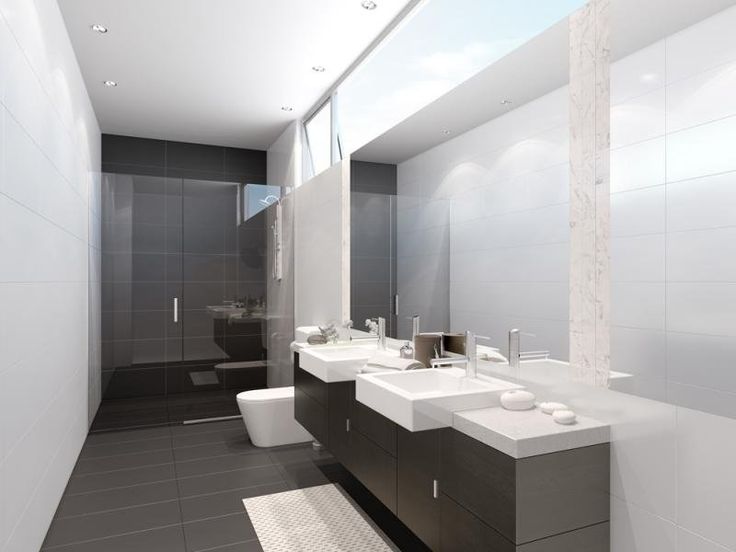
Trends in 2022 are extremely adequate: simplicity, naturalness, balance, neutral colors. This is the situation where fashion can be followed.
- Modern bathroom design through solidity
- 1. Countertop instead of conventional washbasin
- 2. Modern built-in faucets
- 3. Lifting everything off the floor and hanging it up
- 4. Closed storage areas
- 5. Swapping a bathtub for a shower
- Ideas for trendy bathroom interiors in 2022
- . finish colors
- 7. Natural look tiles
- 8. Large tiles
- 9. Gray and wood combination
Modern bathroom design through solidity
Bathroom interior in 2022 is primarily a monolithic layout without dark corners and hard-to-reach places.
The main idea of modern bathroom design is a holistic appearance, as if the bathroom is carved from a single piece of stone. If now it seems abstract, then by the end of the material you will clearly understand how to make a beautiful and modern bathroom interior :
- No dark corners
- No gaps
- The floor is maximally unloaded
- Everything that is possible is built in
- All items are hidden from prying eyes
Further explanation will be given with examples of real photographs, but mostly from expensive fashionable bathrooms.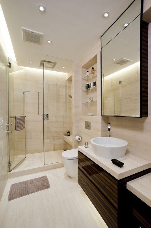 Be sure to read more mundane materials:
- Small bathroom design - 9 rules
- 4 sqm bathroom with washing machine and toilet - 80+ placement examples
Here is a bathroom with expensive fixtures, but would you call such a design modern?
No. Just because there is no such solidity here. And here is:
Now let's analyze in detail how this idea is implemented in practice.
1. Countertop instead of conventional washbasin
Conventional washbasins are used less and less in modern bathrooms. Their fixed size does not allow them to be built in without gaps. The gaps between the sink and the bathroom or wall greatly reduce the cost of the appearance. Built-in or overhead bowls are used instead of conventional sinks to create perfect seams.
The top itself is made of plasterboard (tiled or mosaic), chipboard or acrylic. Because this design is made by hand, you can achieve perfect joints.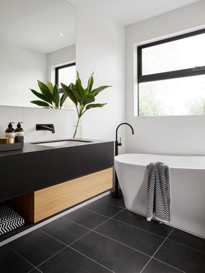 We are not tied to standard sizes, but the cabinet will also have to be made to order.
In the photo below, look only at the countertops and the washbasin, more about the faucets.
2. Modern built-in mixers
This item comes second for a reason. A sink built into the countertop + a cool faucet is critical and raises the level of the bathroom interior to a fundamentally different level.
It's like the difference between an old floor-standing toilet and a wall-hung toilet with an installation - it's worth the extra money.
Yes, built-in faucets are more expensive, but they take bathroom design to the next level.
Bonus cleaning:
- When the faucet is in the wall, chrome remains chrome. I think many people living in areas where water contains salts know how quickly ordinary faucets lose their appearance.
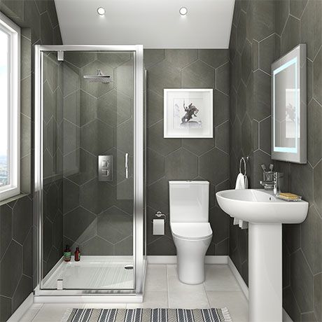
- Dirt and yellow water stains constantly accumulate around the common ones at the point of contact with the sink, which are inconvenient to clean.
The design of faucets has also stepped forward over the past 5 years and by 2022 their choice is simply huge. There are also relatively inexpensive built-in ones.
Ordinary ones also come with a beautiful modern design, but you lose the practicality bonus:
The finish is the background. Modern finishes - neutral background. And against this neutral background, current sanitary ware and faucets look especially advantageous.
3. Lifting everything from the floor and hanging it
Our eye judges the area of a room by the free floor. More floor means more area. Therefore, the trend of recent years is to hang a cabinet, a closet and a toilet.
Fashion is not always adequate. But the idea of hanging really makes a bathroom beautiful, modern and practical .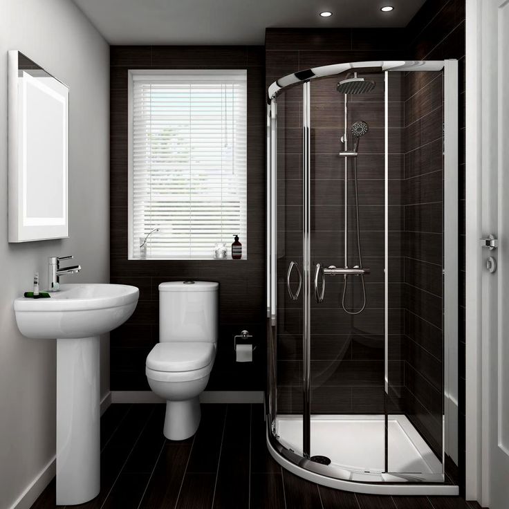 There is no this dark space under the furniture, under which dirt is constantly clogged, and at the same time it is inconvenient to clean it because of the legs.
If deep textured porcelain stoneware is laid on the floor, then under the cabinet or bathtub you can make LED lighting. On a textured tile, the light will give shadows and volume - it looks very cool. Floating bath effect:
4. Closed storage areas
2 facts:
- In any bathroom there is a huge amount of shampoos, gels, creams and other toothpastes and brushes.
- All this looks bad and should be hidden.
You can make as cool and modern a renovation as you like, but the eternal mess due to mismatched jars will ruin everything.
Usually, of the storage systems in the bathroom, only drawers in the cabinet. But they are not enough and almost always hygiene products are in sight. The solution is a narrow vertical hanging cabinet. It holds a huge amount of things, while it takes up almost no usable space. Choose a color for the rest of the design - you don’t need the cabinet to stand out. For light - white gloss, for dark - black, gray, wood effect.
5. Replacing the bath with a shower
Don't rush to defend your right to wallow in the bath. Yes, this is a cool opportunity. But in today's world, time is the most valuable resource. And it is functionally a shower without a chance better than a bath.
If you just think about this question, then the decision to take up space in the bathroom with an extra item that will later waste your time and water does not seem so obvious. Therefore, a bath is only if you are a fan (like me). Otherwise, shower.
We already have a separate material about the design of a bathroom with a shower.
Ideas for trendy bathroom interiors in 2022
Fashion is a controversial thing.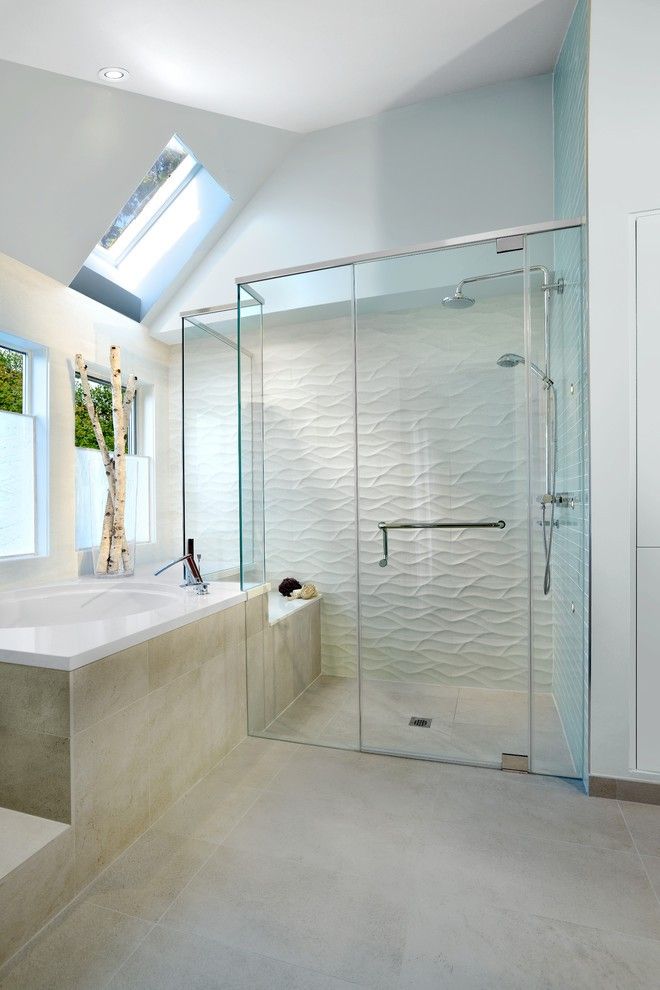 Especially in the design of bathrooms, where renovations are done for many years. The good news is that now there are impeccably adequate trends in repairs. Interior fashion is not the area where some crazy things and kitsch are at the forefront. Simplicity, natural materials and functionality - it is unlikely that this will soon become irrelevant.
6. No bright unnatural colors finishes
Bright unnatural colors in bathroom finishes are a sure sign of an obsolete renovation. Now nobody does that anymore. Accents and colors are added by decors, accessories and textiles. Even in the bathroom there are towels and rugs, which also have their own colors and all this should be combined.
The main idea: a boring design can always be kept alive with decoration, but an overloaded design cannot be saved.
But this thought, lest you be afraid, is actually boring and will not work. If you do not keep this idea in mind, it may turn out to be a collective farm.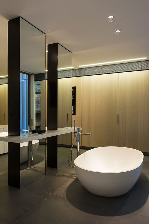 Balance, integrity, accuracy, naturalness, spaciousness are the main ideas of modern bathroom design. Motley colors, luxury, excessive complexity and impracticality are relics of the past.
Good news and with the question of which ceiling to choose in the bathroom - stretch matte, it has no minuses (almost none).
7. Natural look tile
Let's decorate the walls with glazed colored incomprehensibly what do you think? Sounds so so. Here are 3 examples. The first photo shows an ultra-modern bathtub, but the tiles spoil everything. Second, everything is outdated. On the third, it seems not so bad, but the tile is unprincipled and unnatural.
What about wood, stone, travertine, marble, metal and concrete? This is exactly what modern tiles should be like - imitating real materials.
About tile design in modern style and how to choose tiles for the bathroom and how to lay out the walls.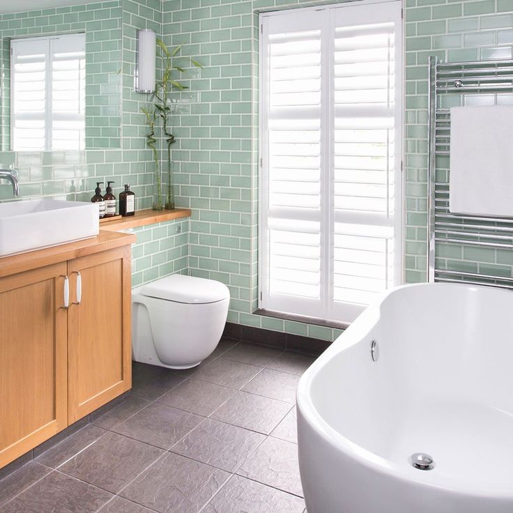 . Never imagine the final renovation as a bare finish of the room. Visualize immediately the real room, how it will look after the move and the appearance of all things and textiles. Then the probability of overdoing it with the intensity of finishing will decrease.
8. Large tiles
If the previous points are observed and the interior of the bathroom looks holistic, then the rule works:
The larger the tiles, the better and more modern the bathroom design looks.
If the wall is enough for two whole tiles, that's enough. The minimum size from which you can consider is 60 × 20 cm, more is better. The mosaic stands apart.
This also applies to tile joints - they must be in color or gray so as not to crush the plane into patches. There should not be a feeling that the walls of the bathroom are pasted over with separate elements. Everything should look like a natural whole.
9. Combination of gray and wood
The apotheosis of the entire 2nd section is gray and wood.