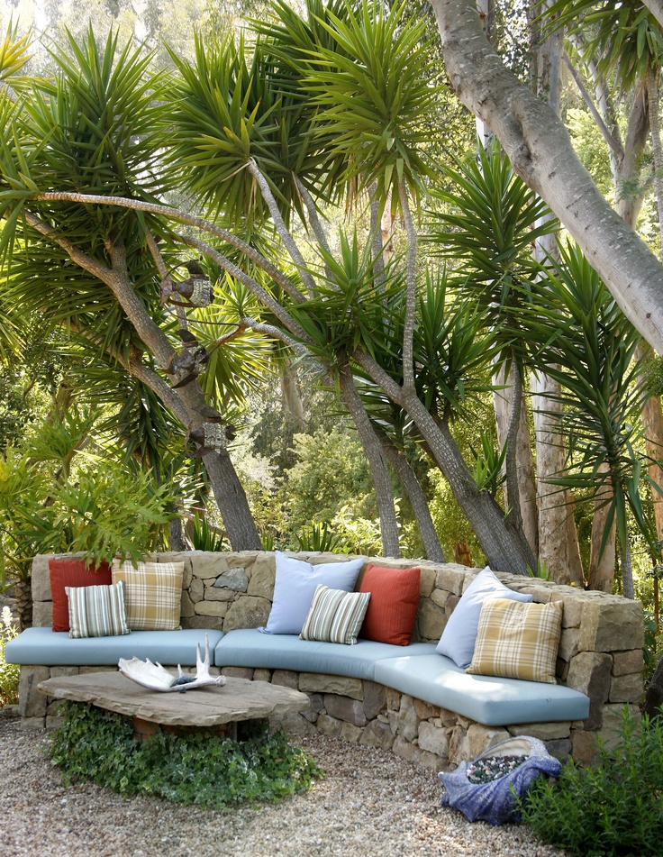
Design room color
a masterclass in decorating with color |
When you purchase through links on our site, we may earn an affiliate commission. Here’s how it works.
(Image credit: Paint & Paper Library / Gunter & Co. / Jonathan Bond)
As anyone who has been through the process of searching for room color ideas will attest, choosing the right color for a room can be a minefield with endless choices and subtle nuances to understand and overcome.
'Choosing color is one of the hardest parts of decorating because we only actually know the true color of something because it’s sitting next to another color,' says Rachel Chudley, an interior designer renowned for her use of strong color.
Here, designers, decorators, and experts reveal how to approach choosing room color ideas and decorating with color with confidence, from using the color wheel to create strong color combinations to using accent shades and neutrals.
Room color ideas – and how to decorate with color
When looking for room color ideas – or even just decorating with color in the most subtle of ways, start by embracing color theory.
1. Embrace color theory
Color blocking is a great way to create unusual or even tonal combinations
(Image credit: Farrow & Ball)
Color theory, which touches on color psychology, can be a complicated subject but there are a few basic principles to help steer you in the right direction. Below, Patrick O’Donnell, brand ambassador for Farrow & Ball , explains.
'Red is linked with passion, energy, and action. The color is also associated with increasing our metabolism, hence its popularity for dining room color ideas but at the darker end, especially a reddish-brown shade, it can look elegant, dramatic and warm for a bedroom. For further inspiration, see our guide on what colors make a bedroom feel warmer?
'Blue has many emotional attributes: at the paler end, tranquillity and calm, to intelligence at the darker end. It is often considered a restful and sympathetic color, so a paler blue is ideal for a bedroom, but I’d err towards darker blue shades for the home office, living room or for kitchen color ideas.
'Yellow (orange shares similar characteristics) is the color of energy, happiness, and optimism and therefore a brilliant choice for either a kitchen or a home office but try and avoid in a bedroom as this primarily is a space for rest.
'Green is a joy to use: the primary color of nature and the outdoors. It is the perfect color family to deliver calm and serenity and therefore has the flexibility to be applied in every room throughout the home if you're looking at decorating with green, but is especially great for bedrooms and for living room color ideas. It symbolizes renewal and growth.
'White represents purity, innocence, and new beginnings, as well as cleanliness and clarity. It can be used everywhere in the home but is very successful in the bathroom and any room where you want to create order and with little distraction. It is also an ideal foil for a well-curated room of art and furniture.'
2. Factor in daylight
For shades are flattering to live among and set off good furniture, go for colors with a bit of dirt in them, as demonstrated in the Oxfordshire drawing room of Emma Burns, director of Sibyl Colefax & John Fowler
(Image credit: Sibyl Colefax & John Fowler)
Another key factor is light, and the best way to address this is by considering the aspect of the room. 'As a general rule, to lighten up a north-facing room, avoid anything with a green or gray base – or don’t fight it and paint it dark which creates a cozy and cocooning feel,' says Patrick.
Meanwhile, using soft, pale tones is a great way to maximize the feeling of light and space in a south-facing room. Light in west-facing spaces is cooler in the morning and brighter in the afternoon so warm tones will work well while light blues and greens can have a calming effect on east-facing rooms.
'The trap that people fall into is that they consider dark rooms to be wrong, and just paint it bright white. I really like to lean into the darkness and explore the depths of color,' says interior designer Rachel Chudley . 'Go for a very deep, dark color but mix it up in a very high gloss paint, and this will reflect the light around the room. Then you get the depth you’re leaning into but also this amazing light which can glow like a jewel, especially in candlelight.'
3. Include contrasting colors to create impact
You can’t go wrong with decorating using glorious jewel colors, says Lulu Lytle co-founder of Soane
(Image credit: Soane)
Interior designers also talk about another element which needs to come into play when introducing colorful room ideas: contrast. As a result, don’t be tempted to lean on analogous colors – those that sit side-by-side on the color wheel – the result will be broadly harmonious but might lack in vitality.
Equally, a scheme based on complementary colors will result in maximum contrast but will need to be softened by neutrals. 'Don’t forget you can introduce techniques such as color blocking to create unusual or tonal combinations,' adds Patrick.
'Clashing colors can really make my heart sing,' says Rachel Chudley. 'For a project I'm currently working on, we’ve been mixing up deep purple, almost blacks, with very bright apple red – an almost "fruits of the forest" combination.
'Getting the color right in a room is an amazing balance, because it’s those last minute touches which can really set things off. What I like to do is just when everything’s looking really harmonious and perfect is to throw in a little rogue element of chaos, like adding a little yellow silk blind in space with no other yellow. If it’s too perfect, a space can feel claustrophobic in its designed-ness, so having a couple of rogue elements like that spices things up, and also helps a house feel like a home.'
4. Base room color ideas around what you can't change
Use color to balance the weight of elements in a room. Here walls in London Brown by Edward Bulmer Natural Paint are offset by the pink upholstery
(Image credit: Edward Bulmer)
Another way to take the first step is to begin with what is already decided or what you can’t change, recommends interior designer and natural paint specialist Edward Bulmer .
'It might be a wood floor or an old fireplace, for example. Then base your tonal choices on the color of these elements – effectively, warm or cool. If you get the tonality right first, you will then have a wide variety of colors that will work and so choice comes down to personal preference or other elements of your scheme – like fabrics.'
5. Consider the color's weight
Blue and green are the fundamental colors of nature and work beautifully together, contrary to the old saying, believes Lulu Lytle, co-founder of Soane.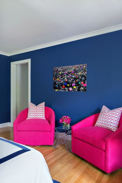 Shown is their Persian Flower fabric in Lapiz and Coral wallpaper in Green
(Image credit: Soane)
'A further consideration that can help is the weight of the color,' continues Edward Bulmer. 'One can get a sense of the weight of elements in the room visually and it helps to try and balance them, for instance an old oak dresser will look better with a mid, rather than a light, tone.'
'For classic and timeless decorating, it's the rather muddy colors that I'm particularly drawn to – those that John Fowler had made up by Christopher Wall of the National Trust, the archive which was eventually given to Tom Helme of Farrow & Ball. They are, in essence, colors with a lot of dirt in them which results in warm, sympathetic and flattering shades for people to live in and furniture to sit against,' says Emma Burns director, Sibyl Colefax & John Fowler .
‘I’ve always adored blues and greens, the fundamental colors of nature,' says Lulu Lytle of Soane . 'Contrary to the old saying, I think they work together beautifully and often combine them. As a child I was exposed to lots of pattern – all our bedrooms were wallpapered – and color. My mother, who once remarked, “raspberry’s just a neutral”, used many deep pinks around the home and clearly left an impression, since they feature strongly in the Soane fabric and wallpaper collections. Later travels to Egypt introduced me to a favorite combination of pale blue and buff and glorious jewel colors.'
6. Decorate with strong colors
Another way to go bold with color is to paint woodwork and decorate with bright accessories, says decorator and designer Bridie Hall
(Image credit: Pentreath & Hall)
Paint ideas are the perfect way to transform a space quickly and easily, adding personality and character to create an inspired interior, says Ruth Mottershead, creative director of Little Greene . 'Bold, vivid hues and lively tones work well in rooms that are made for entertaining, or see a lot of activity, such as kitchens and living rooms. A pop of bright, rich contrasting color is a great way to add impact and an element of surprise to an otherwise muted scheme. Alternatively, bold colors are also a great option for spaces with a lot of natural light and can be used in much bigger proportions without being "too much”.'
7. Try color drenching for impact
Color drenching – painting the walls and woodwork in the same tone – is a fun way to embrace a bold approach, says Ruth Mottershead of Little Greene
(Image credit: Little Greene)
For a strong approach, embrace the color drenching trend. This sees mid-strength tones, in just one or two very closely related colors, used to create enveloping cohesive interiors that allow color to be a focal point. It’s an approach used by interior designer Sarah Brown for the kitchen in her Chiswick home.
'All the walls and woodwork are in the same color with contrasting notes. It’s a way of straddling the design gap between town and country, traditional and contemporary,' explains Sarah.
The beauty of color drenching is that it can be applied to such a variety of different spaces. It can’t make a small room larger, warns Ruth but it can embrace the size of the space and create something that lifts the mood and feels really engaging, inviting and contemporary.
8. Create surprise with color in the kitchen
Walls in turquoise are paired with crisp white cabinetry in this kitchen scheme by Vanrenan GW designs
(Image credit: Vanrenan GW Designs)
Kitchen color ideas are a relatively new concept. Historically, says Edward Bulmer, the considerations taken into account were that the materials used were fire-proof, serviceable, sturdy and washable.
But as more and more begin to embrace bolder tones, the best bet for those who want to follow suit is to consider light and volume of the space, says Louisa Greville Williams of Vanrenan GW Designs . 'If the kitchen is a very large space, we might use a patterned wallpaper and then contrast, rather than match, with a paint color. We think kitchens should be just as decorative as the rest of the house, even though it has a utilitarian use, especially as we all live in our kitchens more than ever so we should enjoy them.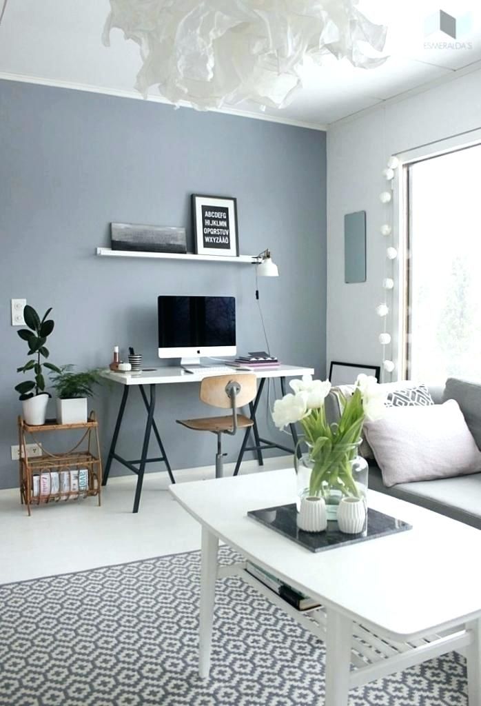 '
'
9. Use bold hues in bedrooms
Don’t be afraid to go bold in a bedroom – in this scheme by Albion Nord crisp white sheets balance the strong orange walls in Sang de Boeuf by Edward Bulmer Natural Paint
(Image credit: Patrick Williamson for Albion Nord)
Bedroom color ideas can be bold too, adds Camilla Clarke, creative director of Albion Nord . 'It’s easy to shy away from bold bedroom color ideas but it works wonderfully when paired with fresh white sheets and the creamy tones of a headboard and cushions,' she recommends.
Bear in mind, you don’t need to go bold with the walls – you can focus instead on big color pops instead. 'I live with a lot of boldly-painted woodwork and objects – all strong in color and finish which have a lot to say when they’re put together,' says Bridie Hall, interior designer and co-founder of Pentreath & Hall .
'My trick is to sink it all into a neutral environment; all of my walls are painted white. Those blank spaces create a negative where the eyes can take a breather and are just as important as the positive impactful burst of color and form.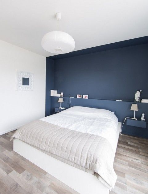 '
'
10. Limit your room color ideas
Here, Sarah Peake of Studio Peake demonstrates how to pick out anchor colours and add in additional pops while always maintaining a sense of restraint
(Image credit: Alexander James for Studio Peake)
Sarah Peake, founder of Studio Peake , says she likes to pick out one or two colors that anchor the room and then mix in other, complementary, colors, with the main anchor tones being the common threads that run through the scheme. You can also use pattern to ensure that even a very bold color scheme is dispersed throughout the space in a more subtle, harmonious way; for example, a plain wallpaper or paint on the walls offset by patterned cushions and soft furnishings that quietly pick up that tone. It is also important to limit the overall number of different colors you use, otherwise the space may feel unstructured and overwhelming.
11. Add color with art
Sophie Ashby of Studio Ashby uses art as a jumping off point for room color ideas
(Image credit: Studio Ashby/Philip Durrant)
Colorful art is another way to go bold. A favorite painting can be a good inspiration and art is always the starting point for any scheme by Sophie Ashby of Studio Ashby who is known for her dynamic designs that feature colors inspired by her South African roots.
'Ideally, we would work from a client’s own collection. From that, we can then begin to build a color palette and design references,' says Sophie. 'In a new build, I like to go with all-white walls and curtains and put color into the middle of the room with art and textiles. While in a period house, I might go for a strong color on the wall picked out by a white ceiling and skirtings.'
12. Work with unusual color pairings
When decorating with unusual color pairings, remember to balance the scheme with a natural element such as the stone floor here which juxtaposes the bold colours, recommends textile designer Eva Sonaike who created this bathroom design for CP Hart
(Image credit: Anna Stathaki/CP Hart/Eva Soniacke)
Decorators and designers will often say they don’t follow rules when it comes to decorating but something that is helpful to bear in mind is that colors never need to match, color combinations for rooms just need to work together.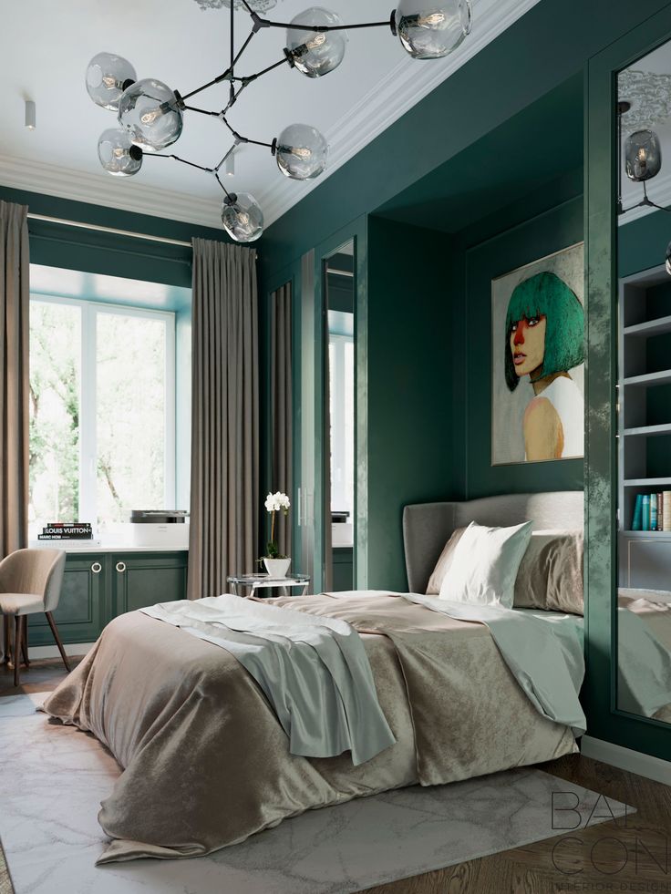
'I love unusual color pairings,' says the textile designer Eva Sonaike who specializes in luxury African interiors, and recently showed off her bathroom color ideas with a collaboration with CP Hart (above). 'My favorite combination at the moment is green and purple,' she adds. 'If in doubt, always look at nature and, in particular, plants and flowers.'
Throwing something unexpected into an interior helps it to look considered and confident, adds Nicole Salvesen, co-founder of Salvesen Graham . 'Choose colors that come from the same tonal family or have the same depth of color, even if they are different ends of the spectrum, this will help them work together. Also choose bolder colors such as rich greens and yellows and raspberry reds as they can be easier to work with, rather than paler candy colors that can sometimes come across as insipid if they aren’t quite right.'
13. Use room color ideas to alter the mood of the space
At the hotel Les Deux Gares in Paris, decorator Luke Edward Hall chose strong olive and orange with accents of pale violet and mustard – the result is unexpected but balanced
(Image credit: Benoit Linero for Luke Edward Hall/Hotel Deux Gares)
Using a more unusual color pairing in a room will alter the atmosphere in the space, explains interior decorator Nicola Harding, founder of Nicola Harding & Co .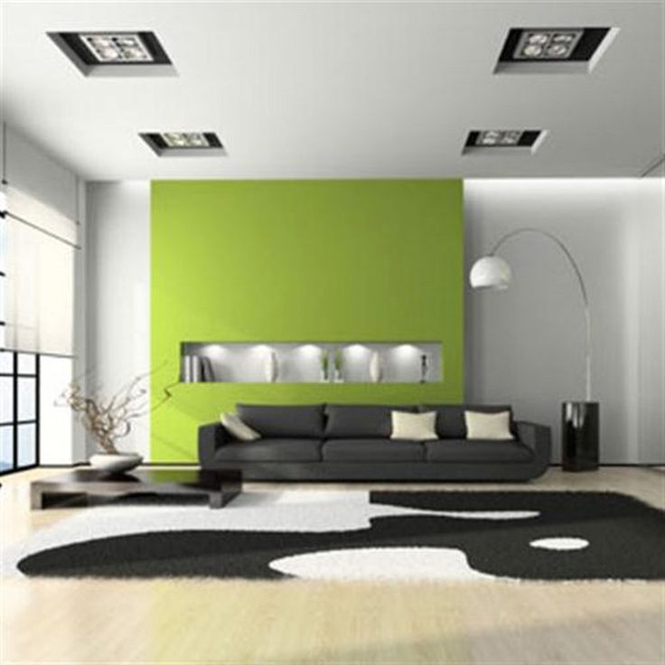 “The greater the degree of contrast there is, the more drama there is the room and when there is less contrast, the space is calmer.'
As a general rule of thumb, you want to include high contrast when you want a dynamic, high energy feeling but this should be done in a space that you don’t spend loads of time in such as holiday homes, cloakrooms, and rooms at home that aren’t in frequent use. 'That of course includes kids’ bedrooms which are naturally more energetic anyway as they are filled with their toys, books and artworks,' says Nicola.
Interior designer Luke Edward Hall took a similar approach when decorating the Parisian hotel Les Deux Gares – conjuring bedrooms of olive green walls with violet woodwork and orange curtains. 'I wanted to challenge the idea that guests always want to stay in bland boxes,' he explains. 'However, I don't believe in throwing a rainbow of colours at a room: there needs to be balance.' For bedrooms, consider some of the most relaxing colors to create a soothing sanctuary.
14. Pair strong and muted colors
Be sure to add a bright hue when introducing an off-tone color, says Nicole Salvesen – above all avoid insipid colors. Here, Salvesen Graham’s cane side table in raspberry red strikes the right cheery note against more modest green and pink
(Image credit: Astrid Templer for Salvesen Graham)
To achieve that balance, it’s helpful to bear in mind that one color can also be stronger than the other, adds Nicola. 'This should be used in the same way that you might use a stronger condiment with a meal, like mustard for instance. A fun color combo is soft pink with a mustard yellow. The mustard yellow would be like the mustard on your plate – therefore one color can be more intense as your accent whilst the other is more muted in tone.'
15. Choose room color ideas by instinct
One color – or pattern – can always be stronger than another when putting together unusual tones. In this bedroom, Nicola Harding chose a dynamic headboard as the protagonist, supported by various shades of nude, pale blue and red
(Image credit: Nicola Harding)
For those who feel a headache brewing when it comes to choosing the right color combinations, take a step back and follow your instinct. ‘Whenever I choose colors I try not to overthink it,’ says the American designer and decorator Sheila Bridges who is known for a joyful use of color in her projects. 'Intuitively I want simple colors that feel relaxing and soothing – particularly during this very complicated and stressful time. Paint color can be transformative but also forgiving. My feeling (and advice) about wall color has always been the same: if it doesn’t feel right just repaint. It’s one of the most inexpensive yet dramatic ways to change the interior of your home.'
The architrave in Suzy Hoodless’s home was painted yellow to create a division between the two rooms but also for some sunshine in the space and to lift the room, she says
(Image credit: Paul Massey for Suzy Hoodless)
'The addition of accent colors is a quick and easy way to transform a space, define an area, or highlight architectural elements,’ believes Ruth Mottershead of Little Greene. ‘If you’re lucky enough to have wonderful architectural details such as archways, mouldings or picture rails in your home, paint is the perfect way to highlight them to create a design detail. A simple pop of contrasting color on a door or skirting is a great way to add impact and an element of surprise to an otherwise muted scheme.’
This is what decorator Suzy Hoodless decided to do in her own sitting room where she painted the architrave between the library and sitting room in a near neon yellow to create definition between the two spaces. 'Colors don't have to be bright–they can be muted too but a powerful shock of a bold or unexpected hue instantly saves a space from being too polite,' says Suzy. 'I particularly like to paint woodwork in an unexpected color, together with quieter tones and lively patterns on cushions or upholstery, it results in things that perhaps shouldn't really go together but somehow they do.'
17. Pick a white with a matching undertone
Pink is a favourite accent color of Natalia Miyar who recommends selecting a white with an undertone in the same shade for a seamless look
(Image credit: Natalia Miyar)
Another decorator trick when you are using a color accent in a white scheme is to bring these together by selecting a white with an undertone in the same shade, recommends the architect and designer Natalia Miyar of Natalia Miyar Atelier .
'There are many different shades of white: my personal favorites are warm white with pink or yellow undertones used with accent colors in the same tones such as burnt orange, red or pink.'
Don’t forget, she adds, 'you can be quite creative, don’t limit yourself to cushions, you can introduce your accent color on any surface including lamp bases, art, furniture and objects.'
18. Break up bold room colors with neutrals
(Image credit: Jonathan Bond for Katharine Paravacini )
When using strong colors in a room, you can create a balance with the accent colors you use, recommends Katharine Paravacini , founder of her own design studio. Bold walls can be complemented by accessories in punchy colors such as reds and yellows and then broken up with areas of neutral such as a carpet. 'We like adding pattern into bold schemes to add interest and depth, too,' says Katharine.
19. Introduce color in unexpected places
Bring an accent color into a bathroom by painting the vanity or architectural detail in a contrasting colour, recommends American decorator Cortney Bishop
(Image credit: Cortney Bishop)
Don't be afraid to bring in an accent color to unexpected places, says interior decorator Cortney Bishop . 'Consider applying a lively hue to a bathroom vanity or painting your interior doors or trim with a contrasting color that makes your walls stand out even more. The transition and break in color will be more welcoming than you might think when transitioning between rooms.'
20. Use antique rugs as a starting point for a color scheme
For Henriette von Stockhausen of VSP Interiors, the balance of color and pattern is the most important thing – too much of one leads the eye astray rather than letting it all sit together, as demonstrated in this master bedroom
(Image credit: Paul Massey for VSP)
You can introduce room color ideas by mixing patterns and prints in interior design – especially when decorating with rugs as a starting point. 'I often start from antique carpets and pick up the colors I would like to introduce more dominantly,' says Henriette von Stockhausen, creative director of interior design studio VSP Interiors . 'I’m not one for using too many colors or patterns in my designs so I choose carefully: if I use a pattern on the walls through wallpaper, I tend to choose a plain-ish curtain fabric and bring a pop of color with trimming and fringes. It all has to feel like a natural progression – not too designed or forced – and more like an interior that has evolved over time and through collected pieces. Also, antique fabrics colors are more faded and sit softer within and next to each other.'
21. Combine room color ideas in pattern ratios
The team at Turner Pocock like to start with patterns with at least three colors in them which will then form the basis of the decorating scheme
(Image credit: Alexander James for Turner Pocock)
Pattern plays a leading role in schemes designed by Turner Pocock . 'Our starting point is always a pattern with at least three colors in it,' explain co-founders Bunny Turner and Emma Pocock. 'It can be a floral, geometric, ikat or stripe and it can come from something as small as a cushion or a large-scale fabric for a sofa, but it will form the basis of our decorating scheme.
'We like to layer different patterns, big and small, in a room so that it creates enough interest without the eye settling on one thing for too long,' continues Bunny. 'It’s important to always work with different scales of pattern – like a large floral with a smaller geometric – as it allows each one to stand out. Working with two different patterns in the same scale means neither will be strong enough for one to bounce off the other.'
As mentioned before, the scale and orientation of the room will mean some are better suited to more dramatic patterns. 'Rooms with plenty of natural light can lend themselves to large-scale pattern and strong colors,' says designer and decorator Sarah Fortescue .
22. Let wallpaper or fabric inspire a room color
Demonstrating how to pick out a color from a pattern and take it to the woodwork or walls, this fabric is called Espalier by Neisha Crosland with Schumacher
(Image credit: Neisha Crosland)
One approach to introduce color confidently to a room – be it a bedroom or sitting room – is to choose a small secondary color detail in a patterned fabric design and use this as the inspiration for solid fields of complementary paint color, recommends Genevieve Bennett, head of design at Liberty Fabrics .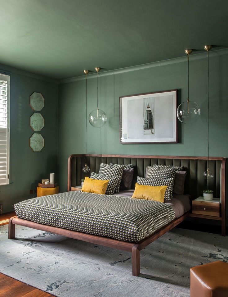 'It helps provide a perfect canvas for the fabrics which is both surprising and liveable and allows you to introduce bold rich colors to a scheme.'
Textile and wallpaper designer Neisha Crosland says another way to sew a room together is to pick out the strongest (or the darkest) color from the wallpaper pattern and use on the woodwork in a room. 'That could be on the doors, cornicing, window frames, wardrobes or radiators – it’s a clever decorating tip that I like to use,' she says.
23. Choose a hero highlight color
Choose a hero design in your color palette and then layer it with other designs in a mix of scales, recommends designer and decorator Birdie Fortescue
(Image credit: Birdie Fortescue)
Again, a vital consideration is about balance – perhaps particularly in a bedroom environment where the aim is to create somewhere restful. To do this, says designer and decorator Birdie Fortescue , be sure to have a single highlight color – or a hero design if it’s a pattern – and layer it with others in smaller scale or quieter styles to ensure there is focus on the highlight tones. 'Florals and geometrics, combined with the correct balance of scale and color, work together to great effect. I’m particularly fond of a trellis design. It is so versatile; a classic motif like this helps to anchor a scheme.'
24. Be inspired by the 'new neutrals'
The team at Elicyon kept the palette for this home office space in London neutral which gives the space a light and bright fresh vibrancy, but used a subtle yet rich textured wallpaper, which gives the room some depth and interesting detail
(Image credit: Elicyon Photograph Patrick Williamson)
While some decorators instinctively lean towards pale yellows, and others where green meets gray, many agree that new neutrals are largely inspired by colors emanating from the natural world, which help us to feel grounded in our homes. 'They also comprise ivory base notes and a scattering of additional tones including rust, pink, beige, mustard and burnt orange,' says Charu Gandhi, founder and director of Elicyon .
'Not to be confused with cold and bland palettes, new neutrals are warm by nature,' she adds. 'Typically matte in finish, they have the ability to flex, and so it’s possible for them to suit any home, be it traditional or contemporary – in fact, their elasticity is the reason we’re calling them "new".'
For a warmer, cozier aesthetic, consider a red-based neutral such as Wimborne White or Dimity by Farrow & Ball, recommends Louise Wicksteed, design director at Sims Hilditch .
25. Steer clear of white with neutral schemes
Here a favorite dirty pink adds a bolt of color in an otherwise neutral kitchen scheme by Gunter & Co
(Image credit: Mary Wadsworth for Gunter & Co)
Even when working with neutrals, color choices need to be site specific, adds interior decorator Rachel Chudley. 'We think that pale biscuits or very light pinks are ideal for south-facing rooms which have plenty of light – not only do they filter the light beautifully, but they also add to a feeling of calm and relaxation, perfect for a bedroom environment.
'When working with neutrals, my only rule is to steer clear of white walls,' continues Rachel. 'They work well in galleries for the very reason that they create a blank canvas which is perfect for focussing on one piece of art, uninterrupted by anything. However, in a living space, you need a touch of color to add a bit more depth and reflect the light around the room.'
Irene Gunter, founder of Gunter & Co, agrees: 'I often find, especially with a neutral background, that adding in pops of color can add so much personality of your own to a space by choosing colors you love and tying those in with the cardinal directions of each room to make sure they complement the natural light (or lack thereof) in each room.'
26. Use a natural palette to allow accessories to shine
Jamie Waterworth Thurstan favors neutral backgrounds so that tactile surfaces and striking furniture can then stand out, as demonstrated here in the dining room of a house in Holland Park, west London
(Image credit: Simon Brown)
Subtle nuances of color are why James Thurstan Waterworth, founder of Thurstan , favours neutral colors in his schemes because they create a soft springboard from which antiques, art and other embellishments are able to sing. 'You can then build out from here with tactile surfaces, patterned textiles, eclectic furnishings and more modern flourishes to create layers of interest, whilst still allowing all the individual elements of the interior to breathe. I gravitate toward natural palettes, and materials too, as for me they bring a certain timelessness and longevity to design.'
27. Examine room color pigments
Subtle background colors allow other elements in the room –such as artworks – to stand out says Tom Cox of HÁM interiors
(Image credit: Alexander James/HAM Interiors)
When it comes to selecting more neutral paint shades, it’s important to get the mineral balance right, believes Tom Cox, co-founder of HÁM interiors . 'We like to look at the pigment and depth of color in a paint, too often a shade will have too much gray or brown as undertones which can then be challenging when adding the layers of furniture and finishing touches.
'We try to make the backdrop subtle so furniture and carpets sit harmoniously, we also like to paint the ceiling, walls and skirting in the same hue, it stops awkward visual breaks and enhances architectural details in an understated way.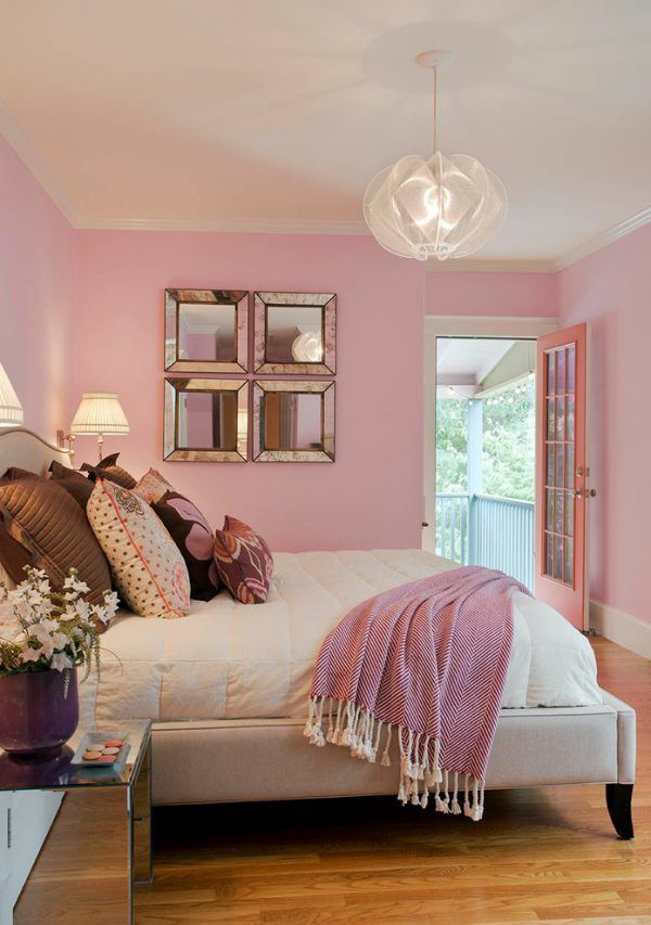 '
'
28. Add vibrancy with orange
(Image credit: Paint & Paper Library )
Give your interior an update that is filled with joy and optimism with vibrant orange. Choose a paint color that is rich in earthy pigments as they give an exceptional depth of color and life to any scheme.
‘Orange is the perfect color for an open-plan kitchen, providing a dramatic yet familiar backdrop to a hive of activity, says Andy Greenall, creative director, Paint & Paper Library . 'Rather than opt for the habitual white on kitchen cabinets, consider a warm pink hue such as Robens Honour, which will provide a playful touch when paired with orange.’
29. Use a color that takes on different attitudes
Beresford Red, Sibyl Colefax & John Fowler for Fenwick & Tilbrook
(Image credit: Sibyl Colefax & John Fowler)
Look no further than a rich rusty red for an enticing and enveloping hue. Like orange, red is a brilliant room color idea for small rooms and snug rooms.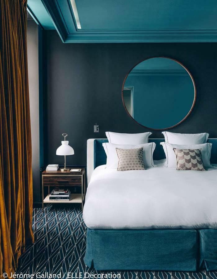 Deep earthy red tones are also great for hard-working spaces like pantries and breakfast bar areas.
‘Whether covered with prints and paintings or left unadorned, this deep Indian red makes a beautiful background for living rooms or hallways,' says Emma Burns, managing director, Sibyl Colefax & John Fowler. 'Chalky off-white woodwork accentuates the depth of the tone and keeps it fresh while painting moldings in the same color can disguise any awkward elements.’
30. Take a dark turn
(Image credit: Kalina Krawczyk)
Deep chocolate brown – this confident hue looks delicious as an all-over room color idea yet it's equally perfect for pairing with brights and pastels.
‘We created Jam (on the wall) because of the glorious alchemy of turning fruit into conserves,' says Cassandra Ellis, founder, Atelier Ellis. 'The colors come alive and offer a delicious, dark alternative to black or dark grey walls. Using red ochre, violet and green make a beautifully changeable color that, while dark, is rich and enveloping. ’
’
31. Curate a jewel-box room
(Image credit: Billal Taright)
Deep purple with all its dark, dramatic, and nuanced glory is guaranteed to bring both opulence and intimacy to rooms, especially those with little natural light.
‘Decorating with deep purple is about selecting the right tone,' says Joa Studholme, color curator, Farrow & Ball. 'Purples with an underlying red create a warm, intimate space, while blue-based ones are more dramatic. Purple works best in small spaces deprived of light, so is ideal for creating jewel-box rooms.’
In this guest bedroom designed by Rachel Chudley, the vivid purple chosen for the walls helps to pull together the strong patterns and tones of the red-striped wallpaper and vintage bedspread.
32. Go for a background blue
Joinery in Inchyra Blue, Farrow & Ball. Armchair in Kimono, Lewis & Wood; panel in Rooksmoor velvet, Mulberry
(Image credit: Jonathan Bond)
Mid-toned blues – ranging from the heritage Air Force blue to softer French blues, these classic colors have become the shades of choice for elegant interiors and exteriors.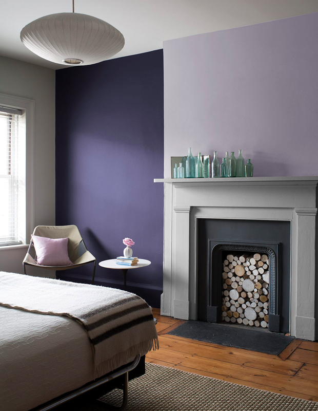
‘Historically, people have often been afraid to design with blue,' says Lucy Marsh, founder, Lucy Marsh Interiors. 'Too cold, too bold. But, with experience, I’ve found success if the right tones are applied to specific situations. This is a versatile timeless color, as a classic wool check or a toile; a contemporary bold paint; or it can be eclectic when coupled with bright colors and strong geometric design.’
If not looking for total color saturation, think about painting a wall of joinery in this mid-tone blue hue and use it as a focal point to show off art and objets.
What color makes a room feel bigger?
Light-reflecting colors tend to make a room feel bigger – though that needn't mean white. Pale pastels will make rooms that receive lots of warm daylight feel larger, while cozy neutrals, such as cream, will make cooler rooms feel bigger, but welcoming, too. You can decorate rooms in darker colors and yet still make them feel bigger – the trick is to keep floors and ceilings in pale shades, and to ensure windows aren't cluttered by drapes.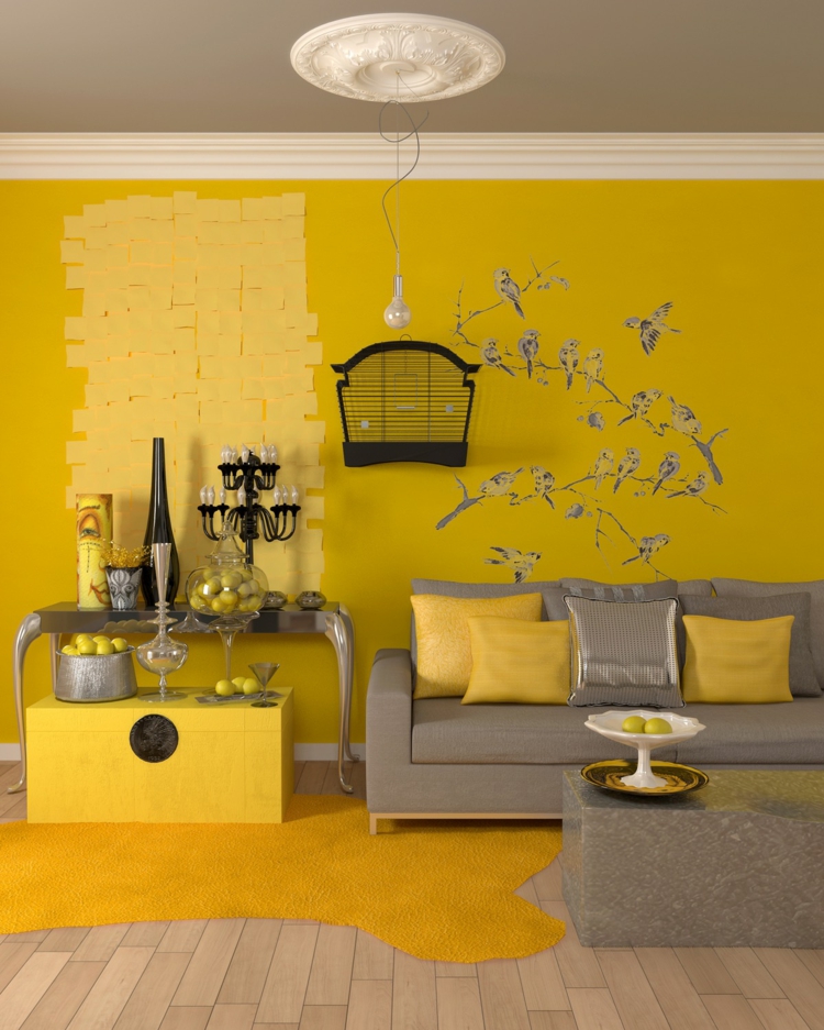
Which color to use for north-facing rooms?
North-facing rooms tend to feel cool and are generally much darker than south-, east- or west-facing rooms, which will get some sunlight throughout the day. Using any color – from yellow to blue – with a warm undertone will make the space feel warmer. If you want to make a north-facing room feel brighter, it's important to choose a light color; however, if you are happy to embrace 'cozy', you can choose dark colors – just ensure they have warm tones so that the room doesn't feel cold and unwelcoming.
Arabella is a freelance journalist writing for national newspapers, magazines and websites including Homes & Gardens, Country Life, The Telegraph and The Times. For many years she has specialized in writing about property and interiors, but she began her career in the early 2000s working on the newly launched Country Life website, covering anything from competitions to find the nation’s prettiest vicarage to the plight of rural post offices.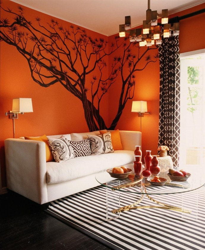
Color Palette Generators for Interior Color Schemes
By
Ashley Knierim
Ashley Knierim
Ashley Knierim is a home decor expert and product reviewer of home products for The Spruce. Her design education began at a young age. She has over 10 years of writing and editing experience, formerly holding editorial positions at Time and AOL.
Learn more about The Spruce's Editorial Process
Updated on 03/04/22
The Spruce / Michelle Becker
When it comes to interior design, computers are not just for professional decorators. Many online tools can help amateur decorators choose hues, develop interior color schemes, and design entire rooms.
Online tools that help you choose interior colors come from many different sources, but most can be grouped into two categories: color generators and color viewers or visualizer tools. Color generators are most helpful for identifying colors and color palettes, incorporating your inputs and preferences.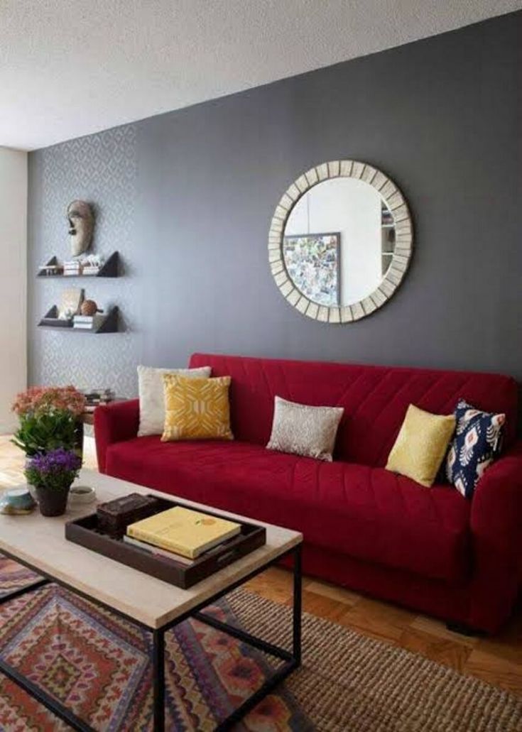 For example, you can upload a photo, and the tool will scan it and tell you what colors are in it.
Some online color generators let you choose colors from a color wheel. Others allow you to upload a photo or other image to develop your color schemes. If you are looking for a way to make decorating the perfect room a little easier, try one of these great color generators.
Sherwin-Williams, Getty Images
This fun gadget was created by Sherwin-Williams and will allow you to build a palette for any room. Upload any photo as inspiration, and the tool will create a custom color palette with coordinating Sherwin-Williams paint colors. You can create an account and save your palettes for future use. While the idea is to find the perfect Sherwin-Williams paint color, you don't have to be married to using this brand's paint to enjoy playing with this fun tool.
Sherwin Williams
Glidden Paints power this user-friendly color tool that works with an uploaded photo of your own house or a sample image already on the tool.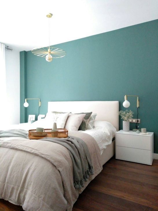 Visualize Color allows you to virtually "paint" a room or create a palette suited specifically to your home. You can easily add color choices to a list to save offline and take into your local paint supply store.
Glidden Paints
To develop a color scheme on this site, this color picker will help you find a tint, play with shade, and experiment with color harmonies. It's perfect if you're hoping to flirt with gradients and color mixing. This site helps web designers, but it's also an excellent tool for home decorators.
Color Designer
Coolors.co is another standalone tool for graphic designers or home decorators. This easy-to-use website allows you to upload any image, pick a starting color and find four more matching colors to create your palette. Once you're done, save your palette until you find the perfect shades. Some features will enable you to adjust saturation, view the colors in "color blindness" mode, and more.
Coolors
Canva is another tool that allows you to upload your favorite photo from that dream vacation and create a color palette from it. Since Canva isn't associated with a specific company, you can match the colors to any paint brand you like. Once you pick an image, you'll get five colors that all play beautifully together.
Canva
If you don't even know where to start to find the perfect color palette, Colormind can help. This tool comes with pre-made palettes to help get your creative juices flowing. Like many other tools, you can also start from an image and match colors to the hues in the photo.
Colormind
COLOURlovers offers tools for creating color palettes and patterns, but it's also a vast online community for design lovers worldwide. COLOURlovers is a global community that has nearly 5 million user-generated color palettes. Check out the "Home" tab for user-generated color palettes for interior design. Over 9 million users contribute colors ideas, palettes, and patterns. Membership is free.
Colour Lovers
Start from one color and explore the wheel of possibilities. Paletton's user-friendly tool has presets, allows you to randomize, and inspires you to play with color. The page opens up with the tool ready to start picking colors. It has a "color scheme designer" and "color scheme generator" tool to get you instantly into the process of finding a color scheme. This tool is terrific for learning and experimenting with color. Once you see complementary colors you love, pop them into a color-matching tool to find brands closely resembling each shade.
If you weren't sure what analogous, monochromatic, or complementary colors were before now, opening Adobe's web-based color wheel app helps you realize these popular types of colors schemes in seconds. This color wheel app makes color play easy. Use their presets or move one of their preset choices on the color wheel to a color that you prefer. Once you've settled on a color scheme you like, this color picker gives you the RGB values of the colors, which you can provide to a paint vendor for paint matching.
Adobe Color
If you plan on making interior changes that include repainting the walls, starting with a color picker from a paint manufacturer eliminates several steps, making your interior design process an easier task. This tool from Benjamin Moore is best if you're looking to paint walls and trim. Although you can pick three colors, they are listed explicitly as "walls," "wainscoting," and "trim." If you can look beyond those labels, you can find three colors that work well in a room, and the app "repaints" a photo you upload or uses one of the sample photos they have for different types of rooms, like the bedroom, kitchen, and more. To save time, you can also select one of their preselected color "collections" or "families."
Benjamin Moore
Degraeve's tool is perfect for this task for designers working from a photo for inspiration. Enter the URL for the reference photo, and the color palette generator extracts the prevailing colors from the image, giving you the RGB values. It works fast and efficiently, taking the guesswork out of color matching.
DaGraeve
Turning Your Color Scheme Into Reality
Color palettes and designer-crafted schemes are based on color theory. They are an excellent starting point for choosing your interior colors, but the true test of colors happens on your walls. The best way to find the perfect palette is to buy some paint samples, paint them on the wall, and see how they look throughout the day and night, as natural light will make colors take on different attributes.
Whether you're picking the perfect bedroom palette or you want to find a few new throw pillows or accessories that match your living room's color palette, a color generator is a great way to find inspiration and discover complementary colors you may not have thought of before.
how shades affect mood — INMYROOM
What color should you paint the walls in order to relax or, on the contrary, feel more cheerful? We tell.
White and Gray
Basic colors that are nevertheless perceived differently by everyone: some people find white light and refreshing, others find it dreary - so be guided by your feelings. However, now in most interiors, white and light gray act as the basis, and there are many reasons for this: they expand the space, do not overload it, and look stylish. A monochrome interior with a minimum of color accents also looks cool - for example, as in the project of Inna Azorskaya.
Suitable for: any room. Salvation for small rooms. And these colors go well with any other.
Design: Inna Azorskaya.
Black
Many people associate black with negative emotions – sorrow and longing. But at the same time, it is the color of elegance and often an indicator of good taste. An option for the brave: use black for several walls, as in this project in Skolkovo.
Design: Kameleono.
Suitable for: as small accents in any room. Makes the interior more contrast, bright. Good in too spacious rooms that need to be made more intimate and comfortable.
Do not use: in large quantities. An exception is if you personally feel comfortable in a dark monochrome room and it does not put pressure on you psychologically. Remember that black “eats up” space a lot - it is not suitable for most small sizes.
Design: Buro5.
Beige & Brown
These warm, natural shades soothe and give a sense of security, balance, and grounding. Usually they are associated either with nature (trees, mountains, sand, stones) or with something appetizing - pastries, coffee or chocolate.
Design: GP Project.
Suitable for: any room, if you dilute them with contrasting accents. Light shades of beige are an excellent base for any interior.
Do not use: brown is not the best choice for small, dark rooms. May create a feeling of clutter.
Design: Elena Markina.
Red and orange
Energize even on a physical level - can increase the level of adrenaline in the blood, affect the heartbeat and increase blood pressure. Warm shades of these colors make the room cozier.
Suitable for: living room and dining room - red and orange promote communication and stimulate appetite.
Do not use: in the bedroom, especially in large quantities - it will be difficult to relax. But red is great for accents - for example, textiles in this color were used in the project of Irina Travkina and Natalya Tarasevich.
Yellow
The color of joy and optimism. It is important to choose the right shade: if light ones make the interior more sunny and light, then darker ones can begin to oppress over time.
Suitable for: kitchen, dining room, bathroom, hallway. Looks good in small spaces. Especially good for accents - interesting details and accessories.
Design: Olga Shapovalova.
Do not use: in children's rooms - very young children are usually uncomfortable in yellow interiors. With caution - in the bedroom. In whatever room you use this color, it must be diluted with neutral shades (for example, light gray, as Svetlana Yurkova did) - otherwise it starts to irritate.
Design: Svetlana Yurkova.
Green
Considered the most natural and eye-pleasing color associated with wildlife, relieves stress. Combines the stimulating properties of yellow and the relaxing properties of blue.
Suitable for: any room, looks especially advantageous in combination with other colors such as white.
Design: Natalia Yanson.
Light blue and blue
Set for peace and relaxation, lower blood pressure, reduce appetite.
Suitable for: small spaces – light blues make the space look larger. For rooms where it is always hot and the windows face the sunny side, cold tones will make them "cooler".
Apartment of designer Anna Muravina in Gelendzhik.
For bedrooms and bathrooms, these colors are very relaxing. Some shades are suitable for workrooms, as they help to concentrate. If you want to reduce your appetite and lose weight, blue is a great choice for a kitchen or dining room. See how delicate the blue color looks in the kitchen of designer Marina Zhukova.
Do not use: too much in any room - such an interior will make you feel sad. For the same reason, it is better to abandon the dark shades of these colors. To avoid this effect, dilute the blue color with white or another light neutral shade. Choose warm (for example, pervanche) or bright colors - azure or turquoise.
Design: Tatyana Kazantseva.
Purple and pink
Pastel shades of purple and pink soothe and relax, darker ones make the atmosphere solemn, strict and mysterious.
Design: Nika Vorotyntseva.
Suitable for: any room, especially bedrooms.
Read also:
how to combine colors in the interior - BasicDecor Blog
The right combination of colors in interior design gives comfort to the home, corrects space flaws and changes the look of the room. But a careless attitude to color schemes will spoil even the most expensive apartment. Therefore, choosing the color scheme of the interior, you should know a few basic rules:
- The brighter the color, the less it should be in the design. Emphasize them.
- Light shades can be used without restrictions.
- Each item has a color. Consider this even when choosing door handles. Any wrong shade will spoil the interior design.
- The balance of warm and cold. Saturated cold soften with two warm shades and vice versa.
- Rule of three. Choose three matching colors and combine them in the interior.
- 60/30/10. 60% - primary color, 30% - secondary, 10% - accent.
- A game of contrast. Any bright tone is combined with black and white, use this rule when you want to highlight accents.
Color combination in the interior of different rooms
Living room. In a small room it is better to use light shades, they will visually expand the space. Cold shades can be used in a large living room, where there is a lot of daylight, bright lighting is thought out. Warm ones are suitable for a living room with windows facing north.
Bedroom. It is better to refuse strong contrast here. Color transitions should be soft. Choose warm or pastel soft colors. Both warm and cold scales are appropriate here if good lighting is chosen.
Kitchen. For a large kitchen, don't be afraid to choose bright, bold hues. In combination with calm walls, they will come in handy. The main thing is that the tones do not irritate. And for small kitchens, light warm colors are suitable.
Hallway. Consider its size. For large - juicy shades, both warm and cold. And for a small one, calm, noble ones are suitable. Such an interior can be diluted with a bright accent.
Bathroom. There are two common ways to decorate a bathroom with a color: 1) in one scale, using several of its shades; 2) a combination of three colors.
Child. For a child under five, choose bright colors: green, yellow, red. For older children and teenagers, light colors are suitable: a combination of blue with white or gray, using beige as the main tone and combining it with light green, purple, yellow, blue or pink.
Cabinet. Choose cool tones: blue combined with burgundy, gray or red. An excellent solution is an office in a dark brown palette. Light colors are also suitable, but they should be cold, not warm.
Color harmony in interior design
There are several types of color harmony in interior design. They are used by designers and everyone who wants to successfully choose a color scheme for their home:
- Analogue. A combination of three colors that are adjacent on the color wheel, such as yellow-green, green and blue-green.
- Complementary. Two opposite (yellow and purple).
- Split Complementary. Any color and two tones located to the left and to the right of its complementary.
- Triadic. Vertices of an isosceles triangle.
- Tetraid. Vertices of a square.
- Combined. Combination of analog and complementary harmonies.
- Black and white with any palette.
Rules for choosing an accent color
Important to consider:
- Who will live in the room: a child, an adult or an elderly person.
- Color of walls, ceiling, floor.
- Target settings: zoning or only accentuation, that is, the use of an object as the main idea of interior design.
- Combination with lighting and color of other objects in the room.
Psychology of color
When choosing a color design, one should take into account the psychological influence of color:
Red
+ Strength, passion, energy, love, power.
- Increases aggression, irritability.
Yellow
+ Joy, fun, enthusiasm, inspiration, increases activity.
- Instability, irresponsibility.
Green
+ Relieves tension, soothes
- Increases feelings of envy, jealousy
Blue
+ Stability, security, spiritual development.
- Cold, fear.
Violet
+ Nobility, luxury, spirituality.
- Promotes depression.
Orange
+ Fights depression.
- Causes laziness, lethargy.
Blue
+ Freedom, protection, sophistication.
- Causes weakness.
Gray
+ Elegance, depravity.
- Increases indecision, sullenness.
Errors in color selection
Ignore lighting. Different light can change colors beyond recognition, so when choosing it is important to consider the palette in daylight and artificial light.
Iteration of colors in one space. The principle "the more the better" will definitely not work here.