Design in line
Design Element Line | John Lovett Design
Elements of Design
Linear Marks
Line, simply put, is the path traced by the movement of a single point. Theoretically it has no width as it then becomes a shape. In visual arts practice we can consider the most basic example of a line the simple linear mark made by a pen, brush or pencil.
From loose, expressive gestures to precisely, controlled marks, the lines we make have a huge impact on the emotive force of a painting or design.
Boundary Lines
The meeting of two sharply defined shapes produces a boundary line. This differs from our first example in that it is implied by the contrast between the two shapes and relies on the shapes for its existence.
Boundary Lines
Implied Lines
In this painting by Caravaggio a powerful line runs down the robe of the angel, into the figure below and down the curve of his back. This powerful unifying element doesn’t really exist but is implied by the thrust of smaller lines in the painting. These repeated curves add up to an implied line with more power and impact than any of the smaller individual curves.
Implied Lines – Caravaggio (1571-1610), “The Inspiration of Saint Matthew” 1602
Alignment
The concept of alignment is a process used in many design disciplines. Design elements are aligned along implied lines, usually vertical or horizontal, to give order and unity.
Whether it is text blocks and images on a page, paintings on a gallery wall or windows in a building, alignment adds to the aesthetic appeal and makes the design easier to understand.
The array of sockets and connections on the back of this stereo receiver are ordered and logical due to their horizontal and vertical alignment. The components are also grouped and color coded according to their function and channel allocation.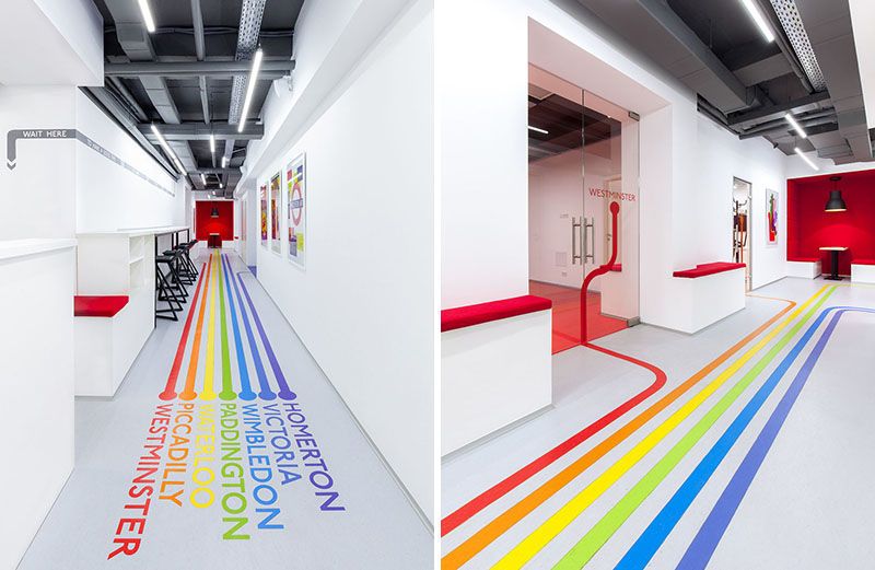 The complexity of the connections are simplified considerably by the use of alignment, grouping and color coding.
Stereo Receiver – alignment, grouping and color coding
Lines can create other elements
Lines can exist as elements in themselves or they can be used to produce other elements. Closure produces a shape, hatching produces tone and random buildup produces texture.
Shape, Tone and Texture – created by the use of line
Kinetic Line
Lithuanian artist, Zilvinas Kempinas has taken line from a traditionally static element to an infinitely changing kinetic element. His work “DOUBLE O” uses two electric fans to suspend a double loop of thin magnetic tape in the air.
Zilvinas Kempinas DOUBLE O 2008
The double loop of tape hovers mysteriously in front of a white background. The effect of this work is mesmerising – the roar of the fans and the fluid movement of the line defying gravity takes some getting used to. After a while the undulating loop completely absorbs your attention.
ELEMENTS OF DESIGN PART 1: LINE
The application of line in this office designed by One Plus Partnership has a lot of impact. Lines are applied diagonally and vertically to create a very dynamic interior.
After many years in the business our Interior Designers have completed an array of successful commercial projects here in Kelowna and across Canada. These engaging spaces did not happen by chance. Design has a technical aspect to it referred to as the elements and principals of design, and when combined successfully, evoke emotion from our interactions with the interior environment. In commercial settings, these emotions assist to reinforce your brand and corporate message.
So, what are the elements and principals of design? We’ll explain it all in this blog series, so check back often. This week we’re talking about line – horizontal, vertical, curving, diagonal; each has an impact on how you perceive space. Lines can also be combined to create shapes and planes, or form – but that’s for another post. Structural elements, applied finishes, even lighting can all be applied to create strong lines within a space.
Dan Brunn Architecture was successful in accentuating length with the horizontal wall slats and rectangular floor tile in this showroom design for Ceasarstone.
Horizontal Line
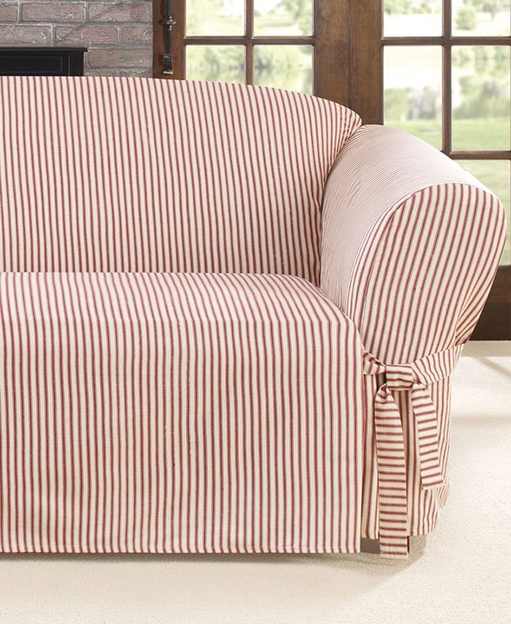
Lines applied horizontally often evoke feelings of stability, grounding, emphasis and direction. So, although horizontal lines tend create length and lower the ceiling of a space they can also be applied to direct the viewer to a particular focal point.
The gold panels applied vertically and upwards onto the ceiling create a strong line that really adds to the feeling of height in Le Theatre Saint-Nazaire designed by K-architectures.
Vertical Line
Vertical lines are often associated with strength (think pillar of strength), stability, balance, and elevation. It has been hypothesized that viewing vertical lines is unnatural compared to viewing horizontal lines. Additionally, vertical lines extend away from our visual plane. For these reasons, the length of a line applied vertically is often extended lending to the feeling of height in a space.
If the goal was to create a dynamic and fun space, Dialogue 38 hit the nail on the head with this design for Guu Izakaya.
Diagonal Line
Diagonal lines typically connote a sense of dynamic movement, transformation, and freedom. Diagonal lines can really bring life to a space, direct the eye upwards or downwards, and add volume to a space, making it feel larger than it is. That being said if applied incorrectly, diagonal lines can conjure a sense of confusion and imbalance.
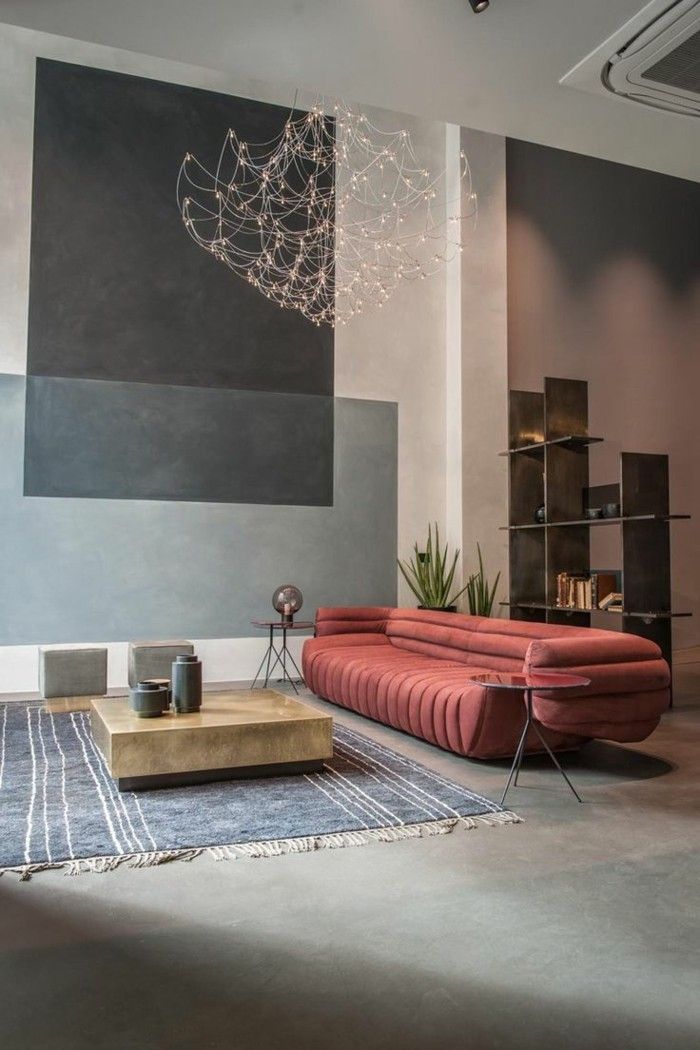
This undulating seating element designed by Cappellini really creates a playful environment in this interior space.
Curved Line
Curving lines whether freeform, arcing, circular, or elliptical often feel natural, organic, playful, and soothing.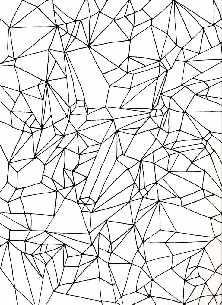 If you are looking to make a space flow curving lines are a great way to do it. They are also very voluminous taking up space within an interior.
By applying lines in a way that relates to your brand message, you can create a space that appeals to your customers and highlights the product you sell.
» Do you need help with your commercial Interior Design project? Contact Hatch Interior Design located in Kelowna, British Columbia – Sustainable Interior Design Solutions for the Modern Workplace.
The influence of lines on the perception of interior design
We perceive many things unconsciously, at the level of intuition. Psychologists have been able to prove that various shapes of objects can directly affect our subconscious.
In this article, we will briefly try to explain, using illustrative examples, what effect certain forms or ornaments that can be used when creating interior design have on the human subconscious.
As you know, any object is a geometric body, consisting of straight or radius planes. In turn, the planes consist of vertical or horizontal lines.
Lines are the simplest for human perception, but different lines are perceived differently by our consciousness and have different specific effects. For example, a horizontal line is perceived as something lying down, and a vertical line as rising up. That is why, from the point of view of the psychological impact of architecture and design on a person, the horizontal has a calming effect, and the vertical is perceived as something strong-willed and solemn.
These differences in the perception of lines that seem to be the same in size, but different in direction, are caused by the peculiarity of the work of our visual apparatus.
A line connecting two points directly does not cause us visual tension, since there is no energy in it. In order for the line to have a strong emotional impact on the viewer, it needs to be given more dynamics. For example, a line that has many sharp breaks and chaotic drops is perceived nervously and restlessly. On the contrary, a line with smooth sinusoidal bends helps the mind to relax and calm down.
Properly using these features in the design, it is possible to ensure that the pattern applied to the walls of the children's room and consisting mainly of horizontal or gently curved lines, preferably pastel colors, has a calming effect on the child's psyche. For the same reason, when designing horizontal or vertical planes in rooms where children are expected to stay for a long time, careless sharp broken lines of bright saturated color should be avoided.
The design interiors of dance clubs, bars or fitness centers opposite will harmoniously fit broken and zigzag lines scattered over the planes, matching the rhythms of modern music or active sports.
In the living areas, the most advantageous will be the use of an ornament consisting of predominantly vertical lines in a contrasting color, hinting at the significance and solemnity of this room, which performs a representative function for guests.
Applying in practice, when developing an interior design or an architectural project, the described properties of lines, it is possible to fully achieve the desired effect by simple and affordable means.
In conclusion, we can add that only a deep understanding by an architect or designer of the nature and degree of impact that geometric lines and patterns have on the mental and psychological state of a person will allow creating the right mood for any interior, depending on the tasks set. That is why the qualifications and practical experience of an architect or designer are extremely important both at the initial stage of developing a design project and in the process of detailed work on it.
Architectural and design bureau "ArchOsnova" is a professional team of members of the Union of Architects and the Union of Artists.
A thorough approach to design and many years of experience ensures the consistently high quality of our projects.
News
17. 06.2022 | We take part in the exhibition at the gallery of the Moscow Institute of Architecture
The VKhUTEMAS Art Gallery at the Moscow Architectural Institute invited us to take part in the exhibition "Diversity of the Environment". The exhibition presents a wide range of topical decorative techniques in the design of architectural spaces and interior design.
04/28/2022 | Our project on the cover of the Beautiful Apartments magazine
A new issue of the popular interior magazine published by the Krasivye Doma Press publishing house with a publication and an atmospheric photo of our project on the cover. We sit in a cozy armchair by the fireplace and leaf through the pages of a magazine.
04/08/2022 | Expert articles for the Center for Urban Development
We shared our opinion and relevant advice on architecture and construction in the current unstable situation with the correspondents of the CUD.NEWS portal.
04/01/2022 | International exhibition MosBuild 2022
The professional exhibition of building and finishing materials was held at the end of March at the Crocus Expo IEC. Traditionally, it is a key platform for manufacturers in Russia and the CIS countries, which this year have been joined by companies from India, Turkey and China.
03/24/2022 | Article for interior design and renovation magazine
Our experts have shared with the readers of the largest edition of "Ideas for Your Home" topical tips and ideas for renovation in a time of uncertainty. We always keep our finger on the pulse and in any situation we are ready to advise our customers on the best solution.
02/11/2022 | Victory and the prestigious award Best of Houzz 2022
Once again, our team won the Houzz International Professional Community Award. A high expert assessment of our activities is very important for us, and we are pleased to receive such significant awards.
06/02/2021 | Publication of our expert opinion on the Ideas for Your Home portal
Ideas for Your Home magazine turned to our professional view of bathroom design and asked for tips on how to avoid common mistakes when renovating on your own.
04/23/2021 | Our bureau was awarded the Best of Houzz 2021
The largest international portal about Design, Architecture and Renovation "Houzz" awarded our bureau with the prestigious "Best of Houzz 2021" award.
01/20/2021 | New feedback about the work of the bureau ArchOsnova
We are very pleased to create comfortable projects for our customers and with the same pleasure we receive excellent feedback from them! This is the most important result and indicator of the quality of our work.
06/05/2020 | Expert article on the largest real estate portal
The architect of our bureau Igor Berezkin shares his experience on the largest real estate portal Domofond. Professional advice on how to properly budget for repairs and what to pay special attention to.
Graph design. Lines - Odie. About design
08 Jan 2023 2091 0
The second part of the story about chart design. After the designer has decided on the choice of axes and coordinate grid, it's time to design the shape of the graph itself. The article talks about the choice of line thickness, scanners and spreads, financial indicators and the famous Japanese candlesticks.
Andrey Markelov
Interface designer, type translator, author of articles
Line charts
The polyline chart is the most popular model that everyone is familiar with from school.
The most important thing is to choose the right line thickness. In this matter, personal taste plays a big role. The author uses a line weight of 1.3 pixels, because he is used to the airy lightness in interfaces. If the reader is accustomed to the thick graphs that Excel generates, thin lines may be hard to read.
Separately, it is worth explaining that fractional pixels exist. When drawing a 1.3 pixel thick line, the graphics system draws a 1 pixel thick line and adds a 1 pixel stroke with 30% opacity to it. This makes the line appear thinner.
The second parameter of the polyline is the rounding of the breaks. Rounding is especially noticeable on thick lines, but there is a belief that the eye reads jewelry delights at any thickness and this affects perception.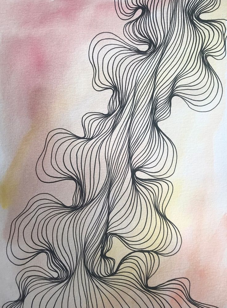
Multiple schedules
Two graphs are often compared with each other. For example, it could be a stock chart and a market index. If you just add a second graph of a different color on top of the first, then both graphs will be hard to read.
Therefore, a shadow is added to the first graph in the form of a gradient fill. The color of the top dot should have an opacity of about 15%. The gradient should descend to the horizontal axis to zero transparency.
Lines are given a stroke equal to the line thickness. This is done in order to avoid color noise at the junction of two lines of different colors.
In rare cases, three graphs need to be compared. More lines are almost never output at the same time.
Scanner and spreads
On a static chart, you can quickly determine only the last price, because it is highlighted and signed on a vertical scale.
To find out the price at any point on the chart, a scanner is used. This is a vertical line that is overlaid on top of the chart and follows the mouse cursor. A dot is placed at the intersection of the scanner with the chart, to the right of which the price at this point is displayed. Below the scanner on the timeline, the date at that point is displayed.
Scanner works well for multiple charts as well. Point prices are displayed on a colored background, the color corresponding to the color of the line.
When comparing two charts, it is often necessary to know the spread - the difference between the charts at a particular point. The spread is displayed on the scanner, to the right of the price, with a plus or minus sign.
The spread is highlighted with a colored background, and the color corresponds to the line up to which the spread is calculated.
Indicators
It is not always convenient to work with the spread in numerical form. You have to move the cursor along the entire length of the chart to see the spread at each point.
Indicators are used in financial systems. These are mini charts that are placed below the main chart.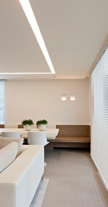 Indicators are not necessarily drawn as lines; a bar chart is often used.
The spread can be represented as an indicator. Then the analyst will be able to see the spread chart for the entire range.
The most popular indicator in financial systems is the trading volume. This indicator is so important that it is displayed by default in the plane of the chart itself, without being placed in a separate mini-chart.
Trading volume is displayed as a bar graph. The bar is green if the price was going up and red if the price was going down.
Traders use dozens of indicators. One of the most popular is the RSI relative strength indicator.
For each point of the chart, the ratio of the average price increase to the average price decrease for the last 15 days is calculated. The indicator draws a graph of the obtained values. A colored zone is allocated in the range from 30 to 70 conventional units.
It is believed that if the RSI chart goes beyond the colored zone up, then the price of the asset is too high and it needs to be sold. If the chart goes beyond the colored zone down, then the asset is too cheap and you can buy it.
Candlestick charts
The standard of any financial system is Japanese candlestick charts.
Japanese candlesticks are a special type of bar chart. Each candle consists of a body and a wick. The body is drawn in the form of a rectangle, the wick is in the form of a line that pierces through the body and sticks out from above and below.
The body of the candle shows how the price has changed over the period. The wick shows how the price tried to change, but rolled back.
Let's say the share price was $200 in the morning and $300 in the evening. Then the body of the candle should be drawn from 200 to 300 dollars, and there will be no wicks.
Let's assume that the price reached 400 dollars in the afternoon, but in the evening it still dropped to 300. Then the candle will be with the top wick.
Finally, imagine that the price dropped to $100 in the afternoon, but returned to $300 in the evening.
