Colors of the future
Colors – Their Meaning and Future
Colors have a natural effect on people. It has the power to influence decisions, alter moods, and generate varying perceptions. There is a whole science behind it, known as color psychology, which is used by marketing experts to create effective business plans and strategies. We the consumers never notice this, but we react to these colors at a subconscious level. For us to know how color psychology is used by businesses, we should look at a handful of colors and what they stand for.
Colors and their Meaning
Although it would be great to talk about each and every color, the information behind the science and their effects on consumers is best discussed in separate articles for each color. Below is a list of five colors and a very short summary of what they mean to businesses.
- Red is a warm color of passion, energy, and anger. It is used in advertisements to tempt, or at least encourage, consumers to buy something.
As it can grab attention easily, red is often used for sale markers and warning labels.
- Black is the color of control and authority. Some will see it as unfriendly or boring, while others see it as being serious and professional. Because of these traits, black colored products will appear beautiful if a little expensive. When combined with a brighter color, the two can create an eye-catching effect.
- Blue is a cool color that stands for trust and reliability. This color is great for businesses that rely on trust, like banks and clinics.
- Yellow is a color associated with happiness. This bright and optimistic color encourages creativity and boosts confidence. Because of how cheerful yellow looks to consumers, businesses use it for things related to fun.
- Pink is the softer sibling of red. It is a calm and comforting color, related to the feelings of love and compassion. The color pink is mostly used by businesses within the cosmetic and fashion markets, and the toy market for young girls.
 It is a color that can be used with expensive and price-friendly items.
The importance of colors in business and marketing cannot be overstated. Businesses would spend time, money, and effort in researching the best color combinations to represent them. You can see this on the logos of famous brands. Some logos have changed design-wise over the years, but the choice of colors would remain consistent.
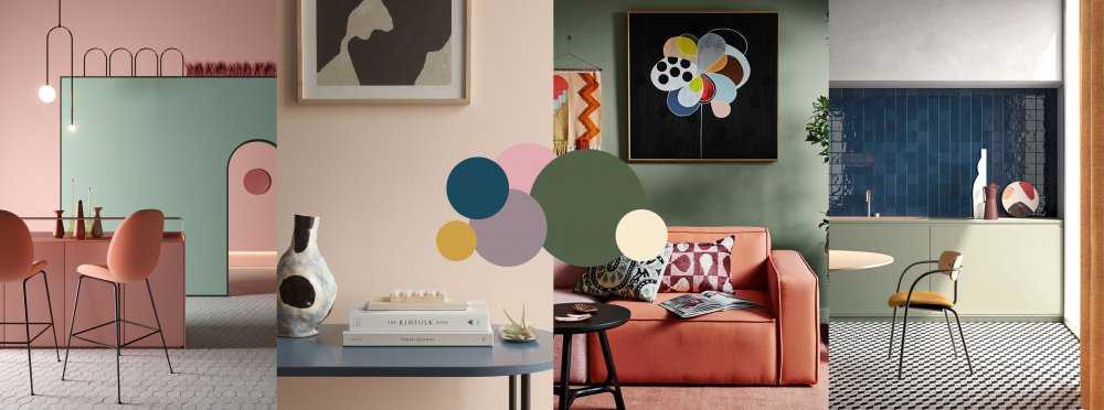
Color Combinations of 2020
Using a single color in a logo or brand is not always enough. Companies would look for the best color combinations. A good color combination is at least a pair of colors that emphasize the positive qualities while reducing the negative qualities. Below are two color combinations of the year 2020. For more combinations, you can read this article from Graphic Mama.
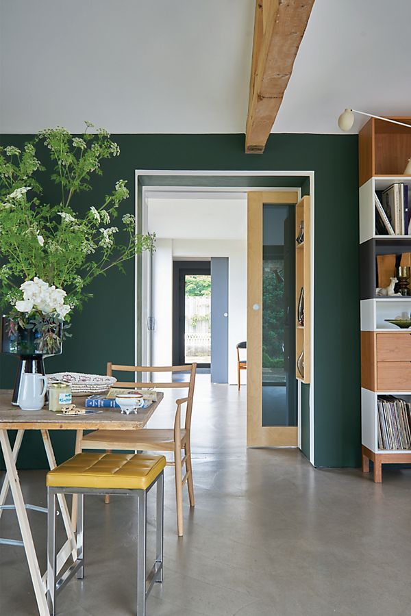
- Black and Green is a color combination of the future because of its hi-tech look. As it is 2020, the color represents the second decade of the second millennium well.

- Black and White is the tried and tested color combination. Often called as the classic color combo, its minimalist look represents the minimalist trends of 2020.
The Colors of the Future
A lot changed across the world when COVID-19 Pandemic hit. With the ‘new normal’ now in place, how much of today’s colors will change to reflect this new world status next year? Here are colors we believe will be trending in 2021.
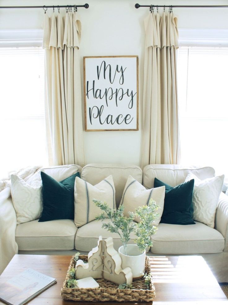
- Foliage Green – Bright and fresh, this color represents the freshness of nature and the coming of a new day. Natural and calming, its vibrancy strengthens positivity and happiness while countering feelings of stress and negativity.
- Light Blue – The color blue has always been a color of trust. With lighter shades, it evokes both trust and peace, and peace is what we need for 2021. Bold and contrasting, it can create harmony with the right color combo.
- Texture + Color – While a visual element and not really a color, texture helps reinforce a color’s qualities through a physical illusion.
 A coarse texture makes a color look rough or rustic, why a silky texture makes a color look smooth. This trend reflects new design options available in newer graphic design software.
- Lemon Yellow – Yellow is a well-known color of summer. It’s bright and expressive, reflecting how self-expressive we can really be. The COVID-19 pandemic gave us a chance to know ourselves more, and in 2021 people will continue to express who they are.
If you would like to know more about how colors can work for you and your business, and what colors will best suit your business, please visit our website.
Why the Color of Technology Must Change | by Amber Case
When I was 14, I saved up money from my first web design job to trick out a really nice gaming PC. I outfitted my computer with tons of blue LED fans, and I kept it on at night, right next to my bed. Shortly after, I realized my sleep patterns were changing. While I wasn’t staying awake any later, it now took me longer to get to sleep. Was I eating differently? Was it just a part of being a teenager? Was it the light in my room? But the orange light from my 80s era alarm clock wasn’t keeping me up. I finally determined that it must be the particular shade of blue light from my new computer. It took me some research to realize all this, but once I did, I started turning my computer off at night. Problem solved. And when I bought my next computer, I ordered fans with orange lights.
The bright blue light of flat, rectangular touch screens, fans, and displays may be appealing from an aesthetic perspective (more on that below), but from a health standpoint, it is fraught with problems. Blue light inhibits the production of melatonin, the hormone that regulates our sleep cycles. Blue light before bedtime can wreak havoc on our ability to fall asleep. Harvard researchers and their colleagues conducted an experiment comparing the effects of 6.5 hours of exposure to blue light, versus exposure to green light of comparable brightness. They found that blue light suppresses melatonin for about twice as long as the green light and shifted circadian rhythms by twice as much (3 hours vs. 1.5 hours). And worse, it’s been linked in recent studies to an increased risk of obesity and some cancers.
A decade after my experience with the LED fans, I started seeing blue displays everywhere. From mobile phones to in-car displays, blue lights were becoming the norm. It’s hard for me to think of any examples of prominent high-tech products on the market now without pale blue screens or indicator lights. LED-based bulbs with more blue light are fast replacing incandescent bulbs. The default display to our iPhones and Androids operates along the blue spectrum, as do our laptops; new cars, especially those like Tesla which aspire to be “futuristic,” come with blue-lit dashboard displays, and so do our “smart” appliances, televisions, video game consoles, watches, the list goes on.
Thanks to the rapid growth of connected devices and digitized appliances, blue light is now flooding into our lives in places where we’re most vulnerable. It’s why, for instance, when we stumble into the kitchen late at night for some water, we’re guided by the illumination from the touchscreen on our refrigerator — and the after-image of the screen leaves us half-blind, and once back in bed, half-awake.
It could be argued that the average person today manages as much information with their devices as an intelligence officer in a wartime situation. But from the Cold War up to now, the user experience of military and consumer technology has vastly differed: Airplane cockpits, submarines, and other military-grade systems are specifically designed for information density, with primary, secondary and tertiary information sources. A key difference in all of these interfaces is color — by and large, many military displays are deep red or orange.
Photo of USAF Maj. Sasha B. Heath by Master Sgt. Mark C. Olsen/DoDWhy use orange and red in military interfaces? They’re low-impact colors that are great for nighttime shifts. In addition, bright blue light is more likely to leave visual artifacts, especially in darkened environments. Have you ever been blinded by the display in your car — or on your phone — when you switch back and forth between looking at that screen and the road ahead? Because the screen is a brighter block of high-energy light, driving (or for that matter, walking) at night creates a longer, stronger afterimage that can adversely affect us when our eyes return to where we’re going.
BMW is a rare exception in the orange vs. blue design divide, because the car company follows the military’s reasoning: Since the ’70s, BMW has made its cars’ dashboard cluster lights with a red-orange hue, at a wavelength of 605 nanometers: This allows drivers to see the instruments clearly, the company found, while also enabling their vision to quickly adjust to the outside darkness after quickly glancing down; red-orange light also caused less eye fatigue.
Somewhere along the line, blue took over in the public consciousness as the “color of the future”, while orange began to look like a shade from the Reagan 80s. In our current culture, blue signals a transition from the past to the present, from the analog to the digital.
Movies and television greatly helped drive this shift. In the late 60s, the landmark depictions of the future, 2001: A Space Odyssey and Star Trek, conveyed a relatively optimistic vision for humanity, in which we are able to transcend wars and other conflicts to explore the stars.
Star Trek, 1966–1969 (Paramount)On spaceships controlled, in both case, with user interfaces that were predominantly orange and red-orange. While both remain widely loved and admired, they’re sometimes perceived as naive and dated. (Never mind that the iPad was inspired by Star Trek’s PADD devices, or that we saw video-based messaging for the first time in 2001.)
After premiering in 1982, by contrast, Blade Runner quickly grew in influence as a cult classic among filmmakers, artists, designers, and advertisers.
Ridley Scott’s depiction of the future was believable, compelling, and most of all, dark — both figuratively and literally.The blue light from pervasive display screens depicted in the movie fit its shadowy film noir aesthetic, and inadvertently became one of the core tenants in our default mental image of “what the future looks like”.
Battlestar Galactica UI featured on designer Nick Acosta’s TumblrIf pop culture has helped lead us into a blue-lit reality that’s hurting us so much, it can help lead us toward a new design aesthetic bathed in orange. We need a resurgence of more realistic user interfaces in movies and TV — which by definition, will skew away from blue. Designers and technologists can help teach audiences to expect more from how user interfaces are depicted in their movies. (Inspiring them to worry, for instance, if Ethan Hunt will have a headache from looking at too many impossible mission messages on a blue screen. ) Film effects designers can even take their talents into real product design, as Mark Coleran recently did.
Popular culture is only one way to reshape users’ expectations around interfaces. Startups, blog posts, news articles and podcasts can help increase general awareness. Popularizing the risks of blue light and re-educating the public about the functionality of orange and red light is the first step, but companies need to take the next steps to build interfaces that are tested, human-centered and functional into real world design.
f.luxNew developments for laptops and phones are promising. Flux is a Mac app that changes the color of your computer’s display to match the time of day. Instead of a bright blue screen at night, you’ll experience a warm, orange-hue that will help you wind down for a successful night of sleep. In the day, the display changes back to a bright white, matching the sky outside. Following Flux’s lead, Apple released Night Shift, bringing the features of Flux directly into the Mac operating system. iPhone users can now use Night Shift and the less-known Color Tint feature, and Android users can download Twilight for their screen-dimming needs. I hope this new trend extends to all devices, and that we see a world lit by LEDs in warm spectrums.
None of this is meant to suggest a universal ban on the color blue. Car and appliance displays, for example, could still emanate a futuristic blue during the day — as long as that light switched to an orangish hue as evening comes, but we still have plenty of connected home devices or in-car displays in a persistent shade of bright, unchangeable blue. At least allowing consumers the option might be a good first step.
For military designers, creating an effective, comfortable user experience has always been a matter of life and death. Consumer device designers must begin with a similar perspective. Too much is already at stake.
Originally featured in Fast Company’s Co.Design
Trendy colors Pantone Spring-Summer 2022 -
The most trendy colors of spring and summer 2022 and their combinations.
 Pantone Spring Summer 2022 Colors of the Year New York and London - Pantone Fashion Color Trend Report Spring Summer 2022
 What colors will be in fashion for spring and summer 2022? Before the opening of the Spring-Summer 2022 Fashion Week in New York, the Pantone Color Institute presented its version of the most fashionable colors for spring and summer 2022.
The Pantone Fashion Color Trend Report, the most authoritative forecast of fashionable color trends in the world, traditionally includes four palettes. The Pantone Color Institute presents them every season for the two major Fashion Weeks, in New York and London. On Dec. 8, Panton unveiled its Color of the Year 2022.
The most fashionable colors Spring and summer 2022:
- Fashionable colors Panton-summer 2022
- Fashion colors Panon New York
- Fashion Colors Panon London 922 Panton Very Pery
Trendy colors Panton Spring-Summer 2022
Panton experts first of all analyze the processes and trends taking place in society and their impact on people. Choosing the most fashionable colors of the next season, they carefully study fashion trends, social media trends and select the most relevant colors for our time. But most importantly, with the help of color and color combinations, they want to give what we need at the moment.
Now, when the whole world is going through a global crisis, we all need a stable solid support, but even more hope and moments of happiness.
Therefore, according to experts from the Pantone Color Institute, the trendy colors of spring-summer 2022 reflect our need for balance. On the one hand, we are looking for security and comfort, and this can be provided by calm, rich natural shades and familiar, familiar shades. On the other hand, bright and pure tones satisfy our need for optimism and joy.
Pantone invites us in the spring and summer of 2022 to move away from the usual color clichés and try to combine familiar colors, whitish and saturated shades, bright and dark tones in a new way.
“The colors of spring 2022 embody all of our diverse desires for comfortable intimacy and a sense of exciting adventure through a range of calm and timeless colors as well as fun and playful hues.
In this new landscape where classic fashion rules no longer apply, the shades of spring 2022 allow us to create any combination we want, promoting and encouraging the discovery of new chromatic realities and giving life to individual styles and spontaneous attitudes towards colors.”
Laurie Pressman, Vice President of the Pantone Color Institute
New York Spring - Summer 2022 Color Palette
On September 8, 2021, before the opening of New York Fashion Week, Panton presented a new summer palette to the press. But leading fashion brands and fashion designers got acquainted with the color forecast in the spring. Therefore, these colors are presented not only in the new spring-summer 2022 fashion collections, but also in textiles, interiors and design items in the future of 2022.
The Pantone New York spring/summer 2022 fashion palette features 10 trendy colors and four classic neutrals.
According to the Pantone Color Institute, the trendy colors for Spring/Summer 2022 highlight our desire for balance in a fast-paced environment. This trendy color palette reflects our need for security, certainty and familiar comfort. At the same time, dynamic bright shades give optimism, a sense of freedom, joy and emotional uplift.
Pantone Color Institute Executive Director Leatrice Eisman believes Pantone's Spring/Summer 2022 trendy colors will inspire us to create new and original color combinations in our wardrobe.
Pantone Spring/Summer 2022 New York Top 10 Color Trends
PANTONE 12-4401 Spun Sugar Cotton Candy
Sky blue is reminiscent of the spring sky on a sunny day. Spun Sugar is described by Pantone as a sweet pastel color with an airy character.
How to wear fashionable blue
Delicate blue is one of the most favorite shades not only among women, but also among men.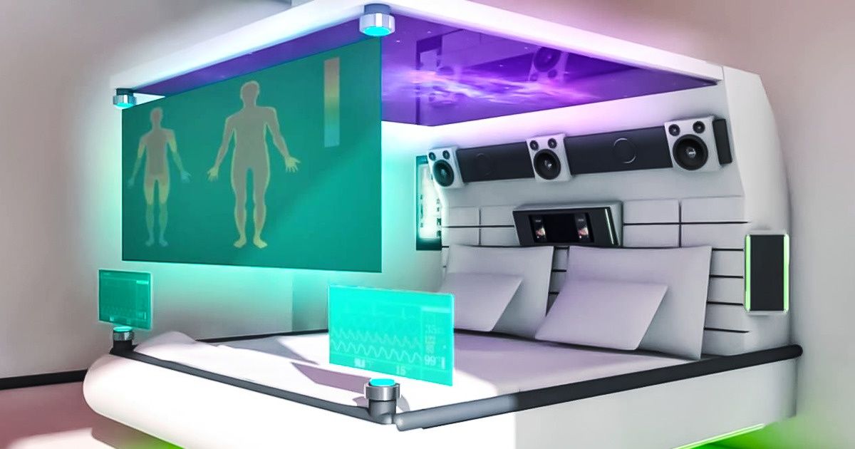 I am sure that most of you have serious experience in wearing blue clothes. But in the spring and summer of 2022, fashion brands and influencers invite us to try it in unexpected combinations with orange, lilac and yellow.
0081
30 Fashion trends Spring-summer 2022
Chopping in Italy-where, how much is
Pantone 13-1513 Gossamer Pink-Pink Pink
Delight and Slose Rosa cotton wool. Of all the Pantone spring 2022 colors, this one is by far the most romantic. This transparent pink color gives joy and hope with its light touch.
PANTONE 18-2042 Innuendo - Innuendo
Innuendo's opulent pink Innuendo is intriguing and sends intriguing signals.
PANTONE 19-4151 Skydiver - Skydiver
The mysterious and endless blue Skydiver in spring and summer 2022 will inspire you to new heights.
PANTONE 14-0850 Daffodil — Narcissus
Pantone week in New York has taken us to a blooming spring garden! Pantone described the color as "laid back". Sunny daffodil gives a feeling of sun and joy.
PANTONE 16-4118 Glacier Lake
Calming and cooling glacier lake conveys serenity and silence.
PANTONE 18-4728 Harbor Blue
According to Pantone Blue Harbor Blue reflects our search for a safe place. In my opinion, Harbor Blue is a completely atypical blue-green shade for a summer palette.
Similar shades used to be found in Pantone autumn palettes. But it is precisely such a calm deep complex color that brings a certain balance and “support” to this palette.
PANTONE 18-1019 Coca Mocha
Like the cocktail of the same name, Coca Mocha seduces with its sophistication. This beautiful warm coffee shade envelops and enchants.
How to wear trendy
coffee shades in 2021 Coffee Coca Mocha we often find in nature and in the things around us. Clothes and accessories in these shades look stylish and sophisticated, so they can be easily combined with many colors and items in your wardrobe.
Feel free to choose work clothes in this coffee shade to look professional and inviting. Clothing for the home of this shade will give comfort and a sense of luxury.
Combine different shades of brown and beige for a matching look, or choose a dress in a very fine fabric in this color that will take your style to the next level with just one swipe.
PANTONE 18-3324 Dahlia - Dahlia
Dahlia is a magenta color inspired by this familiar flower. Lively and bold, this magenta is full of energy. Dahlia is a very welcoming shade that brings vibrancy and effortlessness to this trendy palette.
PANTONE 18-1564 Poinciana
Poinciana - the passionate scarlet color of the exotic flower, also known as the Bird of Paradise, is full of energy! Seductive Poinciana Red is one of Pantone's hottest spring 2022 color trends.
How to wear trendy red in 2022
Of course, such a passionate shade is not for modest girls, it takes a certain courage to leave the house in a bright red summer dress.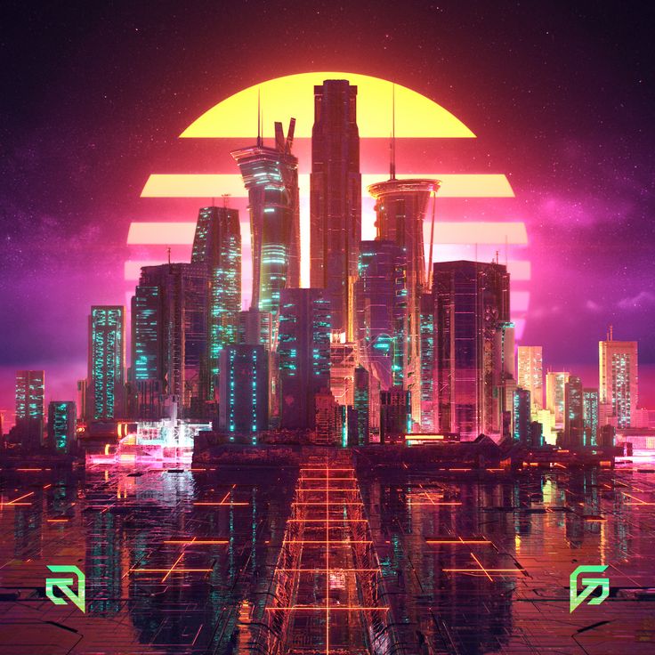 But even in small bright accents, accessories, manicure and lipstick in the summer and spring of 2022, Poinciana will give you the right boost of optimism.
Read also:
30 fashion trends for spring-summer 2022
Sales in Italy 2022: start dates and calendar by region
Shopping in Italy - where, what, how much
Pantone Spring/Summer 2022 NY
The classic palette includes five basic neutrals whose versatility transcends the seasons and allows for greater freedom of choice.
PANTONE 11-0602 Snow White
This almost pure white is a testament to our desire for simplicity and boundless inner peace.
PANTONE 13-0003 Perfectly Pale - Perfectly Pale
Perfectly Pale, a soft sandy beige, offers the comfort and tranquility of a sunny and welcoming beach.
This soothing shade looks great alongside other pastels and florals on the trendy palette.
PANTONE 16-6216 Basil
Green basil leaf, sweet and spicy at the same time, exudes health and well-being. The perfect spring green for pastels and vibrant pinks.
PANTONE 14-4104 Northern Droplet
Northern Droplet is a light gray shade that inspires a feeling of peace, stability and reliability.
PANTONE 18-4004 Poppy Seed
Poppy Seed is an intriguing shade of dark grey. According to Pantone, his inner strength embodies trust.
Pantone Color of the Year 2022
Pantone Color of the Year 2022 is PANTONE 17-3938 Very Peri.
Each time Pantone releases a Color of the Year, it not only presents a cultural outlook for the year ahead, but also expands its shade library. But in 2022, Pantone released a brand new color: PANTONE 17-3938, also known as Very Peri.
Pantone Color of the Year is PANTONE 17-3938 Very Peri. This shade is the perfect combination of blue and purple. With mauve breaking all records for popularity this fall, it's no surprise that Pantone's color of the year is a slightly more intense shade of mauve.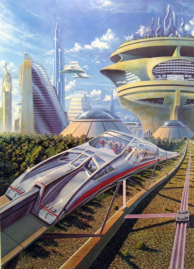
According to Pantone, Very Peri is "a lively and joyful shade that encourages the imagination and creativity."
Here is the description that Pantone dedicated to Very Peri:
PANTONE 17-3938 Very Peri A vibrant shade of blue periwinkle flower with a vibrant purple undertone. It combines the fidelity and constancy of blue with the energy and excitement of red.
PANTONE 17-3938 Very Peri exudes a carefree confidence and fearless curiosity that invigorates our creative spirit. The intriguing Very Peri helps us embrace the changing landscape of possibilities, opening up new perspectives as we rewrite our lives. Combining the qualities that blue stands for and complementing it with a new perspective PANTONE 17-3938 Very Peri presents the future in a new light.
Color of the Year 2022 PANTONE 17-3938 Very Peri is the funniest and warmest blue of all. This is a shade that fully reflects the increasingly pervasive phenomenon of Phygital - i.e. the intersection of physical and digital space, more blurred than ever.
While we are in a period of unprecedented change PANTONE 17-3938 Very Peri is a reflection of the global zeitgeist, transition and new perspectives.
As we emerge from lockdown, our perceptions and lifestyles are changing, and our real and digital lives are merging in new ways. Digital design helps us expand the boundaries of reality by opening the door to a dynamic virtual world where we can explore and create new color possibilities.
PANTONE 17-3938 Very Peri, with trends, the growing popularity of the metaverse and a thriving digital art community, illustrates the confluence of modern life and how color trends in the digital world are manifesting in the physical world and vice versa.
PANTONE 17-3938 Very Peri is a bold and elegant shade that combines the fidelity and permanence of blue with the energy of red. The perfect mix that will inevitably conquer the world of fashion and beauty in 2022.
Pantone Spring/Summer 2022 London Color Palette - Pantone Fashion Color Trend Report SS 2022
London Fashion Week Spring/Summer 2022 Fashion Colors are very similar to the New York Fashion Week Summer Palette, they are also reminiscent of familiar colors of nature.
Trendy Pantone London Colors for Spring/Summer 2022 combine our need for comfort with our deep connection to nature. Promoting a new sense of simplicity and spontaneity, this palette includes pastels and vibrant hues.
London Fashion Week Spring/Summer 2022 Pantone colors reflect the theme of contrast and complementarity. The carefree, airy pastels and exciting vibrant colors of the trendy palette inspire boundless creativity and unlimited self-expression.
Pantone Very Peri's 2022 Color of the Year at the Spring/Summer 2022 Fashion Shows
Very Peri is essentially a very light and soft shade of magenta that echoes popular hues of lilac, wisteria and iris. On the spring/summer 2022 runways, Very Peri was featured by many brands.
Chanel plays with Very Peri in detail: feathers adorn the frilled skirt in the 2022 resort collection. At Valentino, in the color of the year 2022, we find dresses and tunics, while Versace has sparkly skirts and even tights.
How to wear Color of the Year 2022 Very Pery?
Pantone Very Peri exudes a strong personality and is perfect for both casual and evening wear. This light magenta hue works great in total-color and in combination with neutral tones.
Color combinations with Very Peri
Very Peri Violet from Pantone can be a very versatile color. Of course, you can choose simple combinations with black, white and nude. If you want to practice in a trendy color block - choose sky blue, navy blue, sand, turquoise or orange as companions.
Our use of color is connected to our mood and our cultural perception. This is a new future that provides opportunities to create something new and revolutionary
Colors that honor our desire to break down boundaries, reward our passionate need for creativity and unlimited visual expression as we enter this new, uncertain time.
”
Laurie Pressman Vice President Pantone Color Institute
London Spring/Summer 2022 Color Palette:
London Spring/Summer 2022 Fashion Palette is a mix of bright and pastel spring garden colors and calm, rich natural tones.
PANTONE 14-5713 Cascade
Turquoise Cascade is a dreamy aquatic shade that refreshes not only the body but also the soul. It reminds us of the waters of a tropical beach and is ideally combined with sandy shades and bright colors of exotic flowers.
PANTONE 16-1349 Coral Rose
Coral Rose is a vibrant orange-pink color that gives us energy and a sense of release from negativity.
PANTONE 18-4143 Super Sonic
Super Sonic is a vibrant shade of blue that is so familiar and familiar, bringing calm and freshness.
PANTONE 12-0825 Popcorn
Popcorn is a cheerful and sunny shade of light yellow that exudes warmth and hope.
PANTONE 13-2004 Potpourri
Pantone Potpourri is a fresh, light pastel pink shade of delicate spring buds that whispers romance.
PANTONE 17-1928 Bubblegum
Warm and vibrant pink Bubblegum is a charming and playful shade that promises happiness and fun.
PANTONE 18-1160 Sudan Brown
Warm Pantone Brown Sudan Brown is a dark earthy color with orange undertones that conveys the fantastic atmosphere of the African savannah.
PANTONE 15-0549 Fragile Sprout
Fresh Green Young Green Pantone Fragile Sprout is a vibrant, slightly acidic shade that leaves you speechless.
PANTONE 14-3612 Orchid Bloom
Pantone Pastel Lilac Orchid Bloom reminds us of our eternal love for the colors and scenery of lavender fields.
PANTONE 18-1307 Coffee Quartz
Pantone Coffee Quartz is an intriguing dark brown that is robust and earthy and epitomizes simplicity and elegance.
Pantone Spring/Summer 2022 London Classic Fashion Color Palette
PANTONE 11-1001 White Alyssum
Pantone White Alyssum is a clean, fresh shade that embodies our desire for lightness and simplicity.
PANTONE 15-1304 Humus
Pantone's appetizing Hummus is a classic and practical beige color that evokes a sense of well-being and tranquil luxury.
PANTONE 15-6316 Fair Green
Fair Green is Pantone's light green shade, soothing and refreshing.
PANTONE 14-4104 Northern Droplet
Northern Droplet is a light gray that inspires a sense of calm.
PANTONE 18-4004 Poppy Seed
The silent power of this dark gray reflects strength and stability.
Write in the comments, which trendy colors of this spring and summer from Panton do you like the most?
Like this:
Like Loading...
News
Meet Dulux_2023 Key Color - MAGIC OF NATURENews
September 13 AkzoNobelwill announce
key color_2023 On July 7 and 8, Akzo Nobel invites you to participate in a design intensive.
 ..
.. News
Special programs for professionals in the Studio...Interview
Apartment "in the style of Druzhko" Designer Alexander Mershiev about the renovation for TV presenter Sergey Druzhko and the possibilities of transforming the space with Sikkens paints.News
Dulux plugin - add colors to projects with one clicknews
Sikkens presents: the first issue of the updated "Big. ..
.. Review
Clear skies by AkzoNobel Let's talk about the key color of Dulux 2022 - it is called the airy and delicate light blue shade "Clear Sky" (14BB 55/113), designed to become a "breath of fresh air", a symbol of change and freedom.News
Helen van Gent is back from Amsterdam! September 15th...Overview: Technologies
New improved Dulux Expert app: now all services. .. The application allows you to determine the color, find it in the catalog, try it on the walls and select the desired product.
 News
Petersburg in the colors of AkzoNobelnews
Dulux 2021: color of the year - color of the cityNews
The Dulux Academy, together with the Wagner Academy, launches a series of. .. Instagram Premium Paints #Sikkens
 Overview: Technologies
Sikkens decorative flooring at MosBuild 2021 November 11 at 16:00 Dulux will continue a series of designer webinars...News
October 22 at 16:00 AkzoNobel invites you to the webinar "Like. ..
.. news
Dulux Color of the Year - 2021. September 29 at 15:00 Creative Director... AkzoNobel opens up new perspectives with Key Color...Item: Technology
Dulux launched a support program for painters and designersnews
Magic color: Dulux prepared for Children's Day. .. Children will be able to “visit” a lesson at the AkzoNobel Color Academy, learn about what color is, where it comes from, as well as play color Sudoku and perform other interesting exercises.
 News
June 2 at 12:00 - AkzoNobel webinar on color in design... May 15 at 12:00 – AkzoNobel webinar with Russian translation Speaker - Stephanie Kraneveld, Head of AkzoNobel International Programs for Education and Expertise in Color (Netherlands).News
Moscow - Amsterdam. May 7 at 12 noon AkzoNobel invites...
 news
For designers, architects and planners: 30...News
AkzoNobel is involved in the restoration of the famous masterpiece... Dulux donates 100 color scanners to industry leaders. Stock...Prize
AkzoNobel: the best color solution for I Love residential complexReview
Come out in color We will tell you how to use the paint from the new DULUX "Easy to Update" line to paint doors or windows on your own and in one day.
News
AkzoNobel presents: a symphony of color and music in the Manor House... BRAER tiles: calculation for the ages The vibrocompression method makes BRAER paving slabs durable, and the ColorMix technology allows you to achieve a variety of shades. With proper installation, the product will retain its properties for decades. We talk about important nuances during installation and operation. Ecology out of time New Horizons has developed a range of nature-inspired playgrounds with sustainable materials that will last for years to come. Minimalism in the interior with Fundermax HPL panels Advantages and possibilities of using HPL-panels in creating modern functional and aesthetically attractive interiors. Restorers carried out work in the memorial complex... Beslan hosted a traveling restoration school of the Union of Restorers of Russia. Its participants carried out restoration and conservation work on the ruins of school No. 1. The project took place with the support of Baumit, specialists in the field of restoration of historical buildings. MacTech.
 Stages of a long journey Aluminum architectural structures of Masttech are used in their projects by architects of leading bureaus, such as SPIC, ATRIUM, TPO "Reserve". Not so long ago, the company's specialists developed - according to the terms of reference of AB Tsimailo, Lyashenko and Partners - an exclusive solution for a stained-glass window block, which is mounted on two floors at once. 5 rules for a typical project of a country house - a workshop ... How can an architect create a successful type design and avoid mistakes?
 Using the example of a barnhouse made of Wienerberger ceramic blocks, we tell the key ideas of the new workshop at the "School of the Designer" Six public complexes implemented using.
 .. Knauf AQUAPANEL® technologies have long won recognition in the domestic construction industry. Especially in the field of public buildings, which are subject to special requirements for safety, fire resistance, vandal resistance. At the same time, “dry construction” technologies significantly reduce installation work. Brick plus: what is masonry friendly with What materials should bricks be combined with to turn a building into an architectural event? We answer the question by looking at the iconic houses built in St. Petersburg with the participation of the Slavdom company. "OrtOst-Facade": the start of the National Historic.
 .. The company "OrtOst-Facade" has completed the work on finishing the facades of the Children's Art and Aesthetic Center "School of Arts" - the first facility in the large-scale complex of the Khersones National Historical Park October 5, 2022
 State Museum of Architecture... For architects, designers, builders, developers Pipe Module: concise lines of light The novelty of m³light is a modular luminaire made of impact-resistant polyethylene. From such a lamp you can make different lines, emphasizing the architecture of the space Fast but beautiful The leading manufacturer of wall enclosing structures, the TechnoStyle group of companies, has released a line of Urban modular facades that can be used in an urban environment.
Fast installation, high technical performance and a new level of aesthetics open up more options for architects. Shoulder feeling The design of the DELABIE handrails from the Nylon Clean series gives people with limited mobility more ease of movement, and the special coating has antibacterial properties that remain throughout the entire service life. Red brick from brutalism to postmodernism Together with the BRAER company, we recall vivid examples of the use of brick in brutalist architecture - a trend that was able to refresh perception and revive emotions.
 His recent experience proves that the simplest red brick is relevant.
 Maybe even - more than. Glass for SBER:
freedom of sight AGC offers a wide range of architectural glass products that meet today's energy efficiency requirements while delivering superior visual performance. About AGC products, which are also exclusive, on the example of the new building of Sberbank City, where several types of premium glass were used, including one designed specifically for this facility The art of being invisible Architects Aleksandra Helminskaya-Leontieva, Olga Sushko and Pavel Ladygin share with readers their experience of using innovative Invisiline ventilation grilles in designing modern interiors.
 invoice unit The Scriabin Ceramics plant supplied 220,000 clinker bricks for the West Garden residential complex, designed by the SPIC bureau. Especially for the project, a new format and color map was developed. We are talking about a young and promising brand. "Donskie Zori" - 7 years on the market! Grandmaster indicators of the Russian manufacturer:
 93 types of hand-moulded bricks, annual output - 15,400,000 pieces,
frost resistance and strength - higher than European analogues,
excellent logistics and - already - a warehouse program!
And also: best-selling bricks and exclusive for special projects Houses from Porotherm
at Open Village 2022 Wienerberger invites you to visit the exhibition
Open Village from 16 to 31 July
in the cottage village "Quiet Dawns" in the Moscow region.
 This summer you will be able to see 22 houses built using different technologies. point-blank question We tell and show on the example of three buildings how using the BAUT system it is possible to create a large surface with “crenellated” masonry: a school, a library and a business center.
 Object
Facade value In the reconstruction of a late 1960s office tower in Bilbao, IDOM architects faithfully reproduced its façade in new materials, a requirement imposed by the city authorities. Press: Architect Sergey Trukhanov: “Soon time and place will become...
 Like William Gibson: “The future is already here. It's just not evenly distributed." And if for some sectors of the Russian market VR is practically the past, then for others it is the future or the present that has recently come.
send.project
After arable land The All Grain restaurant in the former brewery of Stepan Razin: an elevator, concrete "bags", plow lamps and armfuls of ears of corn.
Prize
Building for four centuries The new library at Cambridge Magdalen College has won the Stirling Award for Best Building in the UK 2022. Its authors, Níall McLaughlin Architects, are confident that they have fulfilled the customer's task: the building will last 400 years.Competition results
Assemblage point We are talking about the results of the competition for the concept of a public and business cluster and residential areas with an experience park in Khimki, showing the selected project.
send.project
Transparent Monnier Working on the community center project for the Chistye Prudy club house, APREL architects proposed to preserve, clean and restore the walls of the late 19th and early 20th centuries, while at the same time approaching the reconstruction creatively: the degree of openness-closedness of the premises varies graduatedly to the right and left from the playground.send.project
lingonberry-brick A new point of attraction and gentrification in the neighborhood of Sevkabel port: the renovated territory of the former tannery with "balconies" near the Gulf of Finland, aesthetic ruins and red-brick architecture.
Object
geological fault The Futura-Architects bureau has been working with the New Piter microdistrict in the south of St. Petersburg for several years. We are talking about the latest project - a house in which the architectural ideas of the authors were able to get along with the limitations of comfort-class housing and gave rise to a layering that is pleasant for its typology.Object
On the hills of China The Beijing Bureau of MAD has completed the construction of a new stadium in Quzhou. The first facility of a large-scale sports campus is almost completely hidden under a green lawn and became the largest building in the world with a heat-protective ground cover. Press: On the scale of development of the capital, renovation and star...
 Conversation correspondent of "Rossiyskaya Gazeta" with the chief architect of Moscow Sergei Kuznetsov.
Report
Moscow Architectural Council - 77 The Council supported the project of the tower that completes the VTB Arena Park ensemble from the north side. The authors of the project - UNK - proposed to increase its height from 100 to 150 m for better proportions. During the discussion, there were proposals to increase the height stronger, make the tower slimmer and move it off the axis of the Third Ring Road, so that it did not close its perspective from Begovaya.
 send.project
Business processes Office for a large company, located on the 17th floor of Neva Towers: the predominance of unsecured workplaces, transforming rooms, various meeting rooms and an abundance of natural light.Prize
Signals to the future The finalists for the International Highrise Award 2022 have been unveiled, including just one European building.
Object
Concrete balconies The Landmark Hotel in Medellin by Plan:b arquitectos uses materials typical of the city with a functional and stylish result.send.project
Streams of air and light For the office, located in the Atlantic business center and intended for rent, archCLOUD chose timeless design, art objects and “old-fashioned” offices instead of open workplaces.
send.project
Crystal Clarity The ascetic interior of a dental clinic, the coldness of which is diluted with cobalt blue, a Suprematist cross and a historic cast-iron staircase.Object
Among the rapeseed fields The Qingxi Museum of Culture and History in Ningbo is skillfully integrated into the natural and agrarian environment.
Report
Three "green" stories We are considering urban environmental projects presented by the General Plan Institute at Architecture. They are of a very different scale: from collecting information and wishes of residents on a city scale to growing meadow plants between houses and paintings, which, as it turned out, heal trees, help heal wounds in the bark. + a list of species natural for Moscow to help the developer.send.project
Serious conversation A children's clinic with an "adult" interior: diluted with signature blue monochrome, steely sheen and futuristic geometry.
News
Plates of Bagration The project of a new skyscraper from the architects of SPIC in Moscow City has been published. In it one can see: Moscow skyscrapers, Chicago, Malevich's architecton and an attempt to deconstruct the integral image of the Moscow skyscraper, found by the authors in recent previous works. Press: City of moving crowds Grigory Revzin on whether it is possible to separate the Italian futurist from Mussolini .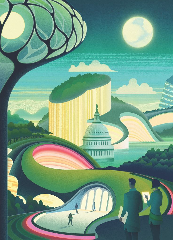
In the history of the architectural utopia "New City" (Citta Nuova) Antonio Sant'Elia intrigues with a certain mystery. This is one of the central images of the architectural avant-garde. Mystery is determined by two circumstances.
Object
narrowness of sight The Casamirador apartment building in Belo Horizonte, Brazil is sandwiched between neighboring buildings on a plot measuring 12.7 by 60 m. Gisele Borges Arquitetura has come out of this difficult situation with honor. send. project
Object
white roofs The sales office for a residential complex in Wuhan will turn into a kindergarten for its residents in the future. The architects of Atelier Xi incorporated both use cases into their project so as not to waste resources on demolition and new construction.Object
Preserving the history of Chistye Prudy How to make a club house comfortable, meeting the requirements of expensive modern housing in the city center, while retaining the maximum of the original building of 1915? Ilya Utkin, together with Sminex, solved this puzzle for Potapovsky Lane, 5 - we are studying how.
send.project
Bright blend A wine bar in the cultural and business cluster "Basmanny Dvor", the ideas for which the architects borrowed from the modernist resort architecture, adding rich colors and vintage furniture.Review
Stars for the Moscow region We chose 6 of the most "star" and remarkable projects of the Moscow region from those shown at the "Zodchestvo" stand and are considering them. Leading educational institutions.
 send.project
Sports outside the window Skate area for a linear park from XSA Ramps: professional and amateur sports, entertainment and alternative leisure scenarios as part of the improvement of residential areas.Object
nest house Swedish electric sports car manufacturer Polestar has unveiled a 'concept' model of a treehouse that could make outdoor recreation more sustainable.