Color schemes for small homes
The Best Colors to Use in Small Homes
If you have a smaller home, you may think you are bound to only using white and beige shades in order to not make it appear larger. However, there are multiple different colors you can incorporate into your home that will give you the appearance of a larger residence. Here are a few options of different colors you can use in a small home.
TaupeTaupe can be used in more than just one way. Paint your walls with this shade and include it in the decor you currently have. Pair this beautiful hue with a bold shade or two to truly bring the entire decor together. There is no better way to do this than to use a bold hue such as yellow, orange, or blue.Taupe is an excellent overall color for any size home. It is chic, trendy and adds a dimensional feature to the living space. This color works best in the kitchen, home office, or even in the living room. The key is to pair it with other light hues and to allow the room to have lots of natural light.
This greenish-blue color is not only beachy but its classic as well. The color plays well with multiple different hues which is always a plus. Pair it with bold, richer shades for a contrast that is hard to miss. This shade works well in the foyer, kitchen, or guest bedroom.
GriffinGriffin is such a unique shade that it will mesmorize you all at the same time. The richness of the color works well in the bedroom because it is relaxing and calming all at the same time. Pair the shade with metallics to bring out different hues throughout the color.Griffin is best described as a dark chocolate shade with hints of gray and taupe. The color is a commanding hue that adds richness and dimension.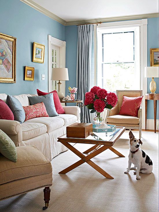 The key to working with this color is pairing it with creamy softer shades. Additionally, you want to only use this color on an accent wall for the best outcome. This color is perfect for the library space or even the living room.
There is nothing quite like adding shades of pastel blue to a home. The notoriously beautiful color works well in any space it is placed in, not only that but the color is extremely pliable. Choose a lighter shade of pastel blue for a softer take or a darker version of this shade for a richer, bolder feel. This hue works well in a bedroom or even in the bathroom.
GrayGray works well in any room because of how broad the color is. The color works exceptionally well in the kitchen area as it will give the space a chic appearance. It is also a great way to brighten up an all-white kitchen with just the right amount of color.
 The key to working with gray hues is having bright, crisp white all around the space. The crisp white shades instantly lighten this hue and give it a charming effect. You want the gray to feel soft and charming not stuffy and cold. Choose a gray hue with a purple or blue undertone. This is an excellent overall color which means it will work well in any room in the residence.
Oriental RedRed may seem like a difficult hue to work with but it is quite the contrary. The bold hue works great in any space it is paired in, especially in a neutral room. The key is using it in small doses, having an accent wall and decorating around it works best.Yes, you read that correctly red hues work well in any space of a home. The reason being they are rich and fun with a twist of modern. The key to working with red hues is knowing which shades work best and where. You want to use hues that are less bold and have richer undertones. Doing so will bring life to the space while still being multi-dimensional. Pair this shade in all rooms with great lighting.
This regal shade is everything you have dreamed of and more. The hue is not for the faints of hearts or for the homeowner who wants to have a simple space. This color commands your attention as soon as you enter. It also shifts colors depending on the lighting you use. The brighter the lights the darker the color will appear. However, if you use bright lights the hue will significantly lighten up.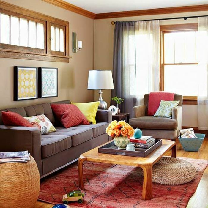
When it comes to using patterns in a small room the key is adding them one bit at a time. You never want to use too many patterns in one room. Keep it simple, keep it chic and the outcome will be beautiful. Consider using patterns that have similar hues to the colors you are already using in the space. Place patterns everywhere in the home for the perfect contrast.
YellowBring on the cheery hue! Yellow will make a huge difference in any room. The idea is to add a hint of bold in the space to add texture and drama to any room regardless of the color scheme you may have going on.Yes, you read that correctly the color yellow when done the right way will make the room appear larger.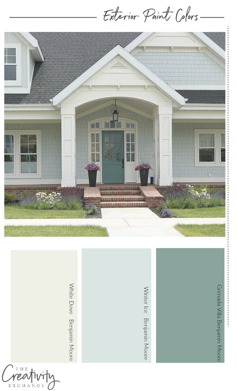 You want to use soft shades of yellow on the wall and on furniture pieces. This will bring a bright touch to the room. Use this hue in the living room or dining table for a fresh touch of brightness.
Alabaster is crisp, a white hue with a twist of charm. This color is the perfect combination between white and beige. The color will pair well with all shades which is great because you can work around that and add patterns to the room that will make the space appear larger in size.
Which of these hues will you be using to make your home appear larger? Please share with us your thoughts in the comments below.
How How to Choose House Paint Colors for a Small Home
By
Ronique Gibson
Ronique Gibson
Ronique Gibson wrote for The Spruce for more than two years, covering home design and home staging topics.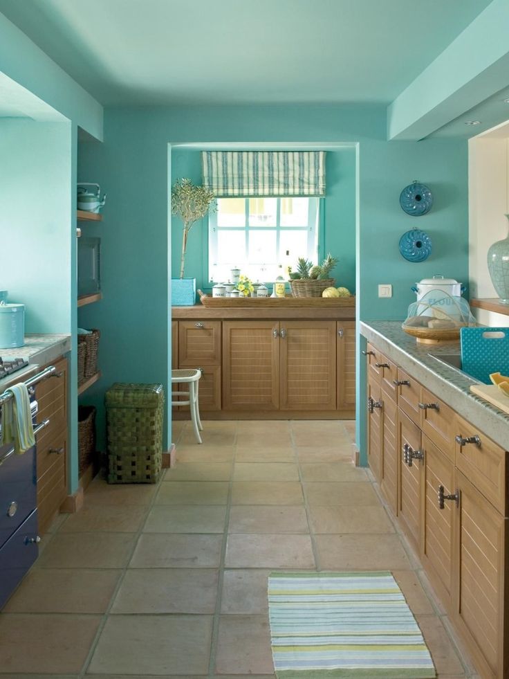 She is a trained architect and is LEED AP certified. She also launched a home lifestyle site in 2009 and has written for such publications as Better Homes & Gardens Kitchen + Bath and Houzz.
Learn more about The Spruce's Editorial Process
Updated on 05/13/22
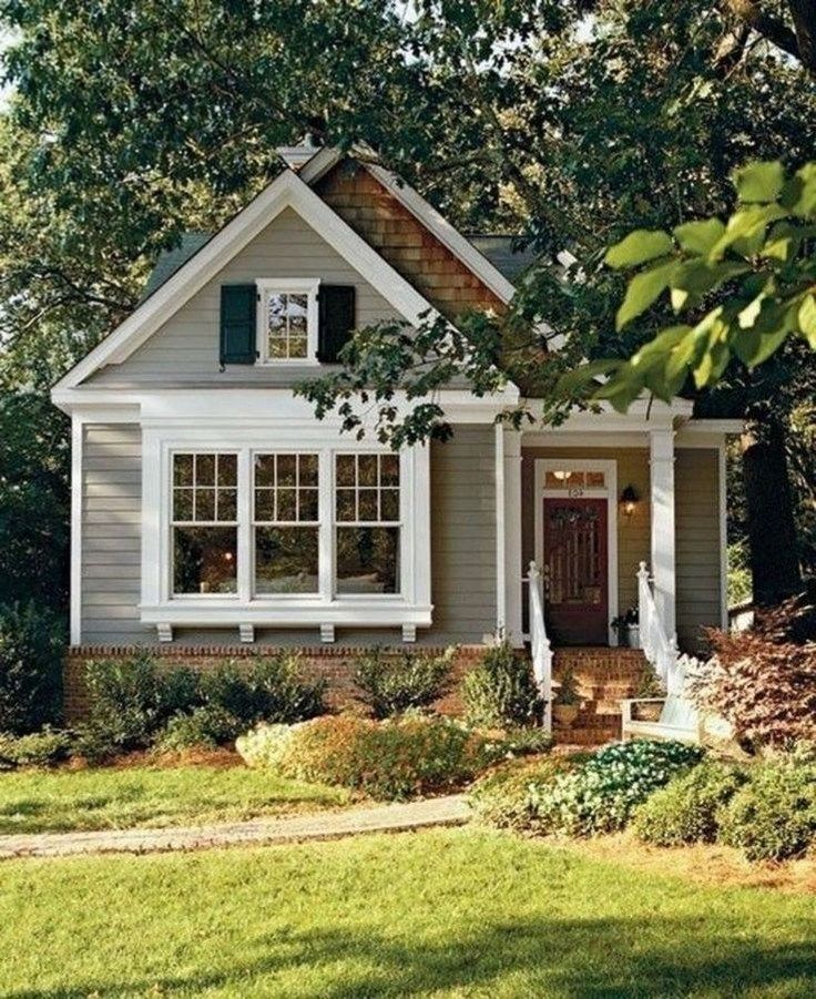
The Spruce / Christopher Lee Foto
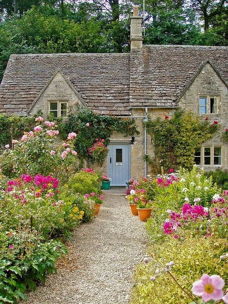
A Welcoming Front Entry with Natural Light and Color is Essential
Choosing house paint colors for a small home is not an easy task. This is because little spaces have the ability to carry a lot of weight. Hallways, foyers, and mudrooms can determine the look and feel of a home. Before you go out to buy paint for your small home, take the time to establish the effect you want to achieve. Here are some ideas to help you in your endeavor.
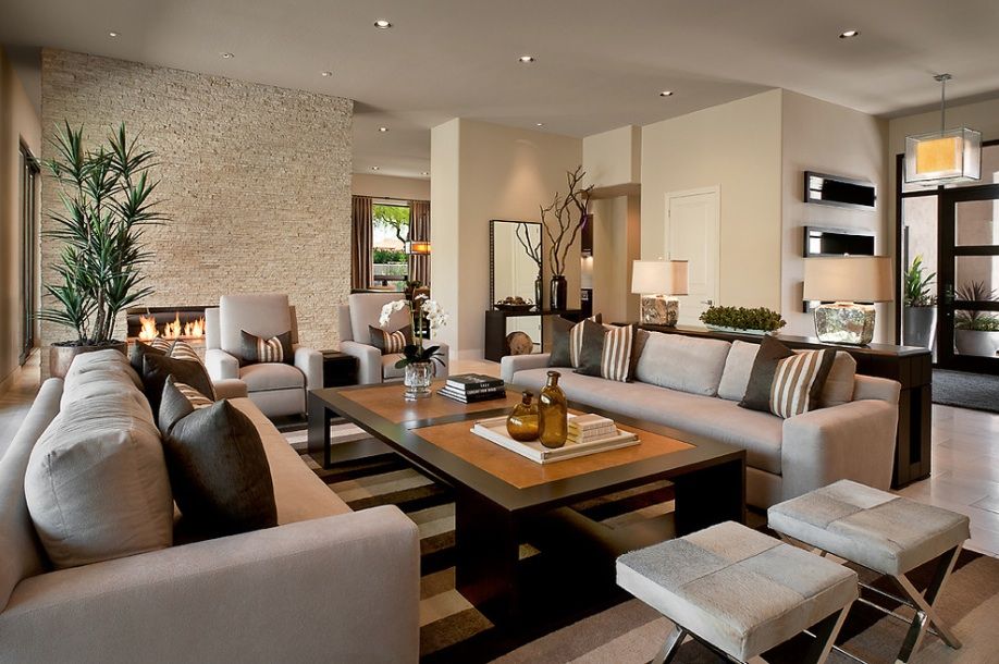
Invite Buyers Into Your Home With Living Room Paint Ideas
The living room is the first room home buyers see when they walk into a home. If it isn’t impressive, they won’t linger. Paint your living room walls white to increase its brightness and to make the walls visually move away. If you feel that white will be too stark and cold, try taupe. It is a calming sand color that enlarges a space and makes it feel warm and welcoming. It is also a great backdrop as it takes on the color of natural light while keeping its integrity. You can also try cream, ivory, or beige.
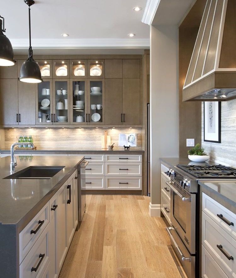
Ensure Your Kitchen Uses Neutral or Welcoming Colors
Consider using natural wood stain colors for your kitchen Getty ImagesCreate a Sanctuary With Bedroom Color Ideas
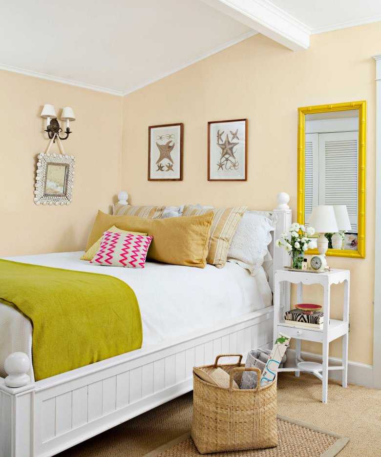
The bedroom is a place of relaxation and must be a total haven. Use white and other relaxing colors to make your bedroom appear bigger. Blue’s suggestions of the sea and sky make it innately relaxing. In fact, research shows that people sleep for longer periods in blue bedrooms. If you don’t fancy blue, try icy gray-green that’s a great take on neutrals.
Homeowners with small bedrooms like to use earth tones and neutrals like gray, yellow, or green. These hues make walls visually recede into the background, highlighting the accessories in a room. White also works well in a small bedroom, but avoid using stark white since it can make a bedroom look bland. Ivory, cream, and butter are good options. Paint the ceiling white as it’s the best choice for a small room.
Consider Neutral or Accent Wall Kitchen Paint Ideas
Are you looking to add more pizazz to your kitchen - kitchen paint colors could do the trick. Ever wondered why most kitchens are painted red or orange? It’s because these colors stimulate the appetite. If you think they might be too bright for your kitchen, paint your walls a soft pumpkin or kumquat. These colors are vibrant but not intense. If you want something gentler, try white, pale blue, or cream. Also, consider a neutral palette color tone where wood stains become the color choice as opposed to a definite color. Wood stains bring out a natural sense to the kitchen and keep your kitchen feeling warm and welcoming.
Create a Tranquil and Relaxing Bathroom with Color
Ensure your bathroom uses soothing interior colors Getty ImagesBathroom Colors Should Be Tranquil and Relaxing
Bathrooms look great with soft colors.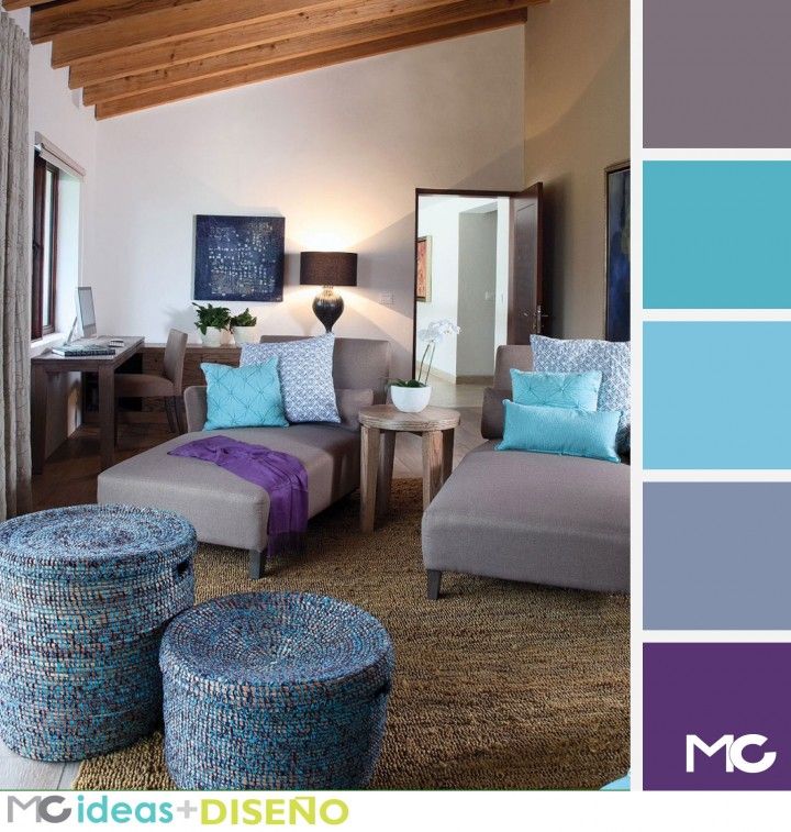 Soft colors make people feel relaxed and also flatter the skin tone. Buyers fall in love with bathrooms painted ivory, gentle rose, or buttery tan. If your bathroom doesn’t get a lot of natural light, paint the walls pale yellow or straw-like yellow as they mimic sunlight.
If your bathroom is very small, paint it white or lemon to make it appear bigger. You can also create a coastal vibe with sky blue paint. Paint the walls and ceiling a similar color to visually enlarge the space. Buyers’ eyes will travel effortlessly, and they’ll think the room is bigger than it is.
Avoid Bright Wall Colors Where Possible
Bright walls are a turnoff for buyers. If you want your home to sell fast, paint the walls a white or off-white color. This will enable buyers to easily repaint when they move in. White paint also gives a home a bright and clean appearance. Make the most of the numerous brochures and paint selections at your local paint store and seek an expert’s advice on the color schemes you can use.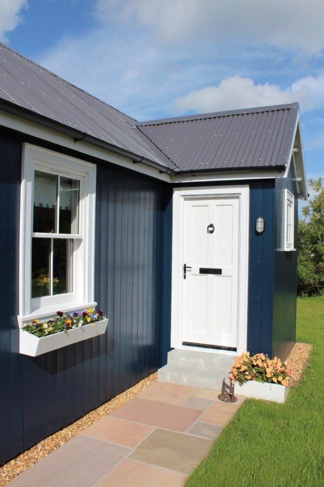
Home buyers have strong feelings about bold color. To please them, use neutrals like white, beige, or cream. Painting the large rooms a neutral color will help buyers to visualize their belongings in the space. Buyers are attracted to neutral interiors both online and offline. Your neutral rooms will look better in listing photos, and more buyers will book a showing.
Choosing house paint colors for your home sounds simple, but it can be one of the toughest choices to make. Follow these tips, and you’ll be sure to choose the best interior paint.
Color solutions for house facades: changing the appearance beyond recognition
Projects
My construction
register for Z500
get access to all the features of the site.
What do you get?
- layouts with linear dimensions
- communication with other users
- information about the implementation of Z500 projects in your area
- own construction blog
- follow other construction blogs
- add to favorites, compare
register / login
M²
Square
Bedes
23456+
1
2
3
4
5
6+
9000 +1 9000 storey 929 Jul.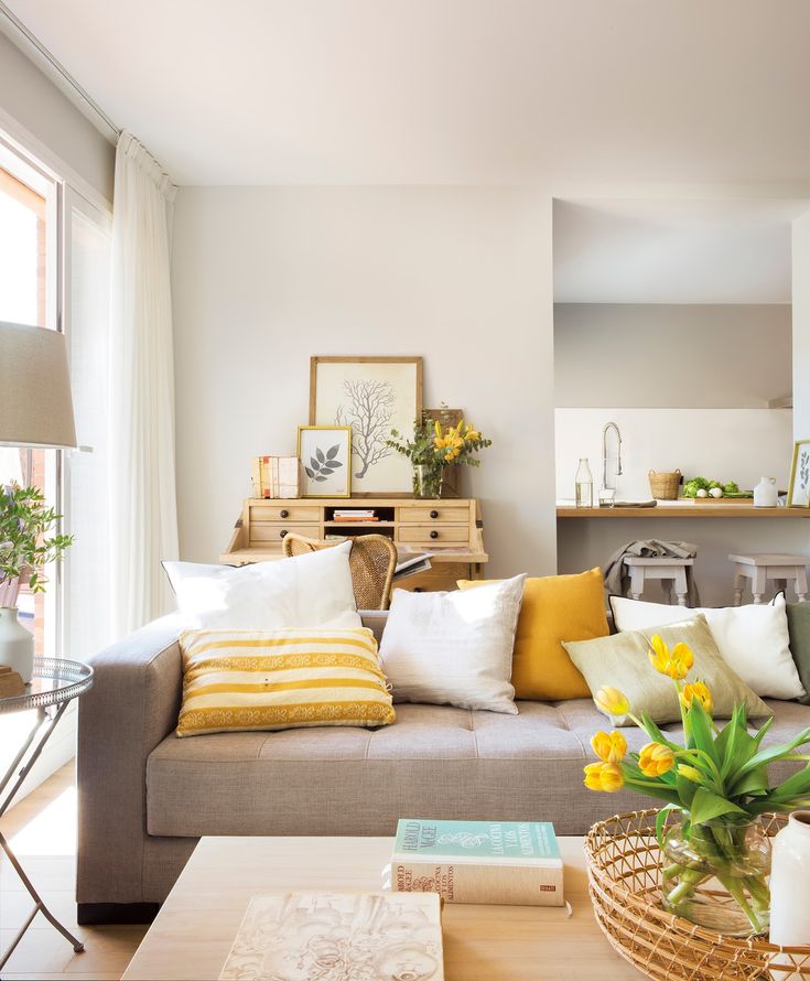 2014 at 00:00 0 comments1217 views
 To change the external the appearance of any house, it is not necessary to add or remove architectural elements, it is enough to choose a different color scheme for the design of the facade. Thanks to our selection of proven ideas you can turn your home into a modest neat house, and a respectable estate.
1. Natural beauty
The facades of the house are decorated in light colors. Against their background, the terracotta tiled roof and the dark brown plank gables, window frames and doors that complement it look win-win.
The combination of contrasting dark and light natural tones is an effective finishing option suitable for any architectural form of the house, allowing it to blend in harmoniously with both urban areas and lush greenery
2. Red and white
The color scheme brings us back to the traditions of family estates. The red color of the tiles is favorably set off by the pastel wall with doors and windows made in light color.
Traditional, time-honored materials bring cohesion and balance to the home, making it look like a classic manor house.
3. Urban restraint
Home decoration in monochrome palette, including the gray color of brushed steel tiles, white plastic windows and the restraint of white plaster, give the house a universal urban appearance and successfully harmonizes with the urban environment.
4. Accent colors
The neutral, soft gray roof serves as a good backdrop for the light-coloured plaster and makes it possible to set accents in the form of green gables, red frames, shutters and railings of the French attic windows.
Such a house creates the impression of a fairy tale, delighting with non-standard design, and will look great on a forest glade or in a flowering garden
5. Solidity and respectability
Everything in this house speaks of reliability, wealth and inspires confidence.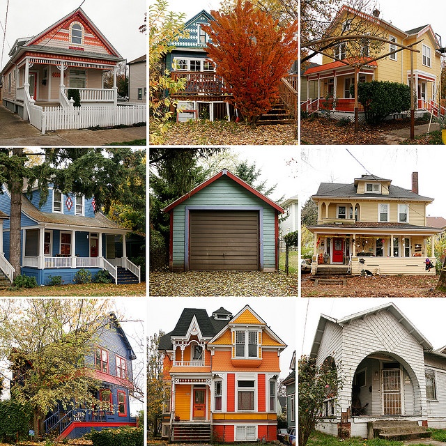 Chocolate-colored ceramic tiled roof, modern brick-like cream facade tiles, dark windows and massive doors - an abundance of expressive textures and colors add solidity and significance to the house.
6. Harmony with nature
Everything reminds of the forest: both the juicy green color of the tiles and the companion colors of the plaster (white and brown-purple) harmoniously separating the facade.
Thanks to the dark color of the attic, it looks solid and solid. Thanks to the division of color, the house as a whole looks more squat.
Harmony in everything: green shutters to match the roof, basement floor tiles to match the walls.
The house will look great in large green areas.
facade design planning:
- Finishing should be worked out in harmony with neighboring buildings and color background, so as not to provoke a conflict style.
- A tried and tested move is to choose a lighter shade for the walls than for the roof.
 On the contrary, you shouldn't do it.
 - Light colors of the walls make it possible to play with color roofs and choose companion shades for walls, thereby diversifying monotonous façade. Companions are better to choose according to the color combination table to create a complete image.
- Worth adding to facades individuality, highlighting with color accents that do not stand out from the general style, individual elements: frames, decorative grilles, shutters, drainage, doors.
The above solutions are safe can be used in your own experiments during construction or replacement stylistic solution for your home.
JOIN US ON SOCIAL NETWORKS
AND GET THE NEWS FIRST
Rate the article
(
Ratings: 1
Average: 5
)
We use cookies to collect and process personal data so that your settings on the site work properly.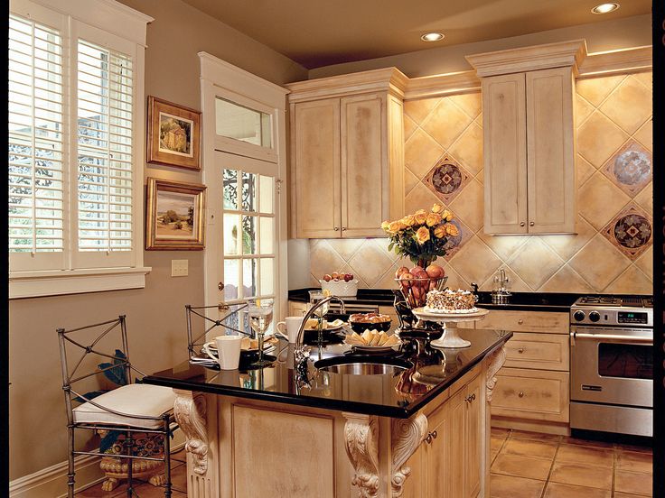 By continuing to use the site, you agree to their use. You will find more information in the privacy policy. To limit the use of cookies, click here.
6 best colors for a small bedroom
Intimacy is best for a bedroom. A small room creates the effect of a nest or a cocoon, helps to relax, get cozy and feel in warm comfort. It is easier to create a cozy interior for sleeping in a small area than in a large one.
Despite the popular belief that small spaces should be bright, there is no universal color that suits everyone. Different people will suit their shades, depending on perception or temperament.
1 Pure white
White expands the space, making it clean and airy. A room in white seems untouched, serene, filled with light. But we advise you to add a few furnishings to it in your favorite moderate shade to smooth out the innocence and sterility.
16photo
wrede. se
se
Instagram @lifeoncedarlane
wrede.se
Instagram @thelifestyledhome
wrede.se
unsplash
Instagram @the_edgeofstyle
Instagram @adairs
Instagram @homebuyerswa
Instagram @oh.eight.oh.nine
Instagram @indiasaka
Instagram @hygge_wabisabi_interiors
Instagram @taylorwmurphy
Instagram @vk_idea
wrede.se
Instagram @interiorsgem
-
Bedroom
A short guide to decorating the bedroom: from zoning to decorating
2 Pastels
Warm undertones are also traditional for sleeping rooms. They create comfort and relaxation. Dusty, whitened pastel shades blend well with each other, can be easily replaced by others in the same tone and saturation. Just like the white color, they expand the space.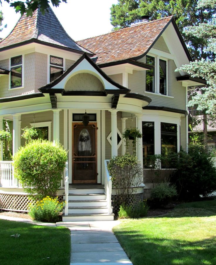
In a well-lit room they look bright, and in the twilight they acquire density and density. Pastel colors include complex combined paints: gray-blue, light gray, creamy mint, dusty turquoise, light pistachio, pale peach, powdery pink, creamy lavender.
eighteenphoto
Instagram @arca_designspb
Instagram @propia_home
wrede.se
Instagram @planaspb_com
wrede.se
Instagram @homefor3_
Instagram @artdepartmentstyling
wrede.se
Instagram @alexey_volkov_ab
Instagram @cathodonnellstyling
wrede.se
Instagram @vazhenina .inspired
Instagram @arca_designspb
Instagram @piece4home
Instagram @akho_2019_home
Instagram @liketoknow.it.home
unsplash
Instagram @popsofcolorhome
Vibrant, soft shades of pink and blue are traditionally used to decorate small bedrooms. Light light colors set in a romantic mood, fill the space with air and grace.
photo
Instagram @planaspb_com
Instagram @dizain_interior_ufa
Instagram @overatno18
Instagram @the.pink.dream
Instagram @tonekrok
Instagram @classicwhite_by_rebeccawhite
Instagram @sandradeco__sweet_home
Instagram @rosenude_homedeco
Instagram @thedecordiet
Instagram @liketoknow.it
Instagram @lilierosedeco
Instagram @ enjoy_home
Instagram @designdevotee
Instagram @homebyinel
-
Bedroom
8 fresh ideas for decorating a really small bedroom
3 Natural colors
For those who don't like color but don't like sterile white, finishes with natural elements or their imitations are suitable. Wood and all its shades are well suited for the bedroom, creating a calming effect. Textured plaster for concrete or cement in combination with warm wood will create a contrast of sensations, but eliminate the need to make a color accent. Such bedrooms are suitable for lovers of eco-direction, loft, minimalism.
photo
simple-interiors.com
Instagram @alexey_volkov_ab
Instagram @thaisqueiroz.interiores
Instagram @alexey_volkov_ab
Instagram @tanyalesukova
Instagram @alexey_volkov_ab
Instagram @zibellino_design
Instagram @alexey_volkov_ab
Instagram @pro_interior_designe
Instagram @alexey_volkov_ab
Instagram @highqrenders
Instagram @alexey_volkov_ab
Instagram @zibellino_design
Instagram @alexey_volkov_ab
Instagram @alexey_volkov_ab
- 6
Small rooms
5 perfect color combinations for small apartments: the pros' opinions
4 Dark shades
Contrary to popular belief, dark rooms have their own charm. The dark tone of the walls does not expand the space, but creates depth. Against its background, light furniture stands out becomes brighter, does not dissolve in the environment. Dark bedrooms embrace with color and immerse you in a deep sleep.
photo
Instagram @highqrenders
Instagram @sistersdesign_moscow
Instagram @highqrenders
Instagram @marchenko.asya
wrede.se
Instagram @annea.interior
Instagram @cartelledesign
wrede.se
Instagram @fayes_homestyle
Instagram @timbertrailshomes
-
Colors in the interior
6 most successful combinations of light and dark shades for your interior
5 Bright accents
If you like active accents, decorate the room with bright details: decorative pillows, rich color throw, colorful curtains, colorful bedside décor.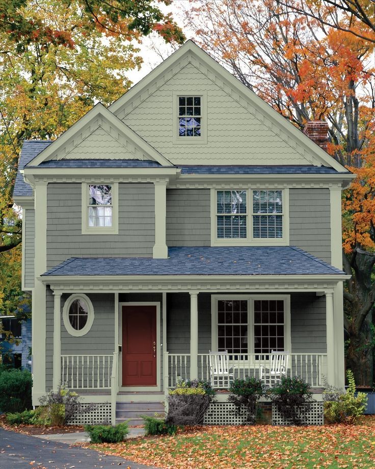 For relaxation, provide plain bed linen without bright patches. After waking up, when you make your bed, bright colors will cheer you up and set you up for a productive day.
photo
Instagram @enjoy_home
Instagram @natalya_golubovich
Instagram @pro_interior_designe
Instagram @the.squiffy.mill
Instagram @decohygge
Instagram @marelledecodesign
Instagram @homeat12
Instagram @hau5au
Instagram @the_organized_nest
-
Bedroom
Top 5 color combinations for a peaceful bedroom
6 Contrasting combinations
People who like brightness will like saturated rooms that will set you up for colorful dreams. Juicy tones visually slightly reduce the space, but bring additional emotions to their owners.