Best colours for home office
Best Colors for Home Offices
With so many people working remotely or on hybrid schedules, the home office has become an important room in the house. Work areas have been thoughtfully carved out of living rooms, kitchen nooks, attics, basements, spare rooms, closets and even garages. Regardless of size or location, a considerable amount of time is spent in this room each day. Productivity is the #1 consideration for a successful workspace and color plays a role in achieving that.
Wall-Fast as the Wind PPU26-17When choosing color for your home office, consider the types of activities that take place there. How does the room need to feel for you to do your best work? Do you need to sit quietly and focus, or will you take calls and join video conferences? Will you need to move around the room or have tables available to spread out projects. Is this your private workplace, or do you share the area with other family members?
Proper lighting is a must: natural light from a window helps keep energy levels at their peak. Task lighting can also keep eyes from becoming fatigued if they focus on small details for a long time. Color also looks better in well-lit rooms!
Let’s take a look at how color can impact your working style:
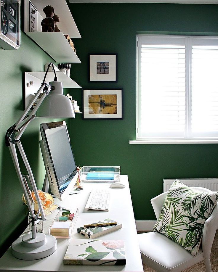
White is a great color for small spaces to help areas feel larger and more open.
wall- Nano White HDC-MD-06Gray is a color that feels balanced, does not distract and easily coordinates with other office furniture or colorful accessories.
wall: Platinum PPU26-11walls- Meteor Shower N450-3, trim & door-Polar Bear 75walls & trim-Silver Bullet N520-2
When the need to focus is essential, neutrals create a non-distracting background. Try using warm shades of brown, taupe or sand keep walls from feeling ho-hum dreary.
wall & trim-Light Truffle PPU5-06ABlue is a tranquil color. Lighter blues have positive associations for clear thinking.
walls – Light Drizzle N480-1 trim-Polar Bear 75Darker Blues are known for creating an atmosphere of stability.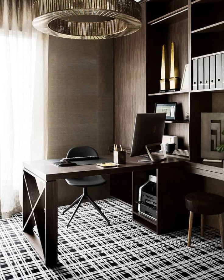
Aqua and turquoise offices have a peaceful balance of blue and green and are easy to live with and helps with focus.
wall – Beach Foam S450-1back wall & trim- Vibrant White BWC-12, accent wall- Thai Teal M460-6Natural and calming green are great for people working long hours and does not fatigue the eyes.
wall & trim- Back to Nature S340-4 door-Graphic Charcoal N500-6Dark Greens create boldness and balance in where concentration and focus is needed.
wall- Royal Orchard PPU11-01 fireplace & trim: Smoky White BWC-13 door-Barnwood Gray PPU24-07Yellow is associated with optimism and helps stimulate creativity. This is a great color for designers to have in their space.
walls & trim- Painters White PPU18-08, geometric design-Charismatic PPU6-14Terra cotta tones provide a sense a warmth to all white space and can suit a variety of home office styles.
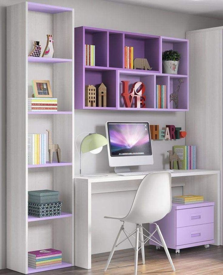
walls: Smoky White BWC-13 trim: Polar Bear 75 desk: Canyon Dusk S210-4For a room that feels less serious, pink is a color that adds an element of charm and playfulness in an office.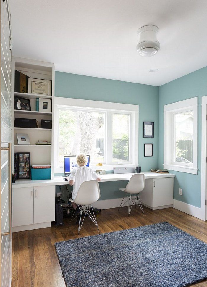
Red is a high energy color – great for rooms where there are lots of conversations or activities taking place.
walls-Red Pepper PPU2-02 trim-Polar Bear 75When projects call for out-of-the-box thinking, purple is known to stimulate creativity making it terrific for studios or craft areas.
walls- Standing Ovation N570-2 accent- Elephant Skin PPU18-16Lastly, your home office can be professional, but still feel personal. Show off family photos, favorite pieces of art, book collections and make sure your favorite coffee cup is always nearby!
Colorfully yours,
Erika
Home office paint colors – the 10 best color schemes for an inspiring space |
When you purchase through links on our site, we may earn an affiliate commission. Here’s how it works.
(Image credit: Davide Lovatti / Future)
Over the past year, those of us lucky enough to have a dedicated room in which to shut ourselves away have gratefully recognized the peaceful retreat they provide. However, now working from home is likely to be the norm for many of us, we are thinking about the aesthetics of these spaces.
But how to add beauty to what is, after all, a functional space? This is why choosing the best home office paint colors are vital to creating a successful scheme.
Home office paint colors – 10 ways to energize your space
1. Paint with a dynamic color palette
(Image credit: Mark Bolton)
‘Make your home office area a brighter space that the rest of the room,’ advises Annie Sloan, color expert. ‘Basic color psychology can come into play here, but fundamentally whichever color you choose – it should be something you love. I think strong colors are important whatever your role: this is not a room for relaxing, you want the space to feel dynamic.’
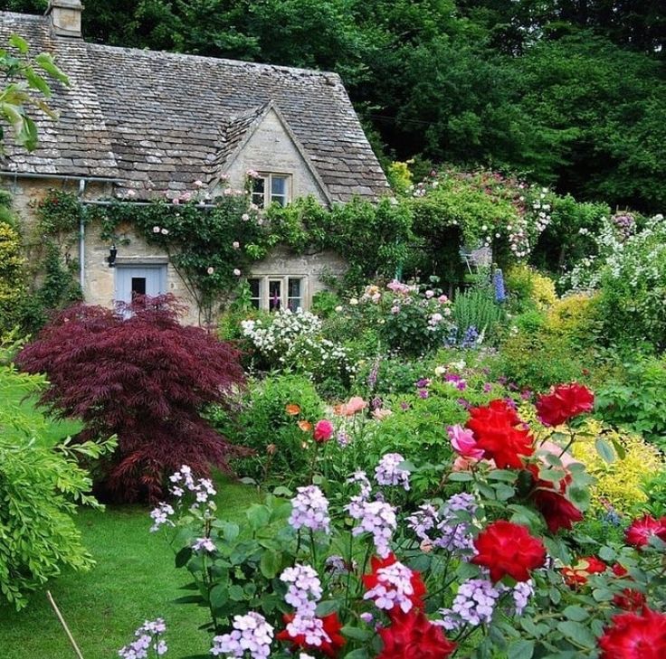
2. Instil a sense of calm with a green color scheme
(Image credit: Davide Lovatti / Future)
According to color psychology, beige greens and yellow greens are the most stress-reducing shades – so they are ideal for a home working environment. They also make a good neutral background for displaying art.
3. Make neutrals interesting
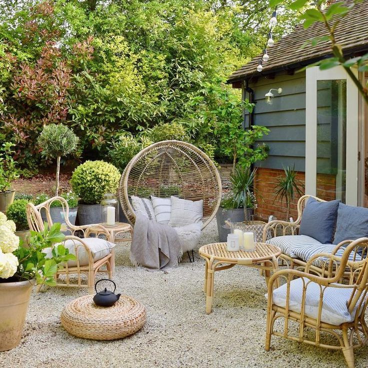
(Image credit: Manolo Yllera / Future)
Even a room that’s lacking in color can still be bursting with visual appeal. In fact, many designers love working with a neutral color palette because I can really translate to any design style. But the key to doing is successfully is to embrace a variety of elements that will add interest. You’ll want to combine materials and textures, which will create contrast and a sense of dimension.
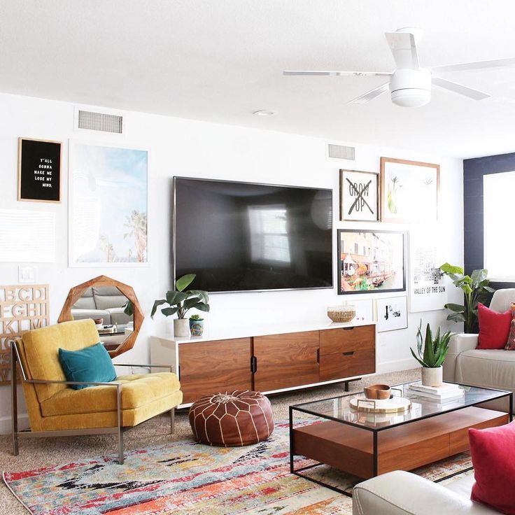
4. Draw on personality and playfulness
(Image credit: Future)
‘With many of us working from home these days (at least some of the time), it’s important to foster a creative and inspiring home office environment – and not play it too safe when it comes to using pattern and color,’ says Sarah Peake, founder, Studio Peake .
Your book storage and home office setup need not be staid in character nor sombre in color. Scale up the atmosphere by painting the fitted joinery in a block color and let the books provide the detail.
5. Go for a fail-safe neutral
(Image credit: Paul Massey / Future)
A neutral home office offers infinite possibilities for making spaces airy and relaxing, or elegantly sophisticated and timeless
There is no doubt that neutrals have been the most popular tones for home offices during the last year, and for good reason. Many people feel most comfortable when surrounded by carefully balanced colors that create an understated environment and make few demands on the eye.
This new and updated neutral is are all about minimalism, simplistic shapes and natural finishes, so ditch the chaos and opt for an uncluttered study that inspires creativity.
6. Paint using a selection of cool tones
(Image credit: Paul Raeside / Future)
When it comes to blue home office ideas, Jane Rockett, co-founder of Rockett St George, says, ‘Cool blues and deep navy tones promote creativity and are the perfect choice for your home office – typically spaces that you go to for visionary thinking.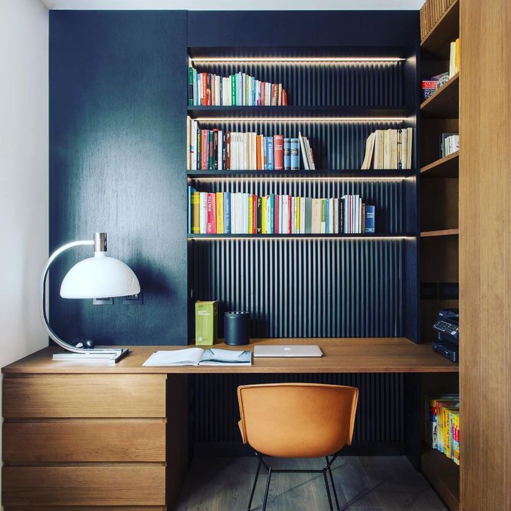 ’
’
Because cool tones aren’t overpowering – in fact they often feel like they are receding – they often help a small room appear to have more space, which can make them a great choice also for a small home office or library.
7. Separate your work and play space with color
(Image credit: Simon Bevan / Future)
Use color to create a 'zone' for work. Zoning with color helps you to make the most of your work space, by creating a distinct areas for you to shut yourself away from the rest of the home.
A full immersion of color, with one stunning shade for all walls, can bring interest into the room without overwhelming the eye; deep-tone colors work particularly well for this. The style also complements strong architectural features in a fresh and modern way. Plus, once you step out of the 'zone', you won't feel like you are at work.
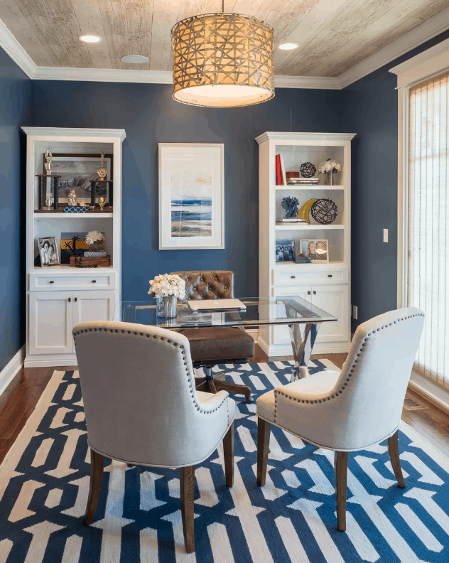
8. Decorate in a harmonious color palette
(Image credit: Davide Lovatti / Future)
If your home office is bursting with natural light, then why not go for a popular grey color scheme with touches of mood-boosting blue?
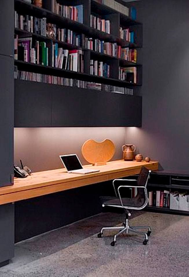
Grey and blue is a harmonious color combination. Dark schemes, such as the deep, almost blue-black charcoal walls here, create an intimate environment for quiet contemplation.
'The orientation of your space will affect the way a color looks on the walls, and is the reason why exactly the same shade of grey paint can look completely different in different surroundings,' explains author Kate Watson-Smyth.
9. Go for a marvellous monochrome scheme
(Image credit: Jan Baldwin / Future)
A study or home office will look sophisticated and smart decorated in black and white, but if you are sticking religiously to the monochrome color scheme, it's really important to ensure that you add plenty of texture into the room to ensure it feels cozy and welcoming. Texture is vital – remember that the most successful monochrome interiors combine depth and dimension with tactile pieces to create an interesting narrative.
10. Create a 'zone' with color and pattern
(Image credit: Future)
When it comes to color, don’t be too conservative.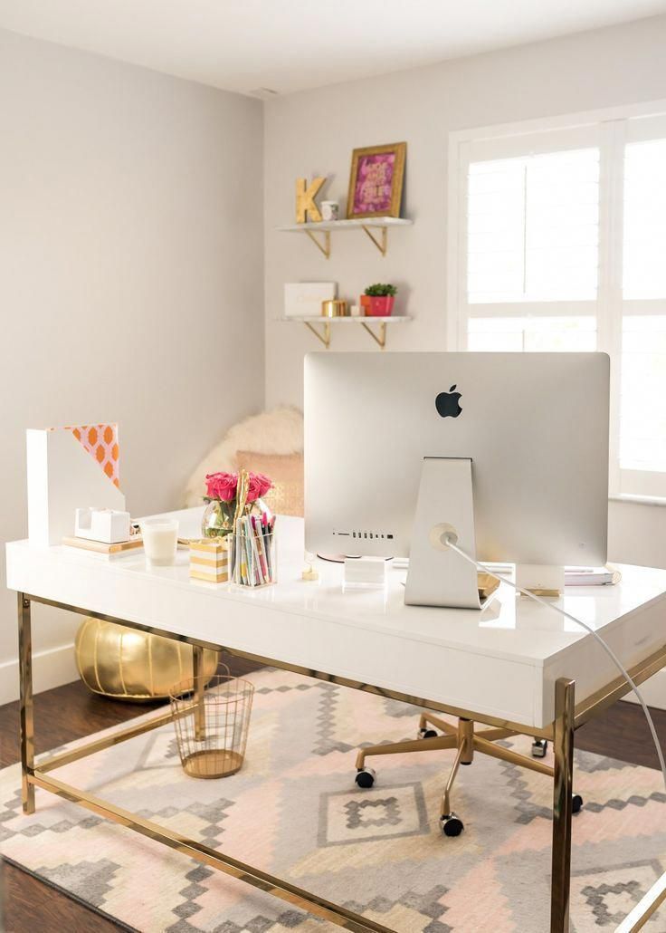 A striking hue will inject just the right amount of flamboyance to add energy and foster creativity, as demonstrated by this bold study, which delightfully combines pattern with strong color.
What colors are good for a home office?
Soothing colors, such as greens and blues, will offer tranquility and that all-important link to the outside. However, while these shades suit south- or west-facing spaces, and even light-filled north- or east-facing rooms, you many feel a home office that only receives cool daylight is better suited to warmer colors.
What is the best color to paint an office for productivity?
‘Choosing the correct shade for your home office as important as you job,’ says Annie Sloan, color expert. ‘Select the best hues depending on your personality traits and what your job requires of you. For example, those who lack focus will benefit from bright colors, while those who role requires deep thinking should consider contemplative blues.’
Jennifer is the Digital Editor at Homes & Gardens. Having worked in the interiors industry for a number of years, spanning many publications, she now hones her digital prowess on the 'best interiors website' in the world. Multi-skilled, Jennifer has worked in PR and marketing, and the occasional dabble in the social media, commercial and e-commerce space. Over the years, she has written about every area of the home, from compiling design houses from some of the best interior designers in the world to sourcing celebrity homes, reviewing appliances and even the odd news story or two.
Choosing a color for decorating an office, photo - Rehouz
With the increase in the availability of the Internet and its resources, representatives of various professions began to do part of their main work not somewhere in the office, but right at home. Any successful person, be it a politician, businessman, writer, designer or architect, must have a separate room in his home - an office. This is a room that fully meets the needs of the owner and is equipped for the most comfortable and productive performance of certain activities.![]()
The color design of the home office is a purely individual issue, directly dependent on the taste preferences of the owner and the nature of his activities. In this case, the color performance is determined not only by the features of a particular interior style, but also by the psychological influence of the desired palette on a person. By choosing the right shades, you can create ideal conditions for both complex painstaking work and creative activity.
Effect of color
It's no secret that each shade has a certain effect on a person, his mood, worldview and performance. Any of the representatives of the color spectrum has its own characteristics, which must be taken into account when designing the interior of a place of daily work.
White color in the office interior
The white spectrum is ideal for small spaces. He adjusts to the working mood and keeps in good shape, not allowing you to "give up. " This color can be used to decorate walls and ceilings, or, conversely, play on the contrast of tinted surfaces with white furniture.
In the design of an office, white shades work well in combination with brown, gray or green. And with so many options, from frosty snowy to deliciously milky, this color gives designers a lot of creative options.
Beige office
Beige is considered universal. Gently soothing, evoking a sense of stability and security, it is perfect for floors and walls, allowing you to complement the environment with bright details without overloading the overall composition.
Against the background of white panels, the beige tone will emphasize the sophistication of the furniture without burdening the space. A successful combination of beige with gray or blue will give your home office a special chic.
Green in the office interior
The green color, taken as the basis for the design of the workplace, reduces susceptibility to noise, increases efficiency, and neutralizes eye strain.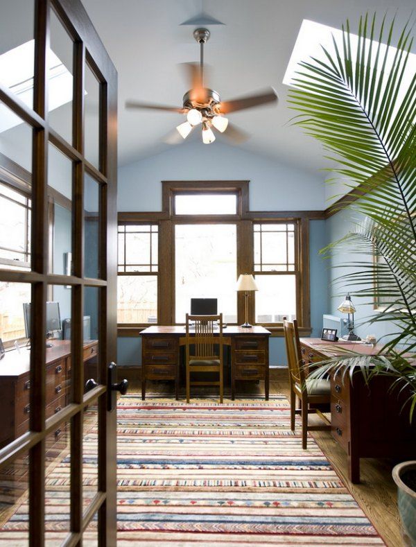 For a home office, shades of forest moss, juicy apple or lime color are preferred.
Wood-brown, white or gray interior details will be an excellent addition to greenery.
Yellow
Yellow invigorates, energizes and increases intelligence. However, constantly stimulating the nervous system, the bright elements of this spectrum are tiring. Therefore, when decorating an office, it is worth giving preference to soft, unobtrusive shades.
A friendly neighborhood with a yellow base shows soft green, gray or brown tones.
Orange
Orange is characterized by experts as a "cheerful" color that increases the overall tone and stimulates the imagination. It is suitable for creative individuals who need creative ideas. In cabinets, it is used in combination with wood, white and gray shades.
It is worth decorating northern, cold rooms in orange tones. On the south side, with an excess of sunlight, such an interior will seem tiringly hot.
Blue and light blue for office
Blue improves productivity, stimulates thought processes and gently calms the nervous system, creating a strict, businesslike atmosphere.
Blue shades will be an excellent choice for decorating an office, if the owner's work activity requires increased attention and precision.
However, the blue palette for the workplace should be used very carefully, carefully considering the lighting to avoid bouts of melancholy.
Gray cabinet
Gray is a symbol of neatness and minimalism. In the study, it is ideal for both background decoration and furnishing. Thanks to its aristocratic restraint and majestic calmness, the gray color adjusts to the achievement of goals and the concentrated performance of work of any degree of complexity.
Pairs well with white, greenish and orange tones.
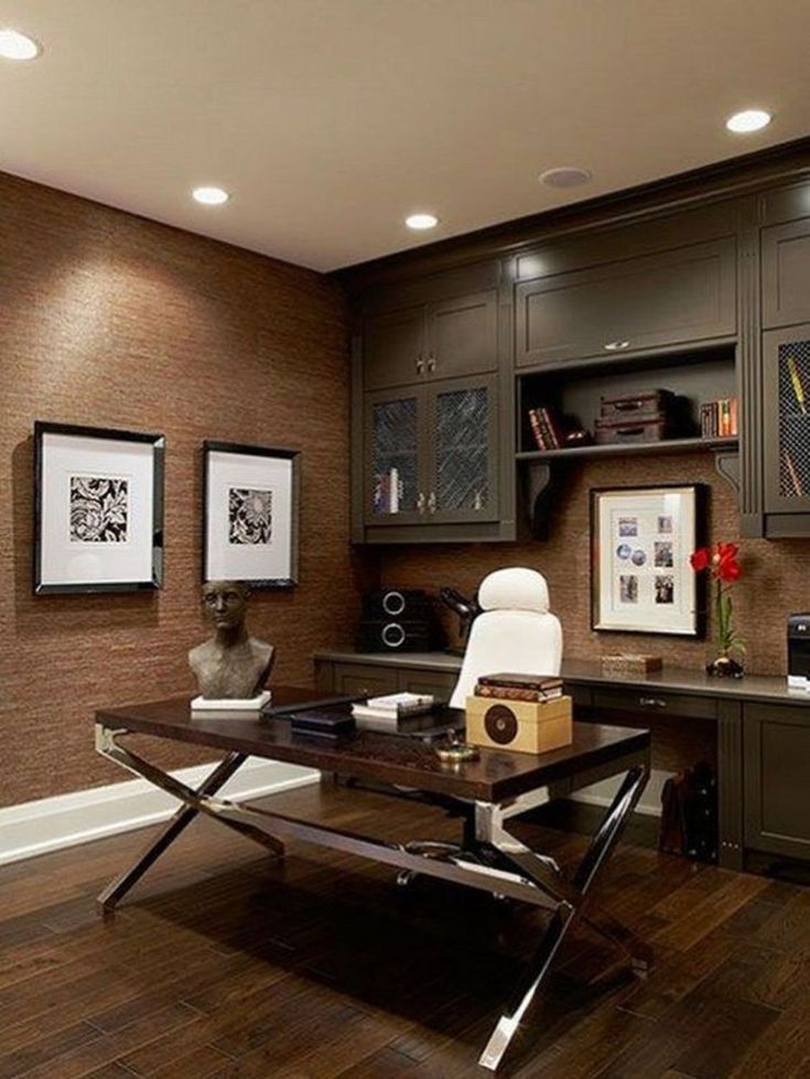
Cabinet in brown tones
Brown tones are traditionally associated with the stability and prosperity of the owner. In the design of cabinets, wood-brown is considered a timeless classic. All shades of this spectrum soothe and help to focus for making important decisions.
Modern interiors often use a striking contrast between a light general background and dark brown furniture.
Violet
Violet stimulates the imagination. In small quantities, it has proven itself well in the design of the working area of people in creative professions. Plum and orchid in combination with white and ashy colors are considered the most suitable shades for the office.
Red and pink?
Decorating your home office in red or pink is not a good idea.
Red is a very active color, and with prolonged exposure it can cause unjustified irritability.
Pink is a symbol of romance and dreaminess, and such feelings are by no means conducive to productive activity ...
However, if you like red or pink, and these colors have an extremely positive effect on you, here are some stylish examples:
Design Tips
When choosing the color scheme of the office, in addition to personal preferences and recommendations of psychologists, you should follow a few simple design rules:
- The smaller the cabinet, the lighter the base color should be;
- For the south and east side, with a sufficient level of natural light, it is worth choosing neutral or cold shades;
- Warm colors are preferred in cool or dimly lit rooms;
- Dark rooms will be cozier with the use of a light color palette;
- You should always select several additional ones for the main tone.
Color in the interior of the office - photo
0 0 votes
Article rating
| Posted on 06/10/2019 |
| The office is a kind of microcosm, where they retire for work and leisure. For fruitful work and the appropriate mood, the right color scheme is necessary. The right combination of colors in the office interior is the key to creative success and creativity, focused work on business projects. A harmonious color scheme will also encourage visitors to the office to constructive dialogues and positive outcomes of negotiations. When choosing a color for an office, it is important to consider: Perception of the color palette. It is important to take into account not only personal perception, but also the visitors of the office, with whom it will be necessary to resolve business issues. Room dimensions. Dark and rather deep colors visually reduce the area, light colors make it more spacious, especially in combination with coatings that have a glossy sheen. It makes sense to keep the walls of the working area in dark colors, tending to brown or burgundy, it is more rational to keep the recreation area in light colors. Illumination. Dark colors in the interior of the office are chosen if it is well lit, as they visually take up space. Matching interior style. Some styles provide a specific color spectrum and its saturation level. Designers recommend using two primary colors when decorating the office interior, which complement small inclusions of third colors. The optimal proportion is 60:30:10, where 60 is the main color, 30 is complementary, 10 is blotches. According to psychologists, saturated and bright colors prevailing in the office excite the nervous system and can distract from work. A monochromatic office design is a good solution, given the need for complete concentration at work. Warm colors (reds, browns, muted yellows) can warm you up and help you concentrate. You should not make them too saturated, so as not to lead to distraction or, on the contrary, to increase the sleepy atmosphere in the office. Cabinet furniture in this case should be made of dark (possibly red) wood. A good solution would be jade, light green, flower green. Any natural natural color (aqua, for example) will bring lightness to the design of the cabinet. But still, it is not recommended to make green tones the main (or at least the only) one. You can shade them with textiles or accessories. You can bring freshness to the interior of the office with the help of cool colors: blue, purple, blue. However, you should be very careful with these colors, as they can completely “freeze” the atmosphere of the room. These colors are ideal for inclusions and accessories, for partial finishing. Color combinations Similar shades. Combinations of blue with blue, yellow with orange, etc. can bring a certain depth to the interior of the room. The color ratios in this case are very subtle: a slight contrast can separate the work area from the rest area without attracting much attention. The inept use of contrasting colors can spoil the color scheme of the cabinet. Since they will hurt the eye too much if not combined correctly, they must be used very carefully. For example, don't mix blue and yellow or purple and orange. A combination of neutral and bright colors will be successful. This is a great choice for decorating any room, including an office. For a home office, classic neutral colors (beige and almost all shades of gray and its combinations with other colors) are suitable, which contribute to concentration in work. In the office should not be present, at least not in the field of view, bright objects. Black and white is a classic. They are great for the office, both individually and in combination. Thanks to strictness and neutrality, they create a working atmosphere. Here are the most successful combinations of colors in the office and their combinations. White. Creates a feeling of comfort and freshness, adjusts to the working mood. In a small office in white it will be comfortable. Grey. Associated with office restraint and dress code. Gray, white, beige - a considerable number of cabinets around the world are painted in these calm colors. But classic gray can make you sleepy and despondent, deprive you of motivation, make you passive. Therefore, if you decide to design an office in gray colors, make the main color light gray or close to a spectacular silver tone. Optimal combinations: white, natural green, scarlet, beige. Brown. One of the win-win options when arranging an office is to use a discreet and noble brown color. There are many interesting shades of it - from light woody to deep chocolate. It will effectively dominate and be in an equal pair with a different color. Brown did not fall into the "dull" group along with his colleague, gray. On the contrary, scientists believe that this color can create a feeling of safety and security. Moderately saturated brown promotes concentration at work and gives a feeling of comfort. Combines brown with white, all shades of green and blue. An office in different shades of brown will also look spectacular. Beige. Compromise color for office. Suitable for most interiors, regardless of their area and lighting. Beige gives a feeling of comfort, stability and promotes constructive conversations. If this is the main color, it is recommended to add bright blotches of another color (curtains, chairs, a small carpet). Yellow. An up-to-date solution for young, creative and energetic people. Yellow is able to defuse the situation and bring positive emotions, especially if it is complemented by interesting textures. The color will show itself even if it is expressed in furniture, curtains and carpet. Combinations: green, white, light gray, black. Orange. Juicy orange, like yellow, will have a positive effect on mood. It radiates energy and promotes thinking in the development of creative ideas. But, according to psychologists, it is better not to make it dominant, but to use it in combination with a calmer tone or in the form of inclusions. Office color combinations: grass green, peach, wenge, brown. Red. Enhances emotionality and expressiveness, almost like yellow promotes creative activity, invigorates. Desaturated red in the office can be wallpaper, but with an unobtrusive light pattern. Red can highlight desired accents or furniture details. Combined in the office red with white, brown, peach. Purple. Due to saturation and brightness, it most often does not dominate in office spaces. This color can be one of the walls or some pieces of furniture. Purple in the office walls harmonizes with white, gray, wenge and green. Blue. An office in blue colors saturates with energy and determination of its owner and business partners. It is advisable to use it in spacious and well-lit offices. Blue. The office in blue is easy to read, it gives a feeling of cheerfulness, freshness and encourages the emergence of new ideas. Blue looks equally good in offices of different sizes. In the ranking of the most successful colors for the office, blue confidently shares the first place with green. It helps not to lose concentration and, like green, does not tire. For everyone who has to work with numbers or small details, this is what you need. The most successful combinations with white, blue, purple and brown. Green. Often dominates in private offices or used in an equal pair with a different color scheme. It is comfortable to be surrounded by natural green, it is associated with flora and helps to see the "green light" in solving business issues. An office in green is the dream of every workaholic. Color does not tire the eyes, soothes and helps to focus. Very good for reading. If you have to spend a lot of time checking documents written in small print, green will help you keep yourself in control and not lose focus. Pairs well with grey, brown, beige and white. Turquoise. An office in turquoise colors is a good solution for creative and active people. It helps them generate ideas and improves their mood. But it is better not to make it the main one or very saturated so that it does not start to tire. Harmonizes with white, brown and gray. Wenge. Deep and noble wenge embodies the beauty of natural wood. Cabinet in wenge color emphasizes the impeccable taste and solidity of its owner. Wenge promotes a calm working rhythm and focus on business. It can be expressed in furniture and flooring in combination with soft beige walls and a white ceiling. 
|
 The environment should be conducive to constructive dialogue and comfort.
 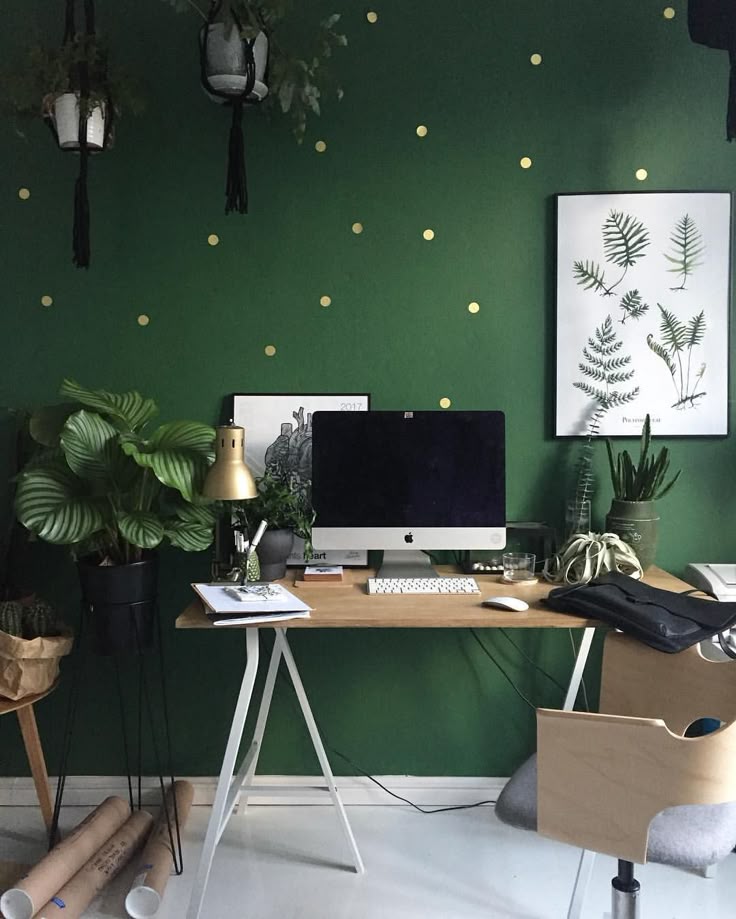 An option may be to use the same color, different shades and saturation.
  The other side of the coin is that such a performance may seem a bit boring.
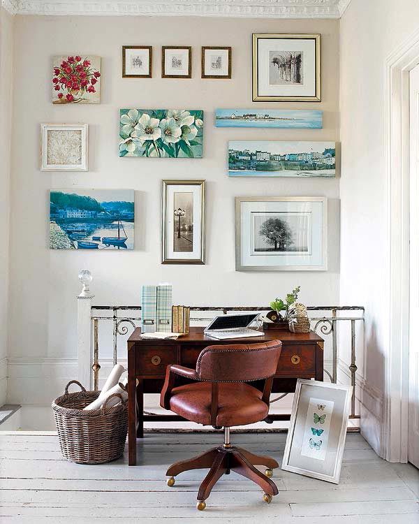
 For a short rest, let them be near, but not inside the working area.
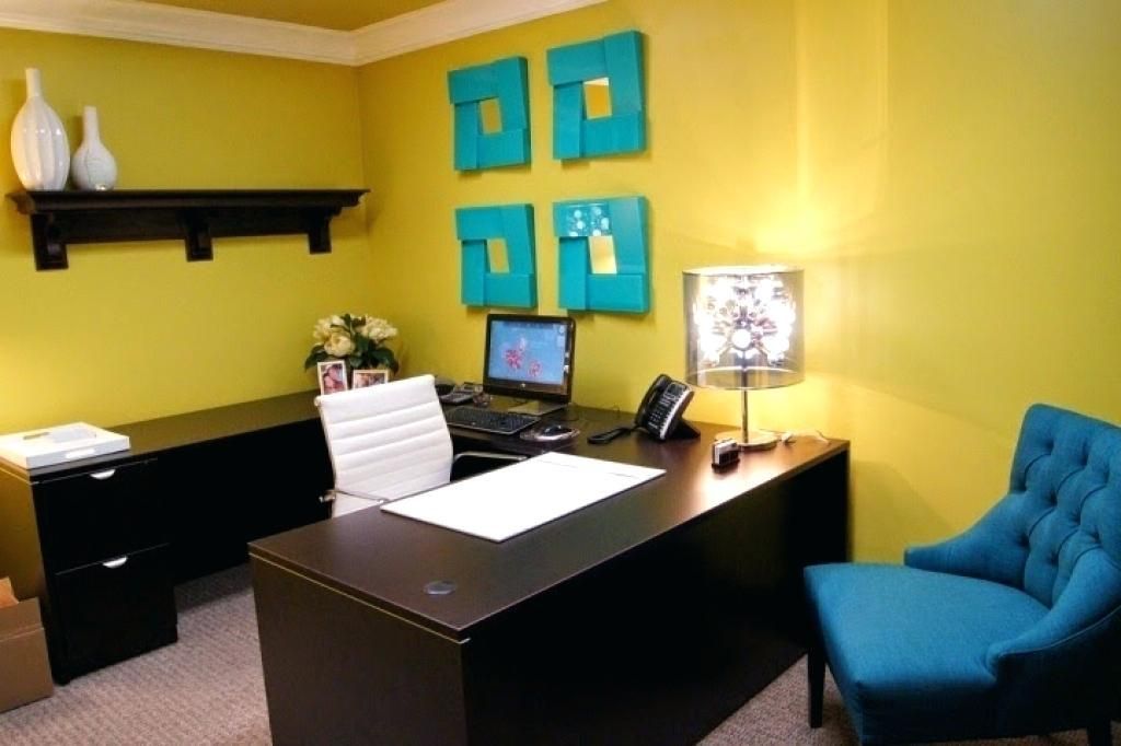
 Harmonizes beige in the office with brown, blue, black and peach.
 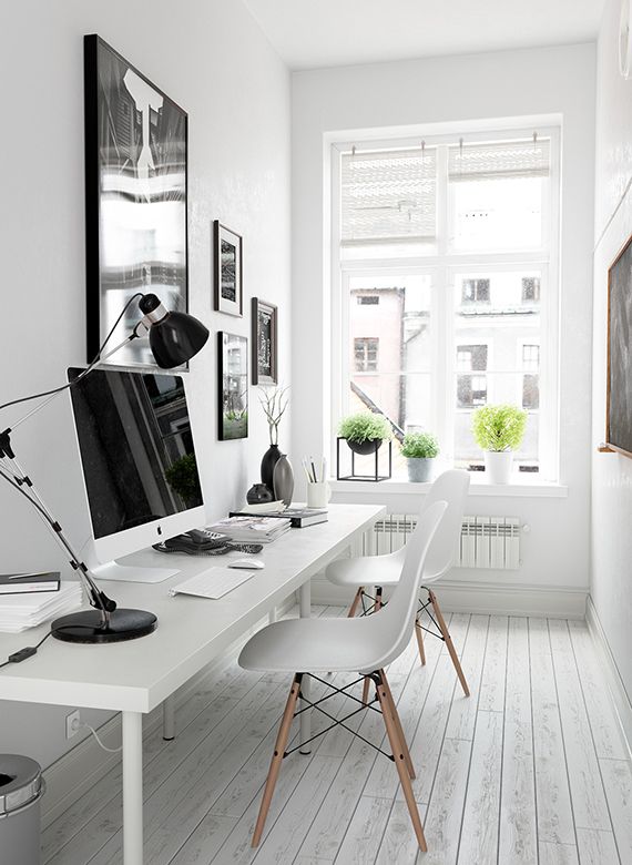 Red should be used in moderation and carefully. Even if you like it, it can be uncomfortable for office visitors, as it can overwhelm them or annoy them, as a result of which the negotiations or the transaction will not be completed successfully.
  Walls, chairs, an office chair can be blue in combination with a white or beige ceiling and a brown floor. Also, blue is combined with blue and wenge.