Best colors for small house exterior
Exterior Colors For Small Houses? (Explained & Solved!)
Choosing an exterior color for your home comes down to taste, style, and preference.
Many homeowners prefer to choose their favorite color – within reason. You don’t see many houses that are hot pink, but they do exist.
But what are classic colors for smaller houses?
When Painting Your Small Home a Certain Color, Consider This:
Lighter, neutral, and earthy tones are the best color for a smaller home. Brighter colors like off-white, light yellow, or grey are perfect for making your house look bigger than it is. Light blue and cream colors give small homes a cottage or beach look.
Table of Contents
What Are the Most Used Colors for Smaller Houses?
The most used colors for small homes are more likely going to be bright and light.
Here is a list of the most-used colors in a smaller home exterior:
- Grey
- Light Yellow
- Sage or Hazel Green
- Off-White
- Light Blue
- Barn Red
There are also popular tiny homes and small home exteriors that use real wood with black trim or real stone to give it that small, cottage, Hobbit-home vibe.
If you like it to feel more farmhouse-looking, you might paint it white with red trim.
Either way, most exteriors are light, neutral, and earthy-looking.
How Do I Pick Exterior House Colors?
Picking an exterior house color comes down to your style and taste!
If you love beach or cottage style tiny houses, you might want light blue or off-white to give it that summer vibe. Ranch styles are more yellow and cream.
If you like something a little darker, you would go with a darker blue, an earthy green, or even a barn red.
Or, if you are feeling adventurous and fun, you might choose a bright, light yellow or light sage green!
Either way, choosing a color is more about happy you will be when you come home to it every day and less about marketability.
Although, if you are planning to sell that house again in the future, try not to paint it bright pink.
What Exterior Colors make a Small House Look Bigger?
Brighter colors make a house look bigger and more inviting.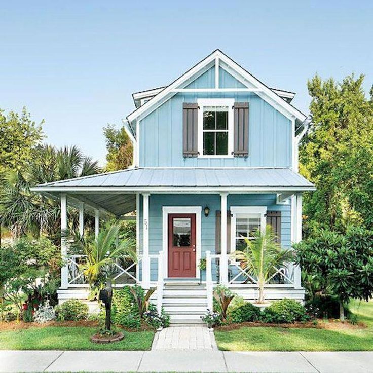
A lighter color, such as off-white, cream, or light blue or green, will make your house seem less compressed and more open and airy.
If you painted a small house a deep, dark blue, it would feel tighter, smaller, and more cramped.
Furthermore, interior paint jobs should be bright and sunny. It is proven that darker paint jobs inside can make homeowners feel more sad, angry, or confined.
If you’re not sure about this, consider looking at two small houses side-by-side: a deep blue and the other a bright cream or off-white.
Even a light grey is better for making your small house seem so much bigger!
How Many Colors Should a House Exterior Have?
A house exterior should not have more than three colors.
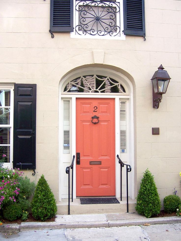
This would include the color of the walls, the shutters (if you have any) and trim, and finally the front door.
Many homeowners love to have neutral homes with light-colored shutters and trim but with a bright, statement-making front door.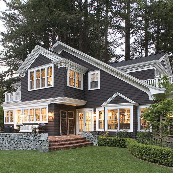 Sometimes they will go as far as four colors, but that is usually two different shades of the same color in the trim or walls.
For example, your house could have white walls with grey trim or shutters, and a big red door.
Or your house could have light blue walls, dark blue shutters, and a bright white door.
Whatever you decide, try not to go over three exterior colors for your house, and make sure they match!
Exterior Color Combination Ideas for Small Houses:
On the road trips home to see my family, I always pass by this light purple house with black shutters and a bright, neon green door.
It is the oddest-looking home and has been there for about three years now. I assume it either can’t sell, or it makes the owners very happy.
However, I wouldn’t recommend it for your own home.
If you are looking for good color combinations for your small home, consider these:
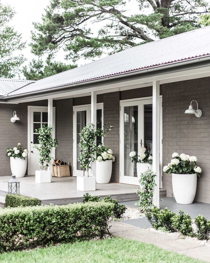
- Off-white walls, light grey trim/shutters, red door.
- Light blue walls, dark blue trim/shutters, white door.
- Light green walls, cream, and dark green trim/shutters, brown door.
- Light yellow walls, cream, and white trim/shutters, blue door.
These are only four of the many, many combinations out there that can make your house into a home.
Consider looking online at small house exteriors and get some ideas for yourself!
How Does the Choice of Color Affect a House?
The choice of color can really affect how the house is perceived.
Like we mentioned before, the color of your house can make it look bigger or smaller, open and airy or cramped and confined. It can also make it feel “warmer” or “cooler.”
In the same vein as that neon-green door and purple house that I pass on road trips, people in your neighborhood will remember your house specifically if you give it a bright and crazy color scheme.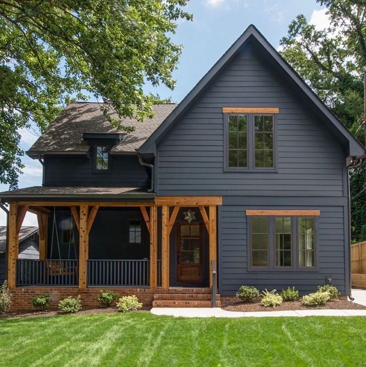
Or you can blend into the crowd with a basic, neutral tone.
While you don’t have to take any of this into account when choosing a color palette (after all, this is your house, do what you like with it), some homeowners want to feng-shui their home to match their style and tastes.
So, if you like basic white colonials, light blue beach houses, or bright yellow farmhouses, that’s entirely up to you.
Should Exterior Colors be Lighter or Darker?
Exterior colors are better when they are lighter – if it is painted.
If you have a home made of natural stone and wood, a darker trim looks great!
However, if you have painted wood or siding, consider going with a lighter, more earthy, and neutral tone. This is a great choice that will make your house look fresh and new, with bright, happy colors that light up your yard and street.
Once the exterior is painted lighter, you can add darker or more earthy trim colors to it, such as dark greens, blues, or even browns and reds.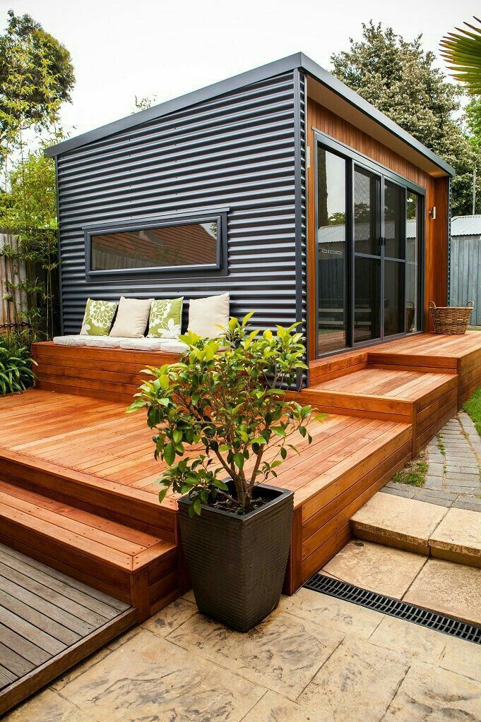
If you painted it a dark color, that’s also fine, but you will have a home that is more imposing and may look smaller or more cramped because of it.
However, there are some dark colors, such as blue and barn red, that work well with smaller homes and make them seem warmer.
Most of all, choose the color that you like best! You are, after all, the person who will be living there.
Why not enjoy it?
What Color Houses Sell Best?
Houses with versatile colors or ones that aren’t too bold and garish are your best bet when selling your home.
If you have ever seen houses that were painted purple or bright green, perhaps even pink, then you might have assumed that those are too hard to sell.
Not without a fresh coat of paint, that is.
Some of the more marketable colors are:
- Off-White
- Wheat (Cream Color)
- Grey (& Other Shades of Grey)
- Blue (Light & Dark)
These are the classic colors that most houses are painted to keep them marketable.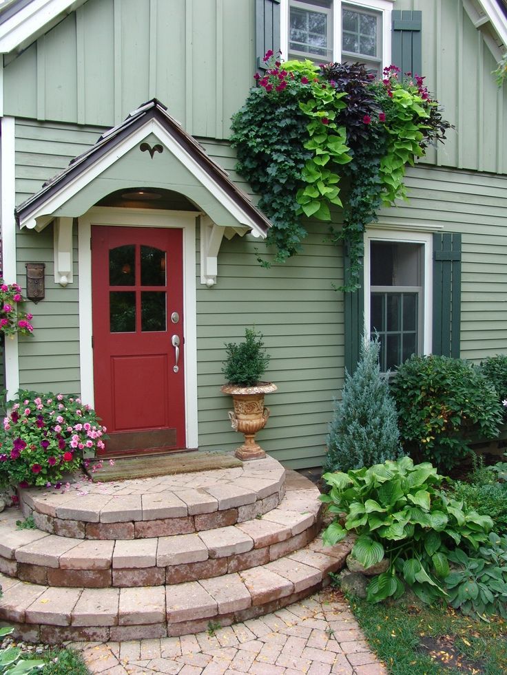
Creams, greys, blues, and off-whites are great because you can pair trim colors with them, such as blue shutters or a big red door.
If you had a very bright or primary-colored exterior paint job on your house, it might be a lot harder to sell.
If, however, you like bright colors, consider these colors instead:
- Yellow (Sunny or Light Yellow)
- Green (Light or Sage Green)
- Red (Barn or Deep Red)
Primary colors are way too bold and often will make your house stand out too much. Neutral, earthy tones are much easier to sell because they go with everything.
Neutral tones are easy on the eyes and don’t attract a lot of attention, and they are pleasing to look at, too.
Should the Outside Colors Match the Inside of the House?
The outside of your house is simply to make a statement to everyone passing by.
It can be neutral and plain or eye-catching and bright, but your inside doesn’t have to match.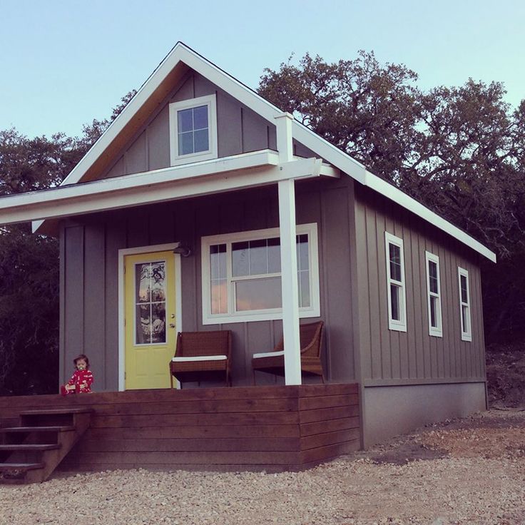
Instead, many homeowners will do one of two things:
- Choose an overall theme both inside and out (cottage, ranch, modern, colonial, etc.).
- Have an outside that doesn’t match the inside at all.
There is no “should.” Your house is your own!
Enjoy it, and make it look however you want, you’re the one who has to live there.
However, if you are in the market for selling your house, you might want to rethink having a bold inside, especially if your outside is painted a plain, off-white colonial style.
If your inside has hot pink walls and leopard print furniture, then you might need to redecorate before the realtors come knocking.
References:
12 Exterior Paint Colors to Help Sell Your House
What Color Should You Paint a Small House Exterior?
The Best Colors to Use in Small Homes
Was this article helpful?
Great!
Click to share.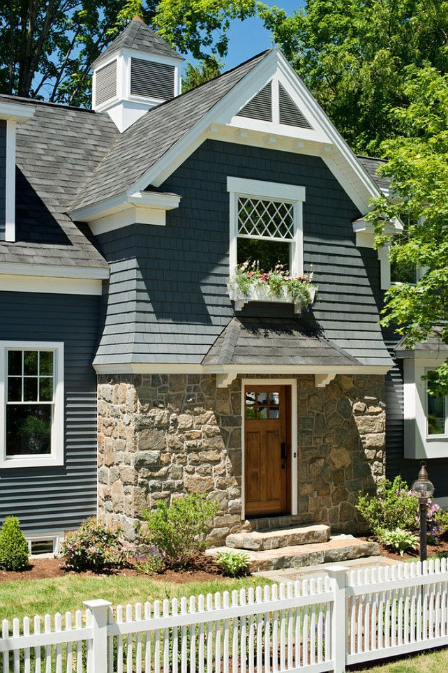 ..
..
Did you find wrong information or was something missing?
We would love to hear your thoughts! (PS: We read ALL feedback)
Name (not required)
Email (not required)
Message
House Color Schemes - 15 Paint Colors for Your House
Find the Perfect Pairing for Exterior Paint Colors
1/17
Selecting a single color for your home's exterior can be difficult enough, but trying to find two or more hues that work well together in a whole house color scheme makes the decision even more challenging. Whether your aim is to highlight architectural details or simply to find a complementary shade for shutters and trim, the choice is an important one.
"Color can make a big impact on the look of a house," confirms architect Jim Rill, principal of Rill Architects, in Bethesda, Maryland. For inspiration, consider your home's style and scale as well as architectural styles typical of your neighborhood and region. "The best exterior colors are contextual to their environment," Rill observes. Here, 15 color scheme combinations that hit the mark.
istockphoto.com
1. Two-Tone Olive
2/17
Deep natural colors that recede into the landscape are typical of Craftsman-style houses. For this renovation, Rill Architects chose a duo of Benjamin Moore olive greens: Gloucester Sage (HC-100) and Dakota Woods Green (2139-20). A yellow-orange stain on the front door adds a lighthearted dash of color. "Front doors should always have character and draw subtle attention to themselves," Jim Rill points out.
Related: Welcome Home: 11 Fresh Ways to Spruce Up Your Front Door
rillarchitects.com
2. Straw and Sage
3/17
"A balanced look always provides plenty of curb appeal," says interior designer Kerrie Kelly, principal of Kerrie Kelly Design Lab, in Sacramento, California. "Starting with a neutral shade in straw yellow sets a welcoming palette, while accents in sage green give a lively look to traditional architecture. This combination is an approachable classic year-round."
Related: 9 Ways to Crank Up Curb Appeal with Nothing But Paint
kerriekelly.com
Advertisement
3. Putty and Gray
4/17
Older neighborhood dwellings guided the color choice for this Midwest home. "We chose a soft neutral for the body of the house that would allow it to stand out and yet still complement the other homes around it," reports Kristen Schammel, interior designer for Highmark Builders, in Burnsville, Minnesota. "This exterior is simple, traditional, and admired!"
Related: 7 No-Fail Exterior Paint Colors
highmark-builders.com
4. Red and Black
5/17
"Red is a classic color," says interior designer Cindy McClure, owner of Grossmueller's Design Consultants, in Washington, D.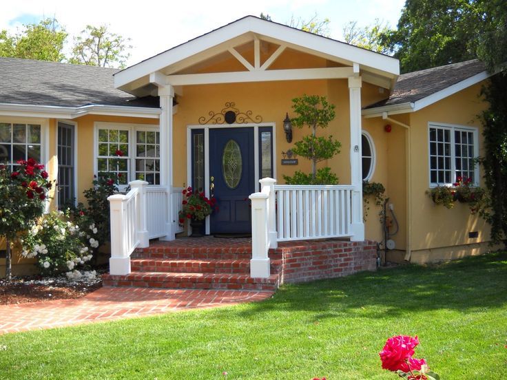 C. "I love using it on smaller homes because they handle the color so well. Black accents like the front door and shutters look great when set off by white trim."
Related: Before and After: DIY Facelifts for 8 Home Exteriors
grossmuellers.com
5. Gray and Blue
6/17
"Gray is a great neutral that can match just about any style of home and is a beautiful complement to brick," says Jackie Jordan, director of color marketing for Sherwin-Williams. "The slightly more saturated shutters and door provide a sophisticated accent and bring in the tones of sky and sea." Seen here are Sherwin-Williams's Comfort Gray (SW 6205) and Rain (SW 6219).
Related: The Most Popular Paint Colors in America
sherwin-williams.com
Advertisement
6. Green, Cream, and Burgundy
7/17
"The combination of green, cream, and burgundy is a favorite for Victorian-style homes," reports Erika Woelfel, director of color marketing for Behr Paints.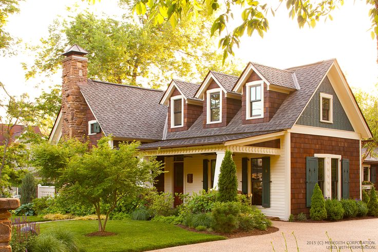 "The bold color scheme gives this home a dramatic yet warm appearance." The trio of Behr colors used here are Ivy Wreath (QE-46), Terra Sol (QE-20), and Country Lane Red (QE-07).
Related: 18 Victorian Homes We Love
behr.com
7. Charcoal and Lime
8/17
A wonderful way to make a bold color statement on modern houses—even the smallest ones—is to start with a strong neutral and add a bright pop of color on the front door. This home, designed by Ana Williamson Architect, in Menlo Park, California, combines two Benjamin Moore hues: Gunmetal (1602) for the siding and Tequila Lime (2028-30) on the door.
Related: 9 Bold Rooms That Will Make You Rethink Black Paint
awarchitect.com
8. Greige and Teal
9/17
You can still achieve a modern look without using shocking hues if those colors just aren’t for you. Here, greige—that’s gray and beige—with a teal door and natural wood and stone accents puts a modern spin on the traditional neighborhood home.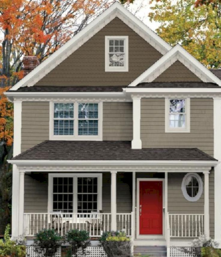 This combination still looks warm and welcoming without feeling dated.
Related: America’s 50 Favorite Streets
Zillow Digs home in Edmonds, WA
Advertisement
9. Blue, Red, and Tan
10/17
Blue is a popular exterior color for homes in waterside settings like this one. Adding red and tan to highlight trim and architectural features was a eye-catching choice by designers at New Urban Home Builders, in Grand Rapids, Michigan. The trio of hues also gives the lakefront compound a Scandinavian feel.
Related: 11 Paint Colors Designers Pick for Their Own Homes
ashleyavila.com
10. Black and White
11/17
Black and white never goes out of style. Whether you have an old home or a new build, this classic combo looks fresh forever—plus it really pops against a green lawn.
Related: The Most Popular House Styles in America Right Now
Zillow Digs home in Laguna Beach, CA
11.
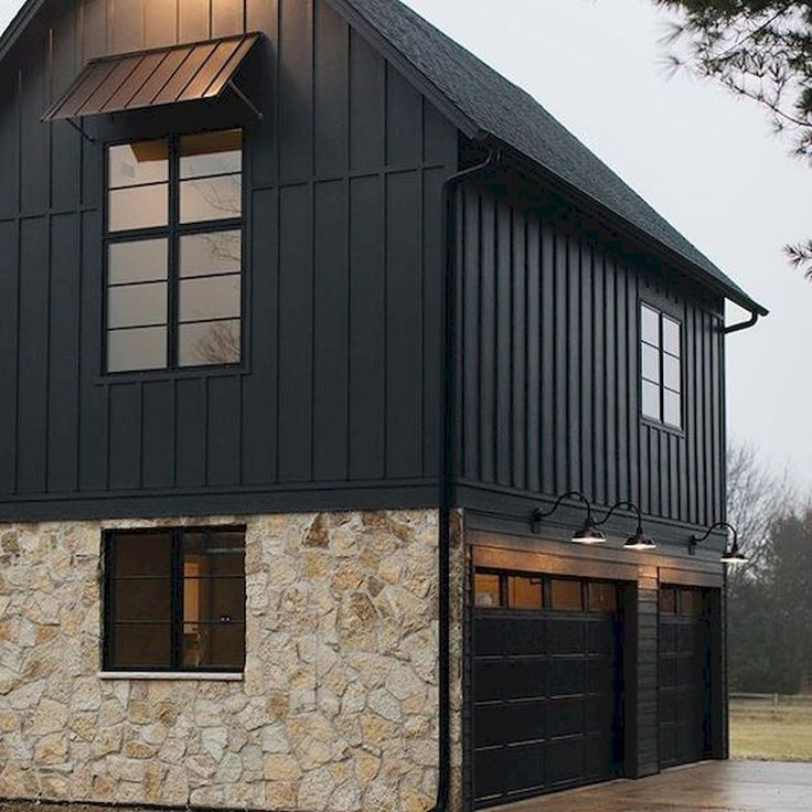 Black and Taupe
 12/17
A twist on the traditional black and white color scheme. If crisp white and classic black looks classy, swapping in taupe warms up the look and brings a touch of warmth and coziness to your home exterior.
Related: 12 Outdoor Upgrades That Make Your Home More Valuable
Zillow Digs home in Rancho Santa Fe, CA
Advertisement
12. Yellow and Blue
13/17
Some might think that a double dose of primary colors is too bold for a house, but when executed with finesse, it’s a real charmer. Here, aqua blue and mellow yellow keeps play off each other for a quaint effect.
Related: 9 Paint Color Rules Worth Breaking
Zillow Digs home in Coronado, CA
13. Brown and Sand
14/17
Nearby houses inspired the color scheme of this charming home. "The sandy color on top resembles the muted tones common on neighboring houses," says architect David Neiman, of Neiman Taber Architects, in Seattle, Washington.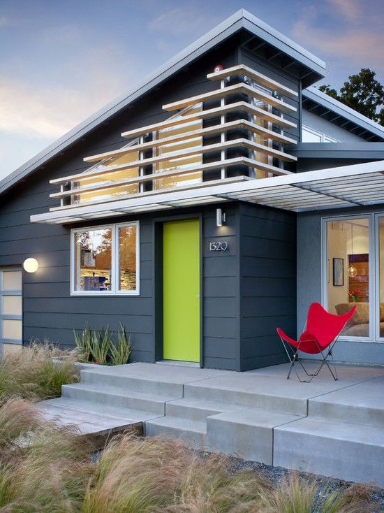 "The brown is a darker complement that provides a strong visual base. Red window frames add an extra punch of color."
Related: 19 Rooms That Prove Beige Isn’t Boring
neimantaber.com
14. Turquoise and White
15/17
Turquoise is a fun choice for those who live in warmer climates; it evokes sunny skies and the sea. If you’re nervous that it’s too bold of a color for your neighborhood, cool it down with white accents. When used in combination, the palette is bright and cheerful.
Related: 15 Tiny Beach Bungalows for Your Next Vacation
Triton Builders; Uneek Images
Advertisement
15. Taupe, Red, and White
16/17
Honor the history of your home with a simple palette. The white columns maintain the old house charm, but the soft taupe and red give it a 21st century twist.
Related: 13 Homes from the Original Colonies that Still Stand Today
istockphoto.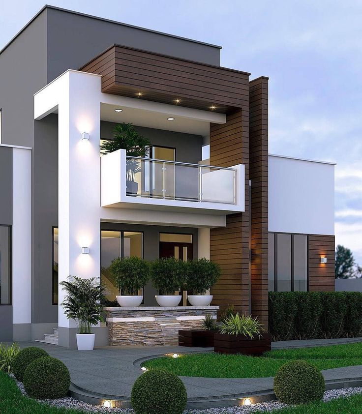 com
com
A Perfect Match
17/17
There's a color combo perfectly suited for every kind of design preference and home style.
bobvila.com
Don't Miss!
If you have the money to hire a handyman for every household woe, go ahead. But if you want to hang on to your cash and exercise some self-sufficiency, check out these clever products that solve a million and one little problems around the house. Go now!
Small houses photo - 135 best examples, photos of the facade of private country houses and cottages
Compact cottage in the style of a barnhouse.
St.Petr
Photo: small, two-story, wooden, brown barnhouse (barns) private country house in Scandinavian style with a gable roof and a metal roof with
Lake Calhoun Organic Modern
John Kraemer & Sons
Builder : John Kraemer & Sons | Photography: Landmark PhotographyFresh design idea: small, two-story, modern style gray house with combined cladding and flat roof - great interior photo
AIA GOLD MEDAL Winner for Design Excellence Family Room with Primary Suite Above
Clawson Architects, LLC
Buildings have 4 sides.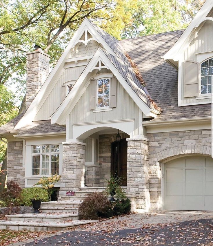 So often, the sides and back are forgotten and yet this is often where we gather and entertain the most. A seamless addition added an expanded kitchen, mudroom, family room primary suite, renovated hall bath, home office and Attic loft Suite
Hyde Park Residence
Mezger Homes
Pictured is a white, small, one-story private country house in a contemporary style with a combined cladding, gable roof and metal roof
Strawberry House 9000 From03
Nakamoto DesignPoint 900 Forestry 9002 : “This project is built of a full exterior removal and replacement of the siding, windows, doors, and roof. In so, the Architects OXB Studio, re-imagined the look of the home by changing the siding materials, creating privacy for the clients at their front entry, and making the expansive decks more usable. We added some beautiful cedar ceiling cladding on the interior as well as a full home solar with Tesla batteries.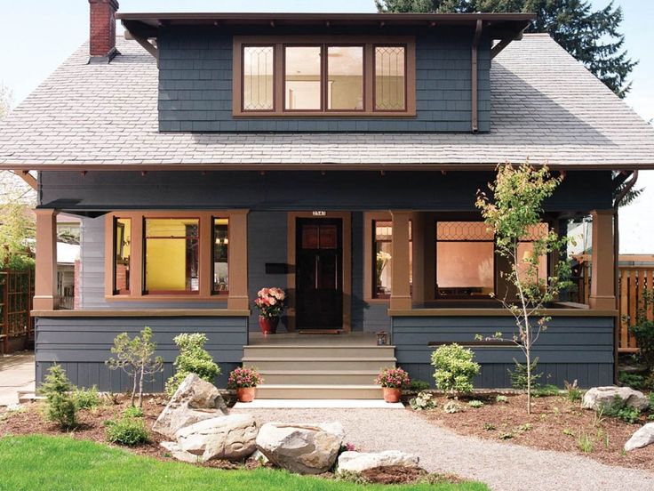 The Shou-sugi-ban siding is our favorite detail. While the modern details were extremely important, waterproofing this home was of upmost importance given its proximity to the San Francisco Bay and the winds in this location. We used top of the line waterproofing professionals, consultants, techniques, and materials throughout this project. This project was also unique because the interior of the home was mostly finished so we had to build scaffolding with shrink wrap plastic around the entire 4 story home prior to pulling off all the exterior finishes. We are extremely proud of how this project came out!”
Cabot Cove Tiny House
Tyler Karu Design + Interiors
A tiny waterfront house in Kennebunkport, Maine. Photos by James R. Salomon
Pictured: one-story, wooden, blue, small mini-house in a marine style with a hip roof and a shingle roof with
Tiny Home
Arbor South Architecture
Erik Bishoff Photography
Design Idea: small, one-story, wooden, gray private country house in a modern style with a pitched roof and a metal roof
Sugar Grove Farmhouse
Elizabeth Eason Architecture LLC
Bruce Cole Photography
Stylish design: small, white private country house with gable roof and tile roof - the latest trend
Tiny House at0 Cheekwood 904 904 Noble Johnson Architects
Tiny House Exterior Photography: Gieves Anderson Noble Johnson Architects was honored to partner with Huseby Homes to design a Tiny House which was displayed at Nashville botanical garden, Cheekwood, for two weeks in the spring of 2021.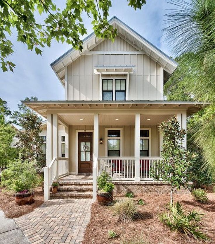 It was then auctioned off to benefit the Swan Ball. Although the Tiny House is only 383 square feet, the vaulted space creates an incredibly inviting volume. Its natural light, high end appliances and luxury lighting create a welcoming space.
Seattle Boat House
Glo Windows and Doors
A uniform and cohesive look adds simplicity to the overall aesthetic, supporting the minimalist design. The A5s is Glo's slimmest profile, allowing for more glass, less frame, and wider sightlines. The concealed hinge creates a clean interior look while also providing a more energy-efficient air-tight window. The increased performance is also seen in the triple pane glazing used in both series. The windows and doors alike provide a larger continuous thermal break, multiple air seals, high-performance spacers, Low-E glass, and argon filled glazing, with U-values as low as 0.20. Energy efficiency and effortless minimalism create a breathtaking Scandinavian-style remodel.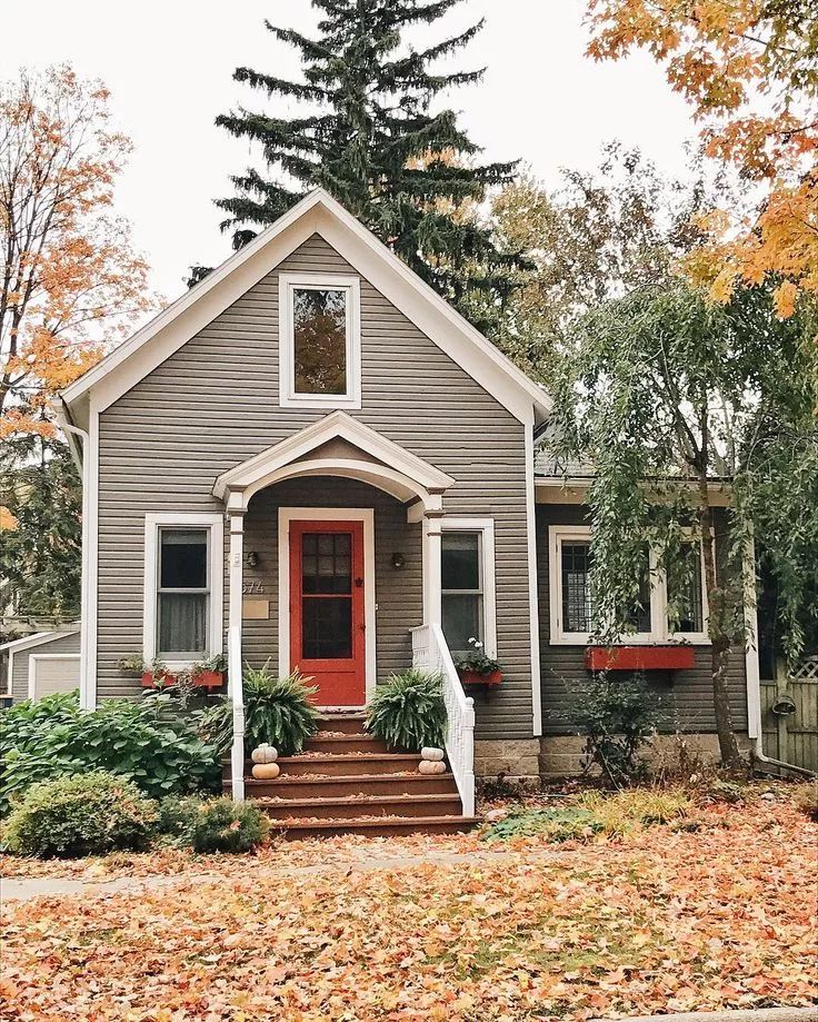
House // TW
M Gooden Design
Photo: Roy Aguilar
Design Idea: Small, one-story, brick, black retro private country house with gable roof and metal roof
Full Home Remodel
ThreeTree Construction
Inspiration for home comfort: small, one-story, wooden, blue retro-style private country house with hipped roof and tile roof
Classic Charleston Home
DLB Custom Home Design
Original design example of a small, two-story, white, neoclassical (modern classic) private country house with cement plaster cladding, hipped roof, and tile roof
Harrisonburg Home
The Gaines Group Architects
Contemporary home built on an infill lot in downtown Harrisonburg. The goal of saving as many trees as possible led to the creation of a bridge to the front door. This not only allowed for saving trees, but also created a reduction is site development costs.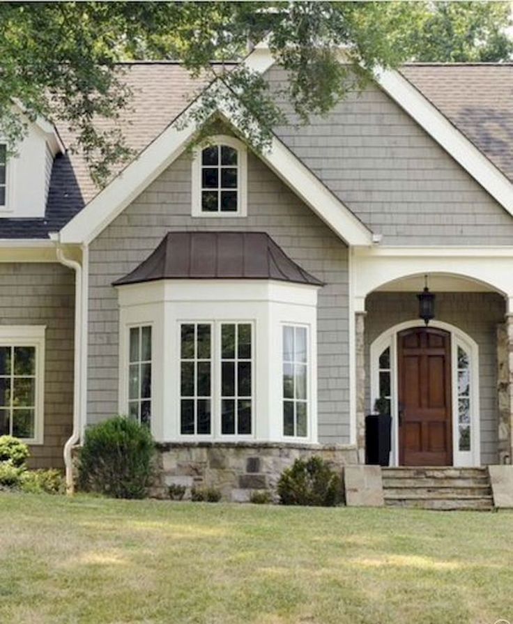
228 Pendleton Road
Our Town Plans
Richard Leo Johnson
Original design example: Small, one-story, gray country house
Arlington, VA Modern Tiny House
FineCraft Contractors, Inc.
FineCraft Contractors, Inc. Harrison Design
Original design example: small, two-story, gray modernist mini house with cement plaster cladding, gable roof, metal roof and black roof
The best interior colors. Designer advice. Grey. White. Beige
About the grays and neutrals from the "Top 50 Best Selling Paint Colors" palette
The best paint colors for walls and ceilings, according to a professional.
The world's best-selling interior and exterior colors.
The best shades of grey: from almost white to almost black.
How does color change under different lighting conditions?
When choosing a paint color for the interior or exterior of your home, it's a good practice to familiarize yourself with the palettes of the most popular and best-selling colors.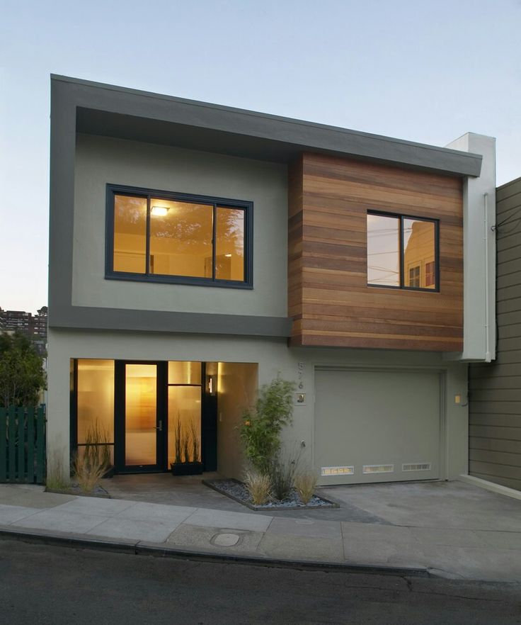 Such palettes are formed on the basis of the choice of both professional designers and owners of apartments and houses, and help not to drown in the ocean of thousands of available shades of paint and varnish products. This can often be a great starting point when looking for the perfect color.
Below is a palette of the 50 most popular and best-selling paints of the famous company Sherwin-Williams. Of these, we select the 12 most versatile and reliable gray and analyze them in more detail. There will be descriptions and tips for using a particular color, with explanations of why this color is more appropriate in certain places and conditions. The “pluses” and “minuses” of the selected colors will also be taken into account.
In this article, we rely on the great experience of US designer Cindy Alred.
Give her the floor:
Repose Gray
The world's number one color in all paint companies. Of course, this cannot be said with absolute certainty, but I would be very surprised if I knew that this was not so.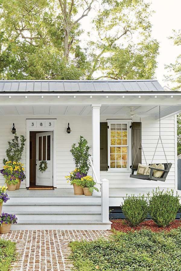 Repose Gray is a fantastic warm light gray that I highly recommend to my clients because it is perfection when it comes to painting all the walls in the house with neutral light tones.
Pros: Versatility. This gray is especially good because it not only looks beautiful during the day in natural light, but is also one of those rare colors that look great in the dark under artificial light. When changing the color temperature of the lighting, unpleasant shades do not appear.
Cons : In rooms with plenty of natural light, Repose can produce a very faint bluish-gray cast.
By the way, all the colors on the Repose Gray fan card (card 244) hit the bestseller list, which is not surprising, because this set is just great. These are stunning and versatile colors and you will see some of them below.
Sea Salt
This color is almost as popular as the previous one. The vast majority in the poll named it as their favorite Sherwin-Williams color.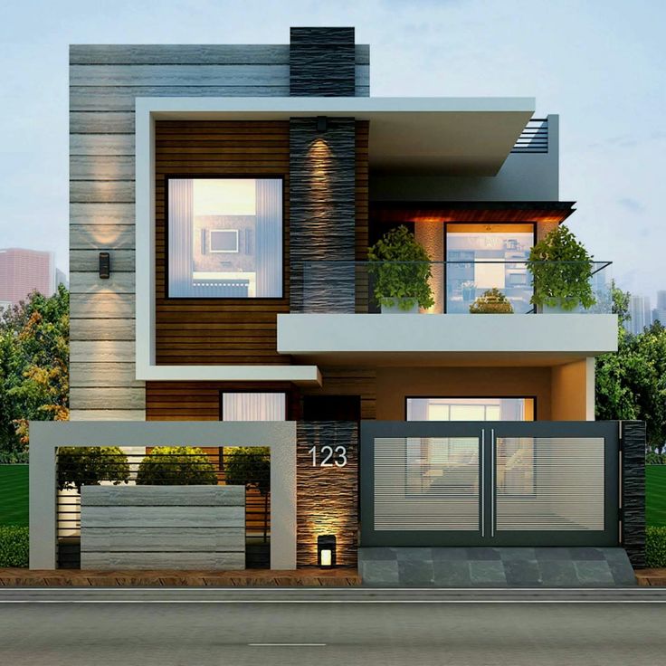 You can safely go for it if you are looking for a soothing and serene spa color.
Pros : Peace and serenity. When properly lit, Sea Salt is one of the most beautiful shades of blue-green-gray.
Cons : Has a chameleon effect and can be finicky in certain lighting conditions (usually areas with lots of natural light). It is very important to do a test run first. This color looks best in rooms with little or no natural light (bathrooms, bedrooms, etc.).
Worldly Gray
This is another trustworthy warm light gray that is very close to Repose Grey, but slightly warmer and darker. I often recommend it to clients instead of Repose Gray as the overall color for the whole interior if there is a lot of natural light in the room, as the former can look too white in such conditions.
Pros : In rooms with lots of natural light, Worldly Gray is ideal and versatile.
Cons : This color will appear darker in areas with little natural light, and may look a bit heavier than a traditional warm light grey.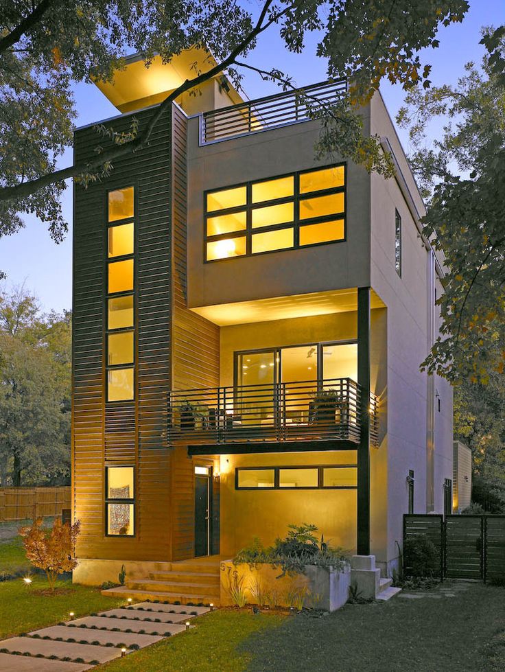
Crushed Ice
I first met Crushed Ice recently when I was redecorating my living room. I chose it as a replacement for Repose Gray (our number one), which looked a bit lighter than I'd like in this space. And in the end, I just fell in love with him, so I can confidently recommend you to try this color. It's a little lighter, a little cooler, and has a little more pigment than Repose Grey.
Pros : Crushed Ice is a stunning warm light gray that sits between a light (with barely visible color) and a medium tone. A rare gem in the range of intermediate neutrals.
Cons : Crushed Ice looks better in areas with moderate natural light. Not the best choice for rooms without windows.
Dorian Gray
This is another fantastic neutral warm gray in the midtone range. I used it on my client's range hood and it looks beautiful. Dorian Gray also works great as a neutral color for furniture.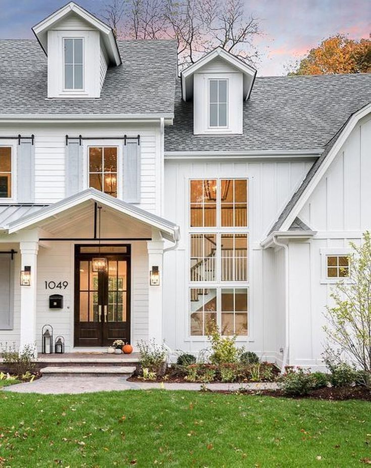
Pros : Found on the same color fan card (244) as Repose Grey, but only two shades darker. A very versatile color for walls and cabinets.
Cons: Too much natural light can cause Dorian Gray to become colder and no longer look like a warm grey.
Dovetail
If you're looking for something darker than a neutral mid-tone warm gray, then Dovetail is a great choice. It is well suited for interior doors and cabinets. It is unlikely to be suitable for painting all the walls in the room, but the accent wall of this color will look beautiful.
Pros : Dovetail is a win-win option when you want to add contrast to a room, but don't want to use very dark tones so as not to lose the overall lightness.
Cons: Dovetail may take on a warmer tone in artificially lit rooms. Although it doesn't hurt him too much, he remains handsome. Drift of Mist It's a very subtle color that I consider to be an almost perfect neutral.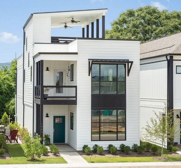
Pros : Drift of Mist is one of those rare colors that solves the problem when neither white nor more saturated colors are suitable.
Cons : There is a very slight hint of muted yellow (very faint). This is what distinguishes it from white, softening to neutral. And, although I do not like the presence of yellow, but this color I could use at home.
Peppercorn
No wonder Sherwin-Williams Peppercorn is on the bestseller list because the color is unheard of good! This overcast dark gray has tremendous depth and is perfect for an accent wall, closets, and some very small spaces.
Pros : Peppercorn is one of the most trusted dark grays. It always looks good on walls, cabinets and interior accents.
Cons : No problems come to mind with this color. He always looks great.
Iron Ore
The next sample is a beautiful very dark gray with a brown tint that has become a popular choice for interior doors, cabinets and facade elements.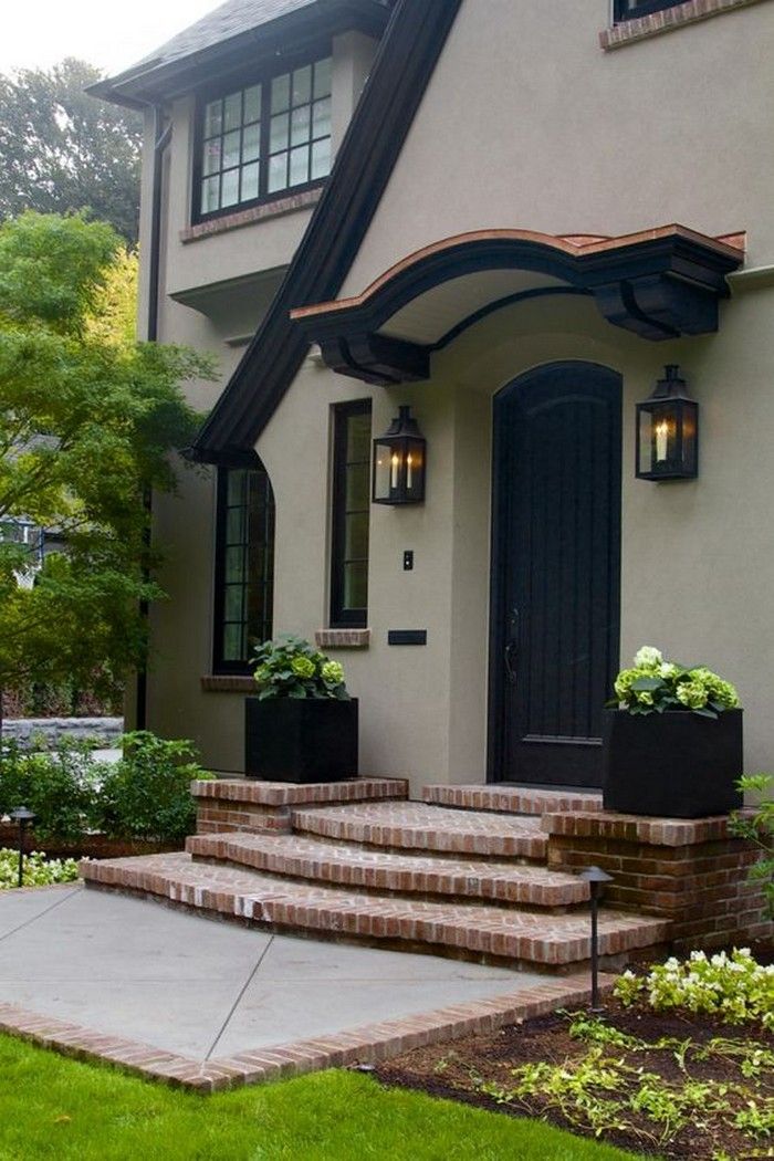 Truly an amazing color!
Pros : Iron Ore is a stunning deep and heavy color. It adds instant contrast to a space if used sparingly.
Cons : When using this color for finishing exterior elements, be careful to make sure that it blends harmoniously with the overall color of the facade, even if it is almost white. Indoors, this is less true, but the bright sunlight outside brings out the Iron Ore tones strongly.
Black Fox
Another fantastic dark color on the bestseller list that is very similar to the previous one is Black Fox. But while Iron Ore tends to be dark gray, Black Fox is more of a very dark brown.
Pros : Very rich dark, perfect accent color for walls, interiors and facades. Very versatile.
Cons : In windowless rooms with artificial light, Black Fox can have a rather warm undertone, but still be beautiful.
Tricorn Black
Of the black colors I most often prefer Tricorn black in my projects.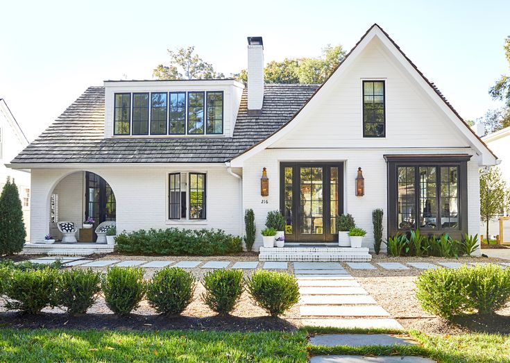 First of all, because it really looks like black. And small brown-gray undertones save him from excessive roughness and harshness.
Pros : This is a very versatile and reliable color for both interiors and exteriors. If you are looking for the best black color, you can go for it, because it is really beautiful.
Cons : I've never had a problem with this color. He won't let you down. The taupe shade complements almost any color when used as an exterior finish or accent color.
Mindful
I have been using Mindful Gray for many years both on client projects and for myself. I think Mindful Gray is one of the prettiest and safest warm grays and is great especially for furniture.
Pros : An extremely versatile warm gray that looks best in cabinets and other furniture, as well as fronts. It's a little heavy to get a warm gray on the walls, but it's fine if you're looking for a warmer, mid-tone gray.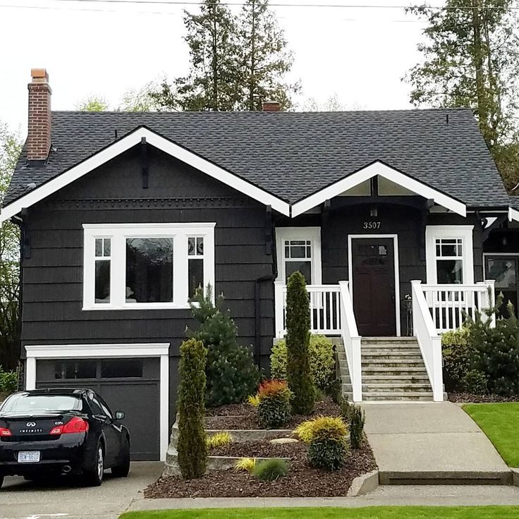
Cons : In rooms with a lot of natural light, Mindful Gray can look cold, but still not lose its splendor. However, if you want a warm gray that stays warm even in these lighting conditions, then Mindful Gray is not the best solution here.
Most of the Sherwin Williams colors featured on this list are simply gorgeous. I haven't worked with many yellow/beige tones so I didn't rate them in this review.
And one more thing. Before using any of the colors I've given excellent marks to, be sure to test them in the room and lighting they're intended for. Lighting can change color drastically and I wish you weren't disappointed!
For information on how light changes color, see article Warm and cold interior lighting. Color temperature of light.
How to choose a light bulb with good color rendering, read the material The quality of lighting in the interior. Choosing the best lamps
Paints of the colors you like, you can order right now on this site.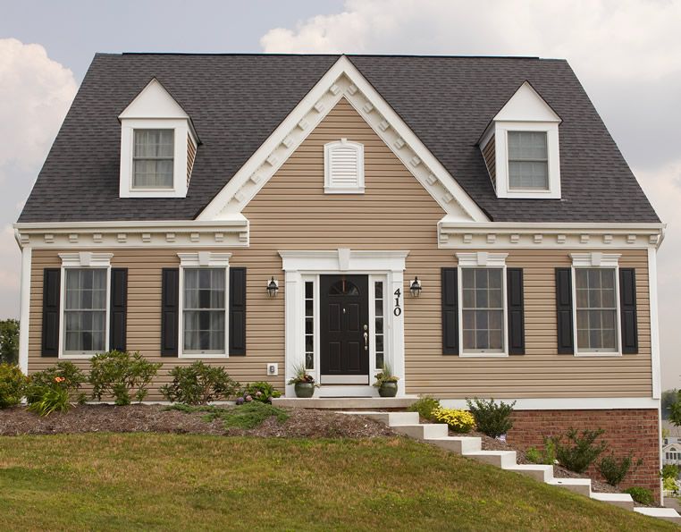
Learn more
