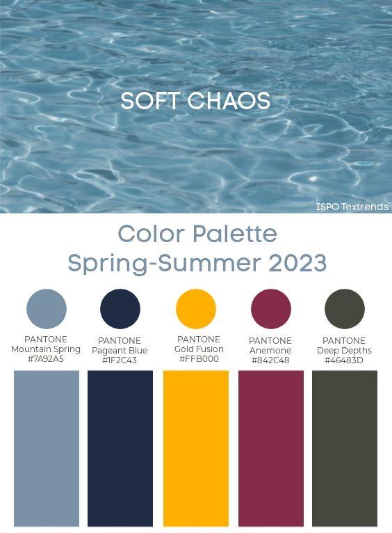
2023 pantone color of the year
Digital Lavender Pantone Color of the Year 2023
It is anticipated that Digital Lavender will be the Color of the year 2023, as confirmed by WGSN and Coloro in collaboration. While 2022 introduced us to a brand new color, Very Peri, a joyous periwinkle blue, the happiest and warmest decided by Pantone, Digital Lavender is very close to Very Peri which will be very popular in the coming months.
Since both hues have more to do with the feeling of isolation and merging lines between the digital and physical world, let’s take a look at how Digital Lavender is going to contribute as the color of the year 2023.
Color forecasters predicted Digital Lavender to be the color that will take over the Fashion Industry, a lot of glimpses at the fashion weeks in New York, London, and Milan are living proof.
With visions of beautifully dusty hues and Southern French allure, the introduction of Digital Lavender by WGSN and Coloro is anticipated to be the contemporary shade that is set to make waves in the fashion and interior world.
Please enable JavaScript
Introducing Digital Lavender Color of the Year 2023
Forecasters at Coloro and WGSN believe that Coloro: 134-67-16, also known as Digital Lavender, will be the color for 2023.
Something that already has an online presence with Very Peri, a closer hue chosen for 2022, subtle lavender tones will lead the color charts as customers are now looking for more subtle and pastel tones that help them find solace and peace.
This purple will be important for consumer electronics, digitized wellness, mood-boosting lighting, and home goods. Its sensory quality makes it perfect for self-care rituals, therapeutic practices, and wellness products.
Digital Lavender 2023: Key Inspirations
Inspired by art and design, WGSN and Coloro took inspiration from Argentinian designer Andrés Reisinger who had created a series of virtual furniture pieces, Puma and Living Color’s sustainability campaign Design to Fade, Mercedes-Benz’s ‘living creature’ vehicle the ‘VISION AVTR’ and the list goes on.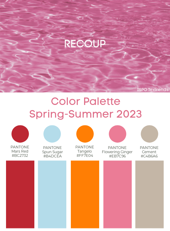
The spiritual references go back to rooting from Crown Chakra which is purple, as the hue is a color signification of spirituality and with the pandemic coming to an end, people are looking forward to more spiritual inspirations.
These colors are inspired by WGSN, Coloro, and various Spring Summer Fashion Weeks noting the highlights. This signifies stability, serenity, and digital escapism, things we are all looking for.
Lavender is gender-inclusive, while the soft and subtle tints bring the feminine and self-care version of it, being closer to the hues of Blue makes it edgier simultaneously.
Digital Lavender: Significance and Key points
These are a few points to pick from Digital Lavender as 2023’s colors:
1. It is a neutral tone that will be readily accepted by all generations, and celebrated by Gen Z.
2. The additional colors in collaboration with WGSN X Coloro include, Spring and Autumn color combinations.
3. Covid-19 has reshaped the way we see colors, trends, and the industry, we’re now more digitalized and looking for harmonious escapes, Very Peri for 2022 and Digital Lavender for 2023, follows a similar story.
“Our S/S 23 palette reflects a more hopeful and optimistic view of the future,” adds Jenny Clark, Head of Color at WGSN. “We anticipate challenges ahead, but we’re hopeful that our consumers would engage with these colors positively.”
Check Out the Top Key Color Trends 2023 for Design & Forecasting, exploring tints and hues that celebrate spring with the essence of a new era and digitalization.
Why is Digital Lavender Becoming an on-trend Color?
A wider view of the color will represent many emerging moods of a human being, bringing the best of conveying a sense of calmness and cheerfulness that soothes our mind, which is something we’re all looking forward to.
With customers finding their zen mode in the virtual spaces, Digital Lavender invites us to a frequent virtual era that we’re totally setting our eyes on.
The soaring social media with a diversified blend of physical and digital, Lavender will soon will the Pantone color of the year at its best with a perfect harmony of cheerfulness and calmness.
Both creative professionals and customers enjoy using Digital Lavender. In this way, the cheery yet also calming, almost healing shade blends in with the now popular earth tones and natural yellows, which produce an impact that is both calming and bright and friendly.
People want a solid, uplifting environment, especially in their private living areas, especially in light of recent events.
This explains why the color “Digital Lavender” is becoming more and more well-liked.
How does Digital Lavender Affect Mood?
According to research, viewing digital lavender induces sensations of tranquility and peace. Deep violet has a lavish, creative appearance.
Pale lilac conveys gentleness and serenity. The corresponding wavelengths of the various tints cause these sensations of color.
Longer wavelength colors, like red, have an energizing and invigorating effect on our mood.
Red and other colors with longer wavelengths have an energizing and stimulating effect on our emotions.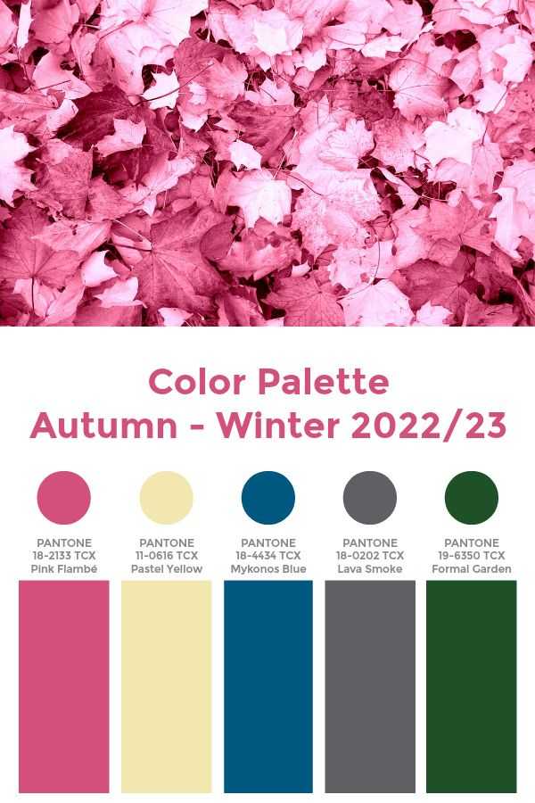 On the other side, cool colors with short wavelengths look more harmonious, such as blue or turquoise.
Thus, it comes as no surprise that digital lavender has become popular. This is from the perspective of color psychology.
What is the Coloro Code for Digital Lavender?
Coloro code 134-67-16 is the color code for Digital Lavender, as announced by WGSN and Coloro, presenting itself as varied yet soft.
Everybody who frequently works from home or spends a lot of time there wants peaceful surroundings.
Lilac wall paint, light wood furniture, and a rug with a delicate design may all be seen in a contemporary space in 2023. A cozy atmosphere is produced in the home by combining colorful and soft colors.
Why is It Called Digital Lavender?
According to Joanne Thomas, head of content at Coloro, it “signifies that stability, tranquility, and digital escapism that so many of us have incorporated into our recuperative rituals to both safeguard and promote our mental health in trying times.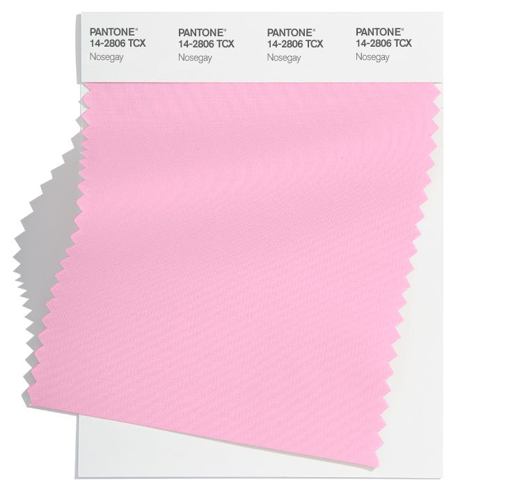 ” We strangely can see that which is the core reason why it’s named Digital Lavender.
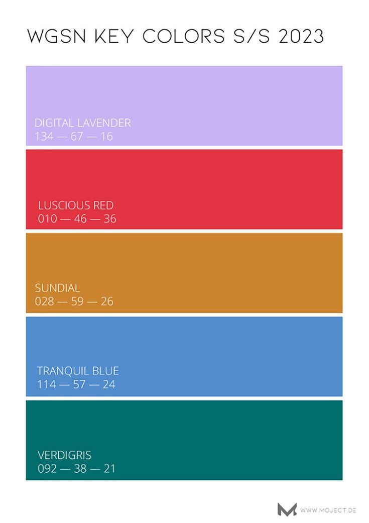
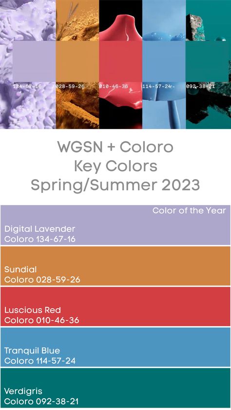
What is the Key Color for Spring Summer 2023?
These are the tops colors for Spring and Summer 2023.
- Luscious Red (Coloro: 010-46-36)
- Sundial (Coloro: 028-59-26)
- Tranquil Blue (Coloro: 114-57-24)
- Verdigris (Coloro: 092-38-21)
Digital Lavender Photo References
Pantone's Spring and Summer 2023 Color Trends Report
This color palette is all about contrast.
Nashia Baker, Associate Digital Editor at Martha Stewart
By Nashia Baker September 19, 2022
Advertisement
woman looking at paint colors for wall
Credit: Charday Penn / Getty
When the Pantone Color Institute began considering the color trends that would dominate in the spring and summer of 2023, they knew the 15 shades they spotlighted would need to speak to renewal and reemergence after a long, cold winter.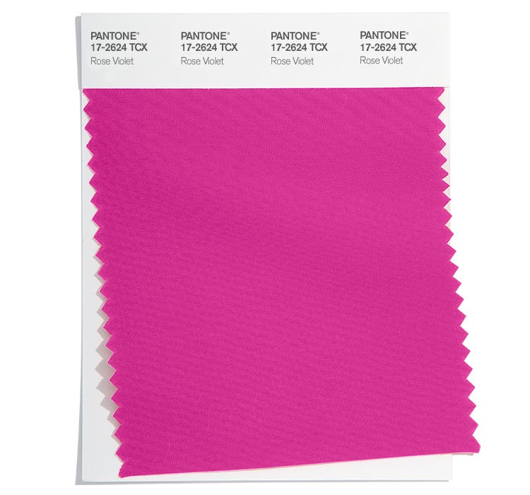
To put this palette—which was also predicated on emerging fashion trends—together, the Institute looked to contrast as a guiding concept: "Colors for Spring/Summer 2023 are recalibrated for the new era we are entering," said Leatrice Eiseman, the executive director of the Pantone Color Institute, in a press release. "Blending escapism with reality, wholesomeness, and joy, we embrace the exploration of extreme contrast in mood and color."
blue and grey paint swatches pantone brand
Credit: Courtesy of Pantone
New Classics
The team decided to start with five "neutral" colors as the foundation, and build the contrast from there; the grounding shades are tranquil and represent a "quiet presence." Anchored by Pantone 12-4604 Skylight, a pure, water-inspired color, which mirrors cleansing aqua, and Pantone 13-3804 Gray Lilac, a "dreamy and ethereal lilac infused gray," this part of the color trend report represents its "utility and basic-ness.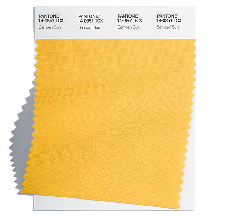 "
"
- PANTONE 17-1230 Mocha Mousse
- PANTONE 14-6011 Grayed Jade
- PANTONE 12-0912 Tender Peach
- PANTONE 19-3954 Bluing
- PANTONE 13-4201 Oyster Mushroom
swatches of paint red and yellow
Credit: Courtesy of Pantone
Vibrant Brights
The remaining 10 shades, however, signal the "uplifting, vital sense of play that comes through" the color scheme. These vibrant hues were all meant to boost experimentation and expression: Pantone 18-1664 Fiery Red signals energetic intensity, while Pantone 14-0756 Empire Yellow is a representation of joy.
- PANTONE 16-0229 Titanite
- PANTONE 16-1544 Persimmon
- PANTONE 14-1140 Iced Mango
- PANTONE 12-0643 Blazing Yellow
- PANTONE 14-4122 Airy Blue
- PANTONE Electric Blue Lemonade
- PANTONE 17-1563 Cherry Tomato
- PANTONE 17-3020 Spring Crocus
- PANTONE 16-6230 Andean Toucan
- PANTONE 16-2122 Pink Cosmos
Ultimately, pairing these shades together, via your wardrobe or throughout your home, imparts the sense of freedom that comes with trying something new. This "quirky contrast" highlights our desire for individualism, notes the release—and "encourages us to express ourselves in unexpected ways."
this link is to an external site that may or may not meet accessibility guidelines.
Trendy Colors Pantone Spring-Summer 2023 -
Trendy Colors Spring/Summer 2023 from the Pantone Color Institute. Pantone Spring-Summer 2023 New York Colors of the Year - Pantone Fashion Color Trend Report Spring Summer 2023
What colors will be in fashion for spring and summer 2023? On September 7, before the official opening of New York Spring-Summer 2023 Fashion Week, the Pantone Color Institute presented its version of the most fashionable colors for spring and summer 2023.
The most famous Pantone Fashion Color Trend Report consists of four palettes. The Pantone Color Institute presents them every season for the two major Fashion Weeks, in New York and London.
Pantone Fashion Color Trend Report includes ten of the hottest shades of the coming season, as well as five trendy shades of classic neutrals.
Spring/Summer 2023 Hottest Colors
According to the Pantone Color Institute, the New York Color Palette for Spring/Summer 2023 reflects our relationship with color now and how it has been influenced by our experiences in recent years.
The spring 2023 fashion palette celebrates newfound freedom and the excitement of new things. A bold approach to experimenting with color brings whimsical contrasts.
The color combinations of the spring/summer 2023 trendy palette are perfect for experimenting with color. And Pantone's 2023 warm season colors further underscore the desire to express individuality in unexpected ways.
“Spring/Summer 2023 colors have been recalibrated for the new era we are entering. Blending escapism with reality, well-being and joy, we explore extreme contrast in mood and color.
This season's color story has practicality and simplicity, and at the same time, it has an invigorating, life-giving feel to the game.
”
Leatrice Eiseman, Executive Director Pantone Color Institute
New York Spring Summer 2023 Color Palette
Pantone New York Spring Summer 2023 Fashion Palette features 10 trendy colors and five classic neutrals.
For the Pantone color palette, experts have selected hues designed to encourage color experimentation and individuality. The description of fashionable shades is charged with positive. Like for example Empire Yellow "joyful", or Classic Green, which Pantone says has health benefits.
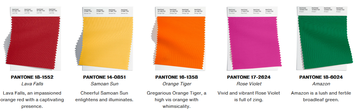
Top 10 Pantone Spring/Summer 2023 New York Colors
PANTONE 18-1664 Fiery Red
Intense Fiery Red energizes. But throughout history and in various cultures, red has been the color of blood, passion, the clothes of kings and nobility. And now the fiery scarlet remains both a symbol of love and the struggle for power.
PANTONE 18-2143 Beetroot Purple
A bold shade of fuchsia, Beetroot Purple symbolizes the fruits of nature. Bright Beetroot Purple is one of the most memorable color trends for summer 2023.
PANTONE 15-1335 Tangelo
Juicy orange Tangelo, like its delicious counterpart, is rich in vitamins and bright taste.
PANTONE 15-1530 Peach Pink
Delicate peach shade Peach Pink invites you to embrace. Combining the warmth of orange and the tenderness of pink, Peach Pink is femininity and energy.
PANTONE 14-0756 Empire Yellow
Empire Yellow as the color of joy, happiness and spring represents optimism and lightness of being.
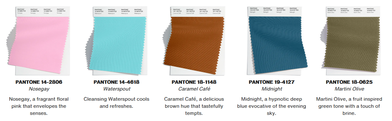
PANTONE 12-1708 Crystal Rose
Crystal Rose is a soft pink that symbolizes modern romance.
According to Pantone experts, delicate pink in the color palette of spring and summer 2023 is a response to people's need to distance themselves from the madness of modern society and the emotional tension of recent months.
PANTONE 16-6340 Classic Green
Classic Green is a revitalizing green color rich in health benefits like fresh greens.
PANTONE 13-0443 Love Bird
Love Bird is an exotic green with a lively personality. Bright, almost acidic, Love Bird is the perfect anti-depressant that reminds us of our connection to nature and pure natural energy.
PANTONE 16-4036 Blue Perennial
Pantone's muted Blue Perennial is the perfect complement to this trendy palette with poise and versatility.
PANTONE 14-4316 Summer Song
Pantone's Summer Song is a pure blue shade that represents calmness and relaxation.
Read also:
Fashionable colors Pantone Autumn - Winter 2022/23
Fashion Coats 200111 Schopping in Italy - where, how, how much, how much /Summer 2023 NY The classic palette includes five basic neutrals. Their versatility gives great freedom of choice and extends beyond the seasons. Pantone's new classic palette offers light pastels that blend well with others. Here you can see the delicate color of the sea wave "Skylight", the gray with an admixture of lilac "Grey Lilac" and the sophisticated green "Leek Green". And the Vanilla Cream and Macchiato colors further enhance the soothing and luxurious vibe that Pantone is trying to create this season. Skylight is a color of clear, clear water that represents serenity. Vanilla Cream is a soft, appetizing shade of cream. Gray Lilac from Pantone is a dreamy and ethereal lilac gray shade. Delicate Leek Green represents greenery with subtle fragrance. Macchiato is a luxurious shade of light brown that is delightful just like its fragrant Italian namesake with a light layer of foam. The Pantone London Spring-Summer 2023 Fashion Palette will be presented to the media ahead of the official opening of London Fashion Week on September 15, 2022. Red Cherry Tomato attracts attention and seduces. Persimmon honey coral. Fruity orange with a tropical flavor. Radiant warm sunshine Vibrant and brilliant yellow-green Exotic green, reminiscent of highland forest. A soft blue inspired by a cloudless spring sky. Vivid, luminous blue will electrify this summer palette. A garden pink that contrasts with all other shades. An offbeat gray with quiet power. Mineralised grey-green. Delicate peach shade. Soft, delicious milk chocolate color. Vivid ink blue. Like Loading...0001 The Pantone Matching Sestem or Pantone Color Palette is a system that allows you to select a specific color from a wide range. Every year, fashion designers update their palette with ten new shades. So, here is the hit parade of the main colors of the autumn 2022 - winter 2023 season, proposed by fashion designers according to the Pantone system. Fashionable Aurora Red transforms a woman, making her infinitely feminine, but at the same time confident in her beauty. The palette of colors offered by fashion designers such as Alberta Ferretti, as well as branded clothing manufacturers Gucci and Blumarine, combines the contradictions of characters, creating a woman of the new time. She is swift and graceful, defiant and tender, domineering and submissive. You will be interested in a new trend: trendy colors spring-summer 2020. dynamic and awakens feminine power. Most often, styles created in such colors blur the line between the beginning of male and female, combining them into one. Pantone Warm Taupe, offered to us by Valentino and the world-famous manufacturer of clothes for beautiful ladies, Max Mara, can become the basis for the entire autumn wardrobe. Picking up details for it will not be difficult. In memory of the passing summer, the modern brands Roland and Mourer and Gucci offer us this magnificent, intriguing shade. It emphasizes the eyes and delicate blush of the female face, adds elegance and creates the effect of renewal and freshness. It goes well with strict black and bright orange. A very sophisticated reproduction of dark pink with the illusion of dust on it, presented to us by western designers Paul Smith and Fausto Puglisi in the fall-winter 2023 collection. The long-awaited Potther's Clay, which is presented in the new collection by fashion brands such as Truussardi and Tibi, as well as fashion designer Phillip Lim. It just fits amazingly into the autumn colors of any region. It is beautiful, somewhat bold, but at the same time neutral, so you can easily pick up additional details for it, which will only emphasize its naturalness. Passionate and frivolous hit of the autumn and winter season 2022-2023, we are offered by fashion designer Oscar de la Renta and designer Zang Toi. Bodacious is not typical for a period of rainy autumn or blizzard winter, but still fits well into the environment. It goes well with bold red, burgundy and hot pink tone. Such fashionable colors of autumn and winter instill confidence in a woman, give them strength and originality. Fashion house Chloe and Max Mara introduce us to an unexpected shade of yellow in the new cool autumn-winter season. This is a bright spot on the palette, fashionable colors according to Pantone. Daring and at the same time gentle, it exists well in a frame of chocolate and gray colors. This year, in autumn and winter, women will shine brighter than the sun itself. This new shade from modern fashion designers Zac Posen and Michael Kors is based on a classic base color. It combines dynamics and confidence, sensuality and cold calculation. It looks great with many complementary shades and can perfectly form the basis of the wardrobe. The heavenly color palette presented by the designers of the Italian fashion house Fendi, as well as fashion designers such as Elie Saab, will win over more than one representative of the fairer sex in the autumn-winter period. A color that is difficult to pass by, because it easily coexists with all Panton fashion proposals. No wonder modern designers and fashion designers such as Michael Kors, Zac Posen and not only turned their attention to him. The cold, gray and endlessly fashionable color of clothes harmoniously coexists with any other colors of the autumn-winter season. Below you can see a photo of the colors positioned as an additional set to the main palette. Here you can find a delicate rose, fuchsia, silver and bronze, which are offered by famous fashion designers Michael Kors, Kenzo, Valentino, the Zimmermann sisters and many others. A great mood for lovely ladies will be created by bright pink, coral and purple colors. Pantone describes them as "creating a quiet presence." Unlike previous color palettes of classic colors, the summer 2023 palette contains non-trivial base shades.
 PANTONE 12-4604 Skylight
PANTONE 12-1009 Vanilla Cream
PANTONE 13-3804 Gray Lilac
PANTONE 15-0628 Leek Green
PANTONE 17-1221 Macchiato
Pantone London Spring-Summer 2023 Color Palette
London Spring - Summer 2023 Color Palette
PANTONE 17-1563 Cherry Tomato
PANTONE 16-1544 Persimmon - Persimmon
PANTONE 14-1140 Iced Mango
PANTONE 12-0643 Blazing Yellow
PANTONE 16-0229 Titanite
PANTONE 16-6230 Andean Toucan
A PANTONE 14-4122 Airy Blue
PANTONE 18-4245 Electric Blue Lemonade
PANTONE 17-3020 Spring Crocus
Floral purple first blooms in early spring.
PANTONE 16-2122 Pink Cosmos
Classic Fashion Color Palette Pantone Spring/Summer 2023 London
PANTONE 13-4201 - Oyster Mushroom - Oyster Mushroom
PANTONE 14-6011 Grayed Jade
PANTONE 12-0912 Tender Peach
PANTONE 17-1230 Mocha Mousse
PANTONE 19-3954 Bluing
Like this:
 The favorites of spring-summer 2022 were delicate colors: light lilac, serene rose quartz. Fashionable colors are brighter, of course, more saturated. It is these shades that make a woman self-confident, especially when they attract the admiring glances of the powers that be.
 The top ten most fashionable autumn-winter colors
1. Aurora Red - red dawn
2. Pantone Warm Taupe - warm, taupe
3. Panront Lush Meadow - literally translated as a lush meadow.
4. Dusty Cedar
 It can also serve as the basis of any outfit and goes with any color scheme.
 5. Potther's Clay - clay for pottery
6. Bodacious — reckless
7. Spicy Mustard
8. Riverside
9. Airy Blue
 Lightness, weightlessness, sparkling like frost on a branch of a winter tree. Airy Blue pairs well with Lush Meadow and Dusty Cedar.
 10. Sharkskin - Sharkskin
Additional colors of the autumn-winter 2022-2023 season
Learn more