What color should i paint my office at home
Best Colors for Home Offices
With so many people working remotely or on hybrid schedules, the home office has become an important room in the house. Work areas have been thoughtfully carved out of living rooms, kitchen nooks, attics, basements, spare rooms, closets and even garages. Regardless of size or location, a considerable amount of time is spent in this room each day. Productivity is the #1 consideration for a successful workspace and color plays a role in achieving that.
Wall-Fast as the Wind PPU26-17When choosing color for your home office, consider the types of activities that take place there. How does the room need to feel for you to do your best work? Do you need to sit quietly and focus, or will you take calls and join video conferences? Will you need to move around the room or have tables available to spread out projects. Is this your private workplace, or do you share the area with other family members?
Proper lighting is a must: natural light from a window helps keep energy levels at their peak. Task lighting can also keep eyes from becoming fatigued if they focus on small details for a long time. Color also looks better in well-lit rooms!
Let’s take a look at how color can impact your working style:
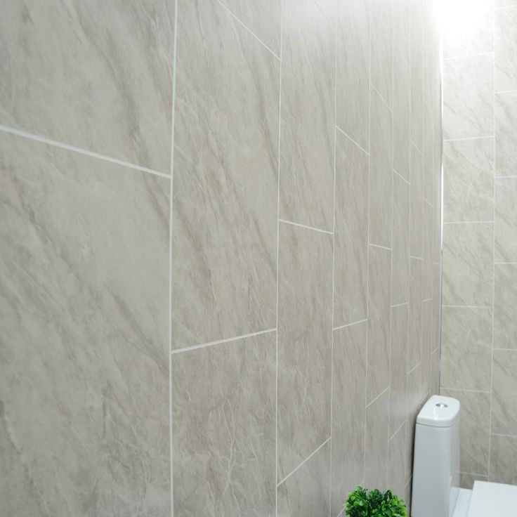
White is a great color for small spaces to help areas feel larger and more open.
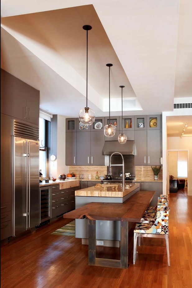
wall- Nano White HDC-MD-06Gray is a color that feels balanced, does not distract and easily coordinates with other office furniture or colorful accessories.
wall: Platinum PPU26-11walls- Meteor Shower N450-3, trim & door-Polar Bear 75walls & trim-Silver Bullet N520-2
When the need to focus is essential, neutrals create a non-distracting background. Try using warm shades of brown, taupe or sand keep walls from feeling ho-hum dreary.
wall & trim-Light Truffle PPU5-06ABlue is a tranquil color. Lighter blues have positive associations for clear thinking.
walls – Light Drizzle N480-1 trim-Polar Bear 75Darker Blues are known for creating an atmosphere of stability.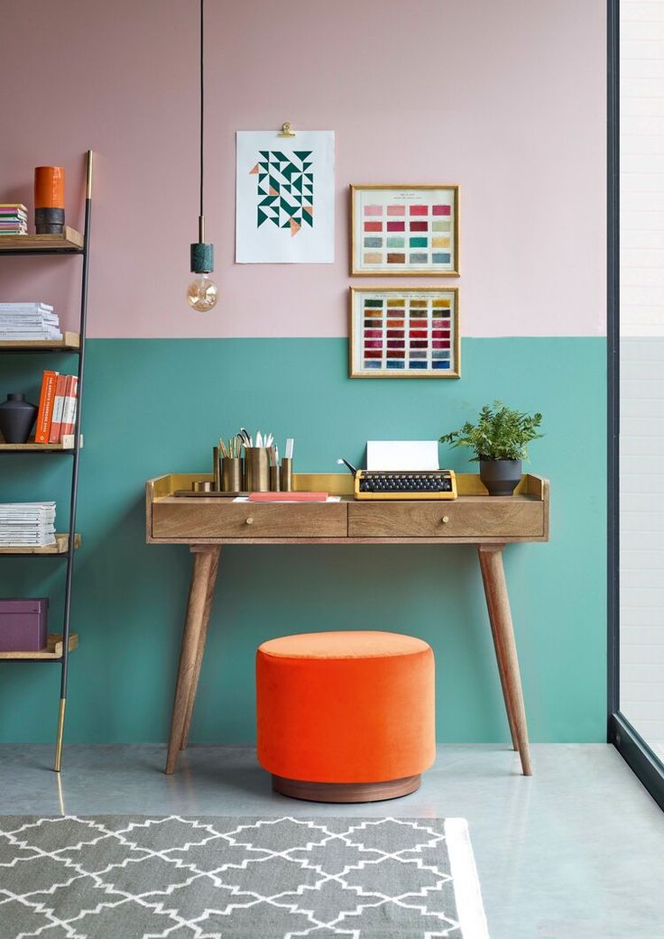
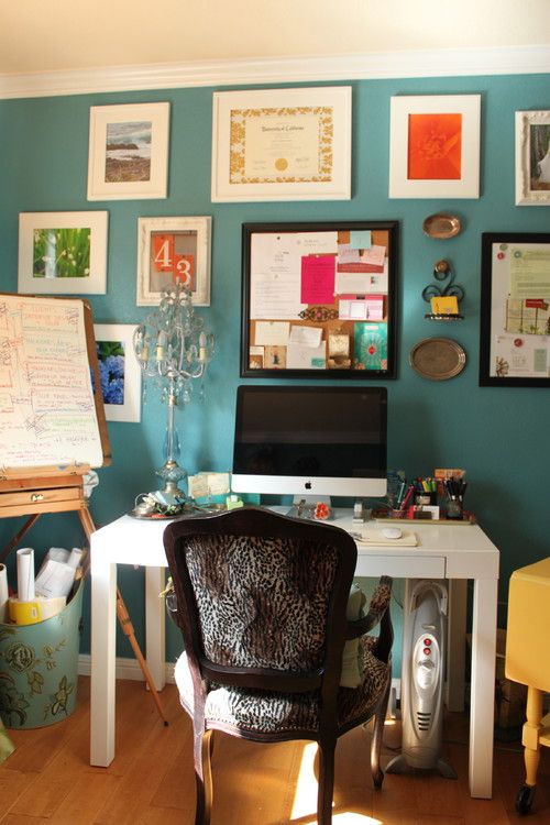
Aqua and turquoise offices have a peaceful balance of blue and green and are easy to live with and helps with focus.
wall – Beach Foam S450-1back wall & trim- Vibrant White BWC-12, accent wall- Thai Teal M460-6Natural and calming green are great for people working long hours and does not fatigue the eyes.
wall & trim- Back to Nature S340-4 door-Graphic Charcoal N500-6Dark Greens create boldness and balance in where concentration and focus is needed.
wall- Royal Orchard PPU11-01 fireplace & trim: Smoky White BWC-13 door-Barnwood Gray PPU24-07Yellow is associated with optimism and helps stimulate creativity. This is a great color for designers to have in their space.
walls & trim- Painters White PPU18-08, geometric design-Charismatic PPU6-14Terra cotta tones provide a sense a warmth to all white space and can suit a variety of home office styles.
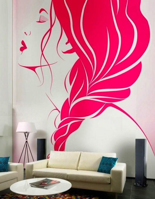
walls: Smoky White BWC-13 trim: Polar Bear 75 desk: Canyon Dusk S210-4For a room that feels less serious, pink is a color that adds an element of charm and playfulness in an office.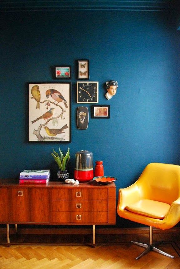
Red is a high energy color – great for rooms where there are lots of conversations or activities taking place.
walls-Red Pepper PPU2-02 trim-Polar Bear 75When projects call for out-of-the-box thinking, purple is known to stimulate creativity making it terrific for studios or craft areas.
walls- Standing Ovation N570-2 accent- Elephant Skin PPU18-16Lastly, your home office can be professional, but still feel personal. Show off family photos, favorite pieces of art, book collections and make sure your favorite coffee cup is always nearby!
Colorfully yours,
Erika
Home office paint colors – the 10 best color schemes for an inspiring space |
(Image credit: Davide Lovatti / Future)
Over the past year, those of us lucky enough to have a dedicated room in which to shut ourselves away have gratefully recognized the peaceful retreat they provide. However, now working from home is likely to be the norm for many of us, we are thinking about the aesthetics of these spaces.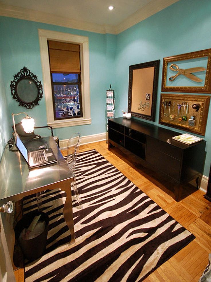
But how to add beauty to what is, after all, a functional space? This is why choosing the best home office paint colors are vital to creating a successful scheme.
Home office paint colors – 10 ways to energize your space
1. Paint with a dynamic color palette
(Image credit: Mark Bolton)
‘Make your home office area a brighter space that the rest of the room,’ advises Annie Sloan, color expert. ‘Basic color psychology can come into play here, but fundamentally whichever color you choose – it should be something you love. I think strong colors are important whatever your role: this is not a room for relaxing, you want the space to feel dynamic.’
2. Instil a sense of calm with a green color scheme
(Image credit: Davide Lovatti / Future)
According to color psychology, beige greens and yellow greens are the most stress-reducing shades – so they are ideal for a home working environment. They also make a good neutral background for displaying art.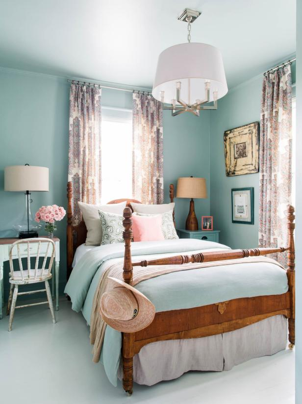
3. Make neutrals interesting
(Image credit: Manolo Yllera / Future)
Even a room that’s lacking in color can still be bursting with visual appeal. In fact, many designers love working with a neutral color palette because I can really translate to any design style. But the key to doing is successfully is to embrace a variety of elements that will add interest. You’ll want to combine materials and textures, which will create contrast and a sense of dimension.
4. Draw on personality and playfulness
(Image credit: Future)
‘With many of us working from home these days (at least some of the time), it’s important to foster a creative and inspiring home office environment – and not play it too safe when it comes to using pattern and color,’ says Sarah Peake, founder, Studio Peake .
Your book storage and home office setup need not be staid in character nor sombre in color. Scale up the atmosphere by painting the fitted joinery in a block color and let the books provide the detail.
5. Go for a fail-safe neutral
(Image credit: Paul Massey / Future)
A neutral home office offers infinite possibilities for making spaces airy and relaxing, or elegantly sophisticated and timeless
There is no doubt that neutrals have been the most popular tones for home offices during the last year, and for good reason. Many people feel most comfortable when surrounded by carefully balanced colors that create an understated environment and make few demands on the eye.
This new and updated neutral is are all about minimalism, simplistic shapes and natural finishes, so ditch the chaos and opt for an uncluttered study that inspires creativity.
6. Paint using a selection of cool tones
(Image credit: Paul Raeside / Future)
When it comes to blue home office ideas, Jane Rockett, co-founder of Rockett St George, says, ‘Cool blues and deep navy tones promote creativity and are the perfect choice for your home office – typically spaces that you go to for visionary thinking. ’
’
Because cool tones aren’t overpowering – in fact they often feel like they are receding – they often help a small room appear to have more space, which can make them a great choice also for a small home office or library.
7. Separate your work and play space with color
(Image credit: Simon Bevan / Future)
Use color to create a 'zone' for work. Zoning with color helps you to make the most of your work space, by creating a distinct areas for you to shut yourself away from the rest of the home.
A full immersion of color, with one stunning shade for all walls, can bring interest into the room without overwhelming the eye; deep-tone colors work particularly well for this. The style also complements strong architectural features in a fresh and modern way. Plus, once you step out of the 'zone', you won't feel like you are at work.
8. Decorate in a harmonious color palette
(Image credit: Davide Lovatti / Future)
If your home office is bursting with natural light, then why not go for a popular grey color scheme with touches of mood-boosting blue?
Grey and blue is a harmonious color combination. Dark schemes, such as the deep, almost blue-black charcoal walls here, create an intimate environment for quiet contemplation.
'The orientation of your space will affect the way a color looks on the walls, and is the reason why exactly the same shade of grey paint can look completely different in different surroundings,' explains author Kate Watson-Smyth.
9. Go for a marvellous monochrome scheme
(Image credit: Jan Baldwin / Future)
A study or home office will look sophisticated and smart decorated in black and white, but if you are sticking religiously to the monochrome color scheme, it's really important to ensure that you add plenty of texture into the room to ensure it feels cozy and welcoming. Texture is vital – remember that the most successful monochrome interiors combine depth and dimension with tactile pieces to create an interesting narrative.
10. Create a 'zone' with color and pattern
(Image credit: Future)
When it comes to color, don’t be too conservative.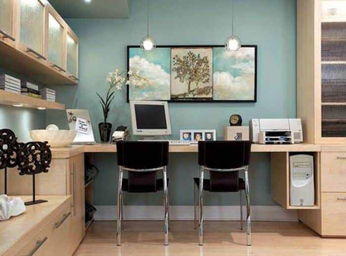 A striking hue will inject just the right amount of flamboyance to add energy and foster creativity, as demonstrated by this bold study, which delightfully combines pattern with strong color.
What colors are good for a home office?
Soothing colors, such as greens and blues, will offer tranquility and that all-important link to the outside. However, while these shades suit south- or west-facing spaces, and even light-filled north- or east-facing rooms, you many feel a home office that only receives cool daylight is better suited to warmer colors.
What is the best color to paint an office for productivity?
‘Choosing the correct shade for your home office as important as you job,’ says Annie Sloan, color expert. ‘Select the best hues depending on your personality traits and what your job requires of you. For example, those who lack focus will benefit from bright colors, while those who role requires deep thinking should consider contemplative blues.’
Jennifer is the Digital Editor at Homes & Gardens.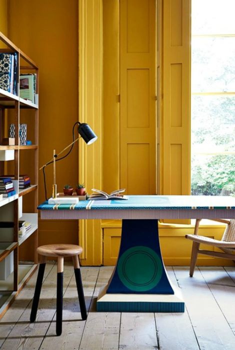 Having worked in the interiors industry for a number of years, spanning many publications, she now hones her digital prowess on the 'best interiors website' in the world. Multi-skilled, Jennifer has worked in PR and marketing, and the occasional dabble in the social media, commercial and e-commerce space. Over the years, she has written about every area of the home, from compiling design houses from some of the best interior designers in the world to sourcing celebrity homes, reviewing appliances and even the odd news story or two.
How the color of the walls of your office affects the desire to work does not work well in the office, it is quite possible that the walls are to blame. Or rather their color. So rather read what is there with your office: it will help you in your work or, conversely, drive you into a severe depression.
Studies have shown that 17% of office workers are more likely to contemplate the walls drying with fresh paint than going to a meeting. And the truth is, no one needs meetings in such a number. Half can be safely cancelled. As for the paint - this is quite an idea - instead of a couple of meetings, you can take and repaint the office. After all, the walls of your office are much more important than some kind of meeting there? In fact, what is the use of the meeting? An extra half hour of sleep? And the color of the office walls, as it turned out, will affect productivity and your desire to work for many years. So gather your strength and colors - and run to paint the office. Well, or if you are too lazy - just take this text to the boss, let him be impressed too and hire specially trained people for this business. And of course, you can relax at home for a couple of days while your office is being painted.
Gray and other neutrals
Author: Global Look Press
The tradition of painting offices in neutral (feel free to read as dull) colors was born by itself, well, apparently, so as not to irritate the eye once again. Gray, white, beige - a considerable number of cabinets around the world are painted in these calm colors. And gray suits are also prescribed by a mass of strict office dress codes. And now, attention, surprise! Gray completely demotivates, makes employees passive. And beige and white make employees, and especially employees, feel sad and depressed. As for male employees, orange and purple, which are far from neutral, also have a similar effect on them. In general, you understand what paint should be left in the store.
See also:
Boss
What is the danger of friendship with the boss
Yellow
Author: Global Look Press
Here the scientists were a little torn apart by the conclusions made. Some say yellow is cool. Everyone will look at him, enjoy life and be creative to the fullest. Others argue that it cannot be worse, your eyes will get tired of yellow even before you start work, and it will be impossible to concentrate at all. Well, they can continue to argue, but it seems to us that everything is quite obvious: if you plan to be creative and produce new ideas - paint the walls yellow, if you are going to focus and concentrate - do not paint!
Green
By Global Look Press
A green-painted office is the dream of every workaholic or someone forced by their boss to sit in the office for days. This color does not tire the eyes, and, in fact, it does not tire you either. But it calms and helps to focus. Also very good for reading. So if you have to pore over documents written in small print for a long time, green will help you control yourself, not get mad from monotonous work and not lose concentration. Look how the guy in the picture is shining, for sure it's all because of the green walls, or he just liked the blonde, or he is now told on the phone that his bonus this month will be a couple of million dollars. But, most likely, it's still because of the green!
Blue
Author: Global Look Press
In the ranking of the best colors for the office, blue confidently shares the first place with green. It helps not to lose concentration and, like green, does not tire. For everyone who has to work with numbers or small details, this is exactly what you need. The main thing is not to confuse it with blue (this is the darker one) or gray (this is the color of an office suit, from which everyone will become depressed).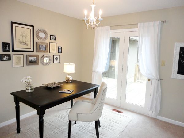
Brown
Written by Global Look Press
Oddly enough, brown didn't make it into the dull group with its fellow gray. On the contrary, scientists believe that this color can create a feeling of safety and security. So if you sell insurance, for example, or the services of a security company, then brown will help convince customers that everything will be fine with you.
Red
Written by Global Look Press
It would seem like you have to go crazy to paint your office red. No, it really did. Red can also help creatives. It enhances emotionality and expressiveness, almost like yellow promotes creative activity, and generally invigorates. The latter, by the way, can also help those whose work is associated with physical labor. True, along with cheerfulness, red also increases hostility, so perhaps do not paint the negotiation room in this color. And also know - if you decide to paint open space with red - everyone will constantly nibble something in it, red stimulates the appetite.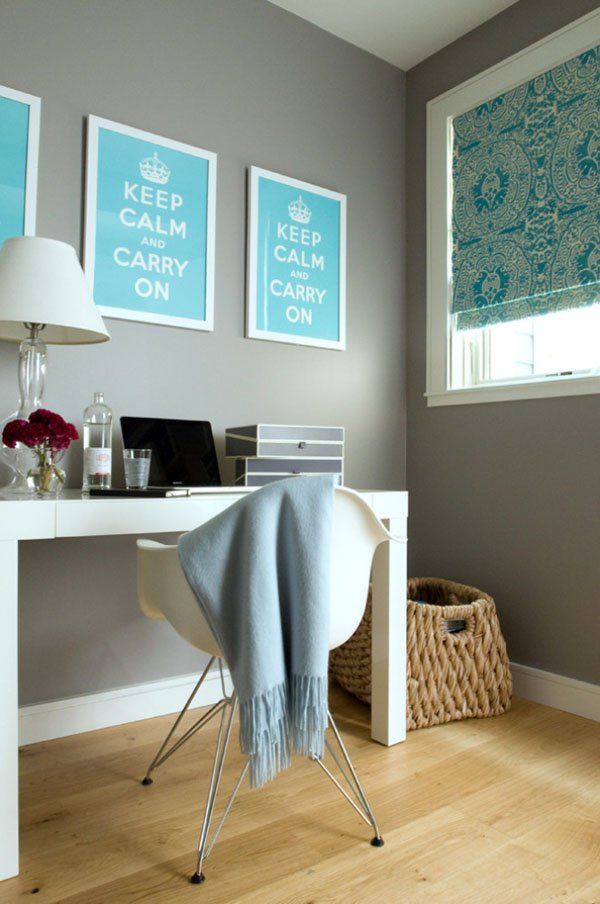 Well, you understand that everything is too ambiguous to paint the entire office. So if you are not a maniac-killer, not a member of the communist party, it is better not to paint all the walls. But you can apply red in the corner where the coffee machine was, the workers will come, watch and cheer up without any coffee.
Now you can apply our color perfection range to your office and decide how much it helps you in your work. If suddenly an assistant from him is so-so, it is urgent to repaint it.
News tape
Only business news
Show another
boss
What is the danger of friendship with the head of
The most readable
1. Drummers have found a way to deceive the Paid Parking system in the center of St. Petersburg
2. Surovikin did not exclude the adoption of difficult decisions regarding Kherson
3. "PMC Wagner Center" was left without a commissioning permit
The best colors for a workspace: how to paint an office?
Color perception affects the efficiency of our work. Colors that enhance the performance of one office may have the opposite effect in another. Suitable shades may vary from one industry to another. You also need to consider how the background colors you use in the office affect how customers feel about your brand. The scale of your office, as well as the amount of natural light it receives, will also affect which color schemes work and which don't.
Obviously, a lot is needed to get the best result. We want to make this process easier by gathering information about the impact of color on behavior in the workplace and how choosing the right shade of paint can help you achieve your goals.
- Factors to consider
- Effect of color on labor productivity
- The best paint color for your industry
Factors to consider when choosing the right paint colors for your office space
The process of choosing a color is a tricky one. The color palette is varied, and it is difficult to determine which shade will suit your surroundings. If you take into account a few recommendations for choosing the right tones, the task becomes much less difficult.
1) Think about the purpose of your space
The choice of color can be highly dependent on the company's industry: discreet tones, such as various shades of gray and white, are suitable for professional environments such as offices and banks. Shopping areas often opt for bolder, more seductive hues that evoke emotions in shoppers, such as variations of red and orange.
2) Check the level of natural light saturation in your room
Light will significantly affect the choice of paint. Rooms with little or no incoming light require lighter tones, while a brightened room can benefit from artificial dimming. It is also necessary to consider how the light will change the color perception of the paintwork.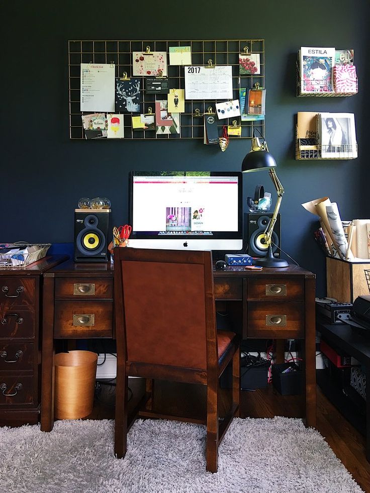
3) Be aware of the influence of color
Using the ancient Chinese philosophy of "feng shui" will allow you to determine the best color solutions. Feng Shui recognizes that the background has a psychological effect on workers and visitors. For example, blue and black backgrounds are associated with supporting inner work and helping people focus, green with growth and determination, and red supports vitality.
4) The size of your room will help determine the right color palette.
If you have a small area, brighten it up and the room will appear larger. If you have a large space that you want to make more intimate, use a dark palette.
5) What is the desired room temperature?
Colors can be hot or cold. To "warm up" the space, use orange, red and yellow paints. Do you want to cool down the room? Consider blue or light green.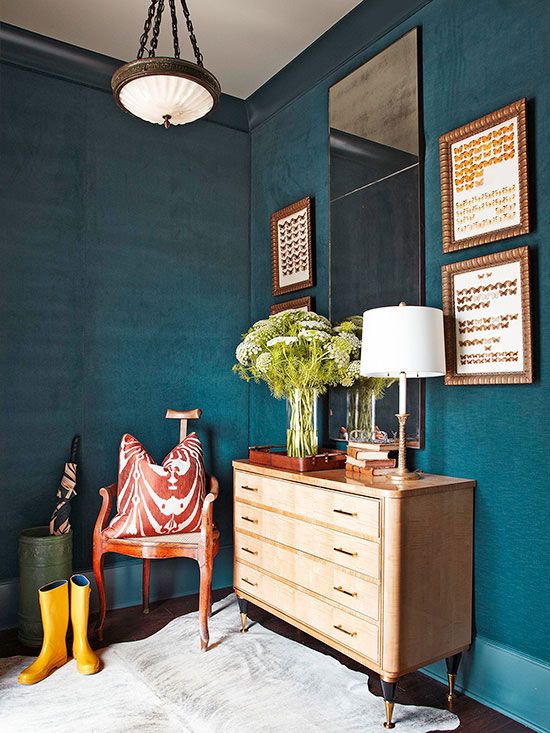
6) Consider any large items in your space
The next color selection method is to focus on the existing interior decor elements. Whether it's a piano, a fireplace, a piece of art, or just a bunch of woodwork, these are all elements that will set the tone and help bring out the right color combinations.
Return to TOP
Effect of color on mood, productivity, comfort and energy levels
If you think color is just a style preference and doesn't really matter, think again. The wrong solution will actually kill performance. Conversely, wise interior coloring can have many positive effects, such as making employees feel focused and energized, which will affect their productivity.
Colors often depend on the field of activity, and for good reason. In fact, the work that is given to people in each department of the company is different, so you will see a different interior color scheme in each of them.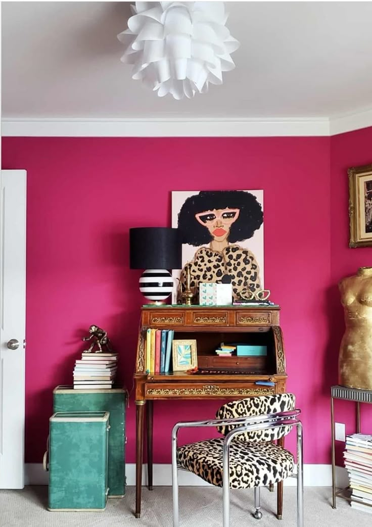 Some shades help to calm a person, so they are used in rooms where work is associated with an increased level of stress. There are also colors that influence the creativity of an employee, which should be considered in positions where it is important to be innovative.
Blue: tranquility and productivity
Blue is the color most closely associated with stimulating the mind and creating an atmosphere conducive to more productive work. It is believed that blue tones affect us on a mental level, creating physical states of calm, peace and relaxation.
If your job requires constant concentration and to be free from stress, then choosing a shade of blue would be the best option.
Green: balance, calmness and growth
Green is a color known for its ability to create calmness. It is also associated with balance and confidence. This is natural as there is a harmony in nature between green leaves, herbs, shrubs and shrubs and this is the reason why choosing green is "pleasing to the eye".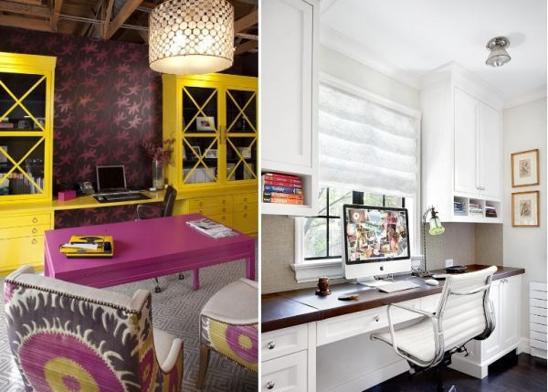
Green tones are also a sign of growth, as the financial industry has noticed. Fortunately, there are many different shades of green that can be used in a wide variety of industries.
Yellow: creativity and positive vibes
Ask an interior designer what two words they associate with yellow, and they're more likely to say "optimism and innovation." Yellow is not only uplifting and creates a feeling of happiness, but also stimulates creativity, which is why it is used as an accent color in offices where employees are tasked with thinking outside the box.
Yellow is the color of the sun and light, which can make people feel energetic. However, be careful - too much yellow can be distracting and negatively affect performance.
Orange: playfulness and creativity
Orange walls immediately make you think of citrus fruits, associated with vitamin C and health.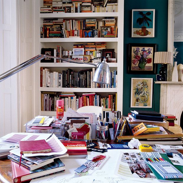 And although orange refers to the "hot" tones, it is not an aggressive color. Some claim that it stimulates the brain by increasing the flow of oxygen to the frontal lobes.
There is also an element of change in orange, perhaps because when the leaves change in autumn, many of them take on an orange hue, signifying the end of summer, the beginning of autumn and the coming cold of winter.
Red: energy, attraction and aggression.
Red is intensity. It is difficult to use it for general painting of a room, but it can become an important element in finishing. It is associated with everything from anger and energy to strength and determination. Red is known to increase blood pressure, heart rate, and metabolism.
Considering that stop signs and fire engines are red, it's no surprise that people are more motivated to react in places where red paint is released.
Purple: quality and luxury
Interestingly, purple contains a mixture of emotions associated with red and blue, so it is often used in spaces where energy and productivity are important.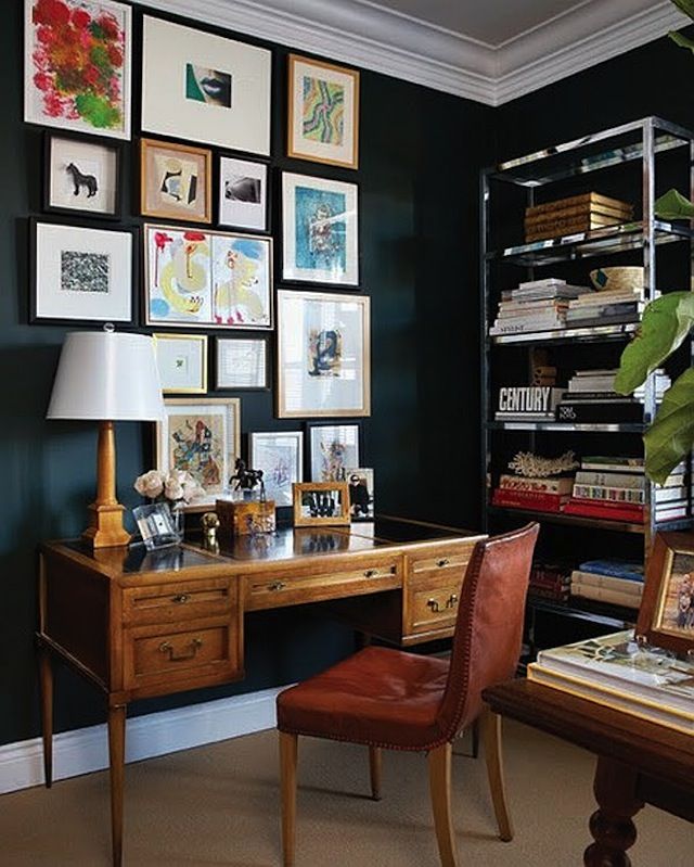 Centuries ago, the only way to dye anything purple was to extract the color from snails, making it rare and expensive.
Thus, he became the color of royalty and has retained a sense of wealth, power and wealth ever since. If you want to add sophistication to the interior, use paints of various shades of purple.
Brown: Reliability
From masculine to dependable, earthy brown offers multifaceted warmth and seriousness. In the wrong situations, brown can bring down the mood in a room, creating gloom. But when combined with the existing natural wood in the room, like paneling or richly colored piping, it can make the space feel powerful.
Law offices use brown, as do people who work in areas where it is necessary to create a feeling of safety, warmth and security.
Black: sophistication and efficiency
Lack of light - black, but this does not mean that this "color" has no place in commercial and residential real estate. Black is known for its ability to evoke deep emotions, but it must be used wisely, recognizing that it is not suitable for all occasions. However, almost every color goes well with it, making it a great accent piece.
When using black paints, it is recommended to dilute them with white or very light colors: if your walls are black, the furniture should be white.
White: Purity and Efficiency
Saturation with white can make a room modern, clean and innocent, sophisticated yet efficient. Off-white colors such as eggshells give the interior a soft feel. White color will visually enlarge a small room, making it more habitable. White is an extremely popular choice for healthcare facilities, both people and pets, laboratories and charities. It's also a safe choice if you want to keep a neutral color scheme.
Back to TOC
What is the best office paint color for your business?
Every industry has its own standards and needs.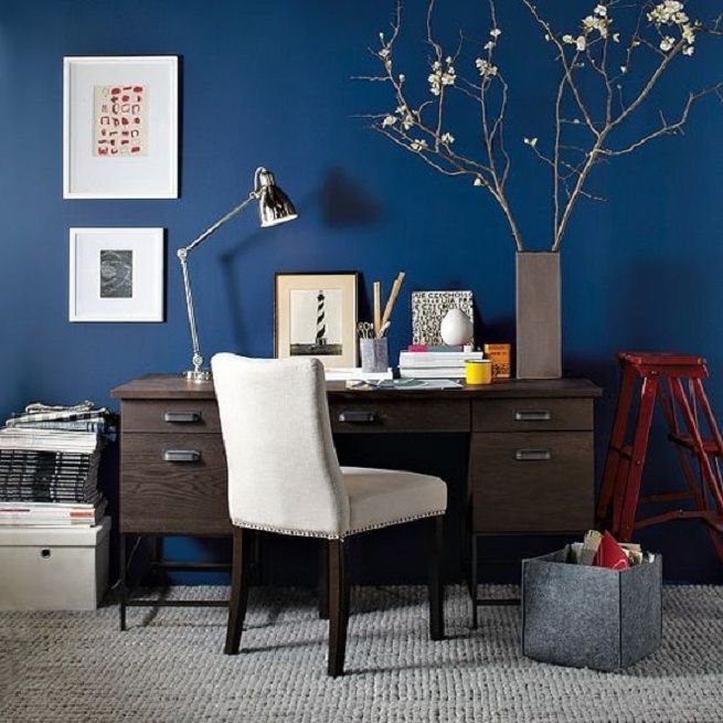 While industry-specific standards can be broken in some cases, choosing paint colors is much easier when you look at your industry and the paint colors chosen by your peers.
Choosing the right color is important for both employees and customers. Next, we'll take a closer look at which paint colors belong to which industry, and you'll get a much better idea of how to approach the painting phase.
Back to Table of Contents
Best Paint Colors for Financial Services Offices
Accuracy, accountability and responsibility are terms often associated with the financial services industry. Whether it's a bank, an accounting firm, or financial advisors, these are professionals who need to instill a sense of trust in their clients. But employees also need to be motivated to focus on deadlines, analyze numbers and trajectories, which means they need offices with paint that won't distract them.
What paints should finance professionals consider?
Blue. Blue is a popular color preferred by clients in the offices of their financial professionals to create a sense of security and safety. This color makes employees feel calm, which is necessary when they are forced to work at an accelerated pace.
Green. While financial professionals rely on more than just luck to serve their clients, green is associated with good luck, also the color of money, making it an effective option. Green evokes a sense of harmony, which is another positive feeling that financial experts want their clients and employees to experience.
Black. Few colors can be as serious as black. When it comes to clients' hard-earned money, they want to be sure that their financial experts are as serious as possible. Black is also associated with strength, so using this color, which pairs well with just about any other color, is a smart option.
Back to index
The best paints for the healthcare industry
When entering a healthcare facility, people want it to be clean and feel comfortable.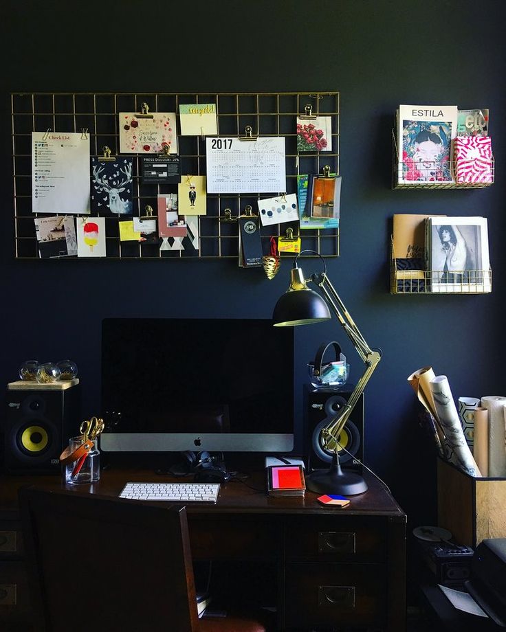 Medical procedures are often accompanied by light injections and injections, which can be stressful, so a choice that relieves some of that stress can do wonders for the patient.
Medical institutes are painted in light colors. They avoid bright red or orange colors. Rather, the palette is usually a combination of soft colors.
How should healthcare professionals consider paint colors?
Light pink. Warm yet caring and feminine, light pink is often the color of choice in women's clinics. It is widely used in medical institutions. Pink has been found to calm emotional energy and it can ease feelings of anger.
Blue. The human body actually releases soothing chemicals when blue comes into contact with the eyes. It is an "airy" color reminiscent of the sky and serves as the perfect backdrop for the greenery found in any establishment.
Green. Known as chromotherapy, it is used to heal people due to its balanced healing properties.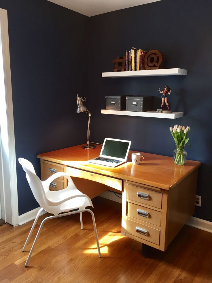 Green also promotes balance and comfort, which helps patients recover faster after surgery.
Back to TOP
Best Paint Colors for High Tech Offices
The tech industry is another calling that requires many hours at the desk. The most productive employees here are focused on the smallest details: writing code, fixing technical problems, and more. It is also necessary to ensure peace of mind throughout the enterprise, since long hours and ahead of schedule can put employees under pressure.
The best colors for technologists
Green. Using rich green paint on accent walls will help employees stay creative and innovative in getting things done. Green is pleasing to the eye and helps relieve stress for workers who need to stay focused hour after hour.
Blue. A cool and relaxing color, blue is ideal for the hi-tech industry for its calming effect when it's needed most.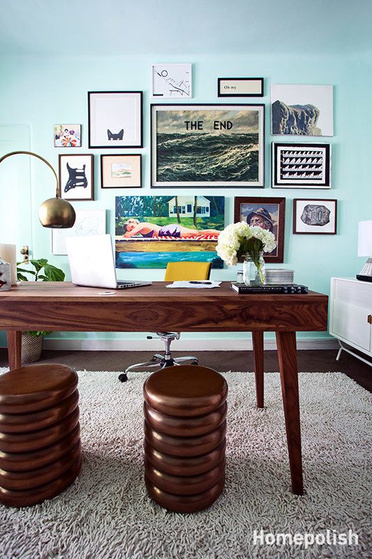 Blue is especially useful in areas where intellectual prowess is required.
Vivid colors. Red, yellow and orange colors can add the energy that tech workers need to stay at work. But instead of an entire wall, these colors are best used as accents or in artwork in specific areas of an object.
Back to index
The best office paint colors in the construction industry
Construction is an industry that requires energy and focus. While the job site is where most of the energy is spent, offices are places where a lot of planning is required, so it is recommended that the palette include colors that facilitate the ability to stay on target, concentrate and be accurate.
The office is also a place where contractors meet with clients, so there must be a certain degree of professionalism and trust in the interior design of an office.
How should builders consider paint colors?
Brown.