Spanish cottage style
A modernized Spanish-style bungalow in Santa Monica
Crisp white walls and an earthy, neutral approach to décor and styling runs throughout this Ocean Park bungalow in Santa Monica.
It's a cozy, curated space that was once cluttered, chaotic and not quite right for its new owners.
'The goal of this project was to modernize a classic Spanish bungalow in Santa Monica while maintaining the integrity of the home,' explains interior designer, Genna Margolis at Shapeside.
'The house had no common thread that pulled the space together, she says. 'There were so many different styles – it was all rather confusing, so we scrapped the lot and started entirely from scratch.'
Genna knew she had her work on her hands with this renovation. She wanted to get it just right for her client. After all, he was trusting her to give him his dream home.
Created by Genna, Shapeside is an award winning full-service interior design firm based in Los Angeles. Before creating Shapeside, Genna worked with some of New York and LA's most well-respected designers.
We speak to Genna Margolis about the design project. You can see more of the world's best homes on our dedicated page.
Living room
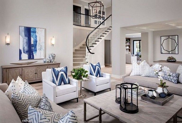
Dark and dreary before, Genna knew that an open and bright living space was priority number one for her clients. She went for a brilliant white palette to help open up the room. A cozy color scheme featuring tonal blues, wood and copper work wonderfully to enhance the leafy Santa Monica surroundings.
(Image credit: Amy Bartlam)
(Image credit: Amy Bartlam)
Kitchen
Traditional or contemporary, a white kitchen is a timeless option you can't go wrong with. A white color scheme can make a small space appear bigger and equally won’t clash with the décor in a large, open-plan space.
(Image credit: Amy Bartlam)
Dining room
The designer didn't let a compact room become a barrier to creating a dream dining/ breakfast space.
If there’s one thing that’s going to create the illusion of more space, it’s decluttering – it can actually make a room feel wider in seconds, and that is just what Genna did when designing this bright, white scheme.
(Image credit: Amy Bartlam)
Hall
When decorating our homes, it’s all too easy to forget the hallway; after all, it’s not as if we spend much time in there. But there are so many reasons for making the effort. A beautiful houseplant take center stage and draws the eye upwards.
(Image credit: Amy Bartlam)
(Image credit: Amy Bartlam)
Media room
'Moving into the the media room, we really weren’t sure what to do with it at first, it was so dark and got very little light,' says Genna. 'This gave us to the idea to lean into the darkness and decorate with a navy color palette – perfect for a cozy movie night in.'
(Image credit: Amy Bartlam)
Home office
(Image credit: Amy Bartlam)
Main bedroom
An essential part of any bedroom project, a well-considered lighting scheme will set the mood. Lighting is no longer just functional; it has become a home accessory and sometimes even a design object.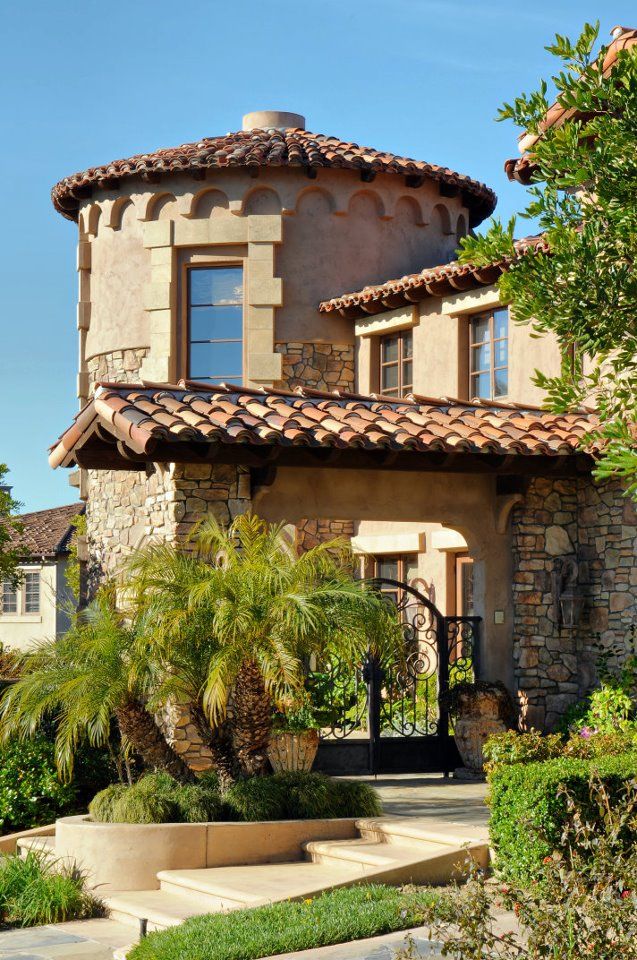 Here, a pair of concrete pendants work well to center the space.
(Image credit: Amy Bartlam)
(Image credit: Amy Bartlam)
Outdoor shower
The outdoor shower takes its inspiration from the color and vibrancy of Mexico. ''My client went to Mexico and he wanted to recreate the look and feel of one in his home.' Here, Genna used a selection of Spanish-style tiles in rich colors to create a jewel-like, textured look.
(Image credit: Amy Bartlam)
Exterior
(Image credit: Amy Bartlam)
Photography / Amy Bartlam
Interior design / Genna Margolis at Shapeside
Styling / Meeshaluna
House Tour: A Spanish Bungalow Makeover in Los Angeles
When you come across a neglected home, do you see an eyesore on the street or a diamond in the rough? For designer Julia Chasman, old homes speak to her and inspire her to revive them with retro elegance and vintage charm. When she stumbled across a rundown Spanish bungalow in Eagle Rock, California, she knew that she wanted to restore the home to its former glory and pass it along to new homeowners.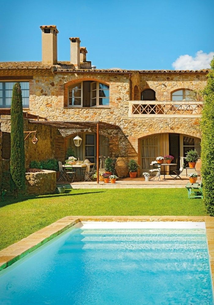 “When I saw this place it was very sad looking, but I saw the potential in what it could be,” Julia says. She bought the home and poured her heart and soul into restoring the entirety of the property, leaving nothing untouched.
Operation Restoration
With all the care and attention to detail Julia puts into her restorations, simply calling her a house flipper wouldn’t do her work justice. Once the restoration was completed, Julia staged the house using items from her personal collection of vintage furniture and accessories. “My style and taste in decor is drawn from multiple influences.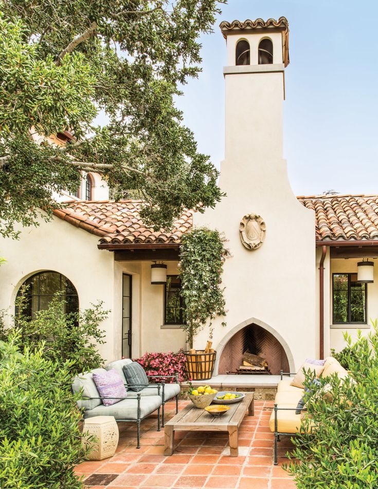 Like most designers, I like to mix high-low if I can. This is reflected in the quality of the furnishings and in the artwork,” Julia says.
With all the care and attention to detail Julia puts into her restorations, simply calling her a house flipper wouldn’t do her work justice
This living area is light and welcoming and inspires anyone who walks through the door. Julia fills the space with her own collection of furniture including an English sunset-glass light fixture, a Picasso ceramic vase on the coffee table and vintage upholstered chairs.
Her design style mixes vintage and antique finds with modern floor plans and bright colors. “I take great pleasure in the mix—and the hunt—to find things for free,” she adds. “I found the brightly colored chair in the guest bedroom in the street and painted it myself with four coats of Farrow & Ball’s Blazer in high gloss. Then I recovered the seat with the same honeycomb-pattern fabric that’s on the upholstered chair in the living room.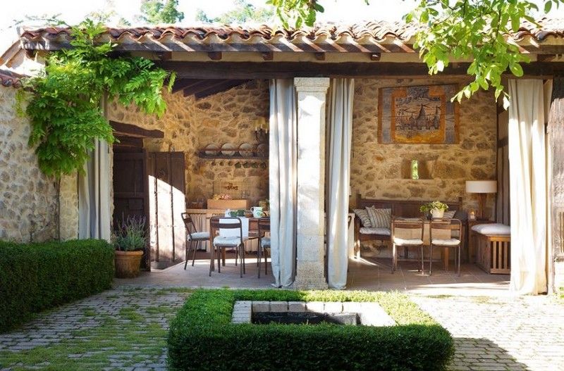 ”
”
High-Low
The high-low approach is also, of course, budget friendly. “Lighting is a great place to mix. The living room has a very good piece of English sunset glass on the ceiling fixture and handmade wrought-iron sconces with antique mica shades above the fireplace, but I used Home Depot Schoolhouse globes in the hallway, and a mix in the kitchen of inexpensive factory-style pendants over the island and a good Schoolhouse Electric reproduction pendant over the sink. The country chandelier in the dining room is from World Market.”
The inclusion of this 1952 O’Keefe and Merritt stove brings a vintage charm to the kitchen. The stove was restored and reglazed to make it look brand new. The white subway tile and polished chrome accents pair well with the greens used throughout the kitchen.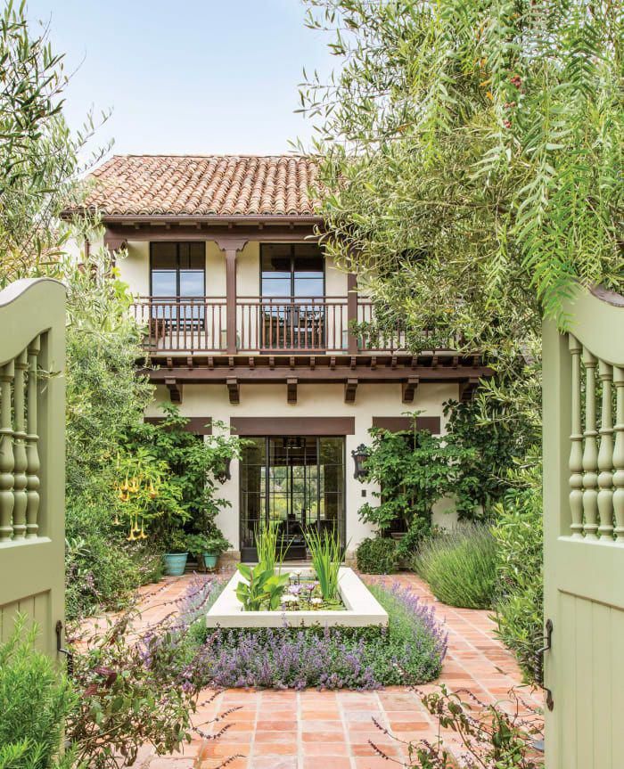
Spanish Bungalow Vision
“I enjoy sharing my vision with others, and I want to show off the home as I see fit,” Julia says. “It’s bittersweet to sell a home that I’ve poured so much into, but being so emotionally involved makes the experience more rewarding.”
Pre-makeover Spanish bungalow kitchen.Julia had the pipes rearranged and windows moved to better suit the space. The rich sage green and deep reds bring warmth to this newly remodeled room. Julia incorporated the same tile used in the living room into the kitchen backsplash. The original windows were refinished, and a vintage stained glass panel was inserted where there was once a cabinet. This adds a unique focal point above the sink and looks like it was meant to be in the home all along.Julia takes special care of the homes she decides to restore, and she understands the challenges of taking on older properties. “First and foremost, a home needs to be functional as well as livable,” Julia says.
Pre-renovation Spanish Bungalow butler’s pantry.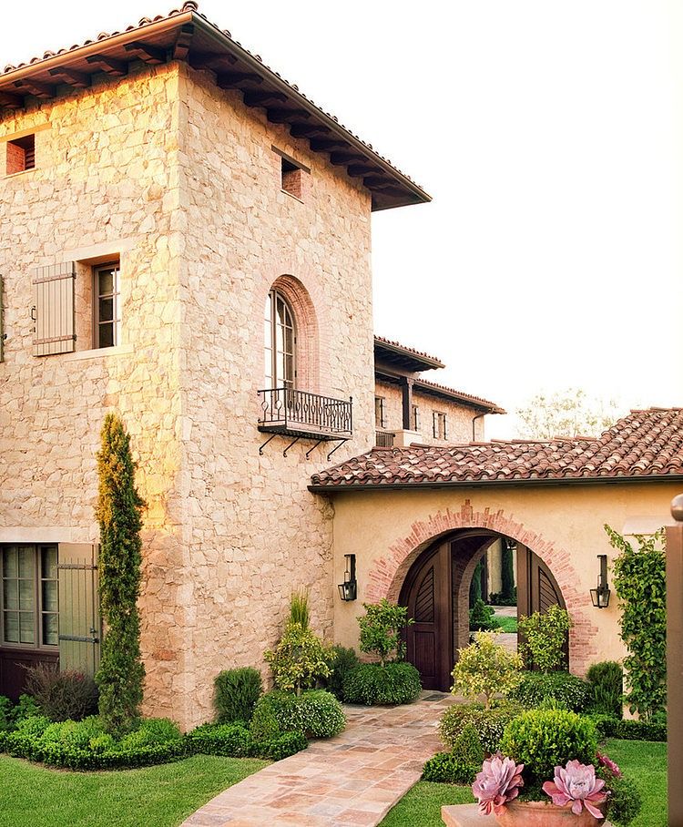 The butler’s pantry after. The sage green used for the custom cabinetry brings a cheerful feeling to the space. Adding more storage in the kitchen expanded the kitchen significantly, and makes the room bright and spacious.
Sacrifice for Modernity
She took this idea to heart by tearing down a few walls original to the Spanish bungalow. But what she sacrificed in period correctness, she gained in livability by creating a more open and modern flow. By replacing the electrical system and rearranging pipes. She made some great additions including a 1920s-inspired second bathroom that wasn’t there before. And then added a patio outside the master suite. “You can have vintage charm and style with modern conveniences,” Julia states.
Bay window before the renovation.This window seat makes a grand impression and acts as an independent space. Julia custom designed the cushion, which can be enjoyed by humans and pets alike. The staging of this reading nook is cozy and brings a touch of rustic charm to the space.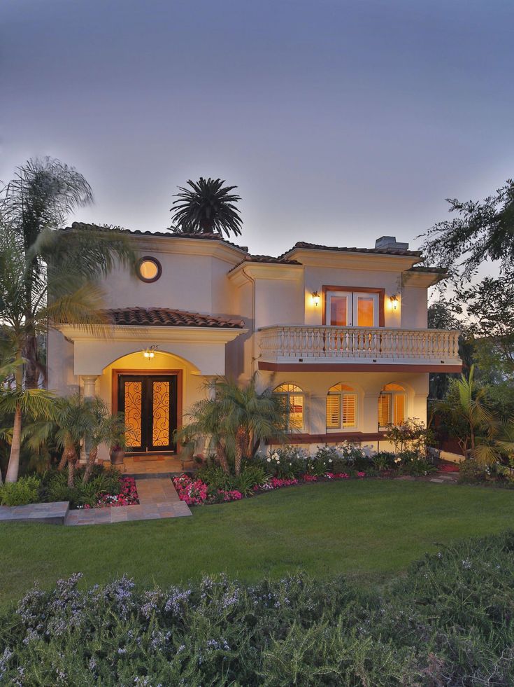
Her additions reflect the age of the Spanish bungalow, and every decision is made with the house in mind. “I usually just go with my gut on projects like these,” she says. “I try not to worry too much or second guess myself.”
An antique tile-topped book rack combined with Bentwood wall-mounted coat hooks imbue the entryway with period charm.Thoughtful Restoration
For Julia, restoring homes is a labor of love and is much more than searching for a return investment. “Not everyone wants a vintage-style home, and that’s okay,” Julia says. Her inclusion of classic elements stays true to the home’s history. As she moves on to new projects, she feels how rewarding the process can be.
The vintage bed featured in the master bedroom is one of Julia’s personal treasures. The dark wood and hand-painted poppies were matched with vintage oil paintings that bring warmth and richness to the room. Julia added the french doors to give the room more light and she also added an outdoor patio attached to the master suite.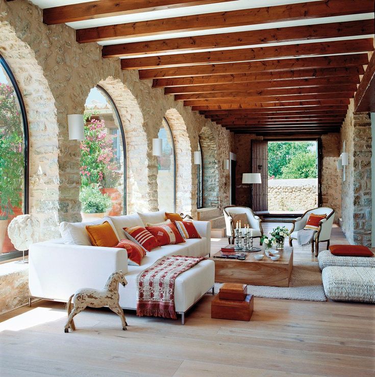 Still lifes featuring fruit and flowers contribute to the decorative aspect of the space. Julia loves the richness old oil paintings bring to a room. This painting ties in perfectly with the hand-painted bed below and has the same color scheme used throughout the home.
“I believe my houses attract the buyers they are meant to. There are enough people out there who appreciate what I do and respond to the home the way I do, with love and admiration.”
In order to maximize storage in the hallway, Julia added a large linen cabinet styled to fit the home. Vintage wallpaper found on eBay instantly brings retro flair to the space. This is just one of the many small touches Julia added to the home for it to stay true to its vintage charm.It’s All in the Details
This dresser has charm in all the right places.The focus on small details throughout the home is remarkable. Julia’s personal touch is seen in every room she designs. The mixture of subway and hexagonal tiles is a point of interest and brings a vintage appeal to the modern fixtures in the shower.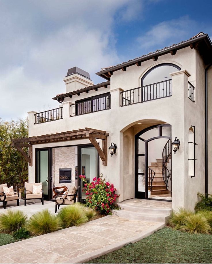 The master bathroom stays true to the original layout and maintains the original cabinetry, windows and bathtub. An updated reproduction sink was added, as well as brand new tiling. The color scheme pays homage to vintage bathrooms in Southern California that featured bright-colored tile mixed with black-and-white accessories and silver fixtures.The French doors that lead out from the master bedroom and patio are additions Julia made; she felt they increased the overall space of the room. A connection between the indoors and nature is essential for true California living.
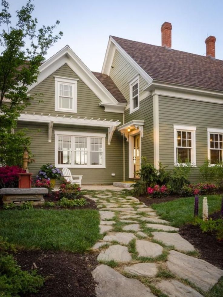
Julia gave this Spanish bungalow some much needed curb appeal. Adding decomposed granite, a fresh paint job with bright accent colors and a Spanish-style fountain she designed herself. The fountain is now a focal point that is enjoyable from inside or outside the home.
Here is the exterior before shot, it’s hard to believe this is the same home!Julia gave this Spanish bungalow some much needed curb appeal, with decomposed granite, a fresh paint job with bright accent colors.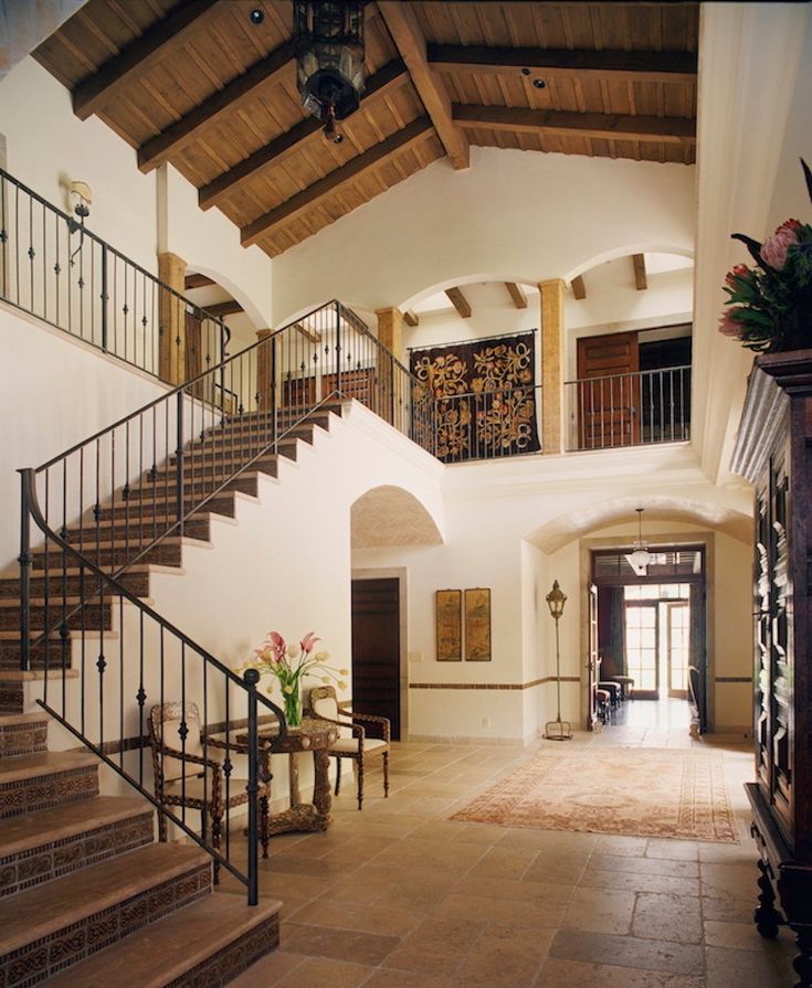 The fountain is a focal point that is enjoyable from inside or outside the home.
Want more simply beautiful ideas? Check out this post on A Small Kitchen with Big L.A. Flair.
Of course, don’t forget to follow us on Instagram, Facebook and Pinterest to get your daily dose of cottage inspiration!
Total
3K
Shares
Related Topics
- bungalow
- eagle rock
- house tour
- julia chasman
- Los Angeles
- makeover
- renovation
100 photos and design rules
Original and bright, at the same time elegant and - homely cozy, generally European, but absorbing Arabic and Latin American features - all this is the Spanish style in the interior.
This direction has its own features and characteristics, knowing which you can properly organize the living space and preserve the national flavor of the Mediterranean.
Contents
- Characteristics and style features
- welcome arched elements in doorways, windows, vaulted ceilings;
- mainly natural materials are used in decoration: stone, wood, ceramic tiles, earthenware;
- variety of finishes with different textures: rough walls, smooth tiles, pleasant warmth of natural wood, stained glass windows;
- a common element of the decor is a fireplace made of roughly processed stone, complemented by forged details;
- art forging is also present in furniture and decor;
- the color scheme is dominated by a neutral shade, which is diluted with bright colors: yellow, orange, terracotta, olive, bright - blue, white;
- decorative elements are presented in the form of earthenware, ceramic vases, paintings, tapestries, rugs and capes made of homespun cloth, soft pillows, mirrors framed in forged frames, large round flowerpots with live plants.
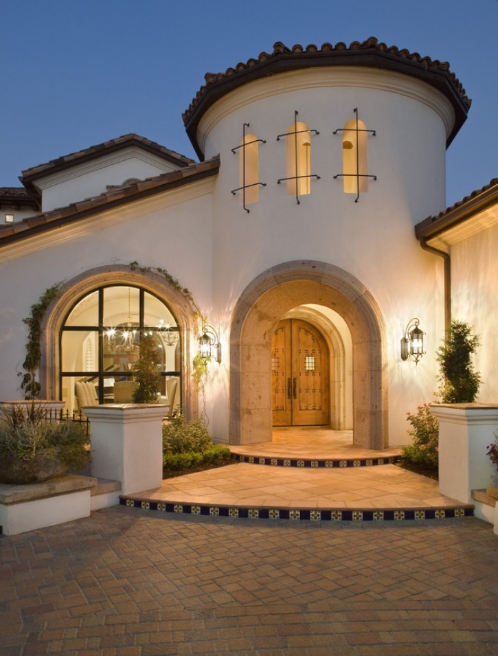
- The classic solution repeats the style that was typical until the end of the 19th century. In this case, the interior looks luxurious, includes an abundance of decorative elements, dark shades are used in the design.
- The modern variety has undergone some changes, taking into account the current realities. So, we had to abandon the arched openings in favor of the usual rectangular ones with door leafs, the color scheme became brighter and lighter. Household appliances for various purposes have taken their place in the interior.
- sand;
- terracotta;
- brick;
- orange;
- yellow;
- olive;
- red.
- natural wood;
- stone;
- sandstone;
- marble;
- ceramic tiles;
- clay;
- plaster.
- larch wood;
- tiles;
- stone;
- brick.
- open terraces with arched elements;
- rich vegetation.
- spacious cabinets;
- pedestals of various sizes;
- dressers;
- open shelving;
- buffets.
- flower vases;
- figurines, of porcelain or wood;
- painted pottery;
- mirrors in original frames;
- paintings;
- forged compositions;
- houseplants in pretty pots;
- colorful pillows, plaids, wraps with ethnic patterns, lace napkins and tablecloths;
- light curtains for windows, made of cotton;
- mats.
- a comfortable sofa and easy chairs;
- dining group: an impressive table and a set of chairs;
- coffee table;
- fireplace.
- beautiful spice jars;
- painted plates;
- ceramic containers with cereals, flour, sugar and other bulk products;
- earthenware jars;
- unusually shaped dark glass bottles filled with olive oil;
- kitchen utensils (pans, saucepans, saucepans, scoops), polished to a shine;
- wicker baskets for bread, pastries and fresh fruit;
- large baskets of vegetables on the floor;
- flower pots with stunted plants.
- bedside tables;
- chest of drawers;
- chair;
- bench with upholstered seat;
- dressing table with marble top;
- simple framed mirror;
- chair or ottoman.
This direction is presented in two versions.
When using the Spanish style in the design of one-room apartments and small houses, it is recommended to use it in all rooms.
If you have spacious housing at your disposal (a country house or a large apartment), then a mixture of congenial directions is allowed. The main thing is that as a result of the experiment it was possible to achieve their harmonious combination.
Color range
When choosing shades, pay attention to colors that are typical of the Mediterranean environment. These include:
Blue, cyan and purple can be found in a modern interpretation of the Spanish style.
The background is traditionally calm tones: white, milky, light – beige.
It is important not to overload the composition with bright accents in order to avoid the annoying effect of mixing colors.
The bedroom should look more restrained, but contrasting combinations are allowed in the kitchen and living room.
With extreme care use bright red - . Usually it serves only to highlight individual parts of a small size.
Materials and finishes
Only natural materials are used to create classic Spanish interiors.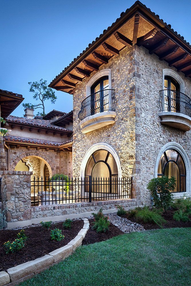 We use:
Plastered walls in white or light-colored paint are the calling card of this trend. The ceiling is decorated in a similar way. Often it is supplemented with wooden beams.
Gypsum boards make it easy to create partitions, niches or other architectural elements. They are suitable for applying plaster and subsequent painting.
For the floor, depending on the purpose of the room, the following is used:
The last option would be appropriate in the kitchen, which has access to the backyard with paths made in this way. This technique will help to combine open space and the interior of the house.
In the modern version, parquet boards or laminate can be used instead of wooden floorboards.
Tiled and stone floors are designed for hot climates, so in winter in colder regions they should be complemented with traditional or homespun carpets.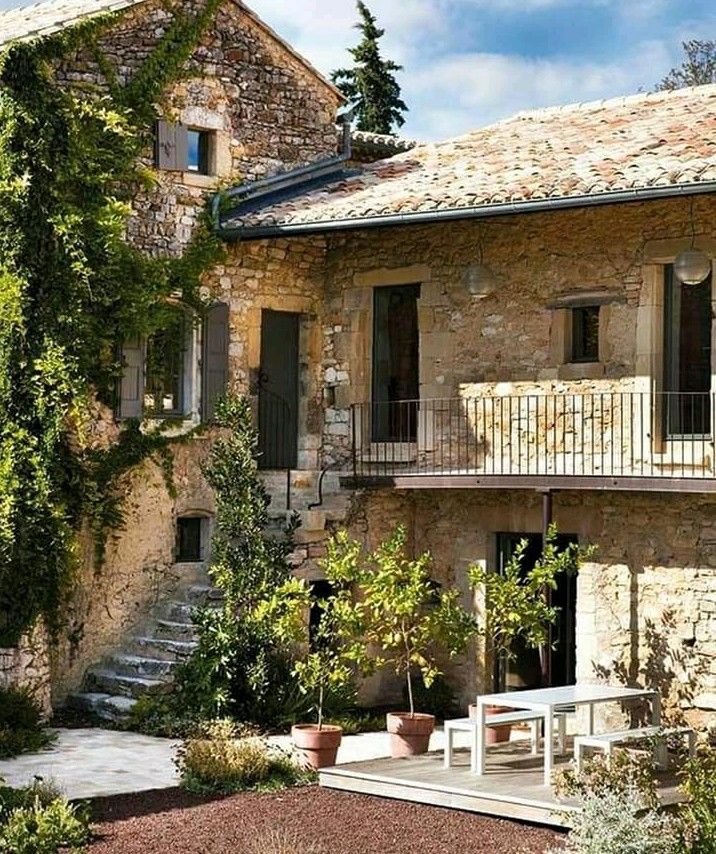 The second method that provides comfortable conditions is the installation of a "warm floor" system, where possible.
For a country house, the interior of which is made in the Spanish style, you should consider the design of the landscape. In this case, the following look advantageous:
Furniture and decorations
Spanish style furniture looks massive and heavy but is quite comfortable. For its manufacture, natural wood is used.
Forged elements and carvings are used as decor. The surface of furniture items is tinted in dark colors, sometimes subjected to artificial aging. The functions of the upholstery are performed by genuine leather and textiles (cotton, linen).
Wicker rattan furniture is allowed. It is appropriate in both the classic and modern version of the Spanish style.
Upholstered furniture
Upholstered furniture includes sofas, armchairs, couches, benches. They have a rich appearance, comfortable and functional. These are reliable and massive furnishings that combine luxury and simplicity of form.
Wooden details decorated with traditional carvings. The upholstery is made of leather, durable fabrics. In addition, upholstered furniture is often complemented by special covers made of dense textiles in dark shades.
Traditional Spanish-style sofas and armchairs are equipped with hard handles, but always have a soft seat.
Cabinet furniture
Cabinet furniture includes the following items:
Made from wood. The facades are decorated with carvings, elements of artistic forging, metal fittings (handles, hinges), inserts of transparent, frosted or textured glass.
Decor
To create a complete interior in the Spanish style, various decorative items are used.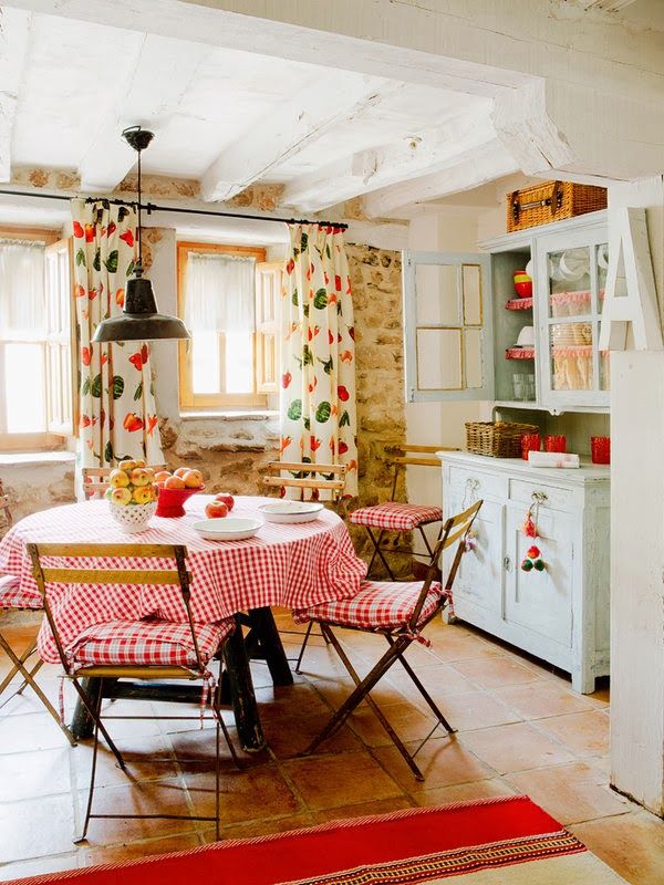 It is important to observe the measure, as an excess of details can destroy the chosen concept.
Appropriate:
Lighting
In the daytime, the need for lighting is fully met by large windows. There are usually several window openings on one wall.
At nightfall, the central chandelier is turned on. It is complemented by lamps located on the periphery (table lamps, floor lamps).
All items are made in the same style, contain elements of artistic forging, give light with a warm spectrum. Lampshades are made of glass or ceramics. Lighting fixtures stylized as candelabra and candlesticks with appropriate light bulbs will be appropriate.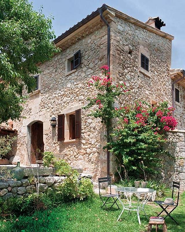
Often there is such a technique as the illumination of shelves in cabinets, niches. If the area of \u200b\u200bthe room allows, then a fireplace can serve as a source of additional light.
Proper placement of mirrors can improve the efficiency of lighting fixtures.
Spanish style in different rooms
Spanish style in the design of rooms for various purposes has its own nuances. However, the overall concept is always preserved, so the interior is warm, life-affirming and cozy.
Living room
In Spain, like in Russia, the living room serves as a gathering place for all household members, a space for receiving guests. Therefore, this bright room is the largest area in a house or apartment. Her furnishings include the following pieces of furniture:
Cabinet furniture is installed along the free walls: a sideboard, a rack, etc.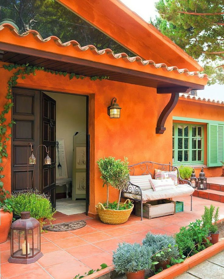 The facades of furniture products are decorated with carved patterns, lion heads, exquisite metal fittings, chair and table legs have a smooth bend.
Part of the floor is usually carpeted.
Decorative elements complete the overall look. These can be ceramic vases installed on the floor, paintings, a forged fireplace grate, live plants in flowerpots, mirrors, and various lamps.
Textile items have a common color scheme, and the ornament on curtains, carpet, cushions and capes for upholstered furniture is made up of the same type of elements.
Kitchen
This room is not only used for cooking. The kitchen also serves as a dining room. However, the dining area is always separated from the work area.
The wall in the cooking area is usually lined with mosaic or painted tiles.
Chandeliers of the same type are suspended above each functional area.
In the dining area there is a table, a sofa, several hard chairs with high backs and soft pillows.
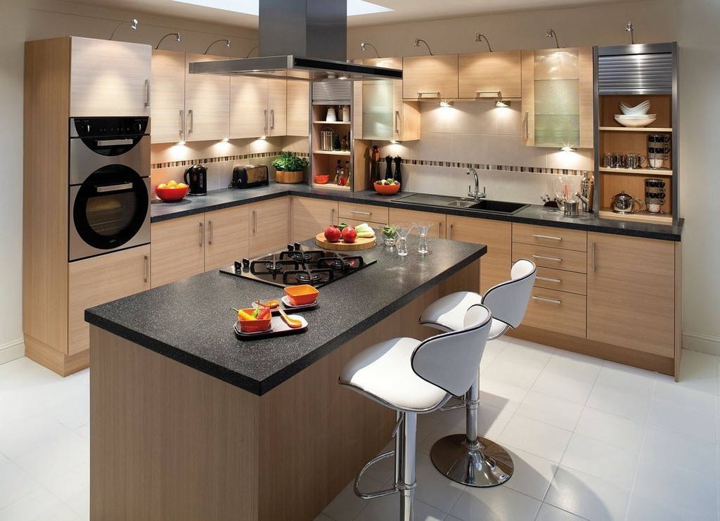
Set top made of natural stone or hardwood. If the area allows, then the cooking space is complemented by a wide island-type table.
Household appliances are usually hidden in cupboards.
The most common items can serve as decor in the kitchen:
Bedroom
A large bed with a massive headboard is considered to be the main element of this room's furnishings. The material for the manufacture of the sleeping bed is wood, complemented by forged details. If desired, the bed is equipped with a canopy made of light translucent fabric.
Also in the interior are:
Bed linen, curtains, carpet are made in soothing colors, which contributes to better relaxation. Decorative pillows in bright colors dilute the restrained atmosphere a little.
The walls are often decorated with nautical paintings, embroidered with tapestries. Carved figurines, knitted napkins, ceramic floor vases will look appropriate.
In addition to the upper chandelier, the bedroom uses a floor lamp, table lamps, lamps stylized as candlesticks.
Spanish style is able to fill an ordinary home with warmth and comfort, give a feeling of eternal summer, please with a riot of colors. Natural materials, natural textiles, reliable and durable furniture, cute accessories will help to recreate the atmosphere of the Mediterranean.
