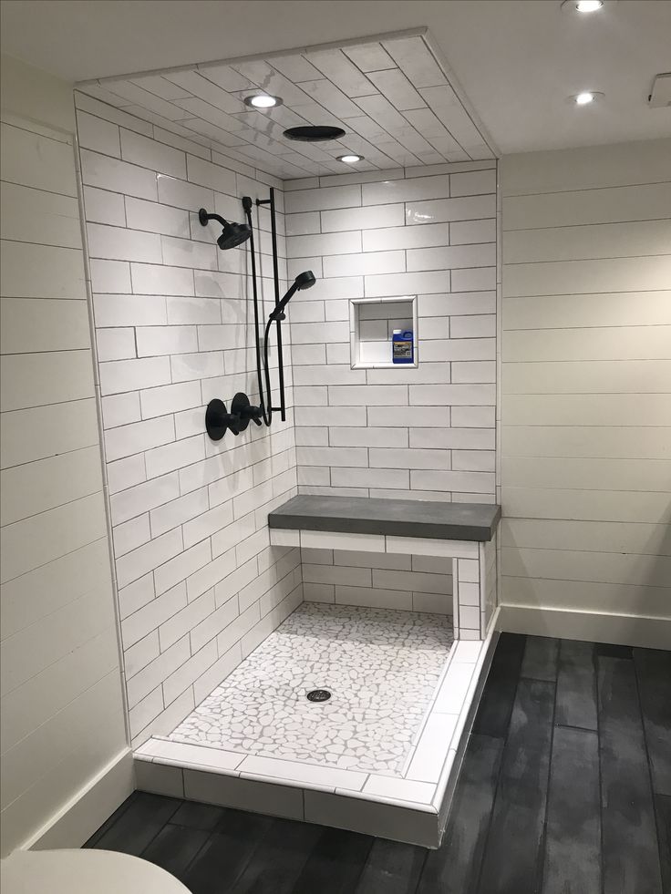
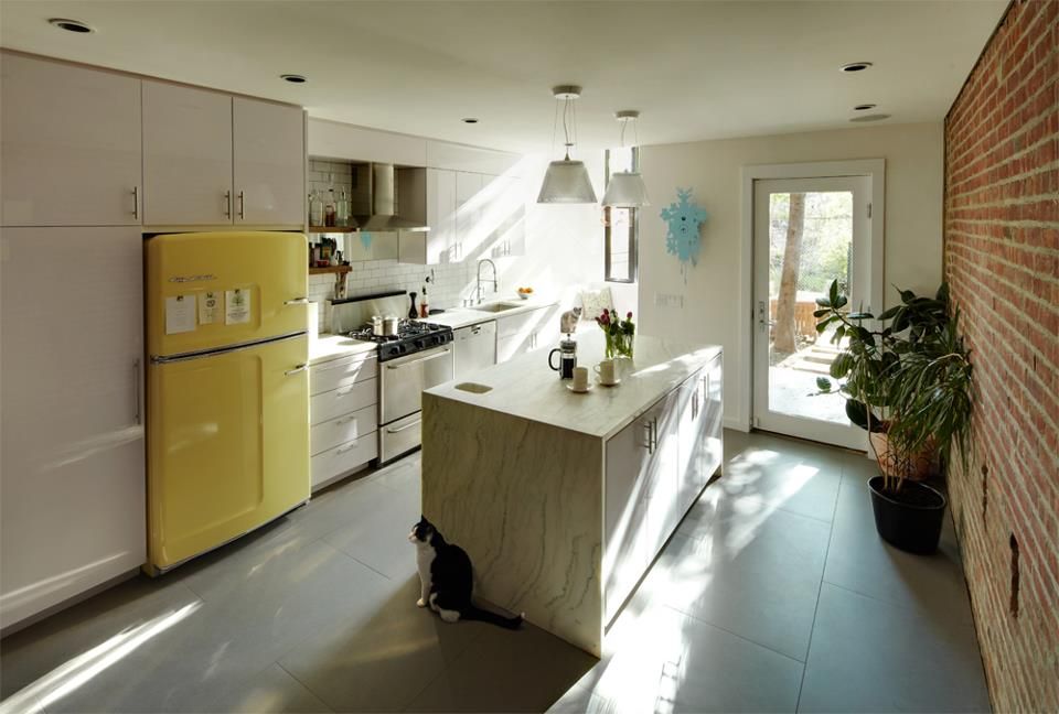
Some interior design ideas
50 Chic Home Decorating Ideas
1
Set Up a Cozy Reading Spot
Heidi Caillier Design
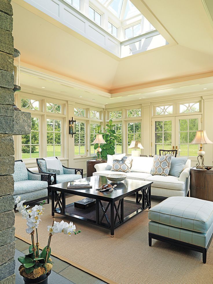
No designated reading nook? No problem. If your home doesn't have any leftover real estate to convert into a reading nook, design your formal living room to serve double duty as a cozy lounge area. Here, Heidi Caillier strategically chose furniture with fabrics and shapes that are both sophisticated and homey, perfect for entertaining or unwinding alone.
2
Don't Be Afraid of Black Paint
Farrow & Ball
The soft black paint color in this bedroom makes it feel special and intimate in ways you'd never be able to achieve with a lighter hue (this specific shade is Farrow & Ball Railings). The eclectic furniture lends itself nicely to the darkness, too, adding a more lived in and homey vibe.
3
Style an Empty Fireplace
Reid Rolls
Rethink how you style an empty fireplace. In this texture-rich environment, interior designer Leanne Ford turned an empty fireplace into a little gallery to display pottery and artwork.
4
Treat Your Windows
Victoria Pearson
Adding the right window treatment can make all the difference. We're especially into Roman shades with a fun pattern. "It goes against decorating 101, but using small patterns together can be easier on the eye," says interior decorator Kristin Panitch, who designed this dreamy pink cloud of a bedroom.
5
Re-Style a Bookshelf
Fiona Lynch
From the inky stained wood to the modern side chair and clean-lined ladder, this home library designed by Fiona Lynch is a gorgeous contemporary take on traditional design.
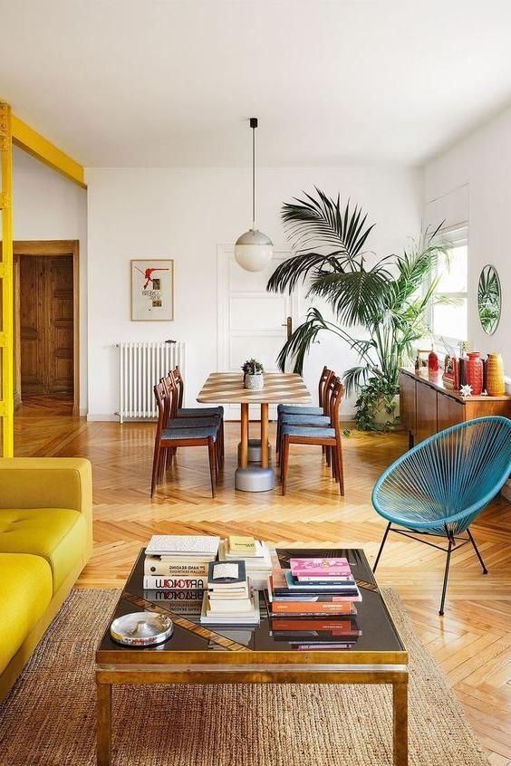
6
Set up a Breakfast Nook
John Gruen
Breakfast with a view? We're in. This one is country-chic and just a touch rustic but still polished. It also proves you don't need to have an actual built-in nook to achieve the right vibe.
7
Spruce up Your Entryway
Paul Raeside
If you don't have a grand foyer—or you do but it needs some love–introduce a small console table. For a formal yet modern aesthetic, opt for a traditional table and then hang modern abstract art above it. Then lean some portraits against the wall for a laid back take on the gallery wall.
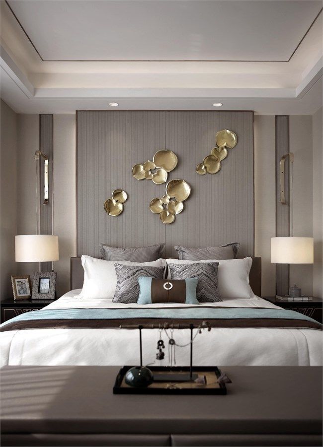
8
Just Add Sheepskin
Leanne Ford Interiors
If any area in your home is feeling austere, sheepskin throws are the easiest solution. They bring in warmth, texture, and comfort while also being super affordable and easy to move throughout your space as your needs and moods shift.
9
Swap Out Your Throw Pillows
Studio Ashby
Throw pillows are the easiest way to freshen up in the bedroom or living room. Introducing a new color, print, or shape with a throw pillow can make the whole space feel new again.
10
Bring a Stool Into the Bathroom
Annie Schlechter
Slide a stool next to the bathtub. Not only will the extra surface space help with organization, but it's also a great way to make the whole space feel more luxe.
11
Show Your Powder Room Some Love
Peter Murdock
It's easy to overlook a room when it's super tiny, especially because there simply isn't enough useable space for décor. But it's definitely possible—and well worth it—to show these nooks some love. Take this powder room, for example. With a light blush pink wall color and a surrounding gallery of eclectic artwork, the small room packs a lot of punch.
12
Install a Canopy
Fantastic Frank
If you want to transform your bedroom into a palace fit for royalty, add a canopy. This white gauze fabric hangs so beautifully and brings an ethereal look to the minimalist bedroom.
13
Swap Accents Seasonally
Nicole Franzen
Plaid? For winter? Not even close to groundbreaking, but we're still here for it.

14
Get Inspired By Nature
Leanne Ford Interiors
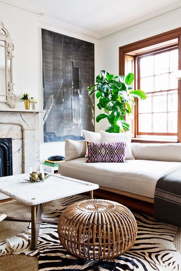
This space is rich with texture, which creates warmth and dimension. There's also plenty of character even though it's sticking to a strict color palette. For a similarly inviting and grounded environment, get inspired by nature. Think seagrass, rattan, jute, wood, brushed concrete, and marble.
15
Reupholster Your Furinture
Nicole Franzen
Reupholstering your furniture will automatically freshen up an entire space. And if you love eclectic decorating, take notes from this impeccable living room. All the juxtaposition in this room is working so well—the angular mirror, vivid orange art, marble fireplace, rustic stool, and geometric pottery are all unexpectedly complemented by the softness of the blush pink chairs.
16
Simply Tidy Up
Mikael Axelsson
This probably isn't what you want to hear since we don't think of cleaning up as fun, but adding a few pieces that ease organization can make a huge difference. Consider installing coat hooks or bringing in a stylish coat rack coat by the front door. Then place a small folding chair underneath it to sit on when you take off your shoes. This will prevent those dreaded (and previously inevitable) clothing pileups.
17
Color-Block Your Wall
PHOTO: Matthew Williams; DESIGN: Studio DB
For a graphic statement, color-block your wall. Paint half of it a bold color or opt for two neutral tones. Here, black creeps up about a quarter of the way while the rest is a nice shade of steel gray, creating an understated-yet-unique statement.
18
Touch up the Walls
Alexander M. Reid
Freshen up a bathroom by giving the walls a fresh coat of white paint. If that sounds like too much of a commitment, use a magic eraser to touch up smudges. It's bright, refreshing, and the perfect blank backdrop for a fun gallery, as seen in this bathroom designed by Alexander M. Reid.
19
Apply Accent Wallpaper
Catherine Kwong
You don't have to wallpaper your entire room—just pick a wall and accent with it. It's fast, easy, and makes a big difference.
20
Layer Rugs and Patterns
WILLIAM ABRANOWICZ
This eclectic home designed by Sean Scherer is a treasure trove of antiques, whimsical fabrics, and fearless decorating. It's also a masterclass in layering.

21
Rethink Your Gallery Wall
Annie Schlechter
If the walls in a hallway are feeling tired or lackluster, add a gallery wall. Bring in antique frames, or hit up a thrift store or flea market, and arrange a ton of hand mirrors into a gallery wall.
22
Introduce a New Throw Blanket
Robson Rak
Putting a colorful throw blanket at the end of your bed or flung over the sofa is an easy but transformative design trick. It's also a great way to experiment with colors and prints before fully committing to them.
23
Opt for Statement Art
PHOTO: Alexandra Rowley; DESIGN: Studio DB
Make a simple wall a little more exciting with oversized artwork.
24
Install New Lighting
Studio Ashby
If there's anything that can single-handedly polish off a room, it's a light fixture. Case in point? That brass pendant light. It feels much more refined and sophisticated than a table lamp would and contrasts with the more traditional elements throughout the bedroom.
25
Paint Your Floors
Thomas Loof
Can you imagine how simple this bathroom looked before it had a bright blue floor? The quick change allows the tub to take center stage. We'd want to soak in there all day long.
26
Put A Bold Floor Lamp In The Corner
Studio DB
This little corner is sleek, stylish, and perfectly handsome as is, thanks to the modern leather lounger and graphic rug.
27
Introduce Contrast
Catherine Kwong Design
To create interesting contrast, replace one thing in an otherwise totally traditional room with something super modern, like this geometric coffee table and abstract-painted floor.
28
Add a Bench at the End of Your Bed
Nicole Franzen
You don't need a footboard. A bench will get the same job done. It'll help anchor your bed, act as a spot to sit and put shoes on, and serve as storage for extra pillows and blankets.
29
Rearrange Your Furniture
Nicole Franzen
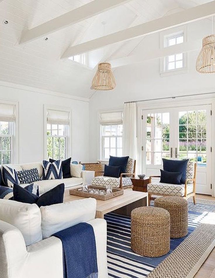
Symmetry, who? Your chairs and couches don't have to line up—in fact, you don't even have to have chairs.
30
Go Minimalist
Leanne Ford Interiors
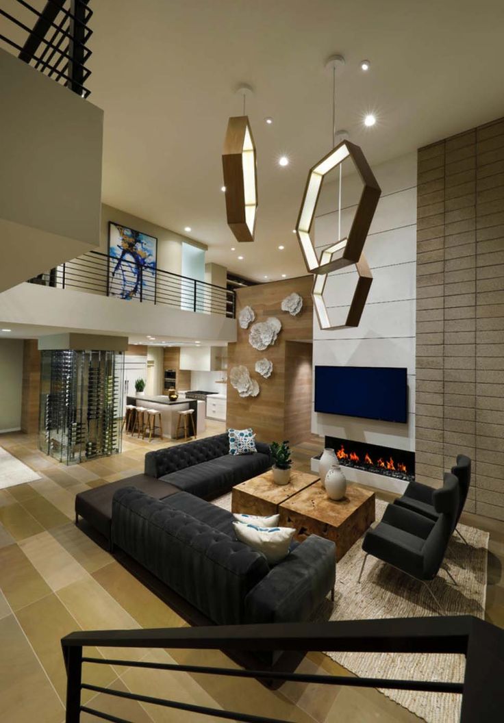
Pare your stuff way down and your room will look totally different. This doubles as a makeover and spring cleaning all in one.
31
Add a Statement Tablecloth
House Beautiful
A bold, patterned tablecloth can instantly make a traditional space a little more eclectic. This one picks up the blues in the wallpaper.
32
Play With Proportion
PHOTO: Dustin Askland; DESIGN: Elizabeth Roberts Architecture & Design
This exquisite living room is playing with shape and scale in so many ways—each design detail offers a universe of inspiration.
33
Put Your Collectables on Display
Leanne Ford Interiors
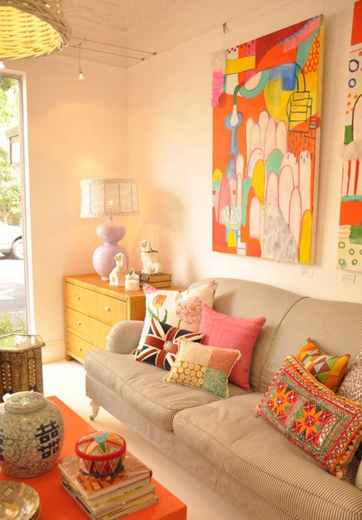
If you've been collecting something for a long time and aren't sure where to put your knick-knacks, install a floating shelf in your room of choice and then line them up. We love the sense of nostalgia these vintage glass bottles add to the bedroom.
34
Screw in a Colorful Light Bulb
Black Lacquer Design
For an unexpected (and easy) pop of color, trade in your classic bulb for a bright one. It adds the same vibe as a neon sign without taking up any space on the wall. Try it in a hallway or entryway, where décor moments are precious and square footage is limited.
35
Introduce Florals
Robson Rak
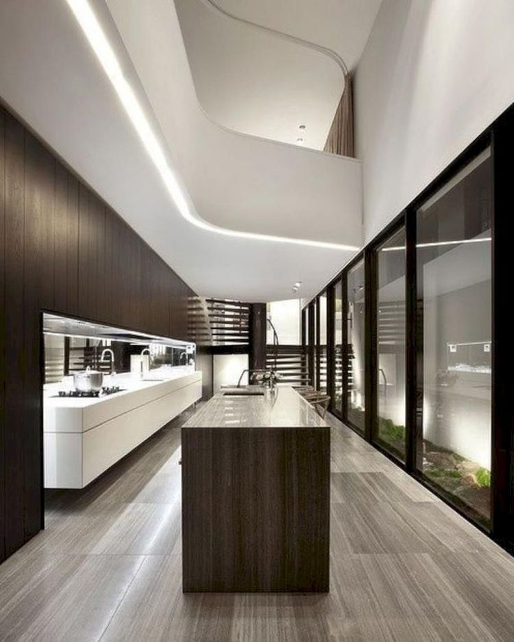
Adding a nice floral arrangement can beautify a whole room on it's own. The shapely vase, accompanying artwork, and unique rose gold faucet in this bathroom don't hurt either.
36
Add Seating to Your Floor
Courtesy of Jesse Parris-Lamb
You could sit on your couch—or you could sit on the comfiest floor pillows ever. We'll take the latter.
See more at Nicole Franzen.
37
Swap Your Window Shades
House Beautiful
You've been there, done that with fabric drapery and Roman shades, so swap your window treatment for an alternative texture, like bamboo. We're swooning over this wild bathroom.
38
Mix in Metallics
House Beautiful
Does anything make a statement like something shiny and gold? Add a metallic light fixture, sculpture, or vase to instantly upgrade your room.
39
Update Bedding Seasonally
Courtesy of Ronen Lev for Nicole Franzen
Jonathan Scott, home design expert and brand ambassador for Stearns & Foster, recommends owning two sheet and comforter sets, so you can swap them out by the season. "In winter, you want warm and inviting bedding, like faux fur and bulky blankets," he says.
See more at Nicole Frazen.
40
Wallpaper a Small Space
Nicole Franzen
Wallpapering a small room or closet with give it a surprising edge. Do the whole room, or just use scraps to line drawers, cabinets, and backsplashes. You could also opt for a statement ceiling.
41
Create A Statement Wall
Jonny Valiant
Designer Zim Loy discovered Harkerware on eBay: "There's tons of it, and it's so cheap!" She started collecting it for her dining room, then covered the whole wall with plates to create the same effect as one big piece of art.
42
Move Furniture Away From the Walls
Courtesy of Tessa Neustadt
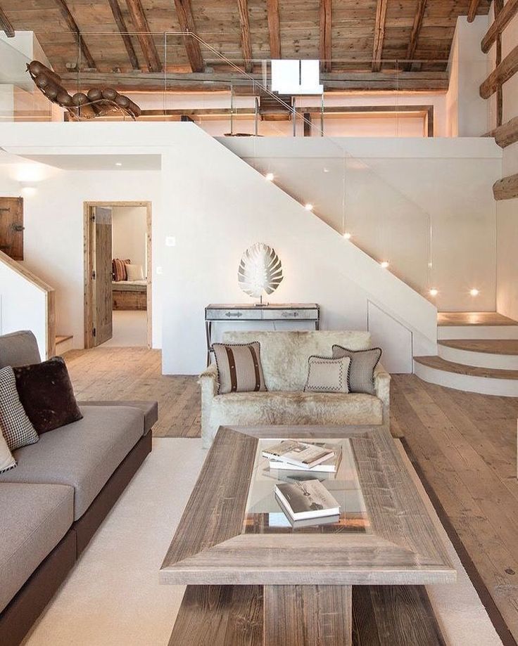
Floating furniture away from the walls creates more intimate seating. That means all you have to do is shift your furnishings a few inches to totally transform the vibe in a room.
See more at Amber Interiors.
43
Add Cozy Textiles
Courtesy of Tessa Neustadt
Printed, colorful textiles add so much personality. And as if the bright colored rug and sleek mounted lights weren't enough, this bedroom has also got a seriously swoon-worthy pendant. The Moroccan-inspired fixture adds eclectic appeal, and helps anchor the space.
See more at Amber Interiors.
44
Show Off an Antique
Courtesy of Tessa Neustadt
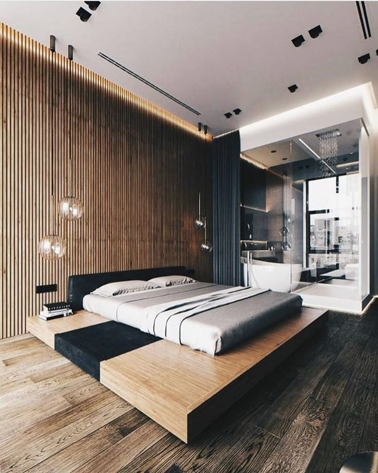
The copper tub is obviously the star of this bathroom, but it doesn't have to feel dated.
See more at Amber Interiors.
45
Recover Your Furniture
David A. Land
The super easy way to switch up your furniture game? Buy a slipcover.
46
Ditch Your Coffee Table Base
Courtesy of Nicole Franzen
If you've got a marble top coffee table, take it off and place it on the floor. Prop it up with some books for a bohemian update.
See more at Nicole Franzen.
47
Lay Down a Rug
Courtesy of Tessa Neustadt
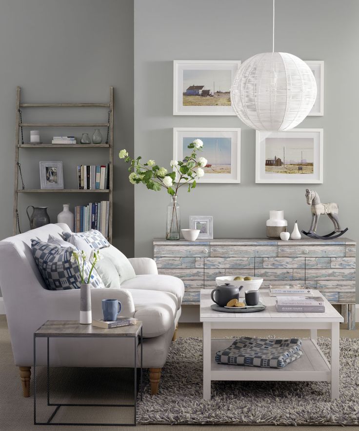
Boho? Rustic? Traditional? The rug you choose can instantly change the whole aesthetic of your room.
See more at Amber Interiors.
48
Mix and Match Chairs
Miki Duisterhof
Swap out your formal chairs (in this case, bright blue and green ones) for a few rustic metal ones.
49
Hang a Colorful Curtain
JULIAN WASS
For the entrance hall of this Pennsylvania farmhouse, designer Jeffrey Bilhuber opted for a curtain instead of a door. The deep yellow fabric pops agains the regal blue wall color and adds rich texture to the space.
50
Add Color on Open Shelves
NGOC MINH NGO
Open shelving allows for fast and easy decor changes. Blue accents stand out against a neutral palette.
Hadley Mendelsohn Senior Editor Hadley Mendelsohn is House Beautiful's senior design editor and the co-host and executive producer of the podcast Dark House.
65 Best Interior Decorating Secrets
1
Cut Pre-Made Tile for a Custom Look
Stephen Karlisch
“We typically cut readily available materials that are in standard sizes into smaller sizes of those same tiles,” Jessica Geller of Toldeo Geller reveals.
2
Wallpaper Your Appliances
Bjorn Wallander
Have ugly appliances or simply want to change things up? Use peel-and-stick wallpaper, as designer Janie Molster did to the fridge and freezer in this kitchen.
3
Play With Pattern
Anthony Gianacakos
You can mix colors and patterns that'll push the envelope but still remain stylish and authentic. Just take it from designer Anthony Gianacakos, who did so in his own bedroom. "My strong suit is color and pattern combination," he says.
4
Fake a Window Using Mirrors
Allie Provost
In a basement room with no windows, Camila Pavone of Effortless Style Interiors came up with the idea to combine two mirrors to fake a window.
5
Give Stainless Steel a Matte Finish
Kevin Scott
"We love how this finish surface interacts with light; It is soft, subtle, and welcoming," says Suzanne Stefan of the stainless steel matte finish in her kitchen, which she created using Scotch-Brite. Learn more about the process here.
6
Find Space to Use Collected China
Emily Minton Redfield
“I wanted to fashion a space where you could have a friend over for coffee or tea…and actually use your collected china," says Marie Flanigan of this tea room she designed. It's proof that any collection can be a jumping-off point for a room.
7
Hide a Radiator With a Cabinet
Leanne Ford Interiors
A radiator can easily throw off your design vision.
8
Create a Cozy Quiet Room
Kerri McCaffety
9
Use Lacquer-Effect Wallpaper
Werner Straube
"If someone draws on it, it’s a lot easier to repair than real lacquer!" — Corey Damen Jenkins
10
Make Your Own Art
“Purchase a few matted frames, and pop in your own sketches of abstract art. The picture mats will look expensive, and you'll have your own personal touch on the walls for guests to admire.” — Eneia White
11
Bring Multifunctional Furniture Outdoors
HomeGoods
"Small, outdoor ceramic stools are great pieces of furniture that perform double duty.
12
Transform Eyesores
CHRISTOPHER DIBBLE
"In this basement remodel, we would've had to spend a ton of money rerouting the HCVA air duct. Who wouldn't go with ballet-slipper pink instead?" — Max Humphrey
13
Paint on Faux Molding
Aldous Bertram
"There was no ceiling molding and no molding around the doors in this apartment, so I added them with paint! —Aldous Bertram
14
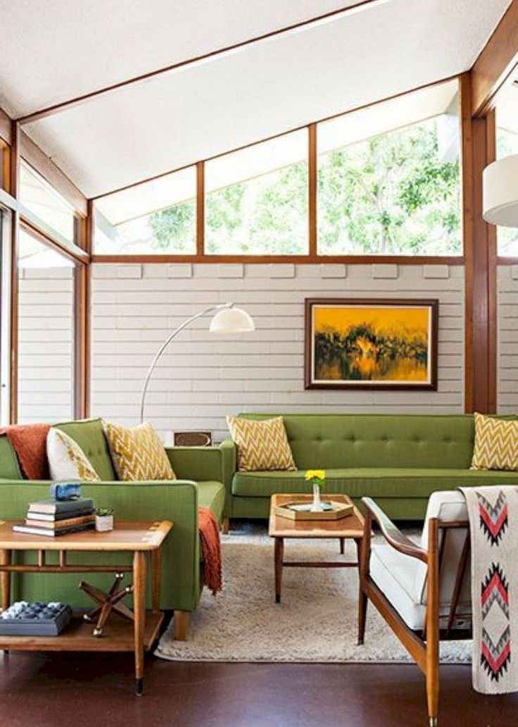
Reuse What You Already Own
STEPHEN KARLISCH
"We were able to work in a lot of pieces from their previous home, which made it feel layered.
15
Fake It 'Til You Make It
Annie Sloan
"Do something groovy on the actual steps! The bolder you go, the bigger the smile when you see them." — Fawn Galli. Here, a painted runner by Annie Sloan looks just like carpet.
16
Use Murals to Give Life to a Space
Joshua McHugh
"Murals are a way of bringing more people into the house, so even when it’s just the two owners, it never feels lonely." — Raji Radhakrishnan
17
Mix Old and New Decor
Lark and Linen
"Old and new belong together. A mix of modern pieces and antiques never tires." — Caleb Anderson
18
Step Up Your Lighting Game With High Tech
RYAN GARVIN & TYLER HOGAN
Improve health and temporarily turn a room a different color with "top-of-the-line smart circadian rhythm lighting.
19
Liven Up Ordinary Spaces With Wallpaper
Richard Powers
“I love to use wallpaper in mundane spaces. Hallways, pantries, powder rooms—all become moments of joy and funkiness. Areas of transition can be places you enjoy spending time in.” — Fawn Galli
20
Don't Be Afraid to DIY
Dustin Halleck via Edyta and Co
"If punk rock has taught me anything, it's to do everything yourself. All of my favorite interior designers were self-taught."— Max Humphrey
21
Choose the Right Bulbs
Black Lacquer Design
"Choosing the right light bulb is very important. LED bulbs are energy efficient, and they can look great." — Paloma Contreras
22
Add Some Wicker
Nathan Schroder
“Wicker is an element I love for its texture and versatility.
23
Upgrade Your Light Switches
Courtesy of Courtney Hill Interiors
“Update your light switches! Elegant controls add a spectacular element to an older home or character to a new one.” — Courtney Hill
24
Invest in Antiques
Julie Soefer
“Great art and fabulous antiques only get better with age. It’s better to cry once and have a forever piece.” — Chandos Dodson Epley
25
Even Rentals Can Get an Upgrade
Keita Turner
"These doors were uninspiring and ugly," says designer Keita Turner. See how she hacked a custom upholstery job here.
26
Trust Your Intuition
Old Brand New
"Follow your gut.
27
Use the Ceiling to Redefine the Room
Maura McEvoy
“Look up! We use ceilings a lot. Through them, we define the lines and beauty of a space.” — Julio Salcedo
28
Add a Bar
Anne Schlechter
"Every house should have a great bar. It is the central point of a party, and if you entertain a lot, it will be celebrated, so put some thought into it." — Jordana Joseph
29
When in Doubt, Paint It
Annie Schlechter
"Never underestimate the power of paint. You don't have to break the bank to achieve a new look. A fresh coat in a vibrant color takes an old piece of furniture or empty white room and gives it new life.
30
Draw On the Walls
Courtesy Anthony George
31
Embrace a Classic White Kitchen
Heather Talbert
“Classics never go out of style. I hesitated about doing a white kitchen in my own house, thinking I’d been there, done that. But I’m so glad I did. I will never tire of it.” — Alexandra Kaehler
32
Get the Most Out of Your Space
Lark and Linen
"Actually use your beautiful things! I have a chocolate lab and white furniture in my living room. It took some training, but now he knows the furniture is off limits." — Lindsey Lane
33
Go Deep
Courtesy of Larette Design
“Don’t be afraid of dark.
34
Don't Be Afraid of Clutter
Victoria Pearson
35
Splurge on a Primary Bath
Katie Hodges Design
"The splurge everyone should make is a fabulous primary bathroom. I used hand-painted porcelain sinks in mine." — Todd Richesin
36
Don't Underestimate the Coffee Table
Erin Nail
“In an open seating plan, always use a well-proportioned statement coffee table to ground the arrangement and give it a sense of place.” — Sean Michael
37
Make Ceilings Look Higher With Tall Furniture
Black Lacquer Design
"Use tall pieces in a low-height room.
38
Think Asymmetrical
Sarah Winchester Studios
“Get creative when thinking about form and function. A client in a traditional Georgian home needed it to work for her modern way of entertaining. We opted for an asymmetrical, organic space that encourages guests to float through the room while engaged in conversation.” — Kate Coughlin
39
Figure Out a Floor Plan
Edyta and Co.
"The most important first step in design is a good floor plan." — Jessica Helgerson
40
Invest in Upholstery
Heather Hawkins via Studio Ten 25
"My clients ask about the most important pieces to invest in: I believe in upholstery and art! They help anchor a room.
41
Have Fun
Studio Ten 25
"Make sure you're having fun. What's more fun than making your own home more beautiful?" — Eche Martinez
42
Create Your Own Light
Sargent Architectural Photograph
“When you're given a dark space that doesn't have great light, create your own light. In this kitchen, we used Sherwin-Williams's sunny Energetic Orange, and it turned out just fabulous— so cheerful.” — Matthew Boland
43
Know Your Dealbreakers
Rustic White Interiors
“Don't settle. If you have your heart set on a piece, don't try to find something similar just to save money. Chances are, you’ll never be completely satisfied with the substitute (or its quality).” — Brian Watford
44
Swap Out Big Pieces for More Impact
Old Brand New
"When clients want a quick, impactful update, I recommend the pieces that take up the most surface area, like rugs, paint color, or window treatments.
45
Focus on One Investment a Year
Willie Cole
"Buy one good piece of furniture every year, and in five years, you'll have five pieces. Everything else may change, but these will remain constant." — Jeffrey Bilhuber
46
Reflect Your Personality in the Bedrooms
Katie Hodges Design
"In the primary suite, decor can deviate from the common areas and really reflect your personality." — Ali Vanderpool and Ariana Villalta
47
Amp Up Your Ceiling Game
Paul Costello
“Faux paint, lush lacquer, or wallpaper on a ceiling will garner that ‘Wow’ response.” —Leslie May
48
Make Sure It All Fits
Old Brand New
"Being able to visualize the scale of a piece is critical.

49
Mix Your Metals
Black Lacquer Design
"Embrace mixed metals. It can feel like the fixtures are curated and bespoke." — Shelley Johnstone
50
Collect Unique Pieces
Old Brand New
"The strange bust from the flea market, the weird painting you are drawn to: Buy them all. Curate a space that is truly one of a kind." — Stephanie Sabbe
51
Incorporate Inherited Pieces
Courtesy of Sarah Gilbane Interiors
"Don’t be afraid to use inherited antiques. Add a backdrop with exciting wallpaper: The combination is simply the best.” —Sara Gilbane
52
Use Wallpaper to Start a Conversation
Courtesy of Studio Monroe
“It’s a bit of an investment, and you can’t take it with you when you leave, but nothing brings va va voom like vibrant wallpaper in a conversation-topic pattern.
53
Don't Stop Editing
Jennifer Palmer via Old Brand New
"The least expensive action: edit, edit, edit!" — Katie Sutton
54
Establish a Color Scheme
House Beautiful
For a head-to-toe makeover, the first step is creating a palette. "I come up with a basic color scheme for the whole house, and then I take that from room to room," reveals Gary McBournie, a designer based in Boston. "It plays itself out in different ways in different rooms."
More: 20+ Fresh New Color Combinations to Try
55
Put Investment Pieces Up Front
Francesco Lagnese
"Use and enjoy your antiques and unique finds, especially in a utilitarian room, like the bathroom.

56
Play With Textiles
Francesco Lagnese
"Straw, jute, rush—natural materials and neutral tones are always chic. They're the white T-shirt of interior design." — Meg Braff
57
Extend Your Backsplash
Joshua McHugh
58
Add Texture
Amy Neunsinger
Neutral decor can be interesting if you include a variety of materials. "I used a range—from fine-gauge and open-weave linen, to raw silk and taffeta, to cotton velvet and distressed velvet," says California-based designer Ohara Davies-Gaetano. "Not only that, there's also the contrast of matte sheens that absorb the light, and lustrous sheens that reflect it."
59
Use the 50/150 Rule
Francesco Lagnese
For the perfect color family, mix one batch of paint 50 percent lighter than the base and another 150 percent darker.
60
Warm Up a Room With Mirrored Walls
Courtesy of Jan Showers
Mirrored panels like the ones lining this alcove can be elegant — but don't just slap them up, designer Jan Showers warns. Large sheets of mirrors will look commercial, so try a sectioned pattern in the traditional French style instead.
61
Don't Skimp on the Sofa
Douglas Friedman
"Put your money into a comfortable, well-made sofa that you'll have forever. You don't have to deny yourself that expensive designer fabric you love—just put it on something small, like a pillow." — Krista Ewart
62
Try a High-Contrast Palette
Kilz
63
Choose the Right Curtain Length
James Carrière
"For classic side panels, you really have to go all the way to the floor.
64
Fake Square Footage
TREVOR TONDRO
Glass shower doors add instant square footage. To complete the illusion, run the floor tiles straight into the stall. "It makes the room feel larger," says designer Alla Akimova. "If I had changed materials, it would have interrupted the space."
65
Pile on Pillows
Victoria Pearson
"I don't do dinky accents...small pillows look like something that came with the furniture." — John De Bastiani
Caroline Picard Contributing Writer Caroline is a writer and editor with almost a decade of experience.
Lauren Smith McDonough Senior Editor Lauren is a senior editor at Hearst.
Hadley Mendelsohn Senior Editor Hadley Mendelsohn is House Beautiful's senior design editor and the co-host and executive producer of the podcast Dark House.
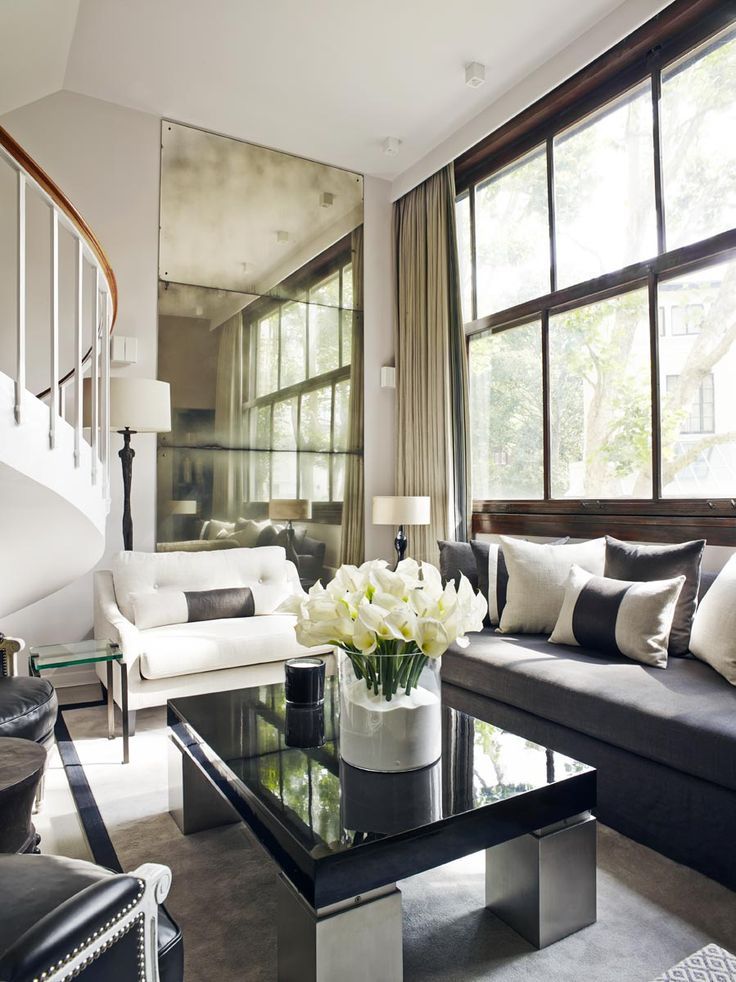
Townhouse of 110 m² in fusion style, where every centimeter is thought out - INMYROOM
Project of the week
Color palette in the spirit of Gaudi mosaics, decorative plaster and wood in the decoration, some loft furniture - we tell how the designer designed a three-story townhouse
Place
new moscow
footage
110 sq. m
Floors
3
Rooms
4
Design
Yana Ukhova
Photo
Olga Shangina
Briefly
Details create a stylish interior. In this townhouse in New Moscow, they are thought out to the smallest detail: the designer combined loft furniture with classic finishes, hung flower pots on the wall, picked up pillows with natural motifs to match the panel, and commissioned the artist to paint a painting inspired by Gaudí.
The customer's family has two sons: the youngest is 12 years old, the eldest is 21 years old, he lives separately and comes to visit. On three floors, we wanted to create a comfortable space for everyone and provide places for receiving guests and a cozy corner for relaxation.
Details
Designer Yana Ukhova worked with an existing layout: the customer purchased a townhouse when all the internal partitions were erected.
On the ground floor there is a kitchen-living room with a dining area and a TV area. On the second floor there is a bedroom and a room for the youngest son. The attic floor is a relaxation space that turns into a guest room when the eldest son arrives.
Several loft items were added to the kitchen-living room: a dining table with metal pipe legs and stools fit perfectly. Decorative wall planters on a blue velvety wall “softened” the atmosphere. “The resulting interior reminds me of a box lined with soft pearl gray mother-of-pearl,” says Yana Ukhova.
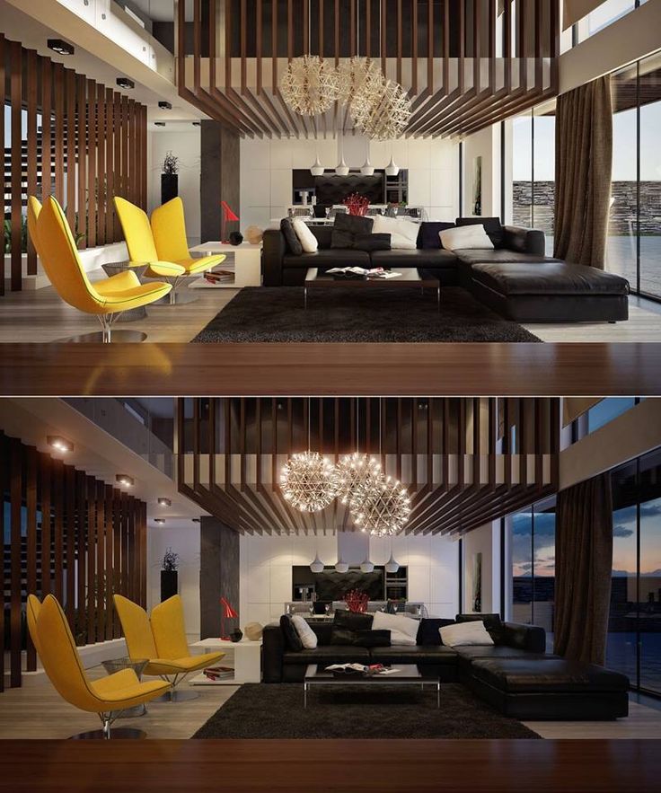
Gaudí's mosaics were the inspiration for the interior design - the designer and customer especially liked his Salamander. “Especially for the project, we asked the artist Maria Tretyakova to paint a picture based on. It is called “Geckos,” says Yana Ukhova. “All the shades used in the interior were combined on the canvas: turquoise, blue, emerald, wheat, copper.”
In the bedroom, a panel draws attention: wallpaper with a pattern that imitates a cut of natural stone. The customer asked to cover one of the walls with marker paint in order to write inspiring phrases on it.
In choosing furniture, we adhered to a modern style: we installed cabinet furniture of straight shapes, a comfortable modular sofa was placed in the attic. The furniture of the Polish company VOX was ideal for the nursery: it combines a cute design with functionality.
Yana Ukhova adhered to the fusion style in interior design. The designer boldly combined classic stucco with concrete-look stucco and decorative bricks.
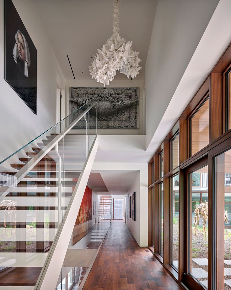
Mostly built-in storage systems, in the bedroom there is space for a dressing room. Cabinet furniture and bookshelves were made to order in the workshop. In the bathroom on the first floor, it turned out to equip the laundry area - it is located behind sliding doors and is hidden from view.
Vertical wooden slats were chosen to finish the attic — they visually lift and level the ceiling. On all other walls - high-quality washable paint.
Layout
Furniture plan, 1st floor
Furniture plan, 2nd floor
Furniture plan, 3rd floor
Brands featured in the project
Finishes:
Finishes: on walls, Littlee; Farrow & Ball; author's decorative plaster, Batega; panel in the bedroom, ID Wall
Flooring: parquet board, "Good floor"
Decor: decorative planters, Mybotanica; painting "Geckos" and a painting in the dining room (canvas, acrylic painting), Maria Tretyakova
All textiles: curtains, bedspreads, decorative pillows - textile designer Svetlana Lisovskaya
Do you want your project to be published on INMYROOM? Send interior photos to wow@inmyroom.
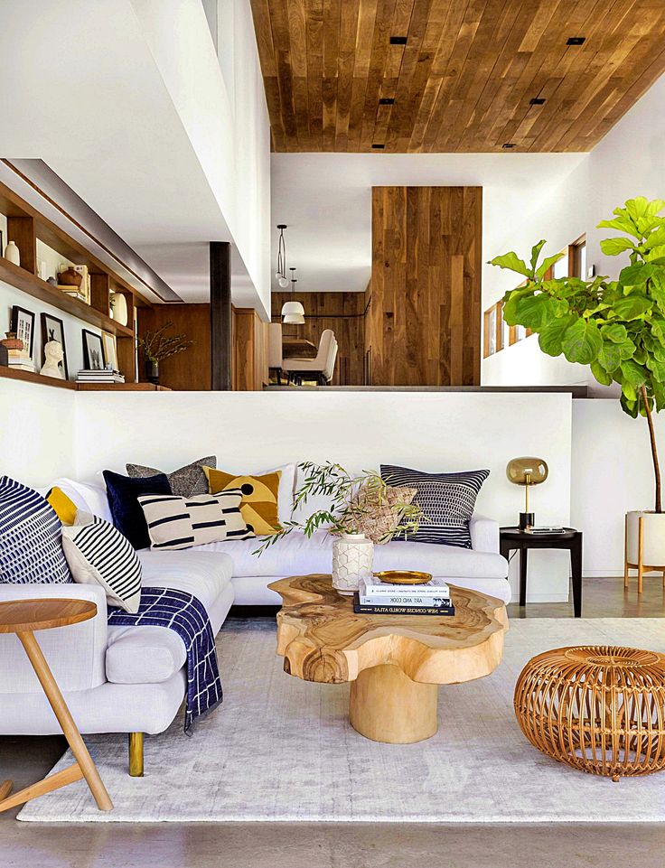
Apartment design - photos of the best ideas. Original interiors of apartments
Updated:
How can residents of small apartments arrange their housing properly? At first it seems that it is very difficult, but everything is in our hands! Consider various options for apartment design.
Let's think about how to make the apartment CONVENIENT FOR OWNERS. It depends on their lifestyle and interests. For example, if a young man, a girl or a couple of newlyweds lives in it, then, most likely, guests often come to them, they arrange noisy parties or just sit around the TV. An adult or older person may have other interests.
| One-room apartment design options | ||
|---|---|---|
| dining-living room | bedroom-living room with a separate kitchen | living room combined with a loggia |
Let's talk about them in more detail.
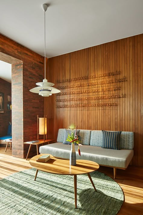
Dining room-living room
It seems that young people will want to connect the kitchen with the room, dividing the apartment into conditional parts using a DINING TABLE, BAR COUNTER or SOFA. A larger number of guests will enter such a room, someone will be located in the living room, someone in the kitchen, while everyone will see each other and communicate freely.
A folding sofa will serve as a sleeping place. If the area allows, you can put a sofa in the dining area, then you can put a bed in the room.
Read more about the living room combined with the kitchen.
Bedroom-living room with a separate kitchen
An elderly person will most likely decide to leave the kitchen untouched, except to shorten the wall between the room and the corridor in order to increase the hallway. If the room is not very small, it would be good to divide it into two parts: a bedroom and a living room . Of course, the division will be rather conditional.
Living room combined with a loggia
Another popular way to increase space is to combine a room with a loggia. We remove the window and the door, glaze the loggia, insulate it, and we get a small room. In it you can equip a dressing room, office or bed.
Key interior elements of a one-room apartment:
- furniture;
- window;
- lighting.
Read more about the design of balconies and loggias.
Furniture
Furniture in a small apartment is always difficult. You should decide what you can do without, because you should not force a single room. A closet is a must, you can't do without it. In the large hallway you can install a tall and spacious closet. If there is not enough space, we demolish the wall between the room and the corridor and put a closet in its place.
Window
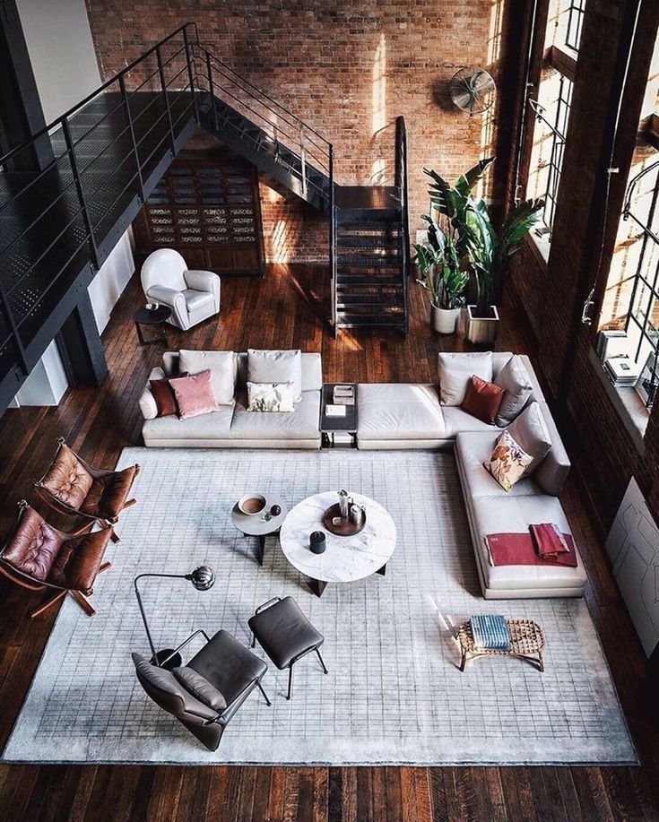
A large open window always transforms a room, and its design plays a big role in the overall decor of the room.
Please note! A good visual increase in space can be achieved by abandoning conventional fabric curtains.
They eat up a lot of space and accumulate dust. Instead, we suggest installing roller blinds or Roman blinds, which look harmonious both on their own and in combination with light tulle.
Lighting
In a small room arrange the lighting so that there are no darkened corners . For this, spotlights are good. When you need a lot of bright light, turn on all the lights, and if necessary, you can turn off some.
Read more about the design of one-room apartments.
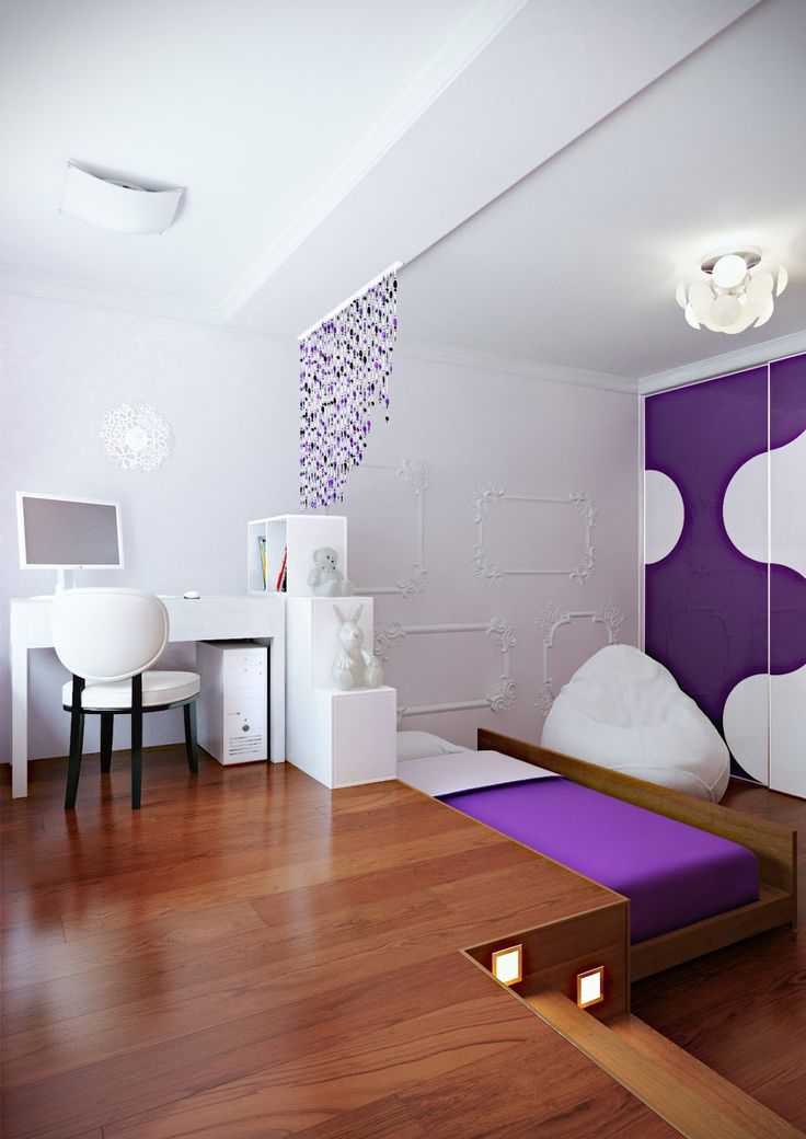
Studio apartment design
In recent years, such housing has been actively built, and its main feature can be called a very small size. Compared to the studio, some one-room apartments seem like mansions. Of course, we are not talking about luxury apartments, where the area of such a studio can be 100 square meters. m.
Standard apartments are very small, and they need to fit a bathroom, a kitchen, and a room.
This is not an easy task to handle. Of course, it is necessary to fence off the toilet and bathroom from the rest of the space. But the kitchen and the room can be arranged as a living-dining room.
In fact, in a studio apartment, we will use the same options as in a one-room apartment. You can highlight the kitchen area using the floor and ceiling of different levels, as well as contrasting tones.
We recommend to choose furniture with rounded shapes and solid colors.
Apartment design in Khrushchev
Apartments of this type are distinguished by a small corridor, a tiny kitchen and an equally modest bathroom.
What can we do about all this ?
- Replace ordinary interior doors with sliding ones (remove them where possible).
- Replace simple wardrobes with built-in wardrobes (compartment wardrobes are perfect for this purpose, you can read more about them here).
- Hang blinds instead of fabric curtains.
- Place compact light furniture.
Having done all this, we will free up quite a lot of space. Having correctly designed the walls, we will also visually enlarge the room.
- We cover one half of the wall vertically with bright paint, and the other with beige or white. The same effect can be repeated with wallpaper. Thanks to this solution, the room will seem more spacious.
- Paste photo and 3D wallpapers on the wall opposite the entrance.
Don't forget about mirrors, they always "work" to increase space.
It is not advisable to overload low ceilings in Khrushchev with complex structures, so it will be enough to make a glossy stretch ceiling. It will create the illusion of height and hide unevenness.
How to furnish an apartment for a family with a child
In an apartment where a baby is growing up, it is advisable to make a nursery or allocate a part of the room where there will be a bed and a rack with toys.
It often happens that parents have to share a room with their baby. When a child is just born, it is enough for him to allocate space for a crib and chest of drawers.
As a child grows, his needs gradually increase. Considering this, we will think about how to proceed.
More about the design of a children's room and the choice of children's furniture.
Option one
Until about four years old, the child wants to be close to his mother, so there is no need for any partitions between parts of the room.
Option two
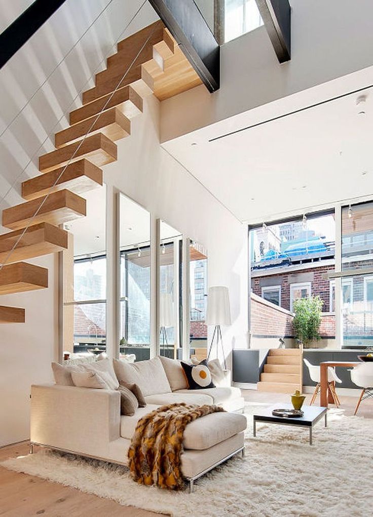
It is best used for older children from 5 years old. At this age, he can sleep on the second floor of a bunk bed. We mean children's complexes, consisting of a closet, all kinds of racks and a bed upstairs. Firstly, they save a lot of space, and secondly, they form a real corner for the child. There will fit all his things, books, toys and a comfortable bed.
This complex can be positioned so that it separates the parents' bed from the nursery. It should be noted that a place for the child should be arranged next to the window, as the baby needs good lighting.
Parents can be offered additional lamps that will decorate the room and make it cozier.
More details about the interior of a nursery for a girl.
Option three
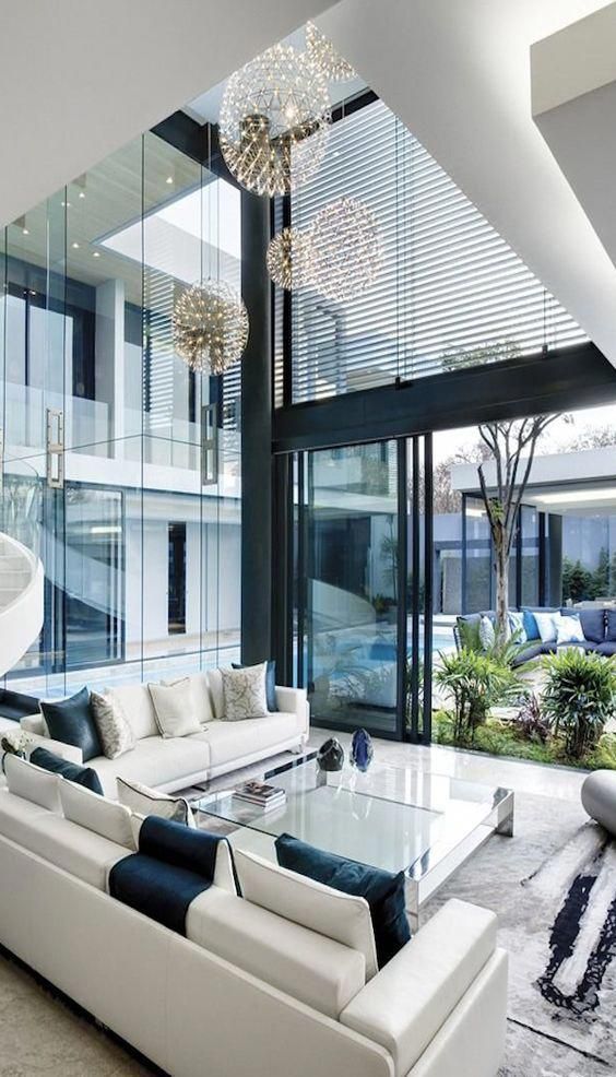
To equip a mini nursery, you can build a plasterboard wall. This method is ideal when the child has grown up and needs personal space. If the room is large, then it can be easily turned into two by installing a partition and sliding doors. During the day they can be opened so that the light from the window illuminates the entire room, and closed in the evening. The result is a separate cozy corner for an independent child.
How to design the whole apartment
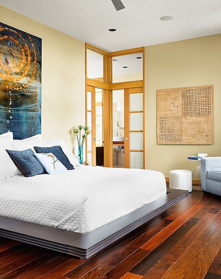
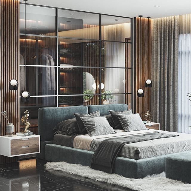
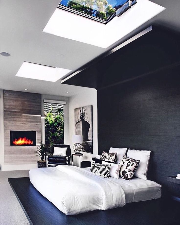
Bedroom
Women approach the design of the bedroom very carefully, thinking through every little thing. First of all, we choose a bed with a comfortable mattress. With a tight financial situation, you want to save on everything. When buying a bed, keep in mind that any frame can be purchased, without frills.
Attention from an inexpensive bed can always be distracted by a beautiful bedspread or other interior details.
The main thing is not to be stingy when choosing a mattress, otherwise no design will please you!
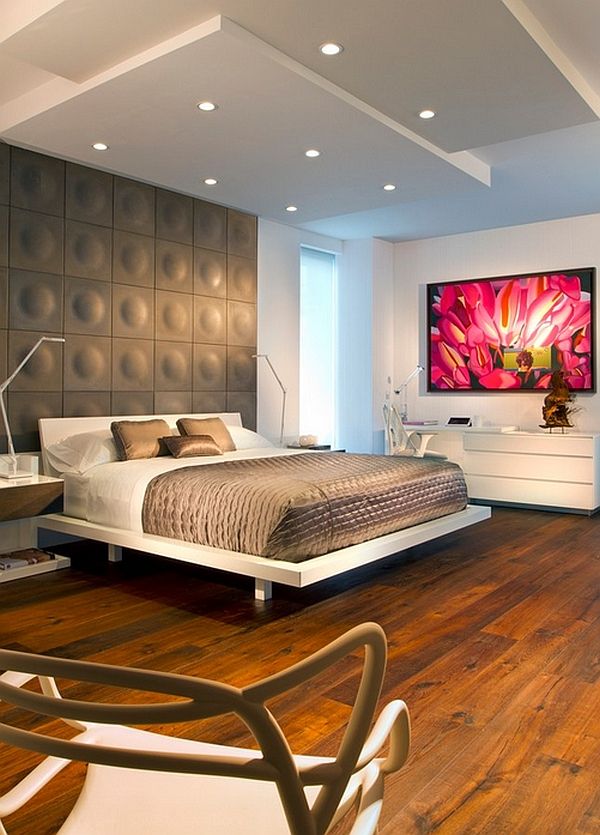
Bedside tables are usually placed next to the bed for convenience, but you can find a bed with shelves at the head.
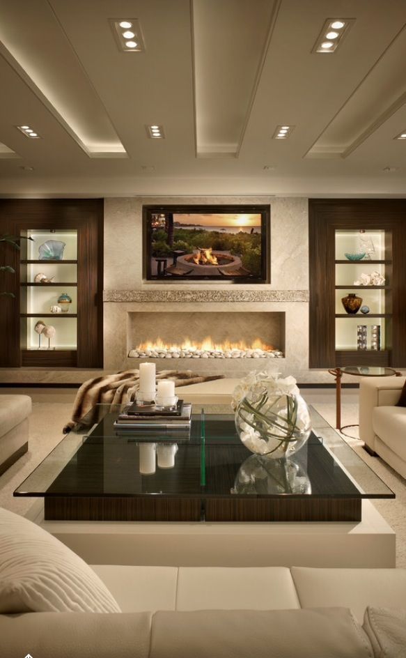
In general, it all depends on the chosen style and possibilities. In a large room, you can put an oak carved chest of drawers, bedside tables, trellis, and drape the windows with blackout curtains.
Most often, the smallest room is reserved for the bedroom, and as always, you have to dodge in order to fit everything and not forget about style.
One of the key points in the design is the choice of the leading color.
It is clear that the hostess will choose her favorite color for this room, and no one will dare to object.
However, there are a few rules for choosing the color scheme for the bedroom :
- Do not stop at one shade, as it can get boring over time. It is better to combine it with two or three similar colors or with white.
- Avoid sharp contrasts, this will prevent you from relaxing and relaxing.
- Be careful with bright colors. They are well suited for a young couple, but they will quickly tire the elderly.If you like red, burgundy orange or any other bright colors, then it is best to pick up small details of the interior of the selected shade. It can be a frame for photos or pictures, a vase, a floor lamp or a drawing on bed linen.
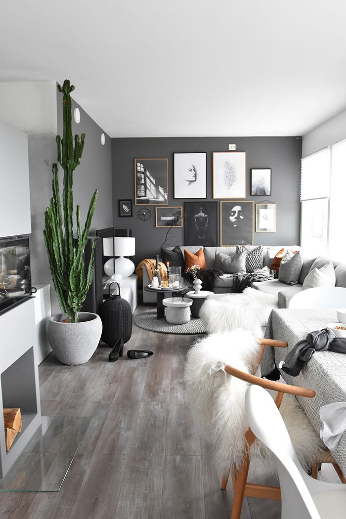
- Do not use more than three colors.
See more photos of the bedroom design.
Living room
What should be in the living room? After all, friends, relatives gather there, and I want everyone to be comfortable.
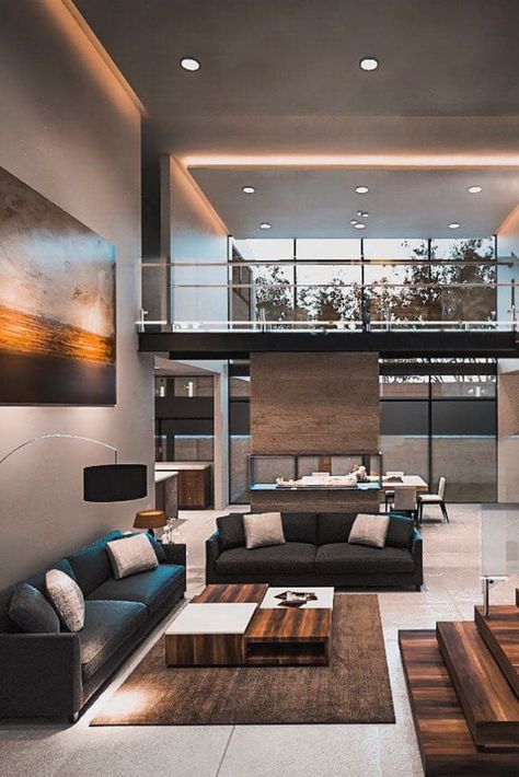
So, needs a large, roomy sofa, if the size of the room allows, then a corner sofa . It is likely that guests will eat and drink something, and this requires a table. There are folding tables that occupy a minimum of space when folded, but help out during the holidays. They fit well into the interior of the living room.
Large armchairs should not be placed in a cramped living room, they clutter up the room. Instead, we recommend using small soft chairs or ottomans.
To make the room look stylish, not tired of excessive variegation or, conversely, not look faded and boring, you need to highlight the main detail of the interior.
This could be:
- window ;
- TV;
- furniture .
We focus on one thing with a color, pattern or bright accessories, and leave the rest of the elements neutral.
The living room should be well lit, so you can hang a chandelier with several powerful bulbs or equip spotlights. If the first option is a classic, then the second is a fashion trend followed by modern lovers. Accordingly, choosing one style in the interior, you need to follow it to the end. For a classic living room, a large spectacular chandelier is suitable, and for a modern style, small built-in lamps.
Floor lamps, sconces and table lamps will be an excellent addition to the atmosphere, they make the room cozy and suitable for a quiet family evening.
Kitchen
In most families, the kitchen is one of the most visited places in the house. Here we cook, and eat, and communicate after work, and even receive close friends.
The kitchen has a lot of storage space. Our goal is to decorate the interior so that nothing interferes, and everything is at hand.
One of the best inventions of modern science is built-in household appliances. It is ideal for both spacious and miniature kitchens.
The kitchen floor is best tiled, as it is durable, easy to maintain and serves as an additional decoration.
In the photo we see an example of a small kitchen. The small set perfectly combines fashionable bright color with neutral tones. This is correct, since in a limited space, all-orange furniture would look unnecessarily “aggressive”. The stove and sink are conveniently located here, as well as the space under the window. This is a good design find. By removing the window sill, we get additional space for cabinets and drawers.
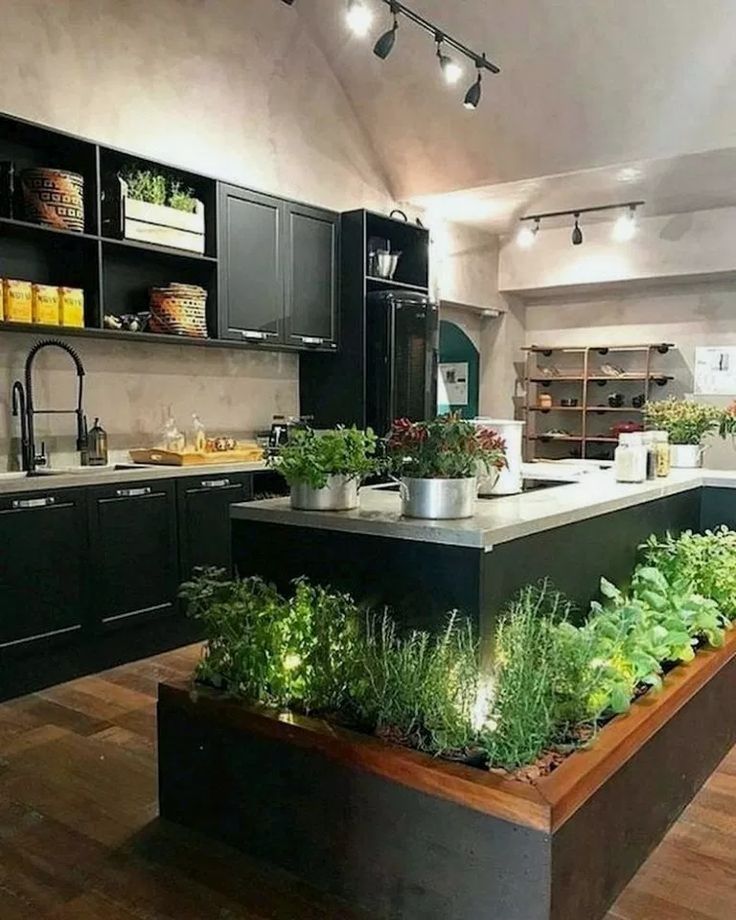
This version also makes good use of the space around and below the window. If the wall is wide, we can place the kitchen set around the window. It is very pleasant to look outside while cooking and cleaning. In addition, this way of placing the working area frees up space for a dining table and a refrigerator. This set will appeal to connoisseurs of natural wood and calm natural tones. See also our material on choosing blinds for the kitchen.
Here is another example of the use of natural materials in kitchen design. Read more about kitchen interior design
Bathroom and toilet
The design of the bathroom, as well as the toilet (if it is located separately), is not worth saving. To do this, you need to choose only reliable and moisture-resistant materials and functional furniture. They should serve for many years, because their replacement will cost very, very expensive.
We wrote earlier about the design of a small bathroom in more detail.
Rules for decorating the bathroom
- We choose ceramic tiles or mosaics for walls and floors.
- We paint the ceiling with high-quality paint or make it suspended.
- We care about good lighting.
To improve the appearance of the bathroom, modern designers have come up with the idea of hiding all communications when decorating the walls. Looks very aesthetic!
Learn more about bathroom design.
Corridor
Corridor design should be as practical as possible! Coming from the street, you can accidentally touch the wall with your foot and stain, scratch expensive wallpaper. The child will also touch furniture, walls and mirrors with dirty hands.
How to design a corridor to be beautiful and practical?
Design options
- We cover the walls with decorative plaster .Now there are many beautiful shades on which you can apply various patterns. And such walls can be wiped with a damp cloth.
- We use artificial stone . This material looks very stylish and unusual. Plus, it's very practical.
- Sheathing walls with plastic or wood panels.
The corridor is a rather small space. To visually enlarge it, you need to hang large mirrors, and if space permits, install a wardrobe with mirrored doors. See more photos of wardrobes for the hallway.
It is worth mentioning the lighting. In a long corridor, you need to hang several shades or one powerful chandelier.
It is important that the color of the furniture is in harmony with the interior doors.
How to organize repairs in the apartment
We decided to renovate the entire apartment. This is, of course, a difficult matter. Where to begin?
- Imagine how each room should look like. Let's draw a plan.
Learn more
