Neutral decor ideas
15 Dreamy Neutral Living Rooms
Is there anything more calming than looking at these neutral living rooms? I don’t think so! If you love warm browns, beige tones, and creamy whites, then this post is for you! We just love the neutral decor look in homes big and small.
These neutral colored living rooms will inspire you to create a soft beige color palette inside your home. The living room is an important place for your friends and family to gather, so why not make it special? These decorating ideas with warm tones will spark lots of design ideas. From a brown sofa to a beige rug, there’s a neutral piece of furniture or decorative accent for everyone! Take a peek at our neutral family room selection below!
1. Antique Gold Wall Mirror
The cute antique gold mirror really helps to warm up this space!
Tom Delavan2. Brass Metal Accents
I love brass metal decorative accents like the amazing dome pendant light in this living room. The tufted beige sofa, marble coffee table and gold leaning floor mirror really help to give this space character.
3. Brown and Beige Ceramics and Accents
I love the minimalist decorative accents in this cute neutral living area!
@brittanyambridge4. Earth and Clay Tones
Earthy and clay tones are a must to give your space a bohemian, natural vibe. This gorgeous neutral sectional sofa provides so much room for relaxing!
@mymoderndom5. Exposed Wood Ceiling Beams
Blond wood ceiling beams help to give this space contrast. I also admire the design of a single sofa paried with 4 accent chairs around a coffee table! Such a unique and fun design.
@tamaramageldesign6. Faded Blue Throw Pillows
This farmhouse style neutral family room was balanced out with a few faded blue throw pillows.
@carcabaroad7. Live Edge Coffee Table
Live edge rustic wood is very much in style these days. Choose a raw, live edge coffee table that gives your home a natural wood touch.
HGTV Jaclyn Joslin8. Pampas Grass Decor
This Scandi style space was decorated beautifully with a glass vase full of light beige pampas grass!
@emmamelins9.
 Pops of Faded Colors
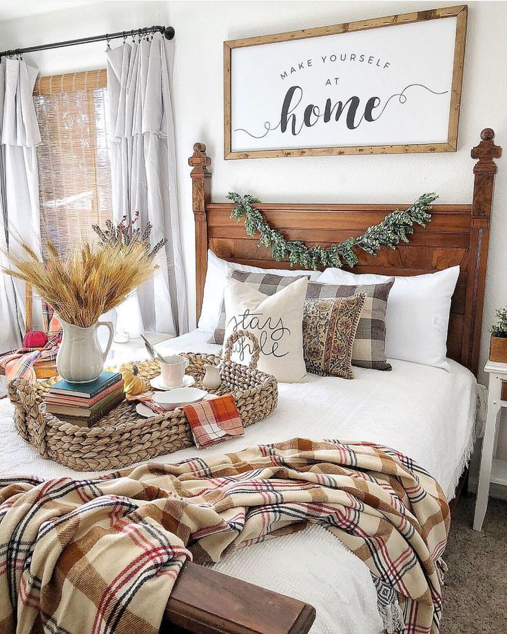
This is a great example of a living room that added color in a natural way. Going with faded colors that blend in nicely is the way to go! It gives the space a bit of color and a lot of character.
@the_stables_10. Twin Woven Leather Accent Chairs
Matching accent chairs are always pleasant to look at!
@changoandco11. Wood Cane Accent Chairs
The wood cane accent chair in this living room helps warm up the room. The minimalist artwork on the wall is a daring choice.
@alyssakapitointeriors12. Neutral Decor for a Small Space
A gallery wall filled with beige Parisian city photos is the perfect way to decorate the walls of your neutral living room.
@teresalaucar13. Beige Sofa
A beige chaise lounge across from a comfortable sofa is the right piece of furniture for this gorgeous stone fireplace.
Jill Egan Interiors14. Brown Leather Sectional Sofa
Brown leather sofas are a timeless choice for a warm living room.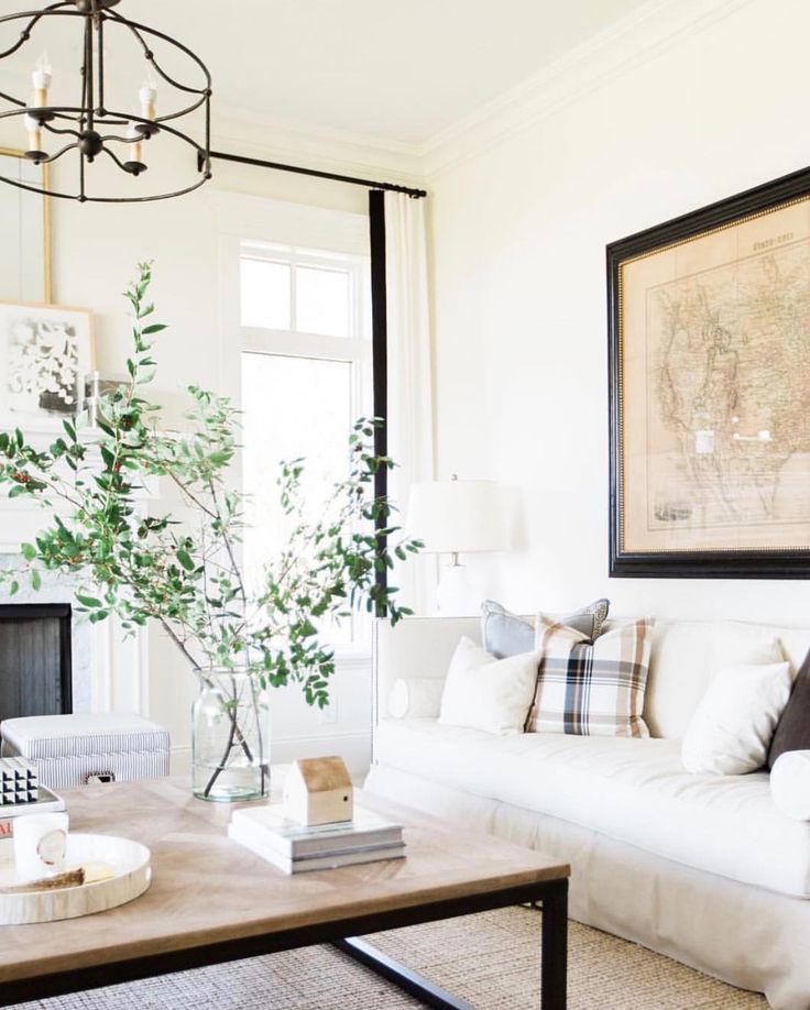
15. Jute Rug and Pampas Grass
Jute strikes again with its practicality!
UnknownWe hope these neutral living spaces inspired you as you go about decorating your own home! As you can see there are many interesting ways to get the neutral look in your home.
More Neutral Decorating Ideas
If you love decorating with neutrals, then you’ve come to the right place! Here at Curated Interior, we adore neutral tones when it comes to furniture and home decor. We’ve written extensively on how to get this look in your home. Here are a few more popular recent guides:
- Neutral Desks
- Neutral Rugs
- Neutral Office Chairs
- Neutral Sofas
- Neutral Armoires
Happy curating!
Pin this for later:
- Living Room
- Neutral
Total
8K
Shares
Curated Interior
We share the best home decor ideas, furniture recommendations, coolest products, and interior design tips for America's most stylish women.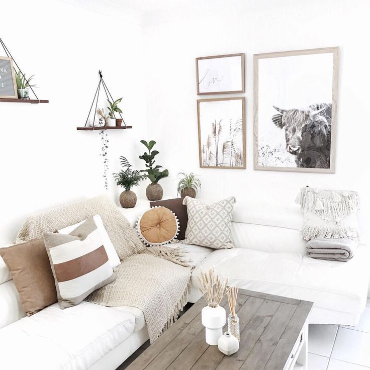
Curated Interior uses affiliate links and we may receive a small commission if you make a purchase from linked retailers, at no cost to you. We only recommend products from merchants we know and love. As an Amazon Associate, we earn from qualifying purchases.
These 26 Neutral Living Room Ideas Exude Quiet Drama
While color experts are predicting that a surge of saturated hues will dominate our homes in the year ahead, nothing quite beats the quiet beauty of a soothing, neutral-hued room. Not only does an understated palette soothe the eye (who needs wall-to-wall patterns after a day squinting at your computer screen?) and signify easy elegance, but it also promises—blessedly!—to never go out of style. Living rooms, in particular, are the perfect venue to perfect a neutral color scheme through elegant furnishings, plush carpets, and effortless accessories. But even though the “vanilla girl” aesthetic is trending across TikTok these days, a neutral look does run the risk of looking, well, too vanilla, or, worse still, just plain boring.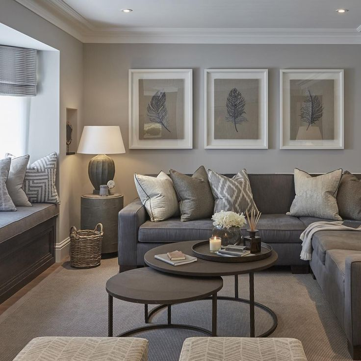
New York designer Augusta Hoffman is well aware of the pitfalls of a neutral decor scheme but embraces the challenge in her sophisticated projects. The key to keeping things from looking too monotone? Embrace luxe materials and sculptural forms. “Working with subdued tones actually gives the freedom to be more exploratory with materiality and texture,” she tells us. “To add warmth and comfort to neutral spaces, I love to layer a variety of ivory-toned textile techniques with rich leather, patinaed metal, organic stone, and antique wood accents.”
And you don’t have to stick with a white or cream-colored paint job, either. According to the experts, the year ahead will welcome a bevy of “new neutrals” that allow subtle base colors—think pink, beige, and sage green—to peep through the pigment. But don’t take our word for it: These 26 neutral living room ideas in our archive demonstrate that it is indeed possible to go beyond the pale.
1
Cream Dream
Joshua McHugh
This serene space, in a New York City home designed by Alyssa Kapito, is a masterclass in artful all-white layers.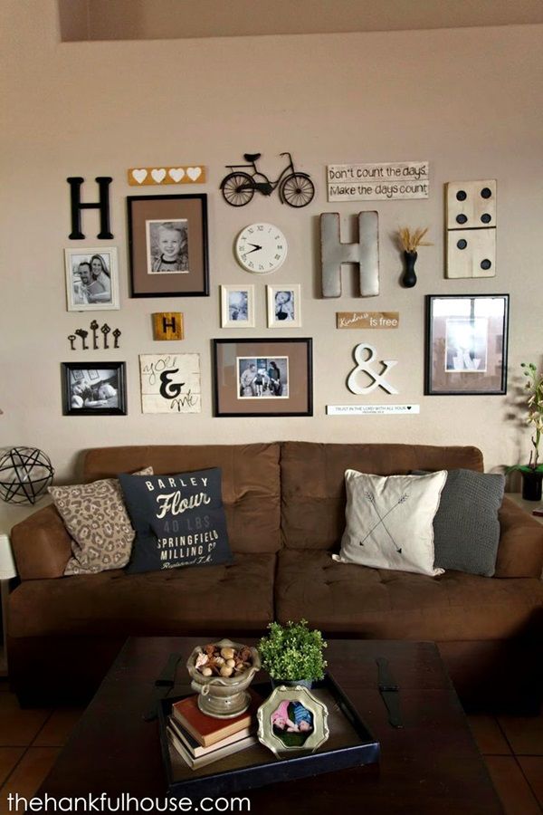 Multiple seating areas—in soft whites, of course—create a perfect environment for entertaining, while a plaster chandelier by Eric Schmitt “gives this lovely glow and a sense of architecture,” per Kapito.
2
Down to Earth
Winnie Au
As an alternative to flat or glossy paint, give lime wash a try. The trending texture lends a sense of cavelike warmth, or in the case of this Brooklyn apartment by Office of Tangible Space, the feeling of living “in an acorn.”
3
Relaxed and Regal
Tim Lenz
This refined living room, the handiwork of Augusta Hoffman, shows off the designer’s easy mix of contemporary silhouettes and weightier wood antiques. “We decided to embrace [timber’s] materiality and use it as a contrast to the surrounding spaces,” Hoffman says. “With that, we had to make cognizant choices to make the rest of the space feel bright and open so that the dark wood tone didn’t overpower everything. ”
”
4
Pattern Play
Stephen Pagano
If you crave patterns in your neutral space, go for it! Just make sure they’re in a complementary tone and motif. David Netto protégé Lily Dierkes used a Namay Samay fabric in this Nashville residence. The scalloped wicker ottoman adds texture.
5
Laid-Back Ranch
William Waldron
Traditional gets a twist in Reese Witherspoon’s Ojai, California, ranch. Designer and friend Kristen Buckingham, who had experience designing other Spanish-style homes, created a living room that felt “fresh and youthful” with linen slip covers, leather and wood furnishings, and a soft white-washed paint job.
6
Southwest Kick
Ryann Ford
Just because you seek a neutral look doesn’t mean you have to abandon regional flourishes—or your taste for fun furnishings. We love this renovated Austin ranch home designed by architect Paul Lamb, with its adobe walls and modern sofa and chairs.
7
Traditional Touches
Douglas Friedman
This Sonoma, California, estate might be a new build (the previous house was destroyed by a wildfire), but designer Ken Fulk incorporated plenty of cozy, old-world touches—including the 19th-century stone mantel, which was imported from Italy. Unconventional shapes and outsize silhouettes, as with the Jane Hallworth cocktail table, bring the look back into the present day.
8
Set in Stone
David Mitchell
Balance out your neutral living room with deeper tones. Designer Tim Godbold grounded this room with a deep blue carpet, a move that draws the towering stone fireplace into the scheme.
9
Ombré, You Stay
Colin Miller
Think outside the box when it comes to the neutral living room of your dreams. Here, in a Manhattan model unit, ELLE DECOR A-List designer Rodney Lawrence specified a sunriselike gradient wallpaper to create a mood that soothes.
10
Ground Control
Frank Frances Studio
To keep your neutral scheme from catching a case of the blahs, play with shapes. Here, in a Brooklyn apartment by Ishka Designs, circular silhouettes are repeated in the rug, cocktail table, lamp, and fireplace. “We love the principle of a circle,” says firm partner Niya Bascom. “There’s no beginning, no middle, no end—only constant growth.”
11
Olive Love
Stephen Kent Johnson
Don’t be afraid to treat green like a neutral. After all, as Pantone’s Leatrice Eiseman tells us, “Mother Nature uses it ubiquitously in plants and foliage.” The designers at Ashe Leandro seemed to have taken that advice to heart, as shown in this Manhattan living room where the curvaceous olive-green sofa is a seductive inflection point in an otherwise neutral room.
12
The Light Touch
Silvia Foz
Recently, we’ve seen an army of new neutrals come to the fore in home designs, ones that reveal just the teeniest tinges of color. Here, in her first ever interiors project, fashion designer Carly Cushnie selected pink-tinted Dimity by Farrow & Ball. “It’s not overwhelmingly pink but just enough to give the space some dimension and depth,” she explains. Mauve chandeliers and chairs tie it all together in this combined living and dining area.
13
Sculptural Statement
Stephan Julliard
Meet the future of neutral in this ultracurated Parisian apartment designed by Hugo Toro. Soft, sand-colored walls surround travertine screens, a light mint carpet, and a suite of arresting curved furniture.
14
Malibu Cool
Shade Degges
Paint colors and furnishings contribute to a perfectly neutral scheme, sure, but don’t forget about raw materials.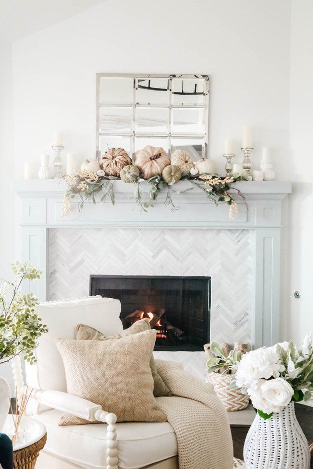 Here, in this breathtaking Malibu, California, retreat, white oak ceilings, concrete floors, and a black plaster fireplace surround are a handsome trifecta.
15
Art That Pops
Douglas Friedman
If you can’t stray away from color, never fear. Try enlivening your neutral room with pops of it with artworks and accessories. We love this example in an art-filled San Francisco home designed by Nicole Hollis, where a vivid glass cocktail table and paintings by Josef Albers and Larry Bell add pizzazz.
16
Organic Chemistry
Joanna Maclennan
It’s been millennia since mankind emerged from the cave, but we’d gladly stay there if it meant inhabiting one as chic as this! In the historic French farmhouse of Patrick and Lorraine Frey, the sitting room showcases an original stone vaulted ceiling and custom furnishings all upholstered in Pierre Frey fabrics, of course.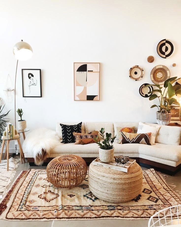
17
The New Tudor
Nicole Franzen
If your home is blessed with historic architecture, like this Pittsburgh Tudor owned by designer Ramsey Lyons, don’t feel pressured to replicate the style inside. In fact, in her living room, Lyons completely transformed the once-heavy timber wall panels using lime wash and tinted wax. Furnishings in soft patterns and a zippy blue artwork by Donald Martiny add even more levity to the formerly serious space.
18
Into the Wild
Douglas Friedman
“I’ve never met a leopard print I didn't like,” Diana Vreeland once quipped. The same goes for virtually any other animal print, which, when combined with the right colors, makes for the perfect neutral look. Here, designer Jessie Schuster reupholstered a pair of vintage chairs in a Clarence House tiger pattern for one fabulous, yet complementary, scheme.
19
Collector’s Paradise
William Abranowicz
Whatever you collect—books, antiques, tchotchkes—a neutral living room provides the perfect blank canvas to display them. Cliff Fong collects (in addition to some 400 rare orchid species) art and 20th-century design masterworks, all artfully displayed in his largely black and white Los Angeles living room.
20
Alpine Elegance
Lindsay Brown
This Lake Tahoe cabin used to be a dark-and-dated ’80s-era ski chalet. No longer, thanks to Sara Oswalt of Purveyor Designs. A light-and-bright palette of cream upholstery and honey-colored timber brought the home into this decade.
21
Timber Touches
Joshua McHugh
Parquet floors and millwork are the perfect basis for a neutral living room scheme.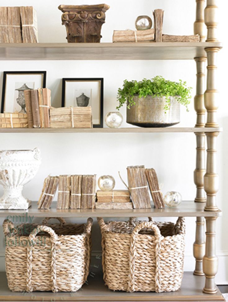 Here, in a New York City apartment overhauled by Cochineal, the designers struck a careful balance between dark, light, and mid tones. “These are unifying factors but still allow us to have variety and creativity and open-mindedness,” says firm cofounder Sarah Mendel.
22
To the Lighthouse
Chris Everard
If you have a view this wild, flaunt it. Here on a windswept coastal site in the U.K., designer Sally Mackereth transformed an all-white lighthouse into a restful family vacation home.
23
Graphic and Novel
Douglas Friedman
Jazz up an otherwise neutral living room with lively zips of pattern, as with the Manhattan home of Carlos Garciavelez and interior designer David Lawrence. The graphic lines of the rug, cocktail table, and Barcelona give the space an artful edge.
24
Rock Steady
Read McKendree
Embracing doesn’t even begin to describe this warm library in a California home designed by Workshop/APD.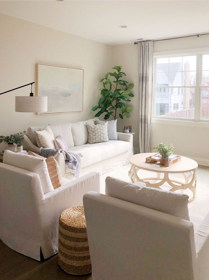 Here, the designers leaned into the room’s tawny stone palette with the travertine cocktail table and fireplace surround.
25
Modern Marvel
Roger Davies
Expanses of glossy concrete and tan-tinged furniture make this California desert retreat a showstopper, without detracting from the cinematic views framed by the building.
26
Farmhouse Chic
Douglas Friedman
Instead of going completely monochrome, opt for a variety of fellow neutrals like gray, cream, black, and white. We love George Kolasa’s Hamptons farmhouse, whose mix of comfortable upholstered furnishings (plus a vintage pommel horse) creates a perfectly worn-in, unfussy feel.
Anna Fixsen Deputy Digital Editor Anna Fixsen, Deputy Digital Editor at ELLE DECOR, focuses on how to share the best of the design world through in-depth reportage and online storytelling.
news, apartment, decoration, things, ways, tips, design and interior
Russian News / Design and interior
HERE News
One of the biggest design misconceptions is that a neutral palette will be boring.
The reality is that nothing could be further from the truth! By mixing different textures and fabrics, you can create a design with elements that can be anything but trite. nine0013
The result is a space that feels like a breath of fresh air.
Yulia Tychino, an expert of the TUTH NEWS online publication on design and interior design, has listed ways to include neutral decor elements in your home.
Photo: ©TUT-NEWS.RUStart with the basics
When you start a decorating project, you have to ask yourself what color to paint the walls. For a neutral space, the walls themselves don't have to be the star.
Instead, they should provide a quiet background for other items such as artwork, accessories and accents. There are many shades to choose from: white, ivory, soft gray and light blue. nine0003
Whatever color you choose, choose a color with a neutral or white undertone that will give your entire room a light and airy feel, perfect for small spaces!
For large upholstered items such as sofas and chairs, choose fabrics in neutral colors such as white, brown, beige and taupe. Not only will they be more practical and durable, but they'll also be a good place to add interest and color to accents, pillows, and bedspreads. nine0003
From scratch
In any design, the rug defines each zone, so the furniture doesn't just float in space. Flooring can be laid to ground a seating area, a dining table, or to add more weight to a bed in a bedroom.
In neutral spaces, you can use one that resonates with other elements, or add some color to add interest. Natural fiber rugs are often chosen for their durability, while woolen and synthetic fibers offer more pattern and color options.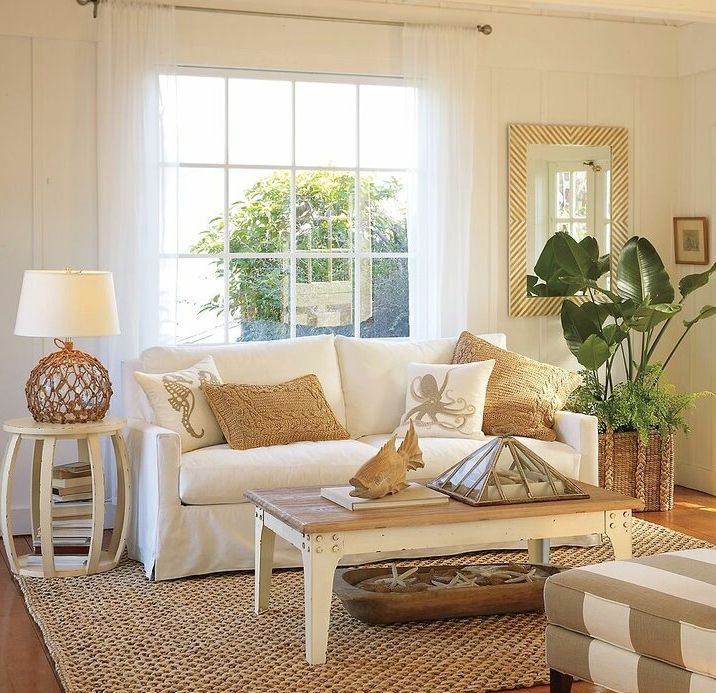 nine0003
Layer on top
Thinking of neutral living room decorating ideas, the easiest way to spice up your design is with pillows. Because it's easy to find pillows to fit any budget, they can be updated when you need them to look new, or even swapped out for different seasons.
Use variations of the same colors but in different fabrics and textures. This is when a neutral palette is beneficial - if you want to add colors, just do it in pillows.
Dress the walls
In a busy room, the artwork complements other elements, but in a neutral space it can really shine. For this reason, the choice of artwork is even more important.
Look for items that tell guests who you are and something about your unique style. Pay attention to the scale - choose one large work as a star or create a gallery wall with a group of works done in the same colors. nine0003
Add accents
Choosing accent pieces is perhaps the most interesting part of decorating any room.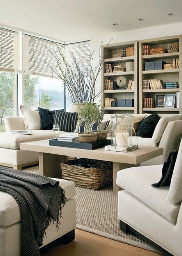
By strategically incorporating these finishing touches, you can add character and personality and truly make the space your own!
Wood
Wood is one of the best ways to bring warmth to a neutral design. Add it to accent tables. Looking for a boho look? Bring some recycled wood.
Other items that work well are live edge shelves, bamboo curtains and rustic wood chairs. Look for vintage pieces that will give your design more dimension and character. nine0003
Colorful accessories
Need some color? Inexpensive accessories are a great way to spice up your design, and you can change them over time to give your space a whole new look.
Try to stick to one (or two colors maximum) to keep the design airy and fresh. Scatter them on the same subject by grouping similar items.
Flowers
Almost any design will get a boost from vegetation. Organic elements not only add freshness, but also soften the design. Add small plants to the table, such as potted plants and flowers.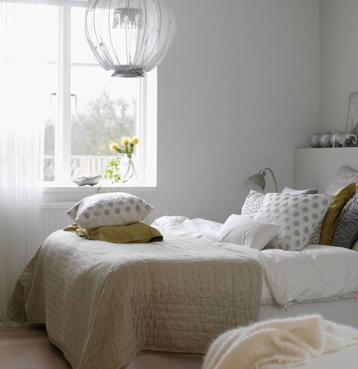 Large plants are a great way to make a statement or create balance with another bulky item in the room. nine0003
A neutral palette is not a trendy color or trendy wallpaper. On the contrary, it is a timeless design that can be updated with smaller components.
Author: Veronika Golasovskaya
contact the author
- apartment
- decoration
- things
- ways
- tips
Latest news
Incidents
28.01.2023
The new incident with shooting in Jerusalem occurred due to the fault of the 13-year-old teenager
Society
28.01.2023
more than half of the Italians surveyed against the sending of weapons to Ukraine
Garden and the garden
28.01.20120
How to properly prepare grapes for winter: tips from experienced gardeners
Life hacks
01/28/2023
4 simple life hacks you need: no one will come up with
Main news
Horoscopes
01/27/2023
"Positive and happiness time": at the end of January 2023, 3 zodiac signs will be the most coveted desire
horoscopes
01/28/2023
"Circulation of finance": in In February 2023, a powerful money storm will hit 3 signs of the zodiac
Society
0003
01/27/2023
Four useless food additives named
HERE News
It happens - you fall in love with this bold graphic wallpaper, trendy color or trendy fabric.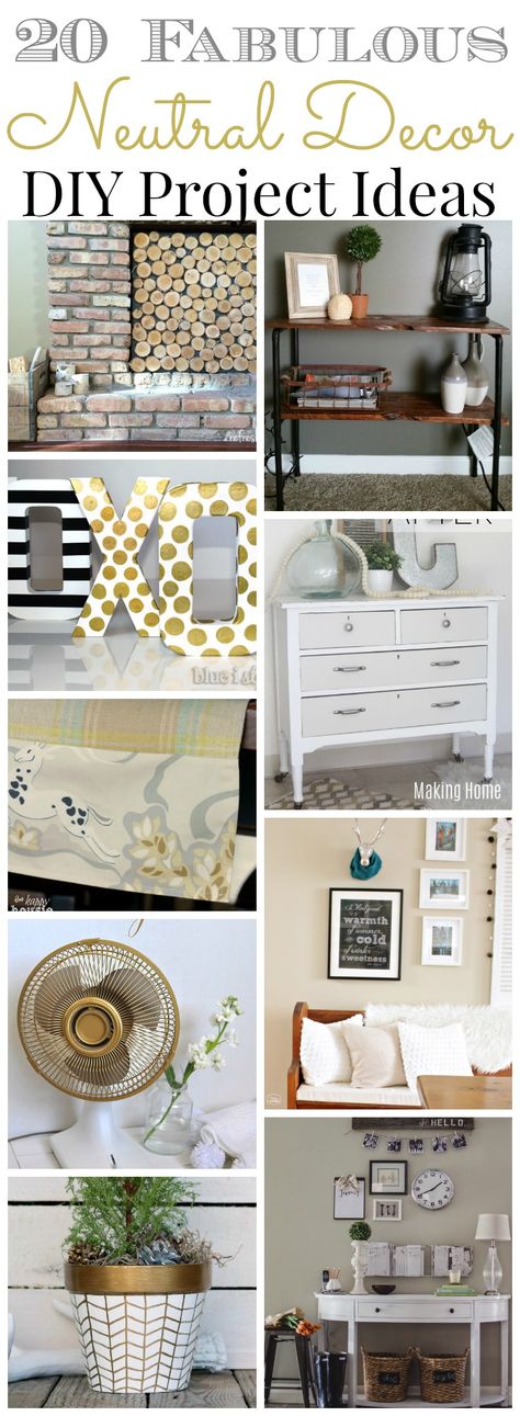
At first you like it. This is a big, eye-catching statement. But fast forward a year later - the trend is over, and the quality that made it stand out is becoming too much.
When you use a loud design in general, it leaves little room for changes later. The solution includes a neutral color scheme that provides flexibility and can be updated piece by piece.
We know what you're thinking, wouldn't it be neutrally boring? The answer is an emphatic no. nine0003 Photo: ©TUT-NEWS.RU
The neutral design offers an open airiness that lets the space breathe. The key is to bring in texture, varying shades of relaxing hues, and layering elements to give the design depth and interest.
Yulia Tychino, an expert of the TUTH NEWS online publication on design and interior design, shared her tips on how to create a neutral design that will not be forgotten.
Start with the walls
The easiest way to freshen up any space is with a coat of paint in a calming neutral hue that serves as the perfect backdrop for everything else you bring to the design. nine0003
Often when thinking about painting, shades are chosen so that they become an important part of the design itself. In this case, try thinking about it the other way around. What does it mean? Instead of the wall color being the star, a neutral hue allows other elements to stand out.
While they may be softer shades, there is still plenty to choose from. In no man's land, there are many paint colors - ivory, whites, warm beiges, soft grays and blues - all work well. One of the biggest benefits of these shades is that they reflect light and give the illusion of more space. Who doesn't want this? nine0003
Add bigger pieces
Ground the space with solid pieces of furniture. For example, a living room in a neutral color scheme provides a solid base that can be updated with small accent pieces.
For couches, sofas and chairs, white and beige will match any interior and can be embellished with pillows and throws instead of bright colors and patterns. As always, when choosing large items, pay attention to the scale and make sure the size will fit your space.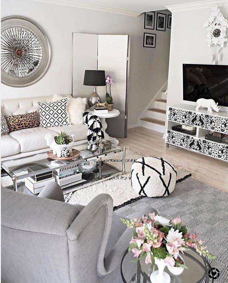 nine0003
Look at your feet
No design is complete without a grounding mat. Neutral flooring comes in a wide variety of materials and options. Rugs should be used to mark parts of the room - seating area, dining area, and so on. For the busy home, sisal and jute are popular because of their durability.
Wool and synthetics will have more pattern and shade options. If you want to add a little more color, rugs are a good place because they are much cheaper and easier to replace than large pieces of furniture. nine0003
Bring in the warmth of wood
One of the best ways to warm up any neutral design is to use wood elements. Look for items that reinforce what you want to say - a reclaimed wood coffee table, bamboo curtains, farmhouse-inspired chairs, or a living edge shelf are all good examples.
Adding touches like this will bring strong design elements without being overpowering. Vintage and rustic items with interesting texture and character work especially well.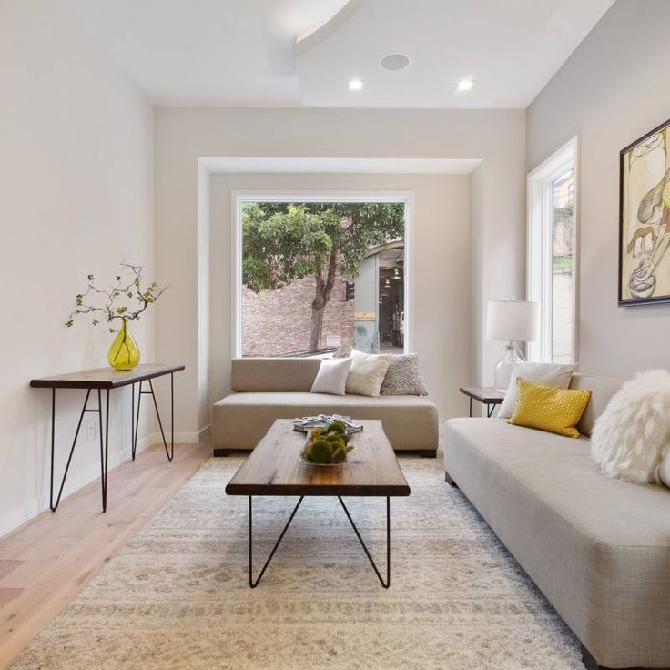 nine0003
Fill the space with personality
One of the best things about a neutral background is accessories, and accent pieces can be constantly added and replaced to add variety to the design. By adding smaller splashes of color, you can create vignettes that grab attention rather than get lost. As with carpets, it's also much cheaper than buying larger, brighter ones.
Living room wall paintings are an excellent example of this. In a busy space, they have something to compete with, but they can take center stage in a neutral design. Pillows also add color and subtle patterns. Layering them will create interest. Even pillows in the same color scheme can be striking if sizes and fabrics are mixed. nine0003
A neutral design may not have the luxury of a design filled with rich fabrics and bright colors, but it also allows new elements to shine.
Author: Veronika Golasovskaya
contact the author
- house
- decoration
- things
- ways
- tips
Latest news
Incidents
28.


