Kitchen color and design
25 color schemes for your kitchen |
Finding the right kitchen color ideas that you will love for years to come has never been more important, with the kitchen now a multi-purpose room designed as much for living as it is for cooking.
Neutrals aren’t for everyone, and the sizeable cost of a new kitchen shouldn’t dictate that you play it safe. It’s more a case of choosing how and where to introduce color, picking spots that can be easily updated, and introducing shades that mirror the color palette in the rest of your home – these are just a few kitchen ideas to choose from.
'It’s amazing how a change of paint color or some new tiles can give a colorful kitchen or painted kitchen a completely fresh look, picking up on different accents within the home,' adds Rob Whitaker, creative director at Fired Earth .
Kitchens are rife with color opportunities, from appliances and flooring, to window treatments and cabinets. Start by deciding how much of permanent commitment you are willing to make to room color ideas. One of easiest and least expensive options is to paint a wall that can be easily updated should you tire of it.
Kitchen color ideas
For a classic, timeless kitchen idea, we sometimes err on the side of safety and choose a completely neutral scheme, forgetting that a little lift of color can cheer up a room immensely. Painted finishes work well for timeless schemes, and of course, can be updated at a later stage if you’re confident enough with a paintbrush.
Our curated collection of the best kitchen color ideas and painted schemes will inspire you to give your kitchen a bold new look.
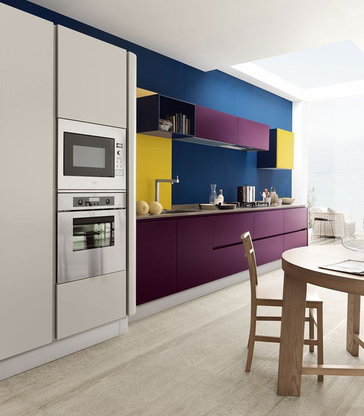
1. Go for a classic blue and white color combination
(Image credit: Future)
Blue kitchen ideas are a tried-and-tested color pairing that works beautiful in both country and modern kitchens.
Blue room ideas are perfectly suited to kitchens. It may be bold but this deep blue tone is timeless and simple to use. This shade sits happily with other hues of the color for a harmonious, layered look and is beautifully offset with pale tones and warm neutrals, as well as stark white or black.
Think about incorporating rough, touch finishes, too. Schemes with intense, solid color demand texture, like raw wood, battered metal, distressed paintwork and linen to introduce a laid-back element.
2. Go for green-on-green
(Image credit: Future)
Inspired by the natural world, green kitchen ideas are restful with a touch of heritage. Strong yet soothing, it brings an enveloping feel but can also sit quietly and allow bold kitchen furniture to shine.
'Mixing different shades of olive green works surprisingly well,' says Charu Gandhi, founder and director, Elicyon. 'I personally love painting a combination of wall and woodwork in olive green, or using a green tiled backsplash in a kitchen.'
3. Warm up with brown
(Image credit: Crown)
Decorating with brown is no longer the detested color it once was. While rich caramel hues definitely belong to the neutral color family, they are anything but plain – there is a luxuriousness to them that is at once refined but also bold.
‘We feel this tone is perfect for domestic spaces, such as kitchens and pantries, where you don’t want the color to be a protagonist,' says Bruce Hodgson, founder, Artichoke. 'A client chose it for a recent project and it works really well in rooms that don’t benefit from lots of natural light, as it manages to be warm and welcoming without overpowering.’
In this brown room, a warm tan, saturated with caramel tones, this hue manages to be neither too bright nor too overpowering.
4. Weave in earthy tones
(Image credit: Samantha Todhunter)
Earthy tones are a top trend for this year, so incorporate rich and warming brown tones and clay shades into your kitchen color ideas and painted kitchen ideas.
This kitchen balances these paler earthy cabinet and pale worktops for a light touch. Your chosen kitchen countertop ideas are an integral part of your kitchen color scheme, even if you’ve chosen white.
In fact, white is a fabulous choice if the rest of your scheme is colorful, as it will create balance and order. In this scheme, designed by London-based Samantha Todhunter , the white seamlessly flows up the walls.
'In this kitchen, the joinery is painted in Farrow & Ball's Setting Plaster which is a favourite shade of mine, as it’s pink without being pink. Painting units creates a great feature that sits against a canvas of clean white walls and countertop, finished with bold artwork that adds color in a confident yet cohesive way to create an easy sophistication.'
5. Don't hold back with black
(Image credit: Future/Darren Chung)
'Dark colors and black kitchen ideas are becoming more mainstream in modern kitchens and, at Crown, we find that this adds drama, strength and solidity to the space. A versatile look, it also can portray an edginess in your interiors,' says color consultant Judy Smith at Crown .
She adds: ‘Black also has the ability to put a contemporary spin on even the most traditional looking space or furniture.
'If you incorporate black into your kitchen scheme in a subtle way, such as painted cabinetry, it will give the scheme definition and add depth to the room without having to completely change the space.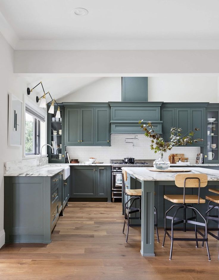
'Black is a classic tone that can be easily brought into an interior scheme and used alongside existing pieces already inside the home.'
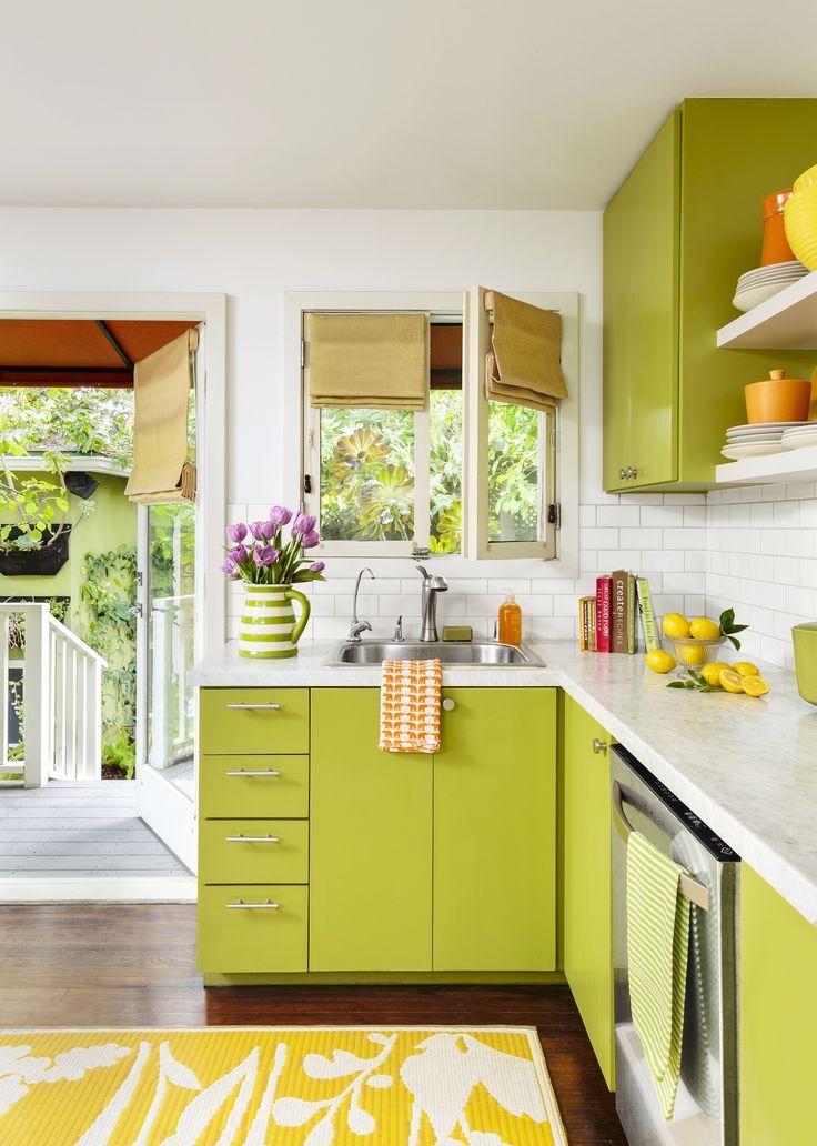
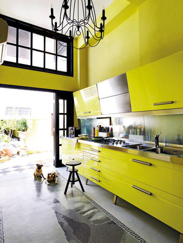
6. Go bold with yellow
(Image credit: Future/James Merrell)
'Known as the "heart of the home", the kitchen is the space in our homes where many of us tend to spend most of our time. It’s a place to cook, snack, and perch as we mindlessly scroll on our phones and socialise.
'It’s also one of the main rooms where the design and style can affect your property’s value. Therefore we often suggest opting for colors that offer a more playful and punchy tone for the kitchen to bring about energy,' says home interior expert Natasha Bradley from Lick .
'Yellow affects our emotions and is a great choice for kitchens, particularly if there is a lack of natural light. It’s bright and cheerful and brings positivity to the heart of the home.'
These vibrant kitchen cabinet ideas guarantee to give an instant pick-me-up every time a person walks into the room. Alternatively, opt for two-tone kitchen ideas for double the design impact.
7. Make your island pop
(Image credit: Kate Lester Interiors/Lauren Pressey)
Natasha adds, 'Another recommendation which works extremely well if you've got an island is to change the color.'
This could either be with a totally different color, or by going for a brighter or darker version of a shade that's been used in the rest of the room. This is just one of many kitchen island ideas you can play about with.
The beauty of this trick is that it injects color but still gives you a light and breezy feel.
Painting your island, like Cali based interior designer Kate Lester has here, will work like an accent color does – you’re just using it on a larger item. You can then link that color through into your accessories, like tableware, casserole dishes, lighting and rugs. To complete the Cali look, add in some rattan and natural wood.
8. Opt for a calming gray
(Image credit: Tom Howley)
'When it comes to gray in the kitchen, it’s a classic color, very timeless and safe. We often feel very secure in gray because it doesn't ask anything from us. If you are quite a hectic person, and you want your kitchen to blend into the background and be very elegant and subtle, it’s a lovely option,' says Natasha from Lick.
She explains that one brand's most popular greys is Grey 07 – the darkest one – and the green undertone works very well with white walls.
This Tom Howley kitchen shows how this often cold color coupled with terracotta can create a space that feels warm and welcoming – a boost for anyone looking for gray kitchen ideas for a north-facing space.
‘It’s important that, when it comes to making a bold design choice, it fits within your home and with your tastes,’ says Tom Howley, design director at Tom Howley .
‘Rather than persuade the client to step away from a more traditional paint color to follow a trend, often we will speak with the client and find out their requirements and their likes. Once a decision has been made about stepping away from a more neutral color palette, it’s all about deciding how much of a statement the client wants to make.
'Neutral color palettes in the kitchen will never disappear. Clients can look to add color and personality to their spaces through styling, accessorizing and even kitchen flooring.
'But for those clients that want to add a stronger injection of color, black, gray and blue kitchen ideas still remain very popular and can be contrasted with light color work surfaces and flooring.’
9. Color block horizontally
(Image credit: Future/Simon Brown)
Color blocking is the pairing of two or three different colors to give a totally unique look, and is a great way to give a contemporary edge to more traditional rooms.
The blocking effect gives this cottage kitchen a modern twist, with blue and cream kitchen ideas paired to perfection.
10. Keep it classic with white
(Image credit: Future/Anna Statham)
Natasha, from Lick, says: 'Classic for a reason, white paint is known for its light-reflecting properties, making your walls "recede" and opening up small spaces.
'Our top picks include the creamy White 03 - a soft white with yellow undertones that can open up your kitchen while keeping those warm, cozy vibes. If you want the ultimate in light reflection, White 01 is a brilliant white but with gray undertones that can boost the energy levels of any small kitchen ideas.
'White creates a feeling of calmness. When used in a kitchen, it can make the space feel clean, sophisticated, and elegant.' There's so much scope when it comes to white kitchen ideas, with endless options to choose from.
11. Add colorful splashes to neutrals
(Image credit: Future/Polly Wreford)
Judy adds: 'We often choose to keep kitchen units and appliances to tones of white and gray, with materials for floors and worktops like stainless steel, polished concrete and wood, because these are expensive items that we don't want to have to replace very often – yet they form a great neutral basis to which we can add personal touches.
'They are the perfect base for vibrant color that will add personality and style, yet which can be inexpensively changed and updated in the future.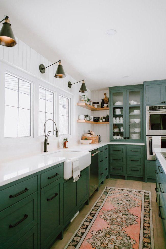
'Really bright colors work well – shocking pink, orange, electric blue – and these can be painted on to cupboards if you prepare them first by sanding down and using a primer, behind a clear perspex backsplash, or as whole walls of color.'
This kitchen does exactly that, with a vibrant mismatched backsplash and pink pastel kitchen cabinet color, along with eye-catching accessories.
12. Black too stark? Try navy
(Image credit: Tom Howley)
Blue kitchens are perennially fashionable, and darker shades can give a dramatic edge. If you want to strike a balance, team it with a lighter worktop and a light wood floor to add a bit more brightness.
(Image credit: Future/Paul Raeside)
If you want to start experimenting with bold colors, a good way to do it is through a statement wall. This will give a splash of excitement, but won't overwhelm the entire room.
This modern kitchen idea keeps contemporary cabinets white, letting the feature wall speak for itself.
14. Join the dark side
(Image credit: Neptune)
Practicality and beauty go hand in hand in this kitchen from Neptune, whose colors and mood are evocative of old Dutch paintings.
Simple kitchen shelving ideas and a freestanding dresser, rather than wall-hung cabinets, offset the rich chocolate palette for an open, relaxed feel.
The dark walls work to absorb imperfections and even out textures, but there are still some tactile elements. Brooding, dark colors often work best when used dramatically and uncompromisingly. Painted kitchens with a rich brown-black on both walls and cabinetry create a bold statement that feels as historic as it does chic.
15. Go for green in your kitchen
(Image credit: Little Greene)
Green is very much the color of the moment, and we predict that it isn't going anywhere anytime soon.
In this kitchen by Little Greene, Aquamarine is used on the island and lower half of the wall, then the color is taken up a notch on the door frame and island trim, then down again for the upper wall, resulting in a harmonious effect.
When it comes to green kitchen ideas, look for paler, cool shades like this for sunny rooms that get plenty of natural daylight; north-facing rooms or those with poor daylight will benefit from warmer tones.
16. Add color with tiles
(Image credit: Future / Jonathan Gooch)
Handmade and artisan kitchen tile ideas will bring a unique mix of color, pattern and texture to any kitchen scheme, adding instant character to walls and floors.
There’s something about tiles – their tactile quality, the potential for adding color, pattern and personality – that few other surfaces can match. Decorative tiles fell out of favor for a while, but they are most definitely back and with a huge choice of forms and finishes.
Here, a selection of glazed tiles in an Azure blue sit prettily in an alcove space. They make an interesting foil to neutral colors and seamless finishes, enlivening your kitchen and making it feel totally yours.
17. Paint in a pink palette
(Image credit: Future / Carolyn Barber)
This muted color combination has given pink a whole new identity.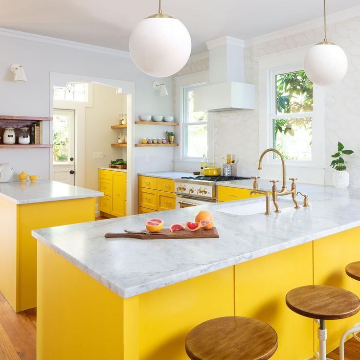 No longer super-girly, the murkier tones of blush pink teamed with industrial gray have a stronger, gender-neutral appeal.
A slim shelf is ideal for displaying pretty plates above a worktop. Here, shades of dusky pink and mole tone beautifully with the pale gray marble surface below.
18. Decorate with a sea of blue
(Image credit: Future / Emma Lee)
Making a color part of the scheme rather than the focus of it offers a more contemporary feel.
This kitchen backsplash idea looks every bit like it’s been created using hand-made tiles but is actually a wallpaper, while subtle hints of ice blue and punchy red balance the look.
19. Create contrast with color
(Image credit: Neptune)
Contrasting black or deep gray with white is the most effective way to create impact in a predominantly white kitchen, but the key is to vary the proportions.
A 50/50 black and white kitchen split could feel cold; instead, pair dark cabinets with marble and another vital ingredient: texture.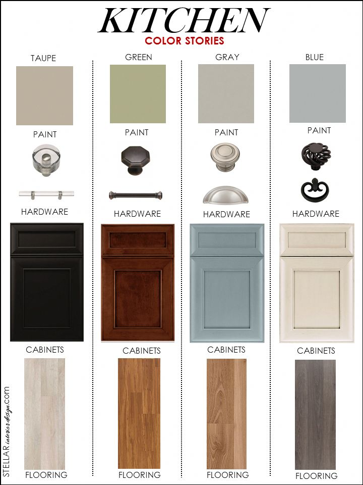 Grain-rich timber doors and accessories will break up the space beautifully, as shown in this Henley kitchen by Neptune .
20. Be brave with a daring color scheme
(Image credit: Future / Polly Wreford)
A bold red kitchen idea is often considered a daring choice for interiors, but used creatively it can introduce a welcome burst of energy and excitement.
A poppy-red kitchen cupboard is ideal for lifting a dark green-gray scheme, while accessories sporting the same shade create a sense of cohesion.
If you're looking for ideas for how to choose a kitchen color scheme that uses bold shades subtly, this is a great option.
21. Be cocooned in an emerald green kitchen
(Image credit: Hubert Zandberg)
Green is having something of a resurgence in the kitchen design space. 'Shades of green are an increasingly popular choice for kitchens,' says Helen Shaw, Benjamin Moore's UK Director. 'At the center point of the color wheel, green can adapt to both cool and warm schemes, working to tie varying hues together.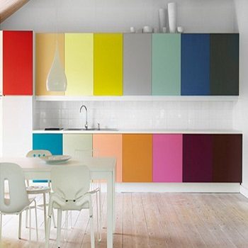 '
'
‘The brief for this kitchen was to bring the greens of the garden indoors,’ says designer Hubert Zandberg. The glazed kitchen wall tiles set off the industrial notes, and natural wood provides a richly textured look.
A well-lit room with clever kitchen lighting ideas will also help the color scheme stand out – take inspiration from the vintage-style pendant lights in this space.
22. Introduce shimmer and shine
(Image credit: Future / Damian Russell)
With its warm, burnished lustre, brass is once again in the ascendant, lending a polished edge to interiors.
A dark background is ideal for showing off the gleaming beauty of brass. Here, it forms a counterpoint to a statement mirror-like panel that adds a glamorous note to a modern kitchen island.
23. Use toning colors to create a cohesive scheme
(Image credit: Ledbury Studio)
This kitchen has base cabinetry in a dark blue, but the use of a toning color on the walls – here a bright turquoise – creates a much bolder finish.
This is a clever technique, choosing painted kitchen cabinets that are easy to redecorate around, timelessly fashionable and easy to sell to future buyers, but adding pep with a wall color that can be quickly and easily changed when the scheme needs a switch up.
24. Be bold with a toned down red
(Image credit: Plain English)
Red kitchens are back in fashion – but they're far from brassy. Instead, toned down reds that edge towards terracotta or deep reds such as cherry are having a moment.
That doesn't mean that lipstick red can't be on your list – but this bold shade works best for flat-fronted, contemporary kitchens, while the earthier and berry shades are more suited to traditional spaces.
25. Go for a pure white scheme
(Image credit: Lisa Staton Interior Design/Haris Kenjar)
White kitchen ideas are still the biggest selling 'color' in the kitchen market place, and there's no denying that choosing white cabinets does make it considerably easier to adapt and tweak color schemes at a later date. Avoid the 'clinical' look by making sure that there are some elements of natural materials in the room – perhaps wooden flooring, or a timber table top and chairs.
What are good colors for the kitchen?
Of course everyone has their own personal style , but what are the most popular kitchen color ideas?
‘A trend that is growing in popularity is warm shades of grays,’ explains Jamee Kong, head of design at DesignSpace London . ‘Unlike some of the sharper colors, gray tones work well in both matt and gloss finishes and are very versatile. For example, matt warm gray tones could create a distressed look by bringing rustic charm to a design.’
Color is a powerful design tool – not only can it completely alter the mood of a kitchen, how much or how little you add will affect which parts of the room you’re drawn towards. ‘The rule of thumb is to use color sparingly and in clearly defined areas,’ says Gordon Boyd, area sales manager for Nolte Küchen .
‘Colors should serve a purpose rather than be used at random. Go for a basic color and then use another to accent certain areas. Alternatively, try corresponding pairs, such as shades of green or blue, or play with natural tones and add a more vibrant color to certain elements, for example a shelf, a sideboard or a bench.’
The shades you choose are just as important as how you use them. While it can be tempting to opt for your favorites, it’s advisable to restrict strong colors to elements that are easy to update, such as installing a backsplash, and opting for those that have greater longevity across large areas.
Whether your kitchen design is starting from a preferred shade, taking its lead from an heirloom piece of furniture or statement appliance, or simply a color that echoes the style of your home, selecting a second or third tone can alter the look drastically.
‘Choosing two colors that work well together means either choosing complementary colors – colors next to each other on a colour wheel – or choosing contrasting colors from opposite sides of the color wheel,’ reveals David Mottershead, MD at Little Greene . ‘Contrasting colors will be energizing, while complementary colors create a calm space.’
How do I choose a color scheme for my kitchen?
Choosing color is such a personal experience – in fact no one knows for sure whether we all even see the myriad shades in the same way. Mark Wilkinson, Founder of Mark Wilkinson Furniture , believed that the colors we choose automatically are naturally influenced by current fashions.
‘The color in a kitchen – be it on walls or fittings – should last for at least five years, minimum, so try to look beyond immediate trends and choose a color that will keep you feeling good long term,’ Mark advised.
The real secret of using color well is to use it carefully. While trends help to inspire, it’s best not to follow them too slavishly. Take time to think about how color might affect the mood of your room, for instance, warm ‘advancing’ colors, such as reds and yellows tend to be energising and stimulating, while cooler colors that ‘recede’ including blues and greens will feel more calming and soothing.
Kitchens are rife with color opportunities, from appliances and flooring, to window treatments and cabinets.
Start by deciding how much of a permanent commitment you are willing to make. One of easiest and least expensive options is to paint a wall that can be easily updated should you tire of it.
A more permanent option is to opt for striking worktops. Solid surfaces such as Corian and Silestone are available in a wide palette. Glass backsplashes are another popular option, and can be supplied custom back painted in virtually any shade.
What colors make a kitchen look bigger?
While light colors are generally recommended for compact kitchens, remember that a small space also has less opportunity to express its personality, so introduce a pop of color where you can, or try pretty pastels. They can prove a great compromise between bright primary colors and boring neutrals. Dusty oyster pinks and pale yellows are currently in vogue and will lift the spirits in a sun-filled kitchen.:max_bytes(150000):strip_icc()/modern-style-kitchen-high-gloss-cabinetry-f7ec4e51-075876f3b22f4c41a4af9e595b1e4622.jpg)
Hi-gloss finishes will also help to bounce the light around, helping to create a sense of openness. They’ll need to be regularly wiped though to clear off finger marks so might not be best suited for family schemes. Matt finishes are popular right now, as are more textured ceramic-look doors. These will lend a little softness to the color and, best of all, require less cleaning.
Avoid cool colors in north facing kitchens as they tend to be too chilly for comfort. If your kitchen lacks natural daylight, consider going with the gloom by choosing dramatically dark colors. Jewel tones like deep emerald and rich garnet are on-trend and will lend character in the style of a private members club.
What are modern kitchen colors?
In the past, there may have been an all or nothing approach to color in the kitchen – remember shades of lime green and orange being so popular in the 1970s? The new palette is a little more restrained and considered, with pale blues, shades of grey and darker, inky shades proving popular.
‘Hybrid greys – where the grey is mixed with another color – are on trend for 2022. For example, brown-grey or taupe will maintain grey’s modern look but bring warmth to a scheme,’ explains Kiran Noonan, Marketing Director at John Lewis of Hungerford .
Adding an accent color is as popular as ever and here, yellow comes into its own, particularly in play with darker shades of grey.
‘The rule of thumb is to use color sparingly and in clearly defined areas,’ says Gordon Boyd of Nolte Küchen . ‘Go for a basic color then use an accent shade to highlight certain areas. Alternatively, try corresponding pairs, such as shades of green or blue, or play with natural tones and add a more vibrant splash to certain elements, for example a shelf, sideboard or bench.’
Painting your walls and also cabinets is an easy and modern way to transform a room, and when you inevitably get bored with your chosen color in years to come, it is an easy refresh job.
Gathering together paint cards is a good place to start and, as many cards and brochures now feature ‘complementary’ shades, they’ll also help you to find accent and toning colors, too.
If you’re planning to refresh an existing scheme or don’t want to commit with your cabinetry then accessories are an effective way to add a pop of color. Pick an accent shade and then visit the high street, speak to an interior designer or go online to look for fabrics, china, glassware and small appliances in your chosen shade. A feature wall in the same color will help to bring the whole look together.
Jennifer is the Digital Editor at Homes & Gardens. Having worked in the interiors industry for a number of years, spanning many publications, she now hones her digital prowess on the 'best interiors website' in the world. Multi-skilled, Jennifer has worked in PR and marketing, and the occasional dabble in the social media, commercial and e-commerce space. Over the years, she has written about every area of the home, from compiling design houses from some of the best interior designers in the world to sourcing celebrity homes, reviewing appliances and even the odd news story or two.
55 Best Kitchen Paint Colors
Karyn MilletAdding color to your kitchen is the best to way to make it look polished—no renovation, no construction, just a paint color (or two or three!) and a brush. Whether you're the kind of person who prefers to keep things understated with white and greige or someone who loves a pop of anything vibrant, you're in great hands here—we rounded up 55 kitchens featuring every shade in the rainbow. Most of the examples ahead star beautiful paint colors, but we also included a few colorful material ideas for those of you want to do more than repaint. Ready to punch up your cabinets with bright blues and reds, or ground a large space with a soothing gray or green? No matter what your color preference—or if you're totally stumped for inspiration—allow the fresh kitchen paint color ideas, designer examples, and shopping tips to guide you.
🏡You love finding new design tricks. So do we. Let us share the best of them.
Advertisement - Continue Reading Below
1
Olive Green + Warm Wood Tones
Tessa NeustadtThough designer Tammy Randall Wood is a believer in hiding appliances and other kitchen essentials away behind closed doors, she also makes a strong case for allowing the enclosures to shine with a bold paint color that nods to nature.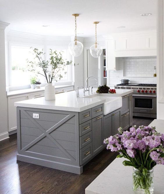
Shop a similar shade of green paint below:
BUY NOW Valspar Satin Brisk Olive, $44
2
Black and Charcoal
Heidi Caillier DesignThis kitchen designed by Heidi Caillier is only separated by an archway, so to create visual separation without totally clashing, she chose a bold and dark color scheme for the kitchen. The wood-paneled walls are painted black and a charcoal-hued natural stone material serves as a backsplash and also frames the windows for an extra punch of style.
Shop a similar shade of black below:
BUY NOW Farrow & Ball Pitch Black $46
Advertisement - Continue Reading Below
3
Pale Icy Blue and White Brick
Heidi Caillier DesignHeidi Caillier painted the cabinets an icy blue hue and the brick walls white for a brighter aesthetic and then secured a small piece of artwork to bring some moody depth.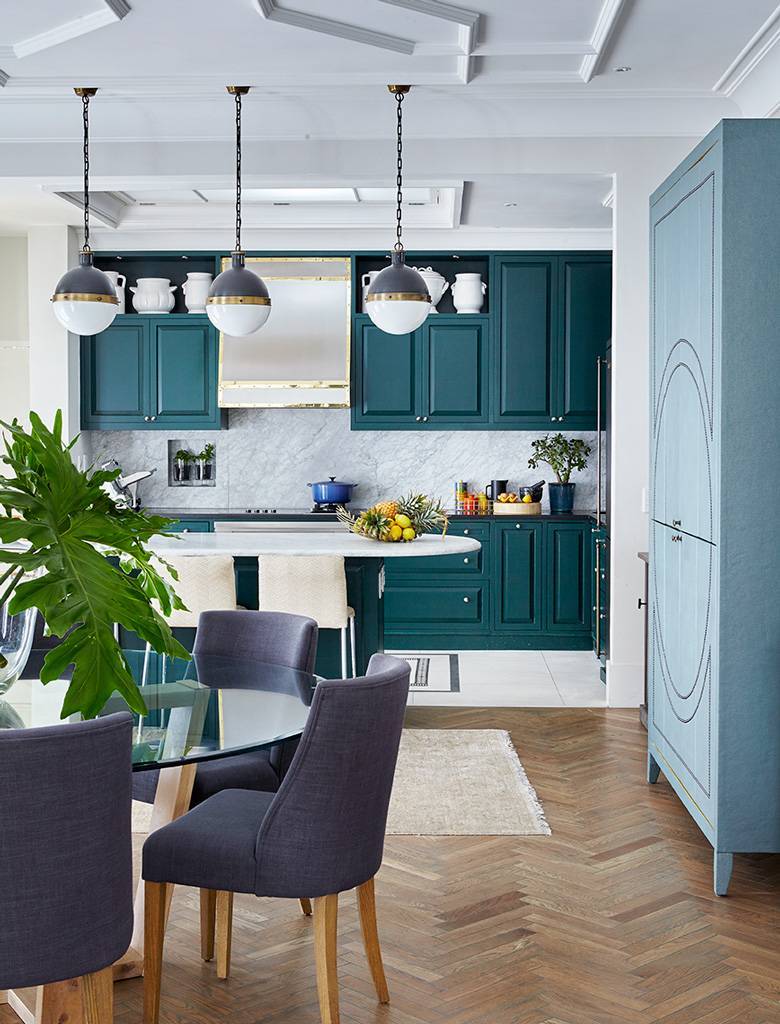 The brass hardware and fixtures speak to the gilt frame.
Shop a similar shade of blue paint below:
BUY NOW Farrow & Ball Graupel, $110
4
Pale Yellow
Read McKendreeThe cabinets climb almost all the way up the wall in this coastal kitchen by Kevin Isbell, but that didn't stop the designer from applying a soft shade of pale yellow paint to the top of the wall and ceiling. This cheerful shade contrasts with the blue painted floors just enough!
Shop a similar shade of yellow paint below:
BUY NOW Backdrop Disco Nap, $45
Advertisement - Continue Reading Below
5
Khaki Green, Gray, and Pink
Thijs de Leeuw/Space Content/Living InsideThe rest of the home designed by Nicole Dohmen of Atelier ND is dominated by rosy hues, so to prevent it from taking over the kitchen while still ensuring flow with the surrounding rooms, she opted for earthy tones on the cabinets.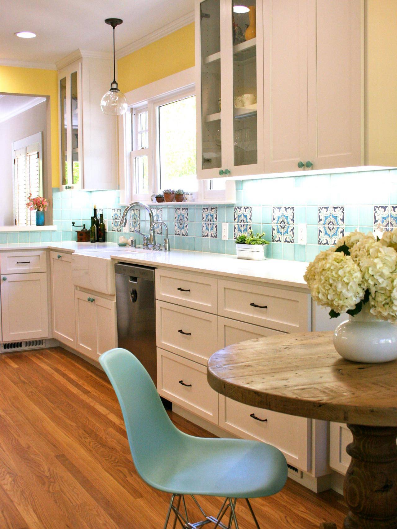 Violet still makes an appearance in the Calacatta marble counter and backsplash zellige tiles, and a dusty blush tone veils the ceiling.
Shop a similar shade of neutral paint below:
BUY NOW Farrow & Ball Mouse's Back, $115
6
Midnight Blue
Emily HartOklahoma designer Kelsey Leigh McGregor used charcoal gray Negresco granite on the backsplash and countertops of this kitchen so they would nearly disappear against the dark paint color used on the walls, hood, and cabinets. Though it's dark navy, it appears black in certain lighting.
Shop a similar shade of paint below:
BUY NOW Farrow & Ball Stiffkey Blue, $110
Advertisement - Continue Reading Below
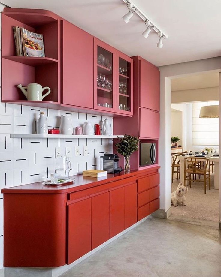
7
Light Pink and Burnt Orange
Karyn MilletA super light shade of pink applied in a plaster-like finish and paired with a burnt orange island makes a statement in this small New York City kitchen designed by Celerie Kemble. The faux finish channels the texture of wallpaper.
Shop a similar textured paint below:
BUY NOW Portola Paints Specialty Finishes
8
Eggplant
James MerrellIn this striking London kitchen, design Rita Konig opted for cabinets from her own colorful line for Plain English in a shade of purple dubbed Burnt Toast. Calacatta Viola, a mauve-streaked marble, brings out the inky eggplant.
Shop a similar shade of purple paint below:
BUY NOW Rita Konig Burnt Toast cabinets
Advertisement - Continue Reading Below
9
Forest Green
William AbranowiczPolished concrete gets a surge of warmth from the green cabinets and abstract blue artwork in Kathleen McCormick's home. It's the perfect combination of edgy and homey.
Shop a similar shade of green below:
BUY NOW Valspar Peacock Green, $30
10
Marigold and Brick Red
Katie NewburnThe cheerful yellow wallpaper in Shavonda Gardner's kitchen proves that you don't need tons of windows and natural light to make your kitchen feel sunny. The red range and lower cabinets add a fun and unexpected contrast while the unlacquered copper pots, soapstone counters that quickly patina, and wood tones tine the two warm colors together.
Shop a similar shade of red below:
BUY NOW Farrow & Ball Pelt, $110
Advertisement - Continue Reading Below
11
Pale Blue-Green
Nicole FranzenIn this tiny Brooklyn apartment, Patrick McGrath sectioned off the kitchen from the living space with a freestanding island but he also did so visually by painting the wall of cabinets a soft blue-green shade.
Shop a similar shade of light blue below:
BUY NOW Benjamin Moore Polar Sky, $55
12
Navy Blue
Emily J FollowillThis kitchen designed by Melanie Milner gets the royal blue treatment, which is glamorous on its own, but even more so with the bronze, mahogany, and natural stone materials used throughout.
Shop a similar shade of light blue below:
BUY NOW Benjamin Moore Deep Royal, $55
Advertisement - Continue Reading Below
13
Greige, Cream, and Muted Mint
Heidi Caillier DesignA greige tone is used for the cabinets while a cream tone is used on the ceiling and accent wall. But the color-blocking fun doesn't stop there in this Heidi Caillier-designed kitchen—the door is painted in a muted mint shade that picks up on the unique color of the range.
Shop a similar neutral shade below:
BUY NOW Farrow & Ball California Sand, $110
14
Marigold + Terracotta
William AbranowiczPaint isn't the only way to bring color to your kitchen. In this impressive hacienda kitchen, The vaulted ceiling is covered in terracotta tiles while the marigold zellige tiles assert a sunny atmosphere.
Shop similar yellow tiles below:
BUY NOW Clé Tiles Saffron Zellige Tiles, $20
Advertisement - Continue Reading Below
15
Cream + Dark Green-Blue
JARED KUZIADesigner Karen Swanson limited the number of cabinet uppers she installed in this English countryside-inspired kitchen, explaining that, "so many people want to blanket the wall in cabinets, but that can make a kitchen feel heavy and claustrophobic." Instead, she left a windowed wall bare so light can pour in, and so she could hang artwork. Dark cabinet lowers and storage columns pick up on the dark green in the still life but don't overwhelm the room.
Shop a similar shade of cream below:
BUY NOW Benjamin Moore Sugar cookie, $55
16
Sky Blue
Annie SchlechterIn this kitchen by Sheila Bridges, a shimmering blue wallpaper is accentuated by glossy sky blue paint. If you're tempted to paint a small kitchen all white to make it feel larger but also find yourself craving color, consider this space your sign to the plunge with a pastel.
Shop a similar shade of blue paint below:
BUY NOW Benjamin Moore Grandma's Sweater, $46
Advertisement - Continue Reading Below
17
Fire Engine Red
George RossBirgitte Pearce designed a hidden pantry to keep stored items discrete behind sliding doors with textured glass—but once open, the pocket doors reveal a bright red surprise (a great introduction to the world of bright paint colors for the uninitiated!). The wood floating shelves and brass door handles warm up the saturated colors.
Shop a similar shade of blue paint below:
BUY NOW Benjamin Moore Heritage Red, $90
18
Cadet Blue
Emily FollowillBecause the kitchen sits at the center of this home designed by Meredith McBrearty, she used the same blue-gray color in adjacent rooms and then hung lime green pendant lights to inject a splash of fun.
Shop a similar shade of blue paint below:
BUY NOW Benjamin Moore Normandy, $46
Advertisement - Continue Reading Below
19
Glossy Green
Thomas LoofKati Curtis opted for jewel tones throughout this old Tudor home to open it up and give it that surge of energy that only saturated colors can accomplish. The lush green paint is even richer in this high-gloss finish. The custom matte metal panels over the refrigerator is a welcome surprise next to such shiny materials.
Shop a similar shade of blue paint below:
BUY NOW Benjamin Moore Shamrock Green, $46
20
Pale Green
David TsayA pale green blends seamlessly between the kitchen and dining area of this "jungalow," by Justina Blakeney, especially when paired with the Moroccan clay tile backsplash and ombre dining bar stools in the living room.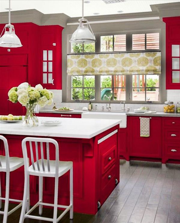
Shop a similar lacquer finish below:
BUY NOW Farrow & Ball Cooking Apple Green, $110
The combination of colors in the interior of the kitchen
When planning to renovate the kitchen or when planning to buy new kitchen furniture, everyone is faced with the problem of decorating the kitchen interior and choosing colors for such an important room in our house.
Based on the designers' recommendations, we have compiled the basic rules for combining colors in the interior of the kitchen. When deciding on the choice of color for decorating the interior of the kitchen, two main points should be remembered :
1. All dark colors can hide and reduce space, while light ones expand it. Therefore, for a small kitchen, it is desirable to use pastel colors in combination with bright accents. Too spacious kitchen can be made more comfortable if you combine bright colors and low-key dark color in its interior, and make the kitchen set two-tone.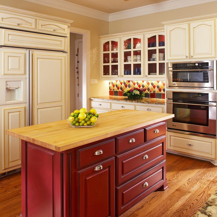
2. The interior of the kitchen can be done in multi-color or single color. In a multi-color kitchen, one color should be dominant.
Single color (monochrome kitchen)
If you are going to design a kitchen set in a single color, you must not only choose one color for the set itself, but use its shades in interior design.
The basis of a quality kitchen design lies in the maximum harmony of furniture and decor with wall, floor and ceiling finishes. It is very important that the components of the interior fit each other both in terms of stylistic orientation and color scheme.
Every person associates the kitchen in the house with the comfort and warmth of the hearth. This effect can be achieved only if the right combination of colors in the interior of the kitchen.
Designer's advice on choosing a color palette and its intensity:
* The kitchen can be decorated in several colors.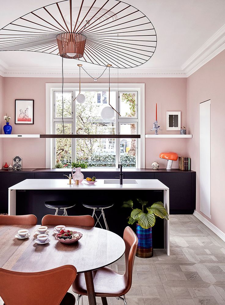 However, you should not use more than three shades, as in this case the main idea of \u200b\u200bthe design of the room will be lost.
* If the color of the walls and the color of the kitchen set are the same, then the shade of the furniture should be darker, at least one or two positions.
* In most cases, it is not recommended to make the floor and ceiling in the same color and texture. This will lead to an imbalance in the volume of the room.
* The countertop and backsplash (wall panel) should preferably be designed in colors that are opposite to the kitchen set and other furniture. The game of contrasts helps to place the right accents.
* If the furniture in the kitchen is light unsaturated colors, then the walls, curtains, upholstery for chairs or sofas, tablecloths must take the lead in using brighter and more catchy colors. Otherwise, the kitchen will be boring and uninteresting.
* If the walls are painted in bright, eye-catching colors, then the kitchen set should be made in soothing colors that do not attract the eye.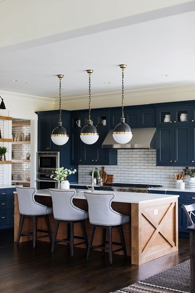 And vice versa. The defiant color of the kitchen set does not allow making walls that are active in color.
Color rules:
White - goes with everything, best with blue, red and black
Beige - goes well with blue, brown and white
Gray is a boring color that is nevertheless basic. Pairs well with dark pink, red, purple, hot blue
Pink - this color goes well with brown, white, olive, gray, turquoise
Red - perfect with yellow, white, green, blue, gray and black
Brown - with bright blue, cream, pink, green, beige
Orange - with blue, blue, purple, violet
Yellow - with blue, purple, light blue, gray, black
Green - goes with golden brown, yellow, black, light beige
Blue - with red, gray, pink, orange, white, yellow
blue to lilac, green, yellow, orange, red
Black is a versatile elegant color. Looks good with all colors. Best combined with orange, pink, green, white, red and yellow.
At first glance, choosing the perfect color scheme for your kitchen seems like a difficult and impossible task. Indeed, you need to spend a lot of time to achieve the desired result. However, by applying the above rules in practice, you will see that the game was worth the candle.
A popular color option for the kitchen is a combination of the base color and its shades with white.
Basic rules for choosing wall colors for the kitchen * A large pattern on the walls visually reduces the size of the room. * A small pattern, on the other hand, makes the room appear larger than it really is. * Geometric patterns on the walls of the kitchen in the form of intersecting stripes, like the ornament on Scottish kilts, create the illusion of a continuous space.
 * Vertical pattern "raises" the ceilings, visually "increasing" the height of the room. * Horizontal pattern and horizontal stripes on the walls expand the kitchen while reducing its height. * The diagonal lines on the wallpaper add dynamism to the kitchen, creating the illusion of movement.
 Today, designers are actively using an interesting option - the use of silver instead of white. If white is the traditional choice in a monochromatic interior, the use of silver is in line with the latest trends in interior design. Designers love metallic for its neutrality and the ability to combine this color with many others. Gray color is perfect for the kitchen in view of its practicality and non-staining.
So that a plain kitchen does not turn out boring, designers recommend following certain rules:
* choose at least three additional shades in the interior, one of which must be dominant.
* use different shades of the base color to divide the kitchen into functional areas. This technique, among other things, allows you to correct the shortcomings of the layout.
* use different textures of materials - one color looks different on materials of different textures. Contrasting accents. Even one item that contrasts with the main color of the kitchen will make a monochromatic interior more “alive”. For this, the already mentioned black color, and any bright shades, are suitable. The main thing is not to oversaturate the interior of the kitchen with separate bright details.
Another use of colors is two base colors and complementary shades of transition from one color to another.
Contrasting color combinations in the interior of the kitchen
When using contrasting color combinations in the interior of the kitchen, you must be extremely careful. For in this case, you risk making the kitchen too aggressive or tastelessly decorated.
The combination of opposite colors in the spectrum, where only one of the selected colors is the main one, looks good in the interior.
Contrasting kitchen looks stylish and trendy.
When designing a contrasting interior, furniture should be the starting point.
Furniture should be darker than the walls and lighter than the floor.
The most popular color combinations for a contrasting kitchen interior: * orange and blue * orange and black, gray * yellow and purple * peach and blue * white and black * red and black * red and gray * red and gray white * beige and dark brown * green and black * lilac and warm green In addition, a combination of any bright color with white or black is considered a contrast.
Conclusion Whatever design option you choose, whatever combination of colors in the interior of the kitchen you choose, follow the basic rules: * White or black color can be combined without risk with almost any other color.
 * In a multi-colour kitchen, use no more than five shades and no more than two colors for the kitchen set. * The main (dominant) color in any combination should be only one color. * Glossy surfaces enhance the depth and saturation of the color, matt ones subdue. * All decorative elements of the kitchen serve as color accents, so they should be the brightest.
 Design wisdom says that incongruous colors do not exist. The combination of colors in the interior of the kitchen depends, first of all, on your taste preferences.
Popular articles: 0006 Choose the color of the ceiling for the kitchen The color of the walls in the kitchen - tips, photo We draw up the kitchen with wallpaper - which color is to choose , types of wallpaper Vinyl wallpaper for the kitchen - beautiful and practical, 55 photos Mosaic tile in the interior of the kitchen
Ceiling design in the kitchen - photoOl000 different colors in the interior - designers' advice on choosing colors for the kitchen and 95 photos The choice of color for the kitchen set depends on how you would like to see the kitchen after all the work is completed. Designer tips on how to choose the right color for your kitchen set and what to watch out for: * Do not use more than two colors in one kitchen set. * If the kitchen set is designed in two colors, then the color of the upper cabinets should be lighter in tone than the lower cabinets. * A monochromatic kitchen looks better when it is made of colors ranging from light beige to dark brown, pleasant, calm and not too flashy. A plain kitchen looks good if the kitchen space is not large. * Only one color should be the dominant color in the typeface if the typeface is made in different colors. * Different colors of the kitchen set must be combined with each other. Furniture should be the starting point in kitchen interior design. If you are planning to buy brightly colored furniture, it is advisable to make walls in calm, neutral colors. And vice versa, a monochromatic and not bright kitchen set requires more catchy, contrasting walls and surrounding decor. The following color combinations are popular in one headset: black and white, black and pink, black and red, black and orange, red and gray, red and white, yellow and blue, beige and gray, green and light -yellow, dark brown and light brown, brown and beige, orange and dark brown, lilac/purple and yellow, burgundy and light pink, green and brown. * In a small kitchen space, you do not need to use dark saturated colors. Remember that a light color visually enlarges the space. * A room with a large area will become more comfortable if the light suite is supplemented, "diluted" with bright accents. * Too dark a kitchen set, even in a large kitchen, can create a gloomy atmosphere. * The colors of nature are best suited to the color of kitchen furniture. The best color combinations in one kitchen set: Color plays a huge role in a person's life, it affects well-being, mood, performance, relationships. The kitchen is an important part of our home, we spend a lot of time there, so choosing the color of the walls for this room should be taken seriously. Basic rules for choosing wall colors for the kitchen: Each person has an individual approach to the choice of color, so you should figure out what will be relevant for the kitchen, and what can hardly be called the right decision. Let's take a closer look at the main color options: Red - This color is considered one of the most intense, bright, impressive and eye-catching. However, do not forget that it can not only arouse appetite, but also inappropriately increase blood pressure. Psychologists say that such a solution for the kitchen is preferable for people who are strong-willed, self-confident and able to always keep any situation under control. Pink - This shade of red can have different effects on a person - it all depends on the saturation. However, he is not so aggressive, but, on the contrary, carries a tendency to calm and tranquility. Pastel shades of pink are able to improve mood, give a feeling of lightness and tenderness, but crimson ones - awaken appetite, increase tone, excite, make people more emotional. Orange - If the lady of the house chooses this color for her kitchen furniture, she will always win. The fact is that it is orange shades that moderately increase appetite, and communication in such a bright environment is always relaxed and easy. This is one of the reasons why such tones are chosen in many modern cafes and restaurants. They are considered the key to movement, dynamics and communication. Yellow - A yellow kitchen will be filled with light, warmth, comfort and boundless good mood all year round. This choice is most often inclined to cheerful and loving people who love to start their day with beauty. Even in cloudy weather, when it is autumn or winter outside, it will always be sunny and clear in a yellow kitchen. Experts say that this color awakens the "muse" in creative people, and also contributes to the manifestation of imagination, prompts a desire to experiment, including in culinary business. A variety of shades allows you to choose the best one, but it should be borne in mind that too bright contributes to anxiety, and dim - a breakdown. Green - Green has long been considered the most pleasant color to perceive. It evokes a feeling of calmness, and the interior in such colors gives people comfort and a sense of security. Blue - A blue kitchen is sure to give its owners a sense of calm. It is natural that such an environment will evoke associations with relaxation, sea, sky, water. Well, how can you not relax here? Paradoxically, scientists have found that the popularity of blue shades increases at times when a country or the world as a whole is experiencing crises, including economic ones. It's easy enough to explain. It is the heavenly colors that are a sign of security, trust and even devotion. If there are those in the house who want to say goodbye to excess weight forever, then it is worth acquiring a kitchen in a bright blue color, since, unlike red, it perfectly fights hunger, dulling it. Violet/Lilac - Violet kitchen is always a bit of a daring option, which always reeks of brightness. Many are inclined to this choice, knowing about some mystical properties of such shades - to attract wealth, strength and power. Nevertheless, it is the purple color that is considered an expression of sensuality, subtlety. To make such a kitchen look luxurious and stylish, you should pay attention to the right combination of shades and accessories. Calm tones, in turn, will create a unique romantic atmosphere in this corner of the house, where it will be pleasant not only to cook and eat, but also to receive guests with a cup of fragrant tea. Brown - In most apartments today you can find kitchens in brown made of wood or "under it". This is not surprising, because such a color gives a feeling of confidence, stability, trust, comfort. In addition, it is considered the most neutral, since, in most cases, it does not affect the general well-being or mood. Black - A kitchen in black is, as they say, an amateur. The fact is that many modern people are prone to prejudice and consider this color to be mournful, mystical, dark. However, designers prove the opposite and, with a skillful combination of accessories, turn the black kitchen into a stylish and presentable room, which, in addition to everything, looks spectacular and harmonious. This is a classic that will remain relevant and in demand at any time. Most often, black is combined with white, red and orange. White The indisputable advantage of such a kitchen is the visual expansion of space. Also, this color is able to soften combinations of any, the brightest shades. It is known that it is completely impractical, but it always looks stylish, spectacular, expensive. However, you should not get carried away too much, as the abundance of white can cause eye strain and even headaches.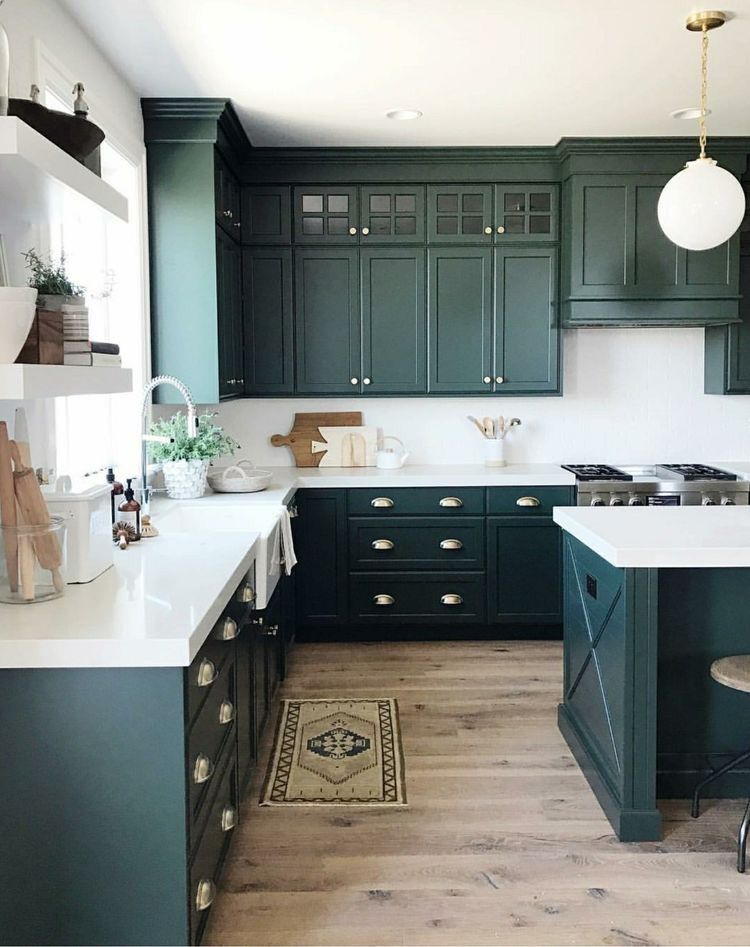 It can be calm or tonic, effective or calming, bright or gentle. Consider in this article the basic rules and advice from designers on choosing colors for the kitchen.
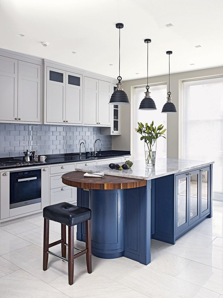
 Looks good with all colors. Best combined with orange, pink, green, white, red, yellow.

 Psychologists have come to the conclusion that bright red furniture should not be installed by those who regularly diet, wanting to lose weight.
  Who should choose such a solution? First of all, those people who are used to quick snacks are active and purposeful.
  In addition, it is a symbol of growth, life, development, relaxes, protects from stress, nervous overload. Choosing a green kitchen is for those people who do a lot of work, read, work, and also regularly experience psychological or physical stress. In addition, scientists have found that this coloring is able to reduce pain in the abdominal cavity, harmonizes the general condition of the body.
 It is worth noting that brown is one of the most combinable colors, as most of the others are combined with it.