Flower colours in the garden
Color Schemes for Flower Gardens
More Articles
Find more garden information
Other Article Categories
Choose CategoryRecipesRaised Bed GardeningAnimal Pest ControlsGardening for the PlanetSoils & CompostSeed StartingGrowing Fruits & VegetablesPlanting Techniques & ToolsPest & Disease EncyclopediaHouseplant CareAdvice Garden Planning & Design Color Schemes for Flower Gardens
Guidelines for combining colors in your landscape design
By Suzanne DeJohn
What is the best color scheme? The one that's most pleasing to you! Color wheelColor is usually the first thing people notice when they see a flower garden, and choosing plants in pleasing color combinations can be daunting to a new gardener. The color wheel is a helpful tool. It's based on three primary colors — red, yellow, and blue — and also depicts the colors in between.
The concentric bands show the colors in different degrees of saturation. Fully saturated colors are the most intense; as you move toward the center of the wheel, the colors become softer, more pastel.
Warm colors. Yellow, orange, red, magenta — these "warm" colors bring energy and excitement to a planting. When planted at a distance, they draw the eye in.
Cool colors. Purple, violet, and blue tend to be soothing and quieting. They can get lost at a distance and so are best for close-up viewing.
There are no hard-and-fast rules in choosing colors. A bold chartreuse green might fall into the "warm" category, while a softer, pastel shade of that same green might fit right in with a cool-color palette.
The most important design tip? Choose plants and colors that you love!
Designers use specific terms to describe color combinations. To help you get started, here are a few examples:
The most important design tip? Choose plants and colors that you love!
Complementary Color Scheme
Left: bright pink yarrow (Achillea millefolium 'Saucy Seduction') contrasts with chartreuse-green Orpin stonecrop (Hylotelephium telephium 'Autumn Charm'). Right, the bright red flowers of maltese cross (Silene chalcedonica) pop against the backdrop of green foliage.
This yarrow (Achillea 'Terracotta') and woodland sage (Salvia nemorosa) offer more subdued complementary tones.
Right, the bright red flowers of maltese cross (Silene chalcedonica) pop against the backdrop of green foliage.
This yarrow (Achillea 'Terracotta') and woodland sage (Salvia nemorosa) offer more subdued complementary tones.In complementary color schemes, two colors on opposite sides of the color wheel are combined.
- Brings energy and excitement to a planting
- Examples: blue and orange, yellow and purple, red and green
- Use varying hues (shades of blue, for example) to keep it interesting
- If needed, tone it down with quieter colors and foliage
Analogous Color Scheme
Left: Zinnias, geraniums, and marigolds in shades of red, orange and yellow create a vibrant planting. Right: Knapweed (Centaurea 'Caramia'), smooth phlox (Phlox glaberima 'Triple Play'), and sea holly (Eryngium planum 'Blue Glitter') offer a pleasing palette of pink, purple, and steely blue.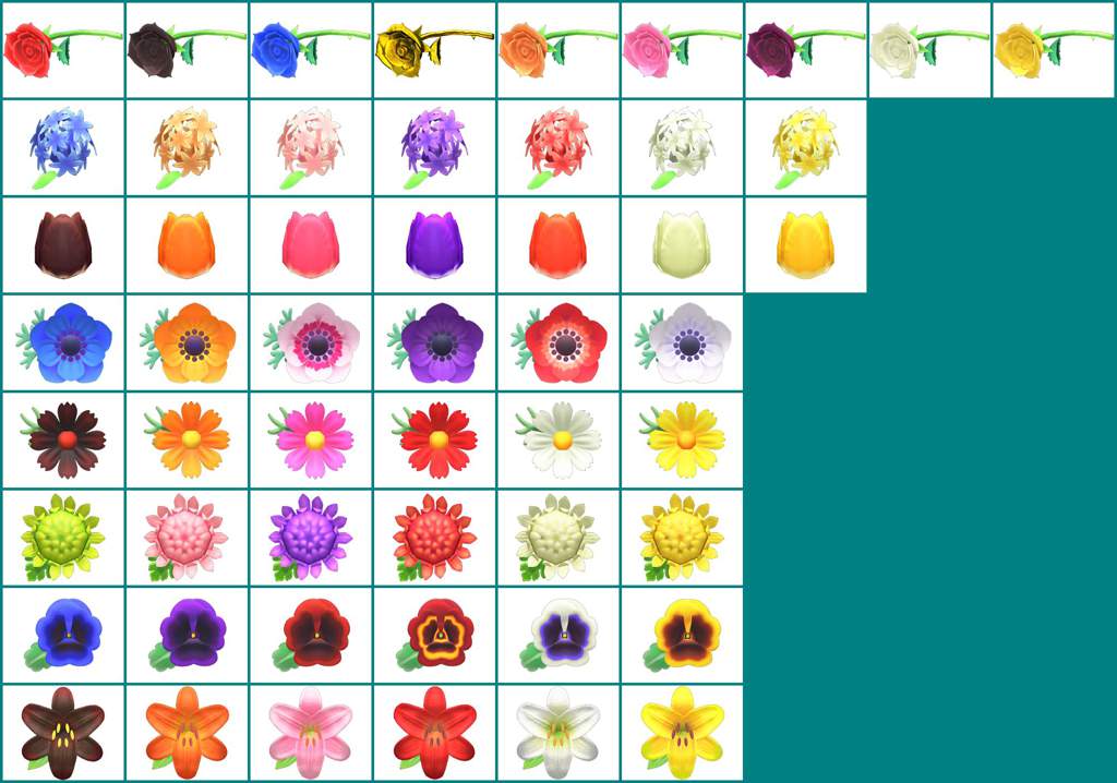 Orange and red-orange marigolds and chartreuse lady's mantle is a traffic-stopping combination.
To create an analogous color scheme:
- Select three neighbors on the color wheel (colors that are adjacent or near each other)
- Makes it simpler to choose plants that are attractive together
- Examples: yellow, orange and red; blue, purple and red
Monochromatic Color Scheme
Left: Foamy bells (Heucherella 'Fun and Games Red Rover'), with coppery-red to peach-colored foliage and tiny white blooms, combines beautifully with Diascia 'Towers of Flowers Apricot' to create a pleasing monochromatic planting. Right: This pink-themed border includes coral bells (Heuchera 'Dolce Silver Gumdrop'), geraniums (Pelargonium 'Marcada Pink Purple'), calibrachoa, and petunias.Another option for a monochromatic color scheme is a "moon garden." Gardens featuring all white flowers are especially beautiful when viewed by moonlight.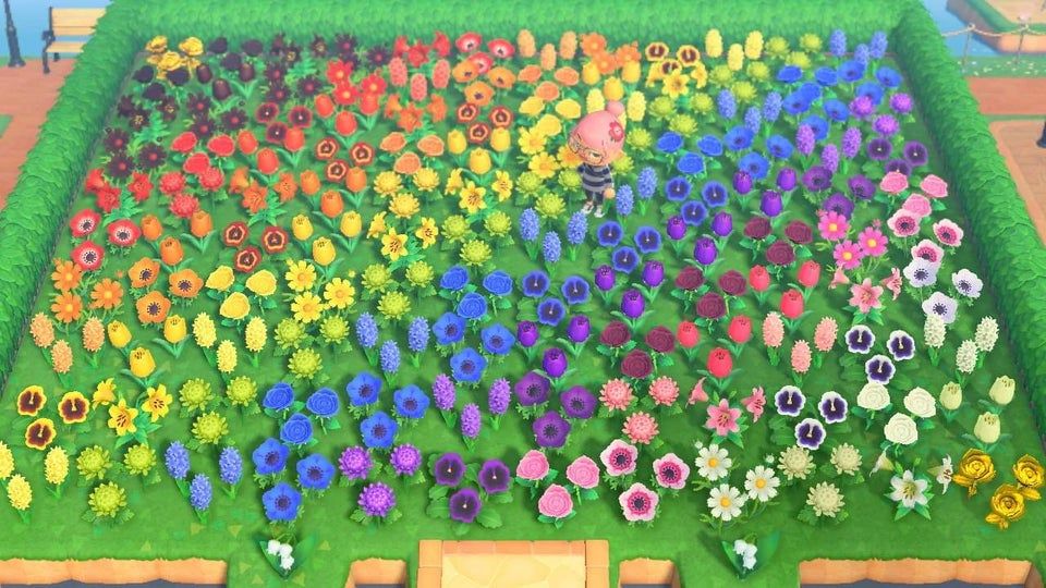 Good choices include moonflower (Ipomoea alba), night-blooming jasmine (Cestrum nocturnum), and evening stock (Matthiola incana).
Last updated: 11/30/2022
Share this Article:
People who read this article often purchase
Related Articles
-
Our Viva Planters Grow Color
-
Garden Design Techniques that will Transform Your Landscape
-
20 Terrific Plants for Winter Landscapes
Get the Dirt
Stay up to date on new articles and advice. Please fill out the information below.
Share this Article:
Related Articles
-
Our Viva Planters Grow Color
-
Garden Design Techniques that will Transform Your Landscape
-
20 Terrific Plants for Winter Landscapes
|
|
|||||||||||||||||||||||||||||||||||||||||||||||||||||||||||||||||||||||||||||||||||||||||||||||||||||||||||||||||||||||||
Color theory, color in your garden
Consider the color wheel. There are warm (active) colors (from green to red-violet) and cold (passive) - from blue-green to purple.
Active colors excite attention, are clearly visible at a great distance.
Passive colors are soothing, well perceived at a short distance, but their shades are hardly distinguishable at a distance.
Color affects the perception of form and space, which is widely used in landscape construction and in creating spatial illusions. nine0003
Warm colors a visually bring an object or plane closer, and cold colors remove it.
To create a beautiful landscape composition, you need to know the laws of spatial color mixing. The effect occurs as a result of the fact that the human eye does not perceive separately many small fragments of different colors. A flower bed, in which small multi-colored spots are combined, is perceived from afar by the eye as a spot of an average color - this is the result of spatial mixing.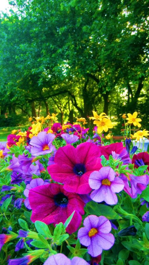 With it, intermediate, pure colors are obtained from the main, pure colors. nine0003
For the perception of the composition, the features of the psychological impact of color on a person are also important.
So, red color excites, but with prolonged perception it causes fatigue.
Yellow causes joy, but with prolonged exposure, anxiety.
Green and Blue soothe, Blue and Violet can depress.
All color accents in the garden are included in the natural green background. nine0003
Color composition can be built according to the laws of contrast or nuance. A contrasting color composition will be obtained if two complementary colors are placed side by side: red with green, blue with orange, yellow with purple. When elements are repeated within the same composition, the opposition effect is enhanced.
For tri-colour composition , you can choose the shades of colors that form the vertices of an equilateral triangle on the color wheel, such as shades of red, yellow and blue.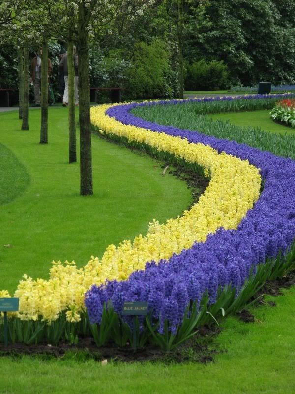 nine0003
The best contrast is achieved by combining strong and weakly saturated colors. Contrasting combinations excite attention, are clearly visible from a distance. They are used in the design of parterres, entrances to the garden. For ceremonial carpet flower beds, parterres, flowerbeds, plants are used, the flowers and inflorescences of which overlap the leaves, therefore, when viewed from a long distance, spots of pure spectral color are visible. The most advantageous in this case are contrasting color combinations. nine0003
Colors that are nearby in the color wheel should be combined in carpet flower beds undesirable (blue with purple, red with orange, yellow with orange).
Nuance color composition is based on the main color and its shades, which differ in hue, lightness and saturation. For example, red with shades from red-orange to purple, blue with shades from purple to cyan. The nuanced combination of colors is soothing, but it takes a long time to perceive and does not look at a great distance.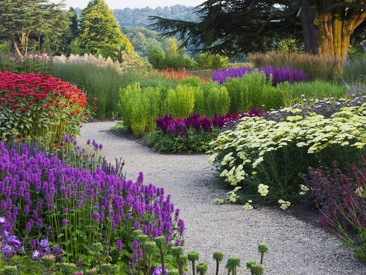 nine0003
For single-color flower beds (blue, blue or red flower bed), plants with a certain color of flowers and leaves are selected. To liven up the color scheme, neutral colors are included - white or gray (silver).
The multicolor composition of the flower garden is based on the visual balance of colors: there is no dominant color in it. The colors black and white play a very important role in the color composition, as they are combined with all spectral colors. nine0003
Black (for plants - dark purple) contrasts with any light color - blue, pink, yellow. Any colored spot on such a background seems more saturated.
White color (allisum, even filling with white marble chips around the flower bed) “gathers” a varied composition into a single whole, smoothes out the feeling of variegation.
Light Gray (Silver) or White will help separate colors that are unpleasant to the eye: green and blue, purple and green, red and blue.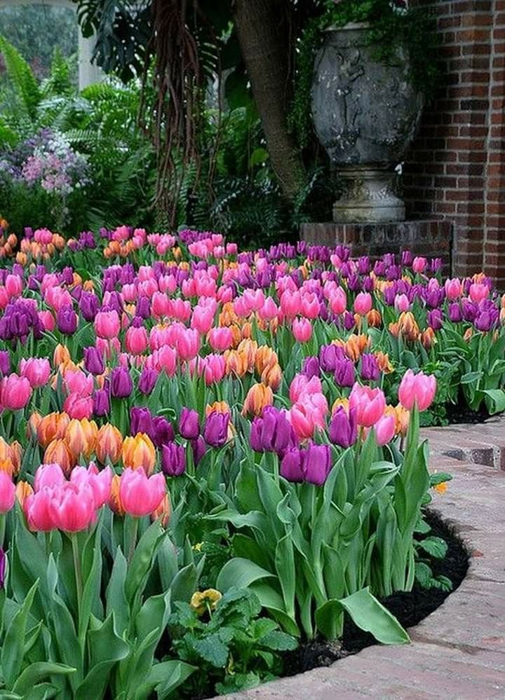 This technique is widely used in the preparation of flower beds: a border of white allisum or silver cineraria will perfectly separate the blue lobelia from the green background of the lawn. nine0003
Color dependent on lighting. Color may look different in different lighting. With too bright or, conversely, insufficient lighting, the color seems less saturated, its shades are poorly perceived.
In the dark, the human eye can only distinguish black and white colors.
At different times of the day, sunlight has a different spectral composition - and, accordingly, we see colors in different ways.
During sunset, orange-red light predominates, so red and orange flowers appear saturated. At the same time, yellows lose their saturation, blues appear greenish, blues and purples turn black. Similarly, open fire and lamps with a warm radiation spectrum distort the color. nine0003
In twilight lighting, the blue-blue part of the spectrum predominates, as a result, blue and blue colors become the brightest and most saturated, yellow turns green, orange loses saturation, red turns black. The same effect is given by lamps with a cold radiation spectrum.
These patterns determine the change in the color and mood of the garden during the day, season, year.
Advice: To enliven a “one-color garden”, it is made up of plants that contrast in the texture of the leaves, the nature of the inflorescences, the density or openwork of the curtains formed by the plant. nine0003
Advice: A colorless garden can be livened up with a few bright accents. The chaotic bright color environment, tiring the viewer, can be balanced by the introduction of neutral colors - black, gray, white. Color theory for garden design How to plan the color scheme of the garden? What shades to choose? Use flowers of harmonious close colors, or bright contrasting shades. In any case, your favorite color should serve as the basis. nine0003
- 1 of 1
Pictured:
The basis of this bright flower garden is yellow daylilies and foxgloves.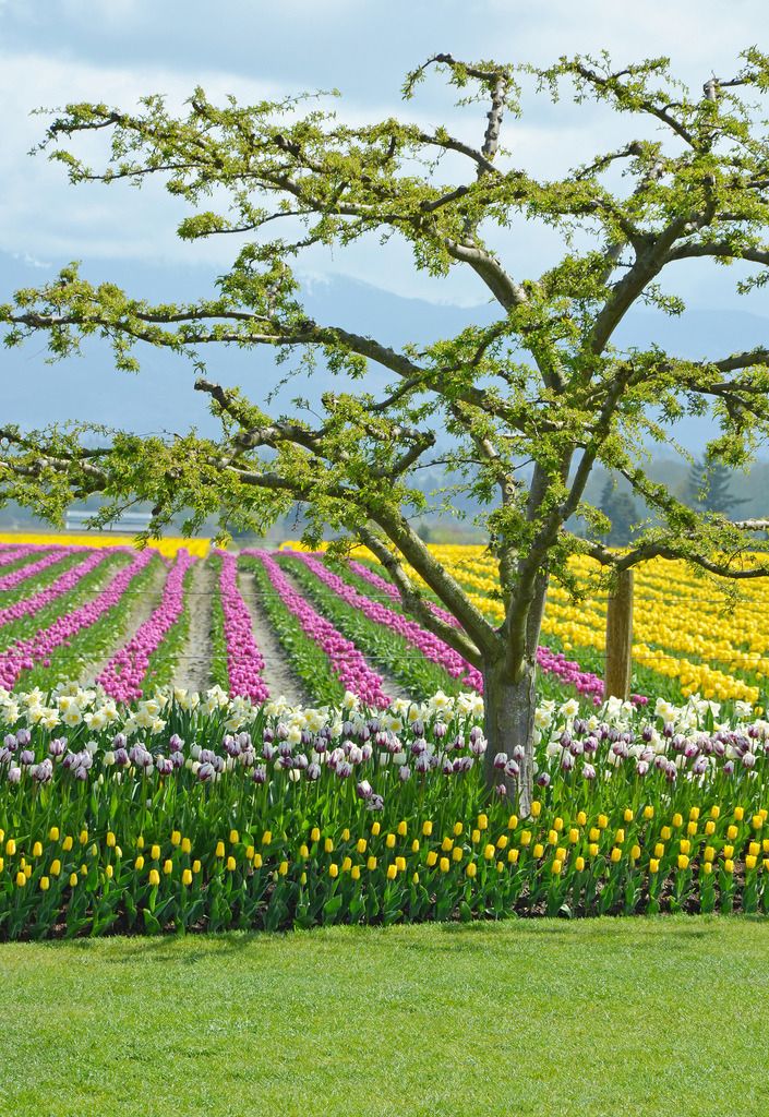
Which color should I choose?
Warm or cold? Creating a color scheme is the most interesting, but also the most difficult part of working on a project. Thinking through the color scheme of plantings in a green garden, it is useful to use a color wheel on which all colors are arranged in a certain sequence. All colors and shades are conditionally divided into warm (yellow, red, orange) and cold (blue, indigo, violet). nine0003
- 1 of 1
Pictured:
The world's first purple flower garden in Sissinghurst. Plants are selected according to the principle of contrast in shape and size. To highlight the complex base color, plants with pink and blue flowers are added.
Listen to yourself. Let color into your green garden. Bright warm shades stimulate physical activity, energize. Therefore, warm-colored plants are good to plant where vigorous activity is expected.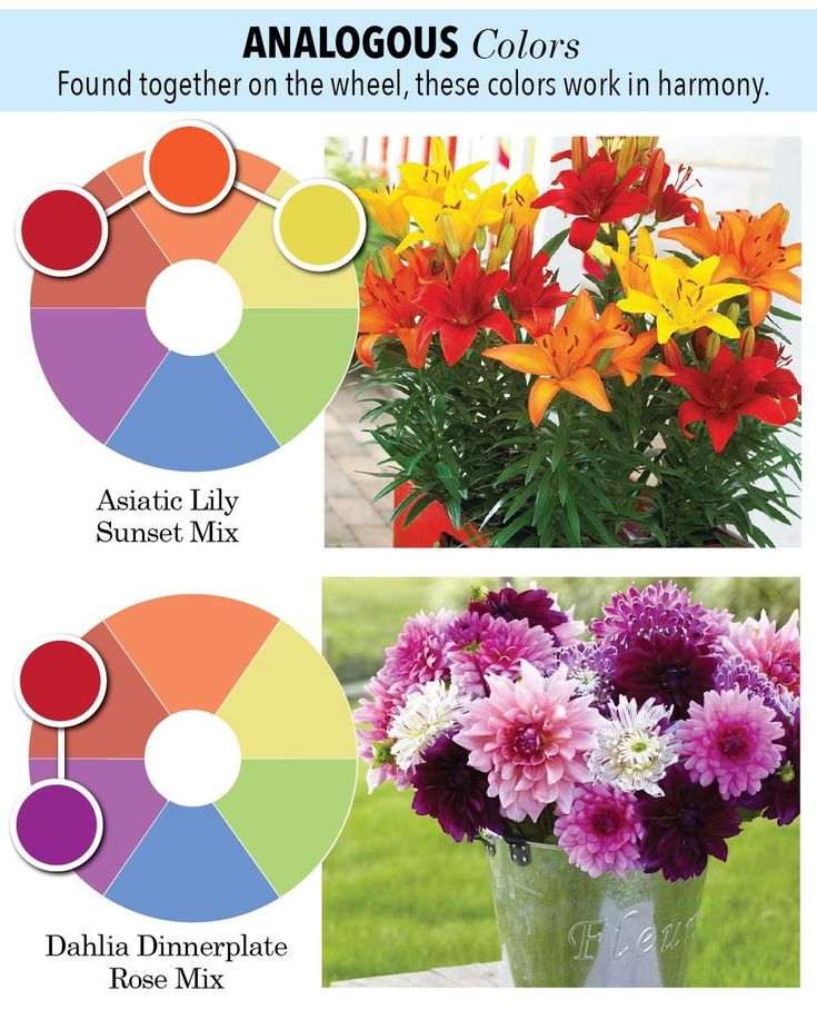 Cool shades soothe, promote relaxation. They are good in the recreation area - near the pool or patio. Your green garden is an extension of your home. Therefore, it is reasonable to use the colors that are used in the interior for the coloristic design of various zones. nine0003
- 1 of 1
Pictured:
The recreation area, like a cozy living room, is designed in soothing lilac-blue tones with the addition of white.
Color and space. Warm colors visually bring objects closer, so it is better to place them in the foreground of the flower garden. Cool tones, on the contrary, seem to recede, move away from the observer. Using this property, you can visually enlarge the space by planting blue flowers in the background of the composition. White gives a feeling of purity and freshness. Unlike blue, it does not create a depth effect, but, on the contrary, moves forward. Therefore, if you want to draw attention to any part of the garden, arrange a border of white flowers there.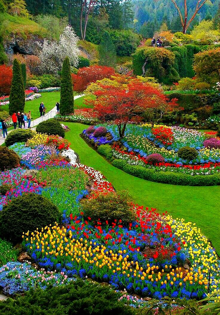 nine0003
- 1 of 1
Pictured:
Vibrant colors are separated by buffer plants in neutral tones, which are also the background.
Harmony or contrasts?
Harmonious composition. Created from the base color by combining shades located in adjacent segments of the color wheel. Do you want to arrange a flower garden in refreshing shades of blue and purple? Plant Fassen's catnip, pink monarda, pink and purple argyranthemum together, and bushes of wormwood and Byzantine chisteta add cool silvery hues. Like warm sunny colors? Compose delicate yellow daylilies Demetrius and Icecap, with a dye navel and peach and apricot roses. In the second half of summer, a similar yellow flower garden can be created from rudbecky, marigolds and marigolds. nine0003
- 1 of 1
Pictured:
Charming flower garden in blue-lilac tones of ornamental onions and catnip with white and light pink aquilegia.
Play with contrast. The most powerful combinations are the so-called complementary colors located on opposite sides of the color wheel - yellow and purple, orange and blue. In spring, orange tulips surrounded by blue forget-me-nots or muscari will cheer you up. In summer, a bright contrast of purple and gold will be created by Black Beauty geranium and loosestrife. nine0003
- 1 of 3
Pictured:
Not a single color. You can decorate your green garden without the use of bright flowering plants. You can play with combinations of different shades of foliage - from light green or silver to dark green and purple.
- 1 of 1 nine0133
Pictured:
This square parterre composition is built on a combination of foliage colors of boxwood bushes, tinted paving, as well as light green and purple coleus. In the very center - a rectangle of gray-blue shoots of young.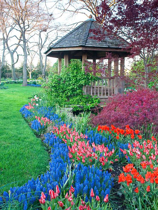
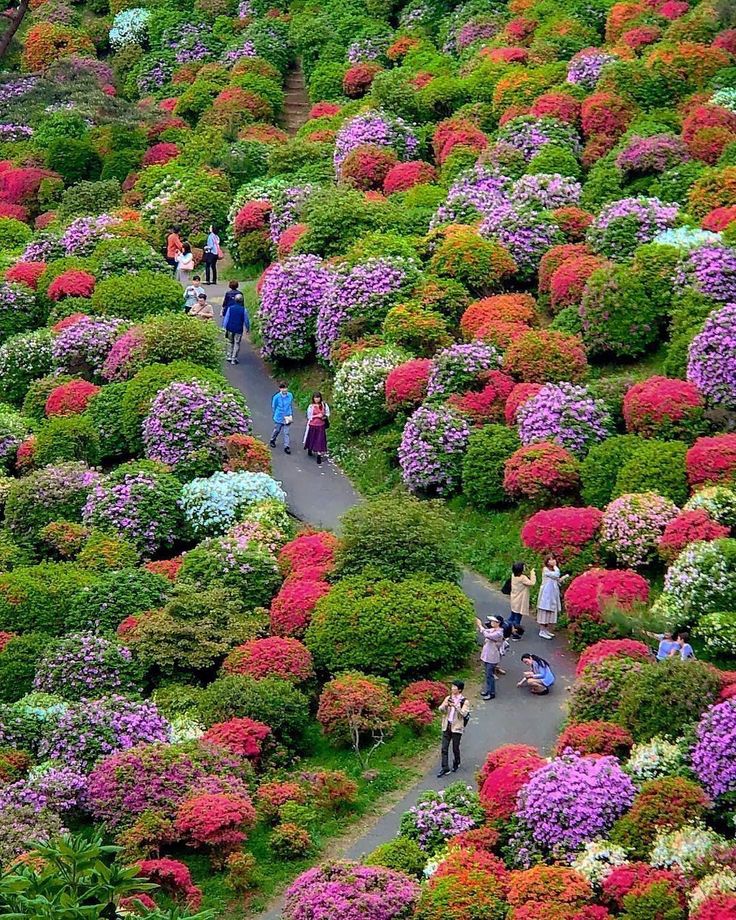 Color choices are a matter of personal taste.
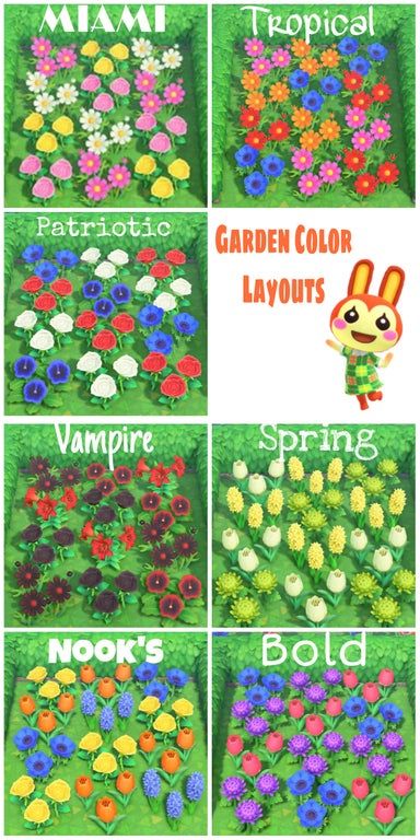 It can help you combine different colors of blooms, foliage and other elements in ways that you find pleasing.
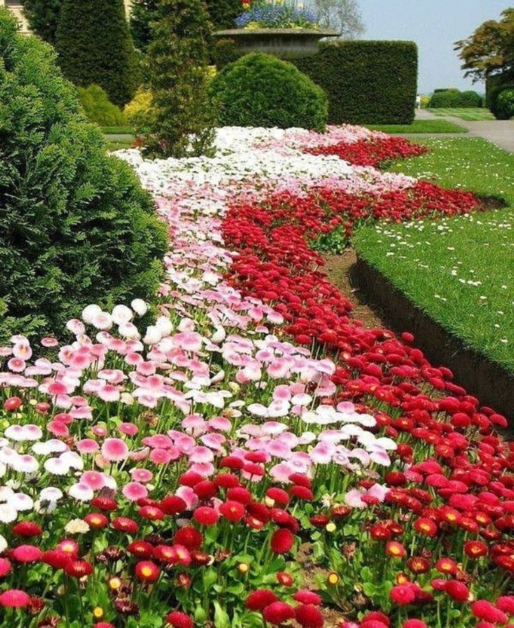 Split rail fences, arbors, seating, structures and enhancements dont have to be dull brown or black. Painted pots and boldly colored window boxes can complement or contrast with plantings. A vivid blue bench, brightly painted birdhouse or purple dog house can liven up your landscape.
