Decorating with color wheel
Home Color Palette + Easy Color Hacks
This post contains affiliate links & photos. See our full disclosure here.
In this post: Color is one of the easiest and most effective ways to change the look of any room. Learn the basics of color in interior design, how to use a color wheel, the difference between color schemes in interior design and home color palettes, as well as how and where to use color in your home.
Color in interior design is a powerful tool. When you choose the right colors, you can make a space feel lighter, friendlier, more glamorous, more elegant, or whatever feeling you want to achieve. And when you create a whole home color palette, especially if you use a color wheel for decorating, your home instantly looks more pulled together and stylish.
Table of Contents
What Is Color?
“In physics, color is essentially the way our eyes and brain perceive different wavelengths of light reflected off objects.” [source]
Color is one of two key ways that you can create beauty and cohesive flow in your home decor. (Finding your style is the other.)
What are the basic colors?
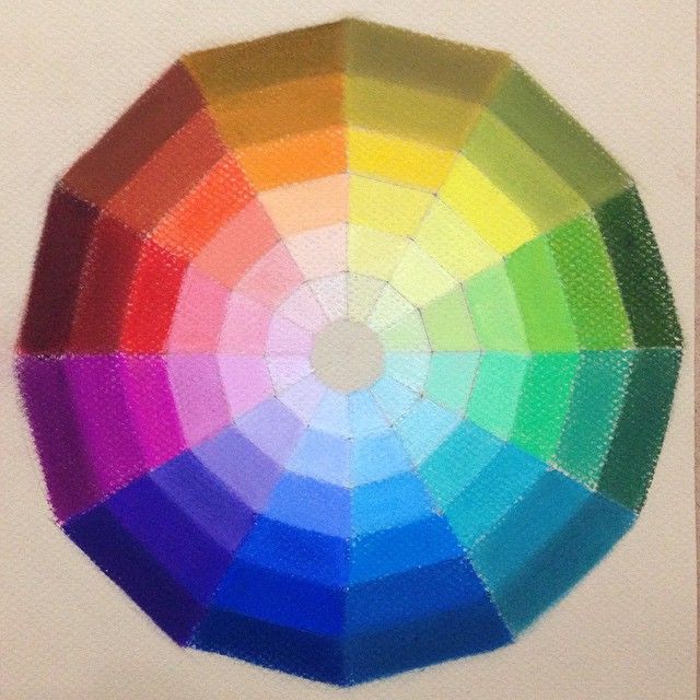
Most of us remember back to kindergarten and maybe painting at an easel. Well from that you may remember the 12 colors on the color wheel. Just in case you don’t, they are:
- 3 primary colors – red, blue, and yellow.
- 3 secondary colors – orange, green, and violet (or purple)
- 6 tertiary colors – yellow-orange, red-orange, red-violet, blue-violet, blue-green and yellow-green
Different colors have different meanings, can influence our creativity and productivity, and create different emotions and moods.
Color psychology is the study of colors in relation to human behavior.
Put simply, the colors we use in our homes can affect how we feel and how we act. So it’s important to choose the colors we use wisely.
The psychology of color in interior design
Here are a few common colors and their positive and negative emotions and connotations.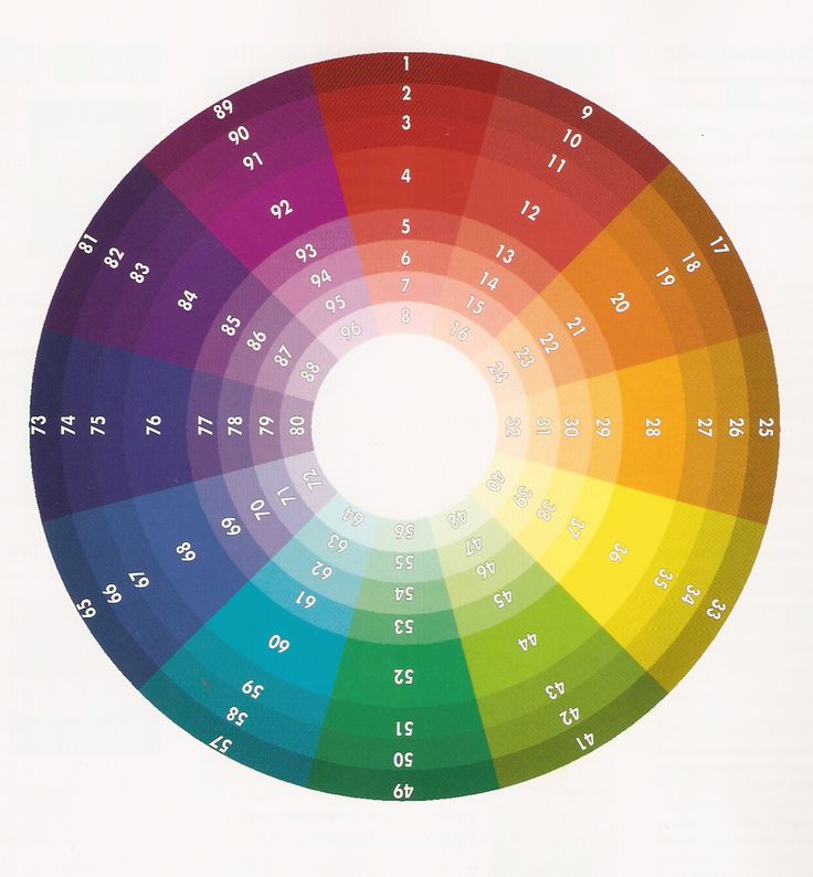
Pink
Positives:
energetic, feminine, love, romance
Negatives:
immature, girly
Red
Positives:
stimulating, energetic, action, drama
Negatives:
irritable, angry
Orange
Positives:
joyful, happy, sunny, creative, stimulating
Negatives:
pessimistic, hyperactive, superficial
Yellow/Gold
Positives:
optimistic, happy, bright, cheerful, alert, sunny, powerful
Negatives:
tough to get a good shade of yellow
Green
Positives:
calming, balanced, harmony, life, freshness, stability, peace
Negatives:
ambition, greed, jealousy
Blue-Green
Positives:
serenity, tranquility, softness
Negatives:
impractical, idealistic
Deep Blue
Positives:
peaceful, cooling, quiet, powerful, rich
Negatives:
withdrawn, depressive, frigid
Purple
Positives:
power, luxury, elegance, creative
Negatives:
sad feelings, frustration,
immaturity
Grey/Silver
Positives:
glamorous, prestigious, sophisticated
Negatives:
emotional, sensitive, mysterious
Black
Positives:
strong, elegant, formal, mysterious
Negatives:
fear, grief
White
Positives:
light, innocent, cool, clean
Negatives:
sterile, associated with hospitals
Brown
Positives:
safe, secure, comforting
Negatives:
restrictive, barren
What is Color Theory
Color theory dates back before even Leonardo DaVinci’s time.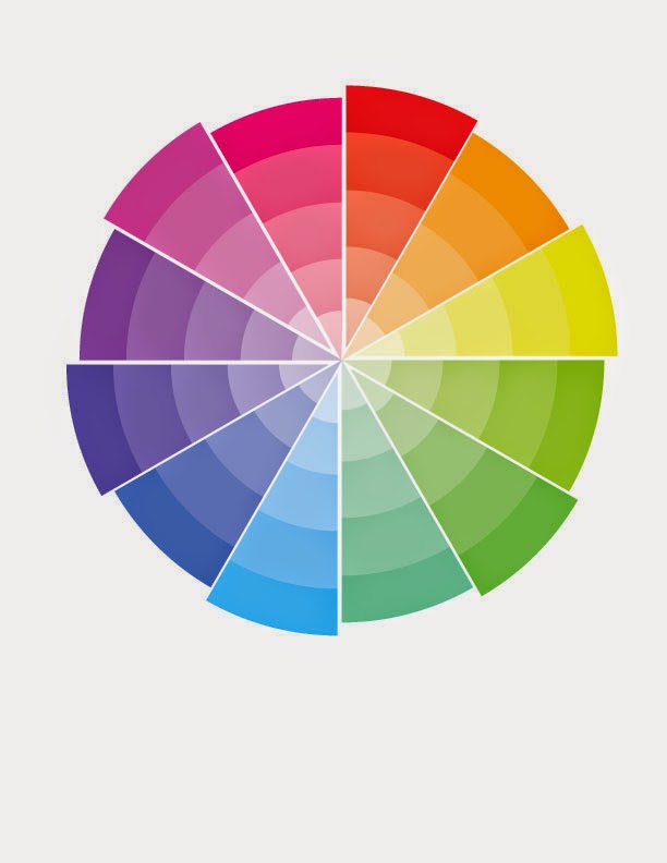 Color theory in interior design is the study of colors and how to use them in harmony in your home to create the flow and atmosphere (feel) you want your home to convey.
Why using color theory in interior design is important
The colors you use in your home should not be chosen individually, in isolation, but rather with your entire home in mind. They should coordinate and they should assist in achieving the feelings you want in your home.
Color theory in interior design terms
Sometimes you need to explain things a little more than just saying “it’s red” or “it’s blue”. Here are a handful of words that will help you when talking or reading about color theory.
Hue: Another word for color
Tint: Adding white to a color
Tone: Adding gray to a color
Shade: Adding black to a color
Cool Colors: Greens, blues, and violets
Warm Colors: Reds, oranges, and yellows
A color scheme in interior design is essentially a framework for choosing your specific color palette.
The four main color
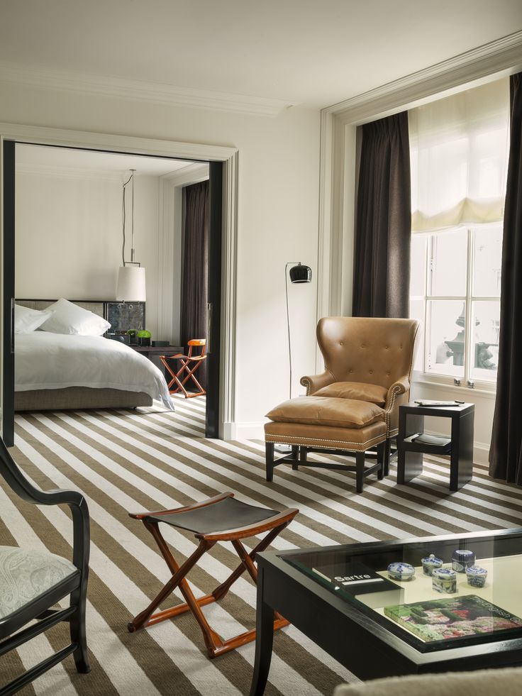
schemes in interior designMonochromatic. One-Color Scheme – also called monochromatic – this color scheme uses any one color and all of its shades, tints, or tones. This scheme is very easy to implement and is a good place to start if you are unsure of yourself and your color choice, or if you like a subdued and subtle look.
Complementary. Two-Color Scheme – also called complementary, this color scheme uses any two colors that are directly opposite each other on the color wheel. This scheme is typically a high contrast look with colors such as red and green or orange and blue.
Split-Complementary. Multi-Color Scheme – also called split-complementary, with this color scheme you choose one main color and then the two colors on either side of its opposite. It offers rather a dramatic look.
Analogous Related Color Scheme.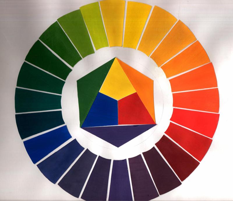 Also called analogous, this color scheme uses one main color and up to six neighbors next to it on the color wheel. A fun color scheme, best used with the 60-30-10 color rule (see below).
There are other color schemes too, but these are the most common and will give you plenty of options.
Choosing colors that work well together to get that great flow is sometimes tricky. But it’s much easier if you have – and know how to use – a color wheel to help you!
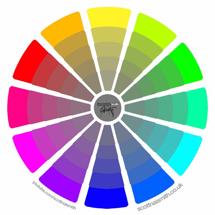
What is a color wheel?
A color wheel is probably not something you’ve used in a really long time, if at all. But it is a handy tool to help visualize which colors will work nicely together. And it can help you to decide on a color scheme for your home.
How to use a color wheel for decorating and choosing colors for your home
To choose colors for your home using an interior design color wheel:
1. Turn the wheel so that your favorite color family is located at the top, under the “Main Color” title.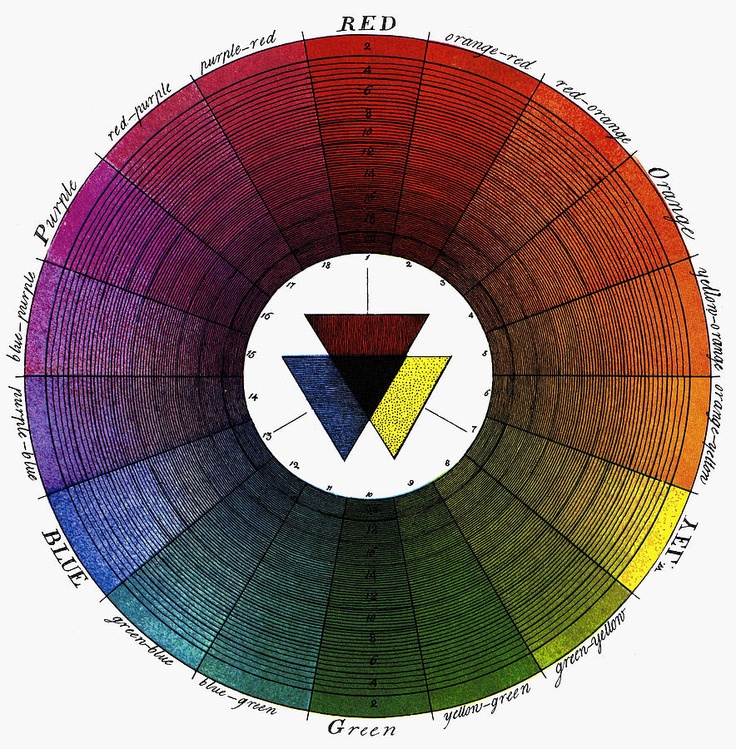 Let’s use blue-violet as an example.
2. Next, locate the coordinating color(s) on the color wheel for the color scheme you’d like. For example:
In a monochromatic color scheme, you will use the various shades of blue-violet beneath the main color on the color wheel.
In a complementary color scheme, yellow-orange, and its shades, tints, and tones will be the complementary colors you use with the blue-violet.
In a split-complementary color scheme, yellow-oranges, and red-oranges will be your coordinating colors.
An analogous color scheme (also called a related color scheme), green, blue-green, blue-violet, and violet will be among the colors you use to go with your blue.
3. From these basic coordinating color families, you can choose paint colors, fabrics, and all the necessary decor items for your space.
My favorite color wheel for decorating
There are several color wheels out there.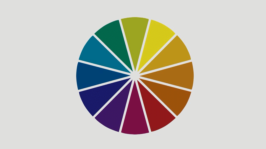 But my all-time favorite color wheel is this one, available on Amazon.
It’s meant specifically for interior design, so it includes colors that are more relevant to decorating than one meant for web or graphic design would.
It also has the color schemes summarized and a handy guide to colors that harmonize on it too.
If you’re unsure about the cost of getting a color wheel, keep in mind the potential cost of making color mistakes in your house – the paint, the fabrics, the furniture. If you’re decorating one or more spaces in your home, the return on your color wheel purchase could be huge!
Understanding Color Temperature (Undertones)
All colors – including white – are made up of other colors. Those other colors create something called an undertone. So, what are undertones?
Wait, maybe you’re thinking “I love and decorate with neutrals. I don’t need color theory.” Well, that would be wrong, my friend.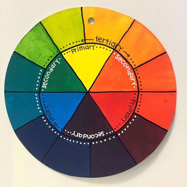
Even if you love to decorate with neutrals, you are actually decorating with color because every shade of neutral other than pure white and pure black is a color and has a color undertone. This is especially true with paint.
There are two types of undertones, warm undertones, and cool undertones.
In general:
- Warm colors with undertones like red and yellow feel cozy.
- Cool colors with undertones like blue and green feel calming.
Undertones matter in your home decor because they affect how your eyes see the colors you use.
3 ways to determine the undertone of a color
1. Use a color wheel
One simple trick to finding the undertone of something is to hold up your color wheel to it and see what color it most looks like.
2. Check the bottom of the paint swatch
THE EASIEST WAY TO FIND THE UNDERTONE OF A PAINT COLOR IS TO LOOK AT THE BOTTOM OF THE PAINT CHIP/COLOR SWATCH.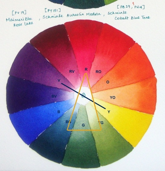 This is especially true for white and neutral paint colors. If the bottom color has green in it, the white will too. If it is a pink color the white will have pink in it too. In this way, you can choose a white or neutral with warm or cool undertones that work in your space!
3. Grab a piece of printer paper
Another way to determine the undertone of a color – especially a white – is to hold it up to a plain piece of white printer paper. The white printer paper will provide contrast and you should be able to see the color as it truly is.
Undertones matter especially in decorating with neutrals as you’ll want to decide whether you have:
- Cool neutrals (with green, blue, or violet undertones) or
- Warm neutrals (with red, orange, or yellow undertones)
3 Tips for Choosing Your Home Color Palette
Remember a color scheme is a general framework used to put your colors together.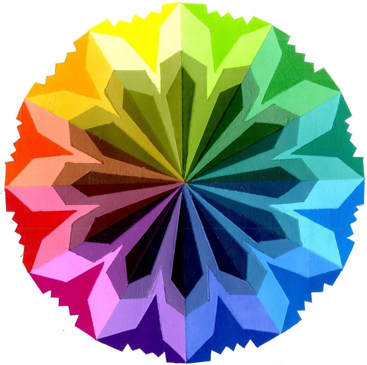 It’s based on the color wheel and color theory. While a color palette is the specific colors you choose for your home. It includes things like the names of your paint colors and specific fabrics, etc.
01| Ask yourself 4 questions before you choose colors
You should ask yourself 4 questions when you’re choosing a whole home color palette:
1. How do you want your home to feel?
Because colors evoke feelings, you will want to choose colors that evoke the feelings you want in your home. Do you want your home to feel relaxed and cozy or invigorating and energizing?
Warm colors like reds, oranges, and yellows will make your home feel cozy and lively. Cool colors like blues, greens, and purples are chill and relaxed.
Decide how you want your home to feel overall and choose colors that will help create those feelings.
2. What colors do you love?
Choosing a color that you love, will help ensure you won’t get sick of it any time soon.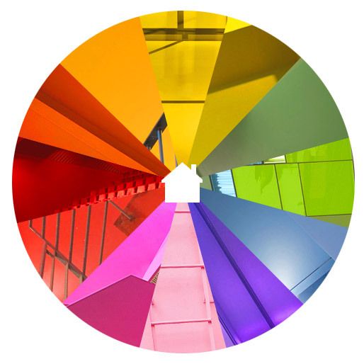 Granted if you love big bold colors, you may not want to go and paint every single wall in that color. But your favorite colors – in clothing, home decor, cars, etc. – can be a great jumping-off point for your whole home color scheme.
My favorite color happens to be black. Just one look at my everyday wardrobe and my favorite T-shirt that reads “black is my happy color” will tell you that.
Do you have a favorite color? Perhaps a glance at your wardrobe will help you determine what colors you are naturally drawn to?
By starting with a color that you love, it is unlikely that you’ll get tired of your color scheme quickly.
3. What colors are you stuck with?
Undoubtedly, you will have some things in your home that have to stay. Whether due to budget, time, or talent, you will need to take stock of these unchangeable elements in your home. Some of these things may be flooring, kitchen and bathroom cabinets, countertops, faucets, wall tiles, etc.
Unless you’re planning on renovating these as you decorate, they are fixed and—like it or not—play into the color palette you will choose for your decorating.
Most of us can’t change or renovate everything all at once. Some things have to remain long-term in your home.
Take cues as to colors you have to implement based on the unchangeable things in your home, like floors or cabinets that you’re not replacing for a while (or ever).
Pay attention to those fixed things and their undertones:
- What is the undertone of your home’s woodwork?
- What is the undertone of your home’s metal finishes?
4. Do you want a high-contrast color scheme or something a little more soothing?
Take a look at the four most common color schemes above again, paying particular attention to their descriptions.
If you love high contrast color, you may want to utilize a complementary color scheme.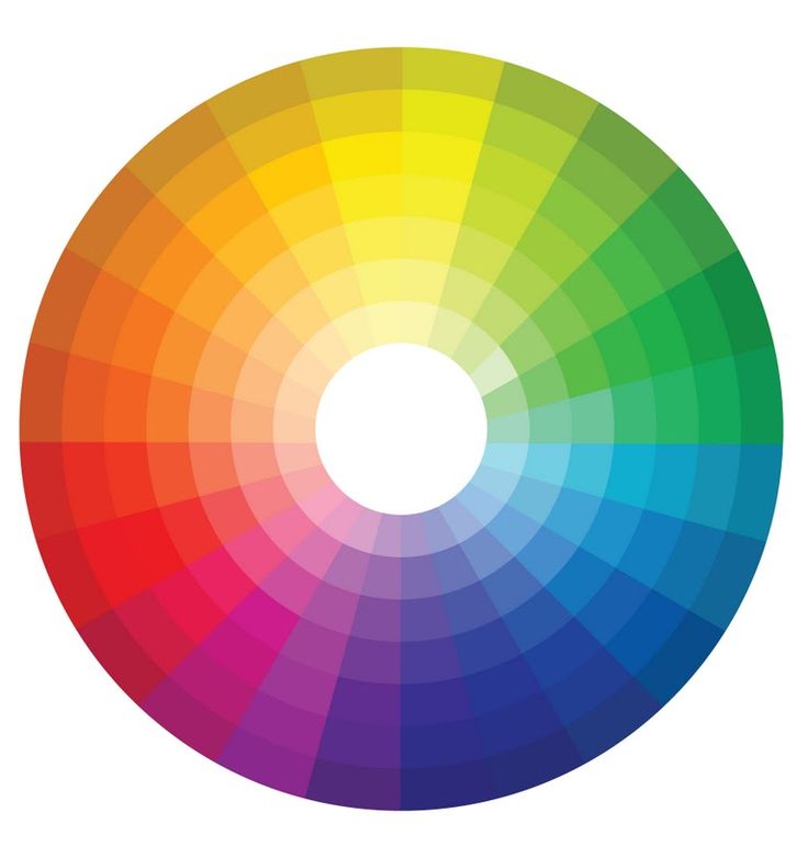
But if you want more of a soothing space without jarring pops of color, stick with a monochromatic color scheme (particularly one with plenty of neutrals).
02| Keep the 60-30-10 color rule in mind
The 60-30-10 rule is a basic and timeless color in interior design rule that states that 60% of the room should be a dominant color, 30% should be a secondary color (or pattern/texture) and 10% should be an accent. It’s a rule that when followed brings balance to the colors used in a space.
- 60% is the Main Color. The easiest way to incorporate your main color into over half of your space is to use your main color on the walls. If your main color is a bright color, you may not want to do that though. But if you do, try to use plenty of neutral colors too, to keep the space from feeling overwhelming.
- 30% is an Additional Color. The purpose behind the additional color is to bring some life and interest to the space.
 It’s best to use this additional color on furniture, rugs, and curtains.
 - 10% is the Accent Color. Generally, the accent color will be the brightest or most intense color in a space. You can utilize this accent color on vases, throw pillows, candles, and various other accessories. The benefit of using your accent color on these things is that they can be changed with the seasons or when you get bored of a specific color.
Our living room is mainly black and beige. By keeping the bigger things neutral, we can change out the accents with the season.
Red Holiday accents.Burnt orange accents for fall.Green accents for summer.03| THE best hack for choosing colors that work perfectly together every time!
Want to know my biggest hack for choosing colors?
Pull all your colors from an inspiration piece.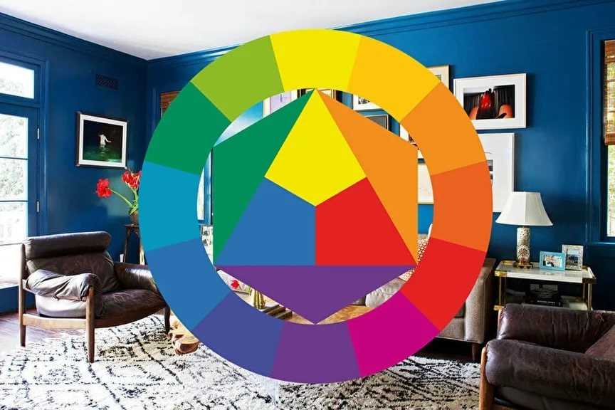
Your inspiration piece can be a multi-colored couch or a bedspread, a piece of art, or even a swatch of fabric you LOVE. Professional designers have already spent the time to put the colors together to create these things, so take advantage of that and pull your individual colors from a great piece!
Just be sure your inspiration piece works with the fixed or unchangeable items in your home such as flooring and countertops, etc!
Choose the Individual Colors for Your Whole Home Color Palette
The key to creating a great home color palette for your house is to use a limited number of colors – and to use them in different ways in each space. This will give you that cohesive flow you want, without every room looking identical.
Keeping in mind the color scheme you want to use, how your want your home to feel, and which undertones are already in your house, choose the following for your home color palette:
- A white
- A neutral
- One main color
- A second color
- A third color
For more help with your home paint palette, check out our course, Decorating Uncomplicated, which includes 8 done-for-you home color palettes!
10 No-Commitment Ways to Add Color to Your Home
Look at photos of any of the rooms in our home and you’ll see that I’m a ‘neutrals girl’ through and through.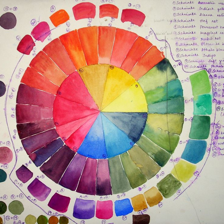 You see, I’m afraid of committing to any one single color because I know myself well enough to know that I tire of color very quickly. And it can seem very jarring to me to have bursts of color around the room.
For those reasons, I prefer to decorate with neutral colors. I paint walls in neutrals because while a wall can be painted over, such as when one accidentally chooses the wrong color, it can mean a lot of extra work. I prefer to choose neutral-colored furniture too so there’s a neutral base to work with when I want to change things up, as I inevitably do.
But that doesn’t mean I NEVER want color in my space. Personally, I crave a little more color in the late winter when everything is incredibly blah outside or in the heat of summer when refreshment is needed.
So how does one add color in interior design without committing to any one or two colors for the long haul?
By using a handful of these 10 no-commitment ways to add color to your decor, of course!
1.
 Add flowers
Cut flowers not only add some life and organic shapes to your room, but they can also add a splash of color whenever the mood strikes. Grocery store blooms are very inexpensive for those with a small budget. But kudos to you if you find and make friends with the local florist who will create a bouquet from in-season blooms to suit any budget! Or you could even go faux, and make your own reusable arrangement!
2. Trust the faithful throw pillow
Throw pillows come in all shapes and sizes and can generally be found rather economically if you’re willing to look. I like to buy the Ikea feather throw pillow inserts and then just swap out the covers with ones from Etsy or Society6 when the mood strikes.
DIY bunting or store-bought banners not only add a splash of color, but they can also make your home feel more festive, cheerful, and whimsical too. This is perfect if those are some of the desired feelings you want your home to convey!
4. Fill your home with plants
If you’re are far more talented than I and have a green thumb instead of a black one, plants can add color and cleaner air to your home too.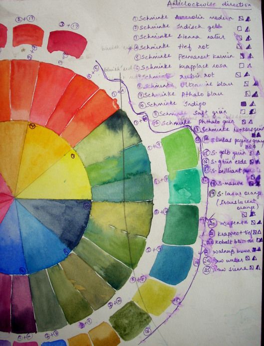
5. Add colorful art
There are so many places you can find downloadable and printable art these days – including our own Etsy shop – that it’s easy to swap out prints in frames whenever you feel like adding a splash of color – or even a different saying – to your walls or surfaces, without painting. You can even get large-scale art on a budget!
6. Display your books
There’s been quite the trend lately of either wrapping books in plain paper or turning them backward, spine in, to help them blend in better. Plus, you can use pretty reference or fiction books as decor as well. If you’re looking to up some color and you own those books anyway, you might as well put them on display.
7. Add wallpaper – of the removable type!
If you’ve got a little more time on your hands, and don’t mind the work, removable wallpaper may just be the ticket to a more colorful space without the scary commitment of a permanent wallpaper. Try applying it to just a single wall to draw attention to it, or apply it to a thin MDF panel, mounting it to the wall and completing it with a bit of trim.
8. Cozy up with throw blankets
The companion of throw pillows, throw blankets can be heavy or light depending on the season and are even easier to switch out than other colorful accents. Bonus – they fold up pretty compact for storage.
9. Switch out a rug
I know, area rugs can sometimes be expensive. But they don’t have to be – especially given that they endure a lot of abuse underfoot. Rugs USA and Wayfair both have plenty of inexpensive area rugs that can pack a punch of color, or blend in with their neutral surroundings.
10. Change the curtains
If you’re craving a more colorful space, you can always hang colorful curtains. For a pop of inexpensive color, use curtain ring clips and hang anything from flat sheets to scarves to painted drop cloths.
So as you can see, if you’re a neutral lover like me, or if you’re just on a budget, you can add, take away and swap out whatever colors you like easily with these 10 no-commitment ways to add color to your decor!
If you’d like to study color in interior design further, or just look at how others are using color in their homes, you might like these books:
- The Colour Scheme Bible: Inspirational Palettes for Designing Home Interiors, Anna Starmer
- Habitat: The Field Guide to Decorating, Lauren Liess
- Colour: The Professional’s Guide: Understanding and Mastering Colour in Art, Design, and Culture, Karen Triedman
Do you have a good grasp of using color in interior design? Have you chosen a home color palette for your house? Do you know how to use a color wheel?
How to use a color wheel for interior design |
(Image credit: Alamy)
Using a color wheel will help you get the perfect palette for a color scheme for your home.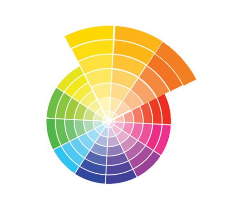 This is true for interior design and decorating, but it can be used to get color combinations right in clothing and art, too.
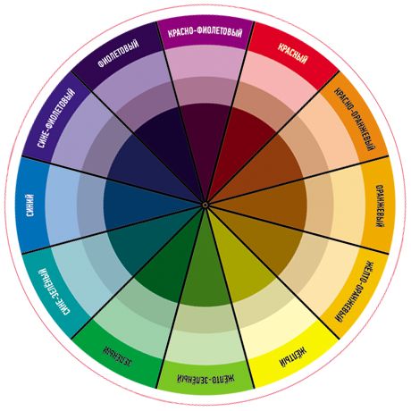
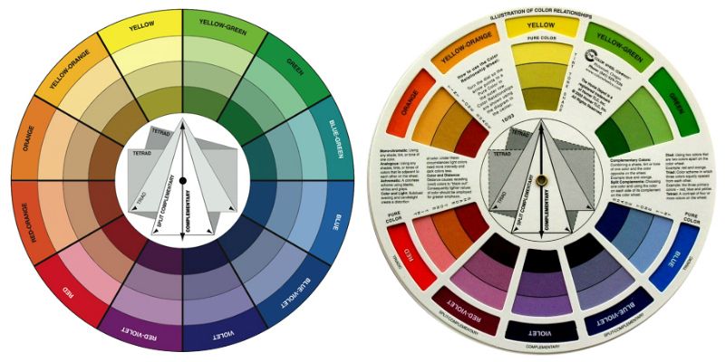
What is a color wheel? If you haven't heard of it before, the color wheel is a simple device that shows how primary, secondary and tertiary colors relate to each other. In other words, it helps you quickly see which colors go together.
From monochromatic and complementary palettes to split complementary, contrasting and triadic, it can be used in combination with color theory to help you create successful decorating schemes and guarantee decorating success.
Conceived in 1666 by Sir Isaac Newton to map out the various relationships between colors in the spectrum, the color wheel is essentially a visual representation of 12 core colors in a circle, from primary hues to secondary colors and so on.
In interior design, it provides a clear and instant visual for exactly which hues contrast and coordinate, to help you to devise harmonious, tonal or contrasting room color ideas.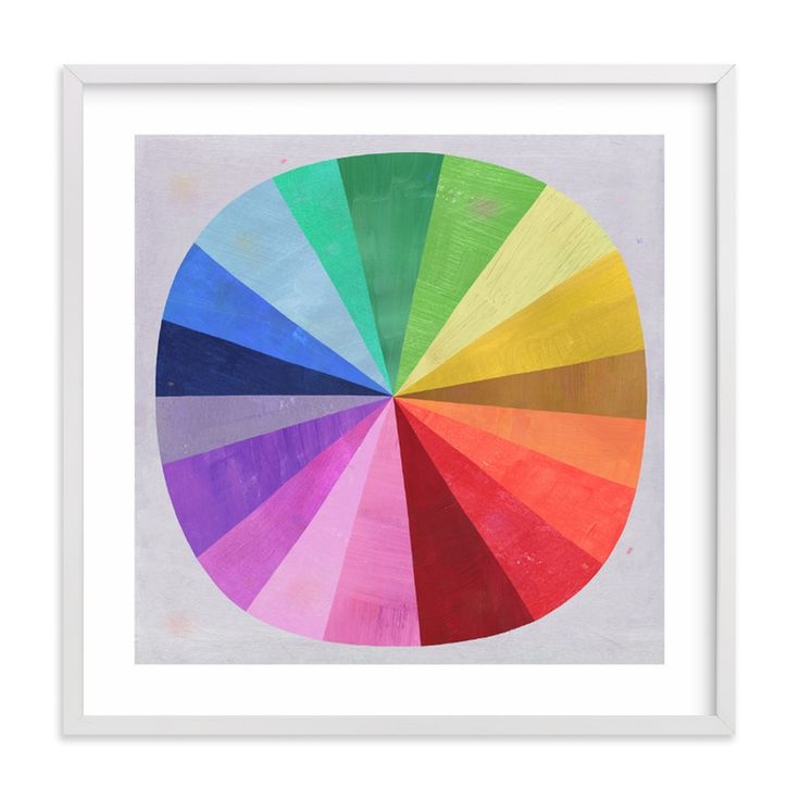
How to use a color wheel?
(Image credit: Alamy)
There are 12 segments on the color wheel, each one representing a color. The wheel shows how colors relate to each other, whether they’re side by side or diametrically opposite.
Structurally, the wheel includes the three primary colors of red, yellow and blue, alongside three secondary colors, green, orange and purple (where two primaries are mixed together to form another).
Finally, there are six tertiary colors, a mix of a primary and secondary color. These are red-orange, yellow-orange, yellow-green, blue-green, blue-purple and red-purple.
The warm colors – the reds, yellows and pinks – feature on one side. You'll find the cooler hues – blues, greens and purples, on the other.
How to use a color wheel to create a color scheme?
Using a color wheel to build color schemes also needs an understanding of the different types of color schemes for your home decor ideas. These are the schemes you will need to consider on the color wheel in combination with color theory. We list them below and include interior design tips to make the guide more useful.
1. Monochromatic color schemes
(Image credit: Mulberry Home)
Monochromatic colors (also called analogous) are all within one color family. They create a scheme that is a combination of tones in a single color. Monochromatic color schemes create a harmonious, calm feel
This might be a combination of blue and indigo, for example. To use the color wheel to match analogous colors, follow these steps:
- Pick your hero color.
- Now pick two similar colors on either side of the directly complementing color.
- These will be your second and third colors.
2. Complementary color schemes
(Image credit: Sarah Kaye Representation Ltd)
Complementary colors are opposites on the color wheel, for example red and blue.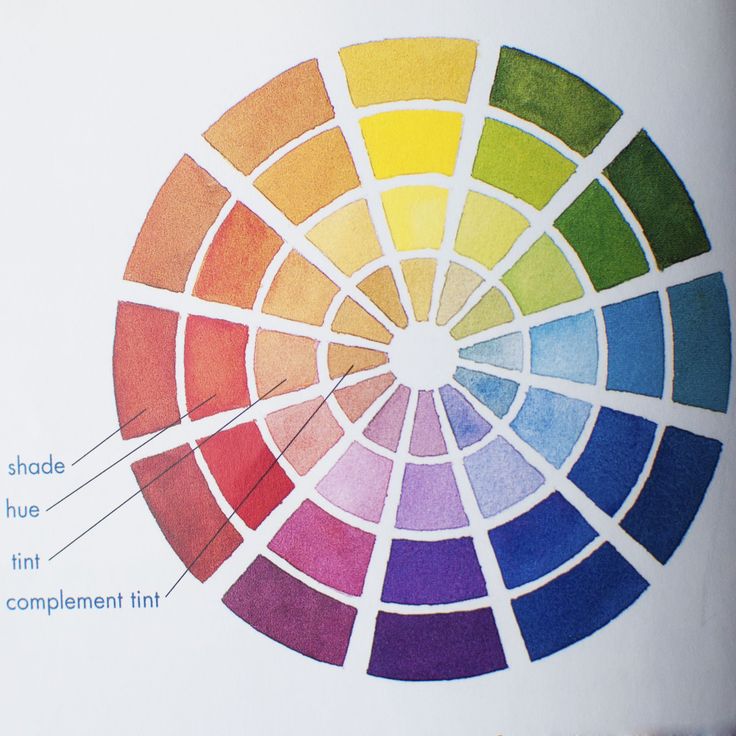 When placed next to each other they are pleasing to the eye. To use a color wheel to match complementary colors, for instance if you wondering what other colors to use when decorating with green walls, then follow these simple steps:
- Pick one color from the color wheel – this might be your main color choice.
- Look across the color wheel to the opposite side find your main color's direct complement.
3. Split complementary color schemes
(Image credit: Jake Curtis)
Split complementary color schemes uses one main color and two complementary ones. Split complementary rooms include the main color (above, blue), the complementary color (above, red) and a third color that's closely related to the second/complementary color (above, pink).
The contrast here is less stark than in a complementary room, so while it creates a bold look, it is tempered and calmer. To use the color scheme to create this scheme:
- Pick your main color.

- Look across the wheel to pick a complementary color
- Pick a third color adjacent to the complementary color.
4. Contrasting color schemes
(Image credit: Future)
Contrasting color schemes use two colors from the opposite sides of the wheel, such as a bold color from one part of the color wheel (above, blue) and a lighter color from a different color family (above, yellow). These schemes can be used to create bold schemes. To use the color wheel to create this scheme:
- Choose a bold color from one part of the color wheel.
- Choose a lighter color from a different color family.
5. Triadic color schemes
(Image credit: Sarah Kaye Representation Ltd)
Triadic uses three colors from the color wheel, which might be contrasting, complementary or monochromatic. The finished scheme is bright and bold, but still harmonious.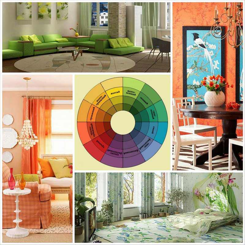 Here, you can see it in the blue, yellow and green:
What colors go well together in rooms?
If you follow the rules of the color wheel, you will discover a wide selection of palettes to choose from. Some of these combinations you will already be familiar with, while others you may not have come across before. These are just a few successful combinations:
- Yellow and green.
- Yellow and blue.
- Yellow and orange.
- Blue and red.
- Blue and green.
- Blue and orange.
- Blue and pink.
- Green and pink.
'Deciphering what colors go well together depends on where on the color wheel they sit', says Helen Shaw, of Benjamin Moore . 'Consider creating a monochromatic scheme which uses varying levels of saturation of one color. We would recommend using a paler shade of one and a darker hue of another.'
Below, we show you how the color wheel has been used to create some pleasing color combinations for rooms.
1. Pink and green
(Image credit: Future/Damien Russell)
Decorating with pink? This contrasting scheme pits a pale aquamarine against a flamingo hued pink. Accessorized with a splash of rich fuschia pink on the mirror frame, the pale blue flooring gives it an air of a modern classic.
2. Monochromatic blues
(Image credit: Future/Simon Bevan)
Using variations of one color is a calming approach. Here, decorating with blue on the chest of drawers makes a sophisticated backdrop to the lighter tinted powder blues of the upholstery, while the teal bowl adds an additional layer of color. This is a great combination for living room color ideas that you want to feel calming.
3. Monochromatic pinks
(Image credit: Future/Simon Bevan)
Purple room ideas are an unusual choice, but this harmonious living room color scheme utilizes a host of pink and purple shades to great effect. The rich aubergine color of the upholstery is echoed by the lampshade, while the plum walls wrap the scheme in warmth.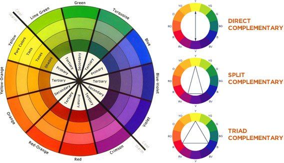 Small splashes of pink and yellow lift the scheme from becoming too moody.
4. Green and blue
(Image credit: Future/Chris Everard)
Decorating with green is fail-safe. ‘There there is no room where green doesn’t work’, says designer Suzy Hoodless . ‘One fallacy is about mixing blue and green – they can be seen together and I have paired these shades with great success in past projects.’
Green is on the cooler side of the color wheel, ranging from watery blues to deep forest greens, reflecting the world around us – sky, sea and earth. This palette can create a visually strong statement that is also warm and very easy to live with. A pleasing plain color paired with a welcoming pattern, is the perfect foundation for an inviting room scheme.
5. Green red and grey
(Image credit: Benjamin Moore)
Decorating with grey is enduringly popular. A split complementary scheme, chosen from adjacent points on the color wheel. The deep green paint on the walls features deep gray undertones making a striking backdrop for a cast of vivid furnishings and accessories in appealing shades of red and coral.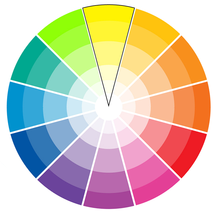
6. Orange and blue
(Image credit: Sofa.com)
New neutral room ideas include spicy shades. In this living space, the tonal shade of terracotta on the wall provides a warm background for the bold royal blue sofa. Dashes of brown, terracotta and pink on cushions and artworks echo the wall colors, while the matching blue footstool and paler blue rug anchor the look.
7. Green, blue and white
(Image credit: Jane Churchill)
Green room ideas are always restful. Here, a clutch of green hues are combined in pattern, planting and upholstery, with a harmonious pop of blue. All are framed and grounded with strong black lines and pale cream walls.
8. Blue, green and pink
(Image credit: John Lewis & Partners)
The rich, pink of the sumptuous bedspread is the dramatic focus of this bedroom. A classic split complementary scheme, the addition of the deep blue shade of the headboard and the forest green walls ensure a cohesive, cosy sophistication.
9. Blue and red
(Image credit: Future/Simon Bevan)
Decorating with red is tricky but complementary hues of vibrant red and cool duck egg prove a surprisingly fresh mix, against which geometric pattern in crisp monochrome lends a modern edge. The look is softened by the curves of the dining table and chairs.
10. Blue, green and yellow
(Image credit: Future/Michael Sinclair)
Yellow room ideas needn't be all-yellow. Utilizing colors from almost a third of the wheel, this harmonious scheme teams blocks of blue, yellow and olive green together for a calming effect. Patterned wallpaper in a neutral shade grounds the look, while the pale green pattern on the headboard gives it a fresh edge.
11. Pink and white
(Image credit: Future/Alicia Taylor)
Powder pink walls and upholstery are given extra depth thanks to the accessories in this space. Rich pink curtains and a patterned rug in a plethora of pink hues, from pale pinks to almost red shades tie the tonal look together beautifully.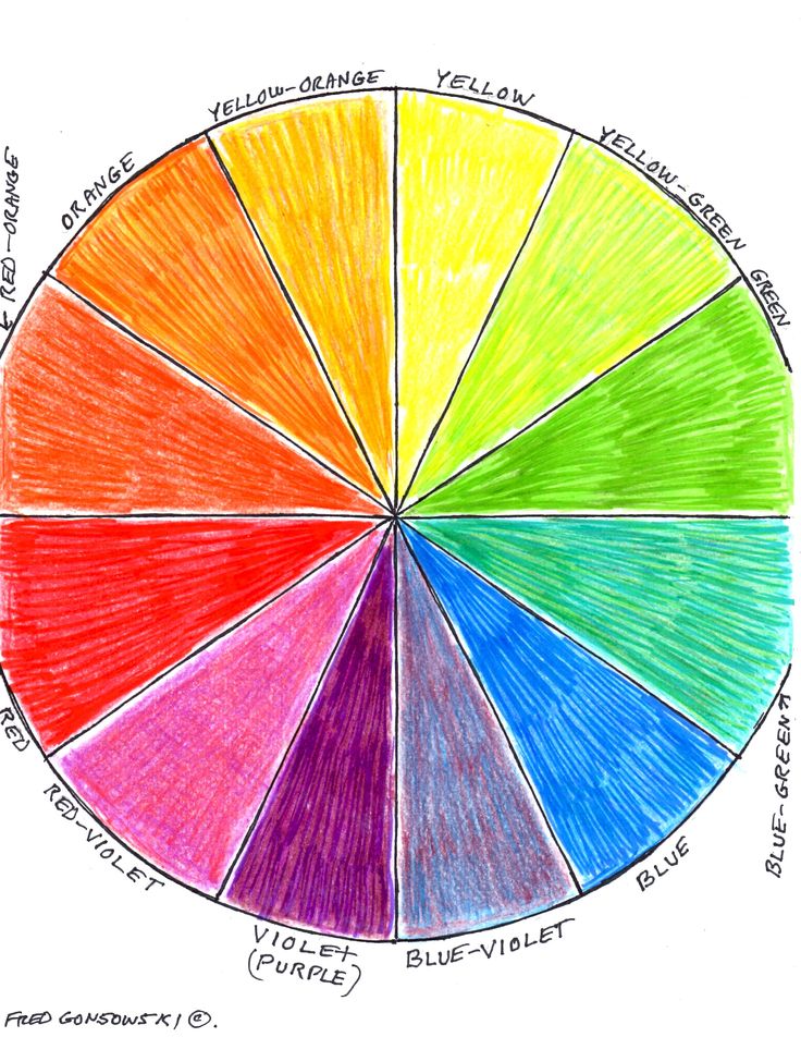
Now that you're armed with the knowledge of how to use the color wheel and how to mix colors, you'll be inspired to create your own perfect palettes.
What is color theory?
(Image credit: Future/Simon Brown)
In essence, color theory is the application of art and science on decorating ideas. It uses the color wheel to explain how we see colors, the effects created by mixing colors, and how they match or contrast with each other, as well as how color can affect mood, generate emotions, soothe or aggravate. This is why using the color wheel to create different effects is important.
'Color undoubtedly has the power to make our homes look more beautiful,' says Dulux Creative Director, Marianne Shillingford. 'But it also has the power to change the way we feel about them and behave in them. It can connect spaces together as much as the people in them and it can make us rest better, work better and just feel better'.
While applying the theory of what color schemes combine well is pretty fail safe, it's important to consider what use the space has.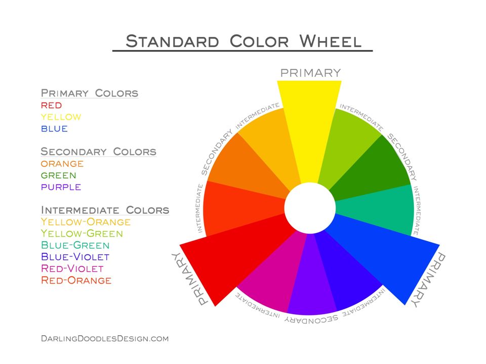
Ruth Mottershead, Creative Director at Little Greene agrees. 'For example, the kitchen is often the hub of the family home – usually a place of activity, the heart of family life and a place for entertaining friends. A kitchen therefore is an ideal place to make more adventurous color choices and certainly the space where you can really experiment with vibrant colors.'
'For more tranquil spaces like the bathroom, consider shades that exude serenity so you can create a haven within your home. For a scheme that provides you with a calm retreat, use colors with warm undertones that really bring comfort to a space.'
Color theory is also a great place to start when you are learning how to design a moodboard as it will help you to define the backbone of your design.
What's the difference between hue, tint and shade?
When discussing color, these three words are key. Frequently confused and used interchangeably, in reality they’re three distinctly different things.
A hue is the purest form of any color, whether it’s primary, secondary, tertiary or somewhere in between on the spectrum of colors on the wheel. Hues are very intense and are very dramatic, so they are usually lightened or darkened for the majority of decorating schemes to create a tint or a shade.
A tint or shade includes the addition of white or black to a color will create a tint or a shade. If you add some black to a hue, you create a shade and go darker. If you add white, you create a tint and go lighter.
Ginevra Benedetti is Associate Editor on the Homes Content Team at Future. She has been writing about interiors for the past 16 years on the majority of Britain’s monthly interiors titles, such as Ideal Home, Country Homes & Interiors and Style at Home, as well as Livingetc and of course, Homes & Gardens. This naturally lead her into writing for websites like HomesandGardens. com.
com.
With contributions from
- Lucy SearleGlobal Editor in Chief
use the color wheel and other tricks
use the color wheel
1. For a monochrome space
If you want to create a monochrome interior at home, you do not have to choose strictly one tone and stick to it. In this case, it will take a very long time to collect materials and furniture, and the result can turn out to be flat and boring.
Wikimedia Commons
Look at the color wheel and choose the shade you want to make the main one. Now pay attention to the beam of flowers coming from the center it hit. You can use all these shades in your interior to create a monochrome.
If you have chosen a light muted tone as the main color, then for point accents you can choose dark saturated tones from the same range, and vice versa.
Unsplash
Instagram: @homeinhoneyfields
Instagram: @_shallash
Instagram: @asma__omer
2.
 For a two-tone space
 If you are planning a bright and contrasting interior, you will need two different colors that overlap well. If you already have one favorite color and you are pairing it, first find it on the color wheel.
Wikimedia Commons
For example, you like the reddish orange in the middle of the hue stripe. Calculate where it is from the center. Now draw a straight line from it through the center, as if dividing the whole circle in half. You will be taken to blue-green tones. Count the same number of steps from the center as the orange, and you'll find the perfect match for it.
Such contrasting combinations of bright colors are best used in non-residential rooms: in the kitchen, in the bathroom, in the hallway. For a bedroom or living room, choose colors closer to the center or edge of the circle, they are softer and lighter.
Instagram: @retrostylebylinda
Instagram: @houseonmerrittstreet
3.
 For a three-color space
 The 60/30/10 rule can also be used in color selection. This means that you choose the main color, which will take up a little more than half of the entire space, add one large contrasting shade and one spot to it.
Wikimedia Commons
Using the color wheel, you can choose these colors like this: find the main shade that you like, and pick the remaining two at the same distance from the center, but to the right and left of it. That is, three successive horizontal shades.
For example, you took lemon yellow as a base. Next to it are orange and lime tones. It will turn out not flashy, calm solution.
Instagram: @tomfaulknerfurniture
Instagram: @nataliamprojekty
If the previous method seems boring, you can use the color wheel to match the three colors differently.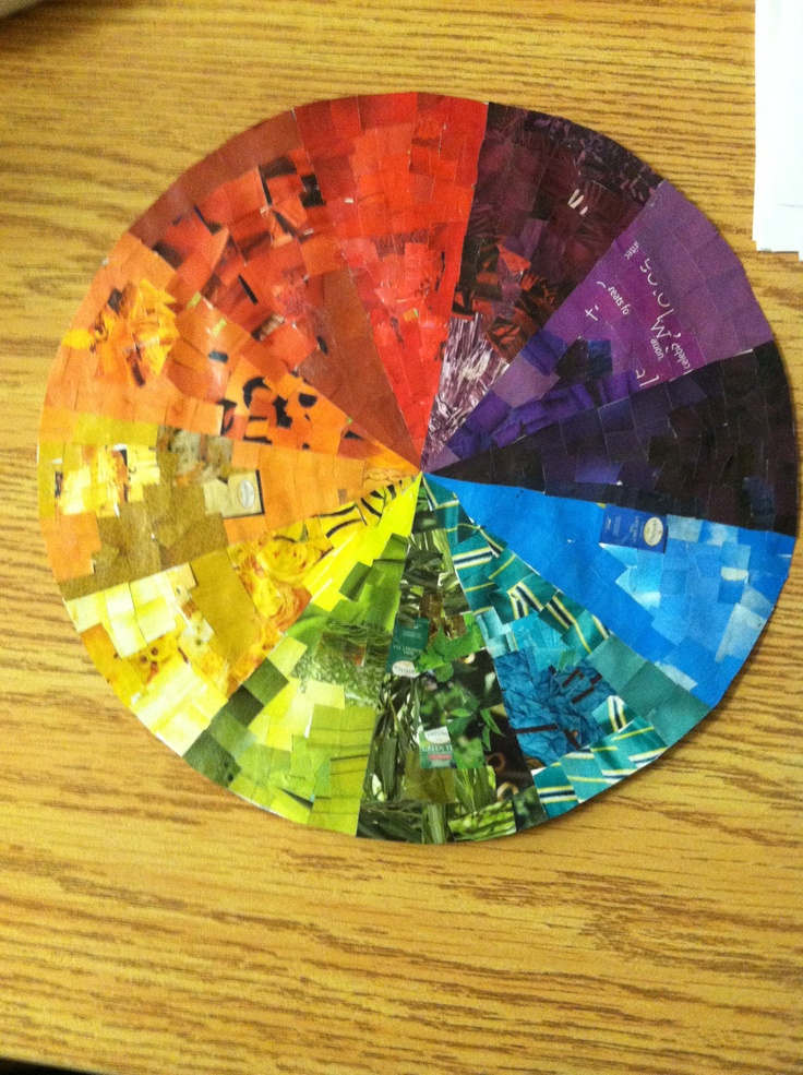
Wikimedia Commons
Find the shade that you have already chosen as a base. Next, mentally create an equilateral triangle with one of the vertices in the selected section of the circle. For example, you settled on orange. At the same distance from it will be red and blue shades.
In general, it is not necessary to stick to an equilateral triangle. You can easily move two vertices one step down or up, right or left.
Instagram: @cocciolatte
Instagram: @hus_nr_28
4. For a four-color space
The most complex scheme in terms of materials, decor and furniture that you can use, since finding the right amount of matching objects and surfaces is not easy . This scheme can be useful for large rooms or complex multi-color styles, such as pop art or boho.
Wikimedia Commons
But finding matching shades on the color wheel in this case is very easy. Just write a square or rectangle in it.
Geometric figure vertices will always indicate good combinations.
Instagram: @sivan.konvalina
Instagram: @jennshomestyle
Instagram: @annlacouture6
Pay attention to the paintings and photos
It is not necessary to look for beautiful color combinations on your own. Artists and photographers have already done this for you. Here is what you can do.
- Take your favorite painting or canvas in digital form and upload it to a website that matches the pixel tones. So, by clicking on the picture, you will find out exactly what colors are combined in the image you have chosen and select the paint or fabric of the same tone. Look for websites that suggest Pantone colors to make it easier to navigate the store.
- Upload an image to a site that collages the main colors used.
 This technique is more convenient if the image is complex and consists of dozens of different colors. The program will select some of the most frequently used options.
In both situations, you can also use Pantone Studio or Adobe Capture.
Unsplash
Instagram: @manders_kraski
Get inspired by nature
You can start from the color combinations that surround you in nature, everything is harmonious in it. Try picking colors that go with your favorite season. Cold bright and light shades are suitable for spring: light green, pink, blue, lilac, lemon. For summer - warm and saturated: green with a hint of yellow, red, brown, orange. For autumn - warm and in yellow-orange colors. For winter - a combination of white with blue or gray.
Instagram: @likemyhome
Instagram: @gooddom43
Instagram: @loft.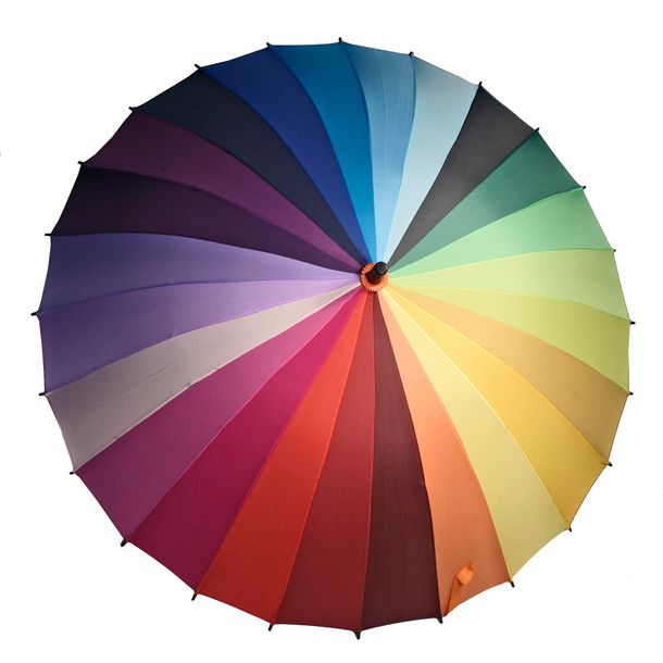 ds
ds
Instagram: @prorooms and yellow is a shade of intellectual activity. The psychology of color is much deeper and more interesting. Try to pass the Luscher color test on your own or with the help of a familiar psychologist. Its result will offer you four shades that you will associate with self-esteem, self-trust, development, and limitations. In this case, the shades will lie in the standard range: red, green, blue and yellow.
Instagram: @dariadesigner_interior
Instagram: @dondecor_life
Prepared by
Maria Revina
principles, compatibility, examples with photo
The color wheel has been used by designers for a long time to combine colors in the interior. The original color palette was designed by Isaac Newton. The scientist managed to decompose the light beam into the colors of the visible spectrum: green, yellow, violet, blue, red, indigo, orange.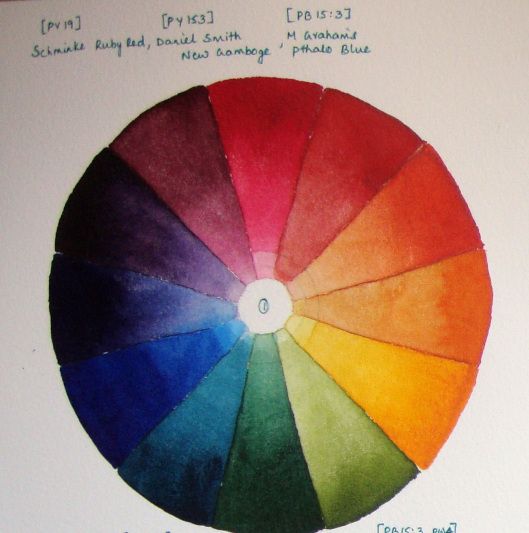 The statement about the influence of shades on the human psyche is scientifically substantiated, therefore, the arrangement of a comfortable living space must be taken seriously. From this article you can learn how to use the color wheel in the interior.
Handy schemes for designers
Today, the rainbow wheel is used in a wider range. It consists of several levels. Itten's idea is taken as a sample. It clearly shows how the colors are combined with each other in the direction of the circle. The primary bases are in the center, in the form of a triangle. These are red, blue and yellow. When mixing pigments, secondary colors can be obtained from each pair of primary colors. These include: orange, purple, green. They are located on the second level. Combinations of any base color with an additional one are called tertiary. They can be seen on the final disc.
Black, white and gray in nature we meet already in a diluted form, so they are not on the color wheel. The combination of colors in the interior has its own pattern, thanks to which various schemes and tables were invented, which are used by artists and decorators. For convenience, a special scale of proportions has been developed. The dilution of pigments in it is indicated in optimal ratios: primary colors account for 10%, secondary combinations - 20%, neutral and tertiary halftones make up 70%.
How to find suitable tones?
Companion colors are arranged regularly opposite each other. First you need to decide which primary color will be preferred, then select an additional one. Harmonious are combinations of three tones that are together. For example, the companion of light green is purple. So pink and fuchsia shades are suitable for him. On both sides of it are yellow and green, which can also be used in compositions with light green.
Color schemes
Basic principles for the formation of color compositions:
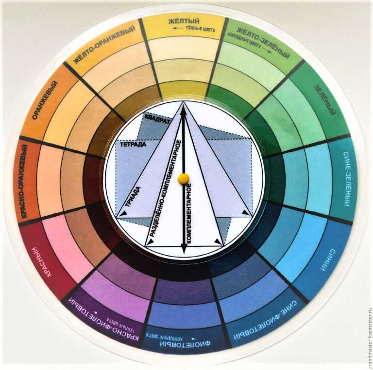
- Designers often use standard triads of shades when decorating rooms. If you draw a triangle in the center of the circle, then its corners will indicate the desired colors.
- In a similar way, colors are distinguished according to the rectangle scheme.
 Of the indicated paints, one is taken as the basis, the other two - as additional ones. With the help of the fourth color accents are created.
 - Analog combinations can consist of 2-5 shades arranged one after the other. In such combinations, semitones are selected that are identical in pigment proportionality.
- Complementary, contrasting combinations of base colors with complementary colors are used to create striking effects. In this case, tones with a high concentration of pigments are selected. One contrasting color can be replaced by two adjacent tones.
- A double split group of tones is formed according to the square principle. If you go in the direction of the circle, then every third component of the palette is selected. Examples of a selection of the correct combinations can be seen in the top photo.
Harmonious combinations
Competent decoration of a room can assume a unique and rich color, if the components are matched perfectly.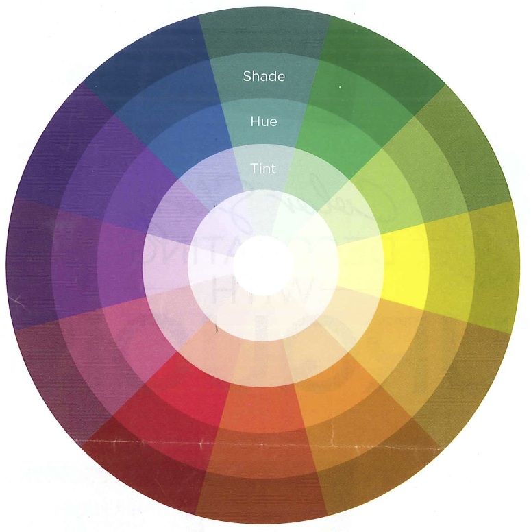 It is necessary to study the rules for combining colors in the interior and the color wheel, to understand how many shades are acceptable in the decoration of one room.
Choose from two to four matching shades from the rainbow spectrum. To dilute such a combination, you need to make several universal tones - from white with a gradual transition to black. Here you need to be able to use the game of proportions. Two base colors are chosen saturated, there should be more of them. Additional contribute in moderation, but so that they are noticeable. With the help of the rest, variety and accents are created. Ideally, the room should be decorated in three or four tones with the addition of a few achromatic colors. If there are fewer tones in the interior, it will look boring.
Rules for monochrome design
It is also allowed to combine colors in the interior within the framework of monochrome. The color wheel for such preferences is presented a little differently: starting from the center and to the edge, each component of the entire palette varies from light to dark.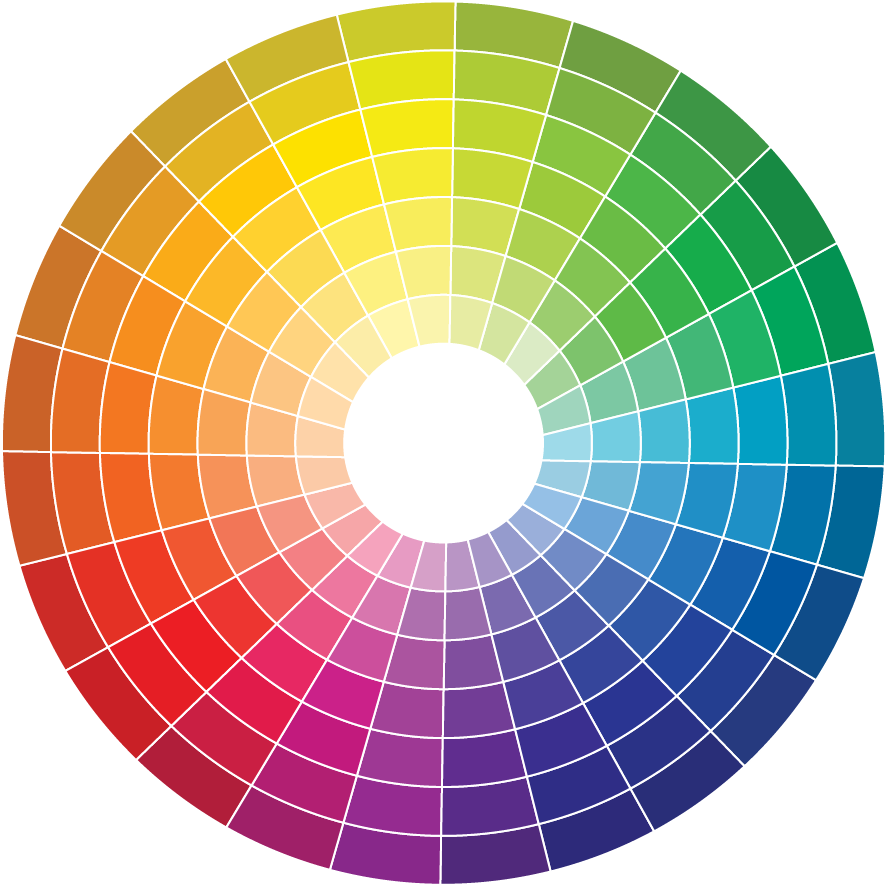 Decorators use the monochrome principle, choosing several shades with different saturation. This combination requires the addition of neutral touches. Red, black, white and gray colors are chosen as accents. These are just the basics, then we will look at how you can apply the range of color combinations for interiors in practice.
Gray combinations
This is the most winning tone and is often chosen for the purpose of a relaxing time. In addition, any suitable color combinations with gray in the interior will look perfect. The main thing is that the introduced shades are in harmony with each other. In the photo below, additional colors to gray are selected: a shade from the main blue scale, from a number of tertiary combinations - light brown. Beige touches make the room warmer. This tone is obtained by adding white to the brown pigment.
Room in achromatic hues
Look how interesting the shades vary within the same background. The interiors look very noble with a similar combination of colors.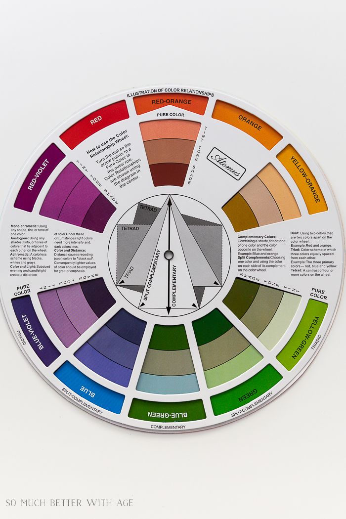 The photo perfectly demonstrates an example of a modern style with a predominance of gray. The lightest tone is taken as the main tone, the saturated one acts as an additional tone. For a cold room, the most winning accent color is red. In this version, it is somewhat blunted, brought to a restrained tone.
The combination of colors in the living room interior
Violet is on the opposite side of the yellow spectrum on the color wheel. According to the design rules, they can be combined. Pillows in purple and yellow can bring brightness to a monochrome concept. Without the addition of additional colors, the living room would look lifeless and too cold. Diversity is also achieved here due to different textures, as well as metal accessories.
Living room with bright accents
A room design based on cold tones can make a room look dull. Bold color combinations with gray in the interior give unexpectedly interesting effects. If you add at least two warm shades to it, this will immediately bring an atmosphere of reliability and comfort.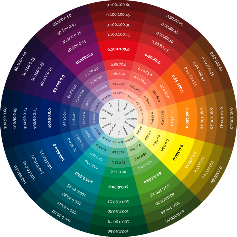 This design is suitable for the bedroom. If you want something new, try to combine conservatism with ultra-fashionable attributes. For example, put armchairs with an unusual bright color in the living room.
Color combination in bedroom interior
The color wheel played an important role in the design of this room (pictured below). The design is based on two main shades. Turquoise is opposite the related range of beige and brown. The bedroom should be warm and discreet in decoration. Brown tones are ideal for a relaxation room. Here, the originality of the design is achieved by changing the saturation of shades. The introduction of white accents gives the room a certain airiness, freshness.
Color and style
Each color has its own tasks, a suitable palette of colors is attached to a specific style. If you ignore these techniques when decorating a room, you can end up with bad taste. Here are the basic rules:
- Black color is suitable for modern style, minimalism, loft, hi-tech, art deco.

- White - modern, modern.
- Gray - country, Provence.
- Brown - country, provence, modern.
- Red - minimalism, art deco, modern, high-tech.
- Yellow - Provence, modern, minimalism.
- Orange - modern and colors suitable for yellow.
- Green - country, modern.
- Blue - loft, hi-tech, country.
- Pink hebi-chic, modern, country.
- Violet - hi-tech, loft.
All colors except yellow and orange are suitable for classic style. The solar scale in the standard design of the premises is used extremely rarely, it is more used to decorate the room.
Shade Challenges
The color wheel in an interior is a huge help in decorating a space. Guided by the rules of the rainbow spectrum, you can quickly master the basic design techniques. To navigate well in colors, you need to know what tasks each of them performs. What can we expect from different shades?
For example, red activates the visual system.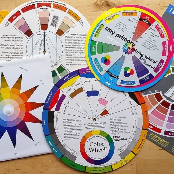 Black is a symbol of luxury, visually reduces the room. The combination of gray with other colors in the interior opens up wide possibilities for fantasies. White is versatile, expands the space. The yellow-orange spectrum improves mood, improves appetite, is used to create accents, and is associated with the sun.
Blue is considered practical and original, it brings calmness. Purple is multifaceted, used to decorate any room. Brown is designed for comfort and a homely atmosphere. Green brings freshness to the interior, light pink gives peace.
Looking carefully at the different shades, you can understand what touches they can bring to the room. Let's see what it might look like with black as an example.
Luxury interior
If you choose black as an additional color for the living room, it will look contrasting and even luxurious. This design is suitable for a large room. Black color in the interior is always associated with wealth and rigor.
Visual perception of shades
The depth of one tone can be perceived by the human eye in different ways.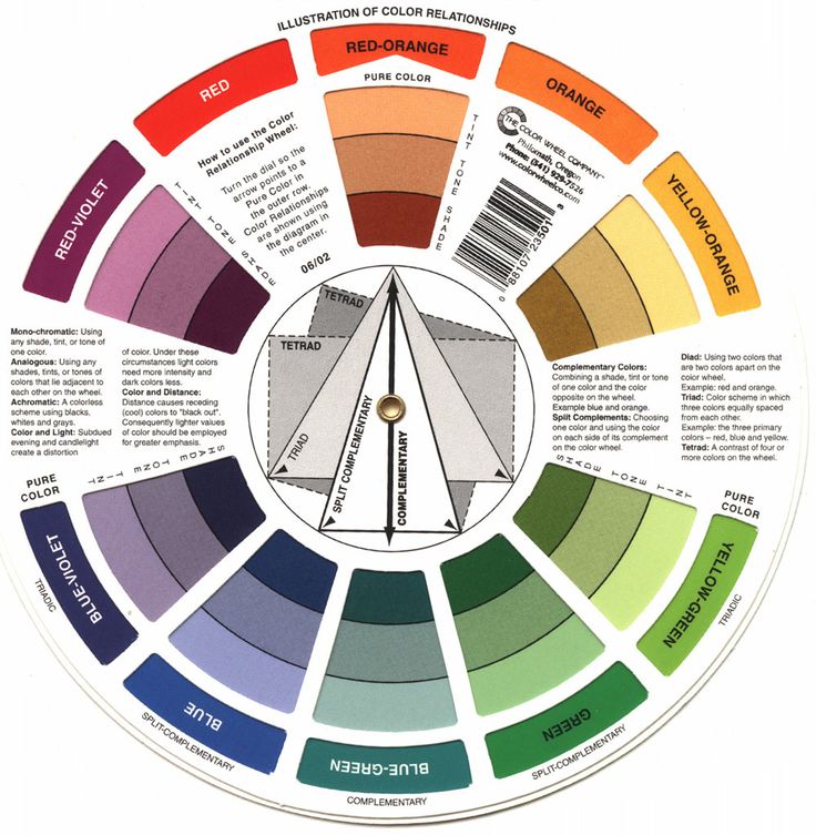 To a large extent it depends on the lighting of the room. Shadow effects also affect the brightness of the scenery. Various color illusions can occur due to a certain distance between the colorful spot and the human visual organs. When decorating a room, you need to take into account its size. For example, if you reduce the distance in relation to the blue color, it will reflect greenish notes. If you increase the distance from yellow, it will appear orange. The latter, in turn, when the gap is extended, will begin to cast with red strokes.
Creating tone gradations
By adding additional touches, you can make base colors more interesting. If you need to reduce their saturation, add white color and the rest of the shades will immediately become less bright. To get different blue transitions, add some black. The palette of cold tones will immediately sparkle with different shades. Gray color is able to soften any rich compositions. Using these techniques, you can change the tone of the color both within the same palette, and when combining shades.